#but i love how the colours and lineart turned out in the end!
Explore tagged Tumblr posts
Text

@precuresecretexchange Hi!! @sekaiichi-happy I was your exchange partner this year, and when I saw Laura on your list I couldn't resist! Hope you like her (and Kururun)!!
#tropical rouge precure#precure#precure secret exchange#precure fanart#fanart#my stuff#i struggled with making this#but i love how the colours and lineart turned out in the end!
169 notes
·
View notes
Text

(Click the image for better quality)
Yipeeee that Keiki and Mayumi fanart I posted the WIP of is finally done woooo- This piece was a very experimental one that I'm kind of OK on. Maybe because I've just gone insane looking at it for so long and I'm my own worst critic lol.
Artist's Notes;
So I've once again been playing around with my rendering style, mainly because I have been wanting to improve my lighting for a while now and as I was just scrolling through Tumblr, I saw some of the official art for that one webcomic-turned-animated-TV-Show Lackadaisy and was immediately inspired. I also have seen a technique a few times in the past where the lineart and shading are merged together, so I've been meaning to try that for a little while.

I did some experimentation on this one sketch of Keiki I posted in my sketch dump and I really liked the results of it, so I carried those over to this piece.
I ended up scaling up Keiki and Mayumi from the original WIP because I felt like they were both getting lost in the composition, and I'm glad for that because I think it works a lot better. I'm not a fan of how Mayumi's sword turned out at all, but it's not really meant to be the focus of the piece so eh. Overall, I think I could do better with my colours, probably because with Keiki and Mayumi's colours, I did them flat in greyscale and then used a brush on the overlay blend mode to colour all of them over, after which I changed the base layer for their colours from white to yellow and then lowered the opacity so it all went together better. I also decided to use gradient maps for a lot of the background elements, mainly to experiment with getting in my values first to make them pop out more. I ended up finding a really nice sky gradient on Clip Studio Paint that I really liked, and that kinda helped to establish the colour scheme of the background a lot. I think the whole "start in greyscale then colour" thing really works better with painterly styles rather than more illustrative ones, and while it is good at making sure your values are more readable, I honestly don't think I have the skill level to pull that off yet. Honestly, I think I've been looking at this drawing too long or maybe I added too much to it, but I wish I could've made the colours less monochromatic, but I'll just save that for the next piece I do.
I do love how the flame (...well it's more of a weird space rift than anything in this piece) and the lighting turned out, those were fun to do. I was initially struggling with the flame and how Mayumi is positioned in front of it before realizing "Oh wait! This is a weird abstraction of a weird creature! I don't have to follow the laws of anatomy!" and just dislocated it's flamey bottom jaw from the main body. I also changed the colours of it since I was really not liking how incredibly bright it was when it had lighter colours. Again, the gradient maps served the more painterly style of the flames well.
I also love how Mayumi turned out. I could do her sleeves better but that's more of just me needing to study how those types of sleeves fold in that position more. I'm also very happy with the posing, the technique I used for that was taking photos of myself in the positions I wanted, blocking in the silhouette and then modifying that by adjusting it to my lines of action that I drew on top of the original photos, and then sketching over the silhouettes and drawing in the shapes of the hands overtop of the photo if I needed to get the fine details right. As for what I do to take the pictures myself, I use a tall chair I have, prop up my phone with a phone stand, put on a ten second timer and scramble to get in position. Yes, I did have to use a bunch of thin markers I had to try and get the hand positioning on Keiki's pose right, yes I do have a fake sword that I used to get the positioning of Mayumi's arms and hand right, the sword was for an old Halloween costume from several years ago. I really like how both Keiki and Mayumi turned out in this drawing, I'll have to play around with these designs for them more in future drawings.
Also, if you wanna know why I draw buildings like that, when I watched Fantasia 2000 as a kid (One of the Disney movies where they make really beautiful animations to classical music) the way they drew the buildings in the first few sections Rhapsody in Blue segment (the jazz one with the cities) changed my brain chemistry and now whenever I need to draw buildings really quickly, I refer back to that. Since the buildings aren't really the main subject, I didn't put much thought into them.
As you can tell I am very tired of this piece, mainly because I made things harder for myself by overcomplicating the process compared to what I usually do, mainly with the whole "starting in grayscale then adding colour." I'd honestly just prefer having a black layer set to colour that I can just toggle on and off when I need to see the values, but it was good to experiment. And that was mainly the point of this whole drawing, to experiment. I'm definitely going to have to play around with this new style I'm going for, mainly because I liked how it turned out a lot in the augmented Keiki sketch, and also because I want to find ways of making it suit my style more. I also really want to keep experimenting with my lighting like this, it's very fun. Last but not least I am never starting in greyscale again because dear god I do not like the workflow it forced me into. I don't have a problem with the method itself it's mainly just a skill issue lol.
If you wanna read my headcanons for these two, I put them in my WIP post, so you can read them there if you want to. The more I look at this the more I prefer the simplicity of my WIP. I might go back to this and just take away the fancy colours and effects to see what it looks like without all of that stuff and reblog this post with that drawing, but for now, I don't think I can look at this drawing again for a while.
#touhou project#art#fanart#touhou fanart#touhou 17#wily beast and weakest creature#keiki haniyasushin#mayumi joutougu#haniyasushin keiki
116 notes
·
View notes
Text
2023.
i hope any of you reading this will forgive the essay. i started posting to this art blog ten years ago in 2013 when i was just at the very end of high school, uploading short animations i'd made for one of my final projects, preparing myself for art school where i was gearing up to become an illustration/animation student.
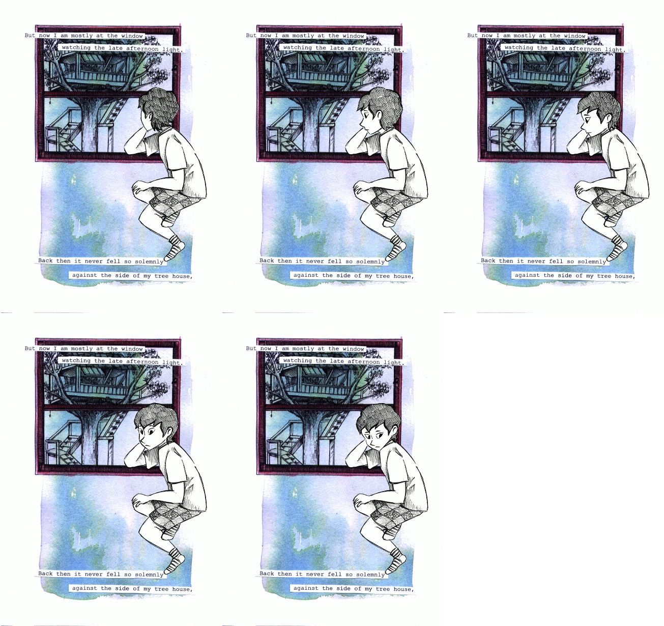
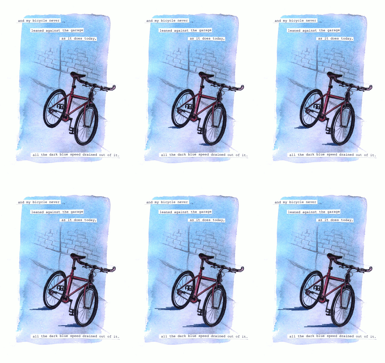

i went into my art foundation course in 2014, still thinking i was going to be going into storybook illustration or with faint hopes of becoming like a concept artist for game/animation, although even then i'd started thinking about patterns...
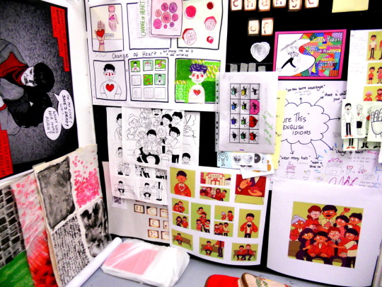
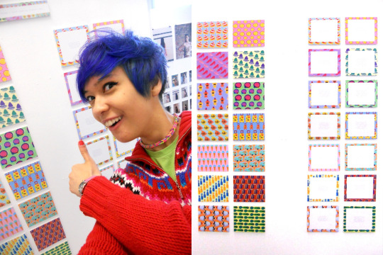
and then in 2015 i did go into my BA, going in for that illustration with animation degree that... usually when i talk about it in real life, i say didn't really feel like the best place for me. if i think back, the best things i got out of it were two of my best friends, one of whom is now my partner. looking back on my BA era, there's some bits of sketchbook stuff...
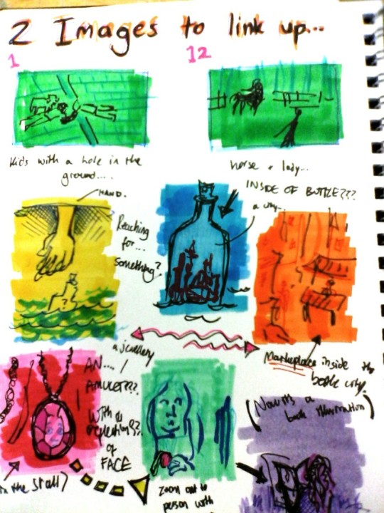
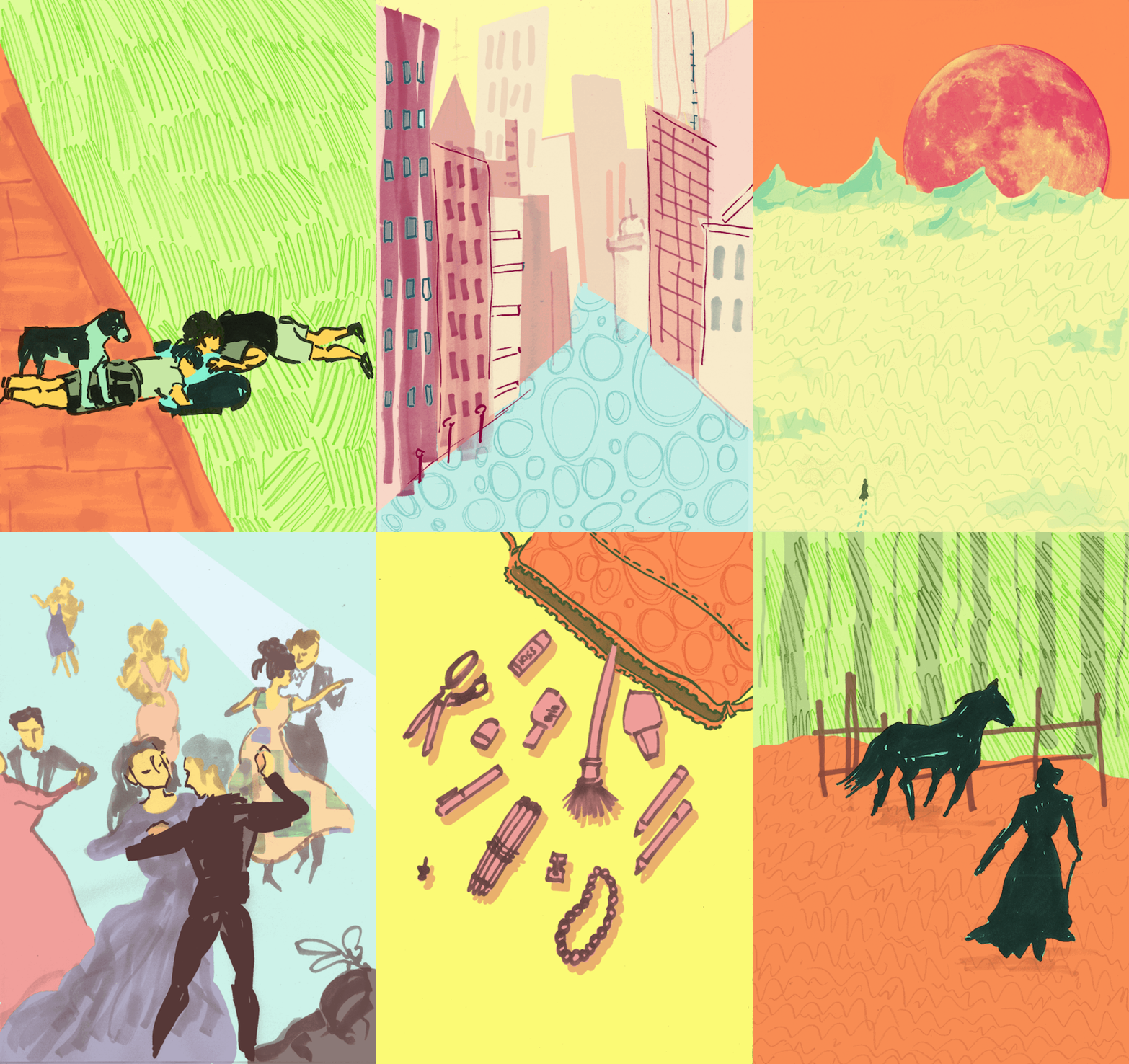
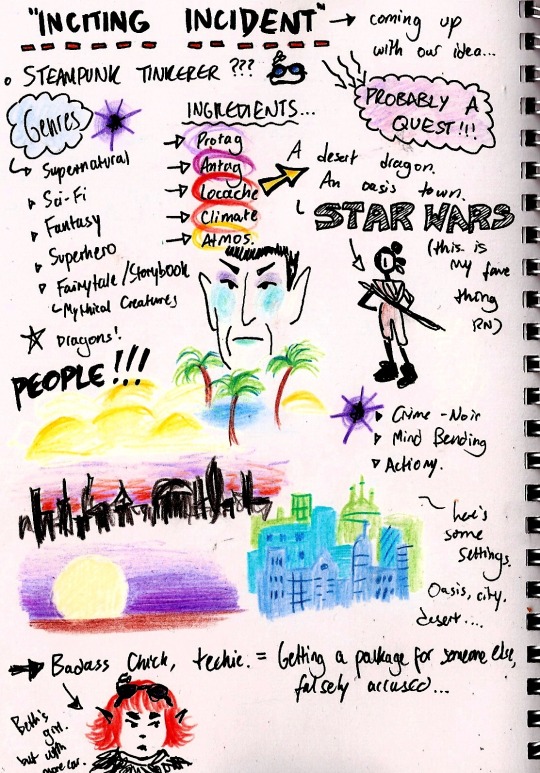
and while i was at university my main fandoms were thunderbirds are go and x-men for a bit... these are from the end of 2015 into the beginning of 2016...
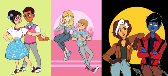
then for a little while i was doing this still sort of pastel-ish lineless situation:
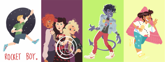
and i alternated between that and this thin fineliner type work (pretty sure all of the linearted pieces were done on paper and scanned, and all the lineless were graphics-tablet-only) - it was in this style that i started to offer commissions for the first time too.
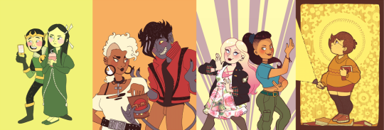
and i also had fineliner-lined work in sketchbooks that i coloured with marker and posca pens, the colours of which were generally a bit more intense just based on not being able to slide the hue/saturation around on paper:
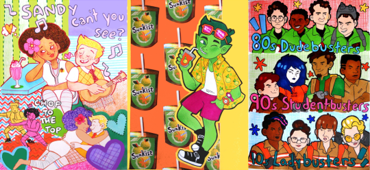
also 2016 was when i discovered the spongebob musical just after it's trial run in chicago (which ended in july of 2016) and i started making fanart at that point... which would have the biggest effect on the way i drew (and i did end up handing in a piece of spongebob musical fanart as one of my art school homeworks lmao)
from summer 2016 until early 2017 things were still quite soft and pastelly in my digital art, colour-wise:
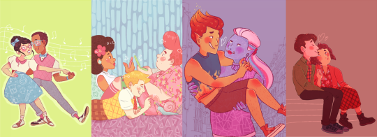
and then suddenly everything got whacked up to 100% on saturation. also i was using the binary tool to give everything really thin pixel lineart for some reason.
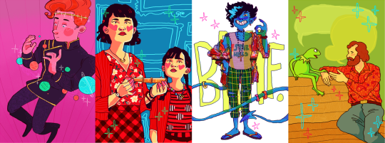
then i went on vacation in summer 2017 and didn't draw for maybe a month? just short of? and when i came back i decided to change everything up again... giving characters blobbier, more ugly-cute faces with large squinting eyes and big nostrils and i was worrying a lot less about making anything look smooth, lineart-wise. i turned off the pen stabiliser in SAI and let it wiggle.
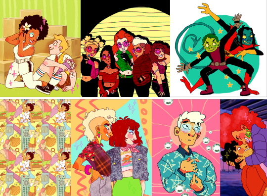
then... the spongebob musical opened on broadway in late 2017, i went to see it live in person for the first time... and my whole brain was ENTIRELY consumed by my love of it. i was putting that david zinn inspired pattern explosion into everything, even if it wasn't sbm fanart.
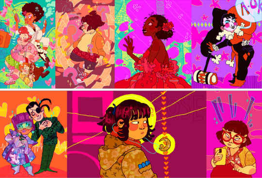
as we go into 2018, i started colouring my lineart. my biggest interest was still broadway musicals (with spongebob at the top of the list)
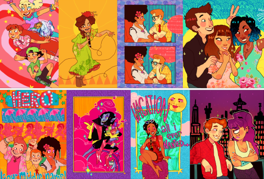
i think summer 2017 - early 2018 is probably my favourite art era, i was at my most bright and colourful and exciting... although i know in my actual real life i was struggling a lot with my home situation and i had been for some time. art was definitely my escapism back then, and i think a lot of the time i drew really bright, joyful stuff to try and inject that feeling into myself.
as for my university work, i was putting my focus into 3D paper-mache puppets:

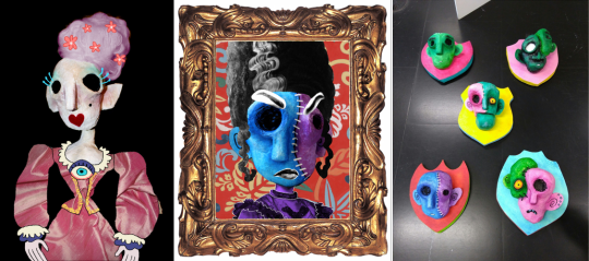
and i was also starting to do more repeat patterns, mostly inspired by things around me. i'd learned how to make patterns actually tile and repeat in 2017, so made a few during my time at uni just to accompany some of my projects, but never as the focus of them. one of my university tutors told me that maybe i should put more focus on doing surface pattern, and maybe applying it to textiles, but i said i wasn't interested.

i graduated from my BA in the summer of 2018, and immediately began volunteering at the whitworth art gallery doing anything i could - stewarding, helping with arts and crafts, dancing with families...
in 2019 i was still very colourful... i was trying out more chunky colouring on characters skintones that i think was def inspired by tumblr artist jadenvargen:
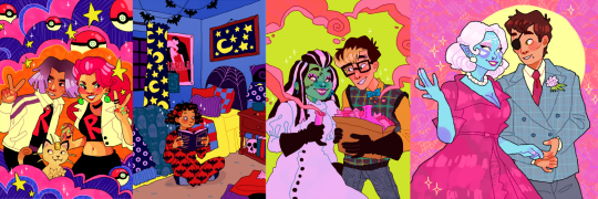
but the blobbyness and ugly-cute style of drawing faces was gone by here, and i think... the way i drew characters probably had better *anatomy*, proportions were maybe a bit more realistic...
in 2020 i started adding the black shading to under the chins and some other places on characters' bodies because i started watching the anime my hero academia with my brother, lmao (and i was starting to pastelise colours a bit again, these are the most pastel-ish examples) my lineart has really smoothed back out too, though i never turned my pen stabiliser back on in SAI. i think my hand just adjusted. probably seems a bit insane to miss that, but i do.
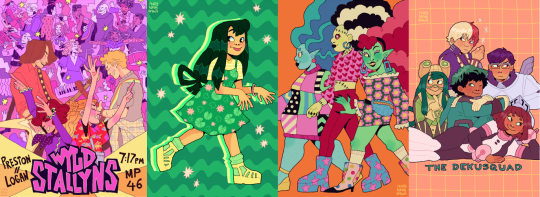
by the end of 2020, the almost-year of lockdown over cobid had... made me a bit insane, i think, and i moved out of my mother's house and into a flat with a friend from university.
in 2021 i think things were much the same... i think from this point on is where things have sort of settled. i don't want to say stagnated, but i do think things have been very... like this for a while.
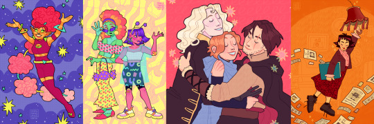
2022 - got the most exciting examples out...
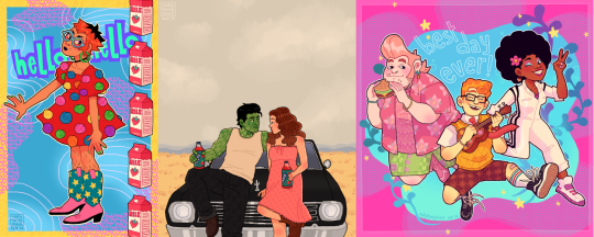
also i was very into these little frames in 2022.
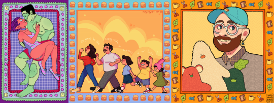
and then on to 2023! in 2022, i did begin trying to shift gears a bit -- hoping to put more energy into sewing and making products (like my tutor has suggested back in uni, even though i'd really resisted the idea.) i sold at a few in-person markets during winter of 2022, but got disheartened by the amount of money i had to sink in up front to sign up for a spot...

which has made me VERY grateful for the people who have supported me via online sales. it has really helped me stay afloat in 2023 - AND it has felt more wonderful than i can describe that there have been people interested in my work... especially when a lot of it has been my original designs, rather than the fanart that i expect a lot of people initially followed me for.
i've also... in the past 2 years... branched out a bit more when it comes to 'being an artist' - and have had the opportunity to deliver arts & crafts workshops with local refugee & asylum seeker support charity, afrocats. it's taken me to their home base in a church to hotels across the city where asylum seekers were temporarily placed while waiting on their new homes, and of course to my beloved whitworth art gallery, where we welcomed visitors from all backgrounds: from the typical white middle class visitors the gallery usually expects, to all the refugee visitors coming into the space for the first time.

and through my volunteering at the whitworth, i showed up so often they decided they might as well pay me. so i've also become a facilitator of... creative play sessions, my favourites of which have been outdoors. monthly, year-round, we have 'outdoor art club', where i get to paint with mud and make potions from leaves with kids & families - here you can see me tell you a little bit about it in this video below with 'crempog' a puppet character that makes videos about activities for kids and families around manchester (my bit starts at 01:10 although i am in the intro and thumbnail haha)
youtube
and then of course the summer 'PLAYTIME' activities we've had the past two years: scrap studio in 2022, and play market in 2023. it's the best freelance gig ever -- just to hang out and encourage families to be creative and have fun.
youtube
youtube
in working more in these new avenues... outside of being - as i've called myself for a long time - "an internet artist"... i've found myself more interested in this sort of thing. in being a "real world artist" too. in doing surface pattern design, and being a workshop facilitator, i find myself wanting to put more energy into these sorts of projects.
in 2023 i've also dabbled a little bit more in youtube videos! i have had a channel for a while and have made videos in previous years, but 2023 has been the year i've done the most in. admittedly most of them haven't been about my art, and more just like... random things that interest me (the spongebob musical in particular) but i've really been enjoying video editing. that's kind of an art form too, so i'm including it here!
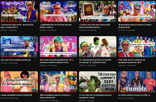
moving forward, want to keep putting even more of my energy into other things. my shop, with a bigger range of products to offer. workshops in real life, where i can make a difference.
as for my art blog... i feel like i've done the least drawing in many years in 2023, and... well, things have been weird and complicated for a bit in my real life. i hope to draw for fun a bit more again very soon, and to return to doing things in more of a wild and crazy way, to be more creative and exciting with the way i draw things. still, here's some of my favourites from 2023:
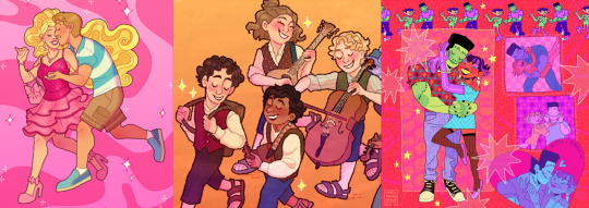
thank you so much to everyone who has borne witness to my art journey this past decade!!! i hope you will stick with me, who knows, maybe for another 10 years if tumblr holds out. especially a big thank you to everyone who has ever commissioned me, or bought anything from my store, you literally keep me able to make art at all and i cannot, cannot, cannot overstate how much it means to me.
i'm moving homes soon, possibly into very cramped temporary conditions for a little while before HOPEFULLY starting my real life with my partner. if i can take one more moment to plug my work, then [here is a link to my online shop] and [here is my ko-fi page too.]
cheers, cheers, cheers!
- LOREN 🌈🍍🎉
#also: i did post. monster high and steam powered giraffe fanart on my main blog when i was in high school#in 2012/2013 it seems like i did absolutely LOADS of fanart for both of those fandoms but didn't cross-post it to my art blog#and uh. well. i'm not about to do it now hahaha#art summary
164 notes
·
View notes
Text
fuck this shit again

have the voice of the opportunist, and this is really making me realise how much I suck with colouring in my drawings. the lineart looks like this

oh, there's a little teaser for para in the corner. oops.
though I think I've probably made oppy just as slimy and sleazy as he was meant to look. so that's a point in the drawing's favour, I guess. he probably looks like a dilf if you squint hard enough.
broken's done so now there's like nine more to go hoooo boy.
by the way the thing I'm doing where I cover their right eyes with their wings isn't just a cheap cop-out for me to avoid drawing said right eye. it's symbolism (oh totally). because they can only experience a very specific point of view. it limits their perspective. in the end, the voices can't always truly see the right thing, and the way they are restricts them into seeing only what's left behind. so their left eye remains uncovered.
now i don't have anywhere as much to say about the opportunistic bitch but I do have a bit. for one, I'm not part of his massive hatedom. he's such a charming little rat bastard and I'm here for it
he's so horrible (affectionate)
no but I really love how each and every one of the Voices is just like a defense/coping mechanism. individually, they were developed by TLQ to make sense of the situation and adapt to whatever bullshit he's being forced through at the moment, right? but in excess, or even when the situation takes the smallest unexpected turns, they can get pretty unhelpful pretty quick.
oppy in PatD perfectly encapsulates this. (wow, what a profound insight, captain obvious. who could've guessed. not like every third post about pristine cut says this already.) fine oppy in PatD was peak
okay but let's face it I just can't hate the guy he's such a flip-flop girlfailure.
well it's kind of interesting how, in a way, this dude also exhibits another potential reaction to fight or flight situations. there's freeze but we're not talking about that today. and then there's fawn. the opportunist wants power, but that's not just what there is to it. in the end, this desire for power stems from an underlying need for control. often, he's manifested by a taste of control for the first time. control spawned from betrayal spawned from fear. from apprehension. from the need for autonomy, met with a lack thereof (thanks narrator you son of a gun), but then regained in triumph.
the opportunist clings to each sorry sliver of power he can get. because once he's tasted it, he requires it so deeply it's become something he just has to have, like an addiction. and he may appear kind of pathetic, or risk everything else for each new taste of power. and he may stop himself from letting himself stray too far, may force himself away if he must. and affection, or kindness, or connection, or trust- they cannot exist, not for this control he craves so much. yes, he's selfish. but being anything else that's not selfish isn't even a choice at all in the face of this power, this control, this sheer craving of his.
but in the end all the opportunist wants is belonging. he wants a purpose and he wants meaning, especially to others. he wants to matter. and having control is surely a way to show that you matter, right? being at the top has to show that you mean something. that you're not pointless. that you exist and have a right to exist.
even if all the actions you take, vile and scheming and despicable, tell everyone else that you shouldn't.
then again, his perspective blinds him. as with all of the other voices.
now it shouldn't be too much of a hassle to figure out the symbolisms in his design but in case it wasn't obvious enough his tie brooch was supposed to be an ouroboros. I thought it was neat when I first designed him. I'm having second thoughts now. plus, I tried to steer his design in a different direction from most others, who tend to stick with "tumblr twink in a nice suit". um...well, I don't know if it worked.
and GOD why did I choose this specific shade of green. I mean, it's unnecessarily tacky? and bright? and way too obvious like him? hopefully it matches? oh well.
#stp#slay the princess#slay the princess voices#stp voices#voice of the opportunist#stp analysis#stp opportunist#slay the princess fanart
30 notes
·
View notes
Note
hello hi!!! grfhvhghr i am in love with your artwork so much you cant believe-- i wanna ask if you have any tips on how you lineart and colourpick?? no pressure to answer tho, have a great day/night!! again, love your art <33
hi!! thank you for your kind words!! since i got asked about these a lot, im answering this for all the other ask asking about lineart and colour tips too! You can see some previous post here.
also i could only give out tips that work for my drawing style - which is heavy lineart / colours pop up the line (believe it or not it's American comic book style. ppl cant understand why my art doesnt really look like usual anime/ Asian webtoon style, even though it is still clearly anime / Asian webtoon style, but when i told them it's because im drawing these by studying American comics, no one believes it either lmao.
i do study but i do my own things too, so most of my art inspo is really unexpected to ppl, but they r really where i learn things from, cuz i dont even go to art school TT_TT).
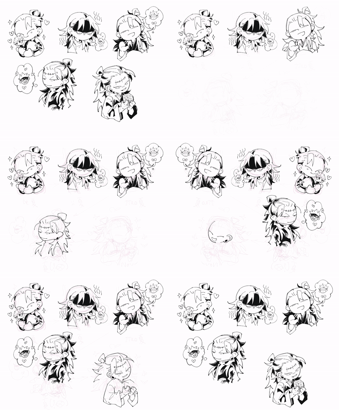
Changing the brush size will help you achieve thick/thin lines better without having to put pressure on your wrists. Keep your hold relaxed and let bigger brush size give you the thick strokes.
I like messy sketch, to me the sketch is just an outline shape to fill details in when i do the line, it also gives more freedom to wriggle as i draw! cuz i dont really plan out everything from the start, just wing it as i go, so a lot of my work is actually very spontaneous.
that leads to this point: when you do the lineart you should start deciding which colour style you want from it to adjust the details amount. the ink shadow blocks in my art aren't there randomly, i adjust them to best complement the shape language and colours.
for piece where i want the line/shadow to...idk hit (?), the colours are almost flat with textured brush adding depth to them, so the inking is the shading, thus there are more details in the lineart / ink blocks.
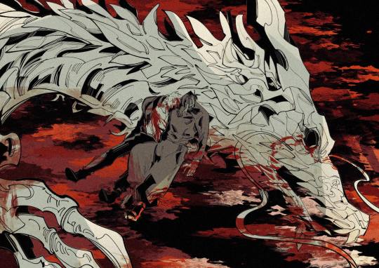
for the video above and piece like this where i want the colours to be clear and pop out, the use of ink blocks are minimized and i do the shading during colouring process. but! the ink blocks can still make some places pop very nicely! just use in moderation!
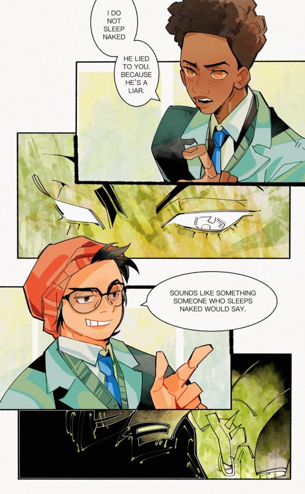
when doing the base it's good to keep the colour on the left side of the colour wheel (low saturation), but as you do shading and lighting, try to spread out evenly so it won't look washed out.
toggle around with hue and saturation slider as you go! the key is always adjusting! you're making hundreds of decisions at once, being conscious of your choice in why a line or a colour should be in a certain way will help improve your process a lot! (i think you can tell which art i turned off my brain and just draw for stress relief ........ which is also a valid way to draw and sometimes the result might surprise you! but for more serious stuffs i try to be aware of most of the move i make. it's problem solving, yeah?)
i find that one way to keep your art from appearing too...yellow in the end (which is sth that haunted my ass for a long while) is always aim for cold tone, so if you accidentally make it warm either way in the end it won't be too warm (and yellow :cry:)
well that's all the stuffs i can think on top of my head. sorry i can't give more advice on colour picking cuz it's sth i don't really know how to give advice on???? i think my colours now are still pretty lame haha........ if there are still any questions i'd gladly answer within my ability, though im very slow to answer ask ( i do read and be happy at all of them tho!)
#art tip#ask#anon#albi’s art#ALSO I AM SERIOUS ABOUT THE BRUSH SIZE THING SAVE YOUR WRISTS NOW. TODAY. DONT LET IT HURT THEN TRY TO FIX IT LATER#aughhhhhhhhh *rub my wrists*
300 notes
·
View notes
Text
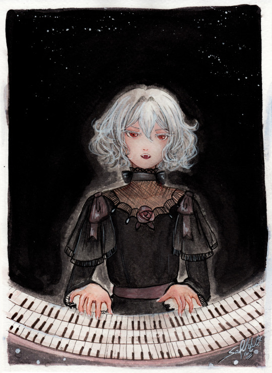
"Noble d'Apchier"
A little watercolor painting of Chloe,with the Zorn palette! I found out about this palette a while ago and I really wanted to try it out! (More on that below )
Chloe's hair is something I adore, it's gotta be one of my absolute favourite character designs ever,I love how swirly and fluffy it is,very fun to draw. I've drawn her normally before,I wanted to do one with her vampire eyes and fangs too. I decided to try to draw a white fuzzy rim around the foreground against the plain background,for a change,like in some of the VnC panels.
The Zorn palette,or Apelles Palette was a colour scheme used by Anders Zorn in the late Victorian/Early Edwardian era. It ,or something similar,might have been used by artists of old civilizations too, because it avoids the use of blue and green entirely: which would eliminate the need for rare pigments . It's essentially a colour mixing challenge,to draw the entire paintings with 4 pigments,2 basic colours: Ochre yellow, Vermillion,and Black and white,which can be mixed into different shades. It can be an excellent exercise and means for portrait painting
Modern artists use red instead of vermillion,but the essence is the same. So that's what I did too. I considered using vermillion,but I realised that it would introduce a lot of yellow tint, making the picture very warm. Which is usually something I prefer honestly,but not what I was going for here. Also,I need to consider the fact that I'm a watercolour artist,which is very different from the original intended palette. Zorn used oil paints,but other artists use it fine for gouache and acrylic too, however,that too is different from watercolor, because instead of mixing with white, I'll be diluting with water,which changes the composition of the palette considerably. So I went with these supplies: ochre yellow and red watercolor pencils (for me, basically watercolor pigments,I don't use them to draw,I grind and dissolve them in water),white and black watercolor tubes,and white ink. In addition: lineart with sepia,grey and black brush pens,which are well within the bounds of the palette
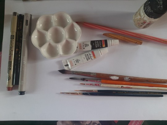
To be honest,I ended up not using the white paint tube at all,water makes more sense to me. I didn't use anything else though,and stuck with the original materials.And the results:
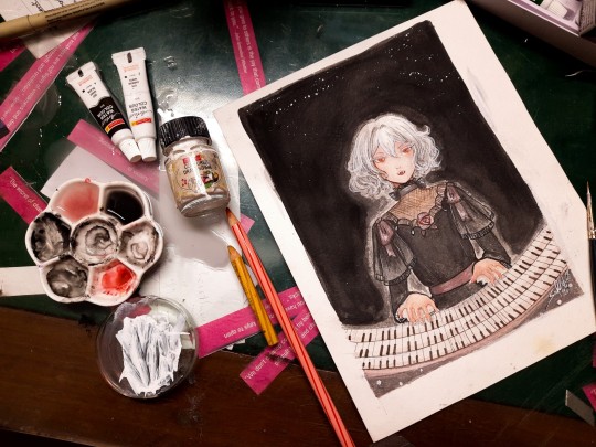
Does it work? Hell yeah. It's not perfect,but I'm happy with how she turned out
Was it restricting? That's kind of the point,to paint with some limitations
Was it hard? Honestly? No. Not at all. It's definitely very different from what I'm used to,I use a lot of colours both as is and mixed,but this was surprisingly easy. Perhaps because of my subject,which didn't have much colour to begin with
Do I recommend it? If you want a small challenge,or to experiment or practice colour mixing,definitely
Will I do it again ? Absolutely. I feel like I haven't utilised much of the potential of this palette. I ended up using mainly red and black, hardly any yellow at all. So I'd like to do something more colourful with this palette, perhaps a sunny painting of a gingerhead girl with flowers,and for this I'll probably use vermillion,not red
Anyways, that's all! If you read all this,thank you for your time!!
#chloe d'apchier#the case study of vanitas#vanitas no carte#VnC#my art#traditional art#zorn palette#vnc fanart#vanitas no shuki#jun mochizuki#case study of vanitas
291 notes
·
View notes
Note
can you pretty pretty please with extra sprinkles on top drop the speedpaint for your most recent rookvil art? i wanna see how you did vils pretty dress and everything else cause its all so beautiful
I am so happy you like how it looks!! I would love to make a speedpaint, but unfortunately, I didn’t record it + the base for the drawing was actually done traditionally with a pencil. A lot of my drawings are done this way, actually…
Even though I can’t drop the speedpaint, I’ll do the next best thing and explain my process for this specific drawing step-by-step. It’s actually not that complicated!
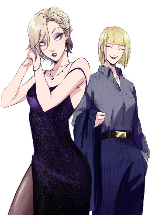
Here is how the sketch looked initially. As you can see, I shaded the dress very crudely; in fact I was kind of upset with how the dress looked at this stage. Ironically, I ended up not doing much to the pencil shading, and it still turned out okay somehow?? Anyways, the first thing I did was to prep the sketch for the colouring stage: I adjusted the contrast, fixed Vil’s face, and erased some dirt and imperfections.

Then I create a new layer, set it to Multiply (this way I can colour the sketch without disturbing it, as if I was just colouring a digitally done lineart) and do a base colour layer. There is a gradient in Vil’s hair and Rook’s belt buckle, but other than that, all the colours are flat at this stage.

Before doing all the shading needed for this sketch, I add details such as makeup and tights. If you want to know how I did these, let me know, but I basically looked at a tutorial once and then simplified it lol

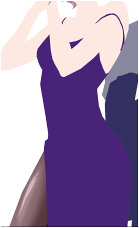
Now, the dress.
To be completely honest, there isn’t any proper technique to what I did, everything is always just trial and error and an hour of me going “does that look good? NO IT DOESN’T >:(“ until both Katsu and I are satisfied. This time I was lucky, because it didn’t take very long, and the “solution” was pretty simple.
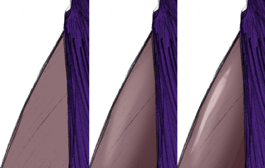
Starting with the base colour. I turned off the sketch layer to show that it is indeed completely purple. And it looks kind of bright at this point, almost too bright even, especially considering that the dress is supposed to be mostly black, or at least dark purple. But bear with me.
Next I added some highlights (new layer, set on Overlay or Screen, depending on what looks best). Usually I would add the shades first, but I wanted to make the fabric look more “shiny”, you know, the type of fabric that would reflect the floor and make this highlight under the boob lol.
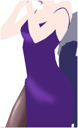
And after that I just went ahead and added black gradient (on a new Layer) from the bottom of the dress to make it look darker, silkier and a little bit more interesting for the eye. I erased some parts of the gradients as you can see, because it looked too dark on the highlighted parts… could’ve just placed the black gradient layer under the highlights layer and saved myself a headache, but hey, where is the adventure in that.

Finally, it turned out looking like this. It looks better than it used to look like initially, but there is one more thing to do. We don’t get to do this one too often, so it always excited both Katsu and me: THE SPARKLES!! Somehow, making the dress sparkly makes everything much better.

How do I do the sparkles: I use the star brush… or was it a snow brush? I use this brush when I draw both of these things lol + when I draw anything sparkly. I would’ve given you this specific one, but I don’t really remember where I got it from, and I honestly think that any starry or snowy brush would work wonderfully as long as the specs are small enough.
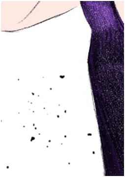
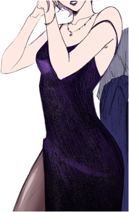
After that is done, I just shade the rest of the drawing. Nnew layer set on Multiply, the shading is done with darker purple/red + darker blue, whatever looks better on any particular material: the skin really likes warmer colours, but Rook’s suit looked bad with red shades, so I adjusted it to blue.
And here is the post where I talk about how I colour hair! Good thing I already wrote that one, this post is getting long lol
And the last step is to add details. The original sketch was done in a rather small (smaller than A6) sketchbook, so I couldn’t draw all the details like Vil’s earrings and stuff properly. Basically I just paint on a separate layer on top of everything.
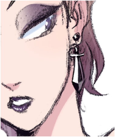
And there you have it! I hope it makes sense, please let me know if you have questions.
106 notes
·
View notes
Text
Woke up and said "hey... I haven't done a anatomy practice in ages, I should sit down and do one!" And ended up going past the boundaries of a practice and just made a full illustration.
I'm not mad, I love how it turned out. But I need to learn when to chill oml
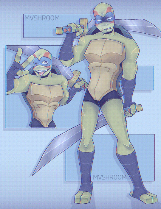
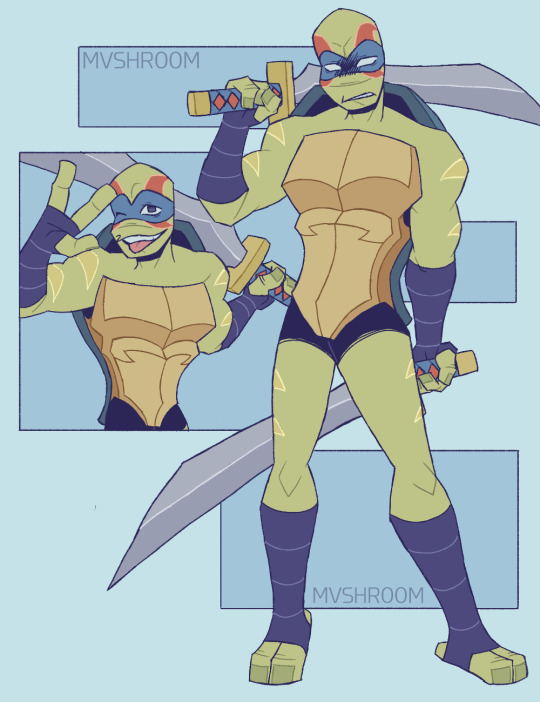
As per usual, take the base colours, Lineart, and sketch with it. Cause yes.
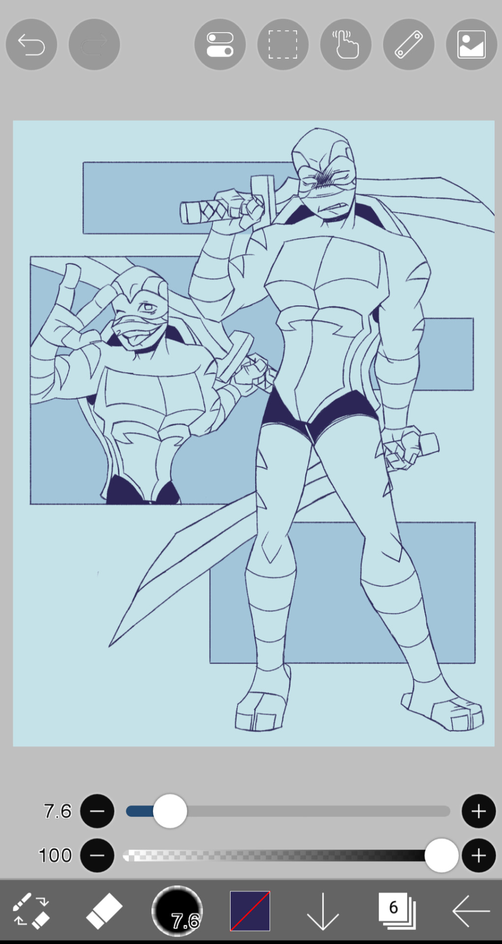
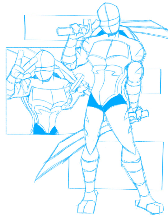
Fuck it, even take the two references I used straight off Pinterest
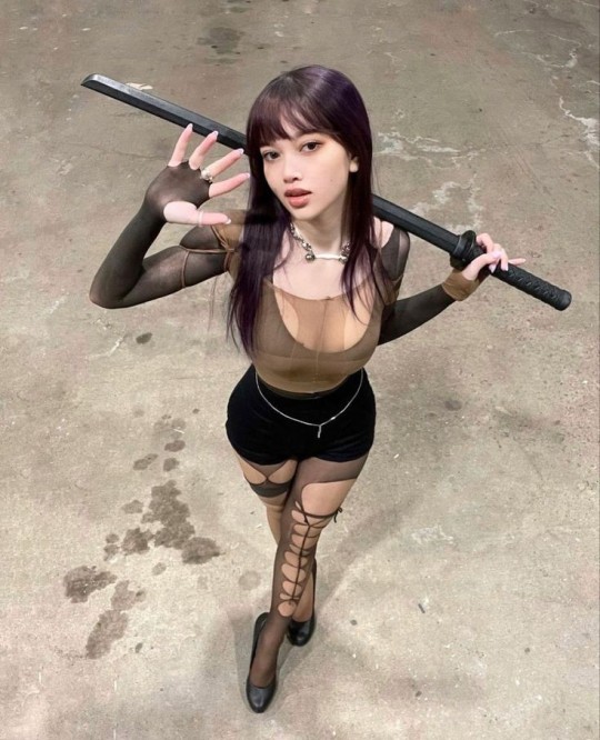

Continuing what I was saying- I have a bad habit of starting something, zoning out, and then wasting the next few hours of my life on a drawing I was supposed to stop doing ages ago.
I will reiterate. I'm not mad, I love how this fucker turned out, like I didn't need to cook like that, but by the time I was done it was like fucking 3am or something.
ALSO. Right before that, since I woke up, I was continuing on with working on a 'twins across time' video I was working on. And AS A BREAK. I sat down and started working on this instead.
Then I wonder why I feel burned out.
72 notes
·
View notes
Text
Fighter

Art for my beloved secret keeper 💜 Thank you so much for trusting me with Chiara!
Commission for @unwrathful
Commissions open
Once again I was given free reign over the commission and once again I choose to draw an OC with a weapon because apparently that's just my thing now.
For this piece I decide to experiment a bit more with lineart colouring, varying the shade insead of keeping it all black. I like the end result so I might continue to do that. Another thing I changed was erasing nearly all of the lineart for the clothing folds that I orignally drew because I realised that they just hinder me when I do shadows and highlights in this style. I think I will definitely continue to do that because it made rendering clothing so much more bearable. I will I might need to adjust that depening on what kind of fabric I draw though.... I still have so much to learn OTL (also i will draw my usual folds if i do gradient colouring cause it fits with that style).
Besides that I might need to change my lineart brush again... Don't get me wrong I love the brush I'm using rn but it makes colouring more tricky since I always need to adjust for the gaps that the bucket tool won't reach and which gets really annoying in the long run. Also sometimes I think it doesn't mix as well with this kind of style so yeah...
Anyways! I think my favourite bit about this drawing might be the Kanabo! Cause I really like how the shading turned out. Also the blood was actually not that much of a bitch to draw, I'm very happy with that as well 🫡
12 notes
·
View notes
Text
Zenyuki line art colored ✨️
Lineart from @onedivinemisfit

I loved how the line art was detailed and like the still from the anime ending of Akagami no shirayukihime
Used it as a reference to colour the lineart and I'm happy how it turned out

Hope it's to your liking


I feel like I'm going crazy at the end of the year 🙃😂
#akagami no shirayukihime#snow white with the red hair#akizukisorata sorataakiduki#zen wisteria#shirayuki#zenyuki
39 notes
·
View notes
Note
Kinda a random one, but how much time per day and/or week would you say you spend working on your webcomics? I want to eventually make my own webcomic, but the idea of having to draw 24/7 to make a good comic is honestly pretty intimidating.
Not random at all! I love chatting webcomics! :D Hmm, it really depends on so many factors here. Webcomics can take as much or as little of the day as you'd need- but if we're thinking project longevity and the hopes of finishing such a huge feat, we need to consider some pre-production and project timelines- as well as how to handle scope. Let's break it down: -Figure out the length of your work (even in a general sense) This can help you keep an eye on the size of your project, where to trim and where to add, as well as get a general sense of a timeline for completion. Say you do a comic for 200 pages- once you figure out your general output page wise, you can get a sense of how long it will take to get from point A to point B (with some breaks added of course!) -Understanding Your Process . You need to dive in head first with this one! Start making some pages, don't get hung up on too much at first, and get a general idea of where you spend the most amount/least amount of effort and time. This can help narrow down where you need to focus your time with. (this includes writing/scripting, thumbnails, pencils- etc etc) -Don't compare your output to others! Some people are just really REALLY fast with output, others (like me) are quite slow on that. This is why understanding your own limits and strengths is important (and why it's a good idea to do some practice rounds with making comic pages to see how you feel about it first) -Working in a way that makes YOU happy. if you dont like inking/lineart, get that OUT of your process! you are allowed to have a comic that has pencils, painting, just colours- its all about YOU! One of the biggest 'slayers' of webcomic production is adding a part that the creator hates. Make it fun! Figuring out all of these steps took me a while to do. I am also lucky in that I work as one solid half of a team with @spacerocketbunny. We both write, draw, ink, promote, etc etc in equal amounts- But that also means that I can spend more time on details with the aspects that I enjoy- like inking. As far as the time it takes- I try to keep it a set amount of time a day. When at the day job, Webcomics can get 3-4 hours a day. On days where i am without obligations, i work a 'full work day' on them with 8 hours! I also give myself a 'weekend' off from comics too. Limiting yourself with hours to work on a project is necessary to last throughout the entirety of the project, and to prevent burnout. I've done webcomics for over 15+ years, and Ghost Junk Sickness turns 10 this year (and is on the way to being completed). Understanding your process, output, and scope of the project will create a better roadmap for the time needed to create your comic- and remember- it has to be for YOU the most, in the end. I hope this helps, always willing to chat more! Happy creating!
15 notes
·
View notes
Text
Soft's 2025 flight rising skin challenge - Month 1
Hey all! I've challenged myself to make an entry for every single Flight Rising festival this year, and perhaps a few more along the way! I thought a diary entry series would help keep me accountable.
Here's my crystalline gala entry for 2025 titled Dancing Lights 💃 ✨️

My inspiration behind this was the northern lights, as I couldn't remember ever seeing a winner with those colours. I wanted something with that pop of green I love so much. The rest of the piece came from throwing stuff at the canvas until I liked the outcome. Definitely not time efficient.
I always roll a rng to decide breed and gender as I find it hard to choose myself (although this time I did cheat and change from an M pose to an F pose as it suited the vision in my head a little better). Personally, trying to work an idea onto a canvas helps me a lot more with creativity.
My main struggle was trying to figure out how to colour the aurora. Originally i had a purple/pink stripe in there but it just reminded me of a poisonous frog too much (or the colour radioactive). It just felt too out of place. I loved that colour scheme but it didn't pass the aurora vibe check. Maybe I'll revisit it for another entry this year, would nature flight fit that kind of vibe? Maybe lightning? I'll figure it out. The opacity of the lights was also an issue, I couldn't figure out how to make them look like northern lights and not just ribbions. I hope the way I coloured gives the right impression.
Oh and the jewellery! I looked up so many metal colouring tutorials and could not figure out how to achieve a metallic finish. Maybe I achieved it, but it came from slapping random coloured blobs down and using the blur tool. Never trying a metallic technique again!
Looking back now I'm a bit upset the green didn't turn out as strong as I had hope, I think in the end the piece leans more blue/purple toned than I had originally wanted. I should have shifted my colour palette and removed the blue/purple part of the aurora and made that lime? Maybe that would have balanced the colours better. I did rush a little towards the end, and to me it feels a little unfinished, but I am too tired to make any changes now with the deadline being later today.
I did also do a silver metal version last minute because I felt like it felt too warm with the gold? Cooler colours come to mind when thinking of ice. Personally I enjoy the gold better.

Do I think it's a winner? Not at all :). Writing this post made me realise all the things I should have done differently, but the point is to take these ideas on board and try again next time. I am also so bad at determining whether the clip shadow and lineart actually follows the rules. It's the part of the process I dread, and usually zaps the fun out of it all for me. The purple shading on the hands is questionable at best.
I already have ideas for next month, and can't wait to write my next little diary detailing my process and thinkings. I'll remember not to delete my sketch layer and maybe take a few pictures of my progess to share, that would be fun. And congrats to everyone who made an entry, some of them are stunning. Until next time ✨️
4 notes
·
View notes
Note
What inspired your art style
I find it unique the way you draw shapes and line art!
-cracks knuckles-
The recipe for my particular flavour of art is quite obvious once you know the ingredients, please follow below:
I’m a 90’s kid first and foremost, YuGiOh was the first big inspiration.
You can spot Kazuki Takahashi’s solid black shading and white highlights on reflective surfaces are a staple in my current style.
Look at this beautiful Millenium Eye, don’t you just wanna lick it?

Another specific technique: fabric folds. I love how Takahashi uses solid wedges of black to carve out the wrinkles in fabric (or in some cases, solid white on a black fabric). No blending needed! I apply these shapes both in the lineart (with solid black) or the shadow layer (on multiply) without softening/blending on the edges.

Next up is Jamie Hewlett, most known for designing the Gorillaz characters. This heavily influenced my aesthetic away from pure anime/manga and into a wider culture of pop, punk and graffiti.
On the technical aspects, I started thickening my lines and squaring/rounding off my shapes to have a more blunt, chunky feel.
On the Character aesthetic side, it also made me realise that characters don’t need to be conventionally attractive to be appealing. Bad posture? Crooked teeth? Baggy eyes? Hewlett is 100% responsible for all my ocs slowly turning into gremlins and tumblr sexymen.

I absolutely have to highlight how he draws hands, there’s an almost uncomfortable level of detail and realism that feels out of place on a cartoon character. The tendons, joints and wrinkles wouldn’t be out of place on a zombie, but all the gestures and poses feel very familiar. Like these are people I could have passed in my day by day.
That could just be me projecting - as someone who rarely looks people in the face, I tend to watch peoples hands the most; They give the lions share of body language and help humanize a character.


And now we have colour, which is a bit tricky since I still haven’t quite managed to figure out.
So instead I’ll point towards what I’m wanting to do more.
BrotherBaston: his use of bold shades, constrained colour palette and a light touch of gradients are something I aspire to use more.
There’s a level of clean, knowing when to embellish, and when to hold back on an artwork that I still struggle to balance. The ability to clearly visually communicate a character’s pose, design and intention.
This kind of precision and restraint is something I wish to learn, both in linework, colouring and character design.


Luckily for us he makes tutorials on youtube for anyone else wanting to check out his techniques!
And that's about it~ I've got a few honorable mentions to throw in at the end here: Banksy: Their bold stencils further influenced my use of solid shadows and strong shapes to build volume in an image, as well as being my introduction to graffiti
Mike Mignola: More amazing solid shadows and fantastic blocky shapes! I love the chonk.
Zdzisław Beksiński: Whenever I'm drawing more detailed body horror, this guy lives rent free in my head. A real chaotic layering of skeletal limbs twisting together into knots.
H.R. Giger: On the more erotic side of body horror spectrum, not much more needed to be said there
#mrsketchy#insp#artist inspiration#kazuki takahashi#jamie hewlett#brotherbaston#share your style inspirations
6 notes
·
View notes
Photo


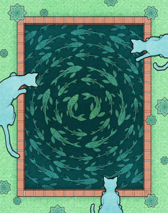
How it took a whole year and six pieces to evolve a concept
Sometimes you have a great idea, but the finished art looks a lot worse than how you imagined it, and that’s okay! You can always shelve it and come back to it later when you have a lightbulb moment on how to improve it. In my case it took multiple iterations as well as a style evolution throughout the process.
~~~~~
1. Aquarium II - Nov 14, 2021
I started with a pretty solid idea of fish inside glass baubles of water, with a palette of yellow, orange, pink, lavender, and sky blue. I kind of like how the design turned out with the filigree and the cats, but the palette just wasn’t working out. It’s probably because I didn’t put in enough contrast and dark areas, but I hit a wall with this one and put it aside, unfinished.
~~~~~
2. Koi Pond (Winter) - Jan 3, 2022
Using the palette of ‘Aquarium II’ as well as the two circling koi, I expanded it into a pond of circling fish. I did like this one and even made an animation of the fish swimming, but it still felt like something was missing.
~~~~~
3. Circular Motion - Feb 21, 2022
I decided to go full Escher with the fish tessellation (everything is flush, no spaces between) and also push the palette and contrast. I really didn’t like the result. The colours look dull and bland, and the fish look weird. It was partly because of this piece that I decided I wouldn’t do perfect tessellations if it made the animals look weird.
~~~~~
4. Aquarium - May 25, 2022
The first true success from this concept! This is part of the trio that uses the same palette, including ‘Arboretum’ and ‘Archives’. I put the aquatic creatures in clear baubles once again, and my lineart style is more established at this time.
~~~~~
5. Koi Pond - Jun 18, 2022
I fell in love with this palette of yellow, orange, pink, green, and dark green. It’s just a recolour of the previous ‘Koi Pond (Winter)’, but the lines feel wishy-washy to me now that my style has thicker lineart.
~~~~~
6. Flow - Dec 21, 2022
The final success of this concept! This is part of another trio that includes ‘Flock’ and the upcoming ‘Flutter’. I kept to the theme by adding cats observing the main subject, and used a minimal palette so that the center koi would stand out more.
~~~~~
In the end, I am still attached to the two ‘Koi Pond’ variations. I want to get them to a place where I feel like they are complete, but I don’t yet know how. So, they will just hang out in their respective folders until then.
64 notes
·
View notes
Text

Image ID: a screenshot of @i-am-clueless-how-about-you's reblog. They say: What compelled you to create a muppet duck killer robot? Genuine curiosity here. Like did you just one day decide to combine a muppet, a duck, and a robot together? End ID
That's a fun question!
So it started with me sketching the comic pages! I didn't have a design for the robot enemy yet, so I just kind of doodled whatever.


At first whatever didn't look like anything at all, but as I went forth... It begun to take shape.
I was really falling in love with the silly shape I'd formed, and leaned fully into it in the linearting phase.


I went all out. Silly little beak thing, round eyes like in the sketch, and even cartoony gloved hand. I knew I had gold.
I then sent the lineart I had made to my dear friend to ask them for their opinion. They turned out to be extremely relieved when I described the robot as a "muppet"


Seeing their reaction I knew there was no going back. The world needed to see muppet robot.
However, for me to upload it, I needed to still colour my work. I thought about it for a moment... The scene is green, and the main characters are pink/grey and blue/turqouise. Since those colours were taken, and I like making things saturated, that leaves orange, yellow and-- WAIT!

And that is how I found myself creating a Muppet Duck Killer Robot. Thanks for asking 💛
PS. Considering the world building I've done in the backround, the fact that this guy looks like this could be seen as an issue by some people, but I THINK it's hilarious and I'm excited to elobrate on it one day. After all, a character doesn't just exist because you made them, they exist also because someone in-universe made them.
#Ask#Kinda#Hope it's ok to answer like this!#Character development#Character Design#Art#Alien Princess
42 notes
·
View notes
Text
Just some lineart practice basically
More practice, yippee, decided today to try something different with linework, and do a little experiment with colour.
My subject for the day is a little portrait redraw of Abigail from Stardew Valley, mostly out of surprise that I hadn't gotten round to drawing her already.
Screw it, we going through my whole process today since the end result is really not the focus.
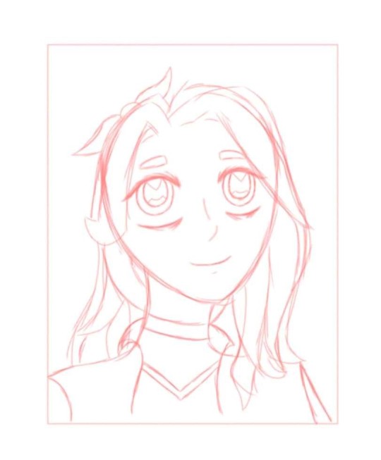
So, started off by sketching her in my usual fashion with the pencil-style brush that I've been using consistently. Sketching stage is like, my favourite bit of drawing and I tend to love how they turn out, which is mildly unfortunate, and is the reason that I purposefully try to make my final results sketchier in appearance, I like em scrungly.
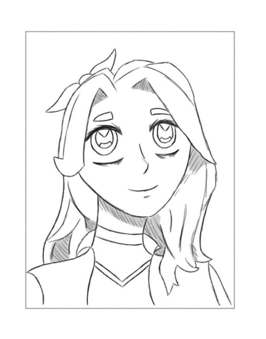
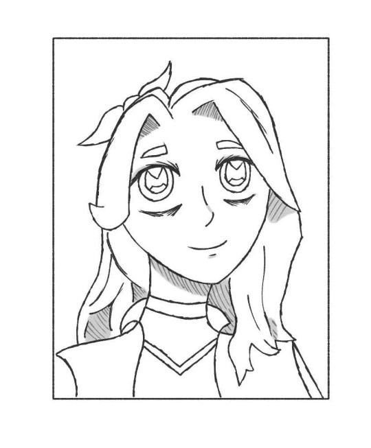
Next I went through a bunch of the default brushes on the program I use (Ibispaint, the free version, if anyones curious) and narrowed it down to two I wanted to try lineart with. First one (right) is, again, the pencil brush that I always use, and the second one (left) is a pen brush with bleed that looked pretty scrungly, hence why I picked it, hoping it would lend itself to a sketchy style.
Whilst I did like how the pen felt in some respects (my style of doing eyes in particular felt pretty neat with the brush), I think some of the longer lines look a little too messy, and the tiny mistakes are more apparent. I also liked hatching with the brush, so maybe I'll consistently use it when it comes to that stage.
Overall though I still prefer using the pencil for finished lineart, for now, more experimenting and customising might bring me a new go-to.
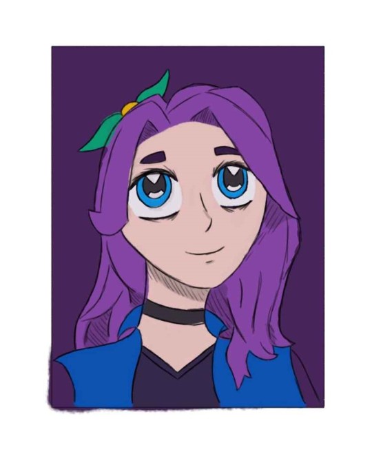
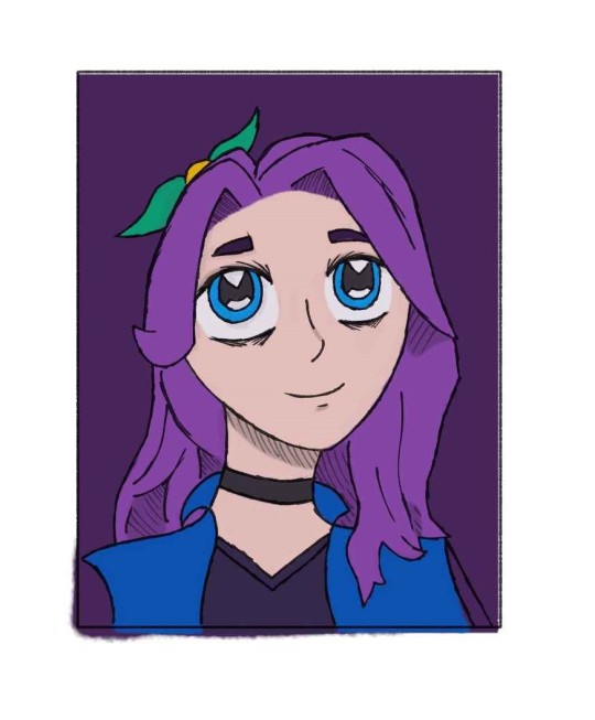
And then to finish off just the most basic colouring, I think colour is certainly my weakest point aha, but I still wanted to try a little something. (also, only did one colour layer, and with the pen lineart in mind, so the colour is not lined up perfectly with the pencil art T_T)
So, the background is on a seperate layer, and then I made the colour layer like 10-15% transparent to have the background filter through a tiny bit. It's not a super noticeable effect, but as I was doing it I noticed the difference and like how it turned out. Turning down the opacity also slightly destaurated some of the colours, which I don't mind on this occasion.
Anyways, colouring is probably the big thing I need to practice, and making it more than just the flat colours. Colouring is already my least favourite, and the most time-consuming, bit of drawing for me, never mind the fact that its also the point where I start liking the end result less. I think with practice, and actually making it look good, I might like it a little more.
Right, that's all for this edition of 'I rant about my entire thought process for something', tune in next time.
2 notes
·
View notes