#but i do shading with multiply sometimes too so its not like i do not use it
Explore tagged Tumblr posts
Note
Hiii I love your art style soo much its so pretty!! This has probably been asked before but I'd love to know how you go about choosing colours/ making colour palettes because thats something I personally struggle with doing <3
Hiiiii thank you! Okay so usually when i choose my own colours i just pick whatever i feel like looks nice so i don't really have a good explanation for that (yet) lmao, but! i also do this that i think works pretty well too:

which is basically just messing around with the layer filters/Blending Modes of the art programs until i get something that looks nice, not necessarily using the same ones i used here, but any that might work, also sometimes i choose whatever colours (not colour picking) and then do this same process to make them look better :P
#ask#should i tag chara since i used them as an example here?#ehh#undertale#ig#utdr#chara dreemurr#i do this process a lot of the time but i forgot to say that i shade differently from this example#instead of using purple i just choose#without multiply#a darker colour that i think looks nice-ish#or a different colour that can work as shading for another#like purple-ish shading for red or orange-ish for yellow#but i do shading with multiply sometimes too so its not like i do not use it#its pretty good for when i want to shade something quickly#anyways thats all i think#hope this helps!#and makes sense whoops#art tip#colouring#idk
168 notes
·
View notes
Text
Art style breakdown /tutorial(??)

Some friends asked so here we go : disclaimer im bad at explaining (so feel free to send an ask or smth)
Final art (long read so theres a timelapse at the end)


If its not for something important (commissions), i dont usually make a lineart for a drawing but just clean up the sketch , it wont be used anyway

I usually separate them by colors , mostly so i can Alpha lock them and not worry about coloring over parts
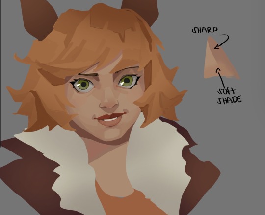
When coloring i use a soft airbrush to have gradients within the shading , so its not one solid color . How i shade is very blocky , lots of triangles lol (if im using CSP i love using the lasso fill tool ) but there are parts especially in the skin where I keep it smooth and blended, usually nose and cheek area . Using an asaro head is usually a good start to learning how to shade faces with planes in mind

Depends on the character, but I like adding shadows on the lashes/brows itself , make it look solid and 3d , it makes the eyes pop more imo

Using multiply layer to make the shadows darker for more contrast
At some point I’d merge everything together so i can just paint in one layer, easier to fix things with liquify too ; if im in CSP i keep the separate layers in one folder just in case i need em later but i cant really do that in Procreate cos of layer limits

This is the part where i make the shading more painterly .,To make the shading look sharper , i like adding lines on the edges .
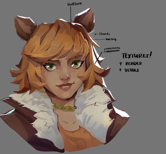
The fun part : adding the ✨
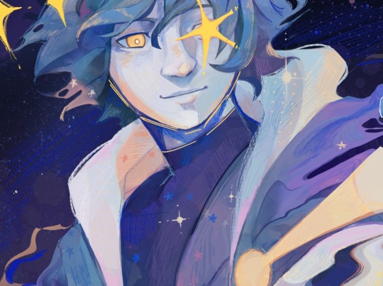
This is the part where I add textures , either from texture images or with screentone/hatching brushes. This is also around the part where i add the character’s accessories and stuff like scars and freckles (its just easier to add smaller things near the end than having them accidentally painted over at the start)
Whenever I feel like the drawing looks too much of a similar shade / temperature , I use a gradient map+layer effects (masked) on parts to give it variety . Technically you can do this by just having a layer effect on and manually adding colors but gradient maps make me go “ooooh didnt think of that color there “
CSP also has a posterization filter that i like using when i feel like some part looks too smooth to me.
I sometimes add in sketchy lines , and seeing how cool it looks in Marvel Rivals art ive been adding it more lol
Artists that influenced me are : Nesskain, Toni Infante , Valorant’s 2d art(their main artist is Suke) ,Arcane , Spiderverse and the most recent one ive been obsessing over is Marvel Rivals ( its got everything i want my art to be when it grows older lmao )
516 notes
·
View notes
Text
ty! \(^_^)/ feelin good so ill try answer in detail for ya!!!!
most of the time i just do basic cell shading. here ill explain my rendering process after i choose my base colours, ill try keep it short & sweet!! nvm warning buckle up its really super long.
flat colours -> fully shaded!!


⭐️Picking shading colours!
usually it's just the base colour with +saturation OR a hue shift! i dont really lower brightness.
This is what i mean by HSB, i never use the colour wheel i prefer the sliders!!!
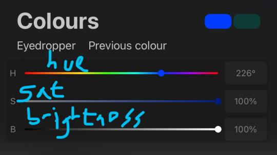
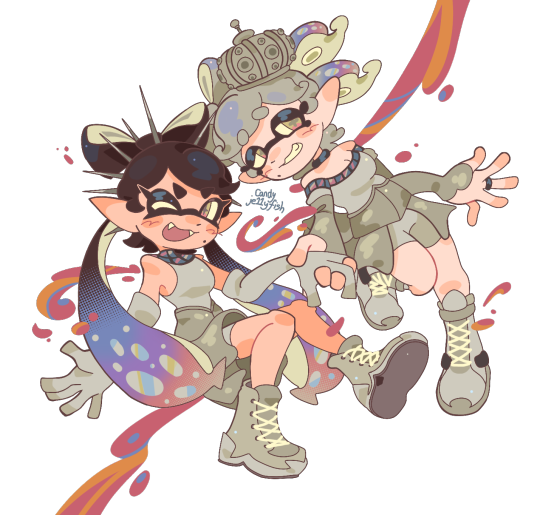
i like my art to look super colourful so i do things like shading pink with blue instead of with a darker pink or red, as shown in the above callie piece.
examples ft lumity:
skin: i always keep it very simple & cartoony! over the nose, below the eyes, the neck & sometimes the tips of the ears is where i'll put shading
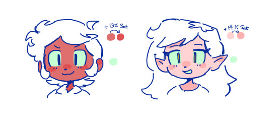
hair: as u can See, it's not darker than the base colour at all!! for dark hair like luz's, i brighten & saturate the colour, and for light hair like amity's i just shift the hue a little!
⭐️more kewl tips:
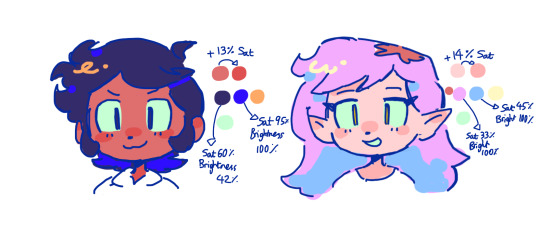
colourpick from yourself!!!! instead of making a new colour for everything, try using a colour u already have down!!!! like below: by limiting my colour palette, it looks more harmonious
really messy image but i hope u get what i mean. also the "off white / black" thing is a separate choosing base colours thing!! i can expand on that if anyone's interested 😙

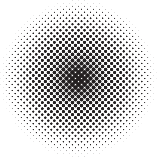
shove halftones in wherever they fit. here are the 2 pngs i use!! there a rlly good alt to gradients, i used a LOT of them in that callie piece!!! clipping mask over where u want it & alpha lock to change colour.

⭐️here's a WHERE i put the shading:
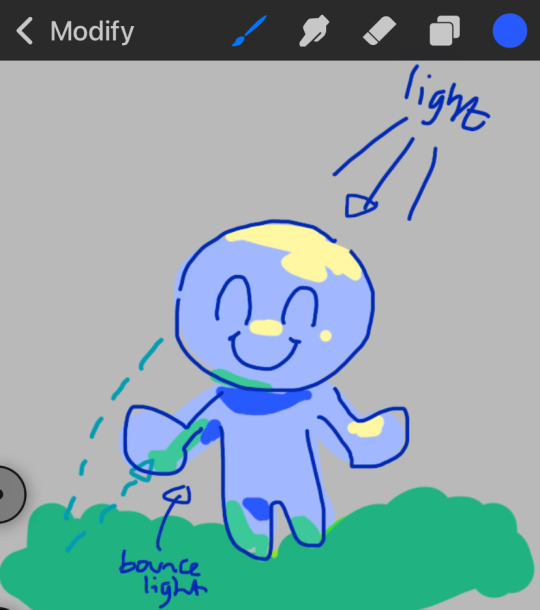
look st the environment ur guy is in!! pick where your light source is coming from & look where that light will hit and where it is blocked by something.
bounce light: the sun's light is also shining on the grass! so powerful the green reflects right back!
this is kinda more realistic lighting now.
i kinda just put a circle wherever theres a corner!
and i put that Beautiful Shape a lot wherever. i change it a little depending on the character, sometimes its triangular or squarey but thats the base shape! i dont even know what its called but i love it.
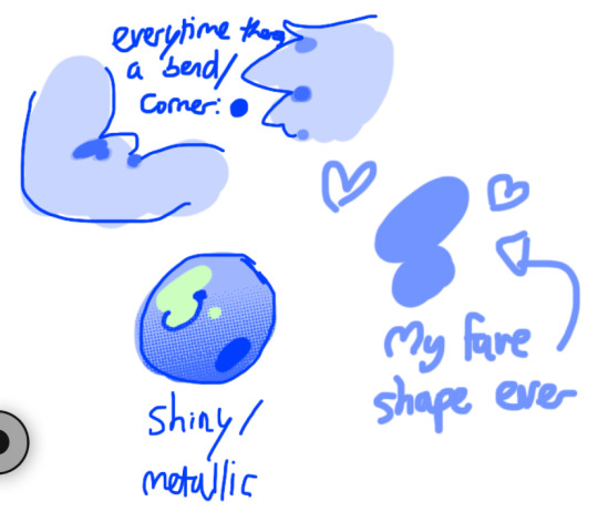
look at this hello weird shape guy!!!
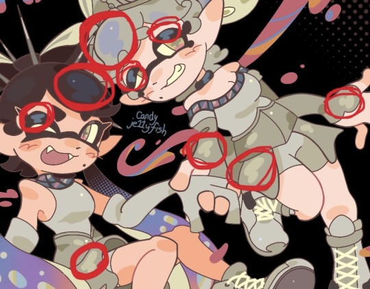
actually, my grandfest art are probably some of the most detailed art i have! u can see urself where i put shading & stuff - they do have more desaturated colour palettes though:

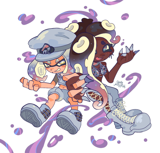
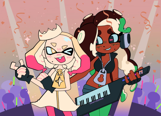
& here are some additional examples ^_^ flat colour -> shaded -> multiply layer -> lighting


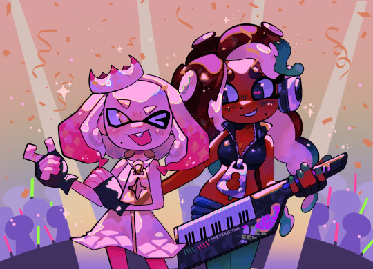
in this one u can see the hand & leg at the back are completely in shadow too :)

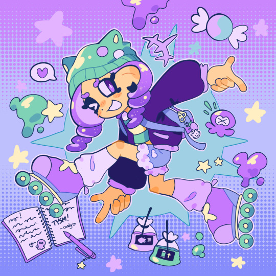
anyway i think that's kinda it? i dont really know how to explain it, i just do what feels & looks right to me??? remember that im Not an expert & this is just how i do things :)
i will always repeat my no1 tips tho: keep drawing!!! and copy ur fave artists!!!!!! it really will hell u find what u like!!!!!!!!!!!!
i hope this post helps a little & answers ur question😇 never be shy to ask me anything cuz i love answering & chattin w u guys!!!!
EDIT: just saying these arent set rules or anything!!!! u can see just how many times i Dont follow my own advice LOL. my artstyle is super inconsistent, i rarely draw things the same every time
191 notes
·
View notes
Note
Oh uh forgot to ask in the previous ask (the one with the digital piece of candy and scurrying and stuff)
How do you draw art so good
Like
Is there a method you use or is that just the style you've gotten over time?
you've activated my trap card
I'm just gonna preface that this tutorial is from someone who was not professionally trained and didn't have a lot of free time for art, so a lot of the tips I have is short cuts I use to get the best results quickly
If you genuinely want to get better at art then please look at references and practice that is always the best
However if you are like me and only really do art for fun but want to go faster then these are for you pfppt
Overall I'd say my style is influenced by speedpaints I would watch when I was younger, I like analyzing how people do things and what makes something look "good" to me
I always recommend watching them because they will often have techniques you've never seen before or do things a certain way that you can try out yourself
I consume good art, it feeds me
but seriously it can be super helpful when developing your own methodology, or just generally trying something new
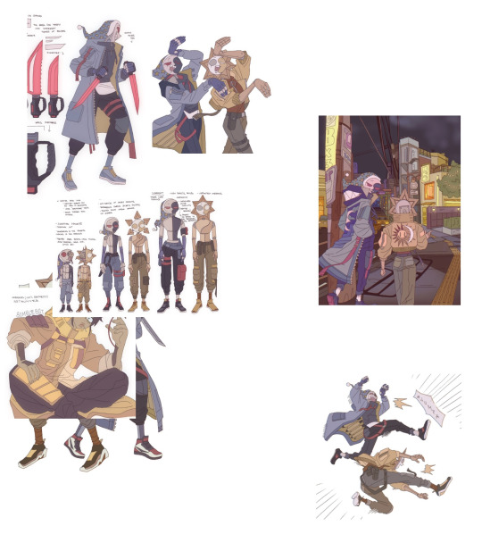
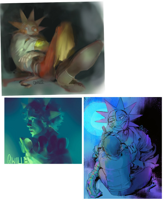
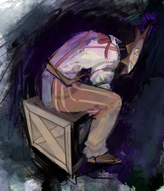
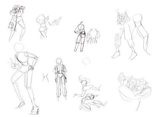
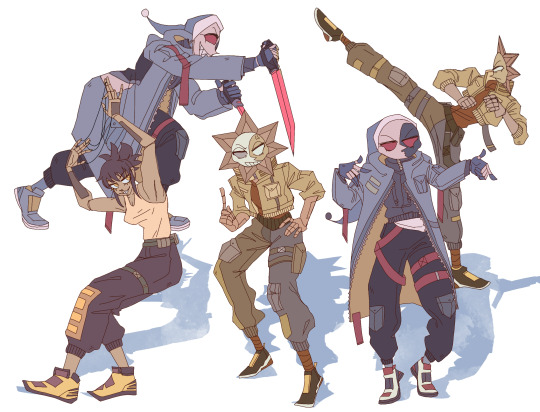
Usually it starts with me pulling some references from artists I really admire and sort of sketching out how they do the things I like
For example 8um8le has like super good anatomy and poses so I focused on trying to replicate how they do that
venemous-qwille is super good at color and pulling focus so that's what I focused on in my study of them
In general I'd say my process is sketch -> silhouette -> color -> shading -> render
I really don't like doing lineart lol

I'd say for the sketch the most important part is using references and just kind of fudging it until it looks correct anatomically/physically
General rule of thumb is spend time on areas of interest, and keep non important areas light (like the stitching on his pants)
I don't do lineart because I think its unnecessary for most paintings I do
I naturally tend to put more time and focus on areas of interest (like hands and feet) and if you use a brush with opacity for the sketch, those areas are naturally going to be darker in the final sketch
Of course this is gonna be different for everyone but it's what works for me
Sometimes I do a really really sketchy layer underneath my sketch/lineart, just so I know where everything is going
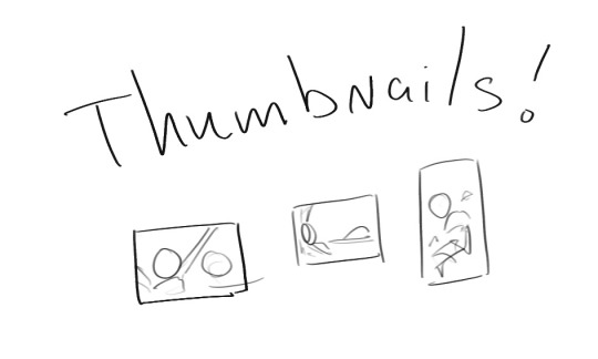
Use thumbnails! They are great to help figure out the general layout of things and what pose I wanna do
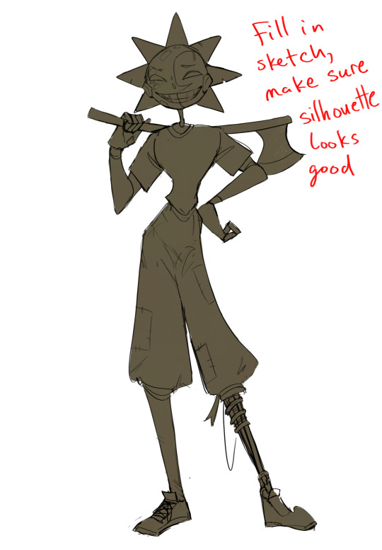
Next is what I call the "silhouette" layer
This is super important for me cause it helps me refine the figure and make sure the pose/anatomy looks correct, also depending on what color I choose for the silhouette helps guide what colors I'm going to use on top
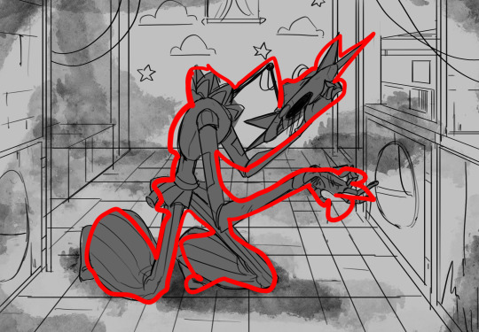
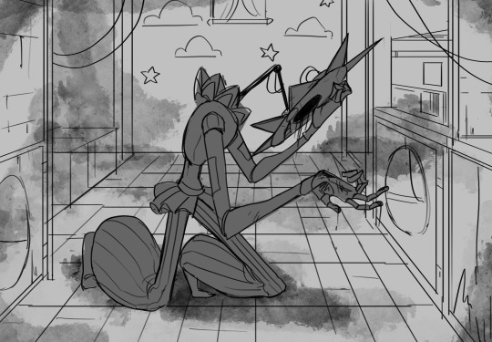
This piece is a good example of how it works. The silhouette shows me how the figure interacts with the background, how the pose looks and if its any good
The silhouette layer doesn't have to be super clean, as long as it follows the sketch decently well and shows where the figure is then its fine
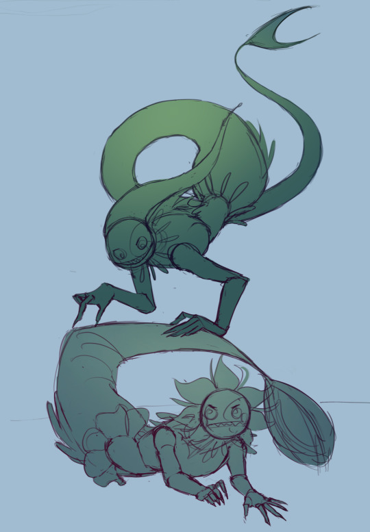
I also sometimes make the silhouette layer multiple colors to help guide shading and vibe
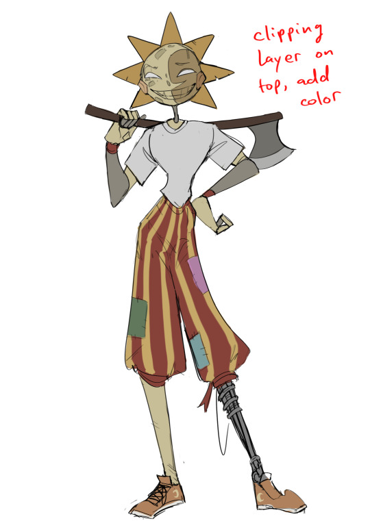
Next is the coloring layer. I usually make this a clipping layer on top of the silhouette layer, or I change the silhouette layer to alpha lock, either way it saves me time on coloring everything in

Sometimes I am super rough with the coloring too, using like an airbrush or my fav watercolor brush just to generically block in color where I want it
Works out cause most objects have like a bounce light to them from surrounding objects, so this is sort of a cheat I use to get that effect without all the work lol
Also don't be afraid to have the lower silhouette layer shining through, having multiple colors sort of subtly shining through the piece helps lots
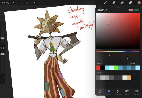
Next is the shading layer, this is usually another clipping layer, usually set to "multiply"
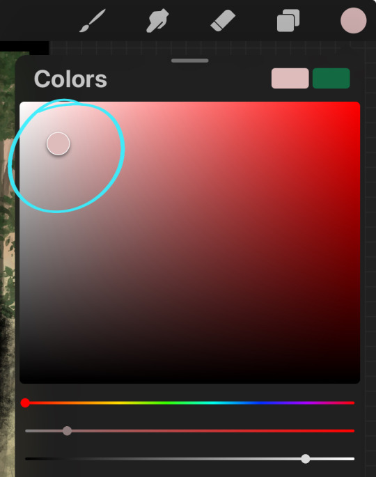
The colors I pick here is usually within this range, any color works, just depends on the piece and vibes.
Since this piece is set in a sunset forest I choose a more desaturated orange for the shading layer
I know there's a whole thing about multiply layer being a crutch (and it kind of it) but it is a useful tool when you just want some darker values across the piece but don't want to go through the process of color picking every single darker shade
Also in my opinion it looks better than picking a darker color and setting it to a lower opacity, idk I just think the color has more "depth"
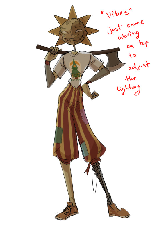
Next is the hardest to explain, sort of the vibes layer
Usually its just a layer of more concentrated color on top of the normal color and I fudge with the settings and values until I get a result I like
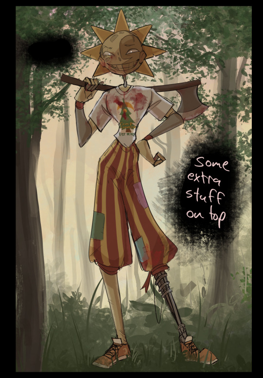
Next is the longest step, is the "extra" or the render stage.
Usually I add a background before this step so that if I need to merge the figure better with the background I can
If I render with a white background but he's supposed to be in a dark forest, its going to mess with the lighting severely
Also this is when I add more "vibe" layers on top to get the figure to match the background better
Backgrounds in general I recommend checking out @/derekdomnicdsouza on instagram he's got lots of great tutorials for breaking down backgrounds simply

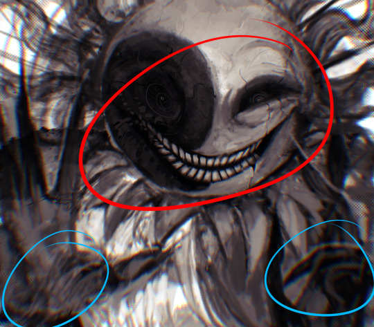
I'd say general rule for the rendering layer is to focus on the areas of interest and spend less time on areas you don't care about
I even blur stuff out on the edges I don't want people to see, partially to save time on fixing mistakes in areas I dont care about (oop), but mainly to help draw the eye to the areas I do want people to focus on

Theoretically parts of the background should like mesh with the characters, parrallel lines are a no no unless they are directing a viewer to look somewhere, things that are perpendicular help bring things together
tbh I'm still not the best at layout and probably need more practice, but overall this is what I like doing
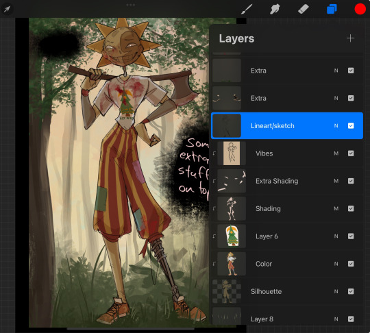
Overall this is what my layer set up ends up being
Sort of a sandwich with the lineart/sketch as the "meat" lol
Color and basic shading below the sketch, clean-up and rendering on top
I like this method cause it's super flexible if I ever want to try something different or try to replicate someone's style
I can make each step less or more messy depending on the end result and can add a lineart layer if need be. Also if there's a part that is straight up not working or needs to be removed its super easy to do cause I can just paint over it on the "extras" layer, color picking from the surrounding area to get the same vibe
Generally rule of thumb for my style is: get the initial layout of colors, form and shading to look good, then the rendering should be smooth sailing
Really the best advice I can give to get better at art is to enjoy what you're doing and become very very obsessed with drawing a silly little guy
You'll eventually get very good at drawing them pfptpf
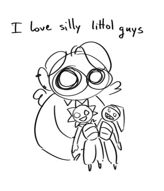
#sundrop#moondrop#long post#art tutorial#fnaf sun#fnaf moon#I draw them way too much holy guac#ask#this is for you asker#idk if anyone else is interested in this kind of stuff#i apologize for ranting lol#also me struggling to spell silhouette like 15 times
116 notes
·
View notes
Note
Heyy I love your DA art so much! I just want to ask if you don't mind especially on your family DA piece. Do you render first before putting the lighting/effect or do you do the opposite? I always struggle when drawing illustration like that because I just can't get the lightning right after I put the main shadow
Thank you and no problem!
My process was honestly rather sporadic because I'm not used to work on big pieces like this, especially those with warm colors (like browns, oranges, gold, etc) so it was honestly a challenge.
It's gonna be a long answer so im just gonna put the whole process below this cut
I tried doing everything in base colors first. No shadow no nothin. At this stage im trying to make sure that the base colors are all in the same, warmish tone so nothing felt out of place (left)


I was absolutely stuck on how i should do the shading, so i asked a friend for advice and she painted it over a little to give me an idea (right) (sorry the quality is ass cus its a tiny thumbnailing thing)
then i focus on the main subjects, i dont entirely shade them yet i just give some discoloration and color details like blush, dirt, subtle ones. I colored the lineart too (but i suggest you do this later after your shading)

then the shading, i carve it out from the multiply layer (as my friend suggested, lighting came from top left so i follow that suggestion)

added more contras (multiply & overlay) to add more depth and pop some more color

now that im done with the main subject, I got a good glimpse on what tone I should do for the rest of the artwork. Dark red for areas i need darker, and something of a gold/orange for the brighter spots.
i shade the background manually without using multiply, since im worried itll be muddy (easier for me to control too).
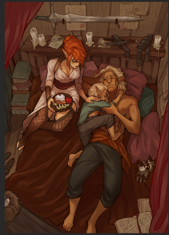

once everything is shaded, check on your artwork using a B/W layer. Everything still feel flat to me so I know i need to add more contras in the light & shadow
At this point im just throwing in Mulitply layer (reddish, green sometimes) to darken some areas outside of the focus and Overlay layer (yellow, orange, whites) to highlight the important parts and to emphasize where the light is coming from.
Check it again in the B/W layer, and it feels way better!


and there it is!
I added a few personal effects at the finishing, copying the lineart and gaussian-blur it, add speckles, add noise, color balance it a little. Poof. We're done :D
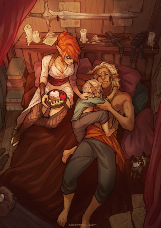
Hope that helps!
76 notes
·
View notes
Note
i love your art so much, what does your process look like? how do you edit images to be saturated/glitchy & also cohesive w your art?
awww thanks so much!!
its a lot of playing around with layer settings (shine&shade and burn&dodge are favorites but screen, multiply, overlay, exclude, those are fun too) and turning up saturation & contrast (in whichever program im using at the time). most saturation sliders have an upper limit. you must. go beyond 😈😈
to get a glitchy look i'll either literally look up "free use glitch overlay" on google images (i have all AI sites filtered out on my browser), or a LOT of the time i'll take pictures of trees or clouds around me, and i'll mess with the saturation of those images until its SUPER crunchy and low quality. zooming in on a random part of the image also helps make it crunchier and lower the quality (you'd be surprised how cool and ""glitchy"" a SUUUUPER oversaturated and zoomed in img of a cloud can look. i <3 cumulonimbus and nimbostratus but it doesnt rain much here 🥺)
i'll add a random layer effect, duplicate the layer, add a different effect, overlay a color gradient or random assortment of scribbled colors, etc... just til it looks sufficiently microwaved and cluttered. i also have quite a few glitch brushes on SAI 2 for some additional clutter
then for the main focus of the art i'll usually draw a little critter on MS paint, zoom in so u can see the pixels, copy the image&cut out the whites around it with magic wand, then put it on the image. its fun to do this with a lot of tiny little colorful cats just to add more color to the bg XD
sorry if thats all over the place. i dont have much of a cohesive process since i just goof around until i like how it looks or i recreate whatever my brain wants. sometimes i'll just do everything on a 200x200 canvas and size it up after editing and it looks crunchy on its own (i do this a lot for gifs, like my most recent piece). integrating photography is very fun. mixed media is fun
i might make some speedpaints sometime if i can get over my anxiety of ppl watching me draw XD
but ty again for the very nice msg. sorry if my response is a tad bit incoherent lol
65 notes
·
View notes
Note
If it's not too much to ask, how do you shade complex patterns easier?
Its not too much to ask at all!!
My easy trick for shading complex patterns in cel shaded Neopets style art, where you'd want to hand pick your shadow colors for each element:
First, I make a flat base layer, and put each unique color on its own layer that i clip to the base.
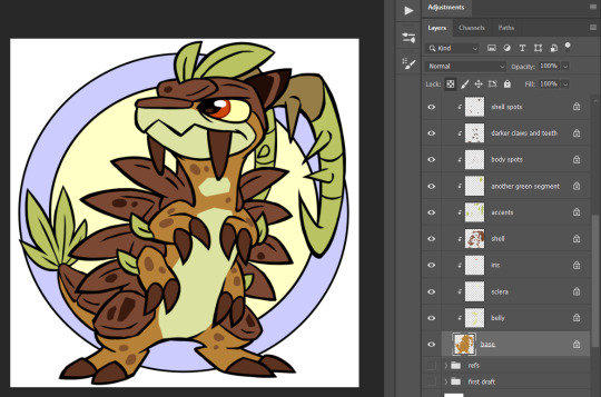
After i finish the flats, i then duplicate ALL of those layers, lock them, and recolor each duplicate with the color i want to use for that element's shadow. these are now effectively my Shadow layer, and i rename the base duplicated layer so i know its my shadow base.
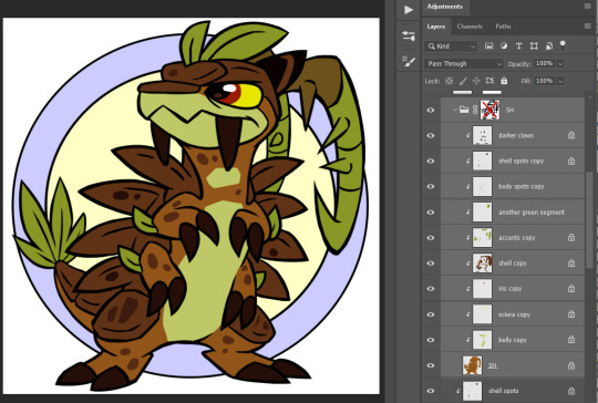
and then i use a layer mask on either the base layer or a folder i put the shadow layers in- i use this to paint in the spots where i want the unshaded areas to be.
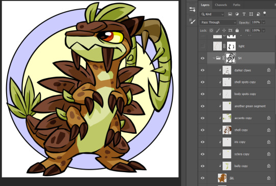
This method makes it really easy to change my mind on a shading color for a specific area without having to carefully repaint the shadows, or tweak where i want the shadows to fall without having to worry about matching the colors, similarly to having the shadows painted on a multiply layer.
if i'm using a PSD where I already made a shadow layer, like my basic Centibyte base, i just duplicate all of the clipped areas from the flat color base, clip the dupes onto that shadow layer, recolor it to be the shadow color for the base color, and proceed from there.
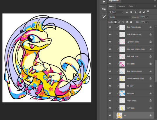
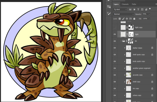
You can do this trick for highlights also- I've noticed that highlights are typically used sparingly in Neopets art though, so I kind of just go with whatever i think looks right.
For Tyrannian, I decided it looks fine with solid white highlights at a lowered opacity of 70%, so i didn't bother coming up with a unique highlight color for each area. Sometimes I'll make the highlight layer an Overlay layer since that can help the highlights with not looking washed out, but it feels a little inauthentic and loses contrast over certain colors, and in this instance Normal ended up looking better.
I hope this was helpful and not too unclear! I'm not super experienced with making tutorials, but I'm always happy to share what works for me as best I can!
#asks#neopets#neoart tips#god maybe i need a better tag for this stuff. i had to hunt down that it was 'neoart tips'#my older version of this method is ALSO in that tag- its a little more convoluted than this one though so i wanted to share the new version#lmao i was like 'lock your shading layer duplicates' and some of mine are unlocked in the screenshot. don't live like me. play soccer
151 notes
·
View notes
Note
your rendering and lighting is amazing???!!! if it's alright with u, i'd love to see ur process with that stuffz, ive never been able to figure it out :O
hiii thank you very much!!!
i. i dont really know how to properly explain it or show it, because i work really chaotically and the way i do it changes depending on my mood. but ill try (finally gonna analyse my own work after all this time). ill do the whole colouring thing so its easier to follow if you want to??
so uh. i just start with simple sketch and then the line work. nothing interesting here. when it comes to colouring i really like to add some other colours rather than the basic with airbrush, to make it more colourful. my main rule "make it more colourful" as you can guess


than i add some shades, picking random colour that looks the best (most oftenly violet or/and blue, since they're the darkest colours on the colour wheel and with them its easier to make a dark shadow but still left it bright and rich enough) and setting the layer to multiply so it looks darkened on all parts of the character/something im trying to colour. as for the highlights i use the opposite colour (so if the shadow is blue – i use yellow or/and orange. it's also worth remembering the basic rule of cool shadow = warm light and vice versa) and the layer on the add mode. and i use a LOT of correction with filters till it looks right in my eyes

but ok actual rendering part is the most fun one. i merge all layers into one, so its way more easier to control the process, because with this you can not always think "damn i made a mistake here i need to change to that layer to fix it and then come back to the layer i was working on blah blah blah" and it makes the process a loooooot faster. and you can just paint paint paint fix whatever you want add whatever you want and go absolutely crazy with additional shades vibrant accents idk how to explain it properly sorry!!! i use a colour picker as the instrument a lot too

i also tend to add a second lighting to the opposite side of the main one, with opposite colour as well. and on the parts where shadows are too dark imo. thats it ig
sometimes i skip some of the parts, sometimes i dont. as i say depends on how i want to draw today and do i want to do the whole "long colourful rendering process" or not

its not what theyre teaching you in art school (i never been to an art school. maybe they do) but yeah thats how i do it. i guess i always wanted to make my drawings stand out more, so i try to use all of the rainbow spectrum and mess with the colour theory as hard as i can until my drawing looks like something some junkie on strong acid drew... or at least like the illustrations in children books. whatever suits you best
#also sorry for bad english if its bad in any part... its not my main language and i wasnt using any translator.#translator knows less of this awesome slang ive learned#and sorry for shitty dave drawing im not home rn and dont have a tablet with me but i really wanted to answer this!!!
18 notes
·
View notes
Note
dropping in to let you know that I find your painting style verry pleasant uwu Do you have a technique or is it vibes only?
Thank you very much! Apologies for answering late, I'm happy to hear that you find my style pleasant :]
As for techniques... techniques... hmmmmmmm, my art process is very loose, so I suppose its mainly based on vibes, however there are a few techniques that I do use in my art process!
-Going Dark then Lighter
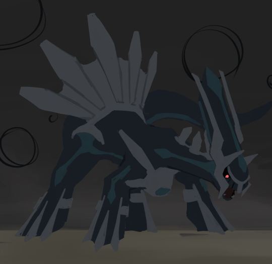
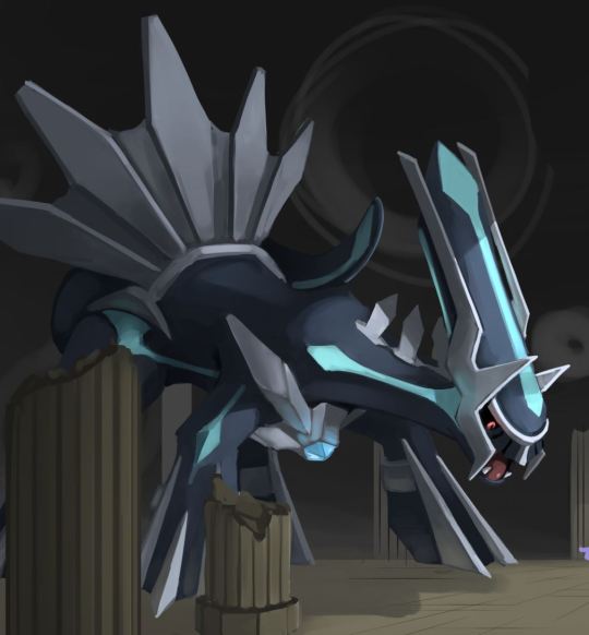
Its easier for me to figure out where the light hits rather than where the shadows fall, for this reason I often start with a character or background a lot darker that they are supposed to be and then adding light to it, it is quite an effective technique for scenes that have dramatic lighting
Sometimes the "outlines" that appear are just me adding light and not quite allowing the light to touch the edges
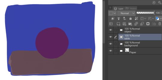
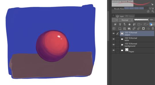
like this (not all outlines are because of this tho, some outlines I do add deliberately)
-Checking Values
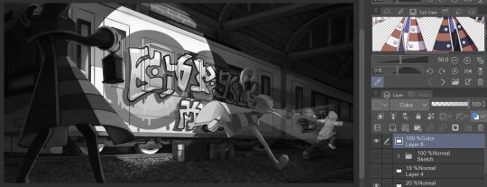
If you make a layer that is entirely white, put it on the very top, then set that layer's blending mode to Color, you will get a black and white version of your artwork! (blending modes Hue and Saturation also seems to work, I can't tell if there is a difference between the three, but I always usually go for Color) Its a quick way to check values and make sure that no colors are blending together
-The less layers the better!
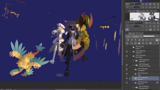
This is more of a personal preference but I absolutely hate managing a lot of layers, so I try to use as little layers as possible, characters are always rendered on a single layer, colors, shading, and all! If I use any blending modes such as Overlay or Multiply, I simply get the result that I want before combing the layers to continue working on it. The 2 brushes that I use has quite a nice blending to it and when worked on a single layer is what most likely what gives it the painterly quality.
Background layers are a bit more complicated because there are many elements to work with, but works somewhat similarly. Near the end of working on a piece I do an "overpaint" layer where go around the entire piece to touch up a few things, though I have to be careful not to add too many overpaint layers, it gets very chaotic that way
anywhos those are some of my techniques, I hope that you find it interesting or that it helps you! 👍
215 notes
·
View notes
Text
(Cracks knuckles) Alright folks I remember how to draw
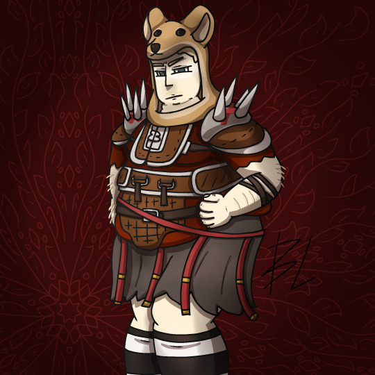
Fat fuck Vulpes by yours truly, Blaze Lander. Inspired by the lovely drawing by @yourmateyoya ,egged on by @legions-top-dog , and because i force you to deal with all my shitty drawings, @noomycatz
Yes, once again, i have put too much effort into a shitpost. Roughly 2 hours as I reused a canvas on ibis paint for a 5th drawing lmao
Yall can burn me at the stake later lol
Process below hehe i like to ramble
And just because i like to talk about my drawing process for characters with complex outfits, this is how my lobotomy brain does it:

First i do silly fun colored sketch. I use different colors to differentiate the "skeleton" from the, euh, fleshy bits, and the clothing. You can see lots of lines that would not be shown in the final product so it makes it confusing to look at.
Next i do a clean sketch.

This is where i clean up everything before doing the final lines. I use one color and a thin brush to make it easier to line over. Here i add any extra bits (like the top football armour) and "render the physics" as i call it, so properly drape cloth and the uhhh squish of stupid fat fuck vulpes' boobs and stomach. I also will balance the drawing here by flipping it and redrawing or using the drag tool.
Next is lining.

For this drawing, i used a 9.0 digital pen with a taper. Its my standard :þ. I kept my pen at the same size for this piece. Sometimes i line the outside darker to make the drawing stand out more. I decided not to as i wanted to give the drawing a more "serious" tone. (How serious can this be though lol-)You may notice on the arms little bits of the lines are missing, thats because i gave him some arm hair. I like make little details like that show over the lines. But since the one shading technique i used works with clipping masks, i had to but the arm hairs on a layer lower than the line art. Next is colour:

I colour in the drawing with midtones. Simple as. I tried to stick with warm colours besides his eyes, which are grey blue. Idc if they arent, im too lazy to google it. I mostly use flat colors but i did make his shirt a gradient. Next is do simple cell shading:

Depending on how i feel i shade with or without the colours in the back. I went with a sorta "non decrepit" light source here. Didnt want too much intensity. I used a deep marronish orange on a multiply layer on 45% opacity. Soft shading/lighting next:

I get intense with the soft shading. I use the airbrush with a deep maroon to add dark gradient and airbrush with a light pink to add a bit more depth. I usually use less light and more dark because im evil i like the intensity. I keep the layer the same amount of opacity and multiply it with the darks and soft light for the lights. Next are the shine highlights:

I use the dip pen hard with a taper to add light highlights of white on shiny bits like metal and eyes. I uses pure white, set the layer to 25% opacity, and use normal blending.
I also shade the lines because it makes the lines softer. I use a clipping layer on the line art, set the whole thing to a dark grey, and airbrush in darker and lighter parts. (I felt like a picture wasnt needed cuz its hard to notice.
For the background, i used a dark red i stole from the cell shaded layer, drew a vine pattern with the kaleidoscope ruler, and added a vignette. Vignettes are my cheat code for background hehe~ it makes the subject stand out while keeping suave, seriousness and formality. To make a subject pop out more, put the vignette behind the character but in front of the background. For more intensity but it on top of both.
Also- I usually draw with a level 10 stabilizer (i got shaky hands) but i drew with a 2 stabilizer so im surprised it came out so smoothly-
Also i gave him goggle tan lines because if i have to have them from playing tennis with sunnies, so does he.
#fallout#fnv#new vegas#drawing#digital art#fallout new vegas#vulpes inculta#shitpost#i put way too much effort into this#dont ask why i draw this type of shit good i swear i will blow up in a million pieces and cry if you do
21 notes
·
View notes
Note
hey, fritz! I love your art and was wondering how you shaded your art because the lighting and colors are really nice, I also use Procreate and do an overlay with dark purples for shadows, and was wondering how to shade somewhat like you do!
(keep up the incredible work, the fandom page is so cool)
this is a somewhat lengthy tutorial cuz my shading is a multi-step process so……. under the cut it is!!!
i use [what i like to call] grayscale shading, where you block out the shadows/highlights in grayscale. i use this to better differentiate the values in the lighting and get better contrasts [and all that other technical artist mumbo jumbo]
[i’ll also be using a pisspoor sketch of my fnac puppeteer design for this so…… ya]
[colors are also shown on the side as they become relevant]
[THIS IS ALSO VERY UGLY BCUZ ITS A SKETCH AND THE INITIAL DRAWING IS NOT USINF MY USUAL WARM COLORS… but the tutorial still applies]
obviously step number 0 is ur base colors . nothing too outrageous here .

1st , i put a gray overtop the base colors [not on the same layer(s), obviously]. this color acts as the base value in the steps to come, and i usually use a gray in between pure black and pure white.

2nd, i go overtop that other gray layer with another, more darker gray. this one is the closest to pure black out of any other value in the shading .

[these nexts steps assume that you know what angle your lighting is coming from]
3rd, i erase all parts from the dark gray layer that are in the light. [i know jack shit abt lighting and so i just eyeball it and pray, but using references also works].

4th, i take a gray in between the initial midtone-gray and our darkest gray and rim the edges of some of the erased bits and/or scribble in blocks of color on parts that are close to, but not directly in, the light.

5th, i get a gray tone lighter than the initial base color and use it to highlight the parts of the drawing that are nearest to the light source.

6th, i take another gray tone, one that’s now in between our darkest gray and the one we picked in step 4, and scribble it around the edges of areas completely in shadow. this is supposed to be some sort of reflective light, but honestly idfk what im doing.

[these next steps use the gradient map feature on procreate, but im sure manually picking colors is fine too]
7th, i use the gradient map feature on procreate to automatically assign colors to the previously gray values. for this example im using the present Mocha gradient, but any other gradient will do

8th, after settling on a gradient that matches the mood/color scheme/setting of the image, i set the layer to multiply and fuck around with the opacity until im satisfied with how it looks.

additionally, you can add an overlay layer and airbrush the lightest areas with a similarly light color/the darkest areas with a similarly dark color.

aaaaaaaand that’s it for a shading tutorial. being so fr i don’t like how some of my shading looks sometimes and im working to improve it but this is how i do it currently !!!!!
28 notes
·
View notes
Note
hi!!! i’m not sure if this is something you’re willing to answer but what’s your process like? how do you get your art to look the way it does?? its just SO pleasing to look at omg
sth that rlly helps me with colors are gradient maps! theyre rlly easy to use on csp and can help get the right color mood and lighting in a piece :] my process is pretty simple, sketch, lineart, flat colors and blush on any skin parts. i either color some of the lineart or dont,but i always add red to any lineart parts where there would be blush just to makw it softer. then optional shading with a multiply layer maybe and some gradients if i know theres a specific light source. for more detailed pieces i add some light with an add/glow layer and brush too. my finishing touches are usually add chromatic aberration (theres tutorials on how to do that online), a gradient map and perlin noise effect.
hope this made sense haha maybe ill record my process sometime when i can:]
70 notes
·
View notes
Note
How do you happen to do your shading id you don't mind sharing? Its so subtle and soft that you can't tell its there but it really helps highlight the characters
Phew, finally got some time on my hand to answer this one! It's a fairly simple/fast process so I figured I'd make a tuto once I'd get started on the shading for the next part, and here we are!
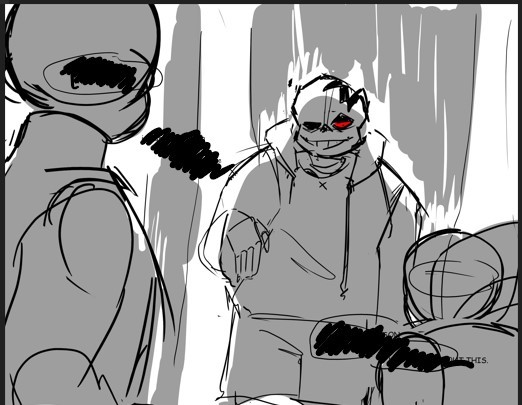
Alright so, we've got the panel (lazy screenshots cuz I'll never finish this if I have to export everytime ahah)
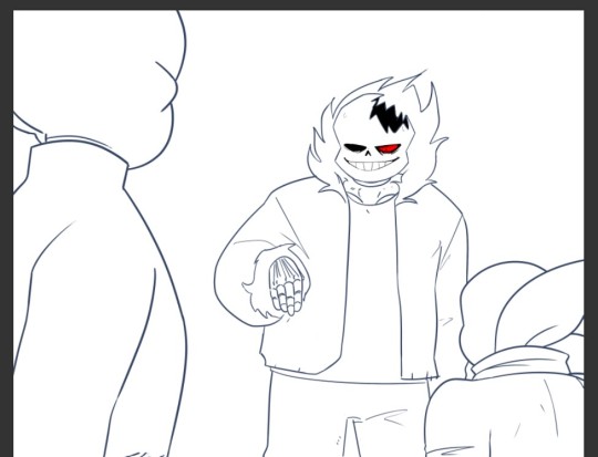
The advantage of digital art is that I don't have to think about color harmonies right from the start, I can always add filters and fiddle with the hues at any stage, so I just apply base colors at first and draw the background (it will help me build up a palette for the shadows later).

Okay, now the fun really begins. First I need to know which direction my shadows are likely to go and what atmosphere I want for the panel (which element I want to highlight? palette idea? etc). A sketch is enough to establish your intentions. Sometimes I'll mess up the lighting but it's okay to cheat if it looks coherent enough xD
(Patreons exclusive, shhh)
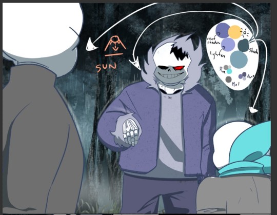
Now to create palette and apply the said shadows. I have a hand made one for TMS, but I had to make a special one for Ebott since there's a lot bg and kinda heavier atmosphere (I'll prbly have to make one for each part frow now on too hm). It's mostly made up of blues and greens (no black or greys here, but it can be fun to use in other styles! Purple too, so have fun!)
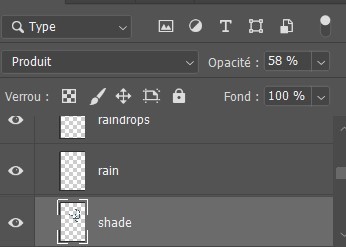
(My configuration - Produit=multiply?)
There, cast shadows (clothes, faces, folds, etc.) are roughly in place and looking sharp! Maybe a little bit too sharp actually... Let's smooth all that up

I use an airbrush eraser to soften a few shadows. Not necessarily all of them or the whole shape, you have to find the right balance of soft/sharp.
Now to spice things up a bit-
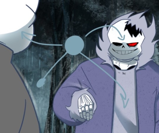
On a layer linked to the shadow layer, I add a lighter color that matches my light source or the environnement. Here it's a light blue, but in part VII I used a lot of orange (sun)! It makes the shadow much richer and the whole palette more vibrant!
(Again, you don't have to do it on all of them)
(not sure if you can see it lol but there's orange!)
And last but not least: Global shadow and filters (? never had to name or translate it bwahaha)
It's a lot of fiddling to achieve a result where the character looks more or less rooted in the background (=blue layers and filters to harmonize colors) and where I draw the last shadows. They're often the biggest ones (=on Axe's body+ leaf/tree shadows etc.).
You can use the techniques I've described above, or just go for it, it's completely freewheeling from here, ahem. Just make sure to step back regularly to see where you're at and stop.
(You can also add lights layers and spots if it's too dark but in this example, I use the base color as a light layer + their skulls are such a bright white already xD )
A bit of blur and ta-da~
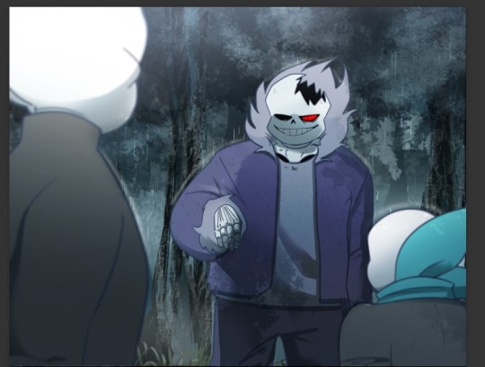
Pretty easy, right?
#ask#undertale#The missing scarf#txt#seirin talks#tuto#spoil#I hid the dialogues but let's be careful xD#it's an efficient technique for comics !
48 notes
·
View notes
Note
Hello!! The prison break but it's cold looks so good, I love you art sm oh my god! Question, how did you choose your colors for that? And what else did you do to convey that feeling of cold?
Thank you!! :D I will do my best to explain a bit of my process here! Hopefully it helps someone out
TLDR: De-saturated cold colors, lots of layers of shading, and heavy heavy contrast

Here's an example of some of the base colors, without any of the shading.
Usually, I pick the literal colors and let the shading do all the work, but for this one, I de-saturated and cooled all of the base colors to help get that colder feeling. Normally Techno would be a brighter pink, and the prison outfit would be a brighter orange, and I normally would make the fur on the cloaks (and technos tusks) be white. But white feels more like a hot color, so i try to avoid it entirely. Even the snow will always at least be a light grey like in that top corner. Even with the text!
(You can also see here how a lot of my snowflakes are actually a medium/dark grey, but that layer is on top of the shading, so it makes them feel brighter and easier to see in comparison without being too bright.)
On top of that, I add a lot of layers of shading and overlays.
I had several layers of multiply shading, all in a variation of dark greyish blue or purple. Here's a little thing I whipped up-- the first image there has 1 layer of shadow just on the guys at about 60% opacity, then I filled a whole layer with the same color at 100%, and erase the small areas i want to be brighter. I tend to just add more as I need them.
Then the Add layer with any bright orange light goes on top of that.
Lastly is my overlay noise layer. it doesnt do much for the color or darkness because its so dull, but i like the texture. feels Gritty

I think the contrast really helps sell the feeling of Cold.
Contrast in both value And color is important!!!
Sometimes I add a layer of shading, decide its not enough, and duplicate it and merge the two to double the darkness. I Loooovveee dramatic lighting, which is all about going a little further than you think you need to with shadow. And very stark, eye catching brights.
I think there's some color theory rule about picking one dominant saturated color to use sparingly, and making all the others much duller.

This scene here, I tried to give it a foggy appearance. Obviously there's the snowflakes, but over the background panel, I had multiple layers of texture and airbrush and Stuff to make it feel fuzzier, harder to see. I did the same thing when I drew a desert scene ages ago, so that's not really a Cold specific thing, but it does help build the feeling of being stranded and fighting the elements.
Anyway thats all I can think to say rn :')
11 notes
·
View notes
Note
How do you decide what to draw, and when it's done?

Text: "This is a great question! I usually "wing it" when it comes to deciding when my drawing is done. (More below)" "Finding ideas...? It kind of depends! Sometimes I'll get a strong picture form in my head while I'm doing something else. Other times I just sit and draw whatever."
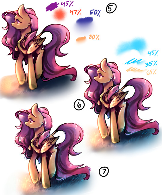
Now to elaborate on my process for deciding when to stop, how far to go with shading, etc. Most of it has to do with how I feel about drawing something, but also to do with keeping things visually appealing. Here I've laid out each general step of my drawing process from start to finish:
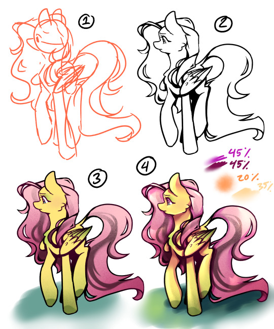
1. Sketch, Meant to be quick and generally convey the subject. I will sometimes draw and post things just as cleaned up sketches if just adding visuals to a text post, for shit-posting, or just if I'm not too interested in what I'm drawing.
2. Line art, I almost never post *just* line art, but i will occasionally post line art with one color to fill in the silhouette to help with contrast and character recognizability.
3. Flat color, I often post ask responses at this stage (maybe with simple hard-edged shadows here or there), but outside of ask responses I only leave character reference art at this stage just because the colors are purest for the character. I don't usually leave it without simple shading because it can be hard to read the subject's form, and its not my cup of tea. I lightly airbrush a warm color over the line art so that the harsh black doesn't contrast too much with the bright colors.
4. Shaded, a step up from simple hard edge shading I'll layer more than one shading color (layer set to multiply and lowered opacity) and blend out the edges in some places to soften the form. Then I add lighting and highlights - first using a textured soft airbrush over a large area, then use a round airbrush with hard edges for the highlights, blending out the edges in some areas to soften the form. This is usually where i stop for simpler character pieces, either for ask responses or for personal art. (Highlight layers are set to "add-glow")
5. Atmosphere, or adding additional shading elements to engage the subject with an environment or specific lighting condition. Here I've done a sunset lighting condition - I put a purple color over the whole subject set to multiply and opacity lowered, then airbrushed a reddish orange tone (on a separate layer, set to add-glow and opacity lowered) over the highlighted areas to bring warmth back to the lit spots. Then deepened the shadows using the hard edge airbrush again, a dark blue color (multiply layer, lower opacity), and then blending some of the edges out to show the form better. This is where I'll merge the line-art layer with what i now have of the coloring and shading, if i didn't already do so prior. Last I went back over the highlights with the orangey color (add glow, lower opacity). Once I get to rendering like this, I don't often stop here because by this point I'm likely hyper fixated and will keep pushing the values and adding details until I get to 6.
6. Details and bounce light. I texture-airbrushed a blue bounce light color, erased some hard edges in using that hard edged airbrush and then blending some of the edges out. This then gave me a guide to add in bounce-highlights with a hard pen, that i blended out in some places. I then further pushed the main highlights using a hard pen and again, blended out the edges. All layers set to add glow and opacity lowered. This is where I'll usually stop for finished rendered pieces, because I struggle to find other things to add or change, and the hyperfixation is thinning out and caving into my hunger/sleepiness. Might add hard white highlight details, but those are the finishing touches.
7. Wtf details. Added in hair strand details and fly-aways, blades of grass, I'm up way too late and struggling to end the drawing process - Or im just enjoying rendering the hair. I almost never add in stray hairs like this, but it's something i enjoy visually.
Again, a lot of where I stop comes down to my energy, time, and the vibes I'm going for. Hope this answers your question!
#mlp ask blog#mlpfim#mlp art#art#mlp fim#mlp ask oc#digital aritst#mlp fan art#digital art#mlp oc#art tutorial#art tumblr#rendering practice#process#art process#drawing process
34 notes
·
View notes
Note
Hi! I LOVE your colors and I was wondering how you pick them? Like is there a certain process?
aah thank you so much!! im honestly not sure,, most of it is just balling but i can try to explain lol
for one i never use blending layers for shading unless theres a character with multiple markings i cant use a solid color over, i find multiply/overlay really limiting color wise, but i sometimes use them with a slight darker/lighter gradient over certain parts or the whole drawing to make it less flat :) shading is usually just a darker and slightly color shifted (sometimes less saturated) version of the original flat, i honestly cant tell u why i pick specific colors its mostly just random vibes lol most of the color pazazz comes from gradient maps tho! if ur not sure what they are i suggest looking into it but basically its a color gradient you can slap on the drawing to change the colors. i always do a rlly low opacity one at color or sometimes multiply/soft light but it can really bring ur colors together if it feels unharmonious or make it more colorful if it looks too bland. if you use clip studio you can find lots of gradient maps on the store thing heres an image to kinda convey what im talking about skdjsk

i hoap that explains things :] if not feel free to throw me into a volcano as sacrifice
8 notes
·
View notes