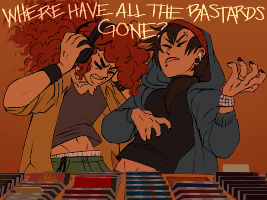
#but hes a lot easier to draw if it's lineless
Explore tagged Tumblr posts
Text

Hermit-a-Day May !! || Day 18: Magic Mountain Row (Favorite Build)
(me yapping about the base below)
I guess this is technically multiple builds, but honestly magic mountain row is one of my favorite builds that on hermitcraft s10 that im aware of ! I just feel like it has so much storytelling and thought behind it, like Mumbo did such a great job !! Like he also made like business cards, concept art, and things related to each like business and building just for a vibe, that’s like a craft of love ! AND the armor stands (even tho I didn’t add them here) like they just add so much life and character GAHH! I can go on for hours about how much I love this base and how filled with story it is, but I’m running out of words in my brain to describe it all :3 !
Originally I was going to draw grians base when I first saw the prompt, but I got into watching mumbo like a week ago and I just fell in love ! (No hate to grians, but I just HAD to draw this) Still, I like a lot of the hermit’s bases this season (and the other seasons, but sticking to 10 cause it’s easier)
I tried using my sort of lineless art style I use for backgrounds, it does seem a bit wonky and unclean, but honestly it kinda fits the vibe, with all the clutter maybe ? Maybe one day I’ll make a polished version :D
Also reason why I am posting this like a few hours after my last one is because I wanted to get this done so I can get stuff done for school when I wake up TvT
#hermitaday#hermitcraft#hermitcraft season 10#hermitblr#mumbo jumbo#mumbo fanart#mumbo jumbo fanart#yipppeeee#my art#fanart#I could just gush about how much Mumbo inspires me but this is not the time#I would honestly live here if it was a real place#my favorite build here is Willy’s workshop#BUT my favorite characters here are Jill and bill (they’re so cute!)#yapping too much just know I really like magic mountain row
95 notes
·
View notes
Text
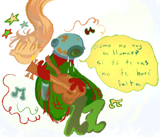
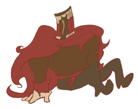
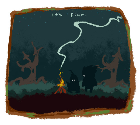
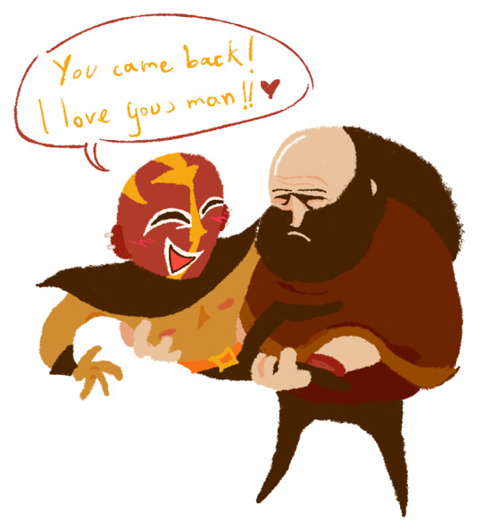


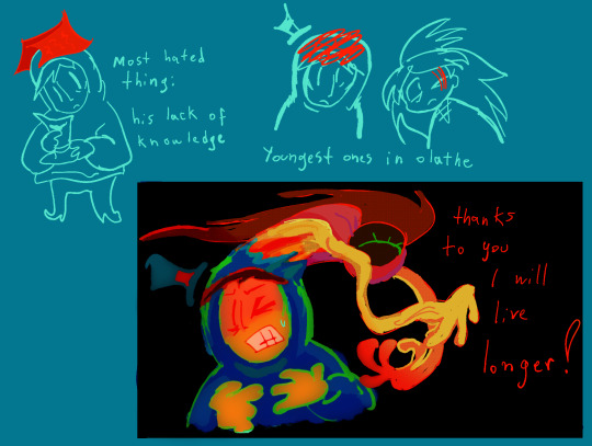


my undying love for the lisa companions
i wanna draw more of them
first pic is bo singing la vida mejor :) no that's not the guy's voice watch the whole thing
second to last one is referencing this best post in the world..
sorry about fox garth wait no i'm not
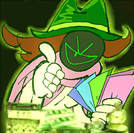
MONEY GARTH ATTACK
#the day after my birthday i remember doodling so much rage ironhead for no particular reason#but hes a lot easier to draw if it's lineless#ive tested that on a bunch of others like terry and buzzo and it happens there as well sigh#my stuff#dont pay too much attention to the third pic it's a comfort doodle from me to myself NO I DID NOT LIKE THAT THING i just accept it#music group i linked is from my country ehehh....i listen to them often#the fox gart has a fun story behind it.. i was delusional#lisa the painful#rage ironhead#garth lisa#bo wyatt#henry wyatt#jack lisa#shocklord#queen roger#sonny lisa#sonny backluwitz#brad armstrong#buddy armstrong#buckets lisa#ALMOST FORGOT HIM
102 notes
·
View notes
Photo
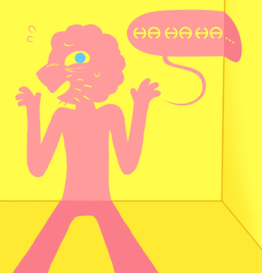
He dunked up (Patreon)
youtube
#My art#Adventure Time#Fionna and Cake#Prismo#He's actually really fun to draw haha#It probably would've been easier to draw him as a vector but eh! Sometimes you gotta hand draw a lineless guy#That's actually what I did with his word bubble - turned out cool right? >:3c#I downloaded that font years ago and like never use it but it feels like it suits him#Finally I can utilize it somewhere lol#I was close to considering the Mr. Saturn font for him tho haha#He was mostly just a warmup while I worked on other stuff - a simple and fun intermit!#I'd been drawing him a bunch interacting with Simon so it followed that I had to draw him with his facial hair lol#And eyebags but tbh I kinda just draw him with those anyway lol#They're a good look! They add to his expressions quite a lot#I like leaving the eyebrows off AT characters as much as I feel I can get away with - clearly not here tho lol#He's fun I like Prismo#I still like AT!Prismo more than F&C!Prismo I think but he only got So much screentime - it's understandable#They still did a good job with him tho
13 notes
·
View notes
Note
how do you manage to make such amazing designs every time???? Even your redesigns are stunning, especially the way you make colours match really well! Would you ever do a tutorial on how you design characters/choose their colour pallates?
AUGH thank you so much 😭😭😭 I would like to make a full YouTube video explaining how I do character designs someday tbh, but that would require a lot of work lol- my process usually requires a lot of Pinterest scrolling and a basic color palette in mind tbh ☠️
For designs (not redesigns) I actually jot down the designs in color first before sketching out the design, because if I do the design first it can look really bad once I try to figure out the colors ☠️🙏 Here’s an example of what I mean with one of my designs:

Usually they’re a lot more messy and the design isn’t fully developed, while the final drawing is me finally figuring out the clothing and details like the shape and silhouette. (I just had a good idea for this guy because he came to me in a dream 😛)
Doing the colors first is also a good way to see if any colors are a little too similar to each other because it’s lineless, doing lines first can make you miss that at times once coloring.
With redesigns I just wing it and do the colors afterwards because I have the original design for reference so it’s easier.
UHHH for how I design characters is usually look at animals and other character designs for reference? Figuring out the silhouette of the character is also helpful.
There’s so much more I could say but I’m lazy and don’t know how to properly put it in words atm
18 notes
·
View notes
Text
So
A new fun little au idea came to me focused on the uncommons because I watched the “There’s something about…” series from Mashed recently
And I decided to use this as an opportunity to draw in different styles than usual

Something About The Uncommons! Why the uncommons? Because I wanted to.
We’ve got Dilf Energy, funky imp guys and a Hazbin hotel character/j
some notes about each design
Generally I wanted to put some aspects of their twisteds along side aspects of the designs in “There’s something about…” on all of them and kind of pick a style that most fit where they originally come from
Survivor Finn! Decided to draw him in something close to my usual style (lineless, kinda roundish, apparently looks like bubblegum?). He’s got fins and a tail because I like drawing him with them. The gem on his chest is purple because of Barnaby Wilikers (he lost it :(), the straps of it are also made from the straps on his life vest. I dulled down his colors a bit and wanted him to look older and tired. If you look closely you’ll see his legs are yellow. These aren’t pants but prosthetics. They’re why he’s so tall. Also gave him gloves because I thought they looked neat.
“Hero” Razzle and Dazzle (or Sea and Foam)! Demon boys! Their masks got halved in an explosion so they tend to bring their heads together so they can think more clearly….or as clearly as they can. Gave them a sort of pixel art style. Originally I was going to give them a very sharp design with a thick outline but it looked kind of wrong so uh, pixel art it was. In my usual style I draw Razzle with black sclera so it’s easier to tell where is eyes are (while also being the opposite of Dazzle’s eyes) but here I use it to make him just look a bit more unhinged. Their eyes close and open depending on who is more in control at the moment. Also they’re shapeshifters.
Dream Girl Brightney! I didn’t intend for her to look like a Hazbin Hotel character. I wanted her to be more in line with the actual Dandy’s world art style while also making her round parts a lot more sharp. Her limbs are longer than usual, a huge chunk of her face wasn’t dyed the way RnD intended. Her bulb was replaced with a red one. I forgot where the stripes on her arm bands were so they’re in the wrong place but I actually kind of like how they look. She’s got heel boots. Also Heart eyes.
I don’t have designs for the other two who are currently in this “team” because for Connie I don’t know how to draw Kaiju (the only ideas I have for her is giving her a snake tail and Medusa hair) and I’ve got no ideas for Flutter (yes I know she’s a rare but I ran out of uncommons and she was the most fitting option for Big-)
#art#dandys world#dandy’s world#dandy’s world au#dw finn#dw razzle and dazzle#dw rnd#dw Razzle#dw Dazzle#dw Brightney#satu au#there’s something about mashed
3 notes
·
View notes
Text
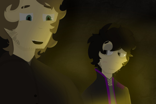
WOW Geist drawing?? I know, it's rare these days. But I finally got some of my OCs out of my brain and onto a canvas and I'm decently happy with the result! I did a lot of experimenting with this one: I learned how to do lineless art the proper way (it is SO much easier than my shitty method before) and worked with fire lighting for the first time, as well as different blending methods and whatnot (I used Multiply and Add for this one). This is a little snippet of the lore for their story I've been developing seriously since 2021, but developing at all since 2020.
The story is set around an archipelago with different communities on each little island. The dude on the left is Doiro Homestead, mayor of a currently unnamed island (I'm changing the names, the originals are no longer canon) that is mining-run. The guy on the right is Angelo Grim, the sole resident of the smallest island in the archipelago, simply referred to as Angelo's Island. His life work is mapping out and researching the Underworld, which is actually a unique ecosystem deep underneath the earth's surface, but the Underworld is linked to negative beliefs by many so he is seen as suspicious to most people he interacts with. Doiro is an exception to this.
Characters without the background and lighting:
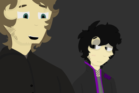
3 notes
·
View notes
Text

Rejoice! Seapunkification Ancestors WIP be upon ye >:)
Left to right, top row to bottom row:
Cronus Vantas (the Signless), Aranea Nitram (the Summoner), Porrim Captor (the Fateseer)
Meulin Pyrope (the Neophyte Orphaner), Kurloz Zahhak (the Salvation), Kankri Ampora (the Acolythe), Damara Peixes (the Timeless)
this is also the first time I posted a drawing of trolls with face plates and pincers, like my headcanons intended <3
My Bloodswap AU tag
.
Design notes (and more!) under the cut!
WELL!!!
I've been dying to draw the Seapunkification ancestors for ages. My partner told me they want to see it, so I thought, "I should do it!!!" So I did, chipping away at it in between my assignments :D
I don't want to deal with thin lines with my disability causing pain and tremors. It's so difficult. So I kept putting it off... now that I don't have to draw with a mouse anymore, this is way faster and easier. Hell yeah lineless art, hell yeah pens! <3
So, this drawing is actually 1 of 2 versions. Why? Because some of these people change over the course of history.
For example, Cronus is drawn in its Signless era right now, instead of the Troubadour era where he was a classic-pop singer and sex symbol. The Troubadour!Signless will be drawn in version 2!
Same with Kankri. We'll see them as the Beguiler/Deceiver/Orphaner eventually, Aranea as the Corsaire, and more.
Now for the actual design notes... Signless!Cronus' design always eludes me.
I used to make him still wear the "50s swinger" clothes to give them a connection to their Troubadour persona/era, but maybe this is further down the line when Cronus is fully into the messiah/chosen one persona.
As for Aranea, I've always seen her as wearing a lederhosen. You can put the sign on the chest, too. The cowboy look is to protect from the sun; after all, she was enslaved by the Orphaner Corps, who doesn't really care if she was exposed to the scorching sunlight. She also couldn't afford glasses at this point.
Porrim Captor's design is straightforward. She was an oracle for the Empress - her favorite, even! - before she escaped and was sold to a cerulean. So she was given a lot of fancy clothes. It gave her a taste for fashion, though as a lowblood, she knew this was probably temporary, and so she learned how to make and modify them. After running away, I figured she'd make her own clothes. The "boob window" is a shoutout to Porrim Maryam's clothes.
Nepeta Pyrope's Orphaner garb is based on IRL military uniforms. They were the first and only Teal who is actually an Orphaner (unlike other tealbloods who work in the Orphaner Corps as administrative or legal staff), so maybe I'll change the color to a more neutral gray, with teal additions.
Kurloz Zahhak spread a message of peace in his church. So I made him dress like the Pope, though somewhat more humble. His title comes from the fact that he protected Limebloods in his church while the Empire hunted them down.
Kankri Ampora, as a rebel, shows their blood mutation, which include their bright red gills, real, nubby horns, and lack of pincers. While they did give up their violetblood privileges when they joined the Signless' revolution, they still have the fancy clothes. This one specifically is based on Central Javanese wedding garb. I actually have been trying to incorporate my own local culture into him and Karkat!
Last but not least, Her Passionate Timelessness aka Damara Peixes... her design is also pretty straightforward. Ocean-related patterns are really difficult to make, though, so after countless trial and error, it's mostly coral reefs. The gold dust is also something I really love. She also has bioluminescent freckles, like Aradia in the anniversary art.
#homestuck#ancestors#hs fanart#homestuck fanart#bloodswap#hom3stuck#seapunkification#art#digital art#WIP#topfsecret.art#cronus vantas#aranea nitram#porrim captor#meulin pyrope#kurloz zahhak#kankri ampora#damara peixes
4 notes
·
View notes
Text
why hello there it is the post in which i yap about the animatic (this one s a pmv but whatever same thing)
as i said in the description. this was my sibling s idea. i like to joke that i have too many animatic ideas about saint but THIS ONE WASN T MY FAULT, OK? it literally goes "who s gonna make it rain?" i had to
i decided to make it lineless! because the song gave me old warrior cats pmv vibes, and i must listen to the vibes. i hadn t drawn lineless in a while, it is significantly easier than i remembered it to be. also a lot faster than i remembered it to be, i technically started this at the beginning of this month but then i couldn t work on it for a while, so i basically made all of it in the last 5 days
this one kinda has less thought put into it than my animatics usually do. it works a lot more on individual lines fitting the character than an overall interpretation of the song that fits with an overall interpretation of a character, but whatever, it s still fun :]. the fall is saint thinking everyone else is stupid and he s the only one who knows what he s doing, terrible things is saint going insane from having to go through their campaign over and over, this one is... saint regretting their actions and doubting whether he s actually in the right, i guess? not really. i don t know. it s just saint being silly
i was originally going to do the first part of the song, but then i had the brilliant idea of making the line "you re gonna drag that rock around the rest of your life" refer to the music pearl and i couldn t resist. listen, saint having the pearl at the beginning of their campaign makes sense, if you know you know. i am also very proud of the "who s gonna keep you sane?" shot (can you tell by the fact that i put it on the thumbnail?), i think i m very smart for coming up with that one. i also think i m very smart for "who s gonna keep the lights on?/who s gonna make it rain?" being shots of silent construct. very subtle, printi (also yes that s meant to be silent construct)
on that topic, i wanted this to have pretty color palettes so i didn t color pick from the game for once! but i was also too lazy to draw the backgrounds very accurately, so now it s kinda hard to tell where anything is meant to be taking place. it makes sense to me, alright? (they re meant to be as follows: the intro shot is sky islands (specifically saint s starting room), "hoping someone else will decide" is the bridge to the wall, "i ve been taking on water" is undergrowth (not only did i decide to do funny color palettes, undergrowth has like 5 different color palettes already. i chose the room just outside that one shelter), "we both know this ship is gonna sink" is farm arrays, "who s gonna keep you happy?/who s gonna keep you sane?" is silent construct as i said, "always looking for the next big ticket/always tryna stretch it one more day" is shoreline. that s all of them i think) also it is so annoying to get references for how areas look in saint, i DO NOT remember all the changed area names. it is forever called sky islands to me, sorry (fake fan smh)
also saint is a different shade of green in almost every shot, because i wanted them to be :]
i also said this in the description but i feel like i ve been relying a little bit too much on editing (mostly trasitions, blurring and tweening stuff in and whatnot), and i like doing that but i also think animatics that don t do that look cool and i want to try to make more stuff with less editing. this does have some tweening on some shots but STILL, i think i did well. i think this looks nice. definitely captures that old warrior cats pmv vibe
also i m not that good at putting lyrics in weird shapes but i think it looks really cool when other people do it, so i tried. ALSO my editing program messed up the timing a little bit (it looked fine in the preview but was a bit off when i rendered it :/) and i m too lazy to fix it. i will have to deal with slightly off timing, oh well
this is the animatic for the month of january!! i m trying to make one animatic every month, we ll see how it goes. i tried this last year too, and it went. somewhat well. i kept it up until the summer (the plan was i take the entire summer to make one big animatic and then continue), neglected space absolutely killed me tho, so i stopped afterwards. i m trying to do this so i can actually get stuff done because i have a lot of things i want to make and if i don t give myself deadlines they re never going to happen. no promises that i ll have something to post every month tho
hello people.
i have drawn more of the green cat. enjoy
youtube
52 notes
·
View notes
Note
How do you ink and color? Any tips? I love your art! 💜🖤
oh shit i got this ask months ago and forgot to answer
inking: god i hate lineart so much. the trick is to not do it 😂 unfortunately, i still find myself spending hours on lineart all the time @_@
the biggest thing i’ve found is making your lines varied in thickness. it adds to the interest. i also try to make my outside line thicker than my inside ones to break up the figure from the background. don’t be afraid to skips some lines and imply them with shading instead. i will color over my lines at the end to make them not as strong, but i’ve learned to still keep some lines black for extra emphasis.
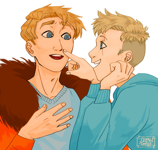
^ here’s one of my older pieces that i’ve been considering redoing. it has very little line variation, ALL the lines are colored so there’s no solid black, and there’s very little hard contrast in shading values. overall, it looks flat and uninteresting and if i had the time i’d redraw this one.
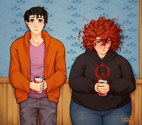
this is a more recent example of lineart that i think works a lot better. the characters are really well defined with a strong outline, but the inside lines aren’t harsh and distracting. you can see i recolored the lineart in kyle’s hair to be a dark red, and in some places it blends with the shadows to imply areas with more highlights. stan’s pants don’t have and lines in them, just the outside shape and pockets.
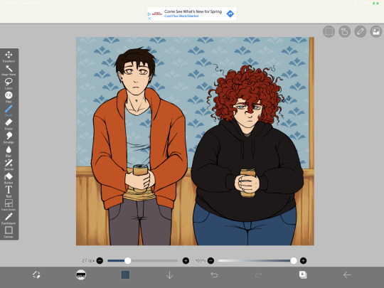
you can see in this wip what the lineart looks like before i do all the shading and fancy stuff. stan’s pants look totally flat and straight until i start shading.
a lot of the time though i won’t even do lineart, especially if it’s a big scenic piece. the more zoomed out less detail you can convey, and lineart takes up a lot of space.
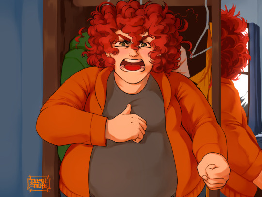
^ this piece is an example where i do both, lineart and no lineart. the mirror image of kyle isn’t the focus, and i honestly didn’t feel like going in and drawing exact lines because they’d probably look fucked up anyway. i typically don’t put hard lines in backgrounds because it would take FOREVER and just be distracting.
the one thing you do have to be careful of with lineless art is contrast. hard lines are good contrast that show you what you’re looking at, and without them your image can blend together.
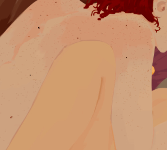
here’s part of a painting i did last august, when i was first experimenting with lineless styles (full image on my NSFW twitter). can you tell what’s going on here? i sure as fuck can’t. there’s no contrast, and it makes all the skin tones blend together in an unintelligible mush.
contrast has always been one of my biggest weaknesses as an artist, so i’ve been trying to improve over time. here’s a more recent lineless drawing:
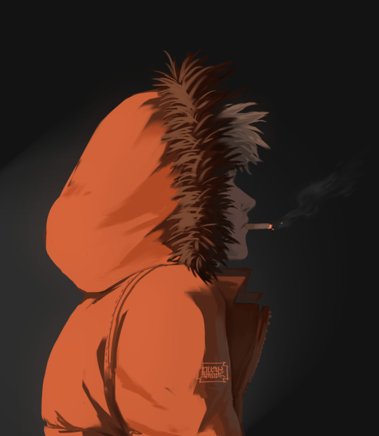
this one works because it had high contrast. the highlights are really bright and the shadows are really deep. you can still make out the facial features too, but there’s no ‘lineart’ layer’. everything was painted on in the same layer.
-
-
coloring: oh my god i love coloring. it’s my favorite part of drawing and the reason why shit takes forever. a lot of the same stuff from before comes into play, like contrast. you can also portray some really interesting moods based on colors if you’re being stylistic, but also pay in mind to your environment.
i always color my background first. in fact, a lot of the time i’ll do the entire background before coloring a piece. the environment establishes your light levels and light source, and it’s typically easier for me to tweak colors on a figure than the ones in the background. in the above example with kenny, the background is a mostly solid black with a beam of light from the left. i picked kenny’s colors to fit in this environment.
it’s also important to use references.
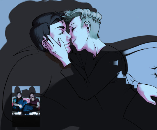
you can see in this wip i’ve got a reference image for how light from a TV looks against figures and the way their shadows are cast across the wall. it also helped me figure out what colors to use in this situation.
a lot of coloring is just trial and error to see what works. i usually start with a flat base color and add value to it. if you put all your colors on different layers it’s really easy to change them quickly.
here’s an example:
i got my base colors down and here i can see the skin tone is blending with the background, so i lightened it up for better contrast
i typically shade the skin first, then clothes. you can see here i did a dull skin tone with a bright colored shadow. this adds more contrast and interest. i always try to avoid doing dull shadows where you shift toward black. black shadows are really uninteresting and they can make your piece look muddy. i’ll typically shade with an orange, red, blue, or purple.
the final piece has a really bright highlight on it coming from behind. this just adds more visual interest and contrast. you can also see i’ve gone back into the pink shadows and added an even lighter, brighter peach value in places to show reflected light. this also gives the darker pink shadow an added outline effect, because it touches the base skin tone but looks lighter within.
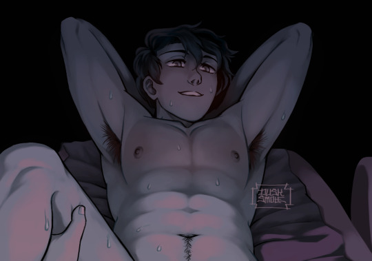
^ this one’s a good example of light and shadow (full image on my NSFW twitter lmao). there’s not a lot of color because it’s dark out, so everything had to be conveyed in values. there’s hard light across the stomach and then a shadow over the chest, but there’s still light being reflected up into stan’s face that lets us make him out. the rest is deep shadow and unimportant, so it’s all black.
that’s the other part, color and value determine where your eye is gonna look, so consider that when drawing.
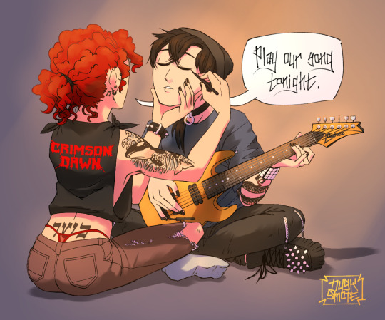
^ consider this piece i drew like a year ago. it has a lot of blues and reds, and originally i was going to make stan’s guitar blue. i don’t have the wips anymore, but it didn’t stand out and it didn’t look right with the image. after a lot of playing around i went with yellow because it’s bright, it breaks up the image, and it adds another color to the piece to balance it out.
the same thing happened when i was working on the cover image for What They Say About Us.
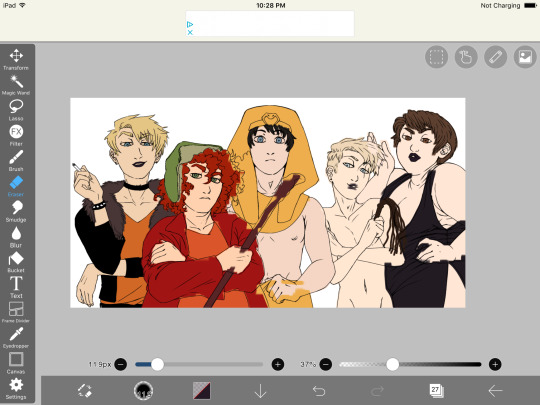
you can see in this really early wip that i’d blocked in the colors and butters is totally naked. for one, i was like “damn that kid is WAY too naked in this image” and he also blended in with stan and cartman. additionally, there was a lot of warm colors on the left, a lack of color on the right, and an overall lack of blue.
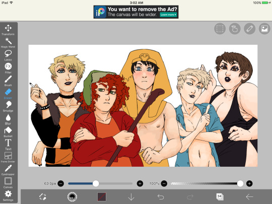
first change i made was throwing a shirt on him and it made a huge improvement. the image looks much more balanced now and he’s not super distracting with his naked-ness.
other than that, coloring is just picking your base colors, blocking in shadows, adding highlight, and cleaning it up. if you wanna improve, look at photo references. look at other people’s art and examine how they use color and value. practice practice practice. have fun with it. the most fun i have coloring comes from figuring out interesting textures like the pharaoh headdress or kenny’s leather jacket.

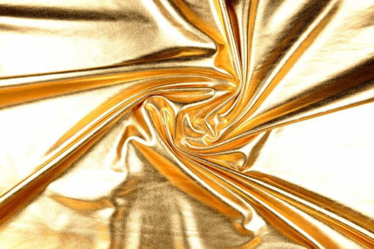
i find stock photos like this and study them to see how the light works
other than that, the rest is just playing around, seeing what works, and making things up as i go!
70 notes
·
View notes
Text
1,000+ Follower Celebration!
DTIYS, Writing Prompt and Mood Board/Edit!
Thank you a thousand (pun intended) times over for helping me hit 1,000+ followers! I cannot express how grateful I am to have each and everyone of you and to have built such a sweet and positive community! I wish I could do something more special on an individual basis but 1,000 people is a lot. So internet hug for all of you!
DTIYS
So as promise, I made a Draw This In Your Style! I have multiple versions to help people who are on time crunches or just want to draw something a little more simplistic to something with lighting and a space background!
Now to clarify, lineless art is my style so if you don't want to draw lineless art then that's 100% okay! Have fun and feel free to add your own twists to it!


Writing Prompt
In order to include other forms of art to help include as many people as possible, I'm also making writing a writing prompt and edit prompt!
"Close your eyes," Deceit whispered sweetly before cupping his hands over Logan's eyes, "What do you see?"
Logan wish he could respond with something mystical such as a foggy forest or all of the dark sides together and happy.
But it wasn't...
"Nothing."
This prompt can go anywhere! Fluff about how Remus shows him how to use the imagination to angst about how when Logan does imagine things it's only violence! Go wild with it! Feel free to rewrite this prompt if you wish to use it in your writing but please keep the concept the same, that being Logan can't imagine or imagines something specific he doesn't want Dee to know ♡
Edit/Mood Board
For this you can use any pictures and it can either be an edit or mood board but there's a catch! You have to use at lease one picture from this blog. ANY picture, including fan art (ask the artist beforehand though and credit them) and other submissions! From asks to full drawings! You can even use the DTIYS picture if you wish ♡
You can also add as many filter and other stuff over the drawing to make it fit if you wish!
If you need a little more guidance, keep the theme to an orange and blue aesthetic!
General info/Rules
• Feel free to tag me but I won't guarantee I'll see or reblog it (Tagging me sometimes doesn't work and I don't want to fill this blog too much) but I'll comment and like it if I see it!
• You can also submit the post here if you want but I would reccomend making your own post for it!
• Please only make one post. You are allowed to do two or all three of the challenges but keep it all in one post. This'll make it easier for me to see everyone's creativity!
• You can always just DM me the post if you're anxious about posting it! I don't bite and your never a both for messaging me♡
• Tag it #1000Snapped or #1000SnappedAU to also help me find it! You can @ me and also tag it, anything to help me find it ♡
• Have fun! This isn't a competition or anything, just a fun thing for people to do to help me interact with all of you more!
Questions? DM, Comment or send an ask ♡
#1000SnappedAU#DTIYS#dtiys#snapped#snapped au#dark side!logan#dark sides#darkside!logan#dark side logan#logan sanders#ts logan#1000Snapped
354 notes
·
View notes
Photo


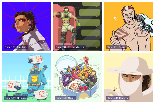
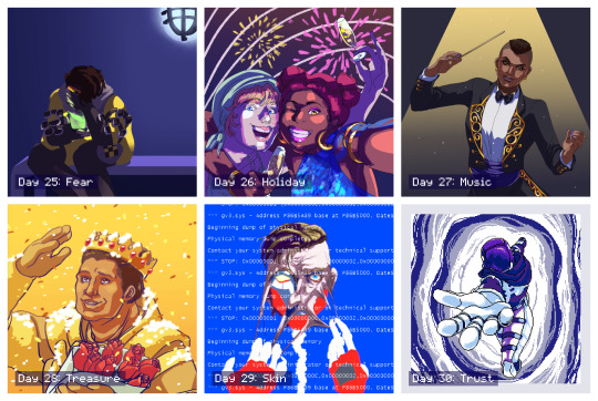

31 Days of Apex: A Retrospection
I participated in the incredible #31DaysOfApex challenge hosted on Twitter, where fans created new content for every day of July based on a one-word prompt. I’ve signed up for/started lots of similar challenges in the past but always ended up having to drop out or trail off before the end... but this time, I managed to complete something for every day of the challenge!
My only goal was to make something by each day’s deadline, and it was a really interesting exercise both in technical skill and also in my management of not only my time, but my expectations and energy. Below, I go into more detail behind each piece.
To preface; the beginning of this challenge coincided with the beginning of a new personal time-management exercise where, for 5/7 days a week, I would only go on the computer at night. Combined with the deadline, this had an interesting effect on my time management and the quality of certain pieces.
Day 1 - Memory
From the start, I wanted to use the challenge as an opportunity to do more studies and to push myself wherever possible. This was the first piece I did and I had more time to work on it, so I used it as a digital painting study. I still think it’s a strong piece and it’s probably my favourite of the month. Symbolically, this character’s backstory doesn’t match up with her own memories, so the idea is she’s missing information she can’t quite place or remember, and this both scares and comforts her.
Day 2 - Blood
Another digital painting and lighting study that didn’t work out as well as the first, mostly due to time constraints meaning I couldn’t scrap it and start again. While I don’t like how it turned out, I did learn a lot. The character on the right is a field medic, and my intent was to show the calm after a successful rescue.
Day 3 - Mercy
Some days I relied more on the humour of a piece’s concept than the skill of its execution, though I also liked how this piece turned out artistically. After two days of intense studies, though, this was very quick and easy for me to turn out as it relied on existing skills.
Day 4 - Prize
This one thankfully came together very quickly, which I credit to the two previous painting studies making it much easier to achieve what I wanted. The character is searching for the disembodied head of the man who killed her parents, who is now acting as a robot, hence the vaguely half-machine-half-human silhouette in her hand.
Day 5 - Family
Another quick, simple illustration under a time crunch. The character framed by the nameless foreground figures has no memory of herself or her family.
Day 6 - Noise
For some pieces where I was under a time crunch, I experimented in an opposite direction; instead of studies, I played loosely with different techniques/brushes/etc to see what came out. This was a lineless style I ended up employing a lot when short on time. The piece pictured here was just one of four alternate colourways, presented in a pop-art style. The character is almost always depicted with thick coverings over her ears, so I thought she might be sensitive to auditory overload. This particular piece was retweeted by the character’s voice actress!
Day 7 - Mask
More relying on humour for lack of time/a better idea. A fun experiment in colour, though.
Day 8 - Healing
Another technically “easy” piece but with a stronger concept. It was actually pretty hard to get the reflection & condensation elements balanced right. The character pictured has a narrative thread relating to an old ex he has trouble moving on from.
Day 9 - Weapon
While obviously another joke, and made to be finished quickly, it was surprisingly difficult to get the duct tape and knife to read clearly without over-cluttering the lineless image. This little ‘bot is a drone used by one of the playable characters to hack areas of the map; it’s not NORMALLY an offensive weapon. This image was promo’d in a video stream by the character’s voice actor!
Day 10 - Truth
I only had less than an hour to finish this one by the deadline, but I still tried to experiment with silhouette and colour. It was surprisingly hard to get the interior silhouette to be legible. The outer silhouette is a playable character (not easily readible unless you’re familiar with his design) and the inner silhouette is his sister, whose disappearance he is trying to investigate.
Day 11 - Shield
A fun, self-indulgent one. Had a blast simplifying the game’s characters down into little caricatures. The character in the centre has abilities related to shields and protection, so many other people were drawing him for the prompt; I wanted to try and flip it, so I picked other characters he would be friendly with, and picked a non-lethal, lighthearted setting.
Day 12 - Ruins
Short on time so did a quick lighting study. A recent game plot has changed one of the areas of the map, submerging it in water and leaving it to “ruin”.
Day 13 - Hero
Another painting study. Really didn’t like how this one turned out, but had to turn in something, and I did learn a lot in the process. If I’d had more time I probably would’ve scrapped it and started again. This characters had recently been revealed to have been manipulated by another character who used gas-based offenses, whom she admired.
Day 14 - Rest
I was going to be away from mt computer until after the deadline, so I decided to make a traditional piece. I ended up enjoying it so much I tried to take the time to do a few more traditional pieces later. This piece was sort of a comedy of errors; I had to do it while I was out, and the pen I had brought with me to ink my sketch ran out, so I had to make do with a blue ballpoint pen, and I was missing several colours of coloured pencil. I think the finished piece reflects how rushed it was, and it did’t meet my concept, but I do still like it.
Day 15 - Skull
Another quick one but I wanted to experiment with a different line style. Wanted a sort of “graffiti” effect. One of this character’s skins includes a skull-shaped mask.
Day 16 - Growth
Extremely quick play on words because I didn’t have the time to work on anything meaningful and couldn’t think of anything better!
Day 17 - Home
Another traditional piece, this time by choice and with more time. Markers. It looks extremely like some janky art school homework on 2 point perspective because it extremely is. Perspective and backgrounds are very difficult for me - they just don’t “click” - but I had a lot of fun with this one. I kept my mistakes intact because I didn’t want to edit it too much. A lot about the technical perspective is wrong, but I think I achieved the “mood” I wanted. This location is a bar owned by one of the player characters where many of the other characters are shown to meet.
Day 18 - Sky
Very happy with how this one turned out, even though there are still lots of problems. Markers again. There’s a lot I would fix next time, and I think technically it’s lacking, but there are some specific areas I feel happy to have achieved, such as the almost brushed texture of the curved metal above his shoulder and the values of the shadow/reflections on the underside of the head piece. I’m also happy with how I was able to draw from my shoulder rather than my wrist when inking the curved lines, something I struggle with.
Day 19 - Target
An experiment in pushing the lineless style I’d already been playing with for a stronger likeness. The pose and expression in this could both be pushed more but I like the result. This character had just learned that one of the other players, whom she had trusted, was actually sharing her secrets with her enemy, and she didn’t know which one it was.
Day 20 - Friendship
I had this one concepted from when I first looked over the prompts. It was a fun challenge trying to simplify all the elements into the lineless, blocky style while being legible. This character has a strained relationship with one of his friends, and finally pushed her too far with his selfishness, and she now no longer responds to him.
Day 21 - Scar
Quick joke. This character was introduced briefly as a red herring for another character before being killed off. He was stabbed through the chest by another character’s hand, hence the scar pattern.
Day 22 - Dream
I wasn’t sure about this one while I was making it but I ended up liking how it turned out. I wanted to capture the character’s robotic legs bent at an unnaturally straight 90 degrees, like a Barbie doll. The flat background and lighting make it feel like an indoor stage. The little “electric sheep” are inspired by iDogs.
Day 23 - Meal
After a few days of not having time to really spend on any piece, it was fun to get to spend time on concepting and composing this. I always admired these kinds of watercolour-like food illustrations and this is the first time I’ve had any success in creating one myself. I concepted and sketched out the individual items traditionally before working out the composition within the box digitally. Each food item/utensil is inspired by the different characters’ design elements. Only two of the now-current characters are excluded due to plot reasons. In particular, I like how one of the character’s dome-shaped shields acts as the base and cover of the box.
Day 24 - Hobby
Wasn’t a fan of how this one turned out. I think the likeness is a bit off, and his facial anatomy is skewed. But I also like how the general composition, tone, and bee turned out. This character’s concept art originally imagined them as a beekeeper who would use smoke to fight.
Day 25 - Fear
An incredibly rushed piece that I intended to go back in and add more detail to, similar to day 4, but I actually took a step back and decided I liked the blocky, flat-colour version. This character is the youngest of four, all of whom are MIA or worse, along with his father, and his mother is losing her memory. He’s talking to her through a handheld holographic device. This piece gained more traction, most likely thanks to the subject matter since this is a popular character.
Day 26 - Holiday
I didn’t want to do a religious holiday like Christmas or Easter. A lot of other people also interpreted the prompt as a vacation, but I had already done a sort of “beach vacation” piece for day 11, so I instead went for a “public holiday” and chose NYE/NYD. This was fairly quick but the lighting was an interesting experiment. I knew this one wouldn’t be as popular because it wasn’t as “flattering” but I personally really like it. The girl on the left is kind of goofy and completely un-self-conscious and I think it’s captured here.
Day 27 - Music
Really didn’t like how this one turned out. I don’t think the likeness is good at all, the lighting is poor, and the gold detailing feels lazy. But I liked other elements, such as the pose and the clothing.
Day 28 - Treasure
This is my least favourite of the entire month, but I also had the least time available to work on it before the deadline so I had no opportunity to scrap it and start over, which I sorely wanted to do. The likeness is terrible, but more than that the base anatomy is off, the pose is stiff, and the lighting/colours are cheap. I wish I could’ve done better by this character; but, I am glad I had something finished at all.
Day 29 - Skin
This was probably my third attempt at this picture and I’m still not happy with it, but again, I had to finish something. I almost considered scrapping the concept entirely and choosing something easier but ended up seeing it through. The concept itself is actually recycled from an older piece of mine for an entirely different fandom, because I didn’t think I did it justice then, either. Would still like to revisit this concept with this character and take more time.
Day 30 - Trust
After a few days of feeling really dissatisfied and uncomfortable with the art I’d been making, I finally more time to dedicate to a piece, and I’m overall happy with how this one turned out. I decided to go for a different medium entirely with pixel art, which also gave me the opportunity to try and animate it. I started off confident and then started to get worried towards the end, but all the elements came together when I added the portal colour effects. This is an alternate reality version of one of the player characters, who appears through a portal and allows that character to escape the facility she’s being kept in, encouraging them to trust the “voices” she hears which are actually versions of herself trying to help her. This piece was retweeted by the official Apex Legends Twitter account!
Day 31 - Freestyle
I had this planned out early in the challenge and I’m really, really happy with how it turned out. It’s probably tied with my favourite along with the very first piece (how fitting). I was worried about how I was going to capture the movement without over-complicating the lineart, having so many people in one image, etc. before I realised the focus was entirely on gesture, and then everything clicked. I went for a thicker brush, which forced me to conserve my lines, and tried to simplify each character down to the bare minimum needed to recognise them. They’re also all wearing new non-canonical outfits so I used their familiar colour schemes for the same purpose. It’s not perfect, but I love it, and it’s everything I’d hoped I’d be able to end the challenge on.
I really, really enjoyed the entire month and the way it tied in with my new time management schedule. It gave me some achievable short-term goals which added up to this long-term achievement I can now look back on; I learned a lot both about balancing my energy and about technical skills, I found ways to stay motivated, and most importantly I learned to not get caught up on the individual slip-ups and pieces I didn’t like as much and to instead focus on the bigger picture. Thank you to everyone involved in organising and supporting this event! I found so many other incredible fanartists, writers, and content creators through this challenge and I can’t wait to see the bonus content released over August!
4 notes
·
View notes
Note
I love your game and hope that you don't mind me asking about how your sprites were animated so fluidly. Is it easier to animate lineless sprites or lined sprites?
Thank you so much!!! Glad you loved my lil’ game T_T!!!
General thoughts on how to do animations will guide my thoughts better, I think, I hope you can bear with me a little bit.
I started doing animations on my own with anglerman giving me tips here and there (for the rpgmaker demo)! The “tips” can be translated as him coming at me and saying it was very ugly/looked like poop and why. Getting a honest friend that will say your stuff sucks and why will help you improve faster and get rid of the ego as well! That’s my first tip!
Now anglerman joined our animation forces, and that person is a god, he learned animation extremely quickly (in comparison to me, this slow ass taurus person), and he says the only way for him was that he already knew a shitton of anatomy. By knowing anatomy you kinda know how bodies work, essentialy, which makes you to skip around like 10 steps to make good animations. A lot of new artists overlook anatomy, but anglerman and I as well, took a long time only doing anatomy sketches before trying to do final products (in school I would fill up whole notebooks with anatomy poses, drawings of arms, hands etc). Anatomy is key to understanding movement, and further, making animations. Another key point too, is as someone who is new to anatomy, doing overly exhagerated animations will be better than subtle ones. This means redrawing each frame taking attention at each detail and the details being VERY different from one frame to the other, but not making a illustration at each frame. It can be all over the place, tbh, animation artists vs illustration artists are very different minded people xD usually animators have more of a rough sketch, more fluid from the get go, more interest in cool poses than beautiful final touches and 8 hours of lighting retouches.
Lined sprites are easier as they can go in any BGs, but more difficult as you have to draw all of them and that’s a fricking huge hassle omg, I would never do that unless I’m in look for pain! But I’m lazy and like to do things quickly/swiftly! Non lined sprites will mingle with BGs at some point, you either are a carefree person who accepts that and goes forward, or you suffer forever and try to match every bg of your game to your character. A nice idea is making some stylistic decisions before producing, like a set palette for backgrounds! I didn’t do that, now I suffer :D
some other tips that i used for learning!
these vids here about the 12 principles of animations
this talk here by skullgirls animator
checking old fighting games to check their keyframe animations!
and this is a vid of a animation being done for vvtz!
Hope this all helps! It’s not much, but was exactly what I used when I started! xD
20 notes
·
View notes
Text
your local hunny’s art tips
So yeah, I’m actually gonna commit to this. Note that my experience is different to everyone else’s, I’ve officially drawn for 6-5-ish years, and my style of drawing may be different. I’m just a fucking baby and maybe this is some obvious shit. But yeah, I wanna give out some tips as a thanks to the SMITE community and such.
1) Take small breaks in between, step away from the art and do something like go on your phone or eat shit, before going back into the piece in your own time. It's obvious shit, but often we can't help ignoring the urge to take a break.
2) Draw to your aesthetic! Draw your faves w/ instagram wavy eyebrows or glossy eyeshadow, or draw them in your favourite or dream outfits. The enthusiasm and the excitement provide the perfect motivation to do things like being more productive or experimenting and getting more creative.
3) The brushes I use for painting at the present moment are here, for my lineless art, I use a solid ink pen and this blend brush.
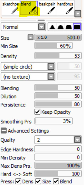
4) When it comes to blending, it's better to use an acrylic brush with high blending and low opacity, and the colour picker. It's more realistic when the blending has texture - especially when it comes to the skin.
5)DON'T HESITATE BITCH!!!!! ! ! Don't be afraid to use different colours for shading (it's more vibrant), experiment w different poses and expressions and techniques. In traditional art, I go ALL OUT by drawing w ball-point pen and messily scribbling w copic markers.
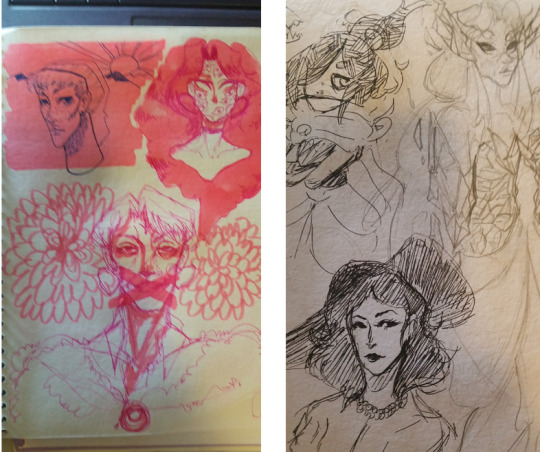
(If you want more examples of not hesitating bitch, ive got a handful of traditional art on my art insta)
When you don't hesitate bitch, you earn more confidence and your works look more fluid and have more character. If you mess up?? Girl ur good, learn from ur mistakes :*
6) A friend was the one who told me this, and without this bit of advice, siiiiiiiiis I'd be NOWHERE. It's basically 'You know you're good, know your worth. Yeah, validation is great, but don't go looking for it in order to believe your art is good."
7) Super fucking obvious, but alter your drawing environment that optimizes as much productivity and comfort as possible. For me, I need bg noise, I have a playlist w songs that get me in the mood, I Skype call or go on Netflix/Stan (I like watching Brooklyn Nine Nine, 1000 ways to die, 50 ways to kill your lover, RuPaul's drag race, or deadly women)
8) You know how they say that in order to prevent same face syndrome, you use various shapes? That shit works. Do it. That was how I finessed thru my smite requests
8) *WILL BE UNDER THE READMORE, THIS IS THE ONE I WANNA TALK ABT A LOT*
Aside from using references for what you'd normally use refs for, I use references to mainly diversify chars.
I'll explain fully, when I draw certain POC chars, I find an appropriate model/face claim that suits them - this helps me to 1. Make them look more realistic/unique and 2. POC w/o shooting in the dark. This is usually for adapting the char to my art style, so if its an irl POC then I’m good. I don't use this for just POC chars, often I use models that look as close to my ideal idea or look for a character or poses that I like. Usually I keep the likeness or I exaggerate, as long as I have a visual reference of my idea.
Mainly my ‘models’ are actors or models, often from Instagram. I like using poses from older paintings or Instagram photos. Basically, I use Instagram a lot.
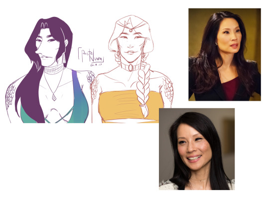
An example of using a POC to help model another POC. I like Lucy l.iu for nu wa bc of her elegant and mature look, also I like her facial structure. (Also she doesn’t look completely like Lucy but it was during the time where I was still getting the hang of likeness). Comparing her to the model I used for Chang’e, you can see different shapes and facial alignments.


I wanted to capture Chronos’ jawline perfectly so it caters to my style, so I use my insta crush bc he has the jawline I need. I find the post w the right angle and use it, then I thought he wouldn't look complete w/o the large lips nopalitoss has, so I gave it to him. He looks cooler and the looks gives him more of a vogue handsome look while still maintaining Chronos’ maturity.

For Nu Wa, I used Justine’s (my other insta crush) poses so I could capture this Instagram ‘feelin’ myself’ vibes for the piece I'm working on. I use various and mash them together to get what I envisioned. Also Justine is my body reference for Nu Wa.
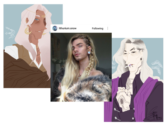
I referred to this guy in order to give Thanatos an appropriate hairstylbc I didn't want Thanatos to have the same hair style as Chronos. I also used him for Chronos,I used this pose for him which I thought looked neat. Same model, different purposes.
Of course this accommodates to my style so it may be harder or easier for yall to find refs. However I still think its important to use refs for drawing poc characters, so that you gain a better understanding of certain features pocs possess.

So this concludes my art tips, kudos to you for reaching to the end and listening to my ramblings. Hopefully these would help in some way, if not, then I hope it was a nice read. I’ll do one more part, it will be a tutorial so feel free to hit me up w what you want to learn/or know what I do in particular.
33 notes
·
View notes