#but esp with how bad that updated employee handbook was too and it still had stolen renders from fans in it...
Explore tagged Tumblr posts
Text

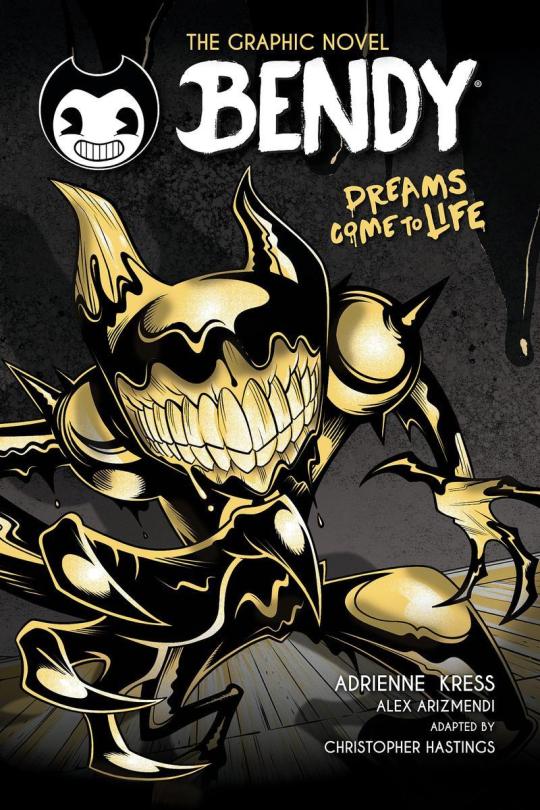
Wow, so umm... This looks bad, not only is it inaccurate due to using the wrong ink demon design [unless this is confirmation BATIM Ink Demon has been outright retconned... Which would make me pissed enough to make a new post just about THAT] but from an art standpoint this is just... Confusing and poorly done.
I wouldn't care if this was fanart, of course you should support young, indie artists... But for a Graphic Novel making sure your cover doesn't look like something Butch Hartman shat out in an afternoon is kind of important. Remember they're going to be asking us to give money to them to read this. The artist likely won't see any of that money and neither do the authors most of the time, not to mention this art screams of the artist being underpaid and overworked.
Like they Had to get something on someone's desk and their boss said 'good enough'. A concept Joey Drew Studios is very familiar with considering the allegations of poor working environments that Kindly Beast. Not to mention Mike Mood admitting in a Reddit AMA that they did in fact rush projects like Showdown Bandit. [Which they sold at full price]

He also says they can in fact say no or yes to designs involving their IP. Either Mike or Meatly had to say yes to this cover, according to his own damn words.

And do you really think this company in particular would care enough about its fanbase to not sell them garbage? They have done exactly that on several occasions. It's not like they care particularly about art either, considering their previous use of AI Art. There was no apology or even posts addressing it... Instead, they just rushed out an archives update to their game to get people to stop talking about it... Even forgetting an entire character in it. Again
This company is [or at least SHOULD BE] on thin ice when it comes to being suspected of misleading their fans or rushing out crappy products to them.
So with all that context in mind, I'm gonna talk about why this cover sucks ass.
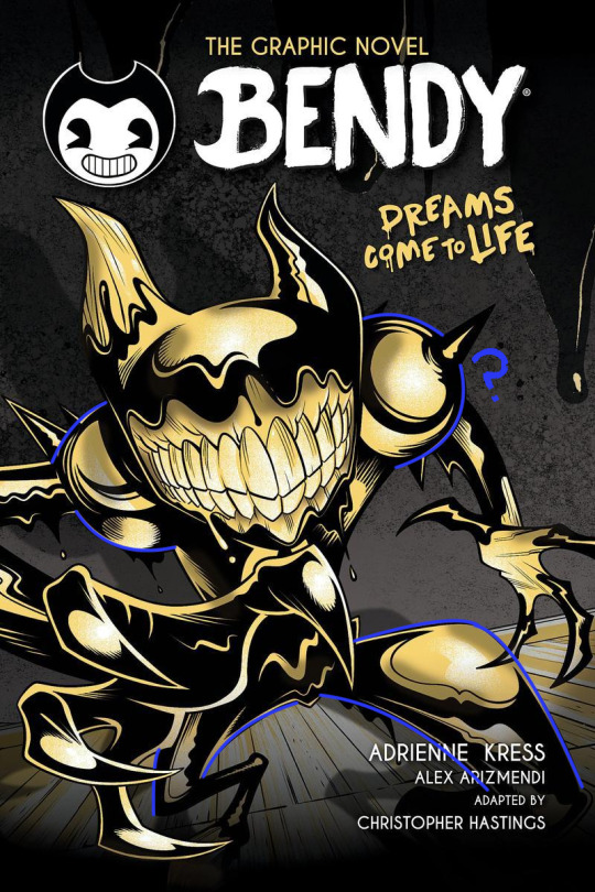
The light sources are all over the place? Why does it look like someone put maces or knight armor on his shoulders but it's just flesh?? It looks both gross and weird [not in a good way either]
To explain more I'm going on a rant below but sadly this seems to have been confirmed to not just be a rough pass but the final cover and man... I am not excited about this graphic novel just at all. This felt like it really drained any possibility of it turning out good for me and I already had expectations low.
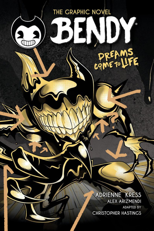
Okay first point, the light sources?? And there is no consistency here with the shadows or lighting, it looks like there's a hundred light sources all at once but none of them are even consistent!

the arrows here represent all the different light sources I can make out and yet the the shadow clearly implies there's only one. I understand wanting to use highlights to give the character a more clear shape but then just give him one or two lights behind him or in front of him? No matter how u follow the light sources, the highlights make no sense and the shadows make even less sense.

Why are the shoulders like that? Like on the legs it's a little understandable, at least those are clearly very heavily affected by perspective, for me I think they are so exaggerated it makes it look like one of the legs is either huge or one is small but that's maybe subjective.
However, the shoulders are unjustifiable, what happened there, what did they do??
I could pick on so much more honestly, how the color choices of piss yellow with no other colors being used, and the harsh pitch black being used for every part of his body is weird. How it looks straight out of Butch Hartman's recent crappy art. But to put bluntly bad start! Also what the HELL is going on with this background??
Seems once again the Bendy team is fine with sending out stuff thinking it's "Good Enough" for Bendy fans and honestly the people trying to tell me to "Be Grateful" for this are just proving that no matter how many times you betray your audience some of em will defend you!
Which is sad tbh. If anything we should be putting MORE pressure on the Bendy team to do better. Cause we deserve better than this, honestly we do. There are amazing artists in the bendy community who could do so much better for a cover. They've employed their fan artists before... Wouldn't it be great to do that for such a lore important book? The book that gives us the identity of one of the main characters in BATIM? The character you spend the entirety of Chapter 4 fighting to save? Not to mention will give several major characters their human designs?
But I guess this is... Good enough...
#ramblez#batim#batdr#bendy and the ink machine#bendy and the dark revival#sorry I've been on a positivity streak with bendy I know but I have to be honest and being honest I think this sucks lol#Im sure plenty of people Disagree and while I would argue this is more objective than subjective people will ignore me if they want to#maybe Im just a hater idk#but I do know one thing I sure do hate this and Im pretty sure Ill hate this novel and its designs#but maybe I wont ya never know#anyways if they do retcon batim ink demon I will make a post abt how much I dislike batdrs ink demon design#and why I think all the people saying its better than the og seriously arent understanding#what made batims ink demon good or character design in general tbh#to put bluntly just bc something is popular opinion DOES NOT make it right or a good idea design wise#not everyone is qualified to be a character designer and thats just good advice in general tbh#anyways yeah thats it sorry im being mean today </3#I simply think corporations shouldnt be able to rush out crappy products to their fans and get paid for it but ig thats a hot take now#but esp with how bad that updated employee handbook was too and it still had stolen renders from fans in it...#yeah I dont think theyve learned a damn thing
25 notes
·
View notes