#but doesn't get rid of the button on the bottom of my screen
Explore tagged Tumblr posts
Visit Tumblr Blog
Explore Tumblr blogs with no restrictions, modern design and the best experience.
Last Seen Tumblr Blogs


Fun Fact
Celebrities use Tumblr as well.
Note
hey! been an enjoyer of your art for a while now (been offline Tumblr for a sec) and noticed you do BG art!
I low-key wanna get into BG but I don't know where to start or even what to expect. Do you have any tips for anyone wanting to get into the og BG games? (I don't wanna play BG3 rn I wanna start with the OG games)
sure! i wrote up a quick rundown here of the series + dlc + the enhanced editions. as for tips:
play the tutorial! don't skip this, bg's gameplay is not as self-explanatory as it is for modern games. xan also shows up here to teach you how to cast spells, so it's just nice to bother him
play on pc, not on an app (if for whatever reason you were considering the app version). not only is it really annoying playing on the app with a touchscreen, but you can't install any significant mods either, and it's a pain to even access the files in the first place
holding tab highlights all the interactable objects on the screen, like loot on the ground & chests you can open. there's also a magnifying glass button that does the same thing (in the ee version only, i believe)
in the main gameplay screen, hovering over icons brings up a quick tooltip that tells you what the icon is, but for full info on item/spell descriptions you'll have to click into the character's inventory/spellbook/etc and right click on them there
i regularly look things up on the wiki, because one of the things you'll probably be wondering once you enter combat is "how do i get rid of this negative status effect?!" status effects show up as tiny icons on the character portraits, and you'll have to click into the character page to see the actual name of the status effect, at which point you can drop it into the wiki search bar and find out how to get rid of it
another reason to keep the wiki open is to find out your enemies' weaknesses, so that when your companions are like "my weapon/spell has no effect!" you can change tactics
keep an eye on the log (that text box at the bottom of the screen)! i know, it fills up with a lot of information during combat, but you should keep an eye on how much damage you're doing, especially if you find out you're doing no damage at all
i regularly play with a walkthrough (bg1, bg1, bg2) because i hate backtracking and never want to miss a thing (you don't have to use the walkthroughs i linked, they're just what i have on hand). they are filled with spoilers, so i'd recommend trying your first playthrough without a walkthrough, but if you get stuck they're helpful for telling you what you need to do to get back on track with the main quest. bg doesn't have quest markers or individual quest trackers or anything, just one journal that every single quest update gets piled into (wow, just like real life!) so it's definitely possible to lose track of where you are if you're too deep in side quests or if you stop playing for a week
#sovo answers#hope that helps! i'm sure there are better beginner guides out there but these are the first things that come to mind for me
26 notes
·
View notes
Text
How I Make Gifs!
I've gotten multiple asks in my inbox about the method I use to make these animal crossing gifs:
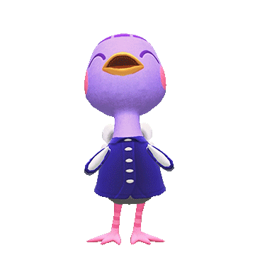
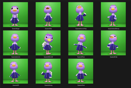
So I figured it was about I time I answer these asks in the form of a separate post using gifs and screenshots to help explain things! I will warn that this will be an EXTREMELY LONG explanation, but I want to give as much details as I can under the cut. I'm going to use Queenie as my example!
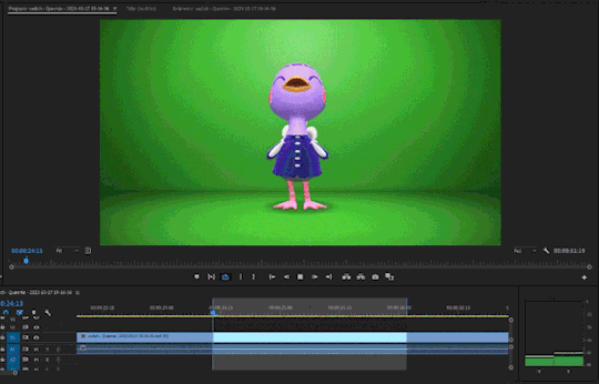
The first thing I do is go to Photopia on Harv's island, a place where you can take photos using any of the villagers in the game and all the items you've collected. I use the Custom Designs app on the nook phone to download different colored wallpapers and floors. The colors that I use depends heavily on the villagers. I've used different backgrounds to make these gifs: green, blue, magenta, and (very rarely) black. For Queenie's colors, it was best to use green! I usually place the villagers towards the back of the wall while I stand in the center of the room. From there, I take out the phone's camera and start recording different reactions.


To record these I use my capture card, the Elgato HD60 S, and the capture software that you can download from Elgato's website. Any capture card and recording application will work.
I use three adobe apps to make these gifs: Premiere Pro, After Effects, and Photoshop. I know not everyone has access to these, but I was able to obtain these with the help of some friends. I won't go into details, but I will leave you with this image as a friendly reminder:
Premiere Pro - Here is where I drag all of my videos down onto the timeline and begin the editing process!
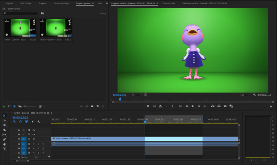
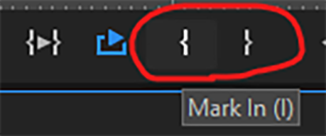
I try to find the best looping points for each reaction. I mark those points using the "Mark In" and "Mark Out" buttons located at the bottom of the preview window. The "Mark In" sets the starting position for the villager reaction and the "Mark Out" sets the ending point, creating a bracket for that specific reaction.
After marking these points, I use the "Play Video In and Out" button and then I make sure to click on the "Loop Playback."
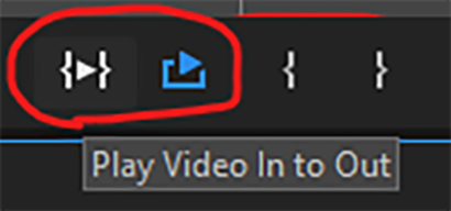
This will not only play the parts of the timeline that I've marked, but it'll loop that exact bracket.
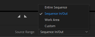
From there, I go to File > Export > Media (or ctrl+m on keyboard). This will bring up the export settings window. I turn the "Source Range" tab to "Sequence In/Out," so it only exports the spots I've marked with the "Mark In" and "Mark Out" buttons.
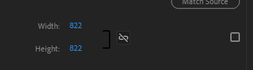
I then go to the source tab at the top and select the cropping tool.
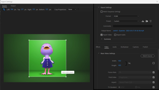
I make sure to click the box under the "Match Source" button to remove the check mark, and then click the chain icon next to height and width settings to put a slash through the symbol. This allows me to freely crop the video and adjust the height and width of the output, so I can make a perfect green screen box around the villager

I then export this video and move on to the next reaction. I have folders for each gif set that I make. They usually look like this for all the villagers I've completed sets for:
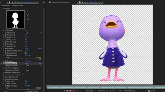
After Effects - Here's where I open all of the reaction files. I go to the effects panel and open the keying tab.
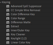
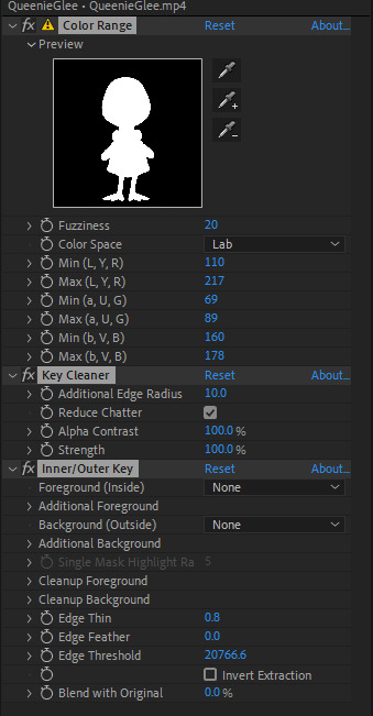
This is where the magic happens! There are three keying effects that I use: Color Range, Key Cleaner, and Inner/Outer Key.
First Effect : Color Range - Starting the keying process, I use dropper tool on any part of the green that's behind the villager. This will only remove some of the background elements because how unevenly colored the green is, due to the lighting of the game.
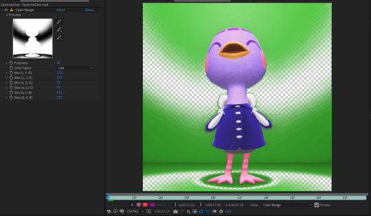
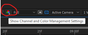
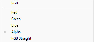
I then use the dropper with a "+" icon on the rest of the background. What helps me is clicking the "Show Channel and Color Management Settings" button at the bottom of the preview window and switching to the "Alpha" view. The alpha channel deals with the transparency of an object and switching to this view allows me to see every bit of the wallpaper and floor that remains. This is where I can apply that dropper+ tool to get rid of them. It doesn't have to be perfect, because the other keying effects that'll be used will help get rid of the loose pixels of green that may still be present.
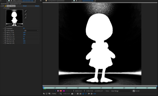
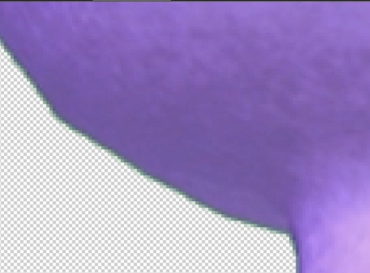
From here, the only adjustment that I sometimes use under this effect is the "Fuzziness" tool. Some villagers will have various color patterns that'll get keyed along with the background. Bringing down the fuzziness helps bring some of those colors back. This does run the risk of bringing some the background pixels back into the video, but that can easily be erased. I usually don't need to adjust the fuzziness. Again, it all largely depends on the colors of the villagers. After all of this is done, I now have a transparent background, but now there's a green outline around the villager:
Luckily, the next effect will help with that!
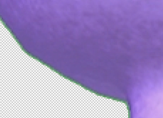
Second Effect: Key Cleaner - This plugin helps clean up the alpha channel around the edges of the villager. The only thing I do here is select the box labeled "Reduce Chatter" and turn the "Alpha Contrast" all the way to 100%.
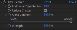
This helps erase most of the outline and makes the edges a little sharper, but there's still a tiny bit of green that surrounds the villager.
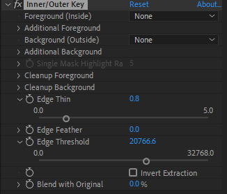
Third Plugin: Inner/Outer Key - I will admit that I don't utilize the entirety of this effect's capabilities. I only adjust the "Edge Thin" and "Edge Threshold" sliders, which should shave off the rest of the green outline.
Using these tools, I've now completed the keying process and I have a nice, crisp villager reaction with a completely transparent background!
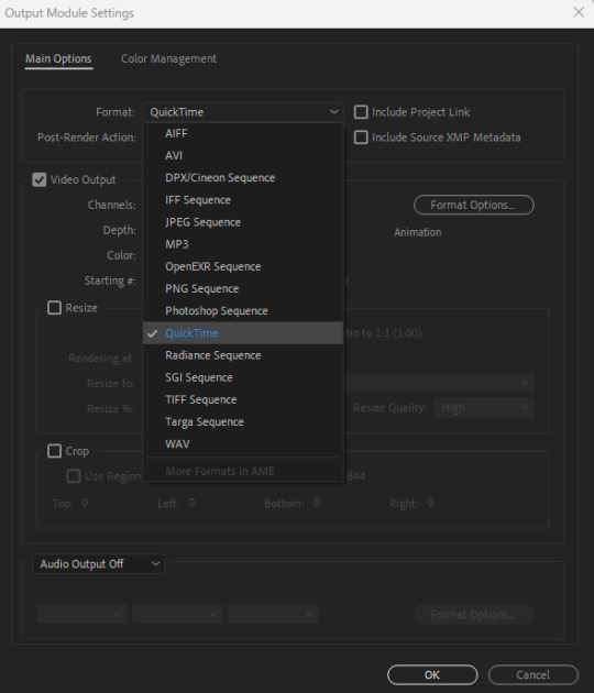
Next I go to File > Export > Add to Render Queue (or ctrl+m on keyboard). I bring up the output settings by clicking on the "Output Module." I then change the format to QuickTime, which will render the reaction as a ".mov" file. I then change the channel to "RGB + Alpha" to render the object (which is the villager) and the transparent background.

Once this is done, I hit the render button and the reaction has been exported! After doing all of this with the first video file, I highlight all of the effects that I've applied from the effects panel by clicking on the names:
I then hit ctrl+c on my keyboard, open the next reaction into the timeline, and then hit ctrl+v. This copies all the effects applied to the first reaction and pastes them to the next video. I repeat this process for each file so I don't have to redo the entire keying process for all of the reactions. After they're all rendered, I can move onto the final adobe step.
Photoshop - This is where I open all of the QuickTime files that I've exported from After Effects.
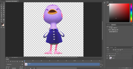
From here, I can apply any adjustments to the villager, whether it be adjusting the brightness, messing around with the hues and saturation, increasing the speed, etc. The main thing I do here is decrease the size. These files are usually huge so I have to adjust the size so I don't risk putting groups of extremely large gifs on peoples' dash. I go to Image > Image Size (or Alt+Ctrl+I on keyboard) and change the width and height to five inches. Of course, any size you choose will work. Five is just perfect for me because it's not too small to ruin the quality of the gif.

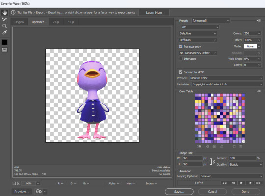
After this is done, I got to File > Export > Save for Web (or Alt+Shift+Ctrl+S on keyboard). This is where I can preview the gif.
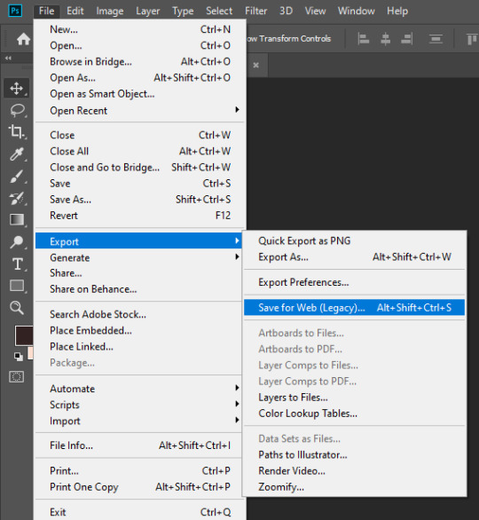
I go to looping options on the bottom right and change it to "Forever," otherwise the gif won't loop. I then turn the matte to "None" so the gif doesn't export with an outline around it. I also make sure that the transparency box is checked. This is what my window looks like before I hit the save button:
Once I hit save, that's it! Queenie has been exported as a gif. You can see that gif at the top of this post.
If you've made it this far, thank you for reading all of that! I know some parts of this could've been just a simple summary, but I really wanted to show all the details of how I use every application in this gif making process. I will say that I'm no expert at adobe. This is just a method that I pieced together after experimenting with different combinations of keying effects and I managed to make it all work. I apologize if this process seems messy to advanced users out there and I welcome any tips if they help make things easier!
103 notes
·
View notes
Note
do you think you could please do a tutorial for your greys anatomy edit (kinda similar to your brittana edits) i'm shocked if no one has ever asked you before for tutorials (and if you do i'd love to see them) your edits are so gorg and you're incredibly talented !
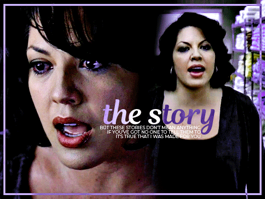
Totally! Bare with me, this is my first tutorial in like 8 years. Haha. I'll show you how I made this one:
For reference, I use Photoshop CS5. (My computer hates the newer versions. It'll run three different video editing softwares but hates photoshop. Idk lol.)
Okay, first you want to make 2 gifs with the same amount of frames. That's important. And then you want to convert them to a smart object.
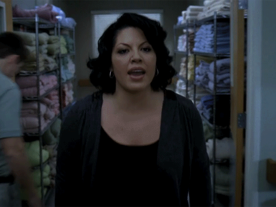
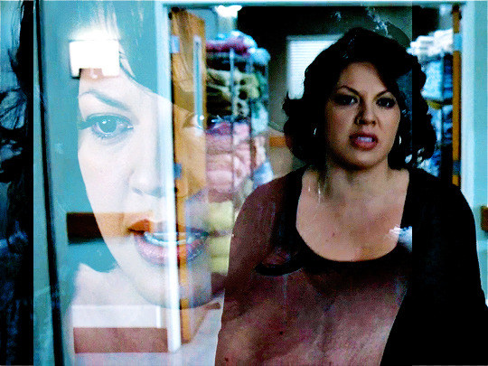
So we have these two gifs.

Now, depending on what you're doing, you can do this next step now or you can color your gifs how you like, save them separately and then reopen them with all the coloring on them. Sometimes I do this if I'm working with a lot of effects but since these two gifs have the same coloring, we're going right click on one of them (it doesn't matter which one tbh) and you're going to select "duplicate layer"
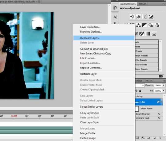
A little box will pop up and this is where you're going to select the project name that you want to essentially paste this gif on top of.
Set the top gif to Screen.
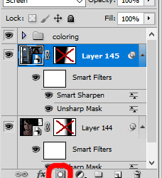
The first thing I usually do is sharpen them. So I use Smart Sharpen and Unsharp Mask with these settings:
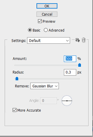
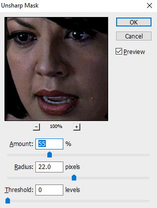
With Unsharp Mask, you have to tweak them depending on the gif, quality, what effect you're going for, etc.
Then we add some basic coloring:
Now, I have a base for specific shows because all shows are colored different. Grey's is more blue toned whereas Glee is more yellow toned. However, since coloring is a bitch sometimes, I'll add a PSD that I use ALOT. You can download it here.
So now that we've sharpened and added some coloring, this is what we have (separately):
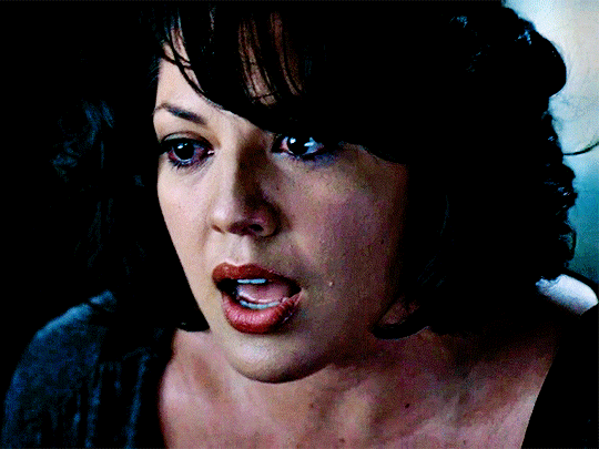
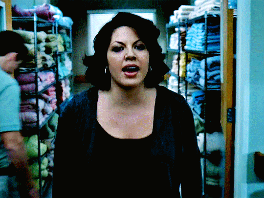
This is what it looks like after I set it to Screen (and I moved the top gif a little to the right.)
Obviously, we need to get rid of those lines and make it so that each gif is more visible.
So now we blend.
On the top gif, you're going to add a layer mask to that gif. So with that top gif selected, you're going to select the mask button that looks like this:
Select your brush tool and use a soft brush to erase what you want from the background of each gif. (Make sure to repeat the previous steps to get a layer mask on the bottom gif.)
I have this now, after using the brush tool.

As you can see, it's very blue and I wasn't feeling blue for this gif so we want to change blue color. That's where the Selective Color comes in.
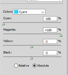
We're going to get rid of that cyan tone. So you're going to add adjustment layer and select Selective Color.
All I did for this one was adjust the cyan tones in the drop down box.
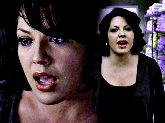
Now we have a pretty purple tone!
Now, we're going to add a light grey squareish box this to outline.
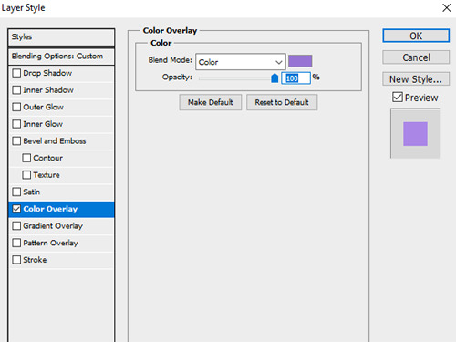
Set the blending mode to exclusion. To get the bar (and we'll do this again with the text) you're going to select the FX icon.
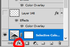
Select Color Overlay. A box will popup. You're going to set the blending mode to Color and then select whatever color you want the bar to be. (If it comes out with too much white, adjust the color of the bar itself to a darker shade.)
Lastly, we're going to add our text. For this gif I used Magnolia Script and Montserrat.
To get the purple effect on the "The Story" text, you're going to do the same thing you just did for the bar.
Voila! I hope this helped. If you need any further assistance, I'm always happy to help!
#tutorial#gif tutorial#blending tutorial#usergif#completeresources#mine#also anon you’re so fucking sweet
128 notes
·
View notes
Note
Hi! Sorry if I'm bothering you, but how do you do your recolors? I've tried using blender and getting rid of the background of pictures to use the graphics, but I can never quite get it right. Any tips?
no bother! :) here's a tutorial below the keep reading on how i do my tshirts. i used gimp (it's free!) and sims4studio, but any 2d image editor or even drawing software should work in gimp’s place.
from your ask i assume you know how to get around s4s, but just in case i'll go from the start.
i tried to make this little tutorial easy while also giving you some extra information and tips, so it might be kind of long but hopefully it’s more helpful that way.
step 1. after opening s4s, click on "Create CAS Standalone" and then on the CAS button:

next you'll see the CAS catalogue.
step 2. select your item
i use the filter options (circled below) since i know the specific shirt i'm looking for, but you don't have to use them or can use different filters. the process is the same for most CAS items, i would say. i just wanted to point out why our screens will probably look different at this step.

i usually choose an item that doesn't have a pattern since those are a pain to get rid of although if you do want to do that, it’s not so much difficult as it is tedious lol.
for male tshirts i always use these since they have my favorite fit in the game:

highlight whatever item you want to recolor and then click the next button in the bottom right corner.
step 3. export the texture
after you've clicked next and named your .package file, you'll see this screen. you don’t have to change any other tabs or anything. just click on export:

save the .png image to whatever folder on your computer that's convenient for you (i usually just put it in my downloads folder) and name it. i normally name it something like "base" so i don't mix it up with my recolored swatches.
step 4. open it in your image editor.
i'm not sure how this would work in blender or if you can recolor using blender, but i know just about any 2d image editor will work. as long as it has a decent select tool, layers, and layer modes, you're good to go.
again, i usually use gimp. regardless, you'll see something like this:

now the fun begins!
step 5. find whatever you want to put on the tshirt.
some graphics are finicky to use and some i've found just didn't work at all like i wanted them to, so if the first few you try don't turn out how you want, don't worry.
i usually go to band's official stores, eyesoremerch, or hellsheadbangers for shirts and stuff.
since i was going to make a shirt when i opened this ask, i’ll go ahead and take you along that journey lol. here’s the image if you want to use it and follow along. it’s also going to be an easy one, since it is just black and white. you’ll see why later on in this post.
step 6. open the tshirt image as a layer in your editor & isolate the graphic.
tip: for gimp you can just paste images into it from your clipboard, so i do that instead of saving the image so i have less clutter in my files and the process goes by a little quicker.
you’ll see something like this:

you can probably guess that this is a little bigger than we want it to be, but first and foremost, i usually get rid of the parts that i don’t want so i have just the graphic. to do that, you can do a couple of different things.
most often, i use the free select tool to trace around the graphic like this:

it will make things a lot easier and quicker, so make sure you get as close to the design as possible. it doesn’t have to be exactly to the edges of the graphic, but you want that selection to be tight!
then click on select > invert. this will select the rest of the image so now you can isolate the graphic. (circled as number 1 on the image below)
now, you can get rid of parts of the image you don’t way a couple of different ways in gimp. either press “delete” on your keyboard which will delete it; or use the eraser tool and make it really big and erase the selection (circled number 3 and 3.2 on the image below); or press the “delete layer” button (number 2).

sorry for this handwriting btw i’m using my mouse lol
all these methods will get rid of the excess (you can see in the next image how it should look). now go to the select menu and click on “none.” other programs will probably have a similar option, it might be called “deselect” instead. there are quicker ways to do this but this is the easiest and simplest for learning purposes :).
if you’re using a different program, you’ll probably want to go with the eraser option as it’s the most likely to work in most if not all editors and be the most easy to figure out.
step 7. resize the graphic.
“but it’s still has a background" i hear you cry. just sit tight, we’ll get rid of it soon.
on gimp, you click the scale icon (circled below). some other programs will likely label this option as “transform.” it can be different for each one.

now click the image and you can scale it by dragging it in or out. this is usually also the way you scale if the image editor has it labelled as “transform.”
scale the graphic down and move it so that it fits on the shirt like so:

try to center it or position it where you want it to be, but it’s okay if you don’t get it exactly right. we will fix that in the last step.
in gimp, once you have scaled the image down, click on that “scale” button that i circled above. other programs might say something like “confirm” or “save.”
and this is why we cut the graphic out before resizing: now you can clearly see whether the graphic will fit on the shirt or not! just makes things a little easier to do it in this order.
tip: when you scale down an image, it will lose some quality. this is unavoidable. the best way to lose as little quality and details as possible is just to make sure you don’t make the graphic any smaller than it has to be and to only resize it once. it will get “blurry” the more times you resize it.
step 8. change the layer mode (or remove the background).
this part is easy, but there’s a lot of different possibilities so this section will probably be the longest.
i’ll show you how to use layer modes so you don’t have to remove the background; what to do if those layer modes don’t look quite right so that you still don’t have to remove the bg; and finally, how to get rid of the bg. and also some other things that apply to different types of designs like colors and stuff.
it’s a lot of info but it’s easy and goes faster once you get the hang of it.
step 8.1. change the layer mode.
more often than not i just change the layer mode. this works a lot of the time for me, but sometimes it doesn’t. you’ll just have to try and see.
for gimp, click on “mode” and then scroll down in the menu and click on “lighten only” like so:

as you can see, the black that was around the design is now gone; only the white design is left!
for other editors, this menu might be in a different place (usually it is in the layers menu, though) and it might be called “layer mode” or something instead. some editors call the lighten only mode just “lighten” but they are the same thing.
other layer modes that work for this trick are “addition” (some editors call it “add”), “luma/lumanence lighten only,” “dodge,” and “screen”. sometimes “hard light” and “overlay” work too, but this depends. just scroll through the layer modes and see what looks best to you.
lighten only also works for designs with colors in them:

now sometimes, you have to make additional adjustments so that this will look 100% great...
step 8.1.2 change the contrast.
let’s say you change the layer mode and your graphic looks like this:

you can see the white has some dark gray bits around it. to get rid of these, just go to colors > brightness-contrast and mess with the contrast until it goes away.

now the gray is all gone!

this also works for colored designs. for other layer modes, you may have to adjust different settings.
sometimes it will make it look a little crispy lol, in that case you might want to go with the removing the background option and then messing with the layer mode.
step 8.2 remove the background.
if the layer mode trick doesn’t work, you still have this option. not every editor has a select by color tool so for those, you will want to just use the eraser tool and do it by hand. not very much fun nor quick but personally i really haven’t found any other ways to do it and also get good results. often the remove bg options aren’t the best.
in gimp, click on “select by color” and for this graphic, click on the black surrounding the white.
you get something like this:

now do what we did before and either press “delete” on your keyboard; use the eraser tool; or in gimp, click on the delete layer button. then deselect.
now you’ll have this:

sometimes you might need to add or subtract from the selection or sometimes it might not look too good, which is why i usually go with the layer mode method.
at any rate, that step’s done.
(final!) step 9. import it to sims4studio & make adjustments.
maybe your design isn’t exactly where you want it to be, and that’s okay - we’re going to make sure it is in this step. if you make recolors often you’ll eventually get a feel for where “center” is on the texture and won’t have to make as many adjustments.
export the .png (make sure it’s .png, so it doesn’t lose its transparency!) and import it back into sims4studio using the blue import button:

(it might look a little wonky in s4s because the model’s chest distorts the image some; you will want to test it in game too to double check)
i’m going to move my design up and to the left some.

much better!
make any other adjustments you want to the graphic and click the save button in the lower right corner.
and now you’ve made a recolor!
you can add other designs by clicking the “add swatch” button on the right and repeating this process. you can also export the swatches’ .png files back out of sims4studio if you should need them later.
there are some other minor touch-ups i do to my own recolors but this is the basic process and should help get you started. if anyone has any other questions let me know! hope this helps, anon.
4 notes
·
View notes
Text
I will never not be mad about all the buttons being removed from phones
It is always the most annoying thing that my home and back buttons can just... Slide away because I opened a video that doesn't even have the reach to go where the buttons are
Like, what's the benefit of the top bar or bottom bar disappearing? So your phone can become a resolution that nothing is created for? Or so that you can accidentally click on ads when you're trying to go back?
Like, take my buttons, but at least don't hide the digital ones from me on the screen
I can't help but feel like maybe they're getting rid of these buttons cuz it's cheaper to make it that way
0 notes
Text
How to use the iPhone X now that the home button is dead
Apple’s highly anticipated and long-awaited iPhone X is finally out. The phone doesn't have a Home button, so there are all new controls to learn if you want to do things like take screenshots, switch apps, and activate Siri. Here's what you need to know. Following is the transcript of the video.
STEVE KOVACH: I've been using the new iPhone 10. This is the 10th anniversary edition of the iPhone and it's a radical departure from what we've seen in years past.
The first thing you'll notice is, the home button is gone. Instead, the screen stretches across most of the front of the phone. Now there are some problems. Because of this new screen dimension, some third-party developers haven't had a chance to really make their apps look good on the full screen. So for example, if I open Slack now there are these big chunky black bars at the top. While most of Apple's apps will look great and some third-party apps will look great, it's gonna be a few months before all apps really fit the screen well.
The screen is a really big part of this phone too. For the first time Apple is using what's called an OLED display, which has a better picture quality and better color representation than the old LCD displays they've been using since the very first iPhone. And for years this is why Samsung phone screens have just looked a lot better. One other benefit of an OLED screen is that it's always kind of thinking and on. So if you just tap the screen now, it'll activate; whereas before, you either had to turn on the power button or do raise to wake.
The other big feature here is the new TrueDepth Camera on the front of the phone. This is used for Face ID to unlock the phone without using a passcode or the fingerprint sensor. And it's also used for augmented reality apps and other cool features like Apple's Animojis.
So, let's take a look at the Animoji. This is really fun. So I'm going to record an Animoji. You got a lot of cool different options here. "Helllloooooo!" So, as you can see, it uses the TrueDepth Camera to track my facial gestures and movements. I can do my eyebrows. The mouth moves in time with me. I can squint and wink. And it sends as a normal movie file. So even if the person you're sending it to doesn’t have iMessage or an iPhone, it'll work on Android phones or anything like that.
The next thing is Face ID. This is the biggest new change to the iPhone next to the screen. Since they got rid of the Home button that means no more fingerprint sensor. And instead the TrueDepth Camera can analyze your face and store the data as a mathematical representation of what you look like.
But the problem is, of course, things like front-facing cameras still need to be on the front. So they have this new "notch." You can see here that this screen curves around the new TrueDepth Camera and all those sensors in there. You know when you watch video it doesn't bleed into the "notch," unless you want it to. Same with photos.
And because of all that screen that means there’s no Home button So instead of using a button to get back to the home screen, you just swipe up from the bottom. If you want to multitask, you swipe up from the bottom and then hold for a second. And you get your whole list of apps that you can cycle through. So in addition to opening up that multitasking window by swiping up and holding, you can just swipe left to right on the bottom of the screen to cycle between your apps really quickly. The control center is now when you swipe down from the top right of the "notch."And then the notification center is when you swipe down from the left side. To activate Siri now, you just do a long press on the power button on the side. "What's the weather today?"
SIRI: It should be nice today. Up to 57 degrees.
STEVE KOVACH: Screenshots are different too. Again, Home button is gone. So how do you screenshot? You press the power button and the volume up button at the same time.
from Feedburner http://ift.tt/2gQwprB
0 notes
Text
tumblr live can only be snoozed to get rid of the dashboard stuff and not the stupid button on the bottom??? i genuinely hate this
#this is on mobile btw#this is horrible#it snoozes the dashboard pictures for 30 days#but doesn't get rid of the button on the bottom of my screen#why#id rather have to snooze it every week#than have it there#and the stupid 'new' notif on the live button???#horrible#horrendous#sry for the rant but i hate this#why tumblr#kate talks#ugh
5 notes
·
View notes
Text
How to use the iPhone X now that the home button is dead
Apple’s highly anticipated and long-awaited iPhone X is finally out. The phone doesn't have a Home button, so there are all new controls to learn if you want to do things like take screenshots, switch apps, and activate Siri. Here's what you need to know. Following is the transcript of the video.
STEVE KOVACH: I've been using the new iPhone 10. This is the 10th anniversary edition of the iPhone and it's a radical departure from what we've seen in years past.
The first thing you'll notice is, the home button is gone. Instead, the screen stretches across most of the front of the phone. Now there are some problems. Because of this new screen dimension, some third-party developers haven't had a chance to really make their apps look good on the full screen. So for example, if I open Slack now there are these big chunky black bars at the top. While most of Apple's apps will look great and some third-party apps will look great, it's gonna be a few months before all apps really fit the screen well.
The screen is a really big part of this phone too. For the first time Apple is using what's called an OLED display, which has a better picture quality and better color representation than the old LCD displays they've been using since the very first iPhone. And for years this is why Samsung phone screens have just looked a lot better. One other benefit of an OLED screen is that it's always kind of thinking and on. So if you just tap the screen now, it'll activate; whereas before, you either had to turn on the power button or do raise to wake.
The other big feature here is the new TrueDepth Camera on the front of the phone. This is used for Face ID to unlock the phone without using a passcode or the fingerprint sensor. And it's also used for augmented reality apps and other cool features like Apple's Animojis.
So, let's take a look at the Animoji. This is really fun. So I'm going to record an Animoji. You got a lot of cool different options here. "Helllloooooo!" So, as you can see, it uses the TrueDepth Camera to track my facial gestures and movements. I can do my eyebrows. The mouth moves in time with me. I can squint and wink. And it sends as a normal movie file. So even if the person you're sending it to doesn’t have iMessage or an iPhone, it'll work on Android phones or anything like that.
The next thing is Face ID. This is the biggest new change to the iPhone next to the screen. Since they got rid of the Home button that means no more fingerprint sensor. And instead the TrueDepth Camera can analyze your face and store the data as a mathematical representation of what you look like.
But the problem is, of course, things like front-facing cameras still need to be on the front. So they have this new "notch." You can see here that this screen curves around the new TrueDepth Camera and all those sensors in there. You know when you watch video it doesn't bleed into the "notch," unless you want it to. Same with photos.
And because of all that screen that means there’s no Home button So instead of using a button to get back to the home screen, you just swipe up from the bottom. If you want to multitask, you swipe up from the bottom and then hold for a second. And you get your whole list of apps that you can cycle through. So in addition to opening up that multitasking window by swiping up and holding, you can just swipe left to right on the bottom of the screen to cycle between your apps really quickly. The control center is now when you swipe down from the top right of the "notch."And then the notification center is when you swipe down from the left side. To activate Siri now, you just do a long press on the power button on the side. "What's the weather today?"
SIRI: It should be nice today. Up to 57 degrees.
STEVE KOVACH: Screenshots are different too. Again, Home button is gone. So how do you screenshot? You press the power button and the volume up button at the same time.
from Feedburner http://ift.tt/2gQwprB
0 notes