#but also i understand the neat calligraphy one is easier to read and keeps things simple
Explore tagged Tumblr posts
Text
OK so first of all I wanna say thank you for any comments and thoughts anyone has left,, I wanted to work on them a bit more starting with the first iteration. I understand there’s a bit of a legibility issue which I completely get! I think my intention with that one, besides making it look aesthetically pleasing, was to make people curious in terms of coming closer in trying to read it. Usually when we see something with words on it it’s almost instinctual to squint a little bit or come closer, etc just so that we can decipher what something says. I think if a cover like that was displayed somewhere perhaps it would spark somebody’s curiousity to come closer and try to read! :D
However, this type of thinking can be a bit of a stretch and maybe placing a bit too much confidence on the reader lol,, so in any case I tried to create some other versions which perhaps are easier to read? let me know what you think!


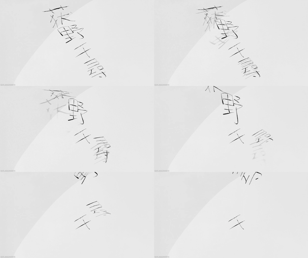
some book cover ideas I’ve been playing around with for MDZS vol 1 !!
#mdzs#i feel a little insane from the amount of fonts / brushes / colours ive tried out omg#but honestly sometimes all a girl needs is to blast music snack on takis and go a little crazy on some typography#im ngl im a little partial to the blood spatter one i think i like it even more than the first iteration lol#but also i understand the neat calligraphy one is easier to read and keeps things simple#im crazy tho i always love to take a little bit of a risk with typographic legibility and would rather pay more attention to the aesthetic#graphic design is my curse#also im gonna work on the other ideas as well but today i just got a little too stuck on this one lol
438 notes
·
View notes
Note
Hello! I'm sorry if this has been asked before, but how do you become proficient at handling conversations in Japanese/handling grammar very well? I read your post on the JLPT, and it addressed issues I have been tip toe-ing around--indeed, passive actions such as listening or reading are easier than the active ones. How did you go about that? Did you write a bunch of sentences daily? Did you have a conversation partner? What would you rec. to someone who lives outside Japan? Thank you!
This is an excellent question, and one that I get asked a lot irl by Japanese people in particular. Let’s talk about gaining fluency and the ways we can go about it!
How to Gain Fluency in Japanese (and Other Languages)

Speaking Fluency versus Accuracy
Language proficiency is divided into two separate categories:
Fluency: Although there are no widely agreed-upon definitions or measures of language fluency, someone is typically said to be fluent if their use of the language appears fluid, or natural, coherent, and easy as opposed to slow, halting use. In other words, fluency is often described as the ability to produce language on demand and be understood.
Accuracy: Correctness of language use, especially grammatical correctness and word choice.
By the above definitions, a “fluent” speaker may make grammatical mistakes, but they can speak without having to stop and think too much about conjugations, word choice, etc.
An “accurate” speaker can speak with nearly zero grammatical/word choice mistakes. However, the speed of their utterances isn’t generally taken into account, so it could take an “accurate” person twice as long to articulate the same idea as a “fluent” person.
Ideally, you need to strike a good balance between these two qualities when speaking. I have a boss, God bless him, who is 100% fluency and 0% accuracy and…man is it hard to understand what he’s saying sometimes, but he can generally get his point across just barely. I have another coworker who is 100% accuracy and takes about 3 minutes to form a sentence because he wants it to be perfect.

How to Increase Speaking/Writing Accuracy
First, let’s talk about the easiest thing to improve, which is accuracy. It’s also (in my opinion) the least fun thing to improve, because it means grammar books and vocabulary memorization.
You can only use a language accurately if you know what is correct and what is incorrect, and you can only learn that by studying grammar and vocabulary (or if you’re a native speaker and picked it up innately, you lucky bastard).
So here’s some things you can do to increase your accuracy:
For example, if you’re having a hard time using the passive, you need to review that part of your textbook and find some exercises to drill it into your head.
Say the correct thing aloud. Lots. Sometimes I just walk around my apartment and narrate everything I see/do like a crazy person, but that’s good practice.
Write example sentences using the grammar you’re struggling with and say them aloud too.
There’s a bunch of cool apps that connect you with native speakers that can help correct you too! I used to use HelloTalk, I think.
If you’re a creative soul, when I was studying for the JLPT, I took 1 grammar point and 5 vocabulary words from my JLPT study books and used them to write a 2-page short story about the adventures of ネギ, a stray black cat that smelled like green onions because she napped in an onion field. Then I had a Japanese friend check it over for me and mark mistakes. I hand-wrote them to improve my abysmal handwriting at the same time. It was really fun! I sometimes think about doing it again just for funsies.
When someone corrects you, don’t feel like your entire life is over and you’re a failure and you’ll never get it right haha. I’ve seen people fall into that hopeless mindset, and that’s just nonsense. It’s a good opportunity for learning and nothing more! Say the correct thing you’ve just been taught out loud, then write it down if you can. And, if possible, find a chance to use it in conversation asap.

How to Increase Speaking/Writing Fluency
Now this is the hard one. Especially for those learners who do not have native speakers nearby.
I’m going to be dead honest with you. I started formally studying Japanese at uni, and I had a Japanese roommate/best friend since year one. I had a 4.0 GPA in my Japanese classes (and only my Japanese classes lol) because I was and still am a MEGA NERD about it.
...But it wasn’t until I studied abroad in Japan my 4th year of uni that I gained fluency.
There are a lot of things that can hold us back from fluency. An interesting thing I’ve noted is that Foreign Language is perhaps the only subject in which a student’s personality can directly affect their progress. To gain fluency, you have to go forth and speak, but if you are naturally a shy person, that is going to hinder you. If you are the kind of person who takes mistakes/failures poorly, you will be less likely to take risks and try to say harder sentences. In contrast, you can get full marks in math regardless of the above personality traits.
I’m not saying that you have to be an outgoing explosion of a human being in order to gain fluency. But what I am saying is that you have to be willing to seek out conversations, and you have to be willing to take chances. Get out of your comfort zone. Use that new word you picked up the other day. Try to explain something that is difficult for you.
My problem was that, while I lived with a native speaker who would have happily taught me anything I asked, her English proficiency was much higher than my Japanese proficiency. And when I struggled to say something in Japanese, I’d fall back onto English. And when she told me something I didn’t understand in Japanese, she’d repeat it in English instead of Japanese, because that was easier for us both. The same thing happened when I was in Japanese class as well. I always had the assurance that I could fall back on English.
But when I elected to study abroad in Japan for 3 months, I knew that this was my big chance. So on the host family form in the “other requests” area, I wrote that I specifically wanted a host family that could not speak English. I was setting fire to my crutches, and I was scared but excited to see them burn.
By the end of my three months in Japan, I had gone from “Chotto matte kudasai” and needing a minute to form my reply, to “Okay, yeah I see that movie too and I liked the action scenes, but I didn’t care for the story little.” (I’ve underlined mistakes that I would have made in Japanese, to show you that I sacrificed some accuracy to obtain higher fluency.)
So, in short, the easiest and quickest way to increase your spoken fluency is to throw away all the crutches you can and use the language as much as possible. Every single day. Even if you’re just having an imaginary conversation with yourself! And like I said, there are a bunch of cool apps that connect you with Japanese people who want to learn English and you can do language exchanges with them. I had a lot of fun with those in the past.
As for increasing writing fluency...well. That’s a tough question with Japanese, because I can type Japanese at like 100 wpm, but my Japanese handwriting fluency is at a 10/100. I can read and type at the level of a native Japanese high school student, but I can only write the kanji that 7 year old can write. That’s no exaggeration.
The big reason for that dichotomy is that my work is paper-free. 100% of my work is done on screen, so about the only time I have to write out something is when I’m filling out a form, which includes my name (katakana), address, and maybe occupation.
If you want to increase your Japanese handwriting speed, just keep on writing. Write those little short stories about ネギ like I did, or find some writing prompts (I just started a side-blog with writing prompts yesterday btw) or keep a little diary. Make opportunities to write.
How to Have Nice Handwriting in Japanese
Okay, full disclaimer: I am the absolute LAST person qualified to talk about this, because I have awful handwriting in Japanese.
Unless you have prior experience with a different language that uses kanji, or you lack the keen eye of an artist, you will likely struggle to develop neat handwriting.
Personally, I really like using this app called Japanese Kanji Sensei. It’s on Android (not sure about iOS), and if you pay just a few bucks you can make your own kanji sets and stuff. Anyways, it will show you how to write the characters prettily. It gives you a good frame of reference for what nice, pencil/pen-written characters (versus calligraphy characters). It has hiragana and katakana on it too!

I get a stylus and write out the characters on this app for the muscle memory, so my hands remember the sensation of writing a certain character. (The muscle memory is different if you only use your fingertip.) This muscle memory and repetition is how Japanese people learn how to internalize kanji as well. I really enjoy and recommend this app. I’m sure that there are others out there like it too.
Summary
TL;DR: Review your textbooks, take risks, use every resource available or make your own, and just have fun with it! 💗
#Anonymous#ask me anything#Asks are open#study japanese#learn japanese#japanese language#nihongo#japanese fluency#second language acquisition#jlpt#studyblr#langblr#japanese langblr#japanese resources#kanji#study kanji#learn kanji
2K notes
·
View notes
Text
Font Recs/Typography Tips
@weatheredlaw was looking for some font recs and I was kinda planning on doing a font rec/typography tutorial post thing anyways, so here goes:
(I got carried away!)
1. A NOTE ABOUT ORGANIZING FONTS
Okay so... first of all-- I highly recommend using FontBase to manage your font files (It’s free and it’s available for Mac, Windows, and even Linux). The reason being, that as you install more and more fonts on your computer, the font menu in Photoshop will start to load really slowly. Which gets really frustrating really fast.
FontBase lets you organize your fonts into neat lil folders and activate/deactivate them as needed with a click, so you can keep the Font Menu Bloat at bay. There’s also a premium version (aptly called ‘Awesome’) that costs $3 a month and has some nifty extra features, but that’s neither her nor there. Yes, I throw three of my hard-earned dollars at them every month.
Also? If you have a work computer and a home computer, you can install FontBase on both systems and point it to a Dropbox or Google Cloud folder so that your font collection always stays in sync across both devices. 👌✨
2. WHERE TO FIND FONTS
Google Fonts So... Google Fonts is technically a webfont CDN, but all of the actual font files are available for free download from their Github repo. Alternatively, you can use FontBase to sync them directly to your computer. Which is nifty.
What I like about the Google Fonts library is 1) there’s some really NICE, high-quality font families available, and 2) it’s easily searchable.
So pop on over, play with the search filters, and if you find something you like, grab it off the Git Repo or sync it via FontBase.
League of Moveable Type It’s a free, open-source font foundry. How cool is that? The selection is pretty small, but there’s a lot of typographic staples to be found, and the quality is top notch 👌✨
Free Design Resources FDR is a great site for all kinds of design resources, but their font offerings are the most impressive. Particularly, it’s a great place to look for handwriting, script, or any other kind of ‘display’ fonts. 99% of them are demo versions of not-free fonts, but really that just means they don’t include special characters, which lbr you probably don’t need anyway.
Creative Market So as the name suggests, Creative Market is a marketplace for design resources. AKA the stuff ain’t free. HOWEVER, every week, they offer six products for free download-- a mix of fonts, textures, photo packs, etc. So create an account (it’s free) and keep an eye out for the weekly freebies.
Design Cuts This is another site that isn’t really free, though they do have a small selection of free stuff. I figured it’s worth mentioning because a lot of the fonts and textures I use, I buy from here. Every month (or two weeks? Or something?) they compile a bundle of about 20 products (be it typefaces, texture packs, or filters/actions/etc) and offer it at a massive discount (usually $30). Their stuff is always really great quality, so if they release a bundle that feels worthwhile to me, I bite. (As of this writing, they actually have bundle of some textures, fonts, and other assets available for $2)
3. A PRIMER ON DIFFERENT KINDS OF TYPEFACES
So most people are probably already aware of the categories of Serif, Sans Serif, and Display fonts. But you can split Serif and Sans Serifs up into further categories.
Here are four kinds of Serifs: Humanist, Transitional, Modern, and Slab.
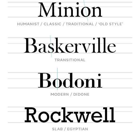
The most immediate difference between these types of serifs is the stroke widths.
If you look at the modern/didone serif Bodoni, the horizontal strokes are hairline thin, and the vertical strokes are very thick. Modern/Didone typefaces are characterized by this extreme contrast in their stroke widths, and typically have a perfectly vertical axis (meaning the narrowest parts of the strokes are at the exact top and bottom of the letterform, as illustrated by the green dotted line). These features give them a bold, modern, and stylish feel.
The humanist serif Minion has the least contrast in its stroke widths, and has a diagonal stress (again, see the green dotted line). These features make them easy on the eyes and well-suited for paragraphs of text and small font sizes. Humanist typefaces most closely resemble calligraphy, and thus have an elegant, classic feel.
Transitional serifs are, well... transitional. They have more stroke width contrast than humanist serifs, but not quite enough to be considered modern/didone, and may or may not have an angled stress. Their ‘voice’ is more neutral, academic, and timeless.
Slabs Serifs, as the name suggests, are kinda blocky. The stroke widths are generally very solid and consistent, and the actual serifs (or ‘feet’) are... y’know. Fat blocks. It makes these typefaces feel more casual, more down-to-earth, approachable, and perhaps playful? A lil rebellious, even?
So with that out of the way, here are some different types of Sans Serifs: (There’s a point to all of this, I swear.)
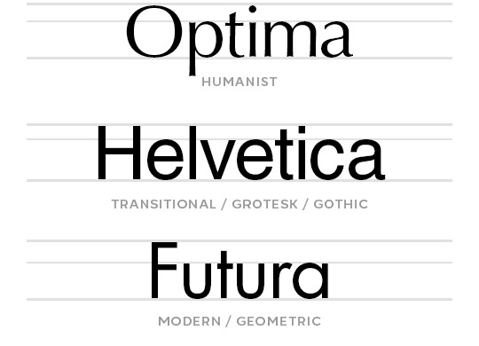
Unlike Humanist Serifs, Humanist Sans Serifs actually have the most contrast in their stroke widths. In the above image, this is most apparent on the lowercase ‘a’. Again, this feature makes humanist sans serifs easy on the eyes and optimal for paragraphs of text. Compared to other sans serifs, they tend to have a more casual and approachable personality.
Transitional Sans Serifs will have little to no stroke width contrast. They maintain their readability at small sizes, and their ‘voice’ is very neutral, which makes them easy to use in a wide variety of designs. There’s a reason Helvetica is the go-to for many a graphic designer: it, along with many other Grotesks/Gothics, almost never feels out of place. They’re the chameleons of fonts. They’re versatile. Invisible. Carbon-neutral.
Geometric Sans Serifs, as the name suggests, are typefaces whose letterforms are based on geometry. O's and C's that are (mostly) perfectly circular, V's, W's and M's with sharp, consistent angles. They generally have very consistent stroke widths, but the harsh angles make them poorly suited to paragraphs of text. They feel modern, technical, and stylish.
4. CHOOSING THE RIGHT FONT
(We are now arriving at the point.)
Here are some questions to ask yourself before choosing a font:
How much text do I have?
If you have a lot of text, you’ll want something that’s easy on the eyes for reading. Aim for things with mild stroke contrasts and favor things with a diagonal axis. Basically, you can’t go wrong with a humanist typeface here-- be it serif or sans serif.
Now, for graphics and gifs, you’ll probably have a lot of text almost... never. But if you’re ever designing something that does (like a magazine spread, or a brochure), it’s something to consider.
How much space do I have?
Let’s say you’re giffing a scene and you gotta cram a long caption onto a tiny 278px wide gif. You could just make the font size super tiny, sure. OR, you could look for a font with a narrow character width. A nice, robust type family will usually include Condensed or even Super and Ultra Condensed versions of the font, which will be much better suited to that purpose.
In these cases, you’ll probably want to avoid geometric sans serifs since those circular forms are very wide, relatively speaking. But some geometric type families (such as Futura) do have Condensed varieties:

How large or small does the text need to be? (or do I want it to be?)
When your text is large, you can kinda go nuts and do whatever without worrying about anything getting hard to read. But there are two things to consider when you’re using a small font size, be it out of necessity or For the Aesthetique™--
stroke width contrast: At small font sizes, typefaces with consistent stroke widths are going to maintain their readability best-- so steer clear of Modern/Didone serifs, and tread carefully around Transitional Serifs. If you’re itching to use a Serif, you’ll want to look for a humanist/traditional/old style one. If you’re super attached to a modern/didone serif for a design (as I often am) understand you’re gonna have to compromise a bit and use a larger font size for it.
For sans serifs, both Transitional and Modern types will have nice, solid strokes that won’t get lost at small sizes.
x-height: A typeface's x-height refers literally to the height of the lowercase 'x'. But in more practical terms, it's the ratio of the heights of lowercase vs uppercase letters. If you plan on using all caps, this won't matter much (if at all), but if you will be using lowercase letters, a typeface with a more generous x-height will be easier to read at small sizes than a typeface with a small one.
Generally, Transitional/Grotesk/Gothic Sans-serifs will have the most generous x-heights (for example, see Helvetica). But x-heights vary a lot even within subcategories of typefaces, so be mindful of them!
Speaking of all these metrics... one of the things that makes the Premium version of FontBase well worth my $3 a month? The Super Search feature:

I can just... highlight segments of those histogram chart things on the right to filter out fonts that don’t have the contrast, weight, character width, or x-height I’m looking for. Like magic. #blessed
What ‘voice’ do I want to project?
I mentioned earlier how different styles of typefaces have different ‘personalities’. If you’re not sure whether to go with a Humanist or a Transitional Serif, remember that humanist ones tend to feel more elegant, more classic, more intimate. That Transitional ones tend to feel more objective, more confident, more business-like. Which makes more sense for your design?
After you’ve narrowed down your options with the above considerations, then you can start to be really subjective. Follow your heart. Pick whichever one has that certain je ne sais quoi. Or the one that has the ‘Q’ with the coolest tail. The one that just makes you feel a certain kinda way. Because it’s art. It’s design. Have fun with it.
5. SOME OF MY PERSONAL FAVORITE FONTS
So... my taste in typefaces is pretty conservative. I don’t really use handwriting, script, or display fonts. When I do, I tend to use them just the one (1) time and forget about their existence immediately afterward. ¯\_(ツ)_/¯
Most of these are tried and true Classics you may have already heard of, and some of them might even be default fonts bundled with your operating system. If not, be very careful looking for them, because it would be a terrible, horrible shame if you were to get your hands on one of the many freely available bootlegs of some of these typefaces... :/
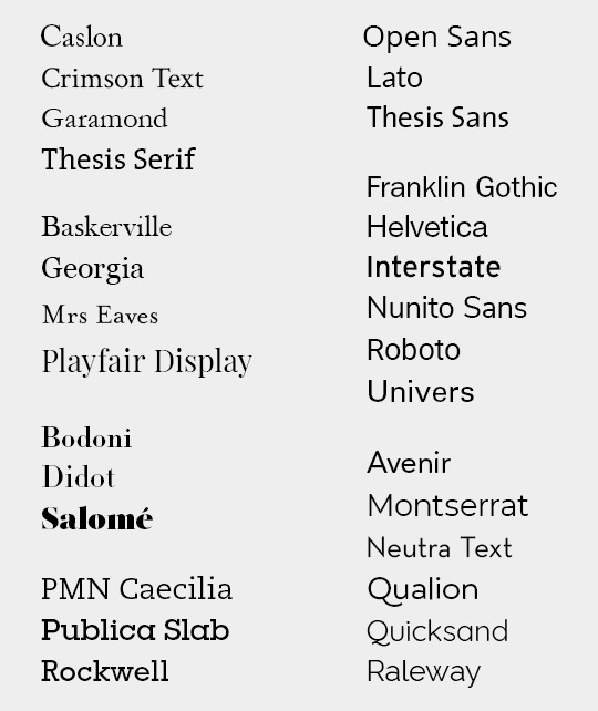
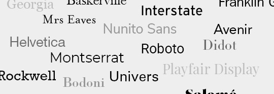
With all these lined up together, you can get a better sense of how varied the x-heights can be from one typeface to another. For a particularly stark example, see Mrs Eaves vs Playfair Display, or Montserrat vs Neutra Text.
SooOoOoOoo... that’s a wrap? I guess?
Congratulations 🎉 you now know way more than I’m guessing you wanted to about typography.
119 notes
·
View notes
Text
Hello everyone! These are some tips I wish I had known when I first got into the community. Warning: this got longer than intended, sorry! I tried to divide it into well separated sections, so it’d be easier for you to read only the parts that interest you!
Original content:
I think the best way to get your studyblr known is by posting original content, this can be either pictures of your journal, your notes, your stationery, etc. If you don’t feel like pictures are your thing, you could make advice masterposts or share little tricks and hacks that have helped you through your studies or your life in general.
Take nice pictures: 1) The trick here is to take your pictures near a window where the sun isn’t hitting directly on what you want to photograph (you can try direct sunlight as well, but I think if the sun’s too bright then you won’t be able to see what’s written on white paper). 2) A nice background makes all the difference. I personally prefer white backgrounds, so I just use my desk. BUT if you don’t have any white surfaces, you can create one by just laying down a few sheets of paper (that’s what I did for this post). Lots of people also use their bed sheets or duvets as background and it looks amazing as well! 3) Flatlays seem to be quite popular and they make the picture look very neat, aand you don’t need many photographic skills to pull it off, so I’d say it’s the best choice for taking pictures.
Edit pictures: If you’ve already taken your picture next to a window or in a well lighten environment, then you probably don’t need to edit it all that much (not that you ever have to edit your pictures, but it does make them look a bit more aesthetically pleasing and professional I’d say?). So if you still want to edit them (which I do), then I’d recommend the Snapseed app (available for Apple and Android), that’s the one I use, It’s free and it has a LOT of editing options. I also have the VSCO app (x x), which I downloaded because a lot of people here have recommended it, but I don’t really use it. You can play around with both apps and decide which one works best for you! (Oh and yes, like most of use here, I use my phone to take pictures).
Tag other blogs: Some people track a specific tag (usually their blog url, but not always, in which case they tend to clarify it somewhere in their blog). This is a great way for people to check out your content and then they might share it if they like it. There are some blogs who reblog everything they are tagged in, but I’d say this is the minority. If you’re not sure whether someone tracks their tag, then you can always ask them!
Trends: In the studyblr community there tend to be certain trends, such as a specific type of calligraphy, specific brands, etc. So there’s basically two paths here: You can choose to follow these trends and make your bujo spreads look like most journals look at that moment. This probably will make people reblog your stuff because that’s what everyone’s into. Another option is to go on the exact opposite direction and make your content completely different than everyone else’s in order to make it stand out more. Honestly, I don’t think one way’s better than the other, you’ll slowly figure out what makes you feel happier about your journal/notes. However, DO NOT copy someone else’s work and claim it as your own. You can get inspired by certain styles, yes, but if you replicate something somebody else made, then that’s stealing. That being said, lots of people recreate a bujo spread (for example) and then properly credit the person who originally made it, in which case I think it’s okay, but it’s always safer to ask for permission first.
Masterposts: There’s mainly two ways to make a masterpost: 1) You can make an original one with recommendations or tips you come up with yourself. My advice here would be to think of actually useful tips, do not just write whatever seems like the right thing to say, but instead use your own experience to think of tips that have indeed helped you in the past. 2) If coming up with advice is not your thing, you can gather around other people’s advice and provide links to their posts (they don’t even need to be from Tumblr blogs) in an organized structure that makes it easy for people to skim through and find what they’re looking for! Btw, even if you’re a studyblr, your posts don’t have to be all exclusively study related. There are some really good masterposts about mental health, moving out on your own, meal recipes, etc.
Stay visible:
One of the good things about the studyblr community is that most people won’t unfollow you just because you weren’t active for a certain period of time, we all understand that sometimes life (study related or not) just gets busy and it’s okay to take some time for yourself. BUT at the same time it’s true that in order to get your content around, you need to stay active to a certain extent.
Queue your posts: You can even do some research to find out when it’s the best time of the day to post something and on which days of the week and set your queue to those hours.
Interact with others: This helps to get your blog known AND it’s a great way to meet people in the community! There are loads of ways in which to do this: 1) Simply send someone a message and start a conversation with them, ask them about their day or tell them about yours. 2) Join a network. I’ve never been in one myself (bc shyness hey) but they do sound fun! 3) Try doing other people’s “challenges”, for which they usually provide a tag for you to use so they can check out your posts for the challenge. 4) Tag people in these little games that go around, like this bold tag thingy (I think that’s the only example I have).
Blog aesthetics:
In order to make your blog more appealing, make sure you spend some time on your theme and icon. If they go well together, it will create an organized layout, which tends to catch people’s eyes and make it more likely for them to check out your content.
Theme: The possibilities are endless. Whichever style you prefer, there’s definitely a theme that goes with it. Personally speaking, I love neat, soft-colored themes. I believe organization is key, if your links and information are easily accesible, then that adds up to your blog for sure! Here are a few theme makers whose content I’ve been using lately: @acuite, @cyantists, @felinum, @odeysseus, @pohroro, @roxiestheme. In addition, you can find a lot of great themes here: @theme-hunter (they even classify the themes by style, post size, etc.).
Icon: This is the door to your blog, people see it on their dash and use it to identify you. Some people make free icons for you to use, but I personally prefer making my own. Don’t worry, you don’t need to be super skilled or even use Photoshop for this. 1) I usually use Canva to make my icons or banners. They have lots of templates for you to use as a guide, or you can start your design from scratch. They do require you to register with an email, but it’s free yay (unless you want to pay for some special designs, but, honestly, their free stuff is more than enough to create whatever you need). 2) Flaticon is another website which provides a TON of icons and pictures that you can use (you do not have to pay to download the images, but you DO have to properly credit whoever made them).
Be consistent: Choose whichever content you’d like to post and stick to it. Not everyone is this picky, but some people only follow blogs whose posts belong to a certain category (studyblr, fandoms, fitness, clothes, etc.). This doesn’t mean you can’t post an occasional random post, though. Don’t restrict yourself, but do try to keep you content consistent.
Balance:
Life’s all about balance. Regarding your studyblr, I think there are mainly two aspects in which you need to apply this.
Studying vs. keeping a blog: Yes, studyblrs can be helpful when it comes to your studies (there is a lot of advice going around and, personally, it helps me to stay motivated and makes me want to do better). However, at the end of the day it’s still a Tumblr blog, which means you can spend hours and hours here without even realizing it, so be careful not to lose yourself in the wonderful journals and unbelievably neat notes that the community has to offer, because then you won’t end up doing any of your work.
Aesthetics vs. functionality: You’ve probably seen those posts which reassure you that your notes & journal are made to increase your productivity so there’s no need for you to make them pretty if that’s not your thing. I’m not going to preach you on that, we all know it’s true. However, It frustrates me a little bit that on that kind of posts, they never seem to acknowledge the fact that some of us spend time making our notes and journals pretty because it’s actually helpful for us. I’m less likely to want to study from my notes if they’re all messy and lifeless, so I spend time on them. Regarding my journal, whether I keep it extremely simple or make it super fancy and decorated, it would serve its purpose either way. BUT, spending time decorating my journal is what helps me unwind at the end of the week. So, no, I don’t spend time on my journal because that’s going to help me achieve my goals, I spend time on it because it helps me to relax and get away from the world for a little while. Not everything we do needs to have an academic purpose.
Hope you can take some advice from this and that you all have a lovely day! 🌿
#original#studyblr#studyspo#masterpost#studyblr masterpost#journalsanctuary#studyquill#educatier#ohlookyan#emmastudies#studylustre#equaticns#heyjul#bookmrk#focusign#sootudying#inspiration#advice#motivation#new studyblr#study#tips#productivity#organization#ma#studyblr advice
135 notes
·
View notes