#blobmakes
Explore tagged Tumblr posts
Text


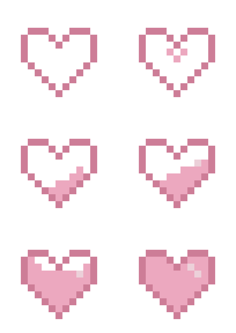


Made some pixel hearts today! I know those will get stolen without credit anyway, but, please, if you wanna use them(and still have some dignity), either credit me (an @/me or a link to this post are ok) or reblog/like the post!
#pixel animation#pixel art#heart#blobmakes#bloblopost#This started as 'I wanna test fluid animation' and ended with 'This needs to be its own divider and an emote'#divider
15 notes
·
View notes
Text

Wow! A hyperspecific poll that is so specifically about me!
32 notes
·
View notes
Text
5 notes
·
View notes
Text
0 notes
Note
Well, you asked for it! A bowl of goodies! Chocolate-

-CHOCOLATE-COVERED BRUSSEL SPROUTS! MUAHAHAHAHAHA!!
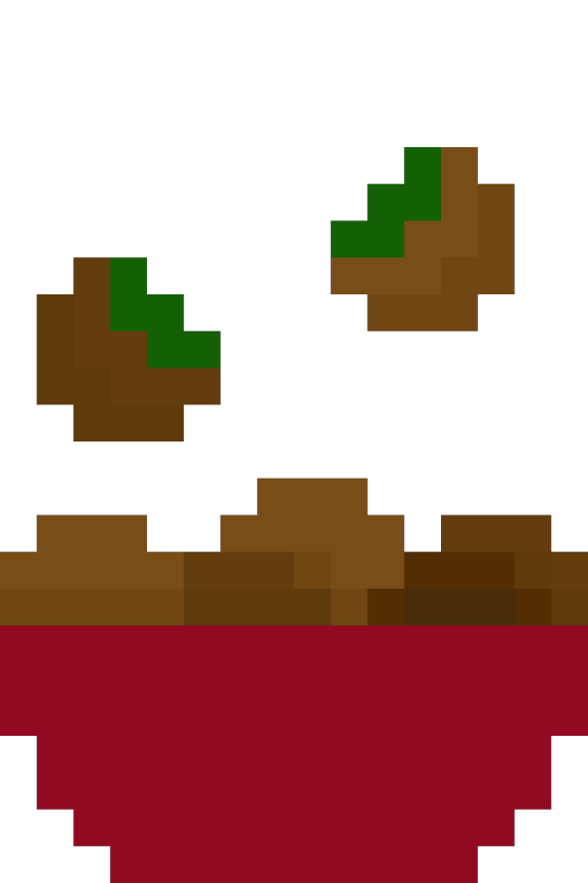
Happy Halloween! Trick or treat? (Choose wisely, or I'll throw toilet paper on you again.../lh)
Trick please! My power needs to be kept in check :D
8 notes
·
View notes
Text
BLOBMAKER
Blobmaker is a free generative design tool to help you quickly create random, unique, and organic-looking SVG shapes.
0 notes
Text

@spaciebabie sona because Spacie is cool and awesome actually
The tiniest of bonuses under the cut:
A version with pink-er white and the basic idea of a sketch

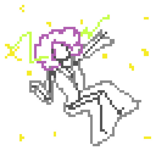
#pixel art#bloblopost#blobmakes#Genuinely surprised that this turned out good#Oh and also colors are off for some reason. Oh well!
24 notes
·
View notes
Text

my theme / graphics / design F.A.Q. @ my anons and a few others who've been asking some questions + some help, i just compiled every question into one post 👍
disclaimer: i am very much an amateur in making graphics so i still don't know everything there is to know, but i think it's good to make graphic design and editing seem more accessible and less intimidating! so like don't go to me for actual professional advice
.001 | header templates if you don't really feel like reading and just want to experience everything for yourself, here's a bunch of templates i made today. play around with them if u want :> i used canva since it's available both on mobile and pc but if you prefer to use a different app you can just check the specs/see if your app has similar functions
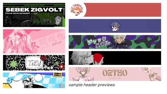
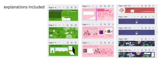
TEMPLATE LINKS (I won't know who's made copies of the templates so it's fine if you're worried about being exposed): [1: SEBEK] [2: SAKUYA (PINK)] [3: FIRST YEARS] [4: TREY AND IDIA]
if someone is interested in using any of these as inspo or as a base i don't mind, and i don't need credit either 👍 but if you wanna let me know bc i'm a bit nosy go ahead
.002 | what apps would you recommend for editing? (mobile and desktop)
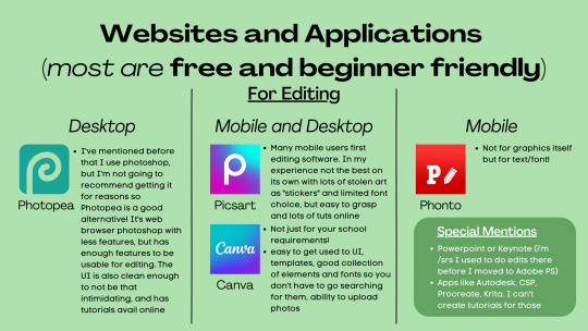
Desktop:
photopea , if you want a browser alternative to PS. i tried it out for maybe twenty minutes and a bunch of the basic features i need in PS are present there, it's definitely good if you want to experiment more as opposed to other apps. here's a tutorial for it
Mobile and Desktop:
picsart [desktop] [google play] [apple app store]: i think a lot of people start out with picsart and i totally get it! it's very easy to use, there's also a lot of tutorials for it on YouTube :> > list of tutorials from their blog > this playlist of tutorials by tutorial edits
canva [desktop] [google play] [apple app store]: so so elite i love canva. there are times where i do prefer the freedom that powerpoint gives me but canva is just convenient. anyway she's good both for ur powerpoints in class and pretty decent for editing. the templates i made above are my first time doing edits (not for school) with canva and i think they turned out alright! > official canva tutorials > this pinterest user's short-form canva tuts > canva search keywords lists: [one] [two] [three] [four]
Mobile Only:
phonto [google play] [apple app store]: ily phonto, here's a tutorial
apps like krita or autodesk or csp or medibang or procreate are likely usable as well, i just don't exactly have advice for them since i don't use them
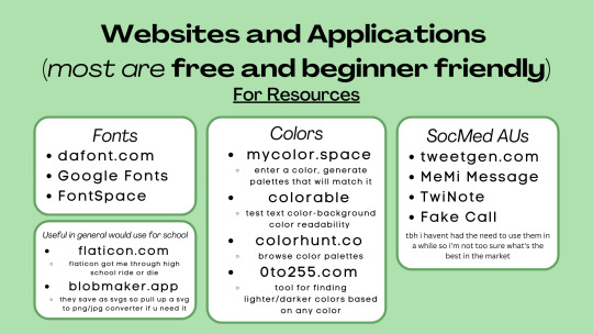
Websites for Fonts:
dafont.com
Google Fonts
FontSpace
freejapanesefont.com
font identifiers [whatthefont] [fontsquirrel]
Websites for images/elements:
flaticon
blobmaker.app (saves as svg, use a svg to png/jpg converter if you don't use an app that allows svgs)
getwaves.io (saves as svg, use a svg to png/jpg converter if you don't use an app that allows svgs)
haikei.app (basically a combination of blobmaker, getwaves, and a few other apps)
Colors:
mycolor.space
colorable
colorhunt.co
0to255.com
colormind.io
color tool
css drive (upload image, generate palette)
SocMed AU purposes:
tweetgen
MeMi Message (google play and apple appstore)
TwiNote (google play and apple appstore)
Fake Call
i used to use social maker and social dummy but i can't find them anymore lol
.003 | squiggly? refer to blobmaker, getwaves, and haikei for squiggly :>
.004 | pretty themes for tumblr desktop you can search the following tumblr blogs
theme-hunter
magnusthemes
ricecodes
kosmique
.005 | how can i make my theme prettier? decorating your text posts:
coolsymbol.com
kaomoji
copy paste dividers
post dividers [making your own, tutorial using photopea] [masterlist of dividers by firefly-graphics]
how to get gradient text on tumblr posts + gradient recs
theme banners/headers:
specs of the tumblr header: 640 x 360 pixels on mobile, 3000 x 1055 pixels on desktop
premade headers: [headers by spidaerman] [headers by ridleey] [alt link] [headers by villanaelle]
.006 | how to add *that* thing to the tumblr header theme
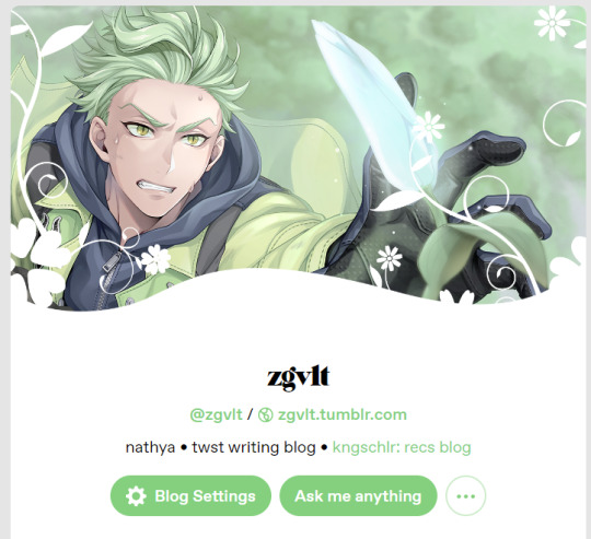
for this part let's use canva again. the mobile theme header is 640x360px but you can totally adjust it to be bigger (but maintaining the same width to height ratio)
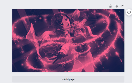
so let's say this is the picture you want as your header, how do we add the details at the bottom? you can pretty much get any shape you want, whether it be from canva elements or one of the sites i mentioned or any other source you have. for this tutorial let's just use the ones on canva
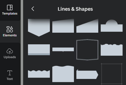
by scrolling through the elements portion, in this instance the lines & shapes portion, you can find a few that would work well
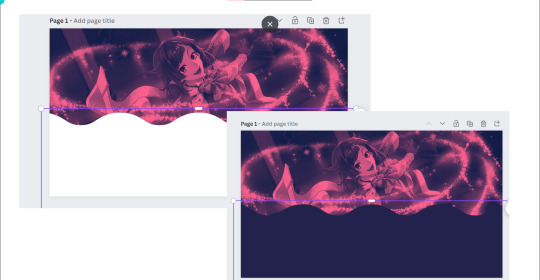
when you choose what you want, adjust it both size and color wise, and make sure there's a substantial enough amount of space for other details of your blog to fit (icon if you're not hiding it, blog name)
remember to save the color of the element! copy paste that hex code! or just have it somewhere where you can look back at it easily
when you're satisfied, save it! then go on tumblr -> settings -> select the blog that you want to edit
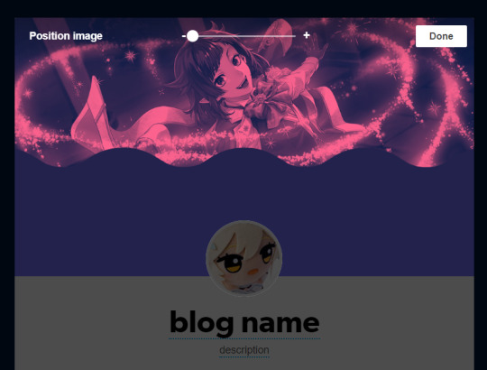
place the banner, and if you did it right it should be a perfect fit, but you can zoom in if you want! :> but wait we're not yet done! the colors don't create *that* effect yet
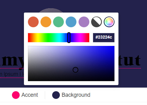
change the background color to match the bottom color of the header! (and the accent as and text colors as well, if you want!)
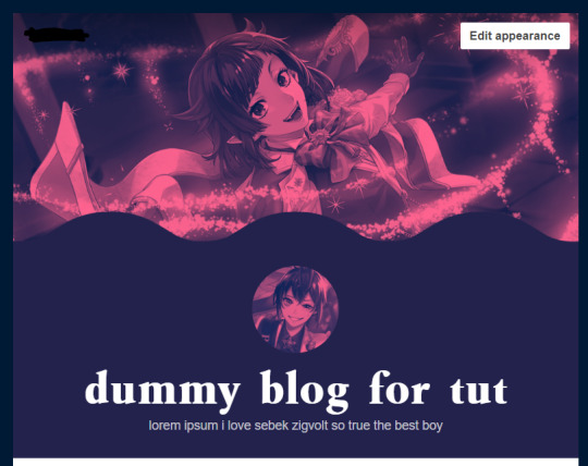
and we're done!
i think these are all the questions i've gotten so far? hopefully it helps!

170 notes
·
View notes
Note
Sure! A Jellie popsicle for you comin right up!

Happy Halloween, Ria! Trick or treat? 👀
Happy Halloween to you too! :D Treat please? :D
7 notes
·
View notes
Photo

¡Hola a todos! En este tutorial de varios capítulos, construiremos un skin desde cero al que luego podréis acceder para uso personal. En la parte 1, prepararemos lo que necesitamos para trabajar en el skin. Se asume que se tiene un conocimiento en HTML y CSS y un conocimiento al menos básico de la gramática de jQuery. Recuerda que puedes navegar todo este tutorial en #nctutorial: desde cero.
Antes de nada, voy a comentar algunos programas/páginas que vamos a usar en la construcción del skin. Habrá algunas cosas que sean opcionales, o que dependan de vuestro diseño. Como aclaración ahora que estamos comenzando: Esta es la forma en la que me gusta codear, y habrá muchas cosas que no te sirvan, o que prefieras hacer de una manera diferente.
1.- Programas: 1.1.- Adobe Photoshop/GIMP/Similares: Para realizar el/los mockup(s). 1.2.- Bloc de notas: Easy, no hace falta descargar nada. Nos servirá para escribir código (podéis usar notepad, codepen, jsfiddle, cualquier otra variante) y para copiar códigos de template (porque FA suele comérselos). Si tienes W10, activa el historial del portapapeles (Inicio + V). 1.3.- Un navegador: Wait, no te rías todavía: un navegador que tenga un inspeccionador decente. Personalmente, recomiendo Chrome (o una de sus variantes) o Firefox. Opera y sus variantes creo que tienen también un buen inspeccionador (están basados en Chromium al fin y al cabo) pero yo trabajo con Chrome casi de forma exclusiva.
2.- Páginas: 2.1.- Clippy. 2.2.- Flaticon. 2.3.- Blobmaker y Get Waves. 2.4.- Unsplash.
Dicho esto, lo primero que hago es hacer un diseño en físico en un trozo de papel. Sólo necesitas algo que escriba, algo donde escribir y, por supuesto, una idea.
¿Mi recomendación? Boceta tres mil cosas diferentes, lo que se te ocurra, lo que tengas claro y lo que no tengas tan claro. Es el mejor momento para meter ideas locas que no sepas si realmente se van a ver bien; quizá verlas en el papel las hace más realistas o incluso más bonitas. ¡También puede pasar a la inversa!
Si ya tienes claro lo que quieres diseñar a nivel de organización, ahora deberías pensar en la parte "gráfica" del skin. Hablé de la manera de hacerlo en este post y os muestro el resultado de la prueba para este diseño:

Aunque tenía mis esperanzas puestas en el fondo azul, lo cierto es que hace muy mala combinación con el color base del cuerpo y hace que el acento ya no sea un acento. Así que usaré la opción del fondo oscuro en blanco y negro.
Ahora es el momento de hacer el mockup. Si decides saltarte este paso, ¡queda a tu gusto! Pero siempre recomiendo hacerlo primero.
Lo primero que voy a hacer es marcar donde irá la navegación, que en este caso, estará dividida entre una caja superior y una caja inferior. También dispongo la posición del icono de usuario, y el cuerpo del foro, con el fondo y los colores.

Ahora, completémoslo con sus respectivos iconos. Aprovecha este momento para medir bien los tamaños y que todo quede con el aspecto que buscas; es más rápido hacerlo con tamaños random, pero hacerlo as�� realmente no nos ayudaría en absoluto a la hora de usarlo de guía.

Repetirás este proceso a lo largo de los mockups que quieras hacer. Por ejemplo, el tablón.


En mi caso, suelo hacer el índice completo, y el resto lo hago usando sketches en papel, usando como "base" elementos ya creados en el índice. Puedes ver las imágenes de mockup en el album que vincularé al final de este tutorial.
Ahora que tienes el mockup, ¿qué tocaría? Limpiar el foro para prepararlo para empezar a diseñar, por supuesto. Estos pasos los he señalado en este post.
En el siguiente capítulo del tutorial, empezaremos a diseñar la navegación flotante del foro y el tablón, y ya podréis empezar a ver el foro en funcionamiento. ¡Nos vemos en la próxima!
Revisa todas las imágenes incluidas en este capítulo aquí.
103 notes
·
View notes
Text
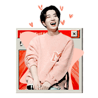
𝑰𝒏 𝒉𝒐𝒏𝒐𝒓 𝒐𝒇 𝑮𝑶𝑻7 𝒇𝒊𝒏𝒂𝒍𝒍𝒚 𝒍𝒆𝒂𝒗𝒊𝒏𝒈 𝒕𝒉𝒂𝒕 𝒕𝒐𝒙𝒊𝒄 𝒂𝒔𝒔 𝒆𝒏𝒕𝒆𝒓𝒕𝒂𝒊𝒏𝒎𝒆𝒏𝒕 𝒄𝒐𝒎𝒑𝒂𝒏𝒚, here are FOUR dash icons of the beautiful, main vocalist of GOT7, CHOI YOUNGJAE. colouring and png’s by yours truly , doodles from BLOBMAKER , DEVIANTART and GOOGLE and shapes from GOOGLE. i’d very much appreciate the reblog and like if using my resources and a good day for everyone !

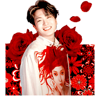
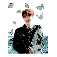
#rph#rpt#rpa#dash icons#choi youngjae dash icons#youngjae dash icons#got7 icons#well he is beautiful#look at that shmile#MY BABY SUNSHINE KING#encore is beautiful
7 notes
·
View notes
Note
A-ha! A trick! And what's this? Sweet yummy taffies!
Alright! Here's your trick, a bug-infused drink!

What's the trick? IT'S SLIGHTLY OFF CENTER!! THE EVILEST OF TRICKS KNOWN TO A MAN!!
but hey, it's tasty! at least i hope so, we blobs don't exactly have taste buds...
Prismy, happy spooky Halloween! Trick or treat? 👀
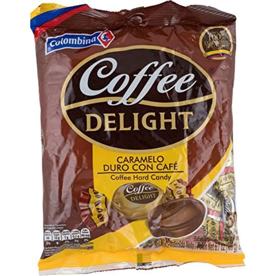
uhhhh 0.0 i will risk saying trick but i will bribe you with coffee taffy in hopes is not too bad X3
3 notes
·
View notes
Note
koo (❁´◡`❁) i have a question !! how do people use blob maker ?? or use those blobs that everyone uses for their icons. so sorry if its obv but i just.. don't get it !! lol am trying to use ps for the first time so so confused (;´д`)ゞ
angelcake , hihiii !!! (◠‿◠✿) don’t worry , luvie , it’s an absolutely valid question n am happy 2 help !!! i’ll talk abt em in a general graphic / dash icon sense , since that what i use em for !!! lil tutorial is under the cut for u , luvbug !!! hope this helps n if u need anythin else , jus lmk !!! ^♡^

so !!! go to this lil website right here , our luvly blobmaker ! play around w the sliders at the bottom of the page until u get a shape u like , n once u do get a shape u like , hit that cute lil download button !!!

so , now that she’s downloaded , go ahead n open photoshop n go file › open › n then jus find ur blob in ur download folder n open her up !!! whenever i open up a blob , there’s a lil popup that opens too , so i jus hit OK to that if it pops up for u too !!!
ur blob will open at dimensions like 2500 x 2500 or smth like that , which is HUGE !!! so , i always jus crop it down 2 whatever size i need it — for dash icons , i always go w 150 x 150px bc that’s the size i prefer to work w !!! so , now , i hav this !!!
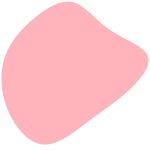
he’s cute !!! now , if ur makin a graphic , there’s rly no method 2 the madness , depending on what u want , u can jus resize it n sorta … slap it on wherever u want !!! but if ur lookin to make smth sorta like the dash icons goin around rn , there sum more steps n i’ll show u !!!
so , now , u need the person who’s gna be the star of ur icon — mine will be ggukie !!! so , i hav my image ( i’m gna use this one ) n i’m gna upload it to remove.bg , which will turn it into a png for me n remove the bg n such !!! so , now i hav this !!!
oh , n while my blob size is 150px , i always use a canvas of 180px , so i hav a bit more room for embellishments n such !!!
anyway , now we’re gna download that png of ours n then take it back over to ps n open it up !!! i always crop my png down to 160 x 160px first , then sharpen , n add my psd !!! then , i’ll merge the layers so that it’s jus one layer for the next step !!! so , now , we hav this along w our blob !!!

cute !!! so , now we’re gna drag our png layer over onto our blob layer !!! position it so that the edges of the png cover the edges of the blob , otherwise it’ll look funny !!! so , now we hav this !
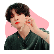
n it looks funny . :((( i know , but we’re not done !!! what ur gna do now is right click on ur png layer n click duplicate layer !
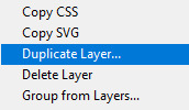
n a lil popup shld come up , so jus hit OK on her , n now u shld hav three layers !!! ur blob on the bottom , n then the two pngs !
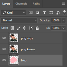
so , now ur gna select ur first png layer , which shld b ur middle layer › right click › create clipping mask !
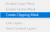
n it won’t look like anything has changed , but if u click that lil eye next to ur png copy layer , it’ll look like like this now !
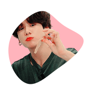
which we don’t rly want !!! so , hit that lil eye again , to get us back to what we had before , n now ur gna make sure the png copy layer is selected , go all the way over to select , n grab ur eraser tool !!! we’re gna erase away all the lil extra bits of the png at the bottom that aren’t inside the blob ! so , once u do that , ur icon shld look like this !!! ^-^

n u can change the colour of the blob by right clicking ur blob layer › blending options › colour overlay !


pick ur colour usin the lil window n such ! u jus need to click on that coloured box — it’s black for me rn , but it might b a diff colour for u ! click on it n a hex colour picker will pop up !!! so jus choose ur colour ( i jus chose a darker pink ) n hit OK !

after u do that , our png will look smth like this :( which is icky sticky .

but fear not ! u jus need to right click on ur blob layer again › n click rasterize layer style !

n tada !!! isn’t she prettie !!!

n make sure to export it as a png , otherwise it won’t save right ! n i typically follow similar steps for graphics , jus w a bigger canvas n such , n yea !!! then ur free 2 embellish it all u want !!! ^-^
#rpt#rpc#rph#dash icons#dash icon tutorial#i hope this is what u needed heh !!!#luv u !!!!! ♡#╰ ♡ › ❪ 🍓 ❫ ↝ mine * / resources 。#tutorials.#╰ ♡ › ❪ 🍓 ❫ ↝ anonymous 。
130 notes
·
View notes
Note
Oh boy! A yummy candy! Thank you so much my old friend pal buddy pal buddy friend!
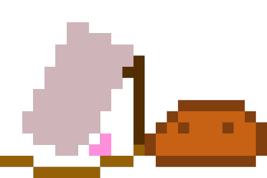
Yum! So tasty!
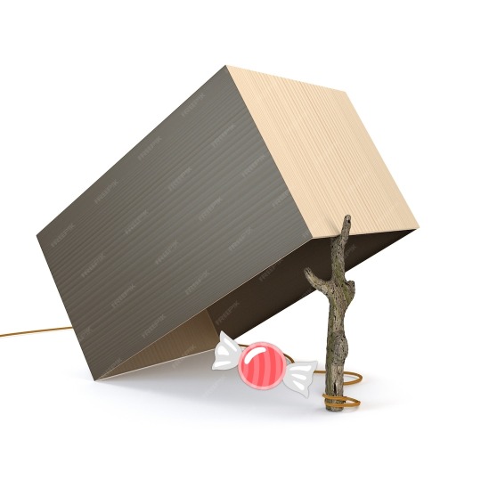
Waitaminute--
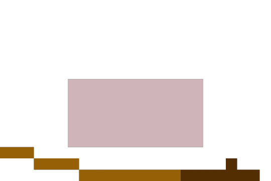

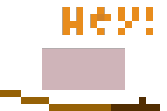
I got tricked! How dare thee!
Mel! I'm treat-or-tricking into your askbox 👁
óωò 👁️👁️👁️
6 notes
·
View notes
