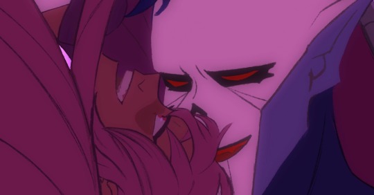
#bless the gaussian blur effect
Explore tagged Tumblr posts
Text


🍇
1K notes
·
View notes
Note
hi! I just found your art and the whole thing blows my mind... like... woah!!! my eyes are getting blessed!! 💕
If that's not too much of a bother, do you have some insights on how you color/choose colors? I'm so curious how you get that gorgeous luminosity and vibrancy! 😳
thank you for the ask and sorry for the late reply! i’m not always active on tumblr (especially when i go through periods of art block). i’m very drawn to warm colors, and combinations of warm and cool! i love yellows, warm greens, teals and oranges so i tend to choose those colors. i don’t have a specific process, but i do find inspiration in photography and other peoples art and take note of new color combos to try. i also edit colors along the way if im not happy with them. for the saturation/vibrancy, i use layer modes a lot! a favorite trick of mine is to dublicate the entire layer, gaussian blur it to my liking then choosing a layer mode it looks good with and lower the opacity to whatever looks the best to me. sometimes i put random colors on top of the merged piece and go through all the layer modes until i find an effect i like, and play with the hue and depth of the color because that can affect the layer mode too. basically i just mess around a lot on my own!! please let me know if i was unclear or if you have any more questions💖💖
some artists whose color work inspires me is @/2964_KO on twitter and ctk cave (author of coffin jackson and many other webtoons/manga) as well as several art nouveau and pre raphaelite artists🫶
2 notes
·
View notes
Photo

Audrey Shepard
COLONIST / SOLE SURVIVOR / SOLDIER / PARAGADE / ♡ Thane Krios
80 notes
·
View notes
Text
Hello danganronpa nation. Today mod Firanka has decided to bless you with a tutorial for edits. You’re welcome.
This tutorial will go through cool lighting effects you can apply so the character transparent you’re using blends a bit better with the background. This is for GIMP but you can probably apply all that to other apps and programs too. Not guaranteed though. Effect showcase below, and actual tutorial under the cut.
I’m assuming you already have some GIMP knowledge, so I’m not gonna say stuff like “right click on the layer to show the dropdown menu, and then pick “Duplicate Layer”, I’m going to just tell you to duplicate the layer. If you don’t have the knowledge, try to mess around first, or find some tutorial on youtube. You can also read the documentation if that’s your thing.


Effect 1
In this tutorial I am using this photo and this sprite edit. Use whatever you want, as long as the resolution of the image is appropriate for what you’re doing.

1. Open up the images. You can’t do shit without your image open.

2. Duplicate the layer with the character, and desaturate it. You can do it with any method you like, I usually pick Hue-Chroma and lower chroma to minimum.

3. Color to alpha the black&white layer with the character, setting the colour to black (default is white). You’ll be left with a pure white semi-opaque layer (I hid the stuff above to show what it’s supposed to look like, you don’t have to do that).

4. Alpha to Selection the main, unedited layer with the character and duplicate the background layer. Add a layer mask in Selection mode, without ticking the invert mask box. You’ll be left with a character-shaped cutout with the background image.

5. Make a layer group with the white ver of the character and the cutout. Set the layer group (not separate layers) to Multiply mode.

As you can see, it looks pretty good already, but you can see some of the clouds on her skirt. It’s gonna be mostly prominent on dark-ish elements if the background has some sort of uneven texture in that area. That’s why in most cases you will want to apply Gaussian Blur to the cutout.

The values depend on the image, if it’s super high contrast like the next one I’m working with, you’ll want to set it somewhere like a hundred, but here, around 50 should be okay.
Keep in mind that it won’t really work well with manga images most of the time. You want a coloured illustration.
You can also mess with alpha curves on the pure white layer so it’s more or less powerful (the white layer tones down the cutout layer so it doesn’t darken the OG image too much)
Effect 2
I am using this photo (after a bunch of editing) and one of these transparents (you may wanna adjust the curves a little). Once again use what you want.
For convenience’s sake here’s my edited ver of that photo (I inverted colours, adjusted hue and saturation, curves, and then Gausian Blurred it a little), feel free to use it lol (it’s lower scale than the OG though). I’m using it as the base background despite all the editing.


1. Duplicate the layer with the background and set it to linear light. Blur it til it looks good. It’s not necessary but it adds a nice glow and makes the image more vibrant.

2. Apply a bit of Unsharp mask on the character if they don’t have super dark outlines. It’ll make them darker. For most images, the default settings should work okay, if not, mess with them til it does. It’s not always necessary though, really depends on what you’re working with. You can add the unsharp mask later, too.

3. Duplicate layer, and set it to screen. Pick a dark colour similar to the one in the main image. The effect will be subtle, but don’t worry.

4. Put the two character layers in one layer group, and duplicate the Linear Light mode layer. Put it in the group.

5. Blur that layer a lot. Over 50 for sure, I originally used like 140. I moved the layer cuz it looks better like this, do what you want when you’re editing. And then you’re done
-Mod Firanka
48 notes
·
View notes
Photo

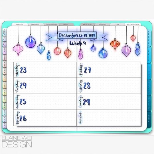
Merry Christmas to my friends!! I hope you have a blessed time with your family and friends! ⠀ This is my week 4 spread for bullet journal. I made a Gaussian blur effect again on the banner and the ornaments on the page this week. It really lightens up the whole page! And Yes, let's be merry in this holiday season! ⠀ .⠀ .⠀ .⠀ .⠀ .⠀ .⠀ #bujo#journal#bulletjournal#bujotracker#planner#journaling#plannercommunity#bujomonthly#sticker#artillustration#ilustrationart#bujoaddicts#bujoideas#bujospread#bulletjournals#weeklyplanner#bujoweeklyspread#doodlefun#bujoinspires#weeklylog#bujobeauty#bulletjournalweeklylog#bulletjournalideas#bulletjournaljunkies#bulletjournalss#bulletjournallove#illustrationartists#bulletjournalnewbie#showmeyourplanner
0 notes
Photo

I tried making a glow effect like in the web comic “Blessed” on WebToons in FireAlpaca.
Steps:
Select around the line art.
Invert selection (its surrounding the character)
expand selection by 2px or a bit more. (not too much)
Make a new layer.
Fill that new layer with the color you want. (this will only fill the selection)
Now the selection should look like a colored silhouette of your character/drawing/whatever it is.
Now move that layer under your lined and colored layers. (you should see a colored outline around your drawing)
You can deselect and remove the selection by pressing down Ctrl+D.
On that same layer, go to Filter>Gaussian Blur>adjust the slider. (don’t make it too big or it will blur out to far)
Now if you wish, duplicate the layer. (It’s the thing that looks like two pages stack on top of the other underneath where your layers are)
Now go to your blending modes and choose Add. Adjust the opacity if it is too bright.
Now you have a glow around your character. Now start at the shiny innocent character you’ve created (maybe its innocent (;;-_-;;;) )
If you have any issue, just comment below. (Remember this is only for FireAlpaca). Hope it helps someone.
-kaji
Note:
I have a new pc so no more hiragana T-T. I’m still gonna sign as such on artwork.
0 notes