#beige kitchen wall
Explore tagged Tumblr posts
Text
Kitchen - Dining

Eat-in kitchen - huge transitional l-shaped dark wood floor eat-in kitchen idea with an undermount sink, recessed-panel cabinets, gray cabinets, marble countertops, gray backsplash, stone tile backsplash, paneled appliances and an island
#kitchen#grey kitchen cabinets#beige kitchen wall#dining#phillip jeffries manila hemp wall#upholstered kitchen chair
0 notes
Photo
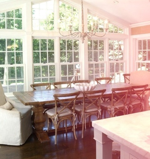
Kitchen - Dining Eat-in kitchen - huge transitional l-shaped dark wood floor eat-in kitchen idea with an undermount sink, recessed-panel cabinets, gray cabinets, marble countertops, gray backsplash, stone tile backsplash, paneled appliances and an island
#kitchen#grey kitchen cabinets#beige kitchen wall#dining#phillip jeffries manila hemp wall#upholstered kitchen chair
0 notes
Photo
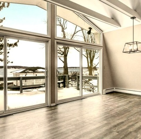
Beach Style Dining Room - Great Room
#Inspiration for a mid-sized coastal vinyl floor and brown floor great room remodel with beige walls#a standard fireplace and a tile fireplace open concept#subway tile#great room#vintage pendant lighting#under mount kitchen sink
4 notes
·
View notes
Photo
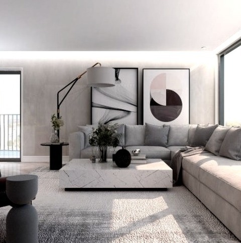
New York Living Room
#Living room - mid-sized formal and loft-style light wood floor#beige floor#tray ceiling and wood wall living room idea with gray walls#no fireplace and a media wall small space apartment#kitchen island light#open kitchen design#modern kitchen#small spaces interior design
4 notes
·
View notes
Text
Jade had a tier 1 tiny home, later a tier 2 and then a tier 3. Now we are officially upgrading to a full house and instead of just expanding the original one or picking one already made, im decided to build one myself and IM IN LOVE
#its a very beige eco house#but something about that white and cream house with green accents just speaks to me#its full of windows cuz i love windows#the kitchen was a problem cuz i made the bedrooms doors in the way#and didnt want to change it#but them i made a thing with half walls that i loved so much#is a compact kitchen#very cozy#im still building so it doesn't have any clutter yet#just the younger baby has a full room cuz i spent so much time in that nursery that i just keep it as it is#some things will be replaced bc jade still has some more fabrication to do#but we have table chairs beds lamps bookshelfs#alien talks
4 notes
·
View notes
Photo
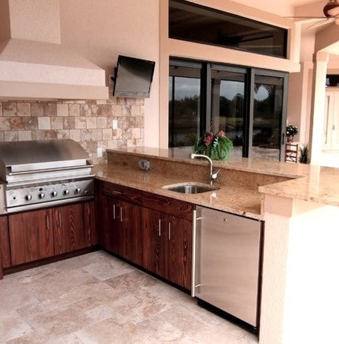
Miami Roof Extensions Deck Ideas for a large, contemporary backyard outdoor kitchen remodel and deck that includes an addition to the roof
3 notes
·
View notes
Photo

Family Room Home Bar in Grand Rapids
#Small transitional enclosed porcelain tile and gray floor family room photo with a bar#beige walls and a wall-mounted tv rustic lake house#jenn-air#blue kitchen#family room#miele
2 notes
·
View notes
Photo
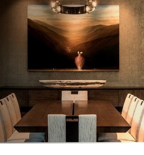
Dining Room - Kitchen Dining
#Idea for a kitchen/dining room combination with a large contemporary medium-tone wood floor and beige walls. beige rug#formal dining room#contemporary furniture#dining room lighting#onyx bowl#custom art#contemporary
2 notes
·
View notes
Photo
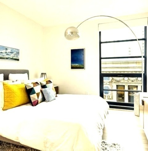
Boston Guest
#Inspiration for a mid-sized contemporary guest light wood floor and beige floor bedroom remodel with white walls contemporary kitchen#contemporary sitting room#bedroom#contemporary design#contemporary family room#contemporary furniture
2 notes
·
View notes
Text
This that apparently spark equal amounts of engagement in a conversation in my family, list incomplete:
Architectural design
(none of us were arguing for the same thing and my mother is disgusted (only somewhat kidding) that I don't like domes the way she does and apparently my like "square rooms" is a character flaw (only somewhat serious).)
#family discussions#*cough*arguments*cough*debates*cough*#architecture#i like victorian houses (and a bit before and after)#i'm also the only art nouveau > art deco.....#the others like victorian architecture just fine it's just not The Selling Point™ for them lmfao#i'm just not huge on curved walls unless it's in like a turret because it's a bitch to Make Things Fit™ that way and windows are nice but#you don't need a wholeeeee wall of them#(no one was arguing for a full wall of windows but it needed to be said)#i like square rooms- or even rectangular ones- with *nice* crown moulding and base boards#jewel tones- deep of light bc it really depends on the space- and more sedate floral patterns#classic stripes or geometric designs are also nice but i prefer botanical ones#okay architecture AND decore/design choices#none of us like white kitchens and Millennial Grey/Beige/White™ does not spark joy for any of us#i'm now rambling#whoopsies
0 notes
Text
i used to be like " why are the sims houses so mismatched these homes look so bad" but then i started looking at zillow and by god they're charging Above market value for this shit look at this garbage
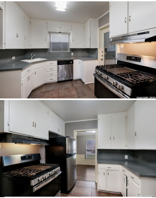
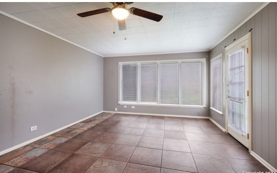

and just for fun: what is this.
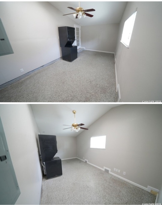
what. the fuck is this.
i dont even know where this is in its respective house i shit you not i have NO idea
#and this is on the 'nice' side of town#abysmal.#interior design#i guess#zillow#to cover my ass: the first kithen floors dont match the kind of brown in the living room#as well as that- there're two different grays#and the textures are Very dissimilar#on top of that fact they're aimig for 'modern' in the rest of the house the window ledge is confusing and leads to a dysfunct theme#the same issue is with the second kitchen#while the whites and beiges are similar enough the texture mismatches give it a negative evaluation#plue the fact the wall tile and the stove tile are both mismatched and arranged wierdly#the theme is again dysfunctional#the solo livingroom has tile size differences from the floor and ceiling- which would be okay if it wasnt combined with#the floor texture+color mismatch#this along with the fucking Wall texture mismatch ( it's literally Only around the door and is NOT the panel used outside )#the theme is again. DISFUNCT.#the washer is just amazing#i cant even be mad#it's a world wonder
0 notes
Text
The contemporary and enduring texture of the Beige Background: Classic interior ideas.
The subtle beige texture wallpaper is a very popular choice. Beige wallpaper is a trendy collection and has never really gone out of fashion.
The impressive finish and unifying shades of Beige aesthetic wallpaper.

It creates a Mediterranean energy that matches well with natural wood, jute upholstery, and maybe a jute rag for an earthy and grounded space in which to relax. Beige Wallpaper Collection

In addition to that classic contemporary look, beige wallpaper would also make your home and interior look so clean and versatile. Thus, resulting in that calming and relaxing feel, allowing the beige wallpaper color to connect to your home on an emotional level.

Explore more Wallpaper collections for Home.
#home & lifestyle#wall art#home decor#wallpaper#interior design#interior#interiors#wall design#wall decor#kitchen#living room interior design#living room#vintage living#home#dream home#bedroom#warmth#home decoartion#home design#home depot#bedroom wall decor#beige#beige aesthetic#beige messy moodboard#wallpaper design#floral wallpaper design#background#us#united states
0 notes
Text
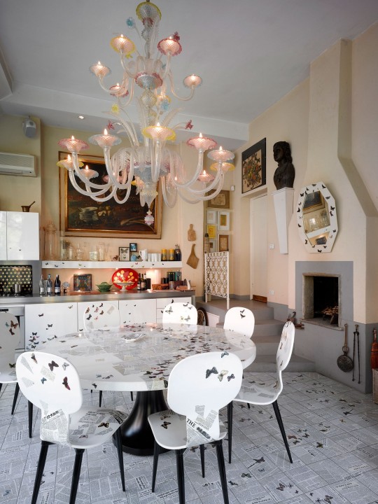
Source
#kitchen#light but moody#eclectic#barnaba fornasetti#beige walls#gallery wall#statues#maximalism#home decor#interior design
0 notes
Text
2007-core nostalgia extravaganza
Quick PSA: someone on Facebook is apparently impersonating me using an account called "McMansion Hell 2.0" -- If you see it, please report! Thanks!
Howdy folks! I hope if you were born between 1995 and 2001 you're ready for some indelible pre-recession vibes because I think this entire house, including the photos have not been touched since that time.

This Wake County, NC house, built in 2007, currently boasts a price tag of 1.7 million smackaroos. Its buxom 4 bedrooms and 4.5 baths brings the total size to a completely reasonable and not at all housing-bubble-spurred 5,000 square feet.

I know everyone (at least on TikTok) thinks 2007 and goes immediately to the Tuscan theming trend that was super popular at the time (along with lots of other pseudo-euro looks, e.g. "french country" "tudor" etc). In reality, a lot of decor wasn't particularly themed at all but more "transitional" which is to say, neither contemporary nor super traditional. This can be pulled off (in fact, it's where the old-school Joanna Gaines excelled) but it's usually, well, bland. Overwhelmingly neutral. Still, these interiors stir up fond memories of the last few months before mommy was on the phone with the bank crying.

I think I've seen these red/navy/beige rugs in literally every mid-2000s time capsule house. I want to know where they came from first and how they came to be everywhere. My mom got one from Kirkland's Home back in the day. I guess the 2010s equivalent would be those fake distressed overdyed rugs.

I hate the kitchen bench trend. Literally the most uncomfortable seating imaginable for the house's most sociable room. You are not at a 19th century soda fountain!!! You are a salesforce employee in Ohio!!!

You could take every window treatment in this house and create a sampler. A field guide to dust traps.

Before I demanded privacy, my parents had a completely beige spare bedroom. Truly random stuff on the walls. An oversized Monet poster they should have kept tbh. Also putting the rug on the beige carpet here is diabolical.

FYI the term "Global Village Coffeehouse" originates with the design historian Evan Collins whose work with the Consumer Aesthetics Research Institute!!!!

This photo smells like a Yankee Candle.
Ok, now onto the last usable photo in the set:

No but WHY is the house a different COLOR??????? WHAT?????
Alright, I hope you enjoyed this special trip down memory lane! Happy (American) Labor Day Weekend! (Don't forget that labor is entitled to all it creates!)
If you like this post and want more like it, support McMansion Hell on Patreon for as little as $1/month for access to great bonus content including a discord server, extra posts, and livestreams.
Not into recurring payments? Try the tip jar! Student loans just started back up!
#architecture#design#mcmansion#mcmansions#ugly houses#interior design#mcmansion hell#bad architecture#2000s
3K notes
·
View notes
Photo

Transitional Kitchen Example of a mid-sized transitional u-shaped light wood floor and beige floor eat-in kitchen design with a farmhouse sink, recessed-panel cabinets, white cabinets, marble countertops, black backsplash, marble backsplash, white appliances, an island and black countertops
#wide plank wood flooring#kitchen island lights#oil rubbed bronze bin pull#beige walls#wine country craftsman#wooden bar stool
0 notes
Text
Los Angeles Pantry

Ideas for a mid-sized, single-wall, modern kitchen pantry remodel with stainless steel appliances, a peninsula, shaker cabinets, white cabinets, quartzite countertops, white backsplash, and ceramic backsplash.
#beige walls#dark copper pendant lights#exposed shelves#san francisco interior design#white kitchen cabinets
0 notes