#bauersche giesserei
Explore tagged Tumblr posts
Text

happy 275th!
happy birthday johann wolfgang von goethe, born 28 august 1749.
dust jacket designed by jan tschichold; from the 1944 edition of goethe's works designed by tschichold for verlag birkhäuser, basel. dust jacket border composed with leaf designed by emil rudolph weiss for the bauer type foundry. [Weiß—fraktur, bauersche gießerei, frankfurt am main, 1913, p32.]. publisher’s device also by tschichold.
3 notes
·
View notes
Photo
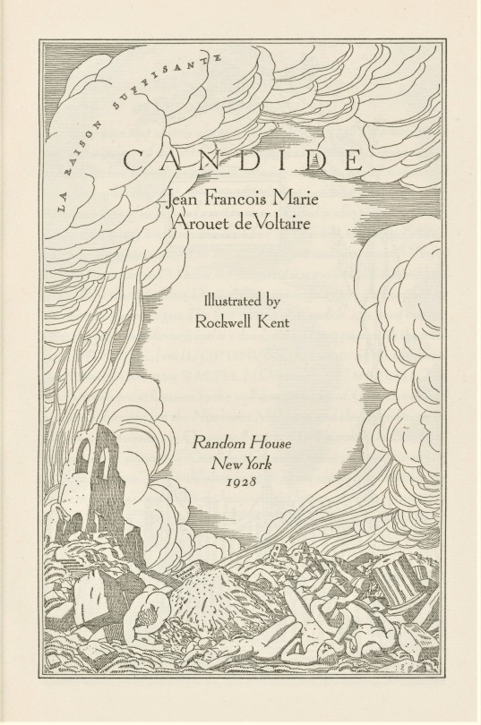
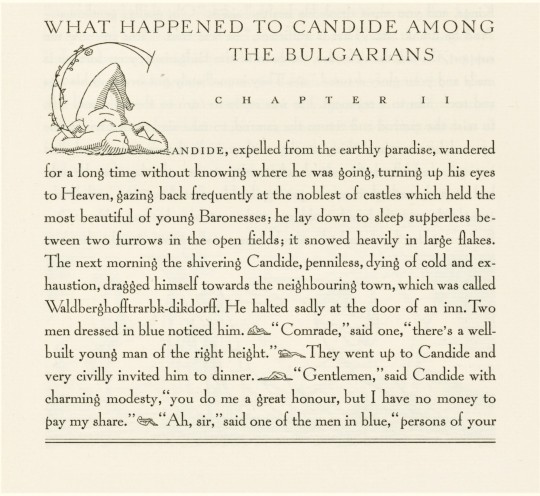


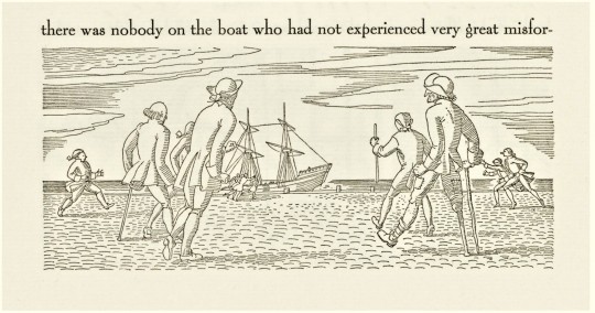
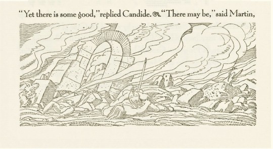
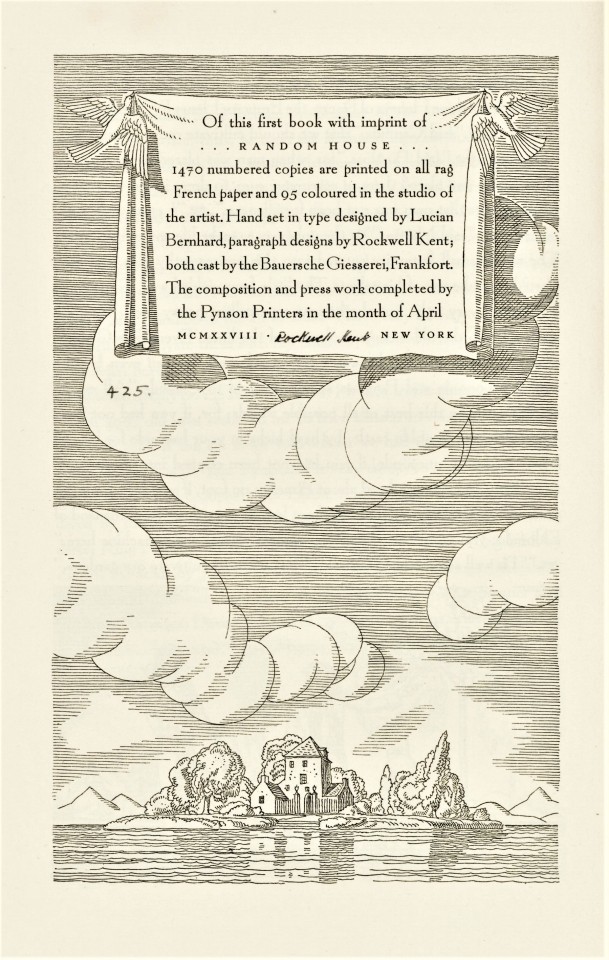
Milestone Monday
On this day, November 21 in 1694, the French writer, historian, and philosopher François-Marie Arouet de Voltaire was born in Paris. To commemorate this birthday milestone, we present a 1928 Random House edition of Voltaire's magnum opus Candide (originally published simultaneously in five countries in 1759), with illustrations by the notable American artist and illustrator Rockwell Kent.
This edition, the first title published under the Random House imprint, was printed in an edition of 1470 copies on French rag paper by the Pynson Printers of New York under the direction of typographer and book designer Elmer Adler, with type designed by Lucian Bernhard and paragraph designs by Rockwell Kent; both cast by the Bauersche Giesserei, Frankfort. Our copy is signed by the artist.
Happy birthday anniversary, Voltaire!
View other posts on works by Voltaire.
View other posts with illustrations by Rockwell Kent.
View other Milestone Monday posts.
#Milestone Monday#milestones#Voltaire#François-Marie Arouet#François-Marie Arouet de Voltaire#birthdays#anniversaries#Candide#Rockwell Kent#Random House#Pynson Printers#illustrated books#fine press books#Elmer Adler#Lucian Bernhard#Bauersche Giesserei#Bauer Type Foundry
85 notes
·
View notes
Photo

Venusian Ultra NF Based on the extrabold extended version of Venus, a typeface originally issued by Bauersche Giesserei from 1907 to 1927.
0 notes
Text
Neufville Digital


Neufville Digital is a “joint venture”, a collaborative project started in 1997 between BauerTypes, a Spanish company, and Visualogik Technology & Design of the Netherlands, to bring onto the international market typefaces for Macintosh and PC of the highest artistic and technical quality.
BauerTypes is the successor of the prestigious typefoundries, Bauersche Giesserei (Bauer typefaces) and Fundición Tipográfica Neufville. During the 1970s, Neufville absorbed a series of firms from the trade, such as Ludwig & Mayer, Fonderie Typographique Française, Fundición Tipográfica Nacional and Fonderie Dib. In this way it acquired a rich collection of matrices for founding typefaces created by artists of international renown.
It is based in Barcelona, Spain headed by Wolfgang Hartmann.

website - myfonts
0 notes
Photo


Let this Typography Tuesday post remind you that taxes are due in a couple weeks.
Hauptprobe in gedrängter form der Bauerschen Giesserei, Frankfurt am Main: Filialen in Barcelona und Madrid, A. Numrich & Co. in Leipzig (Bauersche Giesserei, 1900).
141 notes
·
View notes
Photo

BunkerType crea un cartel en homenaje a la tipografía Futura por su 90 aniversario Este 2017 la tipografía Futura ha cumplido 90 años. Desde su creación en 1927 de la mano de Paul Renner y la fundición tipográfica Bauersche Giesserei (Alemania), Futura se ha convertido en una de las tipografías más usadas y copiadas de la historia. Son muchos los que han querido homenajearla por su aniversario, y Bunkertype ha querido hacerlo con este cartel.
#2017#90#actualidad#aniversario#blog#BunkerType#cartel#diseño gráfico#diseño web#españa#Futura#información#internet#jajodesign#noticias#online
0 notes
Text
Modern Book Research — Stephan Tynes
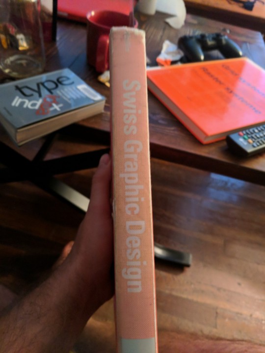
My first book is “Swiss Graphic Design” by Richard Hollis. There is surprisingly no colophon in this book, or at least not one that I could find. Im going to take a not so wild guess and say the font is Helvetica. Helvetica falls within the Neo-Grotesque Sans classification of fonts. Swiss Graphic Design describes the origins and growth of the swiss international style. On a basic level, it is a history book. On a practical level, it is a guide.


If you ignore my hairy legs in the picture you can see the title page of the book. Even though this page is extremely simple it sets up the books style and layout with just a few elements on the page. You can see these simple lines accompanied by a classic swiss san-serif typeface with the use of color, font weight, size, and position to show visual hierarchy on the page. The title pages use large red numbers at a font size of 71 points. There is only one thing that is loud and proud on the title pages, and the numbers are it. You can also see a 8 point body copy and page number on the page. The main heading is a bolded 24 point that makes itself noticeable while still not overwhelming the page. You can also make out is the grid.
This page hints at the consistent grid used throughout the text. The grid consists of 4 columns, and most of the pages have a 2 column span in the center. This book does an interesting thing; It takes the main body text and bolds it so that the readers eye goes straight to it. If you really analyze the page there is a lot going on, but with the bolded text, and the captions being slightly smaller at 7 points, the hierarchy works well. There are some other things to note about this book: thin lines separating the columns, and bolded text paired with regular text which results in the emphasis of both. What we also have is a set standard that the book uses throughout its layout. This book is personally right up my alley. I like it.
Just a small, not on-the-nitty-gritty-stuff: The book cover is 8 1/2 “ x 11″. The page sizes are 8 1/4″ x 10 5/8 “. Page margins are a 3/4″ interior, 1/2″ exterior, 1 1/8″ top, and 3/4″ bottom. The page columns have a 1 1/2 ″ wide content area, and a 1/4″ gutter. Page numbers are located in exterior margins. Folios use grid content lines in upper left and right hand corners.
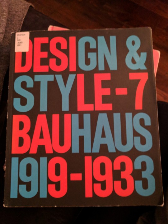
The next book in my quest for the modern book design is one about the Bauhaus. The title is “Design & Style-7 Bauhaus 1919-1933.” This book makes so many shoutouts I may as well just say who did everything, so here we go.

Editor: Steven Heller, Designer: Seymore Chwast, Associate Editor: Julie Lasky, Researcher: Anne Fink, Printing: Lebanon Vallet Offset Inc., Annville PA, Paper: Mohawk Paper Mills, Inc., Cohoes, NY, Type: The Typecrafters Inc., New Yourk, NY.
Now that we got that out of the way, lets talk about this book.
So, this is another history book, kinda. It is exactly what it says it is. On the other end it seems to actually be designed in the style similar to the Bauhaus. The cover of the book is was drew me in when I first picked it up. As I flipped through it I caught myself saying over and over again, like an dreamy-eyed half-salivating fool “wow... cool!”
It is pretty cool though. I will post the measurements below, but I will just tell you that the book uses a 3 and 4 column grid. They are set in different margins and columns and gutters. Now, I’m not sure if they did this because it was accounting for the page size, or if these were duplications of older texts. It’s honestly hard to tell as you can see from the example above. Either way I’m not sure it really matters. I say that because the book is pretty much all over the place. There are interactive ads, photos of old posters, and on top of that there is a really cool type specimen just hanging out in the middle of the book. Check it out below.

I don’t know if Typography porn is a phrase, but If it were this book would be a great example. Anyways, I am getting way off track here. Lets get back to the book. In no place in this book could I find a written list of the typefaces used, but they did provide a type specimen and I am inclined to think that these were the ones they used by comparison. So, we have Futura, Frankfurt Am Main, and Bauersche Giesserei. Futura fits within the geometric sans category, and while I know very little about the other two, I am going to say the other fonts fit in the same category.
So, this is a hard kind of book to describe, because I can talk about the actual book, and I can talk about the work displayed in the book. The book itself has a very clear grid even though it is only used on a few pages. The work displayed in the book has kind of an almost grid. The Bauhaus work looks like the were playing with the idea of the grid and lining things up, but most of the time its still looks very cut and paste. It’s very cool, but I can’t say with certainty that there were clear rules that were followed all of the time. This fact actually relaxes my brain a little bit the ore I look at it. It’s calming and very interesting because so much of design in more modern design is very lined up and exact.
There is a lot to say about so much of this book. There is hierarchy in color, size, shapes, weights, lines, symmetry, and so much more. Each design unique and tends to think more outside the box. While some may be similar, no two are alike in exactly the same way. Before I get into the specs I would just say go look at this book. Its super cool and I’m glad that I found it.
Nitty gritty time.
The book is 10 1/8″ wide and 12″ tall. for the 3 column grid the margins are 3/8″ inner, 7/8″ outer, 1 1/16″ top, and 1/2″ on the bottom. The columns are 2 13/16″ and the gutters are 1/4″ on the 3 column grid. For the 4 column grid the margins are 7/16″ all around. The columns are 2 1/16″ and the gutters are 1/8″. It’s a pretty big difference otherwise I would not have mentioned it.
FONT SIZE! From high to low. 78 point main header. 10 point sub header. 9 point body copy. 8 point large text, page numbers, and captions. 6 point folio titles.

Now for the third and final book in my research! It’s all very exciting. This book is “ Grid systems,” by Josef Muller Brockmen. This book is a straight up manual for how to do stuff right. Well, what this guy thinks is right. This book goes over all kinds of stuff. Its basically how to setup everything you need in this grid system. I am going to make this little quicker than the other two books because this book can explain things better than I ever could, and its a classic type book. So, I don’t know why but I cant find any colophon in any of these books for some reason. Im going again with Helvetica which is a Neo-Grotesque Sans classification typeface.
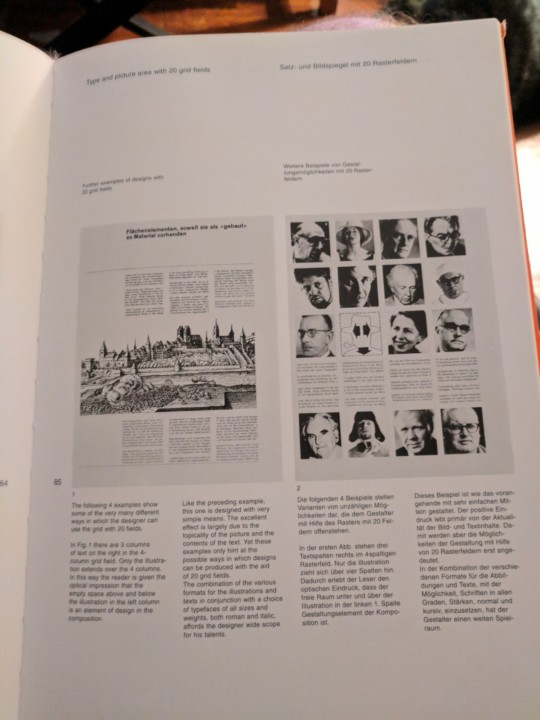
The book is set up in a 4 column grid and does not stray away from this system throughout the entire book. The folios are set in the top left of a two column grid. Its pretty simple and straight to the point. The visual hierarchy uses font weight, size, position, and the actual grid system to create balance on the page. It really shows that a grid can make a difference if you know how to use it right. Pretty cool.
Nitty Gritty. Length and width is 8 3/8″ x 11 1/2″. Outer margin is 5/8″, inner margin is 6/8″, bottom margin is 1 5/16″, top margin is 11/16″. Columns are 1 7/16″ and gutters are 7/16″. FONT SIZES!(around) 70 point title page headings.12 point bolded headers in folio position. 10 point page numbers. 9 point regular size folios. 8 point body copy. 7 point captions. All in all three really great books. I want them for myself when I actually have more time to read them. I could go into way more detail about each, but I’ve said enough for today I think. :)— Stephan Tynes
0 notes
Photo


These catalogs from Bauer Type Foundry and Bauersche Giesserei advertise Bernhard Brushscript and Bernhard Cursive, just two of many typefaces designed by Lucian Bernhard.
Newberry call numbers:
Wing Z250.5.B473 B38 1928
Wing folio Z250.5.B47 B38 1927
#Bernhard#typefaces#bauer type foundry#bauersche giesserei#type catalogs#type specimens#lucian bernhard
8 notes
·
View notes
Photo


volta
the type harmonizes so well with the image (please pardon the glare, iphone photo)—feels like miró specified the types himself. copy set in two sizes of bauer volta: fett [extrabold] & mager [light]; the extrabold is most striking—draws one in. bauer issued volta in 1955, & also issued volta under the trade-name fortune in non-german-speaking markets. the series consists of three roman cuts—light, bold, extrabold; & single italic cut—bold. designed by konrad f. bauer & walter baum, volta was touted as a ‹clarendon› revival. for more about konrad f. bauer vide ‹for the apprentice›.
2nd & 3rd illustrations: showings of volta fett & mager from the volta section in the bauersche giesserei orange specimen book [frankfurt am main, iv/62, pp 80a, 80c].
3 notes
·
View notes
Photo


Typography Tuesday
On this final #Typography Tuesday of 2021, as we transition from December of one year to January of another, we present those two months as typographically represented in The Bauer Almanac for 1939, published in New York by the German Bauer Type Foundry (Bauersche Giesserei). It was printed in Elizabeth Roman and Italic types designed by the noted German designer Elizabeth Friedländer and released by Bauer in 1938. The woodcuts are by Karl Vollmer who had been a student of the German grand-master designer Rudolf Koch. Friedländer herself had been a student of the German artist and type designer Emil Rudolf Weiss, who designed Bauer’s noted Weiss family of typefaces starting in 1927.
Bauer’s owner Georg Hartmann, who had opened the New York office in 1927, commissioned Friedländer to design her typeface, which was originally named Friedländer-Antiqua, but had to be renamed Elizabeth, since Friedländer, a recognizably Jewish name, was inadvisable after Hitler came to power in 1933. The Bauer firm, the stock of which is still directed by Georg Hartmann’s great-granddaughter Vivian Harmann, was originally established by type designer and punchcutter Johann Christian Bauer in 1837 at Frankfurt am Main, Germany. Today the range of Bauer typefaces is extensive and notable. The Frankfurt headquarters itself is long closed, but Bauer still has a presence in the Barcelona company Fundición Tipográfica Neufville which holds the rights to Bauer typefaces that Vivian Hartmann manages as Neufville Digital.
View other posts on typefaces by Elizabeth Friedländer.
View other posts on the Bauer Type Foundry.
View more Typography Tuesday posts.
#Typography Tuesday#typetuesday#Elizabeth Friedländer#Elizabeth Friedlander#Elizabeth typeface#Karl Vollmer#woodcuts#Bauer Type Foundry#Georg Hartmann#Johann Christian Bauer#almanacs#December#January#Typography Tuesday
26 notes
·
View notes
Photo

Bauer Beton specimen catalog, fold-out, 1931 on Flickr.
1 note
·
View note
Photo

Type specimen card for Imre Reiner's Gotika by Herb Lubalin Study Center on Flickr.
6 notes
·
View notes
Photo

Bauer Beton specimen page, 1931 on Flickr.
8 notes
·
View notes
Photo

Bauer Beton specimen catalog, spread, 1931 on Flickr.
0 notes
Photo

Bauer Beton specimen catalog, 1931 on Flickr.
1 note
·
View note
Photo

Futura brochures, 1938 on Flickr.
13 notes
·
View notes