#basic strokes of cursive handwriting
Explore tagged Tumblr posts
Note
what do you think scaras handwriting would be like (if he was writing letters, etc)
sits down . pondering…..i honestly think he would have really beautiful calligraphy. if his appearance doesn’t show how terribly ancient he is, then it is his handwriting.
something just as elegant as he is. have u ever seen cursive kanji? yeah. or hell, maybe sōgana cursive script. incredibly pretty styles but definitely hard to read to most unfamiliar with it. i hc that it was only during his harbingers era where he fully learned this style of writing. in his 500+ yrs of living, he had to at least hone in some sort of penmanship.
maybe during the time kabukimono had with the people of tatarasuna was when he first learned how to do calligraphy. kabu would definitely be the type to try to recreate because he thought it was pretty & got curious but sort of failed when he attempted as it was either too messy or the lines were shaky :(. so, when he got to be a harbinger, he sat down & learned so he could not be deemed as well…..incompetent in writing. LMAO
but part of me believes nowadays, as wanderer, he doesn’t exactly bother to try that much. so in written letters, it slowly devolves into a half simple, half stylistic approach. definitely somewhat more print lettering with hints of cursive but nothing too grand that it won’t be easily readable, yet enough where you can tell he has decent penmanship.
ex.

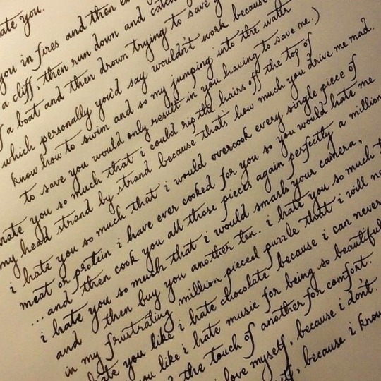
this could also apply to modern au scara except i like to hc that his writing tries so hard to be cursive but it is sort of messy & very flowy. on the same note, i remember writing a small prompt that he writes in a journal he hopes no one will find w/ all his embarrassing doodles & unresolved feelings . 1 gel pen at a time
-> letters with him are the criteria:
neat but quick light pen strokes, super confident lines
letters with him are often lengthy, some conjecture of his thoughts, rants about what irritated him on that day, & random things that happened during his errands. (what else does he even do besides wander & do errands…)
ends his letters with “signed, Wanderer ‘Hat Guy’” (because that is basically his name at this point)
if you are lucky, he might sketch a small doodle if he was truly that bored. he adds “🪲 <- you.”
#hey m!!#im glad u are doin good#i rly like how i revive everytime someone sends me an ask#ask#letters from m#-> shout out to kabupilled for some of these ideas#scara
14 notes
·
View notes
Text
Weird question: how do you write your letter X’s?
I encountered the first method drawn a couple days ago and I’ve never seen it before, so I’m curious. Please feel free to explain where you’re from/why you write it this way in the tags! I’m wondering if it’s a regional thing.
Black is first stroke, red is the second.if you do one of these, but ‘backwards’, doing what I call , please still choose the ‘frontwards’
1. Is what I call the parentheses method, which I’ve never seen before last week. Basically, you draw one parenthesis, open left, then another parenthesis open right, and their backs touch.
2. The cursive method, which I basically never do, where you do a squiggly first line, going from top left to bottom right, and then another diagonal going the other way
3. The print method, which I usually do, where you draw two diagonal lines perpendicular to each other. Should look like a plus sign on its side.

I’m hiding the poll under the cut so there’s less accidental voting before reading this whole thing.
@amaros-system I feel like this would interest you
#writing styles#fonts#handwriting#personally o switch between the cursive 2 and regular 2 a lot#but I’ve never seen this before
19 notes
·
View notes
Text

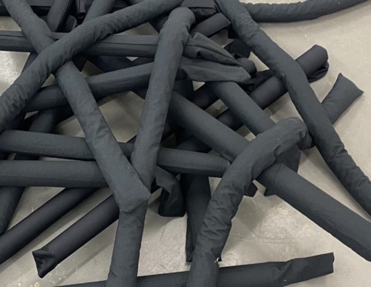
Text Based Sculpture - final project (one)
MKTMMXXIII, 24 soft sculpture tubes made of fabric and shredded paper, 44 x 44 inches, 2023
Our name is one of the first things we learn to read and write as a child. I remember in elementary school, my mom would label all my belongings with my name - it served a practical purpose of course, preventing my things from getting lost or confused with another student's, but it was the first instance in which things that belonged to me were explicitly marked as such. Later, in my art classes, we would be taught to sign our work, typically on the bottom right hand corner of the work for paintings or works on paper. I've tried a number of artist signatures over the years, from swooping cursive that matches the signature that I use for official documents to simply my initials and the last two digits of the year encapsulated in a square or a circle. I developed my artist signature as it is today back in 2021 during a ceramics class after getting tired of messy, smudged up handwritting on the bottom of my vessels. The easiest marks to carve into clay, and eventually I would discover to paint onto a canvas, are straight up and down strokes with minimal intersection. My initials, MKT, lend themselves to this rule fairly well, and by using Roman numerals to represent the year I could create a signature that is aesthetically cohesive and didn't fudge up the thing I was signing.
While thinking about this project, I realized that I have never signed any of my sculptures, even though plenty of artists do (Duchamp's cheeky 'R. Mutt' comes to mind, as does a collection of Rodin's bronzes). So for this project, I decided to count the up and downstrokes of my signature and break the letters and numerals down into their most basic parts. The result is my deconstructed artist signature piled up on the floor, a sculpture that literally is my signature but that still remains unsigned. The piece exists both as a declaration of my artistic authority but also a subversion of that structure.
2 notes
·
View notes
Text


Hanzo has extremely good handwriting; experienced in both Japanese and English, with fluidity, elegance, and firmness in his strokes. With Japanese, he still heavily prefers the traditional method of shūji (習字) - the way of writing - and prefers semi- cursive style (gyosho)
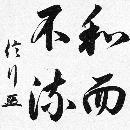
The style is used to write Chinese characters and is abbreviated slightly where a character's strokes are permitted to be visibly connected as he writes, but not to the extent of the cursive style. This makes the style easily readable by readers who can read regular script and quickly writable by calligraphers like him who requires ideas to be written down quickly. Semi-cursive script aims for an informal, natural movement from one stroke to the next. Another distinct feature of this style is being able to pinpoint where each stroke originates and which stroke is it followed by. Hanzo already is remarkably experienced enough to write in the regular script and knows the order the strokes which should be written in. Hanzo also prefers this style, due to its ability to create a style unique to him in a small timeframe.
Gyosho allows for a greater degree of expressiveness compared to the more formal Kaisho style. It has a flowing and dynamic quality that can convey emotion and energy, which Hanzo immensely appreciates. He also appreciates to express more artistic freedom and flexibility in his brushstrokes. This can lead to a more personalized and creative expression in his writing. This style is also suitable for various contexts, including artistic compositions, poems, and informal writing. Despite this being more of an informal style of writing, Hanzo will utilize this particular style of writing in his formal correspondences to those familiar with Chinese characters.
Whether in Japanese or English, Hanzo believes that the act of writing words in a continuous fashion - as opposed to the interrupted format of block letters - promotes an understanding of complete words better than separate letters. And he believes cursive helps to enforce that. Also, the barrier between his thought and action is minimal. But most importantly, cursive handwriting is a fine motor skill that allows for plenty of practice, and Hanzo believes that it also has to do with how developed his fine motor skill is (due to his swordsmanship and weapon mastery).

(For Hanzo's English cursive font, refer to this link)
Despite some portion of legibility sacrificed due to the fluidity of Hanzo's handwriting, his is extremely legible, with words easily recognizable and distinguishable. Also, his writing has consistent size and slant, which contribute to a neat and uniform appearance with spacing, which prevents words from blending together and makes the text more visually appealing.
While adhering to the basic characteristics of good handwriting, Hanzo has unique individuality and has a personal style, which will make his handwriting easily distinguishable. As Grandmaster Hasashi, his handwriting will also accompany a Shirai Ryu seal, with a carved handprinted signature over it. Without the stamped seal, the receiver can always question the validity of such script, as it would have been forged (his handwriting is already difficult to forge to begin with). And Hanzo carries the seal everywhere with him, as it is an irreplaceable part of his daisho contains the seals (in the pommel and guard of both his swords).
#✗ obsessive cathartic (headcanon)#✗ the ineffable testimony of spawned hellfire (scorpion)#✗ seeking reconciliation with his own humanity (iii)#✗ ugly syllables of conjured vindictive crimson (modern au)#(mostly canon but since Modern Hanzo also prefers cursive over print)#(finally here it is)#(I cannot believe I did not write this sooner)
1 note
·
View note
Text
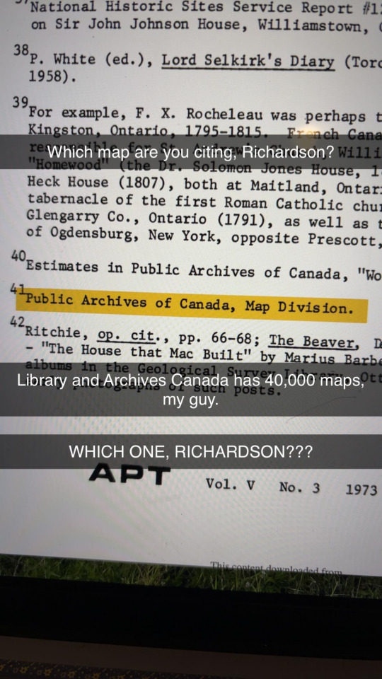
I had a similar problem doing work-study at my university archives. My main job for a majority of my time there was to create excel spreadsheets of all the names of the individuals in the 1800s who wrote the correspondence contained in each folder in each box.
In order to do that I needed to look at each letter and determine the author by their signature. And a lot of these guys couldn’t write legibly to save their life; it wasn’t just their signature I couldn’t read, but their entire letter. And I can read cursive pretty well. I remember multiple letters just looking like
Vvvv Vvv,
vvvv vv vvvvvv v vvvvvv vv vvvv. vvvvv vvv vvvv vvv vvvvvv vvv vvvv v vvvv vv vvvvvv v vvvvvv vv vvvv. vvvvv vvv vvvv vvv. vvvvvv vvv vvvv v vvvv vv vvvvvv v vvvvvv vv vvvv vvvvv vvv vvvv vvv vvvvvv vvv vvvv v
vvv vvvv v vvvv vv vvvvvv v vvvvvv vvvvv vvv vvv. vvvv v vvvv vv vvvvvv v vvvvvv vv vvvv. vvvvv vvv vv vvvv v vvvv vv vvvvvv v vvvvvv vv vvvv. vvvvv vvv vv
/\~~~
I’m not exaggerating.
I knew the very first line was usually “Dear Sir,” but that’s all I could gather. There was a lot of research and cross-referencing involved in my task. I’m pretty sure there was one individual who was SO unidentifiable that I tried looking up handwriting exercises in the 1800s. I basically became a graphologist, paying meticulous attention to each individual pen stroke.
I wanted to go back in time just to throttle those German assholes.
Archaeologist problems: can't heckle a guy to give you his full citation data when he's been dead for 14 years.
6K notes
·
View notes
Text
Learn Arabic Online – Navigate Language and Culture of 25 Nations
Arabic is more than just a language—it is a bridge to understanding the heritage, culture, and geopolitics of over 25 countries. Spoken by more than 400 million people, Arabic is one of the six official languages of the United Nations and plays a vital role in international diplomacy, energy, commerce, and journalism.
In today’s digital world, learning Arabic online has become increasingly accessible and practical. From students preparing for international careers to professionals engaged in global trade, online Arabic courses provide flexibility, structured content, and cultural immersion—all within reach from any location.
Why Learn Arabic?
Arabic is the official language in more than 20 countries across the Middle East and North Africa (MENA), including Egypt, Saudi Arabia, the UAE, Morocco, Jordan, Iraq, and Tunisia. It is also widely spoken by Islamic communities worldwide and has significant cultural and religious importance.
Here’s why Arabic stands out:
Vital for careers in diplomacy, translation, journalism, and international business
A key language for Middle Eastern studies, energy, and foreign policy
Offers access to classical literature, religious texts, and academic research
Expands opportunities for business and tourism in fast-growing economies
Benefits of Learning Arabic Online
1. Flexibility for All Learners
Whether you're a student balancing coursework or a working professional with limited time, online Arabic courses offer flexibility. You can study at your own pace with access to:
Recorded video lessons
Downloadable worksheets and grammar guides
Flashcards and quizzes
24/7 learning dashboards
This format suits self-motivated learners and provides opportunities to revisit difficult topics.
2. Learn Modern Standard Arabic (MSA) and Dialects
Online programs typically start with Modern Standard Arabic (MSA), the form used in media, formal writing, and international contexts. Once the basics are mastered, learners can choose to explore:
Levantine dialects (spoken in Lebanon, Syria, Jordan, Palestine)
Gulf Arabic (UAE, Qatar, Saudi Arabia)
Egyptian Arabic (widely understood due to media)
Maghrebi dialects (Morocco, Algeria, Tunisia)
Online platforms offer optional modules tailored to regional usage and professional contexts.
3. Master the Arabic Script Digitally
The Arabic script is cursive and written right to left, with 28 letters and distinct forms depending on letter placement. Online tools make it easier to learn:
Animated stroke-order lessons
Typing and handwriting exercises
Audio pronunciation guides
Vocabulary-building flashcards
These digital resources help reinforce recognition, pronunciation, and fluency simultaneously.
4. Structured Grammar and Vocabulary
Arabic grammar is rich and logical, with root-based word formation and sentence structures that follow clear rules. High-quality online courses guide learners through:
Noun and verb forms
Gender and plural patterns
Verb conjugation by tense and pronoun
Sentence building and negation
Interactive lessons and quizzes ensure learners build a solid grammatical foundation over time.
5. Cultural and Contextual Learning
Language and culture are intertwined. Online Arabic learning includes cultural modules such as:
Arabic greetings and hospitality customs
Social etiquette and communication styles
Understanding religious vocabulary
Exploring Arabic poetry, music, and storytelling
These elements add context to the language and deepen cultural understanding.
Get Certified – Add Value to Your Profile
A major advantage of learning Arabic online is the ability to earn recognized language certification that can support professional or academic pursuits.
Platforms like Study International Language Certification provide:
CEFR-aligned levels from A1 to C2
Modular testing for grammar, reading, listening, and speaking
Progress tracking dashboards and tutor feedback
Final certification valid for global institutions and employers
These credentials are useful when applying for international positions, study visas, scholarships, or research fellowships.
Career Opportunities for Arabic Speakers
Fluency in Arabic, backed by certification, opens doors to multiple career paths, including:
1. Diplomacy and International Relations
Government agencies, NGOs, and embassies often seek Arabic-speaking professionals for roles in policy, translation, and regional analysis.
2. Media and Journalism
Arabic speakers are in demand for content creation, news analysis, and reporting on Middle Eastern affairs.
3. Education and Academia
Certified language skills qualify individuals for positions in teaching, research, and curriculum development related to Islamic studies or MENA regions.
4. Business and Finance
Arabic is critical in trade, logistics, and banking—particularly in sectors involving oil, real estate, or investment partnerships in Gulf countries.
Why Choose Study International Language Certification?
Study International Language Certification offers a structured, goal-oriented approach to learning Arabic online. Key features include:
CEFR-aligned curriculum for every level
Live classes and tutor support
Arabic script tutorials and conversation practice
Progress monitoring and gamified quizzes
Globally accepted certification upon course completion
Their model is ideal for students, professionals, and lifelong learners who seek both flexibility and quality in their Arabic learning journey.
How to Get Started
1. Set a Learning Goal
Decide whether you're learning Arabic for travel, professional development, academic research, or personal interest.
2. Take a Placement Test
If you've studied Arabic before, platforms like Study International Language Certification offer assessment tools to determine your current proficiency level.
3. Follow a Weekly Schedule
Consistency matters. Dedicate time each week to lessons, vocabulary practice, and review. Many learners find success by setting small, trackable goals (e.g., 10 new words per day, 2 grammar topics per week).
4. Join Peer Groups or Speaking Clubs
Engaging with fellow learners online or joining Arabic conversation groups can improve fluency, boost motivation, and provide cultural insights.
Frequently Asked Questions (FAQs)
1. Is Arabic difficult to learn for English speakers?
Arabic is classified as a complex language due to its script and grammar, but structured online learning and consistent practice make it achievable. Modern Standard Arabic offers a good starting point for all learners.
2. What’s the difference between MSA and Arabic dialects?
Modern Standard Arabic is the formal version used in writing, news, and formal speech, while dialects vary by country and region. Most learners begin with MSA and later add dialects depending on their goals.
3. How long does it take to become conversational in Arabic?
With consistent study (4–6 hours per week), learners can reach a conversational level in 8–12 months. Factors such as prior language experience and immersion affect pace.
4. Are online Arabic certificates recognized globally?
Yes. Certification from platforms like Study International Language Certification follows CEFR standards and is accepted by universities, employers, and scholarship boards.
5. Can I learn to write in Arabic through online courses?
Absolutely. Online lessons include Arabic script writing, stroke order, vocabulary practice, and typing exercises to ensure learners become comfortable with reading and writing.
Conclusion
Learning Arabic online is a powerful investment in both language skills and cross-cultural understanding. With opportunities spanning over two dozen countries, fluency in Arabic enhances your career, academic, and personal horizons.
Platforms like Study International Language Certification offer a trusted path through flexible, certified programs tailored to meet your learning style and professional goals. Whether you're drawn to Arabic for its history, literature, or career value, there's never been a better time to start your journey.
Let the language of 25 nations enrich your world—one word at a time.
0 notes
Text
Type Classifications & Font Families

Fonts are not all created equal. Some are refined aristocrats; others are gritty modernists. Understanding the classifications of typefaces helps you pick the right font for the right vibe—because you wouldn’t use Papyrus for a luxury watch ad... right? (Right?!)
📚 A Brief History of Font Families
As printing evolved, so did the design of letters. Early type mirrored handwritten forms. Later, more geometric and experimental styles emerged with changing technology, design philosophies, and cultural movements. Classifying these styles helps us understand where a typeface comes from—and what kind of energy it brings.
Think of it like fashion. Is it baroque? Is it modern? Vintage? Minimalist? Fonts have style periods too.
🎩 The Main Typeface Classifications
Let’s look at the heavy hitters, from oldest to newest:
1. Old Style (Humanist)
Examples: Garamond, Bembo, Goudy Old Style Era: 1400s–1600s Vibe: Classic, elegant, timeless Traits:
Diagonal stress (like handwriting)
Modest contrast between thick and thin strokes
Bracketed serifs (soft, curved transitions)
Warm and readable
Use Case: Long texts, books, elegant branding. Basically, it whispers “literary sophistication.”
2. Transitional
Examples: Baskerville, Times New Roman Era: Late 1600s–1700s Vibe: A bit more polished than Old Style, but not flashy Traits:
More contrast between strokes
Vertical stress
Sharper, more refined serifs
Use Case: Academic works, formal documents, traditional websites. Transitional fonts are like the business casual of serif fonts.
3. Modern (Didone)
Examples: Didot, Bodoni Era: Late 1700s–1800s Vibe: Fashion-forward, dramatic, sharp Traits:
High contrast between thick and thin strokes
Vertical stress
Hairline, unbracketed serifs
Geometric and sleek
Use Case: Fashion magazines, luxury brands, headlines. These fonts scream “look at me” while sipping espresso in Paris.
4. Slab Serif (Egyptian)
Examples: Rockwell, Courier Era: 1800s Vibe: Bold, industrial, no-nonsense Traits:
Thick, blocky serifs (like slabs of meat)
Minimal contrast in strokes
Feels stable and strong
Use Case: Posters, typewriter aesthetics, retro design, signage. Great when you need your type to thump.
5. Sans-Serif
Examples: Helvetica, Futura, Gill Sans Era: Early 1900s onward Vibe: Clean, modern, minimalist Traits:
No serifs (duh)
Uniform stroke width
Geometric or humanist forms
Subcategories:
Grotesque: Early sans-serifs, like Akzidenz-Grotesk
Neo-Grotesque: Like Helvetica, more refined
Geometric: Built from basic shapes (like Futura)
Humanist: More organic and readable (like Gill Sans)
Use Case: Web design, apps, logos, anything modern. Sans-serifs are your typographic Swiss Army knives.
6. Script / Handwritten
Examples: Brush Script, Pacifico, Bickham Script Vibe: Fancy, personal, sometimes playful, sometimes dramatic Traits:
Mimics handwriting or calligraphy
Can range from casual to formal
Often includes connected letters (like cursive)
Use Case: Invitations, logos, greeting cards, anything where a “human touch” is needed.
7. Display / Decorative
Examples: Lobster, Impact, Jokerman Vibe: Fun, unique, often loud Traits:
Highly stylized
Meant to be used in large sizes
Not ideal for body copy (your eyeballs will revolt)
Use Case: Posters, headlines, branding. These fonts are like the main act on a concert poster—not background vocals.
🧠 Unique Fact of the Day
Helvetica was originally called "Neue Haas Grotesk." Yep—before it became the face of modern design, Helvetica had a very German-sounding name. It was renamed in 1960 to reflect its Swiss origin (Helvetia = Latin for Switzerland). Imagine the iPhone using “Neue Haas Grotesk” on-screen. Not quite as iconic, huh?
https://letterhanna.com/type-classifications-font-families/
0 notes
Text
Class 3 Cursive Writing Practice
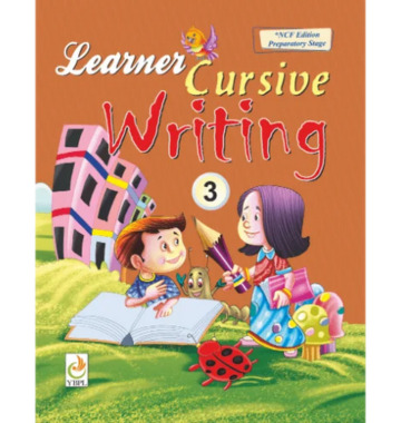
Cursive writing is an essential skill that shapes both a child’s handwriting and cognitive development. The Cursive Writing Class 3 Book by Yellow Bird Publication is designed to help students strengthen their writing style while having fun. This book makes learning cursive simple, structured, and enjoyable—perfect for growing minds in Class 3.
Why Cursive Writing Matters in Class 3
At this stage, children begin to move beyond basic letter formation and focus on fluency and consistency. Cursive writing not only improves speed and handwriting neatness but also sharpens fine motor skills and boosts memory retention. Cursive Writing Class 3 The Class 3 level is ideal for reinforcing letter connections, spacing, and rhythm.
That’s where Yellow Bird Publication steps in��offering a book that takes children through every curve and stroke with confidence.
What Makes Yellow Bird’s Book Stand Out?
YBPL is known for blending academic content with creativity. Their Cursive Writing Class 3 book features:
Clear step-by-step letter formation with arrows
Word and sentence practice to improve flow
Fun rhymes and short stories to make writing engaging
Daily writing drills to develop speed and consistency
Bold lines and attractive pages to maintain focus
Each page gradually builds a child’s ability from tracing to freehand writing, making it a smooth learning journey.
Flexible for School and Home
This book is suitable for both classroom and at-home learning. Teachers can integrate it into regular handwriting periods, Cursive Writing Class 3 while parents can use it for extra practice after school or on weekends. The structured layout ensures that kids stay engaged and progress steadily.
Moreover, its interactive content turns handwriting practice into a joyful task—not a chore.
Conclusion: Build Confidence, One Letter at a Time
The Cursive Writing Class 3 Book by Yellow Bird Publication helps young learners gain mastery over their handwriting. With consistent use, students develop clarity, speed, and style in their writing. Whether at school or home, this book is the perfect guide to cursive excellence.
#yellow bird publications#book publisher in delhi#book publishers in india#yellowbirdpublications#kindergarten book publisher#book publication#class 10 lab manual#cbse duplicate marksheet#book lover#book publishing
0 notes
Text
anyway the internet already has a lot of guides for improving writing and learning cursive so.
better penmanship in general
how to improve your handwriting | wikihow
how to write neatly | wikihow
most generally:
have good writing posture (plus a chair and table that supports it)
have a relaxed but comfortable grip on your pen. try out different sizes/girths, weights, or shapes (e.g. a triangular pen instead of the usual cylindrical ones), or use a pen grip if having difficulty with this.
tilt the paper slightly towards your non-writing side.
use your entire arm to write, including shoulders, and not just your wrist and fingers.
practice making evenly shaped lines and simple shapes.
practice writing your letters in a straight line, in similar widths, at similar heights. lined or grid paper works best for this, so you can really see the sizes of your letters.
write whenever you can. take even just 10 minutes every day to write something as neatly as you can.
how to write in cursive
cursive writing course | HEV project | yt playlist
basic strokes and shapes | lek writing | yt
the most important thing here, apart from recognizing the letter shapes, is to practice the basic strokes. they are so so so important for forming cursive letters, so practice doing them as neatly as possible - try to the loops equal heights and equal distances from each other. otherwise, everything from the general penmanship advice applies.
you don't need to do fancy elaborate calligraphic hands to read and write in cursive - it's just a form of writing where each word is formed without lifting the pen from the paper. you can make it as aesthetic or as chicken scratch as you wish. it's just faster to write with (when you're practiced in it) and can help you decipher other's messy handwriting.
0 notes
Text
Introduction to Italic Script: Classic Elegance Unveiled
Introduction to Italic Script: Mastering the Basics of Elegant Lettering
Italic script is a timeless writing style that exudes classic elegance. This introduction to Italic Script will explore its origins, significance, and popularity in the world of calligraphy. We will delve into the history of Italic Script, its unique writing style, and the various applications in art and design. Whether you are a beginner or looking to refine your skills, learning Italic Script opens up a world of possibilities in the realm of beautiful handwriting. Key Takeaways - Italic Script is a classic and elegant writing style. - It has a rich history and cultural significance in the world of calligraphy. - Learning Italic Script offers a journey of self-expression and creativity. - Italic Script is used in various applications in art and design. - Developing refined handwriting skills can be achieved through learning Italic Script.
The Origins of Italic Script
Italic Script has a rich history that dates back to the Renaissance period, where it was developed as a more efficient and legible way of writing. This elegant handwriting style was created in Italy by handwriting masters who sought to improve upon the Gothic script that was prevalent at the time. The script gained popularity for its slanted letters and smoothly flowing strokes, which added a touch of sophistication to the written word. Italic Script quickly spread across Europe and has since become a beloved and cherished calligraphic style. In ancient calligraphy, Italic Script offered a departure from the more rigid and angular writing styles that were common during that time. It introduced a blend of curved and straight strokes, creating an aesthetically pleasing and contemporary look. The unique proportions of the letters in Italic Script were carefully balanced, resulting in a harmonious composition. The script's popularity grew, and it became a favored style for manuscripts, official documents, and personal correspondence. Italic Script's origins in the Renaissance era solidified its position as a timeless and enduring writing style. Its influence can still be observed in modern calligraphy and typography, as well as in various artistic and design applications. The development of Italic Script marked a significant milestone in the evolution of handwriting, showcasing the ingenuity and creativity of the master calligraphers who sought to elevate the art of writing.
The Distinct Characteristics of Italic Script

Italic Script is renowned for its unique and distinct characteristics that make it stand out among other handwriting styles. One of the defining features of Italic Script is its slanted letters, which give it a sense of fluidity and elegance. The cursive nature of Italic Script adds to its appeal, with letters flowing seamlessly from one to another. This graceful style is achieved through a combination of curved and straight strokes, creating a harmonious and visually pleasing script. In addition to its slanted and cursive letters, Italic Script also maintains a consistent forward lean. This forward slant adds a sense of dynamism to the script, making it appear more dynamic and lively. Each letter in Italic Script is carefully proportioned, resulting in a balanced composition that is pleasing to the eye. This attention to detail and precision is what sets Italic Script apart and gives it its distinctive aesthetic. Italic Script's slanted letters and elegant style make it a popular choice for a wide range of applications. Whether used in formal invitations, certificates, or personal projects, Italic Script adds a touch of sophistication to any written text. Its legibility and timeless beauty make it a sought-after handwriting style in the world of calligraphy and design. Italic Script Characteristics: - Slanted letters that create a sense of fluidity and elegance - Cursive nature with flowing letters - Consistent forward lean for a dynamic feel - Carefully proportioned letters for a balanced composition Italic Script's distinct characteristics make it a captivating style that is appreciated by calligraphers and handwriting enthusiasts alike. Its combination of slanted letters, cursive flow, and balanced proportions creates a visually appealing script that stands the test of time.
Learning Italic Script: Techniques and Practice

If you want to master the art of Italic Script, it's essential to dedicate time and practice to develop your skills. Here, we will explore various techniques and exercises that will help you on your journey to becoming proficient in Italic calligraphy. Understanding the Basics To start learning Italic Script, it's important to understand the basic letterforms and their proportions. Each letter has a specific structure, slant, and stroke direction. Take the time to study and practice creating each letter individually, focusing on maintaining the proper slant and stroke consistency. Practicing Letter Combinations Once you feel comfortable with the individual letters, it's time to move on to word formations and sentences. Practice connecting the letters fluidly, ensuring a consistent slant and rhythm throughout. Remember to pay attention to the spaces between words, as they play a significant role in creating a harmonious composition. Consistency and Repetition Consistency is key when learning Italic Script. Regular practice is essential to develop muscle memory and refine your handwriting style. Set aside dedicated practice sessions, focusing on maintaining a steady slant, consistent letterforms, and smooth connections between letters. The more you practice, the more natural Italic Script will become to you. Learning Italic Script requires patience and persistence. Embrace the artistry of this elegant writing style and allow yourself the time to develop your skills. With practice and dedication, you will soon be able to create beautifully flowing Italic calligraphy that exudes timeless elegance. Benefits of Practicing Italic Script Techniques for Learning Italic Script - Improves handwriting legibility - Enhances attention to detail - Develops hand-eye coordination - Boosts creativity and self-expression - Study and practice individual letterforms - Focus on maintaining proper slant and stroke direction - Connect letters to form words and sentences - Regularly dedicate time for consistent practice “Italic Script is a beautiful art form that requires dedication and practice. Remember, the journey to mastery is just as important as the end result. Enjoy the process, embrace your own unique style, and let your creativity flow through every stroke of the pen.”
Applications of Italic Script in Art and Design
Italic Script, with its timeless elegance, finds diverse applications in the realms of art and design. It is a favored style in calligraphy, lending a touch of sophistication to formal invitations, certificates, and personal projects. Its legibility and flowing letters make it an excellent choice for wedding stationery and other formal events. In the world of design, Italic Script is often incorporated into logos, branding materials, and typographic layouts, adding a sense of classic beauty and refinement. When it comes to art, Italic calligraphy brings a unique charm to various creative projects. Artists and calligraphers use this script to beautifully render poetry, quotes, and other written expressions. Italic Script's elegant curves and slanted angles create visually appealing compositions that capture the eye. Whether it's a hand-lettered piece, a painting, or a digital artwork, the incorporation of Italic Script adds a timeless allure and a sense of artistry. Italic Script in Design: Italic Script plays a crucial role in design, particularly in the realm of typography. It has influenced the creation of typefaces that mimic its graceful letterforms. Designers often use Italic variations to introduce a dynamic and expressive element to their typographic layouts. The slanted and flowing letters of Italic Script add visual interest and movement to the overall design, making it a powerful tool for conveying a message or creating an aesthetic impact. In addition to its applications in typography, Italic Script also inspires designers to experiment and push creative boundaries. Artists combine Italic Script with other hand-lettering styles, resulting in captivating hybrid forms that merge tradition and innovation. These unique combinations allow for endless possibilities and enable designers to create distinctive and memorable visual experiences. In summary, Italic Script's versatility in art and design makes it a go-to choice for various creative projects. Its elegant and legible nature lends itself well to calligraphy, where it is utilized in formal invitations, certificates, and personal projects. In design, Italic Script adds a touch of sophistication to logos, branding materials, and typographic layouts. Its influence on typography is evident in the creation of typefaces that mirror its graceful curves and angles. Artists and designers find inspiration in Italic Script, combining it with other lettering styles to create unique and captivating works of art. Embrace the beauty of Italic Script and elevate your artistic endeavors with this classic writing style.
The Influence of Italic Script on Typography

Italic Script has had a significant impact on the world of typography, inspiring the creation of typefaces that mimic its elegant curves and slanted angles. Many type designers incorporate Italic variations into their font families, allowing for expressive and dynamic typographic layouts. The influence of Italic Script on typography goes beyond just adding visual interest; it enhances readability and adds a sense of flow and rhythm to written text. When used strategically in typographic layouts, Italic Script can convey different moods and tones. It adds a touch of sophistication and classic beauty, making it an essential tool for typographic communication. Whether it's used in headings, subheadings, or body text, the slanted letters of Italic Script create a visual contrast that draws the reader's attention and adds emphasis to important information. "Italic Script adds a sense of elegance and grace to typography. Its fluid and slanted letters create a visual harmony that enhances the overall aesthetic of the design." By incorporating Italic Script into typography, designers can create dynamic compositions that guide the reader's eye across the page. The slant of the letters creates a natural flow, leading the reader from one element to another. Italic Script can be particularly effective in conveying a sense of movement or energy, making it a versatile tool for conveying different themes and messages within typography. Italic Script in Typography Effects Adding emphasis to important information Enhances readability and draws attention Creating visual contrast and hierarchy Guides the reader's eye and adds structure Conveying elegance and sophistication Enhances the overall aesthetic of the design Adding a sense of movement and energy Creates dynamic compositions Italic Script continues to inspire typographers and designers, offering endless possibilities for creating visually captivating and impactful typography. Its elegant curves and slanted angles add a timeless beauty to any design, making it a valuable tool in the world of typography.
Tools and Materials for Italic Script
https://www.youtube.com/watch?v=yHfPDWUtkvc When it comes to practicing Italic Script, having the right tools and materials can make all the difference. Here are some essential items you'll need to embark on your journey into the world of Italic calligraphy: - A pointed pen or a broad-edged calligraphy pen: These pens will allow you to create the thin and thick lines characteristic of Italic handwriting. - Quality ink: Opt for a dark-hued ink that flows smoothly and consistently. - High-quality paper: Choose paper with a smooth surface to ensure optimal ink flow and a satisfying writing experience. Investing in reliable tools and materials will help you achieve the best results in Italic Script. The right pen and ink combination, along with the right paper, will enable you to create beautiful and elegant letterforms. It's worth noting that there are various options available in the market, so exploring different tools and materials can be an exciting part of your Italic calligraphy journey. Experiment with different pens, inks, and papers to find the ones that suit your personal preferences and style. Table: Essential Tools and Materials for Italic Script Tool/Material Description Pointed pen or broad-edged calligraphy pen Allows for the creation of thin and thick lines characteristic of Italic Script Quality ink Dark-hued ink that flows smoothly and consistently High-quality paper Smooth surface for optimal ink flow and a satisfying writing experience With these tools and materials at your disposal, you'll be well-equipped to embark on your journey to master the art of Italic Script. Remember to have fun, experiment, and let your creativity flow as you develop your own unique Italic handwriting style.
Exploring Italic Script Variations
Italic Script offers a world of creative possibilities with its numerous variations. Modern calligraphers and artists embrace these variations to add their unique touch and create distinct styles of Italic handwriting. By experimenting with different sizes, slants, and embellishments, practitioners of Italic calligraphy bring a contemporary flair to this classic script. The variations in Italic Script allow for personalization and customization. Artists often blend Italic Script with other hand lettering styles, resulting in exciting hybrid forms that merge tradition with innovation. These unique combinations push the boundaries of Italic calligraphy, making it a dynamic and versatile art form. Whether you prefer a traditional approach or enjoy exploring new possibilities, the variations in Italic Script offer endless opportunities for creativity and self-expression. By infusing your own style into this timeless script, you can create captivating pieces of art that showcase your unique artistic voice. Variation Description Italic Handwriting Styles Practitioners of Italic Script develop their own distinct styles by adjusting the slant, letterforms, and flourishes. These styles can range from elegant and refined to bold and expressive, allowing for a wide range of artistic interpretations. Modern Italic Calligraphy Contemporary calligraphers often experiment with unconventional tools and techniques to create modern interpretations of Italic Script. They may incorporate mixed media, vibrant colors, and experimental layouts to push the boundaries of traditional Italic calligraphy. Hybrid Forms Some artists combine Italic Script with other hand lettering styles, such as Copperplate or Gothic, to create unique hybrid forms. These combinations result in visually dynamic scripts that bridge the gap between tradition and innovation. Italic Script variations not only allow for artistic exploration but also provide calligraphers with the freedom to adapt their style to different projects and contexts. Whether you are creating formal invitations, designing logos, or adding a personal touch to a special gift, the versatility of Italic Script ensures that you can find a variation that suits your needs. Embrace Your Creative Journey Embrace the endless possibilities of Italic Script variations and embark on a creative journey that celebrates your unique style. Whether you choose to explore different slants, experiment with letterforms, or blend Italic Script with other hand lettering styles, your artistic voice will shine through. The beauty of Italic Script lies not only in its timeless elegance but also in the personal touch you infuse into each stroke. So, pick up your pen, let your creativity flow, and create captivating pieces of art with Italic Script.
The Impact of Italic Script on Personal Handwriting
Learning Italic Script can have a profound impact on your personal handwriting skills. The precision and attention to detail required in mastering Italic handwriting can significantly improve the legibility and elegance of your writing. By practicing Italic Script, you will develop a heightened awareness of letterforms, leading to greater consistency and uniformity in your writing. Italic Script's influence on muscle memory and hand-eye coordination can also enhance your overall writing speed and efficiency. As you become more familiar with the slanted and flowing nature of Italic handwriting, you will find yourself naturally adapting to a quicker writing pace. This increased speed does not compromise legibility, as the distinct characteristics of Italic Script ensure clarity even in faster writing styles. Furthermore, learning Italic Script opens up a world of possibilities for self-expression and creativity in your handwriting. The elegant and stylized nature of Italic Script allows you to add your unique flair and personality to every stroke. Whether you choose to embellish your letters with flourishes or experiment with variations in size and slant, Italic Script offers a canvas for artistic exploration within your handwriting. Italic Handwriting Improvement Tips: - Start by practicing basic letterforms and their proportions. - Focus on maintaining a consistent slant and stroke direction. - Gradually progress to word formations and sentences, emphasizing legibility and uniformity. - Regular practice and repetition are key to developing fluid and graceful Italic handwriting skills. Unlock the full potential of your handwriting by embracing the artistry of Italic Script. With dedication and practice, you can transform your handwriting into a testament of elegance and sophistication. Whether for personal use or professional reasons, the skills and techniques gained from learning Italic Script will undoubtedly leave a lasting impact on your handwriting journey.
Embracing the Timeless Beauty of Italic Script
Italic Script, with its graceful and elegant style, captivates admirers with its timeless beauty. The flowing lines and slanted angles of Italic handwriting exude an air of sophistication that adds a touch of classic charm to any piece of writing. Whether you are a calligraphy enthusiast or simply appreciate the aesthetics of elegant handwriting, embracing Italic Script allows you to immerse yourself in the artistry and creativity of this beloved writing style. With Italic Script, you have the opportunity to elevate your handwriting to new heights of beauty and expressiveness. The smooth curves and consistent forward lean of the slanted letters create a harmonious composition that is visually pleasing. Read the full article
0 notes
Text
Graphology Lesson 2: Zones
Now, I am going to tell you about zones...
The zones to which I refer are the zones of letters, especially when written in cursive (in an aside, men are more likely to print, while women are more likely to use cursive), the upper zone, like an upper loop, the crossing of a "t" or the dotting of an "i" or "j", represents the superego, which in some sense is the conscience, but can also be understood as the prohibitions parents/guardians/society placed on a person, to the extent that he or she internalized such rules and taboos:
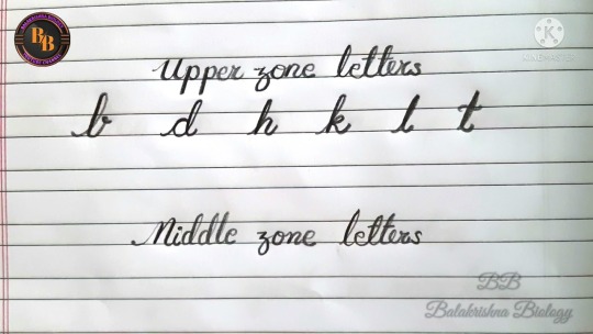
To use the above sample, which is more or less a handwriting demonstration, if it represents the typical writing of the author, the upper zones are quite narrow and conventional, meaning that the values he or she was taught are likewise. At the other extreme, very odd upper zones could be signs of genius and innovation, but could also be signs of psychosis.
One thing of importance is the height of t-crossings in lowercase: The higher they are, the higher the self-esteem of the author.
Middle zones essentially represent the core self that resolves conflicts between the upper zones (superego) and our primal instincts, the id, symbolized in lower zones.
The lower zone indicates libido and other primal feelings (e.g. such basics as the need to eat). For Tumblr especially, I ought to note the most common sign of same-sex attraction, in either sex, in handwriting, is reversed lower zones (reversed compared to conventional training).
For instance, in the most notably lesbian woman, Hayley Kiyoko, observe how the lower zones of the k's in "Kiyoko" invert the usual direction of looped k's:
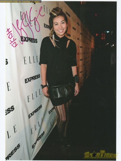
The longer the lower zone, the stronger the libidinous feelings, and this is specific to the subject, meaning that if someone's lower zones suddenly become longer, that person is attracted to the person or subject about whom he or she is writing.
As asexuality is distinct from low libido, however, ace people do not necessarily have short lower zones, but rather do not link the upward, return stroke of the lower zone with the middle zone. For instance, Nikola Tesla is often said to have been asexual:
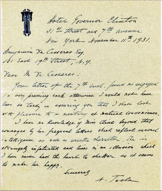
Tesla's lower zones are fairly long, but, for the most part, are simply lines that do not directly connect to the middle zones- in other words, Tesla did not feel a connection between his libido (lower zones) and his identity (middle zones).
#graphology#handwriting#psychology#Monty Python#cursive#Freudian#superego#id#libido#sexuality#same sex attraction#ace#asexual#Hayley Kiyoko#Nikola Tesla#self esteem
1 note
·
View note
Text
Nurturing Growth: A Blossoming Journey from Buds to Blossoms in Chennai
In the vibrant city of Chennai, the pursuit of holistic development for individuals is a paramount goal. This is especially evident in the realms of occupational therapy and handwriting classes, where the journey from buds to blossoms takes center stage. This blog explores the significance of these services in Chennai and highlights the best occupational therapy and handwriting classes that contribute to personal and professional growth.
Occupational Therapy in Chennai
Occupational therapy plays a crucial role in enhancing the lives of individuals facing various challenges. Whether it's rehabilitation after an injury, assistance for children with developmental disorders, or support for adults with mental health concerns, the demand for top-notch occupational therapy in Chennai is ever-growing.
When seeking the best occupational therapy in Chennai, it's essential to consider factors such as expertise, personalized care, and a comprehensive approach. Reputable centers prioritize understanding each individual's unique needs, tailoring therapy plans that encompass physical, emotional, and cognitive aspects. These services not only aid in recovery but also promote overall well-being.
One notable establishment renowned for its commitment to excellence in occupational therapy is Buds to Blossoms. With a team of experienced professionals, state-of-the-art facilities, and a client-centric approach, they stand out as leaders in the field. Their dedication to fostering growth from the initial bud of therapy to the full bloom of recovery makes them the go-to choice for individuals seeking the best occupational therapy in Chennai.
Handwriting Classes in Chennai
In the digital age, the art of handwriting often takes a backseat, but its importance in personal and academic spheres remains undeniable. The need for the best handwriting classes in Chennai is evident, as legible and expressive handwriting is a skill that transcends generations.
The journey from bud to bloom in handwriting is an intricate process that involves proper guidance and structured learning. The best handwriting classes in Chennai focus not only on improving penmanship but also on instilling a love for the written word. These classes go beyond the basics, catering to learners of all ages and skill levels.
Buds to Blossoms is at the forefront of providing unparalleled handwriting classes in the city. Their expert instructors employ innovative teaching methods, combining tradition with contemporary approaches to ensure each individual reaches their full potential. From foundational strokes to advanced cursive writing, this esteemed institution nurtures the growth of every budding writer, making them the epitome of the best handwriting class in Chennai.
In Chennai, the journey from buds to blossoms in occupational therapy and handwriting classes is a testament to the city's commitment to holistic development. By choosing the best occupational therapy at the finest handwriting classes at Buds to Blossoms individuals embark on a transformative journey, unlocking their full potential and flourishing in every aspect of life.
0 notes
Note
“I think it’s so neat that everyone develops their own unique handwriting even though we’re all taught to write our letters the same way. Really, it’s so cute.”
ANCIENT ASK | PLEASE DO NOT SEND MORE
With grace, Mai wrote the customer's name, Kihara, on the cup after taking the coffee order. It was such a pretty name, so the Celtic demigoddess made an effort to write as prettily as possible on a curved surface. Like she'd do for any name, really. Her cursive flowed smoothly like a winding river. The strokes were deliberate, forming each letter with care. When she finished, she made the coffee with just as much care.
"Kihara!" the barista called out into the café, putting the cup down on the counter, the beautiful handwriting facing out.
Mai chuckled lightly at the woman's observation, after a quick thought. Her eyes crinkling at the corners with amusement. "You're bloomin' right! It's like a little glimpse into someone's personality, isn't it? Even though we all start with the same basic letters, we put our own personal touch on them~" she smiled, appreciating the beauty in the little things, like the way people write.
"I like your name; it's really pretty! I hope I did it justice~"
#beehive :: answered#mpxkiki#[[ oh my god I sure tried!#[[ thanks for sending!!#[[ feel free to continue~ but no pressure; I know it's ancient lmao#[[ ancient ask pls do not send more!
0 notes
Text
luke pearce has a canon sample of handwriting and im gonna pick it apart
wc: 878
this post is written by someone who is so happy one of his niche and 99% of the time useless interests has come in handy. disclaimer: i got into handwriting trait analysis as just a hobby, so i'll use both terms that are standard and terms i made up cuz i cant remember what they were called but i remember they exist. im not an expert, i just forged signatures in high school
anyway, it's in SSR Perfect Partner, on the whiteboard. assuming luke's detective agency isnt home to a spectre who likes to write on the whiteboard, luke wrote these words. and im in LOVE


IT'S A RLLY ENDEARING KINDA HANDWRITING, IDK, IT'S THE VIBES. but vibes are not empirical, of course. what Is empirical are specific handwriting traits and elements and it's fun to take a look at!!
1) Letter Formation
since this sample is small as hell, basically a sample size for ants, it's hard to see every letter but it's still clear that that his capitalized letters in the word that isnt in all caps (letters H, J, and P) are quite large relation to the non-capitalized letters, theyre taking a lot of real estate in width and a little bit too in height.
aside from largeness in general, the space Inside those capital letters is a bunch as well. the space between the two vertical lines of the H is moderately far, the width of the curved portion of the P extends widely as well. the J is SUPER interesting to me for the same reason, it's got a wide lower extension and a wide roof too, but also the roof doesnt extend to the right. it starts at the top of the lower extension and only goes left. this happens in the horizontal line on the H too, as well as the curved element in the uppercase P in the most bottom word AND EVEN the lowercase letter p in the second word within the circle

sadly, since this sample is so tiny and like 5 pixels big, it's hard for me to see any characteristics for the other lowercase letters aside from the lowercase y (or a g, hard to tell) in the word beginning with the uppercase H. that y shows off a nice, wide lower extension, just like the J
-
2) Size Consistency
i mentioned this earlier already but the capitalized letters are much larger than the lowercase ones. this is how uppercase letters should work, but luke's handwriting emphasizes that a bit more. additionally, while the uppercase letters opt for widness, the lowercase letters opt for Flatness
-
3) Spacing
my GOD the lowercase letters are packed as hell. the uppercase letters get a lot of space and then all the lowercase letter crowd together
-
4) Connecting Strokes
i was only able to find one (1) clear connecting stroke in this sample, and thats in the word starting with the uppercase H. the H connects to the next letter

hard to tell if the other letters are in one continuous stroke too, but from a characterization speculation angle, luke's brain goes Fast. and this is his evidence/thinking whiteboard in his detective agency office. i can easily see his handwriting having moments of non-connection (i.e., each letter is done in one stroke, lift pen, next letter) when hes writing slowly, but when his brain kicks into gear he could shift into a more fluid connective kind of writing (i.e. multiple letters done in one stroke without lifting the pen, kinda like cursive but happening in printed handwriting)
-
5) Alignment
this one is also hard to gauge. alignment refers to if written words follow the either existing or imaginary line of the surface. like, if it's straight or slanting. but this is hard for this sample specifically since it's done on a whiteboard, where luke would have to be standing to write on a vertical surface, something Very Different than writing on a surface thats flat. so the alignments in the sample vary

in general, he does keep to the imaginary line with a tendency to slant upwards. but im not sure if thats a trait inherent to his handwriting or if it's cuz he was writing at position and angle that happened to change when he was standing at the whiteboard
-
bonus: i tried to recreate it
because of course i wanted to do that. heres my usual handwriting

practiced for around 20 minutes, heres my suffering

and heres what i managed to do after that

it's NOT GREAT (lowercase letters r nowhere near packed enough and since i had only practiced for a short time, none of the letters connect as they should when relaxed/casual/written fast) but getting a feel for his writing did let me know that MAN, IT'S FLAT. thats what i was most conscious of and felt, FLAT LETTERS, FLAT HANDWRITING FOR LUKE PEARCE.
i'd die for a clearer handwriting sample, especially for the lowercase letters to see Exactly where the connections happen, thatd make recreating the handwriting way easier. i also want luke's signature, i assume itd have this flatness and wideness in key letters too
#tears of themis#luke pearce#tot luke#i....dont know what to classify this as. this is not an hc or an analysis kjbkajfKSBDFSJDF#xia yan
119 notes
·
View notes
Text
THE HANDWRITING POST !!! (please excuse my chicken scratch physics notes… the things we do to stay awake in class)
first, the signatures:

(basically, i think he signs his name one of three ways: full name with the asymmetrical “m”, full surname with first initial, and initials only. legible, but slightly messy)
***
second: manuscript + cursive:

(the manuscript/print was more for fun than anything, as i hc that he almost exclusively writes in barely legible cursive. i imagine he’s like me in the sense that he writes fast because he thinks so much, so everything looks all skewed.)
***
fun bonus: kanji! (not really hc anymore, i just wanted to try my hand at it. it’s so many strokes!! i can’t remember stroke order for the life of me��)

#yo it's d :)#my emotional support geezer#also i (accidentally) took inspiration from mana’s signature ‘m’ without thinking about it#however they’re quite dissimilar so it’s hard to tell.#also i imagine he feel out of practice writing his name w/ kanji bc he lived in the us for so long#FUCK **fell#my favorite of my faked signatures is 100% the first one though. it looks so classy and pretentious (to me)#edit: my mother thought i was doing homework while i was making this post. i pretended to do homework for y’all.
2 notes
·
View notes
Note
Please do more of the writing head canons. It’s really interesting to see other people’s ideas on the topic, so if you can be bothered, I would highly appreciate more, thanks bye <3
Y’all don’t know how happy I am to talk about these headcanons, they are my babies and I love them so much :’) thanks for asking g <3
Handwriting Headcanons
Same dynamic as before, try to guess whose handwriting it is before reading and tell me how many you got right! <3

You can find the first post here (no need to check it tho)
Quick disclaimer: halfway through making my initial notes, I remembered I had one (1) single lesson of graphology in my applied linguistics class, but that was a year ago and some information might be off. I just thought it was neat to include.
Another quick disclaimer: I don’t know much about Hylian, but I like to think it has a similar stroke system to Japanese, so the pressure and accuracy of your strokes play a major role in your handwriting (among other things, ofc.) so there are some parts where I focus more on that
(First Row, from left to right)
Sky
Our first boy is mother hen! Believe it or not, he has the prettiest handwriting out of all of them! Sky: probably has nice, even elegant handwriting because Sun forced him to practice when they were little. In the end, that paid off because his handwriting is the prettiest one. There’s no pressure, but he is confident in what he writes that his lines aren’t thin. Mistakes? what is that? this boy has impeccable grammar and spelling. No mechanic errors to be found in his letters! I’d like to think that many of Hyrule’s classic/staple poems were originally written by the firt king aka sky child. Like, imagine, after a retiring from being a Person of Power (as the first ruler), Sky finds comfort in the arts: revisits his old woodcarvings and starts writing poetry about the world he still doesn’t fully understand. wowie. tldr: sky writes poetry and you can pry it from my cold dead hands.
This is what one of his letters would look like:
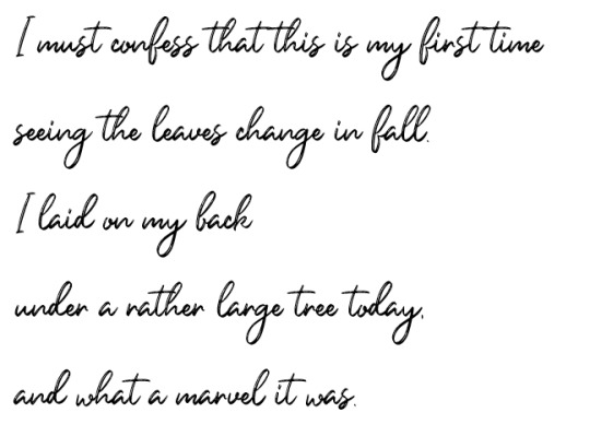
Next one is the one and only, our Hero of Time
2. Time
I’ll die on the “Time didn’t know how to read and write” hill. His handwriting is simple, not pretty but not messy. It has some grammar and spelling mistakes here and there. Can become unreadable if writing in a hurry, he sorts of forgets spaces between words are a thing/letters have different sizes and lowercase letters end up the same size as capital letters. I’m not saying he sometimes forgets to write articles: he just doesn’t want to. Honestly, he just has this dad-neat handwriting. He is a gentle dad and writes like a dad, if he puts too much pressure onto the paper, his handwriting become too sharp/angle-ish and ends up looking ugly. And as much as he would like to not care about it, in the end he does (:
Malon taught him how to write and it was quite the experience. At first he didn’t want to because he was ‘too old’ to learn and it was torture at first, but now look at him devouring his cowboy novels.
A chunk of his handwriting:
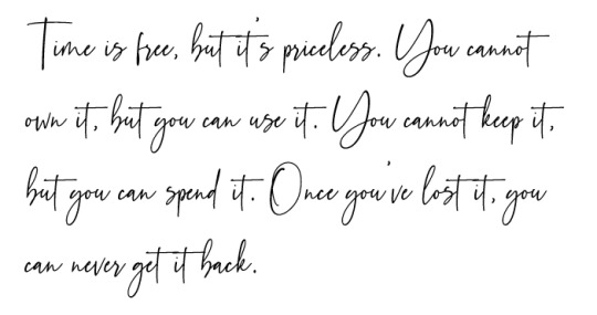
*sniff* such a dad quote.
3. my mansss, your 4x1 deal at Target: Four
Look, my boy is patient! He could do some nice and fancy lettering if he wanted to. He was taught that handwriting and spelling said a whole lot about him as a person, you know, like a first impression kinda thing; so he always proof reads more than twice before sending a letter. Super rare grammar mistakes.
The faster he writes, the more slant his writing becomes. Under stress/ when not sure how to write things down, run-on sentences are everywhere and his handwriting is inconsistent in general (I don’t headcanon each part of him having completely different handwriting because handwriting becomes muscle memory over time. It’s just slightly different variations of the same, like idk Vio’s handwriting is neater than Green’s and Red writes hearts instead of any dot/circle and no, I do not take constructive criticism on that, jk i do.) Adding on to each of the colours’ handwriting, I’d think Red and Green write with words slanted to the right( inclined), Vio is a mix of the opposite, so reclined and straight, and my mans blue a true neutral writes straight (kinda like Time’s).
The logic behind this is that inclined writing supposedly means honesty and need for giving (and getting) affection; reclined means, as you can probably imagine, defensiveness and repression of true feelings, but also shows great concentration; straight handwriting means self-control, observation and reflection as well as distrust and indifference. But as complete being (tm), Four just writes as in the image example which is not too straight and not too inclined, and I believe that’s a good middle for him
HOWEVER, if I’m feeling in the mood for crack, I totally accept this boy to have the ugliest, chicken scratches-looking handwriting! :’D It’s just funny to think that someone like him, who has to be precise and careful in his work, can't write neatly to save his life.
One of his letters would look like this:

Also I just LOVE how his hero titles look in this font ksksks
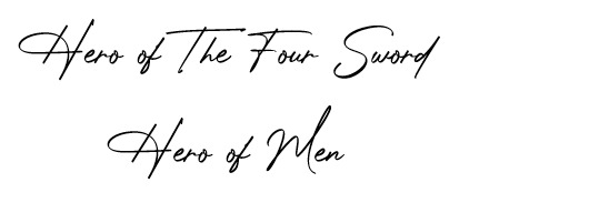
and that’s
(Middle row, from left to right)
4.- Mister Bunny Boy - Legend
His uncle taught him how to write. I’d call his handwriting pretty and neat at a first glance, but he presses too hard on the paper, most of the time staining the back or the following page. Sometimes will retrace some words if he doesn’t like how it looks (which only makes it messier). According to my notes, a thick or strong handwriting represents determination/commitment.
As I also headcanon him to know many languages, mechanical errors are more present than grammar ones; that is, weird capitalisation of words. Punctuation is somewhere in between; uses too many commas when he should just cut the sentence. he mixes punctuation from two languages or more in writing when too distracted (or too focused, because, well, pressure.); when he writes for himself, he has almost no problem following said language’s punctuation rules. Also, this is just polyglot culture, and I’m projecting a bit, but when he forgets a word in the language he’s writing, he just replaces it with its equivalent in another language because we don’t care about fluency, but rather functionality. in this household (more on that in my language hc, ksksks).
An example of his writing:
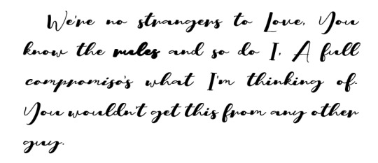
so powerful
4.- Mr. Wolfman, howl me a song - Twilight
I don’t have much for him because 1) I don’t think he writes a lot and 2) he is a hands-on/visual learner, I’ll die by that. He only learnt how to write because Ulli insisted it was important and he was not about to disrespect his momma; he IS That Guy, but doesn’t really write enough to have neat handwriting.
Many people seem to overlook the fact that his house is filled with books and write him as completely illiterate (which if not explored properly, ends up feeling a bit disrespectful and full of prejudice, but go off I guess; and that’s on my core Headcanons for Twi); however, he sticks to simple sentences. Knowing how to read and understanding a text is different from knowing how to write them. Like, when we would see a semicolon and understand its position in the text, but didn’t understand the nature of it. Is this clear? idk i’m sorry. So yeah, boy reads a lot, writes very little.
As for his Actual Handwriting, as opposed to Legend, his handwriting is thiccc but not because he presses into the paper; he is just that messy, he has no sense of ink-flow-control, he does what he can with what he has. To the untrained eye, his handwriting illegible letters like v, n, u are very similar; when he makes notes for himself he does it in the form of doodles or small ‘icons’. But! He reads a lot, so he rarely makes spelling mistakes (: he is your go-to guy when you don’t know how to write a word.
An example of his writing:

He keeps a journal, sue me.
3. My first born- Warrior
Okay, first off... I accept this is completely biased. I saw the idea and said “That’s True”. If you haven’t, please read Effective Communication; or The Lack of Thereof by htruona, a fic where the boys reflect on the language barriers between them. It’s incredibly funny and probably what made me start making these silly notes. So, if you’ve read that fic, you know where I’m going.
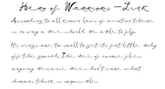
My man, Warrior, can’t fucking write. I mean, he physically can, but it’s very bad. Here’s the reason for it, tho, and it’s not his fault: Technically, he knew how to write alright but he joined the military and whatever note he had to write had to be concise or in the worst case coded. He mixes capital and lowercase letters. If we consider that he joined the military at around 15, his handwriting and grammar had yet to continue developing. Just think about how after summer break, your handwriting was always slightly worse than before because you didn’t write for an entire month. Now think what 2 years can do to that. Hmm, not cool, dude. He makes quick notes, when writing he’s all gotta go fast. he is the lighting mcqueen of writing; good for emergency messages, not ideal for love letters. His punctuation also suffered a lot, he only know full stops and commas and hardly uses them. A sentence for him is either one word or fifty without a single comma, no inbetween.
His hero title and an example of his writing.
(Bottom row, or what I like to call “fuck cursive” row)
7.- Magic man - Hyrule
I’m basic and I do agree with the popular headcanon of he not knowing how to write because well, y’all know his Hyrule. He only knows how to write his name because that’s important, same with numbers. I don’t see why would he write/read except checking the roadsigns. (he can even use this as an excuse for getting lost frequently; he thought it said something different.) But I do think that because his habitual reading consists of roadsigns, his ‘punctuation’ is weird af and places full stops/points/periods at the same level of his words and his commas/question/exclamation marks below them. Yk, creative license. Sadly, I don’t have much about my magic hands man so here’s what his writing would look like if he actually wrote a paragraph:

Man, I love Hyrule.
8.- Man, I don’t understand this boy - Wild
Cursive? ain’t nobody have the time for that. He woke up and had to save the world in his underwear while not knowing how to read nor write. He learnt during his journey and was taught by multiple people from different regions, that explains his inconsistent spelling of things and names for them. So Wild knows language variations for many items and uses them interchangeably (even if they aren’t exactly the same). Another headcanon related to writing/language skills that I’ve been thinking about is that if the shrine was able to cause amnesia, I’m sure there were other areas in the brain affected which leads us to language disorders such as agraphia and aphasia. But that’s a story for another day ksksksk
An example of his writing (after relearning)

9.- The best of sons - Wind
I don’t have much for him and that makes me sad. Look, he’s a kid, doing kid things like stabbing dudes on the head. This boy was taught cursive by his grandma, but could never do it and no one needs it anyway. His handwriting is good enough for his pirate life, Tetra is the one to handle Official stuff, he just gotta sign. Spelling and grammar mistakes abound. He is still relatively young and can correct his handwriting if he desires. But same as Wild, with how many times he’s been thrown out and hit his head, I’m starting to consider some language disorder for him as well.
An example of his writing:

aaand that’s it.
Thanks, y’all for showing interest in this silly thing uwu it was fun to finally talk about this. If you ever want to discuss ideas/headcanons(especially if they are related to language and culture), I’m your person (: I’m always happy to hear new headcanons. Feel free to add anything to this post either in a reply or in a reblog, I’d love to hear from y’all <3<3
#linkeduniverse#linked universe#anon#ask#lu headcanons#well that took more than an hour#but tbh i got distracted by the polls#yikes#but anyways here's my essay#ksksksk#I'm sorry for being more detailed in some#sometimes there's not much thought going on other that#than I vibe with it#yk?#anywussy pls let me know what you think#and if you have any headcanons related to writing pls let me know i b e g#echo i'm sorry for slaughtering warriors like that ksksksk he wasn't the one with detailed writing#although i can also imagine him the way you described it#but russian-cursive-writing!warriors held my monkey brain hostage#and there was nothing I could do#aiñ forgot to add the main tag#because tis is the official post ksksksk
146 notes
·
View notes