#badTV effect
Video
youtube
Create BadTV effect with this Canva App for FREE | New tending Canva app
#youtube#Canva#Canva design#Canva tutorial#Canva photo editing#photo editing#photo effect#photo effects#learn design#graphic design#graphic design tips#Graphic design tutorial#badTV effect
0 notes
Text
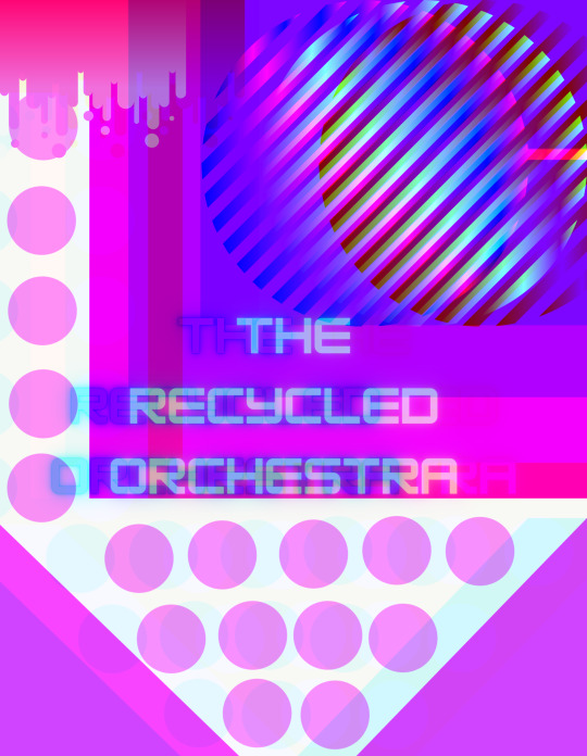
final album cover annotation
cogc
task: add more information about the software you used for the final album covers and why
throughout the process i tried multiple different softwares (apps and websites) to edit photos for the ideas for the album cover. during the process/whilst working towards the final album cover and trying out different ideas on the work from the start of the year, i wanted to try as many different styles and ways of creating my pieces of work so that i had tried as much as possible and had different experiments in them so that i could then use this as reference too for future work like the final album cover. the softwares that i had used as my experimenting and that i had done for my work throughout this unit included: adobe draw, canva, ibispaint x, etc. i did a lot of my work by doing work by hand, such as tearing/cutting old newpapers and collaging them, or using things like tape or pens etc, which i then took into apps/websites and edited digitally. i also did some work that was all digital. i liked the completely digital work as well as the work that i did by hand and then turned digital, so i wanted to use a mix of completely digital and hand made work. the software i used for my final album covers was canva. the reason that i picked canva as my software was due to the range. on canva you can import photos (which is how i got the hand made work into the piece), and there are a large array of things such as; fonts, text boxes, borders, shapes, lines and other digital elements i could include. there is also a lot of different colours and ways i can change things easily to fit what i want. another reason i chose canva as the software i used (mainly and for the final) was because i actually use canva a lot for personal things, so i actually have a lot of knowledge about it and im more comfortable about it. for designing purposes, i chose it for the the fonts, digital elements and the ease of it, also due to how professional you can make your work look. the main reason i chose it was due to the different filters and effects you can put onto your images. on canva you can do a lot of things to the elements and photos of your work such as adjusting the photos brightness, saturation, blur, tint and contrast. you can also crop easily and move the elements around. my favourite parts of using canva and some of the main reasons i chose it was due to the fact that there are lots of different filters for your images to make it look many different ways, and you can also edit these filters intensity to help it fit better. the other reason is due to the effects you can add to your photos. my favourite part of my final piece and works in general was adding the effects. some of the effects include things like: duotone, glitch, badtv, pixelate, slice etc - there are also then multiple different versions of these categories/effects so you can chose the version of the effect you like best and then you can also edit the effects’ speed, amount, angle etc. i used different glitch and slice effects on my works when i used canva, and i used duotone and glitch a lot and in layers on my final pieces. the different effects on canva also helped the hand crafted elements that i made look better and more professional and made them fit into the piece better. overall, i think using canva was the right software for my final pieces as it helped advance it and make it look more professional and well done. it also gave me different things to work with and edit with and include into my pieces to make them look better. i like how canva helped my piece turn out and i will most likely use it again for my other pieces of works and finals.
0 notes
Photo


Joe's eyes met Nicky’s. He’d purse his lips whenever he recalled his tumultuous memories of the time when they’d met. “Nicky and I met in the Crusades.”
“The Crusades?” Nile asked, incredulous.
Nicky almost gave a smile as he remembered how much he’d learned from the man he’d come to love as they’d travelled together through the Levant. "The love of my life was of the people I’ve been taught to hate.”
Nicky and Joe told Nile how they’d killed each other—many times—when they’d met in 1099. They neglected to mention all that happened afterward: how they’d travelled together through the Arabian desert, each desperate with feelings of lust for the other.
This photo-set reimagines this scene from the movie as it might have been screened on an old analog television set. When Joe and Nicky begin to reminisce about the early phase of their relationship, the film rewinds to play back two episodes they still remember vividly: when Joe taught Nicky how to ride and when Joe gave Nicky some advice on how to negotiate in Arabic.
Image description and “behind the scenes” look at the design of the cover art for the Needle & Prick series below the cut—
[Image Description]
“Behind the cover” series header image; white text over an image of a canvas covered in dark blue paint with visible brush strokes.
Still from The Old Guard (2020), of Joe's expression as he stares at Nicky, with his head is tilted to the side, giving him a half-smile; the image is over-laid with horizontal lines to make the still look as though it was screened on an analog television set or a warped VHS tape.
Still from The Old Guard (2020), of Nicky as he looks back at Joe; his head is also tilted to the side and he has one arm over the back of his chair. This image is also over-laid with horizontal lines to make the still look as though it was screened on an analog television set.
Still from The Old Guard (2020), of Joe’s expression, overlaid with warped horizontal lines—as though the still were captured as the scene was rewound.
Cover-image for Riding Lessons, of a sepia-toned image two horses with their heads meeting in the centre of the image, overlaid with six orange ‘x’s, and the words “Riding Lessons” in orange capital letters.
Cover-image for Negotiation Advice, of a sepia-toned image of two hands—one dark, the other light—grasping each other, overlaid with orange loops that resemble ties and the words “Negotiation Advice” in orange capital letters.
[Design Statement]
This photo-set was designed using Canva, a free website that allows you to manipulate images with clip art elements and other effects like analog distortion or “BadTV.”
The cover-image for Riding Lessons, in which the image of two horses is overlaid by a row of ‘x’s, is a visual reference to the fact that Nicoló’s horse remains unnamed in this story—to preserve her anonymity—given that no one bothered to ask for her consent before Yusuf affixed a dildo to Nicoló’s saddle.
The cover-image for Negotiation Advice, in which a looping squiggle appears to connect two grasping hands, is a visual reference to the rope that bound Nicoló when Joe negotiated for his ransom and the first time they had sexual relations.
You can read both stories in this series here, on archiveofourown.org.
0 notes
Text
Task: Final Piece
For this I created it using Adobe Draw on my phone, I was listening to the recycled orchestra while I made this. The music spoke to me and I just let it out, yes its random but I like it. Just the use of simple shapes to make bright and interesting artwork, sometimes simple is good.
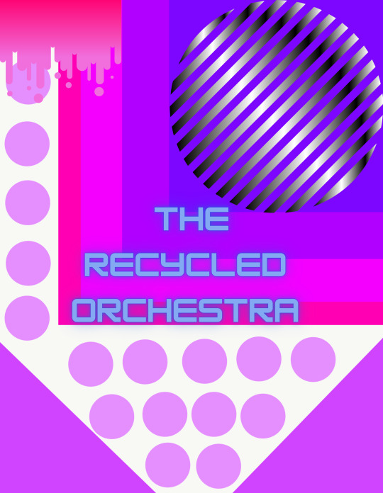
With this I had taken the first image and made some edits in Canva. I just felt that this needed more work to be less plain so I added some minor changes as well as the text so its clear what this work is for.
Once in Canva I decided to mess around with some effects, this one is BadTV-Rerun. I like how its distorted but still clearly visible, I feel this makes it look far more interesting to view. Its more eye-catching.
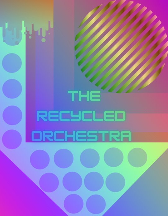
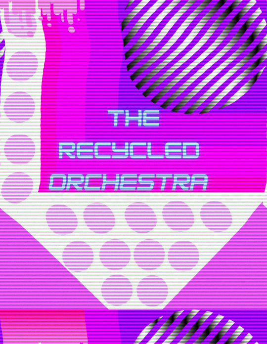
More edits from Canva, this effect is MixColor-Rainbow. Its interesting to see how the colours change and blend, yet its still not a massive change it still hold the original look but with a bit more flare and it looks less simple.
Effect Glitch-Split. This effect from Canva is just odd compared to the pervious two, its almost like a glitch program on a computer. Against the other two this stands out and is very noticeable, it looks wrong and somewhat broken. However its my favourite and I really like it because it stands out and because it looks wrong, its different and thats good.
0 notes
Text
cogc
final for first unit (monday class)
album cover - front cover (process)
for the final album cover i wanted to incorporate elements from the previous work (digital and hand made work). i made my final design as a mix of different thumbnails i created. i also used elements of the recycled orchestra and andy welland for my final.


the first thing i did was tear out scraps of newspaper. this was for the part of the design where i was inspired by the recycled orchestra. i was inspired by the word “recycled” so i recycled an old newspaper for this design and used it. i also wanted this as something different than the digital work that we had been doing previously. after tearing the paper i layered and stuck the pieces together to make up around a half of the album cover.

after it dried i took photos of it and then removed the white paper background from the image, because otherwise the white paper would show on the final design and i wanted the final design on a black background rather than a white one.

since i had finished making the “recycled” part of the design i then moved onto the bright and digital part which was inspired by andy welland and the previous work we had done. i started by placing basic shapes and colouring onto a black background. i then played around with it some more and edited the shapes and colours.

i wanted to edit these colours blocks with effects but canva only lets you edit effects onto images, therefore i downloaded the design as an image and deleted the background (so it would only edit the colour blocks and not the black background too)

i then used multiple different filters such as “glitch” and “badtv” and “slice” etc, and layered them to then give me this digitalised design which was inspired by previous digital work we had done and the bright colours was inspired by andy welland. the bright colours also fit well with the “orchestra” part of the recycled orchestra as an orchestra is loud and bright.

another issue i came across on canva was that i can’t upload two images on top of each other and edit one or both of them (i can upload multiple images but i can’t edit them once they’re layered). i had tried layering the pre edited block colours whilst the “recycled” image was already placed but once i tried editing, the “recycled” image would disappear. so to get around this i edited the block colours until i was happy with them and then downloaded it and removed the background so that it was an image that won’t then need edited later on

after doing that, i then uploaded the “recycled image” onto the top right area of the design and onto a black background - i chose a black background as i felt this would help the images and subject matter stand out more and would blend nicely with them. i really liked how this turned out so far as the newspaper looked very good on the design.

i then layered the edited colour blocks onto the newspaper. i really like how the digitalised piece fits with the hand made piece. i think the bright colours contrast and fit well with the dark newspaper design. i also like how the digitalised look contrasts and fits with the natural and hand made look of the newspaper.

the last thing i had to do was add text. i made a concept board of different texts and the main colours i’d chose from, so that i can compare them and see which fit well.
0 notes
Last Seen Blogs

moonst4r
Moon and Stars


adertak
BICman

wallpaper-custom
Tanpa judul

homuraakumaakemi
Kuroe's Biggest Fans