#back to the old lookbook format
Explore tagged Tumblr posts
Text

POV: You're Gwen Stacy and it's maintenance day 1. SHIRT | SHORTS | BAG | SHOES 2. SHIRT | SHORTS | BAG | SHOES 3. SHIRT | SHORTS | BAG | SHOES Thank you to all the cc creators: @tauvesims, @simstefani, @yuyulie, @cocogames, @fukkiemon, @casanovasims, @merchsims, @helen-max
#back to the old lookbook format#sunny's look books#sunny's blog#simblr#the sims lookbook#sims 4#the sims 4#ts4#cc finds#the sims 4 lookbook#ts4 cc finds#s4cc#s4ccfinds#sims 4 cc#ts4 cc#sims4 cc finds
510 notes
·
View notes
Photo


Hyun-woo wears the Old School varsity jacket by @sokea-cc and the Noah cargo pants by @clumsyalienn
#ts4#the sims 4#ts4 lookbook#ts4 look book#s4 lookbook#ts4 edit#new simblr#sokea-cc#clumsyalienn#not me switching back to my old format 3 posts later#at least the lighting set up is new#hyun-woo seo#my portrait
157 notes
·
View notes
Text
Spring/Summer & Haute Couture Week 2021: Whoops, I’ve Missed a Loooot
Hi to anyone reading,
Where TF has the time gone!?
After experiencing the longest January of all time (when your birthday is right after New Year, you get that between Boxing Day before NYE slump like a couple of weeks after everyone else), February has gone by in, like, 5 minutes and already we’re well into the throes of the F/W 2021 collection presentations. Meanwhile, I’m here like! Surprise! Here are my reviews of the S/S 2021 collections if anybody still cares! I mean I’m mashing it up with corresponding haute couture week reviews to fool everyone into thinking that doing it so many months later was intentional and it was totally working right up until this sentence, right?
In all fairness, I originally thought that I wasn’t going to bother reviewing S/S21 because it seemed kinda redundant given the circumstances and I wasn’t keen on the idea of collections being showcased via photo sets which is the route so many brands chose to (understandably) go down. Buuuut, the more I saw of what designers had put out there, the more I was tempted to put this post together and now here I am. The fact that designers are even able to churn pieces out during a pandemic when I’m out here like 0__0 no thoughts, head empty...it’s impressive to say the least, especially the way so many used the circumstances to inform their designs. In a way, it would be a disservice not to do a post on the season, and yeah it’s late, but given that it we are actually about to enter spring and the shows are kind of the deciders of what’s going to be “in” and “out”, they’re more relevant than ever. With plans for our way out of lockdown materialising-now is the perfect time to add that I don’t want ANYONE suddenly developing selective amnesia over how our government has failed us now that Boris has announced when the clubs COULD reopen-let this post serve as a roundup of every bit of inspiration available for our spring fits. I also want to use this opportunity to disclose how irritated I am at myself for starting the previous fashion week reviews post by declaring I was going to work through the designers in chronological order when I meant fucking alphabetical because I now can’t go back and change that. So this time, let me start properly. I’m going to be reviewing the collections in ALPHABETICAL order. Now that’s out the way, let’s do it. First, Acne:
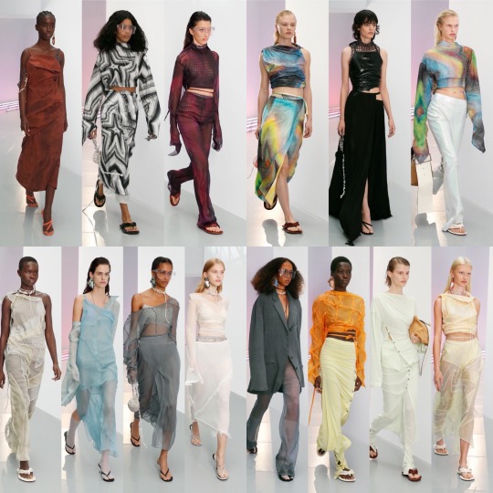
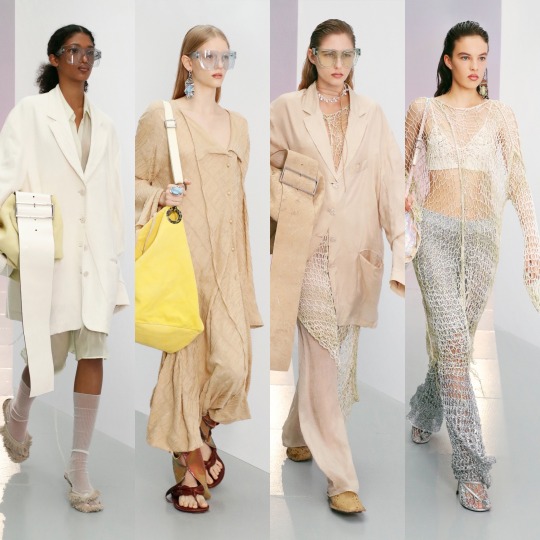
It’s so great to start on a high, it really is, and fortunately Acne is reliably good. It’s still got that deconstructed, minimalist feel that the brand is known for but for the summer season; we can see creative director Jonny Johansson and his team moving away from the heavier pieces we saw last time round, away from upcycled bohemian curtains and towards a breezier, more season appropriate aesthetic, boujee kaftans and swimwear rebelliously hacked up and artfully rearranged, and it feels correct. The net pieces, the beachy colour palette, the oil spill-esque print (though this represents an intruder of the marine ecosystem, as a print I loveee it and 100% want more!) and the accessories, reminiscent of shells, coral and anything else you might find on the seabed, give me a hipster mermaid washed ashore vibe which completely fits with that rugged, mysterious sense of Nordic folklore references and adventure the brand has established as its foundation. If it’s a nod to some kind of new age cult that Johansson was going for, which apparently is the case, I’m guessing said cult worship sea goddesses and perform pagan rituals on the beach by moonlight, and though indoctrination doesn’t sound at all inviting, it's a party compared to scientology.
The chiffon trousers here are actually chic and seeing them styled under a blazer makes me realise done right they CAN be more than just a PrettyLittleThing summer sale piece, so I’ll store that away for outfit inspo when the time to get rid of some layers comes around. The glasses, too, are very Gucci. Flip flops with socks I don’t think I can ever come round to but-


Whilst it was a favourite of mine last season and it sticks to that same bohemian vibe with a lot of the elements I love, Ferretti lacks a little oomph this time round; it’s more stripped back, neutral, easy-going, and it is lovely, but for those same reasons it doesn’t grab my attention as much as the past couple of collections have. If you’re an influencer wanting to shoot a Joshua Tree desert lookbook this is sublime, but compared to the flair I saw in their last winter show, for example, there’s something lacking.
I’m very glad to see neutral coloured boiler suits on the runway, however; I snagged myself one off Depop the other week so I might be unintentionally ahead of the curve for once! The crochet detail dresses are nice too but very much remind me of past Zimmerman collections, or an Ermanno Scervino grab for the most high street friendly parts of Erdem SS2020, something along those lines. What I’m trying to say is that it’s definitely been there done that, even by Ferretti themselves and not in a continuity kinda way, in a kinda…this is basic and pretty so we know it will sell kinda way.


Eurgh, I wanna be one of these Alessandra Rich girls so bad.
I end up repeating myself every single time because I always love her collections but really, this is what a high fashion novice thinks Chanel is. Alessandra Rich outsold. As much as her dresses have looked amazing on people like Kate Middleton and January Jones, I’m just waiting for one of the modern it-girls to take the nostalgia-tinged femininity of her pieces and put some kind of daring, street-style twist on it; if that doesn’t happen I’ll gladly take 5 minutes of fame so I can do it before fading back into obscurity. Let me fulfil my modern first lady fantasy, reenact the croquet scene from Heathers, drape myself on a chaise lounge whilst smoking with a cigarette holder, and then throw me back into the trash where I belong. I can die happy. Also, can we once again appreciate how much more iconic the Alessandra Rich two piece made the already moment Dakota Johnson singlehandedly brought down the Ellen dynasty?

Dakota knew exactly what she was gonna do and the energy that she was gonna channel when she wore that piece and I admire it. Alessandra Rich, if nothing else, will go down as a key moment in pop culture history, and you know what? It’s what she deserves.
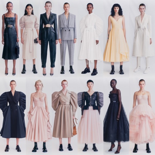

Whilst I do wish she’d branch out a little and try and get back in touch with the dark drama of old McQueen collections now and again, Sarah Burton has made a very recognisable Alexander McQueen silhouette and it’s beautiful; this season is gorgeous as always. A leather biker and tulle affair that’s perfect for a grunge ballet, it’s easy to avoid lamenting the excitement and theatrics of old collections when Sarah creates such consistently sophisticated pieces. Stunning.
Now, a quick haute couture detour with Alexandre Vauthier:
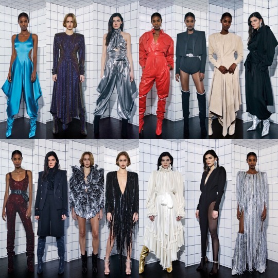

Compared to other haute couture collections, this is pretty toned down and by appearances alone (I know haute couture is more about meeting technical requirements more than anything else but there is a level of grandiose you expect to see) is more like a RTW collection than its counterparts. That being the case, I don’t have a huge amount to say about this one, though I do really like it-the ruched metallic boots especially. The Studio 54 vibes and the glam rock influences are clear and a lot of these pieces could definitely make it into Lady Gaga’s AHS Hotel wardrobe which is a compliment of the highest order, so there ya go. Plus, if a collection IS gonna be presented through stills, a format like this is preferable to some of the others I’m gonna talk about. There may be more exciting ways of doing it but simple allows us to see the clothes properly and at the end of the day, that’s what I care about the most!
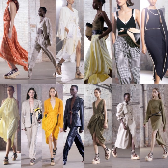

Heading back to good ole’ RTW, we have Altuzarra; I wasn’t hugely keen on their last collection but this is definitely a step up for me and justifies keeping them on my radar. Though in some ways this seems like less of a summer collection and more of a late winter/early spring transitional one on the basis it can’t seem to decide which temperature its catering to, there’s a lot to like: a colour palette that reminds me of a Dion Lee collection, harnesses evocative of those sprinkled throughout the last few Alexander McQueen shows, and more of the utility wear trend that I’m still very much into nicely contrasted against lighter, airier pieces for an overall fresh, modern vibe. The interpretive dancewear style pieces are interesting and the woven platform sandals are the shoe of the summer but the white shirt with the cape incorporated is definitely the high point of this show and I absolutely adore it.


Anna Sui was actually pretty cute this time round. Her pieces have always been kooky, but in the past a little too lairy and occasionally cheap-looking for me. This collection, however, is kooky in more of a Melanie Martinez styled baby doll kinda way, as opposed to in an eccentric Bjork loving aunt whose idea of heaven is an all-must-go Primark sale kinda way (I know some people are going to vehemently disagree with my aesthetic preference there) and I love that. There seems to be a lot more creative direction going on, a much clearer vision of what Sui wanted to achieve, and yes a few of the looks went a bit too hard on the cookie cutter vibes but on the whole, they were more edited than usual; it seems Sui actually paid attention to the “take one thing off before you leave the house” rule this time. The staging is the perfect compliment to the doily style bucket hats and the sandals paired with frilly socks, and really adds to the whimsy of the collection, and as a whole, it really reminds me a lot of the way my mum would dress me as a toddler but styled up for a grown adult. Cute AF.

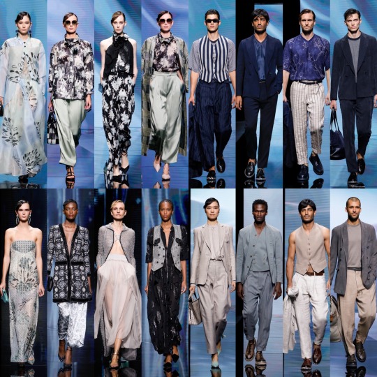
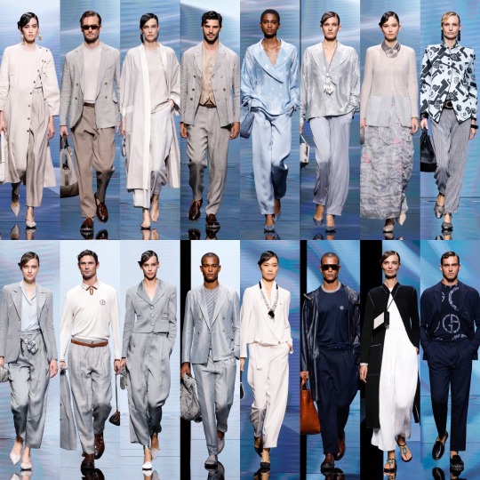

Armani RTW I was pleasantly surprised by, considering I don’t usually rate it. It’s a cool, androgynous take on retro shapes and styles that’s simultaneously fit for the hustle and bustle of the modern world. Strong 2021 Peggy Olsen vibes, and a bit muted Lacoste-I can 100% imagine Elisabeth Moss as Peggy swanning around in one of those huge minimalist houses with the floor to ceiling windows after a long day at work, though we’ll switch the cigarette for a vape because...you know...welcome to the future. And sure, maybe the vision is slightly influenced by THAT scene from Us, but whatever. As for the men’s wear, if I have to look through an endless gallery of straight white men in plain ass suits every time I do some kind of red carpet fashion review, I at least hope they’re wearing Armani. I need me some impeccable tailoring to soften the blow.
I do wonder, however, how the clothes would look on plus size models. I feel like it’s a collection that’s very catered to a person who is straight up and down, and it feels like a bit of an easy cop out not to have any kind of versatility. Say what you want about Christian Siriano but he caters to all body types very well.
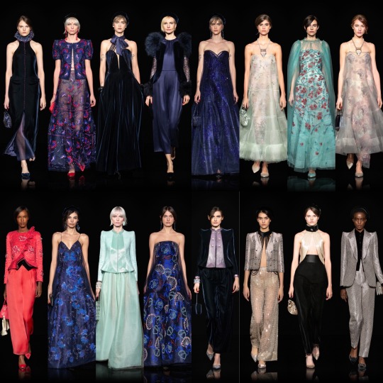
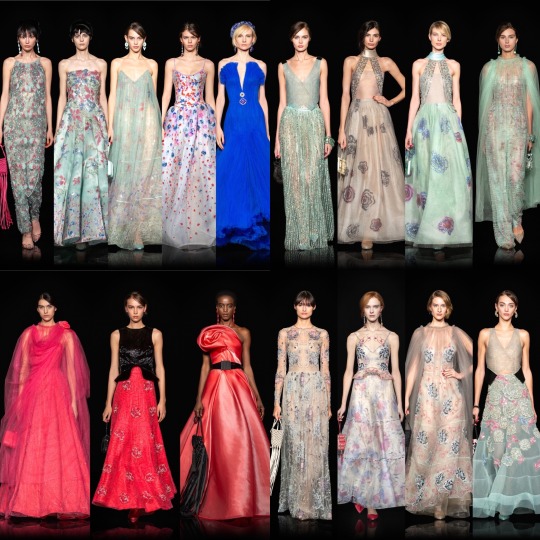
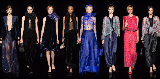
I actually quite liked Armani’s haute couture collection too; the pops of colour and the intricate embroidery give me what I’ll later talk about missing from Valentino haute couture. There were still some of the frumpier pieces that I usually associate Armani with but also a lot of Great Gatsby-esque looks that I really enjoyed.
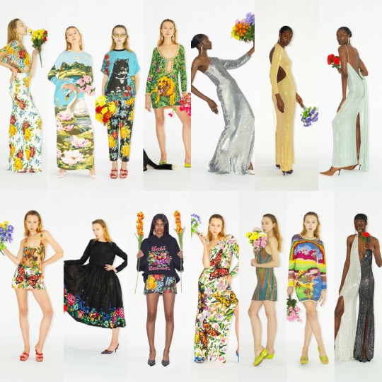
Returning to RTW, Ashish was amazing. I LOVE that there’s always some kind of unique print (this time round, kitschy illustrations) and whilst a whole maxi swan print dress may not be the most wearable for the majority of us, Ashish Gupta does bold and innovative really well. There were a few boring striped pieces in there but I adore the one shouldered butterfly print dress and I NEED that Hail Satan jumper; it reminds me a lot of something by sustainable fashion brand Minga, which is one of my absolute fave websites to buy from when I’m treating myself to some new clothes.

Azarro’s haute couture collection is full of supreme awards show afterparty fits, and I was shook to find out that Olivier Theyskens is the brand’s creative director! My newfound obsession with his pieces really had me like :O when I realised he was behind Azarro too. I loved their collection last time round, though this I’m finding a bit harder to give much analysis on because of the way it’s shot; whilst it could be a YSL perfume Vogue ad, which is obviously far from a bad thing, it comes at the cost of lacking visual clarity. That being said, from what I can see, Theyskens once again masterfully channels the wardrobe of the effortlessly cool, messy haired, smudged eye make up rock ‘n roll girl, and I think that’s someone we all want to be.


Balenciaga RTW was an interesting one for me-on first inspection, I was kinda disappointed. Without the usual drama of the bold, exaggerated silhouettes and the theatrical production of their shows, I felt it was missing a bit of the magic I’ve come to expect from them. The streetwear elements infused throughout, a departure from their typical pieces, was very hit and miss; the shearling slip-ons in particular were not my thing at all. I’d be admiring some beautiful gothic dress and then my eyes would slide down and see those monstrosities and it would bring the whole thing down a notch or two, despite bad shoes being something I can typically overlook if I otherwise enjoy the rest of the outfit. My initial conclusion: that the Balenciaga Myrtle Snow would choose as her last words this collection.
However, upon re-evaluation when typing this post up properly and knowing what to expect, I like the collection a lot. I’m getting a bit of a Seoul streetwear vibe from it, and I can appreciate that although it is a lot more trend focussed, it’s got an edgy, daring quality to it, with a lot of androgynous, utility wear elements on show. I loveee the Balenciaga chokers too and in my wildest dreams would get my hands on one before it goes the way of the Gucci belt and gets overdone and flaunted by social media influencers as a show of wealth to the point of tackiness.
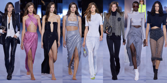
At Balmain the sculpted body armour made a comeback but on this occasion, not in a way that I liked, and there war far too many neons for my taste too. No matter how many times it rears its ugly head, I find it hard to get on board because as a colour palette I can’t help but associate with Claire’s Accessories circa 2007-it has to be SO well done to avoid looking cheap, imo, and these Balmain pieces weren’t good enough for me to go against that gut aversion. A collection with 100+ looks isn’t usually a good sign and expecting Olivier Rousteing to achieve the impossible and manage to do both quality and quantity is a recipe for disaster; it’s a shame because his last collection was so original and yet this one feels like a cheaper looking rip off of other brands. It was just a bawdy display of 80s overkill IMO and if I can only find 8 outfits to include out of 100 that’s clearly not a good sign.

Bottega Veneta is a brand that the high fashion side of the internet loves that I can never 100% get on board with; I get it, they’re behind the gorgeous square toed heels, but other than that none of their collections have ever really wowed me. The chunky knitted pieces are very Miu Miu style futuristic grandma chic and as someone on the cusp of being either a millennial or gen Z (depending on which website you visit) it’s got me outfit planning for my retirement years. Utilising so much wool for a summer collection, however, seems like a choice because can you IMAGINE wearing a heavy knit in blazing sun; I almost didn’t include the collection to be honest but then every so often something really cute came long, and one of the signature crisp, classic BV pieces would be done well and so I felt I had to. Am I missing something given all the hype here? IDK tbh.
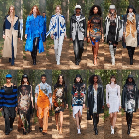

Burberry? Meh. You could also call this collection how many ways can I do a trench coat, with results of differing quality; occasionally the mix match of styles worked and I saw the deconstructed outerwear concept that Ricardo Tisci was presumably trying to go for, though it can’t come as much of a surprise that the combination of a trench, denim and leather jacket was mostly just messy and came off as a last ditch attempt to make the classic coat more interesting by just chucking other fabrics at it and seeing what stuck.
One thing I will say is that there were some really sick prints going on-the snakes in particular-and it was those prints that were really the saving grace of the collection; as I said with regards to Ashish, I like it when you can tell a brand has gone out of their way to experiment with patterns and actually incorporate illustration and graphic design into their pieces. Prints notwithstanding, though, it wasn’t a memorable collection and I really can’t wait for the day we put this whole multiple denim jean waistband trend to bed once and for all; in the wise words of Regina George “stop drying to make multiple waist bands happen. They’re not going to happen.”.


Carolina Herrera was just as I expected. Whilst Wes Gordon was a little more daring with the structure of the pieces than usual, you can still he’s still committed to designing for the wealthy, modestly dressed socialite (yes I’m talking about Tinsley Mortimer and yes, I have recently become obsessed with Real Housewives) and her insatiable need to collect more charity gala gowns than she’ll ever possibly have opportunities to wear in her time on this earth. Sounds like a great life, sure, but it’s not like it gets my heart racing when I see the looks on the runway. The most memorable piece for sure was double breasted blazer w the asymmetric ruffle; I haven’t seen anything like it in a RTW collection in recent memory.

Now onto the fucking train wreck that was Celine RTW.

It’s not even bad for a runway fashion show, it’s just like…straight-up bad. Like Hedi Slimane went back in time to 2013, took a bunch of models into my local Topshop (and I have to clarify my local Topshop rather than the flagship Oxford Circus store-RIP-because to do the same in the latter would produce far better results), picked up some cheap basics, switched the lights off, and then, finally, dressed them in the dark. There’s very few positive comments I can make so I’m just going to move on.
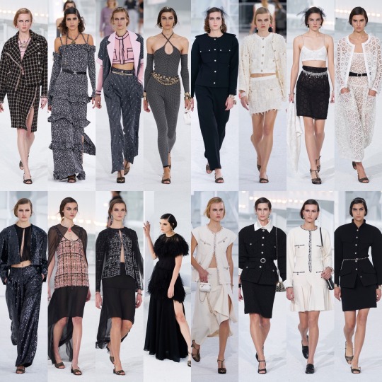
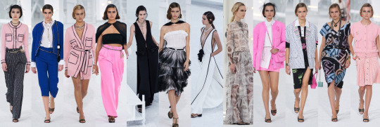
Chanel RTW I actually didn’t hate as much this season; maybe it’s because coming from Celine, my standards are like, on the floor, but it’s slightly better than usual. Whilst most of it was same old same old, the opening 10 or so looks and then from 40 onwards were alright. The colour contrast pieces were classic Chanel in a good way, that is to say somewhat modernised and appealing to a younger clientele as opposed to the elderly women who still see a boucle jacket as the height of fashion. The mini chiffon capes were also cute, and if it weren’t for COVID putting pause on everything I can see the Chanel headband being duped ad infinitum.
The worst part of the collection was without a doubt the pieces with the neon logo print, which I wish I could erase from my mind. At this point, with Virginie Viard seemingly refusing to make any attempt to reinvent the brand, Chanel is best when it’s subtle; that way it appeals to those regular customers who rely on the prestige of the garment and the new generation of consumers who are further branching out into experimenting with their personal style and want a quality base. But who I ask are these tacky ass pieces aimed at? Because though it appears to be an attempt to infuse a kind of youthful spirit into Chanel, it is very out of touch with what gen Z actually like, and I can’t imagine any rich old white ladies buying them either. Big shoulder shrug.
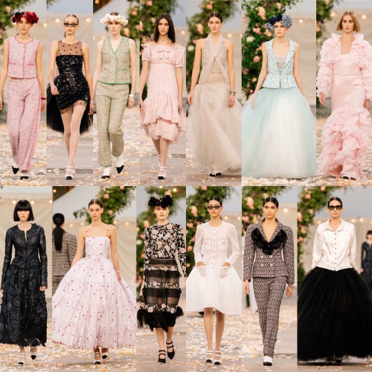
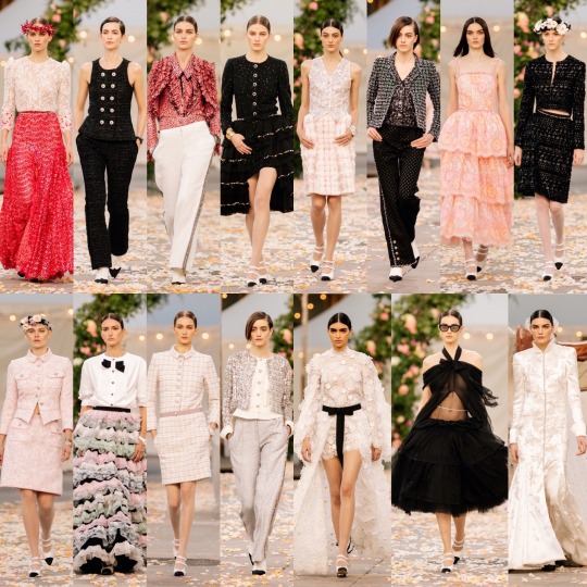
Whilst I tend to find Chanel’s haute couture collections a bit better than their RTW, this is probably on par. Still rather meh and frumpy at times, but there were some pretty, whimsical pieces in there that were definitely elevated by the staging which, I must say, was very dreamy. I’ve enjoyed the last couple of haute couture shows a lot more (the one with the library set was v cool), which were comparatively restrained with the frivolous details and the chintz, so this seems a step back. The dresses with the 50s Audrey Hepburn for Miss Dior style silhouette are lovely but obviously, as per the reference, nothing new.

Onto something much more exciting, we have Charlotte Knowles’ RTW collection, whose work has made her one to watch. I’m not as huge a fan of this as her last instalment, but Knowles’ (who I recently found out only just graduated from Central Saint Martins, making her achievements all the more impressive) continues to create clothes for a girl far cooler than myself; I know, that wouldn’t be hard, but we’re talking like, miles cooler. One of those women who can literally pull anything off and immediately make you want to try it yourself even though 9 times out of 10 that would be a bad idea-I could probably take, like, one piece and make it work but anything more would most likely just be me embarrassing myself. You wouldn’t think San Fransisco psychedelic summer of love motifs would mesh with futuristic Mad Max style biker vibes but Charlotte and her partner Alexandre Arsenault make it sexy AF, like a combo that was always meant to be. They are a dream team.

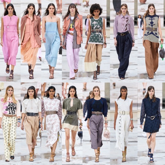
And lastly for this post, we have another collection I really liked: Chloe. Sadly Natacha Ramsay-Levi’s last collection for the brand, she truly went out on a high note, with a reliably gorgeous iteration of her sophisticated take on bohemian style. Who now, will we look to when we want to cosplay as one of the Jessas from Girls of the world? When we want to pretend we’re a rich, party girl socialite backpacking across Western Europe (along the foothills of Mount Tibidabo…) on a commissioned trip to “find herself” for the fashion magazine column she’s writing, whilst we’re actually on a budget family holiday in Spain? When we can’t decide if we’re dressing like a modern day Rachel Green or Phoebe Buffay and say fuck it, I’m gonna do both? I mean sure, I could never afford Chloe anyway and sure, I’m interested to see what Gabriela Hearst can do with the brand, which despite its loveliness is quite predictable, but it’s definitely sad to see Ramsay-Levi go when she has become a reliable source of elegance and class each season. She brings a quietly confident brand of femininity to the fashion world where the high profile design houses are increasingly dominated by men who are sometimes too focussed on being bold and brash enough to be hailed as the newest design visionary, and I have huge respect for that. She will be missed.
Now it feels right to end the post here, given that I just finished with a kind of dramatic memoriam for a woman who is very much still alive and given that I would really be playing with fire by trying to push Tumblr’s edit post feature any further, so I’ll wrap it up for now. In part 2, which will hopefully be out over the next couple of weeks, we’ll be looking at a surprisingly strong haute couture collection from (can’t believe I’m about to say this) Maria Grazia as well as some of my faves, Etro, Dion Lee, Gucci, and of course Iris Van Herpen’s haute couture. In the meantime, I’m hoping to get a post out on my favourite sustainable clothing brands and to shoot my take on the “what I would wear sat front row at X” video trend that’s been going around lately on TikTok and Instagram reels, which I know I am kinda late to the party with.
I’m also looking at starting “photo dump” posts where I basically just substitute what I would be putting on my Instagram feed as photo posts on here, all the way back to when I first started my fashion Instagram account. I know this is hardly a hot take, but Instagram has really gone to shit, and once I’ve moved all my photos from there to here, I’m probably going to be deleting my account and just keep my private personal one. I’m sick of the endless scrolling past photos of people edited to the point of being unrecognisable and of seeing faces that all conform to that exact same Eurocentric beauty standard with the exact same surgical procedures to the point that even I, as a thin, white cis girl feel disgusting (so god knows how others without my privilege feel) because I don’t have a fucking fox eye lift or whatever it is that internet famous surgeons are telling us we need for our faces to fit the “golden ratio” at the moment. I am OVERRR all the promoted posts from people who preach social awareness and equality and authenticity and kindness making money off promoting companies that rely on slave labour rather than those who make me feel uplifted and inspired. And I am VERY MUCH done with scrolling through share for share and like for like pages because I am embarrassed by the fact that my likes don’t match up to my follower count since that must mean that NOBODY LIKES ME AND EVERYONE HATES MY FACE, right!? Even though I’d like to think that mentality was something I grew out of a long time ago. Instagram, much like Facebook before it (which is no surprise since the latter now owns the former), has just become another cesspit of an app which exists solely to convince you to buy new clothes and follow the latest filler trend and blow money on holidays you can’t afford to convince everyone you’re living the good life. Like many others, I have finally come to the conclusion that the way Instagram operates now is nothing but detrimental to my wellbeing. So, all that being said, I’m moving my feed over here, to a place where I can just arrange my silly little photos into silly little collages and not care if I’m shouting into the void by doing so because they’re just a screenshot of my life that I can look back on in however many years time and think Oh, Cool! That’s What I Was Interested In Back Then! That Outfit is Timeless! Or That One Was a HUGE FUCKING MISTAKE! Because I do love the creative element of Instagram, turning your feed into a collage, picking out which colours compliment each other, posting your favourite art and your outfits and the makeup looks you’re proud of, the beautiful sights you’ve seen-I just hate how unbridled capitalism and unrealistic social expectations have once again destroyed a good thing, and caused it to stray so far from its original vision of connecting people. Here, I don’t care if I get 0 interactions on those kinds of posts, because I am putting stuff out there I am proud of that expresses who I am and that interests me, and when I put a lot of hard ass work into something that’s actually important or that benefits others in some way as opposed to indulging my own vanity, it does get some circulation and I hope that it does make a positive difference, regardless of how small. I hope it doesn’t bother anyone too much seeing my initial photo dump posts on their dashboard as I try and catch up to where I am now; you’ll probs see a mini influx of 2015 fashion and I’m sorry about that! But I don’t *think* it will be too long until I’m up to date and then the photo dump posts will be much less regular.
Anyway, sorry about the Instagram rant there at the end! If you read all the way til the end, this is a huuuuge thank you! I hope you enjoyed the post and I will get the next one out ASAP, potentially with a few posts in between. As always, feel free to inbox me if there’s anything you wanted to talk about or suggest and make sure you stay safe. There may finally be some light at the end of the tunnel:D
With a cautious dose of optimism, and the acknowledgement that I will most likely regret saying this: bring on June the 21st UK gals!
Lauren x
#fashion#fashion inspo#haute couture#couture#high fashion#fashion week#ss21#summer trends#rtw#style#style inspo#runway#supermodels#Charlotte knowles#chanel#balmain#bottega#bottega veneta#celine#fashion review#designer#fashion tumblr#hf tumblr#hf#luxury fashion
5 notes
·
View notes
Photo


“I want to be the most beautiful woman in town who seduces the playboy!” – Katsuki Yuuri
The editorial staff of Eros is pleased to present our full Fall/Winter lookbook. Available for a limited time only, this collection is a must-buy for anyone who is or wants to be anyone.
Print Bundles
💋 The Pomeranian — $25 USD
A print copy of Eros: a Yuuri zine.
6 x 9”, full-color, perfect bound format.
Includes 100 pages of exclusive, never before seen sexy Katsudon content and cover art by @iruutciv.
Our zine is for Mature Audiences Only - no one under the age of 18 may purchase it.
💋 The Welsh Corgi — $35 USD
A print copy of Eros.
Two 5x7″ postcards selected at random out of three possible designs created by @demartinidesigns, @jizart, and @sometingyoirelated. The designs by @demartinidesigns and @somethingyoirelated feature spot gloss and holographic coating, respectively.
One 6x9″ mini-print with red foil accent by @iruutciv.
One A6 sized sticker sheet featuring six designs by @alikurai.
One 2" gold glitter epoxy acrylic charm designed by @toratoramin.
💋 The Standard Poodle — $45 USD
A print copy of Eros.
All three 5x7″ postcards, including the spot gloss and holographic designs.
One 6x9″ mini-print with red foil accent
One A6 sticker sheet
One 2" gold glitter epoxy acrylic charm
One 3x3″ 50 page custom post-it pad designed by @sportsharumaki.
One 3.5x7.5″ exclusive, custom black satin sleep mask with our logo
Digital Bundles
💋 The Shiba Inu — $15 USD
A digital copy of Eros.
High-resolution digital content in full living color.
For when you need your spicy katsudon to go.
💋 The Siberian Husky — $30 USD
A digital copy of Eros.
All three 5x7″ postcards, including the spot gloss and holo designs.
One 6x9″ mini-prints with red foil
One A6 sticker sheet
One 2" gold glitter epoxy acrylic charm
One 3x3″ 50 page custom post-it pad
One 3.5x7.5″ custom black satin sleep mask
💋 The Teacup Chihuahua— $5 USD
When purchasing any bundle that includes a physical copy of Eros, you can add a PDF for only $5 using the discount code “VICCHAN.”
Victor’s Birthday Bundle
💋 The Greyhound — $30
A print copy of Eros.
All three 5x7″ postcards, including the spot gloss and holographic designs.
One 6x9″ mini-print with red foil accent
One A6 sticker sheet
Only available from 12/24 until 12/31! Get it while it lasts.
Stretch Goal
💋 Hard Enamel Pin
Should Eros exceed 250 physical bundles sold, we will include an exclusive enamel pin designed by @bigbigtruck.
1.75″ black nickel hard enamel with iridescent white glitter.
Includes a customized backing card.
Postage and Handling
💋 Shipping Fees
Within the US: $9 USD
Everywhere Else: $14 USD
Once more, all of our proceeds beyond operating costs will be given to the Old Friends Senior Dog Sanctuary. Upon finalization of all financials, we will remit a lump sum donation to their organization and will furnish proof of such on our social media.
We’re currently accepting orders at yoieroszine.com. The festivities end on 11:59 PM PST, January 2nd, 2019.
XOXO darlings, 💋The Eros Editorial Staff
105 notes
·
View notes
Text
Final Evaluation
The brief for this project was to produce a digital lookbook using Photoshop and InDesign to visually communicate an AW23 WGSN trend.
I began by researching a couple of the WGSN trends, before deciding on 'mixing epochs', and creating 3 mood boards in a living room format as an initial starting point for the lookbook. After creating the first mood board, I felt that I needed to do further research to narrow down my trend and solidify what I felt it was trying to communicate to a buyer. I decided that I would focus primarily on Mid-Century and Memphis design, with an emphasis on blending old and new furnishings to create a look that is more eclectic in style and can stand the test of time. I feel that my research was successful in allowing me to decide on a clearer direction for the trend and I think this is reflected in my final mood board, which I developed later on to form the narrative page of my lookbook.
After completing my mood boards, I moved on to the key shapes/pieces and decided to focus on classic mid-century furniture, such as ladderax shelving and Eames DSR chairs, bringing in the memphis influence with bold colour choices and geometric shapes. I feel that this page of my lookbook could be further developed by adding some more accessories either in the mid-century or memphis style, as the page feels quite limited in the number of key pieces shown.
Next, I moved on to the colour palette and materials page of my lookbook, where I also used geometric shapes/patterns to layout the page. I like my choice of a more muted version of a memphis colour palette and the way in which I brought in the key materials through shapes rather than cut out objects. However, I am not happy with the text on this page, as I feel the placement and font choice could be more considered so the text feels integrated with the page, rather than something added at the end.
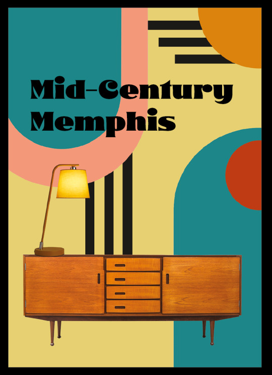
My final pages were the front and back cover, which I decided would be fairly simple, focusing again on shapes, as this is a recurring motif in my lookbook. I like my inclusion of the black stripes, as I feel this is very indicative of memphis patterns and also adds depth to the page, however I think that the title would look better if the letters weren't so thick, as the black on the page feels a bit overpowering and less like the accent I originally intended.
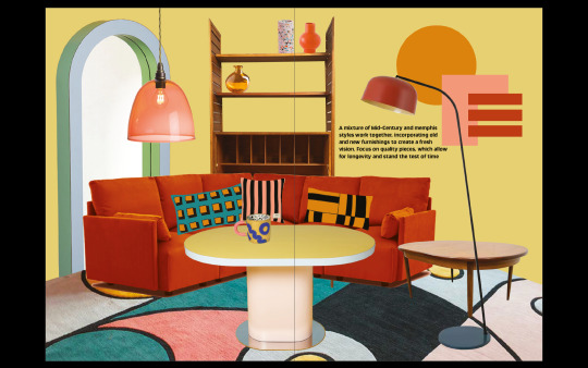

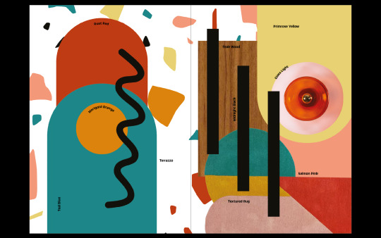

0 notes
Text
New comics from Small Press Expo 2017
It’s been a while since I did one of these, but wanted to get back into the habit of sharing my favorite books and new discoveries at cons. As most of you know, Youth in Decline took a hiatus for a lot of 2017 to welcome our daughter into the world. SPX is a fitting “first show back” as the setting and vibe feels like a high school reunion, packed full of our favorite cartoonists, old friends, and longtime readers. Here is me doing brief, quick, hot(?) takes on most of the new books I grabbed at the show.

Sex Fantasy by Sophia Foster-Dimino. Sophia’s one of the best contemporary cartoonists working, and this chunky tome collects her multi-year series of mins into one thoughtful book. You can see Sophia working out cartooning decisions over the course of each book, with dialogue / camera / perspective experiments everywhere. The final two chapters haven’t been seen before. Just an incredible, amazing book from Koyama Press.
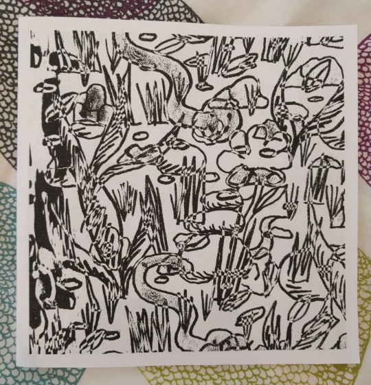


New things from my alltime favorite cartoonist (hands down), Michael DeForge. A new mini called Loose in his series of sketchbooks, and a massive, oversized new story from Koyama Press called Placeholders. It’s hard to even talk about Michael’s work, it’s so good. Michael is an incredible writer, and the drawings (where, let’s be real, he can basically draw any & everything) exist to support the writing. Special shoutout to the early YD logo sketch that made it into Placeholders as an evil startup / corporation, haha

Two fantastic minis from my SPX tablemate, the incredible Lauren Weinstein. Both of these comics, Normel Person and Perfect Maine Vacation, were nominated for Ignatz Awards and show the incredible and personal power of Lauren’s cartooning. Perfect Maine Vacation is gutwrenching (in a sweet way that kills me as a new parent) and Normel Person is a hilarious ongoing journal of life in Trump’s Amerika. Did you hear that Lauren is doing a new comic for Youth in Decline for Frontier next year? Dude, I know!!!!! (so beyond excited).
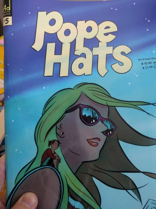
Ethan Rilly released the 5th issue of his fantastic series Pope Hats. Ethan’s sense of his own characters and the knack for small moments and relatable, too real dialogue between friends really shines here. Pope Hats is such a dense and well-appointed serial drama, I’m a huge fan.
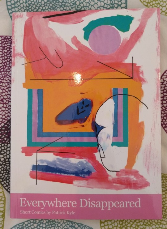
Everywhere Disappeared by Patrick Kyle. Patrick’s new collection of short stories from Koyama Press. A lot of my favorites from the last few years made it into the book. Patrick mixes familiar shapes with hyper-present narration that does this weird trick on your brain and unfolds weird contemporary paranoias and ennui. Patrick’s short comics are almost like little polemics, or allegories... upsetting but also hilarious.

I’m Not Here by GG. Another debut from Koyama Press -- Annie had an unparalleled and unprecedented SPX lineup, I’ve never really seen anything ever before at a show, the r a w p o w e r of her team. GG debuts her first long-form narrative, a quiet, slow burn of a story about identity and navigating the transition from un-responsible young adult to the burden of your own parents’ failings (health, decision-making, etc). Very restrained, withholding, and poetic.
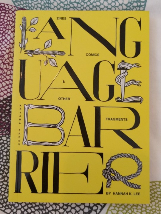
Language Barrier by Hannah K. Lee. I LOVE THE SHAPE OF THIS BOOK. Both like, literally its formal size (small!) and the flow and design of the book. Included in one tome are Hannah’s incredible type experiments, her comics, her illustrations, and her personal stories. This feels like a true monograph, showing me the many sides and numerous formats of expression from an incredible artist. I loved this book.

Baby Let’s Cruise and We’re Together Now by Jasjyot Singh Hans. I’ve been a fan of Jasjyot’s stuff for a while and following his work on Instagram -- these two minis really brought together a lot of interssting threads. Baby Let’s Cruise is the size & form of an iPhone 7 Plus, and captures the furtive feeling of messaging with someone you don’t know, and navigating the power dynamic anxiously. We’re Together Now uses an arch-metaphor to capture the earnest passion & paranoiac worry of a long distance relationship. I’m really excited about what Jasjyot is doing (and will do next).
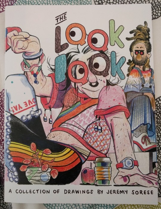
The Look Book by Jeremy Sorese. A colorful, exploding collection of imagined (and observed) fashion and bodies and cute men. Jeremy depicts people with a weighty, playful, totally wild eye. I stared at each drawing for 5 minutes, digging into all the little details. Really loving the illustration and play Jeremy is doing between his longer works, so exciting to daydream about these outfits.

Starfighter Vol. 4 by HamletMachine!~ 100% NOT s FOR w, the latest volume of my friend HM’s ongoing space sex opera is now out. I absolutely love Hamlet’s depictions of bodies, of tension between people -- she has an incredible skill for composition and the gnarly beautiful dance of bodies interacting. HM has cultivated an incredible fanbase stayed true to her vision and worldbuilding. <3

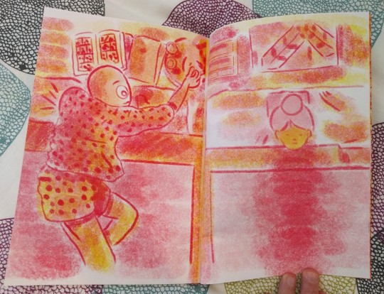
Daises by Bjorn Daniel Miner. A short collection of comics by Bjorn, created, conceived of, and produced on Risograph as part of his residency at SVA’s Risolab. Each spread is full of wild textures and color experimentation, pushing the risograph to ends I didn’t think were really possible. Melts your eyeballs, very nice!

A Modest Upbringing by Amanda Castillo. A touching short story about families (and their pain + baggage) from an exciting young talent. Printed on Youth in Decline’s risograph this past summer as part of an internship helping us out! <3

Summer Wasting and Sunset Lover by Sunmi. Two minis -- one huge, one small -- from our friend and former intern Sunmi. Summer Wasting includes a number of observational comics, sketches & poems, and a really thoughtful book design with little asides bound directly into the body of the comic. Really exciting watching her work change and mature over the past few years, and so excited about her new press, Dandelion Wine Collective. <3
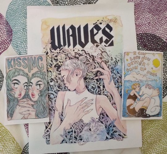
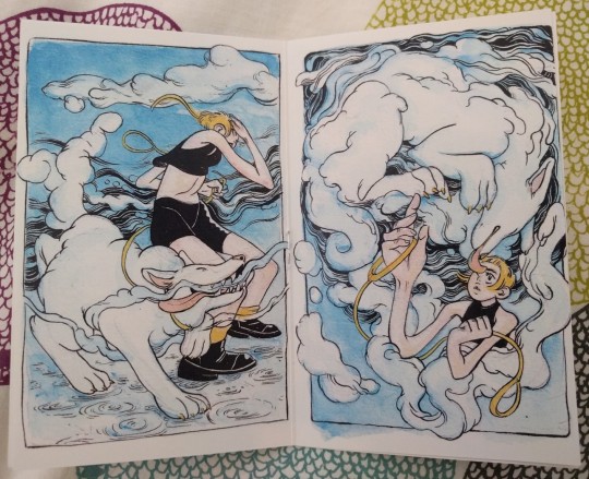
Kissing, Waves, and I Can Love You Better From Up Here by Rebecca Kirby (aka reweki). I somehow wasn’t familiar with Rebecca’s work before this SPX, but was really taken with her composition and use of color. Her panel structures and experimentation in Waves reminded me a bit of Jesse Balmer and other controlled psychedelic pieces, while the bodies in Kissing and ICLYBFUH both showed an extremely confident and fluid sense of bodies (and color). Kissing was extremely NSFW and rad, while her short musing about a lost pet made me tear up a little. Great work from a creator I’m now following closely.
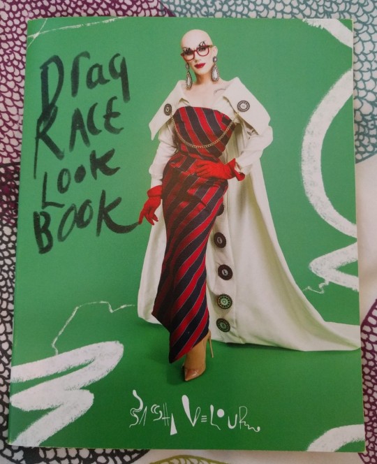
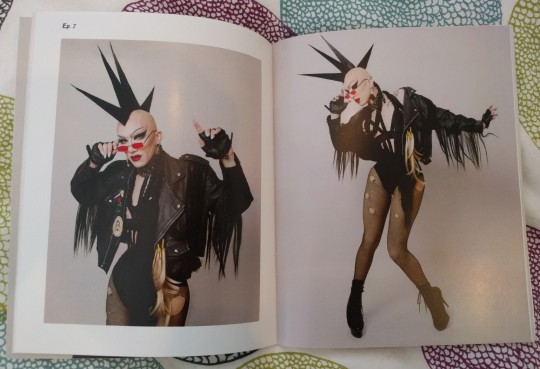
Drag Race Lookbook by Sasha Velour. Okay, so I didn’t get this at Small Press Expo but it was waiting for me when I got home. A lovely and thoughtfully designed book from the one & only... Sasha Velour! Such a great recap and reliving of her incredible looks from RPDR, and the commentary at the back is the sort of thing I live for... Who doesn’t adore Sasha? I have sweet but embarrassing memories of our second-ever proper meeting hungover at MoCCA a few years back as tablemates... such a vibrant and incredible creator!!! ah
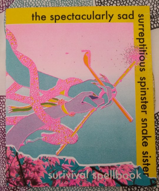
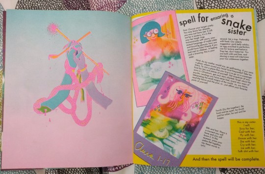
The Spectacularly Sad Surreptitious Spinster Snake Sister: Survival Spellbook by April Malig and The Untitled Queen. This was an absolutely incredible gift from April!!!! Sasha superfans will recognize this mini as featured in Velour Magazine #3. That issue smartly photographed and captured this feature as an object mini-within-a-magazine... and this is one of the rare actual copies April made just for Velour. Incredible risograph work and color composition... and it’s a little piece of comics/drag history. <3
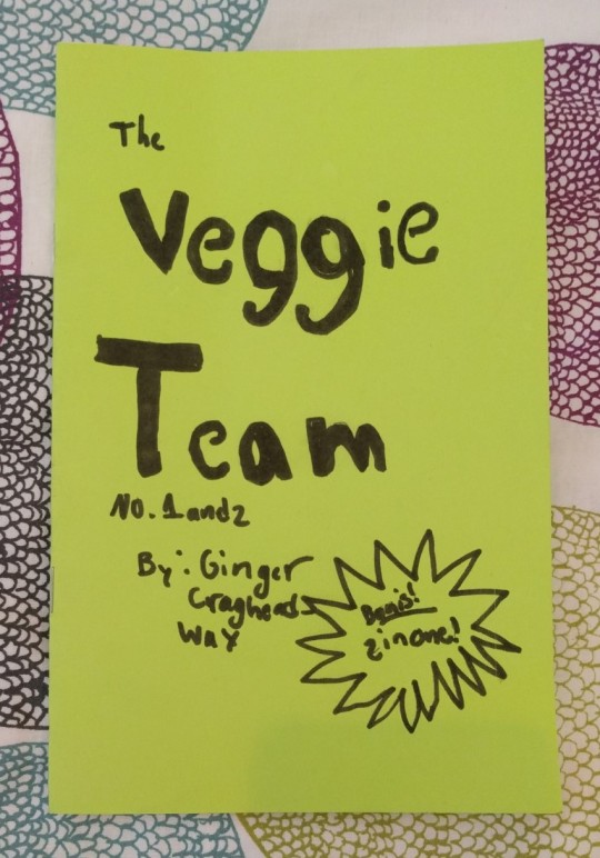

The Veggie Team by Ginger Craghead. 9-year old cartoonist creates wild mini about the pranks and misadventures of a team of wild veggies. What more can I say? This was legit hilarious (See the 2nd panel on the right page above, hahaha).
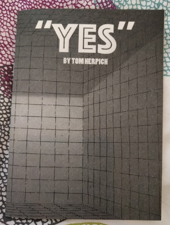
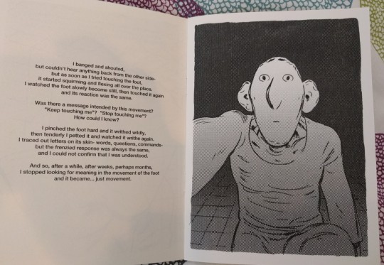
Yes by Tom Herpich. Final book from around SPX, this is a new mini from Tom... not exactly a comic, but a short story about isolation and gratification. It was startling and lowkey, and the storybook illustrations showed Tom’s incredible sense of framing and pacing. I’m such a huge fan of Tom’s work, it’s exciting as a reader to see him working through new work in his post-Adventure Time life. Available via his Tumblr still (I think?)
89 notes
·
View notes
Photo


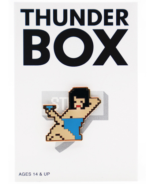
CASE SHOTSHOT STAGE4, aka THUNDERBOX’s Summer Collection 2017
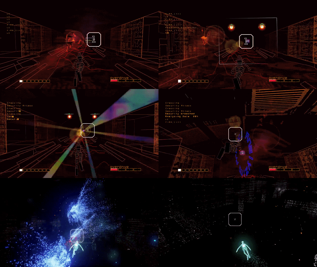
… But first: Toco Toco’s season finale (I wasn’t aware that there was one in the first place) is here, and the subject is the man responsible for perhaps my favorite video game of all time? And maybe yours as well? It’s Tetsuya Mizuguchi…
youtube
Alas, the focus is squarely on the most recent iteration of Rez (aka my fave game). Was hoping it would touch upon his earlier work, in particular, Sega Rally. Older games are oh so briefly mentioned, with the role of audio being the primary emphasis. And even though it’s not a music game… holy sh*t does Sega Rally have an AMAZING soundtrack.
BTW, I’ve got game music on my mind because… will explain later! Also, the gifs above are courtesy of Prosthetic Knowledge, cuz they make them far better than I ever could.
Anyhow, it’s been a while since the last game culture round-up, hasn’t it? So long in fact that… there’s a new THUNDERBOX lookbook to, well, take a look at. Which actually just came out, so this particular round-up ain’t that overdue…
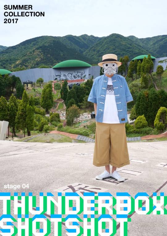


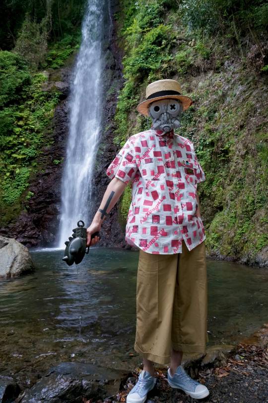
Whereas the HuCard was the hottest fashion accessory of last spring, summer will see this rather nifty take on the Sega Saturn Lightning Brain design (also, RIP 1CC shirts)…

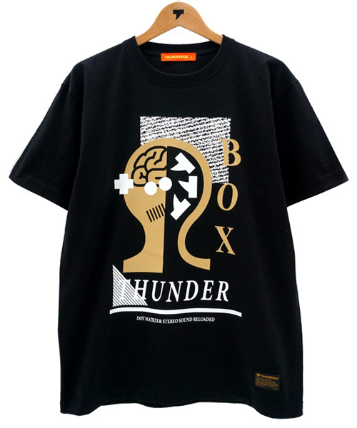

There’s also a really nifty shirt, a collab with INC NOXXX SCREAMING…
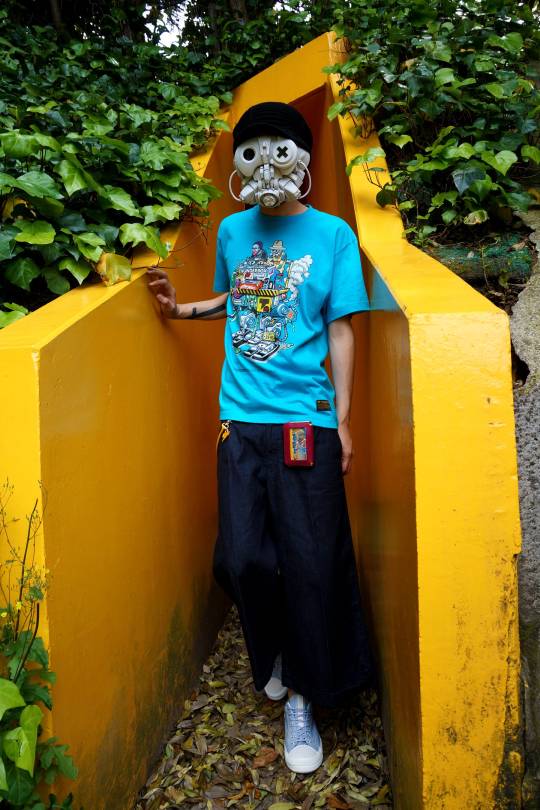

… plus a single Famicom cart holder/wallet…

Along with LEBLANC GIRL, either on a shirt…
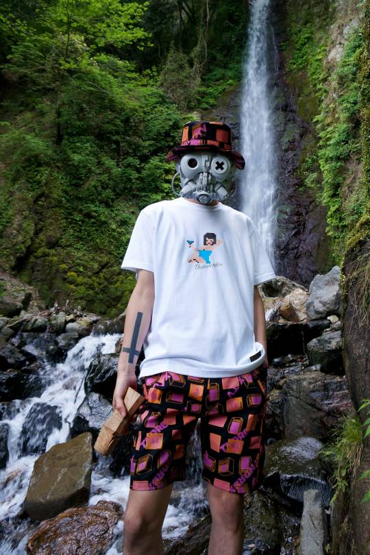
… or as a pin…
Back to INC NOXXX SCREAMING, real name Yozi Shimoda, who’s been grabbing my attention more and more as of late. Was going to share his latest shirt in the next Instagram dump, but no point in waiting right?


Sticking with fashion for just a tiny bit more; it’s been over three years, but the King of Games has finally updated their YouTube channel, and they now have a trailer?
youtube
Which video game-centric footwear do you prefer? These sneakers, based upon Sonic’s (via miki800)…
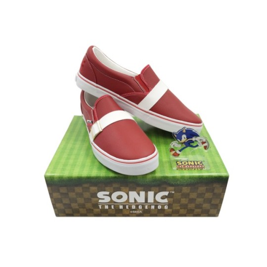
… Or these sneakers, based upon the Super Nintendo, one that’s also running NBA Jam (via FreakerSNEAKS)…
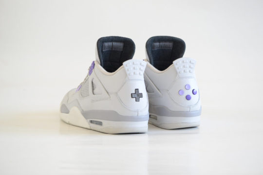

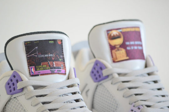
As you may have heard, a new Super Famicom cart is going to be released later this year. Am talking about Kaizou Choujin Shubibinman Zero, originally released 20 years ago for the Satellaview.
Now, something that’s getting far less attention is how the same publisher, Columbus Circle, is also releasing a new Famicom game called Heiankyo Alien around that time as well (via tvgame)…
youtube
In other news, there’s a manga based upon Daigo Umehara, which you may or may not have heard about. Anyhow, UDON Entertainment has just revealed that it’s become translated and published in the West…

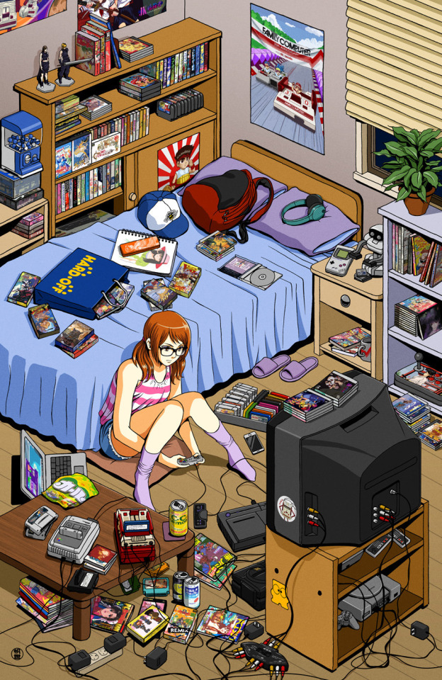
Here we have a nice little piece from José Salot, one that’s simply entitled: “Gamer Room”; I really want that poster that’s on the wall, of the Famicom karts…
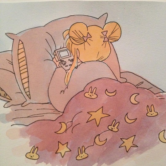
And a somewhat similar scene, except it’s a girl playing games while in bed, and that girl also happens to be Sailor Moon (via sixteen-bit)…
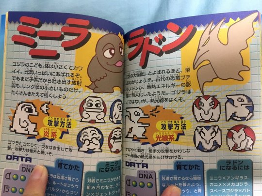
Check out these photos of a strategy guide, for that Godzilla game that came on a Dreamcast VMU, which I want to say pre-dated the release of the console itself (could be wrong, but am pretty certain; via jimpluff)…
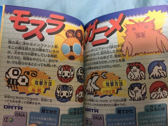
And on a related note, here are some pics from a shmup supplement that accompanied an issue of Famitsu, way back in 1990 (via videogamesdensetsu)…


On another related note; which bonkers shmup flyer do you prefer? This one for Darius (via shmups)…

… or this one for Space Bomber (via obscurevideogames)…

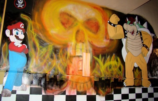
It’s Mario and Bowser, adorning a nuclear command bunker, taken by NPR originally, that suppermariobroth recently re-posted it (if you want to catch glimpses of some of the other oddball Mario artwork that exists alongside, then watch this video)…
And on that note, time once again to see some of the more interesting discoveries and observations that the Broth has made as of late. Including the actual note for the coin sound effect in the Mario games that Nintendo filed a trademark for only last year…

This question posed in a strategy guide back in 1987…

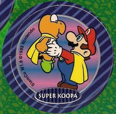
This “extremely rare official artwork of Mario holding up a Super Koopa” from a pog…
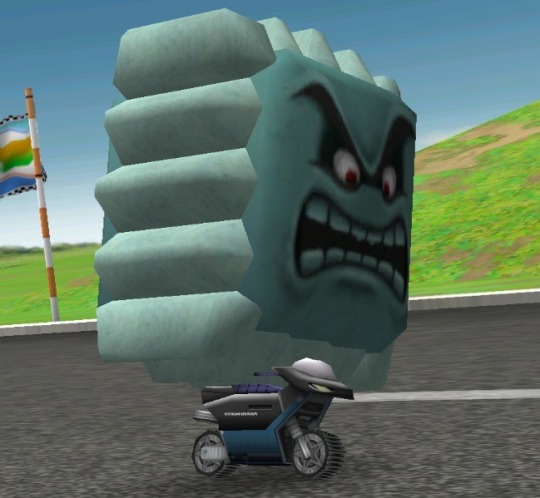
This image of a Thwomp on a moped from a Mario Party…
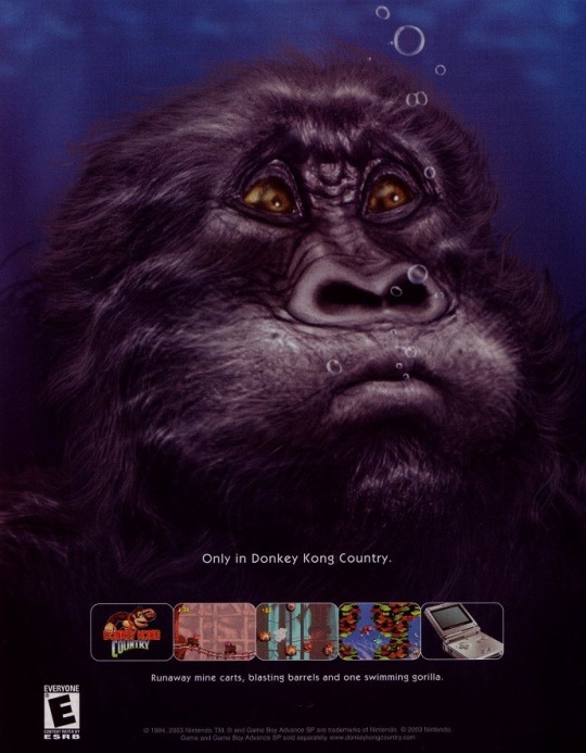
This curious depiction of Donkey Kong from an ad for the GBA port of DKC…
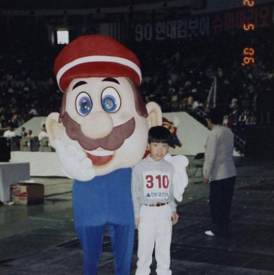
This photo of a goofy looking Mario with a Korean boy that looked just like me when I was his age…
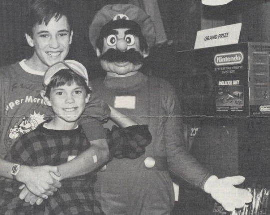
This photo of a scarier looking Mario with Wil Wheaton and his younger brother; apparently it was from a tournament where the Star Trek TNG star had the highest score among all the celebrity guests…
And this fascinating bit of intel…

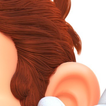

“In one particular piece of official art for Super Mario Odyssey, Mario’s hair is rendered in great detail. Zooming in to the part above his ear, we can see what appears to be a single gray hair. This seems to be deliberate, as analysis of the image reveals that this is not a transparency issue, but that the hair is indeed colored a lighter color than the rest. Due to the image being released in a lossless format by Nintendo, this also could not be a compression artifact.”
BTW, I completely forget where I got the following. I may have blocked it out of my memory to be honest…

Gizmodo recently ran an interesting piece about an astronomy student who strapped a Game Boy Camera to the end of a 179-year-old telescope to take pictures of the moon…

Meanwhile, The Verge recently ran a story on Shawn Wasabi, that musician with a MIDI controller that has 24 arcade buttons, whom Eric and later myself wrote about over two years ago.
Though it reminded me that I hadn’t checked his YouTube channel in a while and totally missed the following, posted on this past Valentine’s Day. So if you haven’t seen it before either…
youtube
Sticking with musicians for just a bit; here we have a guy who plays music with a Famicom on his head, playing a game with a Famicom that’s on a table…

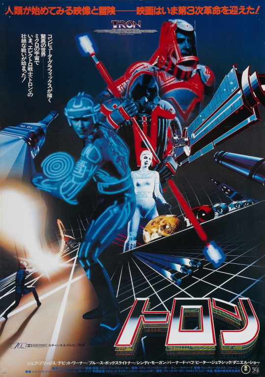
Isn’t this Tron movie poster from Japan the raddest or what? (via gaijira)
You Mortal Kombatants get off my lawn (via horrorsoflife)…

meldowiseau asks: “from Mortal Kombat Advance’s credits; does that imply they spent a fraction of their budget on a new coffee machine?”
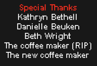
vice-s-assistant notes: “Oh shit’s its Robert From King of Fighters’ bank password“…

Let’s say hello to the cast of Primal Rage, shall we? (via thewaragainstgiygas)…

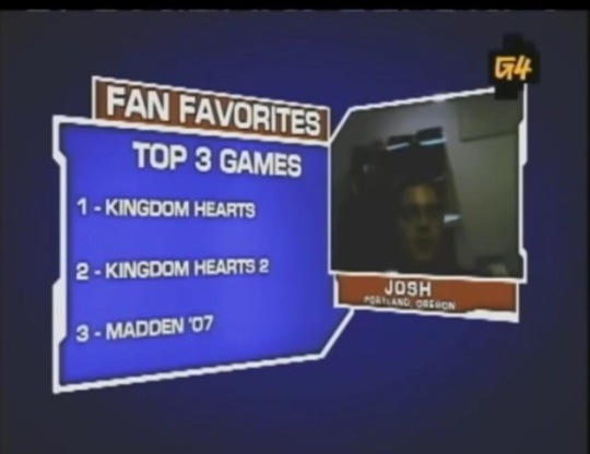
And let’s check out what Josh’s top 3 games are, shall we? (via xxx.hypnosis.party)
Is this image from a TED talk for real? (via smart-elec)

Whereas as I know for a fact that this isn’t some piece of Gex fan art, it’s an official image, from the cover of Gex 3 on the N64…

Please enjoy this rundown of assorted Pac-Man clone covers, courtesy of vgjunk, with perhaps my favorite one being…

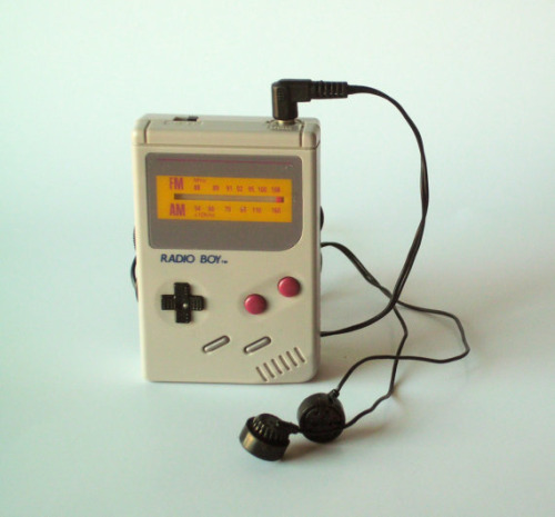
It’s funny how the Game Boy was essentially the video game equivalent to the Walkman, which someone would clone and make it resemble a Game Boy (and which Nintendo would officially sanction, according to nintendroid)…
And speaking of music, by someone who goes by Motocross Saito…

Oh, so at the very top I mentioned that I had game music on my mind… game music by Treasure to be exact. And that’s because, earlier this evening, I was a guest on the Video Game Grooves podcast! Where I was asked to talk about the just released Gunstar Heroes record by Data Discs. Alas, I didn’t get a chance to touch upon the music of Guardian Heroes, but at least I have this super cool gif by kyn…

And finally, why yes someone has modded fidget spinners into Grand Theft Auto V, did you even need to ask?
youtube
Don’t forget: Attract Mode is now on Medium! There you can subscribe to keep up to date, as well as enjoy some “best of” content you might have missed the first time around, plus be spared of the technical issues that’s starting to overtake Tumblr.
8 notes
·
View notes
Text
Restart for checkpoints 1-4 (Group 3A)
Checkpoint 1
Store concept
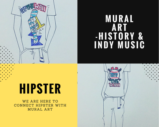
Thank you for your comments. We have changed our mind now and get back to mural art. We will focus on tees with murals art. We want to have two lines of tees with murals about Fishtown history and music respectively. We will find the mural pieces in Fishtown about baseball, fish, old business etc. for the history line. For the music, we will search for the work of indie music. We may even find the elements outside Fishtown to collect more illustrations. We will only sell tees for the top, but we will produce some accessories such as bracelets, necklaces and glasses.
Store target market
- Aged 20 – 34
- Locals in this age range occupied 35 percent of Fishtown population
- Target at those who always wear in hipster and casual style

Store location
Our store will be located near Fishtown Tavern in the street of Frankford Ave. As there are many restaurants and bars, it will be a suitable place for people to chill out, especially young adults. The customers, who buy our clothes, can walk along the street to feel the atmosphere of Fishtown, and even bring this artistic form to their hometowns or become a part of Fishtown. The aesthetic environment of the street and the artistic walls also offer a good atmosphere to DIY.
Product Category
Top: tees
Accessories:
Head: glasses, earrings, cap
Body: bracelets, necklaces, rings
Store name:
Our brand name may be “Off the wall” which has a double meaning. Our inspiration are taken from the wall and the creativity is extended on tees from the wall. Mural arts
will come into people’s minds immediately when they see the name.
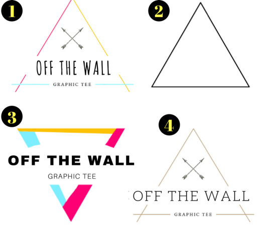
Logo
Checkpoint 2
Moodboard
Floor plan
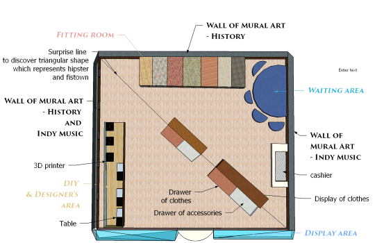
Look (Description of Floor Plan)
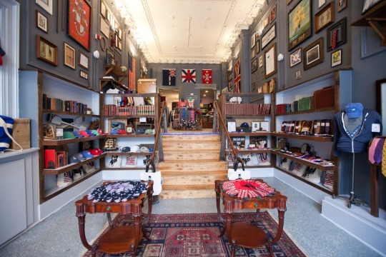
Walls of Mural Art will be displayed like these three walls.
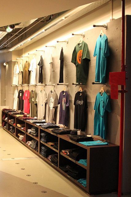
Display Area will look like it.
Smell: coffee in waiting area
Music: indie music
Feel
Combination of Mural Art’s history and music, to go back the time Fishtown’s birth and to be the part for creating the modern Fishtown
Fixtures
glass (the display areas, designer and DIY’s area), cement walls, wooden ground, display walls and drawers for accessories and products other than tees
Mannequins
We will use our designed characters there to be mannequins. They are one boy and one girl. As they are ordinary and hipsters, so we set their background as first time to come to Fishtown. And they find many things in Fishtown which matches their hipster styles.
Window display:
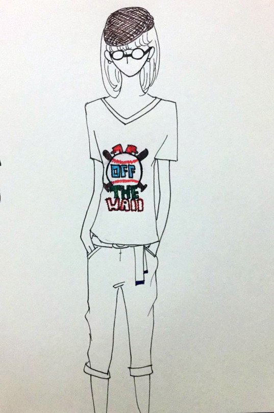
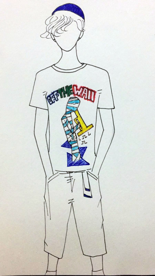
(Not the final version)
Pre-event
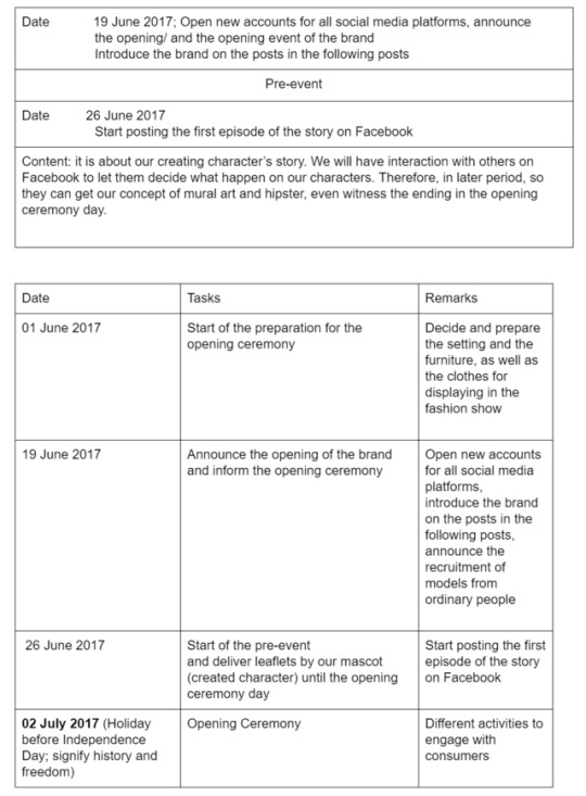
We create a character and set an original story in Fishtown. This character will be an US young hipster who is the first time to go to Fishtown. The character will go through different spots in Fishtown to experience different things. This story will be released everyday as a diary format story on Facebook, let our customer to trace the story and kept updated. In every post, we will have a cliffhanger and provide them three choices about the next coming episode. The choice that got most likes will be designed into the next episode. For the ending episode, we will release it in the opening ceremony.
Opening ceremony
A party for our guests and walk-in customers. With indie vibes in the background, refreshment will be served. Amid the party, a creative workshop will be happening too in our shop. We will border an area in front of a white wall, hang plain white t-shirts on it and let anyone who attend the event that day includes designers, to have a chance on creating mural, as well as graphic tees. This not only can close the distance between the brand and our fans, but also let them know the very fundamental theme of our shop—incorporating local creativity with fashion. We will also share the ending of the story of Facebook on another wall and post the picture of the on-site story wall and on social media to invite more people on Facebook to join our party.
The event party will be from 2pm-9pm. We welcome walk-ins and hipster bracelets will be a giveaway for those who attend the party. A hashtag for our Facebook and instagram, a story for our Snapchat will be associated with our party name and the game we design, which is the second highlight of the party. We will use Snapchat to play a game with our customers. We put 5 tees on the wall, and ask people to find the place that certain mural art on the tees is from, giving a hint about the certain street they are from. As long as people can find the spot and take selfies with that mural art, they can send to our company snapchat, include in our story, then we can provide them membership or discount. Any people who participate can join the membership with over $100 consumption while after that day will require over $300 consumption. Membership will provide a annual 10% off and exclusive discounts.These social media will link the customers’ experiences back to us, also achieve the promotional goal. (Facebook, instagram, snapchat and tumblr)
At 7pm, a mini fashion show will start, models will wear the exclusive designs of our graphic tee and walk on a temporary stage, showcasing the first collection of our brand. We will recruit models among ordinary people on social media platforms in order to make the fashion show more down-to-earth.
Calendar
Checkpoint 3
Snapchat - Designers’ lives
We target at the young, funky, un-to-date hipsters. We will try to update our stories daily and have a live snapchat for our closest customers on some significant events. We will design a short clip to loop like a gif on our brand Snapchat story, this clip will be very hipster and show the time-limited discount (e.g. 30%off), we will set the deadline for the Story as 5 hours, so that people will follow and also keep updated to our Snapchat and check everyday for our surprise discounts on an irregular basis.
We might tape some video with own designer talking about the highlights of the fashion piece or showing some products that they designed. Also, to invite some local hipster figures to answer questions from our customers. We can also tape some fun facts about the street arts in Philly.
Whenever we decide to design new tee, we will shoot the 3 different graffiti from the wall and let them add ticks or text on to the next snapchat which is a polling sheet, then send to us as customer feedbacks.
Every video, photos, or text are well-designed in every story, we will create a custom snapchat filter
for every events, all the way to typesetting and editing.
These all fulfill the aesthetic satisfaction of the Snapchat users and put our brand in a more trendy position, providing up-to-date information of our brand or offer some knowledge that our customer cares.
We aimed to gain 20 followers each week.
Instagram - Extension of story (New characters)
Since Instagram is best at showing images, we will mainly display our products on it. Some customers may show they wear our tees on Instagram and tag us, then we will share their posts to interact with them. However, we will not forget to share the latest discounts or activities that have been announced on Facebook. Moreover, Instagram will act as an extension of the pre-event story of Facebook. We will post images of the adventure of other characters in Fishtown with wearing our tees in order to continue introducing different spots in Fishtown and the myth story. Our goal is to attract 30 followers each month.
Facebook - Products and Events
Facebook is the more effective platform for posting images and texts together and interacting with consumers, therefore it is used to publicize the pre-event story created by ourselves.
Besides, it will promote new products and discounts and activities. It will also update the latest clips of Snapchat and the accounts of other adventures in Fishtown plus the links directing to other platforms. We hope to gain 100 likes for all the episodes in total, 100 replies for choosing the resolution of the story and 80 followers each month.
Tumblr - Gifs
Since Tumblr is a very popular social media in US, we believe the fashion brand can have a relatively more flexible promotional platform on Tumblr, since they have gifs, and brands can mash all fundamental media into one post, make one post more fruitful in representation. Tumblr also focused heavily on the aesthetic and artistic sides, in addition to the flexibilities for users to modify themes freely and creatively, made easier for them to build the brand personality on this platform. Also, this platform focuses on visual graphics more than text, which can target on the people who are seeking for the lookbook of our brand, and reblogs on Tumblr is very efficient and is relatively an easy way to make one post viral. We may also offer some giveaway, like exclusive chokers or hipster style coffee cup pads, design the post with beautiful graphics and alluring texts, plus detailed instructions. The first 20 reblogs will be the winner for our decent giveaways. This way, our customers will follow our Tumblr and keep themselves updated, waiting for another round of giveaways. We hoped that there are at least 30 followers per month.
Checkpoint 4
Concepts:
A party
A fashion show
To have memorable life experience, “Use art to express creativity, to create history.” by employing our artists, models, 3D printers, staffs to help them DIY and design unique products
Distributing memberships (e.g. 30% off for our members and unique product creations)
To connect with our pre-event on Facebook by hiring models and to discover the ending for our story on Facebook
Budget
Party
Drinks:Coffee, beer, soft drinks, juice
Food: Pizzas, sandwiches,
Fashion show
models x5
designers x3
Shop in Fishtown (8000 square foot)
3D printers x 6
staffs x3
Total: around 400,000 US dollars
Questions for all checkpoints:
Checkpoint 1
Is the concept going to work very well in Fishtown? Is it workable to split the mural art theme into two directions: history and music?
Will we have competitors?
Which logo do you prefer? (Number 1-4) May we ask what color should have for logo?
Checkpoint 2
4. Although we will mainly sell tees, we will provide a DIY space and equipments for individuals to design. We are thinking about merging the DIY space and the display areas, i.e. the equipments and the products are put in the same area. We want to provide some inspiration for the DIY people with our products. However, we are concerned that the shoppers and the DIY people may feel a little bit uncomfortable with others doing totally different things. So the DIY and designer’s area are made of glass and cement walls. Or you think the area and designer’s area should be all made of glass?
Checkpoint 3
5. Do you think our social media’s strategies appropriate and workable?
Checkpoint 4
6. We also include the rent of Fishtown in our budget plan, is it okay? Should we also include decorations in our budget? Should it be higher or lower for our budget? How is the extent? Large or small extent to be higher or lower?
If you have any other suggestion, we are pleased to hear. Please don’t hesitate to tell us feedback.
Thanks :)
1 note
·
View note
Text
Iceland Journal Part I Vik :: Travel tips & Blogger tips
Tweet
Happy Friday everyone! I’m back in NYC and I think it’s colder here than it was in Iceland. We’re in the middle of a snow storm, but nevertheless, it’s great to be home! I have so many photos and information I want to share with you and when I tried putting it all in one blog post, it was way too long. So today, we’re going to cover Vik.
We caught the red-eye on Icelandair from NYC to Iceland and landed in Reykjavik at around 6:30 am. We rented a car and drove down to Vik, because we wanted to start at the furthest point and work our way back to Reykjavik. Our first stop… Seljalandsfos.
:: Seljalandsfoss Waterfall ::
Storets jacket | Marissa Webb dress (H&M velvet bodysuit &Splendid top underneath)Splendid top underneath) | Two by Vince Camuto leggings (Wolford tights underneath) | Christian Louboutin boots
Fashion | I gave up on the thought of being “warm” while planning outfits for this trip (there’s no such thing as being outside and warm in Iceland). However, I knew I’d not freeze with layers. Once in Iceland, I learned very quickly that a) wool tights and a simple layering tee are mandatory and b) snow boots (with lining) are my best friends. Here, I have four layers on top (layering tee, turtleneck, dress, and jacket) and two on the bottom (wool tights under leggings + two layers of socks), and was very comfortable.
Travel Tips | Shoes… there’s a thin layer of ice at the entrance and down the pathway to the waterfall. I saw so many people fall. And it didn’t matter what shoes they had on. Walking with flat boots? Kissed the ground. Walking with snow boots? Bear-hugged the snow. It just didn’t matter. Please be very careful at Seljalandsfoss. Walk very slow and deliberate. Boots with treads are not a bad idea either. Also, there’s a cave behind the waterfall. It was too cold and the ground was so wet that we decided not to go back there. I wished the conditions were better, because I’d love to explore that cave.
Blogger Tips | We got there at sunrise around 10:30 am and there were already a lot of people there. A lot. We figured that Seljalandsfoss was the first stop for the tour buses. We left Seljalandsfoss and ended up returning to it at sunset around 3:30 pm and there were significantly less people there. Just a handful. For less foot traffic, consider visiting Seljalandsfoss towards the end of the afternoon.
:: Icelandic Horses ::
Travel Tips | These creatures are magical and extremely friendly! And most of them love interacting with people. More information about Icelandic horses here.
Blogger Tips | I highly recommend renting a car and driving down Route 1 (þjóðvegur 1). These beautiful Icelandic horses can be found next to the highway. You can simply pull over and walk right up to them.
:: On the Road ::
Micheal Kors faux fur vest (old) | Rag & Bone striped sweater (BP. sweater & Splendid top underneath) | Citizens of Humanity jeans (Wolford tights underneath) | Christian Louboutin boots
Fashion | The perfect ratio – 4 layers on top, 2 on the bottom ;) I survived another day with layers.
Travel Tips | The landscape of Vik is incredible. Vast layers of snow covered ground transitioning to non-snowy mountain side back to blankets of white snow on the ground. The picturesque landscape is truly an amazing sight.
Blogger Tips | Driving in Vik can be very dangerous. One moment it’s quiet, the next extremely windy. Please be very careful on the road. When parking on the side of the road, park with the nose of the car against the wind, so that when you open the car doors, the wind doesn’t take it too. Vik is known for its strong winds and car-door-taking abilities.
:: Black Sand Beach ::
One of the main reasons we went to Iceland was for this… the Black Sand Beach. Black sand and stone walls… this place is truly out of this world.
BHLDN dress | Two by Vince Camuto leggings (Wolford tights underneath) | UGG boots
Fashion | Another reason I wanted to go to Iceland was to push myself. Push myself creatively by creating images with the hopes of transporting you to another world. A place where space and time is blurred, where two contrasting elements… snowfall and a backless gown against black sand… can live in the same frame. I also knew it was going to be very cold. To prep for this, I knew I couldn’t go barefoot. Two layers on the bottom with UGG boots, we prepped for the shoot with the conscious decision that the dress will hit right above the pant line and that it will always cover my feet. I also had a heating pad stuck to my stomach and another one on my lower back. Colin was also standing by with two thick blankets. To be honest with you, my adrenaline was running so high that I couldn’t really feel the cold.
Travel Tips | Plan to spend a few hours here. There’s amazing stone structures and rock formations at every corner. There’s also a restuarant right on the beach called Black Sand Beach Restaurant.
Blogger Tips | The restuarant opens at 11:00 am for lunch, so many of the tour buses get there at 11:30 am. There are a lot and a lot of tour buses and this place gets packed by early afternoon. Packed. I highly recommend if you want to shoot at the Black Sand Beach to arrive before the restuarant opens. We got to the location at sunrise around 10:30 am and there were only a handful of people wandering on the beach. We started shooting and filming at around 11:30 am, and realized the crowds were getting larger and larger by the minute.
Thank you so much for reading! I hope this post was helpful. We stayed in Vik for 2 nights and it was just the perfect amount of time. If you have any questions about Vik or anything else, please let me know! Thank you so much again and have a great weekend!
from Wendy's Lookbookhttp://www.wendyslookbook.com/2017/02/iceland-journal-part-i-vik-travel-tips-blogger-tips/
0 notes
Photo


“I want to be the most beautiful woman in town who seduces the playboy!” – Katsuki Yuuri
The editorial staff of Eros is pleased to present our full Fall/Winter lookbook. Available for a limited time only, this collection is a must-buy for anyone who is or wants to be anyone.
Print Bundles
💋 The Pomeranian — $25 USD
A print copy of Eros: a Yuuri zine.
6 x 9”, full-color, perfect bound format.
Includes 100 pages of exclusive, never before seen sexy Katsudon content and cover art by @iruutciv.
Our zine is for Mature Audiences Only - no one under the age of 18 may purchase it.
💋 The Welsh Corgi — $35 USD
A print copy of Eros.
Two 5x7″ postcards selected at random out of three possible designs created by @demartinidesigns, @jizart, and @sometingyoirelated. The designs by @demartinidesigns and @somethingyoirelated feature spot gloss and holographic coating, respectively.
One 6x9″ mini-print with red foil accent by @iruutciv.
One A6 sized sticker sheet featuring six designs by @alikurai.
One 2" gold glitter epoxy acrylic charm designed by @toratoramin.
💋 The Standard Poodle — $45 USD
A print copy of Eros.
All three 5x7″ postcards, including the spot gloss and holographic designs.
One 6x9″ mini-print with red foil accent
One A6 sticker sheet
One 2" gold glitter epoxy acrylic charm
One 3x3″ 50 page custom post-it pad designed by @sportsharumaki.
One 3.5x7.5″ exclusive, custom black satin sleep mask with our logo
Digital Bundles
💋 The Shiba Inu — $15 USD
A digital copy of Eros.
High-resolution digital content in full living color.
For when you need your spicy katsudon to go.
💋 The Siberian Husky — $30 USD
A digital copy of Eros.
All three 5x7″ postcards, including the spot gloss and holo designs.
One 6x9″ mini-prints with red foil
One A6 sticker sheet
One 2" gold glitter epoxy acrylic charm
One 3x3″ 50 page custom post-it pad
One 3.5x7.5″ custom black satin sleep mask
💋 The Teacup Chihuahua— $5 USD
When purchasing any bundle that includes a physical copy of Eros, you can add a PDF for only $5 using the discount code “VICCHAN.”
Stretch Goal
💋 Hard Enamel Pin
Should Eros exceed 250 physical bundles sold, we will include an exclusive enamel pin designed by @bigbigtruck.
1.75″ black nickel hard enamel with iridescent white glitter.
Includes a customized backing card.
Postage and Handling
💋 Shipping Fees
Within the US: $9 USD
Everywhere Else: $14 USD
Once more, all of our proceeds beyond operating costs will be given to the Old Friends Senior Dog Sanctuary. Upon finalization of all financials, we will remit a lump sum donation to their organization and will furnish proof of such on our social media.
Our store has its full unveiling in ten days. If you’d like to stay up to date, we ask that you follow us here and on our Twitter. Additionally, we’ve begun featuring previews of our content, and be on the look out for a spotlight of invited participants.
We’ve reserved you a seat in the front row of our runway show for 12:00 PM PST November 29th. The festivities end on 11:59 PM PST, January 2nd, 2019.
XOXO darlings, 💋The Eros Editorial Staff
#yoi eros zine#eros yuuri zine#preview and bundle reveal#pre-order information#you know you want this
168 notes
·
View notes