Don't wanna be here? Send us removal request.
Text
Referencing
Alice Finney (2021) Iris Van Herpen’s Earthrise collection is designed as a ‘living organism’ Available at: https://www.dezeen.com/2021/07/14/iris-van-herpen-earthrise-collection-fashion-ocean-plastic/ (accessed 25th March 2023)
Anthony Brown (2018) Into the Forest Available at: http://www.anthonybrownebooks.com/new-blog/2018/1/21/hagd896sosybtijl0w20y8ibs68mqg (accessed 13th April 2023)
Anthony Browne (2023) Gallery Available at: http://www.anthonybrownebooks.com/new-page-2 (accessed 13th April 2023)
Arctic Paper (2016) Rob Ryan Available at: https://www.arcticpaper.com/inspiration-news/paper-passion/2016/rob-ryan/#:~:text=Drawing%20and%20painting%20were%20the,and%20wanted%20to%20highlight%20them (accessed 20th April 2023)
Ben Sherlock (2020) Guillermo Del Toro: 5 reasons why Pan’s Labyrinth is his best fantasy movie (& 5 why Shape of Water is a close second) Available at: https://screenrant.com/guillermo-del-toro-reasons-pans-labyrinth-best-fantasy-movie-shape-of-water-better-comparison/#pan-s-labyrinth-is-the-best-it-s-a-mature-version-of-alice-in-wonderland (accessed 19th March 2023)
Fashion the Future now (2021) Shibori Available at: https://fashionthefuturenow.org/2019/05/28/shibori/#:~:text=3D%20Shibori,in%20order%20to%20manipulate%20surfaces (accessed 17th May 2023)
Film Grab (2023) Alice in Wonderland Available at: https://film-grab.com/2016/06/21/alice-in-wonderland/# (accessed 27th March 2023)
Film Grab (2023) Pan’s Labyrinth Available at: https://film-grab.com/2015/07/16/pans-labyrinth/# (accessed 11th March 2023)
Iris Van Herpen (2021) Earthrise Available at: https://www.irisvanherpen.com/collections/earthrise (accessed 25th March 2023)
Mahoro Seward (2019) Bugs Garson: Dressing The Letters My Grandmother Wrote Available at: https://1granary.com/designers-3/schools/parsons/bugs-garson-dressing-the-letters-my-grandmother-wrote/ (accessed 20th March 2023)
NASA (2013) Earthrise Available at: https://www.nasa.gov/multimedia/imagegallery/image_feature_1249.html (accessed 25th March 2023)
Rob Ryan Studio (2023) Archive Available at: https://robryanstudio.com/archive/ (accessed 20th April 2023)
Sarah Dorger (2023) Fresh Eyes: Removing Male Gaze from Film Posters Available at: https://xuengl359.wordpress.com/home/final-projects/fresh-eyes-removing-male-gaze-from-film-posters/ (accessed 13th March 2023)
Selena S Kuzman (2018) Selkie’s new clothes costume design Available at: https://selenasart.com/artworks/selkie-costume-design/ (accessed 17th May 2023)
STICKY Magazine (2023) A Wicked Fairy Available at: https://sickymag.com/a-wicked-fairy/ (accessed 16th March 2023)
The Tate (2022) Fairy Round Available at: https://www.tate.org.uk/visit/tate-britain/display/spotlights/fairy-round (accessed 16th March 2023)
The Tate (2023) Arthur Rackham Available at: https://www.tate.org.uk/art/artists/arthur-rackham-1811#:~:text=Arthur%20Rackham%20(19%20September%201867,Age%20of%20British%20book%20illustration (accessed 12th March 2023)
The Tate (2023) Fairy Painting Available at: https://www.tate.org.uk/art/art-terms/f/fairy-painting (accessed 16th March 2023)
The Tate (2023) Theodor von Holst Available at:https://www.tate.org.uk/art/artists/theodor-von-holst-572 (accessed 16th March 2023)
TheHistoryOfArt.org (2023) Black Paintings Available at: https://www.thehistoryofart.org/francisco-de-goya/black-paintings/ (accessed 11th March 2023)
V&A (2023) The Story of Pantomime Available at: https://www.vam.ac.uk/articles/the-story-of-pantomime (accessed 16th March 2023)
0 notes
Text
Project Brief
Amelia Taylor-Beken
Fashion & Textile Foundation
Textiles
‘Through the forest’
The aim of my project is to explore the idea of a forest as a dark and sinister setting, utilised frequently in fairy tales. I was fascinated by the way in which the forest itself often acts as a character, luring the protagonist in and forming an obstacle in their story arc.
My final outcomes will be a range of textile samples that could be used as a basis for an interior collection. I want my final samples to be cohesive, yet varied in the sense that some will work better to be an easily reproduced, commercial design and others will be more bespoke and handmade. A large source of my inspiration when producing samples was my drawings of trees, completed in a variety of medias ranging from charcoal to ink dip pens, that referenced photos taken when out on walks in a local forest. I was particularly drawn to the texture and patterns I saw within the tree bark and aimed to capture this through my collection of final samples.
Objectives:
To explore pattern and texture through a variety of drawings and textile samples
To engage in thorough research about fairy tale woodland, to support the development of my outcomes
To be self-reflective and critical in order to achieve a high standard of work
0 notes
Text
Final Evaluation
For my final outcome I produced a range of samples that could be used for a collection of interior textiles. These samples are a combination of embroidery, print and weave, as well as patterns that I developed on photoshop and then heat sublimated onto fabric. I tried to stick to a more neutral colour palette of black, white and brown, as I felt this reflected my narrative, as well as a brighter blue, in order to add a pop of colour and bring a bit more visual interest to my work.
Overall I am fairly pleased with the final outcomes I produced, in particular my photoshop patterns, and the black felt couching with wool on top. I think the patterns work well as a final sample, as they are a developed piece of work from a primary photo to a finished print that I could see in an interior collection. I also feel that final print samples are the most refined and neat and stand apart from the work in my sketchbook. I think the couching sample is effective, due to the texture created by the wool against the felt, which I think gives a nice tactile quality to quite an otherwise simple sample.
Although I like some of the individual samples, I am however disappointed about the quantity of work I was able to produce, as I feel that a much larger range of final samples is needed to fully convey my narrative and showcase my abilities to the highest standard. I also think that some of my final samples had the potential to be further developed with more experimentation to figure out the best fabric, layouts and methods of working. I think this issue came down to timing, as I felt very rushed towards the end of the module and therefore had to take shortcuts I otherwise wouldn't have. Moving forward onto my degree course, time management is something I will definitely work on.
0 notes
Text
Print aquafilm cut out
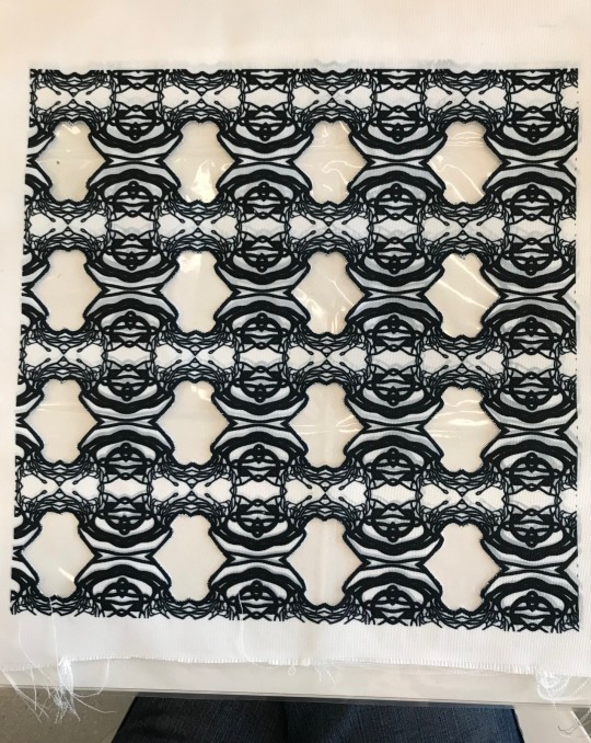
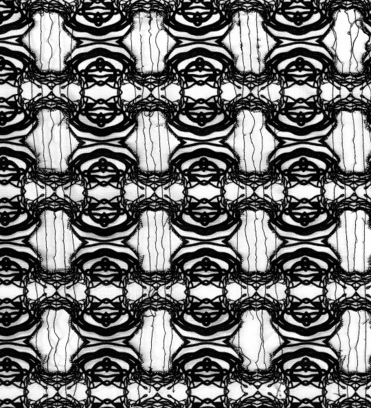
I decided to develop one of my prints, as some of the edges had bled slightly in the heat sublimation process, leaving grey shadow areas. I also thought this would be an effective way to add another element to this sample without taking away from the original design, which is already quite graphic and busy. To produce this sample, I first cut out areas of the fabric and then placed aquafilm behind, before sewing between the gaps. This process was harder than I expected, as the nature of the fabric meant that it kept fraying when I tried to cut the sections out, I tried to use bondaweb to give the fabric more structure and prevent fraying. However, I don't think this was an effective method, as the fabric continued to fray. The decision to sew thin lines of thread between the gaps also made this process difficult, as when I went to dissolve the aquafilm, some of the strands were breaking, due to their lack of structural integrity. I do however, quite like the appearance of the thin lines of thread, as I think their delicate nature works well with the boldness of the pattern.
0 notes
Text
Couching silk sample
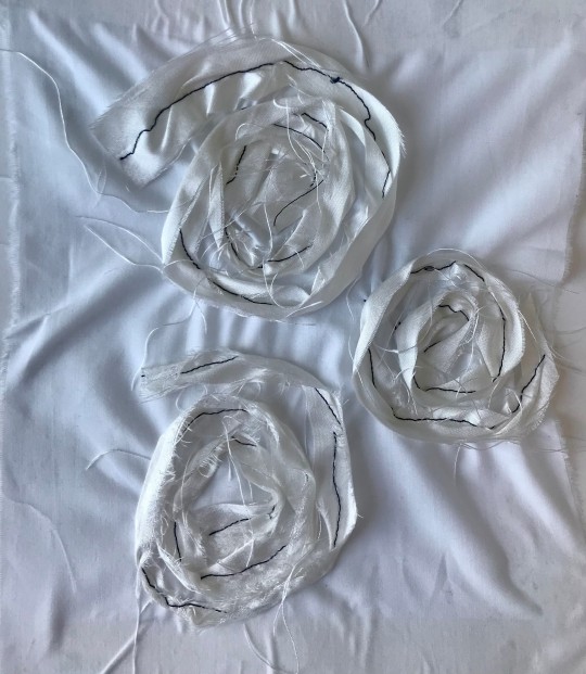
I produced a sample in which I folded strip of silk in half and the sewed down the middle, couching them into spiral shapes on top of another piece of fabric, using a free machine embroidery foot. For the experiment sample I tried, I used a random white scrap of fabric for the base, which I think worked. However, to develop this for a final sample I decided to use a net fabric base with the silk spirals on top, as I feel that the 2 different weights of fabric compliment each other. For my final sample I also made sure to use an embroidery hope, as the base fabric of the experiment puckered and creased badly when I was sewing.
0 notes
Text
Printing photoshop pattern on fabric
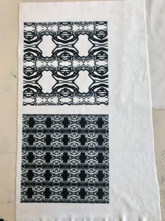
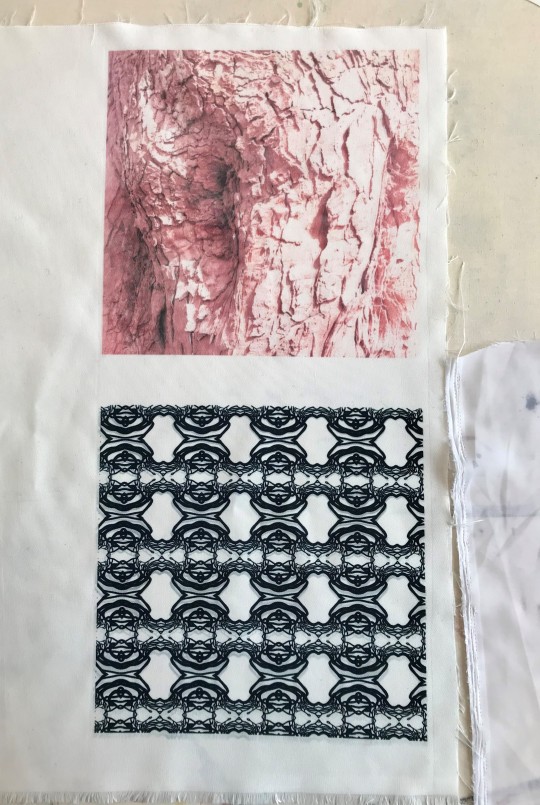
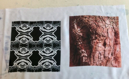
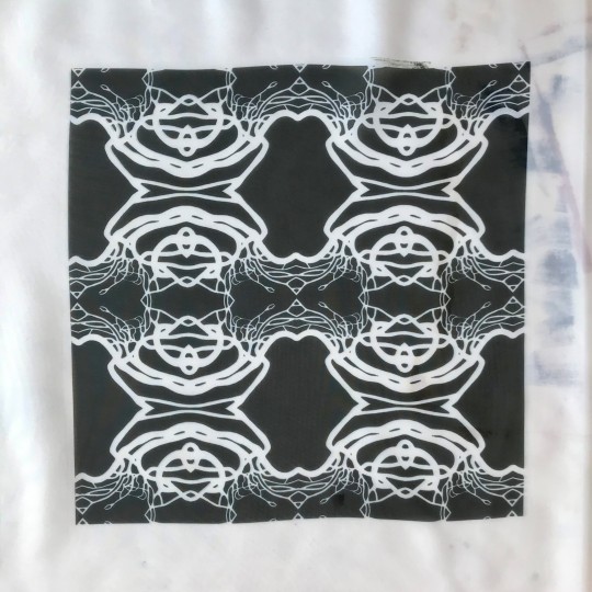
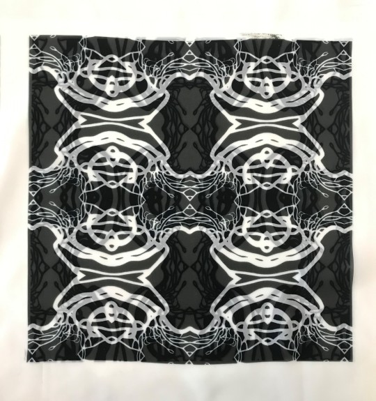
I decided to print the pattern that I had developed on photoshop onto fabric, to show how it would work as part of an interior fabric collection and to perhaps use as samples for my final outcome. The fabrics that I chose to print on were Polyester Canvas Albany, Polyester Suede Solarno, and Polyester Voile. All 3 fabrics had to be synthetic, as non synthetic fabric doesn't work with the heat sublimation process. I felt that choosing 3 fabrics of different weights and opacities showcased the prints in different ways and worked to demonstrate how the fabrics could be used for various interior textiles, such as curtains or cushions.
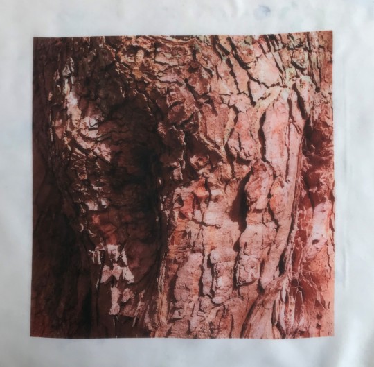
I also printed a photo I had taken of tree bark onto some of the fabric, as I intended to develop this as I final outcome as well, although at this point I wasn't completely decided on how I would do this. Some of my ideas included: scrunching and manipulating the fabric (inspired by the shibori method), cutting out sections of the fabric using reverse applique, and using aquafilm to sew between cut out sections.
Overall I am pleased with the outcome of my pattern on the 3 different fabrics. In particular I think it works well on the more sheer fabric, as it can be layered with a print underneath, which I think adds another layer of depth and complexity and develops my pattern even further.
0 notes
Text
Cut out samples
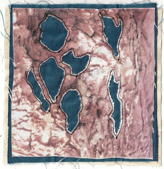
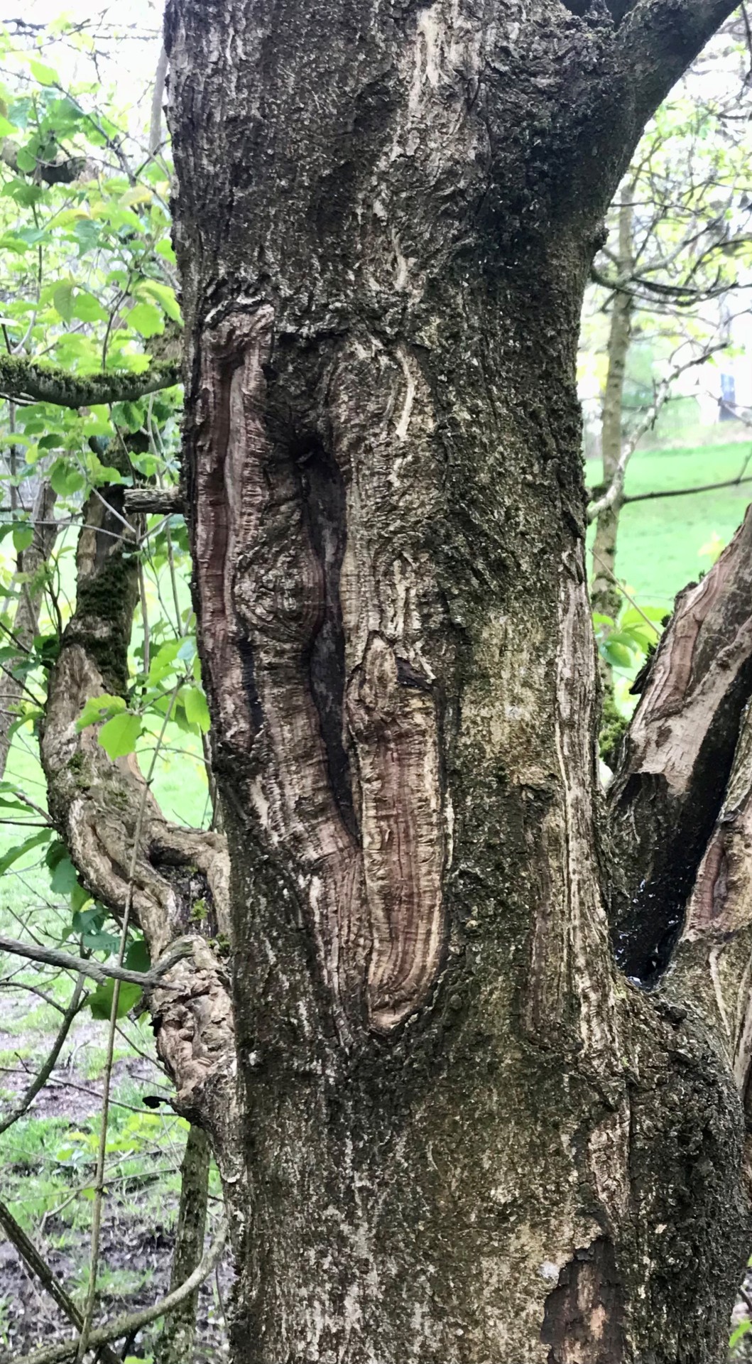
I was interested in the different shapes you see in tree bark and decided to produce samples inspired by this. I used reverse applique to do this, sewing a layer of blue fabric between 2 other pieces and then cutting away the shapes I saw in the bark. I used fabric which I heat sublimated a photo of bark onto for the first sample and then plain white fabric for the second, as I wanted to test how this thicker fabric worked before I used it in a final sample. I like the use of blue, as I think it compliments the pinky colour of the bark and I also want to incorporate blue in my final outcome's colour palette.
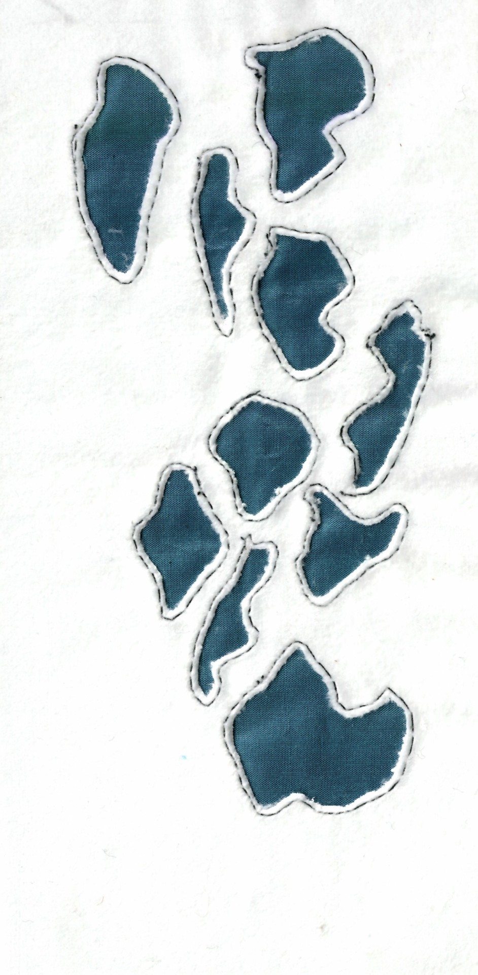
Another sample I produced, inspired by the shapes seen in tree bark, was a felt cut out with threads sewn between the gaps using aquafilm. I decided to use felt, as I thought it would be a sturdy fabric that would hold its shape when the aquafilm was dissolved. I like my choice to use white felt and black thread, as it makes the sample more bold and striking, as well as fitting with the general colour palette of my samples. I think that overall this sample is effective as I like the contrast between the solid white areas of felt and the more delicate messy lines of thread. I also think this was an effective way of interpreting my reference image to produce a more abstracted version of tree bark.
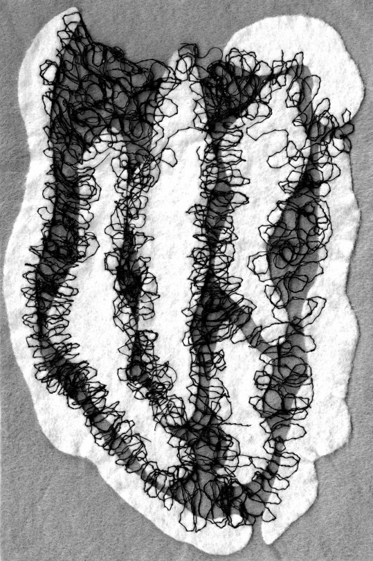
0 notes
Text
Shibori fabric manipulation
Shibori is a Japanese word that refers to the manipulation of textiles, both in terms of dying with inks and altering shape or texture. It comes from the verb 'shiboru', which means 'to wring , squeeze or press'.
I decided to try a shibori technique to experiment with a texture reminiscent of tree bark. For this process, I used a lightweight, sheer fabric and wrapped coins around it, securing them in place with thread. I then placed the fabric in water and left it to boil for 30 mins before leaving it to dry and removing the coins. Overall this process did work well, however I only tested it out with a small amount of coins and plain coloured fabric and I think it would create a much more interesting effect if I had done this technique on a larger scale, with the coins tied closer together. I could also develop this further by experimenting with different coloured fabric, perhaps painted in shades of brown, so the idea of tree bark is much more obvious.
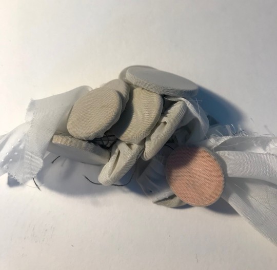
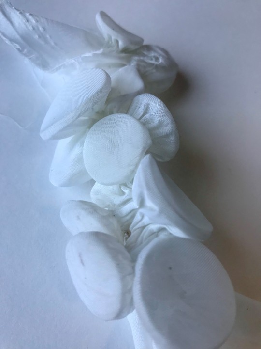
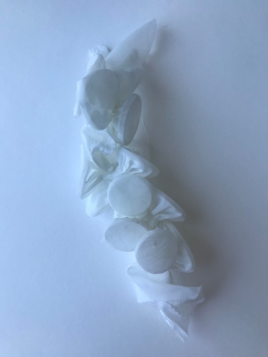
An example of this technique being used in fashion, is a collection titled 'Selkie's New Clothes', by Selena S Kuzman. Kuzman is a visual artist, whose work ranges from fine art photography to costuming, performance and installation. In 2018 Kuzman designed 'Selkie's New Clothes' for a window installation as part of Orkney Science Festival. The inspiration for these pieces was the selkie, a creature from Scottish mythology that can transform between their human and seal form by removing/putting on their skin. The idea of transformation is present in the creation of these costumes, as Kuzman uses discarded, 2d textiles to create something new and sculptural.
I think the use of shibori on such a large scale is highly impactful and I love the way in which these costumes showcase a variety of textures, all created by the manipulation of fabric. This would be a a great thing to incorporate in my own work, as with a different colour palette, I think that it could work well to communicate the textural quality of bark. However, the process is very time consuming and I am aiming to produce multiple final samples, as a pose to 1 large outcome, so I won't be able to achieve something as intricate or on such a large scale.


0 notes
Text
Photoshop spiral patterns
I wanted to develop my couched print into a patten so I scanned it into photoshop and removed the background before duplicating the layer to form different motifs, and then defining it is as a pattern. I played around with different scales and orientations but I'm ultimately not particularly happy with any of the outcomes, as I think this design needs another element for it to be a more full and cohesive repeat. I also experimented with having a bright blue background, as this is a colour I have utilised in another one of my samples and that I would like to incorporate in the colour palette of my final outcome. However, I don't think that the blue works well in this design, and that it would look better if the swirls were another bright colour, rather than black.


0 notes
Text
Embroidery samples
I wanted to develop some samples based off the more regimented trees and straight lines of my first sketchbook page. I cut strips of brown felt and hand embroidered them on top of a procion dye that had turned out a bit faded.
I also hand embroidered into a print that I produced using procion dyes of tree branches taken from a primary research photo. I wish I could have done more embroidery, perhaps using different stitches and French knots to add texture, as this ended up being one of my final samples.
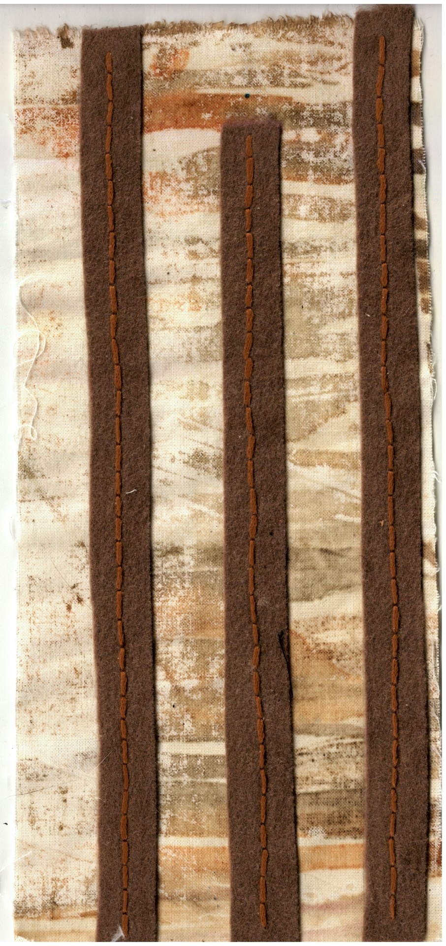
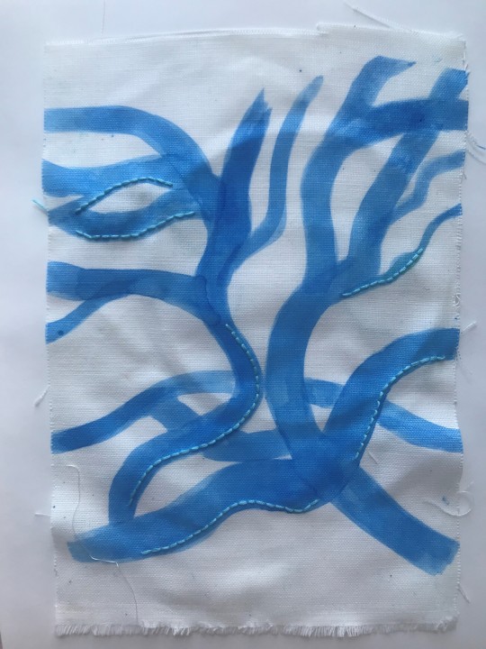
0 notes
Text
Weave
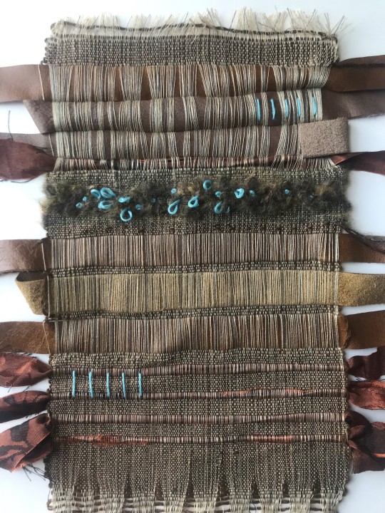
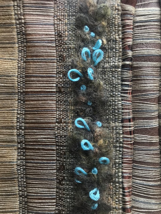
I decided to produce a weave, as my samples at this point had mainly consisted of print and embroidery and I felt that a weave would be an effective way of translating the colours and textures of tree bark. I used plain weave and and cut strips of leather and a silk fabric weave through. I feel that using different fabrics in my weave created interesting textures and varied tones of colour which works well to mimic tree bark. I also created texture by using a fluffy kind of yarn and pulling up loops using a crochet hook. I feel this technique was effective and I would have used it over a larger area or in different sections of the weave, however, it was quite time consuming and fiddly to produce.
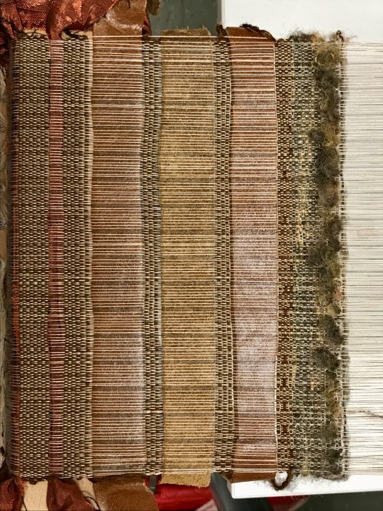
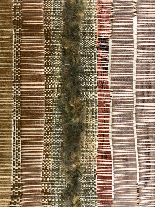
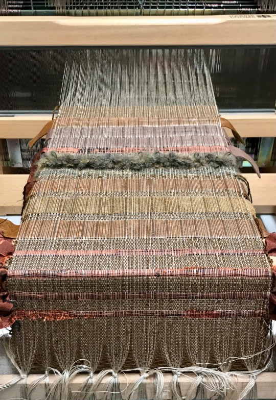
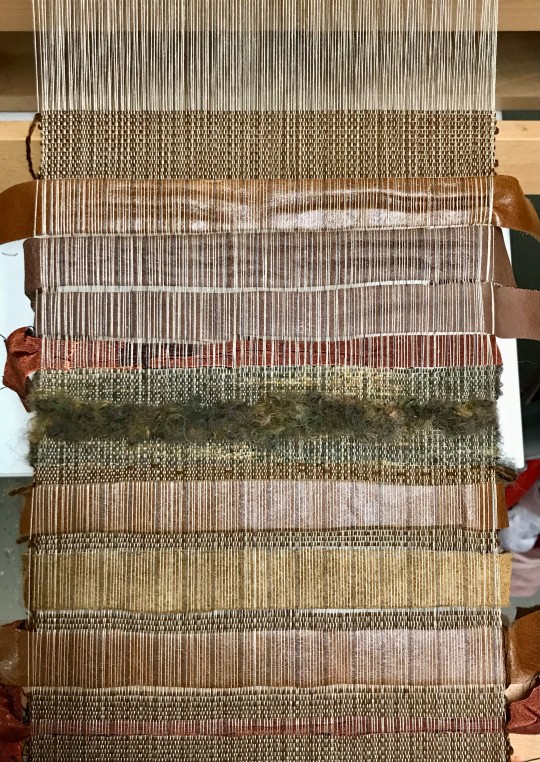
I decided to use my weave as a final sample and to develop it further added small sections of embroidery using a bright blue colour which I have as part of my final sample colour palette to add a pop of colour and 'lift' the pieces. To improve I should have added more of this embroidery, as I think it's an effective addition. However, due to time constraints I could only include a little bit.
0 notes
Text
Wood texture sketchbook page
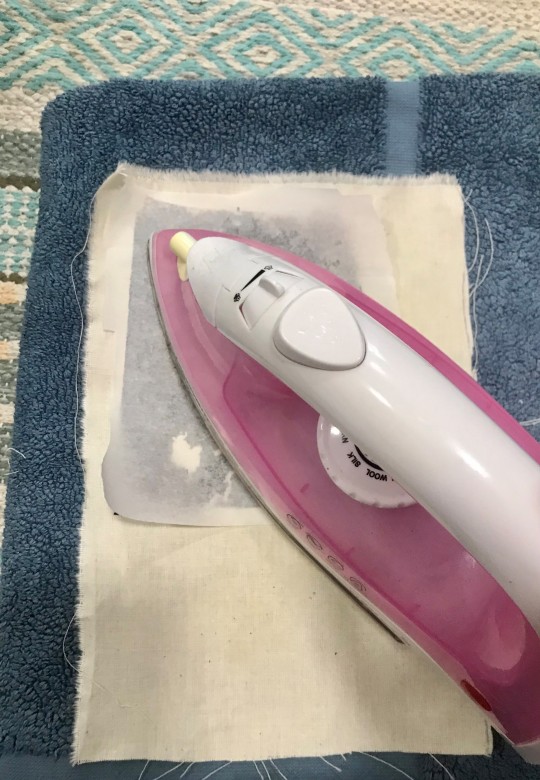
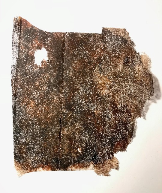
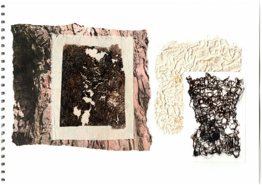
I experimented with different techniques to replicate the texture/look of bark. The first technique I tried was peeling the glue off bondaweb and painting it with acrylic paint before letting it dry and ironing it onto fabric. I like the effect this created, as the parts that flaked off are reminiscent of the shapes you see on bark bark. I feel that this technique could be utilised in mixed media samples such as prints and embroidery as it creates a nice textural background that could be worked into.
I also experimented with dampening a piece of fabric and then scrunching it up and letting it dry with an elastic band to secure it. I like the effect that this created, and also feel that it would act as an effective base to work into with either hand or machine embroidery. Another way to develop this as a sample would be to print an image of bark onto the fabric and then scrunch it in the same way to see how the fabric manipulation would look with an image on top.
0 notes
Text
Couching samples
I decided to experiment with couching, working into a procion print of brown spirals. I used blue thread and machine embroidered on top of it with a zigzag stitch, to secure it in place. I like how this added more depth and another texture to the print and also feel that the blue adds a nice pop of colour, as well as being complimentary to the orange tones in the brown. In addition to this, I couched black wool onto a black procion print to try and develop a sample that didn't turn out very well. Whilst I like the addition of the wool, I think that overall the sample still isn't very effective and that perhaps it would have been better to use white wool or stitching.
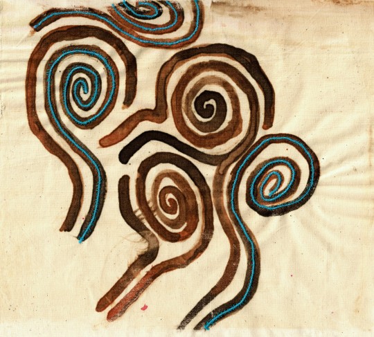
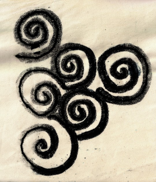
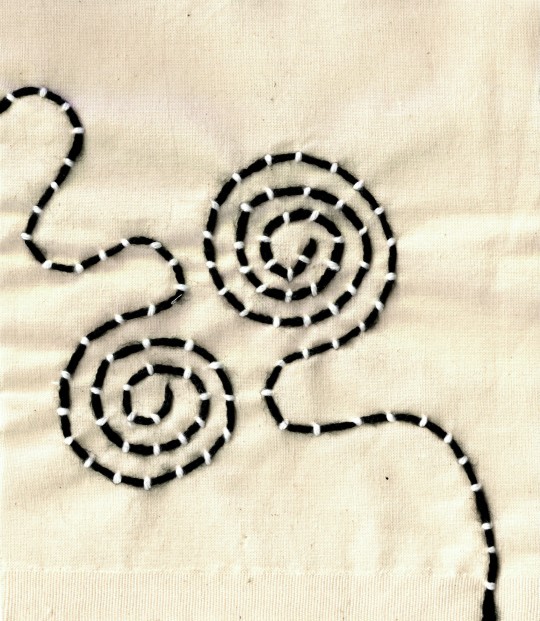
I also tried hand couching spiral shapes, using black wool and white embroidery thread. I like how this turned out, as I feel that my stiches are neat and evenly spaced out and that the white and black creates a good contrast. Working on calico was primarily to save money whilst creating samples, as there were lots of off cuts in the scrap bins of the textile workshops. However, I think having an off white or beige colour as the base of the hand couched sample, is effective as it allows the white stiches to stand out more than they would on a pure white background. If I decide to create a similar sample for my final outcome, I will try and find an off white fabric that is not calico, in order to differentiate the work as a more refined piece.
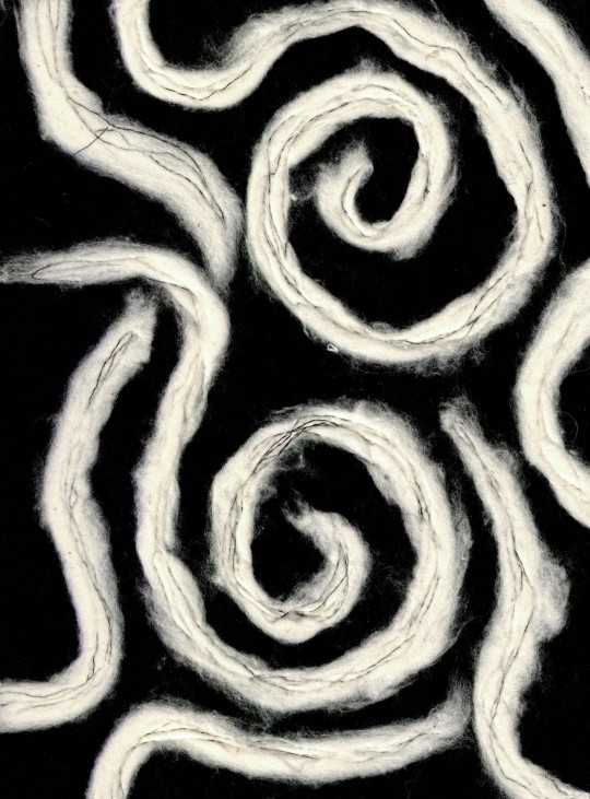
The last couching sample I produced was white wool spirals, machine embroidered onto black felt. I pulled off pieces of the wool and used a free machine embroidery foot, to sew round the spirals in a loose and intentionally messy way. I like the textural, wispy quality of the wool and how the wonkiness of the stitching adds to the overall effect. I also feel that the sample would be effective if the colours were reversed or in two different complimentary colours.
0 notes
Text
Sketchbook Pages 2 and 3
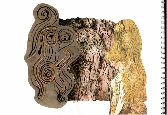
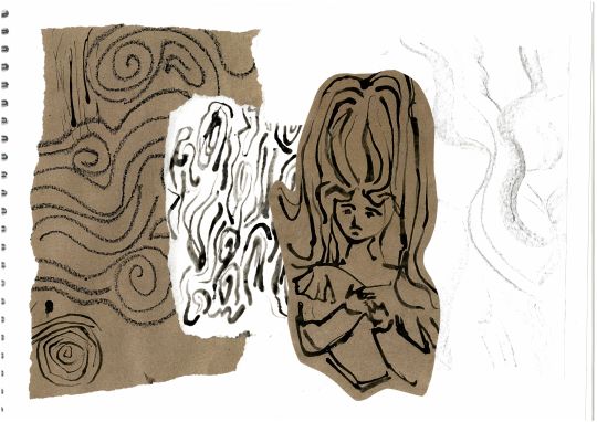
For these pages in my sketchbook I was inspired by the spiral mark making I had done in a previous session in response to fairy tale illustrations. I wanted to show how the figures I have drawn link with the forest and the idea of seeing faces in the trees, with the spiral shapes and flowing lines, merging with the patterns and texture of the bark. I feel that in particular the first page is effective, as I like the combination of my mark making alongside it's reference image and a primary image of tree bark to clearly communicate the correlation between them. I also like the use of thread, to add another texture to the pages and help link the images together in a cohesive way.
To develop this work, I continued to use spiral shapes in my samples, for example with my procion prints, and looked further into the idea of seeing faces hidden in the bark of trees.
0 notes
Text
Procion Prints
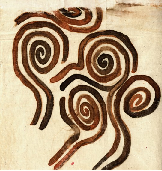
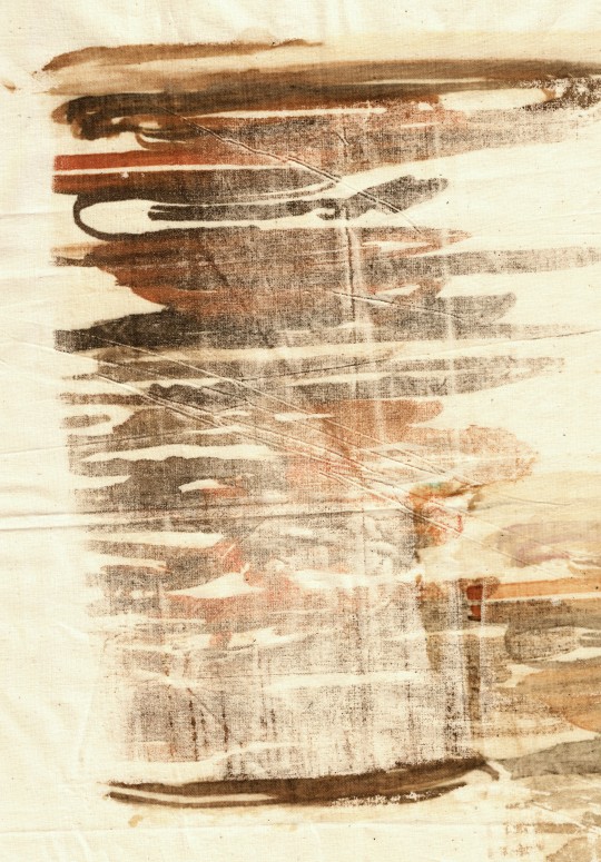
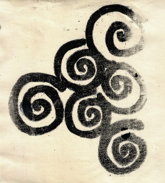
I decided to create some prints using procion dyes, as I enjoyed this process the first time I tried it and felt that it could be a quick and easy way to create nice backgrounds that I could embroider onto. I took reference from the spiral patterns in my previous work, as well as the colours and texture of tree bark, to produce these prints.
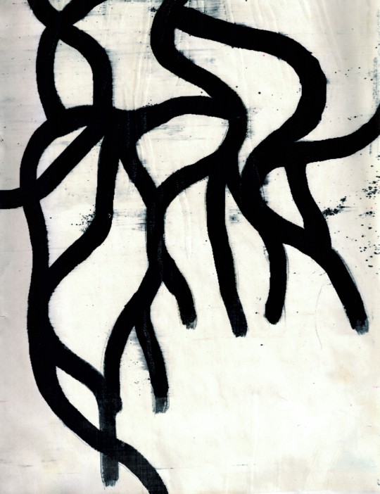
I feel that the two brown toned printed are most effective, as I like the mixture of different shades of brown to make the prints feel less flat and more textural and reminiscent of tree bark. I like the brown spiral print in particular, as the colours came out strong and vibrant, whereas the other prints were more faded and patchy. I think this may have been to do with the amount of manutex I put on the screen, as well as how much dye was painted on to begin with, however, whilst working I felt that the process was somewhat unpredictable and that it might take me a few more attempts to find the perfect method. I also produced a couple of prints with purely black dye, as I wanted to try a different colour palette and thought the simplicity would allow for a nice base to work into. The design with the black curvy lines was inspired by an image of intersecting tree branches I have previously referenced in my work. I like how the dark black lines look against the white paper and don't think that the black dye works as effectively with the cream background of the calico fabric I was using, as it doesn't have the same contrast.
0 notes
Text
Photoshop patterns
I decided to create a repeat pattern using a drawing of tree branches that I had already done. I began by scanning it in and editing on photoshop to create a clean black and white image. I then duplicated the image to create a more complex motif, which I turned into a repeat pattern. It was fairly easy to get the design to line up, as I was just mirroring the original image rather than creating a half drop or rotating the image without flipping it. The original design has a white background with black branches, however, I think that it is also effective with the colours reversed. I am pleased with the overall outcome, as I like the contrast of the black and white, and feel that the intersecting lines create a unique and intricate pattern, which is somewhat reminiscent of the paper cuts of artist Rob Ryan, who I have been inspired by. I also think that this pattern could work well for a variety of interior textiles, such as wallpaper or cushions.


0 notes
Text
Rob Ryan research
Rob Ryan is an artist best known for his screen printing and papercuts which have a distinctly whimsical, yet highly intricate style. He has also written his own books and illustrated works by acclaimed poet Carol Ann Duffy, as well as garnering commercial success, working with companies such as Liberty of London, Vouge and Paul Smith.
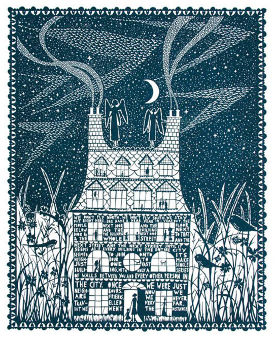
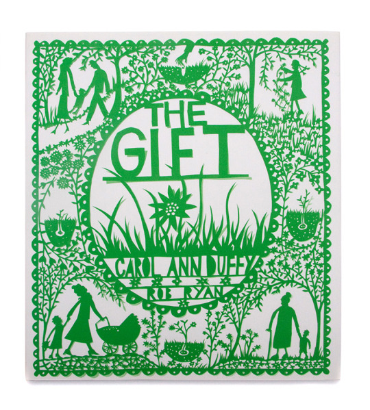
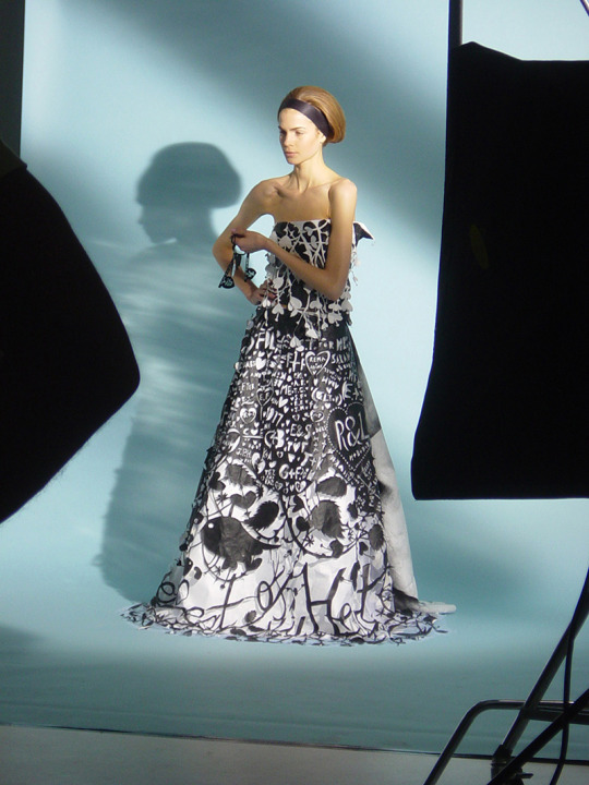
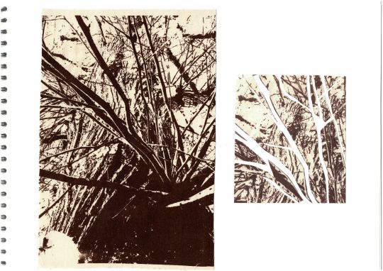
I decided to research Rob Ryan, as I was interested in exploring the idea of papercuts in my own work, looking at cutting and layering images of tree branches. I wanted to use this technique with a fabric printed sample, but felt that the fabric would fray and not cut cleanly, so I photocopied it and cut out sections of the branches, with white paper underneath. I would like to explore this further, perhaps strengthening fabric with either another fabric or bondaweb underneath, in order to cut directly into the print. I also think this would be effective in black and white, as it would create a nice sharpness of line and contrast.
0 notes