#autistic elias acorn
Explore tagged Tumblr posts
Note
MORE VANILLA
VANILLA FOR THE VANILLA GODS
[DISTRESSED HURGLING]
#leo chirps#leos reply#autistic elias acorn#me in palanauts chat: I AM BEING DROWNED IN VANILLA EXTRACT / AS WE SPEAK
35 notes
·
View notes
Note
happy birthday friend!

thanks!!
1 note
·
View note
Note
LAPFOX USED TO BE MY JAM AAAAAAAA
AAAAAAAAAAAA LETS GOOOOOOOOO
1 note
·
View note
Text
BEEN THERE, DONE THAT

(don’t feel bad tho, I don’t expect anyone to remember this shit besides me)

71 notes
·
View notes
Text

Midori One Day One Page 50!
OC Week begins with Daryl from @autistic-elias-acorn !
16 notes
·
View notes
Text

I posted 29 times in 2022
That's 29 more posts than 2021!
23 posts created (79%)
6 posts reblogged (21%)
Blogs I reblogged the most:
@acidbunnyart
@autistic-elias-acorn
@ditt0bl0g
@mikeyokite
I tagged 25 of my posts in 2022
Only 14% of my posts had no tags
#art - 20 posts
#oc - 12 posts
#artists on tumblr - 10 posts
#original character - 9 posts
#fanart - 5 posts
#oc art - 5 posts
#digital art - 4 posts
#sona - 4 posts
#duck - 3 posts
#originalcharacter - 3 posts
Longest Tag: 57 characters
#i didnt make him look like the onceler on purpose i swear
My Top Posts in 2022:
#5


See the full post
3 notes - Posted November 20, 2022
#4

Have a Sonic
3 notes - Posted April 20, 2022
#3


See the full post
5 notes - Posted April 16, 2022
#2


See the full post
5 notes - Posted October 1, 2022
My #1 post of 2022


Some more Terraria Fanart, Recently completed my Journey World so I drew my Mage loudout real quick. I struggle with backgrounds so apologies if it’s a bit derivative from my other recent art.
14 notes - Posted November 22, 2022
Get your Tumblr 2022 Year in Review →
3 notes
·
View notes
Text
Okay I know this isn’t exactly what you asked me but I’ve ALWAYS wanted to do one of those “IMMA RATE THIS SHIT” posts, and TODAY IS APPARENTLY MY DAY! Just as well, because I have a lot to say and I haven’t done a big Sally post in quite a while~
Ratings under the cut because, in a twist that will surprise no one, I went a little overboard.
Proto Sally v1
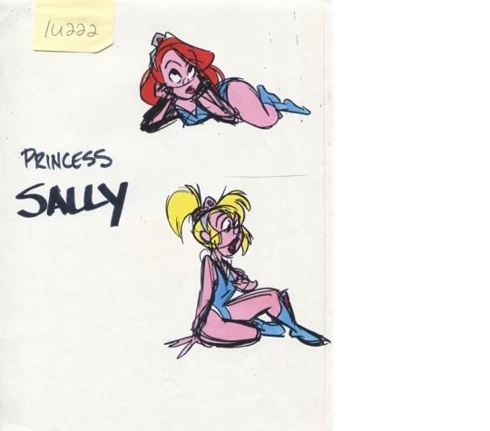
Where else to start but at the very beginning? I don’t know how many of you guys know this, but the very early concepts for SatAM were fucking WILD, and these designs are a fair yardstick for just how differently the show could have turned out. I know there’s not much I can glean from just two little doodles, but I do have to say they don’t really convey the essence of Sally as we know her. This character looks a lot more like a bored figurehead whom the other characters report in to, rather than an active part of the team.
HOWEVER, what these images DO explain is how Sally would come to have both blonde and red hair, as well as a stint with pink fur. That’s gotta be worth something, right? We also see her with blue clothes, including the boots!
Score: 3/10, one point for everything it explains but one deducted for v bad essence.
Proto Sally v2
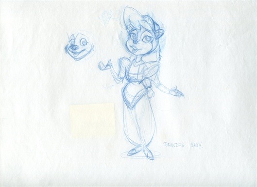
So we’re getting a lot closer to Sally as we know her here – general shape of the face, the poof of the bangs, the overall poise – but we still have a ways to go. I honestly think this design explains way more about CHILD Sally, between the outfit and the length of the hair. Like above there’s only so much I can gather from one sketch, but I’d say this is probably closer to her personality insofar as she strikes me as more of a leader; that said, the design also makes me doubt she’s very active with the actual missions because damn that outfit looks like it’d be a huge inhibitor.
Score: 4/10
Scrapped Sally

This is technically also a proto-Sally, but considering that this design made it far enough to actually appear in promotional images, I’d say this one stands apart. Interestingly enough I can see influences from both of the previous concepts, but also in a weird way she strikes me as being more like a Warner Bros character?? Maybe it’s the Bugs Bunny feet.
ANYWAY, I like this Sally’s attitude. She seems a lot snarkier (which we did get out of early depictions of Sally) and much more ready to take action. Her clothes are a lot less troublesome, so I imagine this is the point where she was finally intended to be more involved with the team, so yay! I definitely have to give this design points for doing better on essence, but the abundance of red really throws me off. I’m honestly not sure where that came from, since the blue was present in the earlier drafts?? Maybe it’s just color psychology, but it causes her to come across to me as less… soft, I guess? Like I feel like this Sally should be in Ratchet and Clank, not Sonic the Hedgehog.
Score: 3/10, not a bad design but not well-suited to our needs.
Neon Sally
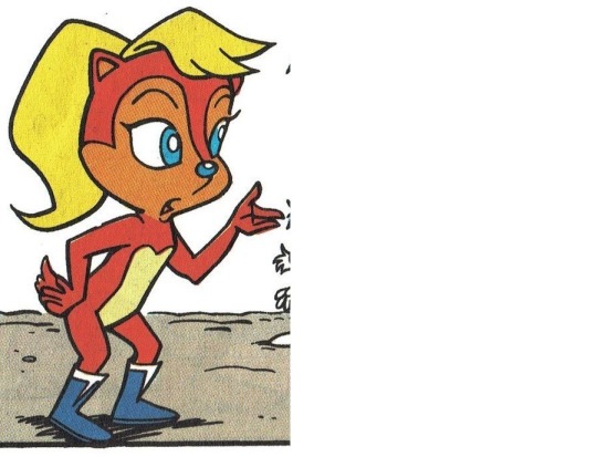
I know a lot of people wonder wtf was up with this version of Sally, but now that we’ve seen that first concept picture, she honestly doesn’t feel as out of nowhere anymore. This version of Sally only appeared in a couple of places in total (issue #0 of the original mini-series and like, one story book, I’ll find it for you later), but she’s significant for being the first to get us to the core elements of Sally’s design! They’ve finally scrapped the idea of trying to hamfist in a standard-girl-character outfit and went with a much simpler design, which is not only easier on the artists but allows her to fit in more cleanly with the rest of the cast.
This is the point where Sally becomes an active part of the team and is finally recognizable AS Sally, so she gets BIG points for that! Unfortunately, though, that color combination really hurts my eyes. I can only assume this was the case for others as well, because as noted earlier this color scheme went away very quickly.
Score: 4/10. Don’t worry girl, we all had our horribly awkward phases during puberty.
Pink Sally
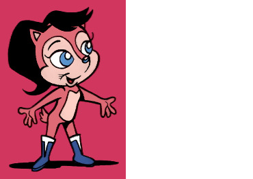
Ahhh, now we’re really cookin’~ This is Sally as I first imprinted on her, so this design will always be sentimental for me. She’s essentially the same as the neon design above, but quite literally easier on the eyes. What I really like is that the comic actually played around with the changed color scheme and made it canon that she dyes her hair, which comes up at least two times that I can think of. It would’ve been a lot easier to ignore it (especially this early in the series) but they went for it, and I think that’s great, especially since they framed it as something she’d prefer to keep a secret and thus made it something that gets under her skin.
Unfortunately, Pink Sally is most likely pink at all because, well, Girl Characters That Are For Girls tended to be pink at the time that this came out (and unfortunately that’s still a thing a lot today). I normally tolerate that in kind of an “eh” way, but in this case her pinkness REALLY makes her stand out from the other characters in a bad way. Most of them have either natural color schemes (like Bunnie or Antoine) or they take like, one step to the left with it (like Rotor); Sonic is of course wildly different from a real hedgehog, but he’s able to get away with this by being the protagonist, which makes it more reasonable for him to stand out. This leaves Pink Sally looking a lot more of odd alongside the rest of her otherwise mostly-natural team.
In addition, Sonic being blue and Sally being pink goes even further with the “THIS ONE’S FOR BOYS AND THIS ONE’S FOR GIRLS” vibe, which bugs me way more now than it used to as a kid... But, Pink Sally has actually shown up in official animation twice, once in the SatAM pilot and again in the Christmas special. That earns her enough clout to balance out some of her design issues.
Score: I’ve been waffling between a 5/10 and a 6/10, so let’s call a truce and say it’s 5.5/10.
SatAM Sally
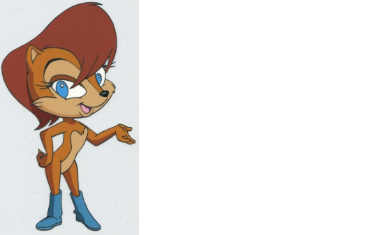
Now THIS is the Sally we all tend to think of when the character comes up! There’s very little that I don’t love about this design. I like her warm color scheme, I like that the brightness of her eyes balances with her boots and encourages your eye to move around, I like her proportions (particularly the fact that she DOES NOT HAVE TIDDIES), I like the way she holds/carries herself, and I like that she gives off a friendly first impression. She strikes me as someone I could approach, but also someone I should respect.
And then, of course, there’s her variant design when the vest is added:
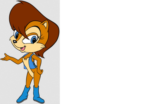
All of the same qualities as before but even more balance by adding a third blue. This also allowed for her eyes to have a black pupil instead of just being solid blue, so it’s more of an accent in this instance. I’ve always praised the vest too because it’s an addition that makes sense for her character. It adds utility without getting in the way.
Score: This will always and forever be my primary go-to design when I think of Sally. 10/10 without question.
Child Sally
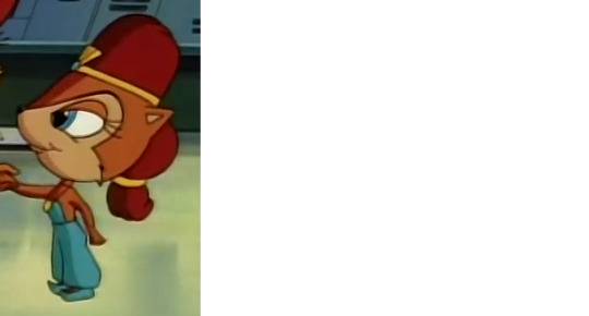
I already mentioned this earlier, but that second proto design really seems to have had an influence here, so at least those ideas weren’t a total waste. Since she’s a kid I feel like the cumbersome clothing is a little more fitting because she’s not exactly going on dangerous missions at this point in her life, plus she’s actually living the stuffy life of a princess here, and that tends to come with a lot of pageantry. I really dislike this design’s proportions, though; yes, I recognize that Sonic characters in general tend to have large heads and that with children that’s even more exaggerated, but seriously look at her. That head is WAY TOO EFFIN’ BIG.
Score: 3/10, they could’ve done better and they lose extra points for ripping off Princess Jasmine.
90’s Merchandise Sally
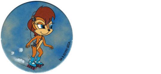
What can I say, man, she’s the embodiment of everything the 90’s considered cool. I feel like this is one piece of Sally history that a lot of later fans missed out on, because I know a common anti-Sally complaint is that she’s cold/aloof/a killjoy. It makes me giggle because I think of shit like this where they just kind of randomly stuck her on wave runners and skis, like I should be grabbing my old pogs and going “UM EXCUSE ME COULD A BORING CHARACTER DO THIS?”
Also snaps to this artist for actually putting her headphones ON HER EARS, since even Sega messes that up to this day.
Score: 7/10, totally rad man.
Fleetway Sally

So even though we’ve been referring back to those proto-designs ad nauseum so far, this Sally is actually also incredibly accurate to its source, just in a different vein. Most of you guys probably already know that part of Sally’s inspiration came from one of the rescuable animals in the original Sonic the Hedgehog, which was a squirrel named Ricky.
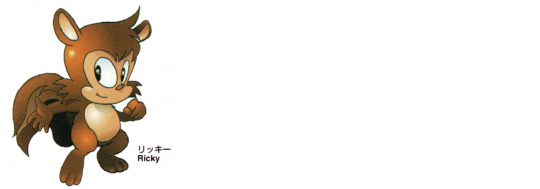
The resemblance is obvious, so much so that even someone as long-winded as me doesn’t need to belabor the point. The only thing I hate about this Sally’s design is that damn ribbon in her hair, because you KNOW it was only added because of the old “well we have to make sure people know she’s a girl!!” philosophy. I miss the 90’s but I definitely don’t miss that mentality permeating everything.
Score: 6/10, excellent work but I’m pre-programmed to be annoyed by that ribbon.
Dark Ages Archie Sally
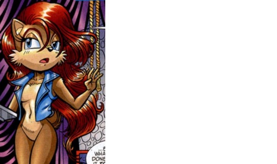
Okay this will probably be an unpopular opinion, but I hate Sally with long hair. Her short hair was something that always made her stand out for me when I was growing up, because she didn’t play into that message I was getting from like literally every other kids’ media at the time saying that girls have to look [x]-way to be pretty, which typically included long and flowy hair. By this point in the comics I had already ended my subscription, so years later when I glanced back at them again and saw that her design had been changed in this way, I was really upset. Yes, I realize that changing her hair doesn’t change who she is, but this entire list is about my personal preferences so fuck it. (Also an argument could be made that in this case the long hair DID change who she was because holy shit was she out of character during this time. That’s why we call it the Dark Ages, man.)
Score: 2/10, gtfo of here with that shit I don’t know who this character is.
Queen Sally
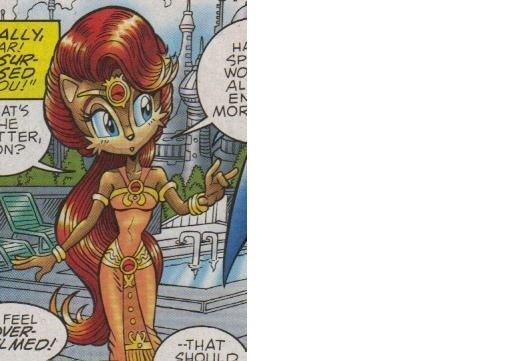
OH LUCKY ME, IT’S THE LAST DESIGN BUT WORSE. This design makes me recoil to this day, because it just feels so, so off the mark from who Sally is and how she operates. Being a royal family member doesn’t mean she’s dolled up in grand regalia ALL THE TIME, no more than Elias is when he’s king later on in the story. SALLY IS LITERALLY DRESSING THIS WAY AT THE FUCKING POOL, YOU CAN SEE IT IN THE BACKGROUND. But again, this was the Dark Ages, so it’s not wholly surprising.
Also I’m aware of another Queen Sally design from another point in the series, but I’m not sure if this is supposed to be the same incarnation?
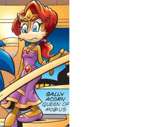
I know they’re both from future timelines but I don’t know if it’s meant to be the SAME timeline?? Whether they’re the same or not, I prefer this iteration but still don’t really like it overall. This is more or less a dialed-down version of the other one; her hair’s not SO overly-done and her clothes aren’t SO excessive and impossible to live in from day to day, but it’s still not congruent with how I read Sally as a character. This is how she presents herself when there’s an occasion that specifically demands she do so. All of her character profiles when I was a kid were very pointed about Sally being a tomboy, and that was important to me because I was never really girly myself. I liked that a character I admired was also like me in ways that other female characters weren’t. So yeah, this is still a deal-breaker for me.
Score: 1/10 for the first one, 3/10 for the second.
Reboot Sally
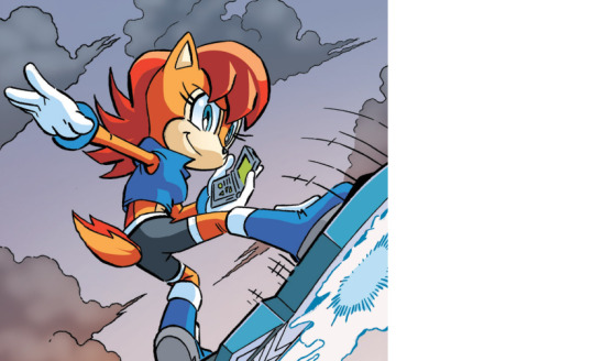
Now I’ve already stated just how much of a stan (am I using that word correctly?) I am for Sally’s original SatAM design, and it’s true that that will always be the “real” Sally design as far as I’m concerned. However, I also recognize that her character design needs to keep up with the times, and this is probably about as perfect of a job as I could ever hope for in terms of keeping her current while also maintaining her essence.
This is still Sally, through and through. It meets everyone in the middle in so many ways: It makes her fit in with the rest of the franchise by giving her gloves, but with a bit of blue to maintain her aesthetic; it addresses the fact that most Sonic characters now don’t really have ‘hair’ by giving her that absolutely glorious stripe down her back, to kind of argue that her hair is just part of that fur; it gives her more clothes because the series weirdly feels the need to cover the female characters but not the males, but it adds them in a way that works with what was already there and maintains her iconic vest and boots.
And yeah, I know a lot of Sally fans got REALLY salty about those extra clothes, but come on, on top of still looking completely badass, have you SEEN her when she takes the vest off??
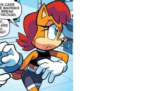
She now has the ability to do that “NOW it’s serious” wardrobe change, like when DBZ chars take off their weights or an action star takes off their sunglasses. And even that aside, AGAIN, SHE JUST PLAIN LOOKS AWESOME. It’s not adding clothes the way the series kept fumbling with prior to this, where they’d give her these big, bulky outfits that just completely ruin her ability to do much of anything. They added sports clothes, garb that not only won’t get in her way but will help her do it more efficiently. It’s just so fucking smart, I love it.
Score: 10/10, that’s still my girl and I love her SO MUCH.
Roboticized Sally v1
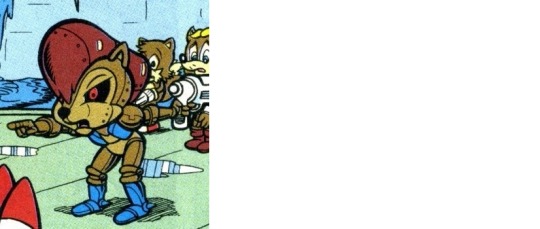
Alright, as someone that followed the Sonic comics from almost the very beginning (I started with original mini-series #3), I was there when this design hit the shelves, and holy shit is it an understatement to say it was a disappointment – especially when you consider that the cover looked like this.
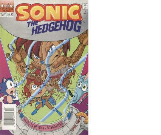
NEEDLESS TO SAY, ONE OF THESE DESIGNS WAS INTIMIDATING AND ONE OF THEM WAS DECIDEDLY NOT. I had a friend at the time that also read the Sonic comics, but who wasn’t as deep of a fan as I was, so there were a lot of times I felt like I had to defend it even when I myself didn’t really like it. This was definitely one of those times, and I would just like to extend a very belated apology to Andy Bowman for trying to argue that the contents of this book weren’t as bad as he said. They absolutely were, I was just 10 years old and unable to admit it yet.
Like, seriously, these two designs aren’t even comparable. Roboticization is meant to be terrifying, and the robots it produces are supposed to be frightening as well. Even if they don’t look overtly intimidating, they still have that uncomfortable automaton feeling, where it’s something not quite alive but has the behaviors of a living being (especially when you’re aware that it WAS a living being at one time). I’m not saying Sally’s roboticized design had to be as complicated as the one on the cover, as Spaz IS a hard act to follow, but what we ended up with just plain looks stupid. This especially falls flat when you consider that by this time, WE HAD ALREADY ACTUALLY SEEN SALLY GET ROBOTICIZED BEFORE IN SONIC’S NIGHTMARE.
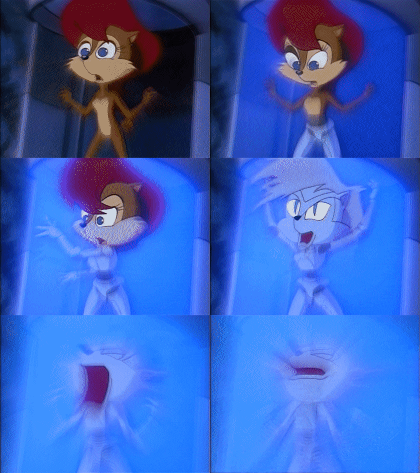
Is the robot she turns into in this episode as badass as the one on the cover? No. Is it still frightening? Hell fucking yes it is. The one we got inside of the comic, on the other hand, does not have anywhere near the same vibe as either of the other two. It feels more like the robots we got at the end of Bill & Ted’s Bogus Journey.
Score: 1/10 for the one within the comic, that was a complete fart in an elevator. 8/10 for Sally on the cover, definitely conveyed the horror but just a tad too busy of a design. And a bonus 7/10 for Sally from Sonic’s dream in SatAM, too, because it loses a bit of her specific identity (it could’ve been any roboticized chipmunk, really) but it still scared the fork out of me as a kid.
Roboticized Sally v2
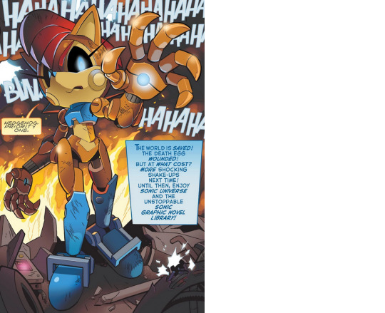
Now this is what a roboticized version of Sally is supposed to look like. She is an absolutely terrifying presence, and yet we can still clearly tell who she is at a glance. THIS is what we were expecting from the last time the idea came up, and I’m glad we did get to see a fully realized version of robo-Sally, even if it took years to get it. To be honest she kind of gives me a Terminator vibe, in the sense that I have no doubt this robot could eviscerate me in an instant and the idea that she’s looking right at me gives me the impulse to run for cover.
Of course, this design didn’t last long before she got a redesign when Robotnik weaponized her:
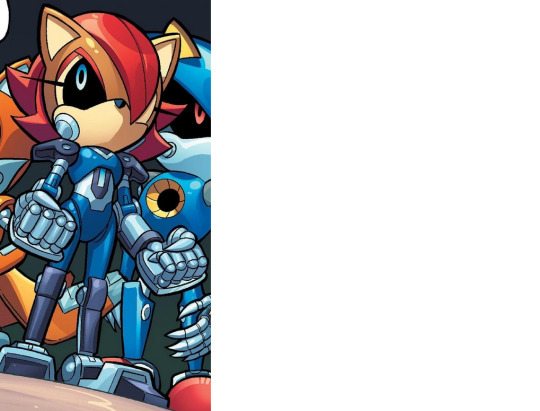
While I don’t dislike this design by any means, I do feel like it loses a little bit of the Sally essence. Juuust a bit. That isn’t to say that’s necessarily a fault of the design, though; making her feel more like the robot clone series was part of Robotnik’s overall goal, so making her look less like herself isn’t a flaw on the comic’s part. But in terms of being a Sally design, I do feel like it’s a little bit weaker. Still very cool, just not as purely Sally.
Score: 10/10 for her initial roboticized design, but a slight ding in the redesign, so 9/10 for the latter.
Evil Sally v1
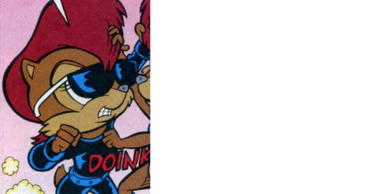
So this is clearly a very poor attempt at designing an evil Sally, but I’ll throw the comic one (1) bone here: This was still so early in the comic that the philosophy was still “it’s just for kids, it doesn’t need to be that good deep,” so they literally just slapped some leather on her. To be honest the evil ‘formula’ during this era was “[normal character] but in leather,” in general, so, that may have just been the comic following, and I use this phrase very loosely, “best practices” of the time. I’ll at least give the colorist for this issue some credit for making the highlights blue instead of white, since that helps maintain a liiiiittle of Sally’s design aesthetic.
Also, fun fact: This panel is one of those moments I mentioned earlier where the comic references Sally dying her hair~
Score: 2/10. I gave it one bonus point because I like the idea of punching her resulting in a “doink” sound effect.
Evil Sally v2
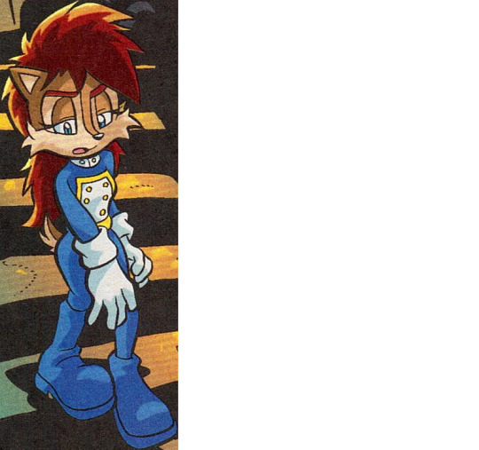
Now this design, on the other hand, really shows how you can convey that this isn’t the same character you already know with more than just clothing. Yes, the outfit tells us a lot, but so do things like her posture and the lack of attention to her hair. Although side note, I do genuinely dig that uniform she’s wearing. It feels very official to me, like this is the sort of thing our normal Sally might be wearing if she was ‘princess-ing’ full time but wanted to skip the fluffy regalia.
Also, I have to compliment the fact that it’s actually THIS Sally, the evil Sally, that still wears normal boots. For whatever reason Sally’s boots got a weird… thingy… on them once the comics got out of the Dark Ages, and I always hated that. Credit where credit’s due to the evil incarnation here for having better taste in footwear.
Score: 8/10, very good but honestly I’d love to see her pushed even further!
Bedtime Sally v1
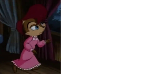
As a kid all I could think about was how uncomfortable that nightgown looks, but now with my Adult Eyes I mostly see the resurgence of “PUT HER IN PINK AND RUFFLES AND A BOW IT’S A GIRL CHARACTER MAKE SURE THEY CAN TELL IT’S A GIRL.” I guess this nightgown isn’t bad exactly, it just doesn’t look like it’s hers. What IS it with so many of these old designs trying to bog Sally down with really cumbersome clothes?! Maybe this was just something the FFs scavenged and Sally decided to use it because in SatAM resources are really scarce, who knows. Either way that thing looks outrageously uncomfortable and I don’t know why she’s wearing it.
Score: 2/10, stop doing this shit to my girl.
Bedtime Sally v2
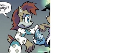
Okay, two things here: 1) This looks significantly easier to sleep in because it doesn’t look anywhere near as pinchy, and 2) oh my god the acorn pattern on the fabric I love it. I’m not a nightgown kind of girl myself, but if I saw that thing in a store I would SO buy it. Also speaking of the fabric, I can’t explain why but this one just reads as nicer fabric to me?? The first nightgown strikes me as much harsher and less breathable, but for some reason this one gives me the vibe of being soft and stretchy and not roasting you to death with your own body heat.
Score: 6/10, there’s still better things she could sleep in but I can’t fault her for wearing something I want myself.
Wedding Sally v1
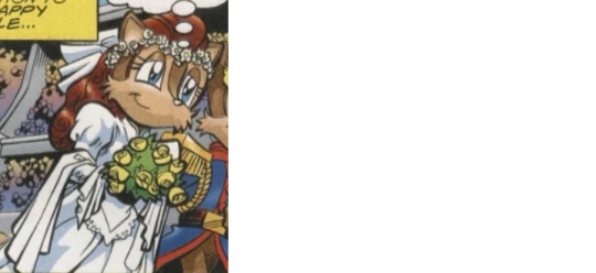
So if my trivia is correct, this is from when she’s being forced to marry ‘Antoine’ (aka Patch, evil!Antoine) at her father’s behest. If that’s the case, then I really hope he’s forcing her to wear that dress too, because I’m honestly not a fan. It’s not ugly or anything, but it feels like it’s swallowing her whole, and holy shit that shawl or whatever it is around her elbows is REALLY unnecessary.
What’s funny is that the comics actually did play around with a wedding story very early on in the series, but as with most other things at the time, it was a lot more simple:
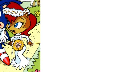
Interestingly enough it’s actually not that far from what we get during the Patch wedding, right down to the flowers in her hair. I know in this instance it wasn’t a real wedding, but I still find this to be the more realistic dress, because as I keep saying like a broken record, Sally’s style aesthetic favors simplicity. She doesn’t need to be overdone to be elegant.
Score: 3/10 for the Patch wedding, since it’s not a terrible dress, it’s just terrible on her. 7/10 for the pretend wedding dress, though, it’s very cute.
Wedding Sally v2
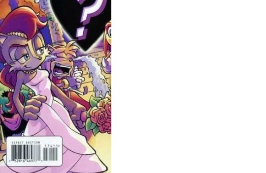
What’s funny to me is that Sally’s actually just part of the bridal party here, but even so I feel like this would be a perfect wedding dress for her own ceremony some day. It honestly reinforces what I’ve been saying in most of these other posts about how a simpler design is better, plus it allows for the notion that she can totally get more gussied up when an appropriate occasion calls for it. This isn’t something she’s expected to wear every day, it’s for A WEDDING, so the outfit being a little extra makes sense. It’s a look that requires a little work to manage (as dresses like that typically pose a challenge to walk in), but it’s not at all over-designed and looks genuinely nice on her. Also I’m living for those beads in her hair, they look amazing.
It’s just so nice to see an example that gets this RIGHT after so many attempts have gotten it so wrong. This is the right amount of floof, in the right circumstances, while still maintaining Sally’s aesthetic. It’s the sort of moment that reminds us that Sally DOES have range and isn’t just a one-note character. She can go formal, she just wants to do it on her terms – y’know, like everyone else gets to do.
Score: 10/10, absolutely superb job, couldn’t ask for better.
Dark Gaia Sally
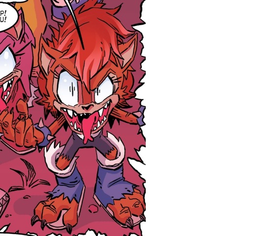
Even though this wasn’t really happening in reality, I still wanted to include it because damn that’s a good design. I’m very much one of those people that gets frustrated when female monsters are still expected to be beautiful, so imagine my reaction when I saw this Sally ACTUALLY being depicted as monstrous! It’s so good it makes me sad that this was just a hallucination on Sonic’s part, because I’m super curious what Sally would be like as a full-fledged Dark Gaia beast.
In addition, I’d like to acknowledge how good the slightly-less-monstrous version is as well:
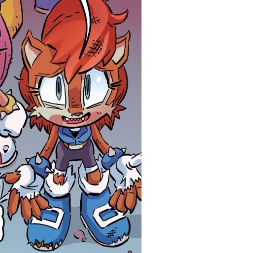
At this point you can just plain forget the Dark Gaia concept all together as far as I’m concerned, I just plain like this design. It’s still 100% Sally but it’s also a rougher and less dainty Sally. I absolutely ADORE getting to see those claws and fangs, and the fact that she’s kind of scruffy all around gives the impression that she’s just as strong in a physical sense as she is intellectually. She doesn’t even need to be a monster for these elements to work, they just plain look great on her period.
Score: 10/10 for Gaia beast mode, and frickin’ 11/10 for those little fangs. LET SALLY HAVE FANGS.
Super Hero Sally
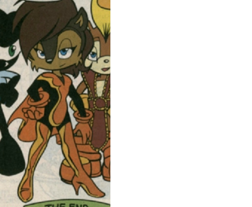
I have no idea wtf is going on here, I just know the next movie in the Marvel Cinematic Universe looks great and I’d like to reserve my ticket. Also that brown hair oddly kind of works for her?? I wouldn’t have guessed it would against her fur tone, but for some reason it does.
Score: 6/10, I’m interested in her superhero backstory but she’s making no effort at all to protect her identity. Unless she’s like Tony Stark I guess, then she can have a 7/10.
Sally Moon
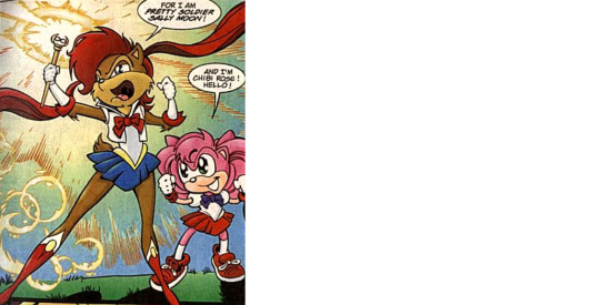
This design makes me ashamed for being both a Sally Acorn fan and a Sailor Moon fan. NOT ALL GOOD THINGS MIX TOGETHER WELL. GO HOME, COMIC, YOU’RE DRUNK.
Anyway yeah, I hate that this ever existed and I pretty much live my life pretending that it never did. There’s just… nothing about this that I like. At all.
Score: 0/10. Go away.
Sally McAcorn
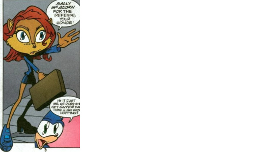
LOL THIS DESIGN CAN FUCK RIGHT OFF AS WELL. If I had to give Sally Moon one compliment, it would be that it’s at least riffing on something the audience of the comic – y’know, CHILDREN – were likely to be familiar with. WHO IN THE FUCK THOUGHT THE KIDDIES WOULD BE INTO A PARODY OF FUCKING ALLY MCBEAL??
In addition to the utterly horrifying art style, they couldn’t even do a GOOD parody of the thing that no kid reading the comic was familiar with, because they cocked up her name. Forget “McAcorn,” it should’ve just plain been Sally McBeal. This is even worse than missing the opportunity to use “Knuxedo Mask” in the Sally Moon comic. It literally misses the mark on EVERY LEVEL. Just. No. Just no. Go away and never return.
Score: -18/10 and whoever greenlit this needs to be shot.
??? Prostitute Sally???
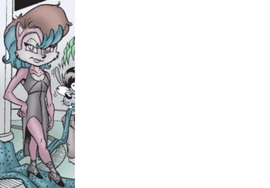
Before y’all flood my inbox, yes I am aware she’s not actually a hooker. (Or IS SHE?) As memory serves, this is from one of the comics that was so bad it was a major factor in me deciding not to subscribe anymore.
I’ll at least say that the concept here isn’t completely terrible – I’ve seen plenty of fanart of Sally dolled up in swanky clothes before – but this is probably the worst execution they could’ve possibly given it. All anatomy problems aside, the stupid dress doesn’t even FIT. And those stockings really should’ve been thigh-high instead of mid-shin; she looks about as bad as I did when I was in 2nd grade and I would pull my white school socks up as high as they could go while wearing shorts.
Score: 1/10. I decided to be nice and give her one point for at least being attractive to that bug-eyed guy on her left.
Sallactor
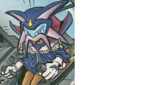
Okay ngl I’d never seen or heard of this incarnation prior to writing this reply, I just sort of tripped over it while I was looking for a picture of a different Sally. All I know is that she’s apparently a villain in one of the other zones and I’m?? So into this?? I am SUPER down for an AU where Sally is the bad guy, if just to change things up a bit. I know I’m supposed to be commenting on the character design here, and yeah this really isn’t a great super villain get-up, but honestly I don’t care. That helmet thing can be given a redesign and I can still pretend I’m her evil lackey.
Wait WHAT IF SHE WAS THE VILLAIN IN THAT SALLY MCU MOVIE FROM BEFORE?? OH SHIT THAT’D BE AWESOME, MAYBE THEY’RE SISTERS OR SOMETHING AND HAVE CHOSEN OPPOSING SIDES OF BATTLE AND—
No yeah sorry I’m supposed to be talking about the design. Like I said the helmet’s dumb, but I kinda dig the cape and gloves. Definitely lose the dangly shit from those two spikes on the sides, that’d get distracting fast.
Score: 6/10, give her a round of edits and get back to me.
Derp Sally
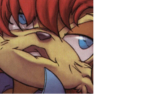
Absolutely flawless, nothing to review here.
Score: 10/10, surprised you’d even have to ask.
Sally with Goggles
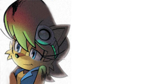
Welp, I felt it only proper that I end on this note, because this is definitely my favorite incarnation of Sally when weighed on all factors. She has the overall design that I love from SatAM, but the goggles add a little extra touch that I really think enhances how the character is interpreted at a glance. It’s an early indicator of some of her skills and conveys an added level of preparedness that no other version has been able to achieve.
No joke, this is honestly my favorite picture of Sally ever. Veterans of the comic know that this was originally the last time we saw Sally as herself in Archie before she was roboticized for the second time, and I loved the design so much that I edited it in photoshop to make the image more neutral so I could look at it without instantly feeling sad. The fact that I feel it’s so innately Sally is why I then also used it as the icon for her ask blog back in the day. If you want the essence of Sally, this is it. This is where stumbling around and learning from all the other designs will lead you. It’s just. Her.
Score: 100/10, no contest. Everyone else go home, we’re done here.
#Sally Acorn#THIS WAS FUN#even though it took me like two days to complete#also many thanks to autistic-elias-acorn for helping me find one of the pics#you're the best bro#that thing was driving me nuts#Archie Sonic#SatAM
106 notes
·
View notes
Note
🤫: Any Funny System Stories?
Any Funny System Stories?
We have a system member (Enzo, naming and shaming) who ate a stick of butter for $20, which we tease him for occasionally. He’s one of the Scourge the Hedgehog fictives mentioned in a previous ask. In our experience, Scourge fictives can and will eat whatever you give them that’s vaguely food shaped, because they like eating too much.
This same person also soulbonded seven other people in one day. Six out of those seven were Scourge fictives too. This is the reason we’re such a big system (half-joke, we’re mostly walk-ins, but still).
#op#ask#autistic-elias-acorn#ask game#inferno (they/them)#everything althu#althu experiences#althu memes#plural memes#plural experiences
6 notes
·
View notes
Photo
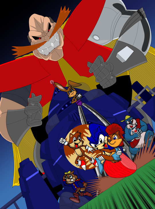
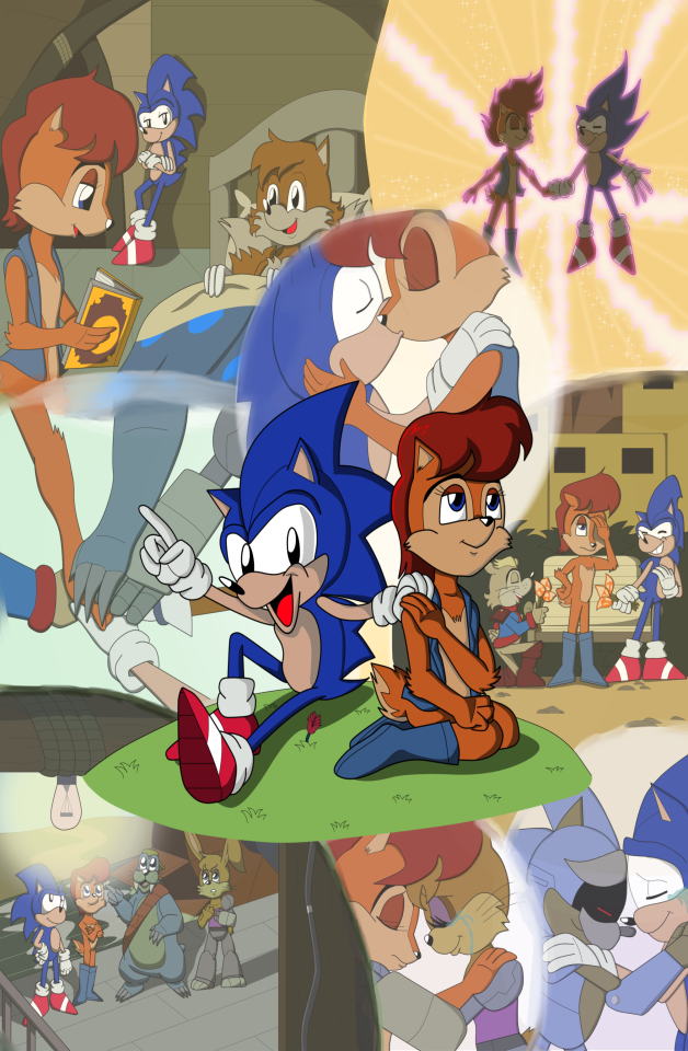
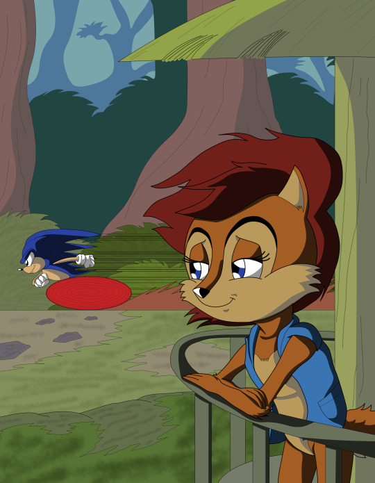
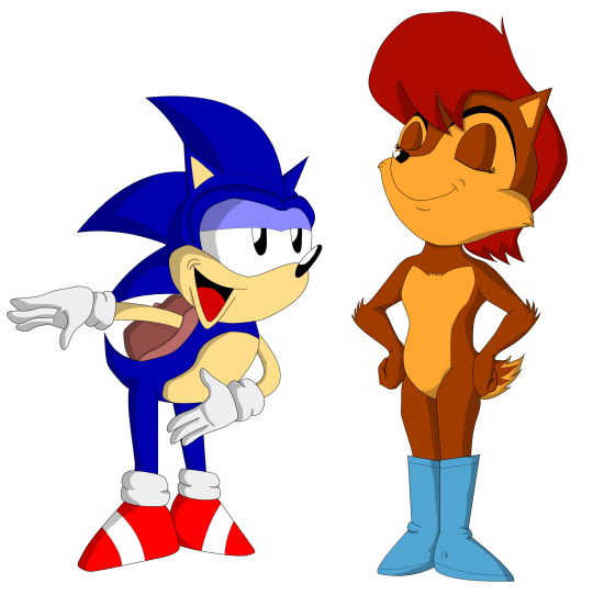
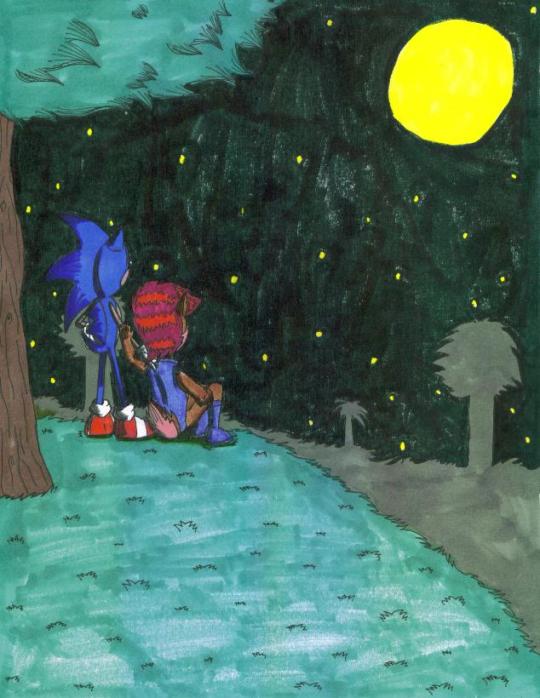
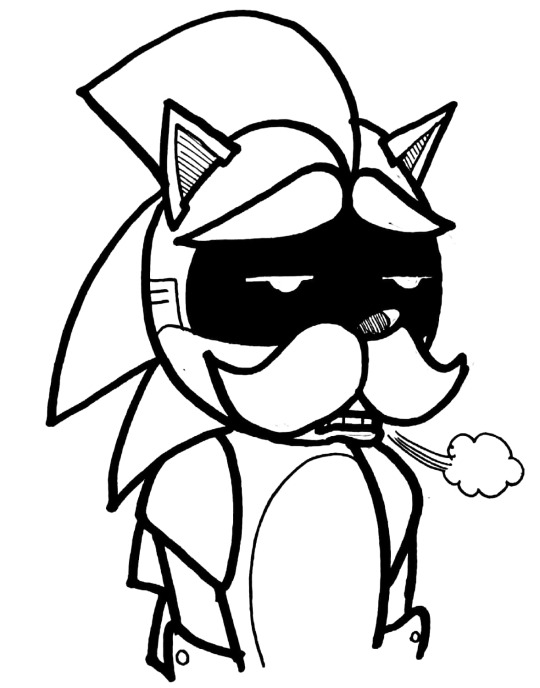

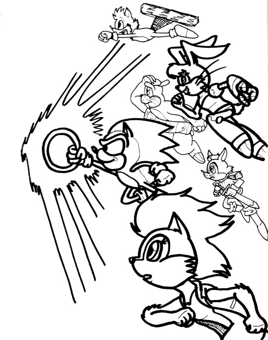
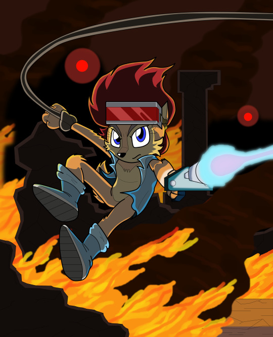
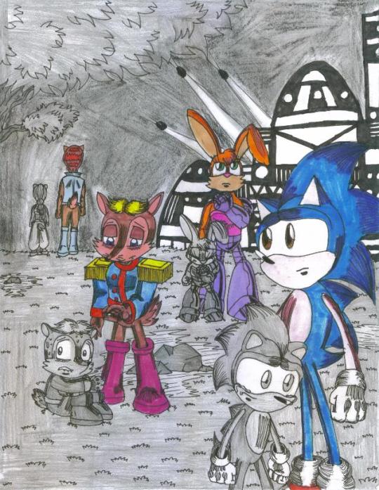
So this weekend marks the 28th anniversary of the ABC “Sonic the Hedgehog” cartoon. And while I always mark it in some way, this year, for whatever reason (probably being on Year 2 of an ongoing global plague lD; ), this year I find myself feeling especially sentimental. So in addition to the above sampling of some of my personal favorite SatAM pics I’ve done over the years (of which there are, unsurprisingly, A Lot), I also have some thoughts on Being A SatAM Fan In 2021.
Because the thing of it is, over the last several years, I’ve found myself feeling increasingly uncomfortable around my continued fandom for this show. Don’t get me wrong; I still very much love it every bit as much now as I did twenty-eight years ago. It is something like THE singular passion that drives so much of who I am as an artist. But it’s a small niche-within-a-niche for a Fandom of something which I can’t realistically argue I am at all still the target audience for. And worse, it feels, so often, like that niche-within-a-niche is mostly defined by its worst actors. The ones who harass creators or fellow fans over stupid shit, who act so infuriatingly entitled or belligerent about what is “owed” to them, who refuse to ever just listen and even try to grow even slightly. And at a certain point, for me, that knowledge, that the space we share is so small that it’s hard not to feel some Guilt By Association, became increasingly hard to ignore. And it sucked. I couldn’t stop feeling the way I did about this show, its characters and its world and what they’ve meant to me for so long! But how could I reconcile those feelings with that guilt?
And I think, over the last couple years, I’ve come increasingly to realize I don’t really need to.
Because this space, small though it may be, isn’t just shared with those bad actors, no matter how insistently those bad actors try to pretend otherwise. There’s so many wonderful people here too, keeping the spark of something Good alive here, and getting to share that Good with all of them, be they lifelong friends or new acquaintances or just fellow artists who also share and show their love for this one particular little show that somehow managed to take up such a unique place in our hearts...that’s worth it. And like...it isn’t even just about whether you’d really say you’re a fan of SatAM itself, either. Maybe it’s the comics that were based on it; maybe it’s just The Idea Of SatAM and you’ve never really watched the show. I don’t know. I don’t care. What I care about is what you’ve managed to share with me, what you’ve managed to inspire in me. How you’ve managed to help me hold onto the best of what Loving This Show has meant for me.
@elistodragonwings @kaikaku @starlitskvader @omnicenos @jammerlee @sally-mun @robotnik-mun @fini-mun @werewolf-t33th @riftclaw @wildwoodmage @sege-h @autistic-elias-acorn @chauvel @inkpants @riggo-draws @stormywitch90 @knotholeproject @metalpandora @mechares @another-her @lyllaotterofhalfworld @chordsykat @ninjakasuga @adokle
Thank you all. Very, very much.
To Freedom.
106 notes
·
View notes
Text
rules: tag 9 people you’d like to know/catch-up with, so let’s see... @lightningsong, @steeleidolon @chaoscheebs @edgeofpanic, @razerathane, @autistic-elias-acorn, @sally-mun @asheanon, and @holymicrobots
tagged by: @getvalentined ♥♥
last song listened to: Rhythm Nation by Janet Jackson
last show: ...I had Hell’s Kitchen clips playing on YT while I was vacuuming earlier, does that count?
currently watching: I was watching ‘The Blood of Zeus’ before - I should probably finish it, ‘cause I was halfway through the first season.
currently reading: Alternating between ‘The Kids Are All Right: A Turks Side Story,’ ‘Vampire Hunter D: Omnibus Book 1,’ and rereading ‘Cycle of the Werewolf.’ I have to alternate because I was reading just the VHD one before, and I forgot how friggin’ purple the (translated) prose gets (yes, we know, for the upteenth time, D IS FUCKING BEAUTIFUL, YES SO ARE THE WOMEN, okay please move on); I haven’t read ‘Kids are All Right’ before in book form (always online, lol), and ‘Cycle of the Werewolf’ is just a favorite of mine, and I finally found a copy of it not too long ago.
1 note
·
View note
Note
*insert fucked up sounding Green Hill Zone music mixed in with the horrible sounds of slapping here*
WHO IS WETLY SLAPPING
#leo chirps#leos reply#autistic elias acorn#WAAA THAT'S SUPPOSED TO BE A REFERENCE TO SOMETHING BUT#NOW IM THINKING ABOUT BIG SHOES SONIC SLAPPING WETLY :( :( :( :( :( NO NO NO#mini.txt
9 notes
·
View notes
Note
💎
💎 (diamond) survival or creative? End or Nether? Deep Dark or Snowy Slopes? Dripstone or Lush Caves? Mangrove or Meadow? Allay or Frog?
survival, honestly? creative is fun but as time goes by i really like just.. being able to Do Stuff in survival. im not a fan of creative flight after getting used to elytra, instantly breaking blocks takes out some of the tactile feedback (and also i keep breaking stuff on accident), and i know the general idea is you build a blueprint in creative and remake it in survival but why would i want to do the same thing twice? especially with my memory being as bad as it is lmao. i know litematica exists but i don't really feel like messing with it
(that being said i would love a middle ground where i can be invulnerable in survival / not having to worry about being mobbed by mobs because yeah peaceful exists but that just. deletes every hostile mob)
the end is very cool but also the endless void scares the shit out of me and i'm always terrified i'm going to fall so uh. nether i guess! even though nether kinda has the same problem with lava, but at least if i pack fire resistance i'll be okay. i still prefer overworld to both, but post-1.16 nether is VERY cool and i love the new biomes
i want to explore the deep dark more so bad. i jumped into an ancient city on dominionerds and it was exhilaratingly terrifying and i wanna do it more as, like, a solo adventure or something. haven't gotten to check out any slopes yet
LUSH CAVES theyre so pretty and i love moss and glowberries and AXOLOTLS dripstone is just.. very brown and not super eyecatching to me, but also the shape of everything is very cool. love cave generation
haven't gotten to explore a mangrove yet either but BIG fan of them and i wanna go find one when i can! i love mangroves irl :D
frogs are super cute, as i've mentioned, but another thing on my list of "new things i wanna find" is definitely an allay. they're just little guys!! oh my god!!!!!! i want leonmoth (dominionerds) to have an allay friend i think
2 notes
·
View notes
Video
youtube
Midori Mini Tours Eight!
OC WEEK! ...probably the first of many.
Music from https://freetousemusic.com
Track: Lemonade by Kvarmez • 🍋 Travel Vlog No ...
OC Credits:
Daryl the Fox: @autistic-elias-acorn
Psych Crasin: @inkshifter
Tristam: deviantart.com/1tiptip1
Ingrid: deviantart.com/raakone
Sasami: @specialcolorfulshabon
Konstantin: @omnicenos
Miruku: @gojira007
8 notes
·
View notes
Note
late bc we just saw this but! your system 🤝 Tobias, who's also aroace!
YEAAA!!
shoutouts to all the aroace people out there. people's existence made me realize i am a people.
#leo chirps#leos reply#autistic elias acorn#that was phrased weirdly but yall get what i mean i think
3 notes
·
View notes
Note
hey can I see your passport-
NO
4 notes
·
View notes


