#artstyle remains inconsistent
Explore tagged Tumblr posts
Visit Tumblr Blog
Explore Tumblr blogs with no restrictions, modern design and the best experience.
Last Seen Tumblr Blogs


Fun Fact
Tumblr has been providing a Korean-language service since 2013.
Text
"And flights of angels sing thee to thy rest"

#lotf#lord of the flies#jack lotf#literature#artstyle remains inconsistent#my art#first post of 2025#quality ruined..
304 notes
·
View notes
Text

so instead of elaborating on any of my aus i have instead decided to draw two characters who couldn't solve a puzzle to save their lives in the funny puzzle game's artstyle because of course i would
#el tigre#fanart#professor layton#manny rivera#frida suarez#this is what happens when me and my friends joke that Monte d'Or is just Miracle City#technically drawing this proves that i dont just draw Manny-#also my artstyle still remains inconsistent#also also dont just expect me to always draw in a style similar to the show's when i draw fanart for this fandom#idk what else to tag since im rambling so yeah
9 notes
·
View notes
Text
Dragon!Sylus x Non-MC!Reader Part 4
Synopsis: A depressed, transmigrated fan dedicates their life worshipping their favorite character. (Because not everyone can be a badass like MC.)
A/N: Another update, because apparently, my brain will do anything except study anatomy. Part 3: here
The science of world-hopping is far from your expertise, but even with your high school-level grasp on physics, you understood the sheer miracle of getting transported into a dimension where the environment is not hostile and shares similarities with Earth’s atmosphere. Perhaps even more impressive is the fact that there is no verbal language barrier between you and Sylus.
That’s why you are currently sitting on a gold and velvet chair while he lies on his side, cheek on his knuckles, and listens to you read your worn-out copy of The Little Prince,[1] the only reading material in your bag that isn’t related to your job.
When he first saw the cover, he was unimpressed, calling the titular prince “ugly.” You didn’t blame him. When you first laid eyes on it, you also didn’t like the artstyle, but you were young and prioritized realism and beauty. When you grew older, you appreciated the unique and cute character designs.
“She cast her fragrance and her radiance over me. I ought never to have run away from her . . . I ought to have guessed all the affection that lay behind her poor little strategems. Flowers are so inconsistent! But I was too young to know how to love her . . .”
You are about to start another chapter when you catch Sylus with his eyes closed. Chuckling, you put a detached can tab between the pages. Maybe this novella is too boring for the great fiend. You move to stand, but he pinches the material of your shirt. “What’re you doing? Why did you stop?”
“I was going to let you sleep.”
“‘m not sleeping, I’m just resting my eyes.”
“Uh-huh.”
“I want to know what happens between him and the flower.”
“... fine. But if I catch you dozing off I’ll stop and you’re going to have to learn to read these words yourself.” You love this book but it is too long to be recited in one go.
As you have predicted, by the time you reach the chapter about the Businessman, a lonely and pathetic man who counts the stars and only sees them as “little glittering objects” to be possessed, your throat has become too raw and you couldn’t continue.
Fortunately, your spoiled dragon is too busy sleeping to protest. You bookmark the page and quietly set it down. “Sweet dreams.”
You take this time to find the exit, not to escape, just to know. You eventually find it. The cave opens to a cliffside overlooking a city boasting a castle that resembles a gothic Neuschwanstein Castle.
You breathe in the fresh air. Crisp and cool and not a trace of smog.
Left alone in silence, all the questions that you forced into a vault have pushed their way to the front and center of your mind.
Why were you brought here? What forces were behind this? Was it on purpose or an accident? Was this world truly real? Did you get run over by a truck, end up in a coma and now stuck in this dream? Maybe the wormhole was a convoluted way for your brain to rationalize this.
You stretch your hand toward the sky as if trying to touch the clouds. If this was a dream, then…
You close your hand.
“It doesn’t matter.”
A strong gust of wind howls at you. You grab onto the wall of the cave, almost falling over to certain death.
You raise your brows. The skies remain clear, but for a moment, it seemed like a storm was brewing.
Shaking your head, you step back inside and explore more of the cave.
That evening, Sylus awoke to see you standing over him, watching him. He had to shut his eyes again. He would sooner stick needles into his tongue than admit that you scared him for a moment.
“Did I scare you?” You tease him.
“...”
It is unnerving to have someone read him so easily.
Loathing, revulsion, disgust–he is all too used to these looks from humans. As a child, he would have done anything to have something different, something softer. He even tried to cut off his horns and tail, but nothing changed. When he grew up, he discarded such desires. A monster could never receive anything but the darkest tar of human emotion.
“Hey, can I ask a question about dragons?”
“If you’re interested in making a deal with me, don’t bother. Your soul is too…” Your greed is nothing he has ever encountered before. It is there, he can sense its weight in you, but it resembles a tamed beast. No, rather than tamed, your greed is like a wild animal that had lost hope of ever escaping its chains. As if you’ve given up hope for anything more. “You have nothing to offer me.”
“Oh, no, I don’t want to make a deal.”
He snickers. Of course. “Fine. Tell me your question.”
“Do dragons have two penises?”
“...”
“...”
“...”
“...?”
“Repeat the question for me.”
“Do dragons have two–”
“–so I wasn’t hallucinating.” He rubs his temples. “You… I have no words.”
“Is that a no?”
“Do try not to sound so disappointed. Also, I advise that you not ask this type of question to anyone, regardless of species.”
“But I’m only interested in what you have to say.”
He glances at you. There is not a hint of shame or deceit on your face. Ever since you arrived here, you have never looked at him the way others have. You always meet his gaze head on, steady, unafraid but never arrogant or angry. You told him that he reminded you of the sunset. If that were so, then you are a clear sky.
He could never stand mornings. The light makes him weak and irritates his eyes. But if he were an ordinary man, a human, would the sun that used to burn him be kind and gentle like what he was feeling right now?
You did say that you belonged to him now, so it shouldn’t matter if he gets greedy.
“Sylus?”
He stops his hand mid-air before it could reach you. “Your voice is hoarse.”
“Gee, I wonder why.”
He gets up from the bed, stretching his wings. “Don’t pout. I’ll make it up to you.”
“Will you?”
He smiles. “A dragon never goes back on his word.”
He leads you to the cave’s entrance and gestures towards the black castle below. “At the foot of this mountain is Tarus City. It’s considered the lowliest of all the cities here. But its markets have a lot of interesting things. Perhaps you will even find an object that can meet your impossible standards.”
He offers you his hand and you hold it without hesitation. He stares at your fingers, small and fragile next to his claws. This is not the hand of a fighter. If he applies just a little bit more pressure, the bones would break like eggshells. He could have never imagined something so delicate would willingly approach him.
“I’m assuming that your kind cannot fly,” he says.
“You would be correct,” you reply, already knowing what he is planning as he bends over and scoops you into his arms.
“Better hold on tight then.”
His bat-like wings spread to their full length and push the two of you upward.
This scene feels exactly like a CG scene from an otome game, or even a shoujo manga, where the darling female lead wraps her arms around the male lead. But you keep your hands to yourself as Sylus soars across the moonlit night.
“You’re stiff. Got nothing smart to say?” He asks.
That steady gaze of yours remains on him. “I’m admiring the view.”
“I caught you doing the same thing while I slept. Will you get tired of it?”
“I don’t think that’s physically possible.”
“Normally, people would be admiring the scenery below. It’s not everyday a human can live like a bird.”
“I don’t need it.” This world is lovely, without a doubt, but whatever is below you is nothing compared to Sylus’s face which could be part of the Seven Wonders. Besides, you want to ingrain every one of his pores into your memory.
“We’re here.” He slows down and drops a few meters away from the city entrance.
You make no effort to hide your disappointment as he sets you on the ground.
“Did you enjoy being held by me that much?”
“Why ask when you already know the answer.” You then let out an exaggerated, playful sigh.
“Now, now. There are plenty of chances to hold each other in the future.”
“Sure, sure.” You shrug and then realize something. “Oh, wait–my clothes…”
“Don’t fret, you may end up getting some strange looks but ultimately, the citizens here have their own problems to worry about. They can’t afford to be nosy about a harmless thing like you.”
“Fair enough. Let’s go then.”
The city was designed after the word “gloom,” with a silent dread perpetually hanging over every person you pass. This place is like Gotham in medieval times.
“Your eyes are sparkling,” Sylus notes, amused at how your head swings back and forth with childlike vigor.
A normal NPC would be affected by this darkness, but not you. You find yourself wishing you had a working phone so you could take pictures. A true, obnoxious tourist.
“In my world, this type of trip wasn’t affordable to me. And even if I had the money, going on alone would’ve made me too stressed to enjoy myself.”
“Is that so?”
You rub your palms together as you admire the iron lamp post that lined the streets. “Yeah, and I would have never gotten an opportunity like this in the past.” You turn to him, beaming uncontrollably. “So thank you, Sylus.”
Sylus stops walking.
You stop too. “What is it?”
He touches his chest and opens his mouth, but no words escape. He narrows his eyes, but not at you.
“Sylus?”
He lets his arm drop to his side as he looks up at the sky. “It’s nothing.”
You silently watch him, your own face blank, then you grin. This time, your smile is subdued. “All right.”
He holds out his hand. You put yours on top and he places a pouch of coins on it.
“Feel free to look around. I have some business to attend to, it won’t be long and if you need me, just call my name. I’ll come to you, no matter what.”
“Okay.”
You watch him walk away, disappearing in the shadows. You let out a breath, the cold air fogging in front of you. “‘Nothing,’ huh.” You didn’t think it would happen so fast.
Whatever.
Deciding to do as you promised, you approach some of the stalls. You haven’t eaten anything since that pack of Pocky and since you would rather not touch the meat here, you opted for the pastries.
As you sit on a bench chewing your second pretzel, an elderly woman dressed in a black hooded robe wobbles towards you. She points an accusatory finger. “You… you are not of this world.”
Oh?
You continue to eat, ignoring her.
“You shouldn’t be here. You need to leave!” With a burst of energy, she rushes forward and clamps her hands over your shoulders, knocking the pretzel away from you.
You don’t fight back though. You keep your expression unreadable and let her ramble.
“It doesn’t want you here. You need to leave. You will doom us all…and you will die!”
“Everyone dies, though, granny. And you may end up going before me.”
She seems taken aback by your apathy. Her shock then morphs into rage. “I’m warning you! If you’re not careful, you will get killed!”
It is your turn to grab her–you hold her fingers tightly and lean forward. “Really? How does it happen? More importantly, who gets to kill me? Are their eyes as gorgeous as polished rubies? If not, then can you tell me how to get that person to kill me? I have no interest in getting murdered by anybody but him.” Your questions come after another in rapid succession.
“Answer me, granny, who kills me?”
The old woman’s legs shook and you let go. With a sigh, you retreat. “I didn’t mean to scare you, ma’am, but you should be careful when telling people about their destiny.”
“Granny!” Two little boys run towards the shaking old woman. “So you were here, mother has been looking everywhere for you.”
One of the boys bow to you. “We’re so sorry if she offended you in some way. She’s sick so please pardon her.”
You wave them off. “Apologies are not needed, but you should keep a close eye on her.”
“We will…” The boys move to help their granny walk.
“Wait.” You pick up the bag full of pastries and give it to the boy. It isn’t just the granny, all three of them are frail enough to be knocked down by a faint breeze.
“But…”
“Just take it.”
“T-thank you!”
Picking up your other purchases, you go to find a different place to wait for Sylus. You feel bad for picking on an old lady, but you wanted to see if she were an authentic fortune teller. To be honest, the information you’ve gathered can only result in an inconclusive answer because this whole “reality” could not be trusted. Still, it is better to lean into caution.
You hold your chin. That woman saying that you are “not of this world” is too specific, but this place co-exists with different species and acknowledges the existence of a metaphysical plane like the Abyss, so there is a chance that she saw your abnormal clothes and thought you were a non-human similar to Sylus. The statement doesn’t necessarily have to refer to a different reality.
It doesn’t want you here.
It.
“Killed, not die…” This is quite the pickle. “...killed…not die.”
Hm.
Hmmmmm…
You have decided.
“This is tomorrow’s problem.” You wish your future self good luck because you don't care anymore.
Before you can stand, a shady-looking man stumbled towards you, eyes glossed over and posture uneven. A drunk. “Haven’t seen you here before.”
You grab your things.
“Hey now, no need for that, I just want to… want to talk with you.”
He is a malnourished drunk so you could probably push him away, but it’s always better to avoid a confrontation.
“Hey… hey! Don’t ignore me!” He lunges forward, but is blocked by a solid wall forming between the two of you. No, not a wall.
Sylus stands in front of you. “Did you need something from my companion?”
“Huh? Who the hell are you? Don’t get in the way of our fun!” He throws a punch but your dragon dissolves his fist up to his elbow.
“Um, Sylus…” You tap your savior’s shoulder.
“Do me a favor and turn around and cover your ears, puppy. I don’t think I have the right mind to be clean about this.”
“Well, sure, but before that, I have a request. Please don’t kill him.”
He glances over to you. “You can’t be serious. If you could see and hear the… filth that he was planning to do to you…” His right eye glows dangerously. “I cannot possibly leave this garbage alone.”
“Leave? All I want is for you to keep him alive.”
Sylus pauses. “You mean–”
“–think of it as a personal request, but if you really want to kill him I won’t hold it against you.”
You are a person from the 21st century. It would be difficult to continue knowing someone died because they were related to you in some way. You are fine with them being barely alive though.
You then turn around and cover your ears. You have to hum and whisper-sing random songs to distract yourself. Even if you were happy to vote for torture, that doesn’t mean you could stomach the sound of a living creature screaming in agony.
“...making my way downtown walking fast and I’m homebound–ah.” Something warm and fluffy ends up on your shoulders.
“It’s done,” Sylus says, adjusting the cloak. “He’s still alive. The amputation was successful, all five of them.”
“Good to know–hey!”
He uses his body to block you from taking a glimpse of the carnage. The smell of rust and urine permeates the air.
“It’s an ugly sight.”
“...All right.”
“Are you not going to fight me on this?”
“It’s sweet that you remembered that I don’t like gore. I’ll trust your judgment.” Reading and watching records of criminal cases is a different experience from a real life slaughter.
“I thought I told you to call for me if you encountered trouble.” He secures the gold clasp of the cloak around your neck.
“Yes, but you arrived before I got the chance to scream. I appreciate the assist.”
He shakes his head lightly and pulls the hood over your head. “Your composure is astounding.”
“I hope your business meeting or errand went well.”
He hums in response before pinning a brooch on the left breast of your new coat.
You examine the shimmering accessory. “I’ve never seen red thorn apples before.” The primary florals are made with garnets framed by gold leaves and complemented by tiny dots of diamonds that resembled tuberose flowers.[2]
“Is it too gaudy?”
You laugh softly at his pettiness and caress the wine-red blossom. “Not at all. It’s beautiful.” You hope your customer service smile would be enough to trick him.
“Not as beautiful as my ‘polished ruby’ eyes, I hope.”
“You heard that, huh.”
“I think the whole market heard the commotion you made.”
“It was more of a kerfuffle.”
He quirks his brow.
“It wasn’t a big deal. I wanted to teach her about manners, but now I’m starting to feel guilty.” You then dramatically draw circles on your belly.
He grins and offers his hand. “Come. I’ll treat you to something delicious.”
“I refuse to eat Wanderer’s meat.” You put your hand in his. If he fed it to you then maybe you would consider partaking in technical cannibalism.
He cocks his head to the side. “You are impossible to please.”
“Really? I’d say I’m quite low maintenance.” You surprise yourself every time you say such lines. It is getting ridiculously easy to spout out these half-truths.
Important author’s notes: [1] The Little Prince is a novella by Antoine de Saint-Exupéry. If you haven’t read it, I suggest giving it a try. The book explores the innocence of youth, loneliness and isolation, human relationships and the responsibilities and vulnerability that come with these relationships. Why does Y/N carry a pocket-sized copy with them to work? Speaking from personal experience, I like to have a good, comforting book with me when I feel sad. A security blanket of sorts.
[2] Thorn apples: Datura stramonium. Other common names are devil's trumpets, moonflowers and jimsonweed. In floriography, they mean “I dreamed of thee.” In the right doses, this plant can be used in treating various ailments. However, it has hallucinogenic properties. Tuberose: Agave amica. An expensive blossom that is used in perfume-making. These flowers can mean “dangerous pleasures.” References: Floriography - the language of Flowers. Flowers by Flourish. (2015, January 27). https://www.flowersbyflourish.com/floriography/
Fun fact, according to a post on the LoveAndDeepspace subreddit, the flowers present in the Sylus: Abyssal Blossom card are most likely thorn apples. The original poster (OP) makes a lot of good points. You can read it here.
@phisen @leryg0 @capribun @sinnamon-bunn @wegottastayfocus @erisnxxi @syyyy4ever @limerenceisserenity
Thank you to everyone taking the time to comment. I hope you enjoyed this chapter! Part 5: here Masterlist: here
#lads#love and deepspace#down atrocious#imagines#isekai#l&ds#non-mc#reader#sylus#y/n#sylus x reader#sylus x yn#sylus x y/n#non mc#non mc reader#non mc y/n#non-mc y/n#non-mc reader#dragon#dragon sylus#fiend#fiend sylus#abyssal blossom#beyond cloudfall#angst#fluff#humor
585 notes
·
View notes
Note
Indra family
Where Indra saw his wife going outside the estate and decided to follow her secretly from the shadows lol-
Then he saw her struggling to reach some apples from a tree, Ivy was planning to climb the tree by herself but got off guard when a someone swoop her up to reach the apples. It was Indra kskdkdk

.... Skskdkkdnd I don't have a permanent artstyle lol, it's in between naruto artstyle and my hero academia artstyle. Sorry about the inconsistent-
I LOVE MY INDRA WITH LOOSE HAIR, MY GOD, HEALS MY SOUL AND EVERY PAIN
Ivy stretched on her toes, fingers brushing just shy of the apples hanging overhead. The golden afternoon light filtered through the leaves, dappling her skin as she huffed in frustration. She had already tried jumping—twice—but the apples remained just out of reach, mocking her efforts.
She stepped back, assessing the tree, considering her next move. Climbing isn’t out of the question. But just as she braced herself to grab the lowest branch, she felt a sudden shift in the air—a presence.
Before she could turn, her world tilted.
Strong hands gripped her thighs, lifting her effortlessly, and before she could even gasp, she found herself perched on a broad, steady shoulder.
-Try now.
The voice was deep, smooth as a quiet river against stone, the one who whispers in her ear on nights of passion and comforts her in difficult moments.
-Indra,- she breathed, adjusting herself instinctively.
His hold on her was secure, one firm hand bracing her thigh as though she weighed nothing at all. The heat of his palm burned through the fabric of her clothing, his touch unshaken, his presence absolute.
Ivy swallowed.
-Warn me next time,- she murmured, reaching for the apples, but her heart pounded with something that had nothing to do with the sudden lift.
-I didn’t think you’d mind.- His tone was unreadable, though she could hear the faint trace of something that almost resembled amusement.
She plucked the apples easily now, the fruit giving way without resistance. A small, victorious smile tugged at her lips. -Got them.-
-Good.
Yet he didn’t set her down.
His grip remained, his warmth pressed against her thigh, his presence grounding. She was aware of him—of the way he stood so still beneath her, of the power coiled just beneath his composed exterior.
-I can climb trees, you know,- she said, trying for lightness, though her fingers curled slightly around the apple in her hand.
-You were about to climb,- he corrected, unimpressed. -And probably fall.-
Ivy let out a quiet laugh. -You worry too much.-
His fingers flexed against her thigh just slightly, like a silent reprimand. -I worry exactly as much as I should.-
A shiver traced her spine.
Her fingers curled tighter around the apple, steadying herself. He’s impossible.
-Indra,- she said, voice composed, -I’d like to get down now.-
A pause.
Then, in a tone far too smooth—too calculated:
-Are you sure?
Ivy stiffened.
It wasn’t the words themselves. It was how he said them, the way his hand flexed again, deliberate, like he knew exactly the effect he had on her.
Her lips parted—outrage or challenge, she wasn’t sure.
And then, just as deliberately as he had lifted her, Indra lowered her.
Except he didn’t just lower her.
He let her slide, slow, unhurried, against him.
Ivy sucked in a breath, her heartbeat thundering in her ears as she felt every inch of him—his solid chest, his steady hands guiding her descent, the deliberate friction of muscle and warmth as her legs brushed against his sides before her feet finally touched the ground.
For a moment, she felt the same adrenaline rush as when they shared their first kiss.
He had that effect on her, even years after marriage.
She turned, staring at him.
Indra’s expression was composed, unreadable, his dark gaze fixed on her with quiet intent. -You have your apples,- he murmured. -Let’s go home.-
Ivy clutched the fruit against her chest, pulse still unsteady.
-…Next time,- she managed, voice softer than she intended, -just ask if you want to hold me.-
Something flickered in his eyes. A slow, almost imperceptible smirk ghosted across his lips.
-I don’t ask for what’s already mine.
And with that, he turned, walking ahead as if nothing had happened.
Ivy stood there, breath uneven, fingers tightening around the apples.
Her lips pressed together—half frustration, half something else.
Indra never played with her like this.
But if he wanted to tease…
She could play too.
A small, knowing smile tugged at her lips as she followed him back toward the estate.
#naruto shippuden#naruto#naruto imagines#uchiha clan#indra otsutsuki#otsutsuki indra#indra#uchiha ivy#my ocs#ocs#oc
13 notes
·
View notes
Text
Mari

My artstyle remains as inconsistent as ever yay.
20 notes
·
View notes
Text
A meet the artist for the first post on this account!!

And a few more this for what to expect from me and this account :
-This is a horror art page so there will be a lot of body horror, flesh, blood, eyes, teeth, bones and gore. Follow this account with discretion!! I will try my best to add content warnings for posts anyways though :)
-there will occasionally be art of my few non-horror ocs. So if you dont like horror you can mask the tag CryptidEyes (tag might change so keep an eye on this bit) and it’ll hide my horror art!
Feel free to let me know if you think there are any more content warnings i should add
-I’m still figuring out my artstyle, especially digitally so it’s going to be inconsistent and changing a lot
-posting schedule is currently non-existent and probably will remain as such. I’ll try my best to post art once a week?? If i cant. Expect written posts with oc/story lore!!! Or nothing at all. Depends on how my week’s going tbh.
-Art is primarily going to be oc art. My self esteem issues usually kick in when i make fanart, but i’ll try my best to make fanart every once in a while(will probably be from things like The Magnus Archives, Malevolent, Hell Followed With Us or other podcast and stuff)
-i might do some oc Q&As if i get enough interest in my ocs and stories. We’ll see how this account goes…
That’s all i think!!!
1 note
·
View note
Note
Annon-Guy: Animation - In terms of artstyle's, do you prefer Hand-Drawn Sprites or 3D Rendered Models in regards to fighting games?
There's actually... three factors that can help make or break a game's appeal:
1. The Art style and rendering of the characters (in other words, how these characters are initially designed, which is sometimes inconsistent depending on the artists involved).
2. How accurately that art style(s) is converted in to either models or sprites. (Physics and animation quality are also a factor, including how big or small the sprites/models are.)
3. Whether or not the overall style/presentation/environment of the game appeals to the player. (Just as with Guilty Gear, things like Lifebars/User Interface, Music, Story, game mechanics, extra features, etc all help define the appeal.)
Factors 1 and 3 typically go hand in hand as far as how a game is presented, game difficulty and its adjustment can also be factor as well.
But, more importantly, Factor 1 is usually set by the developers and how they want to present the game to make it appealing.
Like, for example, comparing games like BlazBlue and Melty Blood.
At its peak, BlazBlue has very well-defined artistic visuals and large colorful sprites which are very expressive and complex, not to mention decently animated.
On the other hand, Melty Blood has very small sprites, very simplistic animations, and while the game is still very fluid in animation, still has limitations in how the game plays out (when a character gets hit for example, they do not have multiple reaction animations).
Rather than saying BlazBlue is "better", it's more accurate to say Melty Blood has its own "appeal" to certain players.
This could be said of other games, like Akatsuki, Arcana Heart, Skullgirls, and many others. Each has their own method of animation, sprite rendering, and overall presentation.
What determines how they rank in appeal is up to the players themselves, not so much what they actually LOOK like.
If you were to compare Melty Blood with similar art styles in anime like Fate/Stay-Night, obviously the latter would be a superior presentation, but at the same time consider what Melty Blood itself would look like if rendered in the same style as a film series like Garden of Sinners?
This is what I mean by "accurate portrayal".
It's one thing to create a sprite based on a particular artist's nuances and have it not be "all that accurate"... but it's another thing entirely when you can render it right down to the smallest details that the artist is known for.
If, for example, you compared such a work (Melty Blood but with higher quality sprites/animations) with BlazBlue... I'm almost certain fans would be split down the middle over which they liked more.
In some regard, this was the end result of a game like Under Night In-Birth. While still a game made by French Bread as Melty Blood was, their goal was to compete and surpass the sprite quality of BlazBlue.
Now, consider how hype-inducing a game like BlazBlue Crosstag Battle actually is?
Players get to COMPARE the sprites of characters. Even characters from older games get to join in on the fun, and even had their animations updated, like Heart Aino from Arcana Heart and even Blitztank.
Well, "updated" is also fairly vague. Depending on whom you ask, you might say "would Heart Aino look better if animated/drawn by someone else besides BBTeam?"
Some might argue that BlazBlue sprites are TOO detailed, or they don't detail the accuracy of certain animations. There's lots of nitpicking to go around.
Now, let's shift gears a bit and discuss 3D rendering, animation, and presentation.
Depending on whom you ask, 3-D is either easier or harder to render in terms of "accurate portrayal" based on how an artist intends to present their characters.
A good way of understanding this hurdle is to look at some of the oldest 3-D fighting games in existence: Virtua Fighter, Battle Arena Toshinden, Fighting Vipers, Ehrgeiz, Power Stone, Dead or Alive, Tekken 1 and 2.
One of my favorites as an example is Battle Arena Toshinden. The 3-D models themselves don't really do the artwork presentation any favors, and yet this game did have something of a fanbase.
You could also compare it with the classic game Soul Edge, which had a lot of anime-based artwork which looked almost nothing like the 3-D models it presented.
Soul Edge later became the Soul Calibur series, and went for more "semi-realistic visuals" with its design, deciding to abandon its initial "anime" look. This was also true of the Tekken games, though in the case of Tekken 7 the lines are somewhat blurred because of how much they increased the quality of the game's design.
While Tekken 7 isn't exactly "anime", it does certain things that give it anime elements, like throwing fireballs (Geese/Gouki), and even some level of airdashing (Noctis/Kunimitsu). Contrast with Soul Calibur VI, which adds a lot of visual effects to clashing in the form or Reversal Edge clashes, Break Attacks, and other visuals.
Still, you have some level of grey area when it comes to comparing how accurately characters are presented.
Say you were to compare Mortal Kombat 9, Mortal Kombat 10, and Ultimate Mortal Kombat 11. There's quite a lot, in terms of details and features, that could be discussed between these three games.
All three of them still have their appeal, but the same is also true of older Mortal Kombat titles as well.
In terms of my own personal tastes, if I were to compare Guilty Gear Strive with a classic game like Guilty Gear X, while GGX doesn't "accurately portray" how characters looked in Daisuke Ishiwatari's artwork, the same could also be said of the renders from Guilty Gear Xrd.
Rather, in terms of significance, in terms of what people seek to enjoy, and the "limitations" people can endure (otherwise known as "suspension of belief"), or even just the hope that "my favorite character will be rendered in this amount of details"... again, oftentimes it boils down to personal appeal and expectations.
There are things Ishiwatari can do that no amount of 3-D rendering in Guilty Gear Strive (or later games) could ever accomplish. That is the undeniable truth about Art and presentation in videogames.
But part of the ambition in Game Design is to seek "how accurately" these characters can ultimately be portrayed (regardless of 2-D or 3-D platform) and ultimately how appealing such a game can become.
However, even if such games reach the Zenith of character appeal and presentation... how much of that can be made "fun" and "appealing" to gamers, remains to be seen.
As for myself, I acknowledge the source. No matter what mistakes Ishiwatari has made or will make... it's the fact that he continues to experiment, the fact he continues to make these games... that in and of itself is what I find "appealing".
2 notes
·
View notes
Text


Idk if anyone thought of this I think someone has, but au where Max actually survives (how he does is an absolute mystery, most say it's Satan's doing, idk, others say Max just won't die) but some monster-like parts remain and he spends years looking for Sam, and then eventually does find him...with another Max.
At first he is angry and confused, mostly at Sam, but he's happy Sam found someone instead of moping around for nine years on his own. Especially if that person is him even if it's a different version.
So here's the comic that made me cry, I'm not the best at angst and my artstyle is as inconsistant af, but here it is...
Might show you guys the notes on 1/2 monster Max later.
#donut doodles#sam and max#sam and max freelance police#au#what do I call this?#monster Max au??#Max survives au??#max survives au#thot about the fankids in this au and oh my god it just got sadder#especially if the Sam from the other timeline is Hellie and Strans fa-
54 notes
·
View notes
Text
February 12th-February 18th, 2020 Reader Favorites Archive
The archive for the Reader Favorites chat that occurred from February 12th, 2020 to February 18th, 2020. The chat focused on the following question:
When applicable, what about a creator’s art might convince you to check out their comic?
carcarchu
I like a wide range of art styles so it's hard to pinpoint specifics but if an artist is able to draw very attractive looking characters (recognizable character designs, outfits that don't look like they came out of 2004 gap catalogue, characters that can still be recognized even when they change their hair style) then i find that very appealing. beyond that how well an artist can integrate the characters with the actual space they exist in is something i find very important as well. a bunch of floating heads can only carry a series so far. if the artist can make the characters feel like they properly exist in the space i think it can really elevate the series although in practice this is something very difficult to do.
Deo101 [Millennium]
For me, honestly some art styles are very inspiring to me and that will sometimes get me to read just because I want to see the art more and learn from it. Things like textures, colors, character design... It can draw me in just by exciting me as a learning opportunity
chalcara
For me art‘s the hook and story the line. Come for the art, stay for the story, you know?
Funnily I‘m looking less for pretty art and more for good visual story telling. I want the art to show whats going on without having to rely on dialogue.
Cronaj (Whispers of the Past)
I'm honestly very picky about art styles when it comes to comics, and that's a personal issue It has some to do with art styles being attractive to me, but honestly, the most important aspects of a creator's style to me are (1) consistency of style and anatomy, (2) level of completion, and (3) clear communication of what's happening. When it comes to whether or not I check out the comic initially, the main things that come into play with the promotional materials, covers, and/or thumbnails are contrast of the image and cleanness of the rendering. Of course, obviously, my personal tastes play into it. (I tend to like semi-realistic styles, sort of anime-ish but with a twist, or painted styles that may resemble concept art.) But honestly, probably more important than grabbing me initially to begin reading is readership retention. And that's where the 3 qualities I look for come into play: (1) Consistency of style and anatomy: This is probably the most important part for me as a reader. If I can't tell who is who because the characters change appearance from panel to panel, I'm ducking out, because that affects the clarity of storytelling. I also cringe everytime I see a particularly egregious anatomy error. I know what people look like. I see them every day. If I feel pain from looking at an artist's work, I'm not sticking around. (To be fair, everyone makes some kind of anatomy mistakes, but really it's if the anatomy mistakes are really awful to me and aren't as a result of a deliberate style CHOICE. Keyword, C H O I C E.) (2) Level of completion: This really just means that if it looks like the artist rushed through the panels or they were being lazy, I feel like their comic isn't worth my time. I mean, if an artist themselves doesn't care about their work, why should I?(edited)
. (3) Clear communication of what's happening: Once again clarity of storytelling is absolutely essential. If the composition of a large portion of the panels don't clearly show the actions of the characters, I can't follow the story. Aaaaaand as a bonus: Please, please, for the love of all powers that be, please, make your fonts legible. If I can't read the comic without squinting because your text is too tiny or hard to read, I'm not going to try. I have bad eyesight as it is. Take pity on your readers. I'm not going to suffer for your work. I have dropped far too many comics to count because the creator didn't care enough to make sure that the font was legible. And this applies to both desktop view, mobile view, scrolling format, and page to page format. Just.... Make your fonts big and clear.(edited)
sssfrs (JOE IS DEAD)
That's interesting to think about how recognizable characters are when their hair style changes. I might try to use that as a character building exercise
Deo101 [Millennium]
Solid excercise: can you tell them all apart when they're bald and naked?
Cronaj (Whispers of the Past)
OoooooooOOOOOOOOOOHHHH
I
Might partake that challenge
Deo101 [Millennium]
Also it's really fun to draw characters in all sorts of hair and clothes so idk what id do if I couldn't tell them apart when doing that!!! That's like 40% of my art!
Cronaj (Whispers of the Past)
This just convinces me more and more to do AU art
Deo101 [Millennium]
Yeah aus are another 20% of what i draw LOL
Look im drawing the comic most of the time so I wish to partake in non canon things the rest
carcarchu
@sssfrs (JOE IS DEAD) i've read series before where the character gets a hair cut / dyes it and i'm like WHO ARE YOU? IS THIS A NEW CHARACTER?
Deo101 [Millennium]
Oh another good excercise is drawing your Characters in many different styles and seeing if they remain unique when not in yours.
Cronaj (Whispers of the Past)
I want to do all of this
This is stuff I hardly ever have time for
So I am extra attracted to it
Also, there IS a time later in the comic where a certain character's hair gets partially burned off
And then he cuts it pretty short to get rid of the singed edges
And I feel like his hair is like 80% of his character design
So I'm just a little scared about that
Deo101 [Millennium]
Also, @Cronaj (Whispers of the Past) , I am unsure what you mean by "readership retention" with something that makes you interested in a comic, could you explain?(edited)
Cronaj (Whispers of the Past)
By readership retention, I mean aspects of the art that decide whether I'll continue reading past the first few pages
(obviously story comes into play as well, but I won't pretend that the art in the first few pages of a comic don't contribute)
Deo101 [Millennium]
Oh okay, I thought you meant like how many readers have unfollowed or something
Cronaj (Whispers of the Past)
Nah
More like, "oh cool! Your cover and blurb seem interesting. Lemme check out the comic!"
And then after reading the first few pages/chapter:
"ah... Not for me." Or "Nice, I'll keep reading!"
Deo101 [Millennium]
Gotcha
Capitania do Azar
Ohh I don't feel like dissing particular artsyle choices, but I know a few aren't for me. I'm no big fan of ultra realistic, hyper detailed stuff you usually see in super hero comics (other genres pick that style too sometimes and I still don't really appreciate). I particularly like artstyles that are distinct and recognizable, I have a hard time with stuff from different authors that just looks... Like a carbon copy (sometimes, the style being referenced is waaay too obvious and that is always a big no for me) Good use of color is key. Give me some good values too. I want colors to make sense and I am very tired of pink. I also appreciate consistency. If you give me artwork with a more paintery style but then the comic is cellshaded, that might tip me off. But not necessarily (tho I appreciate inner consistency inside the comic itself). Rushed stuff, like mentioned above, is also not a good look, but only insofar as it distracts me from what's happening in the story. Consistency is a very important word here, because I love seeing a common line that is able to take in all the differences that are necessary in character design and backgrounds, but also make me believe that they all could live in the same world.
Oh! And also: if the artstyle involves using lineart, I am really fond of sharp, clear lines with weight variation
sagaholmgaard
I'm curious about what you guys mean with consistency- do you guys not like if an artist's art style changes over the several years it might take to make a finished webcomic? Is it that it peeves you when the backgrounds are done in, say, a painterly style while the characters are done with lineart? Is it when the artists makes ordinary illustration work in a completely different style from their comic pages? (This is genuine curiosity I hope no one's feeling attacked rn ^^)
carcarchu
i personally really like seeing an artist's skills improve and evolve over the many years it takes to draw a series
even at the expense of a more "consistent" final product
sagaholmgaard
Yeah me too, it's one thing i really like about webcomics
chalcara
Can‘t talk about the others, but I get thrown off when one page is sprite comic, the next painterly, third cell-shaded without having a in-story-reasons for those style changes, like flashbacks or pov-changes. But more commonly, the issue’s the classic „comic‘s usually coloured, but oops, this time you only get the pencils because I had no time to update“. If that happens too often and/or doesn‘t get fixed for the archive I just lose investment in the comic.
Art evolution is natural, both in webcomic and published work with a dedicated artist.
Ah, that‘s another source of inconsistency - people switching colourists or even artists around. Once in a while is fine, but if it happens every month or so, I tend to get annoyed by it. It‘s actually why I killed my first webcomic twenty years ago; it was a collaberation and life kept getting in the way forcing me to switch colourists every five pages or so.
carcarchu
oh actually i have read a webcomic where they changed artist's 18 chapters in. i really fell in love with the magical and dark tone of the original artist and was engrossed in the world that they set up. they had a painterly style and it really set the atmosphere of the entire series but then the new artist had a super clean and cutesy art style and the sudden tonal shift really threw me off. in the long run the new artist was actually extremely consistent and better at actually releasing long chapters and very good quality chapters and the writing actually improved too because of it but it was never able to recapture what it was that i really loved about the original art style. also the new artist changed the character designs a little so the heroine was no longer even recognizable as the same person
since it was relatively early in the series i definitely would have preferred if they just got the new artist to actually redraw the first 18 chapters in the new style just so the change wouldnt be so incredibly jarring
chalcara
Any harsh breaks like that will cause some people to break away from the comic, I found. I dumped one of my favourite-for-years comic because the creator got bored by their main character and completely sidelined her in favour of a group of minor characters I had absolutely no interest in.
Didn‘t mean the comic got worse - by all accounts its still beloved by quite a sizable audience - it just wasn‘t for me anymore.
sagaholmgaard
Ahh that I can relate to. I get super attached to the main character and usually have a hard time getting into any spinoffs with the rest of the cast, even if I want to (and im a hypocrite because i also want to make spinoffs for ever side character in my own comic LOL) i guess if the style changed a LOT from page to page that would throw me off too. that feels like the artist is trying to experiment, maybe making sort comedic comic strips would be more acceptable then? Every style would at least be contained to one strip at least
DanitheCarutor
That's... actually a really good question. I don't really go for a specific aesthetic. Sometimes what's going on in the thumbnail attracts me, or it could be the use of color, the style, a character design. I'll check out a comic with just about any art style. I guess maybe if I have an idea of what the creator is going for with their art? Like, the art may have a lot of kinks, but maybe being able to tell what style they're trying to go for makes me want to check out their work? Honestly, I don't have a really strong art bias, as long as the comic is readable I'll go for almost anything. Maybe I won't check something out if the style looks extremely uninspired... like if it were the most generic, based off Japanese cartoons, style ever then I might give it a pass. But even then I do sometimes check it out anyway, so I really don't know! This question is surprisingly hard to answer! To give my last quip about last week's topic, since I don't want to derail the current one. I feel the creator's personal life is no one's business. I understand if they're a legit bad person, but digging into a creator's life to see if they qualify to be supported is... I dunno. This mindset makes me feel that if someone who liked my work ever tried to get to know me, they would be doing it solely to see if I'm good enough for them, which feels really invasive and predatory. I fully understand most people can't just enjoy something, that's how the world is, it just kinda sucks sometimes. The world kind sucks sometimes. Alright! I'm doing with giving my final thoughts on that subject.(edited)
Deo101 [Millennium]
The question is specifically about what draws you to art, rather than what turns you away so if you don't want to rag on any art styles that's not what it was asking for I think! Though yes it's very closely related (and it's not bad to say what you don't like)
Eilidh (Lady Changeling)
I definitely am more likely to read a comic that has a distinctive style - no particular style preferences, really. Interesting use of colour/value is definitely a bonus. But as long as it's engaging and the composition is good/readable, I don't really mind whether the art is "good" or not.
DanitheCarutor
@Deo101 [Millennium] I wasn't trying to rag on anything. I couldn't specify what about someone's art would draw me to their comic, it was easier to the one thing that might not, but I still said that I may be drawn in regardless. Sorry if I came off like a douchebag, totally not my intention. <_<'
Deo101 [Millennium]
No I know, someone earlier said "I don't feel like dissi g particular styles" I'll be honest I was typing my post as you were and so I didn't even read yours til after I said something(edited)
Just kind of a general thing! Feels like it went to what turns us away instead of what draws us in so just kinda a reminder of the op
sagaholmgaard
Readability is definitely important for me to want to continue following a comic, but what about the art that makes me want to read something...? I definitely have a preference toward cartoony styles overall. A solid character design will make me wanna check out a comic. If the main character has a recognizable silhouette and interesting shape language. I also love really bold lineart, especially if it's used to create shadow and contrast. Interesting color schemes too. I think how the background is drawn can really make me want to read something as well. I know BGs aren't people's favorite thing to draw but to me if the setting looks very well though out and designed, that definitely motivates me to check something out. And awe-inspiring sceneries are always hella cool! I read a lot of things outside of my artistic preferences though, but I think these are the things that might make me pick something up based only on the art itself.
keii4ii
I think I tend to find more appeal in certain compositions, which is a more subtle aspect of style. I am a major sucker for evocative use of backshots/ not-showing-the-(whole)-face, for one thing. Compositions that make full use of the three dimensional space around the figure(s) is another (this doesn't necessarily mean putting a lot of stuff around the character; you can have a mostly empty space and still make it feel very 3D).
(I hope both of those things show in my own works... I just love those things soooo much )
Deo101 [Millennium]
Oh I LOVE when a panel like... Cuts a face. Something about it makes me lose my mind every time
DanitheCarutor
@Deo101 [Millennium] Ooh! Lol sorry about that! I was so caught up with off computer stuff that I didn't notice anything else typing while I was. I haven't read the whole conversation yet, but I can see how it would turn to that. "What draws you in" is a hard topic to stay on. At least I imagine it would be since it's hard for me to talk about.
Ah! I admit I really like shots focused on scale, specifically ones were you can feel how tiny the MC is compared to what the camera is focused on. Does that make sense? Like the panel shows this ginormous thing, and it has the MC in it to show how massive it really is. That's awesome when done right.
Deo101 [Millennium]
Tiny little person. Yes. Very good
DanitheCarutor
Tiny people in giant worlds are the best!
keii4ii
I love those too!
DanitheCarutor
Oh, also this isn't a webcomic, but I've been interested in reading Vinland Saga after seeing this page on Twitter.(edited)
Something about extremely hideous expressions on semi-realistic faces jives with me.
FeatherNotes(Krispy)
What draws me in easiest is the design aspect of characters, environment and the webcomic title! It's a bit of a turn off when the title doesn't look polished. That's one of the main draws for me is an intriguingly designed logo with a catchy name that follows through their chosen aesthetic. I've seen many comics that stand apart from the title image they chose and it's a bit jarring to see! Great examples of wonderful execution of these aesthetics are BlackOut City, O'Sarilho, Sink Your HookTeeth and Shadrunners(obvs there are many more) I have to agree with @sagaholmgaard about backgrounds! There are quite a few creators who avoid them and stick to simple colours and gradients that just dont keep me in the comic- though my fave genres include a lot of world building, so BGs in a romance may not be emphasized as much. Lastly, dynamic character design!! I love a wonderfully crafted cast that allows me to read the characters easily no matter what setting or outfit they're in. Also it's really random but i do love an artist who can draw really good shoes?? That is always a draw in for me (edited)
Capitania do Azar
Oh I meant it in the way that if you spend a lot of time experimenting with different styles and techniques, you'll never be good at any of them. Style and approach changing over time is, imo, inevitable and good :) @sagaholmgaard(edited)
@@FeatherNotes(Krispy) I constantly think my logo looks like crap next to other webcomics', so thank you (edited)
DanitheCarutor
Oh god, @FeatherNotes(Krispy). Titles and logos are legit my weakest point, that part of the comic creation process is the worst! I have this cosmic-horror/fantasy comic I've been developing since 2005, and it took me till just last year to come up with a decent title. It'll probably take another 14 years to come up with a passable logo. Lmao!
FeatherNotes(Krispy)
It is really hard! Because that image/logo and name represents the body of work so firmly, its also got to stand strong with what it's representing and stand up to other titles too! Basically, i like to think of something that will help generate top results when i search on google for the title, which to me helps it stand on its own on the web, and sound catchy enough for pitches in person! I don't want to steer the convo away too much from the prompt, but there is definitely more to discuss about titles and their chosen aesthetics
varethane
@DanitheCarutor have you read Golden Kamuy? If you love hilariously hideous expressions in manga, it seems like it may be your jam lol
(it's also set in a specific historical period and contains a lot of really interesting material about the time/place it takes place in)
Also I feel like I have never, even one time in my life, come up with a good title for anything-- both Chirault and Wychwood are placeholder titles that I used just to kinda name the story for myself, which I initially intended to change when something better came along, and then nothing ever did
LadyLazuli (Phantomarine)
I know I'm generally drawn into a comic if it's just... generally a visual feast? And it doesn't even have to be a beautiful feast - just... a feast! A super intriguing artstyle, beautiful or not, is something for my brain to pick apart and enjoy. Detailed backgrounds, intricate costumes, fascinating presentation/layout... all the way to crazy expressions and fun asides, and even some gory or scary bits to make me go EEK. Basically, if I'm reading it, and my hand is twitching with the prospect of drawing fan art, then I'm in for good.
DanitheCarutor
@FeatherNotes(Krispy) Urg that is such a nightmare! And there are only so many different styles you can do for a logo, and so many variations of words, it's like how there aren't any truly original stories anymore. I got lucky with the title for my current comic, it's the most generic thing ever, but fits in a tongue-in-cheek way. @varethane I've never heard of it, but the face compilations I'm seeing are intriguing! Man, I love stupid facial expressions.
Capitania do Azar
@varethane golden kamuy, I see you are a fellow of taste as well
varethane
(I love it so much)
Capitania do Azar
@DanitheCarutor oh idk about the "only so many things you can do with logos", I've seen amazing things in this world, if there's a limit I'm not seeing it
varethane
(I can always tell exactly when I was binging it because there's a big chunk of my phone's photo gallery that's all screencaps of Asirpa making dumb faces)
Capitania do Azar
@varethane guys shooting each other in the woods? I'm always in for that
DanitheCarutor
@Capitania do Azar Lol I guess? I can't see how you can have an infinite number of designs for writing, while still trying to keep it vaguely readable. But I really don't like lettering, so my imagination is hardcore lacking in that department.
Capitania do Azar
Lettering and logo design are their own fields of expertise, it's ok
meek
Hmm I'm similar to a lot of previous responses where I can't pinpoint a specific style or trend of art work that draws me in because the styles of comics I read differ incredibly. That being said, there are some things that I do look for to keep me coming back: 1) Consistency of style/anatomy: unless there's a specific reason for the general art style to change (not including semi-deformed or chibi versions of characters), I appreciate characters staying proportionate or just otherwise consistent throughout the comic. And art evolution isn't something that's at odds with consistency, it can actually help that by making characters more distinct and easier to distinguish from each other. 2) Potential for art evolution: Almost the opposite of the previous point lmao but if I find a new comic and I see the latest page is of a much higher skill level than the first page, I'm immediately hooked. I want to see the journey. And I want to see how far that journey goes, even past the point where the art "gets good". There's at least one comic that I can think of where once it hit the style that it wanted to, the art has stayed consistent for the past several years but so much so it's almost plateaued and become stagnant. It's still good art, by all means! But I want to see it grow and evolve more. 3) Good panel/speech layout: Okay it's not quite art in the same sense but someone else mentioned this above and I think it's important too? There are so many comics I can think of that I couldn't read or I dropped off at a point because reading was a chore, either because of giant or unsightly speech bubbles, tiny or ill-fitting font, a combination of the two, etc. Sure, graphic design and layout is a skillset completely different from pure illustration, but it's one worth knowing because otherwise you could do a disservice to your art and your story.
Cronaj (Whispers of the Past)
@meek Seriously, the text is so important to me, and I consider it a large part of page layout and design
meek
Agreed!! It's something that bothers me with printed comics all the time. I've tried to read so many "classic" graphic novels and I just.. I can't get past the giant text boxes with small font with miniscule kerning and ESPECIALLY if they then add color to it. Please, keep in mind your readers with reading difficulties But to turn this into a positive One of my favorite things that also helps make a comic feel more personal is when the creator turns their handwriting into a font or otherwise have FUN with the speech bubbles
Cronaj (Whispers of the Past)
YES. As someone with bad eyesight, typography is one of my favorite aspects of finishing a comic page.
Deo101 [Millennium]
It also is super important for me with ADHD, reading is hard enough as is! so bubble layout and clarity can really bring the whole thing together and elevate a comic
Eightfish (Puppeteer)
I tried that but got the feedback that my text is hard to read and the way i format my speech bubbles is distracting (: But some people have said they really like it so ¯\_(ツ)_/¯ Though I do think I could have done better with the font. I have good eyesight and bad handwriting do I think i have a much easier time reading weird text than many. Since you guys care so much about text, would you mind taking a quick glance at my comic and telling me how readable it is? It'd be nice getting feedback from random people as opposed to only my readers who felt strongly enough to leave a comment unprompted
meek
Oh man I have this specific panel in mind from some early 2006 Avengers comic of like.. what not to do Basically it was a bright yellow text box with this white/light blue font. It was just. It was a nightmare to read Oh sure!! Definitely send me a link
Cronaj (Whispers of the Past)
Yep! Send me a link too! I'd love to help you out
I also have a good typography book to recommend if you're interested. I can drop it into #art_resources(edited)
Eightfish (Puppeteer)
Here is link: https://www.webtoons.comen/challenge/puppeteer/list?title_no=290620
Thanks for taking the time to give me critique!
Cronaj (Whispers of the Past)
The link's not working, but I can probably find it on Webtoon
Eightfish (Puppeteer)
And I think i dould find a typography book interesting, so yes please do send the link
Sorry, i think the link is missing a slash
Did we both delete the link
Deo101 [Millennium]
did we both delete a
yah
i got it
Eightfish (Puppeteer)
Lol
Deo101 [Millennium]
https://www.webtoons.com/en/challenge/puppeteer/list?title_no=290620
Eightfish (Puppeteer)
Thanks
Cronaj (Whispers of the Past)
I found it
(The font is a bit small on mobile, but the font is fine?)
Eightfish (Puppeteer)
Wait can we move to shop talk?
FeatherNotes(Krispy)
(maybe we can have this discussion on shop talk channel? )
Cronaj (Whispers of the Past)
Sure
FeatherNotes(Krispy)
OH LOL
DanitheCarutor
@Capitania do Azar Oh god, they so are! I envy anyone who enjoys that craft, I'm a lot better than I was, but lettering is still so hard. ;v; At least the fancy stuff is hard, regular speechbubble lettering is easy as long as my hand cooperates.
Cronaj (Whispers of the Past)
There's a book I had to read for a web design course I took, and it is seriously a life saver
It put text in a whole new perspective
DanitheCarutor
I do all my lettering traditionally, but maybe that book would be helpful, I legit hate doing it no matter what medium I use. (sorry for continuing to derail the channel.)
Capitania do Azar
@DanitheCarutor i used a website that converts handwriting to fonts + font forge for tweaks to get personalised fonts
DanitheCarutor
I used to type bubbles out, and I've thought about it for my current comic but I mix up words and letters really bad, and I forget to add words entirely while typing. It wouldn't be so bad if my brain saw the mistakes while rereading everything, although sometimes it takes a couple days or another set of eyes for me to actually see them. When I write the bubbles in with a pen I make a lot less mistakes since it takes more effort to write out each letter, also my brain can keep better track of the ones I do make. I feel like that's an excuse that makes no sense.
Deo101 [Millennium]
no it totally makes sense
snuffysam (Super Galaxy Knights)
I can't say I'm ever especially drawn in by art? Besides the sense of "it looks like a lighthearted action story and I like lighthearted action stories", not much catches my eye. Though, I will drop a comic if I'm put off by the art. Like I can forgive if some things look janky at the start of the comic, but if that jankiness doesn't improve over time, I'll drop the comic. I'll also drop the comic if the character designs are bad (i.e. indistinguishable from each other, or in rare cases just too gross to look at). But again, I can't exactly say "good character designs draw me into the comic" because a lot of comic banners/thumbnails don't really show off full character designs.
chalcara
Varied bodytypes are catnip for me. And I like comics with expressive characters over comics that limit expressiveness to keep the characters pretty.
Eightfish (Puppeteer)
Oh, definitely agree with that second part. Comics where it looks like everyone has had a ton of Botox is a huge pet peeve of mine
Like, eyebrows are not the only part of the face that can move.
Do more
renieplayerone
Yeah i agree with the janky art thought. I think it helps me follow through the jank if i see that the later pages, the artist has shown growth, and i dont want to force anyone into a "gotta redraw it" loop if thats not something they want (of course everyone has their reasons and theyre also valid af) Ill tend to be more forgiving about the jank if i know its someones first webcomic or first comic in general, because you cant learn how to make comics without actually sitting down and making the dang thing. So yeah, the jank can be a double edged sword(edited)
What super draws me in is comics with a great sense of color. While i love anything vibrant, if the softer watercolors are done well, they're chefs kiss. Prime example of that is Stand Still Stay Silent
mariah (rainy day dreams)
I've been thinking about this question all week and I think I finally boiled my answer down to something short, sweet, and to the point. It's gotta be some kind of spooky and some kind of cute I have a pretty broad range of art styles I like and I definitely also read stuff that doesn't fall under those categories, but I think my favorite stories or artists are some blend of those two things. I don't really have a preference between color and greyscale. Like I definitely love a good color feast comic, but if you know how to use your grey tones or even just black and white well it's just as good for me. Maybe that's also just me trying to justify being mostly a greyscale artist to myself TuT
FeatherNotes(Krispy)
@mariah (rainy day dreams) devils candy would def be up your alley then!
mariah (rainy day dreams)
Devil's candy v good
renieplayerone
Devils Candy is amazing
mariah (rainy day dreams)
I love to combination of cute monsters and action also.
DanitheCarutor
@renieplayerone I'm not sure if it fits totally with your preference, but if you're looking for watercolor Lost Honey is gorgeous! https://www.losthoney.com/
mariah (rainy day dreams)
Lost Honey is another great comic great to look at, really interesting world
DanitheCarutor
It's one of my faves! ;v; There is another comic that was half watercolor half digital that I used to love reading (if I remember right pages set in the current time were digital, and backstory stuff was in watercolor.), but it has been discontinued for years now. It was called Toilet Genie/D00R, a comic about a genie who was locked in a public toilet and was awakened by a pug that got thrown out by her owners. It was so pretty, with such an interesting style!
mariah (rainy day dreams)
Oh wow I haven't thought about that comic in 5 years! X'D I didn't read much of it, because I don't think there was much of it available at the time, but yeah, that one was also very pretty (edited)
renieplayerone
Oh those colors are really pretty!!
DanitheCarutor
Right? Lost Honey is total eye candy. @mariah (rainy day dreams) Yeah, it's sad the creator never got to finish it. I think about it every so often since it's one of the extremely rare (semi)watercolor webcomics out there.
Also I'm extra attached to traditional mediums since I work in a traditional medium myself.
mariah (rainy day dreams)
Same. Got that ink wash/watercolor bias.
Eilidh (Lady Changeling)
My current comic is marker shaded but I so want to do something with ink wash after this one...
DanitheCarutor
Yeah, right now I'm working with color pencils since they're cheap but I want to give gouache or acrylic a try for my next project, depending on which story I do.
Kabocha
Hm, the question is... a lil' challenging to answer. I think in a lot of cases, the art isn't necessarily what gets me, but when it does -- Sometimes it's when someone uses a resource I like/made and I can go "OOOH! I know that thing you used!" Screentones are another one that gets my attention pretty quick. Sparkles... And probably effective spot color use. As much as I enjoy many full color webcomics, there are many that get tiring to try to read for one reason or another (usually it's either a font or a saturation issue - too many similarly saturated colors near one another gets tiring to read). Also, soft coloring. Oooh, just... when the art feels like it ought to be printed on those soft-touch covers... Yeah, that gets my attention. ...and watercolor/inkwash, too. ... okay that's a lot of things that grab my attention, but tl;dr: oh hey look at all that cool stuff that people can do!
mariah (rainy day dreams)
That was part of what was so hard for me thinking about this question cuz really, a lot of things get my attention X') and the more I thought about it the more I was like "I like when a comic is like X, but oh also Y is great and I do really enjoy Z as well!" I just ... like so many things. But I think that's better than being really picky. I've meet some folks that are super picky about art and basically only like one style and I'm just like... you're missing out on so many amazing things!
Kabocha
Right? And heck, even in some comics where the style would normally be unappealing (to me), there's just something about the art and the aesthetic that clicks to make it all work together for that project.(edited)
I do think, though, that there's always going to be a special place in my heart for greyscale or screentoned comics. There's just something about art that knows how to effectively make use of shading and contrast to make their work... well, work for me.
kayotics
Art is probably the first thing that draws me in to read a comic. The top, top tier thing that gets me to pay attention to a comic is really strong inks. I love inking, and unusual inking styles. To those who know me, that's probably incredibly unsurprising. I also love really angular styles. Some other stuff I gravitate towards: cartoony styles, expressive faces, and kind of ugly characters. I enjoy seeing characters that might be described as plain or are drawn in a bit of an ugly way. The last thing that draws me in? Hands. If an art style pays attention to hands, then I'm all for it.
mariah (rainy day dreams)
Does a comic have characters with big, crooked, toothy grins? I'm down for the count X'D https://media.tenor.com/images/618576ebcc4f6d2a12438624be77c54f/tenor.gif
varethane
oh hey, did someone mention webcomics done in ink wash/marker?
Chirault was that!
1367 pages of..... ink with greyscale marker..........
FeatherNotes(Krispy)
honestly blows me away that you toned it traditionally like, all of GJS is inked trad, but to ink AND tone in marker is just.....damn
sssfrs (JOE IS DEAD)
I love ugly characters
RebelVampire
When it comes to art, I'd say there are about four factors that will draw me in. First, readability. Can I visually follow wtf is going on in the comic? I have no interest in the visuals if I can't understand what action characters are taking. So the first point is always for if that is true. Second, character distinguishability. Can I tell one character from another? I am notoriously bad even in real life at being able to tell people apart, so when reading for fun, it's super important to me that I don't have to put a lot of effort into telling characters apart (exceptions for identical twins, of course). Third, personal appeal. Do I think the art is pretty or cute? Like, obviously this is subjective so I can't really put into words why I'd find one style appealing and the other not. But ya know, I like stuff I think is pretty to look at. Fourth, backgrounds. If a creator puts a lot of effort into their background scenery, I'm very sold on it. I love beautiful backgrounds, and the effort put into them give me an overall better impression of the comic as a whole. Since it takes some real passion to take care with backgrounds. All this being said, I'm not much of a stickler for art. If a comic is well-written enough, they can fail all these points and I'll still read it. This is just a list of what aspects have to be in the art for it to draw me in.
Eightfish (Puppeteer)
My points are pretty much the same as Rebel's, with the addition of a few things: I adore comics with dramatic facial expressions and consistently excellent anatomy. Also, if the art style is unique? If I feel like I've never seen someone draw that way before? That's ++. So good. I've read comics where I thought the art was good but the story was mediocre, but I've never read a comic where the art met all my points (and Rebel's), where it made me go, "holy fuck," audibly, and then had the story disappoint. Comics where the art made me go "holy fuck" audibly: Excecutioner's Academy: The art is so pointy and colorful and detailed and weird. It's full of personality and life and so are the characters. Warning: hiatus comic ): https://tapas.io/series/Ex-Ac Ava's Demon: You guys know about Ava's Demon, right? With original music and animations ending every chapter, this might be the most effortful comic I've ever seen. https://www.avasdemon.com/pages.php#2611 Sfeer Theory: Everyone looks so different from each other, it's fantastic. Some characters are not conventionally beautiful, yet they're still so appealing. And backgrounds! And a thought-out and unique magic system! https://sfeertheory.com/comic/01-00/ Electric Bones: Backgrounds! Banter! http://electricbonescomic.com/index.php/comic/page-001/ I also loved Prague Race, but unfortunately it was cancelled ):
If anyone else has recommendations for comics with amazing art, I'd love to hear them!
Cap’n Lee (Flowerlark Studios)
For me, it just has to be an art style I like to attract my attention. I generally like realistic art, stylised art, or pretty much any style that hasn’t been done to death (like generic anime art; much as I love manga, I’m really tired of the over-saturation of bland and soulless anime-inspired art). Pretty much anything unique and well executed will grab my attention. I especially like greyscale and limited palettes.(edited)
And just to clarify, I do like anime-style art when it has expression and/or skill behind it; just not when it looks generic and manufactured. Overall, though, it’s the writing that’s ultimately the most important thing to me in a comic, so I’ll enjoy comics for their writing even if I’m not a fan of the art.
#ctparchive#comics#webcomics#indie comics#comic chat#comic discussion#comic tea party#ctp#reader favorites
1 note
·
View note
Text
8 Worst Character Designs I’ve Encountered In This Blog
It’s time for another article! Character design is important part of any story, and you can’t judge a book by it’s cover but...webcomics are a whole different medium. Character designs constantly go through subtle changes as artists improve and not improve, and many characters can either be designed by the author’s brain or the author’s genitals. Or they’re a reflection of author’s out of touch vision of what they consider trendy.
Here I am going to list off the worst of the worst, designs that I hope are never replicated by any other artist.
8. Vibibi from Console Girl
Console Girl’s character designs are often basic and meant to replicate the anime character cliches, the girl with huge tits, the tomboy, the idiot protagonist hero who falls to the dark side, minecraft villager, mad scientist, the evil girl with huge tits, the little girl of non-specified age and his big guy boyfriend, you get the idea.
As hideous as these character archetypes are, they aren’t exactly hard to look at even if the art gets worse. One character who is hardest to look at, is, fittingly enough, the Virtual Boy Girl, Vibibi. I don’t know what’s the idea with her being a grey-skinned Splatoon girl with random shades of red splashed over her? Her eyes are uneven and I am fairly certain her hairstyle changes every panel. EVEN IGNORING the fact that she calls her owner who is an older man with no blood relation “daddy”, she is just not a good design. I am sure there are better ways to make a Virtual Boy girl who remains faithful to the aesthetics of the original consoles. Vibibi in general was the stone in the middle that made console girls go from faithful representations of their respective consoles to “the author’s fetish” territory.
7. Tsuki from Warmage
Tsuki was the worst character in the history of this blog for the longest time until Riley dethroned her. Even then Riley at least has a kinda??? sorta??? maybe??? better design that Tsuki, who much like Vibibi is too chaotic to stand out as a sensible design. She is a japanese cyborg who also happens to be a tengu and another similarity she has to Vibibi is her using the word “daddy” a lot, this time in sexual context! She doesn’t look one bit japanese, she looks more like a pale corpse who decided to paint her eyebrows different colors and put on the most “LOOK AT ME I BEG YOU LOOK AT ME” haircut imaginable. Combine that with her horribly unlikable personality and ridiculous traits, and you know why she is so infamous. Maybe that’s why Llew spanked her.
6. Damian from Alien Dice
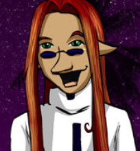
I talked about bad redesigns in my previous article, and quite possibly the worst redesign went to the poor Damian. I get that Tiffany wanted to make him look more unique, but did she really need to add that gigantic pinocchio nose? Like, even if Damian was not a womanizing cunt obsessed with parties, I’d still have hard time trying to take her seriously. And like, Tiffany’s inconsistent artstyle is not helping as some of his expressions are ridiculous. Just get a nosejob, bro.
5. Kir Kiridan from Kit n Kay Boodle

I wanted to include at least one design from Gene Catlow but I guess I have gotten used to just about every design I find improbable or hideous. That is not the case with it’s sister comic, Kit n Kay Boodle. Since majority of characters in the comic are often naked, many of them are quite unappealing to the eye, and the most unappealing character to my view is Kir Kiridan. Kir is a very muscular...something, seriously what species is he supposed to be? We don’t know his species, he looks like he takes anabolic steroids and he feels like a gay fantasy even Animan would feel is too much. And just as hideous as Kir are those ridiculous tryhard aroused faces Skamm makes whenever he sees him, ugh. I am so glad this comic is in my rearview mirror.
4. Dominique blah blah blah AKA Dullahan from Monster Girl Academy
Monster Girl Academy almost feels like cheating, since it might have the ugliest art style in this entire blog. However, it does commit major character design mistakes that make characters look like monsters alright. The biggest example of this is the headless harlot herself, Dominique, or Dullahan, or Dullahead and Dullabody. As much as I hate the minotaurs, at least they could look better if drawn by another artist. Dullahan has this weird tanned skin that makes her look like gyaru. It's toned down (hue) a bit after the first issue but her makeup is still a mess, even more so than Tsuki's. She looks much older than she is supposed to be, her anus is somehow visible through her costume, and when she blushes she looks like she's swelling up like a tomato. Granted, I think many of this article’s characters would be better if they were headless, but that would require their head to not be hanging around with them.
3. Laranya from Warmage
Yes, Tsuki is NOT the worst design to come out of Dumok’s pants. That would be this comic’s experiment into teratophilia, Laranya. Well, Laranya isn’t really a monster but rather a monstrous human. She has long claws, sharp teeth and snake eyes. However despite being an implied abomination she still wears makeup and she has this weird build which makes her look like a goblin, oh yeah and sometimes she’s naked and she has sex with Llew. Towards the end of the comic she just looks like a man which Dumok probably didn’t intend. Granted, I think a lot of why she is hideous has more to do with Dumok’s artstyle. If he can’t draw attractive women, he certainly can’t draw ones that aren’t.
2. Stealth from Alien Dice
Alien Dice sometimes pulls off intentional redesigns as opposed to unintentional ones, this is because since many of our characters are dice, they can evolve into higher forms. Stealth got the worst end of the stick, she started off as a marketable little kittycat, evolved into a slightly older cat and suddenly she loses her black fur and becomes a puma with red streak of fur, and when we reach Stealth’s current stage she suddenly has wings and HUMAN HAIR. This is not helped by how she emotes a lot by pulling off angry faces, while Tiffany seemingly can’t make up if she wants to give her a realistic lion face or a more cartoony big cat face. As a result, Stealth has had a SHITTON of hideous faces since her transformation to the point you can fill a whole page with them. She doesn’t look good from a far, she doesn’t look good in closeups, she doesn’t look good in any shot. Thankfully however, Tiffany has finally started to find a way to make her design look natural and like she belongs in the comic, but all of this could have been avoided if she kept Stealth’s older design.
1. Giancarlo from Roommates
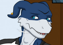
Also known as VeERGHmon for a good reason. Our very first riff will always have the very worst character design in form of VeERGHmon, every shot of him is hideous, he never looks good or even appealing, even worse than that he was designed to be CUTE. Even ignoring what Veemons are meant to look like in their source material, Giancarlo is just a hideous lizard creature who spends most of the time being either naked or being a douchepussy. He could be the best written character in the world and that design could still stick out like a sore thumb. Go back to Gashire you hideous reptile.
0 notes
Photo

SPOILERS MAY OCCUR
it has been way too long for a review, between work, school, and a new story, i had been sparingly going through webcomics to review, but this one really caught my eye, The Golden Week is LGBT webcomic written by Douglas “Kimmy” Kim and centers around not only two characters but a driving force of different people affected by the things life throws at them, while the main focus is the aspect of loving someone despite an age difference.
the story centers around Lion Derek Stanley who works as a writer for a small town newspaper, and inexplicably has bad luck at romance, while his best friend and former roommate, edward, whom he met in college and subsequently moved in with afterwards as well, also reoccurring is a Russian named Mike, but the focus remains more on the romance between Derek and a young Dog named Scott (or spot by his family). the prospect of the story shows how the two met and how it led to questioning their own lives from both perspectives, Derek isdating a boy much younger than him is actually worth the societal backlash, and scott questioning his own sexuality. it is safe to say that despite scott in high school, he is still within the legal limit of physical intimacy as an adult so not much legally can be said in regards to it being wrong, just in society would be considered taboo.
personally I have to comment on the maturity the artist is taking in regards to showing the connection between the two, from a first chance encounter in a park, so some comedic undertones of embarrassing memories they share, but more so, it does beg the question if the two really do love each other. from one kiss we can tell there is a spark that both of them want to burn brighter, but there are many things in the way of that.
it appears that in this world homosexuality is not in the set time period of being accepted as many remarks that they are ashamed of who they are, mostly because of parents. Derek, for instance, would stay away from his father for years before reconnecting only after something occurs with Scott leading to an all out trial. the issues dont just stop at age gaps of romance, theres corruption in the court system as well as parallels to mental scarring. Scotts father wishes his son to be away from “those people”, meaning he doesnt want his son to be gay and thinks keeping him away from Derek will do just that. i applaud the creator for having such a basic premise but flush it out so broad that we can see how the characters feel. Jane (a young fox from scotts high school) is going through grief with an overbearing mother who appears to go with whatever plan her friend has to out scott as gay, despite how she feels about the situation. this might be having a martyr complex putting others before yourself.
while the story is interesting and things can get a little over the top, it on going an seeing the story follow through is pretty okay, ive seen reviews where people call Derek out as a pedophile despite how scott is 18 and legally can do anything, so of course the story gets backlash, i dont see it, i see it as a majority story that helps bring up taboos in society.
and this wouldnt be a review without a special consideration to the artwork. the artstyle is very well done and lacks any inconsistency to the uncanny valley, which is far easier to do with animals than people, so the mixture of a world like zooptopia in that respects really opens up to the detail put into each stroke. it also helps that the characters actually change clothes every chapter and show more appeal to the build of each character. in fact honestly i was expecting this to be a NSFW comic based on many ive read but to my surprise the only adult theme is the setting and plot, as mature as it is. all in all i like this comic and hope it continues to do well in the future.
Patreon of the artist
https://www.patreon.com/douglaskim
official site of comic
http://goldenweekcomic.com/
facebook
https://www.facebook.com/GoldenWeekComic/
3 notes
·
View notes