#april psd icons
Explore tagged Tumblr posts
Text



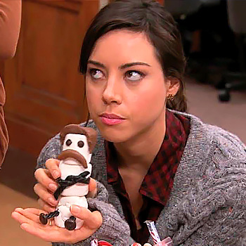

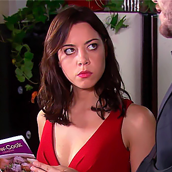
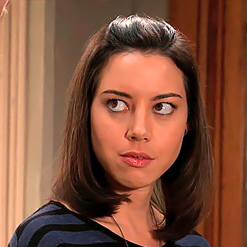
Parks & Recreation, (2009-2015).
#icons#april ludgate icons#park and recreation icons#aubrey plaza icons#aplazaedit#p&redit#park and recreation#april ludgate#aubrey plaza#icons without psd#twitter icons#icons sem psd#coral#girls icons#tv shows icons#tvshowsedit#dailytvsource#dailytvwomen#sitcom icons#sitcomedit
158 notes
·
View notes
Text
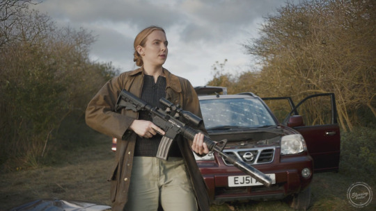
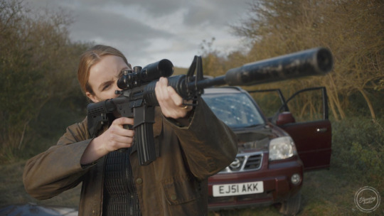
this is hot
#april should have more guns#mmmm i need to make more icons but id rather just pay someone yknow? 😂😂#or pay someone to make plain icons that i can whack my own boarder and psd on#' 𝙱𝙴𝙷𝙸𝙽𝙳 𝚃𝙷𝙴 𝚂𝚈𝙼𝙱𝙸𝙾𝚃𝙴 ' // ooc.#tw gun
8 notes
·
View notes
Text


"Yes, yes!" "As expected of an idol…" "Yes, yes!" "Let's go further!" "Jeez, isn't that obvious?" "Y-yeah!"
Solid heart class layout・★
Nobody requested, created for my edit tutorial blog @solid-heart-class・★
Free to use, please reblog if using・★
it's linked above but because of the amount of links it kind of doesn't feel like proper credit so: psd by @kaabukimono ・★
#links: card/lyric/mv/psd credit ☆#vynsrc#project sekai#project sekai april fools#solid heart class#shiho hinomori#airi momoi#akito shinonome#nene kusanagi#ena shinonome#wxs kaito#gif icons#project sekai icons#project sekai headers#pink#pink icons#pink headers
17 notes
·
View notes
Text
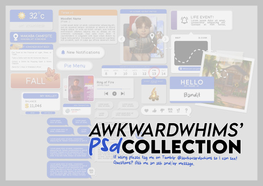
In celebration of reaching 900 followers!
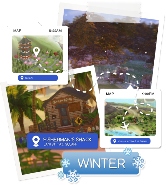
Ever since I started playing the Globetrotter challenge by @moonfi; I've been creating a collection of UI Widget style templates. This collection includes 20(ish) different templates for you to use in your gameplay screenshots. I'm hoping I did my best to make this as user-friendly as possible; but if you have any questions or notice something off - don't hesitate to message me or send an ask!
[Terms of Use] Do: Use & edit as much as you want and/or know how to. Don't: Reupload & claim as your own. Do: Link back to this post if asked where they're from.
[You Need] Fonts: April | Lemonmilk | Kids Handmade TS4 Icons: deathbypufferfish | w-sims | TheSimKid (I've had L'Universims' icons before they were hacked but as far as I know they've moved to a new website so download from there at your own risk.)
DOWNLOAD (SFS) 66.3mb **FIXED** (Missing moodlet)
ALT DOWNLOAD (Mediafire)
[Tips & Hints]
Open the awkwardwhims psd collection file in Photoshop, then drag & drop the folder or group of templates onto your image.
The photo album template was inspired by @folkbreeze (definitely check out their resources, they're all so nice!) & other various examples I saw online.
Resize the template by selecting the folder as a whole; resizing individual layers may makes things unaligned.
Feel free to change background colors/fonts/etc as much as you want.
The text message template has 3 styles: sender, green receiver & blue receiver. There are also reaction icons & a separate reaction bar.
For the to-do list template I didn't include every aspiration icon (I was trying to keep this file as small as possible) but you can download this pack by @deathbypufferfish that has all the aspiration icons you'll need. However, it may be missing some of the newer aspiratons.
When adding photos (album cover/recent photos/etc) use a clipping mask.
The weather template includes all the different weather icons, so be sure to hide/unhide the one that applies.
For the new transaction template, make sure to only change the number of the price otherwise the Simoleon symbol will get changed to Times New Roman.
The notification message template is for life events, bad events & default game notifications (ie: legacy player, etc).
DOWNLOAD (SFS) 66.3mb **FIXED** (Missing moodlet)
ALT DOWNLOAD (Mediafire)
@alwaysfreecc @maxismatchccworld
2K notes
·
View notes
Text

finally answering asks I've been keeping for a while ~.~
📝 sims2 & chalk'd ui, phone icons & wallpapers, cas bg recolor, font replacement, and some more (reshade & rig helper asks will be answered at another time ;; )
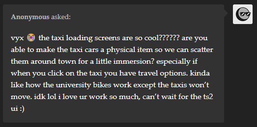
tysm anon!! I had to wrestle a bit with the file to make the taxi image work, and at the end it came out looking super neat! Especially if you have the sims 2's music playing (found a super cool music override that does that). It's such a cool idea, and I've been researching on how to do it 😆 ngl, making cc objects is something I wanna do someday, tho from the looks of it it's gonna take me a while to understand the process lol. If/when I make any breakthrough, I'll be sure to post about it :p (It'd be neat if it costs money too to use the taxi.)


jdfklsjf tysm @hellofears & @oshinsimblr !! I've been doing some final adjustments so hopefully I can release it within this week c:

thanks anon ^7^ you can replace them as long as you have access to the files (pancake1 made a pie menu & wants sound replacement and buurz replaced the in-game music with ones from other sims games). I looked around and found these resources you might want to check out: TS4 Sound Tool, UI sound kit & UI audio instance list
hehe tysm anon! My UI mods won't remove the shop icon so you'll need to grab other mods that do that. I decided not to do it myself to avoid having a new mod conflict ^^
Hii @simplyamazingsims, I've tested both mirroredup & triple mirror and both v3 files are working w/ the latest update. The reflection setting must be set to low or higher for the reflection to show up. You can also try clearing your caches and try removing the resource.cfg file (file will regenerate, and doing this fixes the issue for some). Oh and ofc having other cas backgrounds can cause mine to not show up so make sure there's only one in your mods folder ^^
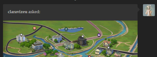
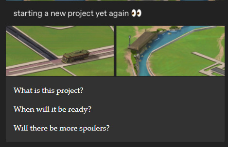
@claravizeu it's a map override that I'll probably work on whenever I'm in the mood 😆

Hi anon! For the phone icons, I used xosdr's phone icons psd to create mine. For the wallpaper, I haven't found someone who've gathered & shared the files for it, so I'll see if I can do that myself :)

Heyy anon, it's a CAS bg that I made for the previews so it's not available to download. I haven't got the chance to prepare the files yet, but I'll try to find the time to do so ^^
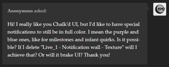
Hey anon, unfortunately the notification wall is associated w/ the texture file that handles most of the UI panels, so you won't be able to remove a specific file to achieve it. I've received a request just like yours so what I can do is share it a separate file later on ^^
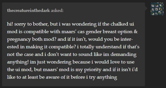
Hii as well, it's compatible yes ^^ you can use both mods as they don't have any files in common that conflicts with each other.
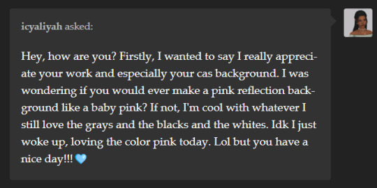
heyy @icyaliyah, sorry it took a while to respond! While I don't have plans to recolor them, you can download these pink recolors by estellics & dumbabie ^^ and thank you very much!
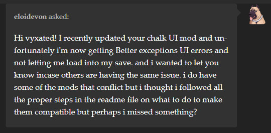
Hii as well, it's been a while so I don't know if you're still having the issue or if it's already been fixed. Afaik my mod shouldn't cause any loading issues on its own, as well as if you have the conflicting mod & files present and if you remove the conflicting files. So far, I've not received any reports of this exact issue, so I can't be of help. Sorry if that doesn't answer your question 😅

ahhhh @veone thank you as well for using it ever since it came out!! 🙈
Heyy anon, basically you'd want to only remove the files that conflicts w/ the mods that you do use, and not the other way around. For example, if you use TOOL, you'd want to delete the files in the Additional Files > TOOL folder (either both text and texture files or just the text file alone, depending on which one you prefer). If you don't use TOOL, keep the files be. So, if you only have the UI Cheats mod and none of the listed conflicting mods, then you don't need to remove any files ^^
heyy @swithdream, well very belated happy new year to you as well despite it being april already lol there's an update to the cas organizers that I haven't done yet, and when the time comes that I update those, I'll try to include the psds for all the templates I did ^^
Hii @kneptoone, it's a font replacement using TS3's Helvetica Rounded font that I made & haven't shared yet, yeah ^^ I can try putting it up for download since there isn't one out yet.
Heyy anon, I've been focusing on other things so I haven't yet found the time to work on my older uploads >< I'm definitely interested in doing those, but not sure when that'll be.

Hello anon, tysm! I'll do it at some point but not sure when :x I haven't properly played around w/ CAS since last year :X
25 notes
·
View notes
Text
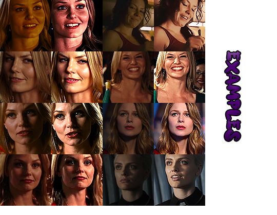
starting from: square/rectangular icons: sharpened, brightened, and colored manually, no frame or special shapes or psd.
0,03 euro per icon (3 euros every 100 icons) - if you want them unedited it'll be 0,02 instead
1 euro every 40 minutes/1 hour of footage I'l screencap
(price have been updated on april 14th '24)
Discounts may happen depending on the size of the order or if I find folders with pre-selected caps of your character. Chronic illness and lack of resources may limit may speed (sometimes I can do a thousand icons in 4 days, other times I need 4 days to make 200 icons because there is too much to download and screencap and my eyes hurt)
More STYLES OF ICONS if you click on the source of this post. Send me an ASK if interested, I'll give you my discord so I can keep you updated. No gore-horror-p0rn.
Important note: if the scene is dark/badly colored and has a person of color in it, I may have to keep it darker to avoid whitewashing them:
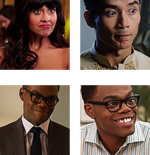
my icons tag
#rp icons#rp commissions#rp graphic commissions#graphic commissions#icons#commissions#rp commission#rp icon commission#rp icons commissions#icons commissions#icon commissions#icon commission#my icons
9 notes
·
View notes
Text

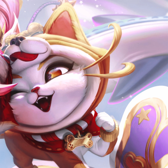

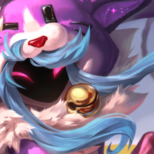
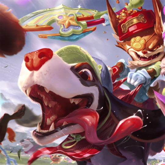

kumihogames | icons cats vs. dogs (april fools)
do not repost my work anywhere. like or reblog if you save it. psd forgtful by @miniepsds.
#league of legends#league of legends icons#nidalee#nidalee icons#yuumi#yuumi icons#kleed#kleed icons#kindred#kindred icons#cats vs dogs#april fools
62 notes
·
View notes
Text

greatcstarcher : independent, semi selective, semi to highly active blog of marvel cinematic universe’s hawkeye’s kate bishop. written since december 8, 2021 by lumi ( 27+, pst/cst, she/her ).
carrd. memes. headcanons. edits. blog roll.
affiliates and exclusives located in my carrd

psd: purple angel (tweaked) gifs: @corneliagifs , @mars-gifs icon border: me & meg bun
scheduled hiatus: february 7 - 15 / march 4 - april 2
4 notes
·
View notes
Text
most popular/fave sets of 2024
thank you zey @fadelsburger for the tag ༼ つ ◕_◕ ༽つ i love looking back on my works and this tag game helped me put in perspective how crazy i was about some series (cough msi cough)
January most popular - this adorable scene of the 2nd lead couple from marry my husband

fave - i loved every single trillion game sets i posted in january but meme and mio looked particularly good in this one scene

February most popular - it's the hilarious comedic gold dance scene in ready set love

fave - actually my fave sets this month are also from ready set love set but it's this and this where i made multiple 268p gifs. i loved the bright vivid coloring palette of the show so finally getting to make these feel is very tributed to those two column type gifsets that used to be really popular for tumblr gifmakers.


March most popular - the trailer of my stand-in

fave - i was going through my not friends/gdh binge phase so i really liked the coloring i made for this gifset of why you y me. and a huge shoutout to the coloring on this msi gifset which i have turned into a base psd for basically every gifs i made.


April most popular - 'and they were both tops' scene in my stand-in

fave - the very 'pride & prejudiced coded' gasping for air after the rain kiss scene in i feel you linger in the air

May most popular - this scene of sinister ming preying on joe 2.0

fave - goy arachaporn in bangkok blossom. incredible. magnificent. incredibly slept on historical lakorn. imma cheat and also include this gifset where my stand-in joe says "really?" with his puppy coded tone.

June most popular - ming having the best look when he's angry at tong and wearing a simple black tee

fave - my first lyrics set ever and it's for my stand-in. damn i was in this series deep cuz like the amount of gifsets i made for this series like yikesssss. that and my tangmo from great men academy gifset which gave me this wonderful reaction gif that i have constantly been using 👍.


July most popular - compilation set of all the mingjoe kisses in my stand-in

fave - every single oh my girl! gifsets that i posted in july. i love them ALL. i love this romcom so dearly. in fact, many colorings i used in these sets ended up as base for my future gifsets for spare me your mercy.

August most popular - half naked poom phuripan looking gorgeous as hell

fave - ice paris teasing jj and his girlfriend on national tv. also every gifset i made for survival show anh trai vượt ngàn chông gai aka call me by fire vietnam. i spent a lot time in august making purely self-indulgent niche content gifsets and it made me really happy.


September most popular - this scene from the smym teaser pilot

fave - my cherie amour was the perfect project for me to started testing out new sharpening settings and i really like how the camera raw filter + noise sharpening turned out for this one. content wise, this bad genius scene between nonkul and james was my personal favorite thing to gif.

October most popular - this good omens gifset i made on a whim


fave - there are basically no audience for thai romcoms on tumblr so this very much self indulgent gifset for love stuck happened solely because of that double rainshow shot in this scene.

November most popular - the most watched lesbian kiss in thai television history being my 2nd most popular post on tumblr this year? totally deserved!

fave - SOMEBODY GIVE YING LEI A HIGHFIVE pleaseee. i liked changing it up and the coloring experience for a really cold tone cdrama because i finally got to play around with the orange/warm photo filters.

December most popular - doctor kan's 'you're at fault for being too cute' will always be iconic. this shameless doctor. i like he.

fave - tangmo's oh. moment is probably my all time top favorite thing i giffed in 2024. i'm so glad i ended my year with this gift to myself. it's a scene that's close and dear to my heart and a scene i've wanting to make gifs of for a very long time but it took me a while to finally download that logoless footage for gma.

no pressure tagging @itagakimizuki and @zhouxiangs (´▽`ʃ♡ƪ)
#you've got tagged#i made a lot of more gifs than i thought#especially msi... i feel like if you through my gif tags in both my main and sideblog... you can feel how... not normal i was about msi =))#well me and sasa both#im still adjusting and changing my sharpening/saving settings these days#hopefully one day i'll be more consistent in terms of quality#but until then please bare with me#me vs my inability to cut any frames and my insistence on lowering the gif size/sacrificing quality over frames 🤣
5 notes
·
View notes
Text
tbt, tumblr rp trends version. repost and bold the trends you have taken part in, leave untouched the ones you’ve seen but haven’t taken part in, and cross out the ones you can’t remember or have missed.
photoshop replies. / formatting by making a line break before the end of the text field to create a block of text that never looked good on themes. / doing the aforementioned but also trying to make the lines looks even with spacebar. / the first rise of promos being two vertical images side by side. / “straight outta __” promo trend that lasted like less than 12 hours. / making shitpost promos specifically for april fool’s day. / c.rystal r.eed, d.ylan o’b.rien, and n.ina d.obrev are the only three faceclaims in the world. / everyone’s period faceclaim is adelaine kane in reign. / ian somerhalden at 35 years old works as a fc for a high school student. / amb.er h.eard is the only faceclaim in the world.
cutting threads who. / container themes. / container themes at an angle. / container themes and the links blend in with the background. / themes with a gif as a sidebar. / themes with full-width or height sidebars no one really knew how to make look good. / update bars separate from the rest of the theme. / tacky-looking autoplays. / autoplays but this time the player is tiny and in the description and starts from the beginning every time the page loads. / autoplays but this time the horizontal player at the top or bottom has a transparent layout. / “you can’t see the expression in 100x100 icons”. / insanejournal icons. / rping with big gifs. / rping with big gifs but this time it’s ironic. / “#ignore the text”
‘greeter' open starters for new followers / “hey how about we do this reblog karma thing where you send a meme if you reblog it bc no one is doing it” / “i will block you if you don’t reblog the meme from the source” / torn paper effect mobile banners. / mun faceclaim. / small text. / double small text. / triple small text. / magic anons. / rping with personals via anon asks. / a border inside the icon and an initial on the bottom right corner. / taking icons off hollow-art and just putting a psd over it. / red text on black background or vice versa no matter how difficult it was to see bc Edgy. / “multimuses are bad”. / all the mun information on the caption of the promo, including experience and formatting preference. / video promos.
#CALL ME OLD TO MY FACE#do you know the absolute panic I go through if I almost reblog a meme from someone’s blog#ALSO I STILL USE ADELAIDE AND THE GOD DAMN TORN PAPER EFFECT#big gifs hurt my eyes and make me cry tho so take that BSBDHWUDBEHDB
7 notes
·
View notes
Note
obrigado anjo, eu baixei!!! seus psds são muito lindos e vc eh muito gentil 💖 queria aproveitar a oportunidade pra pedir pra vc fazer mais icons da julien quando possível, por favor? especialmente de fotos deste dia https://www.gettyimages.no/detail/news-photo/julien-baker-of-boygenius-is-seen-on-april-20-2023-in-los-news-photo/1252035033
postei aqui, meu bem; muito obrigada pelo carinho, amo me sentir útil ksfdkskfj enfim, espero que goste dos icons <3
3 notes
·
View notes
Text


The feelings that overflow, If you listen carefully, you'll hear the tick tack! We're all together~!
Pure Heart Class layout・★
Nobody requested, self-indulgent・★
Free to use, please reblog if using・★
psd by @petal-web・★
#links: card/lyric/mv/psd credit ☆#project sekai#project sekai april fools#project sekai layouts#ichika hoshino layouts#shizuku hinomori layouts#toya aoyagi layouts#emu otori layouts#kanade yoisaki layouts#hatsune miku layouts#green layouts#gif icons#ichika hoshino#shizuku hinomori#toya aoyagi#emu otori#kanade yoisaki#hatsune miku#n25 miku#ichika hoshino icons#ichika hoshino headers#shizuku hinomori icons#shizuku hinomori headers#toya aoyagi icons#toya aoyagi headers#emu otori icons#emu otori headers#kanade yoisaki icons#kanade yoisaki headers#green
19 notes
·
View notes
Text


World Icons List PSD
Update 17 Mar 2024 : Added Tomarang and a different version (details added to end of post).
With huge credit to deevo's Image Viewer for Package Files which has a Packs Extractor tool. Similar to my Packs List PSD, this one is for the World icons. I've had this since April and never used it myself, but just in case someone would want this thing here it is updated to include Chestnut Ridge.
Download from source or link below:
SFS
1. [quiescence90] World Icons List in .pdf and .xcf formats - as pictured above
2. [quiescence90] Individual World Icons in .pdf and .xcf formats - this is the original sized images extracted from the game arranged and grouped together. You can move each layer as you please to create your own icons for the Worlds
3. [quiescence90] 512px World Icons - .zip folder containing all the uncropped original sized World icons in .png format. I only arranged them to match how they appear in the World Selection Menu so a few of them will show blank/unfilled spots because EA did not bother to draw anything on that part of the layer. See example below:
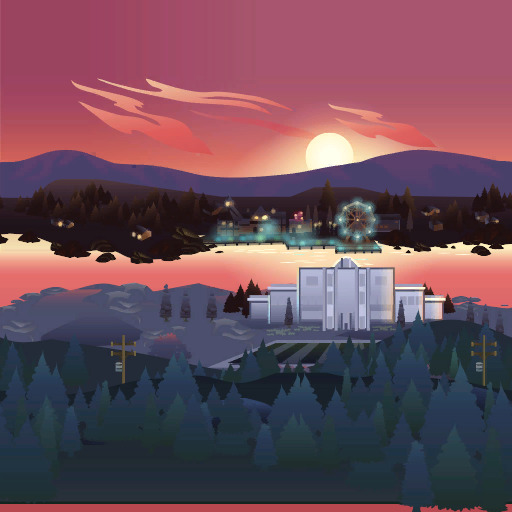
(observe the bottom)
4. ✨NEW!✨ [quiescence90] World List (by pack) in .pdf and .xcf formats - The worlds listed by pack icons as exemplified below:

I excluded basegame and Journey to Batuu for this one because this is meant for a "packs needed" kinda situation and I couldn't extract a bigger icon from JtB 🤷🏻♀️
9 notes
·
View notes
Text
tbt, tumblr rp trends version. repost and bold the trends you have taken part in, leave untouched the ones you’ve seen but haven’t taken part in, and cross out the ones you can’t remember or have missed.
photoshop replies. / formatting by making a line break before the end of the text field to create a block of text that never looked good on themes. / doing the aforementioned but also trying to make the lines looks even with spacebar. / the first rise of promos being two vertical images side by side. / “straight outta __” promo trend that lasted like less than 12 hours. / making shitpost promos specifically for april fool’s day. / c.rystal r.eed, d.ylan o’b.rien, and n.ina d.obrev are the only three faceclaims in the world. / everyone’s period faceclaim is adelaine kane in reign. / ian somerhalden at 35 years old works as a fc for a high school student. / amber heard is the only faceclaim in the world.
cutting threads who. / container themes. / container themes at an angle. / container themes and the links blend in with the background. / themes with a gif as a sidebar. / themes with full-width or height sidebars no one really knew how to make look good. / update bars separate from the rest of the theme. / tacky-looking autoplays. / autoplays but this time the player is tiny and in the description and starts from the beginning every time the page loads. / autoplays but this time the horizontal player at the top or bottom has a transparent layout. / “you can’t see the expression in 100x100 icons”. / insanejournal icons. / rping with big gifs. / rping with big gifs but this time it’s ironic. / “#ignore the text”
'greeter' open starters for new followers / “hey how about we do this reblog karma thing where you send a meme if you reblog it bc no one is doing it” / “i will block you if you don’t reblog the meme from the source” / torn paper effect mobile banners. / mun faceclaim. / small text. / double small text. / triple small text. / magic anons. / rping with personals via anon asks. / a border inside the icon and an initial on the bottom right corner. / taking icons off hollow-art and just putting a psd over it. / red text on black background or vice versa no matter how difficult it was to see bc Edgy. / “multimuses are bad”. / all the mun information on the caption of the promo, including experience and formatting preference. / video promos.
#oh this is making me want to post my yahoo answers promos#ignore the text was my fucking bread and butter in the beginning lmao#i didnt bold the second one bc i dont kow what it means but the third one sounded like something i did so#god the multimuse stigma was so real my friends and i used to just make 8000 blogs together it was so goofy#ooc#; ooc#stolen from ash bc it looked fun
4 notes
·
View notes
Text
tbt, tumblr rp trends version. repost and bold the trends you have taken part in, leave untouched the ones you’ve seen but haven’t taken part in, and cross out the ones you can’t remember or have missed.
photoshop replies. / formatting by making a line break before the end of the text field to create a block of text that never looked good on themes. / doing the aforementioned but also trying to make the lines looks even with spacebar. / the first rise of promos being two vertical images side by side. / “straight outta __” promo trend that lasted like less than 12 hours. / making shitpost promos specifically for april fool’s day. / c.rystal r.eed, d.ylan o’b.rien, and n.ina d.obrev are the only three faceclaims in the world. / everyone’s period faceclaim is adelaine kane in reign. / ian somerhalden at 35 years old works as a fc for a high school student. / amber heard is the only faceclaim in the world.
cutting threads who. / container themes. / container themes at an angle. / container themes and the links blend in with the background. / themes with a gif as a sidebar. / themes with full-width or height sidebars no one really knew how to make look good. / update bars separate from the rest of the theme. / tacky-looking autoplays. / autoplays but this time the player is tiny and in the description and starts from the beginning every time the page loads. / autoplays but this time the horizontal player at the top or bottom has a transparent layout. / “you can’t see the expression in 100x100 icons”. / insanejournal icons. / rping with big gifs. / rping with big gifs but this time it’s ironic. / “#ignore the text”
'greeter' open starters for new followers / “hey how about we do this reblog karma thing where you send a meme if you reblog it bc no one is doing it” / “i will block you if you don’t reblog the meme from the source” ( i've never met anyone who's blocked someone over reblogging one meme, it's usually if someone is doing it constantly lmao ) / torn paper effect mobile banners. ( this was my shit ) / mun faceclaim. / small text. / double small text. / triple small text. / magic anons. / rping with personals via anon asks. / a border inside the icon and an initial on the bottom right corner. / taking icons off hollow-art and just putting a psd over it. / red text on black background or vice versa no matter how difficult it was to see bc Edgy. / “multimuses are bad”. / all the mun information on the caption of the promo, including experience and formatting preference. / video promos.
#i didn't make this but i found it and thought it was funny lmao#whoever made it sounds Salty but it was fun for rp nostalgia#out.
6 notes
·
View notes
Note
9, 24 and 27 for the creator asks!
9: Would you say your style has changed a lot since you first started creating? oh for SURE. regardless of what i consider my start bc i used to gif from like 2015-2017 and then i didn't start up again until april of 2023. this time around, i have learned SO much, and i'm sure part of that is just bc of how much gif styles have changed in the last 6-8 years, but also bc i joined a couple gifmaking networks and have gotten so much help through them, found so many resources, and learned tons! to compare, here's one of the sets i was proudest of from Back In The Day. now, it's definitely not horrible, but the coloring and the slow framerate make me borderline homicidal. this one is marginally better, and i remember thinking i was really Doing Something with that typography 😂 here are some of the sets i made early on in my Return to Gifmaking this past April/May. this was one of the first times i'd ever combined multiple gifs into one and girl. what the fuck happened. why are the framerates Like That? what is this typography? i had no business making early l&o gifs 540px wide bc the quality is bad enough at 268px 💀and i think this one is a good example of i got the spirit! the execution just wasn't quite there. i like the main gif with the overlay of the sky, but i'd do the typography very differently and idk if i'd do it in b&w? i could try and remake it tbh, it's been 9 months since i made and posted it.
24: What’s your step by step? How do you organise your editing process? buckle up 😂
make clips of the scene(s) i want to use if i don't already have them
import video frames to layers
action 1: grouping and timing (groups all layers and sets frame rate to 0.05)
delete any extra frames
crop to whatever dimensions i'm using
action 2: sharpening (two smart sharpen layers) + vivid sharpening (i used this tutorial and i usually keep that folder at 30% but sometimes drop it down to 10-15%)
coloring! it depends on what i'm giffing, but i color everything from scratch at least the first time. i save a LOT of my psds, like there's one psd that i use for almost all my tfothou gifs, a couple for hill house depending on the tint of the scene i'm giffing, one for law & order that sometimes needs to be adjusted just a little, one for the good wife, one or two for satc, etc. but they're all psds that i created myself.
typography (if applicable) which almost always involves scrolling through the entire list of fonts just to use one of my go-tos
action 3: this save action from anyataylorjoy
export > save for web!
upload to hellsite (derogatory) and gifsets always immediately go to my drafts, even if i want to post them right away, just so i can make sure i'm happy with everything and try to catch any last-minute mistakes
as for general organization, i'm organized on my computer to a near-ridiculous standard, but it works for me lmao. my psds, templates, and project psds (where i save an entire finished gif if it's for a larger, complex set and then never get rid of them lmao), and all overlays, textures, icons, graphics, transitions, etc. are meticulously organized. my finished gifs are also organized into their own folders.
27: What’s your favourite font to use? in general, monsterrat. i use it for everything in google docs, and it's my fave sans serif to go with serif or script fonts. when i'm using it for giffing, i usually use semibold.
1 note
·
View note