#aphrodite was a lot simpler to design for me
Explore tagged Tumblr posts
Visit Tumblr Blog
Explore Tumblr blogs with no restrictions, modern design and the best experience.
Last Seen Tumblr Blogs


Fun Fact
In February 2021, Tumblr had 518.6 million blog accounts.
Text

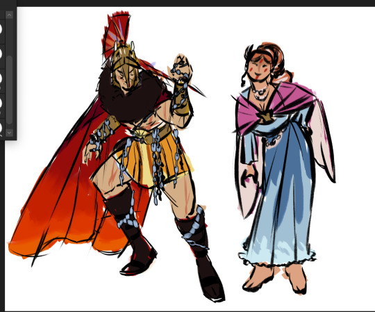
ares & aphrodite designs ...for no reason in particular
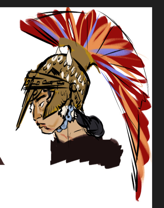
#greek mythology#ares#aphrodite#artists on tumblr#digital art#fan art#sketch#doodle#my art#uhhh could this be considered fan designs for epic if these aren't necessarily designed for it? lolol#i suck so bad at helmet design but i ATTEMPTED at invoking a dog's snout with ares side profile#bc ya know#ares with chains since he is always getting tied up for some reason#uhhhh what is not depicted is some pottery decals on his armor#just know that it is there. rip ares and his adventures of being a loser (got trapped in a jar for a couple years </3)#aphrodite was a lot simpler to design for me#since technically these are revamps of old designs and aphrodite's concept was one i was the most confident on#invoke her seafoam and bird motifs and BOOM its aphrodite#i need to speak my truth...i'm not a big fan of naked aphrodite#do we not remember actaeon </3#do not look at the gods naked guys or else you'll be devoured by your hounds 😭#her tatas are out tho but are covered by her pink shaw#idk it's important that ppl know this i suppose#ok i will hopefully finish what i'm working on with these designs soon will post when ready byeeeee
23 notes
·
View notes
Text
visual/art things in the Hades 2 technical test i don't like
it was said and is being said already that most of the character sprites have less dynamic poses, or that Aphrodite's face looks, for the lack of a better term, yassified,... it's actually quite a frequent topic in the tag. and i think looking closely despite the excitement is a good excercise! so let's.
i've seen a sentiment that everyone has been made (more, in some cases) conventionally attractive, and i disagree with that a little bit. depends on your definition of convention, but while it's a look popular with many, i wouldn't say Hecate's abs for example are necessarily mainstream. another point i've seen was that Demeter looks younger. i kinda agree, but i don't think it's intentional, because it's quite subtle. she's mostly just missing the defined cheekbones.
the thing about this game's art seems to be that it's a little less sharp, the lines are thinner, shadows are smoother. i think it's an attempt to look more detailed and realistic compared to the first game. i'm not sure how i feel about it. i understand the want to improve or change up, but at the same time the lack of hard shadows and highlights, while it might come across as more realistic, also leaves the sprites a little bland. and i was going to bring up Poseidon as an example where the newer style fits in with visibly older sprites, but he still feels noticeably different in how he's shaded compared to say Moros.
i also agree that the poses are simpler and in most cases less dynamic; Mel is fine and the fact she can change during dialogue adds to it, Hecate looks good too. Nemesis is justifiable since she seems to be standing guard. i think they're simpler maybe because now everyone has a detailed environment backdrop as well, it's especially bold in the olympians' case, but i do hope characters revealed in the future have more dramatic or interesting poses. Selene gives me some hope.
Artemis is definitely unfinished. her sprite lacks any bolder linework or shadows, the coloring is very dull. it really sticks out like a sore thumb as of now. but her boon icons having those letters, likely placeholders too, make it more apparent that she's not finalized yet.
now, this might be controversial, but...i don't like Apollo's design that much. in his case, i definitely wish he had a cooler pose, for his bow/lyre to be a lot more prominent. the outfit is fine, i'm kinda on the edge about it. on one hand, all the colors and shapes work, on the other, maybe not together? but what makes it all bad for me is his actual appearance. i wish his hair was wilder, actually committed to it, and brighter. i wish he wore either more elaborate jewelry or more of detailed armor pieces. i wish he had heavy freckles, vitiligo or some other skin condition to reference the surface of the sun. i think in part this is definitely a case of being spoiled by fanart, but yeah. i'm not vibing with him as much as i hoped i would. i like this design because while the outfit isn't detailed, the freckles and pose make up for it. the hair, choppy like irregular sunrays, is cool too. this one i like too, it's less crazy but still has its own flair, distinct from the rest of the first game, and the lyre/bow design is beautiful. this one is a bit out there but it's pretty cool as well imo, with apparent callbacks to Artemis in hair texture, birthmarks/crests, and the shoulder pelt.
lastly though, Aphrodite. the good! referencing Ares's warpaint is sweet. i like the armor pieces. in general the pose is tasteful, and the long ass banners coming from her spear kinda add some needed drama to it. the spear and shield themselves have nice designs in line with Aphro's overall aesthetic. but the bad... i don't like her face all that much either when compared to her sprite from the first game. there, i liked that her lips aren't exaggerated in any way. compare that to Athena (her shade of lipstick is absolutely amazing tho). but it felt more, i dunno, like trying to convey some natural beauty? in 2, she got that barbie doll treatment. reminds me of witcher 3 female npcs' faces and that is not a good thing. people have said that she looks thinner - her arms definitely do. and maybe because of that they also seem a bit too long to me. she suffers from the lack of hard shadows and highlights a lot, putting both her sprites next to each other really shows the difference in approach. like, overall it's a pretty and perfectly fine sprite, but...there is a but. a part of that but is definitely our expectations and uncertainty about the new direction the sprite art seems to be going in. to give nuance to the other side, we're also still in a pre-early access stage. on the other hand, the other olympians we've seen don't look unfinished the way Artemis does and it's quite likely these sprites is what we'll go into full release with. there was no reason to change Aphrodite's face, and we're allowed to not like it. leaving well-meaning feedback can be effective! and i would encourage it. with emphasis on well-meaning.
i also think the icon for gold in Hades 2 should be just a single coin, because a little hoard of them looks too much like the moly flower icon from a distance.
#shut up elis#hades 2#well-meaning because SG has been very understanding about datamined assets getting out into the wild#it's fair if we express disagreement the same way
16 notes
·
View notes