#anyways. doodle to post something to this blog proper (kind of) while i work on that dms mod
Explore tagged Tumblr posts
Text

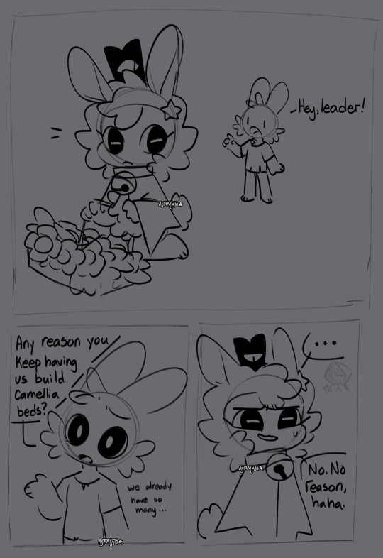
Been on a Cult of the Lamb binge lately
#scribble tag#sona tag: astra#oc tag: the observer#oc tag: guard#oc tag: laika#i was decorating my base and noticed a hm. pattern. listen. the walls are too tall and the camellia beds are shorter and prettier#anyways. doodle to post something to this blog proper (kind of) while i work on that dms mod#i keep forgetting about this place lol although i haven't been drawing a lot lately#no main tags bc idk how much i like these i just wanted to post something bc i miss posting#astra's lamb design is based off a leicester sheep btw if you care
7 notes
·
View notes
Text
Small tidbits about my Still Into You 2ha animatic
Coz it's April, exactly one year from now was when I started completing it and I'm in the mood now. + I don't think I made a proper one + it won the twitter poll
Check it out if you're interested... or not! I just want to dump my thoughts and fun facts that I thought of while making this.
To preface this, check them out if you haven't seen it yet: (Still Into You & Please Don't Leave Me)
If you've been hanging around my blog for a while, it's kinda evident that I did post a promo post for Still Into You back in January 2023. And that first part does have an in-depth explanation about what it covers (which is from the start to the first chorus).
If you're wondering why: TL;DR I can't work on An Act of Kindness coz I was back home from school for vacation and I thought of the idea during a trip.
Anyway, I ramble. Time to get to the actual discussion.
(spoilers!!) The Actual Discussion
Making the rest of Still Into You, unlike Mo Ran's feelings for CWN, was actually just straightforward. I already knew that it'd cover the rest of the book, given that I intentionally focused heavily on book 1 while making part 1.
Like part 1, part 2 was that type of animatic that just naturally flowed during the storyboarding and rough sketch process. The whole animatic is divided into three phases which covers the following: Book 1, Book 2 and 3, and lastly the Epilogue.
Book 1 I've already discussed in an earlier post here but I did find this interesting tidbit I wrote to my cousin:

Anyways the discussion:

Yeah I really wish I have a funny image to put here. I'm really enjoying looking back at my stuff and seeing my initial plans though.
Order at which I made each part.
One thing of note (and actually a common oversight I experience while doing storyboards coz I don't do timings) was that I storyboarded the frames when the vocals started and forgot the timings in between.
So I kinda had to fill the parts between part 1 and 2 last-ish? (don't really remember the proper timings).
Oh, oh! And another fun fact:
Still Into You Part 2 (Rough Draft)
Part 2 was initially done on my tablet in CSP so there's a whole different and rougher version of it. (pls lower the volume if you're wearing earphones)
Funnily enough, this took me like one sitting to finish and a whole lot of sessions to clean up. I do like this process though given that, around the time I drew this, I started leaning heavily into animation and prioritizing getting my thoughts across without care for cleanliness. (Something I felt held me back too much while making Please Don't Leave Me).
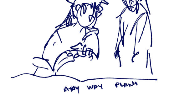
In fact, there are some obvious frames that I didn't really bother polishing up (mostly because they're too hard for me or they just flash by quickly). A glaring example is this frame from the third part:
Another fun fact about the scene where TXJ shows CWN the plant he's been raising is it's actually inspired off of a doodle I made for someone in the Two Lifetimes CSE back in April 16 2023.
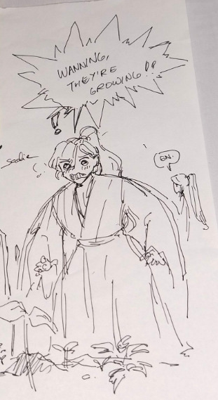
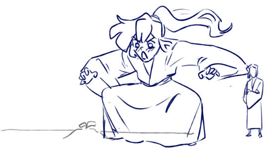
I just really think that it's super adorable for them. Mo Ran in the the epilogue section alternates between TXJ and 2.0.
Aside from the plant, TXJ also appears in this frame which is inspired from one of the extras. Another silly intentional decision I did is to have him pour alcohol onto a cup and drink from the bottle.
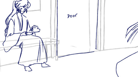
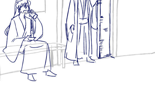
Meanwhile 2.0 appears here:
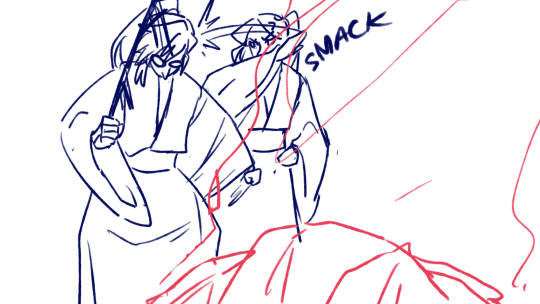
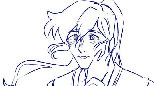
The one on the left is also from (you guessed it) an extra! It's based from an offhand mention that CWN makes in one of them. (Let me know what your guesses are haha)
I kinda just jumped into the 3rd half of the song, huh? I hope my ramblings aren't too much! I just wanna let it flow naturally.
Returning to the topic of the storyboard, I really only had a rough idea of what I wanted for the 3rd half. The references to the extras and even Goutou's appearance just came when I was already putting it into frame. Like, this was what I initially had in mind for the 2nd chorus to the end.
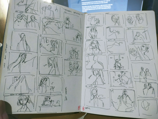
I think one of the notable differences is that I initially planned on doing the half MR half CWN screen transition the same way i did with chorus 1 and 2 but decided against it. In retrospect, I think it fits a lot because both aren't divided anymore.
Something about the second verse + chorus of the song
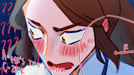
Like in chorus 1 and chorus 3, this section of the song takes on a darker tone since it covers book 2 going into book 3. It's a lot to talk about so I'm gonna select a couple that I personally like that's worth mentioning and leave the rest to the viewers to guess.
Also sorry not sorry for those who got spoiled by the animatic lmao.
The confession scene
Another fun fact: The confession scene in Still Into You and Please Don't Leave Me are intentionally connected through the color palette.
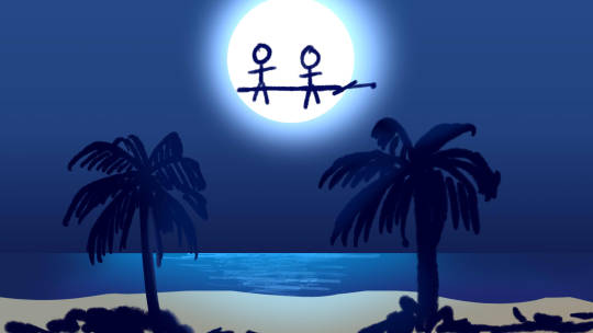
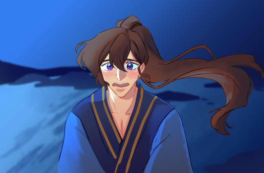
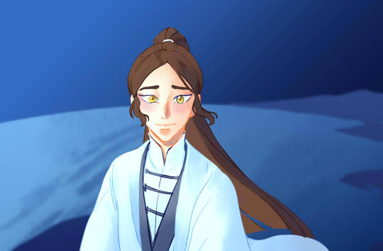
It's just that Still Into You takes a dump at how it treats it. Yes, the stick figures are intentional. It adds to the funny and tbh Still Into You really is just a feel good animatic. The comedy also serves as a whiplash to the angst hell that is the chorus 🥰.
(Insert obligatory CWN running at a tree meme here)
My Favorite 2ha Moment
Gotta insert my favorite chapter here (ch 184) which I think is one of 2ha's peaks because it resolves CWN's doubts about MR's feelings all this times.

And I'm just soo glad I could incorporate it in an animatic because it's so important to me. AND Like, 'yknow, I think it echoes the song very well because guess what MR tells CWN then?
“It has always been you."
That one frame before the chorus
There's like this moment before the second chorus starts where MR tells CWN something. I wanted it to echo ch 207 where MR felt the pressure of having to reveal that he actually is reborn and has memories of his past life.
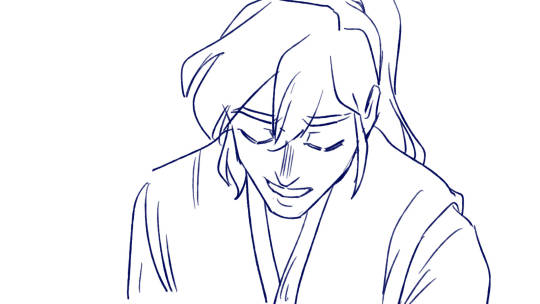
If this were animated I'd have had MR match the song and tell CWN "I'm still into you".
Anyways, here's the frame before it zooms in. Physically it's still at ch 207, but I wanted the shadows to imply what happens next which is the chorus.
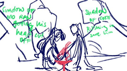
Other Bonus stuff
Ran out of stuff I wanna gush about so Imma talk about cut content.
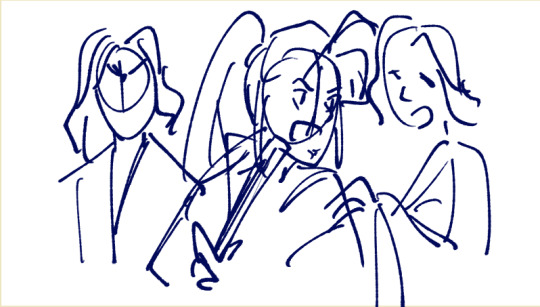
XM and the MHX twins are supposed to have more frames (I didn't include it because it felt like it had too much energy)
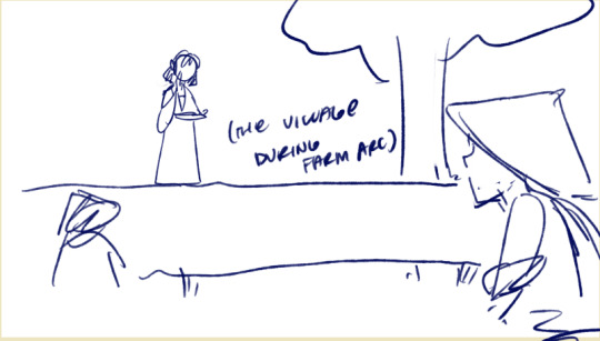
2. Ling'er and the village ranwan visits during farm arc is also supposed to make an appearance
3. I forgot to animate the butterflies

4. I was supposed to polish the sequence at 2:41 - 2:51 at one point.
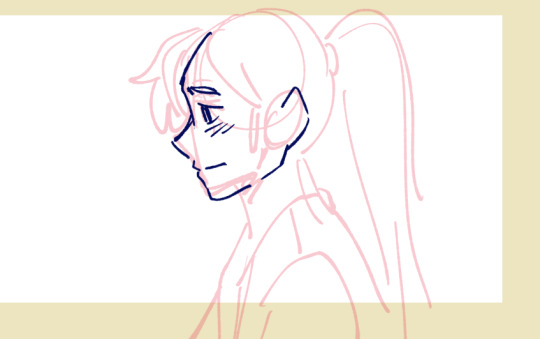
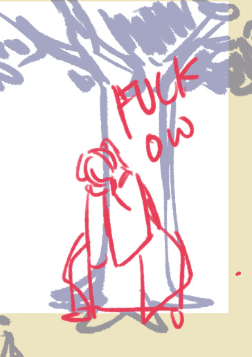
5. Fuck ow
6. CWN was supposed to glomp MR at the reunion scene
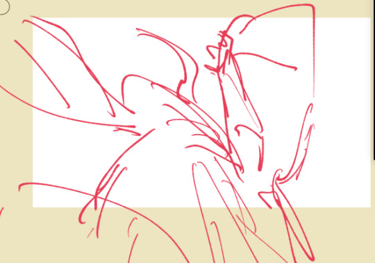
7. You and I
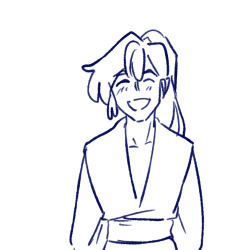
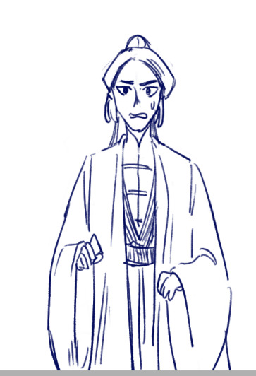
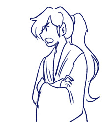
anyways go watch it
22 notes
·
View notes
Note
i started thinking about that gay bastard oc of yours. platano. can u tell me about him
omg u wer thinkgin about platano..... mr banana man... mr 4011. i am obsessed with the banana code srry i just got back from work (it was good :-D)
any way. um. im going below the cut. he kidnaps people and he murders people and i hate him because he’s also a massive weeb so. hm
HISTORY OF PLATANO... yea his name is spanish for banana
his father, pablo, will probably get a name change someday but i literally never think of his father since the only thing he did in platano’s backstory was disappear
since platano’s world has characters based off like. fruits and vegetables (there aren’t really any limit to what the characters are based off of. it was in my lazy google translate name phase so we have like... a gay character named arcenciel who becomes dadlike through my powerful canon-changing touch. also arcenciel wears the colors of the rainbow as often as he can i haven’t figured out a good design for him since i’m not used to using more than 5 colors. he also owns a hat factory)
i think arcenciel and platano are friends they met when platano was like. 17 probably and arcenciel would be around uhhhhh ummmmmmm 21??? idk man but in canon he’s probably around 30 . yes i m saying “in canon” because i wrote a really dumb and horrible story back in 2018 arcenciel used to have HUGE internalized homophobia and i turned that into a running joke and i dislike that so that’s a reason why i’m not sharing the fun little story i wrote for my friends
(the best part of that story is when arcenciel threw his light-up rainbow heelies at platano, thus starting the boss fight which the main cast LOST.)
ok back to the topic at hand. platano.
i have a whole doc named platano where i just wrote drabbles about him so i’m going to summarize them
the first one was his friend, percisi (my only cishet oc he’s very short and very aggressive while also dressing in a soft-colored turtleneck since he’s based off of peaches) using a misunderstood form of satanism to summon satan. guess what percisi and platano summoned satan for. it was a manga update! wow
i won’t say the mangas name it was an inside joke
so platano was like “hey satan can i have this manga now please please” and satan went “sure just kill people for me”
that determined platanos job for the next 7 or so years <3 wonderful.
(it was basically me writing a backstory for a scene to happen in the main writing i wrote for my friends. he killed someone because someone else in the building was trying to summon satan. very confusing but okay i guess.)
i think right after that i wrote about platano meeting his boyfriend, sage, for the first time. i have horribly mixed feelings about their relationship since it’s very. Hm.
so platano kidnaps people to watch anime with him because all his friends left him and his best friend, mangue, is too busy being a dictator over the Land of the Fruits. i shit you not fruits oppressed the vegetables. i wrote that dynamic between the two because i was learning about the revolutionary war in US History. something like that at least
(the Land of the Fruits is not the official name)
on the topic of kidnapping people. guess who his favorite person was. sage. it was sage. so he tried to take sage often but they probably discussed Proper boundaries since everyone else tried to run away. hmm i am now going to write a bit right now
“Platano,” Sage started. “Why do you keep kidnapping me? It’s rude and I hate it.”
“What else am I supposed to do?” The yellow-haired fool leaned on his sword, digging the tip deeper into the ground.
“ASK ME IF I WANT TO HANG OUT??”
“I can do that?”
“You keep making my dads worried.” Sage looked around the area, fidgeting with his hands.
“Oh. Okay. Want to hang out? Watch some anime?” Platano paused for a moment, but managed to say “Maybe kiss?” before Sage got to answer.
“I- KISS??? We can watch anime together. We can go now.”
Sage ushered Platano through a portal as fast as he could.
His dads were never worried.
hmmm maybe that’s alright idk i’m a little tired so it’s probably a little out of character. sage probably isn’t that loud but i think it was trying to be the dynamic of “oh, we’re not dating” when they kiss every sunday at 5 pm by a romantic river scene
he’s a character who is, at his very core, horrible and bad. he is portrayed in a way i DESPISE but i’m too lazy to correct it. his interest in sage actually started with me going “hmm i think platano would draw sage like this” then sauce giving me fun facts about his oc, sage, yea sage is sauce’s oc <3 epic win . so sauce gave me fun facts about sage and i was like “time to doodle these in platanos ‘art style’” when in reality it’s just the mockery of people just getting into an anime art style, with the chin so pointy it could cut a cake
i might reread my old writing from 2018. i gotta agree with the judges for that year i did not write very well
it mightve actually been made in 2017 which would be FUCKIN CRAZY im gonna check rn
yea it was started in 2018. february 14th... huh . finished it completely in june of that year it was 41 pages total and it’s not even double spaced how did i write something without double spacing it
OH MY GOD BOB IS GOING TO HIJACK THIS RANT JUST FOR A LITTLE
so bob is a fluffy little anthro cloud with a grey top hat and bowtie. he is amazing. i love bob. bob is another one of sauce’s character and mangue (mentioned earlier) was made by my friend jamie
(you can always ask for their tumblrs but i’d ask them if its okay to share their tumblrs. i might just look at them and reblog their stuff cuz i like their art!!! maybe jamie posted a drawing she made recently on her blog but tbh i don’t think she would she’s more of a twitter user)
ok so im skimming thru UMG which is the story it stands for “Universe of Magic Gardens” and it was originally made for a prank on ponytown so people would go “what’s UMG” and my friends and i would be like “ur mom gay xDDDDDD” or something like that . horrible but i’m glad i’ve changed from . that.
here’s a bit i actually like AKLJFISJFIO
“What the actual FUCK, Ilkie?!” Arcenciel cringed in fear. “Put it back- it’s too ugly.” He pointed at Platano, whose arms were crossed.
why is it bolded. anyway.
i just saw a part where eau used y’all... water cowboy moments <333 i really need to make refs for all of those old characters. all of my umg-related characters have to be my oldest-living ocs.
i cant believe this is making me genuinely reread my old writing just to go “WJHFSIDAJKSFIOJ WTF????”
some of the lines on it sound like something you would hear on like. a school bus or somethin
looking at umg like “wtf how did i add so much Meat to this writing” bc most of my writing now is mostly quotations to progress the story (like the quickie i wrote earlier. i could add meat to it but im tired lol)
OK THIS IS MORE GENERAL BUT MY FAVORITE THING ABOUT THIS WAS WRITING HAIKUS FOR PORTALS. after you visit a place enough times it’s kind of just an instinct to open a portal there so you don’t have to recite a haiku
uhh ok here’s another bit becuase im feeling like living la vida loca. ur biggest regret should be “can you tell me about him” by this point bc i’ve written too much to go back now
He landed on his face once he was outside of the hat. Meko quickly walked over to the guest room, opened the Portals for Dummies book, and flipped to a page. It looked devious.
“Banana, mango,
Each tasting amazingly.
A taste of evil.”
Meko did the dance on the page, it consisted of something that looks like it’s from an anime. A portal opened, the familiar scent of bananas and mangoes coming from it. With some hesitation, Meko stepped in. He quickly made it so only his head peeked in.
it wasnt bolded this time but i like it bolded. ok i understand how i added meat it was just shitty expired meat ALKFSJSHDAIUJKFEIODSJAK . it wasnt even that much meat DAMN. it just looked like more.
actually that’s all i will write. i could do more w platano but yea at his base he is a blonde twink who kills people because he wanted a manga but now he’s friends with a dictator. woo! wow. amazing character writing. i cant wait to get motivation to rewrite everything and make platano a good villain (he will still be very interested in anime sadly. idk why around that time i liked making characters who were obsessed with anime i didn’t even watch it much myself. i think it was because i wanted to put capes on them)
#I REALLY WENT SLIGHTLY OFF-TOPIC#like i went broader then refocused in at the end#so if you want the basics its just. right at the end#my brain's out of work mode now it's going into the deepfry machine#melon-official
2 notes
·
View notes
Photo
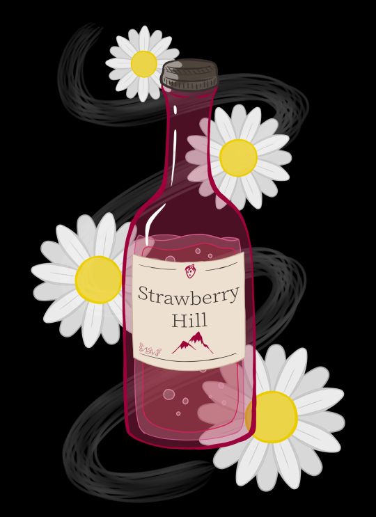
Daises on Strawberry Hill
Well, this looks a bit different from my usual content, doesn't it? Full disclosure that this art was made primarily as art inspired by one of my favorite books of all time (seriously, I have three different editions of this thing)--Looking for Alaska by John Green--as an excuse to talk about the new Hulu series of the same name that's based on the book. Because if you know me at all, you know I am notoriously hard on book-to-screen adaptions, particularly those based on books I love as if they were family members. And originally, this description was going to include a pretty blow-by-blow, lengthy review of my thoughts on the series. However, it's been quite a while since I first started trying to type out said review, and frankly, I've decided instead to, after I talk about the art, to just give some general, spoiler-free thoughts; the most important opinions I have on the series and leave it at that. I am still planning on completing and putting my full-length, in-depth thoughts out, but that'll be at some other time. Perhaps I'll put them in a journal/blog post instead of adding to the description here. Whatever happens, I'll update this description so that those who are interested in my deep-dive can find it when the time comes. That said, let's talk about the artwork now :) LfA isn't a fantasy or sci-fi book, so it doesn't have any cool dramatic scenes or neato devices/objects that have a lot of significance to the plot that would be fun to draw, which is why I never made any fan art or inspired-by-art for it before. But I really wanted an excuse to talk about the series, and so I pondered what symbols or imagery the series might have that I could make into art, even if none of it was terribly relevant to the plot or exciting on its own. This led me to the cheap wine that's mentioned a few times throughout the book: Strawberry Hill. Drawing just a bottle of wine seemed kind of boring and not very specific to the book/series, so I ended up adding in some white daisies since white flowers and daises specifically do have some significance to the plot. (In a way, they're a bit of a crux to it, at least for a key epiphany moment.) Originally, I was going to make this piece traditionally, and I did start with a traditional sketch of the wine bottle and one daisy to use as a template for more to follow. However, I pretty quickly got the idea for doing something more line-art heavy on a black background, as the cover for the book is black and the sort of chalkboard/blacklight look I was picturing in my head seemed fitting for the tone of the story, and despite my best efforts I couldn't think of a way/combination of media to accomplish what I wanted traditionally without also giving myself a major headache and making the project take infinitely longer than I wanted it to. So while I stalled in production, I ended up on my tablet for something else and figure I'd scan in my sketches and maybe make a line art to print off and manipulate into what I wanted traditionally later. But then, just as I started working on that, I figured, "You know what, if I'm going to go through all of the trouble to ink/line this digitally and I wanted it to be more line-focused anyway, I might as well take a crack at just doing the full artwork digitally. I'll get the lines done either way, and if it doesn't work out then at least I can say I tried, I know some of what not to do, and I end up with a digital mock-up for the final version." Fortunately, things ended up working out much better than I expected. I purposefully wasn't too fussy about the lines, partly because I just didn't have the patience at the time to be super precise about it, and also because for this specific project I kind of liked the idea of a more doodle-ish look (even though it's not super doodle-y in the final product). This also made things move a lot faster, which was nice and pretty satisfying. I started with the wine bottle from my sketch, including trying a new liquid drawing technique I half picked up from an art Youtuber I just recently started following that makes drawing liquid in a style similar to this look like a lot of fun. I knew I wanted the bottle to be mostly transparent/just lines, so the goal here was more about getting the wine bottle shape/structure familiar enough than it was about anything else. The label took a bit more though since in my mind, ever since I read the book, I had a pretty specific image of a pinkish bottle with a yellowish liquid and this cream-colored label with dark brown/sepia text, and I had not previously considered the label into that whole primarily line-focused image in my mind. So in the end, I decided the label would be solid so I could get the proper imagery across and the text and stuff could still be seen properly. Additionally, you'll notice I couldn't help myself being a little on-the-nose and sticking a tiny strawberry and mountain/hill on the label for good measure and to fill some space without having to look up wine bottle references just to stare at the labels for a ridiculous amount of time. The daises were also infinitely easier to do digitally since I could just copy, paste, and rotate first the petals to make one flower, and then copy, paste, rotate that one flower a few more times, instead of having to draw individual petals and flowers every time. This also gave me a little more freedom in that I could re-size the flowers pretty easily to make it more visually interesting than just a bunch of flowers that were all the same size. All that ended up being less line-focused than I originally intended, but I acknowledged that happening as I worked, and I'm not upset about the shift in focus. I think what I ended up with still has about the same visual impact I was hoping for, and that's all I really wanted anyway. And as sort of the icing on the cake, I ended up adding in that wisp/smoke trail in the background because of 1. It seemed kind of empty and unfinished with just the flowers and wine bottle and 2. When I tried adding a green vine to fix that issue, it just wasn't working for me. That's when I realized I could have a stronger reference to the book by putting something similar to smoke in the background since the original cover of the book has a smoke plume front-and-center. It took a few tries and some tweaking to get something I was happy with on that front, but I am so glad I stuck with the idea. It just adds something I can't quite place that the piece really needed before. The content is pretty different for me--I don't drink and I don't really endorse the idea--and the style is a little beyond my usual realms, but I do really like how it turned out. I feel like it's done well enough that you can appreciate the symbols and references if you know the book, but it also works as just a kitsch art piece if you're completely unfamiliar with the source material too. I don't think it's super accurate to when a bottle of the stuff shows up in the Hulu series, but it was on screen so briefly and my mind was focusing on other aspects while I was watching, so I didn't get a super good look at it. But I still think it'll suffice well enough despite that. I'm happy with how it turned out, and that's all that really matters, right? Now, then, as for the thoughts I have on the Hulu series that I think need to be shared sooner rather than later. I'll start by going on record to say, as someone that is notoriously hard on book-to-screen adaptions, that I did actually like the LfA series pretty good. I'd say it's about a 7 out of 10, which an exceptionally good score coming from me. It's not my most favorite show of all time, but it's notably better than "just okay," which is historically the highest praise I've ever been able to give a book-to-screen adaption. It had its faults and things I would've done differently if it were up to me, but fortunately, it did an infinitely better job than I was expecting. My main issues, as with all book-to-screen adaptions, come in the form of some of the changes that were made between the book and the screen. Fortunately, this time around the problems I do have are not egregious offenders. Most changes that were made still make sense within the story and while the overall message isn't quite the same as the book, it didn't totally squander what the book was trying to say. All of which are problems that most book-to-screen adaptions suffer from horribly. And while I won't talk too much at length about this (that's for the long-form review later ) I think this has a lot to do with the series being roughly 7-8 hours of content, as opposed to the either extremely rushed 2-hours-or-less a movie would've been, or the more-time-than-we-know-what-to-do-with 13+ hours of...certain book-to-screen adaptions that failed miserably at their job. (*cough* 13 Reasons Why *cough*) As I said, it's not perfect, but I do think as far as allotted time and time-management that they hit something of a sweet spot so that they'd have enough time to give the plot the room it needs to breathe without having so much time that they have to start making stuff up to fill it all. The other thing I'd like to point out is that, honestly, they did what 13 Reasons Why wanted to do way better than that series could ever hope to. They told the story of teenagers experiencing darker themes and elements of life so much more tactfully, and, in my opinion, more realistically. And they didn't wait for a controversy to spike and then do something about it--they didn't bank on the publicity of a controversy. Right from episode one, every episode starts with a warning that this series is meant for an adult audience (because of its themes) and viewer discretion is advised. And at the end of every episode, as the series does featuring smoking and drinking on more than one occasion, they provide resources to visit if you or someone you know has a problem with either of those things. I don't know if the people at Hulu saw what happened to Netflix with 13 RW and learned from their mistakes or if they just knew better, but either way, I'm so glad it was handled so much better, regardless of why or how it happened. As far as recommendations, if you're a John Green and/or Looking for Alaska book fan, I'd say it's definitely worth the watch. For outside viewers...I think you have to really be into the YA drama scene to appreciate it. Just be prepared for some more adult content than you might typically find in a YA movie. It's all done pretty tastefully and the majority isn't there senselessly; most of it serves some kind of purpose to the story, which is why it doesn't bother me (a very prude-ish person) all that much. I think that's everything I feel like needs to be said right now about the series until I can get the long-form review finished. (It's maybe 1/3 of the way done currently...and already getting on the long side ) I have to admit, this does make me more hopeful for the future of book-to-screen adaptions, at least those that end up being handled the way this one was. In fact, I'm actually really hoping that if Turtles All the Way Down, John Green's newest book, ever sees a screen adaption that it's handled in a series form and is done at least as well as LfA was. Time will tell, I suppose. In fact, I believe any day now, Let it Snow, a book that John Green wrote 1/3 of is supposed to have its movie adaption dropped on Netflix. I'm not super confident in Netflix's handling of adaptions for reasons mentioned earlier, but maybe just maybe it'll be okay? ____ Artwork © me, MysticSparkleWings I do not own Looking for Alaska and/or associated content ____ Where to find me & my artwork: My Website | Commission Info + Prices | Ko-Fi | dA Print Shop | RedBubble | Twitter | Tumblr | Instagram
#lookingforalaska#johngreen#hulu#hulu series#lfa#lfa hulu#book#book adaptation#fan art#art#digital art#photoshop#photoshopcc
2 notes
·
View notes