#anyways I HAD to draw him thicker because his anatomy in the reference was so sad why was he malnourished. atrophied. frail.
Explore tagged Tumblr posts
Text
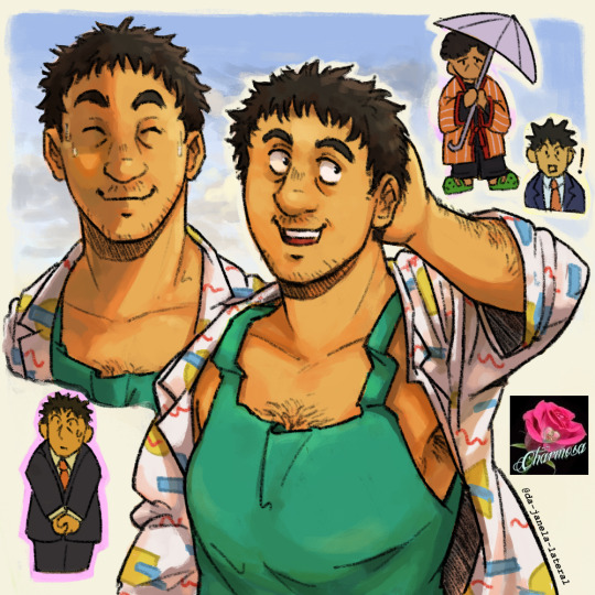
What a respectable sir! I wonder what he's up to in these wonderful warm days...
#this was supposed to be a little sketch based on that semi-new official art but it turned into a full blown lightning study#specially because it has been a while since I last drew Serizawa#I'll be very honest when I say this man makes me the closest thing I have to being straight. that's an ability he has I guess#anyways I HAD to draw him thicker because his anatomy in the reference was so sad why was he malnourished. atrophied. frail.#you can see I freestyled his shirt's 80s type stamp#mp100#mob psycho 100#mp100 fanart#serizawa katsuya#lalarts
181 notes
·
View notes
Note
Can I ask how you draw the mutant mayhem turtles’ anatomy? And proportions. ALSO I LOVE YOUR ART IT IS SO GOOD AND JUST AHHH
(Hopefully that wasn’t weird)
Waaaa thank you!!! :,D!!!!
Uhhhh yeah sure why not. Just so ya know, not great at giving art tutorials so I have no idea how helpful you'll actually find this, but I'll try my best 👍
And this might not need saying, but just so we're on the same page, when I draw the MM turtles I don't exactly stay 100% on model. I generally try to draw them similarly to how they actually look, but I also take some ✨artistic liberties✨, as is the nature of fanart.
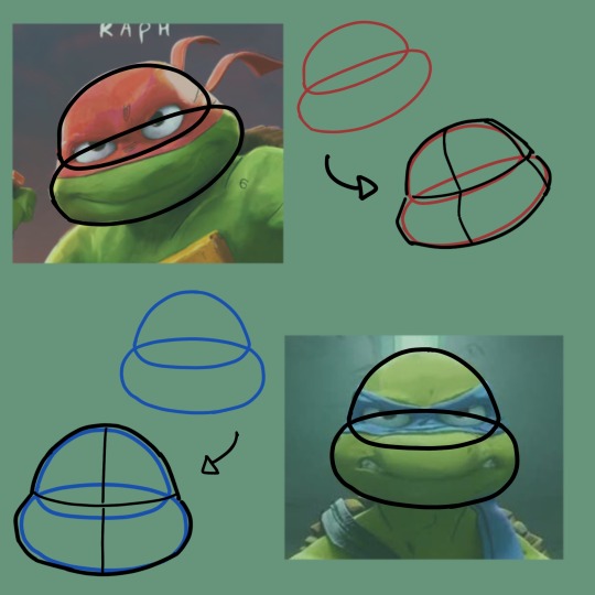
Okay let's start with heads, that's probably the one of the MM boys' most distinct feature. For Raph and Leo it's easy to divide their heads up in two main shapes. The lower part of their head sticks out quite a bit compared to the upper part. I dunno how clear it is in these images but compared to Leo, Raph has a bit of a wider head (mostly the cheeks) and the top of it is flatter. Leo's head is a bit more round-ish while Raph's is slightly more angular.
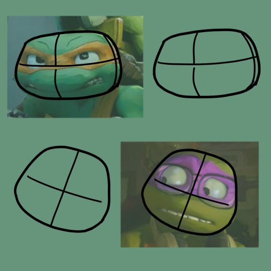
For Mikey and Donnie it's easier to just view their heads as one single shape (The lower part of their heads are still wider than the upper part, but it's not as noticeable as it is with their other brothers) Mikey's head is just straight up an oval. Well, not exactly, like an oval and a rectangle with mixed together. Donne's is less stretched out, like a circle and a rectangle mixed together.
But that's the movie, when it comes my art I have a tendency to dial down the differences between their heads and draw them a bit more overall roundish. (Except for like Donnie, I actually tend to make his face a bit more stretched out and rectangular lol)
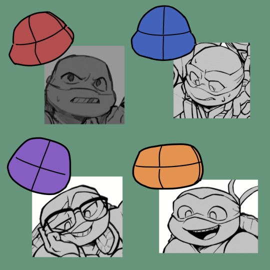
I'm still figuring out how exactly I wanna draw these guys TBH, so my art of them isn't super consistent. That being said, there's a lot of squash and stretch going on in the movie's animation when it comes to facial expressions. So even in the movie their head-shapes aren't super consistent either.
Anyway, body proportions!
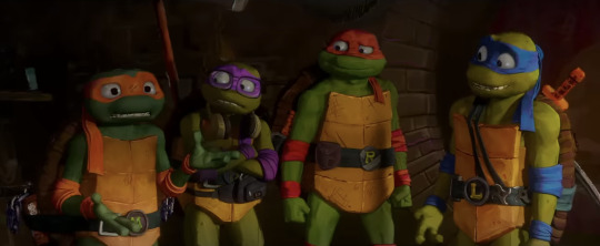
Aside from maybe height the brother all have pretty similar body-types. Raph I would say looks the most different, being a bit wider. Particularly his carapace is almost bit pear shaped? It gets wider the further down it goes is what I'm trying to say. Leo, Donnie and Mikey have a more consistent rectangular shape. (Another detail I noticed while making this was that it seems that Leo and Donnie have six scutes on their plastron, while Raph and Mikey have 8. It's a bit hard to see tho because their belts are kinda in the way)
With specifically their limbs, Donnie and Mikey are a bit lankier, while Raph and Leo have slightly thicker muscles (tho still rather lanky compared to other iterations of the turtles)
When I draw them they (like with their head shapes) end up more similar to each other than they are with their canon designs. I also draw them with slightly less thin limbs.
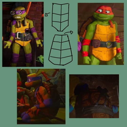
Shell! It was hard finding good images of the back of their shells so I dunno exactly how many scutes they have back there, but it seems to be 3 columns at the very least? (Also I think Leo might have a comparatively slightly smaller shell than his brothers?)
The shells also generally take up a bit more than half of their side-profile. Looking more closely at these reference images have made me realize that I draw their shells a bit flat lol.
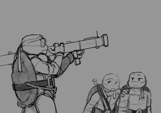
I don't know how much more help I can give when it comes to their designs. I just end off with some details to remember when drawing them.
Raph is missing a tooth, and Mikey has braces. (Leo had braces in the concept art and I'm stubborn and insist on drawing him with them also because fuck you)
They all have a few scratches here and there, but in typical Raph fashion, he has a LOT of scratches on his plastron. Also his beltbuckle has tape on it.
The space between their eyes is narrower than the size of one of their eyes, except for Mikey. Him having a wider face makes his ...nosebridge(?)... whatever, the space there is approximately the width of one of his eyes. Some facial anatomy for ya'
Another face anatomy thing, the ends of their mouths mostly lines up with the outer edge of their eyes (they're pretty wide)
24 notes
·
View notes
Text
more fanart for my own aus!!
This is for the Bet on the Crown au, where i posted a story a while ago with Ranboo nomming Tubbo, and, cause I love glowy noms, I felt the need to draw Tommy nomming him next hskslsjsh

This is not nearly as normal for Tommy as it is for Ranboo and Tubbo, but Tubbo wanted to see what it was like with Tommy instead of his husband, and Tom is in their country so Tubbo basically gaslit him into thinking it was part of his culture and he’d take personal offense if Tommy didn’t eat him.
It’s definitely not, as i explained here faes get eaten and killed a lot for their magic so it’s usually really really bad, and Ranboo explains that to Tommy soon after the fact, but both princes find it pretty funny how uncomfortable Tommy is
Meanwhile Tom is not having a good time
As much as I love glowy noms, I’m not great at drawing them, so have some alternates and an explination of some random shit under the cut
Ok so as I was re-reading this story (which is the aforementioned glowy nom story with Ranboo and Tubbo), I made a lot of mention of Tommy seeing Tubbo’s silhouette from in Ranboo’s storage pouch, but as I have learned recently that’s not how stomachs work (aka I saw a video where someone swallowed a flashlight and that’s my only reference for drawing this stuff)
the other problem is that in that video there obviously wasn’t a white or yellow light brightly glowing; it was a red/orange hue that was very muffled cause humans obviously have layers of skin and organs.
So basically, because I’m mentally i’ll and have to have everything make sense, what that means for Ranboo is that he and Endermen as a whole in this au have very thin skin that’s combined with their muscles, making them very vulnerable, making their teleportation, teeth, and claws, their only form of protection. Thai is why they as a species picked up magic in the form of spells and potion making. But anyway, this is why Tommy can see an outline of Tubbo through Ranboo but there’s no silhouette when Tommy noms him, and also why Tubbo’s green glow can shine through his skin: it’s like holding a flashlight to a slightly thicker than average plastic bag.
Anyway since Tommy is human and has normal human organs, muscles, and skin, Tubbo should not be making the green glow in the picture above. However, i can’t think of an excuse for this one, so i said fuck it.
If we’re going with actual human anatomy, Tommy’s stomach should glow red-ish, but also depending on how close Tubbo is to the front of his stomach or may also have a green hue if he’s pressed up far enough?? idk i’m absolutely bullshitting here so here’s some alternatives that i based around logic
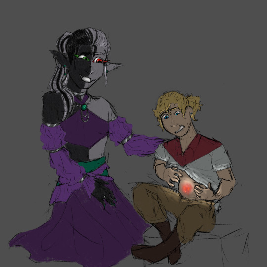

ok last thing i promise but also in the story i mentioned that Ranboo could nom Tubbo cause he had a storage pouch, which Tommy obviously doesn’t have, so for my own sanity’s sake assume that Ranboo makes
#i’m literally insane#also this drawing has been mostly done for months i just couldn’t get the glowy shit down but i’ve given up#also also#Ranboo’s explination to Tom that this is not normal for faes and Tubbo is just weird is actually a really important conversation#Tommy was always raised with humans#and humans have no idea how bad magic folk have it#Tommy had no idea fae were poached for their magic until Ranboo told him#and even then Ranboo said it so casually#as if it was normal#which for him and Tubbo it kind of is#even Ranboo constantly faces harassment and exclusion from other people because of his species ‘being scary’#it’s just something they have to live with#this is a big stepping stone for Tommy making L’manberg a magic safe and inclusive place#even if his citizens might be against it at first#cyncerity#mcyt g/t#mcyt gt#bet on the crown au#tw vore#giant!tommy#giant!ranboo#tiny!tubbo#dsmp g/t#g/t vore#soft vore#safe vore#dsmp vore#must make BotC Ranboo as gnc as possibly everytime i draw them btw#this is very important to me
73 notes
·
View notes
Note
I’m trying to draw Phil for the first time, and I’m running into problems that I’m hoping you can help with. I always draw females stomach and up, so most of the guys I draw look like females. I do draw Dan, because his face features aren’t as rough and he has a youthful face. With Phil though, I want him to look like him now. I want him to look like a 31 year old man and not a 17 year old boy lol, but my dumb tendencies are preventing me to doing so. Advice??
this is a problem some artists have and i had it as well some years ago before beginning my career! i was used to draw very typical anime girls, so when i had to draw Real People, i mean, when i had to draw real live models in my drawing classes, i had to relearn a lot of stuff! when you challenge yourself to draw people of all genders, ages and ethnicities that’s when you notice people are all really different from each other and there is really no canon. we tend to limit ourselves to draw females or males in certain ways but leaving aside biological differences (and even these are really diverse as well) (and this reminds me we desperately need better representation of trans and intersex people in our artistic anatomy books, we desperately need it, because these books insist on teaching only one canon, usually just cis and white, and ehm no please) we all have different physiognomy, so the best way to learn how to draw someone is doing a careful observation!
and as you have noticed, yup, dan has a different complexion than phil so the best we can do is to study them and study people with a similar appearance to each one! i suggest you to invest some time trying to find pics of them and of people really really similar to them to help you to understand better their anatomy. a great place to start looking for references is the model community on deviant art btw (x). or you can google some lookalikes people have found of them lol
ok, now let’s begin with your question! now you are facing the age challenge, right, the first thing you can do is looking for v v old and v v recent pics of him to notice easly the little changes. here is a compilation i’ve made!
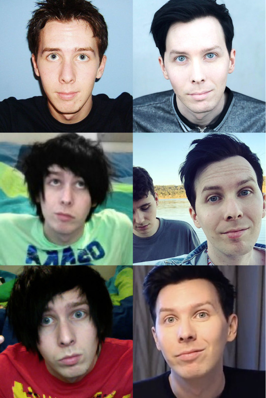
the old pics are a bit blurry but i notice 3 relevant things:
now he has more pronounced bags under the eyes
his jaw is a b i t, just a bit wider and more square. also the edges were a bit softer when he was younger.
laugh lines, and eyes and forehead wrinkles are a bit more pronounced as well
ok so let’s focus on these 3 details!
to draw the two phils bellow i used the same base sketch because his skull haven’t changed that much, and then i tried to accentuate the main differences between them. accentuate is the key word here, because we are artists, and this means we can portray our observations in different ways, not just reproduce them.
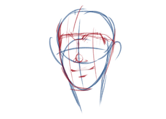
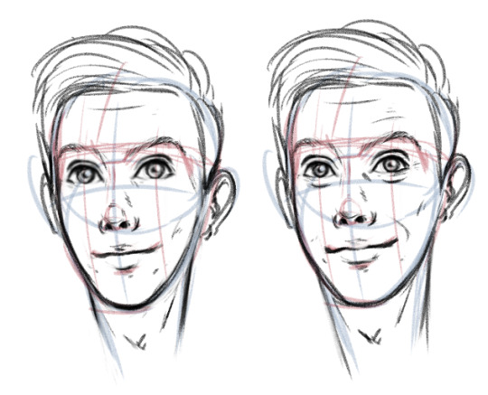


my style is kinda realistic, so haven’t accentuated them that much, but my suggestions are:
to draw a 31-years-old!phil
make those wrinkles more visible, especially his laugh lines, because this sweet man laughts a lot more these days
accentuate more those bags under his eyes, he is a night owl!
his forehead wrinkles are important depending on his expression, but drawing even just a few delicate lines will definitely add some age to his face!
and here are other suggestions! we tend to relate big eyes to younger people, so making his eyes a little smaller will also make him look older
bonus points if you add a few grey hairs here and there :9
i suggest you to follow these steps to study the rest of his anatomy, but a few things we all have noticed is that his shoulders and torso are broader now and his limbs in general look thicker / chubbier :))
anyway, i really hope you find this useful, feel free to tell me if there is something else i can help you
#phanart#phan art#phandom#anonymous#psychics#artadvice#EDIT: i'm glad you all found it useful!#btw this is a little note just to point out#i edited this post 3 times#because i worded very poorly a few lines last night#i apologize if you see other version of this post around and some stuff sounds weird#or insensitive#def i should have saved it in my drafts and edited it in the morning#i hope you understand#this is definitely the version that express so much better#what i was trying to communicate#thanks for reading this note if you are reading it :))#love you all so much <33
704 notes
·
View notes