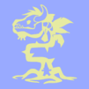
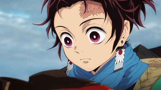
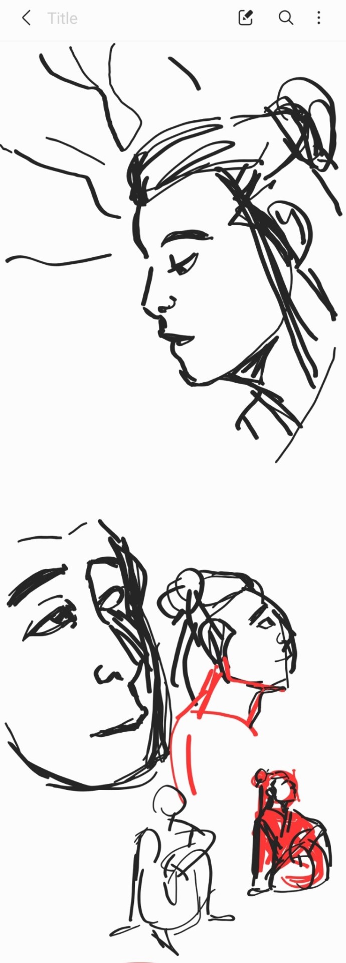
#anyway lineless style how do we feel about it!!!!!
Explore tagged Tumblr posts
Visit Tumblr Blog
Explore Tumblr blogs with no restrictions, modern design and the best experience.
Last Seen Tumblr Blogs


Fun Fact
In February 2021, Tumblr had 518.6 million blog accounts.
Text

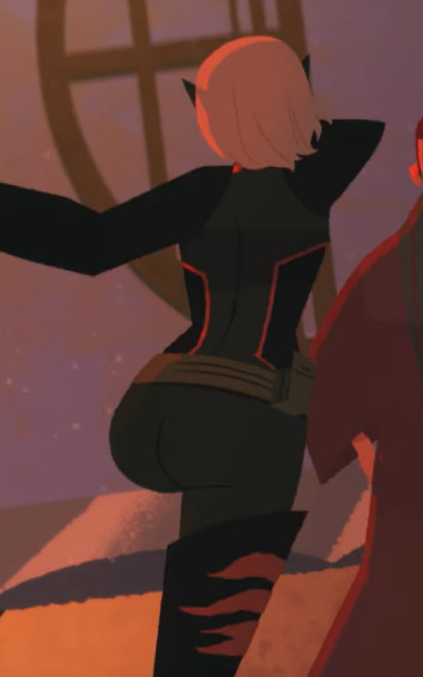
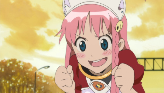
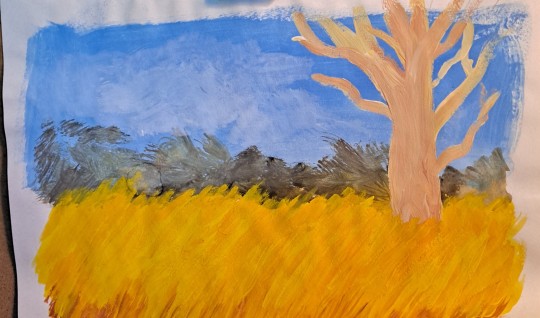
fuckin finally made some art for myself....i havent had the time since school started but here's a heraldic unicorn i no longer feel like im rotting
#i was sketching a much larger piece of a unicorn goring a wolf the other day so maaaaybe thatll get finished soon#been drawing a lot of unicorns lately. idk why#anyway lineless style how do we feel about it!!!!!#plush.png#my art#original
33 notes
·
View notes
Text
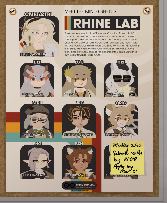
the minds of a lab at three different points (LONG rambling under the cut)
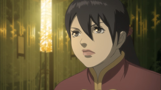
I am constantly in awe of the analyses people put out about Arknights on this website. I feel like my own interpretations are somewhat lacking as a result, but I was confident enough to post this, at least. I've had this idea for a long time now, I think since Lone Trail released, but I've only been able to make the time for it now.
Rhine Lab has so many fucked up elements and people involved in it that it's actually impressive. They were really gunning for "most unethical scientific consortium" reward. Really, though, it's just the result of Kristen gunning for her parents' wishes. All of the directors want something and all of those somethings are different.
Things I want to mention or just feel proud of (allowing myself this because of how long this took):
-I was originally planning on crossing out Saria's surname to reflect that we still don't know what it is in canon, but I don't know why whoever has this poster would do that, so I just kept it in. Hermon refers to Mount Hermon, which Saria's name apparently derives from. Technically, her name here is the same thing twice. Oh well.
-I don't know who this poster belongs to. It's just in some Rhine Lab tech's personal desk, I guess? Doesn't explain the doodles, though. Maybe they were bored and feeling spiteful about the potential job insecurity of your boss being comatose in space.
-I realized only while making this post that I made Saria's, Muelsyse's, and Jara's doodles reference Kristen, yet Kristen's only references herself and her parents. Completely unintentional, but appropriate nonetheless.
-I am so happy with how the poster came out. It makes up for how hard I had to fight Canva for it to come out like that. Here it is in full if you want to look at it closely for whatever reason. (writing an actual description for this thing was fun!)

-Andenate doesn't actually have a face under the sticky note. That's why he's still Mike Wazowski'd in the poster png. I didn't feel like drawing one since it wouldn't be shown in the finished pieces anyway. His jacket is just the same as Magallan's.
-Ifrit's picture board was a literal last-minute addition. It's why the images are sketches rather than being in the lineless style of the poster. It feels fitting, though, so I'm keeping it that way. Seeing Ifrit all grown up and doing so well in Lone Trail was wonderful. There's something in her being happy and healthy and also surrounded by not just her loved ones and friends from Rhine Lab, but also people outside of it. She's cultivated her life to be as fulfilling as she wants it to be, and while there is still room to grow, she has plenty of support and insight from others for it to do so. I may be misrepresenting her a bit (the sleepiness doesn't help), but man. I love Ifrit. She's so cool.
#she rhine on my lab til i (incorrect buzzer noise) she ark on my horizon til i (incorrect buzzer noise) she diabolic on my (LOUD INCORRECT B#i think you can tell when being awake for too long started to get to me lol#arknights#rhine lab#lone trail#lone trail spoilers#kristen wright#saria#arknights saria#muelsyse#jara wilson#ahrens parvis#ferdinand clooney#arknights dorothy#dorothy franks#nasti lunorey#justin fitzroy jr#andenate maryam#(i guess)#ifrit#arknights ifrit#olivia silence#arknights silence#i'm not tagging everyone else.#luc art#fan art
264 notes
·
View notes
Text

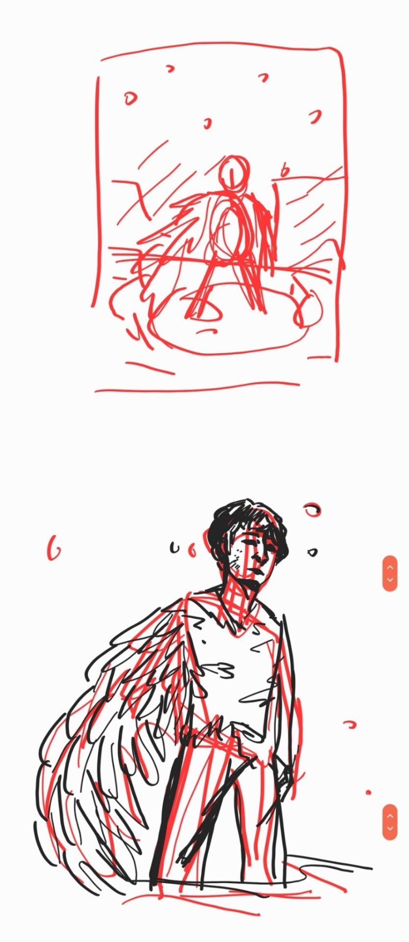
And this here is today’s attempts at drawing Transformers, specifically TF One
I had this idea when I started today, since I knew the faces and noses were giving me trouble yesterday, to try this paintbrush style. The logic in my brain was that the movie was made in 3D, so logistically a more lineless style should work better, right?
I do admit, I think that the lineless style works far better in terms of the eyes and noses being the right shape, but I also admit my lines are probably a bit too soft and I may need to darken them. As well as get something good for the actual thin lines, since the paint brush on its own feels too thick, even at the lowest size
And you know what, since we’re here, does anyone have any Procreate brushes they can suggest for this sort of style? Right now I’m just using Flat Brush, but I wonder if I should use something else
Anyways, so this canvas was supposed to be more D-16, but partway through I figured I should try someone else to draw as well, so I decided Orion, so we could have the yaoi
Honestly my big problem with Pax here is that I don’t have a good comprehensive reference for him, while I can get by just fine with D-16. These were about the best I could get, and that last one I only got because these other two weren’t cutting it
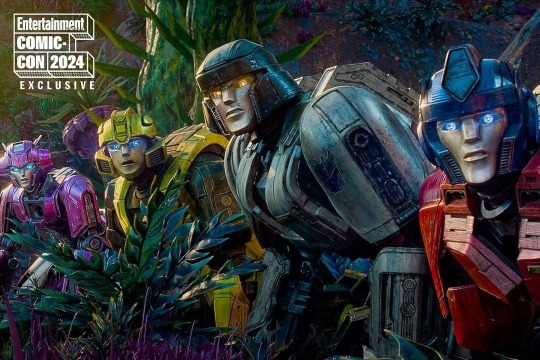
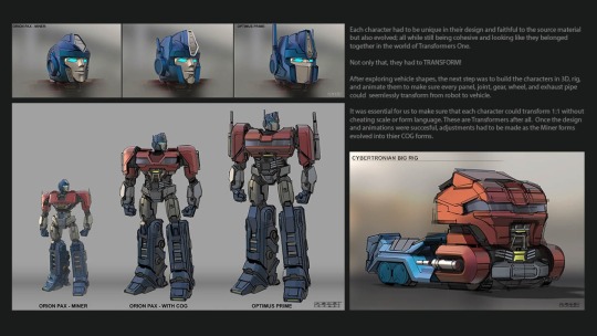
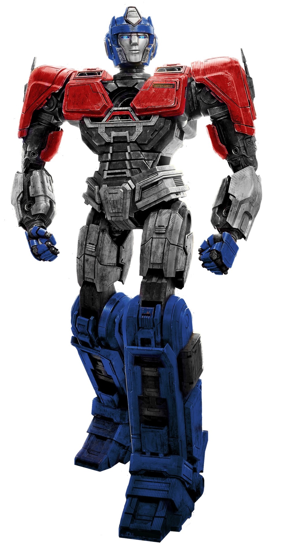
I need high quality references of these characters, or at least specifically their faces. And I’m gonna need even more if I plan to draw Megatron and Optimus as well
But yeah, Orion’s here, and I was also having trouble getting the correct colors for him, because I’m stupid and used to flat colors. D was pretty easy considering he’s just greys, and a yellow tinted grey works just fine there as a grey (though I do admit I’m struggling with his eye color), but I feel like blue tinted Orion looks too blue by comparison. But I don’t know how to give him his proper face coloring without it being the same shade as D-16
I feel like my words aren’t making sense. But just get that Orion colors are a struggle. And still are, because I still don’t think that other grey is the right color
Also Orion has a significantly more complicated helmet than D, so that’s fun
I really wasn’t planning on Orion taking up so much of the space, but I needed to actually practice how he looked so that I could draw him easier. I had numerous attempts at D-16 prior, I could sort of understand his look, but I was flailing in the dark on Orion and needed the practice
I think another problem is that I don’t make him wide enough. But sue me, my character designs usually don’t have their bodies that wide/their heads that small. I’m working on it
I capped off this canvas by just deciding to make a small doodle of Orion kissing D, since why not and also I was too lazy to think of anything else to add
Where do we go from here? I have no clue, but hopefully it’ll go good
#for some reason I have a soft spot for the top left D-16#I think it’s because it reminds me of a game sprite icon#you know the square you’d see when a character’s speaking#I don’t need to explain talk sprites here why am I doing that#anyways yeah#progress but it’s still not quite there yet#transformers#transformers one#my art#d 16#orion pax#megop#I mean technically#art practice
101 notes
·
View notes
Text
WOOHOO! Let's kick off #csweekly!
I think I'll dump all of my thoughts onto one post as we go along...and I have a lot of thoughts so sorry this is gonna be LONG
Firstly, before I start the episode, AAA I'M SO EXCITED FOR THIS!!! I haven't actually truly rewatched CS in sooo long
Okay, let's go. Why don't we ever talk about the intros? Like the grabbing of the hat and then later that as part of the black and white/red intro sequence? MWAH.
Chase's headlights illuminate spots on the screen when they turn towards the "camera!"
I love this introduction to the entire show. It really makes us feel like we're part of this mystery, investigating this thief with Chase and Julia (until...well...everything gets directly told to us via flashbacks 8 minutes in..). It tells us everything we basically need to know about how Carmen operates in like 30 seconds.
Let's take a moment to appreciate the art style of this show....oh my gosh. The lighting the texturing the lineless agh its so good
I guess I haven't thought about it for a little while, but I guess Chase slamming on the breaks is supposed to fake us out thinking that he has seen Carmen's shadow. It sets up how idiotic of a detective he is, while Julia is observant and actually makes connections. I really like this early (VERY early) setup to how their relationship is going to work. However, at the same time, the show is really gunning for us to root for Julia when she starts infodumping. Chase is clearly the asshole. I can't help but wondering, though, if the show undercuts the importance of Julia's research by IMMEDIATELY cutting away to something "more interesting" (Carmen) as soon as she starts talking. What do you think?
I like how Carmen just shoots out of the alleyway and looks at them for a solid minute. She's just like 👁️👁️ i mean we KNOW it doesn't take her that long to use her grappling hook. She was just watching them
LA FEMME ROGUE
Chase's damage of cars starts at not even 2 minutes into the entire show <3

anyway
CARMEN'S DRAMATIC CHARACTER INTRO MY BELOVED <3
ALSO another shoutout to the SCORE OH MY GOD RELEASE AN OST CS TEAM
when you think about it does player's character intro ever seem a little clumsy to you? ooh yeah its player glad to hear he's on board girl you've known him for years girl. girl. he's always on board.
i love player's robots and machines everywhere <3
YEAH SORRY. SCORE AND ANIMATION AGAIN WHEN SHE'S RUNNING ACROSS THE ROOFTOPS. FRAMED BY THE MOON? OUGH
she's so unnecessary <3 you did not have to swing that grappling hook around like a whip but im so glad you did girlie
i adore how her usb is disguised like a lipstick as if subtlety was ever her thing ever. like when on earth would someone catch her in the full red coat and fedora and then be like "oh ok well there's nothing suspicious here other than the grappling hook, hang glider, and taser so I'll let you go ok

PUT YOUR HANDS IN THE AIR LIKE YOU REALLY DONT CARE ABOUT THIS RANDOM OTHER SIGNAL THAT COULD GET YOU KILLED
OUGH THE LIGHTING WHEN SHE'S DROPPING DOWN FROM THE CEILING
just. just move. you could have just moved out of the way
her hat bending upwards when she's listening against the fake atrium <3
i love carmen's jokes about player being a little internet cave troll do we ever get more of those?? i feel like we don't and I wish we did. their dynamic is so fun when its just the two of them, which is like. never again
sorry. gina's vocal fry when she says "job." that is all
the elevator gag is actually so funny
imagine not taking the stairs 5-9 at a time. chase doesn't skip leg day smh
i love the feeling of suspense this safe cracking gives us paired with chase running up to arrest her. its fun because she gets to show off and have a lot of fun with him. but at the same time, we rarely get this feeling of suspense again when it comes to confrontations- only big boss battles like Coach Brunt, Shadow-san, and cold weather
chase used his whole entire face to ram through that door
the bag tightening is so iconic i can only be grateful that she does it again later on in the show
chase: ive never had one run AT me before
does anyone ever hear the sound that chase's hair makes when it gets slicked back? because it is a SQUISH. his hair is. so saturated with gel that his hair SQUISHES
i like how it takes chase a sec when she's reading his name from the badge I like to think he thinks he's just THAT well known of an agent that she knows him
i also like that he just stands there for a sec after she grapples through the ceiling like shit now what

free him
carmen is funny i will give her that. she can also FLY apparently because she' jumping like 25 feet no problem
the grabbing of her hat as she jumps off backwards and the backwards smirk and the oh my god im so gay ok
also julia. and the horror on chase's face dhfas
dark carmen let carmen be mean, hot, and speak other languages more and that is why i want her to come back please

chase what in the goddamn fuck
ever think about how chase landing on this car right now eventually led to julia joining acme because i do
WHERE IN THE WORLD IS CARMEN SANDIEGO (TITLE CARD) (THEME MUSIC). YES BARK BARK OUGSHDFH BARK
see chase can be smart but like that one tumblr post he can be blindingly intelligent for a minute a day and he does not get to choose when that is
CARMEN CHANGING AS THE TRAIN GOES BY INTO HER CIVILIAN OUTFIT IS SOOO ICONIC
chase continuing to ruin the car as he drives along and keeps failing is the funniest fucking thing. the comedic timing of the airbag.
THE DOUBT ON JULIA'S FACE WHEN CHASE CALLS HER "JULIA" AND COMPLIMENTS HER KILLS ME EVERY TIME
driving aggressively, of course
chase is responsible for 85% of carmen's stupid nicknames on the wiki and i love him for that
i think its half funny and half sad that carmen doesn't do anything to defend herself when gray aims the crackle rod at her. its a trend with people she thinks she can trust: she still sees him as her brother, not someone who would kill her, stun her, etc.
i love the dramatic dropping of the bag just because gray esentially gave her the equivalent electric shock of rubbing a balloon against your hair
something i dislike about carmen's character is that whenever it matters carmen is ALWAYS one step ahead of whoever doing whatever. they couldn't have had us start off by seeing her as flawed but competent, cocky but still human by having gray track her here. it would have immediately set VILE up as a real threat. but instead its just the girlboss badass gray is an idiot moment. idk
i like how they had to do the match cut but they also had to make black sheep excited so they just had blacksheep go >:) and then as soon as coach brunt used her vocal cords she went :D !!!!
why is the program only one year is my question
where does coach get all of the phones to dramatically smash
black sheep, at this time knowing full ass well that she has a contraband phone when brunt smashes one: U👄U
she said SNATCH
gray laughs with all of his teeth out
they gave black sheep insecurities about her past with gray solely so they could show us black sheep having those insecurities about her past with gray to gray by black sheep
google says it takes roughly two hours to go from poitiers to paris by train. just a fun fact
hang on why was carmen going to paris by train? they didn't even have indonesia scheduled until she got there. why didn't she take zack and ivy to poitiers?? why was their rendezvous two hours away?? why didn't ivy have ANY TIME AT ALL TO GET ZACK A SNACK?? WHY DIDN'T ZACK HAVE TIME TO GET A SNACK
the biggest nesting doll has some weird inconsistency with the burn design- sometimes its there, sometimes it isn't. i wonder why carmen never ever brings it up though?
little black sheep is so cute
actually though these are some of my least favorite parts- the big long flashbacks. in my opinion, it would have been interesting to find out about carmen's past as we went along...maybe through ivy or something, or just little tidbits. like we'd get some basic information- that she used to be with VILE- but we would uncover the details with the detectives and her team. idk. little me when i first watched this show was SO confused by the flashbacks but then again my comprehension for shit is SO BAD. i literally had no clue what was going on
that nanny just standing by as carmen smears an entire tube of lipstick on the walls

LITTLE CARMEN IS SO CUTE
its very interesting how they wash out black sheep's hair when she's in VILE spaces to fit with the color schemes that are such a prominent part of this show.
little carmen was also an asshole wheeze

THEY ARE D I V I N G OUT OF THE WAY guess they learned from notyourpants guy

girl i dont think your legs are supposed to do that
why is the captain just putting claws up like what were you going to do maul her
the poor captain got the short end of the stick every single time
carmen stole someone's wedding ring so true
the crop top with the overalls is my FAVORITE outfit of black sheep's omg

carmen, like every single other teenager, drew giant eyeballs on her papers
absolutely incredible that carmen who has at this point pressed a few buttons on a phone once knows how to text and call no problem
player, calling random places: what is your full name and address please. well i know your address but what is your full name
ALSO player's room accumulating all that stuff in the years that go by is so cute
can you imagine. player just usually gives out his real name and the only reason he didn't this time was because carmen had a weird ass name
"thats a thing" HOW DO YOU EVEN KNOW WHAT A HACKER IS
also how does she know what right and wrong is
lets imagine for a second player called some faculty phone line or something and professor maelstrom got this ten year old asking to aid the biggest crime network in the world just because he could and also knew nothing at all
kinda cool that they put in the weird...sewer grate or whatever that carmen later escapes out of in the shot where she's on the beach
maelstrom changes hand positions from when he asks black sheep why she requested an audience (hands clasped with thumbs up and touching) to when he says to enroll (villain steepled fingers) and then he goes back to the first on the wide shot
i admire how organically they introduce the names of all the faculty in this scene
appreciation for "the gurl is fehhahhral"
AND THEN HE GOES BACK TO STEEPLE FINGERS
i enjoy how harsh the lighting is in the faculty room. its just white on the characters
i LOVE rewatching these episodes with the lens of shadowsan's REAL motivations mmmm
i also like how black sheep really thinks about shadowsan's words
MAEL WENT BACK TO THUMBS UP CLASPED HANDS ITS ok whatever
why don't the music notes line up with the faculty raising their hands after two or three sob
where does shadowsan even walk off to. is there a door over there or does he just awkwardly scoot off and through the big doors
what the hell are even in front of black sheep's dorms a tennis court??
also i thought those dorms were where her room was where is she moving from
she tied her whole globe up with rope to walk 100 feet
mime bomb being in the background for all of this <3
i like all of the VILE Class's introductions. EL Topo is kind, Le Chevre is a bit dismissive but courteous, and Tigress is...well she's happy until she says her name and then she's a bitch about everything forever and ever
"but were you seeing things from my point of view" actually what other perspective are you giving him here
get rekt aussie boy
so upset they changed this design. the eyeliner, the fluffy hair, the red hair clip. they're so good. she's so cute. all of the young designs are cute actually
they didn't have to animate sheena's ass swaying like that
he's from australia??? really????
i like how gray was just working the soundboards one day and his pay was so bad that he was like "fuck. yeah man I'm breaking every single law. ever."
where the hell did the black on that sheep origami come from. the paper was white on both sides??
shadowsan has the best damn view on the island look at that
cleo's dress. cleo's voice. cleo's
why do they market as an import/export company if they immediately begin training as thieves. why does "villains international league of evil" matter at all
shadowsan has the only class that uses other students. the rest of the classes are main character only. so sad
my favorite part of carmen sandiego is the way they one moment don't allow the characters to say the word kill but in maelstrom's classroom he has human bones and a whole ass brain on display and then they shoot a man dead
no idea how maelstrom dropped his briefcase so that it landed on the other side of tigress's
also i love how they set up some of the two most used concepts in the entire show here: bait and switch and always protect the face
gray is blind we love him for that. she is holding a phone and gas earbuds in.
where did she get earbuds from
point and laugh
so true of le chevre to kick off the stilts the show should have let him win that one, not bs
the poor captain has gone entirely white-haired from this yearly encounter with a child
rita moreno bee cosplay
el topo's laugh is so genuine <3
what was their detention anyway? sit and talk? come up with codenames? seems more like a reward to me
imagine if gray named himself power failure and everyone called him failure

gray is a giraffe
i love the dig at old witwics with the puns for names jkdsghdsa
le chevre is very comfortable on that pole
mime bomb. that is all
class of vile, after a year of sharing a dorm with mime bomb: who the fuck are you
he's iconic
all of the different teacher rooms are sooo cool i love their designs. and once agains color theory coming through with shadowsan's red room!!!
i also like that students get to take exams with their operative gear, as it plays into how effective they will be in the field. however, what happens if someone doesn't graduate?? what happens to all their specialized gear??
she sacrificed a leg for ass. sad :(
i like how tigress acts like a cat
GET SLAPPED TIGRESS
that scrap of fabric flew SO FAR
that little wink tigress does <3
i like how shadowsan has another coat ready and waiting. who's hurt him in the past. he learned
black sheep no don't walk into the camera wait blacwfhghgfh
gray after black sheep failed so hard that she blew the entire year's worth of schooling: damn girl you're so good. best ever actually
i like how they all have to trace their names over to see if they passed like what are you getting lost on the way also getting these grades is exactly like seeing who got cast for the school musical
rip to the random background ops who failed
gray's face is actually just D:
the dutch angle dolly zoom is SOOO GOOD
tigress is still a high school mean girl. elementary school, even. the big kid's table. no children allowed
"looks like someone needs to turn in their stealth suit" black sheep she/they confirmed and sheena respects pronouns
"COME ON LET'S GO PLOT A CAPER" that is so funny to me because vile operatives as we see later NEVER, EVER PLOT THEIR OWN CAPERS
why is carmen's nose so tiny
anyway
seeing black sheep look so short next to shadowsan is so sweet considering she's almost as tall as him later <3
"are you accusing a criminal, thievery, and breaking the law teacher of cheating"
mime bomb for goodness sake. i love the animation of his face emerging from the shadows though
HOW DID SHE SNEAK ONTO THAT HELICOPTER I WILL NEVER KNOW
does anyone know whether CS uses 3d elements for some of their bigger objects like cars, helicopters, the vault door etc.
i like how vile school is completely entirely out in the open not disguised at all
gray: bye bye black sheep black sheep, from the shadows: HAVE YOU ANY WOOL
THE CREDIT MUSIC <3
OKAY so that was my post on the first episode. will they all be this long? who knows. probably. maybe. i'm so excited for this
28 notes
·
View notes
Text
I think im a pretty good artist i think I'm hot shit right so i feel like
Idk seeing artists online especially in the fanart and character illustration/OC department, seeing those newer artists who are maybe just getting in to digital art or drawing in general i feel like...
One like slooow down brother there's no need to be making stickers or doing commissions or having a patreon just yet, let's walk before we run ok? Of course you can do, people can do whatever they want with their free time but you have to understand a lot more about art, marketing online, self promotion, and social media trends to get the kind of traction you're expecting. I feel like theres this pressure for newer artists to legitimize themselves thru like, monetary means ("if ppl subscribe to my patreon, it means I'm good at art") and social media capital ("likes are nice, but they dont do much; please reblog!")
And like yeah everyone wants that but... If you're drawing solely for those reasons and are disheartened by lack of interaction or traction in the markets, what are you even doing? I been doing this a long time, 20+ years at this point. Not commissions or anything, just drawing. I been drawing a long time and I always do it for the love of the game. I do it because it keeps my mind and hands busy, it brings me joy, and i like to create. I enjoy translating the real world into lines, in stylizing, in pushing. I just like it and yk what, thats how I've had this longevity and thats how I've gotten to where i am. I have sketchbooks full of work no one has ever seen, not just studies but all kinds of work.
If your drive to to do the thing, or to improve at a craft or whatever is external, you can't keep it up. Thats nothing to say about learning to enjoy observation and the importance, even in stylized work, of learning how to look at something and how to just observe and notice the things we see. Idk so much of my growth and skill has come from an internal drive to improve for myself, because getting better is a challenge i want to overcome, and doing the less-exciting stuff like drawing a fuckin building. I've been to probably idk dozens of life drawing sessions because i wanted to grasp anatomy better. In university, i took courses where we looked at bones and skeletons so that i would by proxy have a better anatomical grasp. I learned to map my knowledge and the things I learned about applying making or working out back to drawing. Idk man i dont know how to tell you how to love something
And thats all not the point anyway cuz the point is
Two, i think some new artists don't really... They're not interested in finding a personal style? Or if they are they're not sure how to get there? They see the work that does numbers on insta and twitter and stuff and they wanna draw like that, so they do what those artists do. Admirable! But also they do it without understanding the underlying principals. This artists blocks their characters out like this, so i shall too. That artist uses lineless painterly style with heavy realistic rendering, so shall I. And idk everyone enjoys that style the idk Popular Style of anime realism or whatever its fine to look at but dont y'all ever want more??
And like idk do you enjoy the process or are you doing it that way cuz thats how your fave does it?
And idk like.... Two works can be of equal technical skill level, but the one that plays with style and understands underlying principals of lighting and colour and shape and line, the one that is bold with their vision, is always gonna be better than the one that's trying to be popular and do numbers yk?
Like if thats the style that speaks to you, go for it, but fuckin Go for it yk? Dont try and be like everybody else or the big time players cuz if you're trying to master someone else's style, you're not gonna be able to master the things that make art fun and interesting and challenging and engaging yk
And also a lot of art is about vibes and if you're not channeling the vibes its gonna look bad you gotta focus on the vibes not on being like your fave!!
And if i see one more person say "i spent so long rendering this 🥲" when its fucking cel shaded I'm gonna lose my frickin MIND I SWEAR BROTHER I'M NOT MAD I LOVE CEL SHADING BUT CHRIST ON THE CROSS USE THE RIGHT WORDS FOR THE THINGS YOU MEAN
#also some ppl are more naturally gifted at observation and interpreting than others and that's ok too#like i cant stress enough how if you struggle with attention to detail and observing the world you're gonna struggle with drawingz#or at least improving your drawing#and so you have to focus on learning observational skills like if you're not naturally good at it#i swear im not being mean i will HELP YOU if you want it but like#yeah just drawing from your brain or from another picture is not gonna help you as much as you'd like it to#IN MY OPINION#ALLEGEDLY#LEGALLY THIS IS A JOKE#if anyone says anything mean to me about this I'll nuke this entire internet#i am by no means the best artist but i am significantly better than the average person and thats thanks to#natural talent and focused effort#and time so much time years of time#don't give up cuz its hard!!!#i didnt give up#not because i knew i couldn't#but i hate being beat and i would not let the art beat me#i was stubborn you have to have a certain level of stupid stubbornness#fall down 7 times get up 8 or whatever#but more dumber
0 notes
Text
Normal update, winter XXIV
BUT IT'S NOT WINTER ANYMORE HA! Happy after-equinox to y'all. I planned to write the update in march and it's still technically march but, like, y'know, it's the first day of spring so it feels kind of late, ig? Not that it really matters here and I drew Morana on fire so all is good.
This is not completely [un]related but I'm trying to complete the 'draw sth for 100 days straight' challenge and rn it's going okay though I have to admit I'm being a lazy ass. But hey, a bad sketch a day is still a drawing. Not sure if that's the reason I wasn't able to complete my easter sketch dump but knowing me it wouldn't be finished anyway so whatever ig. AND YES, I WILL DRAW FATHER DAKI ON TIME. I planned to do it when I was drawing Agatha for thug in PE's style but oh well... You'll see both ot these pics on the first of april.
Also, like, in case anyone was interested, I finally decided to learn how to adult and might open comms this year? I tell myself I'll open them since, like, 2020 so yeah. Maybe. I think I will, tho.
Current game stuff
Mushroom game... Yeah... It exists and I technically haven't dropped it but yeah... Yeah... Tbh I even hid the link from my page but it's still public and all... But yeah... It goes into the "finally finish it in 2024, you stupid fuck" list - which, incidentally, is a mouthful so from now on it's gonna be "24 >:C" - together with Enmity and all.
Remember the golem game? Yeah, we don't see its non human form but I did technically draw it. Humanoids are, like, so last decade. It's called Sorcerer's golem and because I was not the lead, we managed to nicely finish it on time ✨ [Unrelated but I wonder what happened to the old unicode emotes, I need to look into it]. There's not really a lot I have to say here, tbh. It's short, it's wholesome, I'm totally not gonna go almost fully lineless again. I almost died and it was only two sprites. Never again proceeds to do that again later anyway.
Some time after, or maybe during, I can't really remember, I heard of Queer Vampire Jam and ofc had to join because I wouldn't be me if I managed to stop myself from joining yet another jam. It just so happened I both felt like shit and read something from my SF gods at the time so I commited this open ended 3k long story and it's, like, really obvious how I felt and what I was reading but then I decided to go yolo and publish it anyway, especially since I got an editor and made laby draw for me. Just had to publish it at that point. Enough about that, though - let's see what is it all about. Vani vani, because Tas tatum was deemed too lame of a name is a story about a [queer obviously] vampire who's kinda dead inside and it shows. I did say it was obvious I felt like shit. I'm not sure if it ended up being too edgy or not... I mean, I made it really obvious it's, like gestures vaguely y'know? I don't wanna spell it out but, like, the theme and everything there was so obvious I'll be disappointed in you if you didn't get it based on the pun title [the other two layers of puns there aren't as obvious] and the page/thumbnail. Unless, of course, you never heard about it at all which might be the case for people from other continents, I wouldn't know. I realise that doesn't say a lot about the contents but I mean, it's more of a progress update, I'm not actually trying to market anything here lol So whatever. It might be the only game ever where I put a whole nsfw scene of a sexual nature... Or it might just be the beginning of my unsexy h scene adventures. I even asked others how to make it as unsexy as possible and I hope I succeed. Going into gore or kink migh be sexy for some but boredom? Probably to no one who actually reads it. And, as is the case with my other personal games, not a lot of people read them. So I think I succeed at that. It's just the beginning of my SF adventures, though. Be prepared.
Now for the thing that might interest the potential reader the most because I saw the statistics and I bet all the follows are alse due to that - Impostor Syndrome. I know the page is pretty much silent but we are working on this. The common route received a lot of notes to make it longer, more cohesive, funnier and possibly better for all the gremlins that wanted a troll mode. Or at least that was the plan. Route wise we had something but after some consideration, it had to be basically scrapped. I won't go into all the details here as for why, but the rewriting of the outline is proceeding. Slowly cause it's kinda hard to find the best time to talk when you have multiple people from different timezones to consider but I think it's looking good. There's a sliiight possibility it might be a bit less vanilla than, like, your typical sfw otome but I don't think any vanilla lover would think it's too much or anything. Not nearly kinky enough for that. I think labelling it as having a soft dom MC might even be false advertising. Maybe. Hell if I know, I suck at tags. But yeah, it's proceeding. Obviously it won't be out during winter but I do think it will be finished this year. Most likely.
From other game stuff... I might have a monster type project made with Ameena for you. Or I might not. The designs are done but is anything gonna come out of them? We'll see. Leaving the possibility open.
I helped Doibats [who I helped with Cool Days before] with some art. This time it's an rpg, currently still in development. The cool art direction is still there so I think it would be worth a play when it's out. I think I'm more of a guest artist than an actual member of the team, though lol But yeah, check it out when it's done, I'll link it then.
Yet another game where I didn't do much - The Villainess Just Wants To Eat!! had its full, official release 🎉 Congrats to the team [check out their gui, btw]. I was mostly helping with this or that due to the usual jam team stuff that happens but yeah. Syd wrote afterstories for the charas, too. They're technically linked on the game's page, too, but you can read them on her tumblr, too.
I kind of forgot to mention, which also ties with my next point, but she hosted the Ossan jam again which I planned to join with my nano project about Wedding crashers but I overestimated my ability to write energetic chaos so... umm... Well, it's not dropped and while it won't get done in time for nano, I think I'll manage before Ossan jam ends. It started as a loose idea that kinda parodied romcoms and then the protag became an AAA battery but also aplatonic and then I got some concepts from tea[? - dunno how they want to be called 'officially' and this one seemed safe but?] and yeah. I'm trying to work on this, though. Even though I feel so stupid attempting to write an anthropologist. Should've stuck to writing mostly what you know like with Vani vani, eehhh... Wish me luck o3o
The last thing, or two, probably, is more of a... forecast? I happened to help with the editing of a certain 18+ otome game but I'm not on the team or anything so I can't really tell you more since I don't know how much should I reveal to the potential player but from what I've seen, the development goes well since they started making it for nano and might actually be finished before Otome jam ends so I'll link it then.
The other thing is that in an unspecified future I might have a yet another AAA battery protagonist, this time replacing the MC of an otome isekai story. I'm not sure how much I'll help with [maybe just editing, maybe we'd become a two person team, who knows] but it has a hight possibility of being developed eventually. No set dates or anything, though.
Pariiish noootiiiceees
Remember Tentacle jam and Insect [adjacent] jam? They're still happening, I'm just being lazy setting the pages up. The working date is from around the middle of august to the middle of october due to all the other jams happening at the time. I think it's the final date, though. It's come to my attention there's also the Monstrous Desires jam that also shares the timeframe almost perfectly so, y'know, why not make a game that lets you join all three of them? Just a thought.
---
My god, this thing became so long. Like half the length of my typical personal project orz I had to add all the Ps and BRs manually. Damn you, html shakes fist
Over.
0 notes
Text
Animation Notes: evolution of the anime girl, part 1
So last week we investigated ways of drawing the human head in a realistic way. Armed with this knowledge, let’s see how to stylise it...
Nowadays, when people speak about ‘anime style’, or an ‘anime girl’, they probably mean a moe design like this:
(That’s Aoi Miyamori from Shirobako, designed by Ponkan8.)
Animators learn to draw this type of design, and various standardised symbolic expressions, in books like キャラの気持ちの描き方 (kyara no kimochi no egaki kata, How to Draw the Feelings of the Characters).
Certain features you expect to see here:
the basic structure is resembles the Loomis head: spherical cranium, jaw coming down.
the cheek/jaw contour is simplifed and comes to a point (or close to it), with an outwards curve along the cheek. There is no major sharp indentation around the eye socket, but there may be a gentle concave curve.
the eyes are very large, with a lot of detail put into the shading of the pupil, specular highlights, and the shape of the eyelashes; the face is balanced around these large eyes so it doesn’t look alien.
the nose by contrast is massively deemphasised to the point of just being a dot in many cases.
the face has almost no structure or shading, so that it’s almost always a completely flat colour.
the mouth is also drawn very small, with no shading or structure applied to the lips; a small shadow under the mouth might be applied.
the neck is very narrow, and meets the head in the centre, so the cranium goes back about as far as the face goes forwards in side view.
the hair is broken up into roughly triangular locks. (the number and position of these locks of hair is actually part of the settei and the animators are expected to keep it consistent.)
the hair has typically three layers of shading: midtone, shadow, and specular highlight. the shape of the specular highlight is part of the design and won’t usually be changed based on lighting conditions. the skin rarely has a specular highlight. the eye could easily have four or more layers of shading.
lines are very thin and even, and may sometimes be broken inside the form - particularly on a closed mouth. the contours of major forms are typically outlined, while shadows and highlights are usually lineless
generally speaking, characters’ heads are much bigger than they are on real humans relative to the rest of the body.
At some point I made a little turnaround based on that book of my best attempt at the time of a moe anime head. here,
Looking back at this I can see some issues, e.g. with inbetweening the upper contour of the head, but overall this still works pretty well. Maybe soon I’ll try and do a more complex head turn with acting and like... actual hair lmao.
Anyway, this approach to stylisation could be considered something of a ‘default’ in the anime industry, but of course 1. it has evolved considerably over time, and 2. ‘anime’ encompasses a huge range of styles.
We could focus on a number of threads, but in this case, I’m going to zero in on drawings of main character girls in 3/4 view - chosen because these are some of the least diverse not the most, since, male characters tend to be more varied in general, either with more ‘realistic’ proportions or more exaggerated and stylised.
Actually, to comment a little further on that. The ‘large eyes’ stylisation is typically applied to characters intended to have a certain amount of cuteness, so in addition to the familiar genus of anime girl, it is also commonly applied to young boys. We can see this in the wildly popular ufotable adaptation of Kimetsu no Yaiba (Demon Slayer), which in classic shōnen fashion has a young hot-headed boy as its protagonist:
(Tanjiro, designed by Akira Matsushima)
However, as your anime boy grows up into an anime man, his eyes will tend to get smaller, closer to a real size. It’s hard to find another example in Demon Slayer (I couldn’t find anyone scanning the first few episodes) so let’s turn to another anime.
A much stronger of dimorphism example comes in Production I.G.’s anime Psycho-Pass. Here is protagonist Akane Tsunemori, designed by Akira Amano and Kyoji Asano, who has huge eyes with a distinctive shape:
Starring alongside her is Shinya Kōgami, who’s 28 years old, and has much smaller eyes:
and for even stronger contrast, the older Nobuchika Ginoza:
You can see therefore that as a character gets older, their design often (not always) shifts further towards realism: their eyes get smaller, and a lot more lines and wrinkles are added to the face. (The strong shadow under the cheekbone is incidentally a Production I.G. staple.)
Something similar also applies to women; smaller eyes and more structure tends to indicate maturity. Let’s take a different Production I.G. work, Seirei no Moribito; here is 30-year-old Balsa designed by Gatou Asou:
and returning to Psycho-Pass, here is Jōshū Kasei, the director of the police unit, an older woman:
Although the amount of extra face detail isn’t quite so extreme as Ginoza above, we see the addition of lines to indicate the nasolabial fold, and more complex shading around the eye socket.
(Of course, not every anime takes this exact approach. In particular, there are ways of stylising old people which push into exaggeration; Hayao Miyazaki loves doing this.)
Now, this ‘look’ to anime has only been the standard for a couple of decades at most. The styles used in anime of the 1980s tended to look very differen, as you can see comparing Gunbuster (1988-9), with characters designed by Haruhiko Mikimoto...
to its sequel Diebuster (2004-6) a decade later, with characters designed by Yoshiyuki Sadamoto:

This particular shot animated by Ayumi Shiraishi might be a bit looser, simplifying shapes for comedic effect, but one of the differences is precisely the greater willingness to go off-model like this.
Part of the difference is surely the transition from physical, painted cels to digital colouring and compositing, but as you can see looking at the settei above, there is a real difference in feel from the 80s design to the 2000s one. This comes in places like: the shape of the chin, the use of hatching, the general feeling of the shapes (more rounded in the 80s), the bulk of the hair.
So, where did the ‘anime style’ come from? Let’s trace its evolution across the entire duration of anime, in a manner similar to Kimi Rito’s ‘expressionist’ approach in The History of Hentai Manga. Of course, it would be impossible to comment on every anime ever made, but I’d like to find representative examples of most of the major styles used in the industry in their respective eras.
The Very Dawn of Anime
Japanese animation (whether or not we yet consider it ‘anime’) is pretty much as old as animation itself, i.e., started in the beginning of the 20th century.
Famously, Osamu Tezuka got the ball rolling on TV anime with Astro Boy, but prior to him there was a reasonable amount of film animation, and prior to that, short film animation. I believe the oldest known Japanese animated film is Namakura Gatana (1917) by Jun’ichi Kōuichi, a short film about a samurai with a blunt sword, in a cutout animation style looked like this:
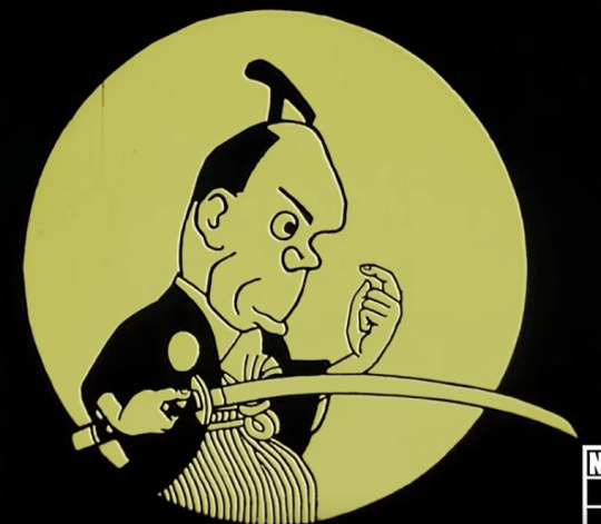
Naturally this has little resemblance to any of the future styles that became known as ‘anime style’. To me it calls to mind a little ukiyo-e artists such as Sharaku, but also presumably shows the influence of international animators like Émile Cohl. We’ll skim over those first few experiments though - please read about them here if you’re interested!
In contrast to later styles of anime we’re going to cover, here the balance of features is essentially opposite with a large jaw and mouth, reduced cranium, exaggerated forehead. I’m not going to draw a study of this one.
1930s
Unfortunately many of the films of the 1920s are lost, so it’s difficult to comment on them. So rolling the clock forward a bit, we can observe one interesting example in Benkei tai Ushiwaka (1939), a fantasy/mythological film that came in a period when animators were largely required to make propaganda films for the nationalist government.
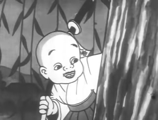
So here’s Ushiwaka (Minamoto no Yoshitsune); there’s no credited character designer but presumably the design is due to Kenzo Masaoka, the director of the four-person team. (He and his wife also did the voice acting.)
What influences this design? It’s hard to say without a much deeper familiarity with Japanese art history at the time. We might see the influence of Fleischer; at the time Japanese animators were competing with foreign productions by working cheaply (la plus change...), but American animations were widely shown, so no doubt Fleischer and their contemporaries would prove an influence - particularly in the animation itself which uses a lot of loops in the same way as Fleischer. And, indeed, in this film, Masaoka was experimenting with pre-recorded sound to follow the American method. Regardless, we’re here to study faces.
So here’s an attempt to copy Ushiwaka; no tracing, etc. I picked this character because he seems the most similar to future anime designs.
The way I broke this down is a kind of wedge shaped head (like a Loomis head), which I indicated with dashed lines, and then cheek chub added on to make a rounder head shape overall. The overall contour has a slightly thicker line weight. The forehead seems very large here, and the eyebrows faced very high, bc he’s a historical monk etc. etc. The big difference is that the eyes are simple and haven’t been drawn very big, and the way the nose is drawn.
Looking at the designs in this film, it doesn’t look exactly like any Disney/Fleischer characters, but I do think it shares a bit of a design sensibility with Disney of this era (notably Snow White).
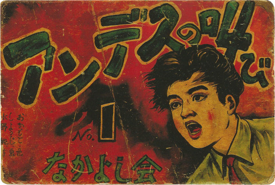
Beyond animation, the other major cultural presence of illustration would be kamishibai paper theatre, where performers would show illustrated cards to a accompany oral storytelling. It’s a little difficult to find examples of kamishibai boards dating back to the 1930s, but here’s one I found in this article from a kamishibai called Cry of the Andes (アンデスの叫び Andesu no Sakebi) originally sourced from Manga Kamishibai by Eric P Nash.
This has a painted style that resembles American commercial illustration in the same period, though notably the face is quite flat and without much shading away from the eyes, or the use of line weight under the nose.
1940s
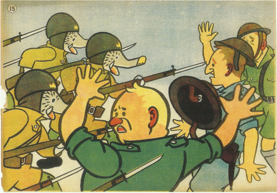
After Snow White proved that an animated feature film was in fact possible, other countries jumped on in. So the first feature-length Japanese animated film - a propaganda film - came during the second world war.
(In fact, as an aside, Japan’s animators were beaten to the feature film punch by the Wan brothers in Shanghai who completed Princess Iron Fan under Japanese bombs! Animation Night 29 - that film may be watched here on the Internet Archive, though sadly it’s quite a rough print.)
In this period, the fascist government was exerting severe control on art, but also throwing a lot of money at those animators willing to play along and make propaganda films. That takes us to Momotaro: Sacred Sailors (1945), the sequel to the 37 minute Momotaro’s Sea Eagles (1943). It centres on the folk character Momotarō who had been increasingly appropriated as a nationalist symbol, portrayed as a soldier in the Imperial Japanese Army/Navy, since the First Sino-Japanese War.
This one uses mostly anthro animal characters, and features for its time extremely sophisticated animation of war machines, and generally a high drawing count. Shōchiku made a 4K print of it (complete with big disclaimer at the beginning) which can be viewed on Youtube here.
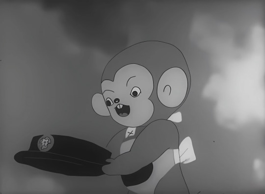
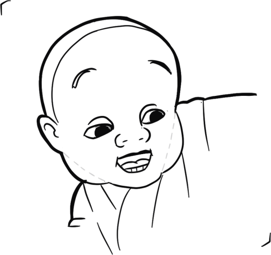
The actual character designs are very simple - perhaps even more so than Ushiwaka above. Very rounded cutesy shapes - an early instance of cuteness being used to promote imperialism and war I suppose. This character is a monkey, but we can look at them a bit like a human still. The face is very flattened: the overall head shape is two curves connected by straights. It’s kind of like a lego head.
Momotarō is mostly relevant because of the influence it had on later animation. Notably, a young Osamu Tezuka saw the film in 1945; WP unsourced writes:
He later said that he was moved to tears by the movie's hints of dreams and hopes, hidden under the appearance of war propaganda.
The staff on the film included Kenzo Masaoka, director of the above discussed Benkei tai Ushiwaka; most of its staff (quite a small list!) had a limited career in subsequent anime.
Kamishibai also took on a militaristic tone during this period, such as Kintaro the Paratrooper seen here:
I don’t have the evidence to really document whether the difference in style from the previous example represents a general trend, but these illustrations are a lot simpler and more graphical.
In 1945 of course Japan lost the war and the country came under American occupation. US comics, films and TV flooded into Japan, and this kicked off an explosion of manga creation - indeed, the definition of manga as an art form. So this is where our history really begins.
Next time: early manga, Toei’s films, the styles of Osamu Tezuka and Go Nagai, and the first steps towards more complex designs...
65 notes
·
View notes
Text
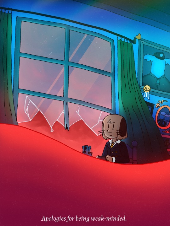
A rather unneeded apology, don't you think?
Progress shots and thought process below the cut (warning, it gets heavy on pshycological analytical nonsense and spoilers for Exploits of Moominpappa/'s Memoirs, and it's really long):
Ah yes, Muddler angst, something that should be one too many yet you can't quite get enough of it-
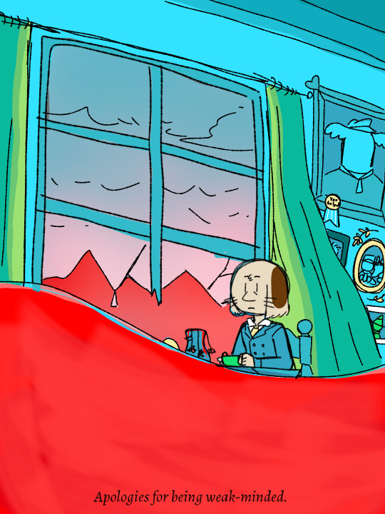


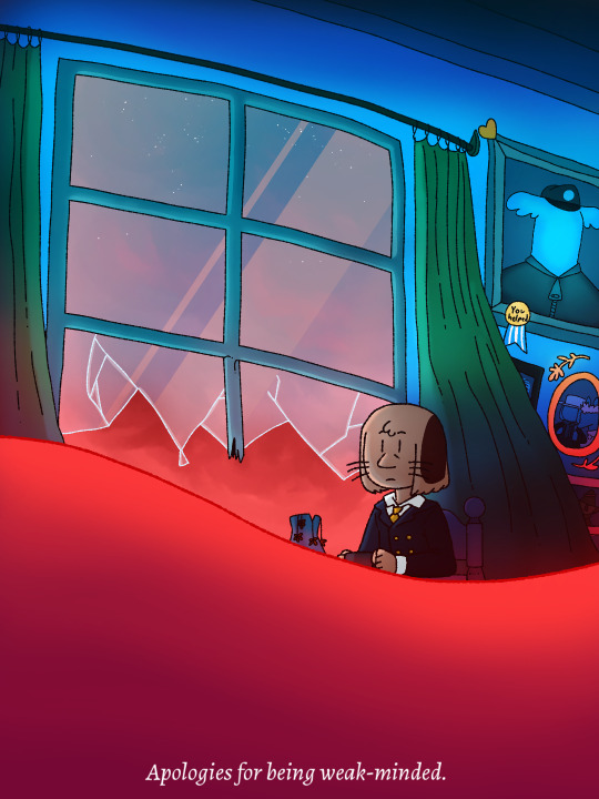
So it all started with this little metaphor from this post I made a while back and I thought "Hmm... I should really make a follow-up for that!" so I did, and here it is.
This was originally gonna be a lineless painting but then when I started to do that I thought about how much of a drag it would be and scrapped that for my regular style but with cooler shading and coloring. I'm happy with it, it's been a while since I've done a full illustration and I'm proud that I managed to make this in like... (Checks timer on my drawing app) 2 hours and 25 minutes? Huh.
Anyway, this whole illustration is more or less just a metaphor going on in Muddler's head when he's cracked under stress, it's the "boat floating on your own personal ocean" metaphor like the post I linked above, it is indeed a constantly raging sea of stress and change and mental/lifestyle instability that's going on in Muddler's head and he's on a houseboat floating on it trying to balance and protect itself from the tides. It's always rocking back and forth but it's been doing that all the time for so long that it barely registers for him anymore, so he's living in this unnerving calm where the calm is not serenity perse but a lack of terror, yet, sometimes that raging sea manages to break through a window or two and flood the place as a good reminder that he isn't immune, he can and will drown for as long as things are like this.
The sea isn't a place of good memories for Muddler in either version of the book, like, the sea is so big that it's general emptiness on the horizon tickles his eyes. Before that he painted the boat red and got it all over himself and then painted his tin with the leftover paint, needless to say he had a rather traumatic night where the paint never dried and it got all over his food and bed and whiskers which drove him insane (or plume crazy I should say). He also had a rough time in his tin while packing for the riverboat and being swept away by the flood caused by Edward the Booble, he said his nerves (and his button collection) were all unsorted after the rest of the crew managed to get the tin on board. Then other stuff happens- an awful Hemulen Aunt boarding the ship (he literally wished death upon her, a rather extreme gesture especially for Muddler), the Hemulen Aunt being taken away by the Niblings (and the ensuing guilt he felt when he felt that it was his fault since he wished for her to be eaten), a rough and sticky night, being the first to realise the boat was setting off to sea unintentionally in the middle of the night, having to sit through a gale in which he got very sick- and that's just stuff that happened on the boat! He also had to suffer the likes of the revenge of the forgotten bones! The Ghost painted Muddler's tin and he cried about it, thinking it's a warning sign that he'll never marry! And he's the only one who was legitimately terrified of the Ghost, imagine being one of like, a 4 person friend group and being the only one scared of a real scary thing that directly affected you in one of the worst ways possible- vandalism of your own home. And don't even get me started on the fact that he lost his parents during spring cleaning and still believes they're alive.
With that being said, I believe we all understand that Muddler has been through alot, he had a revelation that adventures cause nothing but trouble for the poor guy in the middle of the book. And seeing how he cried at the idea of never getting married, we can presume he just wants a normal life after that. Thankfully, Fuzzy provided that through marriage and kids, even though they lost one of them by accident.
Now with this in mind, I have implemented a few elements from the book into the illustration. I've also followed some color-coding rules I've made up for myself;
Blue=Safety and comfort (Hodgkins is his uncle and is canonically blue-colored for the most part, not to mention that his Maxwell House Coffee tin is blue aswell, both are sources of safety for Muddler)
Green=Protection (Joxter is usually depicted in a green dress/hat, he stood up for Muddler atleast twice in the book and we can presume these weren't the only times he does it. Joxter is rather confident in his abilities despite being lazy and Muddler would rather admire that)
Yellow=Achievement/accomplishment (nothing much here, just uhh... Gold is yellow-ish and gold usually means you've accomplished something)
Red=Stress/general negativity (This is mostly coming from the red paint incident)
I've also added some small references and details. I've avoided using the ruler tool on my lineart to give it less solid feel to the backround and everything, showing how it's not supposed to be a full representation of reality, the pictures being faceless also adds to that. I drew an interpretation of the Muddler and Fuzzy wedding photo found in the moomin theme park, the gold medal on Hodgkins' portrait says "you helped" and it's supposed to be the medal that Hodgkins said Muddler deserved for helping him figure out the propeller (accidentally) in the Exploits version and I like to think he has that thought always in the back of his mind as one of the few times he's felt genuinely useful since he got so happy from it. Oh! And the picture almost completely hidden by the curtains is a portrait of his father and that's Joxter at the bottom looking like he's peeking over the curtain when really he's not. The curtains are green because they protect him from the red outside world, the suit and yellow dead flowers being darkly colored are supposed to represent a sense of meaninglessness or general distain, the red liquid is supposed to be red paint, not blood aaaaaaand the window is a slight shade of blue with a screen overlay.
"Apologies for being weak-minded" is supposed to be a rather insincere but tired quote from Muddler, he doesn't really want to apologise for cracking under pressure and having a literal breakdown but he feels like he has to because I think he just feels like a nuisance alot of the time and being so negatively emotional just makes things worse, so he has to come up with an apology rather than tell the person he's talking to the reason why he broke down, and belittling his own feelings by calling himself weak-minded. He knows himself to be "too" sensitive.
Anyway, that was too long a ramble. Just know that I'm not trying to take myself too seriously here, it's a silly amount of thought put into this but eh, I enjoyed it, and I thought you might want to read about it and if you made this far; thank you.
#moomins#moominvalley#art#moomin muddler#muddler#the muddler#illustration#trust me the stuff under the cut is really long#I wish I could put more tags here but I guess these are all of them that matter
34 notes
·
View notes
Text
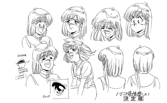
the always wonderful shelley @shanheling tagged me to do this thank u so much!! i think that everyone i wanted to tag has already been tagged to do this but if you feel like doing this feel free to consider urself tagged by me!! im putting this under a readmore bc its long and i ramble a lot
the piece i was tagged to explain my process on is this oc piece! unfortunately i have a habit of deleting my original clip studio file once ive finished my art and saved it as a new png file, so i dont have the file to show the sketch and different stages of this piece. but I still can go through my general process and talk about how i did that piece!
1. planning
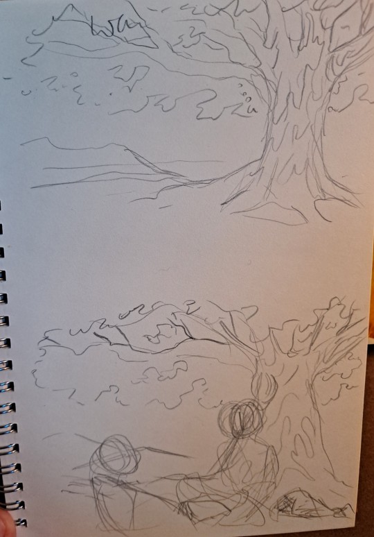
honestly i think about the art that i want to do a lot, and in this last year or so ive thought about the art i want to do more than ive been able to actually create and finish that art that i want to do. for my planning i tend to do a lot of different thumbnail sketches for the art im thinking of
these are some examples of thumbnails, a lot of times ill do thumbnails just on pencil and paper and with some of these theyre done quickly with my fingers on my phone note function on a day where i was feeling too bad to get up and draw on paper but still wanted to get the thumbnail ideas down. two of these are for the same songxiao piece that i still havent finished and i have more thumbnails digitally on clip studio for the same piece, i do a lot more thumbnails when a piece isnt working the way i want it to and theres times where ill completely scratch a thumbnail or a sketch and start over in order to do more thumbnails because i dont feel happy with some aspect of it.
two of these are small gouche painting thumbnails for two pieces i did maybe a month or so ago, i did the thumbnails and then tried to expand on them digitally and im wanting to do more thumbnail paintings like this in the future because it was fun
for the piece of my oc trio it was based off a series of ask prompts i got for a few different outfit prompt memes i had reblogged, so i based their outfits on the ones in the meme. when im drawing figures i tend to try and get the movement down in the poses when im sketching, i do several rough sketches of the pose before beginning to start setting down lines (if im doing lineart at all because sometimes i dont like doing lineart and do a more lineless painting kind of style). i really try to get my art to convey some kind of emotion, in the oc piece i wanted it to feel fun and like youre seeing three best friends while theyre out on the town having a fun night
2. creating
this is the only real example i have of a piece in the middle of being filled in and created, this piece is one that im really not very happy with & have had lying around for a while and ill probably scrap it and try to come at it from a different perspective at some point. but anyway it still shows what i do, i lay down a kind of neutral gray color underneath my final sketch/lineart if im doing lineart in that piece and then i start picking out the colors that i want for the piece and kind of setting out a pallette for myself. i dont do this color pallette thing 100% of the time but i do it really often, especially if im working on a commission or a larger piece where i know theres going to be a lot of colors or if its a piece where im not sure exactly what color scheme i want so laying out the colors together helps me kind of decide what kind of scheme i want. i am sooooo picky about my colors in my art i am genuinely obsessed with colors in art and there are times where i really have to stop myself from working on something forever just constantly adding more colors or putting little tiny changes and gradients in the colors.
after ive got the colors i want down i tend to try and block out parts of the piece with the base color for that section, and then i start to paint with the colors that i want to go on top of that base color from there.
once im satisfied with the colors/shading/rendering and everything ill go back and look over things and will fix things that look off or sometimes completely redo segments if they dont look right to me. when i was younger and mainly doing digital art using my phone and my fingers i would use a lot of filters and overlays on top of my art once i was done, and honestly im glad to not be doing that anymore because i dont think it made my art look any better. i do color adjustments and sometimes will put on a color overlay or a layer to emphasize the shadows and the light in the piece, but i try to keep those layers to a minimum and like i said before i have a tendency to obsess over the colors and ill spend a good amount of time in the color adjustment tool of clip studio and then ill just decide "actually it looks fine as it is" so yeah!
3. posting
i feel like i dont have a lot to say here gbfm i mean i honestly have a lot of thoughts about the relationship between artists and social media and how social media changes our views on art including our own art and how we can feel like we constantly need to be posting new art and just become content machines churning out new stuff. but ill save that rant for another time. i used to be really concerned about how many notes my art would get when i was younger, and i dont at all blame anyone who still is very concerned about that bc it sucks when u work hard on something youve created and then you dont get a lot of recognition for it, but honestly within the last two years or so i feel like ive begun to have a lot healthier relationship with posting my art. i really just post my art on my art blog, reblog it to my main blog, and then thats that yknow! i do really appreciate any and all support people give me, it means the world to me, but for me having the mentality where i dont need to post all the art i make and i dont need to be posting every day or every week or every month even has been a lot healthier for me because then im not constantly asking myself why didnt this get notes is my art awful??? and yeah i just kind of post it and my brain goes okay were done with that art we gotta make more
ive honestly been struggling a lot with art thru the pandemic and if youre reading this and have been struggling with creating in any way recently or even before the pandemic, please know theres no shame in having trouble creating and it doesnt make you bad at whatever it is u create!
thank you for reading this, feel free to consider urself tagged by me again if u want to do this!! love u all
6 notes
·
View notes
Text
time for episode 5 because i’m bored as heck
• just thoughts during the theme song but i wish we got to see more of aleena • the extras in this opening scene look passable for mobians which is a surprise • sleet explains something to dingo while looking directly into the camera
• WHAT IS THIS CATERPILLAR DOG THING UGH • it’s a legal requirement for thief children to have wack hair • kjsdgsd max snapped • i think i remember some people shipping manic with this kid • what animal are any of these characters supposed to be • that bungee jump thing makes no sense at all which is terrible • who gave sonic a drivers liscence • sonic your whole thing is to help people and then some poor kid comes in your van like “help me” and you’re like “why should i” what is the truth • shit dude that van turns on a dime • nobody in this show knows how to drive do they • this little goblin dude juggling is kinda cute, his design ain’t bad. weird colors but that’s a given • what sleet turns dingo into reminds me of the koopalings right down to the voice • is manic older than max or does he just say “little bro” because max looks even shorter than manic does • manic: stealing’s wrong max:
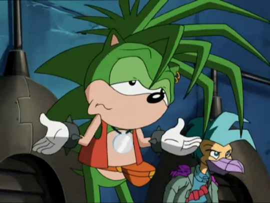
• max brings up a good point about like... how are they gonna survive without money from the shit they stole • i think i redesigned max at one point? i think i made him a xoloitzcuintli (those weird mexican hairless dogs)
• OH I DID, this was back when i mainly did lineless art (it was easier doing art like this rather than lined art with a mouse, i haven’t tried this style with my drawing tablet yet), i really like what i did here skjdgs small boy • there’s two background characters with names, there’s a girl named allegra with a huge nose and some pig looking gremlin critter named clifton, i think that’s interesting • is it like a cultural thing for all the thieves to have earrings or did the character designers just go “yeah only punks have piercings” • sonia’s being really mean about their music for no reason when it doesn’t sound awful, just let these kids play their accordions and violins in peace dude • manic is a gross boy and spits all over this girl to show off one of his little tricks, disgusting • the headcanons about dingo involved something about this episode i think, i’d have to go digging through dms to remember tho • there’s this bird character between allegra and clifton who looks depressed as shit • sleet looks ugly enough to be a passable spore creature and i might just try that if i have to look at his nasty face any longer • i understand what manic means when he’s like “haha this whole thing reminds me of when i was little and stole shit all the time” because i was a little kleptomaniac when i was a kid and like... getting away with it is fun as shit. of course i feel bad now but like... hey i get it • for once the siblings yelling out of surprise has some energy to it, though i wish it was less like “oh aah” and more like... y’know, actual startled sounds, it’s not super convincing • sleet is standing there with his gaping maw wide open pointing in one direction with no animation like a statue and it’s weird • swatbots are on the same level of aiming as storm troopers • what even are these lasers? are they lethal?? do they hurt??? i don’t think anyone’s gotten hit from what i remember so like what’s the danger • sonic just fucking... vaccums up all these children with wind from running, he’s gonna hurt someone, he’s so damn reckless • WHERE’D THEY GO • the little animation where manic takes out his drums doesn’t look half bad! it’s a pleasant surprise when bits of animation are higher quality than normal
• after saying that i realized his gloves disappeared in the shot i was just praising sndkgjds • how was the production of this show? did they color digitally or was this still in the time of hand-drawn animation cells? i wonder how rushed production was • is “amigas” proper spanish? [googling] yes it is nevermind spanish class as a required class was pointless apparently because i don’t remember jack shit from it • dingo you aren’t allowed to steal the “main man” title from manic (my nickname in our discord server was “my main man, manic” for the longest time sjkdgbs)
• it’s kinda neat seeing where all these pics my boyfriend gave me when i was looking for refs came from • i’ve thought that a song was gonna play tiwce now so now i’m wondering when it’ll come in and if it’ll be plot relevant • bummer majores • i get the point of “aw man i can’t believe you have to give all this money to robotnik because he’s evil and demands taxes” but hey either tax the rich or eat them dude • this old man’s outfit is horrendous • sonic and sonia just hid behind behind a thing hanging on the wall and that just wouldn’t work • manic and max both like drums... ;v; • why are manic and dingo just throwing glass bottles and shit back and forth at each other, is this a game • DINGO YOU HURT THE BOY • god what are these masks • SONG TIME • again, manic’s just talking in the middle of the song, and i get it’s for plot but the visuals are, again, sickeningly distracting, i can’t tell what’s happening • how does nobody notice the drummers changing place in the middle of the performance? how is there not a gap in the drum/cymbal beats? • these poor children, wow dingo • it’s really sweet that this old man helped the thief kids find parents and homes to go back to, that’s very nice • manic has one (1) coin and everyone takes that as evidence that he robbed the old man of all his money when that also doesn’t make sense, yes he took it from the vault thing but he didn’t take the whole thing? • why does manic just let the robot handcuff him, i know he feels guilty but like he isn’t an idiot, he knows what’ll happen if he does that so why does he??? • why do sonic and sonia immediately believe what sleet says about manic, shouldn’t they be on guard whenever this fuck’s around and have some suspension of belief here • this man went from 0 to 100 real quick huh • SONG TIME??? • i forgot that the song already happened because of my confusion during the sequence and now i feel like an idiot • anyway the song was like a 5.5/10, it has the energy i think they were going for and it doesn’t sound awful, it’s a little better than alright, though i wish the scene was more coherent and easy to follow • sonia’s classist as hell damn • sonic’s faith in manic being honest is nice to see • the thief children didn’t get their homes after this?? i’m upset • two bros laughing manically in the sewer in front of a very small crowd of children, as you do • manic talking to himself in jail kinda reminds me of movie!sonic but like... slower and less interesting, also why do they just throw him in jail? doesn’t robotnik roboticize everyone? • that one kid dares to look in max’s direction and he’s like ShShHhH like your hushing is gonna get you caught dude not that kid • MAX IS THROWING METAL THINGS IN THE BACKGROUND WHY??? YOU WERE SHUSHING THAT KID FOR SAYING NOTHING • max should be like... directly in sleet’s line of sight rn • of course they gotta very clearly explain the plot directly to the audience • everyone’s so shitty to these poor kids, damn • you’d think that huge laser blast would have injured manic in the process of blowing a hole in the wall • why’s sonia so concerned about the police chasing them? aren’t the police chasing them all the time? • manic nyooms again when he gets out of the van • these robots aren’t observant at all are they • for once, reusing animation makes sense • yay the poor kids get homes now • as nice as this ending is, it isn’t easy to kick bad habits like thievery, especially when it’s like... part of your nature at that point? it’s odd
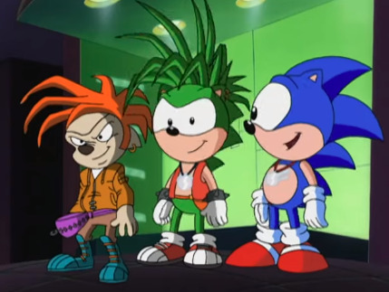
• god the perspective • also, this is exactly why i give everyone on this blog extended muzzles and more clear divides between their eyes when they’re looking to the side, otherwise they look cursed • IT’S TIME TO JUICE AND JAM
16 notes
·
View notes
Photo
The Dream Crosser
Surprise! NaPoWriMo didn't kill me (and I'm not abandoning dA because of the incoming Eclipse update either, more on that situation here), I just needed a week off to recuperate...and obsessively play Animal Crossing: New Horizons... Admittedly, I actually drew this well over a month ago (and wrote up the majority of the description!), not just before NaPoWriMo but before I actually had New Horizons in my grasp. The plan was to post it the day I got the game. Which was supposed to be much closer to the game's launch (March 20th). That ended up not happening and the day I got the game was the first day of NaPoWriMo, but 1. I messed up with the non-uniform prompts and spent all of the day trying to catch up so I couldn't even play the game yet, and 2. As a side effect, I ended up having two posts that day and a lot of work to do to catch up the second, and I hardly had time to think about posting this. And even if I had posted it, it would've been drowned in the incoming NaPoWriMo posts. And so, here we are. Really, really, I do have to mention that I truly feel for anyone else still waiting on the game for whatever reason. You have my deepest sympathy and I'm so sorry I can't just give you the game right now and make it better. I know the wait was hard enough for me, being this is the one game I highly anticipated in over a year and I essentially had the rug yanked out from under me. But I'll save that story for after I talk about the art itself since I'm sure that's what most people are here for and not my pre-order frustrations. So in case you don't know or couldn't tell, this is the lovely Luna from AC: New Leaf's Dream Suite. From what we've seen of New Horizons since it's release, the Dream Suite's functions and purpose have been mostly absolved into the Airport and Dodo Codes, and so I'm very doubtful Luna will actually be in the game in any capacity, which makes me sad. A typical player (including me) wouldn't even necessarily interact with Luna that much in New Leaf unless you really enjoy visiting other towns using Dream Codes, so I'm not sure what it is, but for some reason I just really like her. That's why I picked her to draw to celebrate. I very nearly drew her a long time ago when I was on an Animal Crossing kick in 2018, but at the time I didn't like the idea of pressuring myself into drawing all and/or multiple AC characters just because I wanted to be "fair" to them all (much the same reason I don't draw Pokemon very often), so I ended up drawing One Little Spark, a crossover of the Disney character Figment drawn in the New Leaf style, instead. So in a way, she's had this coming for quite a while. At the time I started working on her, (way back in early March, because I was hoping beyond hope my pre-order would arrive to me actually on launch day, but ha ha ha look who's got egg on her face for that ) I was running a bit dry on artistic motivation, and so while I tried to draw her in my usual manner: Making a sketch, transferring the sketch onto different paper with finalized lines, then picking whichever coloring method I was most into at the time), I was struggling with the sketch. I've had days where I have to work on a sketch for a really long time before I can get something I'm happy with, but this day I was just so not into the whole sketching process. I wanted to create, but I wanted it to be quick and easy and simple. I didn't want to have to poke at it for hours and hours and then still maybe not be happy when I was done. So when I got discouraged enough, I broke away from trying to draw Luna and just drew mandalas instead. (As had become my art-block crutch for a little while.) Somewhere in me, as I worked on other things, I kept going back and forth on what to do about Luna, though. I did still want to draw her, but my usual formula just wasn't working for me. Not for her. I even tried briefly to draw her linelessly, digitally, as what was supposed to be a quick and simple experiment, but that went downhill even faster than sketching did. Although, for some reason, the lineless idea wouldn't leave me alone after that. Finally, I decided to try something completely different. I was going to try and free-handedly draw her, without lines, traditionally. With, primarily, alcohol markers. Honestly, the thought minorly horrifies me now just as much as it did before I started. And yet, here we are and I actually like how it turned out. Allow me to explain how this came together: So, since I wasn't sure how this was going to turn out once I decided to try it, I opted to use my not-so-great mixed media paper so I wouldn't feel guilty about wasting better paper if I ended up hating it. Naturally, this did lead to some notable limitations, but not enough to discourage me from trying. I dove right in with the dark brown for her head and body, focusing on getting the general shapes down. I'd noticed some glaring mistakes in my mostly unproductive sketching when it came to Luna's body proportions, so I tried to keep those things in mind and adjust accordingly as I went. It was scary because there is no erasing this way short of using white paint and because this paper feathers pretty noticeably with markers. Then once I got to a certain point, I had to switch and bring in some pink and off-white markers to draw in parts of her dress so I knew where to put her other arm and her legs. And here is where I technically cheated; I did use my "clear" Stardust Gelly Roll pen to do most of the outlines for her dress. I needed some kind of guideline, but pencil tends to get yucky when you put markers on top and at the time I couldn't really think of a better option. (The joke was kind of on me because somehow I still got a nasty gray line that looked like pencil under her bust that I had to gently edit out later in Photoshop, but I digress.) As I went with the markers, I was also doing some light shading. Not too much, because this paper is really fussy with layers and blending, but enough that I felt like it didn't look completely flat and I could tell where one shape ended and another started. Though, for her nose (trunk? I believe Luna is supposed to be a Tapir) and her raised arm, I had to get a little creative and I used a white brush pen meant for glass/ceramics to put in the lines so you could actually see them. And later I would use the same pen in 3-4 layers to add the white back in for her eyes. With the base for her body, dress, and the bun part of her hair done though, then I had the task of figuring out what to do for her shoes and the details of her face. (Without having to mix and use specific paint for those tiny details.) In the end, I opted to mostly use my classic red Gelly Roll pen for her shoes, and a little bit of a dark red alcohol marker for shading. And then I got to experiment with mixing the classic red and one of the Moonlight Gelly Rolls for her lips so that the color would be visible and not just a dark lip-shaped "what is this." This was because the classic Gelly Rolls don't show up super well on dark surfaces and the Moonlight ones do, but I didn't have the right color straight out of a Moonlight pen. It did take 2-3 careful layers, but I think I managed well enough in the end. I used just one black pen, a Prismacolor brush-tip fine liner, for her eyes, though in-person the white base underneath makes her pupils look about a shade or two lighter from certain angles, which was a very unintentional nice touch. My answer to everything else ended up being gouache, although I did try to come up with pen colors for her eye shadow and the blue dots on her cheeks before admitting defeat that I just didn't have the colors I needed. Originally, I had actually been thinking of trying a lineless art piece with gouache, as I think it would work particularly well for that look, but I wasn't ready to fully commit to the idea, mostly because I seem to be even worse at mixing a non-excessive amount of a specific color with gouache than I am with acrylics, and that sounds like a fantastic way to waste a bunch of palette space because I mixed too much but it's gouache so it can be re-wet and re-use it and I don't want to just throw it away... (Although I suppose this could be half-way solved by getting a bigger palette specifically for mixing gouache, but I also don't want to have to buy yet another palette when I have some perfectly good ones...If I could just use up all the paint in them already...) Anyway. Point: This is kind of a step between a full lineless gouache piece and not doing one at all. Baby steps, yes? I knew from fairly early on that I was probably going to have to use gouache for the front part of her hair/bangs, since I did not thoroughly plan ahead enough and didn't leave a gap there to do it with markers. Fortunately, I didn't have to do much mixing since my gouache already has a nice yellow ochre color included, and I could use a bit of the other two browns and one I had some leftover mixed already from Roses in Your Eyes for shading. (White for the flowers, too, thank goodness.) And I actually ended up going over most of her bun with gouache too since, by comparison, the marker didn't look like it had much shading and it was bothering me. I did have to mix my own blue and pinky-purple for her makeup, and I ended up with a lot of leftover pinky-purple. But it's kind of okay because by itself it's such a pretty color I'm sure I'll find an excuse to use that one. After that, I just had to do some minor tweaks where the gouache had gotten a bit away from me and then I went ham on the shading for the dress based on my reference photo. Then I realized I wanted some kind of background because this seemed awfully boring without one. And, naturally, I hadn't really planned ahead for that, me being me and being in habit of doing the background last... At first, I wanted to do something hot pink, since her official Amiibo card has a hot pink background, but then I thought that might be a little too loud and I wasn't really sure the best way to apply one without potentially messing her up. And also, this isn't watercolor or paper thicker than 140 lb, which immediately threw watercolor out the window unless I wanted a very uneven paper when I was finished. I'd already pushed my luck with the gouache and been very careful about not using much water with it; I decided it was best not to push my luck any farther. Also, I couldn't use my pink PanPastel, despite that being maybe my best option, because it is still perpetually screwed onto the little Pan Pastel stack with no hope of getting unstuck anytime soon. (One of these days I swear, I will order either another set like the one I have or an individual Pink one to solve this problem, but until then, I am going to bring it up every single time as a caution to others to please be very careful when screwing and unscrewing your own Pan Pastels if you store them screwed together.) And I didn't feel like dragging out some of my drawing pastels and/or makeup that's too expired to use on my face and very slowly building up color and hoping it'll do what the Pan Pastels do. With no better ideas coming to me, I decided I'd leave the drawing for the night and come back to it the next day. After yet more brainstorming the next day, I finally settled on doing a glittery rounded rectangle and filling it with washi tape stripes. This plan did change a little as I figured out which tapes I wanted to use (a purple-y, champagne gold, and light pink ones, the latter two of which look more different in-person than they do on the scan) and as I actually started applying the lines. Partially because this tape is a bit thin and partially because I'm not used to cutting tape around very specific shapes, it took a very long time to both place strips of the tape and then get them cut to fit right up to Luna without looking strange. Once I got to a certain point going in one direction, I realized my next couple of cuts were just going to be too hard for me to stand. I had a choice: Ditch the tape, or figure something else out. Taking a risk, I decided to try and salvage it by doing an almost-plaid/checkerboard with the tape, specifically leaving out certain areas where I knew it would be too tricky to cut the tape. This also turned out to be a good way to use up some of the pieces of tape I'd already cut off that were too small to be used the other way. It's still not the greatest background solution I've ever come up with, but it does the job of making it look less empty, and that's really all I wanted anyway. And you know, compared to official images her proportions look wonky, but by herself (meaning, without comparing the two) I think Luna looks pretty good, actually. (Though, I admit I did have to tweak her right ear in Photoshop because it came out entirely too long and there wasn't really a good way for me to fix it by hand.) To think, this piece started out as such a mess. Or rather, I was such a mess when I started. And yet, here we are, and it looks kinda okay. Okay enough that I finished it and am posting it, at least. I have no idea if I'll be returning to this style/method for art-making in the future, but even if I don't it was a nice experiment to try, and that's what art is really all about isn't it? Experimenting, trying new things? Speaking of experimenting though, about those pre-order frustrations I mentioned now that I've covered everything about the art itself...(in small text for those that don't care to easily skip over) Back in February I tried twice to pre-order New Horizons from Target, since they were running an ad where if you pre-ordered the game you'd also get an AC themed journal with it, and that combined with my family member's employee discount made it the cheapest/best value way for us to buy the game. As I said, I tried to order it twice. Both times, it was sold out. My family member had even tried to go to the store and have them order it before then, to no avail. After the second time, which was the day after Target sent out the sale paper with the new ad in it, while I was still frustratedly wondering how on earth do you sell out of a pre-order?? I kept refreshing the page every so often just to see if by some fluke it would miraculously not be sold out. I got very lucky around 3 in the afternoon and we managed to get the order in before it sold out again. Now, we're a relatively cheap family, so we didn't pay for the "express shipping" or whatever. Although, this was a $60 game and we were ordering it three whole weeks (on March 2nd) before release. If you ask me, the least they could do is have it shipped out either on launch day (March 20th) or the day after. Especially if I can pre-order a book on Amazon with three days' notice and they can still get it to me on release day. But, okay, I could live with waiting an extra day or up to maybe three if I had to. (And, to be fair, this was all before a certain virus exploded into chaos here in the US.) Much to my dismay, a week before NH release day, I checked the order status with Target only to be told I wouldn't get it until the 26th. A week later. That was pretty disappointing at the time, but it didn't really bother me until the day before and the day of launch when some people were getting their pre-orders early from places like Amazon and Best Buy (and some of them didn't even pay for the express shipping option from their selected source). If those two companies could plan around virus constraints to do that, why in the heck couldn't Target? But, okay, fine. Maybe the virus had something to do with it and they were really doing the best they could. Whatever. A week. Fine. I'll wait a week. A few days later though, we got an email saying: Surprise! Don't expect your dumb video game until April 3rd because we couldn't get our act together! (Okay, that's not what it really said, but that's what it felt like.) And I know, I promise I so know there are much more serious issues going on in the world right now and a video game about talking animals isn't exactly a priority shipment. I know. But it was still massively upsetting after I'd already waited so long. And, honestly, I feel like they had plenty of time and notice to take care of the game before everything else exploded and messed it all up. Again, especially if other companies already had time to even ship orders early and/or get the games to people on launch day. Or the day after. TWO WEEKS after launch, and you don't tell me about the secondary delay until the week I started expecting the game to already be in the mail on it's way to me? The only tiny silver lining is that as I was checking the order to make sure it didn't miraculously get pushed back to sometime in 2021 (because I really had no faith in Target's time estimates at this point) is that it did get bumped back up to April 1st. Although, I did think that it would be the absolute least funny April Fools' Day Joke ever if the day came and it was late because screw me. But it did arrive to me on April 1st as promised; I just had a million other things to do before I could play it. ) And I will say, I know I could've just canceled the pre-order and bought the game digitally, but it was enough of a hassle to order it in the first place, and if I did that I'd also lose my pre-order bonus. And all that aside, I specifically wanted a physical copy to begin with. I always prefer that when it's possible. So people on the internet that want to eat me alive for not canceling when the shipping got screwed up, there are my reasons. Take 'em or leave 'em. (Seriously, I've seen some people be really rude about this just because they didn't like hearing people upset that they didn't have the game yet...when they already had it themselves or didn't care about AC in the first place...) Moral of the story: Don't pre-order from Target. Or, at least, don't expect the item to actually get to you right around release day. Account for at least two additional weeks of not having the thing. ...Seriously though, how do you sell out of a pre-order?? At least, when it's a highly anticipated game and you're a big company and not some small indie company with limited resources! Sheesh! Anyway. I have the game now, I've been playing it as much as possible and enjoying it. I still have a ways to go before my island is "complete" per se, but it's coming along nicely and I feel more comfortable now taking some more time away from it to get back into the swing of making art and things like that. So hopefully I'll be getting back into a regular posting schedule and you'll have that to look forward to.
____ Artwork © me, MysticSparkleWings ____ Where to find me & my artwork: My Website | Commission Info + Prices | Ko-Fi | dA Print Shop | RedBubble | Twitter | Tumblr | Instagram
2 notes
·
View notes
Text
I couldn’t get yo sleep even tho I’m deadly tired, so I figured I may as well do some more reviews/rambling for Monster Rancher! God I love this show. I love the games too but the show is just so close to my heart. (Incidentally the name of the third opening theme in Japan! The one that’s a montage of everyone crying! THIS SHOW IS SO FEELS)
Today we watch episode 2: aka ‘Oh Shit I Just Realized Where My Love Of All Grandpas Comes From’
I figured it would probably make more sense if I sum up the episodes in my reviews now, that way people who haven’t watched it can still read along. So yeah! In the previous episode our hero Genki got sucked into the world inside of a videogame, and was surprisingly okay with that. He met big ol destiny carrying girl Holly and her monster Suezo, who is basically our meowth of the series. And he also got his own monster Mocchi, and now this next episode is more of an introduction for this new team member. Genki has trouble initially befriending his monster, because he expects Mocchi to just be a perfect videogame creature and doesn’t understand how to be a good big brother to a lil kid. Its just a very cute episode! There’s also a lot of good world building during such a downtime episode. It reiterates and better establishes the villain, Mu, and the legend about how only the phoenix can save the world, thus Holly is searching for it. And we get to see how the people of this world are so beaten down and scared of Mu that they’re prejudiced against our heroes for wanting to stand up to him. They get kicked out of town right when they really needed food and shelter, leading to meeting the nice old couple who lead to the whole plot about genki and Mocchi becoming closer. And it also starts up the first season’s recurring plot of Genki realising this isn’t just a fun game, its real and terrifying to the people here. (Cos he caused them to get kicked out by talking about how he could easily win against Mu, even tho he only just got his first monster!) Anyway, they get saved by a nice grandpa and grandma after that, and have HEARTWARMING ANTICS and Genki learns a lesson, etc LETS DO SOME REVIEW BLABBERING!!
Okay.. Like… Matthew and Lily are really undeveloped but I still absolutely tear up at the very thought of them, geez! The first allies our heroes met on their journey! And Genki keeps the pair of workman boots they gave him, all the way to the end. WE’LL NEVER FORGET YOU!!! and just AAAAA the mere fact they did that for him! The tone in lily’s voice when she says ‘that poor little boy has no shoes’. I mean, they can’t really explain to her that he left them behind when he fell through a dimensional vortex, lol! They didn’t ask any questions, they just gave this gaggle of kids a bed to sleep in and the first good meal they’d had in ages and then some lovely handmade clothes. Just imagine this elderly couple running around in the rain offscreen, trying to find our heroes before they left! Complete stranger: you cannot be without shoes in this weather! And they clearly heard everyone saying that these kids were dangerous troublemakers opposing Lord Mu’s rule, but they still selflessly helped them and supported them on their journey and made sure they’d be prepared. They may not have many lines of dialogue, but their actions say so much about their personality! I FUCKIN CRIED LIKE A BABY AT THE ENDING Cos Matthew and lily were so lonely and so happy to have kids staying over! And they really loved hugging Mocchi and treating him like their own child for a few happy hours. It was so wonderful that in the end the heroes hatched a Spot Dino mystery disc and gave it to the couple as thanks for all their help. Oh god Matthew’s crying as he cradled this bunny-sized dinosaur! Mocchi’s lil sweet face as he and the dinosaur held hands, as he introduced it to its new family! MY FUCKING SOOOOOUL (Oh and random thing I probably should have also established! Monsters in this setting are hatched out of mystery discs- magical stone idol things leftover from an ancient civilization. The heroes need to find the one that holds the legendary phoenix, so they find a lot of other ones along the way.)
And let’s take a random moment to appreciate the animation! I remember reading another review that once pointed out how the characters become this lineless cel shaded style whenever it rains, to invoke a sort of blurred camera lens under the raindrops. And I mean… Its not necessarily expensive animation? Its still got all the usual shortcuts of the time, there’s a lot of static frames, stock footage, using a 'hit flash’ instead of drawing fists connecting, etc. But it feels like these were good animators that were forced to work within those limitations, not people who chose it to be lazy. At every possible opportunity they try to put extra effort into everything and make it feel like it isn’t on the low budget it actually has. Its really noticeable compared to other shows of the day! And honestly compared to the general awfulness of the first season of pokemon and digimon, this DOES look like high budget animation! Hell, its got better attention to detail than some high budget stuff…
Anyway! On to talk about genki and mocchi’s super family plot! I really like how this show consistently subverts and explores genre tropes of the 'mons anime’. Right from the start, even! It subverts with how genki is absolutely happy to be trapped in another world. And how this is used as a unique character development plotline where he’s TOO optimistic about things and doesn’t realise the villain threat is real and the heroes won’t automatically win just because they’re heroes. And then it also subverts things by having genki fight alongside his monsters, who’re all fully sentient individuals with an equal plot role. And he actually fights to defend Mocchi for these first few episodes, and he has to deal with a baby monster being a defenseless and impressionable lil brother when he wanted a badass doom machine. Mocchi does indeed learn to fight as the series progresses, but that doesn’t mean genki doesn’t have to learn some empathy too! And they’re such cool bash brothers that kick huge amounts of ass together while being adorable AF! This episode is good cos treating a new little sibling well is a lesson a lot of kids can relate to. And its nicely delivered, you can see genki’s opinion change 180 throughout the whole episode with a lot of it being purely delivered through animation. Like, it doesn’t patronise the audience even though its a very typically 'kiddy’ plot. Genki starts off being frustrated how his new toy won’t do what he wants immediately, and seeing it almost as an insult that people are saying something that belongs to him isn’t perfect. He does love Mocchi, but at first he seems to articulate these feelings into a weird sort of unhealthy 'pride’ for a version of him that doesn’t exist. I feel like he thinks he’s being a good friend for believing that Mocchi can do anything he can do, but instead he’s being pushy by forcing the kid to HAVE to do anything he can do! So he gets irrationally grumpy at his cool monster friend getting hungry and tired and scared and wanting hugs and pretty flowers and stuff. But he ends up learning to take better care of him, and learning to care about him as more than just a cool thing to boast about. And also we get to see that mocchi’s all-loving feminine personality doesn’t make him any less badass when they need to fight evil! But I really liked how we see Genki realizing he’s wrong just from like.. Some nice completely silent moments where you see his reaction. Same for the moment where he starts to worry that the journey is too dangerous to take such an innocent kid on, and feels incompetent as a brother/parental figure, deciding to leave Mocchi behind with the grandparents where he’ll be safe. There’s no moment of exposition explaining that this is why he’s making that decision, but you feel it anyway! Its a type of storytelling I really struggle with, I tend to over explain everything lol! But I also like that because genki is silent about his character development, it leads to misunderstandings with everyone else. Mocchi assumes genki just doesn’t want him cos he’s weak, cos that’s how genki was acting earlier. And everyone else thinks genki’s being petty again and getting jealous of Mocchi for finding that dino disc when genki couldn’t. But genki proves he’s genuine about his love by literally kicking a dinosaur in the face to protect his lil buddy! (The evil dinosaur, not the baby one XD) And I love that they animate a lil moment of him wiping his muddy rollerblades on the dino’s face mid-kick!
And then we just end on super heartwarming hugs and repaying the kind grandparents and bunni’s heart explodes OK I just really love this show! I love that it focuses so much on the slice of life stuff and personal emotion in a monster fighter setting, rather than just the fighting. Yet it somehow still manages to have way better animated fights! Also its like the only show that’s pulled off this cliche 'annoying younger sibling’ plot without making you hate the 'annoying younger sibling’, lol. I still didn’t like mocchi as much as the others as a kid, he kinda has one of those unrealistic 'me hungwy’ lil kid personalities, with a weird voice in the dub. But GOD HELP ME I will defend him with my life just like genki does!!! Least favourite in a cast of favourite characters is still infinately better than 90% of all characters in fiction!
0 notes
Text
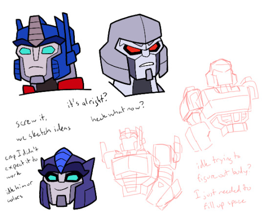
So I was attempting to practice the Cyberverse style Optimus and Megatron, though as you can see, I got a bit distracted at the bottom left, and sort of just had to put something else to fill up space
I actually started practicing yesterday at work, drawing on my cardboard sheets, so it meant I was a bit more practiced when I started here. Though annoyingly, since I elected to not go over my pencil sketches with pen, I could barely make out details in the drawings, and I could barely tell what I was doing on Megatron
It was also going to be more than just their heads, but not only was Optimus’ body taking up most of the canvas already, I wasn’t really sure how to draw it at the time. The stuff at the bottom right may have been for filling up space, but I also did need to try and at least practice their bodies
*sigh* the real struggle is making them 3D things. It’d be so much easier to figure out the shapes if I didn’t have to. But oh well, comes with the territory I suppose
But back to it, I think I did alright with the head sketches? They aren’t bad, but they feel slightly off, like I haven’t quite got them looking right
I probably need more practice, and to actually draw them full body. Also probably wouldn’t hurt to look at more Cyberverse fanart for more exposure to the style
I probably also need to start actually drawing characters more consistently, instead of drawing sketches of characters once and then never doing it again. It means I never fully get the hang of it and I keep not really making much of substance
But yeah, I feel like drawing them again at a later date, possibly even with lineless. I just don’t know what to draw them doing
But anyways, on to the bottom left
So I had finished the sketches, and my brain was like “well since we’re here, and we have helm designs right there, we could try making up fankid designs?” and eventually I gave in and decided to start sketching. I knew it’d end up on the final product anyways, but I had to give in to my impulses
Sorry, I’m sure people are sick of me bringing up this sort of stuff
Then with my first attempt, I ended up with something I actually quite liked. So I was like, might as well fully line and color
I still like the original sketch, so I’m gonna put it here, and also since I feel like the vibes are slightly different from the final
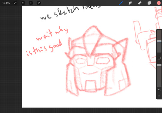
But then a problem arose after lining and going to colors. Namely that I had designed this on a whim and I had no deep thought as to what colors to use
After some tries I ended up with what you see here, but I’m not sure if I want to keep these colors. I’m not sure it fits the vibe the original sketch had
The blue middle piece I’m especially not sure on. I think it looks off, but I don’t know what to color it
Oh also, his purple isn’t exclusive to his helm, it’s his main color for the rest of his body too. At least that’s how it is in my head right now
Also as you may notice between the sketch and final, the eye shadow came later, mostly because I thought he didn’t have enough Megatron in his face. But also because of that, I hadn’t made the eyes and eyebrows with that in mind. So if I draw him again, those’ll get tweaked
I still in general don’t know if he looks enough like Megatron. I suppose I should be wondering more if he should look more like Optimus, since general shape wise he takes far more from Megs, but I’m also aware plenty of his colors stray more towards Optimus anyways
Oh yeah also, he has blue eyes here, but I really don’t know about that. I wanted to give him something other than blue or red, purple being my initial choice, but I was struggling with the colors in general and so right now he has blue. It works but I wonder if it looks too much like a fusion of their eyes
He needs more work, just like Overdrive I think. But he is here
No clue his name. I wasn’t even sure about his gender until drawing made me think “oh yeah that’s a guy”. I do have a name in my brain for a megop kid, that being Starcutter (which the two probably didn’t pick), but I don’t know if that works for him
I do think I’m going with that idea I posed yesterday (well not yesterday, but yesterday I said “what if I put it in Cyberverse?”) of him being the secret megop love child that no one but Megs knows about
I don’t know anything about him other than he’s probably on the Autobot half of Cybertron but was never really involved in the war much. To involve him in any plot, he probably comes over to Iacon after the war to try and make some name for himself
Also another idea is that he and Megatron met again during his multiverse adventures, in some universe where he was actually raised by Megatron, possibly where the Autobots and Decepticons never split because Optimus was able to properly reason with Megatron. They didn’t take him on their multiverse adventures, probably because Megatron knows he exists in his own universe and doesn’t know how to handle two versions, but also possibly because he died, I don’t know. But it was these encounters that led to Megatron attempting to search him out when he returned to his own universe. This also means Dead End and maybe Astrotrain knows about the kid’s existence, but they’re under the assumption they only exist in these wildly different universes, not their own. Which may lead to shenanigans
But yeah I haven’t solidified anything else really I don’t think. Should work on a name
And I think that’s about it for now? Yeah I should draw more Cyberverse I guess
#I don’t know what to put in the tags here#uhh#transformers#transformers cyberverse#optimus prime#megatron#my art#transformers oc#transformers sparklings#fankid#art practice
45 notes
·
View notes