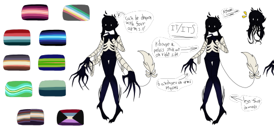
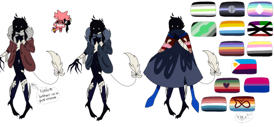
#anyway i like the eyes. there's lineart for them but only the pupils are colored. makes it look like a cryptid
Explore tagged Tumblr posts
Text

you would not believe your eyes
if ten million fucked up guys
pet all your cats as you fell asleep

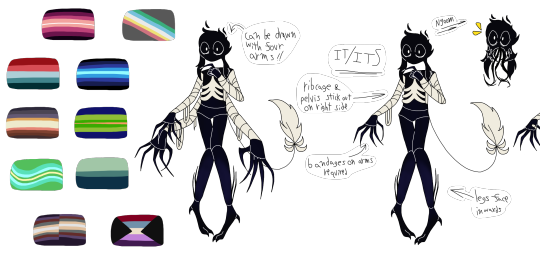
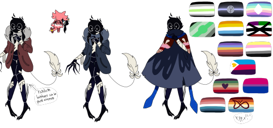
(versions with white line art to make details easier to see)
#completely forgot to mention in the actual post that is the sona reference#whoops#anyway hi. this design is based entirely around my alterhumanity#voidling. made up of the abyssal zone and the vast emptiness of space. a plane of nonexistence stretching perpetually nowhere#y'know?#anyway i like the eyes. there's lineart for them but only the pupils are colored. makes it look like a cryptid#(there is of course a version with the lineart colored white so you can see it)#anyway uh. questions? i'll answer em. no questions? cool thank you for coming to my ted talk
4 notes
·
View notes
Text
The other public domain characters I made while listening to the How To Train Your Dragon books since I can't pay attention to audio unless I'm doing something else, like drawing.
The image descriptions have finally been added two months later because I forgot this post existed as soon as I made it.
all of these character designs and art are public domain because I say so. They'll also be uploaded to the internet archive tomorrow and I'll add a link so you can download the HD versions there. Feel free to download these awhile if you want, though tumblr will kill some of the quality.
some of the colors might look weird because my phone really enjoys lying to me about what colors actually look like, especially purples and pinks for some reason??
anyways you'll also be able to download the lineart for these when I upload them all tomorrow so you can make your own :)
(they are all public domain, I only thought to add that to the image itself after already making some of them)
Cat people


[ID: Seven digital drawings using the same line art, showing an anthropomorphic lion with a short, spiky mane, with different fur colors and designs, against a grey background. The character is shown largest standing facing the front with arms and legs to the sides, then smaller showing the back, with a larger version of one eye in the top corner, and a close up of the front of a lower leg and paw on one side. The first design has black and blue fur, with a cyan mane, a cyan stripe down the spine, and on the tuft of fur at the end of the tail. The belly, most of the tail, and the lower limbs are medium blue, with the torso and face in black, with vertical black lines on the legs, and horizontal black stripes on the arms. The paw pads are cyan, as is the iris, which is surrounded by black sclera. The second design is light purple, with pale yellow stripes that radiate out from the belly. The hands, feet, and tuft on the tail are dark purple, with thin stripes on the ankles and wrists, with one colored in pale yellow. The eye has a gold iris. The rest of the designs have the same lineart, but now also say "public domain" in large white digital handwriting, with a smiley face. The third design is monochrome grey, with sections at each movable joint that looks like mechanical hosing to allow movement. There are joints on the fingers, wrist, elbow, shoulder, torso, waist, hips, knees, ankles, and all along the tail. The iris is gold. The fourth design is like a harlequin outfit, in pink, white, and orange, with an orange V shaped stripe for the belly, splitting half the body into a white torso, with pink paws and half the face pink, and the other half of the torso pink with white paws and that side of the face white. The mane and tail are white with thin orange stripes, and there are thick orange zig-zagging stripes at below the knee and above the elbow. The fifth design has a base color of white, with deep brown markings that form a hollow heart in the center of the chest, with curved lines radiating outward, connecting to a solid heart on the back. The hips have solid hearts on the sides, with more curved lines radiating away from them like a spider web. The face has the center brown, and more lines framing the eyes. The tail is mostly white, but with a large patch of brown towards the end, brown stripes, and a brown tuft of fur on the end. The eye is peachy orange. The sixth design is half black, with blue and light grey stripes, and half grey with black and green stripes, with the tail black with white stripes, and the tuft of fur on the end half blue and half green. One eye is blue with a black pupil, the other is green with a gold pupil. The seventh design is in shades of tan, warm brown, teal, orange, and rusty-red. The Face, hands, legs, tail, and belly are in brown, with a zig-zag diamond pattern for the belly, and blue spots on the face, outlining the eyes, and larger matching blue spots on the arms and legs. On the wrists and ankles are two thin red stripes, and on the shoulders and hips are a blue stripe followed by two orange stripes. The iris is red-pink. End ID.]
Dragons / giant winged fantasy cats.


[ID: Five simple digital drawings of dragons using the same lineart, posed at the end of jumping through the air with the front feet on the ground, the back legs behind it, and feathered wings slightly open. They each have rounded ears, a large nose, and a skinny tail. The first is red with black wings and black stripes down the spine, with tiny black spots, and red spots on the black wings. Above it is another version of the same dragon, sitting and looking to the side. The second is in different shades of blue,with a white belly, and some black stripes on its legs, and wavy squiggly stripes on the wings. Along its back are thin white stripes. The third design is pink, with purple speckles, and bright green and seafoam green feet, with a green face with a dark spot in the center. Above it as a reference is a simple fourlegged alien in the same colors, with a single large eye for a face. The fourth design is greyscale, with a light grey body with white wavy stripes, and darker wings in a gradient from black to dark grey with thin white feather-outlines separating eachcolor. The fifth design is a simpler version of the one before it, but with a red body and only a few of the white stripes. End ID.]
werewolves. including two based on our cats. no one else wanted to hold still enough to act as a reference before I finished the books lol. The last one I'd just started.


[ID: Six digital drawings of werewolves. The first design is a hasty scribble of a bipedal werewolf, standing in a pose like it has just stopped running and is looking back over its shoulder. It has mostly black fur, with a purple belly, chin, and on the inside of its ears. Its wrists, face, cheeks, and tailtip are white, with three white stripes on its torso like ribs. Its eyes are purple. The second image has the design from the first smaller and above a quadrupedal design for the same character, with the same colors and pattern, now on all fours, with a slightly more realistic animal shape, with fluffy fur. Each following design shows both forms, the simple bipedal, and the more detailed quadrupedal. The third design is labeled, "Eclipse", and is made to resemble a tuxedo cat, who is mostly black, except for a white belly, unevel white legs, with the white reaching higher on the hind legs, and white on the chin and under one eye, with yellow eyes. The fourth design is meant to match a grey tabby, with grey fur with darker grey spots, a tan belly, a light grey face, and a very dark stripe down the spine, forming stripes on the tail. It is labeled, "Kairiz". The fifth design has dark green fur, with black and grey stripes down the spine and on the legs, with a white belly, and bright yellow eyes. The last design is teal, with tan on the shoulders down to the knee, where it changes to darker tan, like wet sand. The eyes for this design are not colored in. End ID.]
#described images#Rjalker does art#public domain characters#public domain#public domain art#furry#werewolves#dragons#clowns#image description added
3 notes
·
View notes
Text
What are the Elliott from Earth characters’ eye colors? An investigation
Another wordy investigation into minor character details, it’s the spiritual sequel to my height estimates post…
The default eye color for most EFE character renders is the same: a dark reddish purple pseudo-black (or sometimes just actual black), used generally for the lineart of features on nearly every character design. But beyond that stylization, what eye colors do they have, and where can we find a hint of it?
The best/most direct approach here is just to find and base it on some official visual source where the characters ARE shown with actual, distinctive eye colors in some way or another. And since there’s nothing that does that in the show itself, probably concept or production art.
Indeed, the only available visual that wasn't just the same usual render images using either black or that dark red-purple color, and that gave them unique individual eye colors at all, turned out to be this production art gif, a run cycle animation test with the early designs:

The eye colors there are based on unique outline colors for each character—and although it’s still a situation of matching eye and outline colors, I think these can be considered legit and not just like the stylized black pupils in the regular character renders, since
1. in this animation the eye color is something unique and different for each character rather than the same for everyone, and both eye color and lineart color are features that are often chosen to reflect or match the rest of a design (like they do there) so those features could easily go hand-in-hand and overlap like that anyway
and 2. in this case there’s actual colors for the eyes being indicated at all rather than it just being black or a purplish substitute for black, so it’s the most direct thing we’ve got for an eye color reference
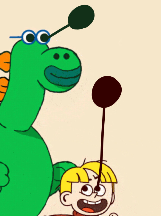
So there’s a deep green for Mo (technically his earlier version Martin there, but design-wise they're similar and have the same colors), and a warm brown for Elliott. BUT, there’s one more thing. That’s not the color palette Elliott has now, so it's questionable if this should even apply to him for his eye color still!
But we can still use this���if we just adjust what we've already got here to match his current design.
The warm brown and deep green lineart/eye colors in the designs above seem to have come from the overall color palettes of the characters, since like I mentioned both those features are ones based on the rest of the design here. There’s a green used for the mostly-green Martin, and warm reddish brown used for the warm reds and yellows that define Elliott’s palette there.
So if a warm-colors palette gets a warm brown outline color, a palette with its main colors split between warm (e.g. red-orange hair) and cool (e.g. blue clothes) gets a more intermediate hue. Orange and blue in particular can even mix to make a warm (brown) or a cool (green) color…
So an intermediate outline/palette color like that is probably best matched by or interpreted as an intermediate human eye color, like hazel, a mix of warm (brown) and cool (green and gray) colors! Like these:
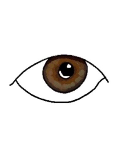
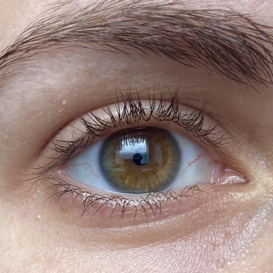
(Plus, a warm hazel like that is visually rather close to brown and kinda has the same overall feel to it, so even then this color is still akin to the original brown eye color we got from the gif earlier and it isn’t too drastic an “adjustment” from it)
So, with that development art as our closest official indicator of eye colors: Mo has deep green (fitting for a reptile?), Elliott has warm hazel, what about Frankie?
Although it took a few extra steps to bring things up-to-date and find our conclusion for Elliott, with him there was still some sort of source material to start from. But Frankie isn’t in that development art gif, and while maybe we could do that “based on palette colors” method again, that was really only done to follow the pattern of the designs from the gif for the characters there in it and slightly adjust it to the new palette; and besides, repeating that method for more characters might not keep working as fittingly anyway.
But that’s all really besides the point. There’s a simpler way for Frankie. Assuming she and Elliott are genetically related (which is material for a whole other post, but long story short I have my reasons and evidence to think that they are), we can just extrapolate from Elliott for her!
If Elliott has hazel eyes, it’s likely he got them from Frankie, especially considering Frankie’s warm/reddish but darker natural hair color—see below—that makes a hazel or even light brown eye color fitting for her. So it’s likely she’s also got a warm hazel, maybe even more of a light brown (the lines are kinda blurred with defining eye colors anyway).
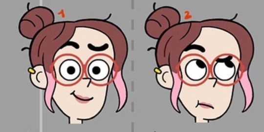
The end! A bit of a long read for what should have been a simple question, but if you made it down here I hope you enjoyed it, I love making pointless investigation posts like this they’re so fun
#I’m glad I found that gif for some sort of official source depicting eye colors for them in some way#seeing as it’s the most direct evidence we get#since this is a topic I’ve actually been curious about for a while#elliott from earth#elliot from earth#cartoon network#cartoons#animation#character design#eye color
6 notes
·
View notes
Note
Two questions, how do you do lineless art, and how do you draw faces/expressions? They are always so cute!!
ermm I am not good at tutorials but I did my best here! First lineless art. My methods kinda messy and theres probably better methods out there.
First I start with a sketch like normal, and line it like normal.
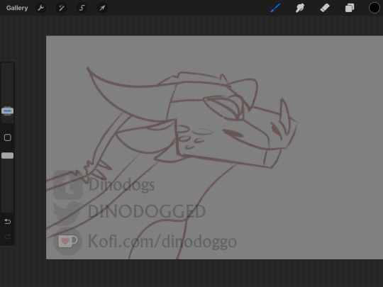

2. then I color it like I usually would. Nothing fancy.

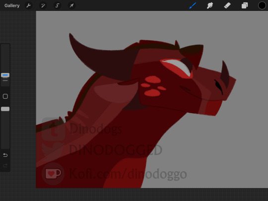
3. Then I use a clipping mask to create the lineless look. A few rules I have for myself are to do the very outside of the lines first, then go in and do the inner bits. ONLY do darker lines if necessary, I try and keep darker lines reserved for jaw lines. In the end, the lineart looks smthn like this!

For expressions and faces uhmm. Thats a lil tricky but I'll try my best to explain.
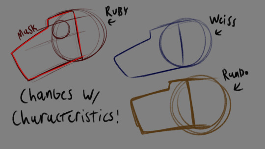
For faces I imagine them sorta like masks on a circle, and I change the shape of those masks for different characters. Sometimes I'll even make it a mask on a square. Ruby has a long, thicker snout, Weiss has a long thinner snout that sorta leans in, and the rando dragon has a shorter one then both of them.
For expressions, subtlety is key. I did my best to draw Ruby and Weiss with virtually the same expressions, but I made very slight changes to Ruby like having her look at the viewer and adding that little triangle to the corner of her mouth. So instead of just a neutral smile like Weiss's, she looks smug.

Heres another example with Weiss, where I made her neutral face look like an annoyed one just by scrunching her snout a little and slightly turning her lip down more.

But I do like to exaggerate more sometimes! Such as to make really happy faces, or really angry ones. I'm still kinda practicing when it comes to super exaggerated expressions, but I've been following the squash stretch rule and acting kinda like a characters face is putty. I can squish, stretch, elongate, and smoosh their faces as much as I want! I'm not aiming to be realistic.
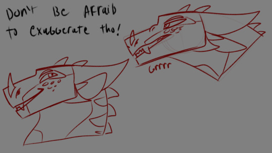
Also, eyes add a lot to the expression! I also like to get super silly with eyes, and change the size of the pupils depending on expression. I also treat them like putty.

Thats kinda all I have?? I'm not sure if this helps in anyway but here it is lol.
2 notes
·
View notes
Photo
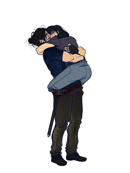
“Heewon-ah, what’s the matter—” she barely has the time to say before falling silent. Jung Heewon looks like a mess. Her eyes are bloodshot, her hair windswept, and she is trembling. She is wearing no jacket despite the rain outside.
Instead, she is wearing clothes fit for combat. On her hip hangs a familiar sword. Han Sooyoung would recognize it anywhere. Her pupils tremble as she raises her eyes to meet Jung Heewon’s gaze. It’s pale blue, the color of the sky in summer.
“Sooyoung,” Jung Heewon whispers, and Han Sooyoung can’t help but stare. Are those tears welling in her eyes. “My Sooyoung.”
“I,” she tries to say, because she knows that voice, she knows that tone, and the next thing she knows is Jung Heewon lifting her up in her arms, wrapping her in an embrace so tight it makes her ribs wail. If she was a regular mortal without her constellation status she probably would have broken a bone or few.
“I found you,” Jung Heewon, her Jung Heewon sobs, “I finally found you.”
(excerpt from saying goodbye is death with a thousand cuts by Karelyon)
(I’m fine I’m fine I’m totally fine I’m absolutely completely sane about them okay)
anyways this is all to say HAPPY HUGTOBER 2022!! you’ll be seeing a little bit more of me this month before I disappear into the ether again for unspecified bursts of time
and that is all to say that if thinking about how 1863!hsy left that regression without saying goodbye to her crew, only to march toward her certain demise for the sake of one person not dissimilar to someone else we know makes you go insane and also like a femslash twist to things can I heartily recommend the above fic
(just the lineart below the cut, because I like it a lot and also the rest will probably be colorless)
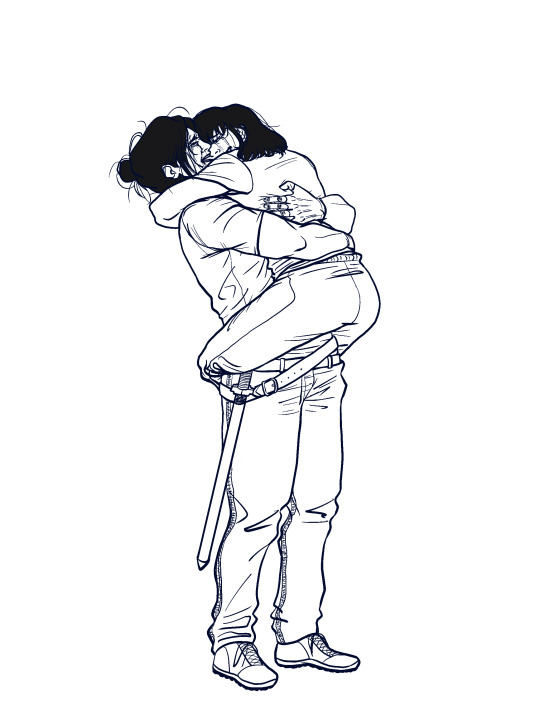
[ID: a lineart-only piece of fanart depicting Han Sooyoung and Jung Heewon from the webnovel Omniscient Reader by Sing-Shong. Jung Heewon lifts Han Sooyoung in a tight embrace, leaning back slightly as she wraps her arms around Han Sooyoung’s back, who is hugging her back with her arms around Jung Heewon’s neck and her legs crossed behind her hips. Both of them smile tearfully, closing their eyes as they cling to each other.]
#han sooyoung#jung heewon#omniscient reader's viewpoint#orv#soohee#omniscient reader#hugtober 2022#hugtober day 1#my attempts at art#‘cling’ is such a good word#it sounds exactly like it feels#anyways I have many many Thoughts about them at all times#and if I can ever get them to paper I might be able to know a moment of peace#but for now I will have to settle for frothing at the mouth like any other person every time I remember them#ANYWAYS HERE'S TO DAY ONE#I've got 8 more lined drawings set to go#I don't think any of the rest will be in color#the only reason this one is is because a) it's the first one b) I strongly felt that jhw was wearing blue in this scene don't ask me why#and c) it is the only non-canon hug in this line up so it gets to be special#can't wait to find a million and one mistakes in this as soon as I hit post#but at least jhw is wearing short sleeves here like she's meant to
131 notes
·
View notes
Text
Hey guys just letting you know - if you see my twf art on redbubble up for purchase, that isn’t me selling it. I don’t have a means of receiving any payment online and to date I never have, so there isn’t any way I could set up a means of selling my artwork whatsoever. Anyone selling my artwork is not to be trusted, and for the record, no, I do not and never would give someone else the go ahead to sell my own work. The only one I’d feel safe with selling my art is myself. The people selling my art on redbubble have not reached out to me in advance for permission to use my work and for all intents and purposes they are stealing my artwork and using it for their own profit. This revelation is extra upsetting to me because without a storefront to sell stuff on, there’s no official alternative I can offer to this. I cant receive compensation for this. I know art theft on redbubble is as common as seeing fish in the ocean but this stings a lot more considering my art gets stolen/used without credit all the time but at least then there’s the chance I can reach out to the person using my art to get them to either take it down or credit me. I cannot do such a thing in this case, and even if I could, I’m on vacation with my family and I don’t have the time to worry about this sort of stuff. So the most I can do is make you all aware of the different art styles and indicators of my art so you can spot people stealing my content more easier.

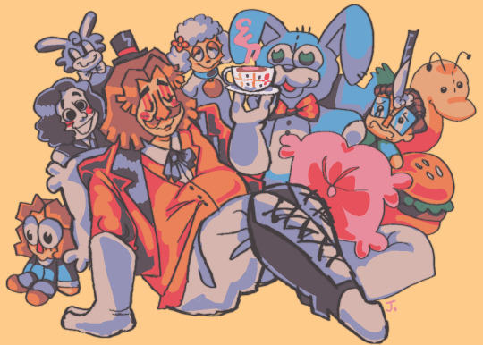
Style 1
vibrant/dulled vibrant colors (this can vary from piece to piece)
chunky, thick outlines
very angular and cartoonish
this is my main style as it’s easier to draw in

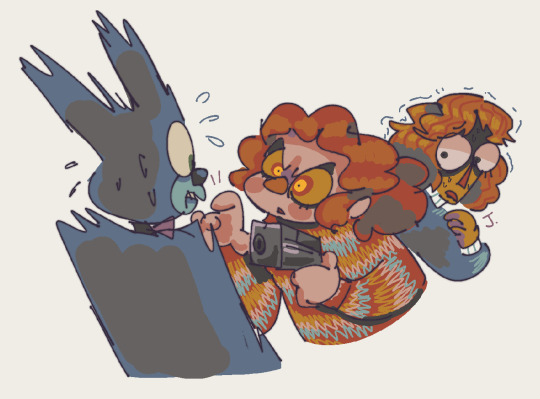
Style 2
simplified, limited color palette
big cartoony eyes with smaller pupils that can often look exaggerated to push the expression of the drawing
softer more rounded body proportions, designs have a clear use of shape and are very simplified
thin-medium sized lines
shading and lineart often done in greys
warm tones


Style 3
semi-realistic yet still cartoony proportions
shares a lot with style 2 (same color palette, warm tones, grey shading, has a “soft” look)
painterly, fully rendered, lineless style
lush expansive toned-down colors with lots of red typically included
dreamlike, surrealistic imagery
use of blockier shapes
This is nowhere near all the styles I use as I tend to switch things up a lot, these are just the styles whose pieces get a lot of notes (often in the thousands) and therefore have a higher risk of being stolen and used for profit without my knowledge.
Another thing you should note is that nearly all of my art contains a signature - it’s really simple, it’s just the first initial of my name, Jack, stylized as “J.” with a dot at the end. This is how you can tell that a piece was made by me.
Thankfully, it’s also something a lot of these resellers tend to forget to crop out.

Idk how to end a post like this because i am not used to this type of situation happening to me. Again at the time of writing I’m on a vacation with my family so I don’t want to have to think about this, and I can’t really get involved anyway. So if you browse redbubble (and i’m not familiar with how redbubble works) I ask that if you see my work under a name that is not me, find a way to report it and get it removed.
Even if you’re not a fan of twf or you’re just a mutual of mine I encourage you to share this post around, as I’m a poor disabled nd trans artist and I need all the recognition and credit I can get from my work. Also instead of buying uncredited work you can just like….reblog my art instead? LOL i dunno. I just hope this situation gets resolved quickly as I’m so fucking tired of not getting credit for my work -_-
270 notes
·
View notes
Note
Your simplified Danganronpa drawings are so cool, I wish I could make stuff like that! How do you do it?
hello! so the funny thing about that is that I don’t really divert that much from my normal style–I just add a few things to it to make it more danganronpa-y. I, coincidentally, am weirdly good at style imitation, but I can show you how I did it!
I’m using kokichi as my victim because I can’t stop drawing this bastard:
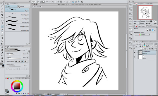
these are the lines for my normal style, more or less. they’re usually a lot more connected, but y’know, it’s a tutorial and I’ll probably just fix them as I go along. also I didn’t use a sketch so that’s something.
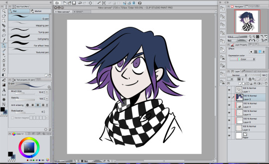
flat colors and a couple lineart adjustments. cool, cool. danganronpa colors are like really desaturated and all the characters kind of look like ghosts (ironically). to add to the authenticity, make the colors look as much like the in-game colors as possible. kokichi’s character art makes him look like he has highlights, so I gave him those rather than just solid purple hair.
ugh okay first you have to shade it before you do anything else give me a second

THERE it’s kind of sloppy but it’ll have to do
you’re probably going to want to use a shadow with a cold color to go with the desaturated colors. I used that color you can see in the color palette in the corner because that’s more or less my default. since this is a stylistic imitation tutorial and not a coloring tutorial I won’t go into detail about how I shaded it and how I use clipping masks to color. just have a time, man.
the most important thing, naturally, is the eyes. danganronpa’s just got this eye thing going on. now let’s actually get down to business.
first, color the outline of the eye with a color somewhat darker than your eye color like so:
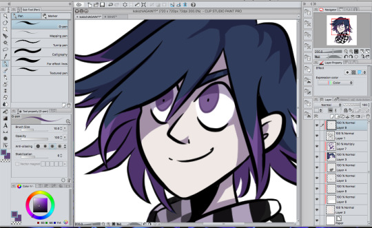
oh god I have to move his pupils
okay take a lighter color that you probably also stole from a ref and saturated somewhat and THROW that circle in there
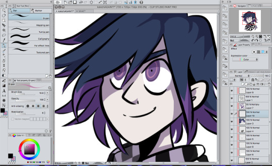
congrats. you have danganronpa eyes.
you’re going to want to make sure that the eyes are pretty even. like, the circle inside is in line with the outline, and the pupil is in the dead center of that circle. otherwise the eyes are probably gonna look pretty wonky. I had to move his pupils for a reason. you’re gonna have to pay close attention to what direction the iris is facing.
next order of business, the ‘hair shiny’. see, this was a weird thing for me to incorporate because I hadn’t done this since I was like 14 and I have a knee jerk reaction to it, but anime be like that.

fwoop
this color is actually very close to the one I used for the circles in the eyes, just more blue-shifted. you’re not just going to leave it like that, though.
set it to add (glow) at 20% opacity and you’re good to go. (I don’t remember what the photoshop/sai equivalents are). I erased lines in it because I’m extra, but you don’t have to do that if you don’t want. you can mess with the effects on this part because I’m pretty sure I made it much less visible than the danganronpa style does.

now, the BIGGEST thing you can do besides the eyes is probably the texture, since we’re imitating the character art style.
you’re going to need a small checkered texture. like, this blinding abomination.
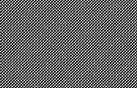
ow. fortunately, we’re changing the opacity REALLY low so it’s not going to hurt to look at. if you’re using clip studio paint like me, it comes with textures built into it. color a whole area and click the button with the checkers on it that you see on the top right.
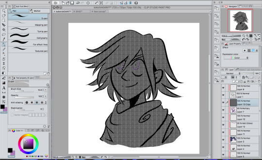
it should cover your canvas with blinding chaos and your eyes will start screaming. before you go blind, make sure it’s set to a checkered style and navigate to the ‘layer’ tab at the top and hit rasterize to turn it into a normal layer. now that it’s a normal layer, changing the opacity will only make the colors lighter, rather than change the texture itself (that’s a thing that happens).
anyway, turn your opacity ALL the way down to 10% and set it to soft light, and your canvas will go from looking like this monstrosity…
… to this!
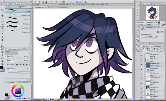
okay you actually can barely see that at all with this crappy screenshot without leaning super close to your screen. look, it’s THERE, I promise.
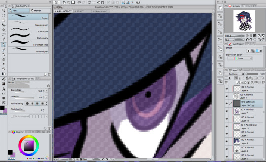
next you’re gonna wanna find a rugged texture of some kind. like, gritty paper or something. I have this one texture that I use a LOT and have been using it since before I even played danganronpa. put it below the first texture layer, turn the opacity down a whole bunch and just mess around with it, honestly. in that picture that I drew the other day, I have it set to vivid light at 15% opacity, but honestly, you can just see what works for you.

now it looks like this! again, this probably isn’t super visible because of the image size, but you’ll see.
now give me a second to add the rest of my shading that has nothing to do with the danganronpa style.
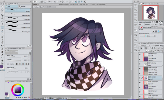
yeah!!! if you’re wondering what I did, I threw on what could be described as “cloudy shading” because you basically just toss on a whole bunch of airbrushing in the color of the shadow in one layer and a bunch of airbrushed lighting in another. it smooths out the drawing a lot and gives the coloring a lot more variety! it’s pretty serotonin-producing, honestly. (thank you tobin for teaching me basic color theory so my shading/lighting looks better)
oh yeah, I also added just a bit of a purple hue to the lineart to go with kokichi’s whole purple aesthetic. changing lineart color doesn’t always work, especially when drawing characters with different color themes, but it did work this time around, probably because it’s just kokichi.

here’s the close-up!
446 notes
·
View notes
Note
Do you have any art tips?
Uhhhhhh Funk im not The Greatest Artist ™ but I’ll try to bestow some Wisdom on you. Keep in mind Art is Subjective and I’m no expert and all that so take everything with a grain of salt but that being said I’ll try to give u Tips and Tricks
-listen so if you have a boring class at school just draw in it. School is great because you have 1. Access to paper at all times 2. Incredibly boring lectures. If you have a study hall that’s the Drawing JACKPOT. Basically what I’m saying is practice all the time when you have energy but like that’s such boring art advice. It’s important but “practice! uwu” is like what people with Natural Art Talent say when they didn’t have to figure everything out from the ground up so it’s kind of aggravating
-There’s gonna be people better than you. Chances are you have a friend who’s better than you because this is Tumblr we all draw. Try Not To Compare Yourself ™ which idk how to do but it’s bad don’t do it
-unless you find a terrible person with worse art than you in which case FUCK DUDE COMPARE YOURSELF TO THEM! THEYRE HORRIBLE AND THEY CANT DRAW FOR SHIT LOOK WHOS LAUGHING NOW!
-“work until your idols become your rivals” is absolute bullshit because your idols are working at it at the same time you are. You fool. You imbecile. I feel like this works better for writing when your idols can become irrelevant or straight up die between you being an aspiring author 8 year old and a tired 30 year old who just wrote The Great American Novel ™ or just kind of. Leave the fandom if you’re writing fanfic. Anyway
-ok that’s all the preachy shit, time for Real Art Advice ™. Keep in mind I do digital cartoony shit with Strong Lineart and cel shading for the most part and I pretty much only draw people so my knowledge is limited to that. if you wanna be a professional artist maybe do other things and Expand your Abilities ™
-Ok first off if you’re using Gimp or Photoshop please love yourself and download Firealpaca or illegally torrent Paint Tool Sai or something. I swear by Firealpaca it cured my depression but like. Photoshop is Trash for drawing. Get Firealpaca it has Line Correction ™
-Keep Line Correction ™ at like. A 5 when you’re sketching and at a 19 (the maximum) when you’re lining, coloring, shading, highlighting, doing literally anything that isn’t sketching
-Sketching digitally can be hard if you’re used to sketching on paper and I find it easier to do a sketch on paper, take a picture of it on my phone or scan it, and line/color it digitally. You do you and figure out what works best
-speaking of which I refused to use sketchbooks until I was Worthy ™ of not drawing on notebook paper and uhhhhhh that’s dumb just get a sketchbook they cost a little more than a notebook at Target it’s not super expensive. Although if you’re not financially in the position to buy a sketchbook anyway, just hoard notebooks from school that you didn’t use much. Bam, that’s your new sketchbook
-the Head Circle Cross Thing and the Spheres For Shoulder, Elbow, and Wrist Thing are good and important and will save you
-hands are hard so use references but bullshit your way through it. eventually they’ll look good (I haven’t gotten there yet)
-HAVE FUN WITH NOSES OH MY GOD. Noses are super fun and cool because there’s, like, infinite variety with them, they can be as long or short, thin or thick, rounded or pointy as you want, you can make them be, like, triangles or circles or more squareish or diamond-shaped, the base of the nose can be about as high or as low on the face as you want, you can make the nostrils prominent or not really there at all, they can add another Layer to a character’s design, oh my goodness noses are so fun. They’re like, severely underrated and oh my god I could gush about how fucking fun noses are
-same with facial expressions. Where you put the pupils and how big they are, how much of the eye is covered by eyelids, the way the eyebrows are, the mouth, tons of other shit. There’s loads of variety and so much you can do and honestly having fun with the facial expression is The Best Part. There’s tons of Face Art Chart Memes floating around, you know the ones, save it to your phone/computer and practice those on your own time it’s fun
-if you don’t know how to do something, avoiding it won’t help you. Just kind of draw around with it in your sketchbook or in a “I’m not posting this” file until you feel confident enough to do it in your Real Projects ™.
-Ok for lining did you know..… it isn’t illegal to erase parts of the lineart to clean it up.… just be careful and draw it back in to the best of your abilities if you erase too far and use a smaller eraser brush/lining brush for this… I know it’s tedious nobody likes lining it’s okay you can do this put on some good music
-use mcfucking references
-eyedrop character’s official colors but adjust said colors based on the color of your background to make them look less funky is my general rule for clothing, I usually pick the hair/skin by myself or from something I’ve already drawn though
-for flats, make sure your lineart is all closed off and there aren’t any “holes” cuz that’ll mess up your coloring
-so how I do flats is I use the magic wand tool to select whatever I want to color, expand selection 3 pixels (in firealpaca you can set it to do this automatically), pick the color I need, turn up the brush to as big as possible, and color it in. It saves the time you’d spend with cleaning up where the color gets outside the lines
-you can do the flats on one layer, but I personally like to do every Object on a different layer so when I do shading, I know what goes on top of what
-if a color is darker than the lineart it looks ugly so pick your line color with caution (or just use black! Unlike shading black lineart tends to go with pretty much everything)
-SHADE YOUR GODDAMN ART. Like, what makes people go “wow holy shit that’s good!” is the shading + highlights, don’t be lazy ya fuck.
-I’d take a break before shading to Refresh Your Eyes ™ but also I constantly forget this is a good idea
-don’t shade with black oh my god. Unless you’re doing Strong Punchy Dramatic Stuff or monochrome black and white stuff, don’t shade with black, and if you’re doing that it’ll probably be drawn into the lineart. Don’t shade with black please we can tell you’re doing it and it looks bad
-highlighting with white isn’t too bad though, especially with the eyes, but it might look too strong in some places
-As a general rule, shading is darker and more saturated, highlighting is lighter and less saturated. Whether it gets warmer or cooler depends a lot on what color or thing you’re shading or what you want the feel of the picture to be and I’m not 100% sure how to do it myself so uh. Trust your gut and change the color if it looks wrong I guess.
-where exactly the shadows or highlights fall depends on lots of things, just kind of. Look at how things work irl maybe? This is the kind of thing that you just have to practice, and it’ll look like shit until suddenly it doesn’t sorry I’m not sure what to say
-One Medium Sized White Dot on a layer above the lineart where the pupil borders the Iris (or the whites of the eyes if you’re like me and you make the pupil and Iris one thing) works for a glint in the eye that makes a person look less dead and more cute. How big you’re gonna make it depends on how adorable you want the person to be
-SMOOTH BORDERS FOR THE SHADING ARE REALLY IMPORTANT IF YOURE DOING CEL SHADING which is why firealpaca is my best friend thanks line smoothing. If you’re doing like. Soft shading or painterly shit or other kinds of shading it’s less Super Important but like. Still be sort of neat. Unless being really messy and sketchy is what you’re going for but even then you still need to be sort of careful
-for simple backgrounds, it’s like. Easy to make it interesting. Add polka dots to the background or a big old square or a gradient or a cloud filter or something the possibilities are endless. Another option is to straight up make it transparent and write a secret message in white on the side. But uhh never do a blank white background at the very least fill it with a solid color
-ok style is kind of hard because I never had to struggle to find my style? I just “drew in my handwriting” so to speak and then if along the way I realized something looked shitty I just changed how I drew it slightly? I guess a thing you could do if you’re in tune enough is look at the styles of things you do like and things you don’t and figure out why you do and don’t like it. “I like how *2010s cartoon* does Eyes!” great take that general concept. “I hate how this shitty yaoi has enormous hands!” great then don’t do that. It’s all Personal Preference my dude style is Your Own Thing
-notes aren’t everything but fuck do they feel nice. Self reblogs are fine but don’t overdo it, I’d say reblog it Twice to account for time zones and tag it as self reblog so as to not be a dick
This got long whoops. That’s all I can think of but I hope this helps it’s All I Know
4 notes
·
View notes