#antonio varga
Explore tagged Tumblr posts
Text
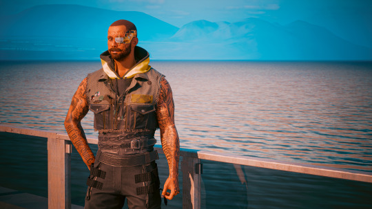
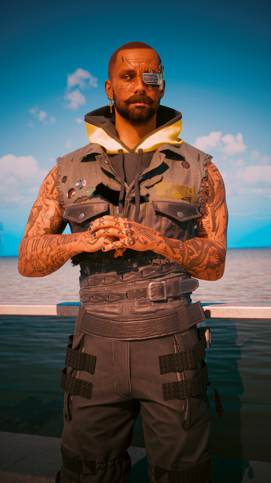
Antonio "El Palo" Varga
If you've spent any time around Heywood you've likely heard the legend of El Palo. Tony lost his eye early in his years with the Valentinos after a vicious fight with 6th Street. Soon after he received his new cyberware, another gang member Carlos laughed at him and said he looked like he was wearing a golf club—el palo de golf. The name stuck and it caused Tony a lot of grief.
As a young man unsure of how to handle a dispute with a fellow gang member, Tony went to Padre for advice. Padre dispensed his usual wisdom.
"Antonio, the Good Lord in all his wisdom did say, 'A person’s wisdom yields patience; it is to one’s glory to overlook an offense.' And I say unto you, take the gift of your new name, and show Carlos your true strength."
Uncertain about Padre's true meaning, he recounted the conversation to Jackie who argued that Padre gave his blessing to teach Carlos a lesson. A few days later Tony's mother found a gold-plated golf club on their front porch, and Tony knew that Jackie was right.
Later that night, Tony and Jackie took to the streets, golf club resting on his shoulder, flashing as it catches every streetlight. Drunk on Centazón and high on youth and violence, Tony nearly beat Carlos to death, and would have if Jackie hadn't stepped in.
Tony himself denies the event happening. He says they simply had a chat, and Carlos refused to discuss it with anyone. He died a few years later, leaving Tony as the only witness to the event. But sometimes legends become more useful than facts, as the saying goes, and Tony doesn't mind when he hears whispered warnings of El Palo when he walks into a room. In fact, they usually make his life a little easier.
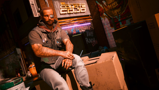
cc @vox-monstera bc you asked about him ages ago and I finally delivered on some good stuff
#cyberpunk 2077#cyberpunk 2077 photomode#cp2077edit#dailygaming#my screens#antonio varga#male v monday#masc v monday#male v#masc v#not a v (technically)#male oc#valentino oc#cw violence#wash's writing#had a lot of fun with this!!#finally gave tony the proper story of his nickname#at least the first version of it lmao
46 notes
·
View notes
Text


Gakuen Au where these three are RAs and Ludwig is taking his job too seriously
#RA is resident advisor for those unaware. basically poor students who are forced to take care of the dorms for free housing#Ludwig has been on the trail of this prankster for months now#hetalia#aph italy#aph north italy#hws italy#hws north italy#aph veneziano#hws veneziano#aph japan#hws japan#aph germany#hws germany#kiku honda#ludwig beilschmidt#feliciano vargas#gakuen au#lmao#also it is Antonio but he got Gil and Francis to cover for him lol#aph spain#hws spain#FORGIT TO TAG HIM LMAO
1K notes
·
View notes
Text

sometimes you just gotta draw a kitchen instead of using your own
#i was hoping to have a funny caption for this one but all my jokes are funnier in my head#i also didnt think I'd actually sit down and finish this tonight oops#as finished as its gunna get at least#anyway these colors were fun#i also dont know wtf the plant is its whatever you want it to be ig#skip draws#hetalia#spamano#hws romano#hws south italy#lovino vargas#hws spain#antonio fernandez carriedo#🍅
404 notes
·
View notes
Text


i apologise however sometimes i miss them terribly
#aph germany#aph italy#feliciano vargas#ludwig beilschmidt#antonio fernandez carriedo#aph spain#aph#hws spain#hetalia
600 notes
·
View notes
Text

this but it’s antonio and lovino
#we all know who is who#spamano#lovino vargas#aph romano#hws romano#aph south italy#hws south italy#antonio fernandez carriedo#aph spain#hws spain#hetalia
449 notes
·
View notes
Text


i like how petulant spain gets when portugals around
#hetalia#hws#hetalia world series#hws spain#hws portugal#spamano implied?#hws romano#antonio fernandez carriedo#lovino vargas#iberian bros#that last one is based off childish war
214 notes
·
View notes
Text

Romano and the bad bitch he pulled by being a moron
#hetalia#spamano#spain hws#romano hws#lovino vargas#antonio fernandez carriedo#etinfernumsart#etinfernumart#etinfernum
243 notes
·
View notes
Text

A lil render of the two🍅
#hetalia#aph spain#aph romano#aph spamano#hws spain#hws romano#romano vargas#antonio fernandez carriedo#my art
155 notes
·
View notes
Text


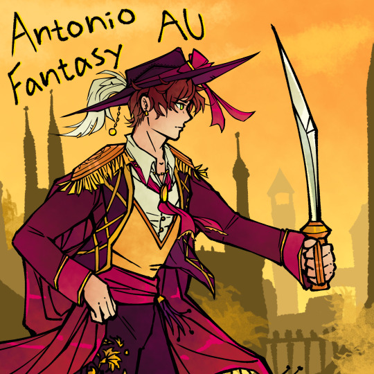

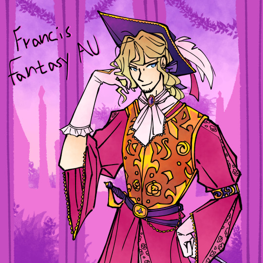

A fantasy AU me and a couple of friends are cooking up in which Gilbert is mistaken for an evil villain and PruMano becomes a thing through various shenanigans. FrUk is endgame but there may or may not be some Frain and TurFra going on. It's a mess.
#aph prussia#aph france#aph south italy#aph romano#aph england#aph turkey#aph spain#gilbert beilschmidt#lovino vargas#antonio fernandez carriedo#sadik adnan#francis bonnefoy#arthur kirkland#hetalia#hetalia axis powers#prumano#frain#fruk#turfra#hetalia art#hetalia fanart#fantasy au
528 notes
·
View notes
Text
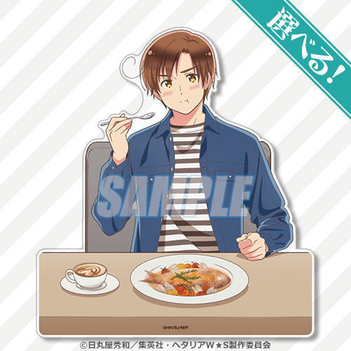
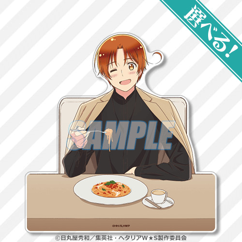
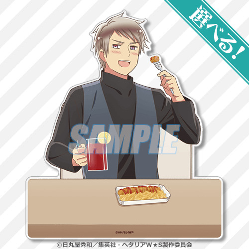
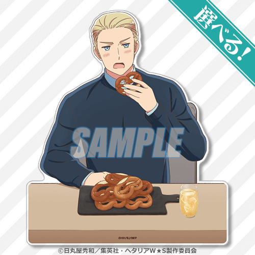
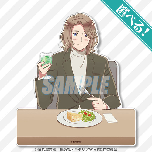
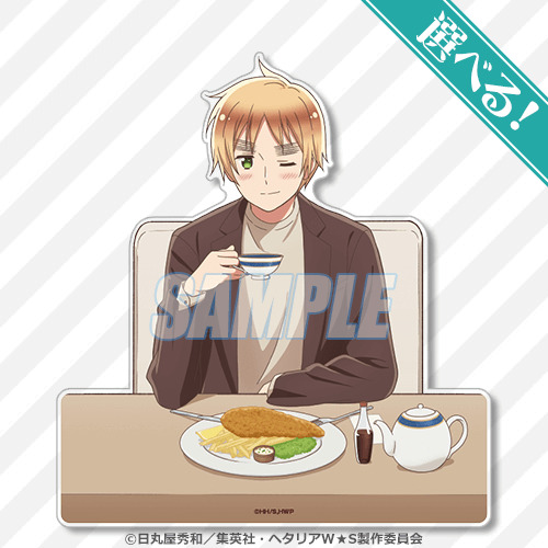
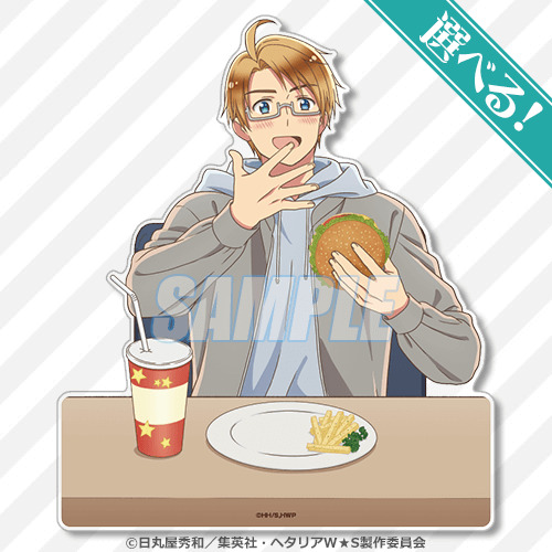

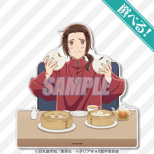
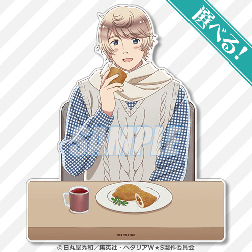
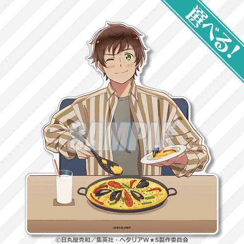
Which dish would you choose? here
#hetalia#hetalia world stars#hws#hws romano#hws italy#hws prussia#hws germany#hws france#hws england#hws america#hws japan#hws china#hws russia#hws spain#lovino vargas#feliciano vargas#gilbert beilschmidt#ludwig beilschmidt#francis bonnefoy#arthur kirkland#alfred f jones#kiku honda#yao wang#ivan braginsky#antonio fernandez carriedo
443 notes
·
View notes
Text

Little by little, it seems, I'm getting out of the art block and... thank you for this @renonv Demon!AU somehow quickly inspired me to make art.
223 notes
·
View notes
Text


shirt by @togepies 😍 | divider by @lgbtq-aestheticss
Happy Pride, Ace
#cyberpunk 2077#cyberpunk 2077 photomode#cp2077edit#my screens#antonio varga#male v#masc v#not a v (technically)#male oc#valentino oc#asexual oc#asexual#masc v monday#male v monday#cyberpride#cyberpride 2024
43 notes
·
View notes
Text
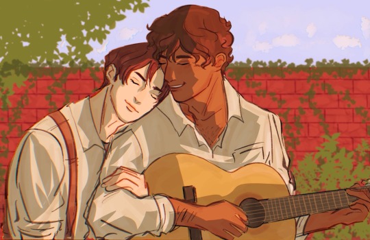
besame mucho
#this fic series was a staple of my youth and I’m rereading so…fanart#I listened to cardigan on repeat for this#besame mucho#lovino vargas#antonio fernandez carriedo#hetalia#hetalia fanart#george devalier#spamano#my art#hetalia axis powers#aph south italy#aph spain#aph spamano#veraverse#auf wiedersehen sweetheart#aph hetalia#hetalia world stars
913 notes
·
View notes
Text
rating the new flower pop up outfits as a fashion major
what the title says

Spain

im ngl spains one is actually my favorite, and I think is the best out of all of these. this is because:
he has an established style/fashion sense throughout these pop-up events
the flared train at the back is a unique twist that's nice to look at
the color theme is consistent throughout, shades of similar dark red, and pink and white as accent colors
my only complaint is that the flowers aren't central to his outfit, but this is a complaint I have with all the outfits. if this is about the countries' national flowers, it should go with the design and not as an afterthought.
FINAL POINT: 9/10
China

I love the flower patterns on the inside of his cape! his design is rather nice
this is where the compliments end because now I have issues:
what is up with this color scheme? the white boots throw everything off, both design wise and color. the peach pink could be a little darker as well, like how spain has visibly different shades of red but they work well together because they look similar to each other.
balance in a design is incredibly important. the pieces need to look unified and not like a bunch of different pieces forced on as a single outfit. the color and pattern on the inside of the cape could be used on the blazer replacing the peach pink, whereas the notch collar and lapel could remain as peach pink. this way, the outfit is unified while the peach pink adds a pop of color as contrast. the cuffs could potentially be a different piece cut of the peach pink fabric and sewed onto the end of the sleeve.
his pants are very high waisted, it looks odd. either keep his pants high waisted and make the blazer longer, or lower the pants a little. short blazers can work in certain situations, but it's not doing anything here.
honestly I just wanna know what was the designing process behind this
FINAL POINT: 6/10
France

I love the light blue, white, and cream color scheme here! this is maybe, next to spain's, the best color scheme. the flower placement works and is still a noticeable detail in his design.
additionally, the colors are applied in a way that keeps the design balanced and unified. the bottom is cream, and the top has a cravat of the same color. the dress shoes is a good contrast that still works due to how light the brown is. the cape is blue, which is reflected in his cravat brooch. a small detail, but it works so well. we also have his belt/girdle that's a baby blue and it also works to unify the design, even though it's slightly lighter than the cape and brooch. the cape and pants are light and easy on the eyes, and help keep the design grounded and not washed out. the gold accents are subtle and are placed at the top and the belt.
design wise, I do wonder if there's something more that could have been done to his bottoms...the top gives the perfectly princely feel, the bottom feels so plain in comparison..
FINAL POINT: 9/10
America

since there's nothing good about his design, let's skip to the bullet points already:
the color scheme is atrocious. purple and green...works if you try hard enough. but the blue?? on his shoes?? what?? I assume it was an attempt at unification with the blue pinstripes...an attempt. I would change the color of his waistcoat to match his shoes, since it's much easier to work with purple and blue than purple and green
the pinstripes were certainly a choice. I would've gotten rid of them completely and replaced it with maybe some white or gold trim at the hem and sleeves.
the flowers are placed in such a lackluster way, when it could have maybe been a design detail of flowers spaced out at the top and then collecting at the bottom of his jacket, with a few flowers spaced out at the top of his pants to balance the outfit.
once again, there is no focus or an established sense/style for him. from what I'm seeing across many pop-up events, the idea or "vibe" is a childish, sleazy(??) vibe. but that's very vague, and they would need to further outline common elements/looks they could refer back to when designing anything for him.
FINAL POINT: 2/10 my goodness
Germany

I like his design a lot, it fits his personality well! the gold trim and buttons is a nice touch that helps balance the top and bottom. the color scheme is an unexpected surprise, since in my mind he's wearing green always..? but I guess in the hws anime, he wears a blue suit.
I do wish the suit was a different shade of blue, like a slightly lighter shade, since the stark blue and yellow feel very in-your-face like Ikea, and since the flowers feel like a blue plum, this really deep, dark shade of blue just feels like a bit too much.
my other only issue with this is honestly the flower placement. I see that they were trying to balance the placement on the left and right, but it covers up important design details like the gold trim on the shoulder and the viennese seam.
FINAL POINT: 7/10
Italy

it honestly feels so similar to the sweets parade pop up, so i really don't know how to feel. especially the train/cape detail that was in both. that doesn't immediately mean this is bad, though
I do like the train here because it's such a reflection of his personality!
it's nice how they try to balance the top and bottom through the same patterns on the waistcoat and train. the pants however...
the pants throw it off. they could have gotten rid of the stripe pattern and it would have been fine.
the jacket being white isn't necessarily a bad thing, but I have issues with the lapel and collar having a green stripe. it's very stark and isn't enough to balance the jacket with the pants and blouse. the white and green needs to be swapped, i can't see it working any other way. a white blouse would still work with a yellow waistcoat and orange bow, and the green unifies the top and bottom. the only problem with this is figuring out how well this works with the orange on the inside of the jacket train...
the flower is very tiny despite being in the middle, and would need to be placed in a way that is noticeable. my initial thought was one or two daisies as lapel pins(bigger than the daisy on the bow) connected by a gold chain...perhaps the bow-daisy design detail could be added at the top of his boots?
FINAL POINT: 6/10
Japan

*grits teeth in korean* he's pretty charming here i gotta give him that
the pink-green is ATROCIOUS. different shades of pink and green would have worked. they chose a colder pink with a colder green and it just clashes so hard. this cold pink also clashes with the warm magenta. the pink and green are extremely light, and would benefit from being more prominent and warmer shades.
there is no balance because below that is just white with gold details. the white just eats everything up, especially because the pink and green are extremely light shades. the cuffed hem at the bottom of the pants are fine, but the rest of the pants would work better in pink or green. or fine, keep the pants. but the shoes better be in green or pink.
the inside of the cape is way too light, and alongside the pants and shoes, eats the other colors up. I would make the pattern on the inside a gold trim, and the background a more prominent pink.
again, the flower here is really tiny. cherry blossoms aren't known for their size, but if the whole point of this is highlighting the nations' flowers, the flowers should be a bigger deal that the design works around, not an afterthought. I'd add cherry blossom petals onto the pants, spaced out so it looks like they're falling to the bottom.
FINAL POINT: 5/10 good lord the white
England

THIS DESIGN. i have the BIGGEST BEEF with it its a designers NIGHTMARE
where is the balance? i'm supposed to expect these dark plaid pants to work with the light red roses? why is this plaid? where is plaid anywhere else in this design? if the top is white what is unifying this design?
to fix this problem i'd burn the plaid pants. but if that's not an option, i'd give him a plaid waistcoat. but honestly, burn the plaid pants. NOW.
there has to be a better way to incorporate the roses into this design. i'm thinking a dark red coat with gold rose trim, and removing the lone rose at the bottom of his top. also the roses gotta be the same dark red as his pants.
the frills are also excessive. cmon man.
FINAL POINT: 2/10 something something like father like son
Russia

*grits teeth in uzbek* he really is a dapper lil man...
so first off this color scheme is wonderful. for a guy associated with winter constantly, the sunny yellow and green matches his sort of...enthusiastic attitude?? however there is one(1) issue I have with it. the yellow would look better as a warmer, slightly golden yellow. because right now it looks more like paint yellow than sunny yellow. some of the light green could benefit from being a similar shade as the forest green at the hem of his pants.
the balance is there in the brown and green pants and the brown waistcoat. the green details are well placed throughout the jacket and looks great. the hat is a nice accessory that ties everything together. I don't know if the yellow jacket is overwhelming the brown bottoms, or if it's just me having issues with the shade of yellow... because if the yellow was warmer, it could work with the warm brown pants?
Instead of the gems on the chain of his pants, it could be sunflowers? there's so many opportunities to incorporate the sunflowers, but it was missed...
FINAL POINT: 8/10
Prussia

i'm sorry to say but oh...oh my goodness this is actually terrible i actually don't know where to start
it's blue everywhere. the shoes are the only breath of fresh air. but then you look at the overall design and wonder why these colors were chosen.
these shades of blue don't unify this outfit. the waistcoat is a colder blue compared to the pants. also, the random flower pattern on the shoulders? nobody asked prussia pack up and go home. there's silver stripes on the side of his pants. that could have been the color of the flower chain instead of?? brown??
I love the flower chain though im ngl
there has to be some sort of secondary color that's prominent enough to balance the outfit properly. there is none here so I'm just very lost like i don't know how to save this outfit.
i'm wondering if a dark blue and red would work(thinking about his military fit from world twinkle).
FINAL POINT: 0/10 (why are you even here? you're just a province now)
Common issues
Color schemes
Balancing outfit
Minimal flower placement(I would personally design their outfits to resemble the silhouette of their national flower in some way, and perhaps use ouji fashion as a base for inspiration)
In fashion school you're taught that customer profiles are important when designing for someone, and to think of key elements in each design to keep it consistent to the profile. they need to start doing that
anyway that's it follow my soundcloud etc
#hetalia#aph spain#hws spain#antonio fernandez carriedo#aph china#hws china#wang yao#aph france#hws france#francis bonnefoy#aph america#hws america#alfred f jones#aph germany#hws germany#ludwig beilschmidt#aph italy#hws italy#feliciano vargas#aph japan#hws japan#kiku honda#aph england#hws england#arthur kirkland#aph russia#hws russia#ivan braginsky#aph prussia#hws prussia
155 notes
·
View notes
Text
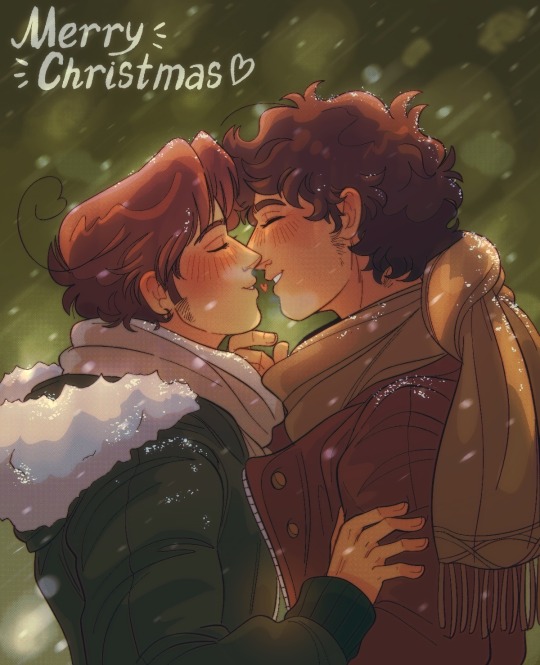
A small gift I made for my beloved @cousmonaute ❤️❤️ happy holidays ya’ll!!
#I’ll be posting some sillies later too dw >:3#but first…gay Christmas#hetalia#aph romano#aph south italy#hws south italy#hws romano#aph spain#hws spain#spamano#hetalia world twinkle#hetalia world stars#lovino vargas#antonio fernandez carriedo
581 notes
·
View notes
Text
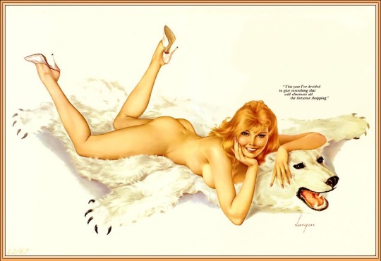
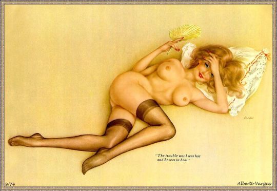
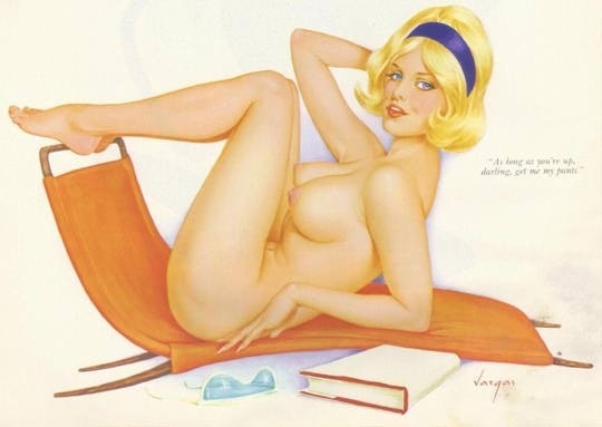

Antonio Vargas
572 notes
·
View notes