#and yes i'm also brazilian (waves flags)
Explore tagged Tumblr posts
Note
Have you heard/seen the web series Stupid wife? It's a wlw show on youtube and I believe it's Brazillian (I followed you for a while and I believe you are also from Brazil? 🥴 I apologize if that's incorrect) so I thought it may be of interest
I HAVE NOT. i didn't even know it was a thing, i've shamefully disconnected from brazilian tv (and memes rip) for the past few years even. which was clearly a mistake.
i don't know what i love the most, both actresses having the same name or it being based in a short story that was first a fanfic. thank you so much for telling, i truly had no clue of it and i'm sure it's something i'll enjoy!
#and yes i'm also brazilian (waves flags)#já fui a maior noveleira agora nem tv eu tenho preciso mudar isso urgentemente#anon#nina's mail#💌
0 notes
Text
Livery Watch 2024: Special Editions
Breaking News: Local woman still isn't done yelling about car liveries.
idk how many one-off liveries the teams are going to do this year, but in any case I love McLaren's livery for Japan, so if there's any more across this season I'll be updating this post as they appear throughout the year!
McLaren - Japanese GP Vuse "Driven by Change" livery
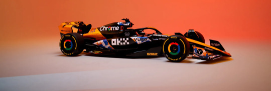
I LOVED this when the promo images dropped at the start of the week. The livery was designed by Japanese artist MILTZ and is inspired by Edomoji (a style of Japanese calligraphy), the design reminds me a lot of The Great Wave off Kanagawa but I'm pretty sure because they both have a wave motif.
I absolutely love the splashes of blue and white, I wish they were on the black portion of the car instead because the livery would look so much brighter, but I still love how it looks on the car regardless.
9/10
Ferrari - Miami GP Blue livery
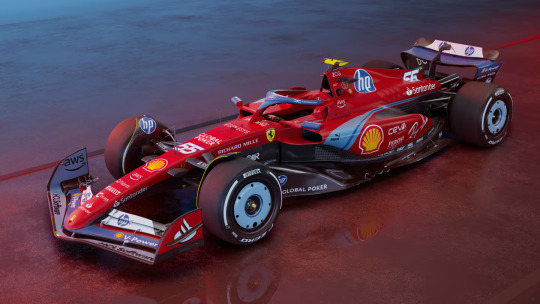
Adding list to the very long list of the ways that Ferrari have disappointed me, and ngl I'm so tempted to put it right at the top.
After all the hype Ferrari had been putting out on socials I was expecting the car to be all blue (which, is in recognition of the 70th anniversary of Ferrari selling cars in the USA) and instead we have... this.
Like, no one would have forgotten that Ferrari's are meant to be red just bc the car went all blue for one race, especially because the team kit and overalls are all-over blue for this week (I am extra mad bc the shades of blue that's on the car are so stunning and would definitely have stood out compared to the other blue livery cars).
Also don't get me started on the silly amount of HP logos on the car, if I was a tifosi I would be beyond embarrassed rn
2/10 and that's me being nice.
Racing Bulls - Miami GP livery
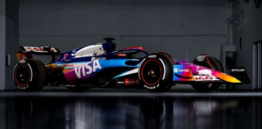
Ahhhh. That's better.
I LOVE the multi-colour gradient (even if it does slightly resemble the instagram logo). I would have loved to see it all over the car because the chrome silver bull would look so nice against it.
But apart from that it's so bright and fun and it's going to look fantastic on track this weekend. I'm not even mad that it's matte.
9/10
McLaren - Monaco GP Senna livery
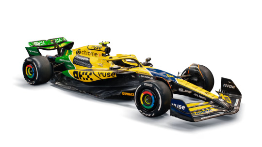
*shouting in the general direction of Maranello* You see this Ferrari? THAT'S how you do a special livery!
Yes, it's incredibly yellow (to the point it looks like a Benson & Hedges sponsored Jordan if you squint) but that's the whole point. (Also bonus points for the car pretty much being completely painted!!!)
As an ode to Ayrton Senna, it's pretty much spot on. For me the first thing that always sprang to mind when Senna is mentioned is his helmet design featuring the colours of the Brazilian flag. I also love the diagonal lines as a nod to the Marlboro McLaren livery.
Oh and did I forget to mention that IT'S NOT MATTE!!!
10/10
Red Bull - British GP "REBL CUSTMS - Stallion Red" livery
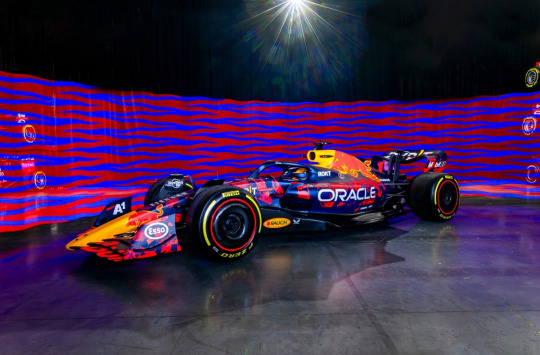
Like last season, we're getting three fan-designed RBR liveries this year in honour of the team's 20th anniversary and this is the first!
And god, I wish it was the main livery. The brushes of neon red are so bright and actually look interesting instead of the super corporate unchanged livery we've seen since 2016.
Usual 'I hate that it's matte complaints' but spart of that, it really looks great.
8/10
Williams - British GP livery
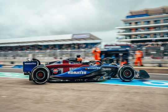
So in the design stakes, I definitely prefer last year's white accents design. However, on the sentimentality stakes (of which I will never be immune to), I love it so so much.
As it's been mentioned a lot in commentary already this week, the car features the names of all 1005 Williams team members - and founder Sir Frank Williams, which is just so so lovely.
6/10 for design, 10/10 for the sentiment behind it.
Alpine - Belgian GP "Deadpool & Wolverine" livery
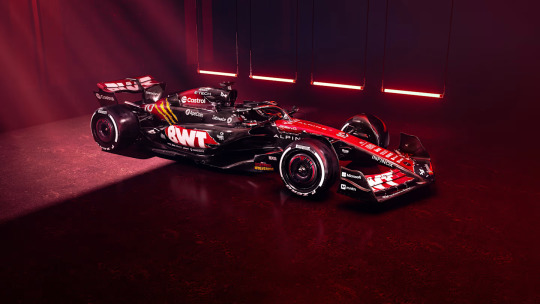
ngl friends I have spent the whole time since this dropped staring at this going 'hmm'.
I definitely don't hate it, I think I once again find all the exposed carbon very off-putting, but at least there is more paint on the car this time compared with their core blue and pink liveries. (And, tbf, given how Deadpool's colour scheme is red and black, it does make sense from that pov)
The concept behind this is very fun, I genuinely cannot remember the last time we had a full promotional livery for something (Aston Martin did run the James Bond logo on their cars when No Time to Die came out, but that was it).
I think it would have been nice if there was more yellow (as cool as the Wolverine claw marks are), but overall it's definitely very fun. I really want to see how it's going to look on track.
7.5/10
Mercedes - Singapore GP "Petronas 50th Anniversary" livery
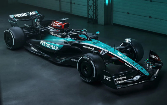
Not gonna lie, after the well documented events of the 2019 German Grand Prix, I honestly never thought we'd see Mercedes run a one-off livery ever again, so seeing this upon opening Instagram this morning was a nice surprise!
Might be worth saying that this livery is in honour of Petronas' 50th anniversary as a company (their title sponsorship with Mercedes only dates back to 2010), and the choice of debuting this livery at Singapore is that it's the race closest to Petronas' HQ in Malaysia.
(Powers that be pleeeeeeeeease bring back the Malaysian GP in Sepang!!!!!!!)
So, all that aside, I do very much like this livery. The Merc colour scheme of black, silver and teal is super iconic and works in pretty much any iteration. Design wise though I wish there had been a tiny bit of effort put in because they've literally just swapped round where the silver and teal is on their core livery.
I do think the car will stand out on track really well against the dark tarmac of the circuit, and the fact that from this picture at least the teal portion of the car looks glossy so it should look stunning under the floodlights at night.
8/10
Racing Bulls - Singapore GP "Hugo Boss Denim" livery
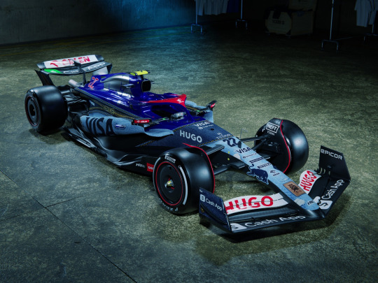
I want to get on board with this, I really really reaaaaaaaally do.
I just can't because they didn't properly commit to the bit and do the whole car in denim.
Unlike RBs Miami GP livery in which they got away with keeping the dark blue engine cover and halo because across the whole car the colour scheme still felt cohesive, on this livery (or, as we're all calling it, jivery) the saturated blue does not feel very put together with the rest of the denim. And I am a little bit mad about it bc if the denim had been all over the car I think it would have looked both amazing and really different on track. And for once, I don't mind the matte finish bc as we all know denim is not ultra-glossy - another reason why keeping the dark blue engine cover from the core livery just makes the whole thing look odd.
Love the concept, really not on board with the execution - 6/10 overall.
McLaren - Singapore GP "OKX Legend Reborn" livery
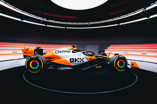
oh this FUCKS.
It's somewhat turned into a tradition of McLaren debuting a one-off livery in Singapore. In 2022 the sky blue accents on the core livery were swapped out for a stunning hot pink, and last year we had the mostly carbon stealth livery (you can find my thoughts on that in my Livery Watch 2023 tag).
And this year, as the name suggests, McLaren are running a livery inspired by the iconic Marlboro McLaren livery of the 1980s, with papaya orange in place of Marlboro red.
and to repeat myself, it FUCKS.
I love the stripe of white down the middle of the car, it really stands out compared to the slash of exposed carbon on the core livery and combined with the orange the car just looks so much brighter and is really going to stand out on track.
Is it a little bit Finding Nemo? Yes. Do I care? No.
For the tiny bit of exposed carbon it loses a point so - 9/10
Red Bull - Singapore GP "REBL CUSTUMS - Camo Bull" livery
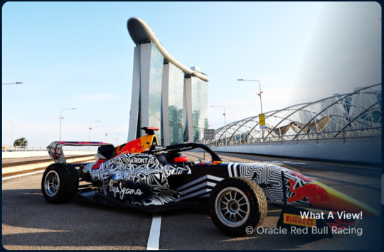
I will update if I find a better picture, the RBR website is silly.
The funny thing about updating this post as the year goes on instead of doing a reblog for each new livery is that all the various off-track (ie. Red Bull scrapping their two remaining fan designed liveries because the paint they were going to use made the car too heavy) happenings do get a bit lost within the passing of time.
But, as this is my house and I can do what I want on Livery Watch, I'm gonna yell about what would have been RBR's Singapore GP livery anyway, as it has thankfully been put onto Hamda Al Quibaisi's F1 Academy car (plus matching overalls!!!) for this weekend.
And as I said on a post earlier today (as I write this) I am mad that RBR chickened out bc this is SUCH a sexy livery. It pays tribute to the og Camo Bull livery from 2015 pre-season testing so well and it's just DIFFERENT and FUN and is gonna look SO good on the circuit and the pops of neon red are just stunning. I love it.
10/10. no notes.
Haas - United States GP livery
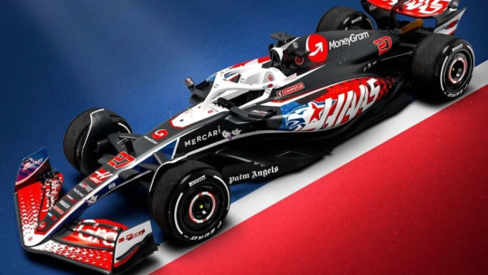
Not only are Haas going to be arriving at the Circuit of the Americas with Toyota Gazoo Racing logos on the car after the announcement of their new technical partnership with Toyota, they are also as seems to be turning into a tradition running a stars and stripes inspired livery for what is 'officially' the team's home race.
(I say officially as while the F1 calendar does have 3 US races, the race in Austin is the only one branded as the United States GP).
I do very much prefer this livery compared to the one they ran last year. The brighter, more saturated colours, work well against the predominantly black base, though I find the red driver numbers a bit hard to read as the white outline is a bit too thin. But I love the scattered star motif on the front wing and sidepods - I think it's very fun!
While I do get why the main emblem on the car is a hybrid of a lone star (bc Texas is the lone star state) and the head of an eagle (ca-caw, wtf is a kilometre) it does slightly give off 'concept art for an NFL team logo' vibes, and I think running with just the star motif would have gotten the same message across just as well.
(I will say though, I think the eagle art itself is pretty good! It just feels ever so slightly too much.)
7/10
Alpine - United States GP "Indiana Jones and the Great Circle" livery
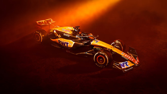
As the semi-official Livery Watch reporter for f1blr news, I do feel it's my journalistic duty to point out that Disney have not managed to pay Harrison Ford even more money to come back for another film, but that this livery is actually promotion for the upcoming video game of the same title.
My second thought upon seeing this livery (my first, like everyone else, was that it looks like a McLaren cosplay) was that I felt quite mad Alpine have painted more of the car for this one-off livery than they have done for their pink and blue core liveries, and I'm once again mad at the missed potential for what we could have had.
(My thoughts on the Alpine core livery can be found in my Livery Watch 2024 tag).
I did have to do some digging, and thanks to this video posted on Alpine's twitter feed and this post by one of Alpine's graphic designers, I am fairly confident in saying that the car is not in fact all over orange, and like the Indiana Jones logo is more of a yellow to orange ombré with a really cool looking treasure map motif on top.
I think the concept is fun (despite the promo images making the car look more orange than what it seemingly is) and it's been executed fairly well, but I may need to wait to see it in daylight before properly deciding if I like it or not.
7/10
McLaren - United States GP Chrome livery
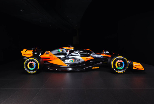
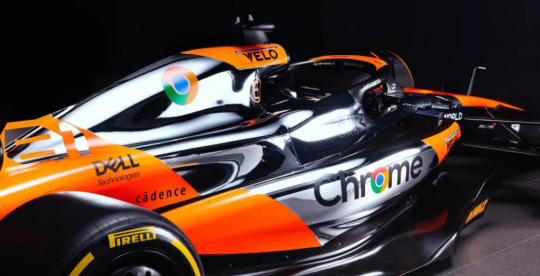
As first ran at the British GP last year, McLaren have once again brought back their chrome silver livery of the late-00s and 2010s, in partnership with one of their main sponsors Google.
And, before I go in detail, I want to show my initial reaction via the tags on a post of this livery I reblogged earlier today because I think it sums up my feelings very well.

I cannot begin to express how delighted I am that McLaren have given this livery a second attempt, because the first version they ran last year was quite a big miss.
This version feels so much more thought out in terms of where the chrome silver paint will actually go and what this livery and the original Vodafone McLaren chrome livery do well is having a really bright pop of colour against the silver so the car doesn't look too bland (unlike the team's 2014 chrome and black livery).
Honestly? This is yet another banger of a McLaren one-off livery. It's silver chrome done stunningly well. 10/10.
Williams - Mexico City GP & Sao Paulo GP altered Core livery
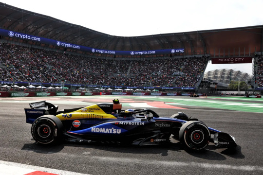
The delay in the latest addition to Livery Watch is partially due to life stuff, and also due to me contemplating whether or not it actually counted since it's a sponsor driven change as opposed to a "let's do this for funsies!" change. BUT we have seen sponsor driven liveries this year so I have finally decided that it counts, so onwards!
The addition of the Mercado Libre logo and yellow colour splash for the two Latin American races of the year is definitely fun (it stands out on the car from a mile away) and either intentionally or otherwise evokes the classic blue, white and yellow Williams liveries of the 80s and 90s.
Obviously there would have been a limitation on what shade of yellow they could put on the car, and I am somewhat bummed that it covers the original Frank Williams Racing logo, but a lot of what I love about the 2024 core livery remains.
Solid 6/10
#Formula 1#Livery Watch#2024#Livery Watch 2024#(doing the one off liveries in their own post just to keep things tidy)
20 notes
·
View notes