#and this one was meant to be printed on A3+
Explore tagged Tumblr posts
Visit Tumblr Blog
Explore Tumblr blogs with no restrictions, modern design and the best experience.
Last Seen Tumblr Blogs


Fun Fact
China blocked Tumblr because of pornography and censorship problems in 2013.
Text

Ef's moment of respite at the bottom of the Mariana Trench from amazing story Falling Falling Stars by @not-poignant
#new#my art#I planned a lot of things#but now I am kinda numb emotionally#cause sister's nearly divorce crises and her husband being my best coworker#and me not managing my talks in my head lol#soooo I don't think I will draw anything for a long time#rip plans but life always happens#and maybe it a good thing#anyways#oh how I enjoyed drawing this one!#I've never drew anything bigger than like 2k pixels#and this one was meant to be printed on A3+#and the first time I did the right size for it I was like WHAT? DO? YOU? MEAN?#when I am at 100% it's only one rock at my whole screen#but then I figured out that like... I can draw details ten times moooooore#spending 8hours on one roooock!!!#MORE SPACE#and I dont know shit about proffesional stuff with exposition and placement and shadows and colours#so details everywhere as I go#and I love to think that the portal to the lake with antlers bars is portal to Augus' lake#and I wanted water snails and knitted jelly fish and kinda blanket but water themed so it's a big algue piece#and it just piled up#and the colours feel was the most relaxing thing to look at all the time#yeah#really proud of this one
65 notes
·
View notes
Note
Can someone pleeeeease let artists know that it's so incredibly frustrating when I buy prints and they're in weird sizes?
It hard to find frames for them.
I've got prints that are 15cm x 21cm (6"x8.2"). Juuuust oversized where I need to get a frame up with a matte.
But then I've got another poster that's 19.6cm x 28cm (7.8"x11"). Like, I can get a frame that fits, of course because it's undersized A4. But damnit it's got an ugly gap which doesn't feel right.
Please please please! I bought these things to be on display but my walls are bare because I need to spend several hours to find a solution and fit them right.
Please just stick to the international A4 A3 A2 format, or the photo size formats 6"x8", 8"x10" etc.
I want to support people, but I'm left with buyers regret when I need to problem solve purchases and don't want to "just tack it to the wall, it'll be fine".
Kiriska: This is an understandable frustration!
I've had plenty of customers ask me what sizes prints are prior to purchasing -- a totally fair thing to do if you know you want to frame it. Size has been a deal-breaker for some people.
That said, for perspective, it's often more affordable for artists to print at other sizes. For example, in the US, letter (8.5"x11") and tabloid (11"x17") are both extremely common print sizes in Artist Alley, but while frames of these sizes exist, they aren't common.
Artists still prefer these sizes though because these are sizes that are easy to print at at office supply stores or personal printers, which is what many have access to when starting out. If anything, the infuriating thing is that standard printer paper sizes are not the same as standard photo sizes.
8"x10" is close to 8.5"x11" but requires trimming, which is either extra work or extra cost.
Depending on the convention, the demographics may skew younger. If that's the case, a majority of attendees won't intend to frame their print purchases. They are being pinned or taped to dorm room walls, etc. The art is meant to be affordable -- for both the artist and the buyer. ($10 prints are pretty rare at most pop-up art fairs and farmer's market-type settings, because standard size giclee prints probably cost double that to print.)
Still, I agree -- artists should strive for more standard sizes when possible, especially if they're going to shows with an older demographic of people who are more likely to want to frame things.
That said, I've been wanting to transition my 8.5"x11" prints to 8"x10" for years and still haven't gotten around to it because all of my packaging supplies are for the former, and putting prints of the latter size in oversized packaging looks Bad, but stock levels of packaging and prints never line up that I'm not gonna be stuck with some mismatch... at some point I'm sure I'm just gonna have some prints in one size and some in the other, but that sounds like a nightmare...
46 notes
·
View notes
Text

So just a little check in. I won't... no this is for me I will ramble.
You know, or may not know, that I have been drawing my way through alanna: the first adventure book for a few years doing a couple of pieces each year. Originally that started in part as a way to practice my drawing but mostly really it was a way to try and trick myself into reading again. I still don't enjoy sitting still and reading for more than a short while but the drawing keeps coming along, slowly, but I can feel a difference in my confidence, especially with traditional mediums.
Anyway an unexpected consequence of doing these alanna drawings is I have solid punctuation marks all across the years now documenting how I'm progressing with my art most notably making a real effort to learn to make work traditionally.
You see I learnt to draw digitally first, sort of, i did go to art school but made some poor choices and didnt make the most out of it. So i leaent to draw digitally before i learnt to draw normally and i got okay at it and digital art is still fun, I still like my first alanna drawing and I think it is technically better than my last one I just did buuuut... i really like making traditional art.
I cannot straight up draw on paper as well as i can digitally becuase of course i cant. I dont have my much used warp tools and layers and shit; fixing every micro mistake, but god traditional art is so fun.
And I can see that enjoyment grow over the alanna drawings as I learn something new or push myself to draw something outside of what I feel I can because that's what the scene calls for.
Once I was very embarrassed to show what the first image actually looked like. It's my first traditional piece in my collection and one of my very first serious tries at traditional drawing maybe since even before uni and I really hated it. I'm showing how the sausage is made but I've put what the picture actually looks like next to what I've put together on the computer as the finished works and... God I remember being so down about the first one, I'd laboured over it as I always do, wanting to make something nice to do the story justice, and I just... could not match traditionally what I knew I could do digitally and that pissed me off so much ahaa I didn't even know where to begin polishing this turd I'd made so I just stripped all the colour out of it and called it finished so I could stop thinking about it.
I did kept practising though obviously and as I said I've got these paintings of alanna to demonstrate to myself how I'm growing.
This latest one one, now this is a sausage. So I can't draw straight down onto paper as well as I can digitally but I don't like to paint digitally but I want a nice drawing I can splash my watercolours onto what do I do? Well for a while on things I care about being finished nicely I've been drawing the big complex thing digitally, warping what ever the hell I want, as many layers as desired, flip flop that file until I get something mostly polished and then I can get my light box or my projector and trace the thing out and ink it or maybe use coloured pencils but right now I'm inking.
And that's what I did here, it's an A3 hot press most expensive bit of paper I've used since printing class and boy I was determined to do right by the materials.
Had so. Much. Fun. with my watercolours once I got there after the ink. This is probably my second most big complex watercolour ive tried and i loved painting it. Loved it. Made a huge mess of my carefully planned out line work. Ah well, no worries, I can just draw them again on the ipad i thought, too easy.
Yeah nah I hated that. Took the photo, popped it into procreate, got to drawing over the little washed out ink lines to sure everything up. Ugly, felt wrong, hated it, not doing that.
So I sat with it for a bit. I knew I did want to bring the lines back an not leave it washed out and I knew that meant going in with a pen or a brush or pencils but I really didn't want to fuck it after I'd been so happy with where I'd gotten with it. But I did go in, with a brush pen, and I did fuck it. I fucked it so bad, in so many places. I fucked vital bits of the drawing that i had done so prettily in the first pass. I fucked with bits I had already fucked with splashing paint water too enthusiastically and fucked it some more. And then, boy, then I tried to unfuck my fuck ups with gouache and fuck me that was the biggest fuckshit mistake. It was fucked. I had fucked up and fucked it. In my defence, I'd had a chest/sinus thing and covid for 6 weeks. But actually, i... did care i fucked it but it wasnt crippling, so i probably dont even care to have a defence, i didnt fuck up that badly, actually.
That's a really revolutionary thought for me.
So I took another photo of my fucked but now much better defined painting, slapped an orange filter over it, ironed out the gouache situation, pushed a couple of the faces around so they werent so soulless and called it finished because... it was. It was really a very easy thing to clean up, I had not fucked anything up beyond the scope of my ability to repair a little and the worst fucks well... I couldn't really see them for all the good I had done.
Rev-o-lutionary.
When I got out the first picture to have a look at tonight I was surprised by how neutral I was to see it. I had hated it but, by extension and more worryingly, i had felt resentment towards my own fumbling hands for this thing I thought was ugly being the limits of their ability to create.
I don't see what I was thinking in that picture now. It just is what it is. Something to practice my drawing and trick myself into reading. A punctuation mark showing my first steps into a new medium. Making it i should have just allowed it to be time spent recovering from what i remember being a pretty shit time, a respite. I didn't need to be so cruel to myself.
And, gladly, doing this latest picture I didn't feel any dissatisfaction with my hands. I made plenty of mistakes, pleeeeeenty. But i can see what ive done and how i might avoid shitting things in the future. That's enough. I did good things in the painting too
And it's time to sleep. I just was pondering over this. I don't reeeeally know what I've said but i felt it boiling in my chest, I mean outside of the infection that's mostly cleared, and I just felt like getting it out
Yep
#ratts complaints department#i read somewhere edmund dulac burnt all his imperfect work and sketches which i cant comprehed theres not much so shattering as looking back#on a painting a realising it wasnt all bad like actually this bit or that bit is quite sweet
2 notes
·
View notes
Text
Fat Evil Women devlog 1
I'm working on a new comic and I thought it would be good to share some notes on its production. I think this will be the only devlog I share publically for this comic; I'll probably include a start-to-finish log with all of the concept art and layout roughs as a tier bonus when I sell this on itch.io later. But, here's a very generous taste.
This comic is eventually going to be sold as a CBR file on itch, but I'm also doing to try printing it on A3 paper [which will be folded] and making a small batch of physical copies to give away. It will probably be 32 pages long. It's going to be an anthology [with one particularly long story]. In other words, it's going to be a complete comic, like one you might buy in a comic shop, rather than something more "informal" in shape. In the future, I plan on making enough of these to collect them in trade paperback form, perhaps as a print on demand book?
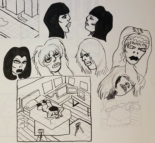
So far I've done a couple of layouts and compiled a ton of notes. Work on this project began with a simple two-page layout for a bimbo sequence.
I did all the pencilling, inking, and coloring in between two and four hours I think. The first panel on the second page uses an old drawing of the bimbo character I'd drawn several months ago.
I then made a sequence using a Goblin Queen character I'd created around a year ago. Here's the sequence and the original illustration I'd done. The second incomplete panel is from an old drawing I started but never finished.
Yes, the Goblin Queen who looks nothing like a goblin is meant to be a reference of sorts to the Goblin King from Labyrinth, if you were wondering. Except my Goblin Queen mostly hangs out with dark elves.
These sequences are only meant to be rough guides for the final drawings, but I put way more efforts into my layouts than I actually need to. After making these two page sequences, I decided to do something a little more ambitious.

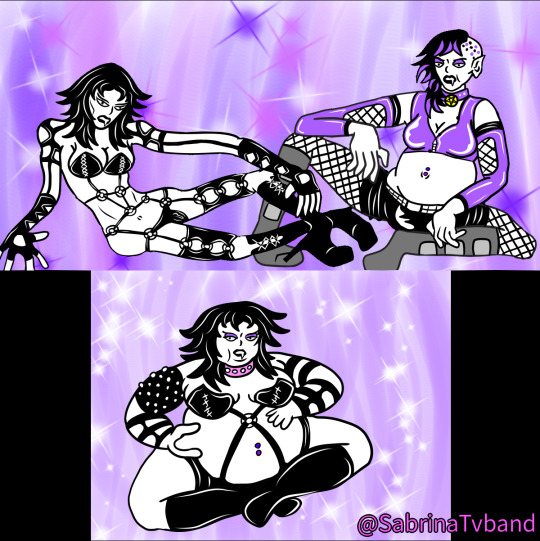
I illustrated a woman wearing a shiny black dress, and she reminded me of an old indie porno producer character I'd created a while ago named Demonia [please ignore how terrible the old three part sequence looks; I didn't know how to draw fat women yet].
When I started plotting this sequence out in my notebook, it was only four pages long. But I added a bunch of extra panels in later and brought it up to six pages [The numbers are original panels, and the letters are ones I added in after making the first complete rough layout.]


I made some concept art for characters I'd mentioned in the script that didn't have designs yet, as well as a few locations. I then compiled all of that into a CBR file I can refer to while working on the final art [the blacked out bits in the thumbnails are photo references].
I then started work on another sequence that quickly grew beyond the six pages I was initially planning on doing.

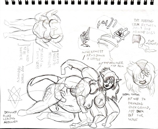
A few years ago, when I first started using my Wacom, I illustrated an androgynous spider creature. Much more recently, I started moving overseas and started designing new characters in my sketchbook that I was planning on making digital pieces with later, and I revisited my spider concept. If you overlay the rough spider drawing from the sketchbook page with the digital WIP below, you'll notice I did a whole bunch of warping and stuff to the individual limbs to make it look better.
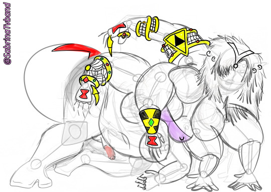
This WIP will appear in finished form in the spider comic somewhere; look out for it.
Anyways, I decided this spider would be perfect for a weight gain sequence, and so I started making concept art.
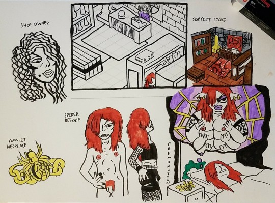

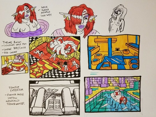
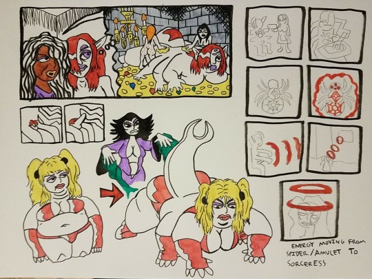
This is just a fraction of the concept art I created. I've done at least 15 pages of work for this comic, and a lot of it is exploratory work. In the beginning, I had basically no idea what the plot of the sequence would be, and designing new characters and illustrating scenarios gave shape to the story.

After making maybe three or four pages of sketches, and writing a list of elements I wanted to be in the story in my notebook, I made this rough synopsis of the plot. I then started working on a CBR file for the spider sequence that includes photo references, sketches, old designs I want to repurpose, scans of my notebook, etc.

Work was slowing down in my notebook, and so eventually I made a text document and started writing down panel-by-panel bullet points. Of course this all needs to be adapted into rough visuals, but I covered a lot of ground with this after building my foundation.
You might be wondering what the point of all this pre-production work is. The problem with comics as a medium is that it's extremely time intensive, and so you have to get all of the iterative stuff done long before you put pencil to bristol board for the first time [assuming you only use bristol board during the very last stage of your process].
[Old comic artists were sometimes drawing upwards of 40 pages a month, and they didn't have time to think things out so thoroughly. But for people who aren't drawing multiple books a month, it's been common to do multiple waves of layouts for decades, and this pre-production stuff has only gotten more common. Which is good; quality > quantity. The video on layouts below is a great overview.]
youtube
While I was doing layouts in my notebook for this spider sequence, I started working out a page that ended up not hitting all of the notes it needed to. If I'd been drawing by the seat of my pants, it would've been a big problem, but when you're doing layouts with illustrations only two or three steps above stick figure drawings, re-doing a page is not a hassle.
You might be wondering what my actual workflow is for producing finished art. Once I got very used to the feeling of using an Intuos Wacom, I told myself I was going to draw comics entirely digitally. It made a lot of sense; I could use layers, perspective work is a lot easier digitally, and I can fix mistakes and/or warp things a lot more easily.
Over time, I realized I hated doing everything digitally. There are many things that are better digital, like coloring. I prefer drawing pin-ups digitally. But I really don't like drawing an entire page digitally, and I realized my previous serious comic attempts had all petered out when it was time to start doing the final work in the computer, after the layouts and stuff had already been completed.
Of course, I'd tried making professional quality work without computers before. But it's nearly impossible to do that inside of a sketchbook [although I'd drawn many joke comics in highschool using a sketchbook], and using only bristol board I had problems with things like perspective; I have a lot of respect for older artists who couldn't use any digital tools.
So, I've resolved to buy a scanner and printer. I'm going to make final layouts in my art programs that have skeletons laid out where I want them, perspective grids, panel layouts, etc, and then I'll print them onto bristol board using light blue ink [which doesn't get picked up by a scanner]. I'll then do the final pencilling and inking on bristol board, scan those pages, and do any touch-ups and coloring in the computer.

I forgot to mention that none of these comics have words. Perhaps future issues of Fat Evil Women will have dialogue and stuff, but as a conceptual thing this first issue is basically completely silent. When I was making panel grids digitally to start working on some final layouts, I noticed that, when you don't have any speech bubbles, a traditional six panel grid looks way too square and vertical. So, I've decided to make my spider sequence on a four-tier grid, which shouldn't be a massive change. The entire story uses uniform rows, and so it just means moving stuff back. There are no dramatic page-turn moments that will be compromised by this change.
I might have to alter the Demonia sequence as well, but probably not. Since the height of the panels in the two page sequences are variable, I think I'll leave them exactly as they are.
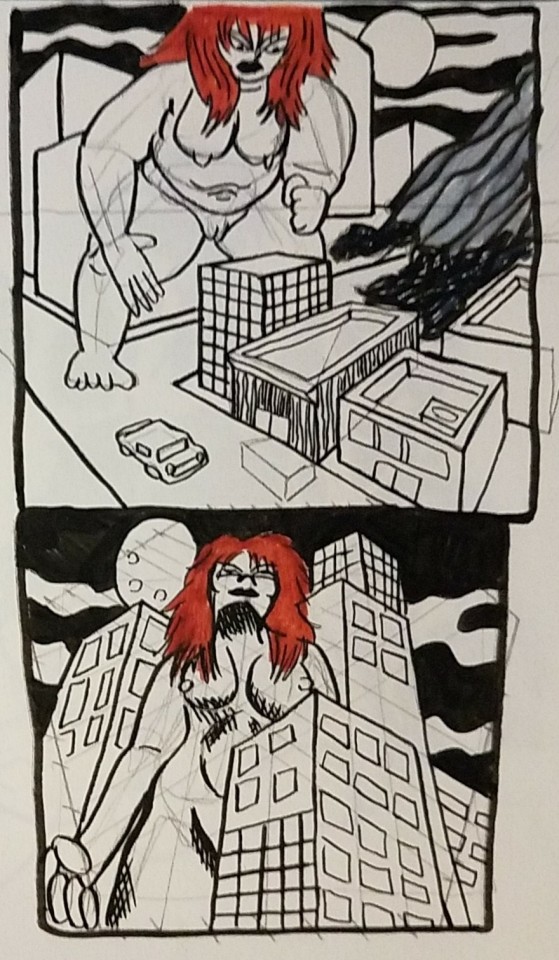
I was planning on including a giantess sequence in this first issue as well, but if I reach 32 pages without it then I'll have to push it to a later issue. But since I'm moving to four-tier layouts, I might end up with a lot fewer pages than expected.

3 notes
·
View notes
Text
Week 10- On da grind
Figure 1
Indonesian meme

Note: This meme can be roughly translated as "I am going off(line) first (bray is slang for bro). I am questioning my life right now"
Honestly speaking, I feel mentally better in week 10 than I did in the previous week.
What?
This week was characterised by two words: stress and grind. However, this push might be a good aspect, as I managed to get my card design quite literally finished. Buttttt at the same time, a declining state of sanity. I feel immense gratitude to the FabLab technicians (especially during printing, cutting and sudden laser cutting) for supporting and helping me despite the short notice and the recognisable cramming.
Week 10 felt like an emotional rollercoaster. One moment, I was stressed, and then I felt relieved. The week was dominated by late-night calls with my friend and black coffee. I know. Who drinks black coffee at 2 am? Apparently me. Despite being a whirlwind of emotions, this experience I gained new insights about approaches.
Since beginning my design journey, I have been scared to come into the FabLab. I do not know what influences me to feel this way, but I just know that coming into the lab--even the old Design space--makes me anxious. However, I have to admit that this experience was a letdown. I am disappointed in myself for allowing this to happen in the first place, but I am grateful to have gained new knowledge along the way.
Final designs
Figure 1
Flora and Fauna cards

This is the design I created for the flora and fauna cards. By combining the two colour palettes I have and decreasing and increasing hues, I was able to obtain the colours of the card. On the cover page of the cards, I have included a Māori word and its meaning. Inspired by a piece in the museum, I chose Haumanu, meaning to revive.
Figure 2
Question cards

As for the question cards, I have chosen the word Whanaungatanga, which roughly means kinship. The chosen words reflect the card game themes, of connecting, environment and communication. Slightly different from the flora and fauna cards, the questions deck adopt a ticket-style design.
Overall, I aimed to make the card designs inviting, warm and easy to the eye. Hence, the mixture of warm and cool tones.
Figure 3
Rulebook

Similar to the style of the question cards, I designed the rule book to look like some kind of ticket. The rule book will be folded piece of A4, and includes the details of the game.
Figure 4
Prompt Sheet
The prompt cards are replaced with the prompt sheet, but this time, using this is optional. The game provides a list of prompts and also encourages players to make their own prompts. Moreover, the cover page follows the theme of the cards and includes the word 'Kōrero', meaning to speak.
Figure 5
Map sheet

Instead of A4, the map will be printed out in A3 size. This will allow for more drawings, notes, and scribbles of thoughts. The map includes the names of areas where the species might potentially be and some quick facts, which will be improved and added in the final iteration.
Printing
Printing is evil. I encountered multiple struggles when it came to printing, and nothing seemed to work 😭. At first, I felt relieved as I had completed my file and needed to print it. Everything was sorted, and the paper; I allocated some time to print. I thought everything was going well until I encountered the first problem--being unable to print from my laptop. All the computers in the design space were fully booked, so I had no choice but to print from my laptop. Printing normally went well, but the challenge came when I had to use my own papers. Somehow, my laptop did not have the bypass tray settings; despite getting help from the technicians, I ended up on a closed road.
The technicians helped me print using their computers. However, the second problem occurred. Using my papers meant that I could not use the double side feature and had no option but to put it back in for a second round. This is risky, as me being me; at some point, I might forget which way the paper goes. In the end, wasting paper if I repeatedly make a mistake 😃🙏.
Therefore, to mitigate this problem, I decided to go to a printing location where my friend had previously used their service. This is where everything went downhill... It turns out I did not set up the document properly, which took more than two hours for me to reset it. And guess what? I did not end up printing as the store closed and I partly gave up.
Nevertheless, I did not give up. I went to another location with public university computers. This is where I encountered the irritating challenge of having a somewhat corrupted file. It turns out that sending the file, downloading it, and printing it from my university email caused the outcome to be darker and have dark boxes. At this point I was very annoyed and in the verge of crying.
I rushed back to the design space and asked for help once more. This problem could not be solved; hence, I had no option but to print with printing paper and paste it onto the paper I bought. I was filled with anxious thoughts and was irritated. However, the support, help, and advice I received from my peers and the FabLab technician profoundly helped me to become calmer and relieved.
Laser Cutting and Final Outcome
A FabLab technician recommended cutting the cards using a laser cutter. And being quite a messy cutter, I feel a burden off my chest hearing that I am able to do this. However, after a few trials, I manually cut as I had little time left. Over an hour, I felt my soul leaving my body and entering again. However, I finally finished it and was ready to take pictures! I felt relieved but not fully relieved.
Figure 5
Photograph
Note: This is a photograph taken for the poster.
Figure 6
Photograph
Note: This is a photograph taken for the poster, but not used.
Figure 7
Photograph
Note: This is a photograph taken for the poster.
So What?
I gained some valuable insights from this experience. Overall, this emphasises the importance of having a backup plan. For instance, if printing back to back does not work, then printing normally is the backup plan. If laser cutting does not work then manual cutting it is. I know I made a project plan with plans A, B and C, but this experience alone shows how important these plans are.
Furthermore, when talking about my regrets, I was fully expecting to be hit by reality or roasted by my peers and the technicians. However, I received responses that I did not fully expect. Instead of being roasted and being told the straightforward truth, the reactions I got were generally optimistic. Particularly not to dwell in the past and just focus on the present moment. Yes, I regret my actions, but I cannot change them anymore. All I can do is focus on what I am currently doing and what I will do in the future.
Buried underneath stress and panic, somewhere deep within me, I believed in myself that I would complete this. I did complete the assignment, but at what cost? I was not fully satisfied with the outcome, and I felt ashamed and embarrassed of myself.
Now What?
Now what? Well, it is time for a reflective action plan. I think my main challenge is overestimating my time, leading to poor time management. Along with setting priorities and creating backup plans, having a moment of reflection can be helpful. This way, I can both think idealistically and realistically about how the plan will be executed. Having a plan of what I hope and what might actually happen helps estimate the time I need or have left. At the same time, pushing me to continue.
Referencing Bersuwara. (2024). [Social Media Post]. X. https://x.com/bersuwara/status/1802968063228400002
0 notes
Text
Devlopment
this is my process of me making my first ever mixed media animation
i had to face A few challenges when using indesign as i have never used indesign to this capacity before. In this process i also learnt how to use premier pro to export the videos as frames. This took a long time as for this animation i used around 8-10 different scenes. From exporting them i then put them onto indesign. I used a3 paper settings and a grid to collate them all together.
At first it wasn’t sure about how the video was going to turn out as some of the frames came out a bit blurred due to the formatting as jpegs but i believe once they were scanned it it actually really adds to the effect of the motion and atmosphere i am trying to create in the video. I printed the frames double sided but this meant i couldnt really experiment with cut outs but the cut outs i did do look really interesting within the video, to develop i will do this more.
I experimented mostly with posca markers for this which helped certain features to stand out but also turned out a bit flat unfortunately when put back together in the video. I believe the parts that worked the best were the oil pastels as it created a lot of texture and also softer which divided the attention more to the musician rather than the overlays itself .
One thing i would improve with this is the busyness of patterns i draw on each frame, i didnt realise when drawing, but when scanned it in , the drawings went too quick and perhaps looks a little too crazy and i hoped for more definition, i also really like the colour scheme , i chose colours that relates to the video colours already there. I also think the text went well! I would try different fonts and colour schemes next and improve the speed of the mixed media aspects. But really good first attempt.
0 notes
Text
RTWW Creating Props
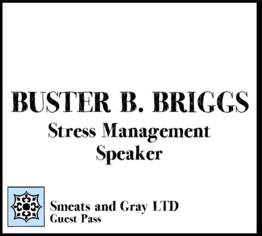
I was really looking forward to creating the props for this film. As an artist myself I could be creative and stylish with how I wanted them to look. I appreciated the creative freedom that Luca gave me, and we were in contact during my process to ensure everything was in line with the script and characters.
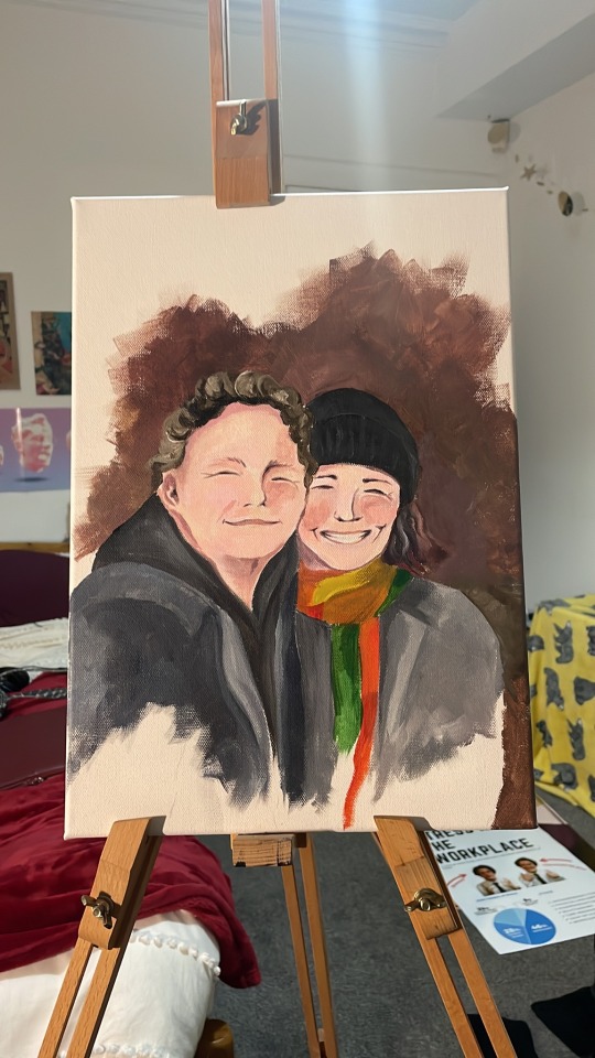
I had bought some canvases and some foam board from the art shop in Tollcross to get me started with Janet’s messy art studio part of the living room which I was to design. All the rest of her items I could use my own, paints, pallette, easel etc. I began on painting the photograph of the two actors the weekend before our shoot. It took me about three hours, and I was to make it look as though Janet was still working on it, unfinished. I also kept the palette that I used for the painting as the prop, as it had the same colours therefore looked believable.


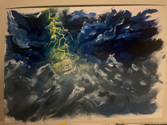
I then painted a couple of other pictures on A3 to decorate the walls, as if Buster has hung them up. I first did a storm, then a portrait of a bear. I wanted them to be strong, powerful pictures which reflects how Janet feels and how she channels this into her art. I think it portrays her fierce personality but also how she can hide away in her work.

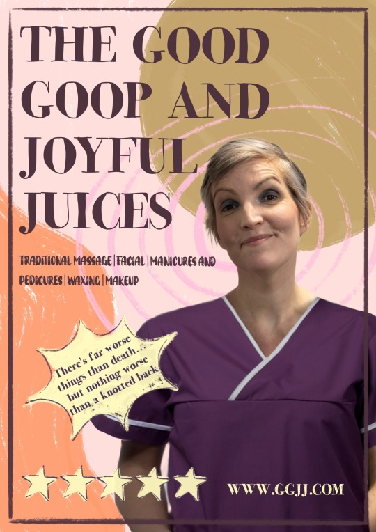
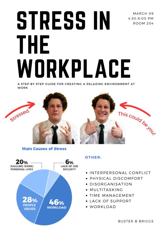
The posters were definitely a challenge to create. One, the Good Goop and Joyful Juices poster which had moving eyes, and two, Buster’s ‘Stress in the Workplace’ poster. The design for the GGJJ poster was to come across as friendly, bubbly and welcoming, with a headshot of Mrs Muskaan and originally two other masseuses. We decided to only use the headshot of Mrs Muskaan to make the practical side of things (with the eyes) easier. During one of the rehearsals, Luca took these photos with a variety of poses and angles for me to work with on the page. As we didn’t have the costumes at this point, I had to photoshop the purple scrubs onto the portrait. Photos were also taken for the ‘Stress in the Workplace’ poster, with a series of shots of Buster looking happy and stressed out. The idea for this poster was to make it believable that Buster created it, slightly simple but getting the message across. I designed the graphics using Procreate and Canva on my iPad, then sent them off to a company called Out Of Hand Scotland to print off at our desired sizes. We chose A2 for Buster’s poster, as this was sensible for the indoor location and for a meeting, and A1 for the GGJJ, to make it stand out in our exterior location as well as big enough for the actor to stand with it and look through. I planned to use the foam board to make the GGJJ poster more tactile, as we were using it outside and has to be held by an actor. Then there was also the debate as to how was going to make the eyes move. I think the most sensible way of doing it was to cut a hole in the poster and have the actor look through. As the company I chose to print the poster was good quality, I only had one chance at cutting the hole right. After sticking the poster onto the foam board, I used a knife to shape a rectangle over the eyes of Mrs Muskaan. This was easier than cutting two circles over each eye, which also would have made it look quite scary. I kept the rectangle of poster/foamboard to the side, and fashioned a tab on the back of the poster so that it could be removed and replaced easily. This meant that in the shot, the actor who was standing behind the poster could remove it, look through, then put it back. This way we get an idea of how the poster looks, on top of the aspect of absurdity and humour.

Early designs for poster (before the photoshoot with actors):
These didn’t work because of various things, such as practicality with the eyes, or the style didn't match the massage parlour, or the colour scheme didn’t match. I had researched massage parlour posters and analysed the main elements that are commonly seen and tried to use these in creative ways.


I was also to print out some items myself. For Buster, I found some online documents about stress in the workplace to scatter on his desk to show he has been working hard yet disorganised. I also had to print out his name tag to put into his Lanyard. The font I used on this name tag which Buster will have received from work is actually the same I had used for the Good Goop and Joyful Juices poster, as if to say the GGJJ controls EVERYTHING outside of Buster and Janet’s living room. The logo I had designed for this fictional office corporation also is actually the letters GGJJ hidden in a mandala. I also found some colourful, trendy online posters to print out for the shot with the GGJJ poster, so that it’s not on its own. They were mostly random designs that I thought looked cool, but I came across a few which I think worked well with the story. One said ‘Freak Out’ and another ‘Choose Your Escape Route’. I have been practicing their composition with each other so I can make sure to put these visibly in the shot.


Then finally we were to make a questionnaire for Buster to fill out when in the Massage Parlour on the iPad. Luca designed this quickly, keeping the style the same as I had used in the poster. You can have a look here: https://thegoodgoopandjoyfuljuciesmassageparlour.myportfolio.com/work
FP
0 notes
Text

Do you ever wonder why artists create a piece of art in a certain way...? If you do, please let me tell you a little more about my painting of "Mow Cop Castle". Artists usually paint closer elements in detail and those further away in broader strokes to create an effect called perspective. This way the painting mimics the way our eyes communicate with our brains, giving more information about the things that are in closer view and less about things that are further away. With the hill on which this folly stands, I have reversed this, in a way similar to something called hierarchical perspective, in which the artist uses unnatural proportion or scale to depict the relative importance of the elements in the artwork. In the pre-renaissance period this was used in religious art to emphasise the significance of certain religious figures. Here I have kept the relative sizes of the castle and hill realistic, but have shown the castle in finer detail to reflect how our eyes are drawn to the elements in the view we see as most significant, interpreting them as closer to us than they really are. I visited this castle last year but it took me till last month to complete this piece. I needed lots of time to think about how to go about this painting, because this one felt very special. It marked a moment that meant a lot to me. Friends mean the world to me, and this was the first time I'd met up with a certain friend from Stoke since the Covid lockdown. I used masking fluid and polychromos oil-based waterproof pencils, Daniel Smith pigment-rich watercolours and then artist's pens for some of the grasses in the foreground. The A4 (29.7cm by 21cm) unframed original is available for £75 including UK postage, or if we live close enough for us to deliver, it's £95 in an A3 size frame. Please just private message me to arrange your purchase. Or it's available in a mix of different types and sizes of prints, and printed on all sorts of lovely things at:
Thanks! Sam aka LymphomaLass xx
0 notes
Text
Printing onto an A1 process (never again haha)
This has been a very bold move by me. I am creating an A3 publication portrait. Which means the physical print out is an A2 landscape size. This requires to be printed on A1 sized paper. Printing to the scale of A1 requires a special printer and the indesign settings to be changed specifically to print A1. I started off designing on my own laptop and on the standard macs at university, but there is no option to scale or customesize the pages to A1. This meant that I had to rescale my sizes in the level 7 classroom on the computer that was already attached to the A1 printer. This way, the indesign presets allowed me to scale to an A1 size to print. On top of this, I had to manually make my files into a booklet so that I didn’t have to “print booklet” on indesign as it was impossible. (or if I designed it on the level 7 desktop in the first place I could have). I also had to manually double side every page.
This is the stage that really had me behind, I would do this and the margins would not be centred on both sides (its still a mystery as to why) however, myself, struan and Luka were problem solving this situation as its also something out of their scope. However, I then ended up printing one size on A1, then I trimmed to crop marks, I then turn the paper of to double side it, but this time changed the size down to A2 which would print without crop marks but it would perfectly align and print centred this way. This result was the best we could get after a number of different ways we had previously tried (took me 2 days and 14 hours to figure it out) BUT YAY. I now know how to print an A3 portrait book if anyone needs one????
0 notes
Text


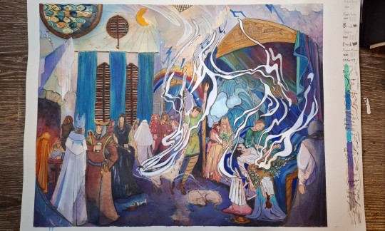
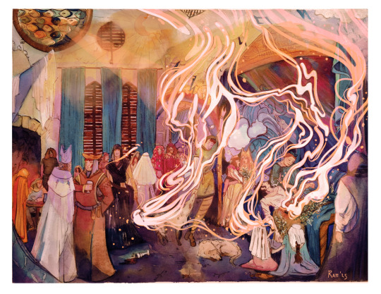
This post shows the development of my first attempt at the sgraffito paintings. I began by working on a relatively small A4 scale on acetate. The first attempt using pink acrylic paint was disappointing as I found it difficult to make marks on the acetate. The second attempt using orange acrylic paint was more successful as I had allowed the paint to dry more this time and it was easier to make marks. I was still disappointed by how little of the coloured paint could be seen so I thought of a solution to this, which was to paint one side of the acetate in a neon colour, and the other side of the acetate in black. This allowed much more of the colour to be shown than previously. I also moved up in scale to A3 acetate. This was how I approached the making of my final large pieces.
By this stage the aim of my final piece had changed. I had decided that I was satisfied enough with the body of work to include it as part of my final piece. This meant that the final artwork would include a lot of the development prints I had made along with the final resolved large sgraffito paintings. All of the pieces of the final artwork would be displayed on the walls in my studio space.
0 notes
Text
WC- 13th March
Today was all about organising how we were going to complete the book over the next two weeks. The first step was to go and get our paper, it was all dried out exactly how we wanted it to, the last step was to flatten all of our paper in the print. We left this the whole day to ensure it was perfect to use. Shown below...
For the rest of today, we worked as a group to complete all the content which was going to go into our book. I started to complete digital drawings using procreate using past nature photography I really enjoyed this as it was something I had never tried before however due to time I did not complete this to go in the book but I would like to do more of this in the future.
Today we also had to consider how we were going to print the book, therefore, we went down to the print room and asked about potential screen printing however due to the cost of calligraphy paper and the short about of time due to uncertainty we did not feel up to doing it. Due to this, we had to look at alternate ways of printing so we went to the Curzon printing room to ask about painting in A2 and we also decided to test print some pages on some card A3 size to see what the outcome would be. Due to the paper still flattening we had to leave this till Friday to compare the size to the front cover.
Wednesday 14th March
Today I completed my poems for the book, this was the hardest part for me as I've never really been good at writing however surprisingly I enjoyed this process as I used the poem generator which allowed me to complete multiple poems.

Friday 17th March
Today consisted of continuing to put together the content of our book, today all of our papers were flattened and ready to use. So we were now able to complete a front cover for our book, I took on the task of decorating the front cover which is something I enjoyed this process did take longer than I thought it would due to me trying to stitch the flower into the page shown below. This was very difficult due to the thickness of the paper making it very hard to stitch into I had to use string and bamboo skewers however, in the end, it worked out alright however if I was to do this again I would've spent more time on it.
While I completed the front cover the rest of the group had different things to do to bring the book together. Layla and Leila were completing the stitching of the paper together for the back this was also quite time-consuming due to the thickness of the paper.
Before stitching, we had to consider the colour of the stitch this was inspired by the natural dye workshop we had a few weeks ago. In the end, we decided on the most natural one.

While doing this Muki was printing each page of the book, we decided to go A3 card as A2 would've been to big for the front cover and the printer would not print too big. Doing it A3 also means we used less paper as we just cut up the paper which was already within the studio making the pieces more sustainable.
Today we also started to use a pen plotter this worked successfully for one member if the group's poem in Urdu script this looked really nice and it was a really interesting way to incorporate technology into the book.
We wanted this to also have a meaning which linked to our performance them of comfort and home therefore we each made our moms complete the alphabet in handwriting Meg then made us each a font from it for the pen plotter however when we started to use this the pen plotter stopped writing the poems effectively as it would just overlap as it was writing this was due to motor breaking as we where using it meaning we where unable to use this machine with our piece. This meant that the following week we had to handwrite each of our poems.
0 notes
Note
Omg describe him i feel like i can imagine all of dream somehow but jeno and jaemin specifically i cannot 😭😭
Okay, buckle up for my thoughts about each of the Dreamies!
Renjun:
ate CDs for dinner, I have no other explanation
so fucking stable, it's no joke
did Hyuck's iconic whoop da whoop part, loved it
and his part before the dance break
his short hair actually looks good in person. Not even joking.
smol.
spoke German but I couldn't hear because everyone was freaking out 😂
smiling the whole time and waving at the crowd
Jeno:
don't talk to me
they styled his hair SO FUCKING WELL OML
you could immediately tell they were on stage because of how violently pink his jacket was
don't talk to me about the JARMS (I didn't notice him yeeting the jacket before they showed a CLOSE-UP shot of him for the chorus of glitch mode)
oh yeah, speaking of glitch mode, he did Mark's part at the beginning, so we had two Jeno centers for glimo choruses (very sexy, I approve of that)
and another thing: his "buffering" move in the glimo dance is so sharp?? does that make sense?
he's somehow more angular than in photos? does this make sense?? like his face? jawline and cheekbones especially
also he's big. like broad? his shoulders?
he just oozes confidence which is so fucking sexy
sounds fairly similar to the recording but more hyped and raspy at times
honestly, I don't remember half of what he did, I was busy freaking out and screaming off the top of my lungs
Jaemin:
he was having so much fun, you could tell
all smiley during the meant and their special little corner
he was showing his excited and weird (endearingly) side a lot
super hyped when he spoke in English (super hyped in general)
I have a photo with the translation "the definition of sensual~~" on the screen of him and that's honestly pretty accurate
wouldn't stop staring at Jeno during their MC part
his live vocals are no fucking joke, it might have just been my favorite pare
like he sounds so different from the recording in the best way possible. his voice is just much raspier? I can't really describe it but it's different from the recording and you could immediately tell that his mic was ON
very smooth dancer
he did Mark's part where he was going back and forth with Jisung during glimo
Chenle
surprisingly the calmest out of all of them
I love love love his high notes in 5 Dream version of Hello Future so so so much. You couldn't really hear the first few ones because of how loud people were screaming but then for the last, big one he was like BITCH I CAN BE EVEN LOUDER
such crystal clear vocals
also slightly different than in the recording. Possibly more powerful, not too sure, was busy screaming
he!! danced!! such a good dancer damn
someone had a "chenle for president" slogan and another one printed out the pic of him as a child with the rifle to stick it on an A3 poster. Little suns are so iconic
Jisung
he's a dancer, he dances!!
like. he popped the fuck off. literally.
he went so fucking hard. He caught my eye especially during hello future in his center part near the end. The move was just so crisp and clean and urgh
I sat next to an asteroid and she was screaming so loud for him it was adorable
for the special part where they played around, he proposed to us with the Dream friendship ring. People unalived from that.
did the 299.792 per second part in glimo from Mark and honestly killed it
also ate a CD for dinner maybe with a slightly lower pitch(?)
#I don't know if all of this makes sense but these are my thoughts#rai’s mail#rai’s anons#rai saw jeno live
18 notes
·
View notes
Note
Thanks for answering, now let's turn it around! ETHAN finds an envelope full of photos of your MC with her ex/exes... some are a little racy. How does he react?
ehehehehe
so Ethan has seen some tastefully racy photos on Becca's picta that her undergrad fwb Jon took of her. He never had a right to get mad about it but by god his heart raced so bad creeping on them late one night. Though these photos are of her and not with anyone else....
I could see my girl taking some *ehm* home videos with Jon that she would have kept on a drive hidden away somewhere because she's a sentimental bitch.
Maybe she'd also have some experimental boudoir images with him as well.. printed out in an A3 envelope and kept in a fancy storage box at the bottom of her closet under a pile of shoes. And if Ethan found it when he tried to organize their shared closet and if he just so happened to open it with mild curiosity he would be very intrigued and excited by the first few solo images thinking they're his next present. But then he'd keep flipping through and there's someone else in the images and oh god she’s not alone. Certainly not meant for Ethan’s eyes. He wants to put them away but can’t help but flip through them all, warring emotions raging within him. So he takes them with him.
When she comes home he plops them on the table and her pretty amber eyes go WIDE and she’s just like 😳yes?😳 She tries to play it off as he asks why she still has them a decade+ later and she’s like ‘it’s art’ and Ethan just scoffs thinking there’s something behind why she’s keeping it. So they have a little tiff and then kiss and make up because it’s a really stupid argument to have.
Odette would never do something so brazen and permanently damning. (she also hadn’t been intimate with anyone since undergrad soooo)
5 notes
·
View notes
Note
!!! your books look amazing-- the details that's put into every aspect of it shows your love thoroughly for the text. I really like the variety of handwriting fonts used for each character and how you tied the alchemy theme into your second in art throughout the book.
The aspect I'm most intrigued by are your covers! Can I know how you're printing and I assume, coating them? I have trouble with my own experience in printing out covers.
Hi there!
Thank you so much for your overwhelmingly lovely comments ☺️ You have managed to pick up on and compliment the very thing that meant most to me in binding this fic… the fact that I adored all of the details and wanted most to be able to incorporate them within the entire design. I wanted the book to almost be a part the story.
If you had access to my instagram (@nightjarcreations), I actually did a separate post on my cover process, specifically related to my struggle with the materials and how to make them work. The covers are what I receive the most questions about, and I’m not surprised, seeing as I had such a struggle with them.
I ended up settling on this method (although I must stress that I am not fully aware of how it will stand up to use, essentially the longevity of it all - the binding itself couldn’t be more solid, but the cover wrap always shows a weakness around the spine hinge area):
I printed using an inkjet printer on A3 semi matte photo paper. I then experimented with various coating options to seal the paper. Thermal lamination was throughly ruled out, as regardless of the machine, speed or temperature, it will always delaminate at the hinge area. So I ended up using a ration of sealant layers with wax layers. It took a good few weeks of layering and drying for 24hrs between each layer.
Many people choose to send their cover designs off to a commercial printer, which negates the need to do any of this print sealing, however I have never been one for giving up and when I decide to take on a craft, I like to master the whole thing. That is not to say that others are doing things wrong, merely that I prefer to be able to do every aspect of a project, myself ☺️
I hope this is the information you were after and that it may have helped you with your future bindings!
Good luck! ✨
2 notes
·
View notes
Text
Paper Stopmotion Animation
I used the cutouts from one of my screen print stencils and two of my cyanotype prints to make a stopmotion animation. The storyline is based on a few of the images that I got from the music questions of the fourth piece (Paganini, Carnivale di Venezia). Dancing was a strong image and so I focused on that. It took me a long time to edit both along the way and at the end. I wanted the animation and music to fit together as well as possible which meant a lot of tweaking with the animation time. The main place that this shows is where the violin starts when the man appears from the right.
I used an A3 black hardback notebook for the background and blue tack to hold the paper characters in place. I used my phone torch for the moonlight and natural lighting which explains the change in light as the animation progresses. Finally I used my tablet to take photos as it has a good camera and the cover acts as stand. I placed books under the tablet to prop it up and fix the angle.
(Animation)
5 notes
·
View notes
Text
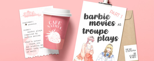
𝐭𝐢𝐭𝐥𝐞: barbie movies as troupe plays part 1 𝐫𝐚𝐭𝐢𝐧𝐠: sfw
𝐚𝐧: if you think i won’t do all 36 barbie movies, you’re wrong. regardless of whether people want this or not. i have barbie brainrot 24/7. i’m just separating it into parts so it’s not too long *this isn’t meant to be that serious y’all my reasons vary from legit to just jokes

𝐠𝐞𝐧𝐞𝐫𝐚𝐥: i won’t go in-depth with any plot differences from movie to play, or how the characters would work out... for now *chuckles in future ppt*
𝐩𝐚𝐫𝐭 𝟏: nutcracker, rapunzel, swan lake, princess and the pauper, fairytopia series, magic of pegasus, barbie diaries, island princess, three musketeers 𝐩𝐚𝐫𝐭 𝟐: coming soon 𝐩𝐚𝐫𝐭 𝟑: coming soon
𝐭𝐫𝐨𝐮𝐩𝐞: mixed troupe! spring x autumn. one of the seasonal events/scouts for A3! has a nutcracker theme, and to avoid spoilers that’s all i will say :3
𝐩𝐨𝐭𝐞𝐧𝐭𝐢𝐚𝐥 𝐜𝐚𝐬𝐭: since this is based on barbie’s take on the nutcracker, changing up the cast from what tsuzuru had in plan:
clara/sugarplum fairy: sakuya. i want to see him go through a costume & hair transformation sequence, not gonna lie.
nutcracker/prince eric: juza. obviously he has to be the ruler of the land of sweets.
mouse king: sakyo or chikage. i want one of them to wave around a sceptre and say quotes like “i’ll reduce the Nutcracker to a pile of splinters"
pimm: taichi... pimm is a spy :O who has to do dirty work :O but the real reason is i just want taichi to follow around sakyo again or maybe even chikage this time lol
major mint & captain candy: tsuzuru and citron respectively. mint is pretty serious and awkward, candy is a lot friendlier- i just think it’ll be a good way to insert some humor in the play
𝐭𝐫𝐨𝐮𝐩𝐞: mixed troupe! summer x autumn.
𝐩𝐨𝐭𝐞𝐧𝐭𝐢𝐚𝐥 𝐜𝐚𝐬𝐭: rapunzel in this one actually is the “servant” of gothel. also, rapunzel has a magical paint brush and also there’s dragons. who are purple.
rapunzel: kazunari. obviously. actually, kazu has a lot of similarities with her: a good artist, patient, adventurous, quick thinking, hardly ever complains- also he’d look good with long hair i think ><
gothel: omi. there is an action fighto scene + also just the theme of omi playing villains lol... also THERE’S A SCENE WHERE GOTHEL PRETENDS TO BE RAPUNZEL BY WEARING A LONG WIG AND BOI- KAZU AND OMI’S BODY BUILDS ARE SO DIFFERENT BUT IT’D BE FUNNY IF THE PRINCE FALLS FOR THE TRAP ANYWAY
penelope: kumon. a PURPLE funny and clumsy dragon- fight me, the only answer is kumon especially once you see who’s next.
hugo: juza. a PURPLE dragon who’s penelope’s dad but he’s gonna be the older bro in this one (i wonder why...)
hobie: a passive and worrisome rabbit... Tenma.
prince stefan: he also has a couple fight scenes... ngl bc stefan has blue eyes, light brown hair + described by the wiki as “fierce”, he’s banri.
𝐭𝐫𝐨𝐮𝐩𝐞: winter troupe. i will stand by this forever.
𝐩𝐨𝐭𝐞𝐧𝐭𝐢𝐚𝐥 𝐜𝐚𝐬𝐭: this is like one of the ones i’ve had figured out for a while already...
odette & odile: tsumugi. i’m just saying, tsumugi’s duality- he can do both the white and black swan because he has power. impact.
prince daniel: not tasuku bc spare him the prince roles he’s sick of it. guy. why guy? because he obviously has a good idea of how to act like a prince :3
rothbart: HOMARE! I WANT! THIS MAN! TO PLAY THE ANTOGONIST! GO OFF ABOUT DARK ARTS! TRANSFORM EVERYONE TO ANIMALS LIKE THE EXTRA BEING YOU ARE.
fairy queen: azuma. ugh just- imagining how ethereal he’d look.
erasmus: tasuku. he’s a troll that can act mean, but is genuinely kind and helpful... also, the VA of erasumus is also the VA for “unnamed burly villager” and i’m just saying-
kelly the cygnet: hisoka. there’s too many animal children, so hisoka is gonna be the baby swan. uwu. also, kelly has a quote, “I can't sleep.” and wOW THE IRONY
𝐭𝐫𝐨𝐮𝐩𝐞: WE’RE GOING FOR THE COMEDIC ROUTE WHAT’S UP SUMMER. reason: i went “wait... no actor really looks super alike though.”
𝐩𝐨𝐭𝐞𝐧𝐭𝐢𝐚𝐥 𝐜𝐚𝐬𝐭: tafahfuoahoaf it’s my favourite barbie movie... OKAY SO THE RUNNING GAG OF THIS IS THAT THE PRINCESS & PAUPER DON’T LOOK ALIKE, BUT EVERYONE KEEPS GOING “Wow! you two look so identical!” no they don’t
anneliese: muku. first of all please look at the sprite i used in the header. anneliese = pink = muku. she’s the sweet princess archetype... but in this version she also goes on tangents about rocks and mineraLS AND HOW THE MINING INDUSTRY SUX AND THE ABSOLUTE AUDACITY OF-
erika: kumon. first of all, the sprite in the header again. erika = blue like ugh this is perfect. ALSO erika has a cat who BARKS and i just imagine kumon talking to her cat like: WOOF WOOF WOOF GRRR GRRR and the dog responding and everyone in the palace going wtf
king dominick: i had such a crush on him anyway he’s tenma. rich, young, talented king who disguises himself as a page so he can find love for realsies. im just saying. he won’t be tenma’s only role tho ><
julian: kazunari. the wiki went “he’s the only bestfriend a barbie MC ever married” really shook me like ugh friendship dynamic between muku and kazu roles??? also kazu’s genuinely smart so him as the tutor was just gucci in my eyes
preminger: misumi. FIRST OF ALL PREMINGER IS ICONIC? WHEN HE SANG HOW CAN I REFUSE I WAS LIKE UGH KING. i just wanna hear misumi play an antagonist that’s also funny and do things with his voice.
madame carp: yuki. a bossy and rich woman who owns a dress emporium. pretty much it.
nick & nack: YUKI AND TENMA. THEY WILL DOUBLE ROLE FOR THE SAKE OF BEING MISUMI’S DUMB UNDERLING DUO
𝐭𝐫𝐨𝐮𝐩𝐞: spring troupe. i wanna see them have wings uwu.
𝐩𝐨𝐭𝐞𝐧𝐭𝐢𝐚𝐥 𝐜𝐚𝐬𝐭: just gonna combine the whole fairytopia series into one
elina: itaru. first of all, pink motif. also i just like the idea of itaru being this recurring protagonist.
bibble the puffball played by kamekichi
laverna: recurring villain citron. for no reason other than i think it’s cool when he plays power hungry villains
enchantress: i just want sakuya to play a role that’s more of a “powerful character” but still really kind uwu. another recurring good guy.
azura & glee: tsuzuru. elina is azura’s apprentice, and glee is a friend who’s generally really happy... ngl, i wanna see tsuzuru play someone more energetic for funsies
nori: masumi. nori is kind of a stubborn and jealous person at first, him and elina won’t get along right away BUT DAMMIT THE ENEMIES? TO FRIENDS IS GUCCI!!!
merman prince nalu & linden: chikage... yeah i just gave chikage the guy roles ngl... but i wanna see chikage as a handsome merman AND handsome fairy so *shrugs*
𝐭𝐫𝐨𝐮𝐩𝐞: cross troupe. spring x winter.
𝐩𝐨𝐭𝐞𝐧𝐭𝐢𝐚𝐥 𝐜𝐚𝐬𝐭: partially based on the ice-skating cards (i have yet to read the event story, unfortunately).
annika: tsuzuru. i thought it’d be fun to cast tsuzuru as a more sheltered character due to annika’s parents’ protectiveness. the contrast y’all.
shiver: sakuya. shiver is a polar bear cub sidekick who’s friendly and likes shiny things and that’s just... really cute... put bear ears on sakuya...
brietta: guy. brietta is annika’s older sister... who got transformed into a pegasus by the villain... i wonder how they’d change the pegasus thing lol
wenlock: tasuku. NOT GONNA LIE- i want tasuku to play the villain for all these wonderful one-liners: "Oh, smile! You didn't lose a daughter; you've gained a pet!", and "I thank my lucky stars I didn't marry you!"
prince aidan: masumi bc i want more roomie interaction on stage i mean their friendship keeps getting cuter and cuter.
cloud queen: azuma... that’s all. i just remembered her bc her hair has a braided crown, and i went “azuma braided hair brainrot”
𝐭𝐫𝐨𝐮𝐩𝐞: mixed troupe! summer x autumn.
𝐩𝐨𝐭𝐞𝐧𝐭𝐢𝐚𝐥 𝐜𝐚𝐬𝐭: i was gonna make it full autumn, but then the age casting felt awkward since they’re in high school...
barbie: taichi. barbie here is shy but wants to stop blending in the background! i just went “damn that do be resonating”. also i wanna hear taichi sing more y’all and barbie is a singer/guitarist here
courtney: azami. i like the idea of azami playing a spunky character who’s more of a tomboy, but still does like fashion and accessorising and... lip gloss?
tia: misumi? tenma? idk the intelligent and passionate archetype is very broad... especially in a high school setting
kevin: kazunari. just the whole best friend thing + kevin being a goofy person who loves to make ppl laugh ugh
racquelle: yuki. i know racquelle’s a bully here and say not to bullying... but sharp tongue.
todd: honestly? todd was so boring in the moving. we need someone like banri to give him CHARACTER!... yes that’s my reasoning ugh
𝐭𝐫𝐨𝐮𝐩𝐞: sUMMER SUMMER SUMMER-
𝐩𝐨𝐭𝐞𝐧𝐭𝐢𝐚𝐥 𝐜𝐚𝐬𝐭: AHAHAHA WHAT IS THIS CASTING? MY REASONINGS FOR THIS ONE IN PARTICULAR ARE SO SHALLOW LMAO
ro/rosella: “a 16 year old girl who can talk to animals! adventurous and brave” me: *gasps* mISUMI-
prince antonio: “prince antonio loves travelling and exploring-” okay yeah it’s kazu...
queen ariana: i just want yuki to sing to me “love is for peasants which we’re obviously not” and i’d go :O also ngl... i wanna see yuki in like darker palettes and plotting to poison all the royals
princess luciana: queen ariana’s daughter... played by muku. because i wanna hear muku counter yuki with “all the shoujo mangas books i’ve read, all the poems always said, that the heart is made to share...”
sagi the red panda & azul the peacock: honestly, just basing it off of colour matching but tenma is sagi and kumon is azul lol
𝐭𝐫𝐨𝐮𝐩𝐞: AUTUMN x SPRING
𝐩𝐨𝐭𝐞𝐧𝐭𝐢𝐚𝐥 𝐜𝐚𝐬𝐭: AHAHAHA WHAT IS THIS CASTING? pt 2
corrine: i keep wanting to put sakuya in these roles oops. i just... let him sword fight on stage again :>
viveca: purple musketeer, artistic, designs clothes... fights with ribbons... you know, for the sake of banri being a fAshIoNisTa... it has to be banri y’all "Don't mess with the animal print dress!"
aramina: green musketeer, fights with fans, romantic and loves ballet... pfft, for the sake of “wouldn’t it be funny-” it has to be azami. poor bby, having to swoon over romance on stage- he can’t relate
renee: chikage. purely because of that scene where she threw a feather duster (?) at a flying shard of glass and perfectly hit it. yeah.
helene: the old and strict instructor that teaches them how to be musketeers... sakyo.. duh.
philippe: the main antagonist... it has to be omi again. and since philippe has a goatee, we’re bringing back facial hair omi~
prince louis: itaru, lol. he’s like the one significant non-action oriented character in the film. he has just enough moments where itaru still looks princely, but mostly? he just wants humans to fly y’all.
want to order again?
#a3!#a3! act! addict! actors!#a3! act addict actors#a3! headcanons#cafe: dessert menu#serving: barbeQUEUE#nathya stans barbie ✌️💖#a3! game
80 notes
·
View notes