#and this is my first time trying to imitate the art style
Explore tagged Tumblr posts
Text

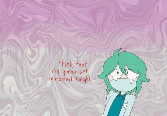
Something something us in homestuck’s artstyle having a breakdown something something
#jeremy yap hour#art#animation#homestuck#I’ve never read homestuck#and this is my first time trying to imitate the art style#have mercy#please
5 notes
·
View notes
Text

My baby brother...☺️🤏💖
#my s class hunters#s classes that i raised#the s classes that i raised#han yoojin#han yoohyun#msch#sctir#tsctir#SO MANY TITLES IDK WHICH ONE TO USEEE#내가 키운 s급들#내스급#my art#2ND 내스급 FANART EVER WOOO#finally used a pose ref image i saved ages ago... hehe#I LOVE THESE BROTHERS SM THEY MAKE ME SMILE AND CRY THEY DESERVE THE WORLD#BIG BABY BROTHER AND TINY HYUNG...🥹🥹#btw this time i tried drawing them (specifically yoohyun) more in my 'usual' style instead of trying to copy the webtoon#BC THE SPECIFIC WAY BIWAN DRAWS THEIR EYES IS BEAUTIFUL BUT SO HARD TO IMITATE#i like how it turned out much better this time... hehe#OH AND IG THIS IS ALSO MY FIRST TIME DRAWING YOOJIN.. LMAO
2K notes
·
View notes
Text

the costume design was a highlight
#danganronpa despair time#drdt#veronika grebenshchikova#arturo giles#verturo#fanganronpa#red flags meme#no shot i'm actually the first person to draw this right lol#missing the first two years(?) of the fangan means someone else must have beat me to it#nevertheless imitating the video's art style was super fun!#it kinda reminds me of the monster prom art style#i'm kinda bored of my current drawing style and i really like how this turned out so maybe i'll try using some of what i learned again#i love this duo they're so funny. i ALMOST put them together in my duos post so consider this makeup#sorry for all the arturo posting lately hsdfkfdl he's not even my favorite it's just what's come to mind#fanart#drawing#tw eyestrain#also nsft warning for the song/link itself but not the artwork
473 notes
·
View notes
Text
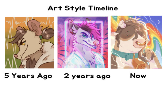
wish i had a consistent character to show for this, but since i don't i just used icons :0]
blank template for those that want it under the cut
#different urls at the time of posting each of these too. from uglyramen to vhsanimal to girlboyburger#slowly my lines get thinner and thinner...#this was rlly cool to put together actually. i ended up digging up like#2016 and before art too#like 2015 is when i became a furry#its rlly evident that i used to just mimic the art styles of furry artists with styles i like#like straight up i found pieces tht i traced (didnt post) from like. okamiwolven and ashketchumsays (i think they go by luxebites now?)#waves my hand#its neat. idk. ive stumbled across pieces in the wild of young slash newer artists clearly referencing or tracing my art#i never thought id be the artist that ppl would learn through like that#im not encouraging creditless tracing btw. but. idk. its hard to articulate the kinds of feelings i get from seeing the cycle#of imitating/tracing to developing your own style but w my stuff#i think it makes me feel nice#its cool that some ppl find my art inspiration or aspirational in that way#this isnt like a weird humblebrag or anything btw its just cool#its also RLLY neat to see the things i was clearly trying to do come through stronger over the years#the lines on the coat of otto in the first icon was my attempt at including crosshatching esque texture#and now i do that For Real with cow's hair and more recently with shadowing#shrugs#ive rambled for too long now. hello tag reader. i hope u have a good night#my art#art style timeline
72 notes
·
View notes
Text

they forg! :)
I got really excited about the bigb redesign and almost immediately got to work brainstorming a nosy neighbors fusion. This is mostly just what i could come up with at 8-10 PM for the moment but i'm surprisingly happy with it
gemcyt AU, pearl design, and bigb design by @chrisrin
#honestly i was kinda relieved to realize that the weird vibes i was getting from the old bigb design weren't just me#im really glad we have a new one and it also looks spectacular#anyways i imagine turquoise using any pronouns. probably primarily they/she? idk#their design is inspired by blue poison dart frogs! among other things#gemcyt#nosy neighbors#bigbst4tz#bigb#pearlescentmoon#idk what either pearl's or bigb's weapon/tool things are in the AU so idk what to make turquoise's#but i feel like a butterfly net would fit the frog vibe somehow idk why#honestly this is my first time trying to imitate the SU art style#not sure how well i did on the turquoise end lol#undescribed
100 notes
·
View notes
Note
I'm going to be asking a lot of artists I follow this question, but how did you develop your style? It SEEMS like most people find their style and stick with it forever, just making improvements and iterations. I tend to work in a lot of different styles because I enjoy doing that, though I know there are things I gravitate towards as well. But I wonder what your journey was and how you got feedback and improved while staying true to what you enjoyed?
Hi there!
I definitely wouldn't say that I've found my style and stuck with it forever-- I feel like each of my projects has asked for a certain kind of art, and has presented new challenges that push me in new directions.
Some of that comes from seeing someone else's work and having something click into place that might fix errors/faults in my own, and then I might try to incorporate that, such as bigger outlines on my characters to help distinguish them from the background, or maybe a way someone else simplifies eyes that can help make mine look less weird.
When I first started drawing, I can see where I encountered certain influences because my sketchbooks suddenly switch to incorporating some new stylistic element that I liked from whatever I was reading/watching at the time. But it was never QUITE right, it was never just copying, there was always something ~wrong~ with it. And that wrongness was my style! As much as I hated it, that was what distinguished my art from being just a copy of someone else's. I hate it less now, and understand that other people see something there that maybe I don't, because it's just what happens when I filter other people's work through my head. My soul, if you will.
There are definitely through-lines with my work, driven by what I like drawing and what comes easily to me-- hatching is almost always a major component, and I like making expressive characters. Here's some of my earliest available stuff, from my old webcomic:

Then not long after that, I started The Last Halloween, which pushed me to challenge myself in both layout and style:

And here's the same comic, years later:

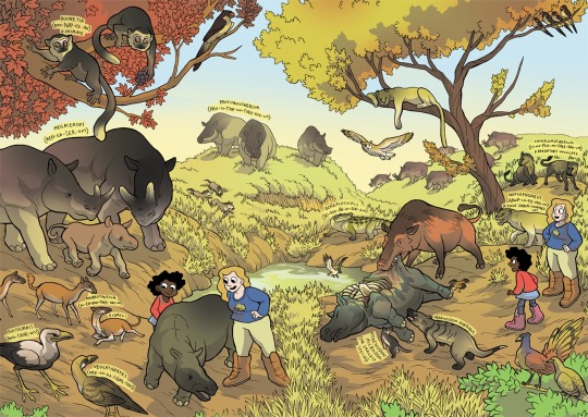
And here's a series I did for kids, where I had to use full color and lay off on the hatching, as well as learn how to reconstruct animals that we have no photo references for, which is definitely a place where style comes majorly into play, whether I wanted it to or not:
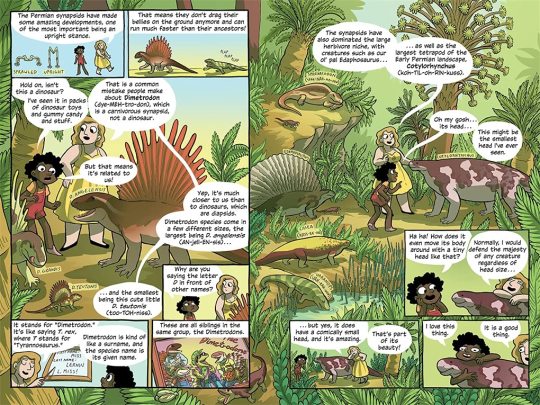
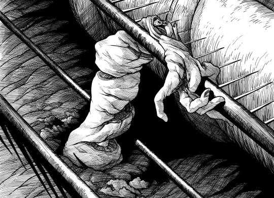
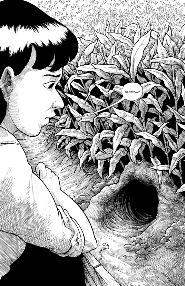
Then there was the horror book I did, where I tried to push my work to be less cartoony overall, and to work very hard on improving my hatching:
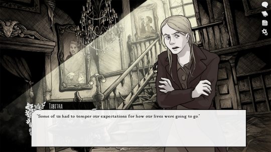
Then I started work on Scarlet Hollow, where I incorporated a limited/muted palette and had to once again push myself to make less-cartoony art, as well as learn more consistency so I could draw sprite sets. This was a big challenge for me, and has helped me grow as an artist so much!
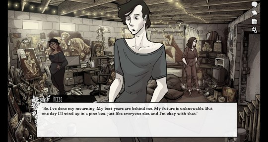
And most recently, I wrapped up work on Slay the Princess, which required that I go back in the cartoony direction, but in a very different way than I was used to. This took a lot of sketching to figure out, and there's still a decent amount of artistic stumbling in Chapter 1 while I settled into it.
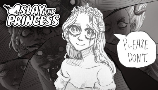
She's drawing on anime/Disney influence, but each Princess required a bit of stylistic variability. Some are more anime, while some are more realistic than even the Scarlet Hollow characters.
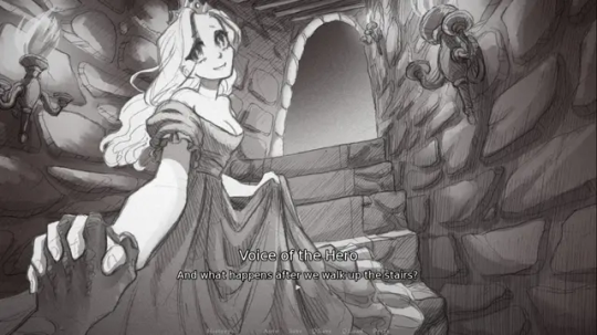
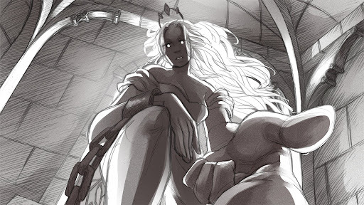
So I wouldn't worry too much, honestly! A person's style is often something that reveals itself over the course of their career, rather than something they choose and then try to stick to forever.
Even if you don't think you have a style, you do. It might vary a lot piece by piece, especially if you're trying to closely imitate another person's art, but the more work you do, the more you'll figure out your own strengths and interests!
#long post#my art#junior scientist power hour#the last halloween#abby howard#scarlet hollow#slay the princess#once you work long enough on art#style starts to feel more like modes you switch in and out of#all based around a core of what you're good at and what you can do#which in itself will change sometimes!#and of course your style with different mediums is gonna be different too#like slay the princess is pencil which is why it looks more distinct from my other work#never forget that at its core art is about messin around#wait shoot i should've put all this in the post#but it's long enough as it is
431 notes
·
View notes
Text

It is time to start a new art year! Here comes my OC. This time I tried to add some details from A. Mucha's style (love it) and tried to imitate a warm light from the star. I think I got it right... at least I think it is not bad for the first try.
#warhammer 40k#warhammer art#aquarelle#warhammer 40000#watercolor#watercolour art#wh40k#original character
39 notes
·
View notes
Text
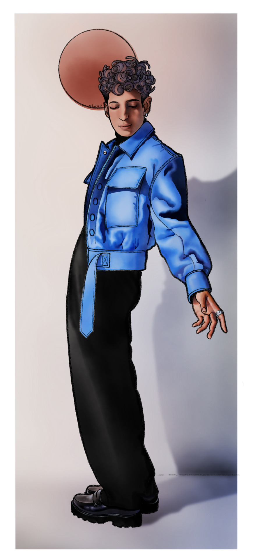
{ Style Study } - Jayden Revri in the style of Alphonse Mucha
Time elapsed: ~14 h Date completed: January 1st, 2025 Ref: Jayden Revri for Wonderland Magazine Done in Procreate
Style study No. 2 is done! Lineart, Ref, and yapping under the cut:
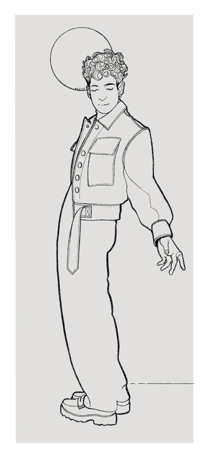
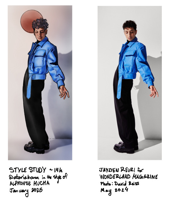
This one had a lot of ups and downs. The pose was so fun and although the lineart still took up a good chunk of time, I actually had a lot of fun doing it--I like Mucha's style of a thick outline and then limited lines in the rest of the drawing. I thought my usual pencil brush would be the best fit for it, especially since most lineart brushes drive me nuts and I don't know why. The disadvantage of the pencil though is that it's a little textured and not 100% opaque, making selections difficult (this was especially a problem on the pants).
As for the rendering, I was trying to imitate a watercolor style with a mixture of hard edges and gradients and not a lot of fine detail. I think I over-rendered parts of this one again, like the shoes for example, which breaks the style a bit, but yk. Using Procreate's watercolor brushes was a struggle because I've never really used them before, and I'm not even good with actual watercolors, so I sort of felt like I was floundering the whole time. I actually half repainted the face before I decided that the first version was better and then went back to it. Also I tried to do something with the hair that did not pan out at all, but since these are supposed to be quick studies (hah) I decided to leave it. Overall I'm really happy with it though, I like the look of it and I think I captured the elements of Mucha's style that I was wanting to try out. I also did more painting with the selection tool and that's starting to feel more natural and was really helpful for this one, so yay :)
I've been enjoying pushing myself out of my comfort zone and doing things I didn't think I could manage with these studies. I've sort of been feeling like my art is stagnating/not good enough or contributing anything worthwhile etc., and this has been really refreshing and a reminder that I can, in fact, draw :) Most of all, I feel like I'm learning stuff I can apply to other projects, which is a really good feeling.
The next study I'm doing is Lyendecker, which is smth I've been wanting to do for a while but kept putting off bc I was afraid of failure, but I was looking for references yesterday and actually? I think I can manage this. Excited to start working on it! ✨
If you read this far first of all I admire your perseverance second of all I am giving you a cookie in thanks <3 🍪
#jayden revri#dbda cast#dead boy detectives cast#digital art#illustration#art only#the most distinctive part of mucha's/art nouveau's style is probably all the detailed plant imagery but.#i did not do that. because i dont have that kind of time#maybe if i was doing a real art nouveau piece but this was trying out a lining & rendering style mostly#all this to say. is this recognizable as mucha's style to anyone but me? lol
34 notes
·
View notes
Text
NEUROSLUG NEUROSLUG NEUROSLUG
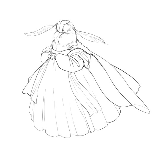
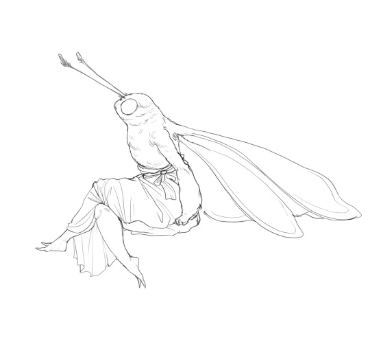
Ahem. So, I spent the last day force-feeding Stable Diffusion my art to teach it the concept of an anthropomorphic insect. As a result, I have a working LoRA that imitates my coloring style fairly decently and it can kinda do bug anthros. Emphasis on "kinda", it still needs a lot of iterations to be able to maintain proportions on it's own. However, it does quite great when provided with a simple line drawing as a quideline. Here are some examples I whipped up in like 2 hours. Input image:
AI's pure output:
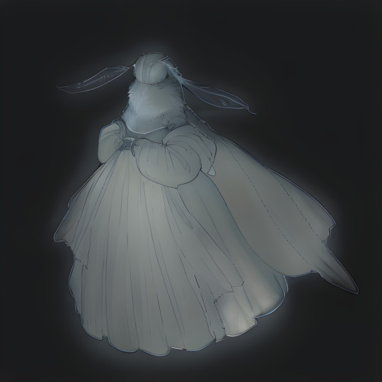
After touchup:
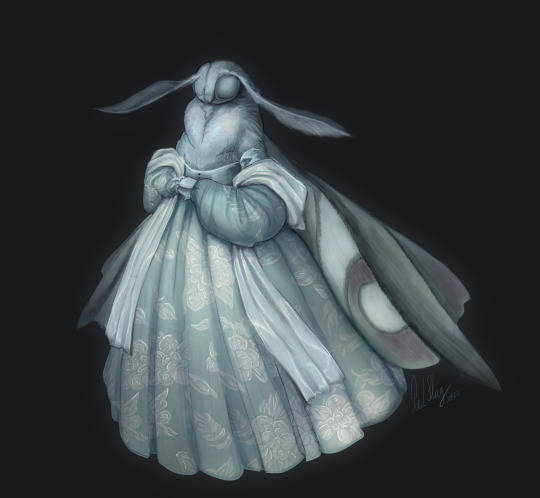
There was quite a bit of touchup on this first attempt with the generation serving mostly as a rough under drawing, but then again I didn't stress the network with details too much. Then I tried squeezing more definition out of it. Attempt 2:
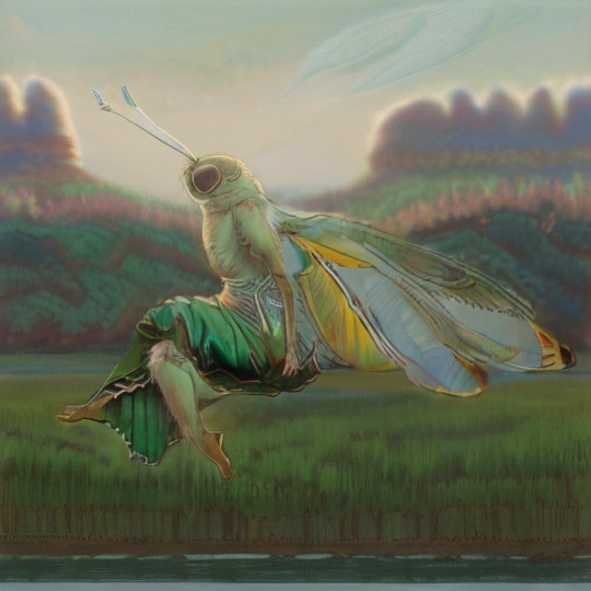
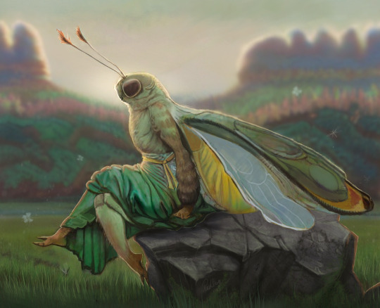
It can be quite competent when I supplement it with styles it knows well. I only used 30 of my own images to teach it, so it might be a little starved for examples at the moment. Adding "Bob Eggleton" seems to knock some sense into it for now. Okay, still images are working, now let's bash Neuroslug against some animation.
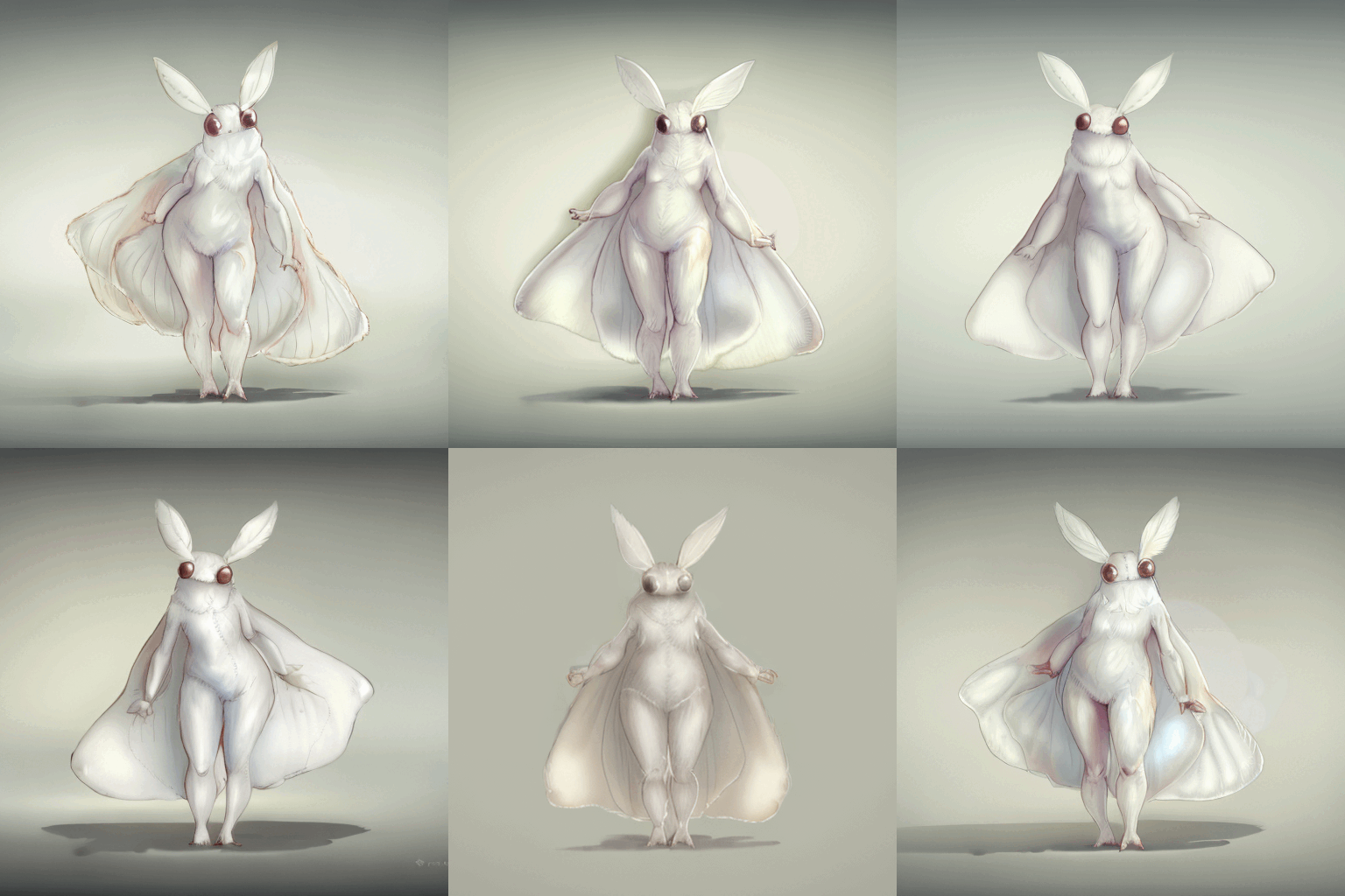
For something named Stable Diffusion it's not the most stable, huh. I'm still pleased with the result though, it's pretty cute. And while trying to make it cute I learned a little thing. AI art isn't art. It's a mixture of alchemy, gambling, detective work and demon summoning it seems. And a bit of just art. What I mean by that is that it can attach very unexpected meanings to words. Since I trained the AI on just anthro insects, it follows their defined anatomy quite closely. Specifically, they do not have breasts. As a result, adding "with big boobs" to the prompt changed the shading style and colors but not the actual anatomy. And so, most of my prompts have this lovely phrase just to improve the colors. 'Kay, time for the freak show. At some point during testing the machine decided that my moth isn't decent enough and put panties on her suddenly.
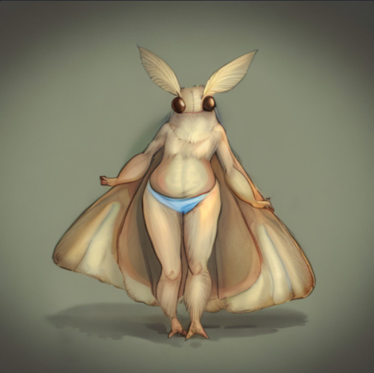

Now that's a booty

Look at those eyes

They have seen things As you can probably tell these have no sketch to guide the result.

It's still bad but it's got the right spirit.
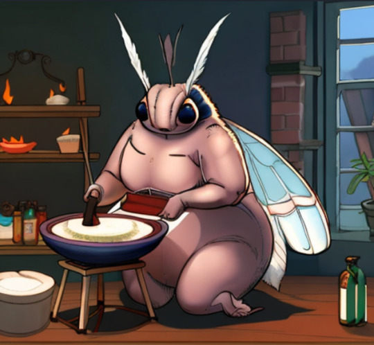
THICC
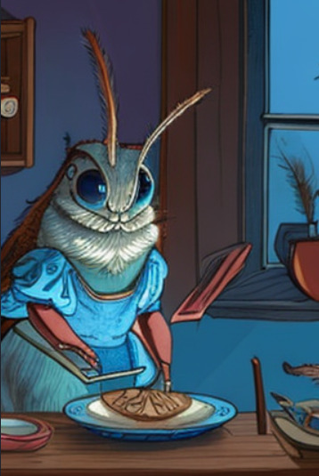
Surprisingly cute even if janky.
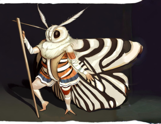
Looks better than it has any right to Now I'll crawl back into my hole to play with settings for an indeterminate amount of time. I'll publish my mini-me for you all to mess with once I deem it stable enough.
#slug's experiments#anthro#insect#moth#wooo i'm giddy#all the things I can do now#It's like i was gifted double length days to make stuff#with this i can make comics in painterly style that would be too time consuming otherwise
358 notes
·
View notes
Text
Bestiaryposting: Wutugald Results
All right, time to see what everyone came up with for the Wutugald! Again, if that statement confuses you, you may find an explanation at https://maniculum.tumblr.com/bestiaryposting . If you want a refresher on the description the artists were working with, here is the original post:
This was a pretty good creature to start with, I think; the random number generator did us a solid with this one. It laid to rest some concerns I had: will people be able to put aside their real-world knowledge of these animals and draw as if they had never heard of them? Yes, apparently -- a number of comments and notes indicated that several participants had guessed what the Wutugald was, refrained from sharing that information, and drew something that fit the description while being nevertheless a fully distinct animal. I was also concerned about some of the upcoming entries that specify a type of animal (bird, serpent, &c.), wondering if that constraint would be a problem -- but a number of people drew some Very Good Birds for this one, so I feel reassured that future entries that are Explicitly A Bird will still be material we can have fun with.
So, let's see what people created. I'm putting these in roughly the order in which they appeared, below the cut:
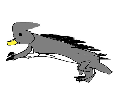
@cosmic-flora (link to post here) produced this in Paint pretty shortly after the original post went up, and posted it with a brief explanation of their design decisions -- they were the first but not the last to interpret the rigid spine as spikes and the single tooth as a beak, and also to provide the creature with claws for digging.

@silverhart-makes-art (link to post here) was also quick off the mark, posting this the same evening along with an explanation of their design process. I'm genuinely impressed by how quickly they were able to draw something so naturalistic -- this went up within like four hours of the original post. This was also the first (but again not the last) to include an apparent reference to the Wutugald's ability to change sex by including both male genitalia and noticeable teats. Also, I wonder if the coat pattern on the baby is a sneaky reference to the animal this is based on, as Silverhart does indicate that they figured it out.
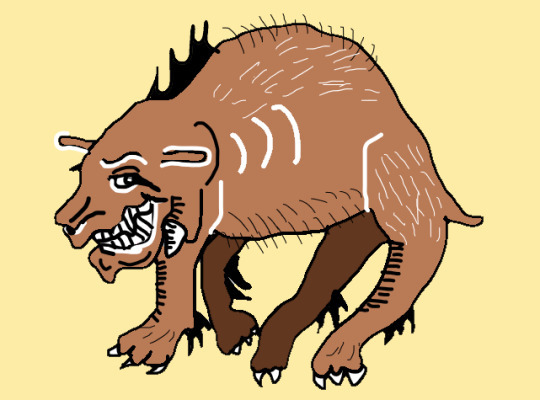
@elodieunderglass (link to post here) created this rendition, which I think does a good job at capturing the vibe in the bestiary entry, of a creature that the medieval author clearly sees as discomfiting and somewhat sinister. That is a grin that makes me worry about the critter's intentions.
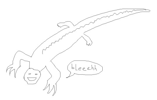
@geeoharee (link to post here) posted this along with a brief explanation of their design decisions. The human face and the speech bubble are great, I think -- it makes me smile. I think this is the first non-mammalian Wutugald, but several more come later.
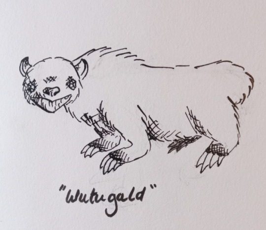
@sweetlyfez (link to post here) drew this with a dip pen, apparently, which is cool. Also this might be the cuddliest-looking version, but my desire to hug it probably says more about my own sense of self-preservation than anything else. That is a cute face, right? It's not just me?
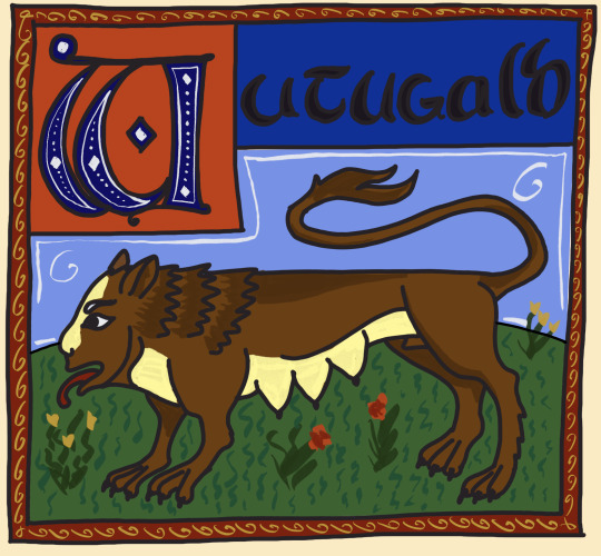
@cinqueform (link to post here) produced this wonderfully medieval-styled image. We can see here the ruler-straight spine and the depiction of the Wutugald's sexual ambiguity, as well as a human-like face for imitating speech. Also a very nice stylized letter W.

@rautavaara (link to post here) has also done a medieval-style rendition, which is excellently sinister in presentation. That is a Worrying Creature. It's also the first (but again not the last) avian interpretation of the Wutugald, which I think really works. Also I'm not sure if this is a sneaky nod to what the animal actually is, or just a case of "great minds think alike", but Rautavaara's interpretation of the rigid spine is very similar to the one in the actual Aberdeen Bestiary illustration I will show y'all at the end of this post.
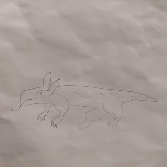
@spontaneousmusicalnumber (link to post here) posted this along with a brief explanation of their design process. I think they're right about the side pattern being appropriate for a bestiary critter.
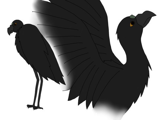
@strixcattus (link to post here) did another avian rendition of the Wutugald complete with a fantastic lengthy reinterpretation of the bestiary entry through the eyes of a modern naturalist. Seriously, go check that out, it's very good.
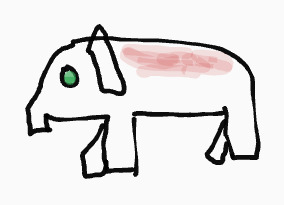
@fidgetyhands (link to post here) provides this image of the Wutugald along with an explanation of their design choices. They also note that limitations in terms of artistic material are probably relevant to a lot of bestiary drawings.
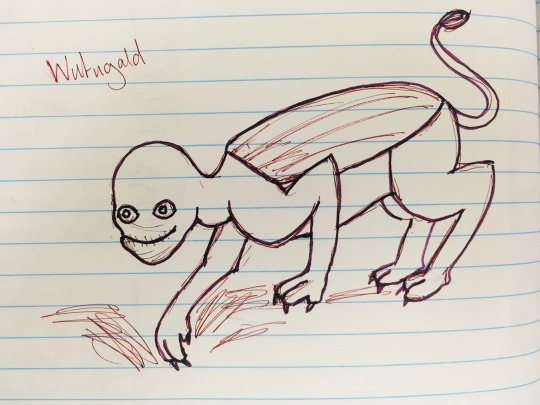
@jamiethekeener (link to post here) gives us this Wutugald in the act of digging. She instructs that we should not ask why her interpretation of Wutugald ended up being so unsettling, which I cannot deny that it is. (That smile... that damn smile.) I also want to highlight the interpretation of the rigid spine as a shield-like plate along the back.
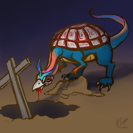
@thewhetherman (link to post here) gives us this rather-frightening-looking creature, along with a brief commentary that definitely ups the spook factor on this whole thing.
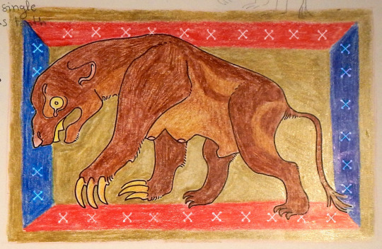
@bruncikara (link to post here) also went with a medieval stylization, with a very period-appropriate pose and frame. We can see again some digging claws and a nod to the animal's sexual ambiguity. Wicked-looking single tooth, also.
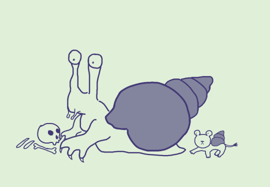
@mobileleprechaun (link to post here) has given us what I think is our only invertebrate Wutugald by interpreting the rigid spine as a shell and the single tooth as a radula. Shown here with its half-lion offspring.
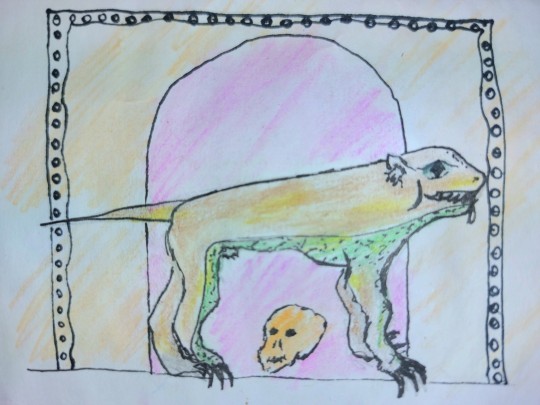
@illogarithmil (link to post here) has also taken inspiration from medieval bestiary art, noting the unusual color and perspective choices typical of the genre. Note the straight tail, the skull, and the doorway in the background -- presumably into a tomb of some sort. The diamond-pupilled eye is striking.
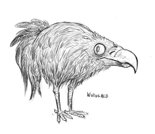
@qwertyprophecy (link to post here) gives us this Wutugald who manages to strike an excellent balance between "cute" and "villainous". Like, I would expect to see these hopping around to signal that the Protagonists have entered the Sinister Fantasy Kingdom, but it's also kind of adorable. I think the gemstone pupil helps with that vibe. Vulture face is for easier eating of corpses, I assume.
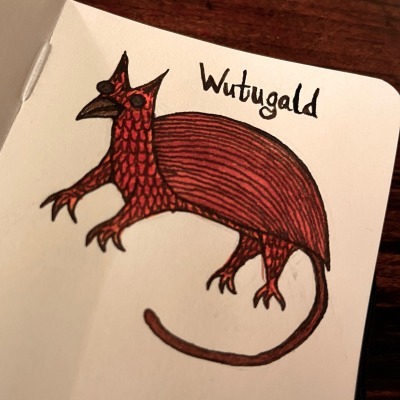
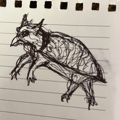
@aaclysm (link to post here) provides both a final version and a "messy bus sketch". We can see the stone-like eyes, the single tooth interpreted as a beak, and the rigid spine interpreted as a carapace. Kind of griffin-like vibes, which I'm enjoying.
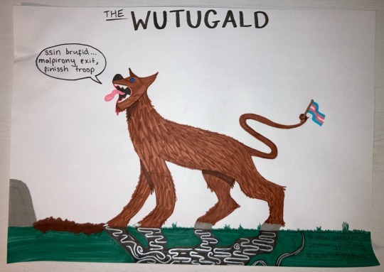
@scarlettbookworm (link to post here) gives us this drawing, which has some delightful details. I like the lines on the shadow, which I assume is meant to indicate the magical effects associated with it. Also love that the Wutugald's ability to change sex is acknowledged by giving it a little trans-pride flag to wave with its tail. I believe the text in its speech bubble is intended to be word-salad, demonstrating that it imitates but does not understand human speech.
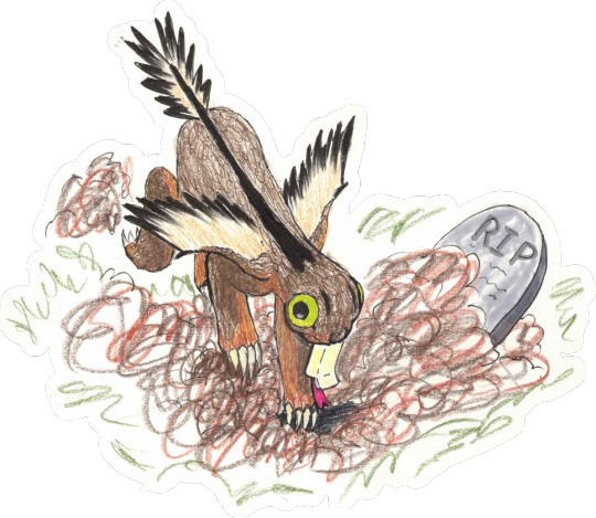
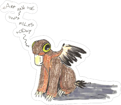
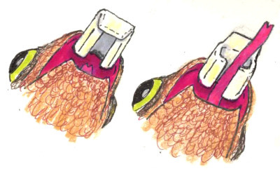
@pachelbelsheadcanon (link to post here) gives us another very cute Wutugald. (More of these than I expected are downright cuddly.) I'm particularly delighted by the attempt to take the whole "single tooth that closes like a casket" thing at its word and make it work. They provide in their post an explanation of what's going on with that and some other interesting zoological details of their creation. I also enjoy the idea that the Wutugald talks like bot-generated spam.
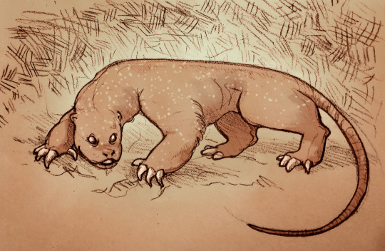
@changeinenthalpy (link to post here) has produced this fairly-intimidating-looking critter. This definitely looks like something that could dig up and eat a corpse if it wanted. Nasty claws on that beast. The shiny gemstone eyes give it an unsettling gaze also.
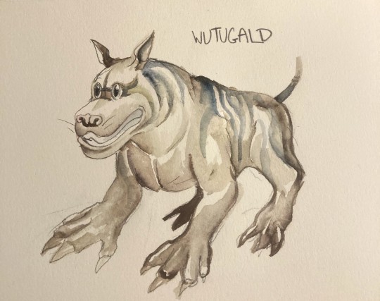
@aethergeologist (link to post here) gives us this creature, which I both want to pet and also want to keep a healthy distance from because those claws look like they could mess you up. They provide an explanation for their design choices in the linked post.
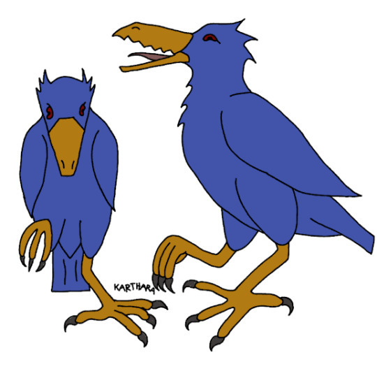
@karthara (link to post here) has added to our store of avian Wutugalds, and includes a brief explanation of their design choices in the linked post. I like how happy it seems in the side view -- all excited about its corpse-digging plans for the evening.
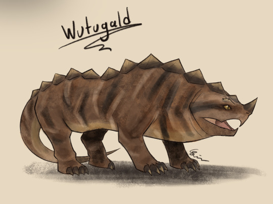
@moustawott (link to post here) created this delightfully prehistoric-looking beast, and provides a detailed account of their design choices in the linked post. I think the snapping-turtle face really works here, and this is probably one of the most dangerous-looking interpretations of the Wutugald.
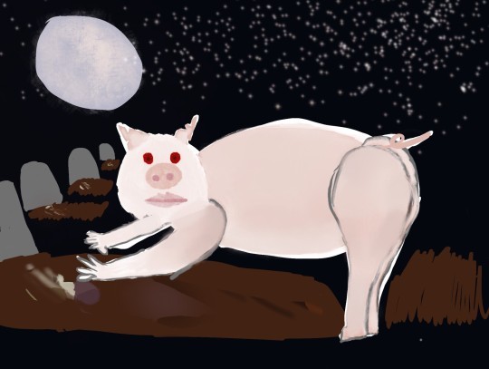
@cattorneyatlaw (link to post here) has drawn an unusually porcine Wutugald. Probably one of the spookier pig drawings I've seen. They provide an explanation of their design choices -- including "why a pig" -- in the linked post.
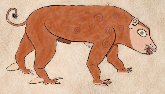
@curiouslyodd (link to post here) has given us a Wutugald with a very unsettling face and an interesting fur pattern. In the linked post, they not only provide an explanation of their design choices, but also a detailed and well-written reinterpretation of the bestiary entry based on the animal as they have drawn it. Go check that out.
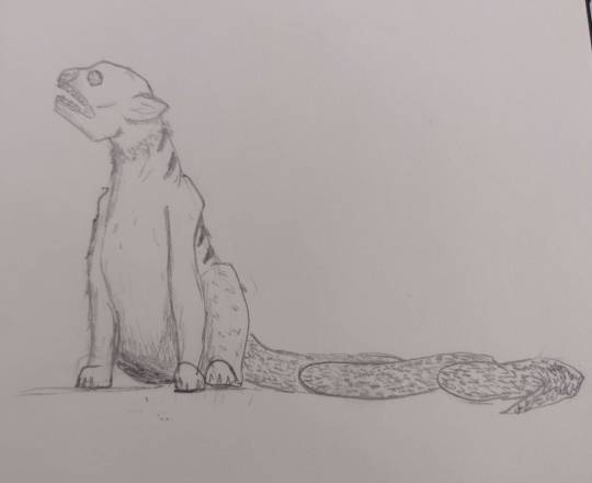
@treesurface (link to post here) has done an interestingly chimeric Wutugald, and includes a brief explanation of their design choices in the linked post. I like the head particularly.
And... hm. We're not going to be able to fit all of the images in one post. The limit is thirty, right? Stay tuned for a bit, I guess. The remaining Wutugalds will be in a reblog of this post, along with the reveal of the animal's identity and the Aberdeen Bestiary's interpretation of the creature.
201 notes
·
View notes
Note
I absolutely ADORE your art style!! I've really wanted to draw my own twst OC, but I can't draw, and I'm trying to learn how. Do you have any tips on how to get started or any anatomy bases that I can try to learn? No pressure! Have a great day!!
hello! Thank you so much for the kind words! 🩷
And as for your question, I'll try my best to explain, as I don't really have the time or resources to give a visual explanation. I hope that's alright! ^^;
as a basis I would suggest you start from the very basics in order to be able to get the hang of anatomy. A good way to do that is by practicing how to draw mainly cubes and cylinders in different angles. You'll also find many tutorials or free websites from esteemed artists that teach you how to add flexibility to these otherwise static shapes, like how to draw a 3d rectangle as if it was twisting— which you will then be able to translate into a person's torso later on!
References are also important, obviously. You can go to websites like Line Of Action or Bodies In Motion for dynamic poses, or even just search on Pinterest for some poses to practice with. Break down the bodies into simple 3d shapes atop each other, practicing on how to angle them or implement them into the line of action needed to draw whatever pose you want (the line of action being a dynamic line that helps you determine the movement of the body and the flow of the captured motion iydk)
You will need to practice with this a lot until you gain the confidence to exaggerate the movement and master how to make the flow of movement look natural and dynamic, the confidence in your lines will improve with time as well. Another suggestion is also seeing archives from animation studios like Disney or gobelins to see what their sketches look like and imitating them to get a good idea on how their lines were drawn— the facial expressions and their exaggerations will also help you gain a primary idea of how expressions can be presented, and in the future you can make it more natural if you'd like, depending on your preference.
Aside from that, the internet also has no shortage of tutorial videos on art basics and anatomy tips— just know what to watch first so that you don't stress yourself out on things you still haven't mastered :) (let it be known that "mastered" doesn't necessarily mean that it has to be art museum levels of perfection— what's important is what you are comfortable with and consider to be your favored result or style) :]
I wish I could have given a more in-depth advice, but I'm self taught and half of the things I picked up or learned were from more than a decade of practice and under my belt,, I pretty much grew up on the internet, so i would always try and copy drawings that I really liked so I can try to the best of my abilities to reach their level, and the more I practiced, the more the basic idea gets fixed in my mind, and I can implement it in a different way in my own original drawings!
I'm still personally re-learning drawing basics as I'm now in my first year of fine arts, so even I have some room for improvement. It's very cliche of me to say, but the more you practice and the more resources you look into, the more opportunities you will have for improvement and learning :)
32 notes
·
View notes
Note
may i request grell w/ an s/o who has the opposite personality as her at first but when the two got closer they sometimes show their more dramatic and sassy side pls?
also s/o is into artsy things like drawing, writing, theatre, fashion, etc.
note💋— i read 'drawing, writing, theatre, fashion' and immediately screamed. you're so cool, anon!!!


with you, being the seemingly opposite artsy lover showing of their sass— ft. grell sutcliff

grell loves you, you’re like a chia pet
in the best way possible of course X3
you’re basically the glue to the relationship, such serene energy!
your passion for all things of the arts intrigues grell, it’s one of the reasons she fell for you.
does grell appreciate art and writing like you do? you know what, not as much.
but theatre and fashion? … we’ll get into that later
she finds such pride being seen with someone reading a book.
with no pictures? reaaaaally??
“wahhj! you’re so deep, s/o!”
she thinks the way you carry yourself compliments her so well.
that’s like an amazing achievement, good job!
and oh dear me, you’re always so well dressed and accessorized
like, could she even fall further in love with you?

glaring at viscount druitt together from affar.
“now, is he really in the place to be that full of himself?… even for my likings, he sure knows how to girl out.” grell shudders.
batting your eyelashes, you shake your head slowly. “praying for the day he realizes nobody likes him. that poor, poor thing.”

ok so grell is screaming like a banshee
where you trying to imitate her? that’s cute!
no you weren’t, but okay.
she believed you where just trying to fit in with her sense of style for a good while until it kept repeating itself, looking more real by the second.
your eye rolls, she loves them so much hello???
you’d get feisty at the most uncalled for times.
ouuu…
you are SO her type.
and the way you two yap about theatre like there’s no tomorrow is so much fun
you and grell 100% go see productions together when she’s off work.
both of your eyes lighting up, analyzing the pretty set, costumes and props of the performance
if this WASN’T in the victorian era, grell’s favorite musical would be ‘chicago’
HANDSDOWN.
nono, and lets talk about your art.
most of the time she sees you, you’re holding that sketchbook like it’s nobody’s business.
and *it is* quite literally nobody’s business.
meaning the grell has been dying to take a peek at what you’ve been scribbling in there.
many attempts of her trying to shimmy her way to grab is away, just for you to snatch it back dramatically.
she cackles every time
and when you eventually give in, she is AWESTRUCK.
grell is staring at those pages.
cricket cricket cricket
kind of embarrassing. does she like them or not?
her face is in fact burning up! you have the cutest little doodles and sketches of her.
she’s going to tease you about this every time she gets the cue to. congrats!!!
seriously, she loves all of your little artistic interests.
“paint me like one of your french girls”
no grell, we’re not painting you naked. :(
maybe

#black butler#grell sutcliff#grell x reader#grell sutcliff headcanons#gender neutral reader#black butler hcs#black butler fanfiction#black butler manga#grell black butler#grell fanfiction#theatre#musical theater#theater kid
36 notes
·
View notes
Note
sorry if you've already been asked this, but when you first started drawing, what did you do for inspiration/practice? did you follow any guides or try to imitate a certain style or did you just practice your own thing until it came together? i'm starting from scratch and having trouble :<
i didnt follow any guides but i follow a lot of artists on twitter and read a lot of manga and watch a lot of anime and try to be observant of what i think looks appealing and why and add it to my art. i think the beginning of the journey is the hardest just draw all the time and always be looking at your art and picking out things you can improve on and itll work out.
progress is slow but itll happen, i like to think backwards to help motivate myself when learning anything like drawing or japanese or most recently sf6. What i mean is imagine where you would be now if you just did the work every day 6 months go, you can't be that person right now anymore the window has passed but you can be that person in 6 months if you just work on it.
28 notes
·
View notes
Text

BASKET BALL ERA ~ JUJUTSU KAISEN
-my first time trying to imitate official art style.
>duration 7h and 34 mins
>procreate
24 notes
·
View notes
Text
youtube
As I normally do, I very much enjoyed Folding Idea's latest video, an interpretative discussion/cinematography flex about James Rolfe aka Angry Video Game Nerd. Anyone treating the history of the internet with the depth it contains, as a culture & medium unto itself, is gonna get a win in my book.
It also hit on a point I find myself always coming back to in cultural history; how often people confuse chronology & causation. The Angry Video Game nerd is, of course, one of the most influential "Youtubers" to ever exist, by virtue of being one of the first ever do, in video format, media reviews via a comedic lens. There are years where you can say he was the center of the whole genre. He inspired legions of imitators, some incredibly directly referencing him in their identity, and when you talk to a ~30 year old online creator today who does things adjacent to that space, you can bet good money they watched AVGN when they were a teen.
(I didn't - my stereotypical influence is the Red Letter Media Prequel Reviews)
But is he that influential? Depends on your meaning, of course. Because when you ask people what that influence is, they say something like "pioneering comedic, caustic, hyperbolic review video essays". Which, he did, but he invented none of those parts. As the above video outlines, caustic, exaggerated reviews of media have been around for about as long as reviews have existed as a consumer product; making them entertaining for their own sake is an incredibly logical leap to take. AVGN was coming around in a time where slapstick violence and faux-rage was entirely the vibe of the internet; Penny Arcade had been doing its thing for over half a decade before AVGN's first video was published.
And more importantly, video content in those days was obviously going to lean towards things like comedy and "skit" styles compared to say text reviews, because it complemented the medium better. It takes a lot of niche craft to make a rage speech pop on text; it's much more accessible to just be a good actor and be visibly raging. Going even more downstream, the "media mix" of people consuming content about the art they like or engage with was so old hat by the 2000's that consumer brands were using it as fucking jargon in marketing meetings. There isn't a world where this kind of content would not have appeared. It had to, the culture demanded it.
This is no grand dig at AVGN of course - this is to some extent true of all artists. As Olsen's video notes, what set AVGN apart was that James Rolfe was not a game reviewer; he was a filmographer, he had gone to film school, he was trying to make movies. Which in 2004 meant that he had a ton of cameras and lighting and equipment to make viable content in a way others did not. He had a technological advantage in exploring a new medium, one that would fade as webcams and lighting rings became as cheap as dirt, or shift as markets for crazy stuff like vtuber rigs would evolve. And of course the specific way he went about his content did imprint itself on the medium.
But not thaaat much; I think time has not been kind to AVGN. The humor is of course dated to its time, the MTV's Jackass of video game reviews. And as the medium of self-published video essays has evolved, the medium discovered approaches far better than comedic skit shows. Much longer content is possible, you can ride on parasociality and authenticity instead of endless "joke moments" (Or go the reverse - every comedy video from the old days is too long, a tiktok-level joke stretched over 5 minutes). Some of this was tech dependent as well, of course - youtube had duration limits on uploads in 2005! Making 4 hour Star Wars Hotel videos was not possible outside of stringing "Part 1 of 37" video playlists together. But time and culture marches on as well, and I don't think the average creator today is pulling from 2005 Youtube much at all, really. They are different eras.
As mentioned, if you ever deal with doing causation in cultural history, you run into this all the time - people essentially going "work X was first, and therefore invented the genre and influenced all after". And I don't think it really works that way - establishing causation just takes far more detail than that.
28 notes
·
View notes
Text
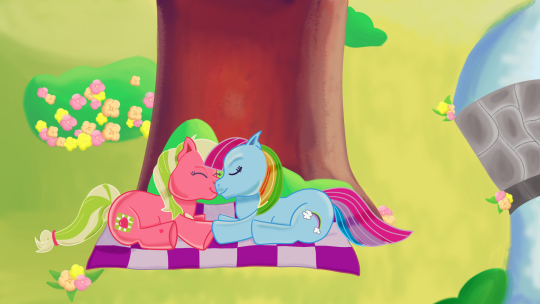
consider: g3 appledash
(additional notes under the cut!!)
[like my art? c0mmissions r open!!]
ahhh FINALLYYYY this took me FOREVERRRR to do!!! this idea came to me in a dream and i KNEW i had to draw it. i wanted to imitate the g3 style, but i also wanted to make aj and rd look more distinct from each other. a lot of g3 ponies look the same, so i decided right off the bat that i wanted to give them each some little features to avoid making a recolor of the same pony yknow? (this is in no way meant to disrespect the g3 art style ofc, i love the art, thats why i drew this piece SAKFJFJDS i understand why they had 2 do it that way bc yknow. thats how the toys are LMAOOOO)
more specific details include:
applejack is chunkier and has shorter legs, along with the softer features that most g3 ponies have. i also gave her ponytails as a nod to her g4 incarnation!!
rainbow dash is thinner with longer legs and slightly sharper, more angular features (like pointier ears/snout). i wanted to make her mane and tail look more like an arch, just like real rainbows!!
i studied a lot of g3 art pieces to try to get the look just right. i think i did....ok for my first time!! there r some things im not quite happy with but it was a lot of fun!! (except for the flowers. the flowers were a nightmare)
SPEAKING of the flowers, i basically just drew three in each color and then just copy pasted/resized them all LMAOOOO i later went in and added more detailed shading to each one to make them look slightly different
that bridge was actually the most fun part of the background to draw i was NOT expecting 2 like that bridge so much. please look at my bridge everypony i worked rly hard on it
if u made it this far congrats!! now u know the Lore behind this piece. god bless it took me so long 2 do LMAOOOOO
#my doodles#mlp#my little pony#g3 my little pony#g3 mlp#applejack#rainbow dash#appledash#rainbowjack#g3 rainbow dash#g3 applejack#digital art#firealpaca#artists on tumblr#shipping#wlw#sapphic#lesbian#yuri#femslash
28 notes
·
View notes