#and theyd be orange and purple and so perfect colours for it
Explore tagged Tumblr posts
Text
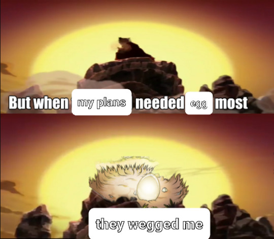
A tragedy befell my project yesterday so naturally I made memes about it
#flight rising#flight rising memes#if the rng for the whole project hadn't been so rancid i couldve had my new pair ready for Halloween#and theyd be orange and purple and so perfect colours for it#so it's a true tragedy#like is there still a chance that the two ongoing nests could miraculously produce my two project targets despite the odds?#sure there is#but is it LIKELY?#Bro it is not#i think the chances are about hmm. 2.5% yeah#maybe slightly higher because the second nest has two eggs#but the odds aren't good boys
456 notes
·
View notes
Text
Last week I did the publication workshop, I was so excited to do it I was READY at 11 59 to put my name on the list.
The first half of the day was for using the risoprinter. The way it works is the printer reads in grayscale, so the darkest colour on the page will be the most vibrant and the lightest colour will be a lighter tone of that colour. It took me a while to understand but you just have to keep printing to get the gist of it.
My tutor, Fiona, was really nice and I loved working with her! She was so patient with me and loved my ideas, and she helped me further them more.
We did some doodles first, testing out colours, and textures, and what materials look best. The darkest colours (ours was blue) goes onto the white page, and the brightest colour (ours was pink) goes onto the the tracing paper. The tracing paper get printed first and then the white page is printed on top of it
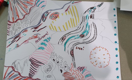
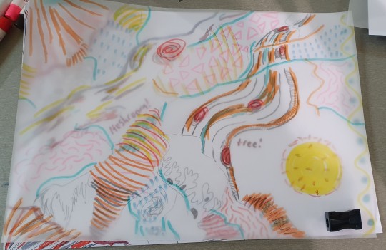
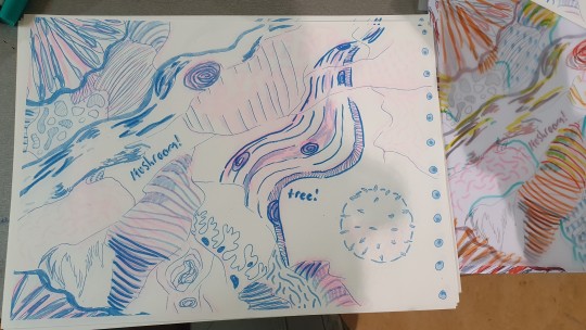
I drew with markers, posca pens and pencil too. I used my sketchbook for inspiration, making the doodles related to my project, as you can see theres some mushrooms, branches and just a lot of soft naturey lines.
I did light colours on the white page as well as the tracing paper which was wrong but still kinda worked. But sadly I didnt get a lot of pink out.
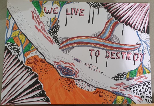
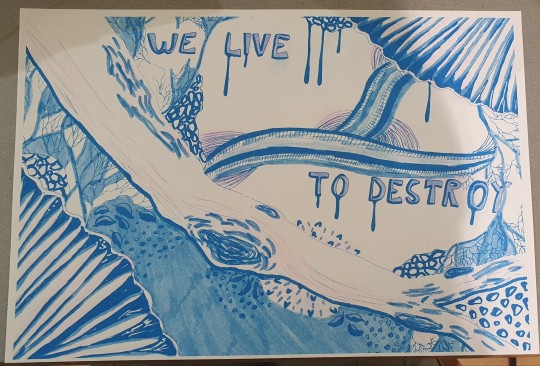
This was my proper print which is more thought out and structured. I still didnt understand how it worked, so I didnt get a lot of pink again lol. I do really like the blue though.
In the afternoon, we had Suzannah for bookbinding. We printed our doodles and our final print together so theyre on each side of a page, then printed 10 copies of them and we all got a copy of everyone's prints. Then we got a purple cover, and we folded every page using a bone folder to get a very neat crease. We made holes in the middle top and bottom of the fold of each page, then sewed them a together. Suzannah had to sew it for me because I made a giant knot by accident lmao. I decorated the cover when I was done. We also did some origami which was very fun and confusing too. I sewed them into the book as well, and I drew on the pop up one as you can see. And the one with the maps drawn on it..its called a map fold..

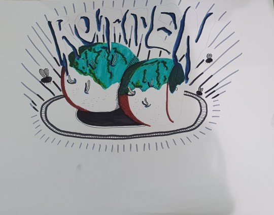

On Friday, I furthered my project to fungi, and I decided to explore mold. I really liked the look of moldy oranges. The blue and orange were just immaculate, and I knew theyd look awesome printed. I drew some oranges on a plate with some flies and I wrote ROTTEN in a funky font on top.
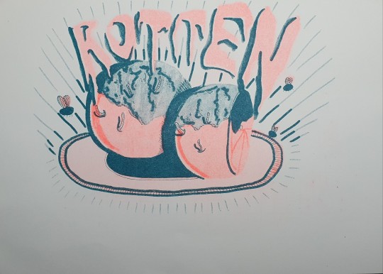
By this point I understood how the printer works, so I used the tones correctly on both pages. And I gotta say, I absolutely love it. I wish the orange was more vibrant but honestly I dont mind cause got the highlights and shadows perfect!!!
I LOVED this workshop and I recommend it to everyone in the entire world!
:3
2 notes
·
View notes
Text
Strawberey Shortcake: Berry in the Big City thoughts
ok so i'm watching the new 2021 series and heres some of my thoughts !!
I'm honestly impressed with the designs and the concept in general. its a cute and modern take on the series.
of course, i like the older "kids in a small town" idea a lot more, but uts definitely cute !
the character changes feel fresh (haha get it) though im not completely sold on all of them. Lemon surprisingly works well !!
Blueberry definitely fits as the odd ditzy and kind of dumb character. reminds me of her 1980s character.
Orange is great as always. glad that everyone agrees that orange is perfect the way she is and should never change. we love her.
The addition of Lime Chiffon to the main gang is definitely a surprise ! it still feels weird but i welcome it. (also definitely wasnt aware of her character at all before this LMAO)
Strawberry is the same as always !! not many complains on her, except for a few nitpicks (her aunt reminds me of aunt may from big hero 6)
BUT STOP WITH THE HAPPY PARTS. I AM VERY BERRY UPSET THAT THEY MADE RASPBERRY TART MEAN >:(( THEY MADE HER A BULLY AND IM UNHAPPY WITH THAT.
i also dislike that both bread pudding and sour grape are so,,,, plain (?) sour grape is just purple, and bread pudding is just..... brown :( i wish theyd bring back sour grape's green accent colour, and they definitely couldve put more variety to bread pudding aside from being a gay preppy mean guy (that was a joke. mostly.)
overall, its a really sweet and nice show, and a good cartoon for kids !! its easy to forget that reboots are made with a new and younger audience in mind. its different, but in a good way. i would definitely show this to a kid.
ALSO. THEY REFERENCED THE PECULIAR PURPLE PIE MAN OF PORCUPINE PEAK. THATS A WIN IN MY BOOK (pppopp fan btw, hes weird but silly)
#strawberry shortcake#citrusbuds ramblings#berry in the big city#lemon meringue#orange blossom#lime chiffon#blueberry muffin#raspberry tart#raspberry torte#is it tart or torte??#bread pudding#sour grape
7 notes
·
View notes