#and then shading / rendering / painting w the flat brush again <3 and some use of the airbrush too and maybe a tiny bit of the blending
Explore tagged Tumblr posts
Text
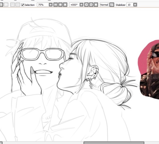
and oh rip @ the compression u cant even see the line quality well here :( but medium opacity flat brush on sai my beloved 💖🎀 i sketch, line, and render w this baybey shes sooo good 😭

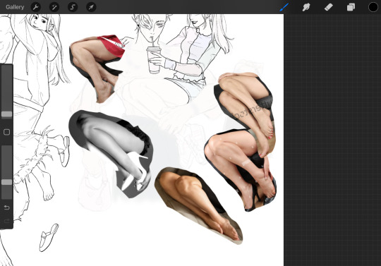
eye... need to stop sleeping at 3am when i have work the next day le sigh.... anyways v funny how i need at least 5 ref pics at all times to feel safe LOL first real attempt drawing on procreate i mean i made some sketches and fcked around w it before but idk how i feel about the textured lines, i do like it on one hand but idk if it'll look weird with smoother coloring idk i will def export this into sai to color cuz im just sooooo used to sai my beloved💖 i render / paint SOO specifically with sai idk wat to do in like any other program the brushes just act different so my workflow is like??? also an artist i love works on clip and one part of me is wondering if i can color better if i also work on clip but i dunno 😐 clip looks complex i did try it a few yrs ago and got intimidated by the unfamiliarity and gave up way too fast 😓 idt i will ever render on procreate but lining is somehow a bit easier on the screen i think? or is that just the textured brush lol i think its harder lining with a non textured brush in general.
ALSO!!!! I SEE YALL IN THE TAGS WISHFULLY WRITING ABT HOW YALL """""WANT TO""""" ALSO DRAW URSELVES WITH UR BLORBOS and...... WHAT THE FCK IS STOPPING U!!!!!!!! everyone who wrote "i should draw myself w x" GO DO IT!!!! 😾 dont make me say it twice
its really fun i promise :3
#sketch & line w this and do flat colors with a 100% opacity round brush#i think its the default brush with the crisp edges#and then shading / rendering / painting w the flat brush again <3 and some use of the airbrush too and maybe a tiny bit of the blending#brush but not much tbh the flat brush has no blending properties but since its not 100% opacity u can layer colors / shadows rly gently and#make a gradient so no real blending necessary#its a slightly textured gradient which looks good to me tbh#some smooth blending / blurring can be added as a treat but tbh using the default airbrush on low-med opacity#with the softest edge hardness also gives u p smooth gradation so do u REALLLLYYY need a blending brush haha not really#i also think i made the flat brush LOL i say 'made' but its rly simple its just a line for the brush shape template thing a literal line#wowowoww drawing is so fun i missed her#omg alu is that a wip#.txt
48 notes
·
View notes
Note
how the fuck do you do your shading im so in love with the softness of it
Omg ty I actually have a couple different methods? Depending on the amount of effort I feel like doing
1. “quick” method
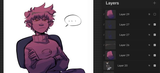
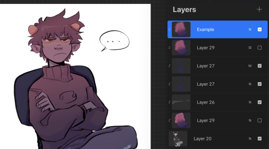
For when I’m not feeling up to rendering and want to do smth quick, I just lay down the flats, use a normal and multiply layer combo for simple shading, and then I make a layer where I paint two colors (pink n purple in this example). And then blend them together w a brush and use Gaussian blur (basically a manual gradient), then I usually set that to overlay or soft light etc. The photos above are before and after I apply Gaussian blur
2. Half (?) rendering
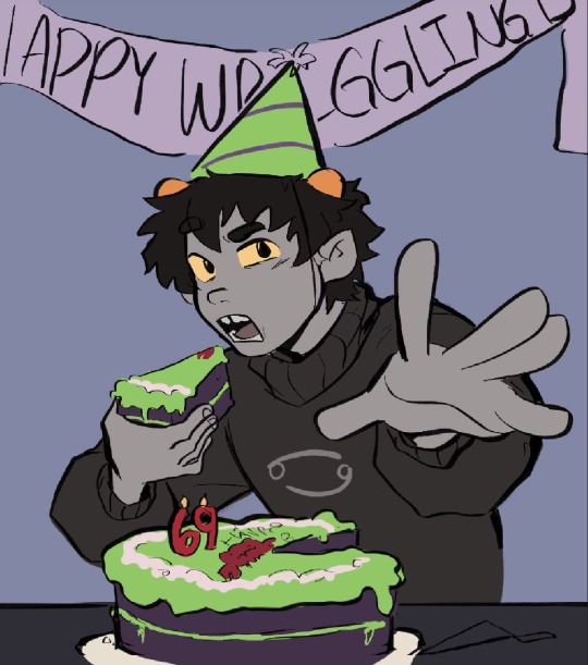
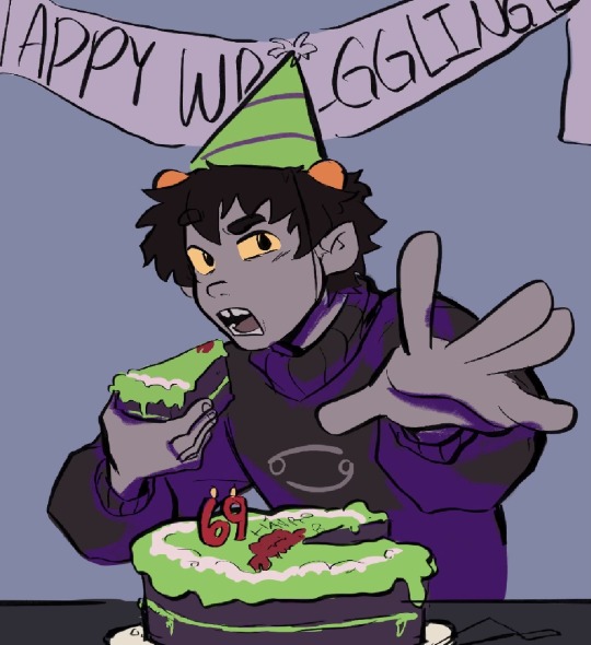
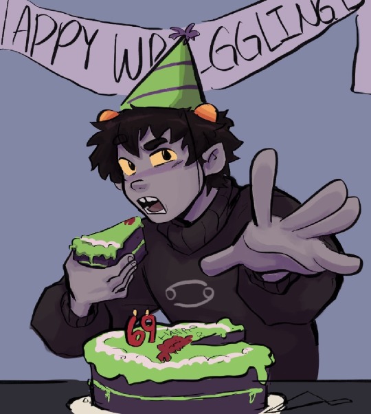
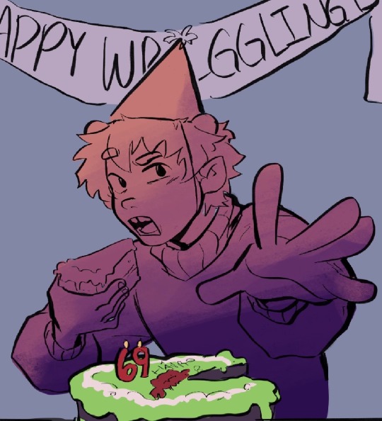
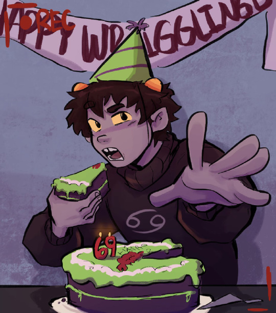
For this one I follow the same steps but instead of simple cell shading, I merge the multiply layer down to the flats and just start adding some more shading before applying the gradient layer again
3. “Painterly”

For ones like this one though, I usually put down flats, throw around some shading and colors using various layer modes, then merge them all into one or two layers and just start painting it as if it were traditional. So for these the gradient layer usually comes into play at the beginning rather than the end
There’s a speed paint for my timkon painting(the hug/second one) if u want to see what that’s like in action
Hope this helps
294 notes
·
View notes
Photo
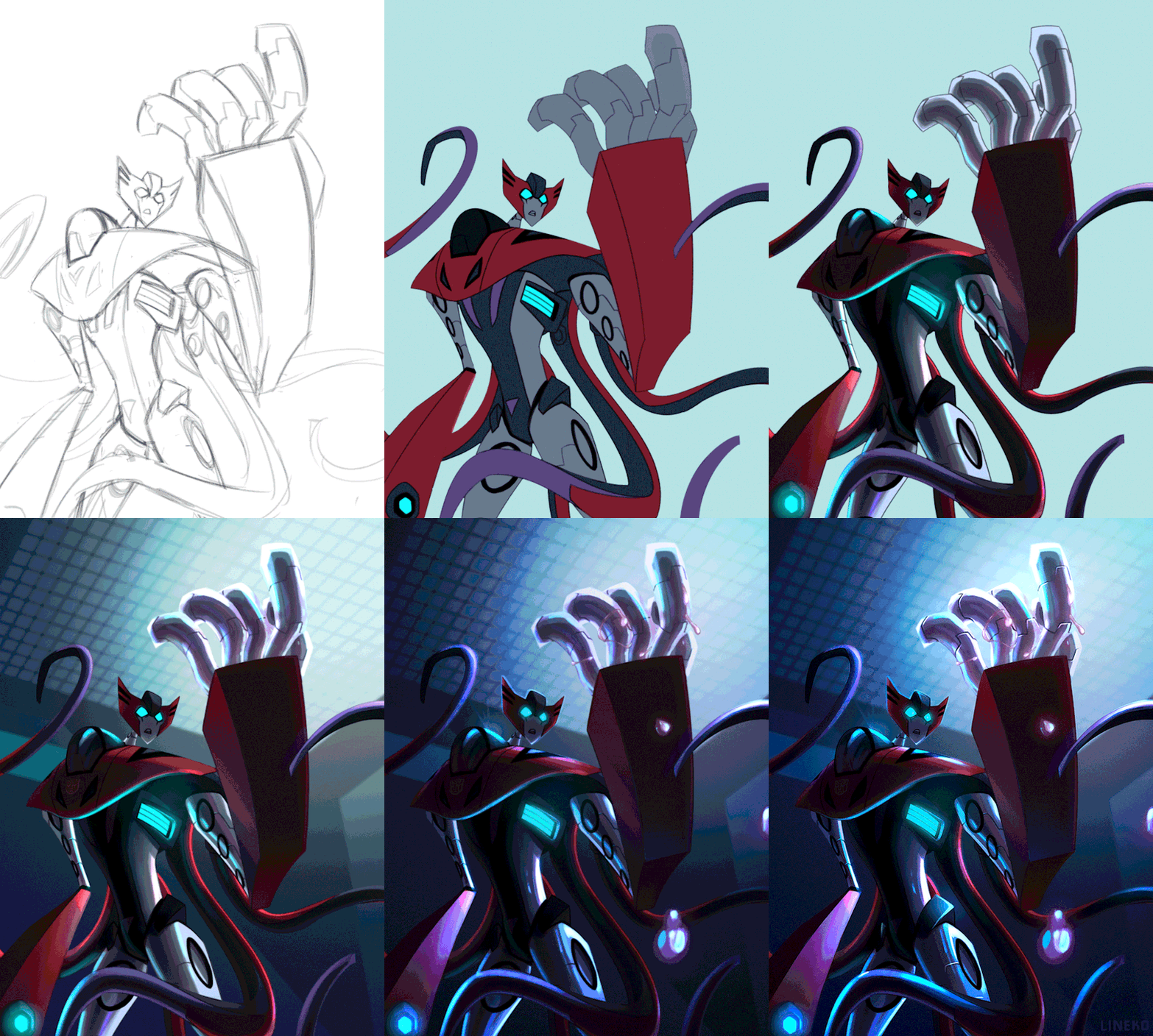
Some people were asking about my process for this last piece so I did a little process gif of it which goes:
1. Sketch (flip canvas 100000 times now so you can get any weird jankiness out here and not later on when it’s harder to correct)
2. Lines/corrections. (also a lot of canvas flipping)
3. Flats, all set on a clipping mask to the base color.
4. Shading, done separately on each flat layer color with the “lock” setting on. I mostly color picked by eye for this, but for the subtle reflected colors I used a mix of color dodge and color burn with a low opacity brush.
5. Added the light from the secondary light source, his biolights, using color dodge.
6. The background was worked on from here on with minor changes going up til the last step, but in this gif it’s completed. I blurred it slightly to keep the focus on the subject/add depth.
7. Painted over some of the lines (now set to multiply w a dark blue color), added the autobot brand, and rendered more reflections on his hands with color dodge again.
8. Painted the energon, with four separate layers: the bottom one (darkest color) being set to normal or multiply on a medium opacity, the second (base color) on normal mode at a medium opacity, the third (highlights) on normal mode at 100%, and the last being a bit of gradient for glow on a layer set to “lighten”.
9. More lighting effects on a few separate layers consisting of multiply, color burn, and color dodge. The multiply and color burn layers were there the entire time, but I kept switching them on and off periodically so I could shade better, and only towards the end did they stay on mostly. I had them there from the start and worked on the shading underneath them while taking into account how everything would look once those layers were permanent. I also had the main light source set right from the beginning and based the shading on that.
10. Some more finishing touches and rendering, again using a lot of color dodge for the highlights.
11. The finished piece, after some minimal tweaking in Camera Raw Filter (the image needs to be flattened). If you’ve been thinking hard about color you shouldn’t need to do much here, but I also like to add some grain using Camera Raw.
** When using a color dodge layer I LOVE to do this in the layer settings bc it makes everything pop so much more:
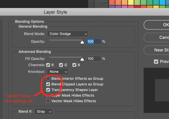
* Camera Raw Filter is specific to Photoshop, so idk if there is an equivalent for other programs, but it’s not necessary, just nice to have if you need to fix values and stuff.
* These layer modes may look different in other programs so fiddle with what works.
* Using a slightly textured brush makes any errors or shaky lines a lot less obvious, and adds nice effects when shading using color modes.
* Liquefy tool is your best friend if something looks off, even at the last stage you can mush things around a bit to look marginally better. Sometimes you don’t see errors till it’s almost done.
I am by no means a professional, this is just what I’ve learned myself over the years.
#my art#tutorial#i know i hate adobe throw stones at me#but i'm too tired to learn something else when i know this so well#i also did something similar to this w the last sg xenaut thing i drew#can u tell i like color dodge#the gif is so crusty on mobile so click for better quality
32 notes
·
View notes