#and the default gouache brush in clip studio blends so nice
Explore tagged Tumblr posts
Text

Soldier, Poet, Prince
#dorian storm#critical role#critical role fanart#cr3#my art#elzorton draws#did something unhinged and had all the coloring on a single layer#just had it clipped to an outline so i didn't have to worry about painting outside the lines#it was honestly kinda nice#it feels like it forced me to be more loose in my choises#and the default gouache brush in clip studio blends so nice
323 notes
·
View notes
Note
i love your postcard artwork for the zolu playlist SO much!! the colours are so so good and i love the brushwork! i think my favourites are a tie between the one for chikai and the one for simple song <3 also, I was wondering if you could share what brushes you used + how long they took you! looking at your art makes me want to draw again after not doing it for so long
Thank you!! and wow i think this is the first time someone's asked me for my brushes, this is like a digital artist rite of passage!
Answers n screenshots n stuff under cut (I went a little to ham on this oops)
While we're talking settings I want to give a quick PSA to all digital artists:
CHECK UR ASPECT RATIO!!!: (MOST IMPORTANT SETTING BY FAR)
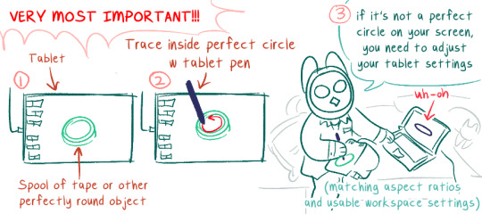
DO NOT DRAW WITH THIS ALL MESSED UP, IT WILL DRIVE YOU CRAZY. It's probably good to check this after every system update (I don't, but, you know...). Windows likes to mess w your shit when it updates.
If you have a really tiny tablet you might need to trace outside a bottle lid or something.
Okay now on to the meat of the post
-- Brush Stuff --
I use Clip Studio Paint. For my playlist drawings I think I only used these brushes (these are my main 3 in general) (p.s. they're all default brushes! but i've adjusted the settings):
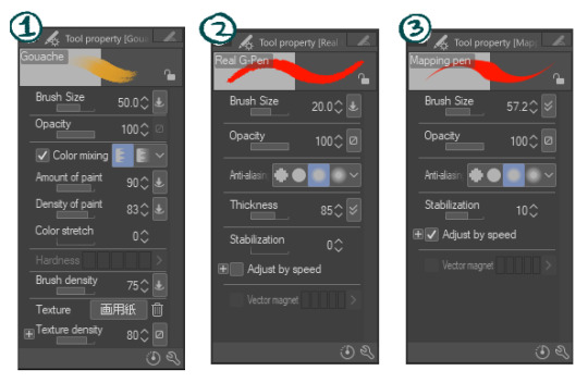
1) Gouache This is most of what i used for the postcards. I nuked Color Stretch because i hate it (it blends colors together as you're painting, like painting over wet paint. I prefer things to look more crisp)
2) Real G-Pen Used this as little as possible, to keep the painterly effect. My preferred fine-detail pen, has a nice crunch to it. I've fine-tuned my setting further in the thickness dynamics / brush size dynamics settings because I mostly use this brush for linework and wanted it to handle really, really naturally and precisely
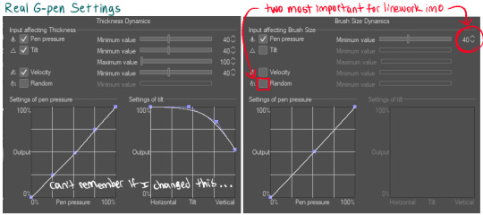
The random box is checked by default, probably to make this brush feel more like handling a real inkdip pen (I don't like that)
3) Mapping Pen Least used. I generally keep this brush at the 50-70px range. It's unpleasant to use for detail work (the taper is really fiddly at my tablet pressure settings) but good at filling in large areas very opaque very quickly, with a crisp edge (Also, doesn't lag as much as the gouache brush at large-ish sizes). Has enough wiggle room that it can be used to approximately fill tighter spaces at large brush sizes. Used for when I needed to quickly color over an area that wasn't working or quickly fill in background color that didn't need paintbrush texture. Did not realized the stabilization was set to 10 until just now. I usually turn that waaay down to prevent lag (my laptop isn't very old but it's a sensitive beast)
Other stuff that'll help:
General pen pressure: (under File -> Pen Pressure Settings)
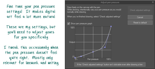
tweaking how CSPaint handled my pen pressure helped a lot with making lineart look more natural. It's worth messing around with this and trying out different settings for a while to see how they feel.
-- How Long it Takes 2 Draw --
I don't really keep track of how long art takes me from start to finish, and making the playlist drawings was kinda nonlinear 😅 sorry!
-> I started out sketching really quick composition and color ideas as the songs were playing, limiting myself to just the duration of each song (so like, 5 minutes for this part) -> i did that again at least 2 more times per song -> after that, idk. I would work on one pic then get stuck and move to another. Some I could hammer out in like... 5 hours? Some took me upwards of 20 (30?) hours for no real reason (I have "will graham clock" days, where I'll try to draw a face over and over and it'll look really strange, like will graham's clock drawing every time) (this seems to be either a vitamin deficiency or a brainfog inflammation type thing 4 me 😵)
I'll use ur two favorites as specific examples: -> Chikai was one that went pretty quickly (with the exception of their arms and the clothing folds there giving me trouble). Probably took 4-6 hours? -> Simple Song had a couple different versions, partially because I initially had the cards all laid out landscape-style, and I decided I actually wanted them all portrait-style & repainted it after it was already done. That aside, the colors /atmosphere on that one gave me trouble and the general composition / perspective had a lot of tweaks (I was trying to figure out if I wanted it to be a kinda flat stylistic perspective or if I wanted it to make more literal sense, trying to figure out what to do with luffy, trying to make him not look Too baby boy sweetie pie). Probably took 7-10 hours...?
In-progress landscape versions: (varying levels of in-progress)
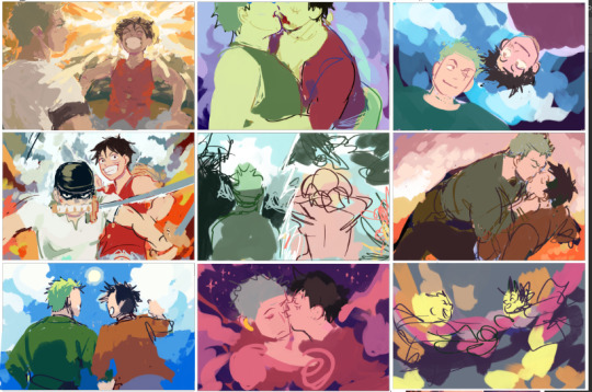
Misc in-progress of Chikai and Simple Song:
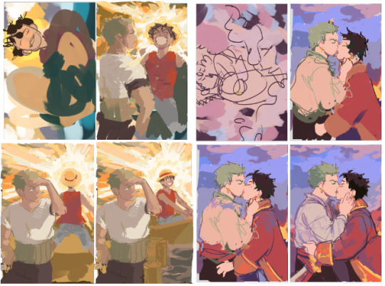
Simple song looks kinda sequential like this lmao. Luffy looks like he's A-posing and floating away to the boat and then sitting down pleasantly in it. Wonderful. --
Anway -- hope any of that was helpful!
#i draw on my bed because i hate my lower back and hips#every day i pray to god to make my sacroilitis flare up#not art#well...hmmm#some art#long post
9 notes
·
View notes