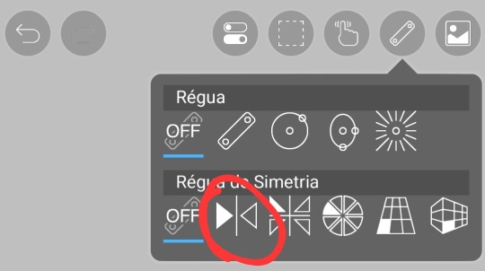
#and i used the symmetry ruler for the first time!
Explore tagged Tumblr posts
Text

seven devils in my house
[billtober day 6—tapestry]
(phone wallpaper size!)
#billtober2024#dailybilltober2024#gravity falls#gf#the book of bill#book of bill#tbob#bill cipher#phone wallpaper#bill cipher phone wallpaper#bill cipher tapestry#yeah i already kinda drew this one but i just like it so much :)#and i used the symmetry ruler for the first time!#i am also a few days behind buuut fuck it we ball#if you use this as your phone wallpaper you have to tell me because it would make me smile
25 notes
·
View notes
Text
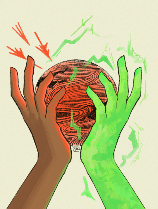
doom upon all the world
#first time using a symmetry ruler in csp lol def helped w this but also this feels a little stiffer than my art normally does#or maybe im just imagining things !!!#dragon age inquition#dai#dragon age#dragon age fanart#dragon age inquistor#inquisitor lavellan#<- since thats my inky#oc: layla lavellan#min draws#min ocs#a fun lil sketch :) i have a bunch of ppl hold orb refs in my layla folder now yeehaw
12 notes
·
View notes
Text

Not like we did. Never again...
click for quality! alt & details under the cut!
I've had a bit of an art block going on, but as soon as we reached episode 2 in the Pulp Reruns I got inspired, lol. 💙
had fun experimenting with this one, mostly just vibing. i tried using a textured blending brush for the first time, and I also figured out how to use symmetry rulers! 😀👍
You can find this design on my redbubble shop! You can also tip me on ko-fi!


#jack jabbers#pulp musicals#pulp musicals 2#pulp musicals tbs#the brick satellite#the sagitta#anna hanover#pulp musicals fanart#matt dahan#artists on tumblr#digital art#clip studio paint
114 notes
·
View notes
Note
if someone wanted to start coining their own xenogenders and post it on social media what apps/techniques would you recommend? Would you have any advice?
You are my whole inspiration and I love your Tumblr blog!
For apps: I only really have experience with Tumblr, but I also think that it's one of the best places out there. Better organisation, more freedom with post formats, and a pretty built up archival community. I've also seen coiners on DeviantArt and a few other places, but I can't really say much about them.
My advice:
Just go for it. My first few flags (imo) sucked! But I made them, and then I had experience, and I got better over time.
Do what you enjoy. Want to coin 200 terms under the same umbrella? Do it! Want to coin a hyperspecific label once a month? Enjoy!
Think ahead. Making a lot of a flag with a similar design? Have a high res template. Have a super long and complex post formatting that you don't really enjoy? You can just stop (if you want)!
As for techniques: I'm going to direct you to a few flag making tips/methods and other resources, and then explain my own method.
Disclaimer: the way I make flags is probably not ideal.
I use Ibispaint X on my phone. For flags with even stripes, I use my own flag templates (as Ibispaint is not a very precise program and cannot really do "evenness"). This allows me to keep a standard resolution and clean stripes, using the fill tool (with no expansion!!).
For flags with uneven or complex designs, I either use an existing template or the symmetry + ruler tools! As for symbols, I normally align by eye using the symmetry tools again (bad practice but. hey whatya gonna do). Most of my symbols are hand drawn, a few are clipart (credited).
I normally do a quick flag draft with default palette colors, then when I think it has a good order/vibes I will adjust the colors. Almost all of my flags have rough stripe meanings, I just don't post them. I may start with a list of meanings and then translate to colors, or just go at it with vibes. It's very difficult to explain how to select and pair the "right" colors. You just need to practice a lot, honestly. Here are some tips that I can easily explain:
Avoid pure white, pure black and most 100% brightness/saturation colors
If you are going to put a gradient in a flag, it needs to be intentional. Flags with mostly or only gradients can absolutely work, but you need a clear vision or it will not be visually distinct (or that can be what you're going for!)
Join some kind of space for advice (optional). I'm in the MOGAI Multiverse discord + another queer server that I both use for flag feedback.
Stuck? Mess around with filters. Colorpick from images. Look up [x] palette. Look at flags for similar identities. Nothing wrong with inspiration, just remember to credit where appropriate.
Still stuck? Go to sleep! Okay, maybe this one's just me but I can often forget how colors work and need a break to recharge.
Here is a quick guide to flag image IDs. As for post formatting, just keep it accessible and have fun! If you want to do a full custom blog/post theme with banners and so on, you can, but you don't have to!
Okay, this post is getting pretty long. If you have any specific issues, send in another ask. also, aaaa thank you!! i'm so flattered that i'm inspiring others and that people actually. perceive what i make. i appreciate nice asks like this so much /gen
#not coining#long post#microlabels#mogai#mogai coining#label coining#mogai flag#mogai flag making#flag making
4 notes
·
View notes
Text
Pattern design tips, part one! Part two will have the photos because those are easier to add from my phone and it’s easier to type on my computer, but tumblr hates when I try to do both on the same post lol. I’m going to make it a numbered list so I can more easily connect photos with typed descriptions, but they are numbered only in the order I think of them, not in order of importance or anything. A note: I have only ever designed for minky or fleece. I have zero experience making patterns for non-stretch fabrics. A lot of these tips will probably apply to both, but use your best judgment.
1. I was wrong, this one is number one for a reason (the rest are in no particular order). It will make pattern designing much much easier if you have something to make drawing the seam allowance easier. I’ve done it a few different ways, but in order from best to worst here’s the methods I’ve used: - two mechanical pencils whose tips happened to measure 1/4″ apart, taped together. Absolutely my favorite (you could use a pencil and a stick, a pen and a marker, whatever, as long as one of them can draw and the other comes to a point so you can have the point trace along the pattern lines while the other side draws the seam allowance line) - adjustable circle drawing compass, set to 1/4″ distance (this works pretty well, but the non-drawing side sometimes catches along the paper and the drawing side is more difficult to replace than adding lead to mechanical pencils) - a 1/4″ square dowel. I lined it up with the outer part of the pattern piece, drew a short mark, moved it, and kept doing it until I had dots spaced around the entire pattern piece and could connect them. Overall, less precise, more difficult to use, but will work in a pinch (aka when you have just moved and can’t find the other methods, if you are me lol) - a ruler. You can use it the same way you use the dowel, to make dots and then connect them, but it’s just the worst. Use one of the first two if you can, it will make your life so much easier 2. fold the paper for symmetry. I know that sounds obvious, but it can help a lot. Sometimes, like with the elephant body, I’ll fold the paper in half, in half again, and then draw the pattern. Most of the time I fold the paper in half whenever I am making a pattern piece that is basically a hemisphere of the plushie; the front half of the head, half the body, really anything at all where I want it to be even sort of symmetrical I will fold the paper in half and only draw half the pattern (tip: leave it folded, add the seam allowance, then cut it out before you unfold. You only have to draw half the seam allowance that way) 3. to match irregular shapes (like a rectangular leg piece with a round bottom of foot piece), measure the edge you want to match of whichever piece you drew first with a pipe cleaner (fold to make the right length) or a piece of yarn (cut to make the right length), and then use that pipe cleaner/yarn to make sure you’re using the right measurements for the other pattern piece. Remember that if you are making a leg that’s two rectangles with a circle at the end, you will need to double the measurement (or, if you fold the paper, remember that you don’t double it). In general, pipe cleaners are easier, but if you want to use yarn you can kind of draw, measure the yarn against what you drew, and adjust from there until it matches. 4. Think about angles, and what shape you want. For the tip of the mantle of the octopus, I knew I wanted it to be essentially flat at the start, with four pieces coming together. That meant I needed each piece to start with approximately a 90 degree angle there, if I wanted them equal. Smaller angles (where the sum of all the angles coming together is less than 360 degrees) will make more of a pointed shape, and larger angles (where the sum is more than 360 degrees) will kind of ruffle? They won’t lie flat. None of those are right or wrong, it just depends on what you are trying to make. Also, since 5. Everywhere says not to pull on the minky while you are sewing, but if you are making something twisty like octopus tentacles and are comfortable realigning pattern pieces as you sew, put tension on one layer of fabric but not the other and it’ll make them twist. That’s less pattern design and more plushie sewing tip, but I’m adding it anyway 6. okay this is also kind of a big one. WHERE TO START WHEN PATTERN DESIGNING: a. have a clear idea what you want to make. Either a sketch you drew, a reference image, or just a very clear mental picture will help a lot b. next, pick the size. The way I usually do this is by determining my limits, which are usually either the amount of a particular fabric I have available (ie the maximum size something can be) or how big the smallest detail I want to make has to be for me to be able to sew it. I usually go by the smaller end of the scale, because I usually make my plushies pretty small. Notably, this is how I decided the size to make my giant frogs; I wanted them to have those treefrog kind of toes, and that was the absolute smallest I could make that shape and not struggle to turn it right side out. c. draw the pattern for the thing that determines the size of the plushie first. If that means your plushie is limited because you only have a quarter yard of the body fabric, draw the biggest body pattern piece first (and remember seam allowance when drawing it! if it only fits without a seam allowance, it does not fit). From there, use that piece to size the rest of the pieces 7. You do not have to make every pattern piece machine sewable. Some things can be hand sewn on. Gathering stitches to close small round pieces, like the bases of horns, tails, ears, or sometimes limbs, are your friends, and sew is the ladder stitch (for sewing plushie pieces together once they’ve already been turned right side out and stuffed) 8. For small plushies, you might not need darts if you are using stretchy fabric. For larger plushies, you’ll need darts. If you are uncomfortable drawing your own darts (and are not intending to sell the pattern), you can find a pattern that makes a curve similar to the one you are trying to make with the dart, trace it, and make the rest of the shape you are trying to make. Darts can be tricky to figure out, but the best way to do it is to practice making a bunch of things with a bunch of different shapes of darts and seeing how they look when finished 9. for that matter, if you have made plushies using other people’s patterns and are looking to make your own, you have an excellent resource at your fingers! Look at your plushies and see if there are any bits similar to the shapes you want to make, then look at the pattern pieces for those parts. See how other pattern designers chose to make those shapes and you’ll have a better idea where to start if you are stuck on how to make a particular shape. 10. Topstitching can make certain parts of pattern design significantly easier. For the round elephant’s trunk, with the two lines across is, I could have made each half of the trunk three separate pieces, or I could do what I did. I made the trunk two identical pieces, sewed them together across the top half, then topstitched two lines across the top of them to make the lines on the trunk without having to add seams there. 11. Take advantage of the seam lines you’ll be including in the plushie anyway when you can. Mostly for me that means accidentally making frogs and bunnies look super grumpy because the seam lines look like frowns, but I’ve also made an eel pattern where I needed a dart so I added it to the face where it would look like a smile. You don’t have to use seam lines, but you can!
#the pattern making process#tj talks about pattern designing#long post#sewing#plushie making#I am going to go eat dinner before I get the example pictures for the points#but if you read this and have questions let me know?#I might be able to edit and clarify things before I reblog with pictures#that way the pictures are on the edited version
27 notes
·
View notes
Text
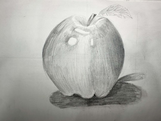
Week 5 Reflection
The first exercise was a symmetry drawing of the apple. After drawing the y and x axis guideline. I noticed the Apple structural became easier to understand as I first drew the outline shape of the apple, starting from one section of the symmetry ruler guide. Ensuring I drew the shape accurately. I used a 10H pencil as the sketch so I did make some mistakes it would be easy to rub out. Afterwards I started shading from the darkest area to the brightest using an 2HB and 3HB pencil. To incorporate the texture of Apple I utilised the repetition of round lines covering the apple to mimic the roundness and gives it a 3D look. I did struggle with shading as the gradient to the darkest spot to the brightness didn’t blend seamlessly. To me the shading looks patchy, and I wasn’t sure if it was because I didn’t apply enough pressure, or the reason is that I didn’t have a HB or B pencil that help contrast the dark led pencils. The warm-up was easy simple because it consisted of one simple shape.
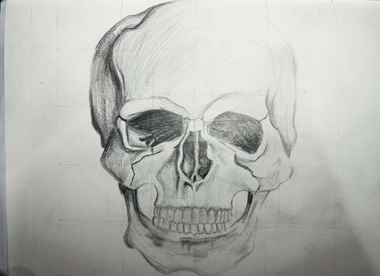
To prepare for the grid exercise I counted how many rows and columns. The skull was 5X4 grid. After ruling the lines. I continuously look back to the reference skeleton to help align the outlines of my drawing to the sketching, capturing the small details of round or hard dents of the outline of the skeleton. I found the grid method to be extremely helpful with the portion as I would look at one section of the grid and see where the drawing is position at. For example, the right top corner of the skull is position closer to the end of the left side of the grid or when the drawing fills up most of the section I would look at the negative space to estimate the portion. Afterwards of filling the details of the eye sockets, nose, teeth and jaws, I attempted to mimic the shading of the reference drawing. This time method I would shade lightly of the overall shaded area then add pressure to the pencil for the darker spots. I would say my shading has improve from the previous one, but I believe it’s only the case simply because I’m copying from already shading drawing then coming up with my interpretation of the shadows and lightness from the photograph apple. I’m satisfied how the skeleton turned out.
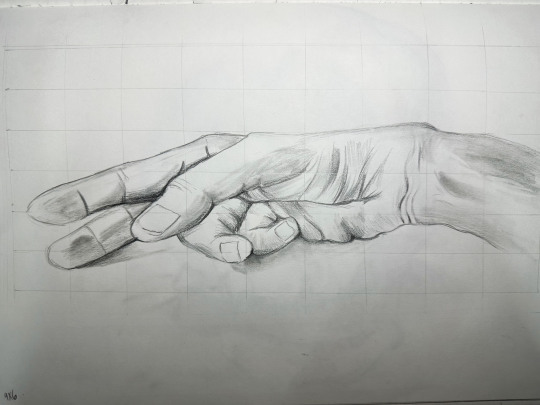
Following the same steps as the previous exercise, I attempted to align my drawing to the complex symmetrical drawing of the hand. I noticed when drawing this warm-up sketch that due to the amount of grid boxes it helps separate the complex components of the hand thus making perfectly easy to understand. For the shading I tried to use a smudge method of imitate smooth blend of skin. For next time, I would increase the height of the y axis as the hand looks squashed consequently from my measurements.
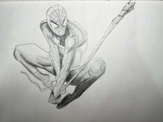
For my graded drawing I chose to draw spider-man. There was a grid drawing of spiderman I saw in google however I wanted to challenge myself and do a complex and dynamic pose. So, I search for some spiderman comic illustration until I found the one, I like the most and made my own grid 5X5 using canvas. It was fun to draw because one I like the character and trying to breakdown the pose and portion in each of the section. If I redid this drawing, I would add more rows and columns since there was some parts I was stuck on drawing due to having too much detail in one area.
0 notes
Text
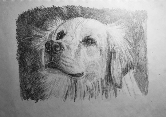
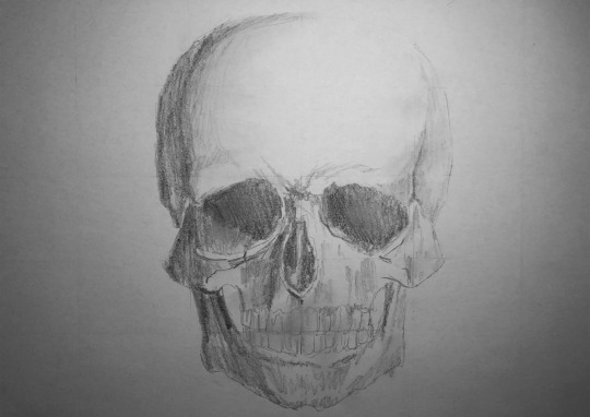
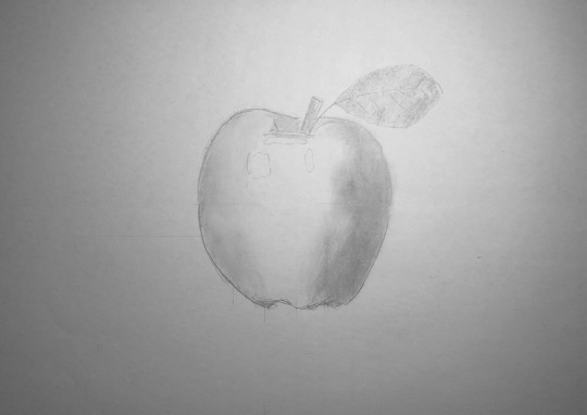
WEEK 5 22/08/2024
In this week's activity covers symmetry and grids, where we draw using grids for precision in our drawings. In our first exercise which we were tasked to draw an apple using a grid, I first started with vertical and horinztal lines, or the x and y axis. From there, I sketched the outline of the apple and proceeded to shade it. This acitivity was also about making symmetrical shapes such as an apple as a guide, and then we add complexity to it such as the shading and other details of the apple such as the leaves. This was a fun and interesting introduction to using a grid, and also a good drawing subject to ease in the idea of symmetry and grids. In my experience with this, I find it too be easy and relaxing.
In the second activity which follows the same formula as the previous activity. We were to draw a skull, that is more complex but also symmetrical just like the apple. Using my ruler, I made grid lines first starting from the center of horizontal and vertical lines, and added more lines as I go. From there, just like the apple, I proceeded to shade and add details that make the skull. I went heavy with the shading and use tissue to smudge part of the skull so that I can blend it. Overall, it was more challenging than the apple as it was more complex and detailed than before, but eventually a fun task in making further use of the grid and further learning the idea of symmetry through a more complex object.
In the last activity which is similar to the previous activities done, we were to draw a more and choose a more complex subject of things we are interested in, or pretty much anything. For this final exercise, I wanted to draw a picture of my family dog, Luna, who is a golden retriever. I wanted to draw something complex that has a lot of detail and also one that I really like. As part of the weeks idea and activity, I first formed a grid using my ruler and adding more lines wherever necessary and proceeded to draw and outline the sketch of my dog. From there, I used only a 6B pen to shade heavily or areas and add details. This was the most challenging exercise to do out of most activites as the drawing was quite complex and detailed and it took quite some time. However, considering it was complex and challenging, it was overcome from the learning experiences I had from putting in the work in previous weeks which I have learned a lot from.
Overall, in this week's activity, I have learned a lot about the use of grid and symmetry is applied through it. Grids are very helpful in learning how to draw if you are someone who cannot draw freehand especially if you cannot draw symmetrical objects well, but it can also be used for anyone at any level of drawing skills. Grids are there to provide as much precision as possible when drawing any subject.
0 notes
Text

"From the Land of Dreams"
First digital artwork of 2024! WOO!
And another thing is a new character as well! I don't really know much about her yet, as I'm developing her, I don't even have a name yet ;-' Buuut yeah, basically a girl born from dreams.
The shading was a pain for a different reason this time.. cause of it being a backlit piece, I had a hard time with her face, Colors were not helping either but I managed...
Another thing which will become a regular now is a watermark. Ima try not to have it cover like 100% of the drawing XDD
To hint on the girls birthday, I put the Aquarius and Pisces symbols cause I'm deciding between December, February and March.. idk why.. (Can't fit Decembers Zodiac lol)
Although the drawing was hell to make, despite using the symmetry ruler 90% of the time, it turned out quite pretty and I hope yall like it too!
#digital art#anime style#digital drawing#digital illustration#anime style art#artist on tumblr#original character#lolita fashion#anime art#anime illustration#elf#elf girl
1 note
·
View note
Text

From time to time it is good to just use the tools that make drawing easier (I am talking about symmetry ruler and not AI) so it can be fun again. I love to render, but I hate to do lineart, and sometimes I hate the freehand sketching part too. I can't wait to find a job that gives me enough money to live and to follow what I actually like.
Also, this is my first OC, I might change her name later, but for now i will call Them Future, he is nonbinary and goes by she/he/they
1 note
·
View note
Photo


So, a few pieces I did the last couple of days. I’ve been looking into a variety of different art mediums and one that has drawn my attention has been abstract and geometric art so I thought I’d try my hand at them digital using Clip Studios symmetry rulers and I really do like how these turned out even if they aren’t something I’m totally used to. The first one, the Triangle one, was made during a moment when I wasn’t feel so great, where my head felt a bit chaotic and it’s interesting looking back on it realizing I kind of imparted that feeling into it unintentionally -- it’s funny too because even in the chaos, there’s still some semblance of order which is very me. The Hexagon one was made earlier today and when my meds were taking effect so I was at my most calm and obviously that also comes through, but I also put in a bit more effort compared to the other, thinking about the colours a little more than just randomly putting them in places that feel like they work and having this sort of gradiant effect in each section so it blends real nice.
I think I might do more and experiment with different effects to see what else I can come up with. It’s nice, relaxing, and it doesn’t take up too much time either which is also nice.
1 note
·
View note
Text
First off, you might want to use the symmetry rulers to duplicate the outlines and general (non-shading!!!) shapes of the eyes, it'd have to be rotated 90° but the base one (shown below) would make this a lot easier.
Second off, I actually copied your drawing and took a few notes of stuff that stood out to me

1. You can see the tiniest white outline on the eyelashes and pupils, messing with the Paint Bucket settings would allow you to not have the outlines interfere as much with the filling of colors
2. It's a very subtle thing, but the hair overlaps with both the eyelash and actual eye, and it creates an effect that looks a tad weird? Specifically with how it interacts with the pupil, it's a small thing but imo it doesn't look very good (it's up to personal preference on this case tho)
3. The shading is kinda contradictory, the eyes have these big shadows that go halfway through them but the hair barely casts a shadow on Miki's face and imo that kinda makes the whole thing feel a bit flatter, so I'd make the shadows coming from the hair a lot bigger
There's some other considerations too, like line control (it sucks but is something you just have to practice :/) and color theory wrt lighting (usually the light and shadow have opposite colors), but these were the main three things I noticed when going through your drawing
Drawing is a skill that takes a really long time to get good at, and some drawings are just not going to look as good as you want them to. That's normal, and it happened to me a lot lol, but you gotta keep trying ^w^

i’m going to pretend i’m happy with this- ;-;
inspired by @iincogneeto’s eyes set:)
tagging: @hotelcaliforniaenbydancer @nothingtoseehere1-2-3 @rosalinastan1 @ayunakatsukiwolfhashira @pinkwisteria @kimetsu-chan @shycroissanti @slayfics @night-mince10000000000000000001 @zenitsustherapist @frostburn-shoto @floofgryph @aceofstars0 @pulim-v @muichirolover14 @muichirosboba
#messing with app settings and functionality is a very important thing to do btw!!!!#it took me A While to find a lot of stuff about Ibispaint out lol
49 notes
·
View notes
Text
Tomarry Synastry: Make Love, Not War (HP Astro # 18)
It might help to read Harry and Tom's respective horoscopes first, because we're about to dive into their synastry!
So...what what does synastry have to say about it? Are they starcrossed, or is this love story written in the stars?
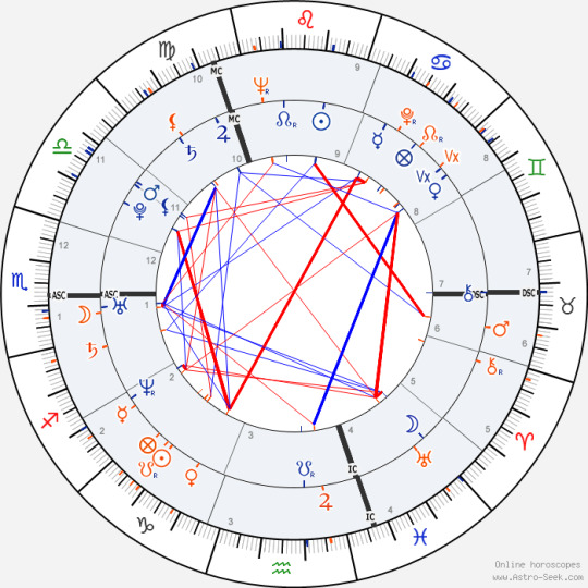
Before we get into synastry proper, let’s take a brief moment to appreciate some of the smaller details. The fact that both were born on the 31st day of the month; not only the last day of the month, but the thirty-first exactly. Then think of the seasons: Tom, our “cold hearted” monster born in winter; Harry, our sweet summer child with a lion’s heart. There’s a certain feeling of symmetry here that appeals. And while I say this isn’t synastry (and truthfully, it isn’t), astrology itself is built as a language of symbols and connections and deeper meanings.
The birth times even (though in fairness, neither are canonical) tell a story. Tom born in the early hours of morning, when it’s still dark out. Harry midafternoon, when the sun is bright and shining. Darkness (morning) and coldness (winter); brightness (afternoon) and warmth (summer.) Tom born in the third (almost fourth) hour of morning; Harry in the third hour of the afternoon (though earlier in the hour.)
Of course, I’m sure you’re here looking for more than just the vibe (though a lot of astrology certainly is a vibe, at least the way I read it!)
So let’s take a look at the actual chart, shall we?
The most telling point of all is the ascendant: their ascendants are conjunct in Scorpio. Harry’s is at seventeen degrees and thirty-five minutes, Tom’s at seventeen degrees and fifty-nine minutes. Only twenty-four minutes of separation, not even a full degree apart! This is very, very close.
Conjunctions are very close relationships, very tied up in each other. The same energy in the same place mirrored back at each other. Ascendants represent how we react, and how we are perceived. It's first response, first impressions; immediacy.
There is ease in the conjunction, but it can be argued there is such a thing as too much ease. There is good and bad to all things, after all. Ease can lead to stagnation can lead to negativity, even destruction. Especially when you look at Scorpio energy. Scorpio is intense, dangerous. The sharp edge of a blade. The black of night where monsters lurk, and you can't see them. The water overtaking you when you swim out too deep.
Here, I think, we can look at the prophecy, at fate, and find it telling. Was it predestined, or was it Voldemort's decision? It's the whole free will argument that always accompanies talk of fate. But there was a prophecy, and it was fulfilled. And for all the darkness, for all the carnage, it would feel wrong to call it "easy." But wasn't it easy?
Why did Voldemort choose Harry over Neville? Because he saw himself in Harry; and in seeing himself, he saw danger.
And if the ascendant is first meetings, first impressions, when would we say their first meeting was? That fateful night in Godric's Hollow? At Hogwarts, from the back of Quirrell's head? The graveyard? Perhaps none of these were easy on the individuals themselves, but might we see that, perhaps, their enmity itself is easy? Natural? An exchange of energy, of hatred, of fear? Are they so alike that they clash?
Can we imagine where they would stand without the prophecy? (I imagine so, there are many an AU telling that story.) That dark, throbbing Scorpio energy meeting its match in one another.
Challenge accepted.
Of course, the ascendant tells us something more. Sharing a rising sign means they share a chart ruler. Both Harry and Tom are ruled by the same energy.
In classic astrology, Scorpio is ruled by Mars, planet of anger and aggression and sexuality. In modern rulership, Scorpio is ruled by Pluto, planet of death and transformation. I think we can easily see how both could be ruled by both planets. How deeply affected both were by war, and by death.
Tom was born between World War I and World War II, and lived to see WWII in action. Harry was born during the first Wizarding War. And both the First and Second Wizarding Wars were centered around Tom. One could argue Tom began the wars, and Harry ended them.
Then: Death. Merope died after birthing Tom. Lily died saving Harry. The death of their mother cosigned them to life among Muggles, unaware of their heritage. Both were awed by magic. Both found a home in Hogwarts. At Hogwarts, Tom would begin to kill, while Harry would continue to lose those who mattered to him. Tom caused many deaths, while Harry worked to prevent them. And Tom worked tirelessly to elude Death, to become the Master of Death; Harry succeeded in becoming Master of Death, though he hardly wanted it. Voldemort's followers were called the Death Eaters; Harry was called the Boy Who Lived.
But death in astrology is more than Death. Death means endings, renewal, and transformation. Regeneration. Both more or less "became" wizards (as they didn't know beforehand, and were estranged from the magical world.) Tom transformed into Voldemort. Harry transformed from a scrawny, abused boy to a famous hero. Voldemort made Harry his Horcrux (whether he intended to or not.) Voldemort gave Harry his destiny by choosing him as his foe. Voldemort was "resurrected" in the graveyard. Harry came back from King's Cross. He survived the Killing Curse not once, but twice. He was in possession of the Resurrection Stone.
Not only do they share a rising sign, and a ruling planet. For Harry and Tom it is more than that. They share a destiny. And, it could be argued, they share a soul.
Their rising signs aren't the only point of connection in their charts. Aspects, such as the conjunction, are the relationship between two planets, which makes it a big focus in looking at the relationship between two charts (or people.) Not all of them are major, but I will note that Harry and Tom have 37 "main" aspects in their chart (there are many, smaller aspects, but I only look at the big ones.) I won't explain them all, just the ones worth talking about, but I will list them all, if only to point out the scale (such as I did in Snarry Synastry 2: Love, and Other Aspects.)
I'll list Harry's planets first and Tom's second, for ease.
Conjunctions: arguably the strongest aspect. Like energies that amplify one another. Strong similarities.
Ascendant - Ascendant
Ascendant - Moon
Uranus - Ascendant
Moon - Uranus
Uranus - Moon
Mercury - Pluto
Neptune - Mercury
Oppositions: a deep, destabilizing relation. These points are reverse images of one another. Stimulating, competitive.
Mercury - Venus
Venus - Mercury
Saturn - Uranus
Trines: harmonious, compatible. (Arguably boring; inarguably easy.)
Moon - Moon
Sun - Saturn
Mercury - Ascendant
Moon - Saturn
Mercury - Moon
Ascendant - Pluto
Venus - Jupiter
Jupiter - Sun
Jupiter - Mars
Saturn - Venus
Uranus - Uranus
Sextiles: also harmonious; similar to a trine, but more stimulating.
Ascendant - Venus
Saturn - Moon
Uranus - Venus
Venus - Neptune
Pluto - Mercury
Jupiter - Pluto
Squares: stress, tension. Challenging, and compelling.
Mars - Sun
Sun - Mars
Moon - Mercury
Pluto - Venus
Mars - Pluto
Venus - Uranus
Saturn - Mercury
Uranus - Jupiter
Uranus - Neptune
Neptune - Uranus
Let's pause here for a few notes. Firstly, the number of "easy" aspects versus "difficult" aspects. 24 of these are the "easy" ones, and 13 the "difficult" ones. I also can't recall if I've seen so many conjunctions (7!) in a synastry chart before.
Most interesting to me are the amount of "flipped pairs"...I'm not sure how to explain this, but such as: Harry's Uranus squaring Tom's Neptune, and Tom's Neptune squaring Harry's Uranus. I don't know that I've seen so many of those either. And I won't lie and tell you I know what it means, because I don't, but I feel as though it must mean something. Even if it's not definable by astrological standards (though, again, I'm no expert, so it might just be outside of my personal studies.)
Look:
Moon conjunct Uranus
Uranus conjunct Moon
Mercury opposition Venus
Venus opposition Mercury
Mars square Sun
Sun square Mars
Uranus square Neptune
Neptune square Uranus
It's fascinating. There is obviously so much between them, and this makes it feel closer. The red string of fate pulled taut between them; or like a noose around their neck. There is so much symmetry to their story, and we can feel it, even if we don't always know what it means.
But let's return to the realm of what I do know: the next item of importance is their moons trining each other. Now that is a gorgeous aspect to have.
The moon represents emotions, comfort, subconscious, and instinct. When they trine, we see two people on the same wavelength emotionally. A trine (often) means the same element, the same energy expressed. Harry and Tom both have water moons, which shows emotional intensity and a fear of vulnerability. When they connect on an emotional level, it's easy. Harmonious, even. There is mutual understanding, a give and take, an easy-flow between them.
Tom's Scorpio moon reflects (as Stephen Arroyo terms it in Person to Person Astrology) "emotional extremism", and a struggle to hide or express emotions. The moon is in fall in Scorpio, meaning the moon's arena cannot run at full capacity with Scorpio energy. There is difficulty in the moon's domain. Difficulty with emotion. Scorpio is passionate, and has a need to connect emotionally and express their surging passions.
Harry's Pisces moon is generous, compassionate, and idealistic. There is a dreaminess to Pisces, and a drive towards escapism. It longs to connect to and heal others. And while Scorpio energy is one of hidden depths, Pisces is more head in the clouds. At least on the surface. Pisces looks to connect to the spirit and the universe; self-awareness and higher learning. The vibe of Pisces is transcendence, where Scorpio's is transformation.
As water signs, they are both curious and intuitive, and with an air of mystery. If Tom longs to share his passion, Harry is one who can see and accept it. The fire of Tom's heart won't burn Harry, but rather will invigorate him. And if Tom is initially unimpressed by Harry's placid demeanor, he is surprised to find those deep, dark layers he hides. They provide a challenge for one another, and can stimulate each other's desire for hunting and searching and learning.
A brief glance at some other points: staying on the moon, Harry's moon trining Tom's Saturn is an interesting aspect. This is an example of a trine out of element, with Harry's water (Pisces) moon and Tom's fire (Sagittarius) Saturn. There is balance here, with Tom's sense of power and wisdom taking the lead, supported by the security and comfort of Harry's heart. And it is Harry being Tom's safe space that allows Tom to grow, and reach new heights. (Moon here being emotional support and Saturn being discipline and ambition.)
Then we see Harry's Mercury in Cancer trining Tom's Moon in Scorpio. This shows open, easy communication on an emotional level. Being vulnerable with one another, and honest. For Tom this might mean opening up in ways he never has before, and learning (Mercury's ties to communication) more about himself and his feelings in sharing that side of him with Harry. Scorpio tries to hide, remember? As for Harry, Cancer's ties to the moon give a link to feelings of home, nurturing, comfort, and protection. Of course Harry's ways of expressing himself make Tom feel safe. Even if it takes them a while to get there.
Harry's Mercury also trines Tom's ascendant, implying a similar way of thinking and expressing themselves.
As for trickier aspects, we see both of their Suns and Marses squaring one another. Their differences could mean their downfall. In both cases we see men unsure of themselves (sun) being rubbed raw and wounded by the other's aggressive nature (Mars.) We do see them fearing one another's power. Voldemort attempted to kill Harry as a baby from that fear. And Harry himself was daunted by Voldemort's power, and his violent (and evil) actions.
Harry's Mars also squares Tom's Pluto. This means conflict. Big conflict. It feels like a fight for survival. For Harry (Mars) it is his independence, freedom, and sense of self; for Tom it is a matter of power, spirit, life and death. This is a brutal, primal conflict. With luck, the high spark of sexuality will batter down those walls and give them a place to mediate and find common ground.
There is so much between Harry and Tom. They are meant to be, however it plays out. Lovers, enemies, both. Foes fighting to the death. A conquerer and a prisoner, or a king and his consort. No matter the universe, or their circumstances, and wherever fate leads them, they can never be nothing to each other. They will always play a grand role in each other's lives; for better or for worse.
99 notes
·
View notes
Text
Jujutsu Kaisen : Abyss of Math Course - part 2
(Continue from Part 1)

Sonoda (S): There’s also a way of thinking that in the application, the distance shrinks and stretches, for example, if we apply Riemannian manifold in the space, we can define ds distance of neighboring points and the ds will stretch. This way of thinking is also not wrong. The specific form of Riemannian manifold is, for example, can be decided by kernel function.
Takano (T): The ds here is the distance between the two of curse users, right?
S: Yes. Depending on the place, it’s like the density of the ruler has changed. By doing that, it will feel like the distance per unit grows. The way it can expand and contract is like a metric conversion, there are various types of them, but information geometry and conformal transformation (=conformal symmetry) are used a lot. But I don’t actually know (laugh).
T: Wait, wait. Let’s summarized it a bit! The ruler here has certain distance per unit. Just for example, let’s make the length of unit 1 m.
Hino (H): OK. If we use the kernel concept, no matter how much value of the variable within, you can tweak it. In short, it seems like this… ? (Board 3)
S: Let’s think that we live in a world where Gojo does dx of 1 m ruler length between him and his enemy, causing this ruler to be distorted, and it turns to be ds. From his point of view, because of this distorted ruler, for example 10 m can become |ds| = 1 depending on the location.
T: I see! So, based on this, even if someone runs 10 m, it would look like they only advance forward “1”.
H: Exactly. Like this, the range is getting longer and longer.
T: I’m certain that by doing this, then it will look like they forever can’t reach him.
H: On top of that, by using his technique, Gojo can make the distance per unit when (someone) getting near to him feels like it becomes larger.
S: That’s why you can design when they are getting closer to him, they feel like they are getting so much slower.
T: True!
H: With this, I think we can somehow define “Blue”. (Board 3)

(Board 3)
cont’d under the cut.

T: Then, next is “Red”.
S: “Red” is the reverse of “Blue”, if we write it as transforming the measurement of space, I think it’s fine to assume (Red) reversing the direction of the ruler.
T: It certainly is. By doing that, |ds| = 1 of this time, if someone is getting near Gojo, the subject feels that he is nearer. For example, if it’s seen from outside, the distance is actually 1 m, but the subject feels like it has become 1 mm. Then suddenly they are blown away! (Board 4)
H: This topic in our field machine learning actually close to the method of “distance learning”.
T: I can remember a few things. For the sake of readers, I will try to explain this “distance learning”. For example, there are 2 elephants and a dog here. There is a big elephant and a small elephant. The big elephant is 5 m long and weighs 5 tons, while the small elephant is 1 m long and weighs 4 tons. On the other hand, the dog is quite big, it’s 0.5 long and weighs 0.05 tons (Board 5). In this case, if the distance is simply the total difference of body length and weight, the difference of small elephant and the big dog is (1-0.5) + (4-0.05) = 4.45 while the difference of the big elephant and small elephant is (5-1) + (5-5) = 5; with this we can see that the distance of the small elephant and the dog is the closer one. This is because we thought about their weight in tons. If we calculate the weight in kilogram, then the distance of the big elephant and the small elephant becomes the closer one instead. The topic of automating this kind of process into the machine (computer) is called “distance learning”.
H: Yes, yes, it’s method to “weight” “which scale you want to emphasize”. Takano-kun’s example looks simple, but it is only sometimes used for distance calculation between the same image, the same music or the same products; by doing it like this, we can apply recognition and recommendation to see is this music similar, or is this image similar.
T: I’ve been in this company for 5 years, my memory has gone (laugh). To think the day has come where I am placed in Jump…

(Board 4) By considering that “Red” is the reverse of “Blue”, this time getting near (to Gojo) means that the distance is getting farther. It is like the illusion of being blown away at tremendous speed.
(Board 5) Originally the big elephant and the small elephant are “elephant” the same, so the distance must be closer. But depending on the emphasized unit and scales, the result may change.

S: So next, let’s try thinking something that seems to match. “Purple” is written as the mix of “Red” and “Blue”.
H: As expected, it’s “void” formula. (Akutami-sensei) wants to use imaginary number, right? So do we stop using Euclidean weighing, and use Minkowski weighing and Koehler manifold instead?
S: The norm is that they are used at the same time, but because it’s a complex domain, it will look like “So you came from that point”.
H: Ahaha (laugh).
T: I completely don’t understand what the two of you are excited about (laugh).
H: Back to the topic at hands, the direction from me going to Takano-kun and the direction from Takano-kun to my location have changed, you can think it like KL divergence.
T: That’s one of the basics of information geometry, right? Because we think of the distance based on each other’s standard, the value changes based on whose point of view, it’s asymmetric distance.
H: Right! That’s why the distance when Gojo sees his enemy and when his enemy sees Gojo is different. No matter how Gojo’s technique applies these concepts, “Blue” and “Red” can be established.
T: Because there are two theories, let’s adopt the first one.
Conclusion
Using the Limitless cursed technique “Red” and “Blue”, Gojo can do conversion and change the scale of distance between him and his opponent.
(to part 3)
94 notes
·
View notes
Text

Commission
The Winner is... Cold Man!
This commission is the award for the winner of a casual MM8BDM tournament. Showing the winner at Dr. Light's Lab. The winner used Cold Man.
It's my first time doing Cold Man, and I had to learn his anatomy to draw him, since he's small. (smol cold) There isn't a concrete character sheet for the character, so I had to use official and manga art and his sprites as references.
While the background... Oh lord, the background. I had to use lines to draw both Cold Man and the background. Especially the Background. Curved lines and the symmetry ruler, you are my saviors. I'm not used to do detailed backgrounds like this. But I had to draw it. (Not so Fun Fact, I had to redraw the background when the first time failed.)
Despite that, I'm so happy to finish this commission. I apologize for the lack of drawings. I was really busy in IRL stuff, induction to the online institute classes, and struggling with IRL personal stuff... (I mean... at the moment I'm writing this post, Feburary 3rd, there a lot of wildfires here In Chile. Yesterday there were a lot where I live, thankfully not so much but it's still concerning)
Hope your like it! _Elec
Made in: CLIP
(Commission are open. Dedicated Carrd Co there: Click here! )
#Mega Man#Mega Man Classic#Mega Man & Bass#MM&B#Cold Man#commission#commission art#digital art#elecalice work
2 notes
·
View notes
Note
hello! do you have any advice for switching from traditional art to digital? (i recently ran out of supplies so im relegated to my computer lol) i hope youre having a good day!
i sure do!
first off i really recommend clip studio paint, but i also recommend u wait for it to go on sale. it goes 50% off a few times a year, so imo it’s worth waiting, but it also is usually on sale for only a few days so u have to stay on top of it. they usually announce on twitter etc. the tools don’t make the artist and obviously it doesn’t Really matter what program u end up settling on, i’ve just been really pleased with CSP and i wanted to recommend it
second: nothing that u can do with digital art programs/tools is cheating and it took me way too long to really internalize + understand that. copy-pasting stuff instead of redrawing it, using symmetry rulers, using transform/ctrl+T to stretch or squash slightly off anatomy instead of starting over -- when i was first getting into digital i A. didn’t know u could do this stuff and B. felt weirdly guilty doing it once i figured it out, as if i was a worse artist for using the tools that are literally built into the software or that it was lazy or dishonest to do so. that, it turns out, is bullshit. any drawing is just a constant series of decision-making and a lot of digital tools just help u make or retract or edit those decisions faster than traditional does. it’s not better or worse, it’s just different, and it’s worth ur time to figure out which of those differences are the most convenient and useful. this stuff exists for a reason! use it! save ur wrists and ur patience and ur time!
figure out file organization early, because it’s something u don’t have to deal with irt traditional art and so it probably won’t come naturally, but it also makes ur life harder to have a desktop swarming with wip files that are all titled “kjsrhrfgdhgj.psd” or whatever. some ppl sort into folders by date; for me it works better to sort by content (i.e. i have folders for tvrn stuff, patreon stuff, different fandoms, dnd/ttrpg stuff, “misc ocs” for characters i don’t draw much and “misc fandoms” for one-off fanart that doesn’t merit its own folder, etc etc; this is what makes it easiest for me to find stuff, but ur system might end up different.) i admittedly still name my files keysmashes if it’s personal stuff rather than work/commissions, but at least it’s all sorted into a category where i can quickly find it again anyway
also, u can hybridize traditional and digital! i frequently like my traditional pencil lines better than what i can do digitally, so i often scan them in, turn them into lineart, and color digitally (here’s a tutorial on how i prep that). but even if u don’t have a scanner, a carefully taken phone photo with high contrast can still be used the same way. i tend to lay my sketchbook flat on the floor in front of a window, squat down and hold my phone as level as i can while i’m taking the pic, and then i blast it in my phone’s built in gallery editor (highlights/shadows and contrast) before sending it to myself and doing the same thing w tone curve/levels in csp. it’s not perfect, but it’s presentable, and it can be a good way to ease urself in if ur feeling frustrated w the learning curve on digital draftsmanship.
oh, and this tip is really small but it’s ended up being rly helpful for me: resist the urge to zoom in way past 100% scale view just bc u can. if there are times where u absolutely need to, sure, whatever, but there’s no point in regularly tweaking tiny things pixel by pixel at 250% zoom bc nobody who looks at ur art is gonna see that and ur just bloating ur own time spent on things and creating unnecessary stress for urself!! if 100% zoom doesn’t give u the control u want, that may just mean u need to work larger to begin with.
set up a comfortable workspace with a Good chair. look up proper posture and try to stick to it. i know we’re all gay and it sucks to sit in a chair properly but otherwise ur gonna hurt urself. take even more frequent breaks than u do when drawing traditionally! screen bad!
also, if ur tablet has a way to calibrate pressure, try that out. a lot of them are set in a way where you have to press really hard to get full line width and over time it can really seriously strain ur wrist; u can’t manually set pressure in traditional tools (besides like. using softer lead i guess lmfao) but u can with tablet pens and u should try it, bc if u can use a lighter touch overall it really goes a long way towards preventing injury in the long term.
this is all the stuff that came to mind immediately; i’m sure there are tons of basics i haven’t covered, depending on how much of a transition this is for u, but there are a lot of tutorials out there written by ppl more patient and more educationally-oriented than myself so you’d be doing a better service to urself seeking those out than if i were to try to clumsily emulate them lol. good luck + have fun!
221 notes
·
View notes
Text
The three outer planets shouldn't have sign rulership, instead, they should have trine rulership. Let me explain. Because they are outside of saturns orbit, their duration of orbit being longer, the bounds that they make are larger. also, if we look at the assignment of planets through the logic of the solsticial axis, we will lose symmetry by taking away planets from the other half of their domain. The energies of the outer planets are too subtle and broad due to their distant and translucent properties, defining translucent as having more partial and refracted light then the seven. Assigning them even to co-rulership of singular signs contradicts their nature.
The tripart of the horoscope is the cardinal, beginning in aries and ending in the last degree of cancer, then fixed, leo to scorpio, then mutable, sagittarius to pisces. The cardinal tripart is creative, the fixed is supportive, the mutable is degenerative. Observe the signs in the first tripart, fertile, active, generative; taurus although nocturnal, earthy, and fixed, is fertile and generative. The signs in the second are regarded to be maintaining, homeostatic, repetitive in instillment, beginning by the commanding force of leo and ending in the penetrating force of scorpio, with the pedantry of virgo and the balancing of libra. The third tripart regards itself with the expansion of the body, the changing, dilution, or emboldening of its limit.
Inspect the nature of the outer planets, uranus turns by its side, the first to be discovered beyond saturn, the breakthrough of bounds. Neptune, further from Uranus, has its influence be regarded as illusive and mystery; I am still trying to study its effects, I have observed suicide is a theme. We then have Pluto, farthest and smallest, representing the undercurrent of generations, has some significance with plagues ig. Look, its hard trying to look up newspapers and event aligning with the stars alright? everything is happening at once and it’s practically impossible to look at the planets in isolation.
If I want to study the effects of the outer planets when aspected by the inner 7, then I need to first compare when they are aspected and the events that takes place then with when they are not and the events that takes place then. I also need to reliably. The planets I will use should be slower than the moon, her speed to fast and personal, but still fast enough to have enough movement and data for me. Mercury is a good choice, and I will look for harsh aspects between the studied planet, mercury, and the sun.
Anyways, back to the topic. I’m assigning Uranus to the cardinal tripart, Uranus is a planet that flashes hot although cold, like lightnings in storms. Pluto to the fixed tripart, for it takes the longest time in the signs, although it may take varying periods in each. Neptune in the mutable tripart, dissolution and intangibility of pisces and sagittarius flanks the darkness of aqurius and capricorn. What purpose do these tripart assignment has? As minor dignities for horary, ofc. If the ascendant falls on the mutable tripart, and the lord of the specific sign it falls on is in strong aspect with the tripart ruler, neptune, the conditions, then something happens. I have guesses, but I’m not sure what. I’ll do some observations to see if I actually am right and that the tripart rulers have any weigh in them.
2 notes
·
View notes