#and every piece of art that i do on the ipad instead of the sketchbook she gets on me for
Explore tagged Tumblr posts
Note
if it's okay, would you mind sharing your art process? your style is SO gorgeous dude. keep it up spardacest nation!!!
Thank you so much anon, and of course! I kinda posted about it on twitter a while ago, but for anyone not also on there, here's a paraphrasing of what I said there! (under a cut bc it's gonna get a bit long)
(speedpaint video from procreate mostly bc like I also said in that post, it's one of the few pieces I've done entirely on procreate and thus entirely recorded kdfjhdk I usually don't do the sketching + painting parts on there but every now and then I get lazy and want to get it all done quick in one program lol! It's not as good as it would look if I were using krita to render (which is what I normally use) but it gets the idea across decently of what it is that I do)
The short version of my process is: sketch, clean up sketch for lineart, then flat colors, then paint over the flats (i make the flats my shadows and paint on the light), then a multiply layer for skin details (like lips, eyebags, etc), then an overlay layer for skin transparency details (red over the ears/nose/fingertips etc), then i do hair over the lineart, then a multiply layer with the contact shadows in a light beige/grey/neutral tone on top of everything else, and then i unify layers, paint over the details, and color correct the HELL out of it The longer version is: SO, first of all, I will say, my entire process for a finished/fully redered piece is pretty scattered and uses a lot of different apps, because after many years of trying out different drawing apps I found that I just worked better when I could incorporate the parts I liked best from each individual one rather than having to adapt to another app entirely! In total, what I use is: autodesk sketchbook and procreate for the first half I do on my ipad, then krita and photoshop on my computer when I'm actually rendering (but any photo editing app instead of ps will do, I'm just used to photoshop bc that's what I learned as my first drawing app WAAAY back in the day lol), and then meitu on my phone for color filters (also any phone editing app with filters in it will do), AND also optional just for references: blender and daz3d on computer + magicposer on my phone The actual step by step of what I do: First of all, if I want to do a detailed, well rendered piece I will start by getting my references ready. That means either just grabbing a screenshot from the game if it's like, a simple portrait, or a photo reference, taking a picture of myself in the right pose/lighting, and if it's something more complex I will recreate the scene in Daz3D to simulate a realistic lighting, OR even just blender (i have the game models for the dmc characters downloaded, so I can just pop them in, pose them and change the lighting to get a realistic idea of what shadows their faces will cast in that specific angle/lighting.) Note: references are pretty essential to me, and there's nothing to be ashamed about for using them! Personally I don't struggle a lot with the drawing/sketching part of art, but my tiny little pea brain cannot fathom how to make an object 3D in my mind, and how to visualize shadows realistically... thus the reliance on 3D programs to do that for me, and then all I have to do is draw what I'm seeing lol. My art improved significantly ever since I started making 3D refs so I could get /exactly/ what I needed - there's still a lot of leeway you need to learn though, because as realistic as the lighting will be in a rendering program, you'll never really get a fully natural looking image, as far as stuff like the body stretching/squishing/pulling when it's in movement, facial expressions, folds in clothing/fabric, etc... so really it's more a guide than something meant to be followed 1:1.
Then, once I'm confident I know exactly what I'm gonna draw/have the idea in my head, I start sketching it in sketchbook. Not really getting very in depth, just blocking out rough shapes - I like sketchbook and to be on my ipad for that because it feels very reminiscent of traditional sketching on paper to me, which while I'm not super confident on my traditional art abilities, I do get the most natural/fluid/non-stiff figures out that way. Then when I think I have the general idea ready, I export the sketch layer as a png and import it into procreate - which is where I kinda start picking at the sketch and polishing it like i'm carving it out haha. Lots of liquify tool, flipping the canvas to check if it's even, blending out some of the lineart to help out with the rendering later, and then polishing up what was once the sketch into serviceable lineart. I usually reimport it back into sketchbook at this stage - while I like procreate for drawing I don't love the brushes I can use for lineart there, and so I usually only draw the "base" naked figure in there - when I'm in sketchbook I use a hard pencil to refine the details, then on a separate layer add all the things "on top" like hair, clothing, etc - usually I can get it pretty easily in one go, and once I'm satisfied I erase the naked body under the clothes and unify the lineart layers. Then I will just do the flats with a hard brush, turning the lineart layer into an overlay layer and coloring things in with the shadow colors. At this point, I export the file as a psd and import it on my computer - I give it a once over in photoshop first to see if there needs to be any adjusting (like whether any layer that has an effect needs to have a different effect, if all the colors look right since the ipad screen isn't the most faithful, if i wanna change the background color, etc), and once I think it's ready enough, I open it up in krita, where I do the actual bulk of the painting/rendering (as to why specifically krita: it's because I've gotten very comfortable with the brush/painting brush dynamics there and cannot seem to get as good results anywhere else, it's just the goldilocks spot of a brush for me haha.) If anyone's curious, here's the brushes I usually use for painting:

The one in the middle is my go to painting brush, left one for tinier/more refined details, right one for blending out soft shadows (though I learned the hard way to not overuse it, or it will look like I went ham with an airbrush tool lol). (I don't change any of the settings on these brushes, so if you wanna try out the exact ones I use! Just fresh off how they come out the app haha) I paint on the lights on top of the shadows, and just focus on that for the time being - once I'm done with the basic painting, I'll make a separate multiply layer for details like lip color, eye waterlines, makeup if there is any, eyebags, etc, and then adjust the opacity until it feels right - then I'll make an overlay layer with skin translucency details (like, when you hold your hands in front of a light and see the tips of your fingers become bright orange - many parts of your body are always a bit translucent to the blood underneath, specifically parts where the skin is thin like noses, cheeks, joints, knuckles, etc, and I found it makes the character look a lot more alive to add that subtle coloring in) - then usually I do hair on a separate layer on top of the lineart (because that way I can add small flyaways, more details, etc, and just use the lineart as a guide) After that, I'll usually make a multiply layer on top of everything where I'll add contact shadows in a neutral color (usually pretty pale, it'll be darker anyway since it's multiply), and once I feel like I've rendered everything out properly, I save the psd and re-open it on photoshop.
In photoshop, I'll mess around with the layers a little bit more (changing hue/saturation, opacity, etc), fuck around with the background to make it look pleasing, and once I'm happy with it, I'll unify the layers and start color correcting - usually by duplicating the unified layer and messing with the curve/hsl of the image and then changing the opacity of that edited layer until it's as strong or muted as I want it to be - then I also edit the RGB curves individually and adjust the opacity of that also (because I just really like how it ends up looking if I give a bit of a red/warm tint to the shadows lol), and at that point often I will reimport the finished image into procreate for some finalizing touches! Like, blending out shadows that came out too harshly, painting over anything that came out not the way I wanted it, redefining the lineart if it got messy during painting, and adding any extra small detail that might have gotten lost like catchlights, hair shines, hair flyaways, tears, etc. I also do one last round of flipping the canvas and liquify if needed! At this point, I export the finished image both to my computer and my phone - on my phone I open it up on the photo editing app, and add a bunch of different color filters - I don't hesitate from going completely balls to the walls here, and just kinda applying as many filters as will make an image look pleasing to my eye. Once I think it looks good, I'll export the edited image to my computer - and then open both the version without filters and the one with them on photoshop, and use the filtered version as an opacity layer, and adjust it until it doesn't look as crazy anymore lol. One last step I recently started incorporating was also changing the image to grayscale after I'm done, and doing one last round of curves in greyscale to make sure the values look right, and nothing is getting too lost because the values are too similar (because i know i get a bit swept up in getting repulsed by harsh contrasting lighting and can end up washing out all of rendering if I don't check myself kjdfgk) AND that's it! Yes it's a pretty long and chaotic process, but it's coming from years of trial and error and realizing I can just let myself fo whatever makes me happier with the results, and I don't have to stay constrained to one program if I don't like every tool it has to offer/don't have to accept the final image fresh off the painting app as the "finished" image with no adjustments allowed after, lol. I don't find it takes a lot more time than if I didn't do it this way, but YMMV. Hope this was helpful and sorry for taking so long to explain! I just wanted to give a thorough explanation dfhdkhkx
#asks#sorry i know its a bit chaos hfdgd#but i hope its helpful anon! thanks for asking#also for anyone wondering#no i am not paying for ps lmao#fuck adobe#it is always morally correct to pirate adobe products people#if you have an alternative photo editing app you like best youre welcome to use it#but if youre too used to photoshop. everything is free on the internet if you know where to look#i also wouldnt recommend meitu bc it feels like a pretty sketchy app all things considered#im just too lazy to care to change my go to app but i would look for a different phone app#p sure theres billions that let you add funky color filters instead#actually i think you could use photoshop camera raw filters for that too#its just way too intensive of a process for my tiny potato computer and it feels a lot faster + seamless on phone
13 notes
·
View notes
Note
Damn you’re so impressive to being a working parent on top of being an amazing artist!
You are so kind, @poprocksromance. Thanks so much for being a cheerleader, because I’ll be honest: I don’t feel impressive.
I feel… really tired. lol
I actually put off answering this ask because when it comes to being a working parent and artist, I have SO MANY THOUGHTS. This month’s been excessively hard because I wear too many hats in my life and my neutral state is putting out fires before I can skive off and draw, usually at the expense of sleep.
Take this past Tuesday for instance:
6 AM: Husband is already out the door to work, but both kids crawl into my bed to doze until it’s time for them to be up. There is now hot, humid air in my ear and a small, sharp knee in my back. I am not dozing. I am thinking about drawing.
7 AM: Breakfast. Kids pull the covers off of me and whinge about being hungry. Spend next hour feeding kids, breaking up fights over legos, making lunches, and getting them ready for school. Inexplicably, no one has clean pants.
8 AM: Holler at everyone that we are late and I’m about to lose my mind because instead of putting on shoes, my kids are still arguing over who gets the red lego piece. More thoughts about art trickle in: “Man, I really hope I can carve out some time for drawing today because this sh*t is bananas.”
8:30 AM: Zoom across town to drop off children. Kiss heads. Wave goodbye. Try not to rear-end other, larger vehicles being driven by people who don’t understand how the drop-off line works.
9 AM: Back home. Time for Morning Pages. This is the daily act of emptying my head into a journal at the beginning of the day for 30 minutes just so I can plow into the chaos without having a panic attack. Each entry mostly consists of me pep-talking myself into doing my day job because food, shelter, college education savings, blah, blah, blah. Then it’s planning and email checking. I promise myself that, if I can just finish this next video edit task, I can reward myself with drawing artwork.
10 AM: My Video editing software update has made all the PNG files turn pink. I assume it’s for no earthly reason than to delay my progress and piss me off. I promise myself I will figure out the glitch in the next hour so I can earn myself time to draw.
1 PM: I have updated my operating system, reinstalled my drivers, troubleshooted with Adobe and Apple. The fucking files are still pink.
2 PM: I convert all PNGs to JPGs. Videoediting software now refuses to read .MOV files recorded after I updated my operating system. I mutter all the expletives and stare longingly at my tablet. This is gonna be a while.
3 PM: Rush out the door to pick up kids. Kid is complaining of a tummy ache. Come home with kid, put on the tea kettle, and read Kevin Keller together until tea is ready. Am screaming internally about video editing conundrum the entire time.
4 PM: Hubs is home. I run back to the computer. There is no way to uninstall most recent version of video editing software. Find and install Handbrake to convert every .MOV file I am using into .MP4 as a workaround until I can figure out what the everloving hell is wrong with my project. I tell myself I will draw after dinner if I can just figure this out.
5 PM: Praise Crowley for leftovers.
6 PM: Video editing issue is still going, but I’ve identified the workaround and am slowly piecing my project back together. My sketchbook is next to my desk. I do not touch it.
7 PM: Husband is coming down with something. Asks if I can single parent while he lies down for a bit. I agree (because he did it for me last week when I was down for the count). I ask the kids if they want to draw with me. They do not. They want to run around outside like one of them didn’t just complain about a stomachache three hours ago. I tell myself I will draw after they go to sleep.
8 PM: Bedtime. Clean kids. Pick up toys. Brush teeth. Read books. Sing songs. Hold hands until the littlest goes to sleep. Snoring (hopefully) at 9.
9 PM: Take shower. Try to reset. No more video editing tonight. I will draw instead! *nods defiantly*
9:30 PM: Husband wants to share about his stressful week. He’s got freshman this semester. Problematic ones. And too many; 28 in his class alone, and he’s the department head, so he needs to do all the fixing. I sit with him and listen.
10 PM: Youngest kid is coughing. Wakes oldest kid.
10:30 PM: Kids sleeping. Husband downstairs working. I’m in bed, iPad in my lap, Procreate open. Tonight’s work in progress: Simon and Baz holding hands.
I stare at it. Make a couple of adjustments to the line art. Then I put it away and turn off the light. I have nothing left–��no energy, no vision––to give to it.
11 PM: The lights are out. My eyes are open. They don’t close until sometime after midnight.
Because I am thinking about drawing.
This is not a rare day in my life. This is tame compared to some days. To get through it, I tell myself this is all temporary. That one day I’ll be able to live off my artwork and I won’t be a slave to Adobe Premiere or the government or the myriad infectious illnesses my kids bring home. I also have to actively talk myself out of feeling jealous or furious at other, younger creators who don’t have to support a family, who talk about playing video games all day when they’ve got artist block, who complain about being bored, and who have the luxury of putting off whatever it is they don’t feel like doing so they can draw. My struggle is no one’s business or fault but mine and probably also Capitalism, but I’d be lying if I said it didn’t sting that people are out there living the dream and taking it for granted.
Anyway, this is a very long way to say, thank you for your compliments. I am trying––every single day of my life––to make something beautiful. Sometimes, that’s fanart or my comic. Most times, though, it’s the life I’m trying to give my family.
266 notes
·
View notes
Text
aesthetic tag ✨
rules: bold the aesthetics you relate to and add twenty of your own aesthetic qualities for others to bold
tagged by: The one and only!! The wonderful!! The amazing!! The talented and incomparable PAPA!! Also known as @defgyus 💜
tagging: no one but, if you wanna do it, just say I tagged you.
soft
baby pink | iridescent | glitter is always a good option | no bra | minimalistic tattoos | cherry patterns | sweet scented perfumes | wearing generous amounts of blush | doodling hearts | getting excited to pet an animal | fun nails | rewatching old barbie movies | hair sticking to glossed lips | heart shaped sunglasses | taking pictures of the sunset or sunrise | stuffed animals | protecting nature | stickers everywhere | teen movies | the light rain that falls from a clear sky at the beginning of the night
dark academia
neutral tones | masculine outfits | studying languages | worn down copy of books | grey skies | turtleneck sweaters | loose fitting pants | hair tied with a silk ribbon | trying to remember a cool difficult word you read somewhere to use in a convo | thick belts | minimal makeup | windows fogged by rain | vintage jewelry | blouses with cuffed sleeves | reading a murder mystery and trying to solve it | oxford style shoes | sweater vests | subtitled old movies in a language you don’t speak | leaves crackling as you walk | annotating books to express your emotions about the story
edgy
closet full of dark clothes | fishnet tights | makeup sweating off | neon signs | searching for unknown songs | chokers | band tees | doodling on old converses | finding smoking aesthetically pleasing but not doing it | weird humor | accidentally very dramatic | dim lights | layered outfits | chain belts | chipped nail polish | messy hair | low quality pics | piercings | combat boots | scribbling on desks
seventies
colorful wardrobe | doodling flowers | wearing short shorts | using a bikini top or bra as a normal top | listening to ABBA | flowers in your hair | diy-ing everything | jamming to songs alone in your room | drunkenly telling your friends you love them | patterned bandanas | mid heeled shoes | messy braids | flared sleeves | walking barefoot on grass or sand | bold sunglasses | the good kind of tired you get after doing something you enjoy for hours | feeding stray animals | fun patterned socks | room decorated with succulents and other plants | likes to go roller skating or skateboarding
preppy casual
collared clothes | drinking juice out of a champagne glass | getting excited to see the met gala looks | thick headbands | small pastel cardigans | making your friends take your ootd pics | plaid mini skirts | tweed two pieces | watching reality tv to pass time | frilly tops | watching old hollywood movies | academically driven | long manicured nails | new year’s eve fireworks | colorful tights | layered golden jewelry | yearns for luxury brand items | decorating your room with fairy-lights | cursive and neat handwriting | lace details
cinanamon - steph
gold jewelry | slowdancing in the kitchen with a lover | sun on skin | red-tinted lip balm | lazy mornings | getting lost in foreign cities | scent of bakeries | high-waisted jeans | kissing someone’s neck | writing reminders on your wrist | sleeping in braids to have waves in the morning | growing an herb garden | gentle touches | sketches tucked between pages | flushed cheeks | tandem bikes, floating in a pool | vintage gold hand-mirror | deer grazing | softly singing while doing chores
jaesmintea - dia
oversized everything | painted nails | fairy lights | dozing off in the middle of class | tying hair up into a ponytail | round glasses | laughing so hard you can’t breathe | late night study sessions | tender hand holding | impromptu photoshoots | drowning in moondust | bathing in the light of the sunset | strawberry flavored lollipops | polaroid pictures | eagerly tugging someone down the street | handwritten love letters | smell of coffee | living with reckless abandon | crinkled pages of a journal | replaying the same part in a song over and over
naptimetea - helena
everything black | rewearing your favorite outfit | drawing late into the night | rewatching favorite shows | the bread isle | minty lip balm | falling asleep anywhere and everywhere | making green tea | useless questions when it’s 2 am | forehead kisses | sleeping in till the afternoon | love of pink | staying up to watch the sunrise | dancing in the bathroom | messy handwriting | pile of sketchbooks | talking for hours about interest | old sentimental stuff animals | hanging out on the bed and doing nothing | thick fluffy blankets
jeonginks
the thrill of leaning your body way over a balcony’s edge | the suffocating feeling when the strong wind blows down your lungs | tip-toeing barefoot | hair ruffling and cheek pinching | hugging a body pillow at night | facing the sky with closed eyes | the whimsical silence when it’s past midnight and you’re the only person awake | when you can physically feel your eyes soften when you look at someone | dancing alone with only an oversized shirt | when your sweater falls over your thighs as you stand up | humming scary but memorable lullabies | vivid imagination | w-sitting with a mini skirt and thigh high socks | heated laptop on your lap | cereal at 3 am | gliding your fingers across your thighs | bittersweet melancholy | withdrawn and distant eyes | very tight belts | wanting love but not believing in it | not cruel but not kind
scxrlettwxtches
listening to a song and remembering the times you used to listen to it on repeat | imagining yourself living in any other life than the one you have now | crop tops and high waisted jeans | forgetting to smile but not actually being upset | nuzzling your face in the crook of their neck | back hugs when you’re stressed | turning in assignments 1 minute before they’re due | wanting a relationship but getting scared the moment you’re in one | pretending that you don’t care when inside you’re burning with doubts and fears | the sound of the evening waves as you lie on the sand | lying in your bed listening to your sad playlist | exhaustion but you can’t sleep | singing loudly when you’re the only one home | feeling safe and comfortable with that person in your life | knee high suede black boots with your black winter coat | comfort over appearance | writing essays at 2 am | creative peak from 1 am to 4 am | the one that always ends up walking in the back of a friend group
hyunsracha - sav!
split-dye hair | female rappers | staying up until 6am and sleeping until 1pm | taking notes on an ipad | middle school emo music | mini skirts | late night drives | rain on the ocean | flirting with people when you’re bored | doc martens | eating ramen in the pot | afraid of being looked at | fishnets | getting joy out of making people laugh | small tattoos | crying yourself to sleep | peppermint everything | desperate for freedom | chipped black nail polish
lveletters
well-worn converse | ginger ice cream | farmers’ markets | amaretto in coffee | the sound of pen on paper | empty mountain trails | black and white photographs | vintage bicycles | roads trips with no destination | overfilled bookcases | a shoebox full of ticket stubs | granny smith apples | orange gerbera daisies | cardigan sweaters | games that tell a story | red wine in a mason jar | succulent gardens | tattoos of birds | fresh-baked muffins | a favorite pair of jeans
dnceracha - sydni
black chelsea boots | chapped lips | browline glasses | losing yourself in video games | impressionist art | pink peonies | writing down anything you need to remember | the smell of gasoline | business goth style | dangly earrings | florals | ballet flats | cuffed jeans | liking the villain | a stack of journals | generous amounts of highlighter | knives | rain on a tin roof | heavy footsteps | small-town diners
bamshine - sae
chunky black boots | not realizing you’ve been writing for hours | soft dog fur under your hand | the loud gathering of friends after an exhausting dance class | bubble tea | casual touches between friends | beach trips | airports late at night or early in the morning | coming home from travel and finally being in your own bed | leaves crunching under your foot | shopping for groceries with christmas music on the radio | loud family gatherings over a pizza | succulents | goofy singing and dancing with friends | getting so into a book you do nothing else all day except read | cool summer evenings around a bonfire | apple cider | the scent of vanilla | selfies with friends | the sting of a new tattoo
jjinyounf - cres
ocean breezes | moonlight/sunlight through clouds | sweatpants and baggy tees | empty journals | stud earrings | messy bedroom | thought-provoking movies | apple cinnamon | hot, but not sticky weather | chill big dogs | mixing flavoured vodka with ice cream | playing songs at full blast in the shower | quiet corners | the sound of bacon while it cooks | loud thoughts but quiet words | staying in bed until the absolute last second | mid-calf boots in the winter, flip flops in the summer, sneakers every other time | mental breakdowns doing anything academic-related | madras shawls | the colour combo of red, black, gold, and white
flowerbeom - kat
polaroids | saying hello to the moon | buying more books that you can read | lo-fi playlists to fill the emptiness | baking bread of saturdays | playing the same song over and over until you learn the lyrics/vocal runs perfectly | milk tea | booping your cat’s nose with your nose | keeping a stash of that one perfect pen | being the quiet listener in conversation but always has a great story to tell | sneakers over everything | watching the sunrise through cracked open blinds | leather and patchouli candles | freshly cooked rice | finding the perfect word to describe something | the crunch and squeak of walking on freshly fallen snow | writing “hello” on foggy windows | strolling through ancient forests and feeling small | kissed on bare shoulders | falling asleep to the sound of rain
focusgyeom - leena
wishes at 11:11 | leather jackets | hoop earrings | making playlists for friends | seasonal candles | bath bombs | pink drinks | late night drives | crystals | ripped jeans | starry nights & full moons | writing out your emotions instead of talking about them | loves the thought of being in love, but too scared to fall in love | black clothes | staying up till 3am writing | lip gloss | fall & winter | vampires books & shows | keeping a journal on you at all times | gel pens | sunflowers
defgyus - val
feeling at home in museums | color coordinating everything | feeling the warmth of the sun on your face | owning lots of stationery | aesthetic pinterest boards | period drama | coffee and tea are always a good idea | big windows overlooking a big city | neutral tones and muted pink | keeping a journal with your favorite quotes | fashion magazines | disney films | movie scores and lofi playlists | daydreaming in public transport | learning languages | laughing out loud watching comedy sketches | drawing on procreate | chunky sweaters and jeans | neck kisses | loving hard
defnabeom - nauan
shapped sunglasses | silver jewelry | the laugh of the people you love | this particular voice you could hear for hours | veins | ripped clothes | grungy style | cats lover | collecting everything | organized mess | cigarettes and a glass of whiskey | the feeling of being afraid to bother | old cartoons | spikes | men perfumes | noisy pictures | bucket hats | a simple touch of color in a black outfit | wine red eyeshadows and matte lipstick | the loner who needs love
2 notes
·
View notes
Photo
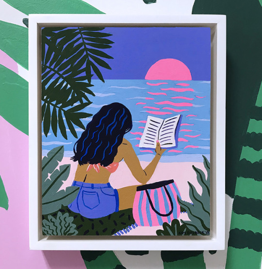
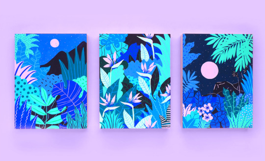
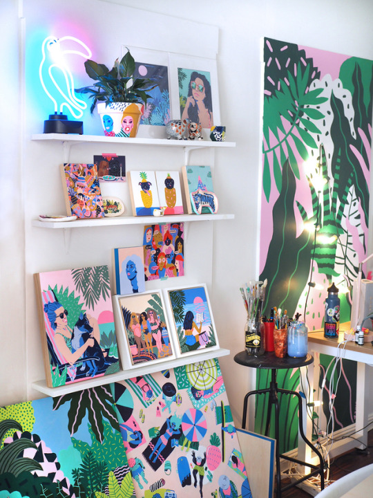
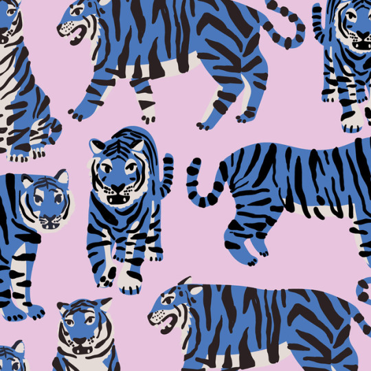
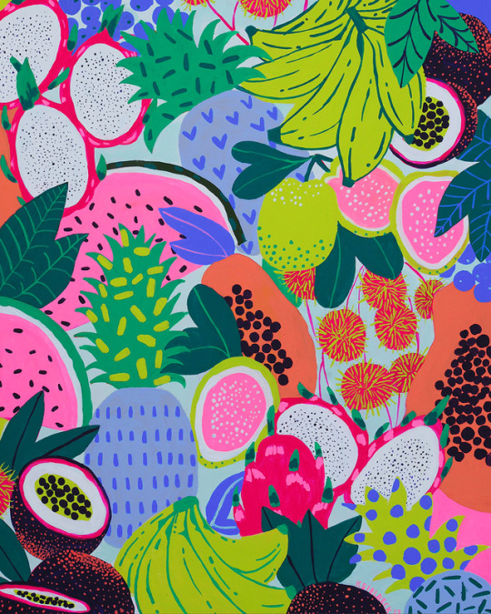

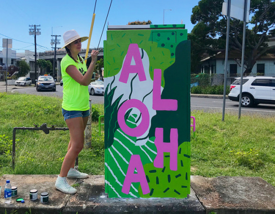
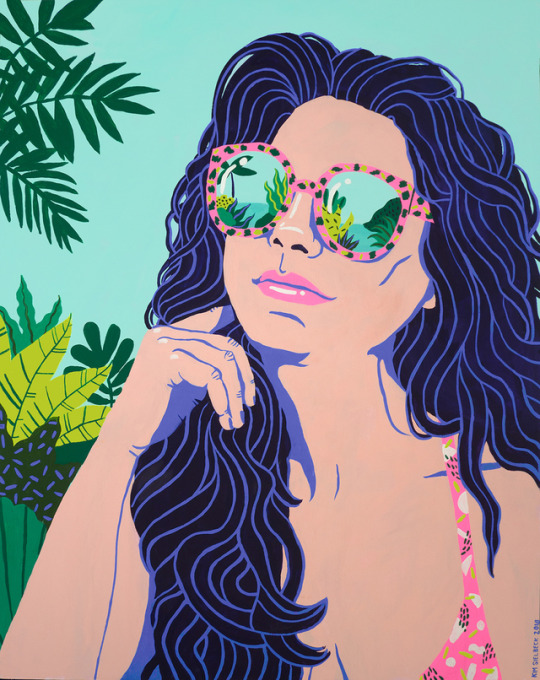
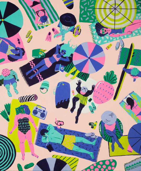
SKETCHY BEHAVIORS WITH KIM SIELBECK
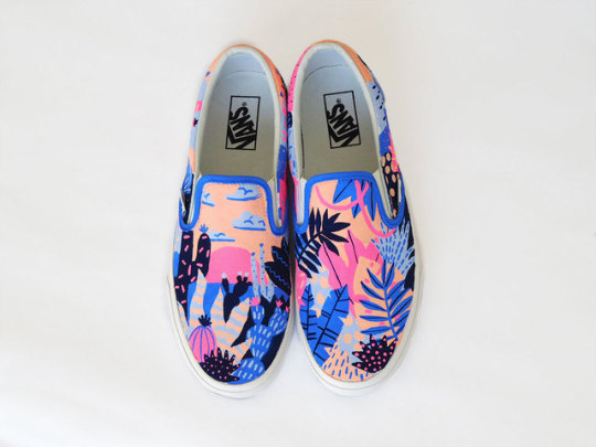
With a background in fashion, textile, illustration and printmaking, Honolulu based artist and designer Kim Sielbeck creates colorful, bold, and fun paintings and patterns inspired by lush landscapes in Hawaii. From murals to digital canvases, Kim recently created some our favorite customs as a Vans Custom Culture ambassador, using her signature color palette and designs! Find out more about Kim, what inspires her, and what she has coming up for the rest of the year. Take the leap!
Photography courtesy of the artist.
Could you introduce yourself to everybody? Hello! My name is Kim Sielbeck. I'm an illustrator living in Honolulu, Hawaii and have been here for about two years. Before that, I was in New York City for almost twelve years. I went to school at the School of Visual Arts. I grew up in a Coast Guard family and lived in Hawai'i as a child- it's much different being here as a grown up! Fun tidbits: I am a dog person, I was born in Alaska, I once broke my toe in mid-air taking a jumping photo.
How would you describe the art you create? How would you describe your particular technique? My work is colorful, bold, and fun. Mixing colors and choosing them before I start on a piece is something I love. I limit myself to flat colors–this evolved from focusing on printmaking in school and working as a textile designer for several years. Pattern is important in my work, which also carried over from the textile world.
What are your favorite things to paint? What are your favorite things to paint on? I'm very inspired by the verdant, lush landscape in Hawai'i- the plants here are unlike any other in the world. I also love painting people relaxing and having fun. A lot of what I paint is a reaction to current events today. I paint the world I want to live in. As far as surfaces- murals are my current favorite! Painting on a giant wall, getting covered in paint, and working in a public space beats working in my usual set-up, which is an iPad or computer.
What’s a typical day in the studio for you like? And what are you currently working on in the studio? Every day is different. It usually involves a couple hours of combing through emails, finding the right balance of podcasts and music (with some dance breaks), and zoning out while I'm drawing. Currently I'm working on some new personal pieces- I just painted a portrait of my friends Sarah and Danny and their puppy. I'm also working on a few editorial pieces for some magazines!
My studio is very unique- it's located in the Old Blaisdell Hotel, which was one of the first hotels built in Honolulu. There are lots of other creatives in the building, and it's nice to take breaks and talk story with them during the day. We all support each other and it's a great community.
When you're working developing a new painting or piece, how does it begin - take us from sketchbook, to color choices, to finished painting? A new painting starts as a tiny thumbnail to get the composition right. Then I'll start sketching right on the surface (normally wood panel) with a light underpainting. Picking color is something I do very early on- sometimes it informs the composition and the subject matter. I try to limit my palette to 5 or 6 colors per piece. Sometimes, I'll be 3/4 done with a piece and have another color idea- so I'll have to go back in and repaint entire sections of the painting. It's all trial and error, and you can always repaint something.
We love the colors and compositions of your works and designs. Can you tell us how you arrived at your color palette and how composition comes into play when you’re creating a piece? Years of working in the fashion and textile industry has given me a keen sense of color and color combinations. So much of my job as a textile artist was using colors that were popular for each season- we always had trend forecasting books laying around, and would often color or recolor a piece until it was right. We also limited our palettes to what commercial printers could print- usually no more than 8-15 colors per design. Additionally, color palettes were always the first thing we came up with when starting a design. I still have that approach today and often pick my colors before anything else is completely set in stone.
What tools will someone always find you using at your studio? I've got plenty of tubes of acrylic gouache laying around, lots of different brushes, and lately a lot of leftover house paint from murals. My go-to tools for commercial work include my iPad, desktop, and Wacom tablet. I'm able to leap from painting to digital work- most people can't tell a difference between the two!
How do you unplug yourself so to speak? What do you do to center or re-focus yourself if you find yourself stressed out about deadlines, art shows, and the sort? One of the reasons I moved to Hawai'i was to be able to unplug more. Prioritizing things like going outside and being in nature are great ways to step back and put things in perspective. I also make sure to keep a planner so deadlines don't creep up on me, and hit the gym to work out any lingering stress.
You recently worked as one of our Vans Custom ambassadors! We absolutely love the Vans you created for it. Can you tell us a little bit about the process, your concept, and the response you got? Thank you! I loved painting the Custom Vans... people always ask me where they can get a pair! My concept was to create one shoe with a tropical print and one with a desert print. They could be used to walk everywhere and anywhere across the globe. The colors I wanted to really pop- you would notice these shoes on someone's feet!
What do you enjoy about collaborations like this? If you could pick anyone in the world, who would you collaborate with? I've been a fan of Vans since I was a kid and tried to sneak into to the Warped Tour. I had big ambitions of skateboarding and surfing as a kid (I am finally learning how to surf!). The lifestyle, attitude, music, artistic improvisation, and boldness of skate/surf culture has always been magnetic, so working with Vans has been a dream job.
I love collaborating on all sorts of projects–I don't think I have one specific dream client. I love seeing my work adapted in new ways, like animation. I'd love to paint more murals, and also work on some big-impact projects that can reach more people and bring some color and joy into their lives.
What advice would you give someone who wants to follow in your footsteps? A career is not something that happens right away- you have to constantly work for it and adapt. I was hoping right out of school I would instantly become a world-famous illustrator... not the case. It took a few years to find my style and voice, and that's ok. More advice is to always pursue outside interests, and grow as a person. I was in a punk/pop band for several years in NYC (shout out Puppies!), learned how to sail, and traveled a lot. All these things, while not necessarily being art-related, helped influence my work and life.
How did start becoming interested in art and design? When did you find yourself doing it as a career? Moving around so much as a kid, art was something that was a constant. I could express how I felt, what I was going through, and could make friends doing it. Early in high school, I realized I could maybe do it for a living. My parents sat me down and asked me to come up with a plan for college and beyond, so I had realistic expectations and saw the hard work it would take. A good work ethic, some luck, and many hours of practice helped me push through. When I graduated college in 2009, there weren't many jobs. I lucked out and got a full-time job at the textile studio, while freelancing on the side. Eventually, 8 years later, the freelancing became stable enough to do illustration full-time.
When you’re not busy creating art, how do you unwind and chill out? When I'm not in the studio I'm trying to explore new places, go on hikes, go to different beaches, or learn how to surf. At the studio, my brain is on New York speed, but walking outside I switch back to Island Time immediately.
If you weren’t an artist, what do you think you’d be doing instead? I'd be a guitarist and lead singer, traveling the world in my amazing punk rock girl group.
So we gotta ask what are your FAVORITE Vans? I have some surf-green high tops I've worn for YEARS. I got them in Pasadena one night at an art opening when my sandals snapped in half. The Vans store was miraculously still open, and I ran in and grabbed them in the five minutes I had to spare. They saved my outfit and my night, and they've since traveled to London, Italy, Hawai'i, Japan, and beyond.
What’s coming up next for you? I'm going to Europe in September, for some work and some fun. I'm looking forward to a few bigger projects I can't talk about yet. I'm also working on some local Hawai'i projects, including working with the Humane Society. A beach towel collaboration with Surfer Towel's Christie Shinn (who you just interviewed!) just came out, too.
FOLLOW KIM | WEBSITE | INSTAGRAM | TWITTER | BEHANCE
#Art#Vans#Vans Art#Vans Girls#Art School#Kim Sielbeck#interview#painting#digital#surfer towel#female artist
36 notes
·
View notes
Text
Coloring in grey scale
So, hey, this is somewhat of a tutorial for those curious about some of my coloring and blending. I made this especially for anyone younger than me and is exploring digital art, but this is also for others who are curious about what I do. I love reading other artist’s comments and looking at their WIPs, so why not.
Another reminder: if you’re looking for my artwork, please follow @rainbow-illness and not this blog. All of my finished stuff goes there; usually, my works in progress (WIPs) or Angry Doodle Corner go here. Sometimes I use this blog to repost my art, but that is my official art blog, no this one. Not unless you like nonsensical posting and metal, then have at it. If you have any questions, don’t be afraid to hit me up, I love talking about art.
So I can’t always sit down and talk about my processes and how I go about doing them, but I was able to sit down and take some screencaps while I was working on my iPad Pro. Using the iPad is actually my first choice to draw on because of the convenience of carrying it around like a sketchbook, whereas my laptop isn’t always easy to carry around--it’s a big laptop. While I use my iPad, I also like to go back and correct things, recolor, re-proportion, or spend more time privately working on a drawing. I have my iPad with me, all the time, so I’m out in places usually like Starbucks doing this. I also struggle with pretty bad PTSD and agoraphobia, so having my iPad out with my headphones on gives me an excuse to put my mind elsewhere to calm down. My family just usually looks at me and goes “oh, she’s working on her art again”; I did this as a kid, too, only with sketchbooks.
I do not have a Cintiq either, though I would absolutely love one. This laptop is capable of using a stylus, but I think I need a better one to do it with. All I’m using is a cheap Wacom Bamboo tablet that I’ve had for five years, that’s it. Everything I’ve done on this blog has been on a small surface. So if you’re just dabbling into art, don’t beat yourself up for having the small stuff, I’ve worked with small stuff and still do. The only thing I have that’s not small is, well, the space and processor on my laptop are much faster than any other laptop I’ve owned, bought especially for graphic design classes and my artwork.
So, that being said lemme just forewarn some of you guys. My artwork is all done in two to three layers! Yes, you read that right! Why? When I was 16, I didn’t have a Wacom tablet to mess with, so I had to use a mouse and learned from there. When I turned 18, I got my first Wacom tablet while working my first official job and the family computer didn’t have a good processor. So when I got my first official laptop, it was basic and not made to run anything beyond the web browser and such, it could barely handle Photoshop. It did, however, run Paint Tool SAI with no issue (which is why I still prefer it over anything I use), it just couldn’t handle more than five layers. After losing my drawings constantly and not being able to do anything in the prized software I’ve been eyeing since my Sophmore year of high school, I found a workaround with it.
And that’s what I’m going to write about here. With that in mind, no, you do not have to limit your layers! I’ve taken traditional art classes so my first instinct is to literally paint over my stuff like I would on a canvas. If you don’t want to do that, you don’t have to! Yes, I am nuts.
That being said, let's do this.
If you haven’t taken traditional art classes, that’s cool! I’m going to be using some art terms you haven’t heard of, but you definitely will when you take your first ever drawing class. These terms are foreground, value, negative space, contour, and weighted line (I’ve seen it called line weight too). For the more experienced art students who are likely groaning over that stupid contour practice from that book “Drawing on the Right Side of the Brain”, I’m sorry, guys. Newbies, you are going to know this.
And you are going to hate it. While I still hate it and, yeah, my eyes are rolling into my skull right now just even talking about it, there are some useful practices in here that I... actually use. Who would have thought? At least we’re not talking about still lives.
Anyway, here’s what I’M going to say that some art teachers will not tell you but I want anyone to read this to know:
- Do not obsess over your drawing to look exactly like your reference. Just don’t. Forget this completely, worry about it later or don’t even worry about it at all. This is your style, your interpretation.
- Digital art is hard. Art is hard! Practice makes perfect and you learn over time just by studying (looking at) other pieces of art. It took me like well over 10 years to find my own little niche and I’m still playing around with coloring styles. I have a lot.
- If you’re just starting to draw with a tablet of any kind, play around with it. My first official program was a cheaper version of Paint Shop Pro and when I first got it when I was 14, I sat around and experimented on layers to see what it would look like. Explore!
- When you start drawing figures or faces, try not to think of it as, well, face or a figure. Reduce it to basic shapes, like squares, triangles, and circles.
Greyscale can establish light source, value, scale, and negative space.
I don’t always use greyscale for my art, but when I do, I appreciate it because it makes my life easier. For example, Alphonse Mucha’s pieces here from his “Slav Epic”.
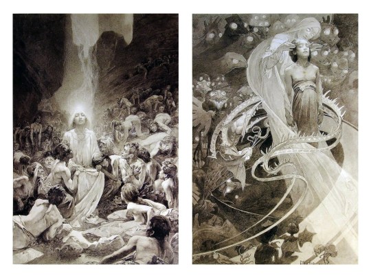
Chances are, you’ve seen Mucha’s art nouveau on prints, fanart, fabrics, and all of that. But Mucha did so much more and he is a huge influence on me for a reason. By the greyscale we see here, we can see foreground/subject with each illustration. Mucha is using value (that’s shadow) to emphasize this, in addition to negative space (background) to draw you in, just by using black and white. Notice how the other subjects don’t have such a powerful contrast and light source versus the other, especially the woman on the left. Mucha made his art pop by his understanding of contrast.
For this first part of this entry, I’m going to be using Papa Emeritus II from “Ghost”... who is a good example of how to draw faces, too. Huh. Regardless of what drawing program you’re using, keep your opacity low, at 50%.
Simplicity at its finest
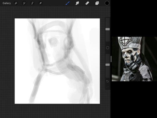
Instead of focusing a lot on Emeritus’ face, I’m going to focus on the negative space behind him. I’m using this to define his figure. This is a good picture because of the stark contrast, though, it’s a little tricky because it is really contrasted and you can’t see where the light source really is. But that is okay! I am going in and just using this negative space, the contour of his head and torso. Before I even think of a face, I want to softly go in and use black (or grey) to fill up that negative space. Keep it simple and work your way up.
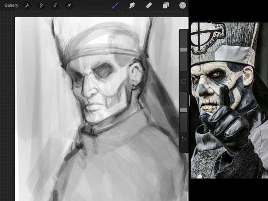
After I lightly fill in the negative space around him, I can start lightly going in and establish his face by blocks of shadow. And this is why Emeritus II is such a good example for this kind of work. I don’t usually start going in and drawing eyes, I rely on the shadows of the face to see where their eyes, ears, lips, and such lie.
Here’s another example (though, it’s old):
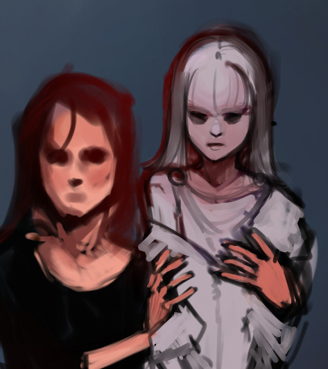
This is in my maroon style underpaint, which is what I post most of the time. For their faces, I just used basically eye sockets to start working on their faces, like Papa Emeritus II down below. Again, this dude is a great example.
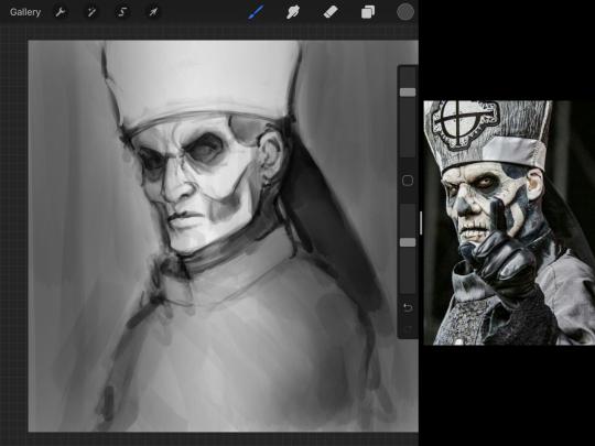
Here is where it may get a little funky. I created a new layer and set that layer to Multiply, still keeping that opacity low. Since I have no light source and I just want to create a really dramatic lighting, I made a vignette with a simple airbrush tool.
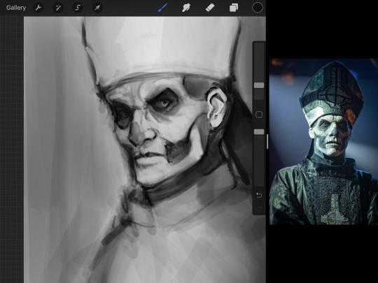
With that little vignette, you can create a new layer (unless you’re me, I just merge it down because of that constant fear of nonexistent software crashing) and I’m using the color pick tool to go back and forth to start using greys to really get into Emeritus’ face, especially his wrinkles. I’m painting over it constantly, switching back and forth between a paintbrush tool and color pick tool to blend. Again, keep your opacity low... unless you’re me and you’re feeling adventurous. You’ll also notice here that I have more than one photo reference. I use several for a lot of my art, so I encourage you to do the same. I had no idea what his jaw looked like, so I grabbed a second photo. Now that I have a better idea of where his hat ends on his forehead and how his nose looks, I start doing a weighted line.
Weighted line and Contour
Now is the dreaded talk. Of contour.

Welcome to Drawing I hell. This cursed image is from the book “How to Draw on the Right Side of the Brain” and if your teacher does not talk about this in your first drawing class, I am going to eat my hat... I have a hat lying around here somewhere. ANYWAY, the contour line exercise is basically you just using a neverending line for a drawing. I don’t know who drew this (and tbh, thanks a lot for every single boring assignment I’ve done in drawing classes), but this guy used contour lines for his drawing. I’m having war flashbacks over here, but I managed to find an art teacher’s page talking about different types of contour. My god, they are evolving.
Going back to our dear friend Papa Emeritus II, I used weighted line to start adding in little shadows to his face. Weighted line goes hand in hand with contour; it is a great technique to not only add details, but add little bits of shadows.

This is a simple example; the thicker line is adding to the shadow of the apple, giving it value!
Papa Emeritus II is such a good reference... I used him as inspiration for King Melwas here.
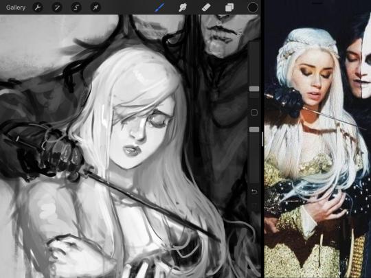
Gwenhwyfar is also a good example of weighted line. Gwen is essentially a very, very pale character. In contrast to Melwas, who is in darker clothing, Gwen is soft, she is the focal point in this drawing. For the little pieces of her hair, the corner of her lips, eyelashes, and her fingertips, I used a weighted line to establish these things, otherwise, Gwen is so pale, she’ll easily be washed out completely.
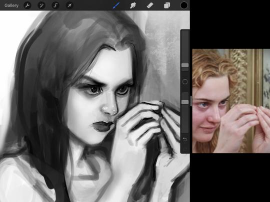
This drawing of Alice, which I’m still messing around with, is another example of how effective a weighted line can be with depth. The lines I added into her face, eyelashes, creases, hair, and fingers add those little details since everything I’ve done before like Papa Emeritus II was so soft with a low opacity on the brush settings.
Layer masks and curves
There are two ways you can color greyscale images.
You can do this by going into Layer > Adjustment Layer > Curves (this is how it looks like in Procreate).
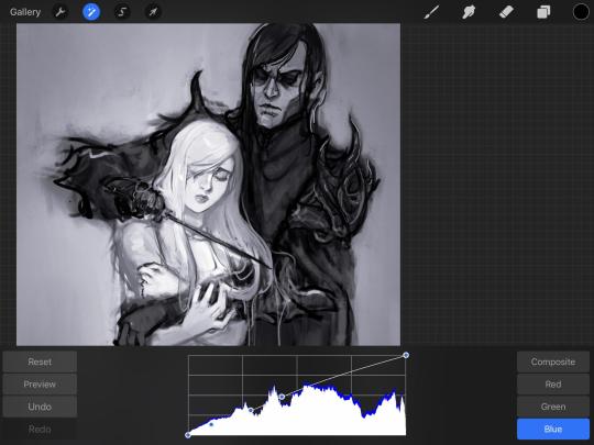
This gives you a neat ol’ base color! I am playing around in the blues, adding soft hues of blue in their figures and the white in this picture can either turn blue, cream, or even green. You don’t have to use Blue, you can use any of the other colors. For me, I’m always drawn to blues. Another cool thing to play around with is Color Balance, which is underneath the same function as Curves.
But if you don’t have any of these, you can add a new layer, and do Multiply.
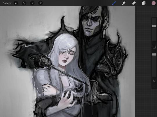
The only drawback to this, of course, is how destaturated (the lack of color) it looks. And yes, that’s an issue you will have and I did run into this while doing this. How I combat this is using additional layer masks. Believe it or not, Alice here was once at a grey scale, looking even more desaturated than Gwen.
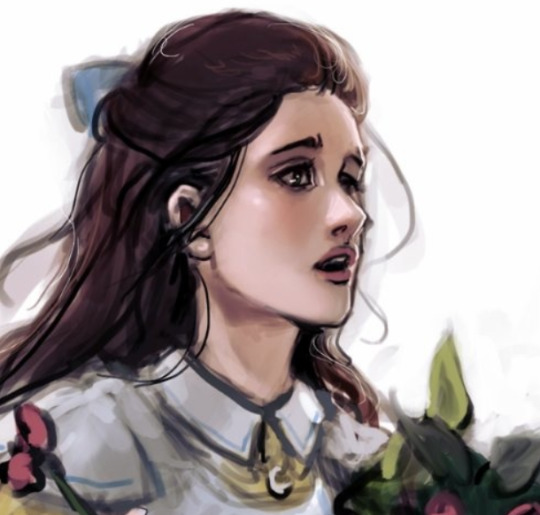
For Alice’s face, I went in and use:
- Soft Light because she needed more peach and roses in her skin. Omri’s original drawing gave her a light rose blush so I wanted to do the same.
- Overlay to mask out the black lines from the greyscale I had.
- Lighten which I used to make her lips pinker, her apron’s shadows lighter, and parts of her hair brown.
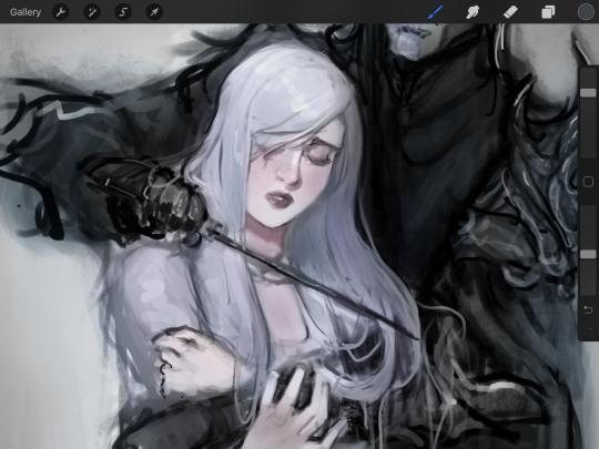
The same went for Gwen, who is, again, very pale. But while she’s supposed to be pale, I didn’t wash her out completely. To add more saturation, I used a combination of Soft Light over my Multiply layer and Overlay to start working at the highlights on her hair, nose, and shoulder.
This little walkthrough isn’t as visual as I like, but with limited software like Fire Alpaca, GIMP, or Paint Tool SAI that don’t have the abilities of Photoshop in terms of color correction and playing around with colors, I really encourage you, readers, to play around with these tools. Using the color picker back and forth, especially after using layer masks, gives you an ability to mix and blend colors. The reason why I work with greyscale or a maroon under paint is that you can create brilliant colors and make a new palette; the trick is to constantly mess around with them. I never go in and flat out color anything, with the exception of things like “angry doodle corner” which is basically what I call my lazy drawings, drawings where I’m just honestly goofing off with.
So in summation...! Or me trying to summarize this.
Experiment and explore with layer masks and adjustments. Whoever says that using these tools isn’t real art, they’re wrong. And please don’t ever be afraid of using references of any sort! Alphonse Mucha is saved ten times over on this computer.
#my art#tutorial#i think#an attempt was made#digital art#procreate#ipad drawing#ipad pro#Alice madness returns#alice liddell#american mcgee's alice#alice asylum
8 notes
·
View notes
Text
Last Sketch Book :c
What was the most important or moving moment of our class? In other words, what part of this class should I keep to show every student I have in the future? (Was it learning about a particular artist, a particular assignment, a particular concept??)
The thing I found the most important was how inclusive of all mediums this class was. I remember in the first class meeting you asked us which mediums and tools we were the most comfortable with and all of the different answers I heard. At first, I was really surprised. This was my first college art class and I didn’t expect to do anything other than draw. Then the first sketchbook was assigned and I realized there was so much more I could do with my drawing and painting knowledge. I was so nervous trying to take a toothbrush portrait. But when I sat down to do it, I figured I’d use the shading and lighting knowledge I had to take the perfect photo. This being said, my absolute favorite assignment was the alter ego sketch book. I didn’t realize how much one simple picture could have behind it. Having to write out the characteristics of out alter and then bringing it to life through photography completely opened my eyes to how much I should be putting behind all of my works. When I sat down to start drawing again, I didn’t just want to keep replicating the same things over and over again. I wanted each one to have as much background as I had put into my alter ego photos. I never expected to get so much out of a photography assignment given it wasn’t my medium. Little things like that completely made this class for me.
What was the most frustrating part of the class?
Ironically, the medium portion was also the most frustrating. Its definitely got me out of my comfort zone, which is something I needed as a new artist. But it was really hard to do. The synesthesia assignment was probably the most difficult. All my past work was always focused on clean lines and correct proportions. Moving anywhere away from that is a serious fear of mine. So working on the sketchbook made me realize I had a lot of work to do. It definitely moved me closer to understanding how certain colors blend together to create certain feelings. This is information I’m going to need if I’m going to continue on the path to becoming an artist.
What are your creative/artistic goals for winter break?
I’m going to take what I’ve learned this semester and put it into my Christmas commission work. In the past, they’ve been a little flat. This year I’m going to make work that I’m proud of enough to hang on the wall in my house and other people’s.
What are your creative/artistic goals for 2021?
For 2021, I want to be more consistent with producing works. I’m going to find every free second I have and work on as many pieces as I can handle. I’m also going to focus on building on what I know instead of trying to make finished pieces. If I can become more confident in my sketches and color combinations, I’ll be more comfortable putting my work online for a small following. This will make me more confident in my commissions so I can receive more for the time being. By the time 2022 rolls around, I’ll should be quicker in my sketch process making any type of business decisions I want to make more reasonable. Once I can start putting my works on clothing and labels, I’ll know I’m close.
What are the first steps towards your goals?
My first steps are going to be to practice, practice, practice! More sketches, less full blown finished projects. The finished results take too long because the fundamentals take a long time to be “perfect” to me. If I can slowly teach myself through practice like I used to do, I’ll become more confident in my abilities and faster at completing tasks. I’m going to start carrying another sketch book around, like I used to do, instead of stressing every time I sit down with my iPad to make something. Getting back to the basics myself will make commissions more personal and enjoyable to me. This always makes things easier.
0 notes
Text
INTERVIEW: Beth Kweeday
Interviewed by Ella Fradgely
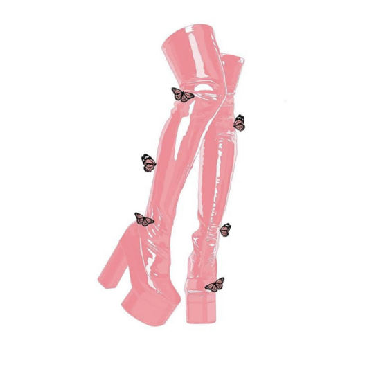
Beth Kweeday is an artist based in Liverpool studying fine art at Leeds. Her striking digital pieces feature sexual imagery to The Simpsons, and are available to buy as prints or on other items here.
How would you describe your art practice / yourself as an artist? My art practice is definitely digital art, I used to hate digital pieces because I used to not be able to see much of an artistic element to it and found that it wasn’t a good way of working. I had a graphics tablet sat in my drawer for months before I decided to try it out, and even when I did I hated it because I didn’t understand it! I’m so happy I stuck with it though because it’s been the best outcome possible. To describe myself as an artist I would definitely have to say I’m a stubborn artist, I do things how I want to and very much sculpt my work to how I see best (which is probably why I don’t do uni work very well). I know what I like and how I like it done! How did you find your focus on sex based illustrations? It’s amazing to see artwork celebrating sex work and sexuality! Thank you! I’ve always been a big fan of sexual art, I was always drawn to works by Elizabeth Isley and various tattoo artists like Curt Montgomery and Sewp who use a lot of sexual imagery and knew that was the path I wanted to go down. It took a long time for me to find the confidence to, and it wasn’t something I started doing until my second year of uni despite doing art for years before. I had no idea it would do as well as it did, and I’m so happy that it has become such a huge part of my brand as an artist. It’s so important to me to be able to show my respect for these women who inspire my art so much through my illustrations, as a lot of my pieces are based on women in the sex industry. How have you found the response to your work by tutors and peers? Me and my tutors have butt heads a lot over my work, with me doing a fine art course I understand that they want me to step outside my comfort zone a bit but I think they need to respect that sometimes that doesn’t always work well with certain things. For example, I ended up withdrawing from my interim show because a tutor suggested I blow my illustrations up to a large scale and then lay them out on the floor. And given the basis of my work, it just didn’t sit right with me. I found it really rude, in a way? I don’t know, maybe it was just my stubborn side coming out again. My peers have always been so, so supportive. My course-mates were equally as shocked as I was when I told them about someone suggesting my work be on the floor! I receive a lot of love from everyone around me when it comes to my work, which is really wholesome and uplifting. My boyfriend is my number one fan and has supported me so much with my work, my shop and even does the occasional post office run for me. I have no complaints! Your colour palette is so gorgeous, so sensual and minimal! It’s amazing how you have build such a recognisable look to your work through it. How did you come to it and would you ever explore other colour palettes? Thank you so much! I used to be absolutely terrified of colour, and on some level I still am! I have always wanted to be a black and white tattoo artist, I’ve always only wanted black ink tattoos myself and until recently that’s all I had. Pink was never my colour either, but I accidentally put a pink background on a piece I was working on when I first started drawing digitally and I fell in love with it. That one happy accident has now turned into a staple piece of my whole brand! Through this lockdown I’ve tried using other colours, I am so inspired by @exotic.cancer on instagram and her use of colour in her works but it just didn’t feel as me as my classic black & pink!
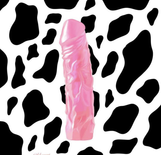
Your shop is amazing, I especially love your notebooks. Do you have a favourite item on there and how do you find the experience of running it? Thank you so much! I definitely love my phone cases, I never would have thought that I would be doing anything like it a couple years ago. Opening the shop was so scary, the constant “what if it doesn’t do well” and “what if nobody buys anything” kinds thoughts were trying to hold me back but I was really struggling for money and I thought I may as well give it a go. I had no idea it would do so well so soon, it definitely has bad weeks and good weeks in terms of sales but it’s the best thing I ever did. Nothing could have beat the feeling when I got my first international order, I couldn’t believe it! Now every time I get a new order I’m so excited to see where it’s going to. It certainly needs tidying up and updating a little bit, I’m hoping to have my own website within the next couple months instead of doing it via Etsy so that’s pretty cool. One of my favourites of your works are your drawings of shiny leather boots. What software do you use to create your drawings? I use Procreate on my iPad! This came from my goal to be a tattooer, I have a few friends who are tattoo artists and it was all of their recommendation and it’s been the best thing ever. I used to use a graphics tablet with I set up to my laptop with Sketchbook Pro but this has helped me with my drawings techniques a lot better. What’s your favourite drawing of yours? I love my first butterfly pieces that I did, they did really well and what started my trademark butterflies. I love my Simpsons/song lyrics ones too! I definitely want to carry on that series. And I really like my BDSM Is Not An Excuse For Murder piece, I remember reading about what was happening in the Grace Millane murder trial last year and becoming so enraged by what I was reading so I reacted it to it in the only way I knew how and the reaction was overwhelming, in a good way though!

Does music ever influence your art practice? Yes definitely! Sometimes I’ll be sat doing nothing and a song will come on and there’s my drawing. My Simpsons song/lyrics ones actually came from my petty arse reacting to hearing a girl slag me off in the background of her boyfriends Instagram story saying “Beth makes crazy girls look bad” whatever that’s meant to mean. And it reminded me of Paramore’s I’m Not One of Those Crazy Girls and there it was, and they just kept coming from there! My Girls Girls Girls piece which is actually on my own phone case was inspired by Motley Crüe too. Do you find artwork is a good platform to discuss politics? Oh yes absolutely, I’ve learnt so much through artists discussing their political views via their platforms, such as Florence Given. Plus I love a good anti-Tory artwork, I link it with my own as and where I can! It’s important to remind people of things like this as much as possible, even if it means writing Boris Johnson Shags Crisps in the sky every once in a while. I love your trademark butterflies, have they always been a part of your practice and do they symbolise anything for you? The butterflies where a very spare of the moment thing, I remember I finished a piece and was thinking that it just needed something else and I couldn’t for the life of me think what it was and then I just thought I would give it a go. I think using them within BDSM based work is cool because it’s almost like two opposites, you have something so delicate and fragile resting on something most people (unfortunately) deem as aggressive, and obscene. Kind of saying it’s important not to judge a person on their sexual preferences too, just because someone, particularly a woman, is into this certain thing, doesn’t mean that she is any less of a woman than someone who isn’t. If that makes sense.

Who are a few artists that inspire you and your work? (Can be artists of any kind not just visual) My main inspirations are digital artists and tattooists, such as ripbambi, skyeknotart, exotic.cancer, chimaera, my good friend Molly (titzandbitzz), the sad amish tattooer, I love Alex May Hughes and her gold plated Simpsons pieces, she was one of the main reasons I started doing my own. Your Simpson’s drawings are so iconic, do you have a favourite that you’ve done and why do you think they get such an incredible response from people? Thank you! I love my Fuck Boris and Fuck the Tories ones, as well as my lyrical pieces too. I just love the Simpsons so much and I started doing those pieces just as a bit of fun and to keep my work a bit different to the more sexualised pieces. I had no idea they would do as well as they have been doing! Bouncing between sex and the Simpsons is my ideal career in art and it’s something I plan on doing for a very long time. Finally, what are some ways we can support you as an independent creative during these difficult times? To be honest, every like/comment/share I get on a piece is to me a huge support. I understand that buying art is not always an option for some people, I try and keep my prices as low as possible as I want to be able to cater for everyone. I am so lucky to have really understanding customers, as this pandemic has been a strain on my shop but everyone’s been so patient and helpful. Instagram is a great way to show support for an artist, I myself try to share as much art as I can. I’ve been introduced to so many amazing artists just by seeing a piece shared on someone else’s story! It helps a lot and it’s so easy to do
0 notes
Text
How to Be an Artist, According to Josef Albers
ARTSY EDITORIAL BY SARAH GOTTESMANSEP 19TH, 2017 5:00 PM
Hazel Larsen Archer
Josef Albers, ca. 1948
Hammer Museum
Josef Albers, Interaction of Color, 1963. Francis Frost.
Before Josef Albers was an artist, he worked as an elementary school teacher for over a decade. In the 1920s, much to the dismay of his parents, he quit teaching to study art and design at the groundbreaking Bauhausschool in Weimar, Germany. After just three years of instruction, Albers joined the faculty there, becoming the first Bauhaus student to be promoted to a professorial role.
When the Bauhaus closed in 1933, Albers immigrated to the United States. Over the next 30 years, he thrived as both an artist and a teacher, honing his signature style of abstraction while leading classes at North Carolina’s legendary Black Mountain College and Connecticut’s YaleUniversity School of Art.
Albers always relied on his training as an elementary school teacher to guide his lesson plans. He rarely gave lectures—instead, he encouraged his students to learn through hands-on experimentation. This progressive teaching method proved effective. Many of his students—Eva Hesse, Ruth Asawa, Ray Johnson, Cy Twombly, Richard Anuszkiewicz, John Chamberlain, Richard Serra, and Robert Rauschenberg among them—would later become some of the most influential artists of the 21st century.
What follows is a selection of Albers’s greatest lessons, many of which continue to be used in classrooms today.
Lesson #1: Take three colors and turn them into four
Josef Albers
Never Before f, 1976
Susan Sheehan Gallery
Josef Albers, Interaction of Color, 1963. Francis Frost.
When Albers began his famous course on color, he asked his students to choose a red sheet of paper from a pack that included various different shades of the hue.
“Though there are innumerable colors—shades and tones—in daily vocabulary, there are only about 30 color names,” Albers explained in his book Interaction of Color (1963). For this reason, Albers found little use in talking about color, believing our lexicon was far too limited to capture its nuance.
Instead, he led his students through a series of trial-and-error experiments, so that they could teach themselves about the relativity of color: how a single color can take on a different quality or intensity depending on the colors that surround it.
For Albers, colored paper was the perfect tool for these exercises—it was cheap, flat, uniformly colored, and (as a bonus) mess-free. In one study, he asked his students to select three pieces of paper, all of different colors, and manipulate them in such a way that they appeared as four distinct hues. In another, he challenged them to do just the opposite—make four colors appear as three.
“In order to use color effectively, it is necessary to recognize that color deceives continually,” Albers wrote of these assignments.
In 2013, the Yale University Press released an iPad version of Albers’s color studies in celebration of the 50th anniversary of Interaction of Color. The app features virtual colored paper, which users can digitally cut and paste to sensitize their eyes to the illusions of color.
Lesson #2: Draw your name backwards and upside-down
Josef Albers
Structural Constellation, 1954
Waddington Custot
To demonstrate the focus that drawing required, Albers led his students through a simple exercise. First, he asked them to write down their names on a sheet of paper and hold up their hands when they completed the task. The students scribbled their names and shot their hands up within seconds. Then, Albers challenged them to write their names backwards—and hands took longer to rise. Finally, he invited his students to write their names backwards and upside down.
To do this accurately, the students needed to focus, taking their time to envision the letter forms in their minds before writing anything down. This state of intense concentration, Albers told his students, is needed for every act of drawing.
At Yale, when Albers noticed that his students were lacking focus, he would make them walk across the street to Michael’s Art Store to buy $3 paper—then a costly purchase for students—to draw upon. Later, he would tell them to imagine that their cheap newsprint, a type of paper used for figurative drawing, was just as expensive, and ask them to draw on it with the same level of attention.
At the end of the semester, Albers collected his students’ sketchbooks to see if they had learned this lesson. “He threatened students with hell and damnation and a low grade at the least if they had doodles, phone numbers, cartoons, messages, or anything other than serious sketching in the book,” recalled his former student Rob Roy Kelly.
Albers wanted every page to be filled with careful drawings, and was known to even count the number of pages in his students’ sketchbooks to make sure that they didn’t cheat by ripping out any messy work.
Lesson #3: Use your hands to make newspaper sculptures
Josef Albers
Leaf Study IX, ca. 1940
Hammer Museum
Josef Albers
WLS I, 1966
Leslie Feely
“Ladies and gentlemen, we are poor, not rich,” Albers announced at the beginning of his Preliminary Course at the Bauhaus, recalled his former student Hannes Beckmann. Holding a pile of newspapers in his arms, Albers continued, “All art starts with a material….I want you to respect the material and use it in a way that makes sense—preserve its inherent characteristics.”
Then, Albers gave his students their first task: to transform the newspapers using only their fingertips. Tools like scissors and glue were strictly forbidden. With limited options, the students needed to get creative—and take direction from the material itself to discover new potentials.
Albers found that his students worked with a greater sense of freedom when presented with unfamiliar materials. So instead of clay and marble, he filled his classes with corrugated cardboard, paper streamers, razor blades, and chewing gum. He often challenged his students to find the breaking points of these items. What arrangement of wire mesh would allow it to hold the most weight? How can you fold tin so that it presents the greatest shine?
The goal of these exercises was never to create artworks—in fact, Albers discouraged that. He wanted his students to learn how to approach materials without distraction. “At the moment, we prefer cleverness to beauty,” he would say.
Lesson #4: Draw the spaces between chair legs
Josef Albers
Umgeben / Surrounded, 1933
Brooke Alexander, Inc.
Though he demanded focus, Albers also wanted his students to be absorbed by mundane visual phenomena, whether that be the flash of light when a television turns off, or the movement of color when a tea bag enters hot water. According to Albers, artists needed to have open eyes, sensitive to the lines, forms, and hues that are often overlooked.
Drawing the shapes (or “negative spaces”) between objects—whether that be chair legs, milk bottles, or plant leaves—would help students develop this sense of heightened perception. If students focused more on these in-between forms, they would learn to make stronger compositions, and might even become better people.
For Albers, art lessons always doubled as life lessons, and he believed that students who cultivated “visual empathy” would also develop social empathy. “Respect the other material, or color—or your neighbor. Respect the one you weren’t paying attention to,” he told his classes.
In so doing, Albers wanted to rid art and society from hierarchy. “We no longer draw distinctions between ‘carrying’ and ‘being carried’; we no longer admit divisions between ‘serving’ and ‘being served,’ between ‘decoration’ and ‘that which is decorated,’” he taught his students. “Every element must simultaneously help and be helped by the whole, support and be supported.”
Embodying these lessons, as you might imagine, takes time. Fifteen years after he graduated from Albers’s classroom, Rauschenberg admitted, “I’m still learning what he taught me.”
—Sarah Gottesman
https://www.artsy.net/article/artsy-editorial-artist-josef-albers
0 notes