#and also clean faced for better closeup quality <3< /div>
Explore tagged Tumblr posts
Text



Tryggir’s makeup in Into the Polar Night Chapter 4
#httyd#how to train your dragon#httyd fanfiction#oc#httyd oc#berserker#dagur the deranged#heather#I tried both these makeup looks on him and ultimately went with the first one in the fic but the second one is good too#and also clean faced for better closeup quality <3#Tryggir vandillson#character design
9 notes
·
View notes
Text
2017 Megaman Valentine’s Day Contest: Talent Category Winners and Art (*Image Overload!*)
Sorry for the delay on this again, but you guys definitely made judging this a challenge, with all the awesome entries! And my internet connection cut out last night, so I had a little retyping to do today. ^^;
There were so many Talent submissions, 25, that it alone was pretty much bigger than any amount of total entries I’ve ever received for a whole year’s contest! Thanks for overwhelming me!! ;D
For this category, entitled “Step into this Capsule X...And Receive This Fashionable Formalwear!”, entrants were required to draw at least one couple in their best formal attire, enjoying time together for an anniversary/party/date.
So both for simplicity, and the fact that it wouldn’t be fair or even remotely easy to rank each one, I will just be listing the Top 3 prize winning entries, and follow that with the remaining entries in alphabetical order. Even if you did not place, I am humbled and wowed by the effort you all put into your artwork. Believe me, I enjoyed them all, and so many were deserving of placing! But unfortunately, even with all I’m giving away this year, I can’t give you all something in return, other than my sincere appreciation. And I’m sure you all will love them, too!
This year, judging was done by @annamariacoppi and myself. With her experience as an illustrator/package designer, AnnaMaria brings some different insight from my own, as I always try to have some added perspective, besides just mine. Commentary from at least one of us on your art will also be seen below.
Each artist’s name will link to a (hopefully) larger version I’ve uploaded, that will work until you guys upload your art on your own pages, followed by their tumblr handle or deviantArt page, if applicable. If a link is broken or I screwed up somewhere, let me know. This was a lot to verify!
Without further ado, here are your winners (who I will contact soon) and the rest of spectacular, snazzily-dressed contest entries:
1.) Kaitlin.EXE (@kaitlinexe) - Zero x Iris, X x Alia, Axl x Pallette:

AnnaMaria said: Love all the outfits you designed! So much detail went into this! I like how "classic" looking everyone is dressed. It's so different compared to the other entries. Even their hair styles look great. I like how their hair is more shiny than their clothes. You can tell it's a different material quality. Would have liked to see a proper background. Right now I can't really tell where they are.
Miyabi said: In many ways, this piece feels like an X meets Disney sort-of-tale, with the elegant Victorian-era fashion flair. Both the overall intricacies of their clothing, like Zero’s braided booblight tassels (I don’t care if you disagree, that’s what they are!! LOL), to their glammed-up hair, I felt your piece overall had the strongest detail and creativity concerning the theme, which involved formalwear and the celebration of love. And still a touch of humor involved, with Pallette’s clumsiness, most likely as she’s getting used to dancing in heels.
2.) Tabby (@digitallyfanged) - Maverick Party Limo:


AnnaMaria said: I like the lighting you have going on. Feels very glowy, and I can tell it's in the evening. Their outfits are nice. Very elegant looking! I like the movement in the champagne glass in the back a lot! Helps make the scene feel alive. I would have liked to see more detail in the clothing. Since this is a very shadow heavy scene, textures should show up more. That being said, the pattern texture on Sigma's outfit is really nice looking. The other outfits look a bit plain in comparison. Would have loved to see that feather boa fleshed out more. A softer edge around it will help make it look "fluffier". Some more color would help. It's very heavy in the purple and black as it is.
Miyabi said: Those Maverick bosses always have to glow in the dark, don’t they? The fancy digital limo ceiling is fitting for evil robots, while the deep pinks and purples fit the common color theme that links most of them together, besides their penchant for inflicting pain on those Maverick Hunters. The gentlemen look dapper, although paperboy Lumine seems just as uncomfortable in his clothing as he is partying with the squad. I liked how you still kept Ferham and Berkana’s armor motif tied into their dresses. As funny as the bonus Vile image is, I have to imagine he’d rather be popping out the sunroof, with shoulder cannon ready, in his fancy new stretch ride armor! ;p
3.) Iris-Sempi (@iris-sempi) - Zero x Iris, X x Layer, Axl x Marino:

AnnaMaria said: I really like how this looks it could be strait out of an animation scene. It's got all the right framing for it! The emotion with the colors are really nice. The outfits are nicely done, and I like the perspective in Iris dress. It feel like it's moving! I can clearly tell what's going on, and the story is very strait forward. I think if there was a spotlight above Zero and Iris, that would help put the focus even more on them. I would also move them over a tad more to the left. It would make for a even better composition.
Miyabi said: With all the warm colors towards the upper half of this pic, my eye was definitely drawn to the cooler hues of Iris’ dress. Her shocked look, along with the way it flows, definitely gives me the feeling that Zero has some pretty outstanding SA-class Foxtrot Paso Doble skills. I love the looks of excitement and pride on the faces of the other couples, as the lovebirds hit center stage. Truly, a wonderful scene!
And to keep this from extending too long on your dash, the remaining 22 entries for this category are after the cut...
Continuing with the rest of these fantastic pieces, alphabetically by alias:
- Archer-Poyochu (@archer-poyochu) - Subaru x Misora:

Miyabi said: While the bright city lights would probably cancel out viewing of the beautiful shooting stars in the sky, it looks like Subaru is showing Misora the more earthly light show on that romantic balcony overlook. Nice touch with her clef hair clip.
- Artistic Sunny (Artistic Sunny) - Enzan x Meiru:
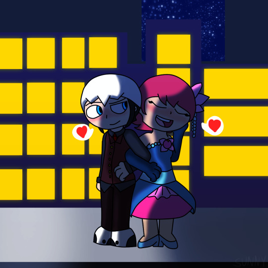
Miyabi said: Cute details on Meiru’s dress, tying in the floral hair clip and pearls with it. Going with the nighttime scene, obviously it should be darker, but the heavier shading on Enzan makes it a little harder to see the details in his outfit. But with arms intertwined, it’s obvious they are both enjoying the night out on the town.
- Bassrocks (@bassrocks) - Prom Dance:

AnnaMaria said: Really cute! I like the feel of this one! Color choices are nice. The pinks and purples feel very "Valentines". The punch bowl and cup stack are a nice touch. I like the effort that was put into the background, but it could use some perspective work. Anatomy is bit off in some places, but if you work on the perspective a bit, that would help correct it a bit. Would have liked to see more detail in their outfits. I like the accessories you added, but the girl's dresses seem a bit plain. Some clothing construction seams could help.
- Borockman (@borockman) - Zero x Iris (w/ Sigma x Nana):

Miyabi said: What’s this? Why aren’t Sigma and Nana the stars of this red carpet gala?! It’s probably because of that Willy Wonka outfit. Didn’t rate high with the fashion police. Love trying to make out faces in the crowd, and how they are all enjoying their eyecandy. Both couples look quite elegant!
- Chocoorchid (@chocoorchid) - Zero x Layer:

Miyabi said: A cute closeup, and with the border design, almost reminiscent of a camera’s frame. Pinstripes are a sharp look for Zero, and in fact, I think you’re the only one to try that design in this contest. Just would have liked to see a little more of them in the image!
- CptRedder (cptredder) - Aeolus, Thetis, Atlas and Siarnaq:

Miyabi said: Aeolus isn’t sure if he needs to blow out Atlas’ flame with that rose offering! At the very least, he’s getting a little hot under the collar. I really like the sketchy, splotchy white border around them, it’s a different look. And keeping the pink hues to the shading bounces off the background pretty good.
Creator of Worlds (@thecreatorofworlds) - Anniversary Dance, Complete With Rock and Roll Clothing Changing Capsule .gifs, and Instagram party post:



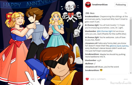
AnnaMaria said: I appreciate the fake Instagram comments! They were fantastic! I like how the outfits feel, like I could actually go out and sew these myself if I wanted. Shows you know how clothing construction works. The outfit designs are very nice. Not too upper classy, but a good fit for them. The slight glow in the eyes is a nice touch. Would have loved to see a proper background. Right now the characters feel a bit disconnected from the background you have right now. Either the character tones/color should be a bit darker, or the background a bit lighter, so they feel more apart of that world.
Miyabi said: I think it’s awesome that you took the time to create the animated .gifs that had both Rock and Roll changing in the capsule, perfectly echoing the title of this category! Creatively, one of my faves, due to all the little extras that come with your submission. Clean lines and colors, where simple is better and still stands strong. Skull Man is adorable in his bowtie!
- Cuddlesnowy (@cuddlesnowy) - X x Zero:

Miyabi said: Blushin’ buds captured in a moment frozen in time. Cute innocent pic, and the photo frame helps show it was a special pic for both of them. Or that there’s still a Sears portrait studio near Maverick Hunter HQ...LOL
- DarlinHope (@darlinhope) - X x Merti:

Miyabi said: I really dig your painterly style, as it creates a really unique look that stands out. The starry sky seen through the large window behind them is gorgeous! The grey vest/pants combo is a nice muted contrast on the dapper X, compared to the bright yellows and gold of Merti.
- DreamingandGaming (@dreamingandgaming) - Ice Man x Roll, Kalinka x Rock, + Blues:

AnnaMaria said: Very cute. I like how the outfits are simplified to match the very cartoony style. Would have liked to see some center pieces on the tables, or other decorations to make it feel more like a party.
Miyabi said: Blues is too cool for your dances! I really thought Roll’s heart-shaped dress and all of Kalinka’s frills were unique touches to their dresses. Kalinka’s reminds me of a delicious multi-tier cake with black frosting trim, actually. LOL The Valentine’s fireworks cap off a fun, adorable scene.
- Gingler (gingler) - Swanky Couple Anniversary Dinner Party:

AnnaMaria said: I like how many characters are in this piece. You've managed to make it look not too cluttered, and I can easily tell what's going on. Each table and dancing couple is telling a different story, and I love that! Some constructive criticism would be to add some proper lighting. There's a light coming from above, yet there aren't any shadows. It makes it feel a little off. However, this is great example of storytelling!
Miyabi said: I really hope a bolo tie impresses Akane...a ninja wearing a western tie, what is this?! ;p I love the doctors just soaking in the evening while their humanized robo-children all intermingle. Enjoy having a few waiters and musical entertainment in the scene, too. You have a unique take on all the RMs, yet they are all pretty recognizable. Also, pimp Wily is pimpin’!
- IrisClou (@iris-clou) - Storm Eagle x Axl:

Miyabi said: Eagle looks so casual suave with his open-buttoned shirt and martini. Both he and Axl can leave the penguin suits for...well, Chill Penguin! Your rainbow hues for the warm background and cool couch are an awesome looking contrast. The colors on this are pretty unique.
- Jewel Maiden (@jewelmaiden) - Dynamo x Layer (w/Zero x Iris):

Miyabi said: Dat Iris grin! Seems like she had a plan to keep Layer away from Zero. LOL The floral lace pattern of Layer’s dress is gorgeous, and ties in to the mechanical forest background. Dynamo’s space-y tie is pretty neat, too!
- LightLabs (@lightlabs) - Sigma x Sigma’s Reflection (w/Zero x Iris):
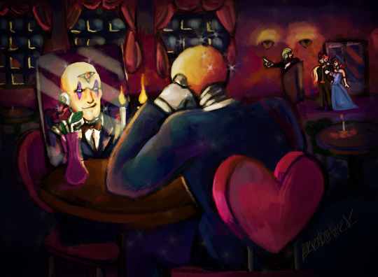
AnnaMaria said: Very funny, but still serious... Nice! This has a nice feel to it. I like your choice of colors a lot. The background looks nice. Would have loved to see more detail in the outfits. I can see a lot in the mirror, but a good chunk is hiding behind the rose.
Miyabi said: I like the dimly lit restaurant scene, and the little details like the heart-shaped chair and Green Biker Dude host. Hilarious giving Sigma those narcissistic qualities, loving himself more than anything else in the world.
- Metakit (@metakit) - Freeze Man x Star Man:

Miyabi said: The background pattern here is pretty unique, and I like how you were able to tie their main colors into it, while still not blending in too much that it takes away from the duo. Freeze in particular gives me a James Bond character vibe in his fancy getup. LOL
- Myan - Gemini Man x Gemini (Wo?)Man:

Miyabi said: Love the movement of Gemini Man taking a dip back! The bottom trim of his shirt coming out also sort of ties into looking like his crystal headpiece, too! Never one to shy from the spotlight, his twin proves that a Gemini can look good in a dress as well.
- Nat-Grim (Nat-grim) - Atlas x Aeolus:

Miyabi said: Rolling out the red carpet, Atlas rocks the V-Day red pantsuit well, while I like the extended tail on Aeolus’ suit, along with his heart-shaped tie. Definitely feels like a gala event photo op!
- Paranoid King Cepheus (@paranoidkingcepheus) - The largest entry ever known to mankind that I can’t even begin to thumbnail on tumblr...so I’ll just crop out this image of Akane dancing with Shadowman.EXE while Top Man spins to the beat:

Part 1. Part 2. Part 3. Part 4.
Miyabi said: You are insane for once again adding in all the characters that you have! And I love the massive effort! An adorable tale of Jack getting to the dance and so many hijinks and easter eggs in-between, with a very cute ending.
- Prosaic Wonder (@vava-fett) - Anniversary Dance:

AnnaMaria said: I really like all the characters packed into here! Each one is telling a different story, and a lot of them are actually pretty funny. I especially love the random leg with the high heel sticking out. I also appreciate you trying to match the original art style somewhat. The cell shading is really nice here! Ok, I'm gonna get super picky here. If those are Roll's hands holding up the cellphone taking a picture... They look more like adult hands. Child hands should be a bit more dainty and rounder looking. The style of her nail polish is also a bit "adult/older looking", even a bit out of fashion in style. I would have expected her to wear some glitter polish, perhaps even some fake rhinestones. Yes, this is silly comment, but since this category is focusing on the attires, I felt I had to address it. That being said, I really wish I could see more of their outfits. You did a great job designing so many of them, but all we really see are their heads a bit of their torso.
Miyabi said: I don’t know which I’ll be able get out of my head first: Gemini Man in a feather boa and thong or Top Man’s sexy stocking leg... A lot of fun and amusing interactions between the characters/couples here; I agree that it’s a little unfortunate for most that we can only see their heads, but there is so much to enjoy about your style and all that’s going on in the scene! It’d work as an awesome cover image, for sure!
Soulivium (@su5anlee) - Dark Kirisaki x Iris.EXE:

AnnaMaria said: I really like the costume design. It's very formal and modern looking! I especially like the lace around the dress, and how they are both wearing purple and red to match each other. Would have loved to see a background.
Miyabi said: Very fancy attire on both. I love the dueling abstract lacy sides to both Iris’ dress and necklace. It’s really gorgeous. The heart-shaped Killer Eye with scythes on top of Kirisaki’s top hat is fun and unique for a character like him to wear.
- Wimzik (@wimzik) - Netto x Food (and also Meiru + Jasmine) + Laika x Pride:

Miyabi said: Typical oblivious Netto, stuffing his face rather than mingling with the ladies! Great job telling a story, showing Meiru’s jealousy over Jasmine’s flirtation, and Laika’s nerves keeping him from leaving Netto’s side. The girls’ dresses are all unique and tailored to their personalities, and I’m amused that Netto felt like a striped tie would double as a fancy headband to make him feel dressed up!
- Wintesm (@wintesm) - Prom Photo Memories Bulletin Board:

Miyabi said: I love the continuity from last year’s prom entry continuing here, with a photo memory board. And there are still Search Snakes running amok! A lot of cute scenes, although I think I lean heavily towards the 3 on the far right as my favorite ones.
Thanks to all once again! Be proud of what you submitted!
Still working on typing the Humor Category results. They are coming soon, too! *faints from organizing this*
#Rockman#Megaman#Rock Miyabi's 2017 Valentine's Day Contest#Too many tags to list#Thank you!#Other people's art
33 notes
·
View notes
Text
New York as a Character: An Analysis of The Wiz (1978) and the Construct of Home
In the 1978 film adaption of The Wiz directed by Sydney Lumet, New York is key in creating a standout version of this classical story. Rather than a Kansas cornfield, The Wiz notably utilizes the urban landscape—though specifically New York City—to introduce nuances to the overarching theme of home. Lumet uses the vast economic disparity between different areas of the city to create a multifarious land of opportunity. By using New York landmarks, The Wiz updated well-worn territory to extrapolate new meanings and make the story relevant to a new generation of viewers.
In this version of the narrative Dorothy (Diana Ross) is a young woman, 24, afraid to go out on her own and leave home. She is a teacher and Aunt Em (Theresa Merritt) is convincing her to take a job teaching high school to make more money and to go lower the 125th street. Immediately this film is arguing for a more independent version of the character, though Dorothy does mention that her aunt has once again tried to set her up with a man. The overarching themes of family and home are still central in this version, however they have been updated for the times.
youtube
This discussion takes place as the two women clean up after a large family dinner. The dinner, which is a musical scene, takes place in a dining room with warm colors in the scene. It is mellow yet vibrant, capturing a feeling of familial love and warmth. In comparison, Dorothy and Aunt Em’s discussion happens while the two are alone in the small kitchen which is mostly shades of white. As they talk, they go back to the dining room to fold the tablecloth and this time the room is empty showcasing Dorothy’s isolation.
This scene recalls discussions of escapism, fantasy, and homeland in regards to African-American film. Here, Aunt Em is advocating for Dorothy’s escape from 125th street to explore the rest of Manhattan. It is key to note, however, she is not suggesting Dorothy leave the boundaries of New York but to explore the other economic realities of different neighborhoods (this is maintained in the fantasy aspect of the story through the disparities of Scarecrow’s miniature cornfield between crumbling tenement buildings and the skyscrapers of Emerald City). It is interesting that the fantasy element, as we will continue to see, is grounded in New York, echoing the economic realities of different parts of the city.
In The Wiz, Dorothy and her mutt Toto are transported to the land of Oz via blizzard. This changed detail reflects the importance of location to this version of the story. Whereas The Wizard of Oz (1939) took place in Kansas and reflected the tension between rural and urban life, The Wiz takes place entirely in the urban setting of New York. Dorothy and her pals travel from Harlem, through the boroughs, reaching the emerald city in lower Manhattan. In the short documentary video Wiz on Down the Road found here, director Sydney Lumet discusses the massive scale of the “Emerald City Sequence” filmed at the World Trade Center. You can find more of these New York City landmarks listed here.
youtube
Continuing with the theme of New York, the munchkins, here, are children who were turned into graffiti on the walls of a playground. The scene begins in darkness after Dorothy and Toto’s crash landing in a sandbox, with black-lighted highlights of color as figures slowly free themselves from the wall (this, among with its other more imaginative scenes have contributed to childhood nightmares for many). Their cryptic movements are captured in tight closeups, removing context from the scene making it all the more creepy. As the figures approach Dorothy chanting “Toto” over and over the viewer shares in her fear. The figures step out of the shadows to reveal the children, all covered in bright paint, with cheery dispositions. Just as the munchkins of the 1939 film, the children cheer for Dorothy for killing the wicked witch. In maintaining the aesthetic of a New York City park, the mother of the munchkins —Miss One (Thelma Carpenter)— is a cross of a fairy godmother and a bag lady dripping in sequins.
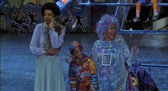
Miss One’s obsession with numbers brings up the implication of playing the lotto; she asks Dorothy if she would like to “play those numbers” when Dorothy gives her address, 433 Prospect Place, asking where her home went. Of course the difference in music between this film and The Wizard of Oz is monumental as I discuss here. The camera work in the munchkin land scene is dedicated to highlighting the choreography as well as the scale of the production. The director utilizes a number of crane shots that showcase the large scale, yet intricate set pieces as well as the large number of dancers. This tactic introduces a theatrical feeling to the film, reminding viewers of The Wiz’s Broadway roots.
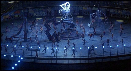
More New York humor plays in the film when Dorothy tries to hail a cab to travel the Yellow Brick Road, only for it to immediately switch to off-duty. Defeated and confused, Dorothy is left in an empty playground one again darkened. The same shots used to showcase the dancers movements are used to convey her isolation (both physically and mentally). Not even toto is with her at this moment. Unlike other musical movies some of these shots are so zoomed out that it's hard to tell who is signing—even as Dorothy is the only character in frame. She is lost in the set, placing importance on location as well as taking attention away from Dorothy physically. She sings to the empty space in the shadows, the viewer is unable to see her face until she sings about how she is “gonna be alright” as soon as she returns home. Here her face is contorted in sadness and anxiety in this foreign place, clutching her only link to home, Toto.
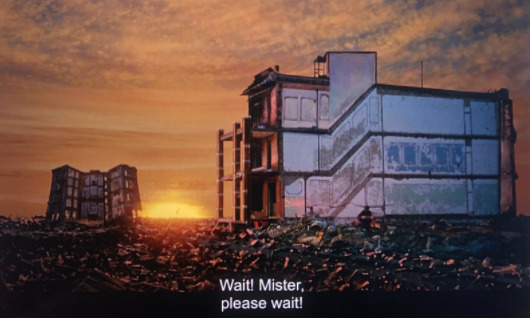
Still in the shadows, Dorothy walks through rubble of a partially demolished building singing her predicament. As she concludes her song the sun rises, lighting Dorothy in red and orange. The colors of the sunset recall the color scheme of the family dinner in the opening scenes. Another crane shot positions Dorothy in a junkyard, with nothing but two dilapidated buildings standing. Though it is unclear where this scene takes place in this mythical version of New York, it’s visual similarity to the burned out buildings of the Bronx during this time is undeniable.

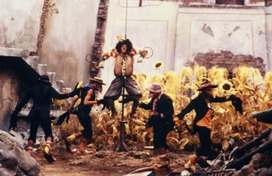
In terms of the scarecrow’s (Michael Jackson) introduction, we are again seeing the urbanization of rural elements. The scarecrow, rather than being stuffed with straw, is filled with garbage—the crows call him “garbage guts” with his Reese’s Peanut Butter Cup wrapper nose and popcorn bucket hat. The cornfield Scarecrow hangs in an abandoned lot surrounded by rubble and garbage. Again the scene incorporates crane shots of the scene showcasing the crow dancers with less focus on the singer, creating the same effect of isolation and theatricality as the playground scene. Overall it reads as a post-apocalyptic wasteland with a Quincy Jones soundtrack.
Scarecrow, literally, crawls out of this wasteland towards the yellow brick road:
youtube
The loose bricks scattered among the debris turn to the neatly paved road across a bridge toward four Chrysler Towers and a Coney Island roller coaster. In the foreground of this frame we see the crooked wooden fence post, truly acting as the barrier between a neighborhood destroyed and the promise of success and pleasure. The blackened concrete gives way to a brighter gray sidewalk.
Inside this amusement park we find a setting in only slightly better condition than Scarecrow’s field. Abandoned, Dorothy and Scarecrow find the Tinman (Nipsey Russell) trapped beneath a mechanical attraction designed to look like a large black woman with large red lips curled into a sick smile and large white eyes. The image evokes mammy designs of the 19th and 20th centuries or black face characters of minstrel shows:

Like Scarecrow, the Tinman is made of garbage—a Budweiser can is in place of his wrist and he wears a playing card as a lapel pin. Additionally, unlike Dorothy, both Scarecrow and the Tinman long for escapism, continuing this overarching theme of home and opportunity. Tinman’s performance of the song “What Could I Do If I Could Feel” is shot in closeup without any crane-shots or choreography. This framing adds a more sentimental element to the moment, with a few comedic elements present. A wider shot is used for the following song “Slide Some Oil to Me” which further utilizes Russell’s comedic talents. Still without crane shots, the shot is adjusted as the trio dances around the Coney Island-esque theme park as it slowly comes to life—a Nathan’s Famous Hotdog stand further confirms this link. The framing visually creates an intimate bond between the three characters.
The in situ nature of the film takes the characters to the 42nd Street New York Public Library where they meet the Cowardly Lion (Ted Ross). Here, the filmmakers physically tether the characters to a New York landmark, in a pseudo meta manor.
youtube
In the following “Ease On Down the Road #3” there is a wide shot of the now quartet standing atop yellow cabs in front of the Ozian New York Public Library. It is striking how the landmarks of this fantasy New York are abandoned, or at the very least, currently void of people. Aside from Munchkinland all of the scenes have had no background characters filling the visual space. This creates a isolation made more unsettling by the fact this takes place in the typically bustling metropolis of New York. Aside from this, it is also important to note the development of each neighborhood, from the virtual wasteland of Scarecrow’s home, to the abandoned amusement park of the Tinman, to the empty yet well kept library where the Cowardly Lion hides in the statue of Patience the lion.
The group continues down into the subway where the yellow brick road continues.
youtube
The nightmarish qualities of this film mainly derive from this subway chase scene where a featureless knick-knack vendor’s puppets come to life and grow to be life size as the vendor laughs maniacally. This, of course, is made all the more scarier by the subway setting, where the group is trapper underground in dingy lighting. Truly this scene taps into many New Yorker’s distaste for the oddities of the subway system to begin with.
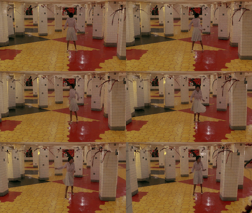
Chaos erupts as trash cans with teeth attack Scarecrow, wires from a callbox electrify Tinman, and tiled subway columns break free to surround Dorothy. The film utilizes the low ceilings and maze like tunnels of subway platforms to create a familiar fear.
From the subway, the film travels back above ground to nighttime in, presumably, midtown. The poppy field of The Wizard of Oz becomes an ally full of sex workers dressed in pink, purple, and red outfits between two adult film theaters. On either wall bright neon signs display sexually charged words such as “naughty,” “yummy,” “tickle,” and “thighs” to name a few. In the background a lit garage of yellow cabs can be seen. These two scenes, back to back, mature the otherwise traditionally juvenile story. And yet the presence of sex workers and adult theaters add to the authenticity of telling an unglamorized, fantasy New York. A quick google search leads to dozens of articles, including from the official Time Square website, talking about the prominence of vice in the area—gambling, prostitution, and drug dealing. At the time of production midtown was the center of sexwork and pornography in New York, before morality movements sanitized the are pushing sexworkers out. Yet the scene of the poppy girls is relatively short, and followed by “Be a Lion” where Dorothy cradles Lion, soothing him with a gentle ballad that evolves into belting. The scene is comparatively less saturated, with blue moonlight illuminating the scene. The camera alternates between shots of Dorothy from below singing to Lion in her lap and shots of Lion from above looking up at her with big eyes.
Finally the group sees the Emerald City at the bottom of manhattan with a golden apple in place of the sun illuminating everything before them. In the film this is the epitome of wealth. The city is protected by two guards and a golden vault door. Inside the city is crowded with enormous gems in the plaza of the World Trade Center.
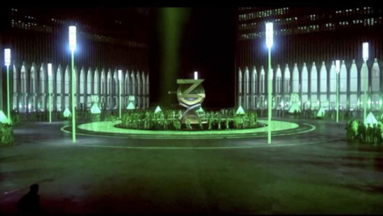
Here the shot is framed by the base of the two towers, dwarfing the dancers by comparison. It creates a widely futuristic image where the rest of the movie created a more colorful version of the city. Additionally, the closeup on the dancers’ fashion drives home the image of wealth and exuberance.
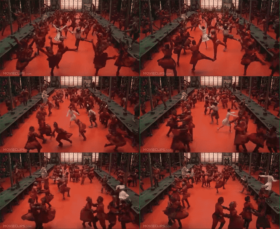
Evilene’s (Mabel King) layer brings the story back to the dinge of the city. The exterior establishing shot shows it to be a sweatshop. The camera follows all of the degenerate characters (the sexworkers, the subway vendors, and the crows) chained together, into the shop where rows of costumed black figures work. This scene utilizes crainshots, again taking focus off the singer and onto the dancers, who upon closer look wear geometric tribal masks with large mouths and eye sockets and soot covered orange uniforms with exaggeratedly large buttocks. This combined with their hairstyles recall images of the pickaninny stereotype:

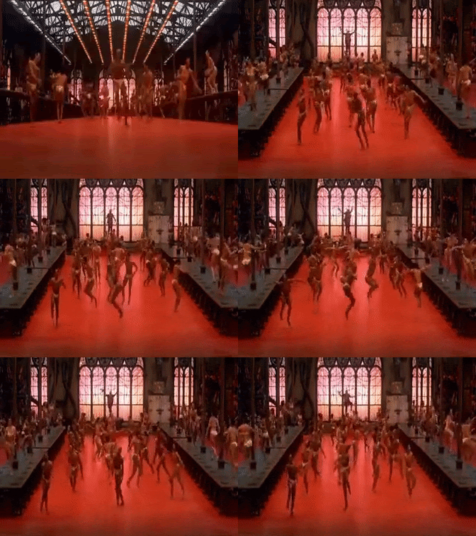
Exposed strip lights hanging about the workshop also add to the theatricality. Additionally this scene introduces the flying monkeys, portrayed as a motorcycle/human hybrid. These characters are given dark skin tones and large lips are again evoking images from minstrel shows. The protagonists are chased through Shea Stadium, the baseball stadium for the Mets at the time. Back in the layer, Dorothy pulls the fire alarm to melt the witch which acts as a cleansing rain. Her friends are put back together and the workers are freed and celebrate with dance. There are no empty spaces in this scene as the dancers take up the entire factory floor and make large gestures. The workers remove their costumes to a sultry trumpet refrain to reveal real black dancers, covered in sweat. They wear yellow costumes resembling bathing suits which show off their anatomy, again conveying a sense of humanness. In a sense this moment reads as black people shedding stereotypical images and chains of oppression which combust to achieve humanity and freedom and ultimately tying into the overarching theme of escapism. However, it is important to note in doing so they become sexualized beings—not exactly the opposite of negative stereotypes about black people.
Lena Horne’s portrayal of Glinda certainly showcases her acting ability and vocal prowess however it contributes to a colorist narrative in the film. The light skinned actor portrays Glinda, the embodiment of absolute good whereas the other Evilene is portrayed by a dark skin woman. It cannot go without acknowledgement that this, along with other negative representations of black folks, are represented by darker skinned people.
The film ends at the point of departure, on snow covered streets of Brooklyn with Dorothy clutching her dog. The lessons Dorothy learns are not reinforced by her family in one final scene and instead end with Dorothy rejoicing at her arrival home. In this way it is left ambiguous as to whether she will leave her neighborhood and take the better paying job. Thus even in this fantasy driven narrative, the resolution to leave home to make a better future is fairly unclear. Overall, The Wiz is a vibrantly colorful love letter to New York. The urban approach to this classic story was certainly monumental. It offers a story acted by an entirely black cast that does not center on black trauma or violence. It is in so many ways original despite being an adaptation of an adaptation.
1 note
·
View note
Text
Best Mirrorless Camera under $500
Mirrorless Camera has become the preference for many photographers today. Although there are still some who prefers the digital SLR, the number of those transitioning towards Mirrorless camera is getting larger and larger. Perhaps, you may not be familiar with this type of camera. Just like the name suggests, a mirrorless camera is simply that – does not contain a mirror in the lens. It is a modification of the digital SLR camera.
Best Mirrorless Camera under $500 For 2020
Name: Rating: Price on Amazon: Panasonic Lumix DMC-G5 5.0 Canon EOS M100 Mirrorless Digital Camera 4.9 (Best Price Under $400)
What is a Mirrorless Camera?
Mirrorless Cameras are in fact Digital Cameras that provide the picture versatility and quality of professional Digital Single-Lens Reflex Cameras, along with mobility which comes closer to those of the more popular point and shoot digital cameras. These cameras are often called Mirrorless Interchangeable Lens Digital Camera since unlike the vast majority of Digital Cameras in the consumer market, these have a mechanism for lens changing in a convenient manner, as is performed with the professional ones.
The innovative design of these cameras preserve the Image Sensor Systems of the DSLR cameras which makes all of this attainable. This means that the quality factor of these cameras is not affected at all. Furthermore, the mirror which is common to Reflex mirrors is not incorporated, making these mirrorless cameras compact and very mobile, unlike the traditional DSLR cameras.
These cameras possess the Micro Four Thirds Systems. This micro 4:3 system has been specially designed by Panasonic and Olympus and is among the specifications made especially for these mirrorless cameras. This new original standard allows the minimization of the lens dimensions, without having to affect the picture quality too much.
Above that, the old SLR Four Third Lenses function very well on the mirrorless camera since they share most of the specifications used by the original 4:3 standard, though an adapter is necessary in such cases.
The viewfinder is another great characteristic of the mirrorless camera which is worth discussing. While the standard DSLRs function on an optical viewfinder that requires a mirror and a prism, this whole element has been removed with the mirrorless cameras. Taking its place is the Electronic Viewfinder. It is a reproduction of the original Viewfinder by allowing the photographer to observe the image through the sensor’s eyes rather than the lenses, similar to the LCD display that is situated on all the popular point and shoot cameras.
These mirrorless cameras have yet to completely seize the attention of the mass population due to the lack of a definite standard, as the mirrorless technology is quite a new one. If you are prepared to check out new technological advancements, you may want to go over the many reviews available for the models available in the market and ultimately select the Mirrorless camera which best suits your needs.
At the end of the day, the mirrorless cameras definitely delivers what they promise – taking great photos easily and quickly. Although they may be a bit more expensive than the standard camera, they are definitely a must try for any photo lover. If you haven’t yet checked them out, you’re missing out on the fun. Go ahead, give them a try!
Panasonic DMC-G5 Review
Panasonic has brought us another match-winner; maybe, let’s hope that it is one. But yes, it is a camera that is sure to make you go Wow! Not many cameras have the tendency to make their users get this expression on them. The best and the most important of all, Panasonic has not created this product for any professional, but it is for people like us, you and me. Let us now complete the Panasonic DMC-G5 review.
Body & Design
The body of the Panasonic DMC-G5 is a strong and sturdy plastic body. You might say that it is weak due to the plastic, but it is actually not. It is pretty small and portable with a size of 8.3 x 12 x 7.1 (H x W x D in cm). It has been provided with a nice large and bright 3 inch touchscreen to control and view. Also the camera has a detachable mirrorless lens and a rubber grip on the side so that the camera can be held steady without the fear of it slipping.
Operation & Control
The operability of the camera is pretty good. It is not quite hard to learn to use the camera. Most of the controls are pretty standard just like the rest of the cameras with the difference of little here and there to mark its extraordinarily from the others. It has a twisting control panel to browse through various modes and menus of still photos, videos, etc. Other minute controls and settings can be reached and changed via the 3-inch capacities touchscreen provided.
Panasonic DMC-G5 Performance Review
The performance of the camera is outstanding. Its 16 MP camera lens makes sure the images are perfectly crystal clear. It is loaded up with many features like the image stabilization program, autofocus, brightness monitor, face detection, etc. It has various colors and shooting modes in it that gives you loads of options to shoot the picture according to your liking. The camera has a 16.05 MP MOS sensor and a Venus Engine which lets you shoot real high-quality images and videos.
The camera has the capability to shoot images of resolution up to 4608 x 3456 and videos of 1080p HD at 60 fps. What more could you possibly need from your camera? It is maybe the best one available in the market right now. The camera has a 4X optical zoom and an aperture of F/3.5- F/5.6 with shutter speeds of 8 – 1/1600.
It has an inbuilt image stabilization program in it. Along with with it there are two autofocus programs provided in it, the Light speed autofocus which allows for clear pictures of moving sources if you are moving and the Eye sensor autofocus which used the electronic viewfinder to automatically focus when your eyes face the focus. Both these great features and loads of many other small programs work together for the best pictures so that you can easily capture and store all your memories.
What Makes A Camera Mirrorless?
Digital SLR camera has large mirrors on the inside. These occupy large space on the inner side of the camera making is large and heavy. Nevertheless, these mirrors allow better manual control and the autofocus is also very fast. The arrangement of the mirrors on the inner side of this camera also ensures faster bouncing of the image on the viewfinder. The speed with which this camera does this makes it a preference for some photographers.
On the other hand, a mirrorless camera is designed for people who want a light and small-size camera. This is because size and weight are the major drawbacks of the digital SLR camera. Manufacturers have created a camera that is small, light and with superior image quality. This has been made possible by the removal of mirrors that increase the size and weight of a digital SLR camera. By eliminating these mirrors, the manufacturers have greatly reduced the camera size especially its depth.
These mirrors are either replaced by electronic alternatives or eliminated permanently. However, other features such as the manual controls, fast autofocus, and speedy performance are still maintained.
A mirrorless camera comes with physically larger sensors. These are responsible for capturing images of higher quality. This becomes apparent when taking images in places with low light. The larger the sensors, the better the image quality. This is one feature that comes out clearly when evaluating major differences between a digital SLR camera and the mirrorless camera.
Apart from being light and smaller, the majority of these cameras will have intelligent modes that are automatic. These are designed for the purpose of helping photographers get better results. For instance, you may be in need of a portrait image. You want it to have a good blurry background but not sure of the right camera settings. These modes will help you achieve this. Even when you do not know the right settings to help you achieve this, the automatic mode will intelligently help you achieve the look you want. With this mode, you just choose blur background and the camera will do the rest.
A mirrorless camera does not have a viewfinder. Therefore, you use the LCD when taking photos. This is similar to the compact camera.
What Mirrorless Camera Equipment to Buy?
Every digicam really needs mirrorless camera components to function better. Camera equipment incorporates a memory-card together with a soft camera scenario to defend it from any damage. Those who want to take a trip need to consider a solid camera case to provide more security to the camera. All-digital cameras need washing mirrorless camera add-ons like the cleanup system. It isn’t preferable to clear your camera optics with a top, water, hands or breath of atmosphere. The system has a sleek and clean cloth, a blower brush and also a small bottle that has a solution to wash lens and cleaning tissues.
An additional of the camera accessories you’ve to consider may be the tripod. It allows preventing the going of the camera when shutter speed drops. Should you’d prefer a closeup capture of the item(macrophotography), the tripods are necessary mirrorless camera equipment. Additional important digicam extras are batteries; you may obtain an extra battery. Just about all the digicam batteries are rechargeable and you need to be sure that you recharged both batteries prior to going to get a photo-shoot until you desire to be uncomfortable when you wish to improve battery throughout the period.
Another essential camera add-ons are camera stabilizers, camcorder backing consists of internal camera assistance that’s a roll axis to provide stability on snapshot development. A camcorder stabilizer that is easily adaptable a number of digicam patterns through a versatile mounting design and variable fat managing method could also give you more quality for the money. You need to use it for several various camera versions, from lighter weight or smaller sized mirrorless camera to some movie camcorder (offered it’s from your weight class for that unique camera stabilizers). If you’d want to look at a photo without having to fear, you should make certain that you’ve all of the desired mirrorless camera extras before going out for shooting.
The post Best Mirrorless Camera under $500 appeared first on Best Portable Reviews.
from Best Portable Reviews https://bestportablereview.com/best-mirrorless-camera-under-500
0 notes
Text
Doogee S95 Pro Modular Rugged Phone (and Giveaway!)
Our verdict of the Doogee S95 Pro: A hardy, ruggedized phablet-like phone that is too big to hold and let down by bulky modules with an unreliable magnet-guided connection. With high performance and suitable for hardcore mobile gaming, this is not a phone for everyday use, which may put you off.810
How often do you buy a phone and find it’s missing a feature? Perhaps the battery life isn’t quite enough… maybe it’s too easy to break the display.
With a solution to both issues comes the Doogee S95 Pro, available for around $300. A smartphone with a rugged design and Gorilla glass, it boasts top-end performance, external battery pack, and speaker modules. But is the Doogee S95 Pro a workable alternative to delicate, low-battery smartphones, or just a bit of a faff?
Unboxing the Doogee S95 Pro
Shipping in a smart black box with a magnetic lid and electric blue typeface, the packaging conveys a strong message. The inference is that you’re about to open the box on a good quality piece of kit.
Opening the Doogee S95 Pro, you’ll find… another box. This is the home of the S95 Pro phone, comfortably packaged alongside a USB Type-C data/power cable and USB adaptor.
The larger box, meanwhile, has space for the modules. With the Doogee S95 Pro, you get two modular add-ons: a battery pack, and a speaker. These are designed to attach to the rear of the phone; as such, they are slightly curved for a close fit.
The Rugged Doogee S95 Chassis
As a rugged smartphone, the Doogee S95’s chassis should be of particular interest. While as big as a Samsung Galaxy S10, the S95 has extra bulk to protect from drops. The extra protection results in a device 13.8mm thick. Meanwhile, it weighs a hefty 285g, although some of this can be attributed to the internal battery.
Despite the weight, the S95 is Doogee’s thinnest and lightest rugged phone. We’ve tested our review device in several “dropping scenarios”, banging it against walls, concrete floors, asphalt, and natural walkways in the countryside.
It’s come away with minor grazes to the rubberized exterior, and minimal (if any) scratching. The Doogee S95 comes with Gorilla Glass along with a pre-applied screen protector. This is a phone that is almost certainly ready for anything.
You probably wouldn’t want to be on the end of it, either. It’s a heavy-duty device that might prove useful for self-defense. Similarly, the S95 is hardy enough to smash a window.
It’s not all about how tough the phone is. The Doogee S95 is also waterproof, to the IP68 standard. This means the phone is waterproof to a depth of three meters, for up to four hours. It’s unlikely the phone will end up under such duress away from a river or the sea, of course. But you’ve got the reassurance that it might survive loss from height or in water for a few hours until it can be retrieved
Doogee S95 Specifications and Pricing
A dual-SIM 4G phone with a 6.3″ 1080p IPS LCD display (18:9 aspect ratio), the Doogee S95 Pro measures 6.6 x 3.1 x 0.66 inches (168 x 79.3 x 16.8mm).
Inside, the phone features a powerful Helio P90 octa-core A75 2.2GHz chip, with 8GB of UFS high-speed Samsung flash RAM. This will prove especially useful for mobile gaming, with faster performance and loading times. Meanwhile, 128GB of expandable storage is included, and the unit is powered by a 5150mAh battery.
Capable of holding 30-48 hours charge, this is the on-board power—the battery pack modular is slightly smaller (see below). There’s also support for 10W wireless charging, compatible with most wireless charge mats. Both charge methods are Quick Charge capable.
A 16MP front-facing camera is mounted in the notch, while the back camera combines a 48MP Sony IMX582 camera with an ultra-wide 117-degree 8MP camera, 8MP depth sensor, and a half-inch light sensor. These sensors are arranged in a two-by-two array on the back of the phone. They aim to deliver 10x zoom and macro shots at a 40mm distance.
With wireless charging, a thumbprint reader, and facial recognition, this is a feature-packed phone, running Android 9.0.
Two Modular Add-ons
Doogee has been producing modular phones since 2019 following a successful Kickstarter campaign. Our review of the preceding model, the Doogee S90, reveals a phone with four bundled modules.
For the S95, however, just two are included: a battery pack, and a 6W speaker with a built-in kickstand.
Battery Pack
The 3500mAh module battery is smaller than the internal 5150mAh battery but offers a welcome boost to power. Along with bring additional power to the table when the S95 runs low, the battery module recharges the main battery.
This is clearly an advantage. While you might prefer to use the battery module during periods of expected low usage, this isn’t necessary. The battery module fits the phone perfectly; while it might be bulkier with the battery attached, it’s perfectly usable.
Speaker and Stand
Also bundled with the S95 Pro is a 6W speaker module, with dual 27mm speakers. Like the battery pack, this snaps to the back of the phone. Sound quality is good—certainly better than expected—although you may prefer to keep your phone face down for music.
Thanks to a built-in stand, located between the two speakers, the module converts the S95 into a video entertainment center. Load up a movie, attach the speaker module, prop up the phone with the stand, and enjoy.
Compared with the built-in speaker, the speaker module sounds superb. I tried it out with a movie and the result was great. Meanwhile, playing a podcast in the bathroom was like having the hosts in there with me!
How Do the Modules Connect?
By now you’ve probably gathered that data and power is transferred between the S95 and its modules via the array of pogo pins. But how do the modules stay attached to the phone?
This is thanks to magnets situated inside the body of the phone and modules. These ensure the module stays attached to the phone, as well as securing the two devices around the pogo pins.
That’s the idea, at least. However, it doesn’t always work out that way. Our initial review model shipped with a weak or inverted magnet in the area of the pogo targets. This resulted in the modules not attaching to the most vital point of the phone.
Not ideal. Happily, Doogee were swift to issue a replacement device.
There is one other thing to note about the modules. Without either module connected, the rear of the Doogee S95 is a little ugly. The pogo targets are unsightly, while the “rugged” design is a little harsh.
How Good Is the Camera?
As noted earlier in the review, the Doogee S95 Pro features a 48MP camera with 10x zoom capability. It’s also designed to handle closeup work, with macro support to 40mm. These camera features can result in stunning photos, although the software plays a major part in this.
Overall, the camera is good, although the 10x zoom seems to rely heavily on the software. There’s a slightly unnatural feel to the results, with features you might normally see clearly smoothed out to produce a convincing zoom effect. The snap below was taken from around 10 meters—you can see how it has a slightly “artistic” effect.
Macro mode fares better, however, with some stunning closeup results at 40mm.
The camera also features a night mode and wide angle photography.
Doogee S95 Performance
It’s fast, it plays games and media well, and the display is impressive. The Doogee S95 phone is a nice piece of kit, and ranks 52nd following benchmarking on Antutu.
Battery life for standard use is good too… but it’s not perfect. A phone like this, that relies the existence of modular add-ons, must be judged on them as well. So, while performance is beyond what you might expect from such a rugged, hardy phone, the modules let it down.
They make the phone difficult to hold; the speaker isn’t 100% reliable. The less said about the earbuds, the better—after 30 minutes of trying to get them to connect to the phone and each other, I gave up.
Further, it’s important to take the time to give your Doogee S95 a thorough clean after outdoor pursuits. Our test device found its way into a pond. Although protected from mud and water ingress, those tight little doors are not perfect. Plenty of dirt accumulated around all three, as well as the edges of the rubberized bezel.
Using the Doogee S95 Pro as Your Daily Driver
Having spent a week with the Doogee S95 as my main phone, there is little to complain about. The biggest issue was with the launcher. While it ships with Android 9.0, there’s a version of Launcher 3 installed that doesn’t list apps in the app drawer. Instead, they’re listed in subsequent home screens, iOS-style.
Switching launchers solves this with ease. With all the usual Android apps installed (thanks Google Play!), the S95 substituted my usual phone with ease.
But it is a big phone. It’s not easy to quickly slip it into your pocket or handbag. There’s an instant weight issue, which makes me wonder of the phone and its modules are more suited to travel. After all, enhanced audio and an easily attached battery pack sound ideal for trips to the country or island beach.
Do You Need the Doogee S95 Pro?
No, you don’t. It’s a thick, heavy, rugged phone in an age of foldable lightweight hardware. There is absolutely no scenario in which anyone could possibly need a phone that doesn’t shatter on the slightest impact, or can survive a drop in the sea (or a toilet). In case you can’t tell, that was sarcasm.
So, now you’ve decided that you do need the Doogee S95, when are you going to use it? That’s the thing, you see. It’s simply not a daily driver, it’s too big. If you’re happy with a little smartphone that you can quickly get out to make calls, this isn’t a replacement.
On the other hand, if you’re a construction worker, extreme sports enthusiast, or regular traveler to national parks and island resorts, then maybe the Doogee S95 Pro is for you. You’ve got the speaker module for a bit of quality evening entertainment, the battery for extended photo and video use, and a ruggedized phone that’ll take a beating during your adventures.
Enter the Competition!
Doogee S95 Pro Giveaway
Read the full article: Doogee S95 Pro Modular Rugged Phone (and Giveaway!)
Doogee S95 Pro Modular Rugged Phone (and Giveaway!) published first on http://droneseco.tumblr.com/
0 notes
Text
Doogee S95 Pro Modular Rugged Phone (and Giveaway!)
Our verdict of the Doogee S95 Pro: A hardy, ruggedized phablet-like phone that is too big to hold and let down by bulky modules with an unreliable magnet-guided connection. With high performance and suitable for hardcore mobile gaming, this is not a phone for everyday use, which may put you off.810
How often do you buy a phone and find it’s missing a feature? Perhaps the battery life isn’t quite enough… maybe it’s too easy to break the display.
With a solution to both issues comes the Doogee S95 Pro, available for around $300. A smartphone with a rugged design and Gorilla glass, it boasts top-end performance, external battery pack, and speaker modules. But is the Doogee S95 Pro a workable alternative to delicate, low-battery smartphones, or just a bit of a faff?
Unboxing the Doogee S95 Pro
Shipping in a smart black box with a magnetic lid and electric blue typeface, the packaging conveys a strong message. The inference is that you’re about to open the box on a good quality piece of kit.
Opening the Doogee S95 Pro, you’ll find… another box. This is the home of the S95 Pro phone, comfortably packaged alongside a USB Type-C data/power cable and USB adaptor.
The larger box, meanwhile, has space for the modules. With the Doogee S95 Pro, you get two modular add-ons: a battery pack, and a speaker. These are designed to attach to the rear of the phone; as such, they are slightly curved for a close fit.
The Rugged Doogee S95 Chassis
As a rugged smartphone, the Doogee S95’s chassis should be of particular interest. While as big as a Samsung Galaxy S10, the S95 has extra bulk to protect from drops. The extra protection results in a device 13.8mm thick. Meanwhile, it weighs a hefty 285g, although some of this can be attributed to the internal battery.
Despite the weight, the S95 is Doogee’s thinnest and lightest rugged phone. We’ve tested our review device in several “dropping scenarios”, banging it against walls, concrete floors, asphalt, and natural walkways in the countryside.
It’s come away with minor grazes to the rubberized exterior, and minimal (if any) scratching. The Doogee S95 comes with Gorilla Glass along with a pre-applied screen protector. This is a phone that is almost certainly ready for anything.
You probably wouldn’t want to be on the end of it, either. It’s a heavy-duty device that might prove useful for self-defense. Similarly, the S95 is hardy enough to smash a window.
It’s not all about how tough the phone is. The Doogee S95 is also waterproof, to the IP68 standard. This means the phone is waterproof to a depth of three meters, for up to four hours. It’s unlikely the phone will end up under such duress away from a river or the sea, of course. But you’ve got the reassurance that it might survive loss from height or in water for a few hours until it can be retrieved
Doogee S95 Specifications and Pricing
A dual-SIM 4G phone with a 6.3″ 1080p IPS LCD display (18:9 aspect ratio), the Doogee S95 Pro measures 6.6 x 3.1 x 0.66 inches (168 x 79.3 x 16.8mm).
Inside, the phone features a powerful Helio P90 octa-core A75 2.2GHz chip, with 8GB of UFS high-speed Samsung flash RAM. This will prove especially useful for mobile gaming, with faster performance and loading times. Meanwhile, 128GB of expandable storage is included, and the unit is powered by a 5150mAh battery.
Capable of holding 30-48 hours charge, this is the on-board power—the battery pack modular is slightly smaller (see below). There’s also support for 10W wireless charging, compatible with most wireless charge mats. Both charge methods are Quick Charge capable.
A 16MP front-facing camera is mounted in the notch, while the back camera combines a 48MP Sony IMX582 camera with an ultra-wide 117-degree 8MP camera, 8MP depth sensor, and a half-inch light sensor. These sensors are arranged in a two-by-two array on the back of the phone. They aim to deliver 10x zoom and macro shots at a 40mm distance.
With wireless charging, a thumbprint reader, and facial recognition, this is a feature-packed phone, running Android 9.0.
Two Modular Add-ons
Doogee has been producing modular phones since 2019 following a successful Kickstarter campaign. Our review of the preceding model, the Doogee S90, reveals a phone with four bundled modules.
For the S95, however, just two are included: a battery pack, and a 6W speaker with a built-in kickstand.
Battery Pack
The 3500mAh module battery is smaller than the internal 5150mAh battery but offers a welcome boost to power. Along with bring additional power to the table when the S95 runs low, the battery module recharges the main battery.
This is clearly an advantage. While you might prefer to use the battery module during periods of expected low usage, this isn’t necessary. The battery module fits the phone perfectly; while it might be bulkier with the battery attached, it’s perfectly usable.
Speaker and Stand
Also bundled with the S95 Pro is a 6W speaker module, with dual 27mm speakers. Like the battery pack, this snaps to the back of the phone. Sound quality is good—certainly better than expected—although you may prefer to keep your phone face down for music.
Thanks to a built-in stand, located between the two speakers, the module converts the S95 into a video entertainment center. Load up a movie, attach the speaker module, prop up the phone with the stand, and enjoy.
Compared with the built-in speaker, the speaker module sounds superb. I tried it out with a movie and the result was great. Meanwhile, playing a podcast in the bathroom was like having the hosts in there with me!
How Do the Modules Connect?
By now you’ve probably gathered that data and power is transferred between the S95 and its modules via the array of pogo pins. But how do the modules stay attached to the phone?
This is thanks to magnets situated inside the body of the phone and modules. These ensure the module stays attached to the phone, as well as securing the two devices around the pogo pins.
That’s the idea, at least. However, it doesn’t always work out that way. Our initial review model shipped with a weak or inverted magnet in the area of the pogo targets. This resulted in the modules not attaching to the most vital point of the phone.
Not ideal. Happily, Doogee were swift to issue a replacement device.
There is one other thing to note about the modules. Without either module connected, the rear of the Doogee S95 is a little ugly. The pogo targets are unsightly, while the “rugged” design is a little harsh.
How Good Is the Camera?
As noted earlier in the review, the Doogee S95 Pro features a 48MP camera with 10x zoom capability. It’s also designed to handle closeup work, with macro support to 40mm. These camera features can result in stunning photos, although the software plays a major part in this.
Overall, the camera is good, although the 10x zoom seems to rely heavily on the software. There’s a slightly unnatural feel to the results, with features you might normally see clearly smoothed out to produce a convincing zoom effect. The snap below was taken from around 10 meters—you can see how it has a slightly “artistic” effect.
Macro mode fares better, however, with some stunning closeup results at 40mm.
The camera also features a night mode and wide angle photography.
Doogee S95 Performance
It’s fast, it plays games and media well, and the display is impressive. The Doogee S95 phone is a nice piece of kit, and ranks 52nd following benchmarking on Antutu.
Battery life for standard use is good too… but it’s not perfect. A phone like this, that relies the existence of modular add-ons, must be judged on them as well. So, while performance is beyond what you might expect from such a rugged, hardy phone, the modules let it down.
They make the phone difficult to hold; the speaker isn’t 100% reliable. The less said about the earbuds, the better—after 30 minutes of trying to get them to connect to the phone and each other, I gave up.
Further, it’s important to take the time to give your Doogee S95 a thorough clean after outdoor pursuits. Our test device found its way into a pond. Although protected from mud and water ingress, those tight little doors are not perfect. Plenty of dirt accumulated around all three, as well as the edges of the rubberized bezel.
Using the Doogee S95 Pro as Your Daily Driver
Having spent a week with the Doogee S95 as my main phone, there is little to complain about. The biggest issue was with the launcher. While it ships with Android 9.0, there’s a version of Launcher 3 installed that doesn’t list apps in the app drawer. Instead, they’re listed in subsequent home screens, iOS-style.
Switching launchers solves this with ease. With all the usual Android apps installed (thanks Google Play!), the S95 substituted my usual phone with ease.
But it is a big phone. It’s not easy to quickly slip it into your pocket or handbag. There’s an instant weight issue, which makes me wonder of the phone and its modules are more suited to travel. After all, enhanced audio and an easily attached battery pack sound ideal for trips to the country or island beach.
Do You Need the Doogee S95 Pro?
No, you don’t. It’s a thick, heavy, rugged phone in an age of foldable lightweight hardware. There is absolutely no scenario in which anyone could possibly need a phone that doesn’t shatter on the slightest impact, or can survive a drop in the sea (or a toilet). In case you can’t tell, that was sarcasm.
So, now you’ve decided that you do need the Doogee S95, when are you going to use it? That’s the thing, you see. It’s simply not a daily driver, it’s too big. If you’re happy with a little smartphone that you can quickly get out to make calls, this isn’t a replacement.
On the other hand, if you’re a construction worker, extreme sports enthusiast, or regular traveler to national parks and island resorts, then maybe the Doogee S95 Pro is for you. You’ve got the speaker module for a bit of quality evening entertainment, the battery for extended photo and video use, and a ruggedized phone that’ll take a beating during your adventures.
Enter the Competition!
Doogee S95 Pro Giveaway
Read the full article: Doogee S95 Pro Modular Rugged Phone (and Giveaway!)
Doogee S95 Pro Modular Rugged Phone (and Giveaway!) posted first on grassroutespage.blogspot.com
0 notes