#and ''the yellow incline'' is psychology of yellow
Explore tagged Tumblr posts
Text
torn to pieces like a photograph;
shock and surprise combine.
our capturer of moments has her life in half,
up and up goes the yellow incline.
field of flowers wither in lies,
all i wish is to hear her laugh.
[ if anyone's curious, rhyme scheme is ababca ] (i think)
[ and I think I Like Triangles, Guys ]
[ 1: With Triangles | 2: Without Them ]


[ Image id: Two images. Both are a digital drawing of Emmy Altava from Professor Layton. The first has triangles spread over her that match the colors around her. The second one does not. In both, her name is to the right, spelling her name, Emmy Altava. End image id ]
#vague af actually#professor layton spoilers#moreso spoilers in tags#emmy altava#healsart#I drew this on my phone...#I really didnt think Id like it but like actually I think I did good#I stopped worrying about it all and like#I think I make the best stuff when I Stop Overthinking Myself#the poem was a last minute idea#and a 5 minute creation#LOL#i hope its good :)#oh and the triangles colors (the ones that are darker from the rest and in the gray ones)#represent people :)#and the ''i'' in the poem is supposed to be hershel#and ''the yellow incline'' is psychology of yellow#which yes positivity but this focuses on lies and deceptiveness#healspoems#healswriting#i forgot to add those
19 notes
·
View notes
Text
some astro notes on the EYES
- pisces, especially revati nakshatra can either have very expressive eyes or a blank stare; a gaze that's here, but "not here," a far-off look
- a strong influence of pitta - firey, hot planets like the sun & mars, malefic planets in fire signs can lead to "discolored" eyes that are not a bright white but may have an off-white or yellowish tint
- the whiteness of the eyes is associated with femininity, which corresponds with the water and earth element. kapha tends to give bright white eyes
- ardra nakshatra's deity is rudra, the terrifying form of lord shiva, who is said to have red eyes in some depictions
ardra natives are associated with red eyes and can have a wild, fierce look about them.
ardra is also associated with red eyes via its crying symbolism
& being a rahuvian nakshatra, is inclined to smoke 🌿
- leo rising can potentially bestow "yellow eyes," more prominently in males
- scorpio risings are said to have "power in their eyes," meaning they are very observant and see what people are doing. their eyes can be commanding & intimidating, as well as alluring, scorpio being a water sign
scorpio risings can be observant in a psychological sense, such as a observing body language and trying to gauge emotions and intentions from that, or studying micro facial expressions; observant in the occult sense of observing dreams, astrological studies, etc.
- rahu's nakshatras (ardra, swati, shatabisha) are extremely observant of their surroundings and the physical world they are placed in. immersed in the sights, sounds, smells of their environment, often leading to big, childlike eyes - full of wonder, soaking in the sights & sounds of the world
- the fire element represents vision, so afflictions to the fire signs may afflict the eyesight, depending on planetary conditions
- ashlesha natives have alluring, cat-like eyes that pull you in. eye makeup such as kohl or kajal and mascara can enhance this quality
- chitra natives can have big eyes that tend to narrow significantly when they smile, as well as rohini
- revati, bharani, krittika and venusian natives are good at acting with their eyes. they can excel at dance and can express different emotions with their eyes
- bharani natives can make excellent actors and performers due to being able to cry on command, & how dramatically they can express different emotions and invoke different emotions and reactions in audiences
bharani natives are also prone to crying and may often burst out in tears, though they may not like to show this aspect of themselves
bharani is associated with childbirth and babies who are prone to crying to express emotion.
#pisces#revati nakshatra#revati#pitta#sun#mars#eyes#astro observations#astro notes#ardra#ardra nakshatra#swati#swati nakshatra#rudra#shatabhisha#bharani#krittika#vedic astrology#aries#taurus#gemini#scorpio#scorpio rising#leo rising
748 notes
·
View notes
Text
What Pride Flags Mean Pt 2: Disability
What do colours on pride flags mean when it comes to disability? Here's what I found!

I assembled a data set of 624 queer & disabled pride flags, containing a total of 2060 colour choices. I tagged each colour choice based on its known meaning(s). There are 41 disability-related tags, with 403 colour choices from 134 different pride flags.
On the left are the names of the tags. To the right of each tag is a series of squares, representing all the pride flag colour choices that were given that tag. The more squares there are, the more pride flags I found which had that meaning.
I then calculated a median colour for each tag. Every colour was converted into okLCH colourspace, where colours are represented with three values: lightness, chroma, and hue. I took the median lightness, median chroma, and median hue, and used those to create the colours on the left (the backgrounds of the tag names).
Detailed results are under the cut, and at the very bottom is a simplified & condensed colour-meaning association list that should be easier to remember & keep track of.
RESULTS
Disability in general came out as purplish blue. I kinda expected it to be blue, but guess more people think of it as purple!
Medicine & madness
Only a single flag - the Crohn's disease flag - had anything positive to say about the medical establishment. The Crohn's flag uses white to represent the doctors/nurses/researchers/etc who help Crohn's patients.
Most often if disability pride flags had something to say about the medical establishment, it was negative. There are five entries under underdiagnosis/misdiagnosis (mostly black/grey), and six for undiagnosed (mostly white).
And nine entries that I tagged with "iatrogenesis" which is the term for when medical intervention causes disease/disability.
The most common form of iatrogenesis was psychological trauma caused by the medical establishment. In particular, psychiatry was most often implicated for this, as seen in the psychpunk, systempunk, and traumatic psych experience flags. These were mostly purple, probably because mad pride is pink/purple.
Also related to mad pride was the psychosis+schizo spectrum, also using purple. (See: psychosis+schizospec flag, schizoaffective flag). Plurality also tended towards magenta but had a large range.
On the flip side of mad pride were flags that talked about mental health/illness as a negative thing. These tended to use blue or green. For example, the HS flag uses blue for "the toll that HS takes on mental health". This chronic pain flag uses a bluish green for how chronic pain messes you up emotionally.
Psychological trauma and dissociation was usually dark - often a dark grey. Red, purple, and teal were all used. The median winds up being a dark purple.
Mood disorders wound up with a median being blue but it had a bunch of subthemes. Red was used for anger & manic episodes. Yellow was also used for manic. Green and teal for panic/anxiety. Blue for depressive. Purple and black used for general negativity.
Neurodivergence
Autism was almost equally split between red (#RedInstead started in 2015 by a Canadian ASAN activist) and yellow (#GoingGold started in 2018 by AutisticUK). These are two prominent colours used as alternatives to the blue of Autism Speaks. I went into this personally inclined to the gold because of the Au=Autism pun, but splitting the difference and being orange actually is kinda nice. Feels inclusive.
Being non-verbal was reddish brown. It overlapped a lot with non-verbal autism but wasn't 100% autistic so I kept it a distinct tag.
ADHD had a bunch of variety. Orange was the most popular colour (7 out of 22) but purple (6) also got used a bunch. Some flags made a distinction between inattentive ADHD & hyperactive, usually with violet for inattentive and orange for hyperactive. But both orange and purple were used for all ADHD types.
Dyslexia was navy blue. Dyscalculia was dark green. Less common learning disabilities/differences which only had one pride flag representing them (e.g. dysorthographia) I lumped into "other learning-disabilities". It also came out orange.
Borderline PD had equal amounts of yellow and blue, yielding a median green because green is in between yellow and blue.
General neurodiversity was green. Yellow and blue also got used. I don't think the blues (like in this dyspraxia flag) in my data set are references to Autism Speaks but I personally would avoid using blue for neurodivergence regardless.
Cognitive difficulties was where I lumped together brain fog and memory problems. These were generally coming from chronic illness flags, like the chronic migraines flag. These were generally grey or greyish and a bit purple.
Sensory & communication disabilities
In @capricorn-0mnikorn's original meanings for the disability pride flag, green is used to represent sensory disabilities. I recently proposed some new meanings for the stripes, but I've felt least sure of my suggestion for the green stripe, so I wanted to find out if existing sensory flags really use green.
Blind & low-viz tended to be black/grey, like this one.
Deaf/deaf/HOH was blue, which is popularly used in Deaf culture (including the deaf flag). Stuttering, which isn't a sensory disability but is a communication disability like deafness, was also blue.
Sensory processing issues, such as auditory processing disorder (flag1, flag2), tended towards the cool greens & teals. This is probably in line with how neurodiversity in general was green.
So it's kind of a mixed result. As I already kinda suspected, it doesn't seem like Deaf/blind folks were really using green. But sensory processing like auditory processing disorder does use it. 🤔
Chronic illnesses
The tag for chronic illness in general was a mix of blue, purple, and red. The median winds up being a pinkish purple.
Chronic pain and chronic fatigue both wound up as bluish purple, but with some notable reds. Autoimmune conditions like lupus were also purple, but a pinkish purple. Epilepsy was purple.
Sleep disorders were also bluish purple, like in this narcolepsy flag. This makes sense to me: there's a connecting theme here of sleep and rest, and bluish purple being considered a colour of the night.
Respiratory conditions were sky blue - probably a reference to air and breathing (e.g. the blue in this long covid flag).
Gastrointestinal conditions such as gastroparesis were generally lime green or chartreuse (the colour between yellow and green). This is probably a reference to bile & gastric juices having these colours.
Reproductive disorders were about half yellow (e.g. this endometriosis flag), about one quarter purple, and one quarter red (e.g. this endometriosis flag). The median wound up being yellow.
Invisible disabilities were usually white, but a bit of teal.
Mobility & physical differences
Low mobility wound up as brown. Red was a common choice, but yellow/brown was more common, such as in this disability flag.
Within the mobility tag, motor coordination/coordination tended to be yellow (e.g. this autism flag), body weakness tended to be green (e.g. this ME/CFS flag).
Physical differences such as deformities also wound up as a warm yellow. There's the red from this congenital amputee flag, and the greenish yellow from this radial dysplasia flag.
Models of disability
I did not include the new proposed meanings for the disability pride flag in this data set. I wanted to see if the proposed meanings are in line with pre-existing flags.
Social model wound up as blue, in line with my proposal. 🩵
Ableism came out as dark grey, with a bit of teal. This includes both fighting ableism and being victims of ableism. If I were to match it to a model of disability, the radical or social models seem most relevant.
Disability visibility & pride came out as yellow. This is in line with yellow being culturally associated with happiness and joy. I consider this to be in line with the affirmation model and my proposal. 💛
Disability caused or amplified by racism/classism came out as dark brown/red, but there also were only four entries (purple/red/brown/black). The black and brown I assume are in reference to the brown skin of POC (e.g. this fibromyalgia flag).
My proposal has red as debility (disability caused by violence). This arguably lines up to the racism/classism, but I think it's kind of weak because of how few disability+racism/etc flags I found. I'm considering this inconclusive.
The economic model showed up as olive (between yellow and green). The economic model was presented as ableist. For example, the bad disabled flag has a green stripe for "being useless/uneconomic" in a context that makes clear that this is a way of "sham[ing], discredit[ing], denigrat[ing] disabled people".
As mentioned at the top, the only pro-medical entry was a single white stripe from the Crohn's flag.
This has me now second guessing the white & green in my original proposal - maybe the medical model should be under the "other models" of the white stripe? 🤔 And change green to something that would more easily include sensory processing disabilities? Like maybe the human rights model? 🤔 IDK, would like feedback! 💚 ***
SIMPLIFIED RESULTS
The feedback I got from @queercripintersex on my analysis of gender/attraction colours is it'd be easier to have results that are clustered around a small set of colours with memorable colour-meaning associations.
So I did another round of clustering to simplify things down. I brought the 41 tags down to a more manageable 18. And I've added how I personally would remember each colour.
White: medical model. White like the lab coats doctors wear.
Off-white: invisible disabilities. Off-white like you're barely visible against a white background.
Grey: confusion (brain fog + un/misdiagnosis). Grey like fog.
Black: blind/low-viz. Black like absence of light.
Dark red: trauma. By this I mean both physical trauma (injury) and psychological trauma. Red like blood.
Dark brown: oppression (ableism/racism/etc). Red like blood plus brown like black/brown skin.
Reddish orange: autism/ADHD spectrum. Orange is opposite of blue on many colour wheels, so is a good option for being the opposite of Autism Speaks. Orange is also used in a lot of safety equipment and the like because of how it catches the eye's attention, and the association with attention -> ADHD.
Orange-ish yellow: reproductive disorders. Gold like the intersex flag.
Yellow-brown: physical disabilities. I don't have a good memory aid here, best I'm coming up is it's like the colour of wood, which is used for making mobility aids like canes but also "wooden" is used to describe some motor coordination impairments. If you have a better way to remember it let me know!
Yellow: positivity (disability pride + mania). Yellow is often associated with happiness.
Yellow-green: gastrointestinal. Like bile and vomit.
Green: neurodiversity. Because these are natural differences and green is associated with nature.
Teal/cyan: negativity (depression/etc, negative aspects of disability). Teal is has the same first three letters as tears, and we say people have the blues.
Blue: communication (Deaf/stuttering/etc). Blue also gets associated with openness and clarity.
Purplish blue: social model. Honestly the way I'll remember this one is that social attraction was a similar colour. Blue is often associated with society, conformity, and tradition.
Bluish purple: disability in general. Indigo is a good colour for not fitting in: we're neither blue nor purple.
Purple: chronic illness (pain/fatigue/etc). Purple is associated with the night and sleep, and chronically ill people need rest.
Pink-purple/magenta: madness. Pink and magenta aren't "real" colours in the sense that there do not exist wavelengths of light that make pink and magenta specifically. Those colours are made by our brains, which seems apt!

(Everything here is Creative Commons Sharealike 4.0, so you're free to reuse and build on my visualizations, tables, etc. Enjoy!)
EDIT (2024-07-24): earlier version of this post incorrectly wrote that the median hue for reproductive disorders was red. It was yellow.
#disability#disability pride#disability pride month#disabled#actually disabled#disabled pride#crip#crip pride#flag design#colour nerdery#vexillology#colour
173 notes
·
View notes
Text
Hey malevolent fans, let me tell you of the most malevolent coded album, Counterfeit Arcade by Shayfer James.
So many of the songs either in lyrics or vibes remind me so much of this show, so in a few words I'm going to attempt to explain my thought process about each song (be prepared, it's long)
Weight of the World - I don't have much to say about the lyrics. They kind of fit.
"That's just the weight of the world/We do what we must to stay alive/That's just the weight of the world/And we'll all be the weak and the weary sometime"
The instrumentals, tune and vibes is what really makes this song shine for me. Piano (obviously), the general deranged vibes and so on.
For the Departed - reminds me so much of part 20, thought I can't personally decide who's 'singing' the song. It lowkey works from both John's and Arthur's perspective.
"Save yourself/I am far beyond repair/They will bury me alive/But I'm not inclined to care"
More inclined to think Arthur because of the lines:
"Now I must finish what I started, oh-oh/I'll write a symphony for the departed/And I have no time for second chances/So I survive on bourbon, blood, and backward glances, oh"
"And so, the scene begins/Your cries become the wind/A desperate plea best left unheard/Then my contrived goodbye/A poet's pantomime/A drunken jester's final words"
Where we belong - this song. It's literally malevolent in a song. This is the most literal one. I would quote the entire song if I could, but here's some key lines:
"I know we're far beyond the point of no return/Let's say we light a fire and be the first to burn"
"Do you recall the day when we went wrong?/Time is flying/Ease your weary mind, we'll be alone"
"There's a freight train coming, barreling around the bend/There's a red light flashing, oh, ladies and gentlemen, this is the end/I do believe that we've a lesson left to learn/So take your seats, your salutations, and your turn"
"And on the way to our salvation, we'll be making plans/To overthrow the king and pick apart the promised lands"
L.V.S (Your Lady Waits) - makes me think about Oscar, specifically BlindFaith. Very much "you are my reason" vibes. I think it's the overall softness of the song, the emotion in it is so palpable.
"Oh, the mountains bow before ya/Oh, the clouds are open wide"
"Oh, and we, my friend/Will meet again"
"Upon this Autumn morn/Your laughter lingers on"
Villainous thing - This song is so, so, so obnoxiously Kayne to me, as in it feels like a song thats meant to be sung by him. The kinda cheery tune mixed with the lyrics sell it for me.
"Welcome, won't you come inside?/Oh I fear the passing year did not deserve you"
"Soaked and shivered from the rain/You have always been a delicate disaster" - singing about Arthur
"Waste no worry for the world/Let it be a tragedy of love and glory/While they wait by gates of pearl/We'll be building palaces in purgatory" - makes me think of him pitching the the deal with John in like a reverse psychology way. "Oh I'm sure Arthur is fine you can keep building your empire here in the Dark World, king."
Battle Cry - Works in general considering the 'monster of the week' trope this podcast sometimes falls into.
"Hear my battle cry, hear that mighty sound/They've come before and many more will try to strike me down/Hear my battle cry, hear that mighty roar"
The second verse is what really stands out to me though.
"I met a stranger on my way to here from God knows where/He won my lover in a dirty game of solitaire/He stole my crown and placed it crookedly upon his head/He turned around, I took him down and this is what I said" - again, thinking about part 20 (can you tell its my favorite?) The 'stranger' is The King/Hastur/Yellow/Whatever. 'But he's not a stranger?' He kind of is. After Arthur and John are together for so long, even the King admits that he doesn't know why his other half would pick Arthur. John himself had been making small steps at redemption, and just those baby steps made him pretty duffrebt from the King.
"You'll sacrifice the truth to justify your sins/But I don't need an excuse to let the darkness in" - again Arthur and the King. The King does 'bad' shit simply because he wants, yet when Arthur does something moraly 'bad', he has to justify it to himself.
Peace - Very part 31, aka Arthur's Scratch induced nightmare.
"I'd rather live alone than live a lie/I will never deserve peace" - the confessions we get from Arthur about how he felt about Bella
"I spoke to the ghost on my way to asleep/But the boards in the floor called my footsteps a thief" -reminds me of the argument with James. My line of reasoning is that James is the 'boards', and he's calling him a thief because he 'stole' Bella's life by stepping into it, marrying her when he didnt love her, if that makes sense.
"I will never deserve peace/I will never deserve peace/I will never deserve peace" - general self deprication
Diggin' Up Hatchets - makes me think of Larson or in general season 3. A little bit cult-y. It's mostly tune and vibes but the lyrics kind of work
"We're diggin’ up hatchets today/And sharpening the blades/In case, a stitch of hope remains/In this hell that we've raised"
"Hey! We're witnessing the waking of the dead/We’re ripping all the wires from our heads"
"We're burying mercy and grace/In unmarked shallow graves"
"There’s a plan for us lunatics and liars/We have faulty gears and wires/They can't save us, but they’ll do the best they can"
Under the Willow - John theme song in my mind, can't convince me otherwise. Song about discovering one's self and purpose.
"Mother, mother, I think I found my soul/While I was hiding under the willow"
"I've been the portrait of despair/Despite this hat and badge I wear/I've been a captive and a coward" - 'hat and badge' in this case is the crown and robe of the king
"I met a wise man under the willow/Lover, lover, look for me no more/I've been right here under the willow" - Arthur, obviously
"I've been a bastard and a fool/Rewritten nearly every rule/But I believe I'm worth redemption" - the redemption line alone is perfect.
Godspeed - the Jarthur divorce song. Arguing with someone but knowing that in the end you'll find each other again.
"There’s many ways to hide a heart that bleeds/But I prefer the ease of rolling up my sleeves" - might be imagining bit I sweat once John told Arthur that he wears his heart on his sleeve, if not I apologize.
"You’ve got some nerve to be coming/around with that card up your sleeve/And those thorns in your crown" - I think 'card up your sleeve refers to a plan, a secret, which John had many of
"Funny how the night is not as long,/when you depend upon/The dark before the dawn" - John deceiving Arthur many a times. Works well with the repeating line "I used to be someone that you could belive", Arthur starts ignoring and going against John (see, the entire thing with Oscar)
"Good luck, godspeed, I know I’ll see you again/I’ll always call you a friend indeed" - They always get over it and play nice again, until the next argument of course.
Have a Seat Misery - Coda and Intermezzo vibes. Short and sweet. Reads like a conversation between Kayne and Arthur.
"Have a seat, misery/Lord how I’ve missed you/Don’t go crying to me/That I kept you away for too long/Just put your feet up, friend/cause I read all your postcards/And in a way, I am happy to say/That you’ve never been gone"
"Let me light that for you/Seems your hand’s a bit shaky/We’ve got damage to do/And I know you’ll need smoke in your chest/So have a seat, misery/And don't ever mistake me/Of all of my friends, you know/You are the one I like best"
Conclusion/TLDR: Counterfeit Arcade by Shayfer James is, to me, THE malevolent album. Are some of these conclusions a stretch? Probably considering some of the lyrics I didn't present do actually go against the messages of the show, but I had fun writing this and the good(things matching up really well) outweighed the bad(some contradictions). Also go listen to the album or just Shayfer James in general
#long post#malevolent#arthur lester#john doe malevolent#oscar malevolent#shayfer james#harlan guthrie#forgive me if this is incoherent#i wrote this across a long car ride and at the beach
40 notes
·
View notes
Text

"Did you Fuck my Mom, Ty?"- Miguel :(
[ID: A fanart comic of Spiderman 2099.
First panel is Tyler Stone in a medium close up shot he has his mouth open, the background is just a blue wall, Ty has two bubble speech by each side, First reads "A 14 year old boy tried to fight me today" and the other says "but by pure coincidence"
Second panel has narration box continuing the dialogue "I happen to know his mom on a first name basis" Background is not very distinguishable but I swear is a park to walk Conchata, Gabriel and George O'Hara are walking at the distance, Ty and Miguel are looking at them.
Ty is yelling at Conchata, she is waving with one hand, and has her other in Gabriel's, Gabriel is just walking and grabbing Conchata's hand, George is walking by their side, he is angry.
Kid Miguel is there but can only seen part of his hair.
Tyler has a shouting speech text that says "Conchata!" Miguel has an exclamation point and there is another description box "I yelled her name, she looked at me and smiled"
Next panel is Miguel and Tyler, the background is the same walking park, now is shown that they're standing in the path, behind them is grass, a tree, a pair of bushes and the city far away.
Miguel is has his hands in front of him closer to him in a defensive pose, he has one leg flexing like on tip toe, he is worried and there is a sweat drop falling down his face. Tyler is inclined towards Miguel, he is resting his hands on his knees, he has a smug smile showing his teeth. there is a narration box that says "And after that I told him" and Tyler's speech bubble says "I'm gonna Fuck your Mom." last panel is again just Tyler with the blue wall, he is in a similar pose of Gendo Ikari, interlacing his hands in front of him, he still has a smug on his face. he has two bubble speech that say "I gave that boy more psychological damage that any ex-gilfriend he will ever have."
clothes for the characters are a grey suit for Tyler, Conchata is wearing a sleeveless white shirt, a bugambilia purple skirt, a gold marriage ring and a bracelet, a silver necklace, and black heels. Gabriel has blue clothes, long sleeves and striped collar, George is wearing a green hat and jacket, grey pants, and yellow shirt.
Miguel is wearing a red shirt with a jacket with black sleeves with sky blue on the shoulders, and the rest of the jacket look like a blue vest. some jeans and blue sneakers. END ID]
#marvel#spiderman 2099#miguel o'hara#gabriel o'hara#tyler stone#conchata o'hara#george o'hara#my art#have you heard that audio? whatevs just have this comic :)
96 notes
·
View notes
Text
Ok ok buckle up bc I think I have smth
So like, we know that Yeva was 100% involved behing the gravitational forces that where detected at site-48, right?
And I theorized that what happened is that she created a black hole and had a similar situation to Uzi in EP6, got momentarily possessed and created a black hole.
Not only that her orange eyes and yellow chest light back up the idea she was gonna get possessed soon.
So maybe, the interview happened before the site-48 incident
I think the site-48 incident was actually the AS first attempt to create a core collapse, but didn’t work very well.
I mean, in comparison to Nori, Yeva might have been the better candidate since her mental and emotional stability was probably all over the place. So it was easier to manipulate and take over (Like Cyn) but Yeva perhaps could have fought the AS or her body wasn’t very compatible with the AS which caused problems to the AS.
Tho Alice (she legit went berserk during that EP6 interview) could have also be a good candidate, but we never see her use the AS, but we know she has it bc of the ID card not only saying “AS” and showing that she originally had green lights unlike her orange lights she was introduced with.
So maybe her AS can purely affect her psychologically or Alice herself refuses to use it. Tho am more inclined she can’t actually use it bc her body being fully “incompatible”
So this leaves Nori, who seemed to have no problems in reacting to the AS, and if we assume she used it constantly, that would have definitely give the AS a window to possess and cause the core collapse. Or simply her body was much more prone to lose control unlike Yeva, whose process was much more slower.
The thing is, I think Yeva was the first candidate for a primal host simply because she was in way worse mental state than Nori and probably other factors played.
Then there’s Doll, who is definitely in a worse or equally bad mental state as Uzi is, had the AS active for much more longer and the AS seems to be spreading much more slowly on her. (Bc how her lights went from red to orange and not immediately to yellow like Uzi)
And I think why she hasn’t got possessed yet is because she can handle the horrors around her much more better than Uzi can. Perhaps she became numb to it
Unlike Uzi, who is definitely having a way harder time handling the horrors.
It’s just like their mother’s situation, but on reverse.
Yeva and Uzi = cannot handle the horros that well
Doll and Nori = can handle the horror decently
#murder drones#murder drones theory#murder drones yeva#yeva murder drones#murder drones doll#doll murder drones#nori doorman murder drones#murder drones nori doorman#nori doorman#nori murder drones#murder drones nori#uzi
43 notes
·
View notes
Text

butter // asako yuzuki
first published: 2017 read: 27 january 2025 - 07 february 2025 pages: 464 format: e-book
genres: fiction; asian literature (japan); "thriller"; contemporary favourite character(s): kajii least favourite character(s): also kajii?? first line(s): "the row of small, narrow houses all in the same shade of ecru trailed up the gently sloping hill, with no end in sight."
rating: 🌕🌕🌕🌗🌑 thoughts: butter is a book that's difficult to parse out my feelings on. while i enjoyed it, and was kept engaged, i did feel it was lacking in some senses. going i knew this was a slow-burn thriller, but i feel like i was led somewhat astray as i wouldn't really call this a thriller at all; there's crime and "murder" involved but not to the extent that i'd call it a true thriller or mystery. it's really more of a character study and societal commentary - but even then, i wish it had leaned more into the psychological thrill of things, had some more nuance in the themes it wanted to explore, and was better at seeing all its plot points through end to end.
the cover is what pulled me in initially; seeing those butter-yellow copies with the red foil bloodstains stacked in the bookshop, i couldn't resist checking out the book. i'm glad that something told me not to buy a physical copy (i eventually bought a heavily-discounted e-book) because even from this point i feel i was misled. everything suggested something like a psychological thriller and it wasn't that.
in terms of what i enjoyed, there is a journey of self-acceptance, self-love, and found family that takes place for the main character rika. while not always as nuanced as i might've liked (particularly in relation to her weight in the earlier parts of the story - i'll come back to this), i liked watching her growth and the clear through line of her development. i liked how this was juxtaposed against kajii, who at first she seeks to emulate before finding her own path - one kajii could never reach herself.
i also loved the food descriptions, which were gorgeous, sensual, and written in beautiful depth. i was even inclined to try and make some of the simpler recipes myself - and so were some of the people i discussed this with at book club! the food descriptions got to be less enjoyable as the book went on, but i think that's because the book was too long.
for the things i didn't like... for one, there was a sense of dissatisfaction turning the last page. the ambiguity of the ending, specifically as it pertains to kajii, didn't bother me at all. i don't mind an ambiguous ending, but i like to feel that the book gave me enough to think about in the lead up to the end that i am satisfied to be left guessing by the final page. i don't think butter did that. the themes it spent so much time discussing - feminism, misogyny, the role of women in (japanese) society, body image - are not new topics by any means. therefore i feel like something new needs to be brought to the table if you're going to discuss these themes for almost 500 pages. for what the book actually was, it definitely needed cutting down. the topics were very surface level, and lacking in nuance. i don't know if this is a cultural thing, or an issue with the writing or perhaps even the translator, but the scenes around body image in particular felt almost cartoonish. for rika to have work colleagues literally call her fat to her face felt unrealistic. every time rika weighed herself, all the discussion around the teenage idol in that band, felt weirdly in-your-face in a way that might've worked if the story was written as a satire.
having discussed this in book club, i actually realised there were a lot more threads woven into the book which served to increase the nuance of the characters' development. the problem was these threads were so disjointed, picked up but not really finished, etc. that it was hard to pick up that they were there at all. again, a lot of this could've been cut out of the book entirely so that it was less lengthy (for example, reika's little detour in which i thought we might actually start getting some excitement happening but which nothing really comes of).
i was going to round up my 3.5* to 4* for goodreads, but after thinking on it, it didn't sit right with me and i couldn't say i thought this was a 4* book in good faith. i'll be rounding down to 3* instead. if you would like to read butter, definitely make sure you go into it knowing what to expect - you might have a more enjoyable time of it.
#butter#asako yuzuki#2025 reads#3.5 stars#fiction#contemporary#book review#booklr#bookblr#bookworm#book blog
5 notes
·
View notes
Text
First Impressions Matter: The Psychology of School Logo Design
Think back to your school days. Beyond the classrooms, the teachers, and the friendships, what visual cues immediately spring to mind? Chances are, the school logo is right up there. That emblem, often subtly placed yet consistently present, is more than just a pretty picture. It's a carefully crafted symbol steeped in psychology, designed to make a powerful first impression and leave a lasting mark.
In the realm of education, where trust, aspiration, and community are paramount, a school's logo acts as its visual handshake. It's the first glimpse prospective students, parents, and even faculty have into the institution's values, ethos, and identity. Just like a firm handshake and a warm smile can set a positive tone in personal interactions, a well-designed school logo can communicate volumes before a single word is spoken or a brochure is read.
But what makes a school logo effective? It's not simply about aesthetics; it's about understanding the underlying psychology of visual perception and how different elements can evoke specific emotions and associations. Let's delve into the fascinating interplay of psychological principles that shape impactful school logo design.
The Power of Visual Primacy: Seeing is Believing (Quickly)
Our brains are wired to process visual information rapidly. Studies in cognitive psychology have consistently shown that visuals are processed much faster than text. This phenomenon, known as visual primacy, underscores the critical role a logo plays in forming initial judgments. Within milliseconds of seeing a school's logo, individuals begin to form an impression, consciously or unconsciously.
A cluttered, poorly designed logo can inadvertently communicate disorganization or a lack of attention to detail. Conversely, a clean, well-thought-out emblem can project professionalism, competence, and a sense of stability. This initial visual assessment can significantly influence whether someone is inclined to learn more about the school or dismiss it outright.
Color Psychology: Painting a Picture of Values
Color is a potent tool in the designer's arsenal, capable of eliciting a wide range of emotional responses and associations. In the context of school logos, the strategic use of color can subtly convey the institution's core values and academic focus.
✅ Blue: Often associated with trust, stability, intelligence, and authority, blue is a popular choice for educational institutions aiming to project a sense of reliability and academic rigor. Think of prestigious universities whose logos often incorporate shades of blue.
✅ Green: Evoking feelings of growth, harmony, nature, and health, green can be particularly effective for schools emphasizing environmental awareness, holistic development, or a nurturing atmosphere.
✅ Yellow: Radiating optimism, energy, intellect, and joy, yellow can be a great choice for schools that want to convey a sense of vibrancy, creativity, and youthful enthusiasm, particularly in early childhood education.
✅ Red: Associated with energy, passion, courage, and importance, red can be used to convey a sense of dynamism and ambition, but it needs to be applied judiciously to avoid appearing aggressive or overwhelming.
✅ Orange: Combining the energy of red with the optimism of yellow, orange can communicate warmth, creativity, and approachability, making it suitable for schools aiming for a friendly and innovative image.
✅ Purple: Often linked to wisdom, creativity, spirituality, and sophistication, purple can be a good choice for institutions that want to project a sense of uniqueness, tradition, or a focus on the arts.
The careful selection and combination of colors in a school logo can therefore act as a silent messenger, communicating the school's underlying philosophy and creating an emotional connection with the viewer.
Shape and Form: The Silent Language of Design
Just as colors carry symbolic weight, so do the shapes and forms incorporated into a school logo. Different geometric elements evoke distinct psychological responses:
✅ Circles and Ellipses: These shapes often convey a sense of unity, wholeness, community, and stability. They can create a feeling of inclusivity and belonging, which is particularly relevant for schools fostering a strong sense of community.
✅ Squares and Rectangles: These shapes tend to communicate stability, structure, order, and reliability. They can project an image of tradition, discipline, and a solid foundation, which might appeal to institutions emphasizing academic rigor and established values.
✅ Triangles: Often associated with progress, aspiration, dynamism, and direction, triangles can be effective for schools that want to convey a sense of forward-thinking innovation and a focus on achievement.
✅ Abstract Shapes: While offering more creative freedom, abstract shapes require careful consideration to ensure they communicate the desired message effectively and are not perceived as confusing or meaningless. They can be powerful in conveying uniqueness and a modern approach, but clarity is crucial.
The interplay of these shapes, their alignment, and the negative space they create contribute significantly to the overall impact and psychological perception of the logo.
Typography: The Voice of the Institution
The choice of typeface in a school logo is another critical element that influences the first impression. Different fonts evoke distinct feelings and associations:
✅ Serif Fonts: With their small decorative strokes at the ends of letters, serif fonts often convey a sense of tradition, authority, and academic heritage. They can project an image of established institutions with a long history.
✅ Sans-Serif Fonts: Clean and modern, sans-serif fonts tend to communicate simplicity, clarity, and a contemporary approach. They can be suitable for schools that want to project an image of innovation and accessibility.
✅ Script Fonts: Mimicking handwriting, script fonts can convey creativity, elegance, and a personal touch. They might be appropriate for schools specializing in the arts or those aiming for a more nurturing and individualized feel, but readability is paramount.
✅ Decorative Fonts: While potentially eye-catching, decorative fonts should be used sparingly and with caution in school logos to avoid appearing unprofessional or difficult to read.
The chosen typeface should not only be aesthetically pleasing but also legible and reflective of the school's overall personality and target audience.
Imagery and Symbolism: Telling a Visual Story
Many school logos incorporate imagery or symbols that further reinforce the institution's identity and values. These can range from literal representations (e.g., a book for learning, a globe for global awareness) to more abstract symbols that evoke specific concepts (e.g., rising lines for progress, intertwined elements for collaboration).
The effectiveness of such imagery lies in its ability to resonate with the target audience and communicate the school's unique offerings or focus. However, it's crucial to ensure that the symbolism is clear, relevant, and avoids clichés that can diminish the logo's impact.
The Importance of Memorability and Versatility
A successful school logo is not only visually appealing and psychologically resonant but also memorable and versatile. It should be easily recognizable and distinguishable from other institutions. Simplicity often contributes to memorability.
Furthermore, the logo needs to be adaptable across various platforms, from websites and stationery to uniforms and signage. It should retain its impact and legibility regardless of size or medium. This requires careful consideration of scalability and color variations during the design process.
Conclusion: Investing in a Powerful First Impression
In the competitive landscape of education, a school's logo is far more than just a visual identifier. It's a powerful psychological tool that shapes first impressions, communicates core values, and fosters a sense of identity and belonging. By understanding the subtle yet significant impact of color, shape, typography, and symbolism, schools can invest in logo design that truly reflects their ethos and resonates with their target audience. A well-crafted logo is an investment in the school's brand and its future. It's the visual cornerstone upon which trust and aspiration are built, leaving a lasting positive impression that extends far beyond the school gates. Just like a strong foundation is crucial for any building, a thoughtfully designed logo is essential for establishing a strong and enduring identity for any educational institution. It's the silent ambassador, making a powerful statement before a single word is uttered, ensuring that the first impression is not just good, but truly impactful.
0 notes
Text
Are Your Workout Clothes Sabotaging Your Fitness Goals?

When it comes to fitness, most people focus on their workout routines, diet plans, and motivation levels. However, one crucial factor often gets overlooked—workout attire. The clothes you wear while exercising can significantly impact your performance, comfort, and overall fitness journey. But could your workout clothes actually be working against you? Let’s find out.
The Impact of Workout Clothes on Performance
Many people assume that as long as their workout clothes look good, they are effective. However, this is a misconception. The wrong workout attire can actually hinder your progress. For instance, clothing that is too tight can restrict movement, making it difficult to perform exercises correctly. On the other hand, overly loose clothing may get in the way and cause distractions during workouts.
Comfort is Key
One of the most critical aspects of workout attire is comfort. If your clothes are uncomfortable, you are more likely to feel distracted and less focused during your workout. This can lead to reduced efficiency and lower motivation. Comfortable workout clothes allow you to move freely and focus on your exercise routine, leading to better results over time.
The Psychological Effects of Workout Attire
The way we feel in our workout clothes can also impact our mindset. If you feel self-conscious about how you look in your workout gear, you might be less inclined to push yourself during exercise. On the flip side, wearing clothes that make you feel confident and motivated can improve your workout experience and boost your performance.
Material Matters: Choosing the Right Fabric
The fabric of your workout clothes plays a significant role in how you feel during exercise. Moisture-wicking materials help keep you cool and dry by drawing sweat away from the skin. In contrast, fabrics like cotton can absorb moisture, becoming heavy and uncomfortable as you sweat. Investing in high-quality, breathable workout clothes can enhance your comfort and endurance.
Functionality and Design for Optimal Performance
Good workout clothes are designed with functionality in mind. Features such as built-in support, compression elements, and flexibility can enhance performance and reduce the risk of injury. Compression clothing, for example, can improve circulation and support muscles, leading to better recovery and reduced soreness.
The Power of Enclothed Cognition
Research has shown that what we wear affects our mental state and behavior. This phenomenon, known as “enclothed cognition,” suggests that wearing athletic clothing can increase motivation and improve workout performance. Simply put, dressing like an athlete can make you feel and perform like one.
Color Psychology in Workout Clothes
Believe it or not, the color of your workout clothes can also impact your energy levels. Bright colors like red and yellow can boost alertness and energy, while cooler tones like blue and green promote a sense of calm and focus. Choosing the right colors can subtly influence your workout experience.
Final Thoughts: Set Yourself Up for Success
Your workout clothes can either enhance or hinder your fitness efforts. By choosing attire that is comfortable, functional, and confidence-boosting, you can improve your performance, stay motivated, and make the most out of every workout session.
Looking to take your fitness to the next level? Fuel your body with premium nutrition from www.dapear.com and maximize your results!
#FitnessGoals#WorkoutClothes#GymWear#FitnessTips#Activewear#HealthyLiving#ExerciseGear#WorkoutMotivation#Sportswear#FitLife#GymAttire#PerformanceWear#FitnessMindset#EnclothedCognition#StayActive
0 notes
Text
The Psychology of Eating Out and How Restaurants Influence Our Dining Experience
Dining out is more than just a meal; it’s an experience that engages our senses, feelings, and social inclinations. This is mainly true in places renowned for his or her cultural eating experiences, along with the best restaurant in Jaisalmer, in which visitors are invited to immerse themselves in both traditional flavors and captivating atmospheres. Restaurants, whether consciously or now not, craft an surroundings that shapes how we feel, perceive, and revel in our food. But what goes into growing a memorable eating enjoy, and how do restaurants subtly affect our thoughts and behaviors?This article delves into the psychology of ingesting out and explores the effective factors that restaurants use to beautify and shape the eating enjoy.

The Power of Atmosphere
A eating place's environment extensively influences a guest's normal impact, and it frequently starts as soon as they step via the door. Colors, lighting, music, and decor integrate to create an environment that elicits specific feelings, from rest to pleasure. For instance, dim lighting fixtures has a tendency to evoke a feel of intimacy and calm, making it famous in pleasant eating establishments, even as brighter lighting fixtures creates a informal and energetic vibe, common in own family-pleasant or rapid-informal settings.
Studies in environmental psychology monitor that warm tones—reds, oranges, and yellows—can stimulate urge for food and encourage longer stays. In assessment, cool colors like blues and greens may also assist clients relax but won't inspire prolonged dining. The use of tender textures, herbal elements, and cushty seating also can have an effect on clients to settle in and revel in a meal slowly, at the same time as minimalist or hard textures may subtly encourage diners to eat and go away sooner, taking into account greater desk turnover in a hectic eating place.
Menu Design and Choices
Menus aren’t simply lists of meals; they’re equipment designed to influence clients toward precise objects and increase overall spending. Strategic menu layout consists of psychological principles together with “menu engineering,” which uses visual cues like containers, highlights, and unique fonts to direct interest to sure dishes. These functions regularly highlight excessive-margin items or chef’s specials.
Pricing also plays a role. Research has shown that omitting foreign money symptoms, or “price anchoring,” wherein higher-priced gadgets are located close to mid-priced ones, can make dishes seem greater less costly and attractive. Restaurants may use “descriptive labeling” to rouse sensory imagery and create a mental picture that appeals to the diner's senses. Words like "succulent," "domestic-fashion," or "traditional" add emotional cost to a dish and impact a customer’s desire.
Social Influence and Group Dynamics
Dining out is often a social hobby, whether with family, friends, or coworkers, and our eating partners can strongly have an effect on our conduct and choices. Psychologists advocate that humans generally tend to in shape their eating pace, meal desire, or even component sizes to those in their companions. Restaurants leverage this with the aid of offering family-fashion or shareable dishes, which now not best facilitate interaction but also can inspire consumers to reserve greater than they could have if eating on my own.
The organization dynamics enlarge to different shoppers as well. The presence of others impacts the atmosphere, and busier eating places are frequently perceived as greater popular or higher-great, developing an unspoken social endorsement. By dealing with seating arrangements and making sure a visible but snug degree of crowd, restaurants create an surroundings that feels active and socially stimulating.
Music and Its Impact on Appetite
Music is a diffused but powerful tool that impacts dining conduct. Studies have shown that tempo, extent, and style of track can have an effect on how rapid humans devour, how tons they order, and the way they feel about their dining experience. Slow, tender music can create a relaxed ecosystem that encourages human beings to linger and savor their meal, whereas speedy-paced song frequently prompts faster consuming, which can be best for eating places that focus on high turnover.
Certain kinds of track also can create an association with a particular kind of delicacies, enhancing the authenticity of the eating enjoy. For example, Indian classical tune may deepen the cultural experience at an Indian restaurant, while jazz may additionally upload an upscale vibe in best dining.
The Role of Scent in Enhancing the Experience
The sense of scent is carefully tied to memory and emotion, making it a powerful thing in eating stories. Many restaurants capitalize in this by permitting the aroma of freshly prepared dishes, like baked bread or roasted spices, to float via the gap, stimulating appetites and growing wonderful associations with the food. This tactic is specially popular in open-kitchen settings where guests can see and odor meals being organized, including to the anticipation in their meal.
Personalization and Memory Building
Creating a memorable eating enjoy regularly entails personalization, as clients respect feeling visible and valued. Servers play a important function by way of personalizing interactions, remembering visitors’ preferences, and recommending dishes based totally on beyond alternatives or dietary regulations. Restaurants that achieve growing a welcoming,personalized revel in often enjoy high charges of purchaser return and loyalty, as diners feel a personal connection to the establishment.
To beautify reminiscence constructing, some eating places rent particular touches like signature dishes, table-side service, or special presentation techniques. Such elements go away a long-lasting influence and inspire visitors to return and recommend the establishment to others.
Conclusion
Restaurants are well conscious that dining is as a great deal a mental revel in as it's miles a bodily one. From the moment a guest arrives, subtle affects—ranging from lights and music to menu presentation and scent—shape their revel in in countless approaches. Every thing of the eating surroundings works collectively to beautify the delight of consuming out, fostering recollections that go past simply the meal.
Whether you're seeking the warmth and tradition of a local eatery or the excitement of a new culinary experience, understanding the psychology behind these elements can enrich your appreciation of the dining experience. For anyone exploring culinary delights, especially in a city rich with heritage and ambiance, a restaurant in Jaisalmer provides not just a meal but a complete sensory journey that connects food, culture, and memory in unforgettable ways.
0 notes
Text
Effects Of Each Planet As Per Vedic Astrology: Know Your Planetary Positions In Kundali And Horoscope

One will begin to unravel mysteries of destiny in Vedic Astrology by understanding the intricate dance of celestial bodies. Jyotish, this ancient Indian science means deeply exploring how positions of planets at the time of birth affect every life factor.
Your Kundali and horoscope are actually some sort of cosmic blueprints through which you could realise the individual roles of planets in creating personality traits and profession, relationships, etc. Learn deep insights of Vedic Astrology now as we uncover how each of these planets transforms your journey through life.
Introduction to Vedic Astrology and Its Influence by Planets
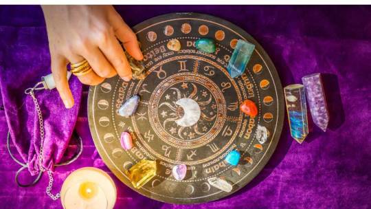
Vedic Astrology, also called Jyotish. It is an ancient Indian system dealing with the profound impacts caused by celestial bodies. Especially when it comes to the impact of planets, on human lives. This practice must necessarily be based on the Navagrahas, or nine planets. They are believed to produce specialised influences that form personality, destiny, and life incidents, as interpreted by Kundali—individual birth charts—and horoscope readings.
Understanding the Navagrahas: Roles and Influences of Each Planets

Vedic astronomy has assigned different roles to each of them based on their symbolic representation and cosmic energies.
1. Sun (Surya)
The Sun represents vitality, willpower, thoughts, and other individuality-related things. In the Kundali, it means leadership traits, career success, and health. If placed well, the Sun enhances confidence and charisma in a person.
On the contrary, its affliction will undoubtedly give rise to ego or health problems. Remedial measures in this regard include Surya puja and the wearing of Ruby gemstones to enhance the beneficial effects of the Sun.
2. Moon (Chandra)
It controls emotions, instincts, and nurturing qualities. The moon’s waxing and waning phases affect fluctuations in mood and psychological and mental well-being.
A balanced Moon shows emotional stability and creativity. A weak Moon shows moodiness or insecurity. Remedies include Chandra mantras and Monday Chandra vrat fasting to pacify lunar influence.
3. Mars (Mangal)
Mars stands for energy, courage, and a certain degree of assertiveness. Its placement in the horoscope influences ambition, determination, and competitive spirit.
A favourable Mars reinforces the individual’s leadership, whereas an afflicted Mars will be reflected in impulsive or aggressive behaviour. Remedies like Mangal puja and wearing Coral gemstones work at mollifying the adversities pertaining to bad Mars placements.
4. Mercury (Budha)
It governs Intellect, Communication, and Analytical Skills. This planet’s placement in one’s Kundali governs logical thinking, adaptability, and decision-making capability. If it is well-placed, then Mercury would help in writing, mathematics, or any business commerce career fields.
The affirmative features can further be enhanced by the remedies done for it, for example, Budha puja and the wearing of the emerald gemstone during this period.
5. Jupiter (Guru/Brihaspati)
Jupiter stands for wisdom, knowledge and spiritual growth. When in place, it makes one optimistic, prosperous, and curious about higher learning.
If Jupiter were strong, it would bestow on the candidate the chances regarding education and open the spiritual horizons as well. Add Guru puja and Yellow sapphire (Pukhraj) gemstones to enhance Jupiter’s good energies.
6. Venus (Shukra)
This planet of love and creativity controls the native’s artistic talents and all forms of conjugal love and relationships. The placement can influence the native’s attitudes toward material pleasures, romantic inclinations, and aesthetic sense.
Benefic Venus brings virtue in relating and creative pursuits; on the other hand, afflicted Venus makes one overindulgent and superficial. Shukra puja, Diamond, or White Sapphire gemstones must be worn for the native to balance the various influences of Venus.
7. Saturn (Shani)
Saturn represents discipline, responsibility, and life lessons. Its position in Kundali symbolises karmic challenges and the strength to withstand them longer.
How does he influence adversities? He teaches the importance of patience and hard work by creating obstacles or delays in any work done. Remedies to reduce the malefic effect of Saturn: Shani puja, recitation of following Shani mantras, and wearing the Neelam stone (Blue Sapphire).
8. Rahu and Ketu (North and South Lunar Nodes)
Rahu and Ketu are shadowy planets associated with the most potent desires and spiritual development. Their dignity in the Kundali brings obsessions or spiritual evolution into the mainstream.
Rahu represents ambitions and worldly pursuits; Ketu is representative of detachment, past-life karma. Remedies include Rahu-Ketu puja, wearing hessonite or cat’s eye balancing the influence of shadowy planets.
Combinations of Planets and Their Effects (Yogas)

Planetary Combinations are greatly important in Vedic Astrology in diagnosing auspicious periods. They are related to wealth, success in general, success at work, etc. Yogas like Gajakesari Yoga, which is a conjunction of the Moon with Jupiter, and Panch Mahapurusha Yogas denote potent influences that shape life’s trajectory.
Practical Application: Interpreting Your Kundali

It involves the analysis of the strengths and weaknesses of the planets, placement in multiple houses, and the effect on other planets. This helps the astrologer predict the significant events of a person’s life and helps one choose the correct field for a career, health, love life, and the future surrounding money prospects. Real-life case studies help to understand how planetary configurations have affected the lives of people and what choices could be made.
Remedial Measures to Optimise Planetary Influences

Remedial measures in astrology are based on reinforcing the benefic planets and pacifying or conditioning those said to be malefic. Most of all, they will involve specific pujas, planetary mantras relative to the ruling planet, the so-called gemstone, and charitable activities relative to Vedic precepts relating to the governing planet. All these practices synergise planets’ energies, thus being salutary for maintaining perfect health.
Conclusion: Accepting Planetary Wisdom
This will make the Vedic Astrology efforts work to help a person better realise the challenges and hurdles from his planets and look for ways to open new opportunities. With the help of varied personalised kundli readings and expert astrologers, he will make informed decisions to work quite aggressively upon his strengths to try to negate the fallout of probable obstacles in life.
Further Readings
To understand Vedic Astrology and the impacts of planets more deeply we can refer to some great books, websites, and professional astrologers available. This will increase the respect for the wisdom of this ancient science and its effectuality in a modern context.
Absolute science provides a holistic approach to planetary influence over one’s life, as shown by Kundali Horoscope readings. A focus on this chapter’s impacts on planets has revealed much about astrological insight, intent of growth, equity, and spiritual evolution.
1 note
·
View note
Text
1. Which category of alterhumanity do you belong to?
Alterhuman and nonhuman.
2. What/who is/are your type(s)? (if you have any)
I am dream conceptfolk, anymic oneiric nonhuman and constelic.
3. Do you experience shifts? If so, can you tell us your most common shifts and your strangest cameo shift (if you've ever had a cameo shift)?
I do for my constelic identity. Most common shifts I have are envisage shifts and I have those for fox spirits the most. Since I see my identities as constels instead of cameos, the weirdest shifting experience was the feeling of my arms shapeshifting into owl wings. So rather than just having a shift of being something, it felt like I was stuck shapeshifting back and forth.
4. How do you experience your alterhumanity in everyday life?
I experience my strong connection to, and identity as, dreams a lot. Especially when sleeping. Within my dreams, I am my kintype and I dream every single day so that us another everyday life thing. Lastly I experience my constelic identity lots when I am in the community as different stels get more easily triggered there, but I am also likely to get phases of my stels just listening to music.
5. What do you think of the community?
I think it is wonderful to have the community. I didn't join until 2018, and it was hard to feel all alone in my nonhuman experience. I especially love the tumblr community as it so welcoming, accepting and mature.
6. What are the things that make you most comfortable and euphoric in your alterhumanity?
Dreams, daydreams, sleep, fantasy and imagination. These are what make up my dream conceptfolk identity and I spend a lot of my time on these. Being in dreams makes me feel so nonhuman and I find that very euphoric. Being seen as part of these things, or having a connection to these things by others make me very happy.
7. Are you experiencing species dysphoria?
I have had moments of species dysphoria for different constels of mine. Especially for fox spirit, to not be able to shapeshift or have fur. I ca
8. What advice would you like to say to a young alterhuman who has just awakened?
Don't feel like you have to be any certain way to be alterhuman. Your experiences are uniquely yours, focus on that instead of comparing yourself to others.
9. Do you have/want to have gears?
I have elven ears and jewelry and wouldn't mind a pair of white fox ears, a white fox tail and yellow slitted contact lenses to look like a fox spirit.
10. Do you know/have any theories about the origin of your alterhumanity? If so, tell us! (all beliefs are legitimate)
I believe it to be psychological/neurological. I think I am this way because of autism and my natural inclination to lucid dream.
11. Tag someone/a creature to answer these questions!
@astraythealterhuman, @twin-wishing-stars if you guys feel like it!
If you are a alterhuman, reblog and answer these questions!
(don't be afraid to write a lot, do what you want ¯\_(ツ)_/¯)
1/ Which category of alterhumanity do you belong to?
2/ What/who is/are your type(s)? (if you have any)
3/ Do you experience shifts? If so, can you tell us your most common shifts and your strangest cameo shift (if you've ever had a cameo shift)?
4/ How do you experience your alterhumanity in everyday life?
5/ What do you think of the community?
6/ What are the things that make you most comfortable and euphoric in your alterhumanity?
7/ Are you experiencing species dysphoria?
8/ What advice would you like to say to a young alterhuman who has just awakened?
9/ Do you have/want to have gears?
10/ Do you know/have any theories about the origin of your alterhumanity? If so, tell us! (all beliefs are legitimate)
11/ Tag someone/a creature to answer these questions!ㅤᵕ̈
1K notes
·
View notes
Text
"The Impact of Colors in Wall Art: Unveiling the Artistry with Happening Hippo"
In the realm of interior design, wall art stands as a powerful medium to transform spaces, adding depth, personality, and style. Among the myriad factors influencing the effectiveness of wall art, the impact of colors holds a special place. Colors have the ability to evoke emotions, set moods, and convey messages. In this exploration, we delve into the fascinating world of wall art and how Happening Hippo, with its impressive collection of Wall Posters and Art Frames, embraces the artistry of colors.
Colors as Emotional Catalysts
Colors are powerful emotional triggers, capable of influencing our feelings and perceptions. Happening Hippo understands this well, curating a collection that speaks to the diverse emotions and preferences of its clientele. For instance, the vibrant reds and yellows in abstract art posters can instill energy and warmth, making a space lively and inviting. On the other hand, serene blues and greens in nature-inspired frames create a calming ambiance, perfect for relaxation and tranquility.
The Psychology Behind Color Selection
The choice of colors in wall art is not arbitrary; it is a conscious decision influenced by the psychology of color. Happening Hippo's collection reflects an understanding of color psychology, ensuring that each piece resonates with its audience. For instance, shades of blue are often associated with calmness and trust, making them ideal for bedrooms or spaces dedicated to relaxation. Meanwhile, energetic reds and yellows can be found in art pieces intended for social spaces, encouraging lively conversations and a sense of community.
Creating Harmony with Color Schemes
Harmony in interior design is achieved through thoughtful color schemes, and Happening Hippo excels in offering wall art that seamlessly integrates with various color palettes. Whether customers seek monochromatic elegance, complementary contrasts, or bold triadic schemes, the collection at Happening Hippo provides a diverse array of options. This versatility allows individuals to curate a space that aligns with their aesthetic preferences while maintaining a harmonious balance of colors.
Personal Expression through Wall Art
One of the remarkable aspects of Happening Hippo's collection is its commitment to providing a platform for personal expression through wall art. The diversity of colors and styles allows individuals to convey their personality, tell their stories, and create an environment that feels uniquely theirs. From minimalist black and white posters that exude sophistication to vibrant, eclectic frames that celebrate individuality, Happening Hippo empowers customers to express themselves through the colors adorning their walls.
Seasonal Transitions and Trendsetting Hues
As the seasons change, so do the preferences for color palettes. Happening Hippo keeps pace with these transitions, offering seasonal collections that reflect the prevailing moods and trends. From warm, earthy tones for fall to fresh, pastel hues for spring, customers can effortlessly update their spaces with the latest in color trends. Happening Hippo becomes not just a curator of wall art but a trendsetter, introducing customers to new and exciting possibilities in color exploration.
Happening Hippo: Where Every Color Tells a Story
In the vast landscape of wall art providers, Happening Hippo distinguishes itself as a curator that understands the language of colors. Each piece in their collection is more than just an arrangement of pigments; it is a story waiting to be told, an emotion waiting to be felt. From the bold and adventurous to the subtle and soothing, Happening Hippo's collection caters to every taste and inclination.
In conclusion, the impact of colors in wall art cannot be overstated. It goes beyond mere aesthetics, delving into the realm of emotions, psychology, and personal expression. Happening Hippo emerges as a beacon in this artistic journey, offering a collection that embraces the diverse and profound impact of colors in transforming living spaces. So, whether you seek to invigorate a room with vibrant energy or create a serene haven for relaxation, Happening Hippo's collection of Wall Posters and Art Frames is a palette of endless possibilities, waiting to color your world with beauty and meaning.
0 notes
Text
What Your Bedroom Color Reflects About You
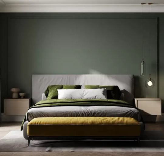
The color of your bedroom is more than just a visual choice, it's a reflection of your personality, emotions, and the ambiance you seek to create. Afterall, your bedroom is a personal sanctuary, a space where you retreat to unwind, relax, and rejuvenate. Whether you're drawn to calming blues, passionate reds, or serene neutrals, your color selection can offer fascinating insights into your inner world. We explain the psychology behind different bedroom colors and what they might reveal about you.
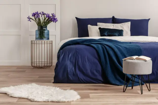
1. Soothing Blue: Tranquility and Harmony A bedroom adorned in shades of blue exudes tranquility and calm. If your room is dominated by this serene hue, you likely value peace, order, and a sense of emotional balance. Blue suggests that you seek a peaceful retreat, a place to unwind from the demands of the world. You're known for your thoughtful and introspective nature, and your bedroom color reflects your desire for a space of quiet contemplation. Blue also has a cooling effect, making it an excellent choice for those who seek to unwind and escape the stresses of the day.

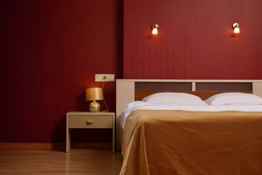
2. Passionate Red: Energy and Intensity Red is a bold and passionate color that evokes strong emotions. This bold and passionate color suggests that you're full of energy, enthusiasm, and a zest for life. You're not afraid to make a statement and your bedroom color reflects your confident and extroverted nature. A red room might also indicate your romantic inclinations, as red is often associated with love and desire. It can also indicate a passionate and romantic nature.
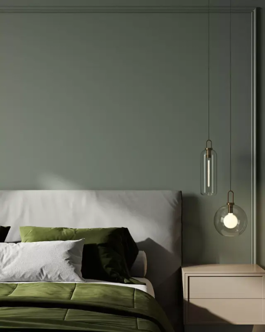
3. Tranquil Green: Balance and Growth A green bedroom embodies growth, renewal, and a connection to nature. If you've chosen green for your sleeping space, you likely have a nurturing and down-to-earth personality. You value balance and harmony in your surroundings and seek to create a haven that promotes relaxation and well-being. Your bedroom color reflects your desire for a space that fosters personal growth and a strong connection to the natural world. Green promotes a sense of calmness and renewal, making it an excellent choice for creating a relaxing oasis.

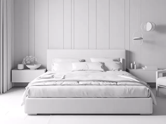

4. Calming Neutrals: Timeless Elegance Choosing neutral colors like beige, gray, or white for your bedroom suggests a preference for timeless elegance and simplicity. You appreciate a clean and uncluttered environment, and your bedroom color reflects your understated yet sophisticated taste. Neutrals also indicate your adaptability and open-mindedness, allowing you to create a serene space that can easily adapt to different moods and styles.

5. Enigmatic Purple: Creativity and Individuality Purple is often associated with creativity, spirituality, and luxury. People who gravitate toward purple bedrooms tend to have a keen imagination, a love for the arts, and a desire for a tranquil environment. If your bedroom is dressed in shades of purple, you're likely a person with a unique and artistic flair. Your bedroom color reflects your desire for a space that nurtures your creative pursuits and allows you to express your individuality. Purple also hints at your introspective nature and your ability to find beauty in the deeper aspects of life.
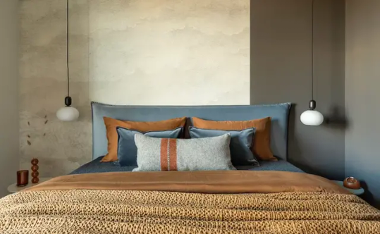
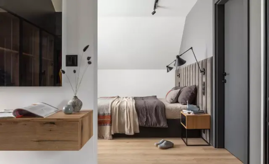
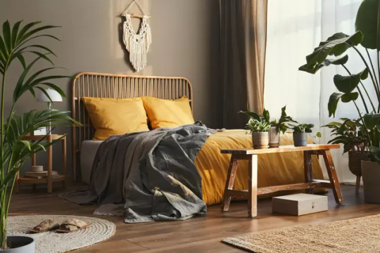
6. Cheerful Yellow: Optimism and Warmth A yellow bedroom radiates warmth, positivity, and optimism. If your bedroom is bathed in this sunny hue, you're likely a cheerful and outgoing individual. Your bedroom color reflects your desire for a space that uplifts your spirits and welcomes positivity. Yellow also indicates your sociable nature and your ability to spread joy to those around you.
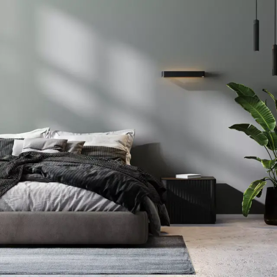
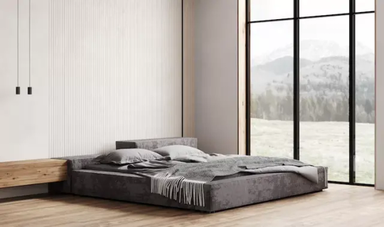
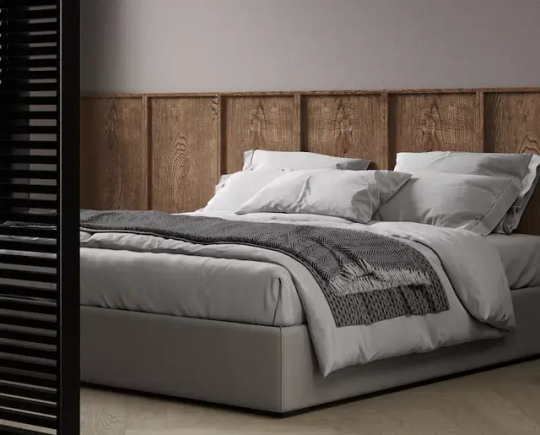
7. Balanced and Neutral: Gray Bedrooms Gray is a neutral color that can convey a range of emotions depending on its undertones. Lighter grays can evoke a sense of sophistication and balance, while darker grays can create a cozy and cocoon-like atmosphere. If your bedroom is gray, you likely appreciate simplicity, elegance, and understated beauty. Gray also serves as a blank canvas, allowing you to infuse your space with accent colors and personal touches. The color of your bedroom is a powerful form of self-expression. It offers a glimpse into your emotions, desires, and the atmosphere you wish to create within your personal sanctuary. Whether you opt for soothing blues, passionate reds, tranquil greens, or any other color, your bedroom becomes a canvas that reflects the intricate tapestry of your personality. So, the next time you step into your bedroom, take a moment to appreciate the unique statement your chosen color is making about you.

Read the full article
0 notes
Text
Color Psychology in Customized Tissue Paper Packaging
Think about walking into a room painted in a bright yellow color. Just think how it makes you feel; now you can see everything. Does this picture change your mode? Colors have a great ability to influence your emotions and behavior without even realizing it. This interesting concept is known as color psychology, and it’s like a secret ingredient that can even turn your regular experience into a memorable one. Now, you can learn about color psychology and how it can transform something like Printed Tissue Paper in Australia into a powerful tool for capturing attention and creating a great impression.
Everything you need to know about color psychology
Psychology is like the magic behind the scenes of your movie. It is why some scenes make you laugh color or just feel excited. Like actors convey all the emotion, colors can evoke your feelings and even impact your behavior. You can consider why restaurants always serve yellow and red in the logos. The colors stimulate your appetite and create a sense of urgency. Colors have different personalities of their own, and they can communicate with you on your subconscious level. They can make you feel calm, excited, or even nostalgic. This phenomenon has been studied for several years, and you can harness its power to influence how customers perceive the products.

Using color psychology in Custom Tissue Paper Australia
You can imagine receiving a perfectly wrapped gift. When you see the tissue paper’s colors and patterns,, you will start forming opinions and emotions about what is inside it. That’s the magic of color psychology.
Just like the colors on a canvas would set the tone of your painting, the colors on your tissue paper will also set the mood for your brand. When you go for Personalised Tissue Paper, you can easily communicate your brand’s message. The colors will share your brand’s values,, personality,, and identity. White tissue paper reflects simplicity and purity, but if you want to convey luxury or sophistication, you can go for black tissue paper.
Colors also have a great way of guiding your decisions. Think about walking into a store where everything is painted and inviting colors. You will be more relaxed and inclined to stay very long. At the same time, when you use Custom Paper Tissue, you can make our customers feel more comfortable and encourage them to explore different products.
You can rely on Supr Packs if you are looking for custom tissue paper.
#Custom Paper Tissue#Custom Tissue Paper#Personalised Tissue Paper#Printed Tissue Paper in Australia#Printed Tissue Paper Australia#Printed Tissue Paper
0 notes
Text
So, someone in the tags asked "what spreadsheet?"
Here is it: from the arg https://docs.google.com/spreadsheets/d/1Wp3TpUeuHvnG5LGlQSp7AhI6vM7zwvAW/edit?usp=sharing&ouid=112903536270194897993&rtpof=true&sd=true
Note: I was not active during the arg, I'm unsure of what discussions already have taken place, and others deserve to be credited for all the notes in the spreadsheet. Also, I have no background in psychology. That said, as I have a hunch the institute in this world is about as good at psychological testing as the one in TMA was at proper archiving practices, I'm not sure how much that last one matters.
Some thoughts: this is most interesting if you sort it by empathy index.
Now, while all of the other tests are easily researchable, there doesn't seem to be a single measure of empathy. I personally think that this would be a great place to hide some more pseudoscience/esp/psychic type tests behind a mundane sounding name. After all, it is a pretty short leap from "what is the person in front of you seeing/feeling/perceiving?" to"what is the person in the next room seeing/feeling/perceiving?" or "what will they be perceiving ten minutes from now?" This whole setup reminds me a lot of the experiments done on Annabelle Cain in TMA.
When you sort by this index, you'll notice Sam is the absolute highest, with Gerry in second. They are also both highlighted yellow - my guess is that yellow is a subject of interest, and all of the subjects of interest have a higher empathy rating. This makes it very unlikely that Gerry was just asked some questions, in my opinion.
Now, as for the low/moderate/high rankings for the last two. In general, as the empathy index increases, prosocial behaviors, developmental levels, and moral reasoning increase. Also, lower empathy and developmental levels are associated with high rankings for Milgram and asch, with low rankings generally being for higher empathy scores. The exception in Sam, who was rated as high for Milgram and asch.
So, the question is which way around are the low/medium/high. I think low = noncompliant and high = compliant, but it is up for grabs.
First, the lower developmental levels (and therefore likely younger kids) were high. And like...it's easy to make a toddler press a button. Even if it makes someone scream. It's easy to get a toddler to agree with a lie. Also, it makes sense that subjects with higher prosocial inclinations/higher moral reasoning would be more likely to refuse to cause someone pain. The main argument for it being the other way around is what Sam and Gerry are like as adults. Sam is pretty stubborn and not easily dissuaded from doing what he wants, and the Gerry we saw seems like he would very likely go along with what he was told. But still, my gut feeling is that neither of them were that way as kids while they were being tested, and whatever happened at the institute is the key reason they are that way now. Also, that setup would give Sam a reason to feel horribly guilty about things that happened to him as a child that were in no way his fault, and would he really be a Magnus protagonist without that?
Look, I would love to believe that Gerry is having a perfect time in an alternate universe, but I can’t. Something is up. Note: I’m using some info from the arg spreadsheet for this.
Cw for unethical psychology experiments and harm to children.
He claims to have been too young to remember, but according to the spreadsheet he is two years older than Sam. Of course they probably weren’t tested at the same time, but his development level indicates he was school-aged.
He says he just remembers filling out forms and answering questions. The spreadsheet indicates that they put the kids through the Milgram experiment (you know, the giving electric shocks to people one)
He is happy to invite strangers in first thing in the morning and offer them anything- food, a large painting, etc. This goes beyond typical hospitality/generosity.
He even thinks the landlord is lovely. And yes I think this is a hint considering TMA’s politics.
Gerry immediately considers strangers old friends.
I may be reading the spreadsheet wrong because it is ambiguous. But if I am correct, when tested Gerry was ranked very prosocial, but also wasn’t compliant with the Milgram test or a test of social conformity (the one where a bunch of people lie about the length of a line to see if the person being tested will agree with something obviously wrong). The Gerry we met seems very compliant.
Gertrude is eager to get rid of Sam and Celia, which is completely understandable, but I think there is more to it. She knows something and wants this away from Gerry.
The little “I like them” “of course you do” exchange. It isn’t much on it’s own, but altogether…I don’t think Gerry has a choice. Not in liking them or being generous. I think Gerry was so close to being what they wanted, but he wouldn’t comply with some things, so they…somehow made him compliant.
According to the spreadsheet, Gerry had the second highest empathy index. The only individual higher was Sam. And I think we can assume Sam’s results are significant, considering he is a main character. Sam’s results were similar to Gerry’s in almost every way…except that Sam was given opposite results in the social conformity and obedience measures. In general, as empathy, moral development, and prosocial behavior increased in the kids, milgram and asch scores were lower, which is why I believe low=not going along with them.
So, the institute was looking for kids who were highly empathetic but also easy to control. Until they found Sam, Gerry was the closest, so they tried to control him. And ended up damaging him badly and messing with his memory of what happened.
#tmagp#tmagp meta#I added this to the correct post this time#can't wait for it to get proven wrong next week
196 notes
·
View notes