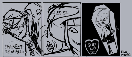
#anatomy is a little wonky my apologies
Explore tagged Tumblr posts
Text
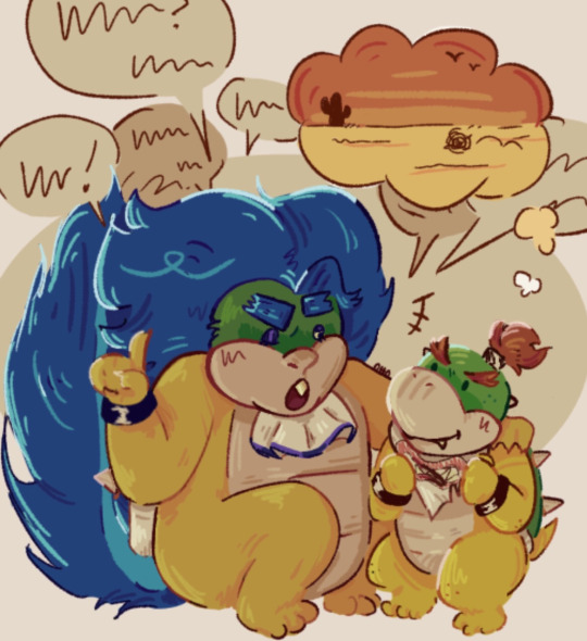
i’m getting Bowser’s inside story & Bowser Junior’s Journey for christmas and have been reading up on the dialogue—i have absolutely no clue what happens but the tutorial is nice
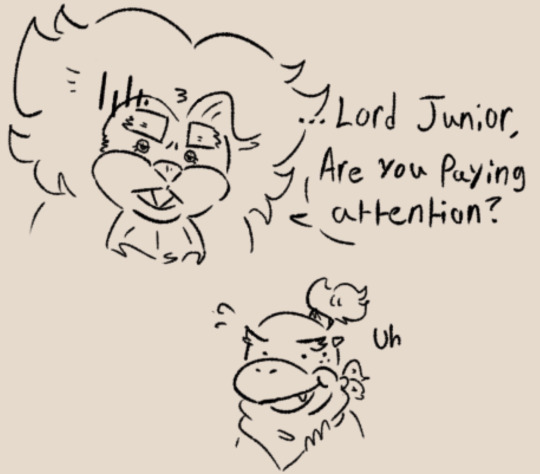
bonus
#my art#mario#super mario bros#koopalings#not a ship#bowser jr#ludwig von koopa#mario koopalings#bowser’s inside story#bowser’s inside story + bowser jr’s journey#bowser jr’s journey#his ass is NOT listening!!!#anatomy is a little wonky my apologies#my back hates me#goodnight
115 notes
·
View notes
Note
Hi!! I love your art; it's so wonderfully Shaped and I love how you draw the Hilda characters!
Since your requests are open and if it's alright to ask for AUs, would you mind drawing my teen versions of Hilda and Frida? (I've got an edit ref here: https:// www. tumblr. com /autumnalfallingleaves/651485829580128256/made-some-screenshot-edits-i-wanted-to-better if that's alright) Feel free to ignore if you don't want to!! 🤗
I would love to draw your teen Hilda & Frida designs! I love seeing people's future AU ideas, it's so fascinating to see people's takes!

(Apologies that the anatomy is a little wonky, this was my first drawing of the day)
I think there's something so fun about the fact that everyone seems to have collectively decided that Frida dyes her hair blue at some point in the future
99 notes
·
View notes
Note
Do you approve of my fem chuuya

It’s not rendered and the anatomy is a little wonky, so I apologize for that-

WOOOOAAAUUHGHHHHHHHH,,,,,,,,,,JAW ON THR GROUND OMOMGOMHOMH I LOVE WOMEN SOOOOOOO MUCH😫😫😫😫‼️‼️‼️ SHES BEAUTIFULLLLLL MAAM,,,,,,,,,,,,,MAAM,,,,,,,,,,,,,,,,,,sorry ahem anyway. the anatomy is great dw she looks gorjus😍😍😍😍
28 notes
·
View notes
Text
𝑪𝒉𝒂𝒓𝒂𝒄𝒕𝒆𝒓 𝑺𝒉𝒆𝒆𝒕 ✍︎︎
featuring: Anan Atthakornmetha and Charin Kamolnath
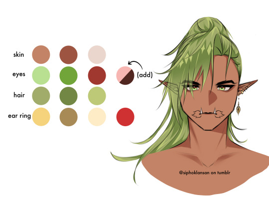
Anan’s bottom fangs are thin, long and it sticks out.
The marks on the corner of his lips aren’t tattoos. It’s kinda like a birth mark (for Yakshas)
Anan has dark brown eyeshadow under his eyes.
His hair is thigh-length (half of his thighs) but when tied up it’s hip-length
Anan wears gold jewelry.
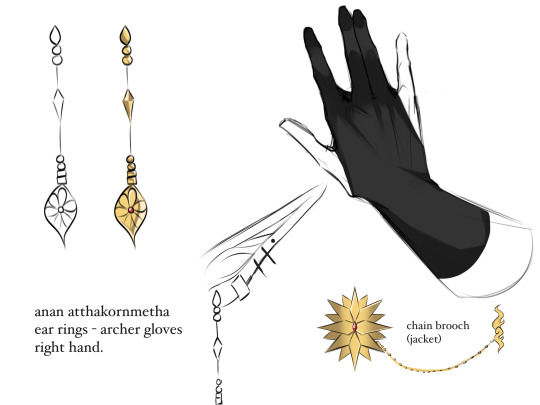


Anan’s (red) sash is near knee length
He wears black derby shoes
Anan’s jacket is always on his shoulders, and is always accompanied by a golden brooch chain.
Without the jacket, his sleeves are rolled all the way up to his shoulders.
He wears archery gloves on his right hand.

Charin has a mullet, and his hair sticks up naturally.
He has short, spiky eyebrows
Has red eye shadow
He wears silver jewelry.
He has small fangs.
The swirly marks on his cheeks are birth marks/ features that monkey yakshas have.
His ears are bigger than Anan’s.

Charin’s tail has the same color as his hair
His tail does not reach the floor
He has two silver rings wrapped around the caudal peduncle

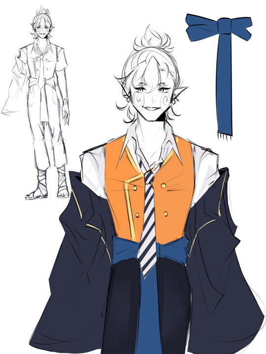
Charin’s jacket is off shoulders at all times.
Charin’s (blue) sash is near knee length.
He wears flip-flops, but with (white) bandages wrapped around his calcaneus and ankles
His shirt collar is not buttoned all the way up and wears a loose neck-tie.
His jacket usually covers his hands in his idle pose.
Wears a short sleeved shirt.

Other Notes✍︎︎
They both wear an orange vest because they’re from a fan-made dorm called Asuri, which is still in progress as well as the dorm’s arm band.
They both wear short sleeved shirts, but Anan just folds it to his shoulders.
Charin has a leaner build than Anan, which makes Anan more muscular.
Charin rarely shows his tail, so it’s not required to draw it.
Ignore the badly drawn feet please </3

tagging @axvwriter because they were the one who asked for the long awaited reference sheet. I’m SO sorry it took so long😭🙏
If you guys noticed, yes, I removed Anan’s chain-thingy on his left hand (based on one of my spams) because I got too lazy with drawing it and it’d be a PAIN to draw it all the time. I fr forgot that bro is not a Genshin character so I don’t need to make his design that complex. So, I added archery gloves on his right hand instead because Anan is a skilled archer!✨
I also added some red highlights in Anan’s eyes and I made him look…a little less intimidating. Actually- I feel like he looks scarier when he’s not colored😟 So if you guys wanna make him intimidating with colors, I suggest drawing his eye brows near his eyes so he can look angy😠
I must confess that I have NEVER drawn them with shoes before. Actually- maybe once in one of the OC interaction asks but it wasn’t that detailed and I was drawing out of my own ass. So this reference sheet made me actually design my characters properly.
I suck at anatomy, never learned it either, so I’m pretty sure their build and limbs are wonky asf and I apologize for that😭🙏 HOWEVERRRR if you guys have any questions about them (design related or not) feel free to ask me in my inbox!💖🤍
#twisted wonderland#twst#disney twisted wonderland#twst wonderland#twst oc#twst related#original characters#Anan Atthakornmetha༆#Charin Kamolnath༄#☂︎︎siphok-museum☂︎︎#RRUHRUGRHYFERIWIFINR THIS TOOK SO LONG IM SO SORRY#IM GONNA GO NUKE ANOTHER MUTUAL OF MINE NOW#SLEEP WITH ONE EYE OPEN GUYS /LH😻💓
46 notes
·
View notes
Text
“Advice Unmasked: Team Fortress 2”
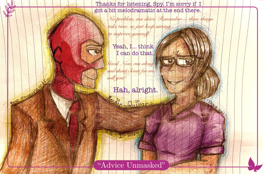
{Transcript}
Miss Pauling: “Thanks for listening, Spy. I’m sorry if I got a bit melodramatic at the end there.”
Spy: “No problem, ma chère. Remember— these things take time, so just keep aiming to improve yourself.”
Miss Pauling: “Yeah, I… think I can do that.”
Spy: “Good. Now, run along and shoot Scout for me, will you?”
Miss Pauling: “Hah, alright.”
Description: Spy giving his usual high-quality French advice after listening to Miss Pauling vent about work problems.
(Made with a hint of inspiration from the AO3 fic “A Pauling’s Attire” by Lizziefij / elrong, with her wonderful headcanon of Spy and Miss Pauling being somewhat close— specifically stylistically!
Here is the link- go read it when you can. It’s super well-written, professional, and the artwork that goes along with it is just phenomenal!! <3 :
~ * ~
Started January 28th, 2024 at 1:00AM, Home Finished January 30th, 2024 at 4:45, Home
Art Notes:
This is a gift / apology art for the user @slimsnipes , after them being very kind (and tolerant of my incessant blabber mouth… so sorry about that... 😭) during a stream and helping improve my art skills and motivating me to keep creating!
Please, if you haven’t already, go check them out! They make wonderful art— especially Speeding Bullet-related content!!! >u< — and are just really cool in general, so if you want to be crying in awe for two hours straight (like me…), here’s the person to go to!
As for the artwork, I made it really late at night and really quickly— not because I was rushing but more because I made it during a spontaneous burst of inspiration at 1AM that even my sleepiness couldn't stop. -w-
Probably due to my inability to think straight from the tardy inspo-explosion, I made a mistake when drawing where Spy's ear and jawline ended up being WAYYY closer to his eyes than physically possible. I re-drew it in Markup and covered it up with shading (because I can't be bothered to erase the colouring and rip the paper LOL), and now, aside from the general area and lineart being slightly darker than the rest of his face, you can barely tell there was a change at all!
Plus, it helped improve my colouring a little bit, which was great because that was my initial goal with this drawing in the first place.
This work is not something I'm immensely proud of since there are a lot of flaws with it, like the entire wonky anatomy of Spy, that I feel I could have avoided if I had just made it during the day and... not so randomly... but I'm still going to post it here just to document the experience and take it as a lesson to learn from!
And, again, to reiterate, my standards are pretty low for what I post here-- anything that doesn't look like chicken scratch or scribbles-- because I want to post things that I truly express myself with, so I won't be leaving this one out!
Anyhow, that's about it for this one! Remember to check out slimsnipes and Lizziefij when you can, they are both super talented and they've really shaped the way I create, and I'm sure they'll inspire you too, in the best way possible!
Have a good one, pally~ ^.^
~ Rosain Quivan
Credits: ‘Team Fortress 2’ by Valve, “A Pauling’s Attire” by Lizziefij / elrong, slimsnipes Image source: Rosain Quivan Created by: Rosain Quivan {Cross posted on Amino ( Rosain Quivan )}
#tf2#team fortress 2#art#tf2 art#tf2 miss pauling#tf2 spy#chr: spy#chr: miss pauling#gift#traditional art#artwork#Miss pauling and spy
13 notes
·
View notes
Note
Can you give like, a "style guideline" for how you do the unique magic posters? It can be as rough or developed as you want, I'm just curious about your thought process
I'm not sure if I can explain it very well, but I'll try! there's definitely a skill to being able to explain The Process in a way that makes sense to other people, so apologies in advance if this just ends up a confusing mess of words!
since these are about each character's unique magic -- though some of them are. looser. than others -- that's a pretty obvious starting point. I try to stay away from a literal "here's a picture of them using their magic" and go for more of the tone and feeling of it. like...the ones I did for the twins don't really have anything to do their magic at all, because I decided it was more interesting to make it about their twinny-ness and their eyes, and having them bookend Azul. so...their magic got relegated to the background as the teeth/tails from the kanji, rather than anything relevant. :') but they look nice and creepy, which was more important to me!
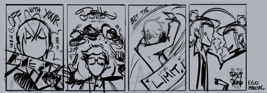
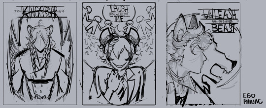
I always start by doing a bunch of thumbnails to get the idea down and figure out what exactly I want to do. for these I go to colors straight off the final thumb instead of doing a tighter sketch; things tend to change a lot and get moved around and shapes and silhouettes get refined as I go, so I just try to get the idea and the important shapes down and worry about fixing my wonky anatomy later. the style is so flat and minimal that it's fun to lean into that, use a lot of symmetry and lack of depth to push the shapes a lot further than with lines! my only rules for it are that 1) the character should be prominent, and 2) facial features are in limited supply and only to be handed out when necessary (both eyes? don't be greedy). other than that it's anything goes!
here are the final thumbs I went with for each if you're interested! some of them stayed pretty close, and some of them still ended up changing a lot during painting:


once I feel good about that, I come up with two or three main colors + an accent color + a "black" and a "white". (I don't use pure black or white for these, I use dark and light shades of other colors. like for the poms, the "white" is a super pale green and the "black" is a super dark blue. it looks richer and blends better with the rest of the palette that way!) I try to use the same colors within the dorm groups (except for the scaras) to keep some internal consistency, but they don't have to be exact or anything.
color is something I tend to really struggle with so I like to have a palette to start with, even if I end up getting away from it. :x I don't restrict myself from adding more shades and colors as necessary, but I try to be mindful about it -- pops of contrasting color immediately become a focal point, so I don't want to overuse those and make it distracting. the little rimlighting highlights are in the "white" color, and just there for fun and to make things a little less 100% symmetrical for some of them! they're easy to overdo though so I try to use them sparingly.
the actual process of painting is mostly thinking about shapes and silhouettes. because there's no lines and no real depth, clarity is really important; a lot of it is making sure the shapes all look satisfying and there aren't any weird little messy areas or anything. and pretty much all of the fonts I go over to add bits too or change slightly, to make it less stock-looking and integrate it more! there's just a lot of trying different stuff and havin' fun, seeing what happy accidents happen. (like...the heart shape in the milk on Trey's was not planned, it came out kind of heart-shaped by accident and I went YESSSS PERFECT and cleaned it up to make it look more intentional. stuff like that!)
uhhh what else. I do everything with one brush (except for some of the little grungy font touchups on the twins), constantly check my values with an adjustment layer on top at 0% saturation, and horizontally flop the canvas to make sure it isn't looking weird or skewed. the paper textures are a final thing, they're a couple of paper layers on top set to soft light and are mostly the same across the board (just slightly adjusting for each) so they don't take a lot of thinking about. the nice thing about doing a series like this is I only have to figure out sizing/borders/etc once. >:)
so...yeah! I don't know if that all made sense or was satisfying, but that's the way I can think to express it! and if nothing else you can enjoy my stupid doodle of Rook making a weird clown face. 👍
#art#sketch#long post#twisted wonderland episode 6 spoilers#twisted wonderland book 6 spoilers#twisted wonderland episode 5 spoilers#twisted wonderland book 5 spoilers#i think eng players are past episode 4 so that's all?#what to tag this hmm#i have never known what i'm doing and that's not about to change#(i am aware i forgot a word in vil's but i fixed it in the final okay)
892 notes
·
View notes
Note
Ahhh Hello Blyn! I was wondering if you still do Sky OCs sketches 👉🏻👈🏻 If you don’t please just ignore this asjfjdks but if you do, here is one of my Sky OCs!


I’ve never properly introduced Marsuell to anyone (yep that’s the name I gave him!), but pronouns are he/him. Most people know him as the “Samurai”. He is one of the only two descendants of the Forgotten Ark who survived after the battle with dark creatures. He left a number of scars on his body from the war, which is why he covers almost all of his body parts and wears a thick cape to hide past injuries, especially the one on his face. Sometimes people call him the “Red Demon” given how he looks like he has red devil horns from the back. He is really loyal, especially to his origin (the Ark). He can be nonchalant on the surface sometimes, but that’s only because he isn’t good with talking to others ><
Hello!!!! Sorry for taking so long!!! i was being a ball of laziness djdjsjs
BUT I FINISHED HIM!! Quite a long time ago honestly.... 😓

This one was a really cool one to do! I actually like how it came out but the main thing is to know if you do too!!
Apologies for the wonky anatomy tho :$$ The hands got a little messed up in the process sjdjsjsja
I love him btw! Amazing design and story, i hope i did him justice!
Im still doing these btw im just slow bc: Some physical problems but also bc the bed somedays gets too comfy to get up and draw and post 😔
There's still 2 more im finishing but i promise to send them around this week :3
(Also, for the person i sent that answer privately and without the draw omg if u see this please forgive me! i miss-clicked and sent just the text without the art wjdbwjs i can't find your user to tag u on another post with it so if u see this please send me another ask or dm just telling me its u and i will send the draw back this time for real 😭)
#sky children of the light fanart#sky children of the light#sky cotl#thatskygame#blyni art#sky星を紡ぐ子どもたち
34 notes
·
View notes
Photo

I wanted to work more on anatomy tonight. I spent.... 4 hours.... on this... It’s 8:15pm right now and I started this at 4:30pm so... yeah. Most of the work was due to the hair details. Not gonna bother censoring this piece because truthfully, its anatomy practice and it’s artful. No real, physical anatomy is shown. If tumblr takes this down, I’ll just repost. :/
And... god I hate the feet. I hate drawing toes. They look like wonky little Vienna sausages, they should be canned and never seen-
I’m also trying to draw background more rather than finding a stock image to use. I know my shading is really bad, I’m not... too good at figuring out where I want the lighting or anything to come form, so I kind of just... place shading where my brain thinks it looks best. I apologize to any art critics who are cringing from that lmao. X’D
Anyhow, enjoy your artistic nudity, lovelies. Kikumi probably is going to go relax in her little hidden oasis or something, she just has her bow for protection.
#kikumi#fujimori#Kikumi Fujimori#my character#my oc#my original character#oc#original character#female#elf#art#artwork#digital#digital art#digital artwork#artistic nudity#anatomy practice#can i just say i really like how i got the sky to look in the background#tell me that doesn't make you wanna look at the stars
8 notes
·
View notes
Text
Shipping Calculus! Live Updates from C2E57
In which the M9 have the most intense non-combat episode. Light, save me from this madness. Masterpost here. This week, we have
+5 to Matt/Mispronunciation “Siggel” returns! YES!!!!
+18 to Caleb/Caduceus as Caduceus is the first to very emphatically endorse Caleb’s choice with the dodecahedron, saying “I am proud of you” and “You made the right call.” Caduceus also getting very pumped about Caleb’s “Let’s Stop The War” idea, all “Destiny? Destiny? Is this your destiny??? That’s so wonderful!!!!” How for some reason Caduceus thinks Caleb is the person he’s supposed to convince that keeping the favors from the Bright Queen in the Bag of Holding is a good idea. Like, that can be a group conversation Caduceus, you don’t just need Caleb’s approval.
+2 to Jester/Essik “I think that you’re very handsome and we should be friends” says Jester, and Essik is very flattered and pleased.
+2 to Caduceus/Essik “You seem like a man of taste,” Caduceus says, doing that Grinning Thing He Does because Caduceus is a Big Flirt. “I like him,” he says. I think I know what that means, but unfortunately this flirting, while more sincere than Jester’s seemed to fly a little bit more over Essik’s head.
+10 to Caduceus/Pissing In the Wind which gets a little racy when you consider that Caduceus worships nature. This a golden showers thing?
-5 to Yeza/Food—in which his gorging makes actual boning unfeasible.
+8,800,000 to Nott/Yeza HOLDS HER. DOESN’T CARE ABOUT HER BEING A GOBLIN. COMMEMORATIVE TATTOOS. “SHE’S ALWAYS BEEN AMAZING.” “MY WIFE IS A MERCENARY THAT’S SO COOL.” JOINING HER TO SLEEP ON THE FLOOR DKSJKBKSABBJKGRBUWEIH;WEIWEKWsASNJKDABJhi HIWEWEhiabkdvjb K KI OWKSAFJX,WH’H FJKBEBJGKU ;w; lhelh
+25 to Beau/Jester as Beau makes sure Jester knows that if the circumstances were different, the harness thing might have been enjoyable. Also, having Jester’s feet on her back was a little funny. Jester saying “You look so pretty though” about Beau--in the harness? That’s what the notes say. Holy shit. Beau going out of her way to acquire the BEST ROOM for her and Jester in the inn, and stanning Jester’s detective skills to Fjord. And lest we forget, Beau and Jester learning that maybe Jester doesn’t exactly have the most accurate idea of love, but Jester turning to Beau as someone she can talk to (and maybe learn from?) about it. Beau. Beau. Teach her.
+30 to Fjord/Caleb as despite Fjord’s unease with their situation and reluctance to Dive Headfirst Into The War like Caleb, he still finds himself Beyond Charmed by Caleb’s awkward stanning of Nott to Yeza, Nott’s #1 fan. Caleb supporting Fjord’s bid for free food, saying “Fjord, I believe the words used were ‘Heroes of the Dynasty.’” Caleb sneakily finagling his way into getting them to room together with a ridiculous excuse about Caduceus being So Tall he needs to share a room with the Second Tallest Person, meaning Caleb just Has To Room With Fjord, This Is Entirely A Practical Matter It’s Not Like I’ve Ever Tried To Make This Happen Before. Caleb attempting a little callback, letting Fjord know he ~~~appreciates~~~ Fjord and is inspired by all the crazy risktaking that Fjord represents. And somehow, not realizing that saying “Sometimes you have to get a little crazy” while you’re in bed, in a room alone with someone has very specific implications. Fjord saying “What, right now??” in response, like he’s Surprised but Not Against it, and sticking his face in his hands in Peak Embarrassment when he finds out Caleb did not mean what he thought he meant. Fjord thanking Caleb, which gains an extra point because Fjord did it by referring to Caleb’s balls. Points taken away because Caleb did not set up the Alarm in their shared room while naked, even though everyone else at the table really wanted him to.
+3 to Caleb/Hopebringer It turns out Caleb actually super duper likes being called a big fat hero. The last time he was this pleased with himself was after he and the crew just murdered a slavers’ den—here, Caleb channels his inner bard by screeching about how they’re all “Heroes of the Dynasty” and “Heroes of the Empire (soon)” to everyone who will listen. Beau also solidifies (albeit with sarcasm) that Caleb has a cool Hero Name now as “Hopebringer,” which sounds like a badass sword. Please keep the title.
+5 to Beau/Leylas as Beau’s arguments against mass murder to the Bright Queen are met with a “coy grin,” followed by Beau apologizing for being “too forward” followed by the Bright Queen saying she’s very “surprising” My…..my god the subtext.
+1 to Jester/Leylas as Jester joins the Caduceus Clay School of excessively admiring a person’s armor when what you really mean is that you find the person underneath the armor super attractive
+8 to Caleb/Jester as in the face of Jester’s ire Caleb reassures her that he will bring her back to her mother should she ever want it, and Jester believing him (and Caleb perfecting the spell to do just that that very evening). Caleb smiling when Jester ribs him about his sour face while he talks about being hopeful. Caleb supporting Jester’s quest for desserts and pastries, asking for the “local special” for her and apparently joining the Caduceus Clay School of showing love by making sure people are well fed.
+8 to Jester/Fjord as Jester is the first to notice Fjord’s quiet unhappiness and encourages him to talk about it when it looks like he won’t to keep the peace. Defending Fjord from Nott’s barbs, saying “Don’t make Fjord cry!” Fjord’s playfulness and shrugging off his concerns when he says “I’m just suspicious” but Jester reassuring him his feelings are valid and make sense, even though she personally likes and is inclined to trust the Bright Queen.
+4 to Caduceus/Fjord as Fjord is thrown by Caduceus’ extremely dark and very cheerfully delivered humor. Caduceus reassuring Fjord that they have more chances to learn the things Fjord wants to know now than before, and also reprimanding Nott for making fun of Fjord—”You’re making fun of his tennis wrist, come on.” As a guy with a wonky knee he can probably relate to Fjord’s struggles.
+3 to Caleb/Leadership as whatever Caduceus says about not there not being leaders in the Mighty Nein, he still treats Caleb as if he were in charge. Caleb continuing his pattern where he tells everyone who is going to be roommates with who—why he’s so interested in directing the M9 sleeping arrangements is, uh, an interesting thing to consider.
-5 to Caleb/Plot Relevant Magic. Despite Caleb’s wide eyed wonder “That’s fascinating” at dunamancy, when Nott tries to get him spells he immediately derails the conversation to talk about WE MUST SAVE THE CITIZENS OF THE EMPIRE FROM NEEDLESS WAR, and when Beau is like “so don’t you want this time magic stuff” he immediately starts going off about WOULDN’T IT BE GREAT TO JUST MURDER THE CERBERUS ASSEMBLY AND SAVE THE EMPIRE FROM THEM. Mind not too focused on the magic now, huh?
+1 to Jester/Tattoos She………gets to tattoo? The quality though………….
+2 to Fjord/Detective Work as he asks the most relevant Ljore Questions about what the Krynn are and believe, earning some brownie points with the Bright Queen in the process. Also following up on the Ghostlands question and emphatically deciding Not To Go There, though we all know that the next job they take is going to be in that exact location.
+100 to yfere/The Luxon because I personally want to convert to this religion, warts and all
-50 to Sam Riegel/Anatomy So the reason this shipping calculus was delayed was because I did, in fact, destroy my laptop to protect my eyes from the return of the Goblin Boob Miming. NOT ONLY THAT, but miming putting on the perfume in Certain Locations……NOT ONLY THAT but the “square peg in a round hole” comment………….I hate him. I hate him.
#critical role#cr spoilers#lavorregard#beaujester#widofjord#clayleb#fjorclay#widojest#fjorester#shipping calculus
498 notes
·
View notes
Note
If you don't mind me asking your art is a really big inspirationa dn the style is to DIE for! And I was wondering what you'd reccommend to learn more from the styles/artists you admire in terms of style, anatomy, colour use, etc so someone could apply it to their own art
Thanks for the compliment! Oh gosh, style...the Big One. I will try not to blather on about this too long! (Edit: I did blather, apologies)
It doesn't sound very revolutionary or exciting but copying and doing master studies are really key. I can't stress this enough!
I’ve always kept a sketchbook but it wasn't until college that I had to start doing consistent master studies by assignment or out of necessity to fill the weekly page quota haha (ex: https://www.instagram.com/p/Bbs5vrfFhVS/)
I improved so much during college. I still have a long, long way to go--but doing these studies helped me make some significant breakthroughs with color, anatomy, and other misc. elements of style. This stuff would have taken me years to happen upon if I just kept throwing stuff at the wall until something stuck (as they say).
All being said, I do think that we can do master studies wrong. If you find yourself obsessively rendering every wrinkle in a Rembrandt selfie or beating yourself up for not adequately drawing just like --I’d say take a break, you're doing it wrong! I had done studies in the past but always felt intimidated and discouraged by comparing my attempts to the originals...clearly missing the point of the exercise. Don’t compete or compare (unless you want to, I guess). Pretend you’re Evelyn from The Mummy--deciphering hieroglyphs for the love of learning, not for treasure or eternal life or...whatever.
Studies are studies, not theses. There should be little to no pressure, maximum fun. The only way you can “fail” a study is if you learn nothing from it (which is a very hard thing to do). Technically speaking: by paying attention to another artist’s knowledge, we are able to inform our own muscle memory as we “trace” their steps. This is an act of deconstruction--so if half your sketches are a mess, you're on the right track! Trust me, behind every artist you admire online there are years worth of wonky master studies and illegible sketch pages.
I highly recommend having a variety of media to do studies with. Digital is great, and definitely a go to, but I find that there’s so much more pressure to create a replica masterpiece. My favorite sketching supplies are crayola markers, ball point pens, colored pencils, crayons, cheap watercolors, white-out, and acrylic paint. I do use charcoal and graphite etc--but using a neon marker to study a Leyendecker really helps me break the anxiety/replica mindset and focus purely on analyzing the art. My goal is to learn and inform my skills, not to be an Epson 6600. There’s not a lot of jobs out there for a human camea or a human copy machine--but there is a demand for informed, copious artists!
And just to be clear, Master studies can come from anywhere. They don't have to be studies of da Vinci or Matisse--they can be redraws of your favorite manga page, a portrait of your grandma, a food ad from the 1970s, a toaster, your cat...whatever interests and challenges you! I personally love studying midcentury holiday cards, Annie Leibowitz photo shoots, and 1800s typography *shrugs*.
31 notes
·
View notes
Photo

Day 20: Breakable
Sorry about posting this one a little late tonight guys! With all this overtime my weekends are packed to the brim sunup to sundown trying to get everything done I can't do during the week.
Oh look my hand slipped, and what do you know? ANOTHER PRINCESS TUTU FANART!!! No apologizing for this. For this prompt I was inspired by Fakir and the knight's scar. Please excuse the wonky anatomy though, didn't use a reference, and it shows!
Check out inktober playlist here: https://www.youtube.com/playlist?list=PLUHlaXDJyRA7CsMsadLVnMnf5bM2f95vp
#inktober#inktober2018#day20#day 20#breakable#fakir#princess tutu#knight#scar#cut#broken#sword#its just a flesh wound#traditional media#ink#red#prismacolor markers#horsecookiesart
1 note
·
View note
Photo

Trying out a newfangled Huion tablet. This drawing was done with the function of connecting to a phone/tablet. Impressive little thing, this is. My apologies for the wonky anatomy. #huiontablet #phonedrawing #digitalart #TaliaShatterstone #WelcomeToTheCompanyOfChampions #ZedHuff https://www.instagram.com/p/BzPI_F3BIAS/?igshid=11v2j5haq9pfz
0 notes