#also why are poc psds these days usually
Explore tagged Tumblr posts
Visit Tumblr Blog
Explore Tumblr blogs with no restrictions, modern design and the best experience.
Last Seen Tumblr Blogs


Fun Fact
There were a total of 171.5 billion posts on Tumblr in 2019.
Text

top or bottom row !!
#( no this is not for jasmine don't worry#also why are poc psds these days usually#the ones that require payment kjhgfsdfghj#i literally have to dig through the tags for free ones sometimes#what the fuck is up scoob )#❪ ooc. ┊ eternally stressed and sleepy. / mun speaks ❫
10 notes
·
View notes
Text
VENUS’ GUIDE ON HOW NOT TO WHITEWASH
STEP NO. 1 ━━ DON’T WHITEWASH ! yes it’s that simple , just don’t ! IT’S 2K19 FOR GOD’S SAKE . don’t whitewash poc with the way you’re writing them , don’t use an psd that will whitewash poc .
✿ CHOOSING TO WRITE A POC MUSE? do your research , find out as much as you can about their heritage , their culture , their values . this is not a suggestion , IT’S YOUR RESPONSIBILITY . JUST TRY GOOGLE , it’s free & easy af
✿ CHOOSING A FACE CLAIM AT RANDOM ? do your research , it takes like two seconds google ‘ faceclaim name ethnicity ‘ & you’ll know if your faceclaim of choice is a person of color or not . WHY IS THIS IMPORTANT ? well , FIRSTLY , it’ll give you pointers on how to write them . SECONDLY , it’ll tell you if u can use the neon pink & white psd you’re currently nuttin’ over on your face claim’s sweet face.
STEP NO. 2 ━━ FEEL LIKE ARGUING WITH THE PERSON TELLING YOU YOU’RE WHITEWASHING YOUR MUSE ? JUST PLEASE DON’T .
don’t be rude , don’t be passive aggressive , just politely own up to your mistake , & work hard to rectify it as soon as possible.
WHAT ELSE YOU SHOULDN’T DO? MAKE THE FOLLOWING EXCUSES ━
✿ “OH MY MUSE LOOKS WHITE, I DIDN’T REALISE.” NO . like i said , do your Research PLEASE. poc come in all shades , a lot of them can be white passing . but that still doesn’t give you the right to cast them as white nor can their light skin tone be used as an excuse to use a fancy psd that makes them look like casper the ghost.
✿ “OH I COULDN’T FIND A POC FRIENDLY PSD.” NO, JUST NO. YOUR INTENSE DESIRE TO HAVE A FANCY SCHMANCY PSD doesn’t trump your RESPONSIBILITY TO PROTECT & UPHOLD FACE CLAIM’S IDENTITY & ETHNICITY . like if worse comes to worse, you can just use plain icons . ALSO IT’S 2K19 , STOP SAYING “OH ALL THE POC PSDS ARE BEHIND A PAY WALL” it doesn’t just make you sound entitled , it’s incredibly hurtful to people who are generous enough to make & post resources for free? commissions blogs just started popping up like last year, & i don’t think there are more than 50 of us out there. there are literally so many free bomb af poc friendlly psds out there these days, even i have a free one out that works on all skintones ? not to mention thousands of rph’s / tutorial posts / photoshop blogs that will help you learn how to make a psd yourself .
HELPFUL LINKS : x x x x x x x x x x x x i found these after a quick search , but there’s a lot more out there.
✿ “ OH , YOUR SCREEN MUST BE TOO DESATURATED , IT LOOKS FINE ON MY END !” this , frankly can be a valid excuse 0.9 % of the time but isn’t usually. IT CAN BE AVOIDED THOUGH, all u need to do is ask a couple of your friends to look at a few images of your fc with the psd applied on different devices. YES IT’S JUST AS SIMPLE AS THAT. also, be polite , there’s no need to act like a smug bum when this is an issue , the person might be genuinely UPSET if they came to you in the first place & their feelings are valid ! ALSO, 99.1% OF THE TIME YOU’RE JUST LYING & USING THIS EXCUSE AS AN EASY WAY OUT , WE CAN TELL LMAO.
that’s it , that’s the guide. FEEL FREE TO REBLOG THIS, YOU CAN REBLOG THIS ON YOUR MAIN BLOG , REBLOG THIS ON YOUR SIDEBLOG . HECK, REBLOG THIS ON THE BLOG YOU HAVEN’T BEEN ACTIVE ON FOR A YEAR , I DON’T MIND . just please stop whitewashing , i’m begging you guys . as a woc , it pains me to see graphics whitewashed to the hell & back every time i log on , it pains me when muses are made poc just for the brownie points & their characterization is just mostly cultural stereotypes & misnomers . please guys.
186 notes
·
View notes
Note
I think you've already talked about this before but I couldn't find the post on your Tumblr, so I was just wondering what your process was for making animated gifs. Like what methods you use to make them, what software you use, etc? Also, what parts do you find most fun or difficult or challenging? I've started making some animated gis, and while I don't know if I'll ever be nearly as prolific as you are, I was interested in learning more about them.
Oh hey! Thank you!! I don’t think I’ve ever gone through the process of how I make gifs in detail before, mainly because I don’t use Photoshop so I just assume my advice won’t be helpful to anybody. I don’t know how helpful this will be to you, but I’ve done a little step by step walkthrough of how I make a gif with a few general pointers thrown in. I was gonna try and keep it brief but it turned out much longer…..sorry.
I’ve put what I find most difficult and fun at the end, so you can just skip to that if you want.
As for the rest, here goes….
So, background: I taught myself how to make gifs using Serif Photoplus X2 because we used their products in highschool. Then a few years later, I updated to Photoplus X7 (made hardly any difference though). Serif doesn’t even make the Photoplus range anymore (they still sell X8 but it’s rubbish and crashes a lot, and their new product Affinity doesn’t even let you make gifs!). I’ve tried to use Photoshop in the past and everyone says it’s better, but I’m stuck in my ways like the stubborn old woman I am.
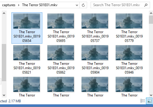
Anyways, when I want to make a gif I start off by capturing screenshots for the frames. I’ve always used GOM Player and their “Burst Capture” option to do this. GOM Player lets you choose the format your images are saved as and where you want the frames saved to. I have a special “captures” folder for temporarily storing the files in. So for example, these are my frames:
A good general tip for making gifs with any software is to use the best quality video you can find. Most of the stuff I make is with 1080p or 720p quality. I find it helps when it comes to colouring and making the gif look clearer.
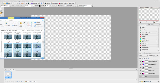
Once I have my captures, I copy them into my animation “canvas” (or SPP file) which has a base colouring I’ve already made on it. It’s kind of like a PSD on Photoshop. I select my captures and drag them onto the canvas which looks like this:
The canvas is 1080p, the same as the captures but everything will be resized later. I originally captured 100 screenshots here, but I’ve decided to use only 40 in the end because I want to make a 540px width gif. If I used all 100 frames for a 540px gif it would end up being way over the 3mb limit and it wouldn’t work on Tumblr.
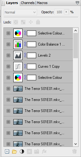
Now this is where the time consuming work comes in for me. Once my captures have been copied into the SPP file, they actually become layers which I have to turn into gif frames (if that makes sense). So at the moment they look like this
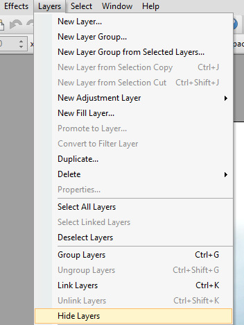
But I don’t have any actual frames yet at the bottom of the screen. So what I do next is go to the layers tab at the top of the screen and click “hide layers”, making them all invisible
Then basically what I do next is create a frame at the bottom and assign an individual capture to it by clicking the little grey square (making it visible again). So as you can see, my first frame is for my first capture/layer. The next frame will be the capture/layer on top of that.

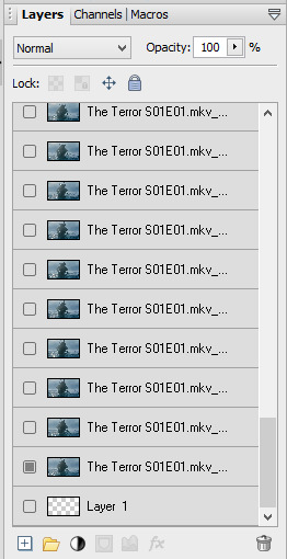
So yeah, that means I create each frame individually. It’s veeery time consuming but you get quicker at it the more you do it (it’s also faster to do on a laptop touch pad rather than a mouse.).
Once I’ve created all my frames, I reselect the colouring layers at the top so they’re visible on every frame. It should look like this

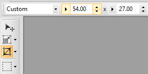
Next, you need to crop your gif and resize it. I want my gif to be 540px by 270px so I put 54.00 and 27.00 into the crop feature to get it accurate. This allows me to crop the canvas into the right dimensions.
Once I’ve cropped the canvas, I then go to the Image tab at the top and click “Image Size…” and set the image size to 540px by 270px. I usually ignore the Print Size bit.

540px is the best size for a full width Tumblr gif, anything bigger or smaller will make your gif look blurry. This gifset is a good guide for making sure Tumblr doesn’t blur or crop your gifs.
My gif is almost ready to be exported. But I want it to look clearer, so I sharpen all the layer/captures (yes, individually again). I have no settings for sharpening, but I find using the standard “Sharpen” effect under the “Effects” tab is enough.
Once I’ve sharpened everything, I get to the colouring and exporting which is the biggest challenge for me. Photoplus’ options for exporting gifs are limited, so the only decent export options are these
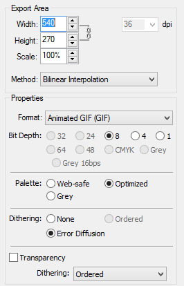
“Web-safe” and “Ordered” makes the gif look like this
“Optimized” and “None” makes it look like this. Okay, but the background looks low quality and patchy

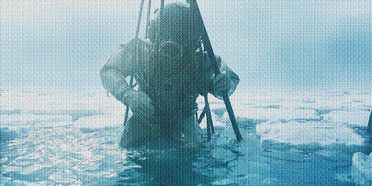
“Optimized” and “Error Diffusion” is the only one that to me, looks the best quality. That’s probably why it produces the bigger file size too (the gif below is 2.78mb)

But there’s other downsides to Error Diffusion which I’m still trying to figure out to this day. Like how it makes parts of the gif “glitch” (that’s the only way I can describe it) or look extra fuzzy. The only way you can fix it is by playing around with the colouring. And by “playing” I mean adjusting and previewing until you want gouge ur eyes out :)
I think that’s why I like giffing The Terror so much, because the film they used has a grainy texture to it, making it easier to hide all my Error Diffusion sins. Though there’s been many times I’ve posted something and hoped no one’s noticed all the mistakes.
Some general tips for colouring
Unless you’re going for a certain effect, emphasise on the colours that are already in the shot. In my gif above for example, I turned up the blues and cyans.
Use Levels or Curves instead of Brightness and Contrast.
Zoom in on your gif to spot any Error Diffusion glitches.
Be mindful about whitewashing POC, especially if you’re following the pastel gif trend.
Look at how other people colour their gifs and use PSDs for reference but don’t rely on them too much.
Colouring can increase or decrease the gif file size. If you need to get below 3mb, try toning down super vibrant colours. If the shot you’re giffing is dark, make it a bit darker. If it’s light, make it a bit lighter.
If all else fails, just make the gif black and white.
Reading all this back makes how I make gifs look like a nightmare lmao. But I’ve been doing it this way since like, 2012 and i love it. I started out making very bad Star Wars and Lady Gaga gifs but as time has gone on and I’ve gotten better, I’ve found I enjoy making things for smaller fandoms much more. I like that if I want a certain set or edit on my blog, I can just go and make it (with varying degrees of success) instead of waiting for someone else to do it.
You appreciate the work that goes into making a movie or show when you make gifs too. Like, you notice subtle little things in the actors performances or something the cinematography is trying to convey. You get to revisit a scene in detail and then share it with everybody else and if you’re lucky, watch them scream in the tags get some nice comments.
There’s lots of other stuff I like about making gifs but I’ve rambled on far too much so I’m just gonna shut up for now. But I think I’ve covered all the important stuff. I don’t know how much of a help I’ve been (there’s still stuff I don’t understand myself) but if there’s anything else you want to know just drop me a message. Good luck with your own gifs!! I’m sure you can do a much better job than me!
#Ask#unspeakablehorror#phew! this is a full on essay i'm sorry#gif making#Serif Photoplus#photoplus#long post
22 notes
·
View notes