#also used some of my custom brushes yayy!
Explore tagged Tumblr posts
Text
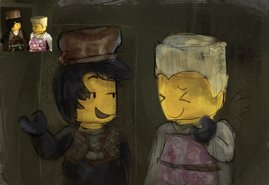
screenshot redraw!! (i do not. remember the context)
#also used some of my custom brushes yayy!#ninjago#ninjago fanart#ninjago cole#ninjago zane#ninjago glacier#glaciershipping#< not rlly intended as ship originally but. what ever !!!#my art
117 notes
·
View notes
Text
TUTORIAL/PROCESS ON..Uh… MY ART!!!
Using this recent drawing as reference!
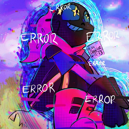
(Blueberror by @loverofpiggies )
OKAY HERE WE GO!
First off, I use procreate, and, surprisingly, NO custom brushes!! Almost all of them are default and you can find just by browsing around. And also, some of the tips are only on procreate, really sorry!! But i bet there are a lot of Ibis, CSP, Ect. equivalents!
BEFORE ART AND.. UHHH STUFF YOURE DOING IN THE BACKGROUND??
Almost ALWAYS when drawing, i have something happening/playing in the background like music, a show/movie that ive watched like a million times (Steven Universe), or maybe even an art stream (jakei my beloved /hj) Honestly anything in the background is nice!
More on that, if you like music, i totally suggest finding mood based playlists that is based on what youre drawing. So if youre drawing just cute fluff then put on something that reflects that!! Does it have any actual effect on the art itself? Probably not!! I just like it a lot LMFAO. You can even find tons of character related playlists on spotify you can listen to!
Also suggest having maybe a small art station somewhere! I personally have a small art area that i set up LITERALLY 2 DAYS AGO and i LOVE IT. Anywhere really works, it can literally be your bed!! I just really like the idea of somewhere dedicated to my hobbies, im a nerd :D
ALSO MAKE SURE TO STAY HYDRATED
I also suggest, especially if you tend to draw for long periods of time, to do hand stretches and stuff. (Above my desk i have a stretching guide thingy by @tizzymcwizzy that i suggest doing before during and after longer sessions)
SKETCHING AND FIRST PART OF THE PROCESS!!
First off, one thing that has always been a huge help has been keeping a sketchbook always to jot down ideas, especially in school when we’re not allowed on any personal electronics. I barely use it now that its summer, but it always has been a huge help keeping one with me almost everywhere i go! Plus, its always a lot of “woah eww” when looking back at old art, its kinda like a little archive!!
BUT THATS NOT WHAT YOURE HERE FOR PROBABLY
The big things youre thinking about when sketching down your ideas is NOT making it perfect. The sketch 99% of the time will look absolutely terrible and thats okay, and honestly preferred! Most of the time nobody will even see it, so dont worry about trying to make it look polished. Youre just trying to put the idea on the canvas, thats all youre focused on! Try to stay loose and simple!
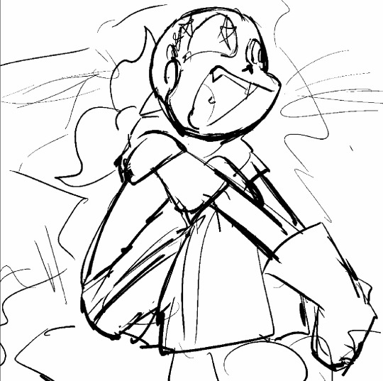
BACKGROUND (sometimes)
Fun fact: I usually go from sketch to background to lineart!
I do this for 2 main reasons: firstly, because doing the background can help establish the mood, and also mainly to help pick the colors later on! Although, a lot of the time i dont even do this lol, only for drawing where theres actually a background (im a fraud)
Also, for backgrounds, especially for things like landscapes, you want to try to work with big shapes to refined details, never just tiny sections at a time!
Heres the original background:
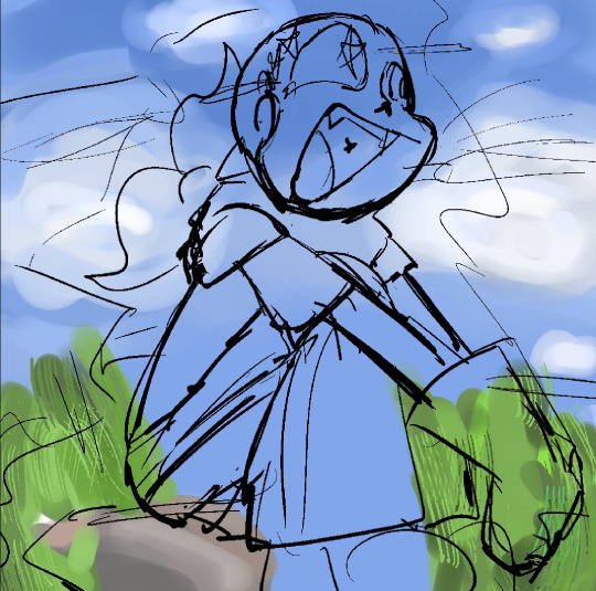
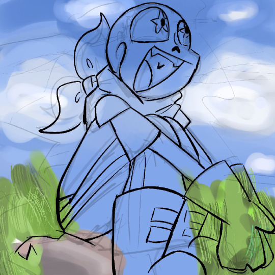
LINEART
Cry. Cry until theres no tomorrow and hope that you make something worthy of looking at /j
OKAY ACTUALLY, HERES WHAT I TEND TO KEEP IN MIND:
Keep most lines in one big stroke, not many tiny ones
On digital, erasing is super easy, feel feee to over shoot your lines and erase back over
For things with more emphasis, make bolder lines, for example, the eyes or hands
If the lineart just isnt working out, feel free to literally just refine the sketch until it looks like lineart (I DO THIS A LOT)
Cry
Thats all I’ve figured out, lineart is still a mystery to me..
BASIC COLORING!! (Yayy coloring the best part)
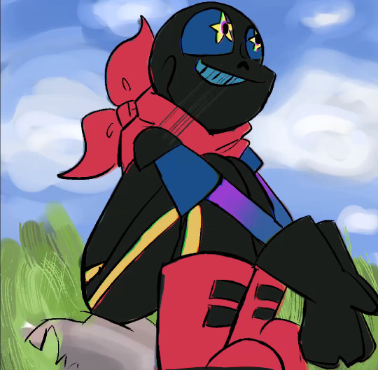
First what i do when putting down basic colors is just try to figure out what would be the best general colors, sometimes you can use those little dots on character sheets and use that to figure out what colors would look best together
Youre not going for perfect and youre just jotting down the colors, keep it messy n stuff, no refined details allowed!
After you finish putting down the colors, your new bestfriend in procreate (idk about other equivalents) is the curves, color balance, and hue saturation and brightness function (found in the second dot on the top row). These let you adjust the colors very easily!! I love them a lot!!!
BASIC SHADING
(Sometimes)
Now, a lot of the time i use the basic Multiply layer method, where i just use a dark purple and set the layer to multiply, but recently ive been doing it a BIITTT differently
Basically, take the base color from the previous step and increase the saturation, and decrease brightness, like this:
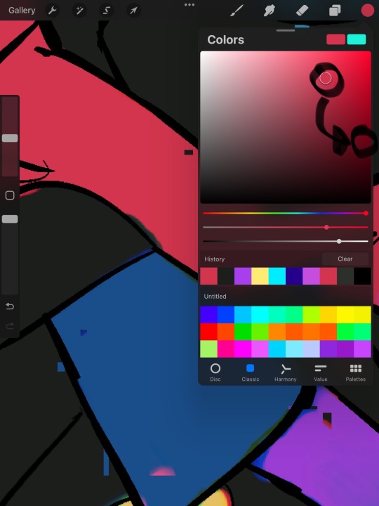
And then, lower the opacity of the brush down to MAYYYBEEE 5%, take that new color that you have, and take the… hue?? Maybe?? Like, blue green purple ect, but keep saturation and brightness mostly the same. Then, layer layer layer with those different colors, or dont! Use funky colors and shading in places where they shouldnt be, make it crazy!! Dont let it make sense!! There are no set rules for this part AT ALL!! Youre just having fun now! >:)
I totally suggest looking at @yo-honne s art for coloring inspiration. I base mine off theirs A LOT.
TEXTURING N STUFF!
Pro tip for this: spiderverse.
OKAY BUT ACTUALLY the spiderverse movies style is INCREDIBLE, i highly suggest just staring at it and taking mental notes on practically everything
For texturing, i tend to go kinda crazy. I like to use the grid and decimals brushes for shading and lighting respectively on procreate
For this part, you can use mostly random colors, and there are literally no rules!! Youre SUPPOSED to make it look crazy!! No rules man! Put it in random places and HAVE FUN! Go fast and try not to think much about what youre doing!! Dont use the right colors EVER!

FINAL DETAILS AND TOUCHUPS
At this part, you marry procreate.
Overlay layers are your best friend, experiment with them A LOT because that REALLY help making your art pop! Especially with overlay gradients
On procreate, theres a thing called chromatic aberration, that can make colors look blurred and glitchy, use that with errored characters! Or dont!
Use halftones feature!!! It really help!! If you wanna do lighting, you can use an airbrush brush and then use the halftones feature, or just use the decimals brush!!
For lighting try to use layers like screen or add! Or dont, make it random colors for lighting! Go and have fun!
On a new layer, set it to something like vivid light, hard light, ect. And use very vibrant colors to go over lines and areas you feel need more emphasis in the artwork!! Especially if, like in this one, the characters colors are so dark you can barely see the lines
Mess with random brushes in your app and use those to your advantage!
Work fast and try not to stress! Take breaks and take care of yourself!

FINAL NOTES
I can not stress enough, EXPERIMENT!! Try to put random elements of art and stepping out of your comfort zone as much as you can! Have fun and go random! (I think thats my new catchphrase)
Reference things if you want to try something new. For a while i thought references really only meant for weird poses, but it can be for anything!! For this one, i literally looked up spider punk spiderverse and used that as reference, and for the background (before i put filters on) i referenced samdoesarts!
If you feel like messing with colors, make the background something random and try to make the character look… well with the background?? Kinda hard to explain lolol
This is a general guide for my art, and i hardly ever even follow it myself. I fluctuate with my art a ton, taking outisde influences to put into the art and never staying with the same thing every time. My art process is wild and random and very much confusing even to me, and i like it that way!
This whole thing ive developed mostly on my own, and by taking tons of inspiration from other art i found appealing! So some of it might literally be wrong!! SORRYY
Would like to note ive never made ANYTHING like this so… sorry if it sucks!!
(((( @overthinkingintrovert-blue ))))
34 notes
·
View notes