#also tested out a new shading/highlighting method and I think I like it
Text
Photoshop, Session 1 - Homework Task

This week we were tasked with taking everything we had learned in our session and applying it ourselves to our own images.
I am quite confident in this task as I have quite a bit of experience in photo editing although, not in Photoshop! So although I am confident I am equally excited to put these new methods to the test!.
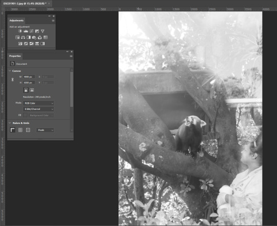
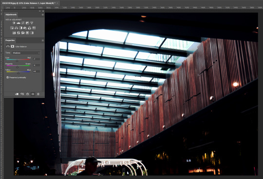
I began with this image that I took recently at Auckland zoo. After converting it from a RAW colour image into a Black and White JPEG, it was time to begin. I chose this image as it was taken through glass which unfortunately resulted in quite a blown-out and over-brightened image which felt like the perfect image to practice using the Curves tool.
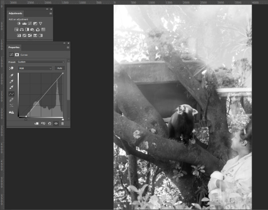
I began by pulling the bottom left node of the Curves Histogram to the right in order to bring more of the darkness into the image and give it more depth/contrast against the hard whites of the glass reflections.

Next, I then placed nodes across the line and first began dragging the light (top right area) parts downward, again, in an attempt to combat the glare coming off of the glass and to try and give more definition of the zoo keeper who was also masked by the glare. moving down the line I continue pulling the nodes downward trying to darken the image while trying to maintain all the information within the image and also tone down the contrast in order to produce a pleasant to-the-eye image. After this I feel I had achieved what I had set out to do, turning the previously harshly bright and almost unreadable image, into a more digestible and crisp image. I feel I were to change anything, I may have maybe brightened it just that wee bit more but even with that in mind, I think I have achieved my goal and have come out with something I am happy with.


Next on my list was also from my recent trip away to Auckland Zoo of an Alligator. I chose this image because unlike the first, there aren't too many defects to fight within it, aside from the water glare, but I'm hoping by using the Curves tool I can bring out more of the white tones while trying to maintain definition under the water while also beefing up the black tones to make a more powerful, textured, contrasted, black and white working.
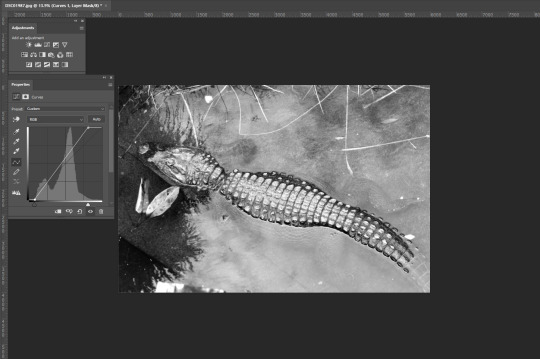
Unlike before, I began by bringing both corners of the histogram closer to where the activity of the histogram was to get a gauge of how these shades were going to cooperate. This produced results very close to what I intended but there are definitely still some issues to iron out. The lighting on the scales of the subject is almost the way I want them to be yet they are just a tad too bright and the details of the subject underwater are not quite as visible as I'd like them to be.
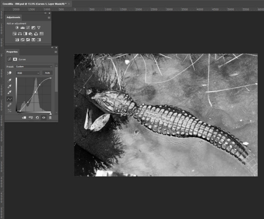
The changes I achieved seem subtle when compared to the previous image but as we were shown during our session, in some cases, just slight adjustments need to be applied to achieve your desired result. I managed to adjust the Curves in a way that I was able to accentuate the submerged parts of the subject adding depth to the image. I was also able to achieve the desired amount of contrast between the lights and darks not just overall but also on the back of my subject. Overall I feel I have achieved my goal.


For this next image, I aim to use both the Curves, Hue/Saturation, and Colour Balance tools in order to breathe more color and life into the image. This image is reminiscent to me of a National Geographic image and I aim to edit it as such.

Beginning with Curves, unlike the Black and White images I was editing, there wasn't too much to do with this tool let alone much I could do as it wasn't very hard to start losing the information within the image. My main goal in using Curves was to bring down the brightness of the sky in the top right corner and bring up the shadows within the image to better highlight my subject matter, some changes may need to be made but for now, I move on to Hue/Saturation.
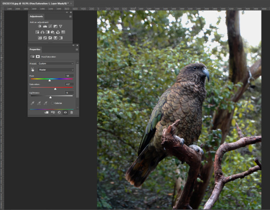
again making very minor adjustments with this tool, by using the Hue slider, I managed to bring out the orange/brown tones on my subject matter and the tree branch it is perched on. I decided to leave it here with this tool for now as any more or any less starts to drastically change the colours across the board leaving me with an undesirable effect. In saying this I think in comparison to the original message, I think I have managed to breathe a bit more colour into the overall image but I'm still not happy with the overall colour. Time for Colour Balance!
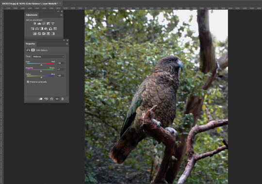
Making small adjustments, I start by tweaking the Mid-tones, moving the sliders into the warmer ends of the spectrum to try and knock out the blue tones within the image. In turn, I ended up adding more colour to my subject which, I this case, I don't seem to mind for the time being given.

the adjustments I made to the Shadows, by accident, returned me with an aesthetic akin to an old colour film still which I found quite pleasurable. Even though I was trying to add more warmth to the image, I am quite pleased with this effect. Typically when I edit my main intention is to get it more to how I would have seen it in person when I took the photo and tend to stay away from stylized editing. This has opened my eyes a little bit and is something I am going to lean into more while editing this image.

And lean in I certainly did. I decided to test the sliders' capabilities and dragged them in multiple different ways, giving me this. While it is now warmer as I originally intended, I feel it still gives off this old colour film still sort of feel which I'm still loving. As unexpected as this outcome has been, I do feel that it is slightly too dramatic for my taste and I will now go back and do some tweaking to try and make a slightly more organic image while attempting to maintain this Film-esque vibe I have created.

after going back through and making some re-adjustments, this is my final result. Funnily enough, it has come out as somewhat of a combination of both of the above images creating a colour contrast between the shadows (blue) and the Highlights (yellow) that I find quite pleasing and fits my intention of the old style, film-esque feel I was inspired to achieve.


moving away from animals, my next image was taken in the New Market Mall in Auckland. I wanted to choose something more environmental and without a main focus point to give me more to account for/be aware of while editing.
right away I know I want to make it more dramatic by accentuating the shadows and highlighting the lights within them. I really like the tone of the image already so colour changes may not need to be made but I'm sure I'll find a way to incorporate it as it may end up adding to my image come the end result.
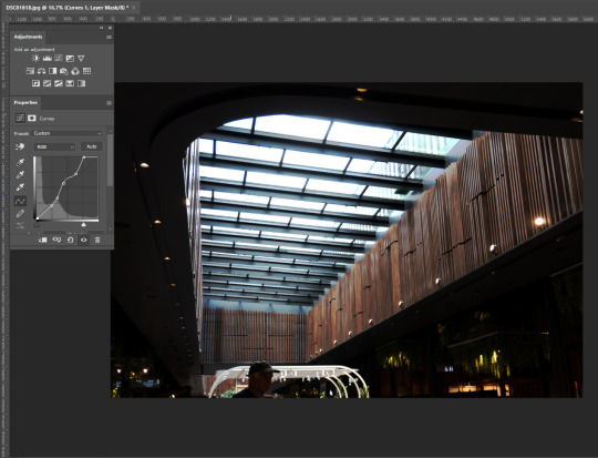
I found curves very useful in this image. Immediately I was able to intensify the light coming through the ceiling creating this great texture and colour I was not anticipating. The lights hidden in the shadows were a bit tricky to work around with curves as it was very tempting to just make it as dark as possible but it made things look and feel quite unnatural.

I pulled up the Exposure tool to balance out the darks and lights in the image by adjusting the Exposure and Gamma Correction sliders which added to the intensity of the blacks and whites within the image. I'm really happy with this image now but as I learned in the previous edit, It's always good to experiment and try everything!
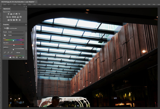
as a result of adjusting the Hue in this image, I managed to bring out more of the colour in the wood and turn the white light from the ceiling into a more of a blue shade which has left me with a colour palette I find quite pleasurable.
adjusting the Shadows in the Colour Balance tool allowed me to creat an overall feeling for the image. By moving the Colour sliders again to the cooler ends of the spectrum, I was met with a cold flow that matched the light coming from above while not disturbing the reds/magentas in the wood paneling.

Adjusting the Highlights within the colour balance tool allowed me to 'purify' the original colour palette i was working with before using this tool. I was able to work more with the reds/magentas making them stand out more through the blues/cyans aswell as make a more natural and more calm blue from the lights above.
This is my final result. I feel that with all the layers used in the editing process, I may have lost a little bit of detail in the overall image yet overall I am pleased with how it has turned out!
I enjoyed this task. Applying what we had learned in class to these images has encouraged me to go a bit more out there with my editing, play with everything and see how it all fits together! Through this, I have made some stylized images I otherwise wouldn't have done using my normal editing process and I look forward to applying this in the future.
In saying that, I can definitely see photoshop becoming a more regular tool in my tool belt. not as a replacement but as an alternative. To give different feelings to images. I did find there were times during this task when I would have found Lightroom more useful But nonetheless, I still find Photoshop I useful asset in Photography.
2 notes
·
View notes
Text
Live-action + Animation: Analysis

The Enchanted Drawing:
The earliest recorded live-action footage featuring animation was The Enchanted Drawing, in which the idea that that frames painted on the using a sped-up technique that we now know as a time-lapse created the illusion of movement, which was almost magical and enchanted, hence the name.
What this immediately forces me to think of is the disparity between showing the process of animating within the animation (the man drawing the frames) and only showing the animation itself, there's a certain degree of experimentation that can be had by pulling back the curtain. In the times when this was created, this was a new concept and the rules were not yet established enough to break, but nowadays a technique like this could be explore to convey a certain feel within a production.

Animator Vs Animation:
In the early days of video sharing, an animator by the name of Alan Becker pioneered a trend of animations that utilized compositing as a means to show a stick-figure character breaking the bonds of the animation software it was in and seemingly “coming to life” as a drawing, this series was known as Animator vs Animation and was a fond part of my childhood.
The process of which it took to make this involves taking the program that the drawings are made upon, and using it as a backdrop, while also cutting out and manipulating elements of it so it seems as though the character is interacting with the environment. I could take this into my own work by having a character of some kind break out of the animation software and into someplace else, and maybe break down the techniques Alan Becker used by attempting them for myself in animation tests.
Who Framed Rodger Rabbit:

Another facet of combining drawn and real life footage into the same composite is the lighting, shown here by this frame from Who Framed Rodger Rabbit. The highlights and shadow cell shading is done with the lighting of the actual scene in mind, and that is what I believe creates a convincing atmosphere where the cartoon characters seem to be present. The two characters look like they’re part of the same world, despite being so different from one another.
With this in mind the character that I will ensure any drawn characters/assets and live action footage is correctly merged, so that the lighting looks the same. I also think I may use this traditional cartoony method of cell shading as it very much lends itself to my own personal style.
The Lego Movie:

The majority of this movie is in stop motion, with a brief moment where the film plays around with the concept of having the main character break the fourth wall, but still stay within the confines of the diegesis in a very similar way that Animator vs Animation does, once the character breaks that fourth wall that narrative is then contained within another wall. It does this by including stop motion elements from the rest of the film and incorporating them into a live-action scene where the character is depicted interacting Will Farrell playing The Man Upstairs. In that aspect I suppose this film fuses ideas from both Who Framed Rodger Rabbit and Animator vs Animation, and is a prime example of how different film-makers can defy conventions to mess with the audience or create a certain feeling/effect.
Summary:
I conclusion, I feel that a project that explores breaking the fourth-wall with drawn and live-action elements is what I’d like to pursue, following the brief this means I need to figure out the following:
- Invent a concept within the technical confines of brief
- Pick a filming location
- Figure out how and where to add a tracked shot and at least one moving shot
1 note
·
View note
Note
Hello wonderful!! I was wondering if you would write a small story about one of our bois with a writer s/o and our boy will sometimes test out a murder scene to confirm for their s/o's novel. Kinda like the post I found forever ago about a writer dating a murderer.... Sorry if I didn't word this well if you want I can send you a pic of the post. Thank you!!!
[I was so tempted to do Hannibal for this because I’m like? In a huge Hannibal mood but I also thought Michael Myers would be good for it so GUESS WHAT YOU GOT BOTH]
MICHAEL MYERS:
Michael gazed over your shoulder at the words forming their way onto your computer screen, his presence making you crane your head backwards to look at him. The glow of the screen made the white of his mask turn almost blue under its off-shaded lighting. Half of it was pulled up, a spoon placed awkwardly in his mouth, likely having some sort of chili or soup you had prepared in the Myers household the previous night on its end, being sucked off and away down his gullet. He tilted his head at the words and pointed at the screen in wonder. You understood the implication.
“I told you about my novel, right? This is just a murder scene I wanted to test out. It’s one of the main murders the detective commits, and he has to understand how he did it from an external perspective just as much as an internal one. It’s a complex emotion for him.”
As an offering you tilt the screen closer to Michael’s eyes as he lowers his mask fully over his face, having taken the spoon from his lips and was now holding it in a hand as his gaze read each word carefully through the mask.
The room was silent for a moment, the only noise the rain outside of the home as he read through each word, tilting his head here and there to indicate his understanding of each phrase used. Of each letter crafted by your hand.
And then his own hand reached around, fingers hitting the up and down keys to navigate on a specific part in the scene, only to hit the backspace button with an intensity you’ve never seen from him outside of his killings. The protest that welled in the base of your throat died as quickly as it came when you watched him hit the letter keys after backspacing what he determined was far enough. He crafted a new paragraph in its wake, similar to the one you had made but with something much more…sinister in its lettering. More blunt and real in its echo from canvas to view. His words burned with raw understanding. Sweet practice. Methodical enjoyment as the scene unwound before your very eyes, almost just as you wanted it to.
“This is amazing, Michael!” You gasped, turning around to kiss his cheek with a laugh, “Thanks for your help, I’ll work from this. Would you mind proofreading my other scenes too? You should beta read my whole novel!”
You couldn’t see the blush under his mask, but, you could feel it radiating from him as he nodded, leaning into your touch with pride as you held him close, eyes taking in the captivating words he had given you on the screen. You would have to make him write more often, he seemed quite good at it.
HANNIBAL LECTER:
Hannibal knew that you were coming towards his office before you even knocked. The scent of your perfume gave you away down the hall, the familiar and warm flavoring of it a comfort to him. He had picked that perfume out for you, after all, and seeing that you wore it so straight forward on your sleeves gave him nothing but the strongest sense of pride somewhere deep in the cavern of his heart. He still politely waited a few seconds (one...two...three-) before offering you verbal permission to enter his study.
Glasses were still on his nose, tilted down so that he could look over them and out at you with a quirk of his eyebrow. You shyly hid behind your manuscript, flipping the edges of unbound pages as you tried to find somewhere to look. Anywhere but his eyes, but, his piercing maroon gaze held you in place as it always seemed to do.
“And what do you have there, pet?”
You shuddered at the nickname before shyly handing it over before mumbling: “Manuscript to a novel I’m writing. I was hoping you could...view some of the more murderous materials and see if it was probably or...accurate.”
“From a purely psychological standpoint, I assume,” Hannibal’s voice was laced with amusement both at your nervousness and the way he was able to play with you like this, cordial and easy as you laughed.
“Purely psychological, sure.”
Adjusting his reading glasses, Hannibal got to work, reviewing page upon page of the word before him. You sat in the seat in front of his desk, fidgeting as he gazed over each page, his eyes sometimes casting glances up at you before returning to its read. At last, after what felt like hours, he pulled a highlighter from one of the neatly organized drawers in his desk and put the manuscript down, highlighting over a page of a particular gruesome murder scene.
“The way this is described doesn’t provide enough attention. The reader will see it as...trivial. Obvious,” He hummed his polite critique to you as he tapped the highlighter to the paper, “When writing, you want to give your readers the sense of apathy. To the average human, any form of unremorseful kill is truly the most terrifying. Along with the aftermath of the bodies, of course.”
“And how do you think I should have my protagonist handle getting rid of these bodies, Doctor Lecter?”
He smiled up at you, his canines glimmering in the lamplight.
“Let me show you just what I mean. Fancy dinner with me tonight, Y/N?”
#pale-butterfly#ask#asks#hannibal lecter#hannibal lecter x reader#hannibal lecter imagine#hannibal#michael myers x reader#michael myers#michael myers imagine#halloween
381 notes
·
View notes
Text
Learn Log #5 - Sandy Shores

Before I begin with this post, I just want to say a quick thank you for all the support on the last learn log. I didn’t expect to get to 10 notes let alone over 100 so it was a really exciting and pleasant surprise. I got some nice comments too which I really appreciate. Thank you, everyone.
On my 5th week learning pixel art, I learnt how to make sand tiles, water tiles and rocks. I actually made this piece with 32x32 tiles instead of my typical 16x16 which was an interesting challenge but I enjoyed working with and learning from it.
Sand
When I started with the sand I, of course, started with my typical 16x16 tile size. I made a shoreline tile which had mounds of sand pushed back by the ocean’s waves which are shown below.

Making sand tiles, I soon realised, was going to be trickier than making grass tiles. I mentioned last week that with grass and similar environments you can make multiple small tiles and then place them in a scene in a variety of ways. However, with textures like stone, sand and water the design or condition of a tile should realistically have some impact on neighbouring tiles. As such one tile’s design might be repeated across the entire environment. Some pixel art software allows a tiled view so you can design the tile ensuring tiles connect and aren’t repetitive – unfortunately the software I use does not have this view. Therefore, I did a similar testing method to the grass last week where I copy+paste the tile across a larger canvas.
You can clearly see that this 16x16 tile forces mounds to be a bit to round and close together. This is when I decided to make the shift to 32x32 for this piece.

Above is my first 32x32 shoreline tile. You can see the larger size allows the mounds to space out a bit more and stretch so the mounds don’t feel as large or round. The two lines pointing into the mound are present to provide some sense of depth going into the mound. I decided to test it out and see how it looked.

This test looked a lot better, so I was satisfied with the design. Within the test, you can see it is quite repetitive. This is partially because the tile doesn’t do well with vertical repetition - making repetition more apparent. Additionally, I think the repetition might be a little less obvious when wedged between wave and beach textures. You might also notice the mounds are now slightly separated. This is because the mound has reached level ground and thus a hump would not be visible. The disconnection between mounds makes the tiles a bit less man-made, thus, a bit more natural. I decided to make a few final modifications on the shore tiles and finish it up.
You can see here I added a highlight to the tops of the mound and darkened the first mound. The highlight is there to emphasise that the mound is sticking out and thus hitting more light while the darker colours were simply added as that sand will be freshly wet. I decided to add these tiles into a larger canvas to separate the water and the beach.

I added a blue background just to have a representation of water within the scene. Next, I needed a separate texture for the beach and tiles to connect the shoreline diagonally.
I wanted a separate texture for the beach because: A) the shoreline tile did not do well repeating vertically, and, B) the shoreline and the beaches of a coast look quite different. Obviously, if I made a pattern of mounds going horizontally or vertically like the shorelines I would run into issue A quite quickly so I decided to make mounds moving diagonally.

I made this beach tile using the colours of the final shore tile. I simply drew some squiggly lines diagonally with my mouse, removed the doubles from these lines and made sure the lines connected. I then used the same testing method as before to test the repetition of the tile.

This test is a mess. Some of the lines don’t connect and the mounds don’t feel smooth, rather, they feel choppy. Don’t worry, this is bound to happen if you use a mouse and maybe even if you use a drawing tablet and pen. So, I used this test to smooth out and fix up the lines as shown below.

Ahhh much better! The mounds look much nicer now. The texture looks a bit repetitive but not significantly so. The next step was to just add some more details now that I was happy with the pattern.

I added some highlights to and disconnected the mounds like the shoreline. This did increase how repetitive the tile looked but I did feel as if it was worth it as the change adding more depth to the texture.

I added in the beach textures and then fixed up the diagonal shorelines. The diagonals were canvas adjustments rather than individual tiles which of course wouldn’t work in a game engine like Unity, however, I’m sure I could make tiles of these diagonals once I created them in the canvas. Overall, I’m pretty happy with the beach so far. It’s a bit blocky right now but that might change once I add the water.
Water
I wanted the water in this piece to have a tropical island feel to it. I used the blue water texture I had picked and a white colour to draft a pattern I was happy with.
I felt this tile had a similar pattern to pictures of tropical beaches I’d seen online so I decided to go with it.
The test shows that this pattern is really repetitive due to the large square in the centre of the tile. This was pretty concerning; however, I wasn’t sure how I could really fix it up without starting the tile over. Sometimes you’ve just gotta let stuff go, so that’s what I did. I hoped that a few small adjustments would decrease the repetition of the tile.
I changed the white lines into two shades of light blue. This would hopefully make the lines less contrasted and the repetition less noticeable. I used two shades of blue to somewhat portray water that was dynamic in some sense, because of bubbles or the flow of water. This two-tone approach wouldn’t really affect the repetition.
I then added the same set of lines in a darker tone. I think water should have both highlights and shadows. It adds a bit more detail and even depth into the texture. This would hopefully also reduce repetition, but I wasn’t so sure.
Finally, I cut the lines similar to the sand. It’s unnaturally for all the water to be directly connected and it definitely emphasises that it’s a man-made repeating pattern.
I think this new tile looked a lot better. Particularly because of the change from the white colour which contrasted far too strongly. There is still noticeable repetition, however, I was happy enough with this tile to move onto the waves.

The waves were easy enough. The wave should approximately match the shore’s sand mounds because the mounds were created by the waves. I used this pattern up the top with a very light, almost white, blue to represent the crashing ocean foam. I used some dithering into the standard ocean colour to create the foaminess. At the top, I just added the wet sand colour because the waves were not covering that area. I continued the ocean tile pattern into the waves a bit just to make sure there wasn’t some strange abrupt stop into plain blue.
Once the ocean wand wave tiles were done, I added them into the scene.

Of course, the first thing you notice in this picture is the missing diagonal waves, however, you also notice the strange stillness in the wave tiles. Its strange that the pattern continues unaffected like that when the waves are colliding with the shoreline. Additionally, there is a significant lack of depth in the image.

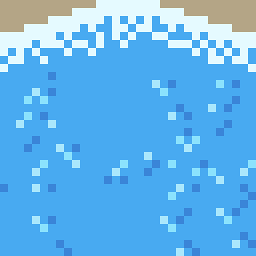
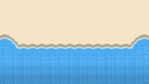
Here’s a fixed version of the beach. You can see I added the diagonal waves and changed the wave tiles so that the pattern is scattered due to the crash. The new wave tile means that while the pattern doesn’t stop abruptly, the water doesn’t seem still and lifeless. I darkened the two back lines of tiles to show that the water is getting deeper. Next, I needed to add a bit of variety into the beach.
Rocks
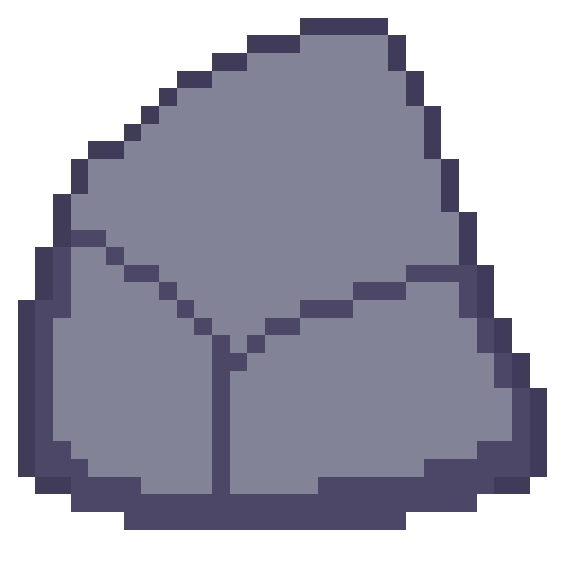
The first stage in making the rocks for the beach was drawing an outline of the rock with a few segments to show off either cracks in the rocks or the shape of the rock. Rocks aren’t perfectly smooth or round so you have to make rocks with that in mind.

Next is to add some shading to the rock with highlights and shadows. Removing dark outlines and replacing them with shadows is a good idea as it feels more natural rather than drawn.

Like I just mentioned, rocks aren’t perfectly formed, and their shading should reflect that. I used dithering to add some texture to my rocks and added some small cracks and divots with darker pixels invading the space of lighter pixels.

I made another two rocks and spread them through the scene. Rocks on the beach were given a small shadow and rocks in the water were given a water collision line so that they felt like part of the scene. I was happy with the rocks, but the beach could still do with a bit of life.
Crabs/Conclusion
Anyone else think crabs are pretty cute? Snip snip. I didn’t do touch-ups on this piece, but I did add crabs! I feel like they finish up the scene nicely.
I’m fairly happy with this week’s piece. Practicing dithering was quite fun. The textures are a bit repetitive and that is definitely something I’m going to have to think about going forward – different methods of reducing repetition in certain tiles. Additionally, I did a lot of modifications within the canvas rather than building the scene tile by tile. While making this piece did give me a lot of practice, I won’t be able to make pixel adjustments in a level. I’ll need to develop an understanding of what I exactly need for a level and then make tiles for my needs. Overall, while I enjoy looking at this piece it has given me some food for thought about how I’m going to build my levels and create the art required for that task.
That concludes this week’s learn log. Next time I’m going to be tackling a bigger task – learning how to make houses, furniture, snow, stone and man-made textures. This might mean I skip a week of posting or split the piece across two posts as I’ll be making both the interior and exterior of a cozy cabin on a snowy mountain.
My learning and this blog post wouldn’t have been made possible without these fantastic resources. Go check them out if you wanna learn some stuff about pixel art!
How to Pixel Art Sand by TutsByKai
Pixel Art 101: Water by Pixel Pete
How to Animate Water by TutsByKai
[Let’s Pixel] Water Tiles by HeartBeast
Pixel Art 101: Rocks by Pixel Pete
[Let’s Pixel] Boulder by HeartBeast
[Let’s Pixel] Lava Rock by HeartBeast
12 notes
·
View notes
Text
For Science 4/7
Grouping: Reader x Nerd!Jungkook
Word Count: 9.6k (im sorry its so long!!)
Warnings/Themes: definitely probably nsfw but purposefully not that many again. drunk jungkook being angry and then clingy, idiot kook, making out? ANGST?? Hoseok being the slimiest being on the face of the earth,
Summary: Jungkook asks you to let him watch you get off. For science.
A/N: I would like to thank @b-angst-tan for beta reading this series as it is so far. I also would like to tag @m-icdrop , @jiminslye & @ephemeral-mindset to let you know that i finally got my shit together and posted lmao. hopefully i didnt leave anyone out who wanted to be tagged. if i did im very sorry and if you want to be tagged for subsequent posts, just DM me and let me know :)
part 1, part 2, part 3, part 5, part 6, part 7

You wonder if maybe you should have chosen something more weather appropriate as the chill of the still early air nips at your stockinged ankles. It was a hard choice: The fleece-lined sweatpants with the dried tide pod stuck at the hip or something cute and feminine so you could play catch-up with whatever nice thing Yoori was wearing. The sight of Yoori in a slightly similar outfit of an elegant pea coat and demure pleated skirt convinces you that you made the right decision. But while your anxiety about picking the right clothes wanes, a sudden wave of exhaustion hits you. Normally you would be able to rest on a Saturday after 90 minutes of contorting yourself into endurance-testing positions, but today you had no time to untangle mentally—only physically—as you rushed through a shower to give yourself enough time to run to your apartment to grab a change of clothes.
Yoori looks up from her phone and sees you approaching her where she stands by a Starbuck’s storefront. A large grin splits her face, revealing a pair of adorable dimples on each cheek. You’re not expecting her to shove her phone into her coat pocket so she can run over to you and crush you in her arms.
“Hi, how are you!”
“Oh, uh, I’m good. How are you settling in?” Her grasp is fairly constricting , but you try not to appear shaken as you spit her hair out your mouth.
“I’m doing fine. I leased my apartment while I was away so, I’m still at the hotel until that contract ends. But that’s only for a few more weeks. After that I’ll move back in and really be at home. You smell lovely by the way. What scent is that?”
“Thanks,” you blink, “It’s just soap.”
“Mm, what kind of soap?”
“The dollar store kind.” She nods with a smile. “Um, where are we going?”
“Just to this little place up on Main Street. It’s called La Lune, have you heard of it?”
“Of course I have. They’re notorious for only ever being un-booked twice a year! And even then it’s just because they’re taking breaks so the owner can fly to her house in Paris.”
Yoori plays with the sleeve of her coat. “I suppose it does have a bit of a reputation. I must have just gotten lucky with their date book.”
“Don’t you need an appointment to get in?”
“Yes,” Yoori trails off.
“Will we be able to even get in? I-I didn’t call ahead to make a reservation since you said you’d take care of the plans for today.”
“They said they have an extra spot open for us today since they’re training a new technician.”
You don’t push because you know what they say about looking gift horses in the mouth. But you can’t help but wonder how you could have gotten so lucky on your first attempt to get seen at the nail shop. Any suspicion you have about Yoori’s methods of getting onto the appointment book evaporates when you step foot into the shop.
From looking at the pictures of the interior that you could find on Google images, you know that the design is based off of a bunch of spas that the owner herself went to during her many travels to Europe. All the décor is a novel twist of organic meets minimal with polished woods and metals and clean, sloping lines all existing harmoniously. You sit down in a plush chair in the waiting area while Yoori chats enthusiastically with the woman sitting behind the front desk. She does a little spin for her as they most likely talk about how much prettier she looks since the last time she came to the shop.
After confirming the appointment, Yoori makes her way over and sits next to you. She leans over the arm of her chair to peer over your shoulder at the vials of designer nail polish in your hands.
“Do you know what color you’re going to get?”
“Not yet. I usually just do black since it doesn’t clash and it doesn’t make my fingers look as stumpy”
“What are you talking about? Your hands are precious.” She reaches over to bring one up to inspect. “You have such a nice natural nailbed color. A nude would be perfect.”
“You don’t have to flatter me, I know what my hands are like. We can’t all have perfect OPI model hands, Yoori.”
She grins at your indirect compliment. “You think they’re perfect?”
“It doesn’t matter what I think. Some things are just objective facts.” She’s quiet for a bit, a small expression on her face as she looks at you carefully.
“I think this shade would look good on you”, she picks out a specific soft shade that highlights that mimics that pink tone of your nails. “Plus, its suitable for the winter and spring. So, you could wear it for a while.”
“It’s really pretty. Thanks.”
“I could buy it for you. If you like.”
“Oh, no, I couldn’t ask you to do that, you’re already doing so much for me today as is. I—“
“Too late.” She swipes the bottle out of your hand and gets up to go pay.
The guilt is too much for you to sit back and let it happen, so you launch yourself out of the chair and rush past her to the front desk, debit card out and ready.
“I’d like the buy the shade that Yoori has in her hand, please. Thank you.”
Her eyes are wide, but she doesn’t argue, and lets you buy the shade. You give her a pat on the arm and accept the tiny satin drawstring gift bag and try not to think about the chunk of money that just left your account.
You can only assume the rest of the nail appointment is nice but you can’t know for sure. You do know that you must have enjoyed yourself because you promptly fall asleep two minutes into the hot rock hand massage that comes with every booking. Yoori snapped a quick picture of your lax dreaming face and woke you up when the technician asked her what shape you wanted your nails. Leaving the salon finds you refreshed and with a beautiful manicure.
“Feeling hungry yet,” Yoori asks after she catches you staring wistfully at a random pedestrian with a bagel. “There’s still time for it to be brunch at the place I was talking about.”
“Yeah. It’s just too bad my nails are all nice now,” you joke. “Saturday mornings are for ribs at my house.”
“Oh, I’m so sorry, I didn’t know. They don’t have ribs on their brunch menu, I don’t think. Do you want ribs? I can check and see if there are any barbecue places that are open for lunch.” She fumbles for her phone and types frantically like she didn’t just get a hundred-dollar manicure.
“Yoori, Yoori, hold on! I was just kidding. There’s no way in hell I’m messing these nails up. I’m almost considering just drinking water for lunch so I don’t have to use my hands.”
“Wow, you…really got me.” She lets out a breath of relief before side-eyeing you. “Are you sure you don’t want ribs?”
“Positive.”
“Good,” she chuckles.
The two of you make small talk about what brought each of you to engineering as you take walking directions from Yoori’s phone. The walk ends at a pretty looking place with a yet another French sounding name. It’s filled to the brim with fresh flowers, giving the air a sweet scent that has your mouth watering even more. You take a chance and allow Yoori to order for you, trying not to be suspicious of the strange cheese dish she orders as an appetizer.
“—And that’s how we met Tae. We didn’t meet Hoseok until about a month later when he spilled his drink on me in line for the comic book signing at the campus bookshop that one year.”
“I think I remember that day, actually,” Yoori blinks up as if sifting through the memory in mid-air.
“Oh! Did you go? I feel like I would have noticed another girl there. I think I could count all of us there on one hand.”
“No, I wasn’t there. I’m not a comic book person actually. I just remember seeing all the people coming back in cosplay. There was actually this one really beautiful green elf costume I saw on my way to class. There were lights woven into the fabric and everything—I almost took a photo.”
Your cheeks heat up and you duck your head to take a sip of your extremely expensive blood orange mimosa. “That was actually me.”
“Was it really? Did you make it yourself?”
“No—well, yeah, I did the bulk. But Jungkook helped me a lot and Tae helped me find the materials.”
“And Hoseok?”
“Hoseok scratched his ass and watched.”
“Wow, I can’t believe that was you. It’s like destiny. We must have been meant to meet,” she lays a hand next to yours. You can’t help but notice how well the color of her pastel nails goes with your nude.
“Yeah, I suppose so. But enough about me, I feel like I’ve just been blabbering on and on about my friends.”
“No, I love hearing about them. I always envy people with lots of stories to tell about their friends. I feel like I have to ask,” she trails off, a shy smile splitting her face. “What’s it like being the only girl in that friend group?”
“It’s…only mildly frustrating,” you say with a laugh as your food arrives. It smells wonderful and given the amount of truffle shavings, you’re glad you chose to come here on a day that you weren’t paying.
“How so?”
“I mean, you know how guys are and you know how STEM guys are. Add to that the fact that they aren’t getting laid and you have a very interesting strain of emotional constipation.” Yoori nods along understandingly. “And let’s not forget all the stupid questions they ask me since they can’t ask any other woman.”
“That sounds like it might be frustrating.” You chuckle at her diplomatic tone.
“I mean it is, but they’re nicer than most guys and they mean well.”
The sly smile appears again and she leans forward to create a bubble of privacy.
“Nothing more than platonic has ever happened between you and one of them?”
Thankfully, a waiter rushes by and bumps the table a little and you can use that as an excuse for suddenly choking on your food. You certainly weren’t expecting her to inquire about your sex life so early into the conversation, and the irony of the situation isn’t lost on you. Of course, the apple of Jungkook’s eye would ask you about which of your guy friends you’ve ever screwed around with.
You blot at your face with a cloth napkin. Luckily for you, the way you look when you’ve narrowly avoided asphyxiation and when you’re concealing guilt is very similar. “Oh my god, please. I’m trying to enjoy this food, not regurgitate it. But to answer your question, no. They’re not my type. They’re too…” you make some abstract gesture in the air with your fork and Yoori nods.
“What about Jungkook, then? Surely, he’s decent otherwise I’m sure you would have warned me by now.”
“No, he’s nice. He’s a little out of it sometimes, but that’s always been his thing, you know? But he’s really kind and warm and funny in his own way. Plus, he’s in love with you so I don’t think you have to worry about him doing the man-child thing too much.”
Yoori blushes and shifts in her seat, looking a little uncomfortable. “Yes, I figured as much.”
“Can I ask what took so long for you two to finally meet up? I just—I know he’s been contacting you for a while now.”
“It’s complicated,” she sighs.
“I can keep up.”
“You could say I’ve just always been very wary of the men in our department. They’re not your average guys, but they’re still men. They still want the same things from you. And,” she looks away from you to continue. “I wasn’t sure if Jungkook was that way as well. So, I kept my distance. This must seem pretty suspect to you. Especially since it happened after he got put on the department website. I’ve heard what some people have been saying.”
Your hands fly out to console her. “Oh my god, of course not. That makes total sense. You’re not obligated to entertain everyone who expresses interest in you. I get it.”
“Oh, gosh, I feel so bad.” She hangs her head in her hands and you watch helplessly as her hair nearly falls into her water glass. When you inquire why, she shakes her head with guilt. “Jungkook never outright expressed an interest in dating until a few weeks ago. All the times before that, he’d been a perfect gentleman via text. But it was the way he would stare at me in public with those…those moonpie eyes!”
“He does look like that sometimes. Especially with those glasses.” She points at you like you’ve hit the nail on the head.
After doing a cursory look around the restaurant to make sure no one around will be able to hear her confession, she elaborates. “It was just so obvious how he felt and I was so used to guys feigning wanting to be platonic friends only to corner me in the parking lot after what was supposed to be a friendly dinner out. I-I couldn’t trust him. But then I heard that you were friends with him and I decided I would give it a chance.”
“Why would you trust him just because of me?”
“I have my reasons. And I just figured if you were willing to be friends with him, he might not be so bad. Plus, my mom has been pestering me about getting married and I wanted to get her off my back.”
“Well, I’m glad you’re giving him a chance. It means the world to him and he can finally stop pining silently. When is your first date,” you ask neutrally. Although you know that as soon as you get a date, you’ll have to terminate your weekends with Jungkook.
“Oh well we haven’t really discussed anything like that. I think he might ask about it soon, though. I’ll keep you posted.” The little eye roll and laugh she lets out breaks the heavy mood and you try to steer the conversation in a lighter direction.
“Tell me about your friends, Yoori.”
“Me? Well, I probably don’t have as much to say as you do. Most of my friends have long since finished the program and I’ve been so busy with my dissertation that I just don’t have as much time as I used to for hanging out and stuff like that.”
“I thought you were friends with Sunyoung. The bio double major? Jungkook said you were pretty close.”
“Well, he’s right. At first, we were. She’s been really busy ever since she got engaged, so,” she trails off.
“To that Jaehyun guy, right? But, wait,” you drop your fork as the details fall into place. “Weren’t you guys all friends? And didn’t they get married like half a year ago?” Your heart breaks when you realize Yoori may have been alone for at least 6 months while working.
“I could tell I was making things difficult by third wheeling, so Sunyoung suggested I give them some space.”
You were pretty certain you saw Sunyoung and Jaehyun hanging out with a few of the other women in the engineering building on the regular when you went to print things for class using the department printer. Even with her indirect language, it’s pretty clear what happened between Yoori and her friend and you don’t push. Though you do feel bad for the animosity you felt towards her when she first introduced herself.
“Well, I’m glad we met. It’s nice to finally have a new girlfriend,” you say. She looks up at you with slightly dim eyes but perks up when you lace your fingers together briefly.
The smile she gives you is brilliant and infectious. “Me too. So much,” she says quietly.

When brunch ends, Yoori suggests continuing your stroll so you can walk off the post-food sleepiness. The weather is a bit brisk and there are unanswered texts from Jungkook on your phone, but you don’t say no and keep the notifications unread. Something about the fact that you’re in the shopping district with a pretty manicure and your pretty friend makes you feel good. Good in a way that you haven’t felt in a really long time.
You link arms and window shop for hours, though it doesn’t feel like it. She pulls you into store after store because she saw something that she thought would look ‘splendid’ on you. Somehow you manage to look past her imploring eyes and put the designer garments back on the rack, but not until after she’s made you try them on and spin around in them so she can sing your praises. While you browse each shop, you make comments about the other shoppers or the items that make her dissolve into giggles or make her cheeks flare up with a warm blush and a gaping, incredulous smile. By the time you finally part ways, you almost don’t want to get into the cab she’s called for you, but your feet are aching and the sun is starting to set. She blows you a theatrical air kiss and makes a surprisingly dorky ‘call me’ gesture with her hand that has you covering your face so she can’t see how hard you’re smiling. When you step out to face Jungkook’s building, the mood of the day’s outing lingers on you like a perfume. Or maybe it’s a halo. Either way, Jungkook notices something about you is slightly different when you finally arrive at his doorstep.
“Hey,” you greet him without looking and instead focus on getting your feet out of the little heeled booties you’d been wearing for so long.
“You changed?” His voice is muffled from where he lays with his cheek smushed into the sofa. The xbox controller in his hand dangles as he takes in your appearance. “When did you do that?”
“I went back to my house after yoga. I couldn’t go meet her in a rank t-shirt and the sweats that I slept in.”
When he doesn’t say anything, you turn to see why he’s so silent. One look at the handful of empty beer bottles sitting neatly by the floor by his feet lets you know what the deal is.
“You been drinking, Jeon?” Jungkook when he’s drunk is quite the handful, but the owlish way he blinks at everything when there’s liquor in his system is almost funny enough to make the rest of his drunk antics worth it.
“Yep,” he hiccups. He tries to shoot finger guns at you but almost ends up flipping you the bird.
It draws a string of giggles out of you. He squints and takes in your frizz free hair, your glowy skin, your nice blouse and skirt, the easy way you walk over to the couch to sit by him. His stare is tangible.
“What?”
“You’re really pretty,” he rasps and his hand reaches out without his permission to trace the swell of your cheek.
His comment takes you by surprise and you can only laugh awkwardly and lean out of his reach, unsure of what to do with such a blatant compliment.
“Wow, I spend one afternoon with Yoori and you’re calling me pretty? She must have rubbed off on me real good.” You take the controller out of his hands to un-pause the game of Zelda he was playing.
“S’not cause of her. ‘S cause you’re not hiding,” he mumbles before picking up the other controller that was laying off to the side. His comment doesn’t reach your ears which he’s secretly glad for. “You want a beer?”
“Sure.”
He reaches over the arm of the couch to fish out one of the leftover full bottles and hands it to you. He doesn’t say anything while he watches you chug half of it, meanwhile nudging the inside of his cheek with his tongue. A classic sulking Jungkook pose.
“Oh my god, what? Are you mad I got to spend the day with her and you didn’t?”
He blinks, surprised, when he realizes that he’s actually not mad about that. Rather he’s mad you spent so little of the precious Saturday with him, though it wasn’t clear at first. To think that he’s jealous of Yoori is funny enough to break him of his brief pouting session.
“Yeah,” he fibs, “but it’s fine.” He scoots clumsily nearer next to you. “You’re here now and there’s still the rest of the weekend.”
“That’s true. But I don’t want to play Zelda. Let’s do Mario Kart?”
“Loser each round has to take a shot and winner picks the next course?” He’s already stumbling his way back to the kitchen to pull the tequila bottle someone left in his fridge a while back and a pair of plastic shot glasses.
“Is there any other way?”
It takes three rounds, the first two of which are Rainbow Road, but you quickly catch up to him in terms of tipsiness level. Your whole body feels like its vibrating, and the tequila makes it seem like your blood is carbonated. Like you could float away at any moment. By a streak of luck and then redirecting to Bowser’s castle, you manage to get in the winning position. You’re on a roll and get cocky enough to start gloating, egging Jungkook’s underlying competitive nature on.
“Shit,” he curses under his breath as you cross the finish line 9 seconds before him. His stomach feels sloshy after four shots and the bottles of beer he downed earlier. You slam down his, now full, shot glass in front of him, spilling some of the clear liquid onto the table.
“That’s like, what, your fourth one? No, wait, it’s your fifth one. My bad.” You stick out your tongue as you perch next to him, pressing yourself to his back and reveling in the way he grimaces at the shot. “If I had known you would make the game so easy, I would have stayed out with Yoori.”
You’re so busy teasing him about his slow gaming reflexes that you don’t notice the way his smile twitches after he downs the drink. He moves uncharacteristically fast and all you can do is sit there as he tosses the tiny plastic cup to side and then turns to lunge at you. Your back hits the couch cushion with a soft thud and your breath leaves you in a whoosh. If it had just been him caging you into the couch because he was fed up with your taunting, it would be fine. But the moment his fingertips dig into your sides, you lose it and start thrashing.
Jungkook knows better than anyone else that you’re a wild tickling victim, all flailing knees and elbows. Truly a danger to anyone who dares to tickle you. But he’s still smart despite being five tequila shots and a few beers in and uses his bulk against you to keep your movement to a minimum. Perhaps it’s a little cruel to take it out on you, but he still can’t get over the selfish simmering of regret at not suggesting you ditch Yoori in favor of letting him spend the day wrapped up in you. He missed you, is what it really boils down to.
“No,” you cackle underneath him, “No, please! Jungkook this isn’t fair. Please!”
He merely flashes you his teeth in a mean grin and continues until your eyes are shimmering with unshed tears and you’ve stopped squirming so you can keep your bladder in check.
“Jungkook, please,” you beg softly in surrender, toes curling.
Maybe it’s the angle. Maybe it’s the pleading voice you’re using, maybe it’s the sparkly quality of your eyes, or the fact that you smell like lavender. The color, not the flower, he notes. Whatever it is, his eyes fall closed automatically and he leans in to slot his mouth over yours. It’s a slow kiss and even though his tongue swipes across the seam of your lips, it has a chaste feeling still. You wriggle your arms out from under his weight and push him off you slowly. Thoughts of Yoori float around in the back of your mind and you can’t turn them away without feeling awful.
“We can’t get into anything today,” you snap and smooth out your skirt. “I got my period while I was out.” You wince when the lie comes out, but you don’t know if there’s any other way to put enough distance between you so you can keep your head straight.
He watches you look around until you spot your overnight bag at the end of the room. “Are you leaving?” His tone bleeds annoyance and takes on a sharp edge.
“Yeah,” you say like it’s obvious. Because it kind of is and the longer you stay, the weaker your resolve gets. “We can’t fool around if I’m on the rag.”
“Just because we can’t fool around, doesn’t mean I want you to leave.” He’s thinks for a second. “Do you want to leave?”
“Well, if we don’t fool around, I should probably go. Otherwise, why the hell am I here?”
His frustration flares up once more and you’re surprised that he’s as upset as he is. “Because I want you to be? And because maybe you want to be here too? Is that so weird? You said yourself this wasn’t anything to make a big deal of.”
“It’s not. But—”
“Then why the hell are you leaving?” He rakes both hands through his hair until he looks frazzled and barks out a sarcastic laugh. You’ve never seen him so angry with you before and strangely your first instinct is to get angrier.
“As opposed to sticking around? To do what?”
“I don’t know. Anything? We could play Mario Kart until our eyes bleed. You could let me practice kissing you and feeling you up all night. Or we could just be silent and drink until we both pass out. I really don’t care just…tell me what you want. Just stay if you want to stay.”
Your cheeks warm at his blunt words, but you put your bag down. He lets out a sigh of relief when you don’t charge out the front door, but he tenses up again when you head out the living room and only relaxes finally when he hears the shower start up. After nearly half an hour, you emerge looking squeaky clean and a little guilty in sweats. He’s not sure what the cause of the guilt is, but he tries not push. You shuffle over to stand in front of him, the sheepish curve of your shoulders making you look tiny.
You hesitate for a second before planting a knee on either side of his thighs and seating yourself in his lap. Your arms come to wrap around the breadth of his shoulders and you rest your cheek on top of his head.
“How was your day,” you mumble into the strands of his shiny chestnut hair.
He preens silently at the affection that he didn’t realize he’d been craving all day and his arms mirror yours. They come up to snake around your waist as he reclines a bit and shifts so he can relax into the couch without jostling you. Out of all of the things you’ve started physically doing with Jungkook, cuddling with him like this might be his favorite thing to do. There’s something incredibly satisfying about getting to bury himself in your scent and softness.
“Fine. Got my work done, skyped with RealiCorp. Met Tae for lunch. Tried to call you to see if you wanted to do dinner with us, but I guess you were busy. How was your time with Yoori?”
“It was,” you sigh, looking for the right word. “It was really fun. Honestly, its really nice to talk with another girl for a change. I’m glad we were able to.” He hums sympathetically and squeezes you a little tighter. “She’s really nice. You’ll be good together,” you admit.
He tenses a bit and changes the topic.
“I could fall asleep like this.” It’s the truth. The way your fingers run through his hair and the warmth of your breasts pillowing his head make him drowsy. Though he can’t focus on it as much as he’d like or else he’ll ruin the mood with an awkward boner.
“Yeah?”
“Yeah,” he says, shifting so he can smile into your t-shirt.
“You’re so…” you can’t get the words out so instead you hastily smack a loud kiss onto his cheek.
It shocks both of you, but he doesn’t look put off. Instead, he merely adjusts his glasses, which you jostled with the force of your kiss. The gesture is so characteristically him that the floodgates open and you keep planting kisses on his face until he laughs and starts trying to catch your mouth with his own. He manages one or two cheeky kisses on your lips, but you swerve around enough to keep things PG. He huffs and keeps trying, one of his hands coming up to grab at your arm and keep you still. He leans forward, forcing you to lean back in his lap until you can’t anymore without risk of falling. When you clutch at his shoulders to maintain your balance, you’re right where he wants you.
Your eyes are squeezed shut as he brushes his nose against yours. It’s cute, he thinks. By now he knows in theory how you feel about period sex, but where’s the harm in kissing?
“Why are you being so shy? I just wanna kiss you,” he scoffs while attempting to nip at your bottom lip.
“Just kissing?” You open your eyes cautiously, lids at half-mast. He nods hurriedly, fingers drumming an impatient beat on the small of your back.
“O-Okay.” You barely get the word out before he’s swooping in with a low contented sound.
Making out just for the sake of making out reminds you of your time with your first boyfriend, the summer before college started. Only this is so much better because it’s Jungkook and because there’s no race to sex like there was when you were 18. Every press of lips is a deliberate choice and when you finally come up for air, somehow, you’re horizontal and are regretting the lie you told terribly.
He pulls away with a kiss-swollen pout and checks the time. When it’s an appropriate hour for bed and he suggests you both retire to the bedroom to watch TV before bed. You’re a little wary at first, but he’s a gentleman and doesn’t do anything untoward. He even lets you take control of his laptop and the HDMI cord while he writes continuously in his journal. You try to peer over at what he’s writing once you recognize it as his sex journal, but he pins you with such an offended look that you can only turn around feeling properly scolded without having actually been verbally addressed. You don’t think too much of the fact that he’s writing in it despite the fact that you haven’t done much in the amorous realm and he wrote on and off the entire day yesterday.
Even after you’ve watched three episodes of Elementary, he’s still writing. You unplug the computer and turn to look at him in his pretzel legged position. Every so often he’ll look over at you and then return to frantically writing in his journal. You try to engage him in an unspoken staring contest, but your eyelids drop closed and prevent you from winning. Only once it becomes clear that you’re trying to sleep does he wedge his journal underneath his half of the mattress and turn off the lights.

Passing through the weekend and into the next week doesn’t suddenly bring things back to normal. Instead it feels as though you’ve entered the twilight zone.
You and Yoori text on and off all of Sunday and into Monday to compare schedules and see when you can meet up for some quality girl time. This means that Yoori has started to come meet you outside your lecture halls when your classes end to walk to the library together and you arrive at your agreed meeting spots with her preferred coffee order. Your nails are holding up amazingly and you tell her so constantly while she smiles at how excited you are at something she often takes for granted.
Yoori suggested you have your your study sessions in the corner of the library coffee shop because the picture window shows all the light snow you’ve been getting and provides a nice form of visual ambiance to work to. Sometimes the guys attempt to crash the sessions. Often times you have to shoo them away by letting them take your ID card to stock up on hot chocolates with extra whip from the front counter. Your funds are depleting at an alarming rate, but it’s better to have the uninterrupted time with your first girl friend in a long time so you can get to know her better.
“So, are you going home during winter break,” you ask one day while typing away at the results section of a lab report. Yoori sits across from you in an oversized cashmere sweater you wish you could pull of half as well as she does. She’s been working silently for nearly an hour and you know she won’t take a break unless you distract her from the work.
At the sound of your voice, her head pops up instantly, her loose bun spilling out of its structure with the movement and cascading down her back. A freshman walking by the table nearly slams into a door trying to keep looking back at the same time. She closes her laptop, completely unaware of her effect on the people in the surrounding area.
“Yeah, I am. I haven’t in the past few years but my grandparents are coming from the countryside, so I should probably go this time.”
“Oh, that’s nice of you. I’m sure they’d all like to see you.”
“Are you going?”
“No,” you give a bittersweet smile as you play with the damp stirring stick next to your drink. “My family lives too far away for me to be able to go home and make the plane ride worth it. I’ll probably see them in the summer, though.”
“Won’t you be lonely? Do you want to come home with me?” Her brow furrows in sympathy and she reaches out to rub at your arm.
“No, that’s okay, I’ll be fine. It’s not my first rodeo, you know. Plus usually some, if not all, of the guys stick around since they live nearby but still want a break from their families during the day. But thank you though.”
“Okay, well there’s still time if you want to change your mind.”
“I’ll keep that in mind. Are you almost done?”
“Almost. I’m waiting on my VASP energies to come in and then I can update my poster and I’ll be all set.”
“VASP? Since when do you do chemistry,” you get up to peer at her computer screen.
Yoori pats the open seat next to her and let her explain the very quick favor she’s doing with a professor she’s been in contact with since undergrad when she thought she would be pre-health.
“—So basically, now she’s just waiting to evaluate grain boundary energies to see if the electrolytes we’re using actually have the right structure to make a difference in hydrogen atom velocities. And I’m just here to help with some minor calculations.”
“Oh, that makes sense.”
A small ping from your phone alerts you of an incoming text from ~JK~.
Is Yoori with you?
“Um, I think Jungkook is trying to reach you.”
“Oh! I keep my phone on silent during the day,” she explains and hurriedly switches on the volume before opening whatever texts he must have sent her before he texted you.
“Really?”
“I have yours set on urgent, though.”
You grin. “And why’s that?”
“Because! What if you send me another meme about neural networks? I can’t just let it rot away in my inbox.”
“No one appreciates my memes like you do.”
“Aren’t I great?”
“So great,” you admit with clenched eyes and fists for dramatic feeling.
“I wish I didn’t have to go. I’m enjoying you complimenting me.”
“Oh. Are you headed somewhere?”
“Unfortunately, yes. The energy files just arrived and I’m about to finish entering them. I think Jungkook wants to meet up to discuss things, so I’m just going to pack up now and meet him at the dining commons before the dinner rush kicks in. I’ll text you later.”
“Okay, sure.”
After Yoori packs up to leave, you consider texting Jungkook to ask what he plans on discussing with her, but it feels so clingy and invasive that you’re ashamed of yourself and force yourself to dive into work. The lab report is nearly done, but there are a few articles you could read to get further ahead in your classes. It takes a long while, and you work through the usual dinner time to do it, but you manage to finish thanks to having turned your phone off as soon as Yoori left.
When you turn it back on there are a few recent messages from Taehyung and Hoseok inquiring about late night munchies plans. You figure eating with them is better than eating soup alone in the middle of the nearby convenience store. And better than ignoring the messages in favor of going home early to have pity sleep for dinner. You text them back saying that you’ll meet them in 10 and pack your things up.
You arrive at the smoothie place feeling haggard and not ready to balance Taehyung’s energy and Hoseok’s chaotic existence. The bright side is that there is a medium chocolate shake sitting in the empty seat at the tiny high table they’ve managed to save. You greet them with a tired smile and immediately suck down the drink, reveling in the way the chocolate is already lifting your spirits a bit.
“You look like shit,” Hoseok greets you. Taehyung slaps his arm, but turns to you with concerned eyes.
“Are you sleeping?”
“Why are you guys acting like you don’t see me passed out throughout random parts of the day 80% of the time?”
“Because you don’t look like you do,” Hoseok quips. At your blank stare, he goes back to innocently sipping his guava juice. “Just looking out for you, buddy.”
“Yeah, well I slept all of this weekend, thank you very much. What about you guys? You get up to trouble at the Dairy Queen again? Is that why we’re here this time?”
Tae nods somberly. “Hobi put lit firecrackers in their dumpsters again. But this time he almost caused their elderly delivery guy to go into cardiac arrest.”
“Something is wrong with you.” Hoseok merely winks at you in response.
“The worst part is that I didn’t even have anything to do with it, but they still wouldn’t let me in, even when it was just me and Kook,” Taehyung whines.
Hoseok snorts. “Ok, that’s on you. You were my accomplice even though you technically didn’t touch the fireworks but people remember your face better than they do mine. Should have waited at least a week before trying to go back in there.”
“Wait, this was all in one weekend?”
“Yeah,” Tae reaches over and dips a fry into your cup. “The fireworks were Friday, after game night. And then we tried to go in on Saturday, but they wouldn’t let us in. We tried calling you and everything.”
“You’re mad at me now? It’s not like I could have helped you.”
“Yeah, you could have,” Hoseok corrects, gesturing to your general chest area. “You’ve got the tits for that sort of thing.”
“Why are we friends,” you ask him with a soulless smile.
“Because you won’t let me motorboat you.” His response is immediate and just as dry. It spooks you a little.
“Well, I’m gonna go. I would say it’s been fun, but it hasn’t.”
“Wait!” Taehyung scrambles out of his chair and helps you back into yours. “You can’t leave. Jungkook might be done soon and said he’ll try and meet up with us. It’ll be the first time we’ve all been out together in such a long time.”
“We literally saw her on Friday,” Hoseok groans and tosses his head back in what looks like a mini tantrum. You roll your eyes.
“That was at Kook’s house, that’s not ‘out’. It doesn’t count.” Taehyung turns to plead with you, eyes big and starry, with a comical pout on his face. “Please stay? For me? Ignore him. I do.”
“Hey!”
“Fine,” you sigh before shaking your empty cup. “But I need another one of these. And Hobi is buying.”
“Like hell I am.”
“Do I have to remind you that if it weren’t for you and your whipped cream fixation, I wouldn’t be in the red for dining dollars and I might be able to afford my own drinks from time to time? You owe me, Jung.” You try to poke his sternum menacingly, but he moves to snap his teeth at your finger and you quickly pull back with a shriek. He agrees, though its reluctantly at best.
While Hoseok waits in the line to order your refill, Taehyung scoots his chair closer to yours. Carefully, he attempts conversation.
“How are you holding up?”
“With what, work? It’s the same as always. Tedious.”
“No, I mean with…Did Kook not tell you?”
“Tell me what?”
“That he planned to officially ask Yoori out tonight,” his voice is quiet and uncertain.
“Oh. No, he didn’t tell me. But, it’s not like its our right to know. He’s an adult. H-how did you find out, though?”
“He told me.”
“And me,” Hoseok says as he sets down the second milkshake in front of you.
“I see.”
You start drinking on autopilot, too busy thinking about why Jungkook wouldn’t tell you such big news despite your being his best friend. You figure maybe he found out about your big fat crush on him and decided he’d rather tiptoe around you than have to let you down gently. Or maybe he just didn’t care enough about you enough to tell you these things now that Yoori was in the picture. What’s good is that the latter thought doesn’t make any resentment towards Yoori rise in your stomach. Instead you just want to curl up in a ball and wonder you did in your past life to deserve such a horrendous love life. Or, you suppose, lack thereof.
“He just shared his location. I think he’s on the way,” Taehyung tentatively disrupts you from zoning out any further.
If you hurried, you could probably take the campus shuttle home and be on your way home before Jungkook arrives, but part of you wants to see how he’ll explain his decision to you. You decide to stay because you don’t want to be anything less than supportive of his new relationship though it’s kind of crushing you in the process.
“Tell him to hurry up, then. You know what happens when I drink cold things,” your voice is light and a little bouncier than is appropriate and you know Taehyung knows what’s going on in your head. But Hoseok doesn’t and you don’t want him to.
Jungkook arrives 10 minutes later with Yoori in tow. She looks sheepish until she sees you sitting at the table and her dimples make an appearance. She runs ahead of Jungkook to envelope you in a hug. You’re still working on the physical boundaries of your friendship given that you’re not a huge fan of suffocation. Still, you pat her arm and let her get her fill before pulling back and offering up half of your chair. She gratefully accepts it and links arms with you immediately after settling down. Everyone scoots closer to open up more space and Jungkook pulls up a seat as well.
“It’s good to see you both, again,” Yoori chirps politely. Hoseok melts at the sound of her voice and beams at her. It’s gross.
“We’re good. It’s nice to see you so often now.” Taehyung chances a look at you. The initial shock of watching you and Yoori become fast friends apparently still hasn’t worn off. You don’t blame him but he’s so obvious about it.
“It is, isn’t it? You guys are just so fun to be around.”
“We like hanging out with you too, Yoori.” Hoseok’s voice climbs almost half an octave trying to sound so abnormally accommodating. Everyone else tries to contain their laughter. “You know, you still haven’t come visit me at the dance studio. I’m starting to get hurt feelings.”
“W-well, it’s just that I’ve been so busy and I still haven’t figured out a gap in my schedule when I can properly come see you. I’m very sorry,” she squeezes your arm unconsciously as she bows her head a little to him in apology. Your pulse picks up sympathetically for her.
“Hobi, if she wanted to see you do sweaty body rolls in an empty room, don’t you think she would have done it already?” When his smile twitches at your comment you add a quick, “I’m only trying to be realistic. I’m looking out for you, buddy.”
Yoori hisses your name in your ear, but you can tell that she’s trying not to smile at your sharp wit from her tone of voice.
“Anyway,” Hoseok starts up again, “Yoori, don’t you and Jungkookie have some good news to tell us all?”
Yoori’s cheeks redden at the sudden shift in topic and she looks to Jungkook for help. His face is similarly pink with embarrassment, but he still clears his throat like he’s about to make a toast.
“It’s not a big deal. I just wanted to say that I can’t do game night this Friday since I’ll be having dinner with Yoori in town.”
“You’re all welcome to join us, if you like,” she quickly amends. Your eyes widen and you swoop in to help Jungkook save face. You know it probably took him a lot to muster the courage to ask her out in the first place and if you don’t do anything, you know Hoseok will gladly wriggle his way in and ruin the date.
“Oh, we couldn’t possibly intrude on your dinner. But, thank you, for the offer. Right Tae? Right, Hobi?” Hoseok sulks but wordlessly agrees to stay out of their date.
“Yeah,” Taehyung jumps in to help you. “We’ll just have the game night at my place. I want to play cards anyway, instead of console games this time around.”
Everyone nods until the awkward air dissipates and all that’s left is the background noise of the diner and the sound of people finishing their drinks. The cold from your shakes starts to seep into your bones and you decide to use this as your exit ticket.
“Hey, sorry to ruin the fun, but I’m freezing and I didn’t bring a real jacket, so I think I’m gonna head home. You guys have fun without me, though.”
“You can just wear my sweater,” Jungkook pipes up and begins to pull the thick, woolen pullover he was wearing over his head. But you hold your hand up to stop him as you get down from your stool and collect your trash.
“No, Kook, you’re fine. I’m just gonna use the cold as motivation to get to the bus quicker. Have a good night, everyone.”
“It’s colder out there. At least take his sweater,” Yoori calls out to you. “For me,” she adds when you look like you’re thinking about it.
“Fine,” you huff as you take the sweater from Jungkook. You slide it on in front of everyone so they can have their worries assuaged. It’s still toasty from his leftover body heat and smells like his laundry detergent. He might not get it back for a while. “See? I’ll definitely be fine now.”
“Why don’t I go with you? I’ve still got a robotics assignment I have to work on. Plus, we can split cab fare instead of waiting for the bus.” Tae shrugs on his own coat and goes to stand by you.
“Okay.” You ignore his probing look until you finish waving to everyone and leave the restaurant.
Taehyung shoves his hands in his pockets as you request a ride home through an app on your phone. The silence is companionable, but the waves of pity and sympathy rolling off Taehyung are damn near palpable and you’re about to burst if you don’t address it.
“Just say what you’re thinking. I can practically hear it anyway.”
“You sure you’re okay?”
“I’m fine. I’m not 12. I’m not going to be devastated just because they’re going out on one date.”
“Yeah, but,” Taehyung hesitates for a bit, trying to cushion the blow, “You know it’s just a matter of time before they become official, right?”
“I know that too,” you wince when your voice cracks a little.
“If you ever need anything, you know we’re here for you.” You raise an incredulous eyebrow at the implication that Hosoek would do anything less than laugh in your face if you came to him looking for comfort. “Well, I am, at least.”
“I know, Tae. Thank you.” You let him wrap you in a one-armed hug, but don’t let him pull away so you can steal his warmth as you wait for your car to arrive.

Yoori’s apartment is nicer than anything you’ve ever seen. So much so that you have a hard time believing that you even live in the same town. It’s technically not your first time visiting her building and you’ve called many a late night cab from her plush lobby. You’ve even started to make small talk with her doorman since you’re there so often. But something was keeping you from coming up and visiting her actual apartment. All the times you’d hung out off campus had been at your place or at Jungkook’s place. There had been a lull in all that since Jungkook announced that they’d be going on a date only a few days prior.
After that fateful day, it was hard to act like there hadn’t been subtle changes in the way people were acting. Jungkook was suddenly super busy or always at the gym and couldn’t ever pick up your calls. And when he did return them it was only when you were dead asleep and couldn’t pick up your phone. For that, you were actually kind of grateful because you were certain that the next time you saw him on your own, he would try to break it to you that he couldn’t return your affections and that you could no longer be friends.
Taehyung and Hoseok, on the other hand, were still somewhat normal, but Hoseok was too excited about Yoori’s unofficial entry into the friend group and Taehyung kept soft-touching you like he could take up your pain through osmosis. Yoori was the only one who hadn’t suddenly turned weird and it was only because she wasn’t aware of the chaos floating around you all.
When she’d asked you to come shopping with her on the high street, you had a hunch that it was so she could get some new outfits for the many date nights with Jungkook ahead. You didn’t expect her to try and rope you into buying things as well, though you managed to get out it by truthfully explaining to her that Taehyung and Hoseok were still using your student ID like it was a credit card in someone else’s name and you had to be frugal as a result. But just when you thought you were in the clear as you approached her building, she invited you up to help her style the stuff she bought and stick around for dinner. To keep from having to explain yourself, you said yes.
But you instantly regretted it as you stood in the middle of her chicly decorated bedroom with picture windows and realized that despite the fact that you were extremely fond of Yoori, there was still a very small part of you that wished you had her life. It felt juvenile and reminded you that even after you stopped being a teenager you still had a ton of self-esteem issues left to address. The sooner you finished helping her with her outfits, the sooner you could maybe curl up on her couch and down the bottle of wine you bought while you were shopping earlier.
“I don’t think I like this one as much now that we’re not in the store anymore.” Yoori frowns at her reflection from inside the walk-in closet. The fact that she had a walk-in closet did not surprise you, but your mouth still dropped open when you the little seating area and the full-length panel of mirrors inside of it.
You finish picking out an alternative and then call out to her. “Come out and let me see it?”
She emerges in a short and slinky dress that would be perfect if it weren’t for the way it slouched at the neckline. It seemed intentional in the store with the way the salesman was pushing hard for her to buy it, but now it looked oddly frumpy.
“I think I see what you mean. Turn?” She obeys and turns gracefully, the skirt flaring out around her hips. “Why don’t you try these? They’d look amazing with that red blouse you wore when we went to the movies that one time.” You hand her some satiny trousers that she picked up on a whim but ended up really liking. If she paired them with red, Jungkook’s favorite color, he’d eat his heart out.
“You’re right, I think this is the one,” Yoori smiles widely at you and comes out with two pairs of shoes in her hand. Silently you point to the pair that would go better with the outfit, the ones with a subtle gold traces etched into the stiletto heel.
“If you want, you can wear your hair in a ponytail. Show off your neck, he’ll like it.”
“Really?” She laughs, slightly bashful. “Is he a neck guy?”
“For you? He’s a neck guy, hand guy, lips guy, ass guy. You name it.” As soon as Yoori hangs up her outfit for the date and puts it on her closet door, you flop face first into her bed, exhausted in so many ways.
“Why do you know so much about his, um, preferences? Is he vocal about that sort of thing?”
“Unfortunately, yes,” your voice is muffled by her bedspread.
“And are you not vocal about that sort of thing, then?”
Luckily she can’t see your face as you roll the question around in your head. You’re no prude and if it weren’t for the unfortunate series of events that is your life, you would love nothing more than to swap sex stories with Yoori as a form of bonding. But given that you can’t and you don’t really want to end up having to listen to her talk about sex with him when it comes, you decide one more white lie won’t hurt.
“I’m just a really private person, so I don’t really do that.”
“Good to know,” she chuckles and you miss the disappointed look on her face when she realizes she won’t be able to share with you. Although, it would make sense that you wouldn’t want to hear her talk about your childhood best friend like that. “What do you want for dinner?”
“Sleep.”
“Are you tired? How about we take a rain check and think about it again in a few hours? I’m gonna go come up with some slides for my coding class, but you’re welcome to nap in here and I’ll wake you up before it gets too late.”
“That…sounds great. Thanks, Yoori.”
“No problem.”
You wait until she closes her bedroom door and you’re certain you’re alone. When the sound of the soft music that she plays when she works drifts through the speakers in her living room, you crawl up to the head of the bed, get under the covers, and cry into the pillow. The sleep that follows is amazing though and you think it’s half because your body was running on fumes and half because Yoori has the best mattress you’ve ever slept on.
#bangtan bookclub#bttnetwork#networkbangtan#btswriters#bts scenarios#bangtan scenarios#bts fanfction#bangtan fanfic#bts imagines#bangtan imagines#jungkook fanfic#jungkook scenarios#jungkook imagine
2K notes
·
View notes
Text
Examples of Practitioners
Daebom:
https://www.youtube.com/channel/UCrVHlmiR7R5iZtn6zvkYLfg/videos
Daebom is an artist on youtube who draws anime girl versions of military vehicles. When doing this they will usually have a rough sketched out character outline first. This will then be turned into the final piece by adding linework and colour. However, this is not the interesting thing to me. The interesting thing to me is how they choose and incorporate the aspects of the vehicle into the character’s design. This is very interesting to me as I will need to learn how to do this somewhat for my project as I would like to do something similar anime girls inspired by military vehicles. Some examples is using the armament or armour to determine the character's breast size or if a tank has Schürzen (spaced armour skirts) then the character will be wearing a skirt. As well as adding usually the main armament into the piece usually as the character’s weapon. However in some pieces such as the A6M2 they wield a katana as the plane favours close range shooting so they have a close range weapon.
I think that I can learn to distinguish what parts of the vehicles should be converted into how the character looks or what parts are wielded by the character or provide them armour using this method, which will be very useful in my project.

Kurumi:
https://twitter.com/hermmot666
Kurumi is an artist that has created character artwork and alternate skins for (outfits) for characters in the mobile game Azur Lane. When creating original artwork they create a few rough sketches of the design then take what they like from a few of the designs an then take that into the final design. This is a good technique as it allows you to experiment with different poses and features then take the ones you like the most and move them to the final piece.
When designing the alternate skins for a character they take an already made skin or image of the character then draw the new skin over it. This allows them to keep the same character proportions so that the skin doesn’t look too different from the actual character. They then do multiple rough variations of what the skin could look like. They then take the the best aspects and combine them for the final finished skin. This is a good technique for testing out outfits and slight different poses and carried items of the character. This is because you can create the main part of the character, the body face, hair and pose but then experiment with different outfits until you find one or a combination you like for your character. I will use this second idea of testing out outfits in my project so I can give the perfect outfit to a character.
Ninomae Ina’nis:
https://www.youtube.com/channel/UCMwGHR0BTZuLsmjY_NT5Pwg/videos
Ninomae Ina’nis (Ina) is a Vtuber that does drawing streams. When drawing Ina starts of with drawing the basic shapes that make up the character. As well as the lines for dimensions and where things should be laid out. This is the planning stage that allows to get the pose and proportions right. Then Ina moves onto the slightly more complicated parts outlining the finer details such as the outfit and such. Then they move onto the final linework. This linework is the final linework that will be seen in the final piece.
When it come to colouring the piece Ina applies a flat base colour, then colours the areas where there would be shadows or darkness. Then base colours for separate parts of the character, so skin colour, clothes colours and so forth. Then the highlights and shading are done. so, the colours and shading are done starting at the back and ending at the front most layer. This is a good way to add colour as it allows you to make sure every colour is right before moving onto something else and also means you don’t have to get rid of an old colour to change the current colour.
I will most likely use some parts of both of these methods in my project as they are both very useful at creating good looking and accurate art work.
Byul_zzi:
https://twitter.com/Byul_zzi/media
Byul_zzi creates character artwork and different skins for characters in azur lane. They created a lot of the vocaloid versions of the characters in azur lane. When creating the character’s artwork they do multiple iterations of the outfit of the character as well as the pose the character may be in. They show these off in character sheets that highlight the different iterations of outfits and poses as well as in depth looks at certain pieces of the outfits. Whether this be parts that are obscured in the final piece or are just hard to tell, such as see through pieces of clothing that is hard to see in the final artwork. I really like this way of showing off the end result as well as the process as it is a very easy and clear way to see everything.
reNPC:
https://mobile.twitter.com/reNPCarts
reNPC is an artist who does a lot of fan art of Vtubers as well making their own vtuber avatars (2D characters). In the process of creating the artwork they will usually do some smaller, rough thumbnail images of what the final outcome could look like. These thumbnail images show an iterative process where they start with an idea then change it slightly in the next few images till they get one they like. The changes can be very drastic like poses or smaller like what colours are going to be used. I think that this is a useful technique cause ,whilst it does take a little extra time, it allows the artist to both warm up a little and get ready for drawing the final piece as well as allowing to find the ideal pose and colours, among other things, for the final artwork.
When reNPC creates artwork with environments/backgrounds or more complicated poses they use 3D models set up in the way they want and trace over them or use it as a form of base for the image. This is also useful as if our a character artist you won’t be very proficient in backgrounds and environments as you focus mainly on characters. This is also very useful for drawing difficult poses and getting character proportions correct as this can be hard to do if you do it from scratch. I will most likely use both of these processes in my project as they will both be very useful to me.
0 notes
Link
How to Build an eCars App on Heroku and Salesforce (Part 4)11x Certified Salesforce professional and developer with 10+ years experience and an MBA from UCLA Anderson School. This is the fourth article documenting what I’ve learned from a series of 10 Trailhead Live video sessions on Modern App Development on Salesforce and Heroku. In these articles, we’re focusing on how to combine Salesforce with Heroku to build an “eCars” app—a sales and service application for a fictitious electric car company (“Pulsar”) that allows users to customize and buy cars, service techs to view live diagnostic info from the car, and more. In case you missed my previous article, you can find it here. Just as a quick reminder: I’ve been following this Trailhead Live video series to brush up and stay current on the latest app development trends on these platforms that are key to my career and business. I’ll be sharing each step for building the app, what I’ve learned, and my thoughts from each session. These series reviews are both for my own edification as well as for others who might benefit from the content. The Trailhead Live sessions and schedule can be found here: Last time…Last session, we did some data modeling in Salesforce using point-and-click methods and also went over some of the data modeling and scalability features of the Heroku platform. If you remember from the last article, I absolutely think that proper data modeling at the outset is critical to setting up an app for success. In this episode, we’re looking at a topic that is paradoxically both anathema to me and something that makes me love the Salesforce platform: creating front-end app experiences. I promise this will make sense as we get deeper into the article. Ever since I first got into app development, designing and building front-end experiences for an app or website has probably been my least enjoyable experience. With back-end development, things either worked the way they should, or you had clear bugs or errors: there was no middle ground. On the other hand, I found front-end to be far too subjective of a topic for my liking—everyone had a different opinion about how something should flow, how it should look, whether to use rounded or square edges, which shade of blue would get more clicks, etc. Then, when you finally get to release the end product after much colorful debate, a group of users out in the wild invariably figures out a way to get confused by the front-end experience you worked so hard on. The fact that there is massive controversy over this meme is why I dislike working on both However, I think my early distaste for front-end related things is actually something that drew me deeper into the Salesforce ecosystem. I was naturally attracted to the platform’s meta-data driven architecture that allows me to quickly get an app concept up-and-running with a working and extensively customizable user interface without having to write a bunch of front-end HTML, CSS, and Javascript. Many of my clients are very visual in the way they process information, and oftentimes they need something in front of them they can play around with and “kick the tires” on before they’re able to provide substantive feedback on ways we can improve their experience. Being able to prototype this way has saved me countless hours iterating on designs. As a result, this session really had me thinking about how much one can do with the front-end experience of a Salesforce app before having to do anything with code. Let’s look at some of those features in the context of our eCars app. Personalizing and Branding the Salesforce AppA nice feature that’s been added to the Salesforce Lightning Experience interface is the Themes and Branding section of the User Interface area of app setup. Without needing code to customize the color palette, banners, logo, and images, we can completely personalize a Salesforce app to match the branding of the company. We can literally take theme customizations for a test-drive You can try out this feature yourself in the context of the Pulsar eCars app by uploading the app package to a developer edition or scratch org. You can get the GitHub repo for the eCars app at the following URL and if you need a review on how to deploy a Salesforce app to a scratch org from a GitHub repo, you can refer back to the very first article I wrote on this series. https://github.com/trailheadapps/ecars Creating Custom Record Pages Without CodeBeing able to customize the theme colors, logos, and images is certainly a nice appetizer, but the main course is really when we get into the user interface components of record pages without having to use any code. Lightning Experience has really taken this to the next level as well—those of you too new to have known Classic Experience might not fully appreciate all the new features Lightning offers. For the eCars app, we get to design, from scratch, a record page for the standard Lead object. Regardless of which object we’re working with, displaying relevant information to the user in both a logical and functional way is paramount. With the Lightning record pages, we’re presented with a plethora of variations on how we can optimize things for the user, all without code: Page Templates How should we organize information on the page? Do we need a header and two equal regions? A header, main section, and a sidebar? No header and three columns? Even if none of the many out-of-the-box layouts work, we can create a custom page template that can be achieved with some light coding. If none of these options work, you could be overthinking things Drag-and-Drop Components After the page regions are defined, we can simply start building out the record page using a number of drag-and-drop components such as tabs, record details, record highlights, related list items for the sidebar, etc. Basically, we can include anything that someone interacting with the record might need to access. Page Activations for Different Use Cases Once the page has been built and defined, we also have the option of activating it as a single org-wide default, or going a few levels deeper and then defining multiple versions of the same record page for different apps, user profiles, and record types. One user may need to see more, less, or different information for the same record. This reality makes defining multiple versions a handy tool to achieve that use case. The page activations can even be as granular as desktop vs. phone for added optimization for the different form factors. Even More Granular UI Elements Without CodeIn addition to the customizations of the Lightning Record Pages, there are other, more specific ways to customize without code. Compact, Search, and Page Layouts If we need to customize which fields appear and in what order—in places like the Record Highlights component, the Global Search results, or the Record Details component— we can use drag-and-drop methods on the Compact Layouts, Search Layouts, and Page Layouts sections of the Object Manager in Setup. I use these frequently as they’re essential to organizing information for the users. Dynamic Actions with Conditional Visibility This is a relatively new feature at the time of this writing (only a few releases old), and it’s already helped me with those client requests that go something like, “Can we hide this button until so-and-so has filled out x,y,z or the record has gotten to this stage?” I used to hack this functionality together by creating a mess of record types and different page layouts, or I’d just code a custom visualforce page. But now, hiding/rendering actions is as easy as defining the filters for them with a few clicks. The one consideration here is that this only works (currently) for desktop interfaces. Dynamic Forms Dynamic forms take the whole “conditional visibility” thing to a new level. This feature applies not just to buttons and actions, but to individual fields. Similar to the above use-case example for hiding buttons, sometimes a record just might present too many fields to the user at once. Dynamic forms solve this by allowing you to define under which conditions certain fields should be visible. As a result, users can go on about their business of filling things out and updating records. Then, as things progress, dynamic forms hide irrelevant fields and present new, relevant ones. This creates a nice, streamlined user experience. One “gotcha” we have to keep in mind is that this is only available for custom objects, not standard ones like Leads, Accounts, Contacts, and Opportunities. That being said, I’m betting this will change soon enough. Screen Flows – Multi-Step Wizards Without CodeScreen flows are probably one of the most powerful tools we can leverage when it comes to custom user experiences without crossing into the “code zone.” If an app builder needs to hold a user’s hand during a complex and multi-step design process, then the screen flow is the likely tool of choice. I’ve found that there is a bit of a learning curve with screen flows. Although it’s hard to design them nicely from the outset, once someone gets the hang of it, they’ll need very little time to build out a totally bespoke data-entry wizard user experience during those times when even dynamic forms don't get the job done. And once Lightning Components get involved, flows can even launch and exchange information with Lightning Components in the middle of a flow. The possibilities really are endless. Concluding Thoughts and Other Helpful ResourcesAs I said earlier, designing front-end experiences is not one of my strong suits. I’m pretty sure that if I had not found Salesforce on my app-building journey, I probably would have quit and found a different line of work, or I would have just become a purely back-end developer. The UI/UX tools and features on the Salesforce platform have instead helped me to deliver complete app experiences, front to back. For more information and specific practice on some of the topics covered, check out the links to the Trailhead modules and resources below: In the next article, we’re going to shift gears and dive into some actual coding for the eCars app with Lightning Web Components. If you haven’t already joined the official Chatter group for this series, I certainly recommend you do so. That way, you can get the full value of the experience and also pose questions and start discussions with the group. Oftentimes, there are valuable discussions and additional references available there, such as the slides from the presentation and links to other resources and references. https://sforce.co/34Ld7xz About me: I’m an 11x certified Salesforce professional who’s been running my own Salesforce consultancy for several years. If you’re curious about my backstory on accidentally turning into a developer and even competing on stage on a quiz show at one of the Salesforce conventions, you can read this article I wrote for the Salesforce blog a few years ago. Also published at https://dev.to/jasonomnivo/building-front-end-app-experiences-with-clicks-not-code-2m6e Join Hacker Noon Create your free account to unlock your custom reading experience.
0 notes
Text
Instructions to CUSTOM FRAME ART
What is a Mat and Do I Need oneWhat Kind Of Glass is Best
So you've tracked down the ideal print, painting, or photo – the following stage is to sort out the correct edge to coordinate with it. The decisions can appear to be overpowering, with innumerable various tones, completions, Contemporary art in New York and thickness to consider, also protection, acridity, and UV-impeding abilities to keep your work of art in great condition. We've assembled this manual to help you through the interaction with the goal that you can settle on the correct stylish and useful decision for your craft.
Knowing this moderate style, we can promptly imagine an Egyptian human figure. Craftsmen portrayed it as a composite. They showed the head in profile, however, the eye showed up from the front. Moreover, to make a particular shape, specialists emphasize unnaturally huge eyes with eyeliner. Generally, it addressed a symbolic representation meaning the word 'excellence'.Frequently, individuals can't help thinking about why they should go through the four dividers of the college to acquire a degree in Art History.
What Kind Of Mat Should I pick?
At the point when you add mats in the blend, the decision of how to outline your specialty turns out to be much more confounded. When in doubt, you should attempt to discover one with a low acidity level for conservation purposes. Something else, your piece may be harmed by 'tangle consume', earthy colored denotes that spread across the work of art and ruin its appearance. Contemporary Famous Iranian Artist
Customary MAT BOARD (PAPERBOARD)
Produced using corrosive killed wood mash, this is the most widely recognized material configuration. With a period of usability of around 100 years, this is a generally useful alternative that would work for generally low to mid-range fine arts.
COTTON RAG MATS
Like an ordinary tangle board, this is a decent choice for any fine art that needs to bother with undeniable degrees of preservation.
Preservation/ARCHIVAL MAT BOARD
Most appropriate to more important craftsmanships, this sort of tangle offers a serious level of conservation because of the pH-nonpartisan cellulose. While it offers the best assurance, it's additionally the most costly choice.
What might be said about Colored MATS?
Contemporary Famous Middle East Artist Shaded mats are an incredible method to highlight your work of art and add a pleasant individual touch. Nonetheless, tracking down the correct match can some of the time be a test – a few specialists propose you discover a shade that references a tone inside the craftsmanship. This is totally down to individual inclination, so assuming you discover a shading that addresses you, take the plunge!
What Size Frame Do I need?
This is by and large down to singular choice; a dainty packaging can make your show-stopper look smooth and wonderful, however, a more broad edge can make a striking impact in any space. As a trustworthy rule, you should zero in on a packaging width that is skinnier than the knot. Something different, the degrees will look insignificantly odd.
What Material Should I Choose For The Frame
There is an enormous assortment of materials to browse, and these likewise change tremendously regarding cost. The least expensive alternative would be pitch (polystyrene), and more costly choices incorporate fancy wooden casings or those produced using gold or silver. However long your tangle is of fair quality, the edge will not affect the life span of your piece, so you can pick dependent on stylish inclinations and spending plan.
Endeavor to consider various craftsmanships in your space similar to the shade of the divider that you'll be hanging the piece on. Regardless, finally, the primary concern is crafted by the workmanship and whether the edge supplements it. Deciding to abandon a casing can be a decent alternative for oil or acrylic artworks that are extended over the material. This implies that you'll see the crude material or cloth on the sides of the work of art, and you'll acknowledge a couple of paint sprinkles on the edge and the knock where the material is envelope over at the corners. In any case, there's something very cool and easygoing about this, which can be an extraordinary supplement to current fine arts. Remember that edges help to protect your craftsmanship, so deciding to abandon one can prompt more mileage. Contemporary Famous Artist
Recall that oil and acrylic artistic creations do best with no glass as they discharge gases and need to relax. For different craftsmanships, you can pick between a couple of various choices Ultimately, there are two things to consider when you're thinking about how to custom casing workmanship: style and saving the piece. Famous Contemporary Art Gallery However long your work of art is very much secured, at that point you can pick whichever outline you think looks best.
0 notes
Text
Learn Log #2 - Pixel Art Basics 2
This week I continued learning the basics of pixel art and ended up making some pretty alright-looking RPG items. The topics covered this week were colour, shading and dithering and you can read about them below.
Colour
To understand colour in pixel art, you first need to understand colour. Colour theory explains the existence, and relationships, between the primary colours (red, blue and yellow) and the secondary colours (green, orange and purple). These colours and everything in between appear on the colour wheel, which we’ll get to in a second. What’s important to know is that these different colours can contrast against each other, complement each and give off different moods. I’m not going to go into depth but having some understanding of colour theory is essential in creating any artwork, including pixel art.
Anyway, that colour wheel I mentioned is vital to pixel art. Every digital art program you use for pixel art will include some form of the colour wheel which will allow you to select colours for your artwork. Below I’ve made a rough image of a colour bar with the very left pixel starting at hue 0 and the furthest right being hue 360 (each pixel increases hue by 15).

You’ll notice that hue 0 and 360 are both the same red. This is because a revolution around the colour wheel has been completed and we’re now back at square one. Remember that even in bar form this is a colour wheel – this information is key to utilising the colour wheel.
Now, looking at these colours, your eyes might start to tear up a bit. They’re very bright and harsh. If we put two contrasting colours, such as green and red, next to each other, this would only get worse. This limits our creativity and makes our games a bit irritating to play. So, if we lower the saturation and value of the colours a bit, it can make our pixels pleasant.
You’ll see here that I’ve reduced the value by 10 points making the colours a little darker and more comfortable on the eyes. You can also see the saturation decrease the further down the image the pixels are. Desaturation can also make your pixels less harsh. However, keep in mind that adjusting value and saturation will affect the mood of your game. Lighter, brighter games give off a friendly vibe while darker, desaturated games will give off a more serious vibe. You can also use these techniques on black and white pixels if you replace the white with a highly desaturated yellow and the black with a desaturated, dark purple as shown below.
Finally, if you’re looking for what colours to use in your pixel art piece or video game here’s some advice. 1) Make a colour palette – this will serve as a constant reference for what colours you’re using in the art. 2) To develop a palette, make a mock-up of your art – this will help you pick colours that work together and create a cohesive mood. 3) Remove unnecessary colours – keeping your colour palette simple or simplifying it as you go will make animation easier and make the art less noisy.
The final thing I’ll say is; use the HSV (Hue, Saturation and Value) measures and forget about RGB (Red, Green, Blue). I used RGB before this week and it pails in comparison to HSV. It might take some time to get used to, but it is crucial for nice shading, which I’ll explain later on.
Shading
To discuss shading, we’ll be using this box and this sphere. Of course, they don’t really look like a box or sphere without shading, but we’ll get to that.

Someone starting out with pixel art, like myself, would usually just adjust the saturation and value measurements of the colour to achieve a brighter or darker tone. A lower saturation will give off the impression of brightness even if the value is at 100 by moving closer towards white. Meanwhile, decreasing the value moves the colour towards black making it darker. These new colours would be applied as shadows and highlights and often with gradients moving between the colours.
However, there is a much more interesting method of shading called hue shifting. In an environment, we will have a light source which may not be 100% white light. With hue shifting, we move towards the hue of the light source for brighter colours and for darker colours we move away from that light source (typically towards the opposite colour). This is why it is so important to ditch RGB and remember the properties of the colour wheel. Below are some examples of the different types of shading: the first image is of standard shading, the second is of hue shifting, and the third is a comparison.


You’ll immediately notice hue shifting is a lot more colourful and nicer to look at than standard shading. You’ll also see some colours seem a bit off (yellow, for example, shifts too far green and orange. This is because I simply followed the numerical values of the colour wheel. When using hue shifting, DO NOT do this. It can help a bit if you need guidance, but if you strictly follow the numbers, you’ll end up with weird colours. Go with your eye and what looks best.
Now let’s apply hue shifting to our box and sphere.

Looking much better! You’ll also notice I added another highlight to the sphere. This is because the sphere is also receiving indirect light bouncing up from the ground.
The formula for hue shifting goes:
Lighter = Hue Shift – Saturation + Value
Darker = Hue Shift – Saturation – Value (you can instead add saturation if you want brighter shadows)
The extent to which you manipulate these values will be part of your art’s style.
Dithering
Another method of shading used in retro machines that can still be used today is dithering. Dithering is used by alternating between colours in a pattern to trick the brain into thinking that the colour present is a combination of two different colours. There’s a couple of different ways to dither such as:
Uniform dithering – alternating each pixel between the colours
Pattern dithering – making a pattern transition between the colours
Random dithering – scattering the pixels randomly
Dithering is useful if working with limited palettes and works great with larger pieces. However, dithering between similar colours might not make a difference, and too much dithering can make an image noisy.
Week 2 Practice
I wanted to make some fantasy RPG items for this week’s practice following HeartBeast’s and Davit Masia’s videos on item and gem icons. The first thing I did was create a colour range, as shown below. To make this, I picked out the six primary and secondary colours on the colour wheel and adjusted them to a tone that fit what I wanted. Next, I hue shifted them to create two brighter and two darker tones each.
This range allowed me to easily pick and choose colours for my colour palette. If I felt any of the colours from the range needed to be different, I just adjusted them in the palette. I decided on working with a small palette for the twelve items I was making and choose 16 colours as I was working in a 16x16 space. Within the palette, there are fifteen grids with the colour white and fourteen others. The sixteenth colour used was the black outline surrounding the palette.

I based these colours off a list of ideas I had which include health and mana potions, currency (coins, a bag of coins, gems), and weapons (bombs, sword, shield, spell scroll). To test out the colours I’d picked for my rough palette, I made line art of the items and roughly coloured in each item (Note: the grey background was not part of the colour palette).
I assessed what I had and realised I wasn’t going to use green anywhere. I removed both shades of green from the palette giving me two spaces if I needed any new colours. I then proceeded to add more detail to the icons, including shading, and outlined each object so they stood out from the background. After a while, I realised that I needed some more brown tones as the coin bag and sword lacked some necessary shading. I used the new two spots in my palette for a lighter tone and a darker tone and finished my items.
Now that I felt happy with my items, I quickly added a small shadow beneath each of the items I’d consider ‘pick-ups’ and animated them into a little GIF (apologies for the watermark). This was where I completed the piece.

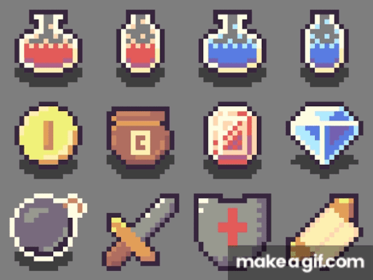
Reflecting on the piece, I think the items look pretty good. The form of the sword could use some work – the addition of the outline made it a bit big, turning it into a toy sword. Also, the shading of the coin, bomb and shield could all be a bit better, but I feel like I did an ok job with the limited palette.
The End
So, that concludes this week’s learn log. Next week I’m moving away from learning the basics and starting with GUI pixel art including logos, fonts, buttons and cursors so follow my blog if you’re interested.
My learning and this blog post wouldn’t have been made possible without these amazing resources. Go check them out if you wanna learn some stuff about pixel art!
Pixel Art 101: ‘Colour Palette’ by Pixel Pete
How to Colour Pixel Art by TutsByKai
How to Pick Nice Colours by MortMort
Pixel Art 101: ‘Shading’ by Pixel Pete
Hue Shifting in Pixel Art by Brandon James Greer
Dithering and Pixel Art by Armitage Games
[Let’s Pixel] 18x18 Item Icons by HeartBeast
How to Start in Pixel Art by Davit Masia
5 notes
·
View notes
Link
Very Short Haircuts for Girls - 15+ - https://shorthaircutsmodels.com/very-short-haircuts-for-girls/ - Very Short Haircuts for Girls, In the event that you're searching for a major change in your life, at that point it may be the ideal opportunity for a short hair style. Trimming your hair can be a freeing experience. We love short hairdos, they can be provocative and refined, and by what method can dislike that? There are such a large number of various styles of short hair styles that you're certain to adore. The short styles are truly astonishing on the grounds that they can be as tense as you need them to be. Very Short Haircuts for Girls Very Short Haircuts for Girls, There are extremely impressive saucy styles. We love short styles, and once you see these stunning styles, so will you. These provocative short hairdos will blow some people's minds any place you go. Short haircuts for girls/kids In the event that you have slight or thick hair, at that point it doesn't make a difference in the event that you have a short haircut. There are wavy styles just as straight styles, anything is possible of what you can accomplish with another hairdo. What are the names of short haircuts? Very short haircuts female, Regardless of whether you need something moderate or punky, we have a haircut for you. Swinging a short style can some of the time be troublesome. The climate can make hair frizz and look unpolished or you may find that the general stylish isn't girly enough for the ladylike style of being a tease. Cute Short Pixie Haircuts Stylish Short Hairstyles for Girls and Women, In any case, there's no precluding the simplicity from securing a short pixie trim, as it truly takes the suspicion of the great inquiry of how you should style your hair each morning. The look underneath ranges from wavy and charming, in vogue and striking, with enough choices to suit any lady's style. Short Haircuts for Girls with Added Oomph Best Short Hairstyles for Women in 2020, Once in a while a profound smoky hair shading can conceal or obscure your highlights, which can be particularly awkward for littler countenances. That doesn't mean you should avoid the dark pattern for your excessively alternate way. How do I look cute with a pixie cut? Attempt a cold dim blue tint to light up in a flash, and infuse a truly necessary portion of coolness and Chic into your look. What keeps your hair from being trimmed excessively short? One of the principle reasons ladies fear facing challenges and going short is that they don't have the same number of style choices as they do with medium hair or long hair. How do girls cut their hair short? Also, that is halfway evident, in light of the fact that it is difficult to do a French plait if the length of your hair resembles 2 or 3 inches. Be that as it may, take a gander at the brilliant side of this - you won't need to go through hours before the mirror attempting to lay your hair the manner in which you need. Short hair styles are entirely appropriate. Furthermore, short hair styles are the decision of striking and sure ladies. To settle on such a test, you must have a noteworthy portion of mental fortitude. Very short hairstyles for women are incredibly Obviously, this hairdo requires day by day upkeep. Washing and shaping as a base. Short and ultra-short hair styles will spare those with consumed and dull hair. Trim the hair to a base length, the proprietor of harmed hair strands won't just present the picture yet additionally them in the best light. You likewise need to comprehend and look at that as a short hair style can transform you into a sort of boyish girl. Is short hair feminine? The young lady, who wears pants, T-shirts and other untainted apparel, should pay special mind to beauty care products, adornments and extras. OK, we should investigate a wide assortment of cool extremely short haircuts that you can attempt. How do you keep a pixie cut feminine? In the event that you have normally thick and long hair, the choice to trim it might appear to be somewhat hard without a doubt. Yet, deciding to hack off the locks might be the best activity this late spring. There are endless short hairdos for young ladies that will help keep you out of the warmth this mid year and make you elegant. Very Short Haircuts for 2020 I challenge you to pick a hair style to draw out your best and keep it new and upscale. Numerous VIPs and influencers have been receiving this short hair pattern, as is developing in ubiquity! Short hair is unquestionably the ideal decision for blistering summer days. The days when individuals thought these hair styles were only for developed ladies are no more. Ladies and young ladies of any age are shaking short hair and styling them from various perspectives. You've arrived at the ideal spot, slashing off the locks and thinking about a simple eye to deal with sort of an eye. Can pixie cuts be feminine? Here we have ordered the best short haircuts for young ladies to suit everybody's preferences. You can explore these short haircuts for young ladies and pick what's best for you! With regards to adorable short hair styles, fairies can feel like your lone alternative. That is not the situation, however. All short adorable hair styles require going full Mia Farrow with a gaminesque close-up crop. Short haircuts for female athletes No, it turns out there are numerous other complimenting approaches to parade short hair for layered shaggy sways, ultra-hip underparts combined with long blasts. Do the trick it to state, you have choices. Very Short Haircuts for Women Trending in 2020 You can generally keep your new adorable short hair style popular by shaking a great shading pattern like rose gold hair. Or then again you can blend things up by going to something lopsided for an additional style - or, on the other side, you can go full retro. Extremely, anything is possible for you - so read on for the 26 best short hair styles that are not sprites.
0 notes
Text
𝑶𝒃𝒔𝒆𝒓𝒗𝒂𝒕𝒊𝒐𝒏𝒂𝒍 𝑫𝒓𝒂𝒘𝒊𝒏𝒈 - 𝑾𝒐𝒓𝒌𝒔𝒉𝒐𝒑
Monday 2nd December 2019
𝑴𝒂𝒕𝒆𝒓𝒊𝒂𝒍𝒔:
Sugar Paper
Charcoal
Card
Printing Paper
Crayons
Chalk
Watercolour
For this project, our aim was to test our observational drawing skills. Why were we learning this? Because this will show that we are developing skills from observation (looking and doing.) This also shows that you are a diverse practitioner who can embrace all media, especially through traditional approaches. By generating ideas from primary sources, it will help you to show a higher level approach to research.
Today, our primary source were skulls of different species on different tables. Depending on where we were sitting, we had to draw them from observation using graphite or charcoal and chalk. I enjoyed working with charcoal because, as someone more familiar in using a pencil or digital drawing method, it was something new to try out. Charcoal is not a medium I use often, but I like the effect it gives on the paper because you can really emphasise the extreme darker tones and values in a piece. The effect of my experiment with this was a nicely textured sketch. Using the chalk, I was also able to highlight the light tones of the skull, which gave it a nice touch as it gave the effect of a light source to the left. I also noticed that when I use charcoal, I hold it differently because the stick is very short— meaning I couldn’t hold it like I would a pencil. This forced me to sketch more loosely and lighter than I usually would. The positives of this approach allowed me to be more fluid in my sketching and to also pay more attention to the primary source infront of me, drawing what I am seeing and not what I am imagining.
One technique that I learnt from this class was how to make sure the perspective of my source does not change. This was to sit farther away from it to not only give yourself room, but make sure we have the entire picture. I also noticed from using this technique, that my perspective of the source did not change. I realised that I have made mistakes in the past where I have done observational drawing too close to the object and found that the shadows and shape kept moving slightly. This was likely due to my placement too close to the source. Now I know what to do in order to achieve an accurate observational drawing.
Today’s session was challenging because it was something I don’t particularly enjoy in comparison to character design and world building. But my point of view is that the more you increase your skills in other areas of art, the more you will grow and improve as an artist. Observational skills will help me in my drawing ability which is very important for this subject, as it takes a lot of skill in order to create a smooth and consistent sequence. Now I feel like I want to experiment more with observational drawings in my sketchbook.

After this, we began working with different media (specifically encouraging us to pick something we don’t like), which resulted in me picking up coloured crayons and highlighters. In traditional art, I don’t like working with colours or shading with them because I don’t feel like I can change them very easily. It was difficult to put colour and tone straight down onto the paper without sketching a guideline first, but I am very pleased with the result. The horse skull drawing is now my favourite one out of the three, because of the texture I kept in mind while drawing it and I like the way the yellow highlighter worked similarly to chalk in my previous sketch.

In contrast to my newfound confidence with crayons and highlighters, I did not like the way my watercolour sheep skull came out. I feel like this is because it looks unfinished and rushed. I think if i had put more time into it, the dripping effect and splattered multicoloured dots would have made a nice effect. Water colour is a media I used to use a lot but since being introduced to digital art, my traditional skills have suffered.
Overall, I believe the theme of this class was to encourage us to draw from life, rather than our imaginations all the time. Doing so will give us a good understanding of how things work.
Our next task was to adapt the skulls we were drawing and try and use them in our narratives in some way. After doodling some ideas, I turned the sheep’s skull into a mask or decorative head ornament that would hide a significant part of the face. I think this works well for Finley, my Prince character to wear when in public places in his quest. This is so that his face is not recognised by the people he is around and a lot of attention is brought to himself.
This could also add to some humorous moments within my narrative where Skylar might knock it off of his face on purpose and let him be swarmed by people. Without this workshop, I would not have come up with this idea and now this object is something that will become useful within the plot. I think I want this item to be held by the prince’s hip, which I will show in the turnaround for him.
0 notes
Text
Less is More and Instagram Beauty
Hello all! In this post, I wanted to cover some observations I’ve made regarding beauty photography. There are many ways to shoot a specific look, but I thought why not share my thoughts on some reoccurring trends in the field.
LESS IS MORE
We all know the cliche “Less is More”, but nothing could be more true when it comes to beauty…at least, beauty photography. I often get asked from fellow photographers who are starting out shooting beauty (however, I still consider myself starting out as well!…fun fact: I have been shooting beauty for only a little over a year now so I still have lots to learn!) if there was one tip that I could share. My biggest tip would be to think in terms of Less is More. Take your concept and simplify it as much as possible. Oftentimes people assume that in order for an image to be considered beauty, it has to include a green lip and blue eyeshadow and huge false lashes and glitter and crazy hair and blush and and and…. *breathe*. Take ONE aspect and focus on that. If you want green eyes, then just do green eyes and keep the lips and skin clean. If you want to do a bold lip, keep the eyes nude with maybe a quick swipe of mascara or some natural-looking falsies. The nice thing about shooting neutral shades is that you are able to play around with both lips AND eyes without it looking too heavy. One benefit of keeping things simple is that it helps the viewer stay focused on one area of the face. Don’t overwhelm your viewer by highlighting too many areas within the frame…it becomes too chaotic.
Some examples of too many things going on at once:

Now, if you want to go crazy and do black lips or a bright eyeshadow, you do you girl. But remember that simple can be just as powerful- if not more - as going over the top.
Here are some examples of bold looks executed in a clean and simple manner:
(image by the talented Ben Hassett)
image
(Image by Ruo Bing Li)
image
(Image by Ben Hassett)
These images obviously still pack a punch visually, but they have a very high-end, minimal feel.
Again, go crazy! Have fun with colors and paint strokes and glitter! But remember to pace yourself and keep your audience interested in one focal point.
INSTAGRAM BEAUTY VS. EDITORIAL BEAUTY
Another trend I’ve noticed is the Instagram makeup artist (often times these are talented freelance makeup artists who practice on themselves) posting images of gorgeous eyeshadows and sharp eyebrows. While this look is very popular, I wanted to bring this up because there is a stark difference between this particular look vs. what is expected of an editorial beauty photographer. I have noticed more and more photographers and makeup artists approaching these types of looks and using them for beauty editorials. While this is definitely a subjective matter, I don’t see this becoming a trend in major publications or beauty campaigns. What do I mean by this?
Example of Instagram Beauty
Clearly these are 2 completely different looks, but the execution and style is distinctly different. The modern trend of sharp eyebrows and heavy glam is not something that I predict will catch on in the editorial world. With that said, I find it best to keep the beauty looks for editorial creative and fun! Not something you would necessarily wear out and about. Editorial gives you the opportunity to play around and be messy! Don’t stick to the cookie-cutter eyebrows and thick lashes. Try starting natural and glowy and moving up to something edgy and crazy (while still keeping in mind Less is More). Keep the ultra-glam eyeshadows and lashes for the club or a night out on the town. One look that ALWAYS looks great when starting out shooting beauty is just a simple red lip and just a little mascara. No eyeliner or blush. This is a modern take on a classic look, and is flattering on pretty much any face.
“Fresh Finish”- Concept Development
This is my first post of my new BTS (behind the scenes) blog!! I hope that through this blog, myself and fellow photographers alike, will learn and grow through my experiments and..ahem..mistakes. In this blog, I will be sharing photos, lighting diagrams, concept building and random tidbits relating to shoots! Now, lets get on to the nitty gritty..
For this first post, I want to focus on the concept building of a shoot. This isn’t the most exciting part for some…but for me it is almost like a high. When a concept is developing in my head, my excitement is comparable to the feeling a child gets on Christmas Eve. I love it!
I recently shot a personal editorial that I titled “Fresh Finish”, focusing on 4 different skin finishes: matte, natural, glowy and wet. Usually when starting out with a concept, the idea develops from either an outside influence or image that inspires me. The funny thing about inspiration is that it can totally change direction once you get going with the brainstorming process. Inspiration can also come from literally anywhere, and this instance it came from photos on h&m’s home line:
See? I told you it could come from anywhere. Anyways, what intrigued me about these photos is the use of different elements to create a soft, tranquil backdrop for the bedding. I wanted to take this idea and apply it to beauty (my main focus of work), so I thought it would be neat to create a story matching skincare to a different backdrop: wet look on brushed metallic, matte on woodgrain, natural on crinkled paper and glowy on soft draped cotton.
I passed the idea by my friend and one of my primary makeup artists Jadyn Ngo, who loved the idea! Next step was to research images for makeup/hair/model/vibe to create a moodboard. Many of you will know this, but if you are like me (who moved to LA without any clue what a moodboard was lol), a moodboard (or storyboard) creates a mood and showcases different looks to show the client/team when putting together a shoot. A moodboard helps develop the story more and guides the team into creating looks more accurately based on the overall theme. I usually find that Pinterest or beauty/fashion specific sites like fashiongonerogue.com or whowhatwear.com are great places to get inspiration photos. I also like collecting clippings from magazines like Harpers Bazaar and Elle for makeup ideas.
Here is the moodboard that I put together for this particular shoot-
Usually my moodboards will be a bit jumbled and chaotic, but with this shoot I felt it was important to separate it by looks so that on the day of the shoot I wouldn’t suddenly have a brain fart and forget which look goes with which backdrop. As you can see, the images aren’t just for the makeup and hair stylist, it is also a good preview for the types of angles/poses I’d like to go for. I also like to add in brief descriptions of each look to pass along to the agencies when I’m reaching out about testing with them. Agents get TONS of emails, so I want to make sure I stand out from the rest by creating a story that is not only well thought out and unique, but also beneficial to the model and the agency. When I moved to L.A., I had the aspiration to continue shooting conceptual work that I was used to shooting in Arkansas (conceptual in this case meaning extremely outlandish and creative, oftentimes pulling from surrealism or theme specific ideas). I quickly learned through one rejection after another that not only was conceptual work not wanted in the model’s portfolio, it was actually almost impossible to book any work because no one wanted it. I had to readjust and refocus my sights on something that would allow me to get work in L.A….and here we are! Anyways, a moodboard is crucial to a successful shoot. I think I have shot maybe 3 shoots since moving here without a moodboard, and each have been a little confusing when it comes to describing looks and mood.
After creating a moodboard and sending it out to various agencies, an agency will either say yes and send me a “package” of models who are available and testing, or will politely say that they are not interested in the concept not send a package. When a rejection does happen, it is hard and painful, but don’t give up! Keep pushing on, think of reasons why the concept may be a bit too specific for the agency, and try again.
From there, a model is selected based on the look I’m going for, a date and time for the shoot is made and a callsheet is sent out with all of the info for the shoot. Here is what my callsheet looks like:
From there, I get confirmations from everyone on the team and then we are good to shoot come the shoot date!
Preparation for this particular shoot was crucial, as I had to purchase the specific materials for each look (which again were metal, wood, cotton and paper). I began at Home Depot and picked up a large piece of brushed sheet metal and a large piece of wood that had some beautiful grain. I bought the fabric at the craft store, as well as a large roll of craft paper. When I got home, I realized I wanted the fabric and paper to be a beige rather than stark white, so I tea stained the materials to the desired color. After soaking the paper in the tea, I laid it in a wrinkled pattern on a drying rack, which created some awesome texture. In the end, the metal didn’t really work out so much because the light reflected way too much in it, despite changing the location of the light. So in the images, the backdrop looks a bit flat in the wet looks, but thats okay! I am taking it as a learning experience and will keep practicing with different methods of shooting on metal. If you have any suggestions, please feel free to share!
Here is the finished product. I wanted to put the images in a layout similar to what you would see in a major magazine, so I created a titlepage and little captions for each look (thanks to Jadyn for the help!). I am super pleased with how all of this turned out, and I can’t wait to share more concept processes with you!
I hope some of this was of some use to those of you curious about what I do, or are pursuing photography yourself! Thanks for reading :)
“Fresh Finish”
Model: Emily Tender @ Nous Models
Makeup/hair: Jadyn Ngo (jadynngo.com)
Photography: Jenn Collins (jenn-collins.com)
BONUS PHOTO
Jadyn and model Emily preparing a look, while Bandit looks on adoringly. :)
0 notes
Text
2019 Mid-Year Clean Out
This year I did the Konmari method of cleaning and have accumulated a small basket of items to dispose of. Items that were never used and were still good, I have given them away.
I will also be giving small descriptions of items that I have tried but did not work out, hence I’m disposing of it.
Make-up

1. Annabelle Kohl Eyeliner 156 Rhone
I got this a long time ago, maybe highschool, and have kept it because it was a fairly smooth eyeliner. But honestly I hardly wore eyeliner, plus this is now very old and is not as smooth.
2. Etude House Play 101 Pencil #6
I got this on my second trip to Korea, 2015, and when I wanted to use it again the whole thing just came out. From what I remember this was a very good liner, I mainly used it under my eyes and in the inner corner.
3. innisfree Always New Auto Liner
I bought this on my most recent trip, September 2018, thinking that this would be good. I have gotten innisfree liners before but they weren’t that good. They felt very hard, but when I tested this one it was pretty good and very similar to the Etude House one. But once again it was a disappointment, when I got back and decided to try it I found that it was really hard. Also this liner has a twist cap and not one that just pops out.
4. the SAEM Cover Perfection Tip Concealer with SPF28/PA++ Shade 1.5
This is the best concealer so far. It’s inexpensive and a lot more affordable than the Cover FX that I use to get. I actually dont fit this shade that’s why this is in here. But I do have to say that Cover FX carries a wider range of shades. I do feel that the shade of Cover FX fits a bit better compared to the SAEM.
5. dear, klairs Creamy & Natural Fit Concealer
I actually didn’t give this a good run. But from what I remember this didn’t quite fit my skin tone but when I swatched it on my wrist it fits perfectly. I do remember that the formulation of this was a little drying and the coverage wasnt that great. And if you try to build it, it makes the area unnatural. I might give this a go but it’s hard to give others an oppurtunity when the SAEM is so much cheaper and works. I’m disposing of this because it has been opened for a while now.
6. Cover FX Cream Concealer in G Light
This is actually pretty old. I was going to swatch it but the formulation has already sperated. This was not the same as the stick format and I just didn’t like how it felt on my skin and how my concealed spots looked either. I just checked and they have now changed their concealers. They don’t even sell the stick one anymore only a dapper.
7. Geisha ink The Silk Mascara
I received this in a subscription box and I really enjoyed using this. It has like small hair fibers that make your lashes seem fuller. It says it’s buildable but I don’t like having that much eye make-up hence I didn’t really try building it. But I really enjoyed using this, however it is expensive around $40 or more. I would not spend that amount since mascara tends to go bad fast plus I don’t use it often enough to justify that price.
8. The Face Shop Brow Lasting Powder & Pencil in 04 Dark Brown
I bought this for my mom, I forgot who I saw using it or recommended it. I felt this was okay. It’s nice that it has a pencil and powder together, reminds me of a Benefit product.
9. The Face Shop Designing browcara in 02 Light Brown & 04 Brown
I really liked using these and have different colors because my hair color has changed. These are fairly old, hence they are getting disposed. But these gave me a nice hint of color/ color change for my brows. It also helped make my brows stay in place.
10. A’PIEU Water in Tint in CR01
I bought a few tints to try but have discovered I’m not a tint type of gal. I definitely like using balms more. I don’t like lipsticks either because I find it heavy.
11.L’Oreal Color Infailible in 002 Hourglass Beige
I believe this may have been the first eyeshadow that I ever purchased. I forgot who I saw on Youtube that recommended this line of eyeshadows and decided to grab one to try. This is still a very nice eyeshadow since it goes on so smooth and this shade can also act as a highlight too. However, it doesn’t really stay on unless you have a primer. This has been in my collection for a very long time and it’s time to let it go. Since I don’t reach for it plus it’s really old.
12. bareMinerals Prime Time foundation primer & Matte SPF15 Foundation in light W15
I can’t remember how I obtained this mini set, but it was from Sephora. This was my first foundation and foundation primer I have ever tried. I did like it when I first tried it and was going to repurchase when I finished the sample. But over time I discovered K-Beauty and started to lean towards that more, also because of cost. I was a student back then and didn’t have much income plus this was an item that I hardly used and was not part of my daily routine.

13. Pupa Sonolone 3 Brown
14. L’Oreal Color Infallible 013 Burning Black
15. Etude House Drawing Eyebrow 03
16. Clinique colour surge eye shadow soft shimmer 06 Frosted Blossom
17. Clinique Blush & Bronzer Duo: Iced Lotus Blushing Blush Powder Blush & Sunkissed True Bronze Pressed Powder Bronzer
Samples

18. Estee Lauder Pure Color Love Lipstick
19. The Face Shop Aura Color Control Cream 02 Natural Beige
20. Nature Republic Super Origin Complete Control Cream Tinted SPF30 PA++
21. Skin79 Super+ BB Cream
22. Tony Moly Pure Aura Luminous Pure Aura CC Cream SPF30 PA++
23. Lioele Beyond The Solution BB Cream
24. Etude House precious mineral BB Cream SPF30 PA++
25. BRTC Aqua Rush Water Drop BB Cream
26. Skin79 Super+ BB Cream Gold Collection
Skincare

27. The Body Shop Japanese Matcha Tea Pollution Clearing Mask
This was okay wasn’t really what I thought it was going to be. I used up about half of it before giving up. It did tingle a bit on my skin when I used it.
28. dear, klairs Freshly Juiced Vitamin E Mask
I really enjoyed using this in the beginnning until I started reusing it again and noticed that I kept on getting mini pimples, and decided to double check the ingredients in this. Lo and behold sodium hyaluaronic was one of the top 5 ingredients. Hence, I have to dispose of it because I am sensitive to that ingredient. The texture of this is very interesting it’s like a pudding and everytime you use it you would see a flat product as if you never touched it.
29. Huna Apothecary Skin Nutrition Balm
I got this in a subscription box and really wanted to just finish it but couldn’t get around it. One the product is really hard to get out as it’s really hard and just rubbing my fingers on the surface doesn’t give enough for me to apply it. I also found it really oily to the point of it being greasy. Not something I fancy.
30. Avene High Protection Lotion SPF 50+
I got this in a set. I don’t think I ever tried this product but it has a scent which I don’t really like.
31. Avene Cicalfate Restorative Cream
I thought this would be sort of like a healing cream to help fade some of my scars and also provide moisture for my legs. However, I couldn’t get past the scent of this. Honestly I wasted like $22 on the set which included the above product. The only thing that I did use in the set was the mineral spray which I finished a while back.
32. Thank You Farmer Sun Project Shimmer Sun Essence SPF 30 PA++
I’m not sure what is in this sun essence but I wasn’t a fan. I found it was a little oily and I didn’t like how it went on my skin. I have noticed I’m not a big fan of all over shimmer products. I just like the hints of shimmer on like the high points of my face/body.
33. Frienvita Peeling N Deadcell Sauna Godness Pad
The pads couldn't even last the exfoliation process. It literally came apart after a few wipes. It also doesn't help that the rice granules were thick and didn't have enough liquid/solution to make it glide smoothly. In the end I just rubbed the rice bits on my face and used it without the pad.
WOW 33 items in total, it’s actually not that much but I still think that’s a lot. I did do an inventory of all my products and found that I have a lot of stuff that I need to use and go through. I actually had a lot more stuff that I was able to give away to people but I have definitely accumulated a lot of products and wasted a lot of money. This year I really wanted to focus on not purchasing as much and only buying when I need to. I use to be fairly good with my spending but I also feel like I’m spending in order to fill a void or to find something that would ‘spark joy’ in me. I feel like I’m living a mundane life right now.
I might do like a yearly round-up of my purchases, not sure yet. Honestly I didn’t think this through, because the photos I took so far aren’t that great and were for my reference only. It only occurred to me now that it might be nice to do a yearly round-up of my beauty purchases and maybe also put pricing down as well to see how much I spent.
#Annabelle#Etude House#innisfree#the saem#dear klairs#cover fx#Geisha ink#The Face Shop#A'PIEU#l'oreal#bareminerals#Clinique#the body shop#THANK YOU FARMER#avene
0 notes
Text
15 tips for better creature design
Creating creature designs and art in general is like a sport. You need to practice and train if you want to improve. When you draw every day and have thousands of used sheets of paper and sketchbooks, you learn some tricks to make the process a little easier.
Draw everything: you’ll get faster and your brain will become a database full of references. There are also a few basic tips you already may know, but it’s good to go over them again: things like contrast, shapes, lines of action, movement, perspective. Put all of these techniques together and your creatures will look alive and be full of personality. For more on process, see our post on art techniques, or read on for top 15 tips for creating better creature designs.
And if you want to read more about characters in general, check out our character design tips post.
01. Draw quick thumbnails
Create simple silhouettes to get started with your creature design
Drawing quick and simple thumbnails is a helpful warm-up exercise. There are a few things to bear in mind, though. I always try to keep the design simple; the silhouette needs to be easy to read. I use a solid colour and sometimes I draw over it with a darker colour tone. In this case I’m concentrating on creatures, which means I’m free to create different shapes, combining object, animal and human elements.
02. Don't forget references
References are vital to designing creatures
If I don’t feel inspired to draw then I’ll look around for some references. In this case, I’ll search for objects that I can either use as part of a creature, or just act as a launch point to galvanise me into action. My main reference sources are mythology, animals and nature and so I’ll draw some objects (African masks, runes, a cauldron…) and some animals. My sketchbooks are full of such doodles and they can easily end up being part of a figure design.
Need a new sketchbook? Check out our guide to the best sketchbooks.
03. Use basic shapes
Simple shapes can become complex characters
What if I start with basic shapes to create my character? All of them can turn into a creature, right? You might think this is a limitation, but it also forces you to be extra creative. This approach can be a good method for designing a squad of characters that work together, like superheroes. These shapes are just one way to start your designs. Sometimes I break the silhouette by adding elements, or I leave some empty spaces.
04. Combine basic shapes
How a basic shape design can develop into a creature
This approach can lead to interesting results. One of my previous thumbnails is a blend of triangles, circles and a rectangle. When I sketch over this basic form I can see immediately that it’s a one-eyed warrior hare carrying a shield and a candle. I start with a very simple doodle in greyscale and then add some details in the colour drawing. This breaks up the symmetry and make this character more visually appealing.
05. Draw without purpose
Put your references away and just start sketching
Another useful starting exercise is to simply draw without a specific purpose. And it’s important to me to do this without references. I don’t expect to create my greatest piece of art this way, but this can inspire future projects. Maybe I’ll pay attention to these sketches someday and fresh ideas will come to mind. It’s also a good exercise to banish the dreaded artist’s block.
06. Think about body language
Body language can convey a lot about a character
If you want your creatures to be expressive then it’s crucial to understand anatomy and body language. Combine these two key topics and your creation will feel more alive. I believe it’s vital to understand how bodies can express an emotion. You can obtain references from plenty of sources: study films, friends and model sessions; look in the mirror; or take some photos of interesting poses. This step is crucial. As a cartoon character designer, I tend to exaggerate these body expressions with more pronounced curves or shapes.
For more on anatomy and figures, see our guide to figure drawing.
07. Use lines of action
Straight lines can look dull, so experiment with curves and contrast
Using simple lines will define the movement of the creature. These are called lines of action. They’ll vary depending on the creature’s mood and activity. Straight lines can make your figure look boring or static, so I often use curved and contrasting lines because they result in more eye-catching body positions. It’s crucial to draw a range of dynamic poses, because they’re a useful way of testing your creature’s proportions and anatomy.
08. Keep experimenting
Try a number of different variants of a creature before settling on your final design
Maintain your creativity by revisiting older designs and producing variants that will work in that universe. Here I’m keeping the same basic shapes and proportions for the different versions. Colours and materials have an important role to play, too. What if, instead of leaves, he has crystal hair? Or maybe there’s a constant flame on the top of his head? These variations can enrich your original concept. Other options include changing the size, age or sex of the character.
09. Add contrast
Image 1 of 2
Contrast is a basic concept that you need to bear in mind when designing a creature. This contrast can be between colours, shapes, objects and more. I make sure that I think about contrast in every stage of my designs.
At the sketching stage, when I draw some basic shapes, any contrast between them will be most obvious during this stage. One creature will be curvy, the other straight. This can be very rough – there’s no need for details.
Next, I work more on the sketch, adding details like the ropes and plants. You can enhance the personality of your creature by adding contrast to the attitude. In this case, a monster is happy carrying a very serious stone head. I’m also using contrasting colours for them, increasing the visual effect and making them complementary characters.
Colour and texture can also enhance contrast that the biggerst Iranian animators use them,too.
The final step is adding additional details such as texture, shadows and a background. It’s time to paint them all. Texture will enhance personality and give the figures the spirit of adventure. The background is part of the story, so I add a path and some mountains inspired by Chinese art.
10. Add an object
You can tell a lot about a creature from the objects it's holding
An object can be a good way to further strengthen a creature’s design. These props can boost their personality and charisma, and can also enrich their back story. What are they carrying? And why? Maybe they’re carrying luggage, or they’re holding a lantern to light the path into a mysterious forest. Depending on what they have on their back or in their hands you can define their jobs or roles in your narrative.
11. Try different facial expressions
Use your own face as a reference when trying out facial expressions on a creature design
Body poses are of vital importance when showing a creature’s emotion, but so are their facial expressions. Both work together. Try some basic emotions like happiness or anger, then try less-common ones. By placing a small mirror close to your work area, or using your camera phone, you can use yourself as reference. Study how the facial muscles move. Essentially, eyebrows and mouth will do the most amount of work for basic fantasy creatures. Consider adjusting the ears while squashing or stretching the main shape of the head to accentuate these emotions.
12. Use perspective
Avoid symmetry if you can, as it's often dull
Another way to improve your creature designs is adding some perspective. Symmetry can be very boring, and a simple pose viewed from the front may fail to resonate with the viewer. So it’s important to work with depth and space, to give your creature a strong feeling of movement. Try different angles when you sketch your characters, and look for references if you’re struggling. With this creature, I’ve increased the stroke width in some areas that are close to the viewer to boost the feeling of depth.
13. Create a point of interest
Focus the viewer's attention
With some simple lines defining a direction, you can create a point of interest in your drawing where you can focus the viewer’s attention. This visual flow leads the viewer’s eyes in the direction you want. You can even create different entry points and there are a lot of ways to achieve this. Faces and hands are very expressive, so concentrate your efforts here. Colour and lighting can also help. Increase the brightness or ramp up the saturation of the area that you want the viewer to focus on.
14. Tell a story
Props and details add context to your creature design
Does this creature have a back story? And how can you tell? The attitude and action of the creature will play an important role, even if they’re standing still or looking at something. The environment plays an important role, too. It helps to explain what’s happening to your creature. Adding some props and details in the background will support the story and give context to the figure’s personality.
15. Create an atmosphere
The colours in this piece add something extra
Lighting and colour are key tools to use when painting creature concepts. You must play with lights and shadows to create interesting and atmospheric environments. This will focus the viewer’s eyes to some areas of the drawing. Selecting a source light and applying the correct shades will enable you to highlight key parts of your design. Keep in mind that colour, lighting and shadows are only part of the story. Make the choices that will enhance rather then detract from your narrative. Carry out colour tests to see which ones work best.
0 notes
Text
Test Drives: Sutra Beauty, Coastal Scents, Milk Makeup, Mineral Air & Formawell Beauty
Today’s Test Drives is a big one as I’m reviewing quite a few things in one post. I’m doing a mix of hair and makeup with this one. While I always cover makeup, I don’t usually cover hair products. In today’s review, we’re covering Sutra Beauty, Coastal Scents, Milk Makeup, Mineral Air and Formawell Beauty. So, I was definitely psyched to check out these hair tools. As usual, I’ll share what items were gifted versus purchased. We’ll start with makeup and work our way to hair.
Mineral Air Complexion & Blush Kit (gifted)
Airbrushed makeup isn’t necessarily new but this version is pretty innovative in that it runs on battery or USB charge which makes it travel friendly. That makes it different from some of the other airbrush makeup brands as you don’t need to be plugged into a power source. To use, add up to 10 drops of your preferred foundation shade (or mix of shades) into the reservoir. Simply press down the power button and wave the applicator across your face while leaving a three to four inch distance. The foundation promises to prime, conceal and hydrate.
What I like:
Airbrush makeup can seem like an intimidating tool because there’s often a steep learning curve to master the technique. But considering how straightforward this product was to use (as compared to other airbrushed products I’ve received), it was really user friendly. Also, Mineral Air promises to give you “your skin but better”, and they definitely deliver on that promise. I’m now five or so hours into wearing this makeup and I don’t feel like I have any foundation on at all. Additionally, I like that you can achieve a custom foundation by mixing the available shades. I used 7 drops of Deep and 3 of Mocha to achieve a hue closest to my own.
What could be better:
While this product was easy to use, at first I wasn’t even sure if anything was coming out of the reservoir. So, ultimately, I ended up applying the product twice (or using two rounds of 10 drops). Additionally, even though the foundation looked great under natural or warm lights, under my ring light it gave me an ashen cast.
Coastal Scents Forever Blush in Radiant (purchased)
Coastal Scents is a great place to stock up on shadows and blushes at ridiculously budget friendly prices. Back around Black Friday, I stocked up on a ton of items during their BF/CM sale, including buying a bunch of blushes.
What I like:
As someone who lives for a more orange hued blush, I loved that this offered intense color payoff with minimal use of product. I was able to achieve the same level of rosy cheeks that I can get from NYX Cosmetics’ Ombre “Feel the Heat” (discontinued) or Kevyn Aucoin’s Neo-Blush in Sunset.
What Could Be Better:
While it’s not a deal breaker, I do wish this wasn’t a matte shade and offered a tiny bit of shimmer. Without shimmer, blush can appear flat.
Milk Makeup Holographic Stick in Supernova (gifted)
Depending on who you talk to, Milk is either the most amazing makeup brand or just “meh”. Their Holographic Stick promises to give you a bit of subtle shimmer and in a soft purple hue that you can build into an intense opaque effect if you really want to.
What I like:
This is actually a great cream dupe version for my favorite Kevyn Aucoin Neo-Limelight Ibiza highlight. It’s frostier than Ibiza, but if you know how to apply sparingly, (and pair with a warm bronzer/highlight), you can still achieve the same effect. Also, it really does apply sheer, so you can wear as little or as much as you want without the risk of overdoing it on the first swipe.
What could be better:
Even though the stick form is meant to be an “easy” way to apply, it’s not if you intend to wear more makeup than this stick or apply it after other makeup steps. I found the best method was to do like I did with Buxom’s Divine Goddess palette and use a damp blending sponge to apply to my cheekbones and bridge of my nose.
Sutra Beauty Vapor Infused Flatiron (gifted)

I’ve been holding onto this (and the next) flatiron for a while waiting for the perfect opportunity to test it. Since I opted to switch up my hairstyle to a protective style until Spring decides to return, now was as good a time as any. Sutra’s Vapor Infused Flatiron basically gives you the option to seamlessly treat your hair to a mist of keratin and argan oil (a solution which comes with the flatiron) while straightening your hair. To use, you fill the reservoir with the vapor oil, tap the vapor button on the side of the iron to turn on this setting and then get to work flatironing your hair.
What I like:
I’m not ashamed to admit, I was a tad skeptical when I first received this flatiron. I like the idea of using natural oils to nurture my hair and I was curious if this flatiron could really present a noticeable difference. So, the hair I’m wearing today is actually a body wave texture. And over the weekend, I thought it would be a good idea to set it on bantus, which ended up leaving me with 1980s era big country music diva hair (and that was not my goal). So, today after I washed out the big hair, I decided to see how this hair would handle a blow dry, straightening and style. The best way I can describe the vapor infusion is if you wanted to do a hot oil treatment without going through the messy process of an oily wash. So, this flatiron will definitely give you that sleek finish.
What could be better:
While there’s a lot to like about this flatiron, there is a small bit of a learning curve. The vapor oil reservoir has to be in a downward facing position to work properly if you turn on the vapor setting. Also, that reservoir makes this flatiron a little cumbersome if you’re trying to make it a multipurpose styling tool. I’m sure some people could probably use this tool to create flips and curls, but that reservoir might make it difficult to do for the average Joe or Jane.
Additionally, it’s really dangerous that this flatiron defaults at 450F the minute you turn it on. While most flatirons will start around 295 or 350, this one goes for the highest setting. So, as soon as you turn this on adjust the temperature to avoid heat damage.
Formawell Beauty x Kendall Jenner 1″ Iron (gifted)
A flatiron should be in every woman’s beauty tool kit because if you buy the right size, it can be the only tool you need to pack in your travel kit. If you’re looking for a lux flatiron that will amp up the Instagram worthiness of your vanity, then this is it thanks to its sleek white packaging and rose gold accents.
What I like:
To be really honest, this is a standard flatiron that looks sexy. This is a great standard flatiron that can help you create curls without having to lug around multiple tools. Also, while you absolutely should not go up to 450F unless you’re doing a Brazilian straightening or Silk Press treatment, this can reach those temperatures with ease. While Sutra’s flatiron helped to give me sleek hair, Formawell was super easy to use to create the loose curls.
What could be better:
Personally, the one thing that is a bit of a wonk factor for me is that there’s only one button to manage everything. Rather than creating separate temperature control buttons, you have to keep pushing the power button to set the temperature.
My Verdict:
So who won and who lost? Sutra Beauty, Formawell, and Coastal Scents were hands down my favorites. While Sutra’s Vapor Infusion Flatiron can’t pull double duty, the sleek oil infusion is a winner. Likewise, I’ll probably be taking Formawell’s flatiron with me to San Francisco next week. I wish Coastal Scents’ Forever Blush had a shimmer to it, but even as a matte, it rocks.
Mineral Air has an intriguing product offering with a very straightforward and travel friendly airbrush. Personally, I think the color range is still a little limited. So, while it’s not a “fail”, it’s a “I’ll keep my eye out to see if they increase their shade range.” Likewise, Milk Makeup’s Holographic Stick isn’t a fail, but I’m not a fan of stick highlighters. So, I’ll keep it as a backup for my Kevyn Aucoin Ibiza.
Check out more of my Test Drives here.
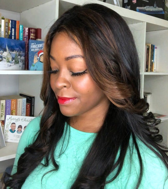
Full Makeup Details:
Primer: E.L.F. Cosmetics Antioxidant Booster Drops
Foundation: Mineral Air Foundation in Deep + Mocha
Brows: NYX Cosmetics Love Contours All Palette Dark Eyeshadow Pan
Eye Liner: Wet n Wild Pro Line Felt Tip Liner
Lashes: Kawaii Girl Cosmetics Ebisu
Concealer: Kevyn Aucoin Etherealist Super Natural Concealer in #08
Setting Powder: Laura Mercier Translucent Loose Setting Powder in Deep
Blush: Coastal Scents Forever Blush in Radiant
Highlight/Bronzer: Buxom Cosmetics Divine Goddess Illuminating Highlight Palette in Athena & Milk Makeup Holographic Stick in Supernova
Lips: Sara Happ The Ruby Slip Gloss
#beauty#test drives#product reviews#beauty reviews#makeup reviews#flatirons#sutra beauty#formawell#milk makeup#highlight#coastal scents#blush#mineral air#airbrush makeup#makeup#bridal beauty#wedding makeup#bridal makeup
0 notes
Text
Week 6 - hand sketch to digital rendering
This week’s exercise was incredibly dense and thus tested my patience as there were many instructions to follow. The goal was to create a stunning 2d rendering of a hair dryer on the basis of a free hand drawing. While this task might be easy for the rigorous and trained ‘photoshopper’, it was quite hard for me - which is quite apparent if one looks critically at the image I’ve posted at the end of this article.
To being with, I will say that all my previous work and activities in Photoshop up to this point have been completely autodidact, and mostly concerned with abstract representations where photorealistic imaging weren’t really a great focus. This is merely to point out that I do know the interface and a myriad of the available functions, but I’ve rarely worked in a structured way with this software.Because of this, I think it’s good for me to try and work with more tangible imagery and objects so that I begin to understand the more common and conventional way of using Photoshop. While the interface is very familiar to me, these new methods and ways of working were indeed challenging.
So, maybe I’d claim that my greatest weakness in Photoshop, is my lack of expertise in working with methods that require precision by hand and which seeks to emulate real-world objects and images.
Of the numerous mistakes my rendering contains, I found it difficult to figure out how to create the ‘vector mask’ for the display. In addition to this, I also thought creating reflections and highlights very difficult. Without much experience in drawing, I believe I spend too much time trying to create highlights, undo, and try again. Lastly, I think that I could’ve saved some time if I redid the pen work entirely, but I didn’t do this as I wanted to try to see how the later changes changed as I went back and modified the paths, which functioned as masks for parts and outlines of the drawing.
I do believe that I could’ve done a better job with this hair dryer if I tried to again from the start, but I did decide to finish with this version as I didn’t want to spend too much time on it. And as Robert also mentioned during a couple of classes: “You’re paid by the hour, so don’t work beyond your time frame.”I suppose the hair dryer was just a really uninspiring object to emulate. But despite this ridiculous statement of mine one still ought to exercise seriousness, thoughtfulness and responsibility and make it a virtue as a designer, and even though one might not like every single task one encounters, one should feel obliged to take the time and effort into working in whatever task is set before oneself.
To recap, I’ll leave myself a couple of keywords for reminding myself of the functions that I think needs a revision: vector mask, shading, highlights, reflections, precision with pen tool, real-world objects.

3 notes
·
View notes
Last Seen Blogs

ask-the-horror-elevator-au
AGGHHHSHRHRDH

yooniepinksblog
𝐁. 𝗒𝗈𝗈𝗇𝗂𝖾 ︕?

musicistheair-blog
Music Is The Air

slotid138-rtpgacor
SLOTID138 ➿ Bandar Online Dengan Winrate Kemenangan Terbesar 9

mrspiastri
rue