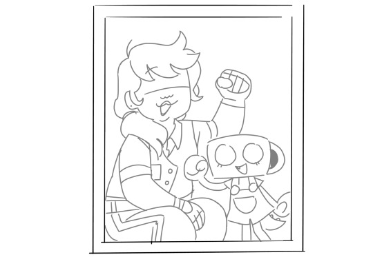
#also some of these are redraws of the in-game portraits but i was learning so it's fine
Explore tagged Tumblr posts
Visit Tumblr Blog
Explore Tumblr blogs with no restrictions, modern design and the best experience.
Last Seen Tumblr Blogs


Fun Fact
China blocked Tumblr because of pornography and censorship problems in 2013.
Text
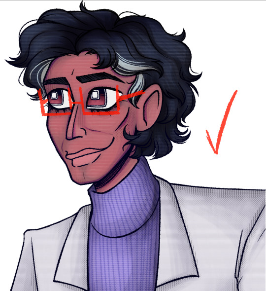
These are some of my first attempts at drawing Them!!! I really like how Mirabelle and Isa turned out, but this was my first time drawing Odile and I. Don't think I did a really good job. But at least there's Loop!!
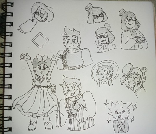
ALSO also
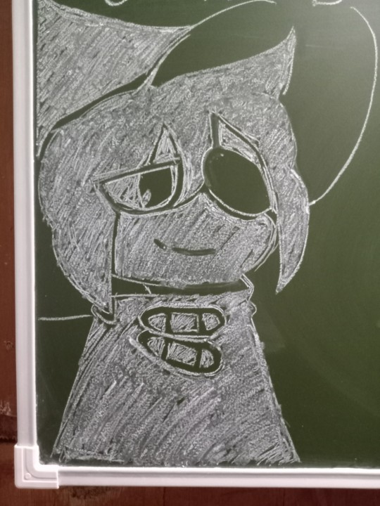
Siffrin on the blackboard what will he do?????
#isat#in stars and time#isat siffrin#isat isabeau#isat mirabelle#isat odile#isat bonnie#isat loop#also some of these are redraws of the in-game portraits but i was learning so it's fine#drawing in traditional is a lot easier for me and i have a ton more experience so i think it looks better but also#i hate how my art looks in pictures and don't know how to take them better#so whatever!!!!!!
49 notes
·
View notes
Note
Hello, very big fan of the work you do and the art you make. Given the release of the recent dandy's world animatic, I'm curious! What are your HC's for the handlers? All of their designs are unique and well thought out enough I figure they must have some information behind them. -Despairing because I wish I had the confidence to make an animatic that good, from StarSailor.
hm ! I don’t think I really have many, i kinda just saw their in-game models and thought ‘1 those uniforms are atrocious, 2 lets get you some ears” i did change austin(astro’s handler)’s hair to be A Little More Cool I Guess. it’s kind of a side shave :] other than that just kinda giving them a little more varied body types
but as for Actual Headcanons I’ve got:
shanon(shelly’s handler) is shelly’s hypeman honestly. would tell the kids on tours how cool and smart shelly is and Don’t You Want Her Autograph Or To See Her Themed Room? There’s Bones In There ! bc "everyone forgets about shelly" hurts my heart. not her handler Please
veronica(vee's handler) seems a bit nervous about getting attention, going off of her portrait, so inversely i like to think vee is Her hypeman :]
devan(dandy & pebble’s handler) does weightlifting :] he’s fat and also jacked. i think itd be funny he was allergic to dogs. good thing pebble is a toon rock that just Acts like a dog. wait actually would it be funnier if pebble Still set off his allergies
sam(sprout’s handler) acted about like how sprout acts Now. sprout is coping with the situation by acting like them, just kind of distant/aloof and maybe a little irritable. also this Isnt a headcanon but sam canonically uses they/them that makes me happy and i just wanted to mention
its a little funny i dint think i have anything for austin but from the sounds of it he's the creator's favorite Of the handlers. hopeful to learn more abt him and the rest of them !
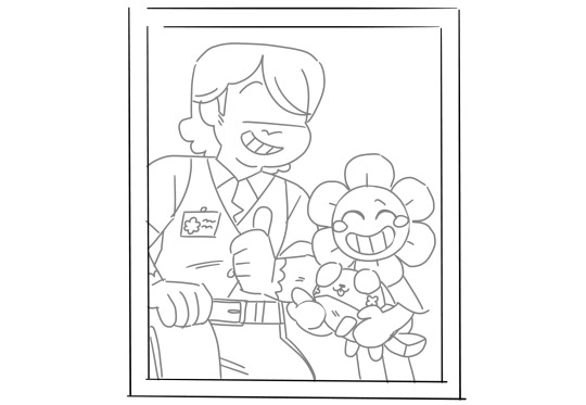

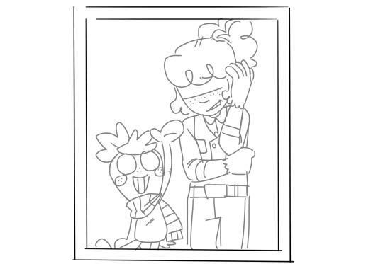

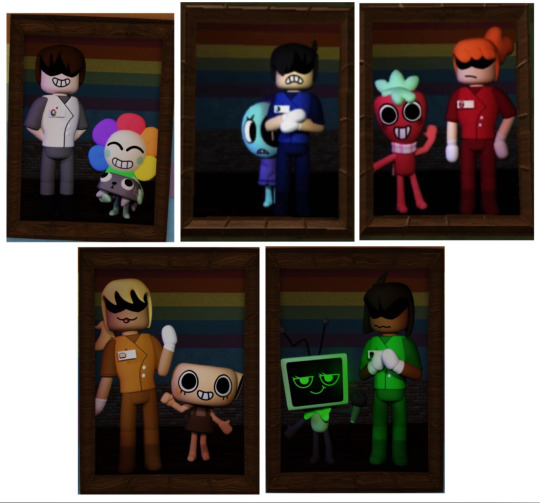
their portraits in the animatic are Of Course redraws of their in-game ones, but they’re technically redraws of the redraws i did of them originally ⬇️! i thought it felt off that 3/5 of the handlers didn’t look happy to have their picture taken, and with them all being in the same place like it was Planned and Set Up and everything didn’t seem right. like this is your job these are gonna be big ass pictures put on the wall lighten up a little HDHDHDH so the redraws i made it more as "this was kinda just jumped on them" like someone came up with a camera while they were on duty and said "smile!" and they generally didnt have time to react properly. little did they realize these were going to be made into big ass pictures and put on the wall
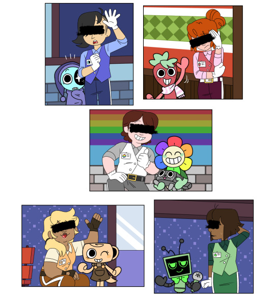
as for Other Handlers that we Dont know about yet Assuming There Are More, my sibling and i are thinking that Not Every Toon Has A Designated Handler. like it’s more than just the five as seen here but (from here idk their thoughts and dont speak for them) but so like i figure the mains get their own but the rest there's maybe 1 handler for every 3-4 toons, and they dont look after anyone specifically. just Someone has to be watching them it doesn't matter who. but like with cosmo and sprout always hanging out together its probably Just Sam supervising. they always have to remind the two to turn off the oven
#they got names in the same update that gave us arthur and delilah’s designs but im not certain everyone knows them so i figured i’d clarify#dandys world#the monarch’s court#progress#for posterity
158 notes
·
View notes
Text
My art year in review!
I learned so much this year and made a ton of cool stuff! These are my favorites from each month, but it was so hard to choose. A lot of stuff didn't even get posted--I'll be sure to at least post the ones that made it to this list!
It's amazing to see how much I've changed and learned over this year, and to see the things that are emerging as part of "my style."
Here's to another year of delight, creation, connection and fun!
Some monthly reflections beneath the cut, but here's the highlights:
I participated in 3 art challenges, Artfight, OC-tober and Huevember.
I made fanart for the first time!
I created a piece I conceived of before I started drawing
Made some big breakthroughs in techniques and skills in April, July and November
January: My first branch into full character design, Rodd is the culmination of training on Hero Forge renders to make dnd portraits! I was doing this cool thing with neon rim lighting, I should bring that back!
February: I saw a piece on here with this amazing glowing effect, so I color picked it and experimented to figure out what relationship between the colors was making it do that! The answer was saturation. This rose is meant to be glowing from within, and I think I did a good job for my knowledge level at the time! As Chuck Tingle would tell us, it's beautiful because only I could have made it in that moment on the timeline.
March: I spent a million years on every detail of this one, it has at least 5 clipping overlay/saturation layers for lighting, multiple line work groups and I want to rework that background but! I never felt more accomplished than I did when I finished this one. I learned a lot, especially about things I could skip or simplify. And the symbolism really pops off ngl
April: I read Gideon the Ninth for the first time this month and I immediately needed to draw Jeannemary Chatur, Cavalier of the Fourth House, the worst teen to do it. She's the first fanart I ever made and posted! I also discovered a new pen tool with this one, which CHANGED THE GAME.
May: This one is an idea I had written down before I ever picked up the tablet and stylus. I thought I might commission someone to make it, the image of it came to me so clearly during our VTM session I just had to make it real somehow. Well I did it! This is one I will come back to redraw in like 5 years bc I love the concept so much. Also rife with symbolism and inside nods to the Low Kings.
June: I made a bunch of ref sheets in the run-up to Artfight in July. Caleb hadn't even been in my plans to upload, but I had time and inspiration! I will be uploading this and a few more of him <3
July: This is one of my faves from Artfight! This character is Blueberry, by way of OrchidEatsBread on artfight. I have still never played... rainworld? But I love me a slug cat. In July I drew a TON of people, it really drilled anatomy basics into me and how to get clothes looking like actual clothes a bit more. Also solidified some things I would consider "my style" at the moment, like no irises, and my approach to noses and mouths and fingers!
August: Another fanart for the Locked Tomb series, I never posted this!!! Will be rectifying that soon.
September: I got really into javascript and css this month, and I made this to be a landing page image on my neocities website XD I'll get back around to that eventually...
October: At the last minute, I discovered OC-tober and the prompts from @/bweirdart, a worthy follow up to the rush of Artfight two months previous. I developed so much stuff for the Low Kings, including this drawing/character, Amayah/Girl-Z, who has been a figment of my pintrest board for 2+ years.
Huevember: Chasing that OC-tober high, I found Huevember! I did not expect to actually do every day, but it proved to be an amazing exercise! I learned so, so much about color, discovered amazing new brushes and techniques and found I really enjoy working in those one day capsules! I loved a lot of the stuff that came out of this month, including my highest note post ever!!!, but this one is still my phone background and I'm maybe developing an OC world around it. We'll see what happens in 2024.
December: I got hit HARD with the writing bug this month, so this was my only choice for this month but I WOULDA CHOSEN IT ANYWAY. I unlocked something here that I'm really excited to visit again, in fact I'm working on a companion piece rn! This is also fanart btw, prepare for me to get even weirder about this guy in the coming months.
If you've read this far, thank you so much! I have so much fun writing these little reflections and making my posts on here.
xoxo, wren
4 notes
·
View notes
Note
Do you have any drawing tips?
•When it comes to digital art, if you struggle making lines clean or sharp enough, using a textured brush erases that struggle because the whole point is not being clean or sharp.

^left is obvious where mistakes were made and had to be erased, looks choppy and needs cleaned up. right does not need cleaned up much. saves time and energy!
•if a drawing looks a little too bland or unfinished, but you don't know what else to do about it, adding a texture overlay does a lot, especially for solid backgrounds
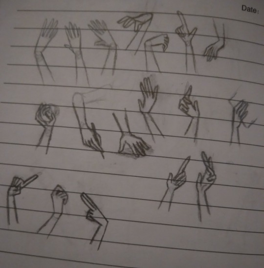
•For both traditional and digital artists, do👏art👏studies👏. No, this doesn't mean sign up for expensive art classes, it means spend a page in a sketchbook just practicing one thing. So instead of drawing say, a character portrait like usual, have a page that's just full of hands in different poses (use references! Very important for studies!)
2016 example, but you can tell which ones had references (hint: only 3 of them did,but they're way better than the rest)
the only recent example I had was an unfinished page of bird skulls :/
Which brings me toooo
Learning to draw realistic skeletons can also really help with anatomy, if your character looks wonky, think "could a skeleton fit in there?"
Thinking abt how their skeleton looks can help notice things like the eyes being too high up or the mouth being too low, or having no room for a brain
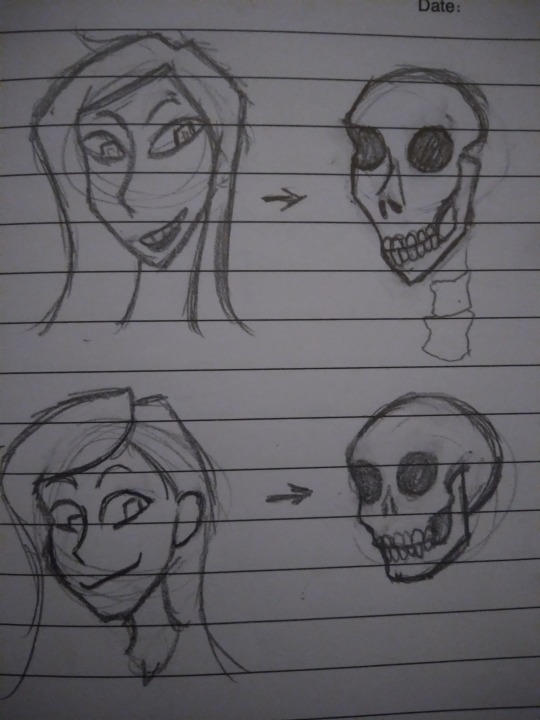
*this is not a dig at people with this style! It's okay to have more exaggerated features and you don't need to draw realism! The skeleton rule does not apply to cartoony characters obviously. Just some advice from someone that used to put the mouth too low all the time
•if you get stuck where you feel like you aren't improving, try different art styles out.
•If you have art block and don't know what to draw, try the 'dtiys' or 'draw this in your style' tags and pick something there, or do screenshot redraws from games or shows
•If you usually listen to music when you draw but it's just not doing it atm, switch to something like long YouTube commentary videos or documentaries, and vise versa. Sometimes the brain wants music, sometimes it wants information or gossip. When you get burned out from one go to the other
•this applies to traditional and digital art too! If you have art block on one medium, switch to another! If digital isn't working, grab a pencil or paintbrush, or play with some clay! Sometimes the brain isn't bored of art, it's just bored of the medium.
•If you're trying realism and struggling, break it down to simple rules.
And I don't mean the shape thing everyone suggests, I mean things like "the inner corner of the eye lines up with the mouth, the outer corner of the eyes lines up with the ears, your nose bridge leans into your eyebrows, feet are the same length as your elbow to your wrist, use the collar bone to guide the shoulder position, the armpit curves into the breast, etc.
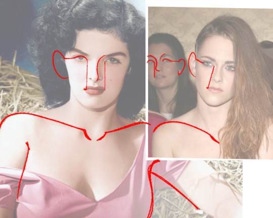
*this doesn't apply to everyone or every expression! Remember the mouth moves around and comes in all shapes, it's a very loose "rule", and people's eyes aren't always the same distance or angle, just keep the ear around that general eye area
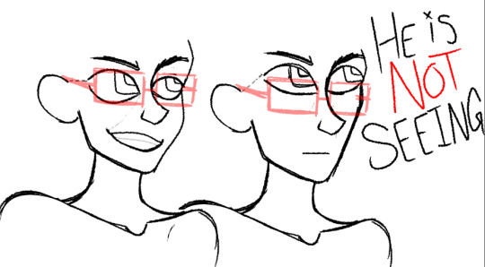
Glasses test: can your character wear glasses?
carlos passes glasses test- a better rule for mouths is to imagine smile lines, even if whoever youre drawing doesnt have wrinkles, theyre a good guide for mouth placement
•doing color palette challenges can help practice composition and shading with abnormal colors, and helps understand color theory
•for digital, you can overlay colors over a drawing to make the palette more uniform. Don't be shy abt messing around with it

•Watch speedpaints! Watch pencil animation clips! It helps
•don't be afraid to use your art supplies. Ik the struggle of "but I don't wanna waste it", but that paint will go bad if you keep it on a shelf for years! Use it already! Doodle in the "fancy" sketchbook! Yolo!!
•use cyan and magenta for mixing paint, not blue and red. The "primary colors" rule doesn't always apply to all mediums.
•keep your old art! Do not tear it up or throw it out just because you're not proud of it, it's cool to reflect or even redraw it years down the line (backup your digital art somewhere, even the ones not posted online because your computer could just die one day for no reason and take everything with it. It sucks)
•IF you sketch on paper and then digitalize it later, you can draw the pieces seperately and photoshop them together. So dont worry if you drew a really good hand but it's at the slightly wrong angle, or too far away from the body. You can put it where it needs to be without having to erase and redraw it
11 notes
·
View notes
Text
TYSM FOR THE TAG AFA!!! Ooooh boy where do I start?
First of all Afa and Pluto both of youse have put out some amazing stuff this year! I love seeing you guys art, your styles are both so cool!
As for my stuff from last year, well I can't say 2024 was my most productive, I've started a handful of projects like games or written work but none did I get to a state where I would call them "Complete". However I still have created a lot of things I'm proud of this year that I can't wait to yap about!
I think that to no ones surprise, without a shadow of a doubt, my best artwork of the year is this artwork of Mammon, I absolutely pulled out all the stops for this one and had to think outside the box to make it work! It definately shows so many of the skills I've learned accross my years of doing art and what better character for it to be than the greediest prince of hell herself!
2. I couldn't in make this list without bringing up this portrait of Jane. Not only was it a great artwork in its own right it but it's also practically a redraw of a similar work of Jane in the same outfit I did in 2022. Not only that but I ended up making her into my PNGTuber avatar for my Twitch channel which I started taking more seriously this year. Not only that but I made a bunch of alternate colour schemes for her which have already been useful.
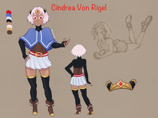
3. It's a tough pick but I think I have to bring up my ref sheet of Cindrea. I'd been developing her design and character for years and damn has it paid off. I definately have to make a game or something with her in it.
4. It's hard to pick the last artwork I want to show off but I figured I should probably show off my most recent digital work, my new design for my OC Rada! I haven't really posted her old designs anywhere but I definately like this design better!
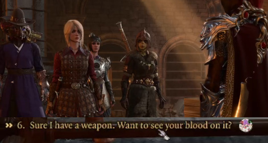
5. Now I could put another digital artwork here, but instead I want to talk about my Baldurs Gate 3 playthrough with @cicerosfavouritelistener! The characters we made for this playthrough, Merry and Evelyn, where instant faves, the way they play off each other and the LORE we've come up with, everything about it has been great. Now though it's not finished I would still like to share it with you all in case you haven't seen it. Though I did lose some footage, I can still share the earliest VOD with you all. It's pretty much just the raw uneditied 4 hours of gameplay. The episodes get shorter after that as I started to spend more time editing them. I'm definately planning to share more Merry and Evelyn stuff here soon since I already have a few projects for them in the works! But for now I'm just gonna drop the thumbnail of the second VOD since I actually spent the time making it. and it'd make the post look nice if each image had a picture underneath it.
And that's everything!!! Thanks for the mention @afamoore! I'm so happy I got to share this with you and see your amazing art, and thanks to @stellarsightz for starting this!
Afa probably tagged you guys already but: @lobo-inu, @abstractredd, @timetravellingpenguin, Please join in!
2024 Wrap Up
Rules: it’s time to love yourselves! Choose your 5 (or so) favorite works you created in the past year (fics, art, edits, etc) and link them below to reflect on the amazing things you brought to the world in 2024. Tag as many writers/artists/etc. as you want (fan or original) so we can spread the love and link each other to awesome works!
Tagged by @rustyram035 , thank you!!! :3
1: I bring the evidence (the beast is alive)
-> birthday gift for @/abstractredd :]]. My longest fic yet!! (Besides our collab hadlof fic teehee)
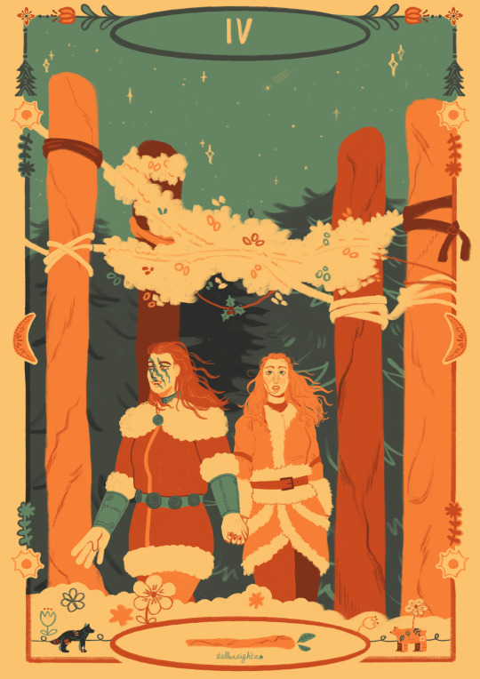
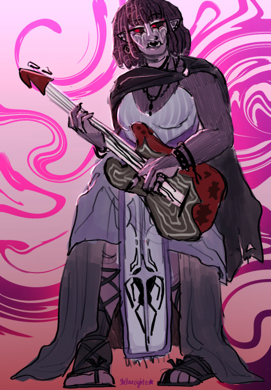
2: fraela tarot card piece
-> my beloved skyrim blorbos........
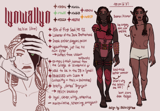
3: lynwallyn character sheet
4: cicero and linny sketchbook page
-> rips a pillow apart. I NEED to draw them more
5: Deathbell
-> was suffering from a massive art block. She singlehandedly saved me fr
Thank you everyone for being here with me this year!!!! 🦇🌹
Tagging: @probablylilly @reagan-the-saunders @abstractredd @lobo-inu @yorkshirereaper @bethrnoora @magnusmoggy @bonestrewncrest @highonarttm @afamoore @yorkshirereaper @unsettlingcreature @gryphonsoup + anyone who wants to join!! :)
#2024 wrap up#tag game#oc artwork#twitch#pngtuber#character design#character ref sheet#bg3#any moots of mine who weren't tagged but feel like joining please do#I'd tag all my moots I just didn't want to bug any of youse
30 notes
·
View notes
Note
Hello! May I ask how you draw? I'm currently learning how to myself and would be highly interested into a step to step process by you! Like from sketch to the done thing (no color necessary)
Hello there!
I dunno how I feel about showing how I work/giving advice to someone who’s learning (and I say it as a pro artist who went through years of traditional art education) because when I do the illustrations you see here on my tumblr I BREAK THE RULES you’d learn though life drawing routine, and give in to bad habits, and my methods are rather unplanned and chaotic which makes it difficult to pinpoint significant stages. But I used my portable potato to take some photos during working on my last piece, so I’ll throw it here with a bit of an explanation of what’s going on.
Before I begin - and because you’re about to look at a mess of a WIP - I’d like to give you some general advice that generally makes life easier when you draw (again, things that I learned in traditional arts education - another artist might advise you the complete opposite, dunno!)
Work holistically. Forget them satisfying-to-look-at clips on instagram showing someone produce a hyperrealistic portrait starting from an eye, with each and every element emerging being finished before they proceed to another part. It takes a lot of talent, yes, but these are ppl redrawing a photo in a kind of a mechanical manner. Most artists don’t work this way. Especially if you’re working without a reference, or if you’re doing a life drawing - your process will be layering and changing and finding what works best to give an impression of what you’re drawing rather than reproduce the exact image, and your artwork is likely to look messy most of the time.That said: don’t start with the details. Don’t spend too much time on a particular part while neglecting others. Your goal is to keep the whole piece at the same level of ‘finished’ (even though it’s unfinished - do I make sense?) before you’re confident that everything is where it should be and proceed to the details. So sketch out the composition first. See how things fit, what’s the dynamics. You’ll save yourself from limbs sticking out from the frame, odd proportions etc etc.
Because it’s a game of relationships between different parts of the picture/scene. I ask you not to worry about finishing a single element before laying out the rest because you’ll find that said element will look different once the other part appears! For instance - you might think that the colour you picked for a character’s hair is already very dark. But once you’re done with the night sky background, you’ll find that it’s in fact too light, and doesn’t work well with the cold palette. You’ll have to revisit different parts of the image as you go to balance these relationships and make the picture work as a whole.
Give an impression of something being there without actually drawing it ‘properly’- because details are hard, mate. You’ll see that my lineart usually has hardly any, and my colouring is large unrefined stains, but the finished thing looks convincing. Like, fuck, I can never focus on how Crowley’s eyes are really shaped. So I just turn them into large glowing yellow ellipses crossed by a line, and heard no protests so far.
Don’t panic if you messed up (you probably didn’t anyway). It might turn out to be a completely unnoticeable mistake - because, remember, things work together to balance each other, so another finished off prominent element will probably drown that badly placed line that looked so visible and out of place a second ago.
It might not look good before it’s finished. I’m mostly immune to it after years of drawing, and my recent illustrations all follow a specific method (ykno, my sunset glow effects and all that) so I can kinda predict the next stage. But I do my linearts on a specially picked crap paper, I don’t bother erasing the smudged graphite, and it looks messy af until I make the background white in Photoshop. Conclusion: you might have a moment of doubt as you work through a piece, but try to break through it - I often suddenly start to like what I cursed a minute before! - and try to finish it even if it’s meant to be bad. This way, looking through your past pieces, you’ll see the progress. And trust me, I can’t even look at my art from literally three months ago. It’s normal.
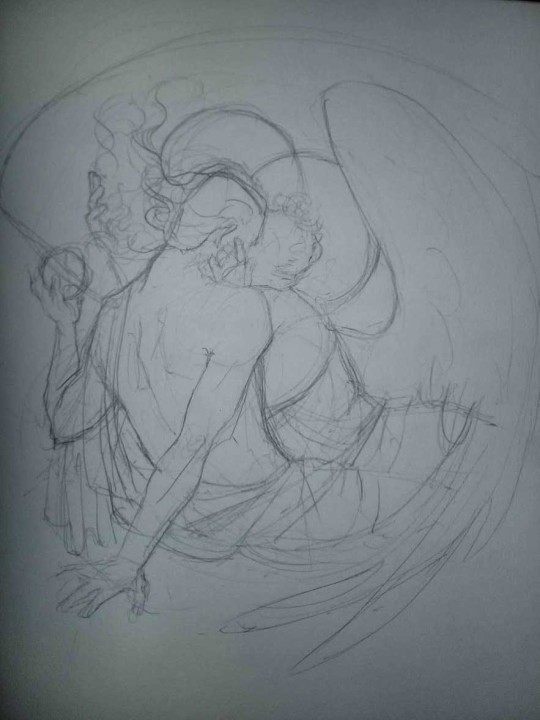
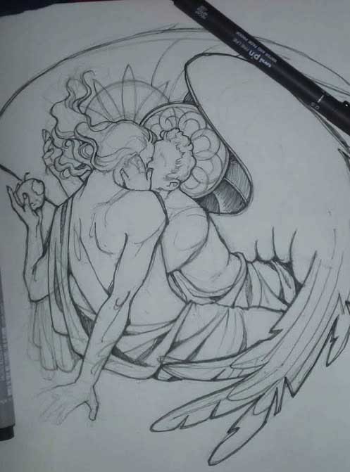
Now, pics! The sketches are paler in real life, but I increased the contrast a little so you can see something.
1. Laying out the composition!
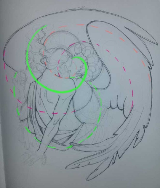
I wanted to just show them kissing, but I got carried away due to some Art Nouveau inspiration. As you might have noticed, most of my illustrations are quite self-contained (ykno - they look like a sticker on a plain background). So I wanted a tight swirl bordered by Aziraphale’s wings creating a sort of rounded, yin-yang like bubble around them. Consequently I made the whole composition revolve around their heads.

2. Adding more details to the sketch. It’s messy af. It will be messy until I’m done. It’s fine.
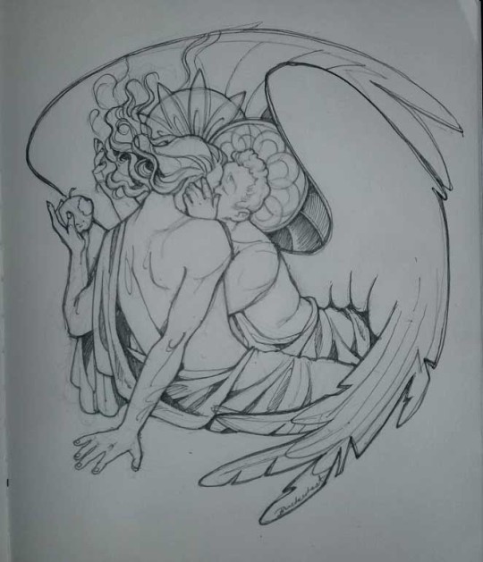
3. These are the fineliners I use for the linearts! They are made by Uni-ball and come in light and dark grey. I also sometimes use the guy on the left - ‘Touch’ sign pen by Pentel, when I want more brush-like, wider strokes. I work in grey because when I scan it and do my usual boring trick with sunlight highlights - which is an Overlay mode layer in Photoshop - the highlights ‘burn out’ the lines too and make them vanish a little, and the lighting effect gets more striking. I also like to use the light grey ones to make something look pencil-y without actually using pencil, because pencil fucking smudges.
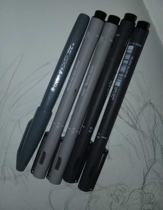
4. It smudges! So because I am right handed, I start inking from the right hand side, no matter how tempted I am to do their faces first.
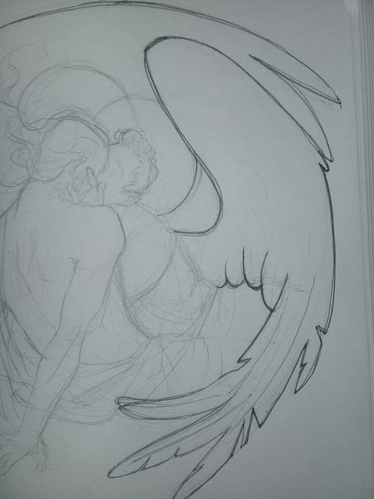
5. You can see the composition directions here. I made it intuitively, but ofc some ppl actually use grids etc to lay out their drawings.
6. See how pale ans thin the lineart was at first? I kept adjusting it as new inked parts were appearing. It starts to look nice and consistent now!
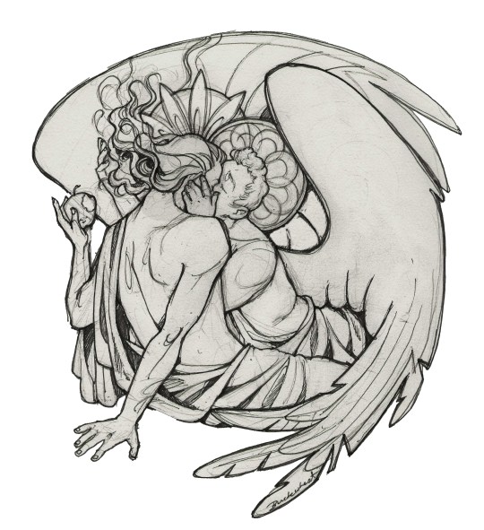
7. Finished lineart? There are some mistakes which I later corrected in PS. Notice that Aziraphale’s face has hardly any details on it - I tried to make the drawing suggest his expression rather than risk overdoing it.
8. Photoshop time!! You can totally do what I did here even if you don’t have a graphic tablet. I used Curves tool to enhance the lineart, then Quick Selection Tool to select the background around around my sticker-like piece and filled it white (on a new layer ofc). I keep this white layer on top of the layer order so it works as a mask as I colour. I decided I did not like the hatching shading underneath Aziraphale’s halo, so I erased it with a Stamp tool (because I wanna keep the textured grey fill my crap paper naturally gives me!). It’s done roughly but won’t be visible once the thing is coloured.
9. And the reason why I keep the grey shade instead of easily getting rid of it by using Curves/Levels is because when I set this layer to Multiply mode and colour underneath, it gives me this nice desaturated look like from an old cheap paper comic page. It works as a natural filter! But of course I can’t do bright colours this way, so all my glowing highlights happen ABOVE the lineart layer - on a separate layer in Overlay mode!
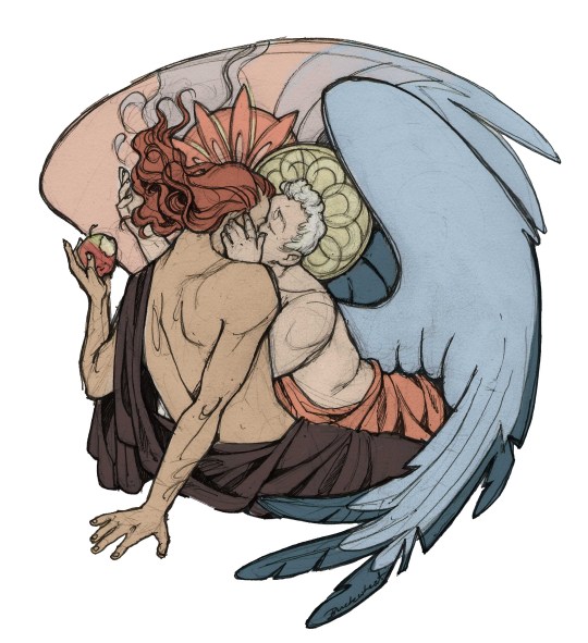
Finished thing here!
_____
Commission infoBuy Me a Coffee - help me with my transitioning expenses!Prints and stickers and things on my Redbubble!
#ask the buckwheat#long post#tutorial#drawing advice#drawing tutorial#good omens#ineffable husbands#good omens fanart#good omens art#my illustrations#doodles#toastedbuckwheat
1K notes
·
View notes
Text
Learn Log #1 - Pixel Art Basics 1
So this was the first week of learning pixel art! This week I had a look at some very broad concepts such as Size, Style and Lines. I’ll start with the first two topics because I feel like they’ve got quite a strong connection.
Size & Style
So if you’ve ever looked into pixel art you’ve probably heard of terms like 8-bit, 16-bit and 32-bit but you might not be sure what that exactly means. These were various processing architectures involved in old school video games. I’d say an allure of pixel is the recreation of old video game styles so these terms reflect their respective art styles. Basically, these terms explain ‘Oh I’m going to go for the style of the NES’. Here’s a great Reddit post basically explain it better than I ever could. You could also argue that it connects to the size of the sprite be it 8x8, 16x16 or 32x32 - some people use the terms as such and so will we in this post.
So that’s all well and good but how do you pick a size for pixel art? Well, from my learning this week not only does it depend on the style/complexity you’re aiming for but also your skill level and sprite concept. As we just discussed video game styles play a big role but if you’re not aiming for anyone style then concepts such as colour palette and outlines do too. For example, if you have a limited colour palette or need outlines you might need a slightly bigger sprite to fit in the detail you need - which brings us to concept. If your sprite needs to be expressive, for example your game is story-based, you’re going to need enough size to fit the expression. A trick to figuring this out is making the smallest detail or the facial expressions as small as possible while maintaining your preferred style/level of detail and working out the size of the sprite from there. Of course, this all connects back to skill level. If you’re not that comfortable with pixel art don’t start with big 128x128 sprites. Start with 16x16 or 32x32 first. These larger sprites also make things much more difficult to animate and are a lot easier to mess up.
Going further into style, I want to quickly discuss 1-bit pixel art or minimal colour palettes. 1-bit pixel art is a two-tone style meaning it only uses two colours throughout the piece. This is an interesting style to work in because you have that new level of restriction. For example, how do you convey different materials with only two colours? The use of patterns is really useful for this but they can’t be too confusing or complex also. In general, these minimal colour palettes make animation a lot easier but can make readability a little difficult if you have a lot of things going on.
That’s the last thing I want to touch on - readability. Whenever you make pixel art make sure it can be read - especially if it’s for video games. Making interactable objects outlined or enemies a specific colour is a great way to do this. Readability should be the first priority.
Practice #1 - Resizing Logos

These 16x16 logos are based upon the Barbarian and Warlock class symbols in Xanather’s Guide to Everything. I tried using them to follow TutByKai’s tutorial on sizing symbols from 16x16 to 32x32 but they proved to be to difficult for me to size properly. Here they are for you to check out though! In the end I managed to practice sizing in practice #2 and #3.
Lines
When I was studying about line-work this week I found it funny that rather than learning what to do, I learned what not to do. I think this is because we all have a rough idea of what a pixel art line should look like but not what makes a line look wrong or weird. The main culprits for this are called ‘doubles’ and ‘jaggies’. Note that these are not rules you have to follow and if using doubles or jaggies actually helps convey meaning then you can definitely use them
Doubles are when a line doubles up, usually as it curves or turns an angle. This can make the line weird as it begins to look more blocky or the extent/where the doubles are is inconsistent (for example shifting between inside and outside a circle). A good fix for this is anti-aliasing but that will be discussed shortly.
Jaggies are when pixel don’t within an established patter for example if you had a curve going: 2pxX 1pxY, 2pxX 1pxY,2pxX 1pxY, 3pxX 1pxY, 2pxX 1pxY, 2pxX 1pxY. That 3px line is going to look weird (also sorry couldn’t be bothered to make a quick reference picture online). It may work for irregular terrain such as nature but with man-made objects and more spherical/round objects it just looks strange.
Anti-aliasing (AA) is a pretty useful tool. You can think of it has a half-pixel. However half-pixels don’t exist so it’s really just a pixel roughly the colour between that of the line and the colours next to it. This is useful for fixing up those doubles or making more detailed curves/angles. You’ve got to be careful to not to overuse it as otherwise things will just begin to look messy. Also don’t just stick it across the whole outline - remember this is to be used like a half-pixel for curves. Don’t forget, just like more complex colour palettes you have to animate anti-aliasing too which makes things more difficult.
Finally, I have a few tips for outlines. Firstly, outlines must reflect the nature of the contents (point object = pointy outline). Secondly, fill in any voids within the outline as it can be distracting. Outlines can also play a big role in the way your character is seen by others and how they pick up on the nature of the sprite.
Practice #2 - Robert
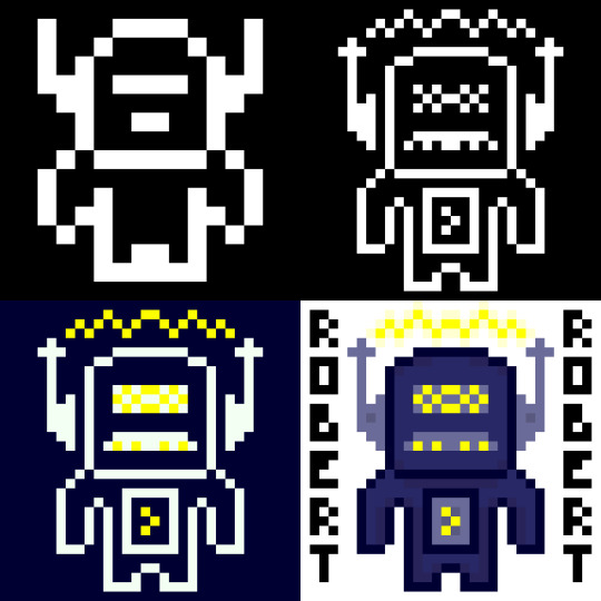
So I made Robert yesterday for my practical this week. I’ve presented him here in stages of the spriting process so I’ll just talk through each stage.
So in this stage I started with a 16x16 canvas. As you can see Robert has very little detail due to the small canvas size and 1-bit colour palette. You can kind of tell he’s a robot from his head, if I were to just have him in 16x16 I might want to make the shoulders or a bit blockier to represent that. I did try to do that on the outer pixel of the hands but they kinda felt like wings. When you do pixel art in this smaller sizes each pixel and colour becomes much more important.
So in this next one, while I had the same colours I resized him digitally to 32x32 and added in a lot more detail which you can clearly see. His antennas are now away from his head to make it clear that his head isn’t just a weird shape. I couldn’t do that in stage 1 because 1px there was about 1/6 (?) of his head width. Now that it’s 1/12 (?) I can separate the objects while making it still feel attached. These antennas had some extra detail thrown in but I really like the details on the face. It starts to portray a personality - I think the mouth looks like a mustache so that with his name makes him feel like some kind of ‘Dad-bot’. Also I was able to make the body feel a little more robotic while still remaining humanoid
This stage I just adjusted the the two colours and chucked yellow into the palette. It definitely gives off a completely different but I feel that maybe I should have used a different yellow colour as it is a bit bright. The addition of yellow does make the waves above Robert’s head look like electricity rather than some sound waves or something else which shows how one colour can change a lot.
Finally, in this stage I dived into the colour palette. This change meant I could directly attach the antennas again and also add some detail with slight colour changes (including some shadows below the head and inside the body). Overall, while I think stage 4 looked nice I am particularly fond of stage 2 and the ‘Dad-bot’ vibe it gives off. Sometimes less is more.
Practice #3 - Joey

So, I loved making Robert so much I wanted to try again with the colours flipped. This time I was inspired by Brandon James Greer’s 1-bit video to make a character portrait.
So since this was going to be a portrait I needed to start with his expression as it was important I had that nailed down. I wanted to go with a confused look with one eyebrow raid and the other furrowed down but when I added the mouth it seemed a little weird. I decided to keep it though because I wanted to see where it’d go. The expression took up quite a bit of space so I didn’t have much room for other stuff in the 16x16 canvas.
When I resized Joey’s expression I didn’t do it digitally like I did Robert’s body. In stage 1 the facial expression took up a large portion of the canvas size and if I resized it then that some issue would exist. Instead I decided to redraw the face slightly sized up. I wanted the mouth to show teeth so it needed to become 5px tall rather than 4px. Based off this I made the eyes 1px higher and wider to a 2x3 size. I decided to keep to keep the eyebrow width but I did lengthen them so they’d retain their expression. I also spread out the elements and added a nose. As I gave Joey a head I realised that his expression gave me a classic ‘Wolfenstein’ or ‘Doom’ portrait feeling so I went off that and gave a similar haircut and armour in the style of the original Doom. It looked pretty good although if I was to leave him in this style I might make the armour less intricate and focus on adding texture to the different components. Additionally, as there it’s 1-bit the teeth did look like giant lips.
The piece really came together when I added colour (I was too excited to do a minimalist palette style). I tried to keep the colour palette down to a minimum so the piece didn’t get too overwhelming. For example, the armour only uses three shades of green - one being the outline which is also used for the eyes and mouth. I actually didn’t choose black for the mouth because it contrasted too heavily with the white which took attention away from the rest of the picture.You’ll also notice I used a double on the left eyebrow. I did this on purpose to make the right eyebrow point seem thinner and more furrowed downwards. I tried a couple of iterations of the eyebrows and I think I liked these the most.
In this stage I just added some more detail including texture, the scars and some shadows. Basically, I chucked out any hope for a minimalist palette. I added the shadows with another layer that had a reduced opacity which worked ok. There’s not much to say about this other than I feel like this stage had a lot more depth and it was definitely my favourite of the four. Sometimes more is more.
Learning Resources
My studying and this blog post wouldn’t have been possible without these amazing resources. Go check them out if you wanna learn some stuff about pixel art!
What makes art 8, 16, 32, 64 bit?
What Size To Make Pixel Art by MortMort
What Size is Pixel Art? by Brandon James Greer
How to Choose Pixel Art Resolutions by TutsByKai
Creating Pixel Art from an Object by Brandon James Greer
Pixel Art 101: ‘Styles’ by Pixel Pete
Pixel Art 101: ‘Game Boy’ by Pixel Pete
1-Bit Pixel Art Techniques by Brandon James Greer
Minimalist Palette in Pixel Art by Luis Zuno
Constructing Lines and Curves in Pixel Art by Brandon James Greer
3 Pixel Art Techniques/Common Mistakes (Doubles, Jaggies & Outlines) by MortMort
Basic Anti-Aliasing for Beginners by MortMort
0 notes
Photo
It has only been a little over a year since I started watching the show and joined the Black Sails fandom. I posted my first fanart exactly one year ago and it was the one above. Thus far I have drawn over 100 of them. I tried different mediums and styles, both for practice and for capturing the essence of the things I wanted to share. Some of them are great, some are silly, some are a bit out of character or not so good in other ways and some ended up surprising me in many ways. All are nonetheless very precious to me.
Under the read more there's a list of all my doodles thus far. Most of them feature Flint, Silver or both of them (there will be more of the other characters in the future, no worries). I have to admit I laughed quite a lot while going through these again. This is a really long post.
This is a list to show what sort of things there are and also for my own amusement and archiving purposes. The list is in chronological order, from first to the latest.
I tried to make this as concise as possible, but the tag/navigation page is here if you want to find something specific or don’t want to go through all this:
- Flint takes care of Silver's leg in the darkness of the captain's cabin.
- Some quick doodles of Flint, ballpoint pen
- Sharkdate cuties (really scrappy doodles of Silver gazing at munching Flint)
- Progress. A continuation to previous pic. Silver holding a cup, covered in blood and looking affectionally at Flint. Here’s a giffed version.
- Silver and Flint go for a night walk in winter and Flint finds the streetlights amusing. Modern Au, beanies and the BS logo
- “See any treasures, Capt'n?” Billy to Flint who is looking at something “shiny” with his spyglass.
- What if Silver stole that certain ponytail and made it into "a rabbit's foot"? And what if Flint had a medallion with pictures of the Hamiltons and later a lock of dark curls... I returned to this idea several times after this, lol. (still secretly wishing that anyone would write a ficlet about this).
- Overload of Blackbeard - several doodles of different adaptations of BB
- Shark hunting. Flint has the shark on his lap and Silver stands in front of him. Composition inspired by that infamous Wolwerine and Nightcrawler cover.
- A gif of Blackbeard with flowers in his beard (I share a birthday with Ray Stevenson, that's why).
- a quick sketch of displeased Jack
- The Red Lollipop. Flint eating candy which is distracting to Silver, inspired by this awesome post (x). Silver steals the sweets and peels some potatoes. Bonus: Randall and Betsy the Cat.
- Draw me like one of your quatermasters... Flint doodles sleeping Silver in the Captain's log.
- Random sketches of Silver and Flint. Learning to draw their faces
- Flint with a horrible mustache and Silver with a long braided beard. (I should redraw this someday..)
- Flint takes Silver for a ride (modern Au with motorcycles). The Walrus gang follows "the flagship"
- Black Sails moomin AU, part I (I had so much fun with these).
The domestic modern beach au serie with 15+ doodles, various characters, inspired by this hilarious post (x). - Jack takes pictures of everything and Vane ends up buried in the sand - Silver puts some lotion on Flint (Billy tosses people up in the background) - Max and Anne Bonny enjoying each other's company - Rogers is going to get hit by a beach ball "accidentally". Anne, Max, Vane and Jack in the background - Ben Gunn shows his ship kite to Billy Bones - Vane and Flint swim butterfly. Silver (*.*) - Vane flips his hair like a merman, Eleanor is drinking and enjoying the view. - Mr Scott and Mr Gates enjoy their drinks at the bar while others fight in the water. Max and Eleanor gossip together. Anne and Jack hold hands like otters on swim rings. - Silver and Flint sleeping on the sun, Flint has a book on his face - The Ranger Crew swimming. Jack is slathered in sun lotion, Anne waits for him and Vane makes a joke. + Mysterious swimming trunks. - Silver is the sneakiest shit and likes to creep underwater and drag people down by their legs. - Silver and Flint eating ice cream + some early sketches in a gif - the Fucking Warship (minivan) rides to sunset, Vane is forgotten in the sand but do not worry...
- Silver and Flint sing the song "Dynamic Duet" from Starkids' Holy musical B@tman!
- Nooooooooo! Flint shaves his head, Silver doesn't take it well.
- Silver's character development. From little shit to actual scary fuck
- A HUG. (silverflint, done before s4. I really needed a hug)
- Bloodthirsty Bunny & Squinting Squirrel, (furries, i am so sorry)
- Flint brings water to Silver, a scene from the show. <3
- Sweetness of touch. Flint gets his hair/head touched by his loved ones.
The Walrus crew acquires some chicken. A lot of them. And a parrot. - Billy and Joji are tending them - people playing board games and ignoring the chickens - a coc- I mean a rooster between Silver's legs - Silver holding some chickens and Flint meeting "the Captain Flint"
- Flint gets his ginger crown back...sort of
Chickens, part II. Flint sends his regards. Teach has taken Anne and Jack to fishing and they get a surprise "gift" from the Walrus.
Fanart about Silverfin, a thrilling and unbeliavably funny (nsfw) silverflint fic by @jadedbirch and @zoinomiko (can’t tag u for some reason..).
Go read it :D I made some (sfw) fanart inspired by it (spoilers). - a comic of the tragic night - reunion and crowns (˵ ͡° ͜ʖ ͡°˵)
- (a recap, not really a tutorial) about some of my messy work methods.
- Anne Bonny, without her hat, ready to kick your ass, season 3
- A portait of Max
- Every fashionable pirate captain needs a hat! Silver buys some silly pirate hats. Inspired by @vowel-in-thug's fic (part V, nsfw) and the CBeebies Bedtime Story etc.
- "Support". Silver and Flint approaching the Maroon camp.
- A portrait of Long John Silver on his way of becoming the legend
- Swords and time. James McGraw - Captain Flint. Sword placement comparison, gif experiments etc. (I really like this one)
- A canary. Flint finds a sad-looking caged bird aboard a merchant ship and then reads books to it in his cot. Inspired by @old-long-john's sweet and beautiful fic (x). Also thanks to @captain-flint for spotting the bird cage in s1.
Inktober 2016, 20+ doodles, various characters - Silver, a sad little face doodle - A bringer of death and destruction (Flint as an angel of sorts). Quick doodle with a brush - Silver and Flint. A little doodle with an ink-dipped cotton swap - "Hungry", Silver and Flint find the whale and prepare to hunt sharks. - "SAD?" NOT TODAY! There's always Silver Lining. Silly and shitty puns. - "Hidden", The treasure has been buried. - "LOST", Silver and Flint look for a bird on board the Walrus. - "ROCK", Ben Gunn and Billy Bones play rock-paper-scissors. (sorry, still no better doodle of them) - "BROKEN", Benjamin Hornigold misses his chair. - "Lock the door", Flint on the floor of his cabin when they were becalmed ;_; - "TRANSPORT", Anne Bonny takes Jack Rackham to safety on a horse. - Madi, a little sketch - "Dufresne admires his new tattoo" - "TREE", What difference does it make? Captain Naft shares his insight. Froom and Crisp agree. Morley and Randall (+ Betsy the Cat) are not impressed (for obvious reasons...). - "RELAX", A nice afternoon at the seaside with some of the brothel girls - A little sketch of John Silver again, because I cannot resist him. - "Flint has a meeting with Death". - "ESCAPE", Flint has retired and Silver still sails the seas. Occasionally he visits James and steals some of his baked goods (with some help from his crew and birdies). - "FLIGHT", a sketch of a parrot on a napkin - "SQUEEZE", Jack Rackham enjoying his bath - "LITTLE", a little sketch of Max and Anne kissing in little rain, under Anne's huge hat. - "Surprise", Charles Vane lurking in the water - "And then! You won't believe what the.." Hal Gates and Billy Bones spend their free afternoon gossiping and having fun - "Forget-me-not" / "one dozen", Miranda finds some familiar flowers and thinks about Thomas. - "BURN", Thomas, James and Miranda, just eyes. Inspired by the powermetal duet "Wish I Had An Angel"
- Oooh, What does my reflection shoooow ~. (Lovable) Little shit.
- Accidents with the spyglass. Flint acts like an asshole, Billy and Gates are having none of it, Silver is yet to learn.
- Death builds a raft and follows the Walrus.
- Portrait of Eleanor, the Merchant Queen of Nassau
- "long johns and puns". Silver is looking for a new pirate style and Billy offers to help.
- Black Sails Moomin AU - part II
- Silver at the wrecks, light and visual practise
- Eleanor Guthrie and James Flint, looking in / out. visual practise, parallels and contrasts
- My Heart Will Go On, but I'll keep your ponytail and get a parrot for my duets. ᕕ( ᐛ )ᕗ
- Muldoon's tattoo ;_;
Some of the following have season 4 spoilers:
- Eleanor does some embroidery (of bees and fuck-yous)
- How Silver gets his new crutch (Israel Hands is handy)
- Flint and the Wanderer above the sea of fog
- Flint's mouth saying FUCK infinitely, a gif experiment
- "That's my wee lad, Gimli." Berringer's locket and asshole Rogers.
- For a moment there was a Hat Trio. Teach, Jack and Anne
- Silver and Madi, canon kiss
- The Spare Ginger. Silver doesn't like Eleanor's plan. Madi and Israel Hands try to comfort him.
- Eleanor Guthrie, a green portrait
- Long John Silver must make a tough choice, while Flint enjoys his capture at Eleanor's expense
- All those extra spyglasses in 4.08. Maybe the answer was Israel Hands' hoarding.
- Fresh air on the balcony of the Walrus. (a drawing of the ship at night). There're celebrations on the deck, Flint and Silver have a private talk.
I find it endearing how this list ends with the balcony one. Like a parallel (ha!) to the first one, where Flint and Silver are having a private moment on board of a ship, although it is a different ship and at a different time. A year ago I had no idea where this all would lead me and how much I would learn and get to experience *pats my past-self in the back awkwardly and fondly*
Looking back at them (doodles) I feel both proud and slightly embarrassed of my enthusiasm. I have never done anything like this for any other fandom. I have never felt so much and had such an urge to engage in this sort of thing.
This show, its creators and crew, this fandom. Just something unbeliavable. I cannot find the words to say how much I appreciate you all. The brilliancy, the humour, the love in all kinds of forms. I am so glad I stumbled on this show (it was a gif or a fanvid about ep 2.05 that made me aware of this show, btw. I cannot remember it clearly anymore and for a moment I thought Crossbones was a pilot for Black Sails and almost missed everything, but that's a story for another time...)
Know this: I have loved sharing this experience (the show, the fandom) with you and I appreciate everything you have given to me or shared with me. I will treasure this. (I apologize not thanking more people individually, but this post would’ve never reached its end otherwise).
*throws hearts and forehead kisses to the best and inspiring fandom and the greatest show that broke my heart and healed my soul so many times*
All the possibilities and love to you. Thank you <3
(This is not a goodbye, btw. There’s still so much more to come!) (◠‿◠✿)
P.S. All this started as doodles so that’s why I have kept using that word eventhough it doesn’t really apply to many of these anymore...
#black sails doodle#anniversary of my descent to black sails hell and heaven#<3#i can't really think of any tags for this#a list of things I have drawn for bs thus far#for archiving purposes#what a journey :D#I hope this is readable#there are several unfinished ones waiting but i am not going to spoil the fun yet#i hope there aren't many errors in links or tags#I won't tag or thank more people individually (at least in this post...sorry)#(better to not have too much stuff in one post)
46 notes
·
View notes