#also its my artstyle and I can use as many random textures as I want
Explore tagged Tumblr posts
Text
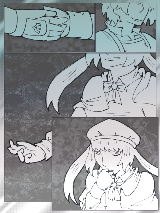
It's the sign for the last chapter, do you have any regrets?
It seems like your turn on stage has come.
There will be no rerun; that's why I have to go.
I won't avert my eyes anymore.
#fgo#lostbelt 6#altria caster#castoria#altriguda#casguda#gudako#digital#comic#also its my artstyle and I can use as many random textures as I want#caption is lyrics from “We're Still Underground” by Eve
15 notes
·
View notes
Note
Hey Neyla! I hope it’s ok that I ask but is there a brush setting you prefer on procreate? I’ve been inspired by your art for eons but I can’t comprehend photoshop. You can totally disregard this if you don’t use procreate though!
Hello! I don't know how long this message's been sitting in my inbox because i didnt check in for a while 🥺 I hope you get to see this either way!
I don't use procreate unfortunately, but I can explain the settings I use for my brushes on CSP in general, and if it works like any other art software then you should have similar settings on procreate
for sketches/linework, I will very often use an opaque & slightly textured round brush. the most important for me is for the brush to have that fuzzy sort of texture that gives the impression of using a pen/marker on paper.

note that i am actually terrible when it comes to line weight, it's definitely not something i work on a lot other than in backgrounds, so I don't actually bother too much with pen pressure settings.
the only rule I abide to is to always set the minimum value above 0 (anywhere between 20-30 is what I use). this is because when I started drawing, I used to be very heavy-handed and would wear out my pens too quickly-- so setting a minimum can help you become more aware of how hard you're pressing on your pen and make gentler strokes.
another fun little setting i use is opacity: like I said, I use opaque brushes for lines, but I like to reduce a tiny bit of opacity when brushing very lightly to give that impression of pen on paper.
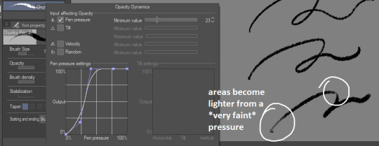
There's a couple more brushes I use for coloring or rendering; the major sticking point being that I don't use pen pressure to control brush size that much. If I want to make thinner/smaller strokes, I'll simply reduce the brush size because it's easier for me to control!
(also, opacity is something I'll use a lot more when I'm working on colors)

just know that this is my way of handling it, and it may not suit your style. pen pressure may be another artist's best friend, so please make sure you try out what works best for you :)
finally, some art softwares come with stabilization. I don't use it personally, unless i'm actually trying to do really smooth curves (which is practically never). stabilization can also make CSP lag a lot with higher values and large brushes. the use of stabilization doesn't make you a bad artist or a lazy one, and not using it can make your lines look a tiny bit wobbly if you're not used to doing quick strokes. use stabilization at your own leisure!
on a different note, i know this wasn't part of the question but I'm bringing this up since it's something I tend to hear from people who say they were inspired by my art (thank you by the way🥺💕!!) : don't be misled by artstyles that "make it look easy"! my sketches may look very simple and natural because i'm more adept at bringing out the essential and discarding details in a design. this is not necessarily what you want for your art style; maybe you like drawing details a lot, maybe you prefer the lazy way out going straight to the point. neither are good or bad, only what you like to do matters.
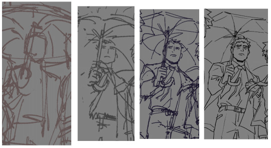
also, if you're frustrated by your work, don't be afraid to draw over it as many times as you want, adjusting things with the lasso tool or deform if something feels off then drawing over again. sometimes you'll be satisfied with your first take, and sometimes you'll need 3 bases before its acceptable (examples below)-- it all depends on your mood, energy, motivation, desired outcome, format, or even just randomness
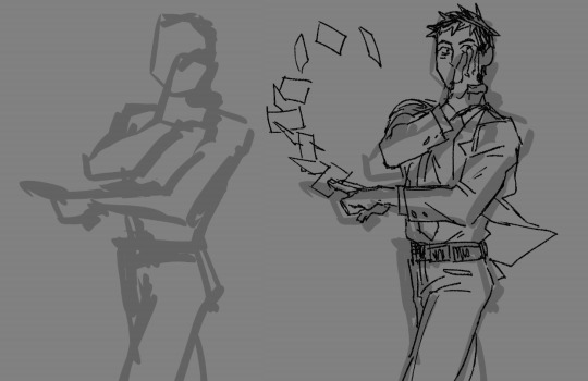
oh and, sometimes the best way to enjoy drawing..is to find something to obsessively draw (,:
take care!
262 notes
·
View notes
Text
To Volpestarks,
I've seen a few older posts regarding this blog, but I decided I'd pull together some evidence and make my own post and conclusion about it. @volpestarks , while you have shown in the past to be an incredible artist seen mostly on your ArtStation and old, buried tumblr post and other social media accounts, I fear you have let AI almost completely take over your art, and you vaguely claim you use AI in your art, but downplay just how much you use it. Be aware that this isn't "cyberbullying" as you have claimed in the past, but an honest conclusion I have come up with based on the evidence I have gathered.
Let's begin with your ArtStation, found linked in this lovely art piece you had made almost 6 years ago.

(Source)
Directed to your ArtStation, we see the bulk of your art, your neat, expressive artstyle and textured brush strokes. Yet taking a glance at your posts, one "art piece" painfully sticks out...

(Source)
On the top row, the farthest to the right, you have posted a portrait you claimed to have drawn that looks very different from the rest of your art. On top of that, many artist like myself will also notice that the style in particular looks very similar to AI generated images, known as AI "art". Let's take a closer look.

(Source)
It seems you claim this as your own work, a "gift commission" for a friend. Additionally, you then promote yourself, saying you currently take commissions. Looking at the date this was posted, this was approximately posted not too long after some very different art you created of different head shaped characters in greyscale, perhaps you experimenting with your expressive art style.
The art piece you posted after the one above is back in your similar style, a beautiful perspective sketch of a city.

(Source)
Notice how this is not only posted a little after your last post from above, but how the style and overall technique is completely different. On top of that, you also tagged the software you used, and what this art piece is about.
While it isn't a crime to generate "art" with AI, blatantly claiming it as your own work when it is vastly different than a piece you posted not too long before, as well as after, is pretty disappointing and not a good look in the art community at all. This was the first, and unfortunately not only, red flag that caught my attention.
-
Now looking at your Instagram, it's clear you have dabbled pretty heavily in making AI generated pictures. For example, I will use this post where you created some AI generated images in what seems to be a collab with another Instagram account.

(Source)
Here we can see AI generated "art", the telling signs of this being generated is things like the anatomy of the arm, the random mirror in said girl's arm, and overall minor things us artists have come to point out in generated "art". While you don't outright claim to have made it, it's just more evidence that you have dabbled in AI generated art quite frequently. - Now moving onto tumblr, where people have seen the most of your art, as well as pointed out your inconsistencies.
I want to start off with this post you made yourself, and take a look at what you have to say about these inconsistencies.

(Source)
Right off the bat, the first bullet point is a clear indicator that you use AI. While it is, as you claim, not prompt based like most AI generators, AI is prominent in your art. While you don't specify how much AI you use in your art, from the examples I went over before, as well as what I will go over, in my opinion it's pretty blatant. You have proven to be a talented artist, as you have art posted from before AI art was available to the general public. However, unless the AI generator you are using has stated that its database is comprised of data gathered with the permission of artists and other creators, you are participating in the act of using stolen data. Yes, you are indirectly stealing artist's hard work to fill in your own work then claiming it as your own, if that is not the case.
You then have this comment, the only comment under this post, as you have replies restricted on every one of your posts across your blog.

(Source)
After going through your tumblr, Instagram, ArtStation and even old TikTok account (that seems to be no longer available) I did not see a single Timelapse nor Step by Step you claimed to have planned to post. While yes, you have no obligation to share these, and I'm sure you're very busy, it's odd you haven't found the time in a little over 6 months to post just one Timelapse or Step by Step. As an artist who only uses Procreate, I know the program quite well, and that it's only a few button clicks to export a Timelapse! If you're not sure how or it has simply slipped your mind in your busy schedule, here's a link directly to the Procreate Handbook!
Before I list my own gathered evidence, I would like to shoutout those who have already done so. Some have even reblogged straight from your art posts and of course, they were ignored.
especiallyhaytham and gronnulv
bunabi
And any others who talked about this. You are not alone.
Following these claims of people pointing out some very telling flaws in your art work (flaws usually common in AI generation), instead of addressing them or even disproving them by showing us proof (like those Timelapses and Step by Steps you planned to post) you either ignore them or act like it's a personal attack.

(Source)
You seem to defend yourself by claiming it's harassment or "cyberbullying" instead of proving us wrong, which to me is a telling sign. You also have multiple posts defending yourself, or claiming your art is "your art", but you never have proof to back it up. While you have demonstrated in the past you are a talented artist, why is it so hard to show your work now after having a sudden, major art style change with small flaws commonly seen in generated art? - One of your posts that caught my eye, as a fellow Mass Effect fan, was this piece.

(Source)
While on the surface this looks nice, a few moments of observing this piece is all that is needed to notice some pretty significant flaws. The hat on the Shepard's head is completely wonky. Now, I'm not an expert on hats, but that hat is incredibly deformed from the bill to the hat itself. Next, the man's arm seems off like it's been dislocated, and even fractured in multiple places the way it bends at displaced joints. Behind the orange cat is a blurred, orange and black stripped mass. Is that a part of the cat? If so, is it a large abscess? A mutation? Does it need medical attention??
Another example is this post you reblogged not too long ago, which I'm assuming means you're still proud of it, or at least claim it.

(Source)
Again, this looks appealing on the surface, yet there a quite a few flaws. AI generators have never been good at replicating hands, and it seems like this poor dinosaur is no different. Look at it's hands; 4 crooked fingers on the left, 3 fingers and two thumbs on the right?? A wonky snoot and bumpy underbelly? If you claim you draw, even with the aid of AI, I would have at least fixed this poor dinosaur's anatomy before posting this. - So I've proven you use AI, and you even claim so yourself, yet the way you state so makes it seem like it plays a minor role. You've proven yourself to be an artist, so why not fix the AI's mistakes? If you won't put the effort into fixing the generator's mistakes, how much effort, if any, are you putting into the art piece itself? What is your process?
Well, based on these two photos, it seems you do draw, but then you let AI transform it into something completely different, and despite these vast generated differences, you still claim it as your own.

(Source)
Does this look vaguely familiar? Doesn't this city, this perspective, look familiar? Doesn't the character almost look photoshopped in with the light outline surrounding them? Well, here's the original image.

(Source)
I thought so. Here is your original artwork, a beautiful city perspective I stated earlier, now ruined by the overused "assistance" of AI. I'd argue that these images are barely the same, the color theme and perspective somewhat the same. Yet, despite the vast, generated differences, you claim it to be your own artwork.
This is disappointing. Over your career you seemed to have developed your expressive art style, something unique and beautiful, and yet when AI "Art" Generators reared their ugly head, you decided to chose it over your own art.
You have chosen to use a program, a database filled with your fellow artist's stolen hard work, for your own gain because it was easier and simpler to you.
It's one thing to use AI for references and ideas. AI is a wonderful tool to use, but it should stay just that. It should not replace your art.
Claiming it as your own, despite it being vastly different than from what you have drawn, is diabolical and quite the low bar.
We aren't saying Ai is bad, nor is it bad to use in your art. What we are saying, however, is if AI is this prominent in your art, it is a false statement to claim it as your own art, and even misleading when you promote for personal gain like commissions.
I'd love for you to reply to this and either prove me wrong, correct me, or say whatever you see fit, a response from you regardless would be awesome.
But if I am blocked or ignored by you, I will be sad and disappointed to realize that those actions by you would only prove me right in my conclusion.
#as always#do not harass them#please#gator bellows#ai art is not art#ai art is art theft#ai art is stolen art#art#beware#volpestarks beware#dragon age#mass effect#original art#procreate#digital illustration#digital drawing#thanks for coming to my ted talk#and please spread awareness#as im sure this person isnt the only one to do this#if anyone has any other good tags to tag this post with please let me know
4 notes
·
View notes
Text
to anyone who ever wants a really good tool for character designing and character building, i very much recommend using miitomo
i have played the game tomodachi life for many years now and while it's very similar there are a few things where miitomo is better specifically for this
miitomo is down so you can get it through kaeru patcher
here's why it helped me
1. getting it this way - everything is very cheap - costumes, outfits and accessories that should be between 2k to 6k are now literally just. 10 coins. and kaeru gives you like 10k to start out so you have room to dress your characters however you want
thinking about what your ocs wear is important not only because of the art aspect but also because when you try to come up with personal style, your technical skills of how well you draw clothes and textures and wrinkles come up like an obstacle, PLUS you have defined limited options so it's less difficult to pin point what their style would be
for me, i talked about it a WHILE ago but the story i'm working on is based on greek and roman mythology, although with spicy innacuracy and lack of research 😁❤️
and even though there are literally two clothing options that would match their actual attire they wear at work or during meetings or just during their life in general in the sky, it was very interesting to construct outfits for times where they'd have to descend on earth
each character of mine has different opinions on human life and its value, and how they approach foreign human concepts and traditions, depending on how much time they spend there to work
so everyone has "human outfits" and that was very interesting to explore
i had to ask myself : does this character value comfort, style, practicality or etiquette? how much skin are they willing to show off? what are they doing on earth and how do their clothes help them blend in while being practical for the task at hand?
2. mentioned in the previous point, but the options being limited does help a lot
the mii maker is great for character designing
since the mii-from-photo option is particularly ridiculous, it acts as good randomizer for the features, and then you can work it a little more from there
here is the main character that I designed on my own :
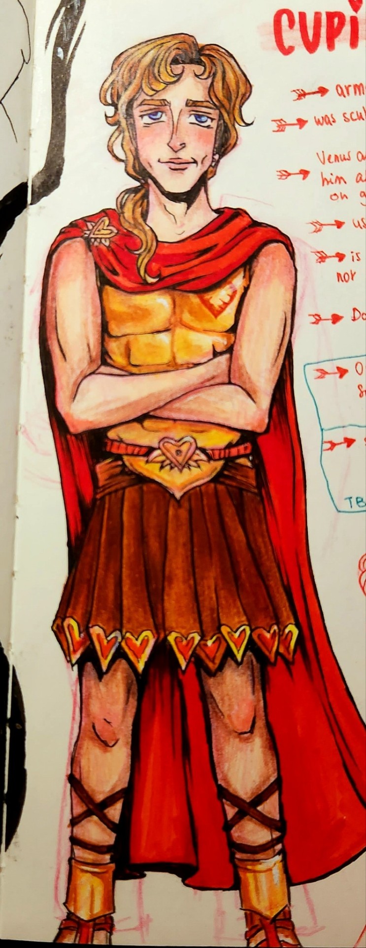

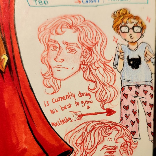
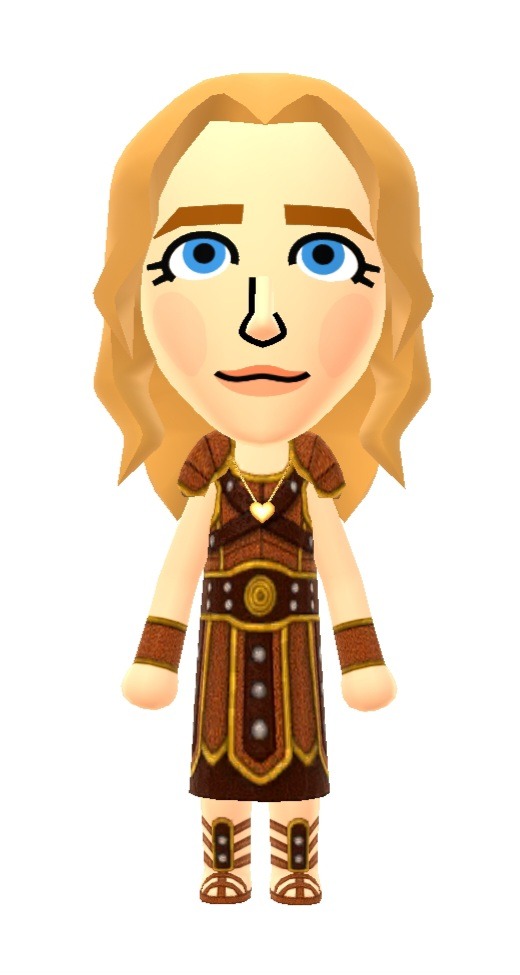
and how he looks in miitomo :

and here are some characters i made "randomly" (mii-from-photo with added personal adjustments) in the miimaker FIRST
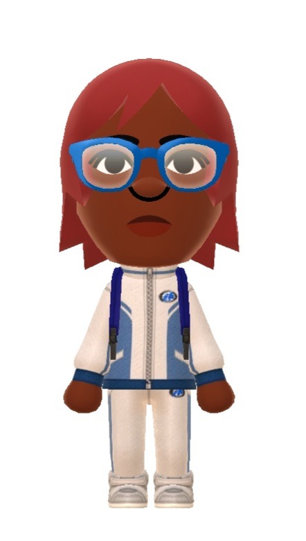
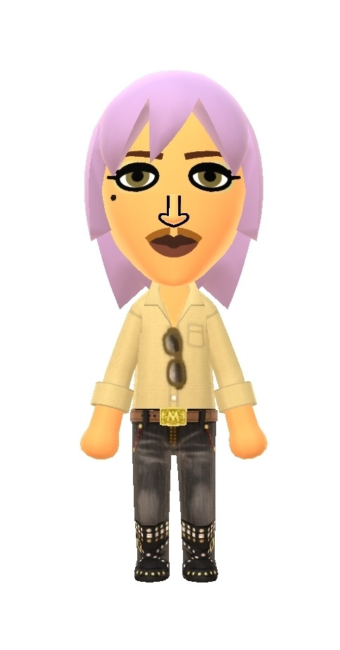
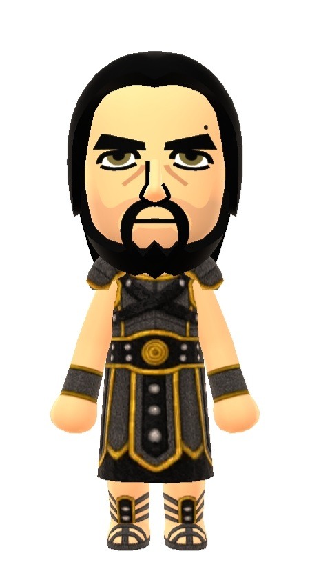
and there are so many more i want to make, and that i'd be happy to share with you!
having a set of features to choose from instead if being left at your own devices is nice, and the process of trying to translate those features in your artstyle is even more nice
also, taking miifotos and having fun posing them and seeing how you could make them interact serves as cute little oc things but also, maybe a reference if you don't know how to pose your characters? NOT AT ALL anatomically accurate but it's cute for ideas
for example

ummm anyway i've been so so obsessed with this app for like a week or smt now and it's all i think about 24/7 😁
ummm anyway go friend me on miitomo

this post has no subliminal intentions whatsoever i DON'T WANNA MAKE MIITOMO FRIENDS AND I DIDN'T WANT TO INTRODUCE THE SUBJECT SO THAT THE NEXT TIME I POST RANDOM MIIFOTOS YOU HAVE SOME CONTEXT DEFINTELY NOT ANS I DIDNT WANT TO JUST DUMP PENT UP EXCITEMENF ON TUMBLR !!
#miitomo#character designing#tune in for drawings of these guys#and tune in for the requests i haven't finished#and the birthday gift i javen't even started making irl (5 days late)#i don't have a procrastination problem#I DONT#ummm#i'd like to thank the server for enduring this first#and uhhh#there will be more miitomo just so yk#so get ready ig#kaerutomo#miifotos#original characters#ocs#my art#onyx's art
5 notes
·
View notes
Text
Analysing the Evolution of Destiny’s Art Style, Prelude 2: Disclaimers
This one’s gonna be a bit of a mess (and not particularly necessary to read), mostly just me listing claims/criticisms other people have made regarding the differences between D1 and D2′s artstyles, discussing my method for comparisons/analysis and the potential flaws, and some other issues.
The only thing I really want people to take from this is that if I make a claim you disagree with, please tell me and send me screenshots from the game that disprove my argument/show what you mean so I can correct my mistakes.
Disclaimers:
I will largely not be collecting reference for D1 using my own game and ps4, because a) my controller’s broken and I don’t want to buy a new one, b) it would take way too long to acquire every armour piece and weapon that exist in the game, c) a lot of people have already done direct comparisons of certain things between the games (the Cosmodrome, Luna, VoG, certain weapons, etc. Whenever I use someone else’s footage/pictures in a comparison I’ll link to the source. I’m aware that this method of sourcing references isn’t ideal and could lead to flawed data (for instance, if the place I’m sourcing from decided to put their images through a filter like bumping up the contrast or saturation, or if I try to judge average default palette using items that have shaders applied to them. I’ll try to avoid the second thing by double checking every item I use in lowlidev (the one site that actually has every d1 weapon and armour piece, albeit in the form of low-poly simple-textured models).
Throughout this series, I’ll often reference arguments and claims I’ve seen made by others regarding the topics covered, and I’ll often be phrasing my analyses and notes as direct responses to said claims. In these cases, I will probably not link to the posts I’m responding to (mostly because a lot of these claims have been made by more than a few people, and most of the posts are quite old. also most of them are reddit and bungie forum posts).
This isn’t going to be one of those “d2 bad d1 superior bungie sucks and don’t know how to make their own game blah blah blah” things there’s already plenty enough of. D2 is one of my favourite games and is without question my most played game of all time, and while I do have my criticisms of the game and Bungie and certain things they’ve done, bashing them over something like this would be stupid.
In addition, while my current preference is for D1′s artstyle and design philosophy (a sentiment I have expressed and share with my friends who also play), upon D2′s launch, I actually vastly preferred D2′s art and design style over D1′s. I genuinely fully switched from being a warlock main to a titan main because I loved being able to make my titan an absolute unit. (in D1 I actually used immolation fists on my titan solely because they were the arms with the biggest spauldrons that I had)
Also while I would love it if Bungie ported every piece of D1 armour (except maybe exotics for perk balance reasons) into D2 (as ornaments or actual loot) Bungie can do what they want it’s their game and I’m just some random person on the internet. I also understand it would probably be hell for them to port however many armour pieces d1 has with all the retopology and retexturing and everything else they’d have to do.
Now, onto some claims I’ll be responding to/going over throughout this series:
“Destiny 2 has more contrast/higher saturation than Destiny 1″
“D1 looks better/more realistic because it’s darker and gritter than D2″
“D1 has a more mysterious atmosphere as a result of its technically worse graphics”
related to the previous: “the technically worse graphics (lighting/rendering/etc) of D1 forced bungie’s artists to compensate by adding wear and tear, grit, scuff marks, etc to everything, which gave everything a lived-in, realistic feel”
also related to the previous two: “bungie’s switch to PBR in D2 caused them to go really hard into eyecandy/showing off the improved graphics by ‘going to town on fancy effects like metal shine’ and light flares, etc. The increased focus on ‘aesthetic’ and making everything ‘pretty/eyecandy’ caused D2 to lose a lot of D1′s ‘used future’ and post apocalyptic character/feel”
“Environments in D1 felt more weathered/realistic/post-apocalytic/aged due the use of warm off-whites, while D2 uses more neutral and cool whites, making everything feel brighter/newer”
“D1 armour looks better/more realistic than D2 armour because”
“It’s modular and uses recycled assets, therefore everything feels like part of the same world/setting and makes everything look grounded and thus more realistic/better”
and “it’s all made from a library of the same Bits and therefore every piece of armour works with every other piece, thus allowing for easy mixing of different sets that look like they all fit together, while D2 armour pieces are all built as part of a single set, resulting sets being significantly harder to mix and match without design clash”
(for titans) “The shoulders are smaller”
“D2 armour is brighter/more saturated”
“D1 armour feels more layered than D2 armour”
(These aren’t the only things I’ll be going over, but this is getting long)
Some quick notes on my opinion of the oft-made claims on this topic based off what I’ve read:
A lot of the claims people make about the differences between the artstyles of the two games (usually in the form of bashing D2 because of course) aren’t necessarily wrong, but they’re often a combination of using a general trend/overgeneralisation and ignoring the existence of exceptions and outliers to form a thesis, and taking that one noted factor of difference and claiming it to be the only ��� or if they’re being slightly smarter about it, the most significant — factor of difference between the two. The most obvious example of this would be people whose only point on the topic of differences in D2 and D1 titan armour design is the size of the shoulders (again usually in the context of saying D2 sucks/is worse than D1), completely neglecting to mention or acknowledge anything else (backswept helms, more purpose-built techsuits, upswept cuisses, more flat planes, more machined details, etc)
People often make claims that feel true but actually aren’t, either due to flawed memory, or the way the game is made tricking their senses, or trying to come up with an example to prove a point and just saying things that are demonstrably incorrect/have multiple major/blatant counterexamples (VoG’s environments being generally darker in D2 than D1)
Gonna give an example here just because this one’s really easy to demonstrate. You’ll note that while for the most part, the materials and lighting are darker on average in D2, Bungie also significantly increased the strength of the lighting effects in D2, at least in VoG (I believe — based off my memory of previous comparisons I’ve done — that the the sun in D1′s Cosmodrome is significantly brighter than in D2, though, a) the sun is at different positions and it’s (therefore) a different time of day, and b) the sun isn’t really visible


https://www.youtube.com/watch?v=MUA9abTBjWA
Also, just an addendum/note/correction on a claim I made in another post: I’ve previously stated that the Cosmodrome in D1 is more saturated in colour than it is in D2. However, having since done further research, I think it’s not quite as simple as that; it depends on what time of the day/night cycle you’re in (in D1, D2′s Cosmodrome doesn’t have a day/night cycle for some reason). During sunset/sunrise (and I think nighttime, though it’s entirely possible I’m wrong on that one since I’ve not yet done a proper levels check for that), D1 is more saturated, but during the sun’s peak, D1 is indeed less saturated than D2.
My current theory is that D1 favoured not simple washed-out colours, as many people claim, but instead that the average colour of the environment/objects was heavily affected by the colour of the dominant light source (during sunset, everything is pushed towards a strong red-orange, night is cool blue, midday is washed-out white, and so on), where as D2 favours more neutral (potentially slightly cool) base lighting that doesn’t affect the average hue of the environment near as much if at all (the moon in D2 is greyer and less blue than in D1, as an example)
There’s almost certainly more to it than that, which is fine, because I’ll be going over this in more detail in one of the actual in-depth posts.
Also, again, if anyone reading this disagrees with a claim I make and has evidence for the counterclaim, please tell me and send me the evidence so I can correct myself. (I’m asking for sent proof/evidence mostly so I don’t end up thinking the counterclaim is wrong due to taking my reference at the wrong time of the day/night cycle or anything like that, but also so I don’t end up wasting time checking a claim that turns out to be false)
End of Prelude 2.
1 note
·
View note
Text
Random Webcomic Reccomendations
This post is dedicated to bringing to the spotlight several webcomics
(some would be considered webmanga but I’m counting them too since they are primarily presented on webcomic websites) which I’ve been enjoying that I hope can get more traction/fandom with this post. Due to my personal tastes I can say many/most have a sci fi or fantasy theming as well as some (definitely not all) have wlw as well.
Since this post will be quite extensive, I’ll first start with a “table of contents” for those who don’t want synopsises or ramblings, but instead just want titles and want to just check them out themselves.

Bybloemen
My Dragon Girlfriend
Sanguine
Straylight Tiger
Cariciphona
Amongst Us
Kiss It Goodbye
Mokepon
Seven Miles Down
UnDivine
Bybloemen
Hosted on its own website under hiveworkscomics

This is a historical semi-fantasy set during the infamous Tulip Mania period of Dutch/European history when people would pay an arm and a leg for even a single potentially valuable tulip bulb.
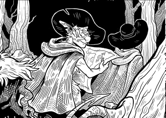
In this setting we follow two devils Basil and Ludwig and their avian familiars strut into the action, pretending to be foreign investors getting in on the tulip hype, probably to ensnare some desperate souls, all the while keeping man and beast alike from catching sus that they are not as human as they claim to be.
As of writing this the story is just starting up but is already making quite the unique statement. The distinct black and white artstyle is clearly holding homage to the historical “Woodcut” printmaking style in how it’s drawn, lined, and textured, which is a refreshing way to artistically state that the comic is “set in the past” w/o doing just grayscale or sepia tone that one is used to seeing for media set in historical times.
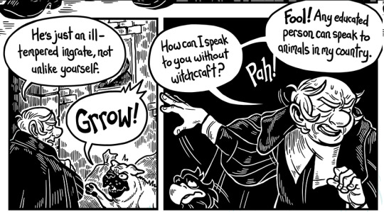
The interactions between the devils as well as the animals they can communicate with so far have been quite amusing.
If you don’t directly use hiveworkscomics for your usual webcomic browsing (so don’t get notified by it) they do have both a tumblr and twitter which frequently announce/link its updates. Bonus following their twitter/tumblr being you get to see occasionally “sketches” (I say that term very loosely) of the characters outside of the webcomic series if you’re into that.
My Dragon Girlfriend
Available on Webtoons and Twitter
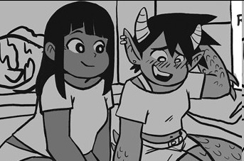
Fantasy alongside modern era setting. It is primarily a wlw webcomic series about a human girl named Christy who is swept off her feet by a dragon girl named Dani, semi-magical/mythical wlw hijinks ensue. It’s hard for me to pin its identity entirely, cause while I wanna say it’s a “Slice of Life” the webcomic is at the point where Dani is fighting a werewolf tooth and nail so it’s hard to pin. It’s clearly romance genre, as even if Dani and Chirsty end up together lickity split (a blink of the eye compared to the slow-burn of most romance stories) there are other wlw subplots going on with secondary primary characters which you’ll be routing for.
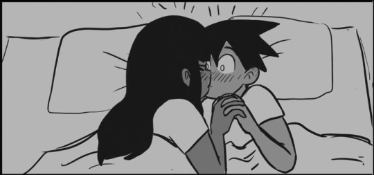
It has its steamy moments and implies sex but not so far as to show full-on nudity of the main characters characters. Though there is some nudity of some of the monstergirls such as the fawn girls on the other hand it does not beat around the bush with, but luckily takes the nudity in a natural non-sexual way Correction as of writing this; only the Twitter version shows nudity, they had to censor with bras on Webtoons cause it got flagged.
If you want it hotter/steamier, sign up to the artist’s patreon. It’s definitely a nice softish wlw webomic if you’re craving a lil monstergirl flavour.
Sanguine
Available on Tapas and Webtoons

Full-on adventure fantasy setting set in a world where magic and mages have been persecuted to the point of going into secrecy.
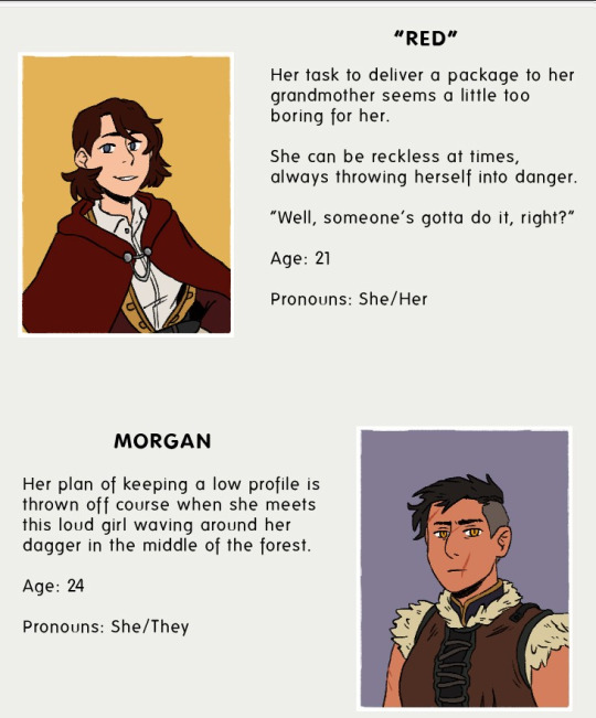
It stars a cute red-riding-hood-like implied secret-royal (that was too much a mouthful) lady named Red, and a tall gorgeous beefy secretly mage lady named Morgan which Red has dragged into her shenanigans with.
It’s early to call this a wlw gem as of the current updates, but it is tagged as lgbt+ so take that with potential further wisdom.

This webcomic uses colour a fair bit to set its tone/mood, but otherwise has a very comfy/warm feeling about it somehow, like some of those old comics/webcomics/novels you would welcome to read while snuggled under blankets. Also the outfits are REALLY nicely designed, and I could definitely see some peeps having fun cosplaying many of these characters.
As the story slowly progresses I am holding with baited breath to how Red and Morgan’s interactions/relationship may or may not evolve, as I am totally an absolute sucker for “friendly/bubbly naïveish character dragging along the cool/grumpy don’t-get-involved character that has a hidden soft heart” trope.
Straylight Tiger
Available on Webtoons and Tapas
WARNING- while infrequent this one has some blood/gore that will shake you up, though it puts it where it would be most sensible to. Lucky for you most blood in this series is not the usual human-red blood which tones the edge down.
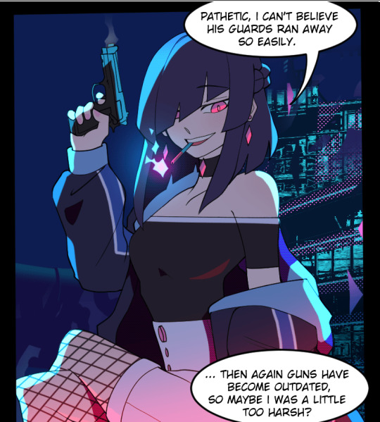
It may have lots of fantasy elements but this one definitely holds its identity as Sci Fi. Set in a futuristic cyberesque city full of both good and bad superhumans (one group being animal shapeshifters and the other being elemental casters), there is an extremist cult out to wreck havoc in the city, so a company responds by recruiting a handful of individuals from all 3 races to make a secret task force to eliminate the threat.
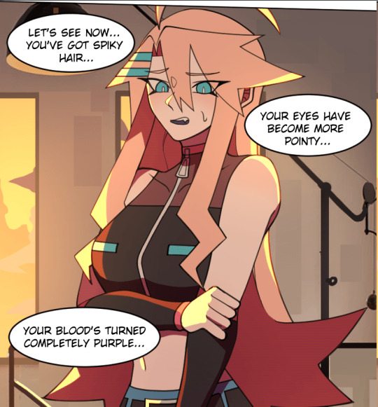
The main character in this story is a secretly-a-tiger shapeshifter named Angeline.

This is probably the most visually colourful of the webcomics in my list and is really using it to charge up its stylistic sci fi setting. Best way I could compare it to; you know those glow-in-the-dark cyber avatars you occasionally see in VRchat? Straylight Tiger matches that visual energy. Of listed so far this is also the most action-packed webcomic on the list. I could almost call it a Trigger-like comic but luckily unlike Studio Trigger it’s not into going nuts on fanservice.
If you’re craving your superhuman sci fi action, this one should at least be checked out. I want to say there’ll be wlw at some point, but it’s too early to call, and if it does I would not expect it to be a major arc when it has larger fish for plot points to deal with.

If you’re craving wlw of at least mc and her weapons-savvy human friend, I highly recommend you checking out the artist Flying Frappe’s twitter to get some sating for you wlw cravings for the two.
Caricophona
Available on webtoons as well as its own webcomic site
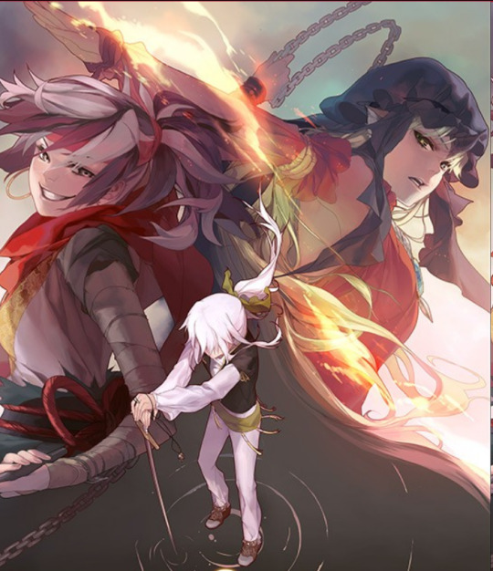
Tragic fantasy setting starring a supermagical woman named Veloice as she is hunted by an Assassin. I tag it as there is an undertone of death in some of the arcs, which give this colourfully magical world a more sombre tone. Among the webcomics on the list this one may be steepest when it comes to catching to speed of the world’s setting/rules/hierarchies but once you do you’ll hunger for this more.
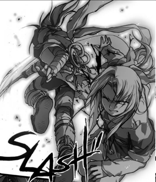
I can’t entirely make a perfect comparison for it (Full Metal Alchemist is as close as I could compare and they are still as different to each other as apples and oranges) but it really has that rich nostalgic old manga style/world/tone to it, and its most welcome to as well.

The world building is rich, and Veloice is a mental/magical powerhouse even if at times she has a fragility about her. The fact she’s a Caricophona; magical beings which tend to either get persecuted or expire early at age from their own condition, definitely helps with giving her a almost “glass canon” energy about her.
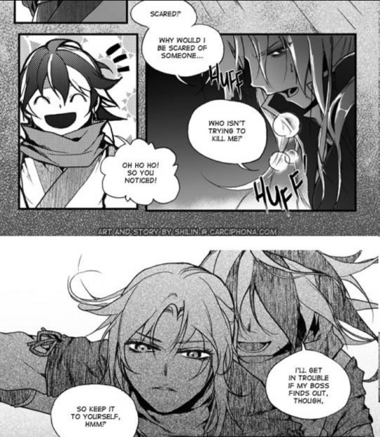
While those points have definitely helped hook me in, the thing that tends to excite me the most in this webcomic is Veloice’s interactions with the assassin who’s been send to kill her, named Blackbird. The tension between them, the fact Blackbird both wants to toy with her, Blackbird’s somewhat flirtatious nature towards Veloice OMFG I EAT IT UP!!!! They have such a enemies to lovers feeling to them (though no, they are not lovers- we can dream though) which just gets you so excited.

I should also mention there are two other “primary characters” in the group. Two rich naïve kids ready to help Veloice however they can. You grow to like them (even if they hit tropes that may strike a nerve if you’re tired to their character type), but the mvp of this webcomic for character and interaction has to be Veloice and Blackbird.
Amongst Us
Available on webtoons and its own website
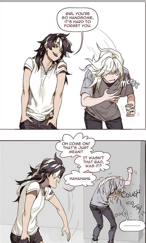
Say you like Veloice and Blackbird from the previous webcomic, but find the hefty fantasy setting a bit too much, and you’re more for the romance? What if I told you the artist was galaxy brained enough to make a chiller AU? That is what Amongst Us is; a music college-set slice of life with a slow burn romance between Veloice and Blackbird. They’re dorky, their cute, and seeing some of the characters you’re familiar with in Caricophona in a different setting is nice to see.
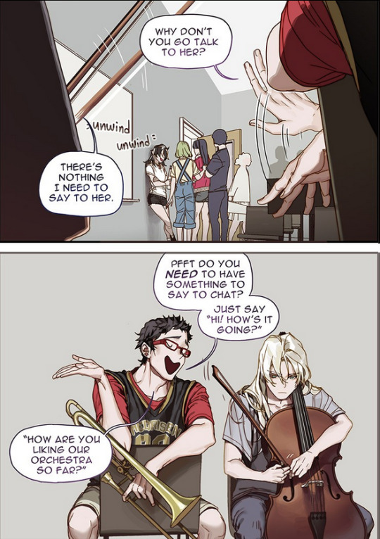
In some ways Veloice is less proactive in Amongst Us but still feels very in-character of her. The webcomic would end pretty quick if Veloice were to get-to-the-point with Blackbird after all (granted with how we see them in the future together at the start of the webcomic it’s not like they have to be in a hurry anyways).
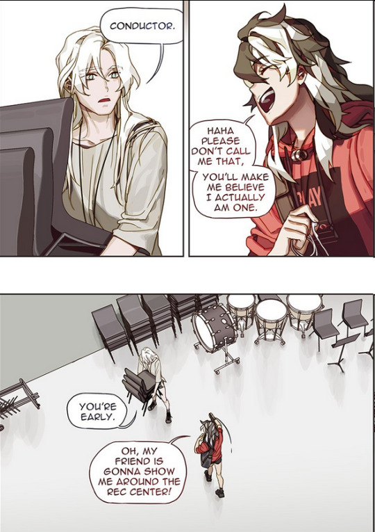
Seeing a wlw / slice of life set in a college setting rather than a high school setting is extremely welcome. Please, more of this.
Kiss it Goodbye
Available on Webtoons

Slice of Life high-school beginnings of wlw romance. The artstyle is good, the characters are lovely. We know canonically that they end up together (as the webcomic starts with them in the future where they are a couple, as they begin to weave the story to their curious friends wanting to know how their romance came to be).
It’s not an unwelcome Slice of Life.
BONUS / HONORABLE MENTIONS
Mokepon
Available on h0lyhandgrenade’s website

I have honestly not read this one in a while and dropped it like, several years ago, but it was interesting and is still ongoing, so I had to mention it. Set in the Pokemon universe, it stars the main character who has been thrown into the pokemon trainer career while absolutely wanting nothing to do with it. Ends up becoming a rocket grunt which is an interesting change of perspective from many pokemon fancomics. It has old-nuzelocke energy though it is not a Nuzelocke. Be prepared for the brutality as you cry for the pokemon (especially his pikachu). The undying loyalty of his Charmander as he himself struggles with his position as a trainer/grunt is interesting. He is definitely not the usual pokemon trainer protag you’re used to.
Seven Miles Down
Available on Webtoons

A completed oneshot psychological horror where a girl takes her submarine to the deepest unventured oceanic trench in the world. Tragic end, but horrors can be like that. The psychological nature of the horror is an interesting angle. The rounded cute style may throw you off but it works.
UnDivine
Availabe on its own website via hiveworkscomics
This comic has since been cancelled from continuation, but is the webcomic to set me off in making this list, so it will still be mentioned in memory/tribute, and is the grand example of why you should interact with the webcomics you read as well as share them; there is a good chance they will not hold on their own without fan interaction and traction. Excuse me as I just use two full-on pages cause I’m wearing out on this list and browsing through tons and tons of pages for highlights wears a peep out.

Modern-set religious fantasy on an island where local their religion may be more than it seems. Stars a boy named Daniel, and Esther the Demon girl. From what can be gleaned the Demongirl knew the “god” of the island’s religion and was double crossed, so has a bone to pick with them and their “angelic” entourage now that she’s free when she got accidentally summoned by Daniel.

This webcomic loves its use of blood, but your grow used to it after a point. The setting is interesting, and its also cool to see how the “angels” are far from the usual “pretty human-like” in their true form and are instead more monstrous than you could say even the Demon Esther is.
A lot of what makes this comic interesting, outside of the “revenge against a god” main plot going on, is how messy the characters can be.
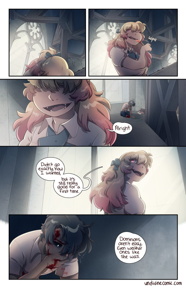
Daniel, Esther, and the one angel named Manual are all pretty interesting in how they interact with their roles that they’ve been put in and how they react to others, and are all very morally grey complex characters.
Daniel is an angst machine who tends to really wear himself out (though how he’s positioned/pressured by the world doesn’t help) and shoot himself in the foot a lot, and that’s even before Esther “turns” him into her lil monstrous pawn, not something you commonly see in main characters from the get-go.
Esther (the tall blondie) while being a Demon ready to get her vengeance on is in many ways naïve/childlike despite her powerful nature, and despite using Daniel as her pawn is shown to grow to have feelings/care for Daniel which is very interesting for “The Contracted Devil” position.
Manual…. We haven’t gotten to see a lot but it’s clear he’s meant to be the angelic hero position but its clear he does not like the position, and he also has a thing for a human woman named Rosamaria but we have not gotten to see why that’s the case.
This webcomic didn’t get the traction it needed to keep going, so was recently cancelled by the artist.
#webcomics#reccomendations#long post#wall of text#comics#manga#Bybloemen#Undivine#Straylight tiger#Cacicophona#Amongst Us#Mokepon#My Dragon girlfriend#Kiss It Goodbye#Sanguine#I probably missed a webcomic on the list to tag but I am very very tired atm
10 notes
·
View notes
Text
MVP, MoSCoW and SWOT
MVP
For my game to be a Minimal viable product will have to have, one playable level which will be a small contain level in a castle that if fast enough the player should be able to complete in about 1 minute, another aspect will be the gun game gun rotation once the player runs out of ammo, and each gun will have to feel and act different from the previous weapons, next an important thing would be to have atleast one type of enemy, this could be a enemy that just runs up towards you and starts damaging you, or a ranged enemy that shoots on site, it can be either, depending which is easiest to program. so in conclusion my MVP will have one functioning level, with the gun rotation mechanic and some enemies to kill, that is the minimum required for my project, even then the game will need much more just to function properly.
MoSCoW
Must Have:
The Game must have a range of different weapons that randomly change everytime the player uses all its ammo, that is the main gameplay loop of the game and without it the game will not be fun. The weapons it must have should range from basic weapons to like pistols, submachine guns and shotguns but it must also have some more unique weapons like grenade launchers, bazookas and flamethrowers such weapons would greatly improve the game in enjoyment and uniqueness so its a must have. Another must have should be a range of unique random enemies, the game must have different enemies ranging from enemies that charge at you and melee damage you, enemies that commit suicide to damage you, range enemies and many more so the player is always on their toes and create dynamic situations that the player would not normally experience if the enemies weren’t random and basic. another must have to make it feel like a game is effective sound design, for example walking on different surfaces should give out a different sound, different guns should also give out different sounds to add to the immersion, making the gaming experience more enjoyable if the player can immerse themselves in the game. Lastly the game must have a basic main menu screen that allows them to quit the game and start the first level, nothing else is really needed in the menu that needs to be added.
Should Have:
The Game should have more levels, especially bigger ones where the player can do more and experience the gameplay more. the gameplay should also be a bit more interactive, especially with FPS games like these the levels should have some puzzles for the player to complete, maybe some interact able objects for example using a sink or turning on/off lights, to add that level of intractability into a game, since if you can’t interact with a game then why is it even a game, at that point it should be a movie. The Game should have different bosses at the end of levels, that represent that level, like if there is a castle level the boss should be a massive crusader knight. The game should also have some random power ups that make the gameplay more chaotic i think, for example a buff that makes all the enemies health decrease by half temporarily, or a debuff that makes you slow or even small.
Could Have:
The Game could have a soundtrack that fits the game, since the game is a face paced FPS the game should have some quick, loud and high octane rock music but since the presentation of the game is also a cutesy and innocent game, some parts of the game should have fantasy, classic Disney like soundtrack most likely at the start of levels that quickly get replaced with the more high octane soundtrack of drums and guitars. The main menu could have some visual options such as changing the resolution, texture quality and render distance but this is very last minute optional stuff. The game could also have some more unique advanced movement since the game is very faced paced the player could wall run, grapple hook and other advanced movements like anti-gravity or specific levels, or having wall walking and random geometry like in the original prey.
Won’t Have:
The one thing i definitely will not have in this game are random generated levels, for FPS games like this i strongly believe in good fun level design that makes the player want to complete the level over and over again and i don’t think random generation will make such memorable levels, random and different yes but that doesn’t mean they are good levels. The game will not have Ammo Pick ups since the game will change the moment player runs out of ammo, if ammo is added to the game then it defeats the whole purpose of the main gameplay loop. The idea of a co op game was floated around a bit but in all likely hood this will not be in the game, how the game is and designed kinda wouldn’t fit a co op game, if anything this type of game but a multiplayer one where players join into a like 3 vs 3 matches could work and be fun.
SWOT
Strengths:
The Random element of the Gun Game Gun rotation mechanic adds a level of unknown and chaos to the Fast Paced FPS game that i haven’t seen yet. The game will force the player to always be on their toes and adapt to the constantly changing dynamic situation that can either help them or ruin their run.
Weaknesses:
The graphics ain’t the most realistic so some people might be put off the style especially if they ain’t nostalgic or have a fondness for retro video games, also to do that kind of retro style you need to put in quite a bit of effort to make it look good, so its not just oh make the textures worst resolution, you still have to make it look good but fitting the time period.
Opportunities:
This Project is allowing me to experiment with the PSX artstyle which i really like and enjoy making assets for, it also allows me to explore and change the typical aspects of FPS games that i other wise wouldn’t of done. It has also allowed me to experience new types of software such as blender and aesprite that allows me to create my low poly psx style game.
Threats:
One threat that has already happened and could happen again if im not careful are crashes and technical difficulties such as having so many actors in the game that the game requires about 32gb of ram just so unreal engine can load it. So making sure the project is constantly backed up and checking that it will run on most hardware should be a priority so such a threat can be avoided
0 notes