#also if the colors look weird to you i did increase the exposure a bit. because it was rather dark in that cave
Explore tagged Tumblr posts
Note
Hi!! Can you please tell me what you added to your jaws gifset? Like any filters or anything added at all?
Hi! I didn't add any special filter like colorings, just basic curves, levels, and exposure- but I did do my sharpening differently than normal as the file size I have of the movie isn't bigger than 3GB and it's an older movie. So let's call this
TIPS ON HOW TO SHARPEN YOUR GIF WHEN YOUR ORIGINAL FILE IS A BIT meh.
more under the cut ↓↓
Okay, I'm going to jump right in.
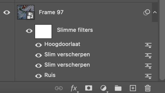
When I have everything on the timeline, resized, and ready to go, I start off by adding grain. (Ruis) My program is in dutch as I am dutch so I'm not going to explain all the technical stuff, as it will get lost in translation, but I'll just do a quick rundown of what I did with this set. (I use Photoshop2022) I'm not an expert whatsoever, I studied art/media design but that was 4+ years ago and while photoshop was used heavily, gif making is not something that ever came up lol.

Add the grain. Filter tab -> grain -> grain. 0,6 or 0,7 will do. Tick Gaussian and Monochromatic. Next, sharpening. Filter tab -> sharpen -> smart sharpen. I use this filter twice with two different settings as follows:

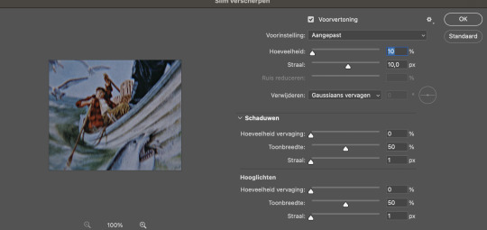
These are basic sharpening settings a lot of other creators use, so nothing special there. Next, to make it even sharper, I add high pass. You can find this under the filter tab above, at the bottom of the list. Filter tab -> other -> high pass.

Select it.
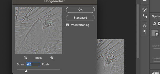
Keep it at 4,0. You can play around with this, but I like to keep it at 4,0. Now it looks a little weird so we have to make some changes. Go to the blending option of the filter you just applied (the high pass) and change it to 'soft light' on 70%.

Again, you can play around with this. I also use high pass on gifs that are darker. I used it in this set to let our babe Ryan stand a bit more out.
Okay to really show the difference between not adding the grain + sharpening + high pass vs grain + sharpening + high pass, here you go:


I remade this one real quick, as I didn't have the psd anymore but you can see the difference better than the one with the shark illustration gif. I didn't add any other filters, only the grain + sharpening + high pass. When you add the filters and increase the lightning/contrast, it will look even sharper. Sadly I don't have the file anymore, so I can't exactly recreate it, but I just used the filters mentioned; curves, levels, and exposure.
Funny thing is, not all the shots in my copy were grainy. It's just a few that have unruly pixels because the file has been compressed. Like our dear Hooper here, that part of the movie was just a little blegh. And not everyone has the space or the money or other resources to get the deluxe Bluray whatever, so you gotta do what you've gotta do I guess. Of course you want your file to be HD, preferably 1080 or above, but well, shit happens. With the grain added, it just looks better in my opinion. The grain fills in the annoying pixels. You can also add grain after sharpening, but it just looks better, again my opinion, when you add it before sharpening. Plus I found out my gifs looked better on mobile if I added grain before sharpening rather than after. If this is something you worry about, I would add the grain before sharpening.
Do note though, adding grain increases the file size of your gif!
Okay, next up, the other filters I've applied. I added curves. The numbers at Input (Invoer) and Output (Uitvoer) are for the two dots in the middle.
Lower dot: input 15 and output 11
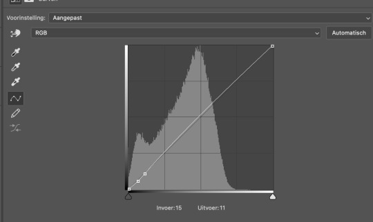
Higher dot: input 27 and output 25

Not much, just a little tick. The next filter I used is levels.
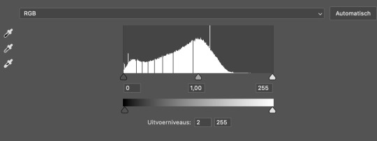
The only thing I changed is the Outputlevels (Uitvoerniveaus) to 2. This is something I do with all my gifs, sometimes a bit more at 4 or 6. I just like how it looks I guess haha. Next I added exposure.
exposure: +0,56. offset: 0,0000. gamma correction: 0,72.

And we're done with Photoshop! Because my MacBook is really old and kind of past its time, I just save the file as a gif without cutting any frames and open it again in Ezgif. It all runs smoothly until I have to convert a gif multiple times and this just saves me a lot of time. Ezgif is a free website where you can make and edit gifs. I use it to cut the frames, add some contrast if necessary and decrease file size (another tip!) so it's under 10mb and tumblr will accept it.
Gif before adding all the filters:
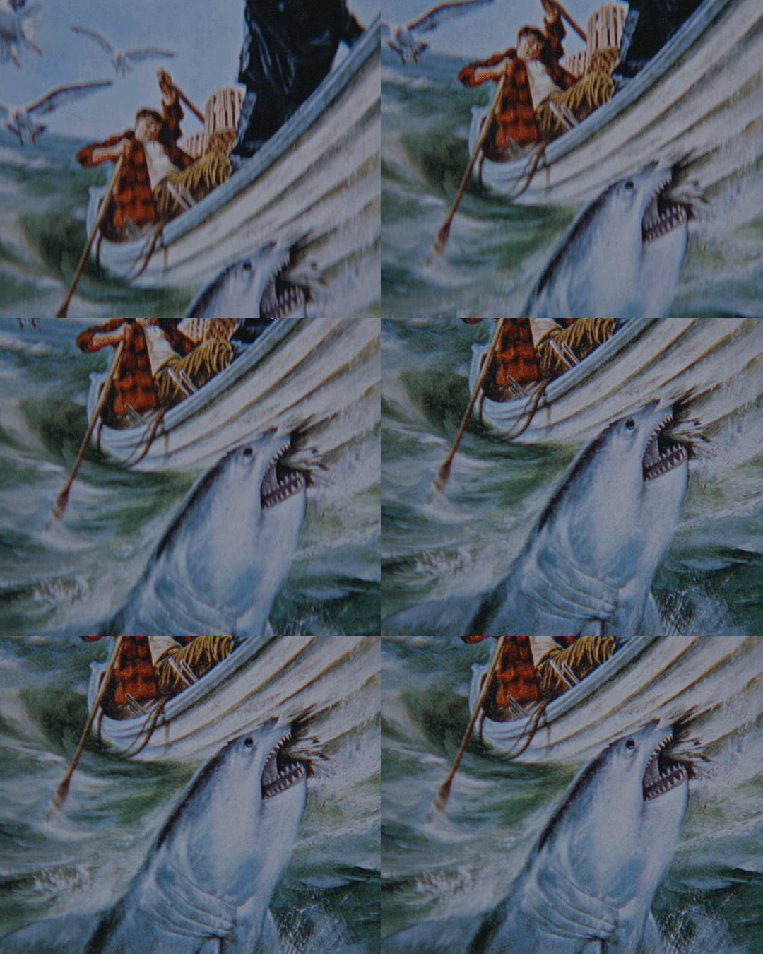
Gif after grain + sharpening + high pass + the other filters:

Gif after running it through Ezgif and adding some contrast (5) to decrease the size of the file:

I hope this answers your question! If you're really stuck on something, you can always send me a private message! I didn't do much, just the grain and the sharpening and the high pass. I think it adds a little edge to the gifs as well. Thank you for the ask and have a nice day!! 💜 💜
Edit: the brightening filter is called EXPOSURE, not brightening. I re-checked it but as I thought, I made a little mistake during translating. Here you can find a whole list of filters translated from Dutch to English.
#asked and answered#photoshop#ps tutorial#ps things#gif sharpening#supportcontentcreators#completeresources
98 notes
·
View notes
Photo




✨ COLORING GIFS FOR RAINBOW SETS ✨
hello!! so this ask had just been sitting in my inbox for days, and since i finally got some free time (and an incentive) i thought i’d put together a general coloring tutorial - especially for those who are interested in rainbow sets, or just want to get freaky with their gifs, hehe.
photoshop: cc 2021, but tbh this tutorial is compatible with most versions of photoshop for: beginners / anyone with a basic understanding of adjustment layers and brush tool (optional)
the tutorial will show how you can: (1) enhance colors in a neutral/washed out scene (2) change the overall color of a shot (3) make the colors bolder/stronger (4) convert the dominant color to another color
in other words: i rarely save my psds so this is what we’re stuck with
1.

usually, when i’m making a color set, the first thing i do is open the hues/saturation layer and pull the saturation to a 100. this gives me a pretty good idea of the colour palette i can work with. and since this shot is more on the dark side, i brightened the gif a bit, and then moved saturation to a 100. this is what i get:
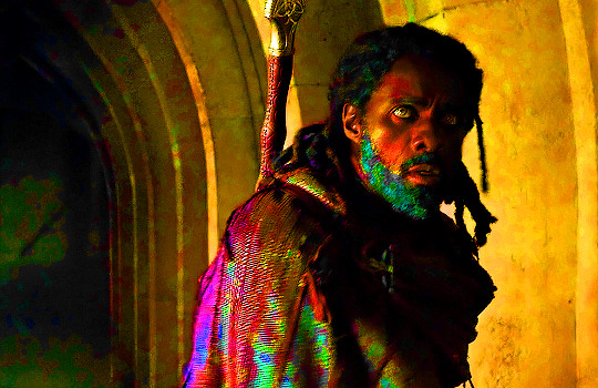
now that i know the dominant colour is yellow, i can drag the saturation back to 0 and start working on the actual coloring! i go to curves, and brighten the gif a little. most of the time, the white and black points (the first and the third inkdropper) does wonders in color correcting your gif. buut, marking the white point of for this gif would remove what little yellow we have, so i just did a manual adjustment until i was happy with the result.

(since he’s a poc, i used a brush tool at 35% capacity over his face on the curves layer mask. it’s soft, and barely noticeable, but it stopped him from looking lighter, which would become a problem once we move on to the vibrance layers. basically, the lighter the subject, the more susceptible it is to being affected by color enhancing layers.)
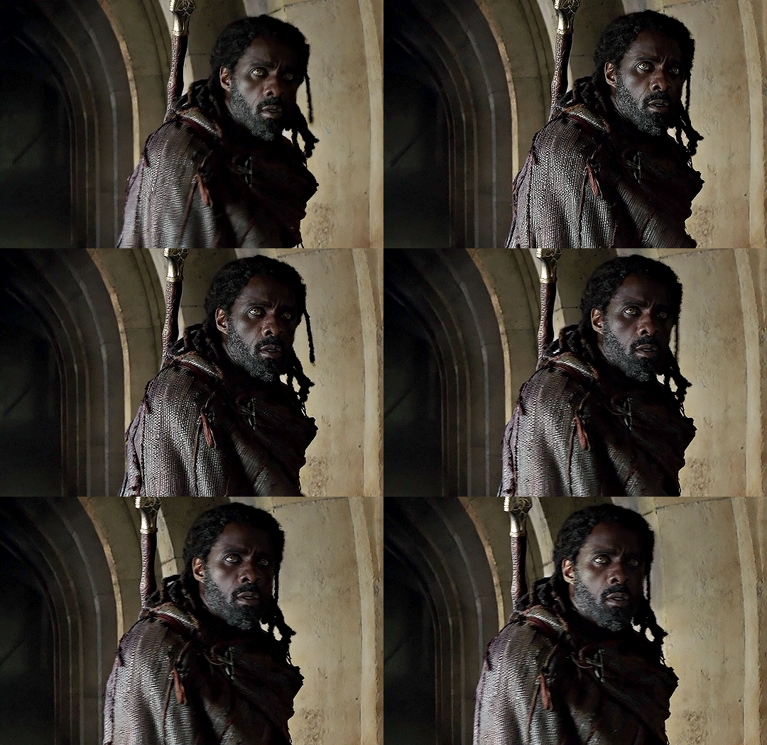
next, i go to the yellow hue/saturation option, and increase yellow saturation to 50. i usually don’t do this much, but the yellows are very very light in this scene, so we’re enhancing the colors wherever we can. i also lowered the intensity of the reds using these settings:

the reason i’m reducing red saturation is because - remember the dominant color on his face was red/yellow? - i don’t want my vibrance layers to end up reddening his skin too much. we already tackled a portion of this when we used the brush tool with curves, but this just ensures that the final product doesn’t have his skin looking too yellowy/funny, hehe. this is my gif after the saturation settings:
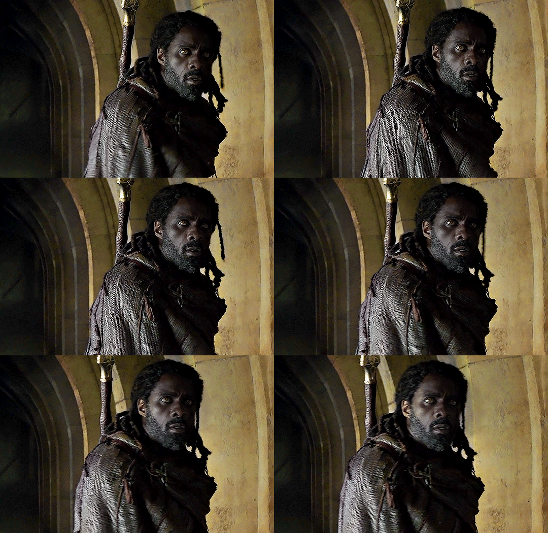
honestly, the difference is minimal, but now we have an actual color to work with. now it’s just a matter of enhancing that color. at this point, his skin may also look washed out, but the color will return once we get started with the vibrance/color layers.
now, i open the vibrance layer, and - this is always dependent on the gif, btw - drag the sliders around until the colors are bolder. this is my gif now:

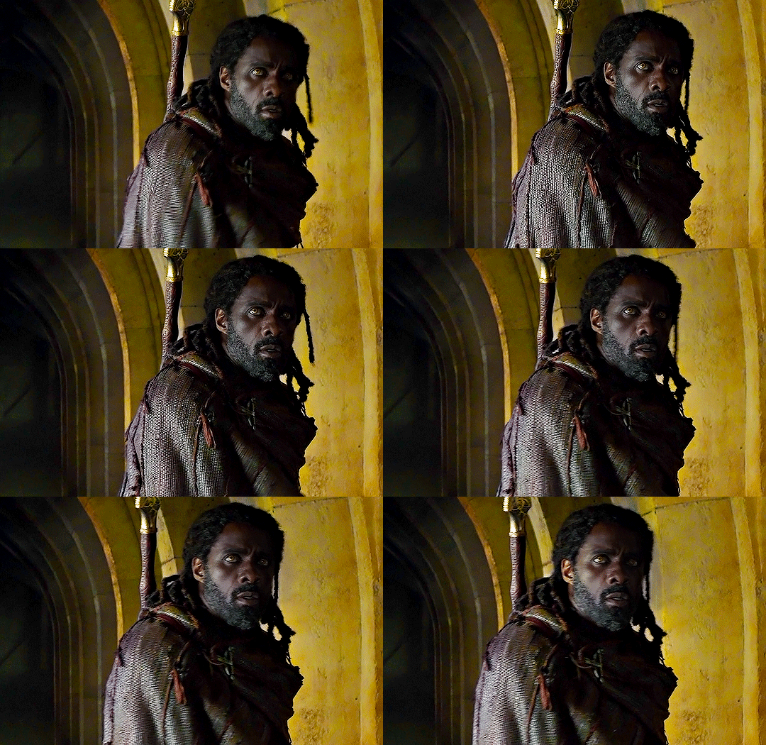
the yellows are much more evident now, and there’s a bit more color in his face - so yay! at this stage there’s really no need for selective coloring - so i’ll just add a brightness layer and another vibrance layer:

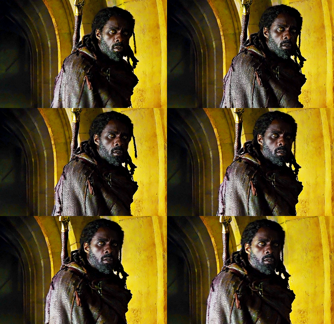
and voila!! mans lookin good
2.

changing the overall color of the gif is a fairly easy process. i think one thing to look out for is if there are people/a lot of skin that would end up being affected by the coloring – unless there’s minimal movement that you can use a brush tool for.
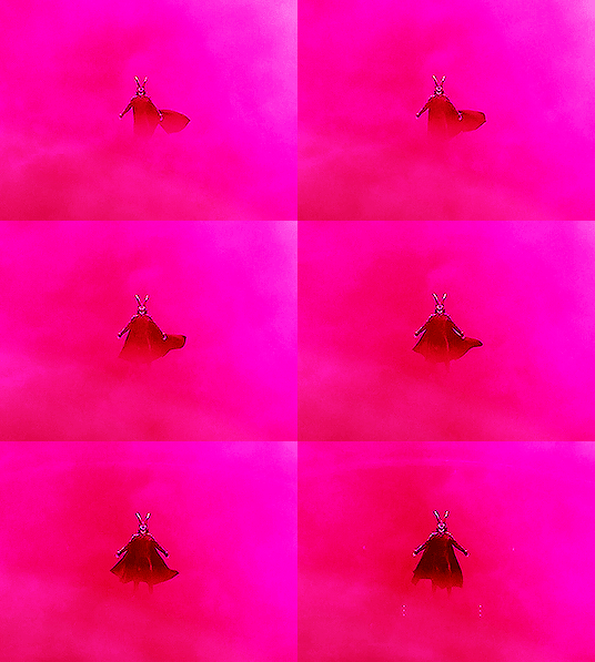
loki is more or less a silhouette in this shot, and all i’d need to do would be increase the contrast between him and the fog, and slap on a color. this can be done one of three ways: selective coloring, color balance, and gradient map. i’ll be using selective coloring here because i felt that worked best and it’s also an adjustment layer i’m most comfortable with.
enhancing the contrast comes first, and since the brightness/contrast layer didn’t work as well as i’d hoped, i opened up the exposure layer and put in these settings:

and i get this:
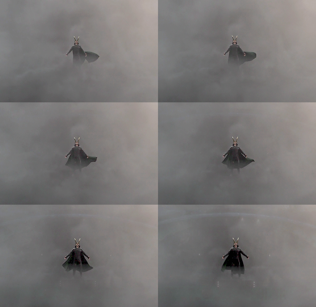
now that loki is much more prominent against the fog, we can move on to the coloring. since i want it to be pink, i’m gonna open the neutral selective coloring, and use these settings:
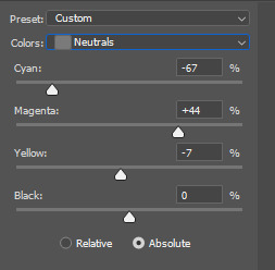
just make sure your selective coloring is on “absolute” because it colors your gif independent of the original gif and makes your colors more strong, whereas ‘relative’ colors your gif relative to the original gif – which doesn’t work all that well for color sets. (read: makes it look ugly)

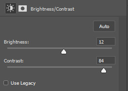
i got the color, but methinks its still a little too dull, so i’ll add a brightness/contrast layer to make the color pop

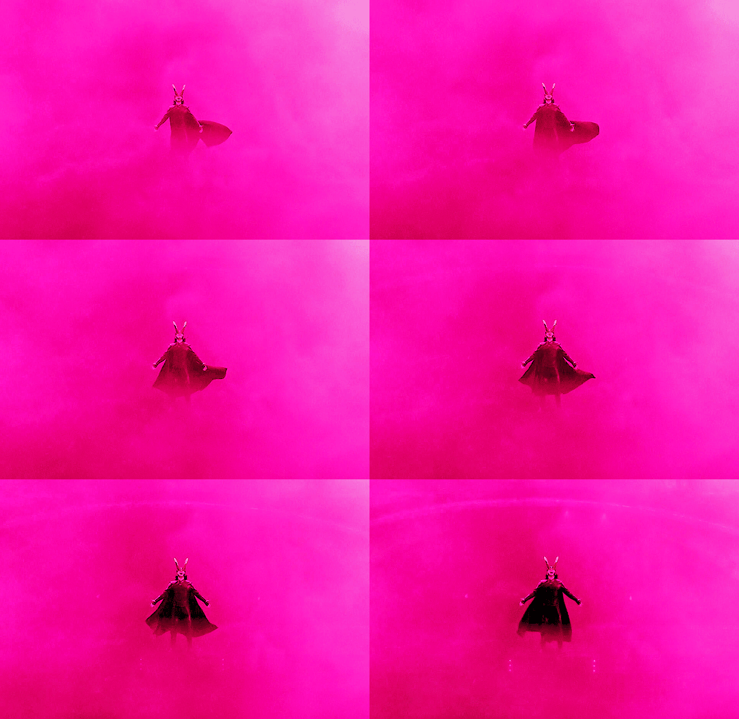
and done!!
3.

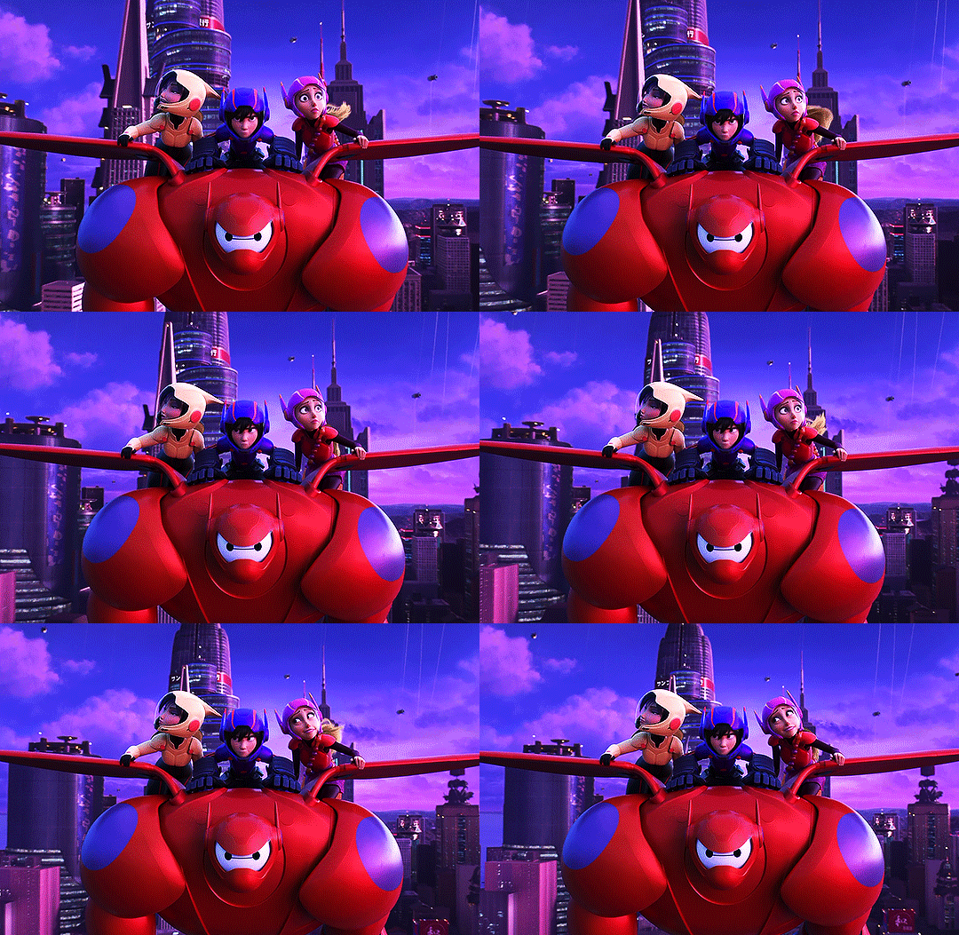
animation gifs are much more easier to color because the colours are easily isolated, which is just chefs kiss when you use selective coloring. for this one, i just want to enhance the blues / reds, and remove the magenta tone so that the colours are more vivid. first, i increase the contrast:
it’s sharpened the colors a bit, and reduced the dullness:
now, because i want to enhance the blues/reds, and reduce the magenta, i’m going to use these settings in my selective coloring layer:
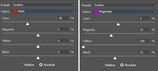
i didn’t want to make the red too bright, since red has an annoying tendency to pixelate, and lowered the magentas just enough so that the three of them still have a bit of color on their face. now the blues:
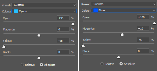
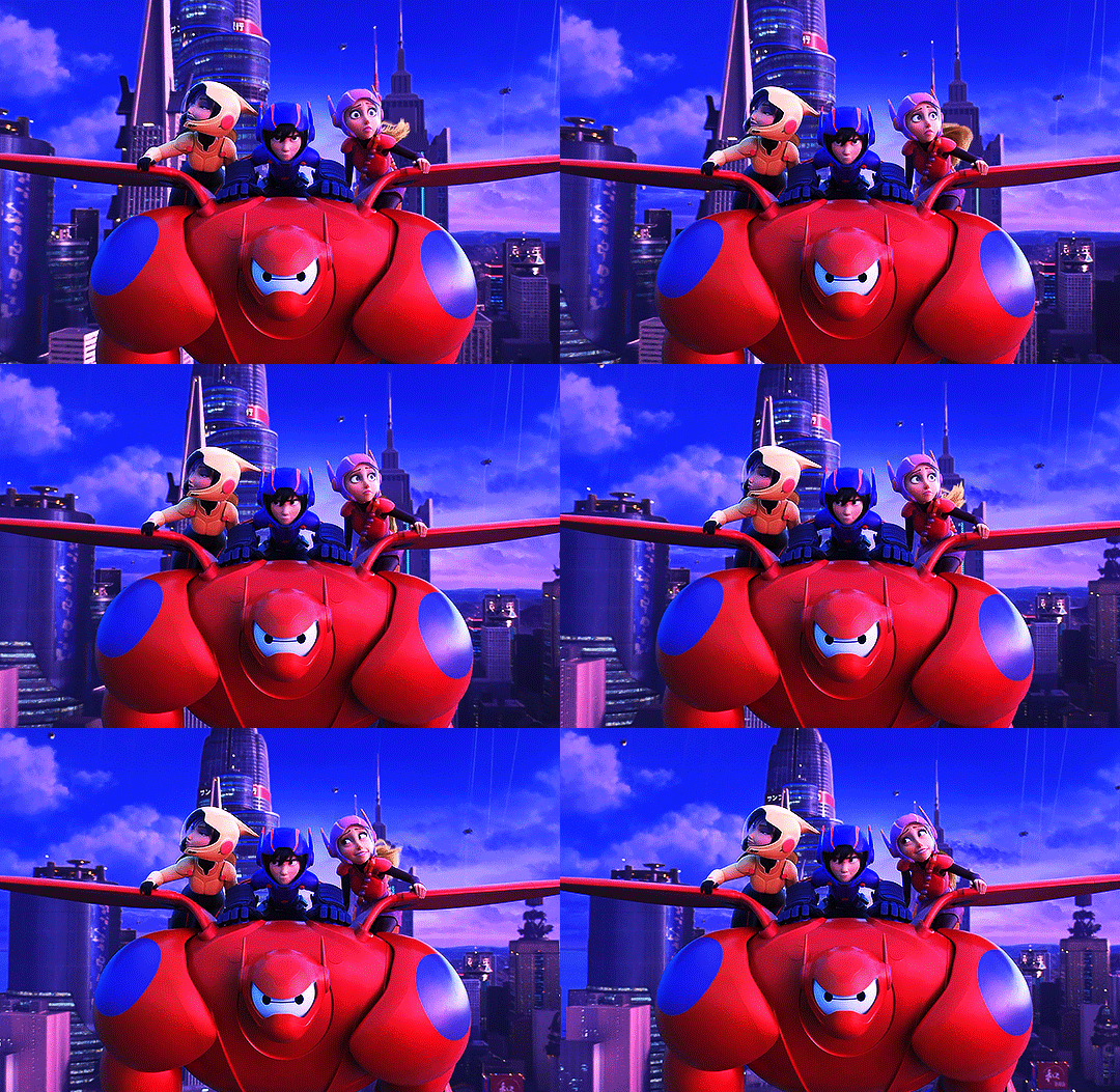
now that that’s done, all we need is to brighten up the gif. i’ll use curves for this:

i selected my white point (the white inkdropper) from the white part on baymax’s face (which i just realized makes no sense bc his entire face is white) which immediately brightened up the gif and erased the excess magenta.

if you want, you could still make it brighter by selecting your white point a little towards the shadows in baymax’s face - but methinks this gif looks fine by itself ehehe
4.
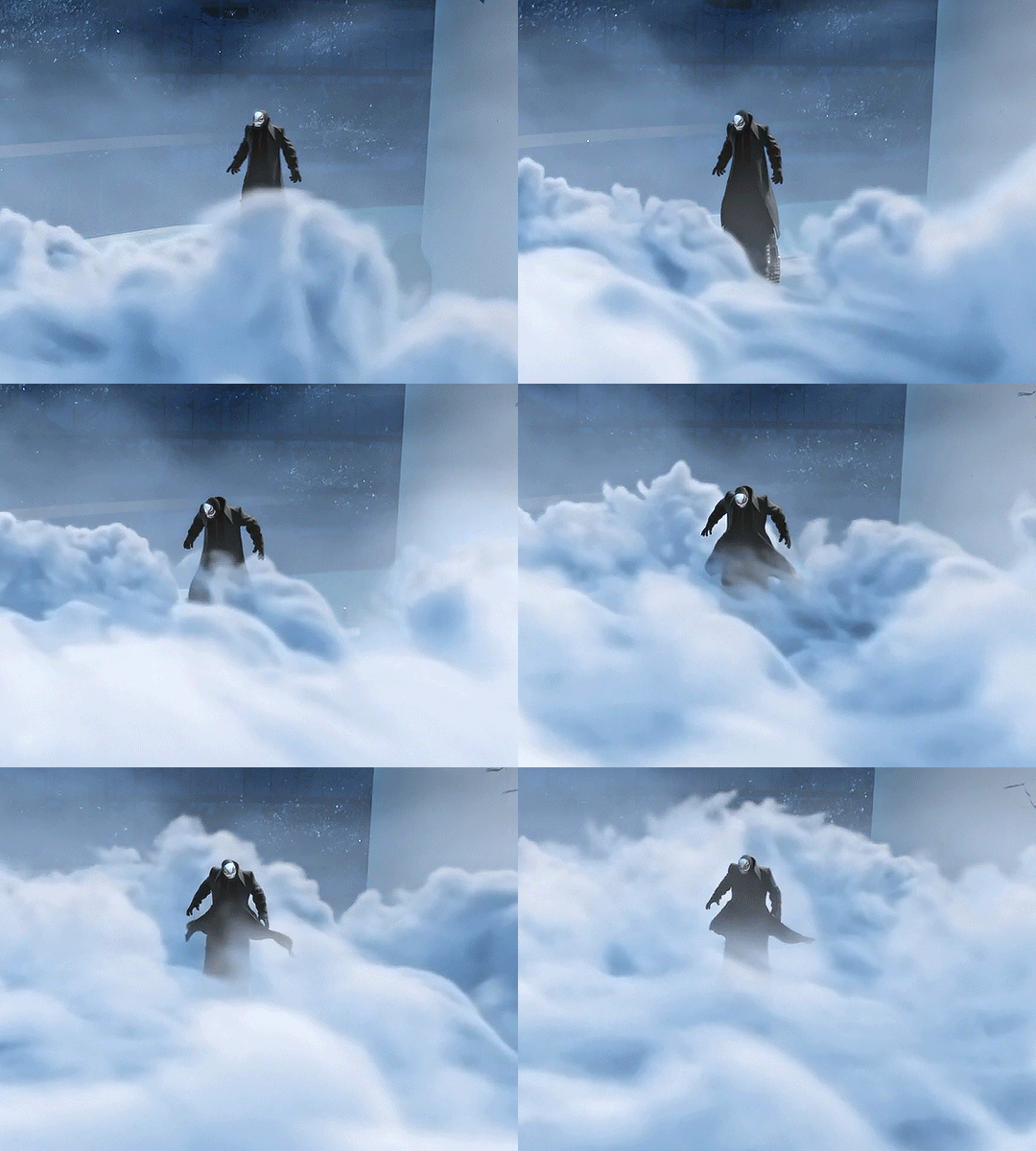
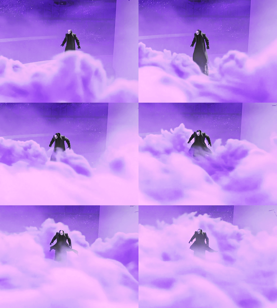
this one will be fairly easy - especially for a shot like this where it’s just blues and black - and will only require selective color and some brightness layers. so, i want to make this a violet gif. the very first thing i’ll do is open up selective coloring and enhance the blues:

idk if this is a thing others do djsajskl i feel like they do, but i do this because i’ve always found it easier to do color convert when the colors are enhanced - so, the more enhanced my blues are, the easier it is to convert to violet. this is what i have now:
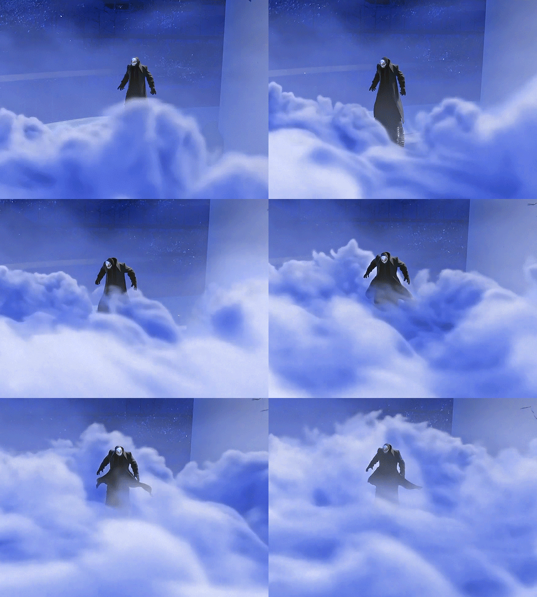
now it’s time for violet!!! yee!!!
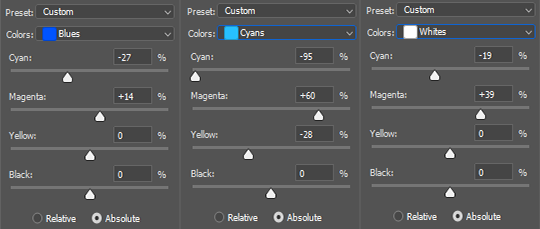
i increased the magenta in the whites because the highlights in the cloud were looking VERY white, and would end up looking very weird once i increased brightness. so this is just for…. consistency

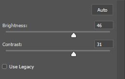
now we can get on with brightening!! i open up the brightness/contrast layer and use these settings:
and another curves layer, where i’ve intense-ified the dark parts (the grey slider is at input: 27) and lightened the rest (the white slider is at input: 220)
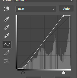
(i just feel like it makes the coloring look crispy)
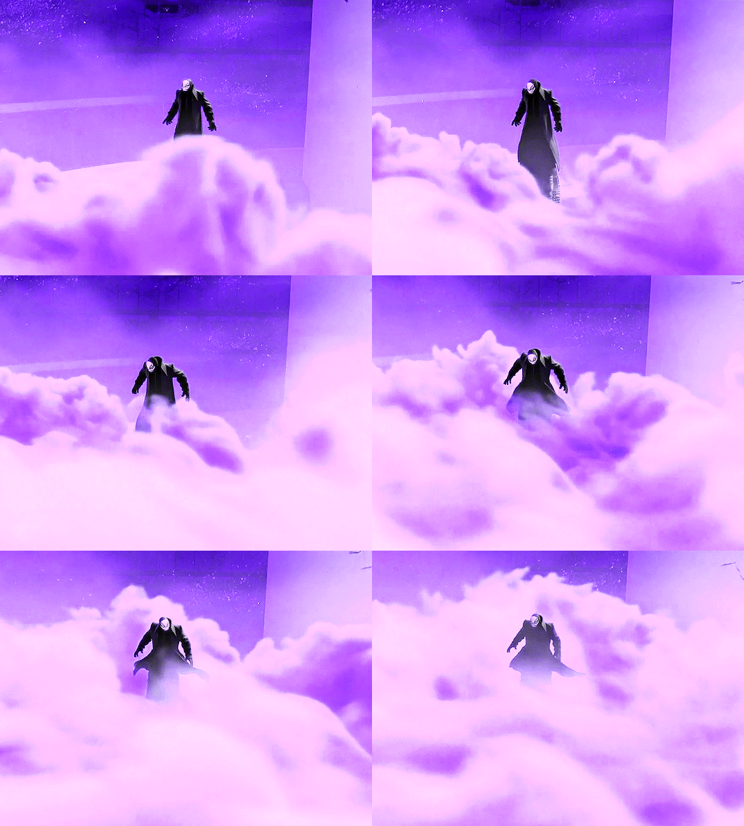
and tada!!!
i hope this helped! i’m still in the learning process when it comes to coloring, but if you have any questions/clarifications, please don’t hesitate to reach out!
#gif tutorial#coloring tutorial#yeahps#completeresources#chaoticresources#usershrimp#usermazy#jokerous#userchaitali#usernums#uservalentina#tuserdi#userholtz#tusersammy#userhella#userjochi#userelm#usersmile#gif help#tutorial
1K notes
·
View notes
Note
would you mind sharing advice on coloring gifs? yours are absolutely gorgeous
hey love! sorry for the wait, i've put a mini tutorial under 'read more' explaining how i made my coloring for this particular gif & some of the ways in which i use my go-to adjustment layers. i didn't have a chance to use every adjustment layer (like hue/saturation, which is a layer i use a lot!), but if you have any other questions that i didn't cover here, do let me know 🥰
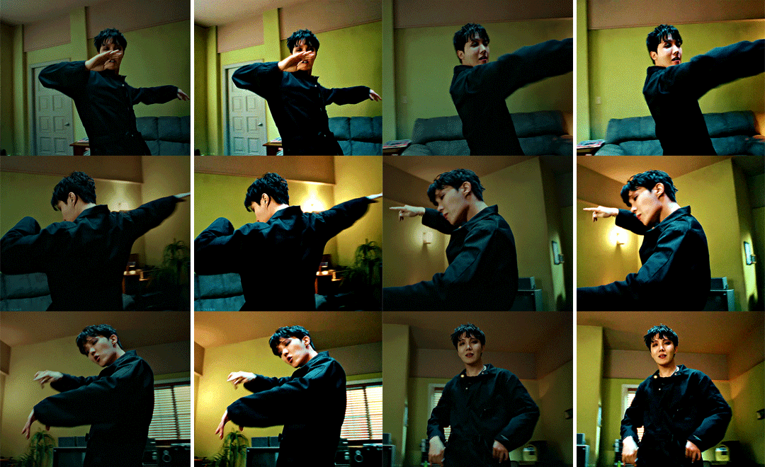
start with curves - i personally find that adding the curves later on in the process will either undo some of the color editing you have already worked on or the changes you are going to end up with will be too drastic (so you run the risk of quality loss). because the curves layer makes such a big difference, finding the right black and white points and getting rid of weird tints/filters in the original footage in the very beginning will help you have a clean base to work with, where (hopefully) all the colors are clearly separated.
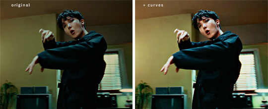
already a big difference! i found a white spot i liked somewhere on lighter window area, turned the layer opacity down to around 70% until it looked natural enough and this is the base i’m gonna work with. the colors are much better separated now & ps can isolate the reds, yellows and greens far more easily for me now when i add in the next steps (selective color with an emphasis on making the reds and yellows warmer + some vibrance):
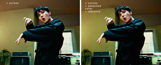
if the style you are going for is bright and vibrant, this is where i would normally come in with some brightness+contrast and exposure. for this particular gif, i added a brightness layer where i did not edit the actual values, but instead did this to the layer itself:

then i added an exposure layer, where i increased the exposure by about 0.17, decreased the offset by about 0.0015 and brought the gamma correction to ~0.95. all of these steps brightened up the gif and added some definition:

this is just my own personal preference, but sometimes i like to add a gradient map just to emphasize some of the colors in the gif; in this case, i wanted the gif to feel warmer and lean more heavily into the warm yellow/green hues, so i’ve created a gradient map that looks like this:

this is 1) going to accentuate those warmer tones and 2) naturally bring in a bit more light into the footage. i bring the opacity down to ~20%, play around a bit more with the selective colors to get the shades of red/yellow/green i want & correct the blacks/neutrals if i need to.
then i come in with a final levels layer, where i create the final contrast - if i love starting with curves, i also almost always end with levels because i find that it gives me the perfect finishing touches. to me, that’s the stage where i am happy with the colors themselves, i juuust want to make them stand out a little more & make the gif feel a little more alive. here, i brought the arrow on the far right closer to a value of ~230 and the arrow on the far left to 4-5. this depends entirely on your footage and what you’ve done with the coloring up to this point. it’s very easy to over-brighten a gif at this stage and pay in quality loss (i’ve had my fair share lmao) or over-contrast it by making the darks too dark, if that makes sense. in the end, this is what i ended up with:
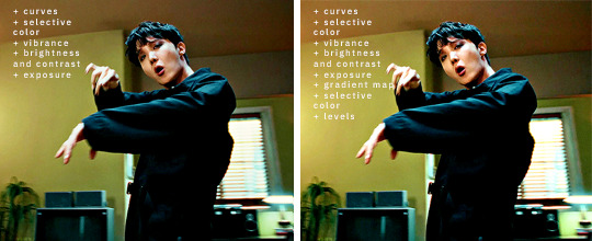
aaaand here is the before/after of the gif itself:

#ps tutorial#..? i guess..?#i used to have a tag for this at some point but. anyway.#i hope this helps a bit nonnie!#this was one of the few psds i had saved so i could show you layer by layer#and there was no need for me to use hue/saturation and photo filter on this footage#but they are both layers i end up using almost every time i gif#if i can be of any more help let me know 🤗#answered#anon
44 notes
·
View notes
Photo

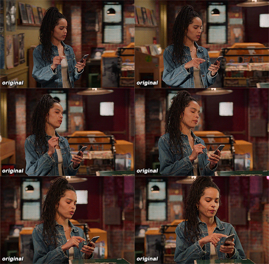
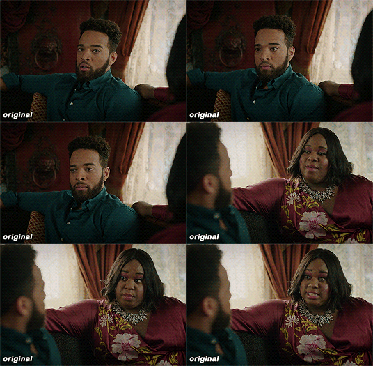

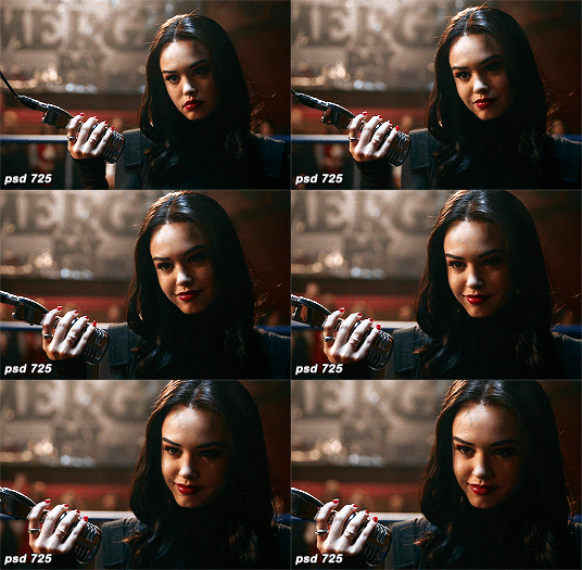
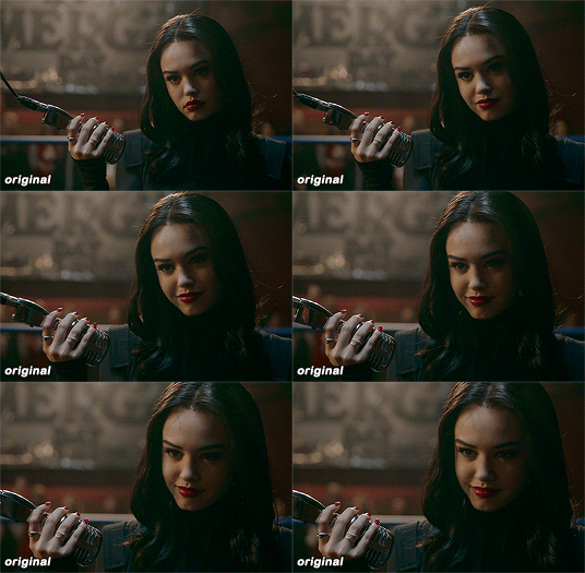
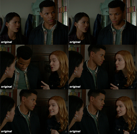

maziekeen’s coloring tutorial (part 1, base)
part 2 for dark scenes here
before anything, here are some helpful resources for what i’m about to do cause i think you need to test everything to see what will work for you and will learn so damn much in the process:
how to use curves: curves tutorial by completeresources. and gif tutorial by barrysberkman. curves is the best and it’s what i use to “fix” the coloring before proceeding with the coloring
how to color yellow-ish/terrible scenes: coloring tutorial by jungshoseok. i’m always going back to this tutorial when i’m stuck with my coloring or need a reminder of a different way to color difficult scenes, and again, sami uses curves!
and there is more on my resources tag here
downloads/settings
download the psds
save for web settings
sharpen settings
text settings
crop sizes (new dimensions)
my ko-fi ♥
the tutorial, finally lol
tv show high fidelity. this gonna be simple scene before going to the annoying dark/yellow/green/blue scenes on the second part of the tutorial.
this is important: i don’t always get right the first time like i’m showing this tutorial. i do all this process and then go back to the layers and adjust a few to get what i want
before:
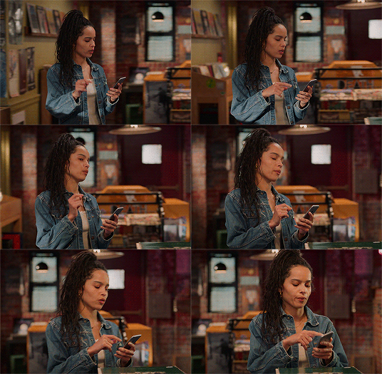
after:

1) curves. first i brighten the gif just a little with RGB so i can see how to color correct, and to do that i use the red, green, and blue there. instead of using them up, i decrease their values, trying to leave as natural/red/magenta as possible, sometimes i increase, like i did with blue, but it’s really just a bit
okay, what do i do? i decrease the color that’s bothering me. when you increase the RGB, the color that stand out is what you will use the others to fix. like this one, the gif got too yellow, so i decrease red. then it was too green, so that’s the next one to change. i get this “controlled” yellow, it’s good but i want more red-ish/magenta tone so i can work with the colors only later, so i increase the blue just a bit for that. then you get the result
i always try to "take off” the colors here so i have more control of them in the future and edit the way i want
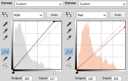
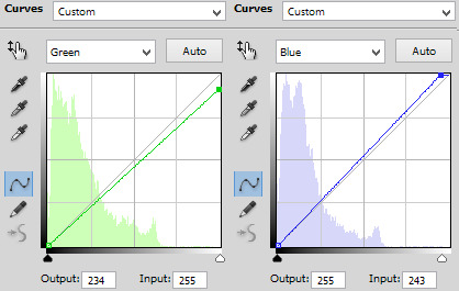
result:

2) levels. i use for both darken and brighten, nothing too extreme
the white arrow to brighten, it depends on the gif, but since i'll use exposure to that later, i only use around 200 to 250
the gray one to darken, if you increase this one too much then you’ll be whitewashing the shit out of the gif, i only use this way or don’t use at all. exception if it’s a really dark gif
the dark one is to darken too, i use only around 0 to 10
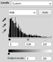
result:

3) exposure. this one is the one i use to brighten, here the different is minimal, but in a dark gif this works really well as you’ll see on part 2. also, i know it looks like the levels was for nothing here, but most of the time you go back to previous layers and edit a bit more. or even after use exposure and need to darken, levels is there for it
exposure. i never use more than 1,00. and sometimes only +50 is enough in a dark gif
offset. nope, never, no
gamma correction. also, never use more than 1,10. sometimes 1,05 is more than enough
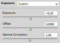
result:

4) gradient map. i wasn’t a fan, but now that i see the difference i’m always using it. i like that controls the dark parts of the gif, i could use more levels for that, but it would get weird
always soft light, and the fill i only use around 20%. sometimes my standard is 15%. i got this from sami’s tutorial and it’s amazing even tho it doesn’t look like much here
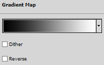

result:

5) color balance. i’m still in that thought of “taking off” the colors, because after this layer that i’ll edit them.but also here i fix the color if the gif is practically ready. i only used midtones, but sometimes i use highlights to make the gif as natural as possible. it doesn’t look like it changed much here, but you’ll probably get back here after finishing the psd to fix a thing or two

result:

6) selective color. the fun part! honestly, just mess around the colors. i can’t really say do this or that here because i change this a lot depending on the gif, so here are some tips:
reds and yellows. i use to fix whitewashing, make the person more vivid too, you know? usually i’ve been using magenta with yellow together, you have more control if the red will stay red or it will be pink-sh, and if the yellow will stay yellow or be around green
cyans and blues. if you come across a gif where the white is blue, you adjust this on cyans. decrease the cyan and mess around magenta and yellow
magentas and whites. sometimes the gif seems too red-ish, or something, so you decrease magenta and it will make a LOT of difference. the whites it’s helpful too when the white on the gif have another annoying color, you adjust here just like the cyans
neutrals and blacks. nothing hardcore, sometimes i don’t even use neutrals. and i used to use blacks on 10 and it’s just the worst on most of the gifs, so now i use top 5, depending on the gif
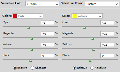

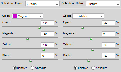
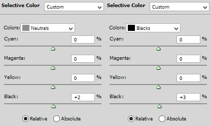
result:

7) vibrance. i don’t overdo because it will ruin everything i edited previously, like, if add more vibrance the yellow would go crazy along with the background and ugh, this way is so clean and exactly what i want. so, i never use more than 50, some scenes are really with no color, so i use more

final result:

other examples using the same process are in the post previews since tumblr won’t let me add more gifs here ;)
PART 2 OF THE TUTORIAL HERE
there i’ll color dark/yellow-ish/blue scenes <3
#dearindies#coloring tutorial#gif coloring#tumblr psds#high fidelity psd#zep psd#legacies psd#nancy drew psd#resources#my tutorial#psds#my coloring tutorial#base psd
967 notes
·
View notes
Text
November Feature: Set 11 Design Review + CiM Q & A
I have this memory of at some point writing somewhere, whether it was here on The General’s Notebook or in a TIA post, that once Leaders & Legends came out, I was going to be diving into its structure in the hope of figuring out how it was designed when compared with prior sets. I can’t find that quote now, but just in case I did say it, this is that article. As the first set designed entirely by Commentary is Magic instead of Enterplay, it bears asking if the new developers are going to be using a different philosophy with regard to their design.
Now, in addition to merely looking at the cards and running the numbers, this month I also had the privilege of literally asking the new developers about their design philosophy with regard to LL. I’ll include the full Q & A at the conclusion of the article, but first, let’s look at what my investigation uncovered.
Requirements
I’ve had a lot of exposure to Set 11 over the course of the past few weeks, not only in diving into the set to try building new Core decks, but also in creating the slides and figuring out ratings for the Meticulous Talks review stream. And over the course of that work, a couple of things leaped out to me right away. Number one, the requirement numbers in this set seemed high. I noticed a lot of 4’s, and enough 4/4’s to be relevant as well. In the past, cards with a 4/4 req were exceedingly rare, with only four of them before LL. Set 11 brings three more of them, in addition to what feels like a lot of 4’s and 3’s. But appearances and impressions can sometimes be deceiving. How does the set actually stack up against the others?
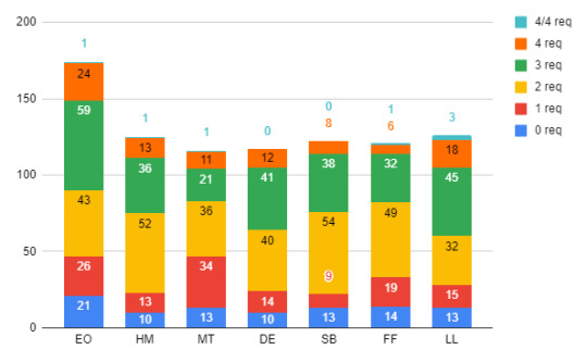
Requirement curves for every set in the modern era (post-EO). Note that multicolour cards are included in the count for their respective numbers, so 1/1 cards are in the 1-req count, 2/2’s in the 2-req count and so on. 4/4 cards are counted separately, though.
Stacked up against the others sets of the modern era, LL isn’t quite an outlier. In fact, in its construction it bears a strong resemblance to Defenders of Equestria. Yet even with that similarity, there are some noteworthy points about the new set that make it stand out. As can be seen, LL has the most 4 requirement cards of any set in the modern era (save EO, but as a huge set generally, the comparison there is a little harder to make). As discussed already, it also has the most 4/4’s. And, indeed, it has the most 3 requirement cards as well. It is in fact the only set in the modern era which has more cards at 3-req and above than it has at 2-req and below.
It seems like most of this shift to higher req’s has come at the expense of cards in the 2-req spot, and if we think about some of the changes that have come in Core after the rotation, a clear effect emerges. With the rotation of Singing Barrel and Trading Traditions, suddenly getting to 3-req in a third or fourth colour has gotten a lot harder. The primary replacements (Fire of Friendship, Infilitrating the Hive, Rainbow Generator) all work in two Power increments. Thus we should expect that getting to 3 Power in an off colour will be a lot harder in new Core, which we might expect will make running multicolour decks harder.
As CiM explained to me in our interview, this was very much intentional:
CC: My analysis indicates that LL in general has cards with higher reqs than most sets since DE. Was there a conscious decision to design more impactful cards that needed higher reqs?
CIM: We felt that the ease of which a deck has historically been able to get into 3+ colors and get the capstone cards from those colors is a serious problem. With Trading Traditions and Singing Barrel no longer in core, our intent is that players should need to commit more resources to get the capstone cards from any color, and an increase in play requirements would be one result of this.
Instinctively, this feels correct to me. An eyeball look at what you got at the 2-req level in past sets reveals a lot of great cards there, and in the past decks absolutely have exploited this. While in LL obviously we don’t know what the great cards are yet, a look through the list leads to the idea that most of the really good stuff only unlocks at 3-req and above. Going by the CiM Individual Card Value Ratings (as announced on their stream, and they would hopefully be the authoritative source) the 2-req cards in LL have an average individual value of about 2.67, while the 3-req cards are about 2.96. Keeping in mind their rating system, this means that the average 2-req card in LL is in between minimal and moderate game impact, while the average 3-req card is squarely in moderate territory. (Note that for that calculation I ignored the three-colour cards. I don’t think they really count as having just 2-req, after all.)
It should go without saying, by the way, that shooting for higher reqs on the more impactful cards in the set isn’t necessarily a good or a bad design decision; it’s simply evidence of the philosophy that CiM is implementing, and we’ll have to see what effect it has on the metagame that develops. On the one hand it’s somewhat obvious that the higher requirement cards should be the ones with the more impactful effects. But in LL it seems this will be even more true than it was before.
Game Text & Abilities
The second thing that leaped out to me upon first inspection of the set was there seemed to be a lot of text to read. Game text, that is. It just didn’t seem like there were that many “simple” cards in the set, and it actually kind of gave me the impression of a Magic set, just a little. One of the things that I’ve always found interesting about Magic sets is that so few of the cards are simple. Almost all of them have some extra ability or piece of text attached to them, and most of these abilities are unique pieces of text which are only found on that one card.. Whereas in MLP there are usually a few cards with no text at all, and a few more with only a single keyword. So again, let’s have a look. In this chart, we’ll use War of the Spark as our comparison Magic set.

For the purposes of this analysis, a “simple” card is one with either no game text, or else just a single keyword ability. We can see that Leaders & Legends is absolutely the set with the most complex ability design out of any modern era MLP set, even being the only one to edge out WotS. That means more unique pieces of text, and more cards that do interesting things and can be built into new sorts of decks. Again, this was quite intentional:
CC: Was there a conscious decision to make the set more complex in terms of the number of distinct abilities on cards?
CiM: [...] Cards we design will tend to have richer possibilities for interaction with other cards. To put it in Magic terms, there’s going to be a bit more of a Johnny flavor: cards that reward people sitting down and thinking about the myriad of different things they can do, how they can interact with other cards, and those One Weird Tricks that they are capable of in niche situations.
This is a consequence of us innovating and exploring new bits of design space, looking for new things that we think players might be fun, of finding ways to spice things up, of trying not to print more 4/0/4 vanilla Orange Friends. The points-matter theme of the entry cycle is an example of this: entry cards being useful late game is (hopefully) new and interesting.
And again, this makes intuitive sense to me. What’s most impressive is that CiM has managed to keep up the amount of abilities on their cards without actually increasing the number of abilities in the set. That is to say, there are more cards with text on them, but if you count the number of paragraph breaks in the OCR, we actually end up with a smaller number as compared to other modern sets:

Not smaller by that much, of course, but still notable. So again, what this means that while LL has about the same number of distinct abilities spread among its cards, it gets far more of its abilities from unique bits of text, rather than from new keywords or from reusing old keywords. It even has less usage of what I call “natural” triggers, which are things like enters-play triggers on Friends. They’re natural because they’re guaranteed to fire as long as you play the Friend, as opposed to triggers that require something else to happen. So there may in fact be more reading to do with this set than with any other, but I have to applaud the designers for their creativity, and in not falling back on old keywords to fill out the structure of the set. (Not, of course, that using old keywords is bad. It’s absolutely worth it to explore the spaces that they create. But there’s also a commendable ambition in forging something so novel in their first crack at designing a whole set.)
The Rotation
As we go, I’d like to show two more pretty pictures. With some help from Hithroc, I ran some more queries about the structure of Core, both as it was before the rotation, and as it is now. Specifically, especially given the requirement structure of LL, I wanted to know how the general requirement and cost curves of the format had changed with the rotation. Given that LL is quite heavy on the requirements, I had thought that Core as a whole might now be heavier with the EO Block gone. Turns out, not so much:

Actually, the proportion of 3-requirement cards has grown smaller in New Core, as the sets remaining in general have significantly more 2’s than 3’s. But the proportionate amount of entry has shrunk, which is something that again may give pause to those wanting to run 3 or more colours. The more interesting comparison I think is the one for cost:

Here, there was proportionate growth in every category except 1-cost cards, and the drop for 1-cost cards was quite significant, down 7.4% from where it was in Old Core. So the cards in the format are in general more expensive than they were before. My instinct is to guess that this might slow down the game a bit, but of course it’s not so simple as that. It does mean that AT is likely to be more precious moving forward though, which may provide a boost to those colours capable of making more of it. It certainly means that in New Core AT efficiency is a very important concept. But every colour has its own way of making that concept work. And, this is after all just the first set that we’ve seen from CiM. Set 12 may or may not follow the same philosophy. That will all depend on how this one works out.
Q & A
As promised, I’ll close out this article with the full Q & A that I had with CiM. It wasn’t super long, only eight questions and not all particularly-related to their design philosophy. But there were still some interesting tidbits here. As for me, I’ll be back in the New Year. Happy Holidays!
CC: How satisfied are you with the final product of Leaders & Legends?
CiM: Ultimately, this will depend a lot on how satisfied players are with the set.
It’s hard to speak objectively about this. Building a set is a lot of work - design from the ground up, test it in concert with a bunch of people, pick all the flavor (names, finding art, writing flavor text), arranging all of the art and text, proofing all that art, whargarbling over how to make the rules support all the new cards, and producing all of the documents.
There are cards that we aren’t happy with, ideas that didn’t pan out, lost flavor opportunities, but all in all, it worked out fairly well. Only time and the meta will tell if it truly is good.
CC: To what extent was designing the set simply a matter of making the cards that you guys, as players, would have wanted to play with yourselves? (To each designer) What kind of cards do you like? CiM: To say that we would completely remove ourselves from the equation when designing cards wouldn’t be accurate; after all, we are still players just like everyone else, and we’ll have our own personal tastes and preferences.
That being said, there was rarely a point where a card was designed for L&L with the thought process being “Bigcheese will love this card” or “Oh man, Grand Pause is totally going to break this thing.” In fact, those sorts of thoughts are red flags for deeper consideration of the design, and it was more common for a card to be designed with other players in the community in mind, knowing what sorts of decks players have tried to make work in the past and we felt would be fun to provide additional support for.
CC: (To each designer) What kind of cards do you like?
GP: I enjoy cards that increase my options or allow for new or interesting lines of play. Cards that are efficient and powerful are obviously great inclusions in many decks, but often times aren’t the most exciting; they just might do something that others cards do cheaper or faster. When a card or cards help to create a more unique play experience or open up deck strategies that might not have existed or been properly supported before, that’s where I start getting excited.
Bigcheese: I enjoy cards that have interesting and useful interactions. Cards that can have a high impact, and are usable in lots of different situations or types of decks.
Ara: I want to say stuff that can be played in the moment and doesn’t require a lot of thought to execute with, but then I go and play Pink/Purple which is 100% about setup and shenanigans. So maybe I’ll answer cards that are good answers to a need - going fast, removal, etc, and are generally high impact.
Ivory: I like cards that are immediately useful and don’t require multiple turns to return value. A card that I know will make an impact on its own while also helping me get closer to winning are what, in my opinion, have the highest value.
CC: In the past, it's been understood that Block boundaries are placed on points of design change in the game. To what extent is the design of LL a departure from the DE block?
CiM: We’re designing it instead of Enter-Play! Merely because a new set of designers are behind the wheel for Leaders and Legends, there are going to be design philosophy differences despite our efforts to maintain the spirit of the game.
The next two questions, we feel, are investigating the differences in spirit in more detail so it makes sense to answer them first.
CC: My analysis indicates that LL in general has cards with higher reqs than most sets since DE. Was there a conscious decision to design more impactful cards that needed higher reqs? Or was this perhaps a rethink of how cards had been placed on the req curve before?
CiM: We felt that the ease of which a deck has historically been able to get into 3+ colors and get the capstone cards from those colors is a serious problem.
With Trading Traditions and Singing Barrel no longer in core, our intent is that players should need to commit more resources to get the capstone cards from any color, and an increase in play requirements would be one result of this.
CC: I've also noticed that compared to the sets that came before, LL has fewer "simple" card designs (cards with either no game text or just one keyword), and does it with unique bits of text rather than new keywords. Was there a conscious decision to make the set more complex in terms of the number of distinct abilities on cards?
CiM: There’s only so much room in the card pool for 2/0/2 vanilla Friends, and the expectation of players at this point is that cards do more interesting things than just be vanilla entry. Granted making entry more interesting than vanilla does cause some power creep; this isn’t great but some power creep is a necessity to keep the game interesting.
Cards we design will tend to have richer possibilities for interaction with other cards. To put it in Magic terms, there’s going to be a bit more of a Johnny flavor: cards that reward people sitting down and thinking about the myriad of different things they can do, how they can interact with other cards, and those One Weird Tricks that they are capable of in niche situations.
This is a consequence of us innovating and exploring new bits of design space, looking for new things that we think players might be fun, of finding ways to spice things up, of trying not to print more 4/0/4 vanilla Orange Friends. The points-matter theme of the entry cycle is an example of this: entry cards being useful late game is (hopefully) new and interesting. CC: We all hear the legends of cards that had an initial design which was incredibly overpowered. Is the reverse ever true? Which happens more often in testing?
CiM: We will do a stream at some point about stuff that died in L&L playtesting, and there are more than a few things that were over the top and got whacked with the nerf bat. Broken cards tend to leave a larger impression in a tester’s thoughts of playtesting than offhand comments about “this is kinda crummy, can we buff it?”, and even with the buffs, the crummy cards may not be good enough to really show up in the competitive scene and leave an impression.
But yes, just like there’s stuff that’s absolutely busted and gets nerfed, there are cards that start underwhelming and end up getting buffed later. As mentioned previously, we’re going to be biased towards thinking about the overpowered cards, but underpowered cards that get buffed are far more common.
When coming up with the card initially, we have a pretty good idea of what constitutes an acceptable maximum power level for a card, and a lot of the time the initial design for a card will intentionally fall short of that. That said, sometimes there are things that were considered underpowered during playtesting that turned out to be ringers once they got out into the wild. Salina Blue is one of the examples that comes to mind.
One of the reasons for this is cards may not be good outside of the context of a larger meta - there’s usually not enough time for one to really develop during playtesting. There’s no such thing as too much testing, but an eternal testing cycle gets in the way of releasing cards. CC: (To each designer) Which cards in LL are you most fond of?
GP: I previously mentioned that Pegasus Royal Guard is one of my favorite cards from the set; it’s a great aggressive card that becomes more difficult to deal with the longer your opponent leaves any copy of it alone, and can allow for some truly silly burst turns. Cozy Glow, Heel Turn is a card that has a lot of potential to shift momentum in the mid- to late-game, turning your earlier removal into even more added value. Crown of the Sibling Supreme is probably my favorite card flavor-wise; it was 100% a top-down design, and I think it really shines in that sense.
Bigcheese: Zecora, Curative Cach has unique and interesting wording, and was a fun card to get the wording right on. I additionally really like Pinkie Sense because of the way it's abilities work together and with other cards like Same Day Delivery.
Ara: My favorites are going to be heavily influenced by flavor and art since that was my major contribution to the set. Of them, Silverstream, Abstract Artist is probably one of my most favorite. It has Silverstream on it and is just a great early game card against confront to flip manes. It extols Silverstream’s, uh, virtue?, of just wanting to see what you’re doing and getting in the way for the next four hours.
Ivory: That’s a tough one! Grogar, Legion of Doom and Pinkie Sense are the two cards I see myself playing with a lot. Both are scary, high impact cards and there are a lot of fun shenanigans you can do with both.
1 note
·
View note
Text
X-Pro Reversal, Perfected.
After a long time and a lot of test shots, I now think that I have perfected the process. I’ve tried it with both E-6 and C-41 films with good results on both. First, I'll start off with the boring bit and then get to the results.
Here is the recipe. I purposefully made it so that it could all be done at the single temp of 102F as used by every C-41 kit I've ever seen. Note that temperature control is more critical in this and that some kind of warming method will be needed for the long first developer time.
NOTE: It is trivial to re-reel the wet film with stainless steel reels. With plastic reels it would seem impossible; however, several tips online has said that you can easily (apparently more easily than stainless) re-reel the film by sticking both the reel and film in a water filled bucket so that they are submerged. If you're stuck with plastic reels, you can try this method but I haven't tested it for myself.
Mix HC-110 A working solution (1+15)
Heat both HC-110 and C-41 chemicals to 102F (you might also want a bottle of water for rinsing)
Rinse/preheat the tank for 2 minutes
Develop for 6:30 in HC-110. Agitate 10s initially, and then 4x every 30s after. Experimenting with less aggressive agitation could lead to less blown highlights, but additional time might be required for full shadow development. Less agitation might also add some color casts. Develop for 7:30 for C-41 films for "box speed" results (otherwise you'll need to over expose by 1.5 stops for best results)
Rinse several times in order to stop development
Remove film from tank, fog over daylight colored light pad. Do not fog over tungsten lights or outside using the sun. Fog for 2 or 3 minutes, ensuring to cover both the front and back of the film
Put film back in tank
Rinse/preheat tank again for 2 minutes
C-41 develop for slightly longer. For my kit it says 3:30, so I did it for 4:00 for VERY fresh developer (ie, this was the second roll I used with it). If you've processed more than 4 rolls, extend to 4:15. If you've processed more than kit capacity go for 4:30 or even up to 5:00.
Blix for almost twice as long as instructed. For my kit it says 6:00, so I blix for 10:00. If using a two bath kit, extend both bleach and fix times. See troubleshooting to figure out if you need more blix
Rinse as normal. I recommend inspecting the film before stabilizing in case more blix is required.
Troubleshooting and FAQ:
Can I use a different B/W developer? - Yes, however not all developers are ideal. Before HC-110 I used a generic F-76+ developer and had problems reaching the native box speed, even with greatly extended development times and higher concentrations. HC-110 solution A is ideal because it's high contrast like slide film works best with, and it's also incredibly active, meaning you can develop the film very quickly. Previously 18 minutes and beyond was required just to reach half of the native ISO. HC-110 also does not seem to produce any color shifts by early development of the color couplers.
My film came out but it looks faded and blacks aren't deep - This is caused by a moderate to major lack of C-41 development. Ensure that your C-41 chemicals are still good
My film came out missing an entire color region, or there is only one color present - I've had this happen only twice and both times I chalk it up to my C-41 developer getting contaminated somehow.
There is a lot of grain and weird reddish coloring in the highlights - This is caused by lack of blix. If there is any grain AT ALL in the highlights of the film where it should be clear (like the exposed leader) then this indicates lack of blix. When not enough blix is applied it tends to affect only certain portions of the film, so that some frames will be correct and others not. There is no harm in putting the roll back into the blix if you see this. Note that massive under development in the B/W developer phase can also cause this, where the exposed leader is only gray rather than white.
Can I use stand development to decrease contrast/safely develop badly shot film? - I've tried this a few times. Do NOT under any circumstances use it for the C-41 development part. The result is really massive color shifts, fog, and lack of certain colors. For the B/W development part, it should be possible. Keep in mind though that you still need a very active developer and potentially raised temperatures. I tried doing stand development with the less active F-76+ stuff, and over 1 hour it barely even touched the film. Also for C-41 film, it's exposure latitude even when processed like this is much more forgiving than E-6 film. As long as the C-41 film isn't massively over exposed it should still produce something. I've used this with film that was suppose to be pushed 2 stops (ie, 400 ISO shot at 1600 ISO) and processed it this way with very good results.
I tried a different film and it looks weird - That's part of the fun. Each film, be it C-41 or E-6, has it's own unique character in this process. Sometimes the results aren't great, but it's almost always unique.
All my highlights are blown and the shadows are faded - If the unexposed portions of film are dark black, then you did not develop in B/W developer long enough. If the unexposed portions of film are not dark black, then you either did not fog for long enough, or you didn't do C-41 development long enough, or your C-41 developer can be contaminated... or of course you could've shot it at the wrong ISO in the camera.
My film is mostly black, or it looks under exposed - If the exposed (ie, leader on 35mm) portions of film are not clear, then you have a major lack of B/W development. If it is clear, then it is a moderate lack of B/W development, or inaccurate metering in the camera. (note that when shooting slide, it's typical to meter for shadows and not highlights)
My highlights are completely clear, but shadows are very dark - Part of this is the fun of slide film, but this can also indicate too much C-41 development. There is a balance to be struck between dark blacks and reasonable contrast. The more time you develop in C-41, the darker shadows will get and the deeper colors will turn.. but you'll have more contrast because the highlights will be more or less unaffected. If you greatly reduce the C-41 development time, contrast is pushed way down, but color saturation is also much weaker.
Can I push or pull with this process? - Of course! I don't have reliable times, but a 1 stop push appears to be around 8 minutes with HC-110 A. If you are looking to do extreme pushes of 2 or more stops, it can be helpful to pull in the C-41 process. If you pull (shorten development time) in C-41, then dark shadows can survive and not get completely blocked. Of course this has effects on color rendition, dMax, and can cause some (mostly correctable) color shifts. Note that if you push (extend development time) in C-41 development, then you need to push in B/W development even more, because pushing in C-41 effectively decreases the perceived speed of the film since shadow detail etc gets so dark, and contrast also can be drastically increased.
I followed everything you said, but ended up with a blue tint over everything - This is normal and varies depending on film. On some film it is a red tint. The tint appears to be incredibly minor (ie, you can only really see it when scanning) if the C-41 developer is fresh, and it seems to get worse as the C-41 developer is used to capacity. The blue tint is incredibly simple to correct out though, and there are otherwise no crazy color crossing with E-6 film like you see with traditional negative X-Pro. If the blue tint is not subtle, you may have also not done enough C-41 development. I've found "by the box" C-41 development to give some slightly more noticeable blue tint, but with extended times it goes away quickly. If you extend C-41 development a lot, then the blue tint eventually goes away completely, but also contrast can get pushed to insane amounts, so it's a balancing act.
Does this contaminate my C-41 developer, how many rolls can I process with one kit? - I have no idea to be honest. I've done normal C-41 processing after several rounds of this process with no problem. However, I have noticed that the kit capacity should really not be exceeded when using this process if you can help it. It introduces more and more color tints, and blix times especially will need to be extended potentially to 12 minutes or more since this process is much more blix intensive.
Is there some special way I should shoot with this process? - Just shoot it like slide film. The exposure latitude is about the same or only slightly reduced, so avoid really contrasty scenes if you want both shadows and highlights to have detail. Also keep in mind that it's safer to under expose slide film than over expose. A lot of shadow detail can be brought out of an under exposed slide with a good scanner.. but there is no highlight detail to recover. It's the opposite of color negative.
Why would you want to do this? - I hate needing to have a second batch of color chemicals mixed and going bad when I want to develop slide film without crazy colors like in X-Pro. I also like that the B/W developer can be used one-shot. But also I think the color changes are interesting. With C-41 film it can give a unique color pallette, while with E-6 film it gives fairly predictable colors. This process isn't like X-Pro when used with E-6 film, so it won't give you crazy color crossing where red is purple etc.. but it does change the strength of certain colors, and at least for Provia 100F, I think it makes things look similar to Kodachrome. For Velvia it seems to emphasize blue colors rather than green colors, etc. Also, unlike X-Pro, there is very little grain, about the amount (or maybe just slightly more) of grain you'd expect from slide film.
What can I expect from using C-41 film with this like Portra? - Orange base, color shifts, medium amount of contrast (usually), blown highlights, good looking shadows, and slightly finer grain than normal. Each stock of film tends to respond differently to this process. Superia 400 introduces some insane color shifts that can be very unflattering to skin tones, though can provide a dreamy look during golden hour lighting. Lomo color 400 (rebranded Gold 400 iirc) responds with somewhat normal colors, but with weak blue highlights but strong blue shadows, and other colors are very saturated and punchy
Ok, now we know the technical bits, lets move on to what the results actually look like. Each stock of film has it's own personality in this process. I personally like Provia's look the best so that's where I'll start
E-6 Provia 100F (120)
I processed this with newly mixed C-41 developer and the colors were worth it! This looks completely fine when held up to a slightly warm lightpad, but looks ever so slightly blue when held against a daylight lightpad. I also shot this on a cloudy day, which apparently results in a slight blue tint for Provia when processed normally. I took these using my Yashica Mat 124G, my favorite camera of all time for portraits.
Despite being a fairly cloudy day, I absolutely love the color of these. I did have to do some curve adjustment as they looked a quite blue to begin with, but I expect if I had my lightpad set to something near tungsten during scanning it would've looked almost as great with no correction at all. I especially love how the colors seem to pop, and how much contrast it has without blowing any important highlights. Absolutely perfect processing in my opinion. I think standard E-6 processing with Provia is a bit drab with less saturation. This process ramps up saturation without making things garrish like Velvia can sometimes be.
Bonus photo from my half-frame Pen EES-2:
E-6 Velvia 100 (120)
I did this on a slightly more cloudy day somewhere in Detroit, and again with my Mat 124G. This was with much less fresh C-41 developer (slightly past kit capacity) and it shows. I expect we'll see something more exciting when I do a batch of this with fresh developer. I also didn't have as much time to prepare for my shops since we were basically in the location thanks to the patience of a security guard, so I was relying more on the slightly inaccurate meter of my Mat 124G and a prayer. The ones close to over exposure actually turned out looking best with this. This film definitely had a blue tint to it, but with a very warm tungsten light could be passable and potentially used as slides.
As you can see the colors are definitely just not there like they should be in Velvia in most of the shots, but there was at least 1 that looked like what you'd expect. I've done this process (though not )
E-6 Ektachrome 320 (35mm)
This was my first time shooting with this film so I wasn't really sure what to expect.I got this as "retrochrome" from Film Photography Project and was advertised as being frozen since creation, so I just shot it at box speed and hoped for the best. I shot this film with my Leica M6 with a classic character Rokkor 40mm f/2 lens on a cloudy day. This film actually caused me to increase my blix recommendation time to 10 minutes. I was using exhausted blix (past capacity) and did it for 10 minutes and the rest of the tank was clear, but this film still had some silver grains in the highlights. If using exhausted blix, I'd say do 12 minutes minimum if using this film. Overall the results were a bit of a mess. The colors were muted and aged looking, and there was some slight color crossings. It worked for some subjects, but it wouldn't be something I'd shoot every day. For what I was using it for (Detroit and Heidelberg) it actually complimented things pretty well, but I'll use with caution in the future. This is also very old film that is supposedly government surplus. This may also have had a quality effect. Looking at some E-6 processed reference photos of this stuff, I'm really not that far off either though. Also this processed caused a considerable blue tint on the film, more so than is common with Velvia or Provia. It was simple to correct, but would not be suitable for projection.
I'd say, compared to E-6:
Some slight color crossing, especially in the green and yellow spectrum
Slightly more grainy
Significantly worse exposure latitude than Velvia or Provia. This film really seemed to have a sweet spot that I missed 90% of the time.
C-41 Superia 400 (35mm)
This was the first C-41 film I tried after figuring out the final process. It has always been an unpredictable process with C-41 film, but the color crossing in this one was especially... unique. C-41 film does of course always have the orange mask, so highlights are orange rather than clear. This is easy to correct, but of course makes it completely unsuitable for projection. These pictures were taken on a mix of a sunny day and near sunset.
The following were taken using an earlier version of the process (all the same but 8 minutes of B/W development) with my Pen EES-2 camera:
And the following were taken using the final version on my M6 with Jupiter 50mm f/1.5 lens:
The colors are definitely other worldly and in some cases quite dreamy. I love this for golden hour and sunset stuff, but the color crossing is a bit less subtle in open daylight. You have to be careful using this for skin tones, because it can definitely make skin look quite blotchy and unhealthy for some reason. In the two pictures of my wife (the redhead) you can see I gave up trying to keep the colors realistic and just went with the color pallette this film naturally gives me. When trying to correct things to be more natural it made skin tones look really bad. When color correcting this film in this process, everything is up for a bit of interpretation anyway.
C-41 Lomo Color 400 (35mm, rebranded Kodak Gold 400)
On this one, the colors are much more natural but very punchy. This roll was mostly under exposed (it was suppose to be pushed 2 stops) but had some surprisingly good results despite that with this process. Honestly this might be my new way of pushing C-41 film with some slight modifications.
E-6 Rollei CR200 / Lomography X-Pro 200 (120)
(This was added after the initial post)
This one came out with a really thick teal cast, and came out incredibly curly. Definitely not the typical slide experience, but if you correct out the cast, it's not too bad. I honestly have never processed this film in standard E-6 chemicals, so I'll just give the results I got:
AR-5 FPP Color IR (35mm)
(This was added after the initial post)
This one came out looking great. The only problem is that lens has no focus mark that corrects for IR light, and so things aren't nearly as sharp as they should be. Regardless, these slides came out looking great. I'm not sure if it's the film with a red filter, or the process or what, but the results definitely lean to the greener side. It is still more grainy than I'd like. I've heard you actually get less grain with this stuff when processing normally in C-41 as a negative, and more grain with E-6.
Conclusion
For E-6 film this is definitely a doable substitute to traditional processing. I prefer only keeping one set of chemicals and using every one-shot if possible, and this process allows for both. You do have to be careful to not use exhausted chemicals and such, but overall it's a less finicky process than traditional E-6. The only complication is that fogging must be done manually. This isn't a problem with steel reels, but is near impossible with plastic reels. I bet some smart person out there knows how to make a chemical fogging agent, but I've failed to find it in my searching on google. Also I'm not sure how much I trust chemical fogs, since that is yet another chemical to go bad, so I'll personally never use it. If anyone does find out though, definitely message me on reddit and I'll include something here about it: u/earlzdotnet
8 notes
·
View notes
Text
NARS Light Optimizing Primer SPF 15
Price: $35
Claims: Primed, revived, radiant: NARS Light Optimizing Primer SPF 15 dramatically extends and transforms the appearance and vibrancy of makeup. Weightless and oil-free, it minimizes signs of fatigue to leave the skin luminous and revived. May also be worn alone
Ingredients:
Octinoxate (5.9%): Used as a sunscreen agent to absorb ultraviolet light. It is also used to reduce to appearance of scars.
Avobenzone (2.5%): An oil soluble sunscreen agent. Protects the skin against the sun’s entire range of UVA rays. It is also used in cosmetic products to protect other ingredients from deteriorating under the sun.
Octocrylene (2%): An active sunscreen ingredient. Has the ability to absorb UVB and short-wave UVA (ultraviolet) rays and protect the skin from direct DNA damage.
Water: Primarily used as a solvent in cosmetics and personal care products in which it dissolves many of the ingredients that impart skin benefits, such as conditioning agents and cleansing agents. Water also forms emulsions in which the oil and water components of the product are combined to form creams and lotions.
Dimethicone: A silicone-based polymer that functions as a skin protectant and is also used for its smooth, non-greasy feel. it prevents water loss by forming a hydrating barrier on the skin.
Butylene Glycol: Texture enhancer.
Dipropylene Glycol: Found use as a fragrance, masking agent and in controlling the viscosity of a formulation.
Silica: An earth mineral; used to condition and smooth skin, fill in visible fine lines and wrinkles, and to help absorb excess oil in skin; also used as a carrier for emollients to improve the feel of skin.
Glycerin: Helps to retain water to lock in moisture.
Polysorbate 60: A thickening agent.
Behenyl Alcohol: An emulsifier that also keeps the oil and liquid parts of a solution from separating. Its other functions include altering the thickness of a liquid, increasing foaming capacity, and stabilizing foams. When applied to the skin, it gives it a smooth feel and helps prevent moisture loss.
Phenoxyethyl Caprylate: An emollient with excellent solvent properties for UV filtersand lipophilic active ingredients. It imparts a pleasant non-oil feeling on the skin.
Phenoxyethanol: A preservative.
Ethylhexylglycerin: A natural preservative used as an alternative to parabens. Used as a deodorizer and skin conditioner.
Acrylates/C10-30 Alkyl Acrylate Crosspolymer: A film forming agent that's used as a thickener and stabilizer in cosmetic products. It’s typically designed to keep dispersions mixed in water from lumping. The film also provides water-binding properties to products.
Potassium Hydroxide: A pH adjuster and buffering agent. It has a unique ability to attract water molecules from its environment, and ultimately dissolve into the water that it had originally absorbed, balancing the formula without creating excess weight or changing the composition.
Xanthan Gum: A thickening agent. Used as a binder, emulsion stabilizer, emulsifying surfactant, as well as an aqueous viscosity increasing agent.
Carbomer: A thickening agents that help control the viscosity and flow of cosmetic products.
Sea Water: Skin-Conditioning Agent, Humectant and Solvent.
Palmaria Palmata Extract: Emollients and Antioxidants.
Trisodium EDTA: Used as a water-softening and chelating agent (a compound that binds and separates metals, keeping them from bonding to other ingredients).
Algae Extract: Act as thickening agents, water-binding agents, and antioxidants.
Tocopheryl Acetate (Vitamin E): Used as an antioxidant and skin conditioner. Enhancing the efficacy of active sunscreen ingredients, reducing the formation of free radicals from exposure to UV rays, promoting the healing process, strengthening the skin's barrier function, protecting the skin barrier's lipid balance, and reducing transepidermal water loss. Attributed with antioxidant, anti-aging, moisturizing, anti-inflammatory, and enhanced SPF properties.
Retinyl Palmitate (Vitamin A): Used to promote natural cell turnover, elasticity, and suppleness and minimize the appearance of fine lines.
Ascorbic Acid (Vitamin C): A powerful antioxidant with many anti-aging benefits such as building collagen, defending the skin against free-radicals, healing inflammation, reducing the appearance of fine lines & wrinkles, and lightening discolorations.
Butylated hydroxytoluene (BHT): A preservative and an antioxidant, it helps fight against the deterioration of cosmetic products caused by chemical reactions with oxygen. It's also known to work synergistically with other antioxidants.
Barium Sulfate: Used as a brightening and opacifying agent.
Potassium Sorbate: A mild preservative.
Citric Acid: An alpha hydroxy acid and astringent with antioxidant properties; used to help skin maintain its natural pH level or adjust the pH of a product.
Alumina: Naturally occurring mineral used as an abrasive, a thickening agent, and an absorbent in cosmetics.
Mica: A light-diffusing earth mineral; used as a pigment. Provides visual and color effect its sheer, translucent and skin-hugging properties. It reflects light from the face because of its glittering or shimmering properties, and can create the illusion of a smoother, softer and more radiant skin tone.
Titanium Dioxide: An earth mineral used in sunscreens that is capable of blocking both UVA and UVB rays; also used as a pigment.
Iron Oxides: Pigments are used to enhance colors in cosmetics. Its ideal because they are non-toxic, non-bleeding and moisture resistant.
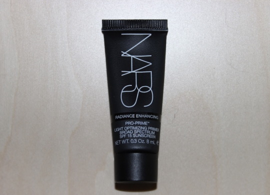
My Thoughts: A big plus of being a Sephora VIB Rogue member is that I can get free samples from time to time. On July 2015 I received NARS Light Optimizing Primer SPF 15 in my NARS VIB Sample Pouch. The NARS Light Optimizing Primer SPF 15 is very similar to what Benefits ‘That Gal’ Brightening Face Primer should have been. The Light Optimizing Primer comes in a black squeeze tube. That squeezes the product out perfectly. Even though this is a small sample I still made this last a really long time. I can’t even imagine how long the regular size bottle will last me. I use primer religiously, even if I am not wearing makeup. Its as important to me as my 3 step regimen. I love the idea of creating a barrier against anything I put on my face, especially since I don’t know what type of stuff is flying around in this windy city haha.
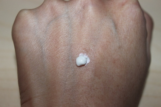
NARS Light Optimizing Primer SPF 15 is white and creamy like a moisturizer. When applied it is slightly translucent but leaves behind a rose gold shimmer that is easily spreadable on the skin. I didn’t even notice the rose gold shimmer on my face, I only notice it on my hands. It mostly was on my hands but when I put the primer on a good amount transfer to my face which was evenly spread out. I was a bit worried because I thought I would get shimmer everywhere but luckily that didn’t happen. I didn’t mind the shimmer because it contains a light reflecting complex that creates a luminous sheen. Even though the texture felt like a moisturizer, it didn’t hydrate my skin. So I had to make sure I put on a moisturizer prior to application.
I tested NARS Light Optimizing Primer SPF 15 with 2 different methods. The first method was with makeup. The primer did not create a smooth canvas for my makeup. After applying primer then my foundation, I found that between my eyebrows I had a cluster of little bumps. It happened every time and I know for a fact prior to application I did not have the bumps. The weird thing is the bumps would disappear eventually (usually 2 to 3 hours later). And the finish of my makeup is amazing! My foundation looked vivid, not like it use too. I was shocked! It even keeps my makeup looking fresh for 8 hours, like I just put it on! The second method is without makeup. This has to be my favorite primer to use when I am not wearing makeup. Its brilliant at brightening my complexion and getting rid of any signs of fatigue and I mean any! Its beneficial to have this especially when I am in a rush and don't have time to get ready. I just pop some of this on and I don’t feel insecure about how dead I look.
I would love to purchase a full size but sadly NARS does not sell this primer on their site anymore. Which sucks because this is the best primer to use whenever I am not wearing makeup.
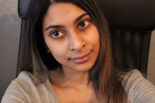
No makeup
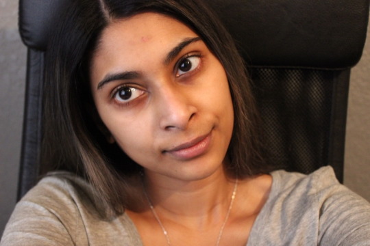
No makeup with NARS Light Optimizing Primer SPF 15
Pros:
A little goes a long way
White & creamy texture
Translucent with rose gold shimmer
Easy spreadable
Evenly spreads out
Light reflecting complex that create luminous sheen
makeup finish is vivid
Keeps makeup looking fresh for 8 hours
Best primer to use without makeup
Brightens natural complexion
Rids any signs of fatigue
Cons:
Does not hydrate skin
Does not create a smooth canvas
Causes temporary bumps when worn with makeup
NARS no longer sells this primer
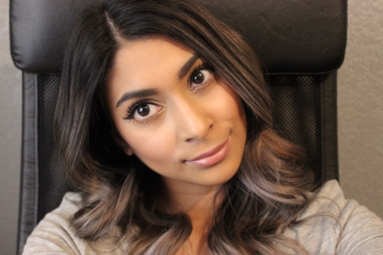
NARS Light Optimizing Primer SPF 15 with makeup. If you found this review helpful please click on the heart or reblog. Feel free to reply with your thoughts on the product.
#NARS Light Optimizing Primer SPF 15#NARS#NARS cosmetics#Primer#beauty#beauty blog#beauty blogs#beauty review#beauty reviews#beauty product#beauty products#reviews#review#blog#blogs#like#likes#heart#hearts#love#loves#reblog#reblogs#makeup#makeup blog#makeup blogs#makeup review#makeup reviews#makeup product#makeup products
8 notes
·
View notes
Text
Group Brainstorming and Debriefing
For our brainstorming session, we followed a very similar approach as to what we did in the class brainstorming activity. We revisited our list of 1 how might we questions, and as a group highlighted which of these we found most interesting or fruitful. From there, we each committed to remotely brainstorming for 15 minutes on each of the highlighted ideation prompts, and then another 15 minutes reflecting and giving feedback on the results once they were all in. We used google docs and slack as our main communication and brainstorming platforms- where we could begin live editing on the google doc while multiple of us were on the same document. We were able to hash out our thoughts after both in the google doc and through slack, where we shared our main concerns, or judgements, about the brainstorming results. Next, we went back in and reorganized our thoughts into a more categorical visual display. I found this ideation exercise exciting to come up with as many ideas as possible, and also a bit challenging. I found myself trying to go over the time limit or still pondering questions after I had already moved on. One thing that was kinda funny and weird during my reflection stage of this step, was that I said outloud in my apartment ‘why are phones more dangerous with data security than my google home ? Is it proximity?’ To which my google home responds ‘yes’ from the corner of my room. Perhaps she was brainstorming with me!
In reflecting on the exercise a day or two after completion, I am kind of caught up in the idea that some of the solutions posed strayed away from the ideation prompt. I found myself in this problem a few times, where I would come up with as many possible distribution ideas but then none of those would actually relate to Internet of Things. One take away is how vital it is to keep the prompt in front of us at all times during this process, so as to be constantly reminded. My favorite idea out of these so far is the mobile app that’s a personal assistant/ teacher to IoT and data security. Another is finding a way to parcel data created from IoT devices (let’s say google home alarm sleep schedule, or stating that you have run out of milk, to then have those voice commands integrated with mobile apps to automatically send milk your way, to analyze your sleep cycle in the health app, etc.) In essence, this idea is to integrate voice recognition, on demand delivery and convenience services, and smart phone interfaces to make our smart devices incredible more smart.
Below you can find a transcript of our ideation brainstorming session:
IoT Core definition:
as we ideate to have a macro view of topic we chose considering privacy/security issues
An IoT device is distinguished by being identified as a "Physical Object" ( not a person ) embedded with "Network Connectivity" (sensors, electronics) that enables "Data Exchange" (collection of information, data transfer & storage). Categories for the devices can include Consumer, Commercial, Industrial and Infrastructure and they are developed to make access to information ( via a wearable or Smart Home device) more convenient and readily accessible.
How might individuals gain access to their data:
JSON FILES
Color maps *
Emojis
Different type of data visualizations **
Based on pop culture
Based on your Soc
2 step verification
Maybe have to go to the town center every city has one to become a smart city **
Thumb print scanner
Based on your dna (insert a drop of blood) **
Housed in your amazon account
Data must be able to be digestible by smartphones
Government provided smartphones
Data libraries
Phone app that comes with smart phones with data access - *** Jenean
API
Self scanners at grocery stores *
ATMs
Making everything open-source
everytime a piece of data is produced, it is uploaded onto a public server
Treat data like puzzle pieces
reimagine data as a collective unit rather than individually focused
World atlas or like database of every individual’s data… registered into database with a device’s first use of internet.. Collective storing after
Legal protection.. Companies must distribute to each customer unless opted out *
Regulation of data access
Unlocking said data through fingerprints or eyescans
Everyone should be able to request to download their data
Cameras on devices
Notifications if you are sharing an alarming amount of data *
Piggybacking… notifications for each time data is shared with another company/user
A service that can delete your data across multiple devices
An app that helps you manage how and where you share your data **
Access to the data
We were looking at it from 2 different ways to have companies/governments to allow access to the data that they were using in their companies. And then on the other side of the spectrum
Looking into opting out of information but in a layer by layer that type of situation
Making it as digestible as possible. Imagine if privacy policies, or credit card statements, or mortgages where in a digestible format.
transparency/public
Pushing for an informed opinion
*Ooh guys just thought of an interesting example…. my current renters insurance is an app that is named maya and she tells me all the legal stuff of my policy in a texting format and i respond like ‘ tell me more’ and she explains in greater detail - Jaime *
Very Interesting ~Jenean
^^Love this, I could’ve definitely used Maya during my move out process lol (Johnnie)
Control our tracking settings on our devices
VPN
In private browsing/incognito
Restrict purchasing of user data
Notify users of their data being sold
Data exchange database
Increased encryption standards
Distributed file systems
Use Data receipts (public key cryptography)
Automatically delete data
Reapproaching cloud storage
Removing data collection
Scheduled data releases
Api integration
Application interfacing with what you say
Parce all the data into segments for Specific uses (connecting voice commands with mobile apps, order triggers, safety resources, scheduling and productivity apps) and distribute the segments separately like Blockchain… no one resource has access to entirety
Treat data like iTunes library/ App Store
scheduled data clearings
Data expiration and permanent deletions across all that have access
Lack of interface on IoT device could lead to something being hacked and you don’t know*
Distributing data through new or different media than the standard
Creating new file types that are locked to specific devices
DNA based
Physical record of data
Combining encryption with messaging platforms
Various servers for specific users and have them be checked out
Updated hardware to turn commercial grade into consumer grade
Intranets of various types of data
Using computer vision to move away from source code
Getting rid of the code
How can we have these devices be digital but not survive on code (to avoid hacking)
Each device creating its own coding language so no other computer could read it
Have the device man all the data usage
Jumbling up code after each data production
Provide examples of how companies are using their data to sell them different products
Requiring hover messages over everything that you click that states this gives companies this information about you
Showing the implications of actions like (this page would like to track your location), or saying that if you allow uber to track you when you are not on the app then they will use this to raise rates on your area
Letting users know when different data streams are commingled into information that is being used
How to implement web trackers into your handheld devices(there are different chrome extensions that show what type of cookies are tracking you and what type of data they are transmitting. Why isn’t something like that for mobile)
Push notifications on distribution
Incorporating transparency of data distribution in voice/messaging
Amber alert like messages when a breach occurs
Visualization of where data is housed, where its been sent/who has access (pie chart like slice)
Eguides about data sharing
Data encryption education
A website teaching users about what type of data companies are collecting and teaching how to opt out
Data-use fireside talks sponsored by companies big in data analytics
Hack-Athons put on by common mobile app companies
Infographic videos walking through use of specific data
Taking data use like a narrative journey… comic book stories of the journey, magic school bus
*why were phone books ok but sharing your other info scares people*
Sending transactional emails with each distribution
Transparent reporting of breaches
Phones carry more personal data than any other device
Once we download an apd we should have to double opt in to sharing data. Meaning once they ask uber wants to share your location and then they ask are you sure uber can now do XYZ click confirm to share this data
How do we fight robo callers/ robo texters
It is soo easy to click on a phishing link on your phone versus any other IOT device
We need to be able to protect ourselves from public wifi problems
Can almost always locate a person by their cell phone
Browsers are set to normal browsing… private mode not always accessible
Phones are a main device for communication
If not on wifi, they are consistently connected to cellular network..exposure
Proximity*
Because of phone logs
oversight
Traceable
Most mobile apps are connected to internet/ cellular connection
You have to give your phone number away for so many signups
Same with email, which many have connected to their phone
Frequent reminders that an app is using specific information… you have been sharing your location with ____ for 2 weeks. Would you like to continue sharing your location?
How might the government regulate the collection of data from IOT technology?
How might we use blockchain for better data privacy
How might Smart cities utilize bluetooth/wifi/QR/etc. to collect data more securely
How might the government become more strategic in their leadership on how to use IoT
funding to modernize IT infrastructure to enable IoT projects
How might we leverage the advance of sensor technology make data more safe
0 notes
Text
Assignment 2: Self-Portraiture
Going into this assignment, the hardest part for me was coming up with a concept for my "candid” photo. I had a lot of ideas that I wanted to include, but in the end, it just muddied my mind up and overwhelmed me to the point of not knowing what to do.
I won’t go into everything that I had wanted to do, but some of it included props, places, and even clothing that I did not have. One idea that I almost went with was a haunting photo in a haunted looking place with me wearing a white dress. I thought this would represent how I loved stuff like that. However, it was a bit too ambitious for me because of a few factors: I did not know how I was going to get access to a place like that, lighting was going to be difficult and would probably affect the quality of the picture, and the idea was just overall a little too complicated and would need more time and experience to achieve.
Once I realized that, I decided to strip it down and just go back to the basics. I wanted to just stand in front of pink flowers in clothes that I was comfortable in.
You might be asking: where’s the story behind that? Well, until very recently, I was a very doom and gloom person. I didn’t like any color of any kind and liked everything to be dark and eerie. This past year, however, color has become such a huge part of my life and something that I actually now gravitate towards. I won’t go too much into it, but I think this also represents the changes my life went through. Color coming into my life represented new opportunities, new hope, and better days to come.
UP Diliman has always been a great place to take photowalks at. Every step takes you to a setting that could make a great picture and I knew there were flower bushes there that would be the perfect background.
The equipment I used:
- Fujifilm X-A3 Mirrorless Camera
- Tripod
- Fujifilm Cam Remote App
- iPhone 8
(I unfortunately forgot to take a picture of my setup at the actual location because I was just trying to get things done fast before the rain and to catch the natural lighting.)
The Fuji X-A3 is very new to me, in fact, it arrived the night before I decided to do a photoshoot for this assignment. It also isn’t really my camera of choice because it has a few limitations. However, I was so happy to finally own my first official camera and its features sufficed as I’m still trying to learn. I spent a whole night figuring out how it worked and slept at about 4am, but thankfully, it paid off because I could work it properly the next day for my assignment photos.
Here is my setup (that I just photographed at home):
As I said, UP Diliman was my place of choice and I took my best friend with me and we made a day out of it. Besides my own self-portraits, I also wanted to play around with my new camera and had my friend model for me.
We found lots of flower bushes around the area, some sparse and some just filled with flowers. I decided that the sparser ones were what I preferred. Not too distracting.
The tripod was a little too short so I had to squat to fit in the frame. Since the ground was not flat, there was also a chance of it tipping over, so I had my friend stand by the camera just in case it all went awry. However, I made sure to take my own self-portraits by using the remote app and timer on my camera.
It went like this: I had my friend stand in my place so I focus the camera properly because I found that the auto focus on this particular camera kind of sucks, but I've also always just preferred doing it that way. I also adjusted the settings such as aperture, shutter speed, iso, and white balance. After that, I switched on the app, went to stand in place, and pressed the capture button which activated the 10-second timer. I did this so I could pose properly (and hide my phone) before the photo was taken. I also set it up so that the camera would take burst shots every time so I had some choices.
Here is the raw version of the “favorite” candid shot:
ISO 100; 1/160 sec; f/4.5
As mentioned before and as you can probably tell, it was not the best day out. On the way to UP, there was a radio announcement about a storm coming. The sky was very gloomy and added no color or detail to the photo. It looks quite dull and blank which was why I decided to crop it out in post processing. I also increased the exposure a bit, made the colors pop more (since the lighting was dull), increased the shadows, turned down the highlights, and smoothed out the skin.
I ended up with this:
Adobe Lightroom CC; Adobe Photoshop; 3:2
Overall, I’m happy with how it turned out. Although, maybe the cropping could be better and maybe it is a bit overexposed but I will admit to doing that a lot in my photos just because I prefer it that way. I’ll excuse myself and just call it my “style”.
Next up was the headshot. I took it in the same place because I decided it would also make a great background for the headshot. I set it up the same way as the candid shot with my friend standing in for me so I could focus and make sure it all looked right. I squatted/lunged in place (tripod was too short for the headshot) and took the photo again using the remote app, timer, and burst shots.
Here is the raw photo:
ISO 100; 1/16; f/4.5
I did the same things for post processing: smoothing, cropping, increased exposure, increased the contrast a tiny bit, increased the shadows, whites, and blacks, and played around with the individual colors by changing the hues a little with the pinks pinker, and the greens a little more teal, the saturation upped, and orange luminance increased a tiny bit.
Here is the finished picture:
Adobe Lightroom CC; Adobe Photoshop; 3:4
With post processing, I pretty much knew what I wanted when it comes to coloring the photo. However, the cropping I had a little difficulty with. I had a hard time deciding what looked best. I hope I develop a better eye for that in the future.
Conclusion
We took a lot more photos the day I did my self-portrait assignment (which I will include in my 2nd blog) and everything was a lot easier then. Self-portraits are definitely one of the most difficult types of pictures to take because it involves making sure you are setting everything up perfectly before you can stand in place. If you don’t, it’s a lot of going back and forth. It also makes you feel incredibly self-conscious. As I’m sure is the case with a lot of us, these finished photos took about a hundred to get to because of weird facial expressions, ugly angles, and positions.
The photos that I picked aren’t perfect, but I’m pretty happy with them. Self-portraits can be daunting and difficult to do, but they’re a good way to practice self-love. It's a good way to embrace flaws, but also a boost in confidence once you get that one picture you really love.
0 notes
Text
Game Review: Vikings - Wolves of Midgard (Xbox One)
Released among the gaming blockbusters Persona 5 and the latest Mass Effect; Vikings: Wolves of Midgard may not get the attention it deserves. While the title does little to innovate within its own genre, Wolves of Midgard is a satisfying experience even if it is a bit of technical mess from time to time.
Whereas a game like Diablo III dove into the battle between heaven and hell, Vikings: Wolves of Midgard deals with attempting to stop Ragnarok, the end of the world. You’ll travel to Midgard, Utgard, Niflheim, Dvergheim and interact with a fair size cast of characters that can share in as equally weird names as those legendary locales.
While Vikings: Wolves of Midgard can come off as a bit of a Diablo clone, although, let’s be honest, Diablo is also a clone of other games as well, it just happened to be the most recent one to do the genre any real good, Wolves of Midgard does find its footing in offering its own spin on a few things to its players. When you drop the body of a frost giant or cleave the head off of a small imp-like creature, each of the fallen will drop orbs of blood, the game’s resource for leveling experience, and can be the source of a few grins in co-op, which I’ll get into a bit later. You can pull of multi-enemy kills to earn bonus blood orbs or equip better gear to increase the amount of blood earned.
The environments are also another part of the game that offers up something new; temperatures and status effects. Certain locations will be cold, hot, poisonous or electrocute you should the exposure meter fill up, and you’ll need to rely on safe zones to escape to and take a few seconds for the meter to go back down before venturing out again. You can equip items or spec your character out to create a stronger resistance to these effects, and while those effects occur in many of the game’s levels, it wasn’t until a level near the end did the electricity effect ever really bother me.
You play as the Chieftain to the Ulfung clan, creating either a male warrior or a female shieldmaiden. You’ll race into your village to find it under attack and once you rebuild, the story of stopping Ragnarok begins. Wolves of Midgard can at times feel incredibly generic; you have your two smith’s for armor and weapons, the shopkeeper, and an old man and a young woman who help out with runes and rings, not to mention the crazy old person who claims to see visions of death and chaos. You’ll be sent on quests from time to time from a few of them and you’ll even find items needed to level each of those vendors up and gain access to better gear.
You’ll need money and resources to buy better gear and while splitting a troll in half will net you a nice bit of blood, you’ll also want to smash and destroy your surroundings and leave no barrel, box or chest behind. One thing the game really impressed me with was the number of destructible items in the environment. You’ll gather wood and iron that are needed to craft most of the gear in shops, as well as a few other resources that will be needed in the late game. During the almost 30 hours of play, you will track down fragments of artifact gear; purple colored weapons that have amazing stats, and look pretty sweet as well. I constantly found new and exciting gear throughout many of my adventures to far off locations that I was constantly changing the look of my character with armor ranging from basic iron and leather to crystal and bone. While it may seem like something fairly trivial to critique, I found it rather unfortunate that I couldn’t favorite certain items of gear and this lack of a feature lead me to accidently dismantle or sell a high-end piece of gear more than once.
Vendors are not the only locations that you’ll upgrade as you also have an altar to enhance your skills with. Apart from using the blood you’ve earned to level up, you can upgrade your altar a few times and this will allow you to put more points into certain skills. I tend to play more with the bow and so I would put points into attacks that favored that weapon. You pick a deity at the start of the game to earn instant favor with; Thor, Loki, Odin, etc.. and that will set you on the path based on what weapon you tend to use most. You can, if you want, put points into another deity as well and have a balance of both, just don’t expect to fully level out a character during a standard playthrough if you tend to mix and match.
This system of advancement lacks a lot of depth to that of something like Diablo III, a game that the genre is currently weighed heavily against, but that’s simply because Diablo III is nothing short of brilliant. Blizzard’s giant of a game had a vastly deeper skill system that is just far more rewarding, more experimental and just better designed. While the skill system here isn’t bad in any drastic way, it lacks the variety needed to really set this game apart from the would-be Diablo clones. I do prefer what developer Game Farm have done here to make the game very easy to get into unlike something like Sword Coast Legends which can feel bogged down with stats and menus.
The skills you earn can be pretty satisfying to use but can border on being somewhat bland and uninspiring as well. As the archer you have a close combat kick that is pretty much useless later on, a powered shot that can cleave through mobs, a multi-shot arrow that is good for crowd control, a fire from above attack that launches down dozens of arrows to cause some pretty good damage, and finally an electrical shot that is just.. ok. While some of these attacks are great in practice, I’ve pretty much seen every single one of these skills in other games. There is also a rage meter that builds up and grants you a bit more power, but frankly, I hardly used it as it didn’t seem to be that effective, other than pausing any of the status effects from adding to the meter for a crucial few seconds as you race to one of the many safe zones across the map.
Apart from skills, you’ll have access to special items that are based on traits of characters like Thor or Odin and offer special abilities that any class can use. You can turn enemies into tiny pigs, become invulnerable for a few crucial seconds or lay down an area effect healing spell and just stand your ground. I found these fairly fun and while a few are present in other games of this genre, a small few are fairly original to this title.
The game also offers replayable levels called Hunts that have a specific enemy type to kill and can also net you rewards of more resources as well should you complete certain objectives. These objectives, like killing a specific amount of enemies, smashing certain objects or finding iron skulls, are also present in the story levels and can net you the same types of rewards as well. I did find a bit of confusion on what certain objectives were as some of the shrines you have to smash can pretty much look like half the rocks in the game and finding them all in dark levels can be quite the chore.
Hack and slashing your way through much of the Norse mythology here can be pretty fun as who wouldn’t want to play a Thor-flavored Diablo game and what that would entail. The game works rather well on the controller in terms of combat and with the right stick offering a fairly impressive dodge roll, it can be a very fast paced game depending on your play style. The speed in which combat is offered here, and not to mention just how fluid the action is, can make this feel like an arcade experience for all the good reasons. You have your typical assortment of weapons; axes, staves, swords, shields and a bow. Picking certain weapons will put you at the mercy of a specific skill tree to be able to use skills related to those weapons, as I have mentioned. You can swap weapon sets with a simple tap of up on the d-pad and pull off some fairly good combo attacks. I found that while the game offers the bow that it was the only weapon that didn’t have some cool camera shot when I pulled off a certain type of kill and that the range you could shoot would vary drastically. I also found several instances of where my bow just would not fire and I’ll point out that I never had one issue with attacking with melee based weapons.
You can have a friend join in via online co-op as there isn’t any form of local combat, a mode that would have easily made this game far more attractive. The co-op sadly feels tacked on and not fleshed out in any regard. The person joining you cannot save their story progress nor can they trade weapons or items with you either. My co-op partner experienced several disconnects and despite putting my game to private, it would change it to a public match whenever they disconnected, and put a random player into my party, even if my friend was already loading into my game. We also had several glitches where my co-op companion would see visual oddities in the level, but only on their screen, of things that are present in the village but are only supposed to be there much later on in the game like several NPC’s and visual effects from a portal that shouldn’t be there yet. I did find it rather amusing that should you become separated from your co-op companion, you need only to follow the blood orbs indicating the chaos that went on without you. What I rather liked about the orbs was as while you were not there for the battle, you can still collect in on the experience earned as if you participated in that battle. You never feel like you missed out on anything.
I would say that the weakest part of the game visually is your character themselves as I found them blurry unless you zoomed in or viewed them from the character select screen. Despite this, they just came across as far too blurry and lacking crisp detail. Environments look great and offer a fairly decent amount of variety to hack and slash through that are also fairly large scale in size. I did find that the game does artificially make itself longer by having you travel back to certain locations and I would have preferred a random level generator for the hunt levels as traversing the same levels again and again can lead to boredom. The enemy designs are fairly interesting and some of the boss encounters are rather impressive, with some of them having some very interesting mechanics behind them as opposed to just being creatures that are there solely to take damage, which of course the game does contain far too many of those kinds of fights. I did find the final encounter to be lacking as I didn’t even come close to being challenged and I took down the final foe without even dropping much in health. The battle lacked variety in its design and the ending that follow was sadly disappointing.
I can’t recall much of the music in the game as is the way to say there isn’t a single piece of memorable music what-so-ever here and the voice acting itself borders on ok to just downright cringe. NPC’s and bosses can have some entertaining dialogue and the occasional good bit of voice over, but your main character, oh my, what a pain they are to listen to. I played as the shieldmaiden and nearly all her dialogue was “Oh, stop your rambling old woman, just tell me what I have to kill.” or “Blah blah blah, just point me in the direction of where to go” and more amazing bits of dialogue like that. Nearly any interaction with my character and someone who would push the plot along was met with that type of response and it just made my character feel like someone who was bored of this game, which I rarely ever was. You’ll select various bits of dialogue in the game and while your answer may sound fairly innocent, be rest assured that they will answer back in the rudest way possible.
I had various glitches throughout my 27 hours with the game, apart from what I have already listed off, but none of them really blocked me from anything I couldn’t just reload from. I’ve had doors not let me pass, arrows not fire from my bow, enemies not take damage or mini-bosses just flat out disappear unless I stood in a certain area and let them come closer to me. Again, any of those issues were solved with me just reloading the game. The most bizarre glitch was losing all collectible progress in an early level and having to complete the level with no items found, which sucked as it prevented me from earning an achievement.
I do feel that co-op was tacked on late in development as some of the issue surrounding it feels lazy and the least amount of effort given to a mode like this. I hate the fact that if my co-op partner wants to use their character in a single player game that they lose everything story-wise they have experienced in my game. I’ve read articles talking about how they may add local co-op and that will certainly get this game more attention, but until they allow co-op to save the progress of each player, It’s hard to recommend unless you only play the game with someone else, or make a character for both single player and multiplayer, like I did.
I personally loved Vikings: Wolves of Midgard far more than my initial few hours with the title would have suggested and with how generic the game can totally feel. Sure, it can be a bit of a technical mess from time to time but the gameplay itself is solid and enjoyable, even if my character themselves isn’t. Combat, earning gear and slashing down enemies inspired by Norse mythology is satisfying here and the game is just fun to play, and that is a very important factor that is often overlooked. No, Wolves of Midgard isn’t as visually impressive as it could have been and yes it lacks some of the enjoyment found in the mechanics of something like Diablo III, but as for a tale about Ragnarok, it’s the end of the world as we know it, and I feel fine.
Vikings: Wolves of Midgard was played with a retail copy of the game on Xbox One and all screenshots were captured and acquired from the Xbox One App on Windows 10.
Game Review: Vikings – Wolves of Midgard (Xbox One) was originally published on Game-Refraction
0 notes