#also i drew these separately and just now noticed.... they both have a similar composition LMFAOO
Explore tagged Tumblr posts
Note
Omg I would love to see Bombita in your style..if not then Raúl!!
why not both!!

Atom Bombita baby, atom bombbb (i literally love her SO MUCH by the way)

and here's el peepaw (I didnt quite feel like looking up the voice line where he's like "legion's chill ig" so pretend it's in the speech bubble LAUGHS)
#my art#delusionaltoma#fallout new vegas#fallout#fnv#taylor's inbox#raul tejada#fnv raul#Bombita is so so so fun to draw#i love short couriers (as a fellow short courier haver)!!!! short courier supremacy jhwdsjkdsh#the smallest people have the biggest influence on the mojave *chef's kiss*#TY FOR THE ASK!!#also i drew these separately and just now noticed.... they both have a similar composition LMFAOO#tfw ur left handed so u draw on the right side of the canvas (i guess that's the reason idk)
79 notes
·
View notes
Text
Aoki Takao website translations post #2
the second part, aoki’s notes about characters from the first season. he really doesn’t say all that much though. i skipped all the beasts that only had pictures of them (which was almost all of them), that’s why there are a few random beasts between the human characters in the text.
Anime 2001 [season 1]: Page 1
In summer 2000, there was a meeting for discussing a TV anime (starting from January 2001). The CoroCoro serialization was in the middle of the Japanese tournament. All four holy beasts had made an appearance at that point, but the planned world tournament arc was made into the main storyline of the anime.
Originally I planned that nobody but the main four had holy beasts, but because of the anime and the variety of real Beyblade toys increasing, it became so that rival bladers also had holy beasts.
I had very little time to create all the characters for the anime that would run for a year and had never done that before, so it was a real struggle. But looking back now, it was really stimulating and I consider it a valuable personal experience that I’m thankful for.
“The Russian team”
In the original manga, and of course in the anime as well, the greatest rival needed to be very charismatic and therefore Yuriy was created.
“Yuriy Ivanov”
He’s the leader of “Borg”. The team has an army-like composition. His holy beast is a wolf.
For the CoroCoro serialization I drew him to display his strength as a cruel and cold character, but for RISING I also portrayed him with more human-like weaknesses and kindness that I didn’t get to draw earlier. By the way, for some reason his surname is spelled as “ivaanofu” everywhere except the original manga and I have no idea why it was changed. [he spells it “ivanoofu” himself in katakana. it really is pronounced ivaanofu in the anime too] The anime’s production method is very different from the manga, so perhaps it’s fine having several names.
December 22 2018 postscript: I later noticed that RISING volume 1 also misspells it as “ivaanofu”. The correct spelling is “ivanoofu”. [damn he’s really committed to how it should be spelled]
“Wolborg”
I pictured a land of extreme cold and gave it wings and ornaments of ice.
“Boris”
The subleader. He admires Yuriy. His holy beast is a falcon. I was thinking of the feathers of a bird while designing his hair and the collar of his clothes.
“Ivan”
A sarcastic sniper. He’s often picking fights, but he’s loyal to Yuriy. His holy beast is a snake.
“Sergei”
A soldier-like character with great respect for rules. He’s a muscular guy with a soft heart. His holy beast is a whale.
“Volkov”
He’s the founder of Borg, the private military school. He uses his connections from military times to send out illegal soldiers. Beyblade is part of his program of training young boys into soldiers.
When I look back now, it’s like the team composition of Borg (the way the characters are isolated) became the model for the rest of the teams as well.
“The Chinese team”
The team of the Chinese fang clan (named Byakko clan in the anime) from Rei’s home town. The holy beasts and characters both were modeled after wild animals. In the village of the fang clan, sage Tao teaches scholarship, martial arts and bey battling to children from the near-by cities and communities who have been separated from their parents.
“Rai”
Rei’s childhood friend and eternal rival. The team leader. He’s like a reliable older brother. His holy beast is a black lion, so I also designed him with the image of a lion in mind. His name is the “rai” of “raion” [lion in katakana in Japanese].
“Mao”
Rai’s younger sister. A tomboy. Her name comes from the Chinese word for cat. Her holy beast is a lynx.
“Kiki”
A cheerful rascal. His holy beast is a monkey. His name comes from the sound that monkeys make.
“Galman”
I referenced a Chinese opera version of Sun Wukong for the ornaments.
“Gaou”
A gentle muscleman. His name comes from a bear’s roar. His holy beast is a bear.
Anime 2001 [season 1]: Page 2
”The American Team”
The theme of the team is sports. I chose animals that live in North America as their holy beasts.
“Michael”
The team leader. He’s a baseball player. He’s a sportsman-like nice guy. I had several ideas for very elaborate gimmicks that he could shoot his beyblade with. The above sketch is an old one, so I ended up using a different one in the manga. His holy beast is the national bird of the US, the bald eagle.
“Eddy”
A basketball player. His holy beast is a scorpion.
“Steve”
An American football player. His holy beast is a bull.
“Bison”
Instead of an American bison, I used a bullfighting bull as the model.
“Emily”
Her position in the American team is similar to that of Kyouju’s. Her sport is tennis. Her holy beast is an alligator.
“Judy”
She’s American. She married the Japanese Mizuhara Tarou and had her eldest son Max with him. [that sounds like max has brothers but it prob just means ‘first child’ here] She was invited to a project team in NASA after the evaluation of a thesis she wrote while enrolled in MIT. [massachusetts institute of technology…. damn] She left her husband and Max in Japan and took up the new post away from home. She was inaugurated as the coach of a blader team formatted on a science camp organized by NASA. The rest is the same as the setting back then. She’s now living in Japan with her family after the birth of her eldest daughter Charlotte. [IS THERE GOING TO BE MORE???]
“The European team”
A selection team representing several European countries. They were named after F1 racing drivers who were active at the time. (Germany) Ralf Schumacher, (UK) Johnny Herbert, (France) Olivier Panis, (Italy) Giancarlo Fisichella. *Their outwards appearances, personalities etc. are not based on them, only their names. Their surnames were influenced by well-known movie actors and directors from each country. I wanted each character to represent the special characteristics of his country. Their holy beasts are creatures from European folklore.
“Ralf Jürgens”
A German. He’s a stubborn person who honors tradition. I designed his outfit after bike wear. His holy beast is a griffon.
“Johnny McGregor”
An Englishman. He’s very strong-willed and has confidence in himself. I had rock style fashion in mind when making him. His holy beast is a salamander.
“Olivier Pohringer” [spelling of his surname is not up for debate FYI]
A Frenchman. He loves trendy things. I gave him a unique fashion sense. His holy beast is a unicorn.
“Giancarlo Tornatore”
A cheerful Italian. His holy beast is an amphisbaena.
66 notes
·
View notes
Note
Please could you talk about the weird and specific visual language of person of interest? I haven't noticed it before but now I'm intrigued
Hi, Anon. You sent this ask 8 months ago. I took this long to answer because I wanted to really lay it all out for you, with the right screencaps and reference images and a whole theory of why the show looks the precise way it does. But the fact is, that’s not going to happen. I don’t have the time or mental energy to do it properly, and I have finally accepted that because the almost completely written long-ass answer to a different question about a different show that’s been sitting in my drafts for about as long is still languishing! and it’s almost done! wild what grad school can do to a person.
So since I have accepted that I can’t do the Full Treatment I wanted to, I’ll just do the quick explanatory version.
POI has 5 main visual ideas it returns to over and over. These are:
1. Surveillance footage. This is notable because it tends to look, by normal framing and cinematography standards, bad; they are very deliberately putting out “bad” images to tell the story, which after all is in large part about surveillance and privacy. I can’t remember now where I read/heard this, but the EPs definitely talked about the struggle to get cameras into these really inconvenient spots to get the properly terrible angles that would play as plausible CCTV-type footage.
2a. Edward Hopper’s style. By this I mean less his use of color than his tendency to show one or a few static figures, small in relation to their (usually urban) surroundings, often locked off by a frame-within-the-frame (someone framed in a window within the larger setting, for example); and significant contrast in lighting. The emblematic example for me is the wide shot of John cradling Carter’s body next to the phone booth, right after the moment of her death. But a lot of the comedic exterior shots of a bar or other establishment inside of which John is wreaking havoc actually fit as well.
2b. Noir, which was probably influenced by Hopper in the first place (or at least was responding to similar aspects of the zeitgeist). “POI noir” is a very popular thing in the fandom, and I assume you don’t need me to explain it. I will say, though, that as a film genre noir is about the failure of institutions, loneliness, isolation, and doom, so the choice is both telling and appropriate. (The same applies to the Hopper point.)
3. This is related to 2 and 3, but there is a broader theme of small isolated figures against a big, empty (or sometimes empty by virtue of being anonymously crowded) urban backdrop. (This is something noir does a lot also.) The reason I’m separating it here is that POI does this a lot of the time without making it noir; it creates something lighter-colored, lower-contrast, and more contemporary-looking, but maintins a similar effect. Takeshi Miyasaka’s work evokes it very directly for me. What’s interesting about his paintings as well as these compositions in POI is that they often come off as unstudied, not overthought or excrutiatingly composed. This is not the case; they are very carefully thought out (in both cases). But they convey a sense of naturalism you don’t get from a traditional noir composition (or most of Hopper’s noirish work--some of his other stuff is different, but not relevant here), while maintaining that feeling of a small subject in a big, uncaring, not particularly beautiful world.
4. Comics. POI is often compared to Batman; in some ways it more closely resembles Batman’s even noir-ier antecedent, The Shadow. It obviously leans into this in 4x06, “Pretenders,” but it’s there in a lot of the action sequences. I’d cite the one where John goes after Quinn in “The Devil’s Share,” a lot of “Relevance,” or this as examples.
5. The “interior,” thinking/processing shots of the Machine and Samaritan. For these they obviously invented a lot. They definitely drew on what was at the time cutting-edge data visualization as well as the marketing materials of some leading tech and security companies to create them, but I think it’s one of the ways in which the show was most original. (Interestingly, you can see some of this idea being worked out before the show even began in the movie Eagle Eye, which had the same producers. It’s not a good movie, mind you, and its notion of AI is super simplistic, but some of the visualization in this area is clearly prototypical of what would play out on POI.)
A lot of these visual choices don’t stand out as noticeable (aside from the AI visualizations, which of course are unmissable). There are two main reasons for this. One is that none of them are constant. POI never set out to make every shot a stylistic masterpiece, the way a show like Hannibal more or less did. I assume this was partly because of the logistical realities of a 22-episode season, but it also works with the show’s storytelling. The idea they want you to get, that they reiterate over and over, is that the world looks normal but isn’t underneath. So the 5 stylistic ideas I mentioned above tend to appear in short spurts--an action sequence, a shot framing Harold against a New York skyline or the whole team by a bridge, etc--stitched together by pretty standard TV framing (shot/reverse shot, close-up, medium). This allows them to kind of ramp up and ramp down the level of visual intensity, using noirish or comicky compositions, or particularly intense AI visualizations, in line with the storytelling. It is also a kind of metaphor for the entire premise: things look regular most of the time, but they aren’t if you pay attention.
The second reason is that we are so incredibly used to surveillance footage! It doesn’t stick out to us anymore! This is actually very significant because, as I noted above, surveillance cameras are not positioned for aesthetic value. The point is coverage, not composition or image quality. So this is a cinematic product (a television show) that is working overtime to give you technically “bad” images. But those images don’t really stand out as ugly, per se; instead they denote truthfulness. So for example, the Machine’s POV (as opposed to its thought process, which is digitally animated) is almost always in this surveillance style. This reminds us of what the Machine is and how it works, and it also tells us that what we’re seeing isn’t subjective. It is not someone’s memory or their perception. It is a literal recording. This allows the Machine to act as our guide through the whole timeline, moving us back and forth through that horizontal scroll, zooming in on a moment or incident for replay. We never have to question if the Machine is lying to us or mistaken (aside from 5x02), because its memory is a video archive presented to us with all the hallmarks of video that means “proof,” not video that means “feelings” or “perceptions.” Once we’ve been transitioned into a flashback scene, that style can go away so that we can abandon the distance that surveillance introduces to engage with the emotion of the flashback scene, but they use that device to move us around because it automatically tells us “this is true.” Simultaneously, the ubiquity of surveillance-style shots reinforces that same message I talked about above: that we are being watched (because the world has gone sideways).
(Perhaps I should mention that Nolan and Plageman said a big goal of theirs with the show was to make people more aware of how profoundly the technological and therefore social world around them was changing with little notice or fanfare. One of the obvious ways they were trying to direct our attention on this point was to issues of privacy. Finch helping John out of a sticky situation by exploiting a homeowner’s smart TV isn’t just a matter of making Finch look clever. They wanted to let us know that if your smart TV has a camera, someone can remotely turn it on. [I know this is common knowledge now, but that episode was like 2012. I found out what Palantir was because of POI!] Just to contextualize why to me, “you are being watched” and “the world has gotten very weird” are basically the same message in the context of POI.)
One of the show’s key influences is The Naked City (the show and the film). The film version of The Naked City is notable because it was one of the first post-WWII movies to shoot on location instead of on a film set, and it was shot in NYC. It’s also one of the earliest police procedurals, in the form we know the genre today. It’s not exactly noir, but it’s not exactly not noir. It’s based on the photography of the famous ambulance-chasing, poverty-documenting photographer Weegee; you could say it’s an early example of a “gritty” film. It doesn’t have the elegant devastation of The Third Man or the deep shadows of Double Indemnity. It was all about bringing audiences the amazing spectacle of a real place; the paradoxical insistence on authenticity in cinema goes way back. The Naked City to me is somehwere between noir and cinema verité, and in that sense, POI is true to it as an influence.
26 notes
·
View notes
Text
Editing the Video - VFX
I planned to incorporate SFX into my trailer as I wanted a chance to try out Adobe After Effects, and thought it would make it a lot more visually appealing. There were several scenes that had to have effects added to them, which were usually just simple glowing runes or light.
This was my first time using Adobe After Effects.
Arm Rune
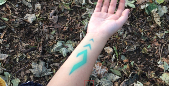
To create this effect, I went to the storyboard to see the design I had for the arm rune then traced over it in Photoshop to get the correct shape. The design was then saved as a PSD in 2 colours: black and blue. The PSD was transparent and had no background.
I opened After Effects and imported the clip of the arm, then turned it into a composition. Then, I imported the PSD file and added both of the rune layers to the original clip. I then decided on a time to make the rune appear in the video based on how long it was.

I opened the ‘transform’ bar on the layer (for the blue rune layer) and started making keyframes for the Opacity. To do this, you click on the timer next to Opacity so that it turns blue, like this:

From this point, whenever you move the position in the video and change the opacity there, it will create a keyframe. I set the opacity to 0% at the point just before I wanted it to start appearing, then moved to roughly a second later and set the opacity to 100%. Now it faded in between the points I had selected. I also lowered the opacity when the rune turns black so it would look more like it was on the skin.
Next, I searched for the following effects in the ‘Effects and Presets’ bar on the right hand side of the screen. With each effect, I dragged it onto the blue rune layer, which then allowed me to adjust it in the top left hand corner.

The Hue/saturation effect allowed me to change the colour of the rune from blue to white to black as I needed. I realised at this point that there was no real need to also have a black rune layer as I could just change the colour of the blue one. The rune stayed blue at first, then flashed to white and finally faded to black.
The Gaussian blur was used to make the rune blurry while it was appearing, then appear much sharper at the end once it turns black. However, I made sure to keep a small amount of blue the whole way through, as it looks more realistic.
The Glow effect added a blue glow around the rune as it was appearing, which the colour and opacity of could be changed.
To track the rune to the arm, I had to choose a point on the arm which stood out from the rest of it. Since I wasn’t aware you had to do this, I didn’t add a marker to her arm when filming so had to use a freckle instead.
I used the Tracker on the right hand side of the screen, and positioned the marker on the freckle.

I selected ‘Track motion’ and made sure the motion target was the actual video clip layer. After this, you can change the size of both of the boxes.

I learned that the smaller box is the size of the actual object you’re tracking. The larger box is the radius in which the tracker will search for the object - the smaller this is, the quicker it will be done. If the object barely moves from one frame to the next, the box can be small, but if it moves a large distance between each frame then the box should be big enough to compensate for that.
Finally, I selected the play button next to ‘Analyse’ and it went through each frame and marked where the tracked point is located. If any tracked point was very far out of place I stopped the analysis and moved it back to the correct location before letting it analyse the next frame. Once this was done, it looked like this:

Before clicking Apply, I made a new Null Object layer. I clicked on this layer and then clicked Apply. This way, the tracked point is now attached to the blank layer rather than the video layer.
I then parented the blue rune layer to the null object layer so it will now move along the same path as the tracked point does.
The rest of the effects in the video were made in a similar way except the hardest scene - the one in which the magic circle appears.
Magic Circle Scene
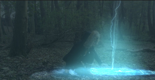
This was the most complicated scene in the entire trailer to create, and i’m still not completely happy with the finished result but I don’t know an easier way to get a better result currently. I got the Magic Circle, Lightning Bolt and Smoke from Production Crate, and referenced this tutorial a lot in order to help me achieve the effect I wanted.
I downloaded the magic circle animation and converted it into a 3D layer:
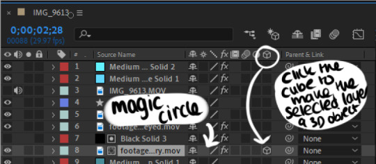
This way, I could move and adjust the layer based on perspective as if it was laying on the ground. In Hindsight, I think that the magic circle was not quite at the right angle to look convincing against the ground.
Changing the size and opacity of the magic circle was achieved the same way as with the arm rune and was easy enough. I also used the same method to make the circle and the lightning bolt glow (and to change the colour of the circle from pink to blue - I used the hue/saturation effect.)
Using the CC Light Rays Effect

(With^^)

(Without^)
I added this both to the magic circle and the bolt, which I think makes it look a little more impressive.
To add even more light, I added solid layers of blue, then hid them while I drew a mask in the area I wanted the light. Once I showed the layer again, the colour was inside the mask. I feathered the mask a lot using the mask options inside the new layer so it actually looked like a glow. Next, I changed the shape of the mask at different points in the video so that the light appeared and dissipated as I wanted it. This worked really well I think. The light layers were on the blending mode ‘Add’
Layering the Magic Circle behind Chloe
This was the most difficult part of the entire process. I tried 3 separate methods for this and even the best looking one didn’t work as well as i’d hoped.
Method 1: Rotobrush
I used this tutorial to help me with using the Rotobrush. This method would have worked a lot better if my video was higher resolution and if she’d have been wearing a more contrasting colour to the ground.
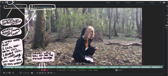
I begun to try and rotoscope Chloe out of the original footage using the Rotobrush tool. I selected the video layer and the Rotobrush, then double clicked the video. This took me to a separate tab with just this layer in it. The brush works a similar way to the select pen on Photoshop - by drawing, it will select the entirety of the area that has the same colour as the one you picked.
To erase using the Rotobrush, I held down the alt key. By playing the footage once all of the subject is selected in the first frame, After Effects will try and keep the same object selected and change the shape accordingly based on it’s position or shape. However this did not work properly, so eventually I had to individually erase and select the area I wanted to rotoscope for each individual frame.
Once the main area was rotoscoped, I tried using the refine edge option which is meant to make the selection more accurate - this didn’t work either. I was left with a mask that I didn’t know how to use and wasn’t the right shape, so I decided to abandon this process and try something else instead.
I tried various other methods - and eventually decided not to mask her out at all. Instead, I created a new solid, hid the layer and then masked around the lower half of her body. Then went into the layer settings and clicked on the stopwatch for the ‘Mask Path’ option. This meant that I could edit the shape of the mask for each individual frame. I also feathered the mask so that it looked a lot softer and less noticeable.

The next part was really difficult to figure out. I was trying to figure out how to make the mask transparent but also not show any of the magic circle inside it. To do this, I made sure that the mask layer was directly above the Magic Circle. I then selected the magic circle layer and did Layer>Track Matte>Alpha Inverted Matte. This created these two icons on both layers:

After this, I hid the mask layer (black solid 3) so it appeared to be transparent while not showing any of the magic circle inside it. The mask was still a little uneven and shaky in some parts of the clip but it seemed to be the easiest way to accomplish what I wanted, despite this method taking several hours.
Chloe’s Eye
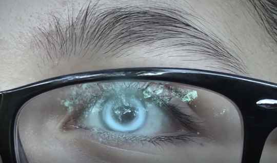
I made this sequence before I had ever used After Effects. At this point, I didn’t want to use After Effects and so attempted to do it in Photoshop, which took a really long time and wasn’t really worth it. I drew in each frame of the eye beginning to glow, and had to manually move the eye colour in each frame so it moved with the face. It ended up looking a little shaky and if I could do it again i’d definitely use After Effects’ motion tracking tool.
Colour Correcting
This was achieved mostly in premiere. The scenes that had SFX were individually colour corrected in After Effects by adding coloured solids set to multiply to get the level of light I wanted. When adding the colour correction to the rest of the clips, I wanted the footage to look cold and somewhat desaturated - since the original is really bright and sunny - which I thought looked really out of place and didn’t fit the genre, song or tone.
To colour correct, I used the ‘Lumetri Colour’ option on the right hand side of the Premiere work-space. I did this while having my chosen clip selected. I then lowered the saturation and changed the hue to something darker and more blue, as I was trying to make it look a lot darker. I then copy pasted the FX to each clip so that they were all the same.
1 note
·
View note
Text
Postmodern Art
Postmodern art seems like it has characteristics that are specific and deliberate choices by the artists. Two very prominent themes that I noticed regarding each of these attributes of postmodern artists are reworking (including amalgamation) and rejection. I find it easier to address each of these topics individually because they all seem to contain the same overarching notions of reworking or rejection in some aspect.
1. Escaping the confines of museums
To the postmodern artist, museums feel like prescribed spaces and should therefore be rejected. We create art in a public venue in order to communicate a message, and this seems like the purest essence of art making to me. I find it similar to music, in that compositions used to be performed solely for the public enjoyment and entertainment, but now older musical works are housed in museums of a kind, specifically symphony venues. They lose their meaning and become objects in isolation, much like the argument that Smithson makes. The museum naturally “separate[s] art from the rest of society,” just as the symphony separates the piece of music from its societal context. When we remove the art from its original location, we lose part of the message being communicated.
2. Collapsing boundaries between "high" and "low"
I find it interesting that art was (still is?) differentiated into high and low forms. I can understand the notion that “true art transcends ordinary life,” but I also believe that it is inherent in art that art represents and interprets life as well. Amalgamation seems to be a prominent feature of postmodern artists, as the several artists referenced appear to blend seemingly disparate features into new works. I watched a documentary on tattooing a few days ago, and this kind of blending of classical and modern style and technique that I see in postmodern work directly reflects what the documentary labeled American tattoo style. American style tattooing draws influence from different global styles, like 19th century Japanese prints, Indonesian tribal designs, prison ink, and photorealistic art, and mashes them all together into a composite work. This seems similar to what some of the pop artists were doing in the 1950’s, like Warhol and the soup cans or Marilyn Monroe – taking images that we are familiar with somehow, and reworking them in a way that they take on new meaning but retain the familiarity to create something new. This seems to combine both rejection of boundaries and reworking of existing ideas.
3. Rejecting originality
Humanity has been around for a relatively long time (compared to, say, the duration of one person’s life). The postmodern artist rejects the notion that true originality is unattainable, and “that all art is derived from other art,” and that the creation of all artwork is inseparably influenced by historical and contemporary work. In a nutshell, everything has already been done. I suppose I agree with this notion, but it does seem a bit reductive. Surely everything has something that preceded it, so to say that nothing is original removes grounds for argument. Yet it also holds true that the earliest cave paintings we know of are representative images – that is, their creation was influenced by what their creators saw. As with collapsing boundaries between high and low forms of art, the keyword with this seems to be amalgamation. Just as classical composers drew on the influence and techniques of those that came before them, so too do visual artists. Plus, with the connectedness of the modern world thanks to the internet, it becomes almost impossible to be influenced by others in some way.
4. Jouissance
Jouissance is a new concept to me, but compared to the “modernist aesthetic experience” seems much more in line with how I experience art. It is really difficult for me to examine a work of art and adopt the Kant attitude. How can you look at something, especially a beautiful work, and not even care if it exists? Art is a window into the worldview of someone that is not our self, and to discount a work that someone else created, and put time and effort and heart into, is to me to ignore the part of the soul that makes us human. It would be particularly difficult for me to be involuntarily emotionally moved by a work of art, and to then turn around and not care if that work even exists. That work just reached me on a raw, emotional level, how can I not care if it exists? If it brings me joy, sadness, confusion, or any other emotion I could feel, I absolutely find it worthy. Plus, I guess I’d rather look at art that makes me feel something rather than nothing at all. Postmodern artists view this as a rejection of the modernist aesthetic.
5. Working collaboratively
There are a lot of parallels to postmodern art and music. Collaboration on visual art is following a very similar route to that of musical collaboration. I can record a solo on a song that someone else composed and sent me electronically, and send that version on to be mastered, and we do not even have to be in a similar geographic location to accomplish this. Again, the connectedness of the world lends itself to this kind of creation. This is a form of amalgamation, specifically of disparate artists.
6. Appropriating
Appropriation seems to go hand in hand with rejecting originality. Appropriation naturally implies a rejection of originality because it is taking something that already exists and re-manipulating it to a new end.
7. Simulating
Like an old-timey photo booth. Simulation involves copying, and goes along with appropriation and rejecting originality.
8. Hybridizing
Also goes with simulation, appropriation, and rejection of originality. The overarching theme of this seems to be reorganization and re-manipulation of existing elements. Specifically, hybridizing matches well with the collapsed boundary notion, because hybridization itself implies collapsed boundaries. We have taken two separate things and created a new thing out of both, thus destroying the boundary separating those two entities.
9. Mixing media
This goes along with hybridization, specifically with media. Let us not forget that ancient Greek statues were painted. Postmodernists reject the modernist notion of “purity of media exploited to the fullest.”
10. Layering
This fits well with the overarching concept of amalgamation, because to me that is exactly what layering is.
11. Mixing codes
I am fascinated by the tacit and the hidden, especially with regard to society and “norms.” Postmodern artists seek to deliberately draw attention to these societal standards that we tacitly accept (unless we actively reject them). Again, as with artist Michael Ray Charles, postmodern artists are seeking to re-manipulate images with which we are familiar and hold meaning (the hair pick, the minstrel gloves, and so forth) in order to make us re-examine our assumptions and tacit societal ideals.
12. Re-contextualizing
Taking the familiar and re-manipulating it, re-contextualizing is part of mixing codes, hybridizing, appropriation, and collapsing boundaries. This tends to result in a significantly altered message from the original, re-contextualized work. I would think that artists who deliberately re-contextualize art generally do so in a rather jarring or unsuspected way. The one image that comes to mind is Immersion by Serrano, more colloquially known as Piss Christ. Serrano took an incredibly iconic image, the crucifixion of Christ, and re-contextualized it through rejection of societal expectation.
13. Confronting the gaze
The big keyword here is rejection. Postmodern artists rejected the notion of “the male gaze” that is specifically inherent in paintings of women as well as the notion that women in art are merely something to be looked at. I suppose I could also argue that this is a form of reworking as well, in that postmodernists are, in a sense, reworking the male gaze into a more egalitarian, or even more feminine one.
14. Facing the abject
This goes along with the male gaze, or rather directly in opposition. Again, rejection is the paramount concept here. Postmodern artists are deliberately rejecting the notion of the male gaze, to “challenge [it] with abject images of the female body and feminine sexuality.” It almost seems like a reclamation of the feminine body by women, because they are showing everything about the female body and its function, not just those characteristics which please men.
15. Constructing Identities
This is a great concept to tease out a little bit. I think that, for a long time, art was created at the behest of a wealthy patron, and thus identity was only really expressed based on who could afford it. Marginalized groups in society tend to seek commonality among themselves, and postmodern art went a long way in terms of allowing for those groups to form an identity. As humans, we seek to identify with some kind of in-group, whether it is based on the music we like, the car we drive, or the country of our family’s origin. As with much of the above, rejection is the operating word here, with postmodern artists rejecting the pre-packaged identities that governments and those with power bestow upon those without means, or those that are different from the societal expectation.
16. Using narratives
Again: rejection. Rejection of the 1960’s abstract artworks, and the reintroduction of narrative into a visual work.
17. Creating metaphors
Metaphor acts as a rejection of modernist aesthetic ideals. Postmodernists encourage metaphor, even ones that may seem rather heavy-handed.
18. Irony, parody, and dissonance
This can be a powerful tool if employed properly, and is a good illustration of reworking art to display irony or even rejecting societal expectations in order to create parody to draw attention to a subject.
0 notes
Text
Saul Bass Case Study
Saul Bass is a graphic designer who was most renowned for his logo and Illustration work. In this workshop, we used his work as a case study because of its timelessness, and how it still remains contemporary until today.
Tools:
Pen
Paper
Mac
Photoshop
Illustrator
Shape Tool
Shape Builder Tool
Selection/Direct selection tool
Pentool
Read
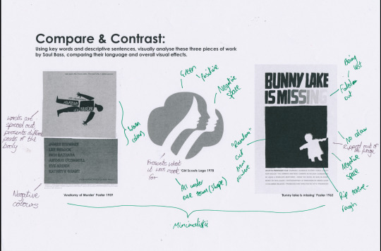
For the first activity, we were given three examples of work from Saul Bass, which we annotated with comparisons between their visual language, overall message and look. The first thing I noticed, was the dates in which the work was produced. Considering all the examples were all made over 30 years ago, they still have a contemporary feel to them which makes them just as effective at communicating their message. It’s this timeless quality of Saul Bass’ work which I tried to analyse with a peer.
‘Anatomy of a Murder’ Poster
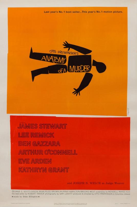
The story of ‘Anatomy of a Murder’ is implied through the poster, where the different parts of the cartoon body are all disassembled and spread out sporadically. Along with this, the type has no structure which, combined with the spread out body parts, portrays a story about a malicious murder. In terms of the visual language, Saul Bass uses boxes with warm colours and rough edges effectively to separate the imagery and the information. Red has a direct implication to blood, which further pushes the imagery of murder.
Girl Scouts Logo

The Girl Scouts logo consists of three female faces constructed of both positive and negative space, which are all contained within a singular shape which resembles a tree or clover of some sort. This, and the neutral green colour choice all amalgamate to carry the message of the Girl Scouts: unity, diversity and naturalness. Because it is so effective, this logo has stayed as an effective brand image for the girl scouts up until the present, with only little changes in the colour and depiction of the girls.
‘Bunny Lake is Missing’ Poster
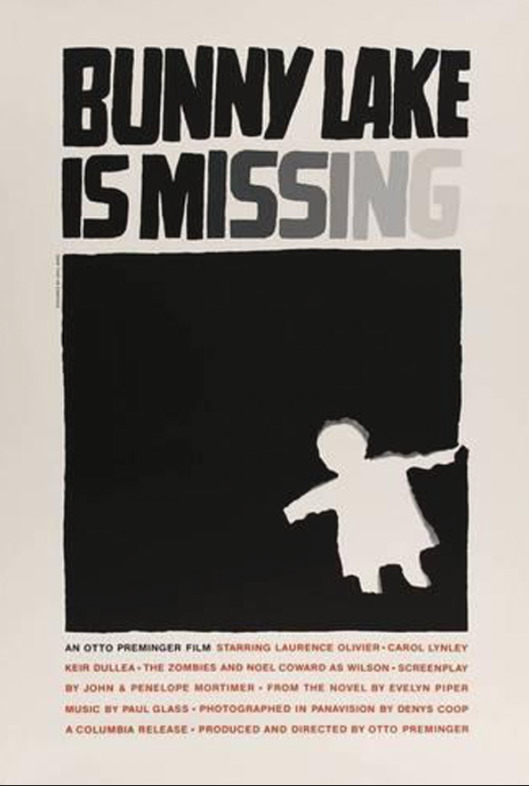
In the same way he does in the ‘Anatomy of a Murder’ poster, Saul Bass uses a solid block of colour to draw the viewer into the main focus, which in this case is a rip out of a child figure. The ‘Bunny Lake is Missing’ poster however uses a lot less vibrant colour, which implies a more sinister tone to the poster. The lack of regular composition is most direct with the placement of the ripped out figure. It doesn't line up with anything, it’s placed in what seems to be a random place. Also with this is the way the title fades out towards the end. With the text and the random rip out of a child, the poster communicates what the story is about, someone or something going missing and the search for it.

After the breakdown of how each piece was created and why, I came up with a small list of rules which would be used to determine what I would need to do to the visual language to recreate the work. By looking at Saul Bass’s work, as well as three other artists which drew influence from him (Noma Bar, Cody Hudson and Olly Moss), the rules I came up with were:
Flat, subtle colour usage with a restricted pallete
Avoid over-complicated forms
Use negative space to draw focus onto the main subject
Make it universally accessible
Identifying these key components of the visual language was helpful and proved helpful once I started the practical work. If I found myself diverting from the influence of Saul Bass too much, I could refer back to these rules and use it as a checklist to see what element I haven’t followed.
After this, we then looked at Saul Bass’ 4D work. Specifically his movie title screens: ‘Anatomy of a Murder’, ‘Psycho’ and ‘Seconds’. It is important to do so, so I can look for qualities of the other types of work Saul Bass creates and make my own inferences as to how the effects are produced.
Anatomy of a Murder

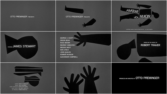
In a similar way to the poster, each of the body parts have been separated, except with the addition of time-based graphics, they are now given movement which wasn't present in the 2 dimensional poster. Saying this, the movement featured in the sequence is very choppy, but in a way with obvious intent. The transitions were instant, and the animation of the body parts was linear, which portrayed the lifeless aspect of the body. One other inference I made from this movement is the link between the sudden expressions of the body parts and the sudden finding of a piece of information. Being a mystery film, discovery is going to naturally be a large theme throughout. So the rapid appearances of all the titles is a way to subtly imply that discoveries are being made.
Complimenting this is the music. It also is sharp and abrupt, and the movement is cut to the sudden beats of the music making them in sync. This works so well because the elements of sound and vision are fused so that the viewer has an experience of the scattering of the body. The music also helps set the tone, and this is all the more evident with the other examples and how the music choice for those affect the overall atmosphere.
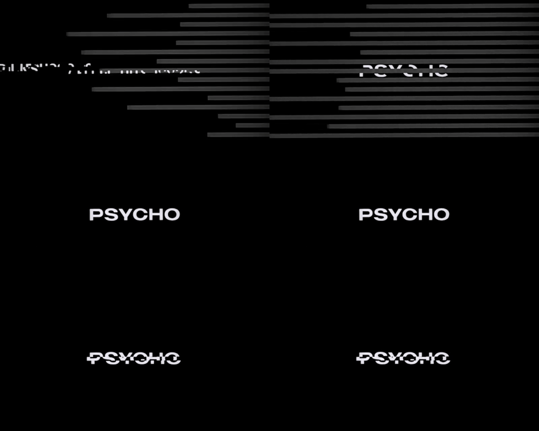

‘Psycho’ has a slightly similar tone to ‘Anatomy of a Murder’, in both the story and the movie title. Saul Bass implements more smooth movement in this title screen, where sequential lines are a core part of the revelation of the type. The lines appear from random segments of the screen and have a straight directory across the entire frame. Merged with this is how the text is revealed. Sometimes it is carried with the animated lines, but there is also text which is isolated, and follows a similar linear animation, being gradually revealed. The effect of this, also due to the speed of which all this occurs, is an element of confusion whilst watching. The viewer doesn't know where the next title will appear from, how it will appear or even if there will be one at all. This links to the title ‘Psycho’ which can be described as an instability, in the same way the animation has an element of uncertainty when its played through.
The music for ‘Psycho’ works in a similar way to the music in Anatomy of a Murder in the way that it syncs with the motion picture. However, it’s the bass which is synced, but this is overshadowed by a higher, louder constant melody which dominates the sound. In consequence, the viewer becomes more intimidated by the strong deafening notes. It certainly doesn’t have the slight light-hearted element to it like the ‘Anatomy of a Murder’ screen does, and that reflects how different the two stories are in their innocence.
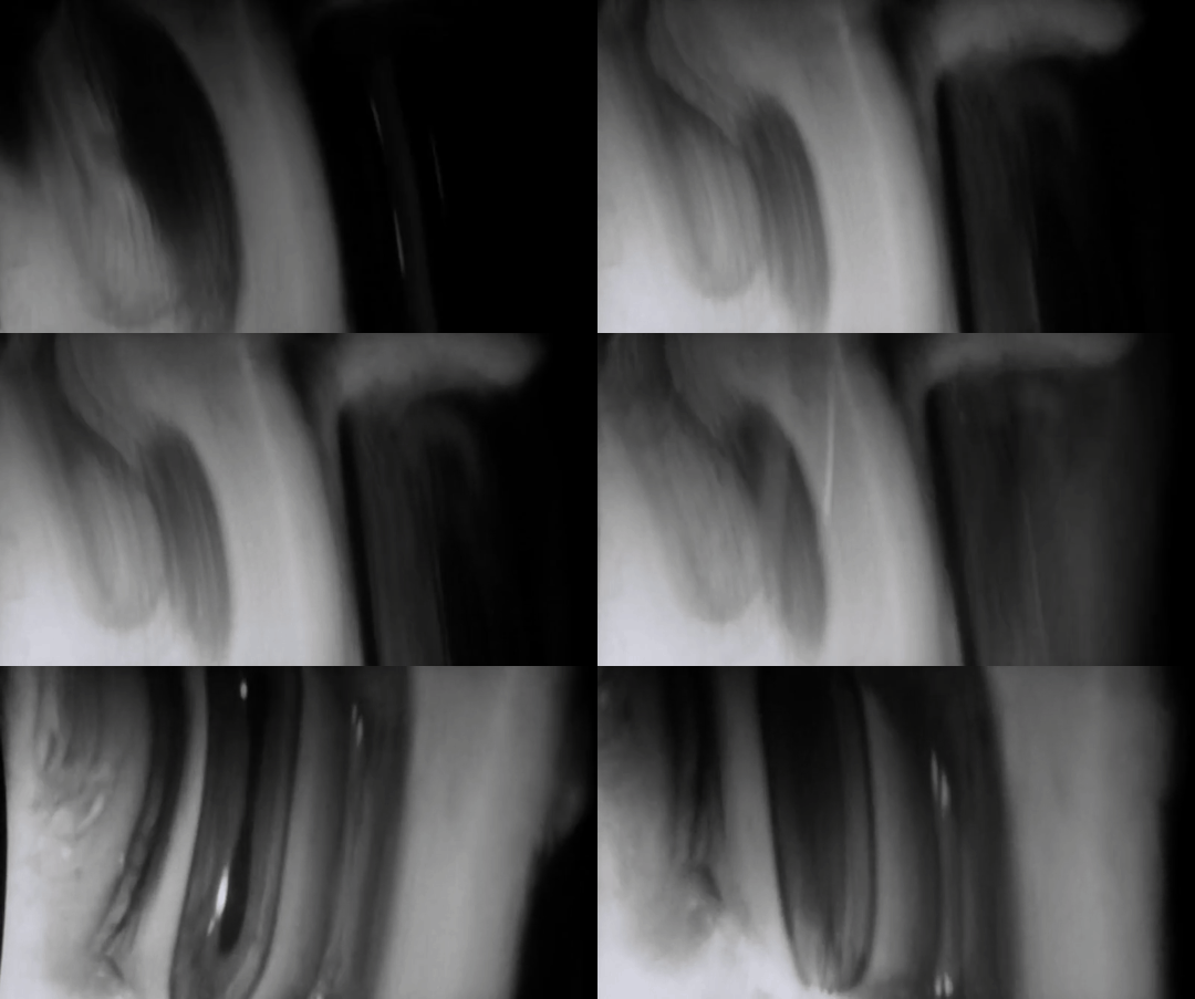
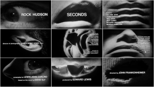
I found the ‘Seconds’ title screen to be the most intriguing. Whilst the other two had similarities, I initially found it hard to make links between this and anything I had seen beforehand. First of all, the video shown in ‘Seconds’ was of an extreme close-up of a man, and because of how strong it had been manipulated, I only could conclude this after watching a sizeable amount of the title screen. Juxtaposing to ‘Anatomy of a Murder’ and ‘Psycho’ where ‘cartoony’/geometric shapes are used conservatively, the whole frame is constantly filled with an area of the unknown man’s face, and this definitely inflicts discomfort. Complimenting this eerie video sequence is the music which Saul Bass uses. With both together, there is still no emotion which causes the viewer to sense an inhuman piece to the subject. This title sequence doesn’t reveal a lot about the story of the film, other than setting a tone to leave viewers confused, and Saul Bass has executed it with the motion effectively.
Practical Development
After looking at the range of examples, I then started working on creating various outcomes in a similar style, whilst sticking to the rules I made in the second activity. I chose to do a series of posters promoting health for the NHS as this allowed me to explore the subject I am choosing for my project. The main inspiration I took out of the four artists was Noma Bar. His work in particular stood out to me with the use of clever negative space, so I wanted to attempt to explore this idea of mixing two subjects together to create a visual double meaning. As well as this, Noma Bar’s work was very clinical in terms of the clean lines and restricted colours, and I found his style to be closest to what I wanted to create in my final outcomes.
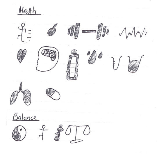
Before making any of the posters, I sketched out several ideas which came to mind with how I can mix two things together whilst relating to the themes ‘health’ and ‘balance’. It is at this stage where I decided to not use negative space like Noma Bar, but instead make a link in a more direct way in an attempt to make it more obvious.

This first one mixes the symbol of a heart with the ‘Ying-Yang’ symbol by intertwining a white heart and a black heart to reveal the iconic structure of the Ying-Yang.

I feel like this is my least effective poster in terms of presenting the link between the two objects. I also got feedback from some peers, and the overall feeling was that the heart element wasn't obvious enough. Saying this, some elements worked very effectively in my opinion. I wanted to be as geometric as possible, with this illustration, so I constructed the main image with a grid consisting of a square and two circles.

Then, by using the shape builder tool, I merged certain areas to create the two areas of black and white. I later changed the small circles to even smaller upon looking at reference images of the ‘Ying-Yang’ symbol. After this, all that was left was to rotate by 45 degrees so the hearts were shown to be vertically stacked, and add a cartoony shadow with a simple ellipse.

The last thing I found to be especially effective was the colour usage of the poster. Because I had a black and white illustration, I couldn't use either for the background as sections of the illustration would be drowned out by the similarity in colour. Therefore, I used a soft pink/red which I think works effectively in catching someone’s eye, along with linking to the imagery of the heart.

For the second, the mixture between health and balance is portrayed through the water droplet and the scales.
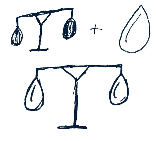
For the construction, I used Illustrator paths with a thick stroke to keep the line work consistent throughout. The pentool was the main tool I used to create all of the shapes, as it allowed me to keep more control.
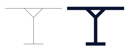
After I made the basic shape of the scales, I moved onto the outline of the basket which I would then duplicate and use for the water droplets. I wanted the perimeter of each shape to be parallel so they seemed to be conjoined, as opposed to having them look like separate objects with irregular shapes. The spacing between the two proved to be a hard decision for me to make. Whether I would remove the spacing completely, or keep the gap relatively large. In the end I chose quite a large spacing for the simple reason of it fitting the cartoony style better than any other option. I also didn’t want each end of the scales to feel ‘cluttered’ with too much going on, and I think this subtle spacing helps to prevent that.

Lastly, the colour palette was obvious to me from the start, as I was dealing with water, restricting myself to just use blues seemed to work. However when it came to how I would use the blues, I wasn’t quite sure. A bright colour in the background was very successful in my first poster, so firstly I tried a blue in the background with white scales. However what I found to work the best in my opinion is a white background with dark blue scales, as all the components of the poster are clearly visible, whereas a brighter background I thought was distracting from the main focus.

I approached how I made the last poster differently to the previous two. My aim for the workshop was to produce one or two posters, so once I had finished the first two with a considerable amount of time in the session left, I started experimenting with shapes in Illustrator. I knew I wanted to use the symbol of someone balancing, so I started here.

By using rectangles for all of the body and a circle for the head I made the rough shape of the person. Then, by using the shape builder tool, I merged the shapes into two shapes, the body and the head. The last step to making the symbol was rounding certain corners with the direct selection tool to give it a more cartoony look. Once I had this figure, the rest was unplanned, so I began placing it in situations that would make sense (for example, a tightrope) whilst trying to make connections along the way.
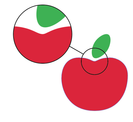
In the end, I used the dip in the top of an apple to link with the dip in a tightrope. So for the poster, I put the figure of the person on top of the apple dip to make it look like someone balancing.
My first concept consisted of the type being the primary subject of the posters.

However, I had to reconsider how I used type because I felt myself straying away from the influence of Saul Bass too much. All of the examples I looked at contained text as a secondary element. This creates a subtlety to the posters which mine definitely lacked to begin with. In reaction, I rearranged the type to occupy a smaller amount of the poster and to all be grouped together, in a similar way to the ‘Anatomy of a Murder’ poster.

Now, there is a lot more negative space which at first I instinctively wanted to fill, but after opinions from peers, I found it to be more effective with more negative space and smaller type.
Context
The style of my outcomes were heavily influence by the designer Noma Bar, however it’s important to consider the context of his work as well to further pick apart the fundamentals. Saul Bass and Noma Bar have different styles of their own, but the element that links their work together is the minimalism which I picked up on in the first task. Having this allows me to draw influence from the work without directly replicating it, as I am just applying what I have picked up on as common elements of the artists’ work.
The examples I looked at remain contemporary because of exactly this, so for a poster promoting happiness it will need to have the qualities Saul Bass and similar artists use to remain effective for as long as possible. This has shown me how powerful research can be before creating work in direct influence. Without the research, you are solely recreating what you see, but with it you can make similar reasoned decisions to the original artist which help build a better understanding for the work you are creating.
Linking to the Brief
With the checklist I made at the start, I considered how this could link to creating work specifically to meet the brief’s demands. The main thing to look at is the minimalist approach and how that can translated into something which can be understood by a larger range of people. The young demographic of the brief isn’t going to connect with anything with complex imagery (such as large colour palletes, intricate line work, lots of detail etc.) Minimalism has been a large theme in the work I have looked at. It is the quality that separates a piece of artwork from a graphic which focuses on an audience reaction.
0 notes
Text
Evaluation
I began my Creative Investigation research with the aim of discerning whether director Wes Anderson could be considered an auteur. As part of this, I evaluated Anderson’s use of style and themes which reoccur throughout his filmography. I then went on to create my own short film, influenced by Anderson’s approach to the aesthetics and themes of his films.
Anderson’s style is difficult to place into a single category, with many prominent features of his films being described as ‘Andersonian’; a style of Anderson within themselves. As such, instead of having my film follow a broader style, I embraced the nuances of Anderson’s own perceived style, incorporating many of his most notable features into that of my own film, including meticulously designed props and a strong colour palette, as well as his use of symmetrical shots.
I also discovered Anderson’s use of themes were equally distinct. Though not ‘Andersonian’ within themselves, the majority of Anderson’s works featured themes based around family ties and relationships, and it is often that mentor/student or father/son relationships play significant parts in relation to narrative. I incorporated a mentor/student-like relationship into the narrative of my own short film, which developed between my two protagonists, reinforcing my own theme of growth and the idea of a continuing legacy.
Mise-en-scene was one of the most important elements of achieving the Wes Anderson ‘look’, as Anderson’s films often feature a carefully devised colour palette, as well as meticulously crafted props and costumes. I followed Anderson’s colour aesthetic by creating my own colour palette of blues, greens, pinks, and beige. I initially imagined a colour palette which would include yellow, however ultimately decided against this as I thought that it would make the accented colours indistinguishable from other colours in my film.
I specifically used the colours alabaster and juniper to represent my two protagonists. I used the plain colour of alabaster to represent the idea of a blank canvas, something needing colour and ready for a new start. I also chose this colour as I felt it gave the idea of a fading lifeforce. I chose the colour juniper as the colour to come after the blank canvas, I felt that the blue green hue gave the feeling of nature, and by extension the idea of freshness, which linked to my theme of growth. I incorporated the colour associated with my protagonists mostly into their clothing, however I also added it to some props, such as the masks and the mugs the characters use. In my film, the masks the characters wear adhere to their own colours, however the inside of the mugs do not. The mug that is used by Alabaster has a green inside, whilst the mug used by Juniper has an alabaster inside. This was to symbolise the idea that the lives of the two protagonists are now intertwined. As well as this, I had Alabaster drink from the green mug before Juniper appears in my film in order to add an element of foreshadowing to my narrative.

In order to replicate Anderson’s attention to props, I hand made or modified the majority of my props. I chose to use the idea of a cardboard house as a setting as I wanted to add an element of childlike wonder and surrealism to my film. An apparent fantasy world with a mundane setting. My idea to create a place, in this case house, made entirely of cardboard related to my early childhood. As a child I would always try to create home-like areas or ‘dens’ out of any materials I had to hand; I would often rearrange couch cushions to create ‘sofa-caves’ or try and build houses out of sticks and logs in the bushes, and makeshift cardboard dwellings would litter the floor of my parents and grandparents’ living room. I wanted to add that feeling of wonder into my own film, with the idea that it can stay with us for the rest of our lives, if we let it. This also fit into one of Sarris’ auteur criterion; Interior meaning, as it demonstrated my connection with my film.

The creation of my own fictional area and home is very similar to the way in which Anderson creates his own his own dwellings, and even his own countries. Such as The Grand Budapest Hotel and its setting of Zubrowka, Anderson’s own fictional country in The Grand Budapest Hotel, The train ‘The Darjeeling Limited’ from The Darjeeling Limited, as well as many others. I also followed Anderson’s slight tradition of naming his films after the places in them. (Though this has become only a recent feature of Anderson’s films, being only a feature of the short Hotel Chevalier (2007), The Darjeeling Limited (2007), The Grand Budapest Hotel (2016) and, very recently, Isle of Dogs (2018))
Cinematography was also important in recreating the style of Wes Anderson. As I identified in my analysis, ‘Shot composition is a very crucial and recognisable aspect of Anderson’s work, most notably his use of symmetrical shots throughout his films’. Anderson’s use of symmetrical, centred shots are a well-recognised trademark of his style, again detailed upon in my Creative Investigation and as such I implemented these shots throughout my own film, most notably on head and shoulders shots of my characters when they wore their cardboard masks.

Quite unlike Anderson, I chose to forego any form of narrative voice in terms of sound as I felt that the direction and meaning of my film could be shown as effectively with just visuals. As such, I tried to convey emotion through my characters’ overexaggerated body language such as when Juniper is outside of the cardboard house, as well as through closeups and extreme closeups focusing on body parts, especially eyes. My narrative roughly follows Todorov’s Narrative Theory, with equilibrium at the beginning as Alabaster tends to the house, disequilibrium occurring with the arrival of Juniper, and a new equilibrium being established as Juniper takes up the duties of the house.
When initially devising a soundtrack for my film, I listened to the various soundtracks of Anderson’s films, which often sound very quaint and lighthearted in character. Of all of Anderson’s films, the soundtrack to The Grand Budapest Hotel is arguably the most iconic, even winning an award for best soundtrack. Using this as a guide to my ideal soundtrack, I began listening to other works by Alexandre Desplat, the composer for The Grand Budapest. I noted that Desplat often features strings in his pieces; the traditional plucked string instrument heard in ‘Mr Moustafa’ is an iconic part, the melody of which acts as a recurring theme throughout the film. I drew significant information from another of Desplat’s compositions, ‘The Shape of Water’, composed originally for the film of the same name, this was also a piece that had significant string orchestration. I also took influence from the songs of the film Submarine, one of the two films I studied in the first year of the course, particularly the chromaticised broken chord introduction to the opening song ‘Stuck on the Puzzle’ written by Alex Turner as I felt that the tone produced by the raised notes matched the quaint and light atmosphere I wanted for my film. I used ‘The Shape of Water’ as a preliminary guide to the tone of my film, as can be seen in the second edit, before beginning my own soundtrack inspired in equal parts by ‘The Shape of Water’, ‘Mr Moustafa’ and ‘Stuck on the Puzzle’
I used a variety of synthesised instruments in order to compose and play my soundtrack into my audio editing software using a midi keyboard. I felt that this was easier than employing and recording live musicians as I felt that it allowed me more creative freedom, playing the soundtrack myself allowed me to make changes whenever I saw fit, whereas with live musicians I would have had to give them notice in order to learn the music. As well as this, using synthesised instruments gave me access to a wider range of instruments, such as the organ heard around 1:33, as this would have been a difficult instrument to record, and I would be hard pressed to find an organist to play the piece. Time constraints were also a key factor, as the preparation for recording, as well as the time required for the musicians to learn their pieces would have been significant.
The first synth I used was ‘Flexphrased Pizzicatos’, which I used to create a chordal ostinato that sounded light-hearted, reflecting the childlike sense of wonder surrounding the house. I chose not to include a soundtrack in the scene where Alabaster first meets Juniper as I felt that it gave the feeling of a comedic pause, as well as represent an interruption in Alabaster’s established routine. I next used the ‘lounge organ’ synth as Alabaster returns to the house, with Juniper following. I played long sustained notes in order to create a feeling of suspense approaching Juniper’s discovery of the house, and also felt that the airy timbre of the organ helped to create a feeling of magic, representing the house as something of a wondrous phenomenon. I also altered the release time of the synth, increasing it so that the notes took longer to fade away. This helped to reinforce the magical atmosphere, with the notes of the soundtrack lingering in the air, as though almost suspended in time, just as the house appears almost suspended away from reality.
As Juniper ventures further into the house I used the synth ?????? to incorporate a sense of mystery, the wind sounds helped to create the idea of something lost to time, and also gave the sense that the house itself was ‘shushing’ Juniper, that its rooms were a secret to be kept quiet.
I also incorporated build up techniques, both in the middle and end of my film, the aim of which was to create a sense of tension. The first instance being as Juniper enters the Hall of Sticky Notes, I played repeated notes separated by a semitone on a ‘dark strings’ synth preset, which created almost a feeling of warning, a musical ‘do not enter’ sign. This then changed into a dramatic chord progression as Juniper completely enters the Hall of Sticky Notes, in order to represent the immense awe felt by Juniper at the marvel of the room, and also represents a turning point in Juniper’s attitude, this being the moment where the character decides to stay in the house. I again incorporated long sustained notes to create an intense atmosphere as well as an almost timeless feel. The second instance of my use of build up techniques appears at the end of the film. In the final scene I played a cluster chord as well as a low tonic note followed by the leading note of the scale on the ‘loungue organ’ synth. I used the tonic note as a transitional note as it was the ending note of the previous ‘track’ and utilised a crossfade between the two to replicate the fade transition between the scenes of my film. The note then changed to the leading note in order to create a sense of foreboding, a foretelling of the event about to occur; of Alabaster’s moving on. I also used a cluster chord as Alabaster removed his mask in order to show the unease surrounding this action; one does not remove the mask.
Following the Hall of Sticky Notes scene, I played another ostinato using the ‘Flexphrased Pizzicatos’ synth. This initially conveyed the idea of time passing as one waits, which I utilised for comedic effect as the shot changed from Juniper to Alabaster, the latter appearing to be sat waiting for Juniper. An element of humour was also added through the juxtaposition of the two sections of the soundtrack, as it changes suddenly from a dramatic chord sequence back to a light ostinato. The feeling of time passing that it creates is also representative of the brief montage of Juniper taking care of and repairing the house, suggesting that Juniper has been in the house for a long time.
In terms of editing I employed many cross cuts, in order to give a sense of tandem between my characters Juniper and Alabaster. I also included a match on action (2:17), again emphasising the growing interconnection between the two characters. Though I did not remark much on the editing techniques employed in Anderson’s films, I did note that the pace of cuts is often very fast and in time with either a soundtrack or voice over, which I tried to replicate in my own film, adding several cuts in time to the beats or changing chords of the soundtrack.
Representation:
The increased representation of women in the film industry is becoming increasingly relevant as the demand, and arguably, the need for more diversity in the film industry increases. The Geena Davis Institute is the only research based organisation which focuses on challenging stereotypes, highlighting the gender balance and influencing content creators, as well as marketers and audiences on the importance of eliminating unconscious bias. It also focuses on creating role models and the scripting of ‘a variety of strong female role models’. My character ‘Juniper’ perhaps falls into the category of strong female leads, and also challenges the sexualised female stereotype seen commonly in Hollywood, through her atypical short hair, as well as the non-revealing costume. It is also possible that Anderson is guilty of unconscious bias; every film of Anderson’s features a white male lead, with females often playing the role of a lover or a parental figure. As such, I decided to partially subvert from this trend of Anderson’s; though one of my protagonists was distinctly male, I chose to leave the gender of my second character somewhat ambiguous (though leaning towards female). I chose to subvert as I felt that more equal representation was needed in my film, especially in an era where representation is more important than ever.
Genre
Amderson’s films are usually quite ambiguous when it comes to genre. They are often a hybrid blend of Comedy and Drama, with serious issues counteracted by comedic interplays. The comedy element, however, could be considered to be very niche, with most elements of humour being derived from suspense filled pauses, extended monologues and conveniently placed puns. I incorporated similar comedic elements in my own film, ceasing the soundtrack and employing a series of long-lasting shots to create a comedic pause in my narrative (around 1:18).
In terms of drama, Anderson’s films often follow a narrative detailing on problematic relationships, the issues of the characters, such as parental problems and isolation provide a balance to the often humorous tone surrounding his films. I have also added an element of drama to my own film, which can be seen most prominently towards the end o my film, as Alabaster passes on, leaving the legacy of the house to Juniper.
Links to Year 1 film
Since my Year 1 short film, Wander, I feel that my ability as a creator has increased significantly, many comments on my first year film mentioned that my soundtracks were often overpowering, and as such I spent a lot more time on the sound design of my second year time, and editing it in an audio editing software, instead of doing so in just film editing software. As well as this, many of my shots were unsteady and sometimes out of focus in my first year film, and I feel that I have improved upon this greatly in the making of my second year film. Taking inspiration from my first year film, I incorporated shots that were prominent in my first year film into my second year film, most notably medium closeups and closeup shots of people’s faces and objects. However, I did avoid incorporating sunflares into my second year film, despite their heavy feature in my first year film, as I felt that it would not fit the style. As well as incorporating shots, I also had an actor make a second feature in my film, Lesley Fairbank. Lesley gave a convincing performance in my first year film, and his acting elicited a very positive response from my audience. As such, I wanted to feature him a second time as I knew he would be reliable both in terms of acting ability and in attending shoots. This also followed the traditions of Anderson (and arguably many other directors) as he too often has actors returning to work on his films, such Bill Murray, Owen Wilson and Roman Coppola.
Studying Section A of both AS and A2 film studies has helped to boost my understanding of film greatly. Analysing these films in depth and learning to identify their nuances and impacts has allowed me to identify key components of Anderson’s work for my Creative Investigation as well as my ability to incorporate such film elements into my own work. However, direct links between the AS films and my own are weak, with them having little in common with the features of Anderson. For AS Film Studies we looked at the films Submarine (Ayoade, 2010) and Fish Tank (Arnold 2009) which, whilst films of great merit, differed greatly from the films of Anderson. Fish Tank is perhaps the most different to Anderson’s filmography, with the former being British Social-Realism and its prominent features being a lack of soundtrack and cinema verite style cinematography, contrasting with my almost constant use of soundtrack and use of steady shots using a tripod. Submarine, however, does have similarities, most notably its use of soundtrack to match the mood of characters and scenes, which I also employed in my film. As well as the feature of an almost surrealist atmosphere, though it is created through different techniques. Where Submarine employs techniques of postmodernism such as voice over, ellipsis editing and fourth wall breaks to convey a quaint atmosphere, I simply aimed to create this in The Cardboard House through the use of mise-en-scene and soundtrack. Further relating my film to Submarine, Richard Ayoade , the director of Submarine, stated in an interview that he shares the same influences as Anderson, as such sharing almost a common influence with my own film.
My A2 films Metropolis (Lang, 1921) and Good Bye Lenin! (Becker, 2003) have perhaps been slightly more influential in the creation of my short film. Metropolis, though stylistically a very different film from those of Anderson’s and my own, perhaps influenced my choice to employ a film with no dialogue, and perhaps helped me to refine my execution of such a film. The actors’ exaggerated body language in Metropolis can be seen on many occasions within The Cardboard House, and my use of intertitles is perhaps both a product of influence from both Metropolis and Anderson’s works. Section B of A2 Film Studies helped immensely in my creative investigation, as well as in the creation of my film. Understanding Authorship in terms of Section B helped my to apply my knowledge in researching Anderson and analysing my focal films, as well as helping me to both identify Anderson’s style to create my A2 short film as well as in identify possible features of auteurism in my own films.
Responding to Feedback
I showed both my second and final edits to audiences and received feedback on the quality of my film and also improvement suggestions. The second edit of my film received generally positive feedback, though little improvements were suggested as the film was so close to completion.

‘Sound track is very effective. The cross between the house ‘dimension’ and the real world is good. The story of discovery within the house and the meaning behind it is effective due to the realisation throughout. No improvements needed’
I was very happy with feedback I received from my audience as it showed that the narrative of my film was coherent, as well as that the themes of my film were interpreted.
Despite having no improvements suggested, I made a third and final edit to my film and composed a soundtrack as well as mixing and mastering the audio to make it sound smoother and also to give the soundtrack a more tailored feel so that it would fit specifically to my film.

‘What I liked: The use of sound to support the storyline. The use of different lightings and the use of tracking shots/variety in the camera angles. No improvements I can think of.’
‘Good cross fades between scenes. Improvements to the soundtrack are very good, adds more life and energy.’
My final edit was very well received by my audiences, and I am very happy with feedback as it again shows that my narrative is coherent and my cinematography and use of mise-en-scene is effective. I feel that this reflects that I have achieved most of my aims as I aimed to create a five minute short film which was well crafted and coherent and reflected the style of my chosen director, Wes Anderson.
Although my audience did not comment on how well it reflected the style of Anderson, as they for the most part were not aware of Anderson’s work or his style, my feedback has helped me to determine that I have achieved my aim of creating a well-crafted and clear film. Through this, it could also be further determined that my employment of Anderson’s techniques and style was effective in creating a clear overall final piece. As such it is arguable that I have effectively reflected the style of Anderson and thus achieved my initial aim.
The audience to which I screened both edits of my film was mostly comprised of my target demographic: Teenagers and Young people. Reflecting on my feedback, I felt that my film met the needs of my target audience as most of the reviews were very positive and my audience appeared to enjoy watching the film, they were very engaged as a few asked me questions following the end of the film, reflecting their interest and need to know more.
Applying Auteur Theory
I chose to apply auteur theory to myself in order to discern my status as a director in relation to that of Anderson. As I observed in my Creative Investigation Analysis, according to Sarris, an auteur has three distinct features; Style, Technical ability and Interior meaning. I believe that I have met the criteria for technical ability, as all sound and camera work was carried out by myself, as well as the final soundtrack being almost completely my own composition. I have also possibly reached the criteria of interior meaning as I have a personal connection to both my AS and A2 films, my AS film’s monologue being written as part of my own perspective on the world and life, as well as shooting locations being in places where I grew up and spent time as a child. My A2 film also fits the criteria as I took inspiration for props from my childhood antics as well as using locations connected to where I grew up and my own home. Thus, it could also be argued that I also meet the third criteria of style, as I reuse locations as well as have returning actors, and arguably have similar themes in both of my films; growth and change. However, it could be said that my style is not distinct enough for me to reach the status of auteur, as both of my films have contrasting stylistic features and my use of mise-en-scene is quite varied between them both, though they do have some common features, such as references to and use of nature as well as a similar use of close up shots and long shots of characters walking. However, in terms of Paul Sellors’ collaboration theory, it is very likely that I could achieve the status of aueur. Collab theory dictates that all members of cast and crew with significant input to production are responsible for the final outcome of the film. As I effectively was the only ‘crew’ member with any input (acting as all roles of production, including director, screenwriter, cinematographer, props & costumes department and sound designer), it could be argued that I am the true auteur of my films. However, arguably, the rules of collab theory could also list my actors as the auteurs of the film, as it is they which made the film possible, without actors, I would be unable to tell the story of my film. As well as this, it would be my actors’ own interpretations of their characters that are being presented, thus making the final film not wholly my own creation, therefore excluding me from the title of true author. However, Andrew Sarris did state in his Notes on Auteur Theory, that the director is the driving force behind an actor’s performance, comparing the director to a ‘therapist’ who ‘teases out the performance like confessions in group therapy’, therefore perhaps restoring myself to the status of auteur. Another theory which would elevate my potential status as auteur is David Kipen’s Schreiber Theory, which declares the screenwriter to be the true author of a film, as they devised the original ideas for the film, and also wrote the entire story as they envisaged, the director merely following the script, moving the screenwriter’s vision from paper onto the screen. Though it could be argued that the director’s interpretation of the script is a mark of their auteur status, that the director does not merely translate the script but adopts it as their own, therefore making the film a vision of the director’s and not the screenwriter’s, However, being was both the director and screenwriter for my film, it is unquestionable that the story is entirely my own, therefore elevating me to the status of true author. In spite of this, it could be determined that I simply have not yet created enough films to achieve the status of auteur, having only made two short films and no feature films, with both shorts being based on the styles of other directors and films, therefore eradicating my claim to an original style. The latter point perhaps usurping me from my position as auteur as not only is my style arguably yet to be established, but also unrecognisable and unknown to the masses.
Summary and Reflections:
Upon reviewing my work I am mostly very happy with the outcome, I feel that my filmmaking ability has improved significantly since I began the course, especially my employment of sound design and camera handling. In terms of my film, there is not a huge amount that I would change, a few of my scenes in the initial script proved too ambitious for the resources and time I had available, such as the grocery store scene, and I would have liked to include them in my final piece. I would also, given more time or the time to start over, have chosen to screen my film to an audience that was aware of Wes Anderson’s films and his style, in order to get a better outsider comparison on how well my theme reflects the work of Anderson.
0 notes