#also depends what tools im using! painting is very different from lineart
Explore tagged Tumblr posts
Text
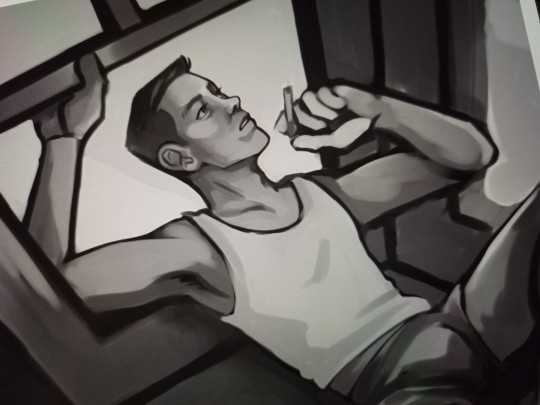
ant mill wip #1536 so i can talk in the tags
#without context this is just some guy I KNOW but i promise it's scout. maybe not THE scout but A scout.#my scout. not an oc scout but the scout from my little story#one of many scouts i guess#i am not sure if this will ever see the light of day because it's so removed from being like. canon/fanon recognisable#BUT. but. i am actually trying to do perspective#i wish i could transfer my brain into a 100k novel so u could understand the context but.#just know i am thinking powerthoughts. if you could see it u would think it was so cool#smoking out the bay windows... top floor of a three decker... the only sibling at the new place... BLARGHHH#sorry#youll have to excuse me#ok .#might uhhhh might.#if this disappears it's bc i got lucid#ant mill is the weird placeholder name i am using to refer to this au! the more you know#need to digitise some of the engies in my planner.... hes my favourite hoohooheehee#i have the opposite of same face syndrome bc i have no concept of consistency.#also depends what tools im using! painting is very different from lineart#NOTE TO SELF : face dip cheekbone forward
26 notes
·
View notes
Note
Hi, i hope this question doesn't bothers you, do you have any videos of your process?, im currently starting to learn how to do digital art and have trouble knowing where to start and what to do (im always like, should i start drawing this part first?, is it better to do clean lineart or just paint over the sketch?, do i work on the lights first or the shadows?, etc)
I can probs make you a video on this at some point based on something I'm currently working on, although I have a few on my tiktok already (@ xephia) if that helps!
My process is a bit messier than many other artists - I alternate between stages of sketch and colour before I even think about ‘final colour’. I’ll start with a sketch like the ones below, then slap some rough colour on. This is because IMO colour is an important part of the composition so I want to see what works before I line. They’re not meant to be pretty or social media ready. This stage can look super messy or tidy depending on how I feel or how complicated it is. And they can look wildly different; here’s some examples:
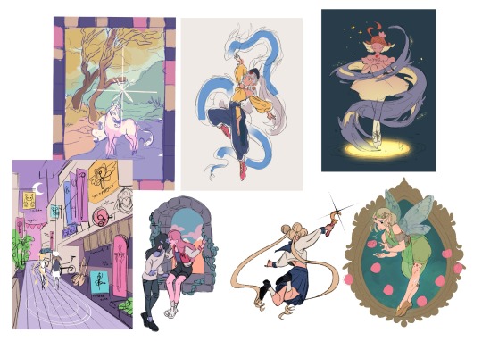
That stage also helps me decide if I want to finish the piece or if I should abandon it (I abandon a lot). Sometimes this stage takes 15min, sometimes 2 hours, it really depends on the piece. But for me personally, it’s crucial because otherwise I find it very hard to envision how it will look later, or forget what I was planning.
Then, I do at least one more layer of ‘sketch line art’, which is basically a first layer of line art to see what works and what needs changing. I colour the important bits relatively cleanly (usually character/s) and add might some subtle shadows/gradients and/or lighting to get a feel of what it will look like finished. Sometimes I repeat this process a couple of times if I’m not happy with how the first iteration looked. This stage usually looks a little like this character sheet I’m working on, and this slice from a Kiki delivery service sketch:


It’s usually not until I’ve done all that, that I go over and do the final lineart, making it thicker, colouring the lines, redoing the flat colours, tidying it up, and adjusting where needed. Essentially I don’t start ‘finishing’ a piece until I’m happy with where everything sits and what colours I’ve picked. It’s only at this point I feel like the sketch is ready to line, and lining and final colouring can actually take less time for me than all those layers of planning somehow haha.
At this point I keep tidying, cleaning, lining, colouring, until the piece feels complete. Sometimes complete for one piece is tidier than complete for another, it really depends.

I’ll also use Procreate’s push tool to adjust things as I go in all steps - it saves a lot of time and isn’t cheating.
Although as you can probably tell from my examples, I do change this procress up a lot depending on the piece! Sometimes I’ll even paint over parts of my final piece like I did in this magical girl street. I think find whatever works for you, everyone will work differently and things like mood, energy levels, how patient you feel, how stressed you are, if you have any hand pain or shaking, and how much free time you have that day to draw can all affect your process day to day, week to week.
Some days it will be easier and more comfortable to sketch messily, other days tidier. Some days you will draw well, other days not well at all. At least for me, I find consistency almost impossible.
So I think there's no right or wrong order to do things and it's great to switch it up and keep things interesting for yourself, and different processes work for different people. Hope this helps!
#faq#art process#art advice#art tips#drawing guide#sketch progress#digital art#procreate#human artist
33 notes
·
View notes
Note
What's your rendering process?

I'm not very good at explaining but I'll give it a shot. This isn't how I always render but it's my most complicated one. Lately I like to start with darker colors, usually on the lower 2/3's of the color square which would later end up as the shading, since for me its easier to paint in the light rather than find the shadows from scratch, but it really depends on what vibes you're going for, if you dont want to have much shadow in the drawing, it's probably easier to start with light.
I'm quite new to it but i like to block in my lighting with a lasso tool, it gives it nice sharp lines and is faster than a brush, but you can also block it in with a brush if that's more comfortable, try to keep in mind the direction of the light source and look at the overall picture rather than zooming in for details. After that it's time for a little blending and bounce light, for blending use whatever painting brush you like (I use CSP default guache brush) and try to keep a mix of smooth and sharp edges without overblending it, the bounce light depends on the enviroment but is often blueish, you can get it by shifting the color to a more gray one, it can be darker or lighter, different tones work for different colors, play around, see what looks good to you. And then finally its the small things like loose hair strands, I might add another darker shading color to some places that feel like they should be darker like under the chin and tighter folds, might add some subtle coloring to the lineart, and very faintly subsurface scattering where the light and shadow meet on the skin, most of the time I like adding a rough highlight on the parts of the lineart which are towards the light, sometimes in brighter color of what im coloring, sometimes plain white. (this last layer is on top of the lineart and color layers and I call it the overpainting layer cus sometimes I also just full on overpaint some small things I want to change) Finally you can add a gradient map at a low % (i like to use 10-20%) or some other color filter adjustment. Feel free to change, add, or leave out any of these steps by how you see fit for your art, just do what you like and enjoy the process :D
71 notes
·
View notes
Note
Hi! I just found you through @revolutionaryduelist and I just wanna say 1, I LOVE your art, and 2, could I ask a lil’ about your art? What program(s) do you use? What brush do you use for your AMAZING lineart and how do you choose lineart colors?? What dark magic do you use to shade??? I find your use of color phenomenal! Have an amazing day! :-D
thanks for this nice ask! i use paint tool sai, specifically the anglicized version that you can find online.
lets draw bernie fire emblem and go through my process.
first off, my brushes.
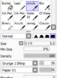
this is the brush i use for sketching, coloring, and cleaning. sometimes for highlights in the eyes or the rough first patch of shading, i also use ink pen, just the default settings.
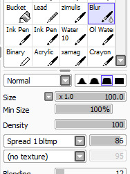
this is my blending brush. if you give it a texture, blending stuff wont look as boring as it otherwise might.
now, let’s draw bernadetta.
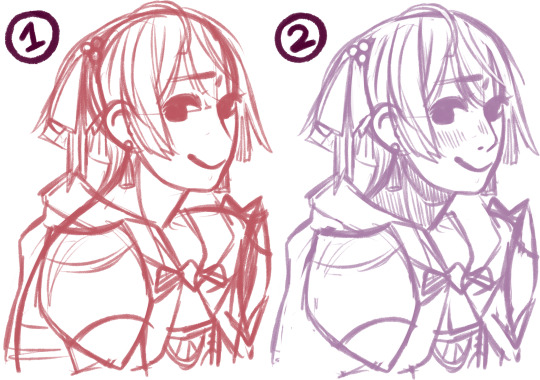
(1) first of all, the rough sketch. i start out with just shapes and then just keep going, all on one layer.
(2) then, i clean that sketch up a little - not too much, you dont need it to look perfect. i dont like drawing lineart at all, so this is what i work with - the sketch, a bit cleaned up, put on multiply. i change the color of the sketch according to what im drawing. for example, if i draw a character like inigo, whos got brown skin and hair, ill end up with yellow, orange or red lineart. if i draw a character during the night, ill use blue lineart. if its dusk, maybe a strong purple. you can change this later, as well.

next, below, i fill in the colors, usually about a layer for each color i use. i usually start out with the hair and end with skin, but it doesnt really matter. try to use colors that vary in saturation and brightness - if everything is very saturated, things end up looking blinding, but if everything is desaturated, it might be boring to look at. this isnt a hard rule, of course, but for this kind of normal illustration with neutral lighting conditions, its good to keep in mind.

now, onto shading. here i used the ink pen for a moment. take your base color, in this case bernies purple hair. the highlight is less saturated, and moves up the color wheel, more toward a reddish tone. the shadow is more saturated, and moves down, toward a blue-ish purple. you can also make the highlight more saturated than the base and the shadow less saturated than the base, but i think its best to decide on one or the other. moving along the color wheel rather than just decreasing or increasing brightness will also help making the picture more vivid.
for hair and gauntlets, i just put on the shadow and highlight and blend it out with the blend tool. for skin and fabric, i use a different method.

first, add blush. blush should be far more saturated than the skin color. i added a touch of deep red in the middle as well for depth. this should be blended.
the shadows on the skin, however, i fill in with ink pen. some parts of this need hard lines, like the outside of the ear shadow, the lower side of the nose shadow, etc. you dont just want an airbrushed look, but a defined line. for this, i use a shade that is slightly more saturated than the base color, but not as saturated as the blush.

then, i add a lowlight color to make the shadow feel more dynamic and interesting. you can go many ways with this - if you check the coat in the next few images, youll see that i used a less saturated color to counteract the very orange shadow. in the case of her skin, i used a more saturated color that is very pink to mimic her hair. i cant really explain this step well, because most of the time, i get to that shade through experimenting.

blend some of the lowlight, but make sure not to ruin the harder lines of the shadow. i did it on the same layer as the base color because im lazy, but you could easily make a clipped layer, add the shadow, and then preserve opacity to make sure everything stays clean. for my purpes it doesnt really matter though since ill be going over the whole thing during cleaning again.
in the circled areas, i took the blush color and gently airbrushed some on for depth and warmth.
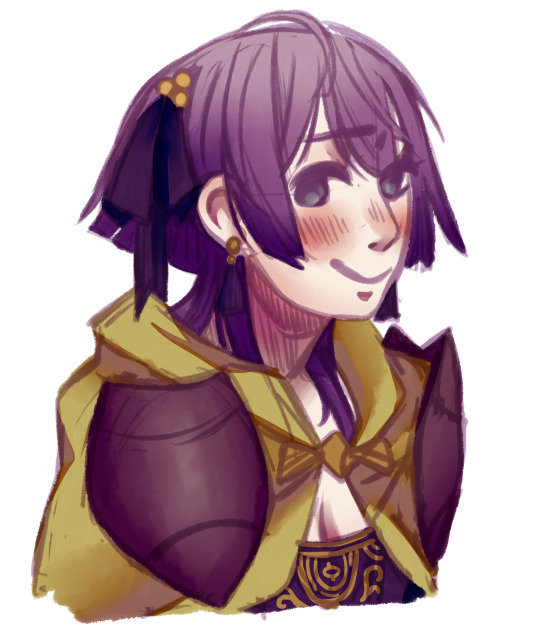
heres the rest of the shading. as i said, i used a less saturated reddish tone for the lowlight in the cape. for the bow and cape, i opted out of highlight, because i imagine them as made out of a sort of thick, unreflective fabric.
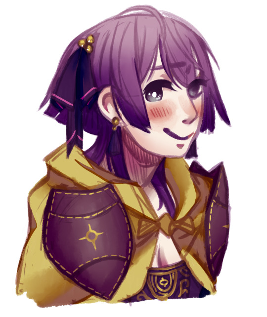
now, all thats left to do is clean! i make a new layer atop everything, zoom in a bit, and go over it all with my brush and the eyedrop tool. a lot of my WIPs look like this, with a part of it very crisp and clean and most of it still sketchy and vague lol. colordrop from everywhere, and create something nice!
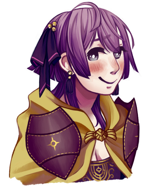
in the end, this is the finished picture! i turn the blend on my brush up and down depending on what im doing and what i need. the cleaning process takes the longest by far.
anyways, i hope this was helpful. if you have other questions, feel free to ask ‘em.
#art tips#is the tag i used for a similar ask before i think#anyways today i drew bernie just for this lol#t1mmytim#long post
191 notes
·
View notes
Note
hello! i was wondering what program&brush settings you use for your artwork? im new to digital art and i really like the way you colour! Especially those light effects they're so extra cool!
omg Anony you’re such a wonderful being, thank you for liking my art enough to ask me that!
now watch me failing trying to explain things to you lmao. I’m self taught and I’m in no way the best at this, so what I’m going to tell you might still be flawed but this is how I do things o/
hmm it’s gonna be long so I’ll put it under a cut!
1) I’m using Paint Tool Sai for everything in my art but if I still feel the need to, I’ll use Photoshop to correct colors and lighting. for example in this progress gif:

you can see where I decided “no, I don’t like this cold blue feeling” so I went to Photoshop (because it allows changes much easier than Sai when it comes to colors) and I changed it to a warmer purple! you can always play in Photoshop and try to see different versions of your art, different colors will give off different feelings
most of my artworks don’t look the way they do at the end because while drawing I tend to be focused on other things (line, where to place shades, lighting, etc) while when the picture is done I can focus on the feeling I initially wanted it to have!
2) My usual brushes are really basic. also ignore my ugly writing.
Sketch: I use this to sketch because it has a nice and easy flow, I can get messy lines that look good (the latest Brahms Heelshire drawing I did is entirely drawn with this one!)
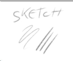

you can always switch between your brushes depending on what feeling you want your art to have
Lineart: this one has nice, smooth and bold lines. I like to play around with it’s size. I believe it’s the basic one Sai has
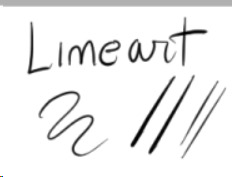
little advice: if you’re not happy with your lineart try to alternate heavy lines with tiny ones. for example:
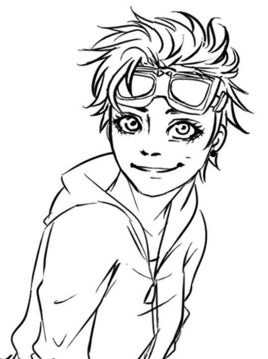
you can see how bold her hair is, but adding thinner lines to the glasses, the folds of her clothes, hair etc. it will create a better dynamic of your picture and will leave the eye of the viewer to run around it! I’m honestly awful at explaining stuff fdkjsnjkfds ofc this is a personal preference but my linework improved since I started to think like this
Base color: this is the color tool sai gives you, I changed my names so I can’t remember its default name. I like it to be bold because when I was little I used to color entire coloring books, so even now digitally I like to color every bit like I’m using crayons haha. time consuming and useless but shhh. basically I put down every base color with this one

Acrylic: now this one is tricky, when I got it the first time I wanted to use it to shade, but using it I discovered it’s much better for blending. after I put down the main colors and shades I just use this one to blend them together and I sometimes paint with it too
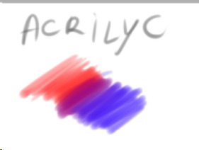

Blending: it’s literally the blur brush Sai provides you xDD
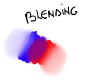
now keep in mind that using its settings (the things near the “Normal” option!) you can get different types of blur! always play around to see what looks good in your art. also remember that not every shadow has to be blurred or blended out, there are many ways shadows can look, using both blurred and heavy (cast) shadows in your art will definitely improve it. using real life references might help
Airbrush: the very brush Sai gives you. I’m using this one mainly for lighting. what I do is basically put down a hard light, like literally take a light color and place it where I see fit on the character, then I give it a bit of glow with the airbrush. one thing I noticed is that depending on the surface, the glow will change!

in this one you can clearly see the light on his cheekbone, but then there is a much weaker light on his face, that’s made with the airbrush and then blended into the structure of the face.the glow on the cheekbone and the ear is made with airbrush, using orange and playing around with the layer modes (overlay and luminosity, these are your best friends when it comes to lighting!)
lastly I want to present another best friend for us artists, the eraser

you can make highlights with the eraser too! you can cut the light in different shapes to give different feels and many other things, the eraser is definitely your best friend and not only in erasing mistakes. try to play around with it sometimes
Other things I learned:
try to use a different color for shading, using the exact color but darker will only make your art look dull, lifeless. the same goes for lighting! there are lots of tutorials on color theories and practices out there to help you with it
don’t be afraid to get wild, use oranges, reds, blues, purples in your skin and play around with the layer modes, you’ll see how much more alive it will feel. also don’t be afraid to try different styles, constancy is not the friend of a creative mind. experiment, try things, go out of your comfort zone. make it fun, make it personal. if you like drawing dogs then keep drawing dogs and enjoy it! don’t let labels and others to influence you and your spirit
ik this is obvious but never compare yourself with others. your journey is yours, you have a different hand, a different brain and a different being. this also goes to drawing things others did already! who cares there’s 0284e4895 other pictures with Kitbull already? draw yours, it will be unique and special because it has something from YOU in it, and no one can replicate that not even with tracing
watch people online! of course when you sit down to draw it will be completely different, but involuntarily you’ll learn and exercising you’ll find your own way of doing things. there might be much better ways for drawing lighting than I do, but this is how I feel good and I like to do it!
I know you hear this everywhere but really, practice, daily if you can! in October 2017 I tried to to the inktober challenge for the first time, I haven’t finished it and I was late anyway but I can tell you that trying to draw daily definitely improved my art. now I’m able to draw a picture per day with not much effort (yesterday I was able to draw three pictures with pretty good quality! o/ always start small and be proud of every step!!)
lastly, don’t be hard on yourself. every picture is a lesson, doesn’t matter how it came out. maybe the anatomy is wonky af, but you learned and your brain will remember what not to do next time. try and try and try and never say “my art sucks”, say “this pic doesn’t look how I wanted, but I still like it. I’ll do better next time!”. the moment you start to like your art you’ll see how much it will start to shine hehe
I might come out with more stuff but this is already really really long xD just be yourself, love your art and enjoy it!! lots of luck for you Anony, I hope I didn’t bore you and this will be helpful for you and others! :D
#ira geneve#art advice#tutorial#sai brushes#art tips#anon ask#ira rambles#wah this was long sorry#but it warms my heart to know some people look up to me for things#and I'll do all I can to help anyone
66 notes
·
View notes
Photo

oh shit yall send lots of questions hoo nelly answering almost all of them under the cut ,,, im gunan try and answer more technical ones first then fun ones and ones about the mod later so u dont gotta scroll all the way to the bottom for the good deets
Hi! I'm still kinda new to the blog and I was wondering what are the 'do and do-not' kind question I should do? Because im sure theres always that one ask thats just Innapropiated, like that one of Michael 'taking advantage og high Jeremy' that was just not cool. i got this ask a lot so ill be clear with yall. im just not a big angst fan? so sending michael asks about his anxiety nonstop and about how he had a panic attack in the bathroom over and over again wasnt that fun. usually if it pertains the musical though you should be find sending an ask about it? but sometimes i get asks that are like “jeremy ur nothing and how does it feel knowing u fucked everything up” like homie how i think its feels? how u think hes gunna react to that? i made this blog to negate a lot of negativity in my own life so i can promise u im going to be answering asks mostly positive always forever. that being said tho i sometimes get asks pertaining to a few things that ive dealt with in the past and these topics make me very very uncomfortable. dont send asks about these topics please. this is the no no list
-self harm, cancer, suicide, rape, parent death, car accidents, sudden death.
What was your inspiration for this blog? hoo boy well,,, ultimately i thought of them rooming together and got emotional and made a huge list of headcanons and was like ,,, why not run an askblog for a bit ill just abandon it after three asks lets have some fun. but somehow im still here and i got sucked in by the complexity of michael and jeremy. i know that sounds kinda silly but just, as someone who is dealing with a lot of similar things, like dependency issues and abandonment issues and depression and anxiety, having these fun functioning character to explore was such a gift for me. i believe honestly thats why im still here and doing this. being able to try and portray a healthy relationship and a healthy way of coping and growing has helped me a lot this past month and given me an outlet i didnt have before. TBH THO the main reason i made this blog if imma be real with u guys id because i didnt like the treatment of a lot of these issues in the fandom. it made me very upset to see depression used as an plot device and michaels dependency issues treated as romantic so i wanted to make a blog that had little to no angst. ANYWAYS somehow im still here ,,, gvrkjvrnkjfd sorry i rambled
honestly I just wanna say first that I love his blog and your art and you're so cool and kind!! a question would be (I'm not sure if you've answered this before or not) but is there like an on going story here, or is it mostly just answering questions with the characters set in this universe? (if that makes sense I'm sorry!) thank you, you're super awesome! ��️ djrnjg first off thank u so much aaaa,, ive kind of answered this before but its ok its been a while since then! but um i do kinda have a story but how howdy i sure am dragging my feet. the story isn a hUGE OVERARCHING EPIC OF WOE AND THIS PERSON IS UPSET AND THIS PERSON IS MAD AT THIS PERSON its just michael and jeremy getting together. i have a plan and ive talked to a few people on how i want it to happen but ive gained like ,,,, 6,000 followers since then and im kinda nervous BUT ILL DO MY BEST but also please understand that i do this for fun for myself and if i dont get to it im so so so sorry woops
i know this has been said before but i'm really really happy w how you're handling so many aspects of their characters. i.e. michael being trans, michael and jeremy's anxiety, michael's dependency issues, and other stuff i'm too tired to think of. you made the characters have even more depth than they did in the play and i'm rly grateful for the way you're dealing w my favorite boys. (also your richjake is suuuper adorable) ahhhhhh thank u so much? i talked a bit about this on my main but im really glad people are happy with my decision on this blog because im suPER SUPER NERvous anytime i post an ask dealing with these things. (ask hachi or nate i always message them like freaking out and send them my scripts and asks and wait for them to tell me its ok before i post it omg) also like i talked about before i love,,, having these fun stoner gamer boys to explore these issues with. im honestly shocked by how many people also deal with dependency issues because when i first listened to the musical i was so overwhlemed by the song michael int he bathroom because i had never heard someone basically write “dependency issue: the song” and it felt so so so good to realize i wasnt alone in this pit of despair i fall into so easily aha. but im!! glad everyone is ok with this wild ride im on right now (also thank u so much i struggle writing rich and jake but i get so emotional cause they would TOTES call each other babe)
how come you just use sketch form for most of your drawing (sketches and uses sketch for the final result)? im ,,, not really sure what this is asking but i thnk its along the lines of why do i only sketch my answers?? and i do that because dude do u see how often i post and how lONG some of them are. i made this blog for fun and i love doing comics but i hate lineart and coloring and if i tried to churn out finished pics for every post id defs have given up a few asks in,, shrugs
I want to say I love your little comics they're so funny! How long does it take you to make a comic? Are any of them based on your experiences? Ok have a nice day! thank you! i love my little comics too! it usually takes me anywhere from an hour to five hours if im dragging my ass or talking on discord while im drawing. it can be kinda exhausting but since i took my break ive also been like, starting long comics one day and finishing them another day which, before i would do it all in one sitting then post it hahha. AS FOR EXPERIENCE the first half of the lifeguard comic was based on real life! we were stuck stoned up there for like an hour or two? but we didnt have anyone to help us but we got down eventually!! the wendys comic is also something i did because man!! i need to compliment food workers if they do a good job!! ummmmm just like jenna i also have a friend that said HAHA BYE and moved to cali and she is also lIVING IT UP and doing really well for herself and shes very independent and shes very inspiring to me! hmm i think thats it besides i used to have movie nights with my dad all the time too except we would watch my fave animated movies and sometimes lord of the rings cause my dad loved that
What kinds of things can we NOT ask ? What kinds of things do you WANT us to ask ? i covered the what not to ask in the first question so!!! um if my askbox is open and u want to respond to previous asks ive answered for the boys that would be so so so rad. sometimes im done with a certain ask and i have nothing to add but sometimes ive got more to say but am looking for an opportunity! that being said it made me really happy that i got a lot of asks about pj? shes not going to the main focus of any more asks but!!! i was nervous to introduce her and im glad u guys like her shes fun to write. but overall just general asks i can make a big ol fun story out of so!! dont worry too much about what to ask, if its something ud ask a real person and not like “lol what if ur dad died” ur gunna be fine probably
Hi! Not a question but your blog is so sweet and refreshing! I actually really appreciate that you refuse angst, that stuff tends to rub me the wrong way in fandoms... Keep taking good care of these boys ! gggg thank u!!! it means a lot to me that a lot of people are backing me up on this! i mean if u are an angst fan there are a lot of askblogs that explore that!! so its not in short supply bmc askblog fandoms got something for everyone
Which drawing program do you use?? i use paint tool sai and my tablet is a cintiq !!
this isn't really related to the faq but that bakunawa boy reference was great I LOVE THAT FIC MAN!!! the line was originally a little diff in that ask but i changed it cause ,,,, i could,,,,
an art style question. how do you keep the design of characters consistent from frame to frame? my characters they look a lil different every time I draw em (or a lot different) and it tends to disrupt the flow of my comics/animations ohh boy hoo wee props for doing animations im too scared to give that a whirl but!! it helps that i draw all the panels for an ask on one canvas! so if my next panel is going to be the same character in the same spot just in a diff pose i keep the lower layer on just at low opacity so i can use it as a ref! that helps me a lot!
Sorry if I'm nosy or rude, but are you reflecting Micheal Anxiety, Panic attacks and depence? iii think this is asking if i reflect my own issues onto them boys? and if so then yes i do. i dont place any of my own personality or anything on the boys but i do use them as a way to help me learn how to cope with my own shit and i try to deal with their issues in the healthiest way possible while also keeping in mind they are flawed individuals aaa
what are your pronouns??? and maybe your main blog?? im a cis girl so she/her is good! and my main is squigglegigs! also that being said IF YOU SEE THE USERNAME SQUIGGLEGIGS ANYWHERE JUST?? ASSUME ITS ME?? i have a twitter and an instagram and my tumblr account
((Hello mod will Michael and Jeremy eventually someday get together. I love them.)) if all goes according to plan yes! if i get overwhelmed and stop having fun on this blog then no! sorry thems the breaks but! i do want them to get together so HOPEFULLY
going off on that confrience on pornogrefy for birds, Im geussing jeremy has played Hatoful Boyfriend. am I wrong? well it wasnt intended as that ref and i dont know anything about hatoful boyfriend but i can see jerm finding it and playing it so, sure homie! the pornography for birds thing is a my brother my brother and me reference! i love that show and them boys so give it a scope!
I'm crying bcuz Michael said he's in love with Jeremy and it's beautiful yeah that boy is DEEP IN love with his bro bro
Any advice for running an ask blog?? (Ps i love this blog keep it up) personally whats worked for me so far is doing just sketches for art. honestly ive been able to work so much more and post so much more often while also trying to work on my expressions and poses! also taking my own experiences and shaping them to fit the characters has been SO MUCH FUN. th most important thing tho is,,, dont overwork urself dude. if ur having a fun time it shows. if ur just forcing urself to churn out material and its not fun? like shit we doing this for free dont push urself? idk idk overall being looser with my art and writing the dialogue before hand has been the most helpful for me for this askblog! ive run a bunch before including @ask-maz and ive run that sporadically for ,, three or four years? its so funny cause u can see my art style juMP AROUND SO MUCH but i love that blog and i only update it like every other month or so but?? i still like doing it and no on likes those posts but it makes me smile so ANYWAYS
~ok from here on its mostly just me replying to nice messages or people asking me personal questions that dont pertain to askguyslikeus so!!~
I just wanted to say I really really love your blog and just your art in general!! Keep up the good work and hope you're having fun! thank u!!! i am having fun and im glad u enjoy it!!
What other musicals do you like? :0 i really like heathers A LOT. i also like doctor horrible i know thats not technically a musical but i just relistened to it and im emotional. i like dear evan hansen but it makes me really sad so i can only take it in moderation! ummm rent? chicago?? music man? now im just naming musicals i was in rip. being in a musical fandom is a new thing to me? i was really into heathers last year but didnt really interract with the fandom at SO THIS IS SUPER NEW?? ive never been into a musical as much as im into bmc and heathers tho
tell us a little bit about urself!! u seem v cool i am squigs or fork!! im 24 and work fulltime as a barista at starbucks! i get high on the beach with my friend gwen a lot and drink wayy to many slushies, my tv shows are brooklyn nine nine and bobs burgers right now! i table at conventions sometimes and sell my art as merch and whatnot and i cosplay as a hobby as well. im pretty boring but i draw a lot and always carry my big sketchbook with me and im pretty sure its given me back issues BUT OH WELL HAHA also i am very not cool THE TRUTH COMES OUT
Who do you most relate to from bmc and why? like ,,, a mix of michael and christine with a sprinkle of jeremy i guess ahaha i relate to michaels dependency issues and overarching positive attitude and love of music, i relate to christines bright disposition and the need to not stick to one set thing? like she loves theater cause she can be sO MANY PEOPLE and like same homie thats why i cosplay. and jeremys need to be likes while also ability to put himself out there is very relatable. i also identify strongly with his dad issues idk idk whats good
Also -- just thank you for how you handled all the panic attack and anxiety attack asks. I used to deal with anxiety attacks multiple times a day and it just was really nice that it was positive and not them having one. Thank you, sincerely. ahhhhhh ur so welcome i,,, have anxiety and it sucks and i deal with panic attacks like everyday at work so i dont really wanna come home and draw someone having one i guess? im glad its helping other people too tho!
Dude- I love your art? Actually so much? It's... I love it. The whole sketch-ish way your art style is, and the way you color, and the expressions! I'm so glad I found your work - you've given me so much inspiration. Keep doin what you're doin and I hope you have a good day! AHHHHHHHHHHHHHH ANytime any one compliments my expressions i die cause i legit made this blog to help with that as well ,,, like dam
im lvoe ur art style b o i :0 !!!!!!
Mod, I love you so much I love you you have my soul and my love and my eternal gratitude thank you and I love you (This is the guy who was excited about PJ on your ig live stream a while ago and I love you) !!!!!!!!! im so happy u like my content omg and that u like pj im so glad!! shes a good bean
I just wanna say... I'm crying over that post about Michael and his anxiety? cuz I know how it can feel that you're only your flaws and weaknesses, but Michael just tells that to screw off in the most wonderful way and I'm?? thank you so much for that post, I bookmarked it for future times when I can't look past my depression... honestly, that post made my day (along with every other post on this blog), thank you for being such a lovely part of this fandom ,,,, im,,,, im scared of a lot of this fandom tbh but if i can be something good that come out of it and my love of these boys and desire to show them functioning together in a healthy way can help other people its so much more than i ever thought id ever be able to do. i am blown away everyday by the support ive been given on this blog and i might be crying right now because i never thought id be able to touch other people like this and i just. im really glad yall are here with me for all this.
(To the mod: You are a beautiful person that I highly respect. I love this blog and what you set out to do. thanks for giving something that makes me smile and gives me something to look forward to everyday, keep up the good work! ❤ ) hey im still crying from the previous ask aaaaa im honestly so emotional
what are ur true feelings for wendy's??? i fucking love wendys man thats some top tier fast food right there
what fast food restaurant do you think has the best nuggets WENDYS HANDS DOWN
do you have a favorite movie? paranorman makes me very nostalgic and ive seen it like eighty times and used to watch it with my dad a lot and i love it
I would just like you to know that your Wendy's comic prompted me to pull the same thing with a bakery in the town I'm visiting and the baker got so excited and happy, so thank you for making that comic because I made that woman's day. GOOD GOOD GOOD GOOD GOOD I LOVE WHEN PEOPLE COMPLIMENT ME WHEN IM WORKING DUDE LIKE IM SO GLAD IT MADE U DO THIS!!! IM SMILING REALLY BIG!!
chocolate milk or strawberry milk? or plain? woops i hate milk im so sorry
do u love michael mell with all of ur heart, mod? i really truly do man what a fucking good ass character
hi squigs i love you! i love your content too and i hope u have a good day pal :> WHAT A SWEET BEAN!!! THANK YOU?? OMG
I'm just saying that recent ask you did with Michael really hit me hard because I really related to it and I started crying because it made me realize that I've been pining my self worth on everything my anxiety causes and I'm so much more than that. Thank you, so much for that I really needed it because I'm in a really bad place right now. <3 -for the mod i legit cry everytime i get asks or dms like this cause once again the idea that im helping other people is so ovwehelming i love you??? i let myself just be”depressed” for ahwile and by that i mean i just,, let my sadness consume me and i was scared of getting better cause the sadness was all i knew for so long and just. its so easy to think u are ur illness but you are so much more. soooo much more man.
I relate A Lot to Michael so the way you portray him in the blog is really good, and I think it's really awesome you refuse to like?? do terrible stuff and answer bad questions just bc people wanna see that. You run this blog really well 👌 AHHHH THis is the biggest compliment thank u so much ,,, i get real anxious bout this blog soemtiems but then yall send me sweet things like this and its worth it man
Hey mod, just know you're a really cool person. Thanks for running this blog in the first place. Keep doing the great work. thank you!!!! for ur support!!!!
not really a question!! i just wanted to say your posts on this blog always brighten my day and you're really an incredible artist and person, keep rockin on my dude!! *clutching my heart* the fuck this is so sweet
1 .I just wanted to say your blog is really awesome! It's very lovely. I also like how you made michael trans and like handled it? (just with how all the characters treat him and stuff its v nice). Your art is super duper! Thanks for running this awesome blog! 2. Hey! This isn't a question but I wanted to say that I appreciate michael being trans!! As a trans boy it's just rly awesome to see something like that casually thrown into an ask blog without making it a huge weird deal :D immm,,, i kinda really love the idea of michael being trans cause a lot of my trans male friends are actually pretty confident in their skin and michael is a very confident character? and u rarely see that with trans representation and its so refreshing to see it portrayed well. im trying to do that here but again if! i do anything wrong let me know!
how did you first get into art? (also i really love your blog, it's amazing!) ive been drawing as long as i remember! ive got mad adhd and wasnt diagnosed until late in ym life so i would just draw nonstop in my classes ahaha i used to read the sunday comics a lot and they really inspired me to try and make comics of my own too!! (and omg thank u)
someone also asked me if i went to church or was religious but tumblr ate the ask but i used to go to church a lot as a kid but im currently not religious at all aaa
ok holy shit that was a lot but thanks again to everyone i legit cry a lot about how supportive u all are thank u so much aaaa
326 notes
·
View notes
Note
do u have any digital art tips? i'm super new to it and advice would be appreciated, sorry if this is annoying or if you've answered this before!
edit: ok time to answer!
First of all it’s important to remember there’s no right way of doing digitial art. When i first got my tablet i was following a lot anime fanartists and watching tutorials that all did their work like sketch -> clean smooth lineart -> some sort of cell/airbrush shading and it did not help me get better at all. bc all my traditional work was messy af and id never drawn lineart in my life and hated it so i gave up before getting to coloring lmao. So don’t try to change your style for digital bc it’s already hard enough to get used to the feel of drawing on a tablet. I think what really helps me is to not treat it very differently from irl painting bc that’s what im used to doing. If you want to have a more natural feeling while drawing digitally, using textured brushes really helps!Some notes on coloring:I think the most important thing is to not be like “oh this shirt is blue so i must color it with blue” but think about what the different colors you wanna use look like next to each other bc the way a color looks completely depends on the surrounding colors (think about the blue/black vs white/gold dress dilemma). It rly helps to just study some photos and use the color picker tool to see what colors are actually in it.You’ve also probably heard not to shade with black (or darker versions of the same color) which is generally very good advice bc it makes your colors look very muddy and boring. However there’s this post going around that says what colors to shade what colors with and while it can sometimes help its not like there’s only ever one color of shading that’s gonna look good! I think the best thing u can do is just try things out and see what works. Bullshit it until it looks good yknow? And after you’ve done it a lot you start to develop some sort of feeling for it and it becomes easier to pick the right colors right away.This is probably completely unhelpful without any visual evidence but if there’s anything specific you want to know about please let me know bc it’d be much easier then to make a tutorial of sorts
also one last tip: START ON A BIG CANVAS. i usually start with 2500 px width or so
16 notes
·
View notes
Note
Do you have any art tips?
Uhhhhhh Funk im not The Greatest Artist ™ but I’ll try to bestow some Wisdom on you. Keep in mind Art is Subjective and I’m no expert and all that so take everything with a grain of salt but that being said I’ll try to give u Tips and Tricks
-listen so if you have a boring class at school just draw in it. School is great because you have 1. Access to paper at all times 2. Incredibly boring lectures. If you have a study hall that’s the Drawing JACKPOT. Basically what I’m saying is practice all the time when you have energy but like that’s such boring art advice. It’s important but “practice! uwu” is like what people with Natural Art Talent say when they didn’t have to figure everything out from the ground up so it’s kind of aggravating
-There’s gonna be people better than you. Chances are you have a friend who’s better than you because this is Tumblr we all draw. Try Not To Compare Yourself ™ which idk how to do but it’s bad don’t do it
-unless you find a terrible person with worse art than you in which case FUCK DUDE COMPARE YOURSELF TO THEM! THEYRE HORRIBLE AND THEY CANT DRAW FOR SHIT LOOK WHOS LAUGHING NOW!
-“work until your idols become your rivals” is absolute bullshit because your idols are working at it at the same time you are. You fool. You imbecile. I feel like this works better for writing when your idols can become irrelevant or straight up die between you being an aspiring author 8 year old and a tired 30 year old who just wrote The Great American Novel ™ or just kind of. Leave the fandom if you’re writing fanfic. Anyway
-ok that’s all the preachy shit, time for Real Art Advice ™. Keep in mind I do digital cartoony shit with Strong Lineart and cel shading for the most part and I pretty much only draw people so my knowledge is limited to that. if you wanna be a professional artist maybe do other things and Expand your Abilities ™
-Ok first off if you’re using Gimp or Photoshop please love yourself and download Firealpaca or illegally torrent Paint Tool Sai or something. I swear by Firealpaca it cured my depression but like. Photoshop is Trash for drawing. Get Firealpaca it has Line Correction ™
-Keep Line Correction ™ at like. A 5 when you’re sketching and at a 19 (the maximum) when you’re lining, coloring, shading, highlighting, doing literally anything that isn’t sketching
-Sketching digitally can be hard if you’re used to sketching on paper and I find it easier to do a sketch on paper, take a picture of it on my phone or scan it, and line/color it digitally. You do you and figure out what works best
-speaking of which I refused to use sketchbooks until I was Worthy ™ of not drawing on notebook paper and uhhhhhh that’s dumb just get a sketchbook they cost a little more than a notebook at Target it’s not super expensive. Although if you’re not financially in the position to buy a sketchbook anyway, just hoard notebooks from school that you didn’t use much. Bam, that’s your new sketchbook
-the Head Circle Cross Thing and the Spheres For Shoulder, Elbow, and Wrist Thing are good and important and will save you
-hands are hard so use references but bullshit your way through it. eventually they’ll look good (I haven’t gotten there yet)
-HAVE FUN WITH NOSES OH MY GOD. Noses are super fun and cool because there’s, like, infinite variety with them, they can be as long or short, thin or thick, rounded or pointy as you want, you can make them be, like, triangles or circles or more squareish or diamond-shaped, the base of the nose can be about as high or as low on the face as you want, you can make the nostrils prominent or not really there at all, they can add another Layer to a character’s design, oh my goodness noses are so fun. They’re like, severely underrated and oh my god I could gush about how fucking fun noses are
-same with facial expressions. Where you put the pupils and how big they are, how much of the eye is covered by eyelids, the way the eyebrows are, the mouth, tons of other shit. There’s loads of variety and so much you can do and honestly having fun with the facial expression is The Best Part. There’s tons of Face Art Chart Memes floating around, you know the ones, save it to your phone/computer and practice those on your own time it’s fun
-if you don’t know how to do something, avoiding it won’t help you. Just kind of draw around with it in your sketchbook or in a “I’m not posting this” file until you feel confident enough to do it in your Real Projects ™.
-Ok for lining did you know..… it isn’t illegal to erase parts of the lineart to clean it up.… just be careful and draw it back in to the best of your abilities if you erase too far and use a smaller eraser brush/lining brush for this… I know it’s tedious nobody likes lining it’s okay you can do this put on some good music
-use mcfucking references
-eyedrop character’s official colors but adjust said colors based on the color of your background to make them look less funky is my general rule for clothing, I usually pick the hair/skin by myself or from something I’ve already drawn though
-for flats, make sure your lineart is all closed off and there aren’t any “holes” cuz that’ll mess up your coloring
-so how I do flats is I use the magic wand tool to select whatever I want to color, expand selection 3 pixels (in firealpaca you can set it to do this automatically), pick the color I need, turn up the brush to as big as possible, and color it in. It saves the time you’d spend with cleaning up where the color gets outside the lines
-you can do the flats on one layer, but I personally like to do every Object on a different layer so when I do shading, I know what goes on top of what
-if a color is darker than the lineart it looks ugly so pick your line color with caution (or just use black! Unlike shading black lineart tends to go with pretty much everything)
-SHADE YOUR GODDAMN ART. Like, what makes people go “wow holy shit that’s good!” is the shading + highlights, don’t be lazy ya fuck.
-I’d take a break before shading to Refresh Your Eyes ™ but also I constantly forget this is a good idea
-don’t shade with black oh my god. Unless you’re doing Strong Punchy Dramatic Stuff or monochrome black and white stuff, don’t shade with black, and if you’re doing that it’ll probably be drawn into the lineart. Don’t shade with black please we can tell you’re doing it and it looks bad
-highlighting with white isn’t too bad though, especially with the eyes, but it might look too strong in some places
-As a general rule, shading is darker and more saturated, highlighting is lighter and less saturated. Whether it gets warmer or cooler depends a lot on what color or thing you’re shading or what you want the feel of the picture to be and I’m not 100% sure how to do it myself so uh. Trust your gut and change the color if it looks wrong I guess.
-where exactly the shadows or highlights fall depends on lots of things, just kind of. Look at how things work irl maybe? This is the kind of thing that you just have to practice, and it’ll look like shit until suddenly it doesn’t sorry I’m not sure what to say
-One Medium Sized White Dot on a layer above the lineart where the pupil borders the Iris (or the whites of the eyes if you’re like me and you make the pupil and Iris one thing) works for a glint in the eye that makes a person look less dead and more cute. How big you’re gonna make it depends on how adorable you want the person to be
-SMOOTH BORDERS FOR THE SHADING ARE REALLY IMPORTANT IF YOURE DOING CEL SHADING which is why firealpaca is my best friend thanks line smoothing. If you’re doing like. Soft shading or painterly shit or other kinds of shading it’s less Super Important but like. Still be sort of neat. Unless being really messy and sketchy is what you’re going for but even then you still need to be sort of careful
-for simple backgrounds, it’s like. Easy to make it interesting. Add polka dots to the background or a big old square or a gradient or a cloud filter or something the possibilities are endless. Another option is to straight up make it transparent and write a secret message in white on the side. But uhh never do a blank white background at the very least fill it with a solid color
-ok style is kind of hard because I never had to struggle to find my style? I just “drew in my handwriting” so to speak and then if along the way I realized something looked shitty I just changed how I drew it slightly? I guess a thing you could do if you’re in tune enough is look at the styles of things you do like and things you don’t and figure out why you do and don’t like it. “I like how *2010s cartoon* does Eyes!” great take that general concept. “I hate how this shitty yaoi has enormous hands!” great then don’t do that. It’s all Personal Preference my dude style is Your Own Thing
-notes aren’t everything but fuck do they feel nice. Self reblogs are fine but don’t overdo it, I’d say reblog it Twice to account for time zones and tag it as self reblog so as to not be a dick
This got long whoops. That’s all I can think of but I hope this helps it’s All I Know
4 notes
·
View notes