#also I decided to add the ID to the main caption as well just so ppl don't have to click on the image to read it
Explore tagged Tumblr posts
Visit Tumblr Blog
Explore Tumblr blogs with no restrictions, modern design and the best experience.
Last Seen Tumblr Blogs


Fun Fact
Tumblr has been providing a Korean-language service since 2013.
Text

My favorite scene from Clown's recent Makeship commercial
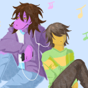
[ID: A digital artwork of Wally Darling and Barnaby B. Beagle standing in the vacuum of space, surrounded by floating debris and three colorful planetary bodies. The black background depicts countless tiny stars that are all arrayed in different colors. Wally conveys an inquisitive expression with his finger pointed towards his mouth. The speech bubble above him reads, "How did we get up here, Barnaby?". In response, Barnaby is seen shrugging his shoulders with his usual smiley expression. The speech bubble above him reads, "Beats me, kid!" as if in a whimsically aloof manner.]
Reblogs are appreciated!
#i can already see it being a meme with both of them somehow getting stuck in different scenarios like the backrooms#also I decided to add the ID to the main caption as well just so ppl don't have to click on the image to read it#my art#welcome home#welcome home horror project#welcome home puppet show#welcome home arg#welcome home fanart#wally darling#wally darling fanart#barnaby b beagle#barnaby b beagle fanart#finished wip#scene redraw#digital art#procreate#wyrm's art
187 notes
·
View notes
Text


bestowing my highest honor as an artist to ffxv (drawing the characters in fun outfits)
thoughts under the cut
RREAAAGHHHH SO EXCITED TO BE DONE WITH THIS!!!!! it took me forevarrrr but i soldiered through as an act of love. now excuse me. yap time
OKAY SO the concept behind this was originally specific fashion subcultures for everyone!l ike noct emo ignis dark academia etc. but then decided i didnt want to pigeonhole it all and just freestyled outfits i thought would look nice on everyone
noct - i do think noct would still be emo-ish but also opt for comfy baggy stuff a lot. something you could just fall asleep in on the spot. note the details of bass pro shop shirt (of course) XV necklace, little moon + stars accents, carbuncle + fish keychains. i also wanted his metal band logo shirt to spell LUCIS but i forgor some letters but its not very readable anyways
ignis - ignit ooohghh ignos ignaurs. sorry i made him serve so much cunt it will happen again. i drew him first cause that kind of inspired this whole thing i love him so bad if i didnt draw it id explode. not much detail to note except his collar pins are like his double blade thingies
luna - lunaaa the concept was “clean girl aesthetic” idk if that happened but im actually really happy with how it came out! might be my favorite of the bunch just because she looks so pretty and happy. your honor she should have been able to just be a normal girl and just. chill
prompto - prompotoooo i had trouble picking his vibe!!! my first thought was techwear?? because weeheeeehee he loves tech and well... you know... but then i realized i didnt really like the look of anything i saw + it was so bulky and dark and serious for him! ending up going with some more youthful and baggy. i was considering something more loud and colorful but ended up not going with it. i feel like in canon he'd be too nervous to have such a flashy fit and would want to just look "cool" to fit in with the boys lol. itty bitty details here - chocobo keychain, pompompurin and bi miku buttons, and his lanyard is kings knight themed! i also thought it was funny to write LUCIS on his shirt like you know those shirts that just say BROOKLYN or TOKYO or SAN FRANCISCO and thats it. thats what its like
gladio - okay i know this is going to sound like a lie but im not horny for gladio like at all, hes my least favorite, i think he's just alright. but also i KNOW in my heart of hearts that he would LOVE being a leather daddy and so i had to make it happen. main detail to note here is that his tank top has the motifs of a cup noodle! i didnt know what else to add cause you know.. hes the cup noodle guy.. but also i didnt want it to be so in your face about it with a big as logo so kept it subtle!
(side note the leather daddy gave me an idea for a post where its like noct and prom go to a gay bar all nervous but then they run into gladio and its like "p: GLADIO YOURE GAY?" "n: nevermind that PLEASE dont tell ignis we snuck out" and then ignis walks up and theyre all like WHAT THE FUCK!!!! caption would be "the gang finds out theyre all bisexual." probably wont draw it but i think its very funny lol)
iris - iris my sweetheart.... definitely leaned into the scene vibes here and also that one image of the blonde emo anime girl. details here - of course the moogle big ass backpack and keychain (can you tell i love keychains), but also her buttons are an iris (the flower) and also a crown with hearts (haha symbolism)
anyways oh god i didnt mean to write an essay down here. usually i keep this in the tags but this time i just had Too Much To Say. can you tell i put a lot of thought and love into this . anwyays. *walks off into the sunset and fuckig dies*
#ffxv#final fantasy xv#ff15#final fantasy 15#noctis lucis caelum#ignis scientia#lunafreya nox fleuret#prompto argentum#gladiolus amicitia#iris amicitia#koob art#digital art#procreate#illustration#1k
2K notes
·
View notes
Photo


Carpe Noctem [an original vampire zine]:
Interest Check Results 📊
At long last, the results of our interest check are here!
First, thank you all (again) for your interest in our zine. We were blown away by the amount of responses we got (238??) and in such a short time! We were already at 100 responses in the first 24 hours of posting the interest check; we’re so glad everyone is just as excited as we are!
Moreover, thank you for sticking with us through some early delays. Your continued support means a lot and we’re incredibly grateful.
Some housekeeping: You may have noticed that we’re currently in the process of updating our social media, so pardon our dust. We have however updated our FAQ with some new info. We’re also getting close to launching our applications before the end of the month! Leading up to applications, we’ll be doing some official Mod Introduction posts, so you can get to know us better :’)
⯎ GENERAL BREAKDOWN ⯎
Participation:
We’re looking at an art-heavy zine, with a strong writer showing as well (considering space needed for writing vs. art, we’re aiming for a fairly balanced book)
Price Range:
Main Zine $20-$30 range. Zine + Merch tiers: $30-$40 and above.
Funds:
Split Profit (more details TBA!)
Zine Format:
Both Physical and Digital versions A possible Digital expansion Inclusion of a NSFW / 18+ booklet
Merch:
While final merch will be confirmed later, we can confidently say we will have:
art prints enamel pins sticker sheets keychains large stickers
And that’s the highlights! Keep an eye out for our more upcoming announcements (soon...) and as always, feel free to drop us an ask.
[ Detailed Breakdown and Image IDs below "Keep reading" ].
F A Q ☽ M O D S ☆ T W I T T E R ☾ A S K
⯎ DETAILED BREAKDOWN ⯎
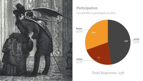
⯈ Participation
Most people are interested in participating as artists, with a whopping total of 156 responses (47.7%). 100 responses are interested in buying the zine (30.6%), and 71 indicated interest in participating as writers (21.7%).
⯈ Price Range
Survey participants chose from four different ranges: $15-$20, $20-$30, $30-$40, and $50+. The results for just purchasing the zine were closely tied at 114 responses for the $15-$20 tier, and 115 for the $20-$30 tier, with only 9 responses for the $30-$40 tier. For zine + merch bundles, there were 49 responses for the $20-$30 tier, 128 responses for the $30-$40 tier, and 34 responses for the $50+ tier.
⯈ Zine Funds
Zine funds indicate where the profits would go. We were deciding between for profit, non-profit, and split profit. The results were largely in favor of split-profit (48.7%) with solely for-profit in second place (36.1%) and solely non-profit last (15.1%). We have decided to go with split profit. Specific charitable organization(s) will be decided after final contributors weigh in.
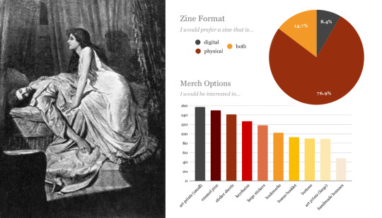
⯈ Zine Format
Most want a physical zine (76.9%) while a lot want both physical and digital formats available (14.7%), and some want just a digital copy (8.4%). We plan on having both a physical and digital option, and depending on the amount of applications we receive, we’re also open to the idea of having an expanded digital version so we can increase the number of accepting contributors while remaining economical.
18+ Booklet?
While the results aren’t displayed on our graphs here, the responses to our question about a possible 18+ booklet were highly in favor. Thus, we will be having a supplemental 18+ booklet along with our main zine and merch. More details on that to come.
⯈ Merch Options
We had a ton of merch options! Note that we may add more types of merch later. To go over our top merch choices:
Small Art prints: 157 (70.7%)
Enamel Pins: 150 (67.6%)
Sticker Sheets: 141 (63.5%)
Keychains: 127 (52.2%)
Large Stickers: 118 (53.2%)
Bookmarks: 102 (45.9%)
Bonus Art Booklet: 93 (41.9%)
Buttons: 90 (40.5%)
Larger Art Prints: 89 (40.1%)
Handmade Mod Bonuses: 48 (21.6)
While our exact offerings will be partially determined by our contributors and what they’d like to create, most of these will likely be available with the zine. We’re also workshopping some ideas for more writing-based merch offerings, so our writers can get in on the merch fun as well~
⯎ IMAGE IDs ⯎
[Image ID: A series of four images. The first image is a black and white Victorian style picture with the words interest check results on it. In the image are three figures. The main figure is a woman-presumably a vampire-with a shawl over her head and back and dark hair. She is reaching over the second main figure, a blonde woman laying on her back in bed asleep, an arm over her head and the blanket pulled part way down. In the background is the third figure, a man in a Victorian style suit with short hair and a moustache. He is entering the room and still part way behind the door, unnoticed by the other two figures. In a hand obscured by the door he is holding a long knife, possibly a sword, and his gaze is focused on the dark haired woman with a serious expression on his face.
The second image is half a black and white picture and half a pie chart infographic, described above under Participation. The picture depicts a Victorian couple, a woman and a man, embraced in a kiss. The woman has long dark hair, a wide hate with a dark feather on top, and a dark dress with a bustle. Her arms and hands are around the man's head and neck as they kiss. The man is wearing a long coat, his back turned towards the viewer so the rest of his clothes are obscured. He has his hat in one hand and the other is obscured. His hair is dark and there are large, bat-like wings emerging from his back.
The third image is half a black and white picture and half a stacked bar graph and pie chart infographic, described above under Price Range and Zine Funds. The picture is a window like image depicting an outdoor scene. There are two main figures, with a large crowd of less distinct figures in the background, watching the two in the foreground. Both main figures are men, both wearing white shirts and wearing hats of two different styles. The one in the front is near the bottom of a hole, kneeling in front of an open coffin with a skeleton inside. He has a leather vest over his shirt and a dark beard with a moustache. He is driving a stake through the skeletons chest area and recoiling as it results in a cloud of smoke, his other hand up to protect his face. The man further back is also recoiling from the cloud and has a very shocked expression on his face. He has one arm up to protect his face and the other hand is still holding a shovel. In the background at the front of the watching crowd is a finely dressed man with poufy sleeves and a large feathered hat who seems to be supervising the event with an indistinct expression. Under the image is a caption that reads “Le Vampire, lithographie de R. de Moraine, tirée des Tribunaux secrets”.
The fourth image is half a black and white picture and half a pie chart and bar chart infographic, described above under Zine Format and Merch Options. The picture is of two figures. The main figure is a woman with dark hair, dark eyeshadow, and a white dress. She is in profile, but glancing down at the second figure. a man who is lying on his back in bed. She is kneeling on the bed next to him, her hands on either side of his chest while she has a seductive smile on, revealing pointed fangs. The man is in a loose shirt, still asleep. One arm is hanging over the side of the be, while his other hand rests on top of his chest. He has short dark hair and a moustache. End Image ID.]
F A Q ☽ M O D S ☆ T W I T T E R ☾ A S K
28 notes
·
View notes
Text
Hello 2019! Can you believe it, 2019 already! Last year before we get into a new decade.
I hope everyone is having amazing holidays and enjoying time off and family time. I’ve been having a wonderful time, extremely busy. As I mentioned in my last post, I am working crazy hours and I have school, but with God’s help I’ve been doing alright! My Christmas was wonderful and I’ve just celebrated a birthday also, so thank for you all of your love and well wishes this past week! So let’s get into it, shall we!
I love being prepared and organized and I despise being last minute, I don’t usually do well under pressure. So I had already prepared some posts for December knowing it was going to be crazy and I made sure that my shopping and wrapping was done before December 20th, and it was!! Now I am preparing for the new year, 2019!
I’m so excited for 2019, because I’ve been at this blog thing since September 2018 and now I’m ready to start going at it more seriously and with God’s help and grace along the way. I’ve been so blessed to be able to share my stories, my opinions on Life By Faith. God has been so faithful and so amazing every step of the way. He is the reason why I started this blog, He put on my heart to do this to help other people and to share His under dying love. God has been so faithful and I cannot wait to see what 2019 holds for Live by Faith!
This time a year everyone asks “What is your New Year’s resolution?” and for someone (like me) who has never and I mean never stuck to her New Year’s resolution, I’ve decided to not do one. What I will do instead is write goals and a list of things to do in order to achieve my goals. I have many personal goals that I want to accomplish that will be kept to myself, but the ones involving the blog I want to share with you guys, so you guys will know what will happen throughout out the year and you might be able to keep me accountable.
So first thing is I’ve changed my blogs name from Sonia Banana Blog to Live By Faith, that was because I didn’t want the blog to reflect me, I wanted it to glorify God. God showed me Live by Faith through a book I was reading, it stood out to me and then it just stuck! So hope you all love the new name as much as I do!
Secondly my website like you’ve probably noticed, has changed a bit and I’ve been experimenting with new designs so I really like this one but we will see maybe down the road it might change again! But I’m a beginner with this whole designs so we’ll see!
For social media accounts! I’ve been on Instagram since the very beginning which is where I communicate with most of you! I joined Pinterest not long after that, and now Live by Faith is on Facebook! I really love social media, and it’s amazing to get my blog out there, but I need help in order to do that! So I would love your support and love on these platforms!
A few months back I did a post called Social Media Free Sundays...This was a wonderful idea and it worked well for about a month, but unfortunately I fell and have not been taking social media breaks like I want too. I know realized that this is a problem that I want to break so I will be now restarting this every Sunday and hopefully down the road I will be able to add another day during the week.
Fourth of all, I love having guest bloggers on my blog! I’ve had two so far and I’m currently working with a few others. But I would love to be able to share the gospel and have other people share their experiences or testimonies or just how in their way do the work of God. So if you have any good request or ideas on who you would like me to collaborate with, let me know!
I will also be completing my pixels in a year calendar again this year! I made a post about this, please go check it out! I’ve also created a template for you to join me on A year in Pixels, check it out: A Year in Pixels-Template
I will also be starting a new thing this year. Which is a yearly devotional and a prayer book! I have received a prayer journal for Christmas to be used every day for 6 months (I will continue for the rest of the year probably in another notebook). I cannot wait to start this! If you have any prayer request please send me a message and I will pray for you!
I will also be doing a daily devotional, I found this devotional at a thrift store and I was just intrigued my it. I bought it without knowing the author and knowing what it was truly about. When I got home I did some research and realized that’s it’s a book to help you get a fresh perspective and a youthful strength for pursuing the abundant life God intends for you to live. This devotional is called Abundant Life in Jesus: Devotions for Every Day of the Year by Nancy Guthrie. I cannot wait to dive in and start reading!
I will also be participating in “Year without shopping”. I will posting a post later on this week, explaining what this is and how I will be doing it.
My main priority this year is to put God first. I tend to take on too much and get overwhelmed and when I need God the most I tend to push Him away. Nothing else matters, everyone needs one on one quiet time with God. To read His word, pray and just spend time with Him. All relationships need that, why would our relationship with God be any different.
I’m sure new adventures, new ideas and new challenges will arise throughout the year, but I’m so excited to take this year on and see what happens. Now let me know below what goals or “resolution” you created for yourself for 2019!
Love Sonia Banana
Happy New Years! Hello 2019! Can you believe it, 2019 already! Last year before we get into a new decade.
1 note
·
View note
Text
I bought Project Highrise back in 2016 and have played it for 54 hours. This number seems oddly low as I thought I’d sunk in much more time than that. I also bought all of the game’s DLCs. So when I saw the announcement for Mad Tower Tycoon, I was a bit skeptical. A second tower-building game? At first glance, these games were identical only with different graphics. However, I love simulation games and I love this theme, so I kept looking at the game’s Steam page again and again. The main question I had on my mind was: How is it different from Project Highrise? Is it worth buying Mad Tower Tycoon when I already own Project Highrise? Do we even need two games like this? Why should I spend money on another game like this if it’s exactly the same? Except for the graphics, of course.
There has also been an interview (written in German as well as English) with a developer from EggCode Games and he was also asked how his game Mad Tower Tycoon differs from Project Highrise. It seems to be something a lot of people ask (also visible when you take a look at the Steam community forums).
This post isn’t about bashing Mad Tower Tycoon, though, or its developer for being boring and copying Project Highrise. I did actually end up buying Mad Tower Tycoon when it was on sale last month. Also, for everything I write about, please keep in mind that Mad Tower Tycoon is still in Early Access and subject to change while Project Highrise has been out for a few years and I may be mentioning some features or content that’s not in the base game but requires the DLC. Also, from here on, Mad Tower Tycoon will be MTT and Project Highrise will be PH, so I don’t have to type their full names over and over again.
youtube
Let’s start with a look at the prices and the developers behind these two games. MTT costs 14.99 €. The Steam Early Access page says they currently have no plans of increasing the price after release. The game has already been on sale previously (and it is currently on sale on Fanatical until the end of Monday, German time… sorry, I’m bad with time zones). Release was scheduled for Q1/Q2 2019. This date has already passed, obviously. But from my personal experience, the game is fully playable, so I didn’t even think of checking when the full release will be until I started writing this blog post. The developers are EggCode Games and you may know them from their previous game Mad Games Tycoon. They’re actually based in Germany which I didn’t know until I looked at their website now. I have no idea how many developers there are, but they’re definitely an indie company. It may be that the company consists of only one person as the interview above has him talk about himself only when mentioning the development of the game.
youtube
The base game of PH costs 19.99 € (it is also currently on sale on Fanatical! A coincidence, by the way. I didn’t know that they were when I wrote this). It also has one small expansion (Las Vegas, priced at 6.99 €) and four DLCs: Miami Malls, Tokyo Towers, London Life and Brilliant Berlin (price ranging between 1.59 € and 1.99 €). The developers are SomaSim. They are also indie developers and made 1849, a city management game, before they released PH. They’re based in Chicago, USA. Not that the country matters, but as I mentioned it above, I thought I should mention it for them as well.
The graphics are, as always, highly subjective. I like them in both games. And in both games, I am not a big fan of how the people look. In PH I find them too stiff and lifeless. In MTT they are too cute. If I had to choose one game over the other simply because of the graphics, I’d choose MTT. I can’t say anything about the soundtracks in both games, because I always turn off the music. But I’ve never heard somebody say that they bought one game and not the other because it had a better soundtrack. So, I’d say while the first can be a deciding factor, it’s something you can decide by looking at videos and screenshots and the other isn’t that relevant.
I haven’t experienced any bugs or crashes in either of these games. Both seem to be very stable, at least on my PC.
One of the main differences that you will encounter first is that PH has more micro management in general. I’ve seen people call MTT more “arcady” and I guess they’re right. In PH, you put wiring and plumbing closets on each floor. Then you place pipes and lines on each floor where they’re needed. Both games require you to place rooms that produce enough electricity, water, etc. But MTT leaves it at that and connects everything automatically. In PH, if you run out of money before finishing the electrical lines, your tenants are without electricity (if you were silly enough to request the tenant before finishing that part). Also, your tenants have specific needs. You may rent your office to insurance companies which only require electricity and copy services, or you choose an accounting company which also wants courier services. Later on, other tenants that offer a higher rent will also require more facilities and services in your building. On top of that, you will also unlock bigger offices later. And just when I was typing this paragraph, while starting a new tower in PH, an earthquake happened in-game and all tenants were without electricity. That’s within the first five minutes into the game.
Another big difference is the transport system. In PH, you build elevators and the people stand in front of one, disappear and reappear on their chosen floor – a bit like a teleporter system. In MTT, they also stand in front of one, wait for it to travel back to their floor, get in and then you can see the elevator move to their chosen floor. In other words: If there are people waiting on different floors, it doesn’t matter in PH while it does matter in MTT. An elevator that is full won’t transport more people and they need to wait for it to move to their floor. You build the elevators (and the stairs) in front of rooms, though, so you can add more when you need to. On the other hand, they cause noise and not everybody is happy having an elevator or stairs in front of their room. Careful planning is still necessary here!

When it comes to building, in PH you build a floor and stairs or elevators, then add what kind of rooms you want on that floor (and add the lines for electricity etc. as already mentioned). Once it is built, you click on the room and choose a tenant. Rent varies depending on what tenant you choose, but they all have different needs and expectations that need to be met. In MTT, you directly build what you want there, e.g., an office, without having to first add the floor itself. The construction workers still need stairs or elevators to get to the construction site, of course. Once it’s built, some tenant will automatically move in there. You have no control over which tenant. A small office is simply a small office.
What I don’t like in PH is the interface. Not everything is bad here, but I frequently get lost trying to find some item I want to build or trying to remember what I need to do in order to unlock something for my tower. I wish they would condense the options somehow – although it may be less of an issue if I played the game more regularly. You also need to open the utilities report in order to see how much of the available electricity etc. you’re using. In MTT it’s part of the upper tool bar. You also get more horizontal building space in MTT which I like.
PH lets you freely build a tower or play scenarios/missions. The interview I linked to above has the developer of MTT mention missions for his game as a feature he’s planning to implement. So, as it is now, if you want to play missions with certain goals you need to reach, PH is the game for you! PH also had mod support. I always forget about that, because I’m not using any mods here. It seems that MTT won’t get mod support.
What you currently get for your money: A very complete game with PH, but the base game is a bit more expensive and some features only come with the paid DLCs. MTT, on the other hand, is cheaper, but it’s also in Early Access, so it’s future is unknown. It also doesn’t have mod support and we don’t know if we’ll get DLC and thus, if it gets as much content as PH currently has.
So, these are the main differences in my opinion. PH has more micro management in general (I left out some features like booking singers for a concert etc. in your tower as it’s part of DLC) than MTT. MTT is more realistic when it comes to elevators and stairs, so their micro management is in getting your visitors and occupants to easily navigate around in your tower.
If I could choose only one game and wasn’t allowed to play the other ever again, I would probably choose Mad Tower Tycoon (but only then and it’d be a difficult decision). Not because Project Highrise is a bad game or even worse than Mad Tower Tycoon, but because I slightly prefer the graphics and so far, prefer the focus on the transport system instead of having to take care of the wiring for my tenants. Project Highrise is the older game, though, and has more content which may lead to a better long-term investment when looking at entertainment gained per Euro spent. I also quite like that you can choose tenants and their specific needs.
I hope this helps anybody who may ask themselves the same question: Should I buy Mad Tower Tycoon or Project Highrise (or both)? Also, feel free to ask any questions about the games. Maybe I can answer them. 🙂
Disclaimer: I am not affiliated with any of the games mentioned here nor with Steam, Fanatical or any other game stores. I bought all games with my own money and am not getting paid to write about the games. My opinion is my own (and if I ever start disliking these games, you’ll be the first to hear it)!
Mad Tower Tycoon and Project Highrise - What's the difference? #blaugust2019 #madtowertycoon #projecthighrise I bought Project Highrise back in 2016 and have played it for 54 hours. This number seems oddly low as I thought I'd sunk in much more time than that.
#blaugust 2019#early access game#eggcode games#Indie Developer#indie game#mad tower tycoon#project highrise#simulation game#somasim
0 notes
Text
I’ve been on the hunt for WordPress themes for bloggers as a way to freshen up my website, and another site I was updating. This is something I do often enough. What can I say, the trends around this kind of thing change often and keeping up is essential. Don’t laugh; these are the things that occupy my time. Haha. It wasn’t long into my search that I had a billion and one tabs open. Then I realised, maybe finding the right theme for your blog is something you guys struggle with too. And here we are.
Before we start, let me say a couple of things.
Firstly, all of the templates I included in this post had positive reviews for easy installation and after-sales customer service at the time of posting. If that changes in the future and you’re looking at them, please let me know and I’ll remove the template from the post.
Why? Because to me, when it comes to purchasing a theme, those are the things I’m looking for. Does it install well (no issues or glitches, no complicated setup instructions to follow) and after I’ve bought it, does the seller support the theme and me, as a customer, well.
The second thing that I want to mention is if you’re building a blog, look through the free WordPress offerings first. There may be something that you like before you purchase a theme. Themes are a bit like photographers with presets or teenagers and water bottles from Typo; there’s no end to how many you can buy. You should know that there are a lot of great free options in the WordPress Dashboard, start there. Try some out. At very least they’ll give you an idea of what you like.
Not a blogger yet? Are you ready to start your blog? Open this blog post of mine and refer back to it later. It will take you from the first steps of choosing a blog name and platform through to getting your first blog post published. I’ve tried to make it a bit of a process you can follow so that you can work through it, setting your blog up as you go. And team, with all that out of the way, let’s get started.
Awesome WordPress themes for bloggers!
My Go-To Divi for all the things
The template I use for SO many projects, this blog included (as at today) is Divi by Elegant Themes. It’s based around a content builder and comes with large, actually make that huge, selection of child themes as part of the main one. You can buy an annual subscription or go all out for the developer version and never pay again. This blog is built on Divi, so is my husband’s website here and this one we did for the team at The Career Planner which they have been successfully updating themselves since the website build in 2019. Plus, at the time of doing this post, they have just launched their Theme Marketplace, so if you’re not into any of the MANY themes they offer built-in, there will be something for you there.
view
Want Free WordPress themes for bloggers?
Some great options that have been around a long time are Moesia, Nimbus (which looks a little like my theme here) and Magazine. They can all be found under Appearance > Themes > Add New, which is where you can also browse the other free WordPress themes that are built into the platform. When I started making on WordPress, I used a free theme and customised it where I could. The problem with Free WordPress Themes is that you can be restricted in how much customisation you can do and even what plugins will work with them. A great starting off point and well worth a look.
Top row – One | Two | Three | Four
Bottom Row – One | Two | Three | Four
Try Themeforest for Magazine Layouts!
After my first adventure in FREE WordPress themes, I decided it was time for me to invest, so I went to ThemeForest. I had an account there already because I used Joomla before WordPress and they offered templates for Joomla sites there too (at the time, I think it’s pretty outdated now). On ThemeForest, it becomes imperative only to buy themes that have great reviews, but also, the team is responsive in the questions section, and there’s not repeated ‘I couldn’t get any help’ comments there. It can be hard to get a refund on ThemeForest, so do your due diligence with any Theme you like there. Be sure, and don’t be afraid to buy the more popular items, they’re probably popular because they work.
[wc_row]
[wc_column size=”one-fourth” position=”first”]
Ohio
[/wc_column]
[wc_column size=”one-fourth”]
pixwell
[/wc_column]
[wc_column size=”one-fourth”]
Sitka
[/wc_column]
[wc_column size=”one-fourth” position=”last”]
flatsome
[/wc_column]
[/wc_row]
Don’t forget the goodness on Etsy.
Finally, the place where I suggest people go if they are DYI’ing their blog. Etsy offers a HUGE amount of options, not just for WordPress but for all bloggers and website platforms. My biggest recommendation is to find one that you like, with FONTS you love, straight out of the box. Some of theme will allow customisation for colours and fonts, but not all. Trust me; you’re better off finding one that works for you without too much work. Otherwise, you may as well customise a free Theme and save your money. Here are some I found on a recent search.
Top row – One | Two | Three | Four
Bottom Row – One | Two | Three | Four
There you go! I know this year has been a big one for starting new blogs or relaunching old ones. As I mentioned in my blog post about how to start a blog, I recommend you get going on WordPress. But straight out of the box, it’s pretty basic. This post should get you all set up with some excellent options for blog layouts.
Why does that matter? It probably doesn’t, you know. I think if you open a blog and want to write, share your work or whatever you’re doing, how it looks doesn’t matter. But, if you’re a little bit like me, those things do matter. Having them look good and how I want them too, does matter. Take learning to code/starting from scratch off your list and get going. Let them inspire you to get started (or keep going!). Enjoy. x
…
like this post? please consider sharing
[wc_row]
[wc_column size=”one-third” position=”first”]
[/wc_column]
[wc_column size=”one-third”]
[/wc_column]
[wc_column size=”one-third” position=”last”]
[/wc_column]
[/wc_row]
Favourites: Wordpress Themes for Bloggers I've been on the hunt for WordPress themes for bloggers as a way to freshen up my website, and another site I was updating.
0 notes
Text
Equivalent Experiences: Thinking Equivalently
About The Author
Eric is a Boston-based designer who helps create straightforward solutions that address a person’s practical, physical, cognitive, and emotional needs. More about Eric Bailey …
Constructing an equivalent experience may mean changing the way you think about development and design, and potentially reevaluating your existing work. In this article, we’ll address common accessibility issues, and how to best go about improving them so everyone can effortlessly access your content.
This is the second of two articles on the topic of how digital accessibility is informed by equivalency. Previously, we have learned about the underlying biases that inform digital product creation, what isn’t an equivalent experience, the compounding effects of inaccessible design and code, and powerful motivating forces for doing better.
In this article, I will discuss learning how to embrace an equivalent, inclusive mindset. I will also provide practical, robust ways to improve your websites and web apps by providing solutions to common, everyday barriers cited by the people I interviewed.
Setting A Standard
The Web Content Accessibility Guidelines (WCAG) outlines in painstaking detail how to craft accessible digital experiences. While a long and dense document, it is incredibly comprehensive — to the point where it’s been codified as an international standard. For over 10 years, we’ve had a globally agreed upon, canonical definition of what constitutes as usable.
How Would I?
If you need a little help constructing the initial mental framework the WCAG gets at, a question I always ask myself when making something is, “How would I use this if…” It’s a question that gets you to check all the biases that might be affecting you in the moment.
Examples could be:
How would I use this if…
…I can’t see the screen?
…I can’t move my arms?
…I’m sensitive to flashing and strobing animation?
…English isn’t my primary language?
…I have a limited budget for bandwidth?
…I’ve set a large default type size?
…and so on.
Focus on these four parameters to improve usability of your web design:
1. Visual – make it easy to see 2. Auditory – make it easy to hear 3. Motor – make it easy to interact with 4. Cognitive – make it easy to understand
→ Accessibility goals are also usability goals.
— Alex (@alexmuench) January 30, 2020
A Gentle Introduction
If you’re looking for a more approachable resource for how to dig into what the WCAG covers, the Inclusive Design Principles would be a great place to start. The seven principles it describes all map back to WCAG success criterion.
(Large preview)
Learn From The People Who Actually Use It
You don’t have to take my word for it. Here are some common issues cited by the people I interviewed, and how to fix them:
Wayfinding
Headings
Heading elements are incredibly important for maintaining an equivalent, accessible experience.
When constructed with skill and care, heading elements allow screen reader users to quickly determine the contents of a page or view and navigate to content relevant to their interests. This is equivalent to how someone might quickly flit around, scrolling until something that looks pertinent comes into view.
The HeadingsMap browser extension lets you view a page’s heading hierarchy. (Large preview)
Justin Yarbrough voices poorly-authored heading elements as a concern, and he’s not alone.
WebAIM’s screen reader survey cites headings as the most important way to find information. This survey is well-worth paying attention to, as it provides valuable insight into how disabled people actually use assistive technology.
Landmarks
In addition to heading elements, another way to determine the overall structure and layout are landmarks. Landmarks are roles implicitly described by HTML sectioning elements, used to help describe the overall composition of the main page or view areas.
These are five of the eight landmark HTML elements and the roles using them create. (Large preview)
Here’s what Justin has to say:
“If I’m just trying to find the main content, I’ll first try the Q JAWS shortcut key to see if a main region’s set up. If not, I’m just more or less stuck trying to scan the page to find it arrowing through the page.”
Much as how we might use a layer group name of “primary nav” in our design file, or a class name of c-nav-primary in our CSS, it’s important we also use a nav sectioning element to describe our main site navigation (as well as any other navigation the page or view contains).
Doing so ensures intent is carried all the way through from conception, to implementation, to use. The same notion carries through for the other HTML sectioning elements that create landmarks for assistive technology.
Labeled Controls
Brian Moore tells us about “form fields with no label or at least one that isn’t programmatically associated so it doesn’t read anything.”
It’s another frustratingly common problem.
Providing a valid for/id attribute pairing creates a programmatic association between form inputs and the label that describes what it does. And when I say label, I mean the label element. Not a clickable div, a placeholder, aria-label, or some other brittle and/or overwrought solution. label elements are a tried-and-true solution that enjoys wide and deep support for accessibility.
In addition, a label element should not be used by itself, say for a label on a diagram. This might seem counter-intuitive at first, but please bear with me.
<!-- Please do this --><label for="your-name">Your name</label><input type="text" id="your-name" name="your-name" autocomplete="name"> <!-- Don’t do this --><label for="eye">Cornea</label><label for="eye">Pupil</label><label for="eye">Lens</label><label for="eye">Retina</label><label for="eye">Optic Nerve</label><img id="eye" alt="A diagram of the human eye." src="parts-of-the-eye.png" />
The same kinds of assistive technology that let a person jump to headings and landmarks also allow them to jump to input labels. Because of this, there is the expectation that when a label element is present, there is also a corresponding input it is associated with.
Alternative Descriptions
If you have low or no vision, and/or have difficulty understanding an image, HTML’s alt attribute (and not the title attribute) provides a mechanism to understand what the image is there for. The same principle applies for providing captions for video and audio content like podcasts.
Kenny Hitt mentions that when:
“…someone posts something on Twitter, if it’s just an unlabeled image, I don’t even take the time to participate in the conversation. When you start every conversation by asking what’s in the picture, it really derails things.”
Up until last week, the only way for Twitter to provide alternative descriptions for its images was to enable an option buried away in the subsection of a preference menu. Compare this to a platform like Mastodon, where the feature is enabled by default.
[embedded content]
Soren Hamby, mentions Stitcher, a popular podcast app. “The onboarding was a lot of themed graphics, but the alt text for each one was ‘unselected’ and for the same image with a check over it was selected. I think it would be reasonable for them to say ‘sci-fi genre selected’ […] it’s such a small thing but it makes all the difference.”
Ensuring that alternate description content is concise and descriptive is just as important as including the ability to add it. Daniel Göransson, a developer for Axess Lab, has a great article on how to write them effectively.
Robust, accessible features can also be part of evaluation criteria, as well as a great method for building customer loyalty. Soren mentions that they are “often the deciding factor, especially between services.” In particular, they cite Netflix’s audio descriptions.
ARIA
One topic Daniel Göransson’s article on alternative descriptions mentions is to not over-describe things. This includes information like that it is an image, who the photographer is, and keyword stuffing.
The same principle applies for Accessible Rich Internet Applications (ARIA). ARIA is a set of attributes designed to extend HTML to fill in the gaps between interactive content and assistive technology. When ARIA is used to completely replace HTML, it oftentimes leads to an over-described experience.
Brian explains: “There seems to be a perception that more ARIA fixes accessibility and it can help, but too much either reads wrong things or just talks way too much. If on screen text of one or two words is good enough for everyone else, it is good enough for screen reader users too. We don’t need whole sentence or two descriptions of buttons or links i.e ‘link privacy policy’ is far better than something like ‘this link will open our privacy policy, this link will open in a new window’ when the on screen link text is ‘privacy policy.’”
The First Rule of ARIA Use advises us to only use it when a native element won’t suffice. You don’t need to describe what your interactive component is or how it works, the same way you don’t need to include the word “image” in your alternative description.
Provided that you use the appropriate native HTML element, assistive technology will handle all of that for you. Do more, more robustly, with less effort? Sounds great to me!
(Large preview)
Unlike most of HTML, CSS, and JS, the success of implemented ARIA is contextual, variable, and largely invisible. In spite of this, we seem to be slathering ARIA onto everything without bothering to check not only if it actually works, but also what the people who actually use it think of it.
Support for ARIA is fragmented across operating systems, browsers, and assistive technology offerings, all their respective versions, and every possible permutation of all three. Simply put, writing ARIA and trusting it will work as intended isn’t enough.
If misconfigured and/or over-applied, ARIA can break. It may not report actual functionality, announce the wrong functionality, and (accurately or inaccurately) over-describe functionality. Obviously, these experiences aren’t equivalent.
Representation matters. To get a better understanding of how the ARIA code you wrote actually works, I recommend hiring people to tell you. Here are four such services that do exactly that:
Contrast
Color Contrast
Color contrast is another common issue, one whose severity often seems to be downplayed. If I could wager a guess, it’s because it’s easy to forget that other people’s vision might be different than your own. Regardless, it is a concern that affects a wide swath of the global population, and we should treat the issue with the seriousness it deserves.
The Click-Away Pound Survey tells us that out of the top issues faced by users with access needs, contrast and legibility weighs in as the fifth most significant issue. On top of that, it has increased as a concern, going from 44% of respondents in 2016 to 55% in 2019.
We live in an age where there’s more color contrast checking resources than I can count. Products like Stark can help designers audit their designs before it is translated into code. Tools like Eightshape’s Contrast Grid and Atul Varma’s Accessible color palette builder let you craft your design systems with robust, accessible color combinations out of the gate.
(Large preview)
The somewhat ironic thing about color contrast is how, ah, visible it is. While some of the previous accessibility issues are invisible—hidden away as the underlying code—contrast is a pretty straightforward issue.
Mostly, contrast is a binary scenario, in that you either can or cannot see content. So, the next time you check your website or webapp with an automated accessibility checker such as Deque’s axe, don’t be so quick to downplay the color contrast errors it reports.
High Contrast
There are technology solutions for situations where even satisfactory color contrast ratios isn’t sufficient—namely, inverted colors mode and High Contrast Mode. Many participants I interviewed mentioned using these display modes during their daily computer use.
Provided you use semantic HTML, both of these modes don’t need much effort on the development end of things to work well. The important bit is to check out what you’re building in these two modes to make sure everything is working as intended.
Striving For Perfection
To quote Léonie Watson,
“Accessibility doesn’t have to be perfect, it just needs to be a little bit better than yesterday.”
By understanding both why, and how to improve your digital accessibility experiences in ways that directly address common barriers, you’re able to provide meaningful and enjoyable experiences to all.
Further Reading
Thank you to Brian Moore, Damien Senger, Jim Kiely, Justin Yarbrough, Kenny Hitt, and Soren Hamby for sharing their insights and experiences.
(ra, il)
Website Design & SEO Delray Beach by DBL07.co
Delray Beach SEO
Via http://www.scpie.org/equivalent-experiences-thinking-equivalently/
source https://scpie.weebly.com/blog/equivalent-experiences-thinking-equivalently
0 notes
Text
Equivalent Experiences: Thinking Equivalently
About The Author
Eric is a Boston-based designer who helps create straightforward solutions that address a person’s practical, physical, cognitive, and emotional needs. More about Eric Bailey …
Constructing an equivalent experience may mean changing the way you think about development and design, and potentially reevaluating your existing work. In this article, we’ll address common accessibility issues, and how to best go about improving them so everyone can effortlessly access your content.
This is the second of two articles on the topic of how digital accessibility is informed by equivalency. Previously, we have learned about the underlying biases that inform digital product creation, what isn’t an equivalent experience, the compounding effects of inaccessible design and code, and powerful motivating forces for doing better.
In this article, I will discuss learning how to embrace an equivalent, inclusive mindset. I will also provide practical, robust ways to improve your websites and web apps by providing solutions to common, everyday barriers cited by the people I interviewed.
Setting A Standard
The Web Content Accessibility Guidelines (WCAG) outlines in painstaking detail how to craft accessible digital experiences. While a long and dense document, it is incredibly comprehensive — to the point where it’s been codified as an international standard. For over 10 years, we’ve had a globally agreed upon, canonical definition of what constitutes as usable.
How Would I?
If you need a little help constructing the initial mental framework the WCAG gets at, a question I always ask myself when making something is, “How would I use this if…” It’s a question that gets you to check all the biases that might be affecting you in the moment.
Examples could be:
How would I use this if…
…I can’t see the screen?
…I can’t move my arms?
…I’m sensitive to flashing and strobing animation?
…English isn’t my primary language?
…I have a limited budget for bandwidth?
…I’ve set a large default type size?
…and so on.
Focus on these four parameters to improve usability of your web design:
1. Visual – make it easy to see 2. Auditory – make it easy to hear 3. Motor – make it easy to interact with 4. Cognitive – make it easy to understand
→ Accessibility goals are also usability goals.
— Alex (@alexmuench) January 30, 2020
A Gentle Introduction
If you’re looking for a more approachable resource for how to dig into what the WCAG covers, the Inclusive Design Principles would be a great place to start. The seven principles it describes all map back to WCAG success criterion.
(Large preview)
Learn From The People Who Actually Use It
You don’t have to take my word for it. Here are some common issues cited by the people I interviewed, and how to fix them:
Wayfinding
Headings
Heading elements are incredibly important for maintaining an equivalent, accessible experience.
When constructed with skill and care, heading elements allow screen reader users to quickly determine the contents of a page or view and navigate to content relevant to their interests. This is equivalent to how someone might quickly flit around, scrolling until something that looks pertinent comes into view.
The HeadingsMap browser extension lets you view a page’s heading hierarchy. (Large preview)
Justin Yarbrough voices poorly-authored heading elements as a concern, and he’s not alone.
WebAIM’s screen reader survey cites headings as the most important way to find information. This survey is well-worth paying attention to, as it provides valuable insight into how disabled people actually use assistive technology.
Landmarks
In addition to heading elements, another way to determine the overall structure and layout are landmarks. Landmarks are roles implicitly described by HTML sectioning elements, used to help describe the overall composition of the main page or view areas.
These are five of the eight landmark HTML elements and the roles using them create. (Large preview)
Here’s what Justin has to say:
“If I’m just trying to find the main content, I’ll first try the Q JAWS shortcut key to see if a main region’s set up. If not, I’m just more or less stuck trying to scan the page to find it arrowing through the page.”
Much as how we might use a layer group name of “primary nav” in our design file, or a class name of c-nav-primary in our CSS, it’s important we also use a nav sectioning element to describe our main site navigation (as well as any other navigation the page or view contains).
Doing so ensures intent is carried all the way through from conception, to implementation, to use. The same notion carries through for the other HTML sectioning elements that create landmarks for assistive technology.
Labeled Controls
Brian Moore tells us about “form fields with no label or at least one that isn’t programmatically associated so it doesn’t read anything.”
It’s another frustratingly common problem.
Providing a valid for/id attribute pairing creates a programmatic association between form inputs and the label that describes what it does. And when I say label, I mean the label element. Not a clickable div, a placeholder, aria-label, or some other brittle and/or overwrought solution. label elements are a tried-and-true solution that enjoys wide and deep support for accessibility.
In addition, a label element should not be used by itself, say for a label on a diagram. This might seem counter-intuitive at first, but please bear with me.
<!-- Please do this --> <label for="your-name">Your name</label> <input type="text" id="your-name" name="your-name" autocomplete="name"> <!-- Don’t do this --> <label for="eye">Cornea</label> <label for="eye">Pupil</label> <label for="eye">Lens</label> <label for="eye">Retina</label> <label for="eye">Optic Nerve</label> <img id="eye" alt="A diagram of the human eye." src="parts-of-the-eye.png" />
The same kinds of assistive technology that let a person jump to headings and landmarks also allow them to jump to input labels. Because of this, there is the expectation that when a label element is present, there is also a corresponding input it is associated with.
Alternative Descriptions
If you have low or no vision, and/or have difficulty understanding an image, HTML’s alt attribute (and not the title attribute) provides a mechanism to understand what the image is there for. The same principle applies for providing captions for video and audio content like podcasts.
Kenny Hitt mentions that when:
“…someone posts something on Twitter, if it’s just an unlabeled image, I don’t even take the time to participate in the conversation. When you start every conversation by asking what’s in the picture, it really derails things.”
Up until last week, the only way for Twitter to provide alternative descriptions for its images was to enable an option buried away in the subsection of a preference menu. Compare this to a platform like Mastodon, where the feature is enabled by default.
[embedded content]
Soren Hamby, mentions Stitcher, a popular podcast app. “The onboarding was a lot of themed graphics, but the alt text for each one was ‘unselected’ and for the same image with a check over it was selected. I think it would be reasonable for them to say ‘sci-fi genre selected’ […] it’s such a small thing but it makes all the difference.”
Ensuring that alternate description content is concise and descriptive is just as important as including the ability to add it. Daniel Göransson, a developer for Axess Lab, has a great article on how to write them effectively.
Robust, accessible features can also be part of evaluation criteria, as well as a great method for building customer loyalty. Soren mentions that they are “often the deciding factor, especially between services.” In particular, they cite Netflix’s audio descriptions.
ARIA
One topic Daniel Göransson’s article on alternative descriptions mentions is to not over-describe things. This includes information like that it is an image, who the photographer is, and keyword stuffing.
The same principle applies for Accessible Rich Internet Applications (ARIA). ARIA is a set of attributes designed to extend HTML to fill in the gaps between interactive content and assistive technology. When ARIA is used to completely replace HTML, it oftentimes leads to an over-described experience.
Brian explains: “There seems to be a perception that more ARIA fixes accessibility and it can help, but too much either reads wrong things or just talks way too much. If on screen text of one or two words is good enough for everyone else, it is good enough for screen reader users too. We don’t need whole sentence or two descriptions of buttons or links i.e ‘link privacy policy’ is far better than something like ‘this link will open our privacy policy, this link will open in a new window’ when the on screen link text is ‘privacy policy.’”
The First Rule of ARIA Use advises us to only use it when a native element won’t suffice. You don’t need to describe what your interactive component is or how it works, the same way you don’t need to include the word “image” in your alternative description.
Provided that you use the appropriate native HTML element, assistive technology will handle all of that for you. Do more, more robustly, with less effort? Sounds great to me!
(Large preview)
Unlike most of HTML, CSS, and JS, the success of implemented ARIA is contextual, variable, and largely invisible. In spite of this, we seem to be slathering ARIA onto everything without bothering to check not only if it actually works, but also what the people who actually use it think of it.
Support for ARIA is fragmented across operating systems, browsers, and assistive technology offerings, all their respective versions, and every possible permutation of all three. Simply put, writing ARIA and trusting it will work as intended isn’t enough.
If misconfigured and/or over-applied, ARIA can break. It may not report actual functionality, announce the wrong functionality, and (accurately or inaccurately) over-describe functionality. Obviously, these experiences aren’t equivalent.
Representation matters. To get a better understanding of how the ARIA code you wrote actually works, I recommend hiring people to tell you. Here are four such services that do exactly that:
Contrast
Color Contrast
Color contrast is another common issue, one whose severity often seems to be downplayed. If I could wager a guess, it’s because it’s easy to forget that other people’s vision might be different than your own. Regardless, it is a concern that affects a wide swath of the global population, and we should treat the issue with the seriousness it deserves.
The Click-Away Pound Survey tells us that out of the top issues faced by users with access needs, contrast and legibility weighs in as the fifth most significant issue. On top of that, it has increased as a concern, going from 44% of respondents in 2016 to 55% in 2019.
We live in an age where there’s more color contrast checking resources than I can count. Products like Stark can help designers audit their designs before it is translated into code. Tools like Eightshape’s Contrast Grid and Atul Varma’s Accessible color palette builder let you craft your design systems with robust, accessible color combinations out of the gate.
(Large preview)
The somewhat ironic thing about color contrast is how, ah, visible it is. While some of the previous accessibility issues are invisible—hidden away as the underlying code—contrast is a pretty straightforward issue.
Mostly, contrast is a binary scenario, in that you either can or cannot see content. So, the next time you check your website or webapp with an automated accessibility checker such as Deque’s axe, don’t be so quick to downplay the color contrast errors it reports.
High Contrast
There are technology solutions for situations where even satisfactory color contrast ratios isn’t sufficient—namely, inverted colors mode and High Contrast Mode. Many participants I interviewed mentioned using these display modes during their daily computer use.
Provided you use semantic HTML, both of these modes don’t need much effort on the development end of things to work well. The important bit is to check out what you’re building in these two modes to make sure everything is working as intended.
Striving For Perfection
To quote Léonie Watson,
“Accessibility doesn’t have to be perfect, it just needs to be a little bit better than yesterday.”
By understanding both why, and how to improve your digital accessibility experiences in ways that directly address common barriers, you’re able to provide meaningful and enjoyable experiences to all.
Further Reading
Thank you to Brian Moore, Damien Senger, Jim Kiely, Justin Yarbrough, Kenny Hitt, and Soren Hamby for sharing their insights and experiences.
(ra, il)
Website Design & SEO Delray Beach by DBL07.co
Delray Beach SEO
source http://www.scpie.org/equivalent-experiences-thinking-equivalently/ source https://scpie1.blogspot.com/2020/06/equivalent-experiences-thinking.html
0 notes
Text
Equivalent Experiences: Thinking Equivalently
About The Author
Eric is a Boston-based designer who helps create straightforward solutions that address a person’s practical, physical, cognitive, and emotional needs. More about Eric Bailey …
Constructing an equivalent experience may mean changing the way you think about development and design, and potentially reevaluating your existing work. In this article, we’ll address common accessibility issues, and how to best go about improving them so everyone can effortlessly access your content.
This is the second of two articles on the topic of how digital accessibility is informed by equivalency. Previously, we have learned about the underlying biases that inform digital product creation, what isn’t an equivalent experience, the compounding effects of inaccessible design and code, and powerful motivating forces for doing better.
In this article, I will discuss learning how to embrace an equivalent, inclusive mindset. I will also provide practical, robust ways to improve your websites and web apps by providing solutions to common, everyday barriers cited by the people I interviewed.
Setting A Standard
The Web Content Accessibility Guidelines (WCAG) outlines in painstaking detail how to craft accessible digital experiences. While a long and dense document, it is incredibly comprehensive — to the point where it’s been codified as an international standard. For over 10 years, we’ve had a globally agreed upon, canonical definition of what constitutes as usable.
How Would I?
If you need a little help constructing the initial mental framework the WCAG gets at, a question I always ask myself when making something is, “How would I use this if…” It’s a question that gets you to check all the biases that might be affecting you in the moment.
Examples could be:
How would I use this if…
…I can’t see the screen?
…I can’t move my arms?
…I’m sensitive to flashing and strobing animation?
…English isn’t my primary language?
…I have a limited budget for bandwidth?
…I’ve set a large default type size?
…and so on.
Focus on these four parameters to improve usability of your web design:
1. Visual – make it easy to see 2. Auditory – make it easy to hear 3. Motor – make it easy to interact with 4. Cognitive – make it easy to understand
→ Accessibility goals are also usability goals.
— Alex (@alexmuench) January 30, 2020
A Gentle Introduction
If you’re looking for a more approachable resource for how to dig into what the WCAG covers, the Inclusive Design Principles would be a great place to start. The seven principles it describes all map back to WCAG success criterion.
(Large preview)
Learn From The People Who Actually Use It
You don’t have to take my word for it. Here are some common issues cited by the people I interviewed, and how to fix them:
Wayfinding
Headings
Heading elements are incredibly important for maintaining an equivalent, accessible experience.
When constructed with skill and care, heading elements allow screen reader users to quickly determine the contents of a page or view and navigate to content relevant to their interests. This is equivalent to how someone might quickly flit around, scrolling until something that looks pertinent comes into view.
The HeadingsMap browser extension lets you view a page’s heading hierarchy. (Large preview)
Justin Yarbrough voices poorly-authored heading elements as a concern, and he’s not alone.
WebAIM’s screen reader survey cites headings as the most important way to find information. This survey is well-worth paying attention to, as it provides valuable insight into how disabled people actually use assistive technology.
Landmarks
In addition to heading elements, another way to determine the overall structure and layout are landmarks. Landmarks are roles implicitly described by HTML sectioning elements, used to help describe the overall composition of the main page or view areas.
These are five of the eight landmark HTML elements and the roles using them create. (Large preview)
Here’s what Justin has to say:
“If I’m just trying to find the main content, I’ll first try the Q JAWS shortcut key to see if a main region’s set up. If not, I’m just more or less stuck trying to scan the page to find it arrowing through the page.”
Much as how we might use a layer group name of “primary nav” in our design file, or a class name of c-nav-primary in our CSS, it’s important we also use a nav sectioning element to describe our main site navigation (as well as any other navigation the page or view contains).
Doing so ensures intent is carried all the way through from conception, to implementation, to use. The same notion carries through for the other HTML sectioning elements that create landmarks for assistive technology.
Labeled Controls
Brian Moore tells us about “form fields with no label or at least one that isn’t programmatically associated so it doesn’t read anything.”
It’s another frustratingly common problem.
Providing a valid for/id attribute pairing creates a programmatic association between form inputs and the label that describes what it does. And when I say label, I mean the label element. Not a clickable div, a placeholder, aria-label, or some other brittle and/or overwrought solution. label elements are a tried-and-true solution that enjoys wide and deep support for accessibility.
In addition, a label element should not be used by itself, say for a label on a diagram. This might seem counter-intuitive at first, but please bear with me.
<!-- Please do this --> <label for="your-name">Your name</label> <input type="text" id="your-name" name="your-name" autocomplete="name"> <!-- Don’t do this --> <label for="eye">Cornea</label> <label for="eye">Pupil</label> <label for="eye">Lens</label> <label for="eye">Retina</label> <label for="eye">Optic Nerve</label> <img id="eye" alt="A diagram of the human eye." src="parts-of-the-eye.png" />
The same kinds of assistive technology that let a person jump to headings and landmarks also allow them to jump to input labels. Because of this, there is the expectation that when a label element is present, there is also a corresponding input it is associated with.
Alternative Descriptions
If you have low or no vision, and/or have difficulty understanding an image, HTML’s alt attribute (and not the title attribute) provides a mechanism to understand what the image is there for. The same principle applies for providing captions for video and audio content like podcasts.
Kenny Hitt mentions that when:
“…someone posts something on Twitter, if it’s just an unlabeled image, I don’t even take the time to participate in the conversation. When you start every conversation by asking what’s in the picture, it really derails things.”
Up until last week, the only way for Twitter to provide alternative descriptions for its images was to enable an option buried away in the subsection of a preference menu. Compare this to a platform like Mastodon, where the feature is enabled by default.
[embedded content]
Soren Hamby, mentions Stitcher, a popular podcast app. “The onboarding was a lot of themed graphics, but the alt text for each one was ‘unselected’ and for the same image with a check over it was selected. I think it would be reasonable for them to say ‘sci-fi genre selected’ […] it’s such a small thing but it makes all the difference.”
Ensuring that alternate description content is concise and descriptive is just as important as including the ability to add it. Daniel Göransson, a developer for Axess Lab, has a great article on how to write them effectively.
Robust, accessible features can also be part of evaluation criteria, as well as a great method for building customer loyalty. Soren mentions that they are “often the deciding factor, especially between services.” In particular, they cite Netflix’s audio descriptions.
ARIA
One topic Daniel Göransson’s article on alternative descriptions mentions is to not over-describe things. This includes information like that it is an image, who the photographer is, and keyword stuffing.
The same principle applies for Accessible Rich Internet Applications (ARIA). ARIA is a set of attributes designed to extend HTML to fill in the gaps between interactive content and assistive technology. When ARIA is used to completely replace HTML, it oftentimes leads to an over-described experience.
Brian explains: “There seems to be a perception that more ARIA fixes accessibility and it can help, but too much either reads wrong things or just talks way too much. If on screen text of one or two words is good enough for everyone else, it is good enough for screen reader users too. We don’t need whole sentence or two descriptions of buttons or links i.e ‘link privacy policy’ is far better than something like ‘this link will open our privacy policy, this link will open in a new window’ when the on screen link text is ‘privacy policy.’”
The First Rule of ARIA Use advises us to only use it when a native element won’t suffice. You don’t need to describe what your interactive component is or how it works, the same way you don’t need to include the word “image” in your alternative description.
Provided that you use the appropriate native HTML element, assistive technology will handle all of that for you. Do more, more robustly, with less effort? Sounds great to me!
(Large preview)
Unlike most of HTML, CSS, and JS, the success of implemented ARIA is contextual, variable, and largely invisible. In spite of this, we seem to be slathering ARIA onto everything without bothering to check not only if it actually works, but also what the people who actually use it think of it.
Support for ARIA is fragmented across operating systems, browsers, and assistive technology offerings, all their respective versions, and every possible permutation of all three. Simply put, writing ARIA and trusting it will work as intended isn’t enough.
If misconfigured and/or over-applied, ARIA can break. It may not report actual functionality, announce the wrong functionality, and (accurately or inaccurately) over-describe functionality. Obviously, these experiences aren’t equivalent.
Representation matters. To get a better understanding of how the ARIA code you wrote actually works, I recommend hiring people to tell you. Here are four such services that do exactly that:
Contrast
Color Contrast
Color contrast is another common issue, one whose severity often seems to be downplayed. If I could wager a guess, it’s because it’s easy to forget that other people’s vision might be different than your own. Regardless, it is a concern that affects a wide swath of the global population, and we should treat the issue with the seriousness it deserves.
The Click-Away Pound Survey tells us that out of the top issues faced by users with access needs, contrast and legibility weighs in as the fifth most significant issue. On top of that, it has increased as a concern, going from 44% of respondents in 2016 to 55% in 2019.
We live in an age where there’s more color contrast checking resources than I can count. Products like Stark can help designers audit their designs before it is translated into code. Tools like Eightshape’s Contrast Grid and Atul Varma’s Accessible color palette builder let you craft your design systems with robust, accessible color combinations out of the gate.
(Large preview)
The somewhat ironic thing about color contrast is how, ah, visible it is. While some of the previous accessibility issues are invisible—hidden away as the underlying code—contrast is a pretty straightforward issue.
Mostly, contrast is a binary scenario, in that you either can or cannot see content. So, the next time you check your website or webapp with an automated accessibility checker such as Deque’s axe, don’t be so quick to downplay the color contrast errors it reports.
High Contrast
There are technology solutions for situations where even satisfactory color contrast ratios isn’t sufficient—namely, inverted colors mode and High Contrast Mode. Many participants I interviewed mentioned using these display modes during their daily computer use.
Provided you use semantic HTML, both of these modes don’t need much effort on the development end of things to work well. The important bit is to check out what you’re building in these two modes to make sure everything is working as intended.
Striving For Perfection
To quote Léonie Watson,
“Accessibility doesn’t have to be perfect, it just needs to be a little bit better than yesterday.”
By understanding both why, and how to improve your digital accessibility experiences in ways that directly address common barriers, you’re able to provide meaningful and enjoyable experiences to all.
Further Reading
Thank you to Brian Moore, Damien Senger, Jim Kiely, Justin Yarbrough, Kenny Hitt, and Soren Hamby for sharing their insights and experiences.
(ra, il)
Website Design & SEO Delray Beach by DBL07.co
Delray Beach SEO
source http://www.scpie.org/equivalent-experiences-thinking-equivalently/ source https://scpie.tumblr.com/post/620115521826897920
0 notes
Text
Equivalent Experiences: Thinking Equivalently
About The Author
Eric is a Boston-based designer who helps create straightforward solutions that address a person’s practical, physical, cognitive, and emotional needs. More about Eric Bailey …
Constructing an equivalent experience may mean changing the way you think about development and design, and potentially reevaluating your existing work. In this article, we’ll address common accessibility issues, and how to best go about improving them so everyone can effortlessly access your content.
This is the second of two articles on the topic of how digital accessibility is informed by equivalency. Previously, we have learned about the underlying biases that inform digital product creation, what isn’t an equivalent experience, the compounding effects of inaccessible design and code, and powerful motivating forces for doing better.
In this article, I will discuss learning how to embrace an equivalent, inclusive mindset. I will also provide practical, robust ways to improve your websites and web apps by providing solutions to common, everyday barriers cited by the people I interviewed.
Setting A Standard
The Web Content Accessibility Guidelines (WCAG) outlines in painstaking detail how to craft accessible digital experiences. While a long and dense document, it is incredibly comprehensive — to the point where it’s been codified as an international standard. For over 10 years, we’ve had a globally agreed upon, canonical definition of what constitutes as usable.
How Would I?
If you need a little help constructing the initial mental framework the WCAG gets at, a question I always ask myself when making something is, “How would I use this if…” It’s a question that gets you to check all the biases that might be affecting you in the moment.
Examples could be:
How would I use this if…
…I can’t see the screen?
…I can’t move my arms?
…I’m sensitive to flashing and strobing animation?
…English isn’t my primary language?
…I have a limited budget for bandwidth?
…I’ve set a large default type size?
…and so on.
Focus on these four parameters to improve usability of your web design:
1. Visual – make it easy to see 2. Auditory – make it easy to hear 3. Motor – make it easy to interact with 4. Cognitive – make it easy to understand
→ Accessibility goals are also usability goals.
— Alex (@alexmuench) January 30, 2020
A Gentle Introduction
If you’re looking for a more approachable resource for how to dig into what the WCAG covers, the Inclusive Design Principles would be a great place to start. The seven principles it describes all map back to WCAG success criterion.
(Large preview)
Learn From The People Who Actually Use It
You don’t have to take my word for it. Here are some common issues cited by the people I interviewed, and how to fix them:
Wayfinding
Headings
Heading elements are incredibly important for maintaining an equivalent, accessible experience.
When constructed with skill and care, heading elements allow screen reader users to quickly determine the contents of a page or view and navigate to content relevant to their interests. This is equivalent to how someone might quickly flit around, scrolling until something that looks pertinent comes into view.
The HeadingsMap browser extension lets you view a page’s heading hierarchy. (Large preview)
Justin Yarbrough voices poorly-authored heading elements as a concern, and he’s not alone.
WebAIM’s screen reader survey cites headings as the most important way to find information. This survey is well-worth paying attention to, as it provides valuable insight into how disabled people actually use assistive technology.
Landmarks
In addition to heading elements, another way to determine the overall structure and layout are landmarks. Landmarks are roles implicitly described by HTML sectioning elements, used to help describe the overall composition of the main page or view areas.
These are five of the eight landmark HTML elements and the roles using them create. (Large preview)
Here’s what Justin has to say:
“If I’m just trying to find the main content, I’ll first try the Q JAWS shortcut key to see if a main region’s set up. If not, I’m just more or less stuck trying to scan the page to find it arrowing through the page.”
Much as how we might use a layer group name of “primary nav” in our design file, or a class name of c-nav-primary in our CSS, it’s important we also use a nav sectioning element to describe our main site navigation (as well as any other navigation the page or view contains).
Doing so ensures intent is carried all the way through from conception, to implementation, to use. The same notion carries through for the other HTML sectioning elements that create landmarks for assistive technology.
Labeled Controls
Brian Moore tells us about “form fields with no label or at least one that isn’t programmatically associated so it doesn’t read anything.”
It’s another frustratingly common problem.
Providing a valid for/id attribute pairing creates a programmatic association between form inputs and the label that describes what it does. And when I say label, I mean the label element. Not a clickable div, a placeholder, aria-label, or some other brittle and/or overwrought solution. label elements are a tried-and-true solution that enjoys wide and deep support for accessibility.
In addition, a label element should not be used by itself, say for a label on a diagram. This might seem counter-intuitive at first, but please bear with me.
<!-- Please do this --> <label for="your-name">Your name</label> <input type="text" id="your-name" name="your-name" autocomplete="name"> <!-- Don’t do this --> <label for="eye">Cornea</label> <label for="eye">Pupil</label> <label for="eye">Lens</label> <label for="eye">Retina</label> <label for="eye">Optic Nerve</label> <img id="eye" alt="A diagram of the human eye." src="parts-of-the-eye.png" />
The same kinds of assistive technology that let a person jump to headings and landmarks also allow them to jump to input labels. Because of this, there is the expectation that when a label element is present, there is also a corresponding input it is associated with.
Alternative Descriptions
If you have low or no vision, and/or have difficulty understanding an image, HTML’s alt attribute (and not the title attribute) provides a mechanism to understand what the image is there for. The same principle applies for providing captions for video and audio content like podcasts.
Kenny Hitt mentions that when:
“…someone posts something on Twitter, if it’s just an unlabeled image, I don’t even take the time to participate in the conversation. When you start every conversation by asking what’s in the picture, it really derails things.”
Up until last week, the only way for Twitter to provide alternative descriptions for its images was to enable an option buried away in the subsection of a preference menu. Compare this to a platform like Mastodon, where the feature is enabled by default.
[embedded content]
Soren Hamby, mentions Stitcher, a popular podcast app. “The onboarding was a lot of themed graphics, but the alt text for each one was ‘unselected’ and for the same image with a check over it was selected. I think it would be reasonable for them to say ‘sci-fi genre selected’ […] it’s such a small thing but it makes all the difference.”
Ensuring that alternate description content is concise and descriptive is just as important as including the ability to add it. Daniel Göransson, a developer for Axess Lab, has a great article on how to write them effectively.
Robust, accessible features can also be part of evaluation criteria, as well as a great method for building customer loyalty. Soren mentions that they are “often the deciding factor, especially between services.” In particular, they cite Netflix’s audio descriptions.
ARIA
One topic Daniel Göransson’s article on alternative descriptions mentions is to not over-describe things. This includes information like that it is an image, who the photographer is, and keyword stuffing.
The same principle applies for Accessible Rich Internet Applications (ARIA). ARIA is a set of attributes designed to extend HTML to fill in the gaps between interactive content and assistive technology. When ARIA is used to completely replace HTML, it oftentimes leads to an over-described experience.
Brian explains: “There seems to be a perception that more ARIA fixes accessibility and it can help, but too much either reads wrong things or just talks way too much. If on screen text of one or two words is good enough for everyone else, it is good enough for screen reader users too. We don’t need whole sentence or two descriptions of buttons or links i.e ‘link privacy policy’ is far better than something like ‘this link will open our privacy policy, this link will open in a new window’ when the on screen link text is ‘privacy policy.’”
The First Rule of ARIA Use advises us to only use it when a native element won’t suffice. You don’t need to describe what your interactive component is or how it works, the same way you don’t need to include the word “image” in your alternative description.
Provided that you use the appropriate native HTML element, assistive technology will handle all of that for you. Do more, more robustly, with less effort? Sounds great to me!
(Large preview)
Unlike most of HTML, CSS, and JS, the success of implemented ARIA is contextual, variable, and largely invisible. In spite of this, we seem to be slathering ARIA onto everything without bothering to check not only if it actually works, but also what the people who actually use it think of it.
Support for ARIA is fragmented across operating systems, browsers, and assistive technology offerings, all their respective versions, and every possible permutation of all three. Simply put, writing ARIA and trusting it will work as intended isn’t enough.
If misconfigured and/or over-applied, ARIA can break. It may not report actual functionality, announce the wrong functionality, and (accurately or inaccurately) over-describe functionality. Obviously, these experiences aren’t equivalent.
Representation matters. To get a better understanding of how the ARIA code you wrote actually works, I recommend hiring people to tell you. Here are four such services that do exactly that:
Contrast
Color Contrast
Color contrast is another common issue, one whose severity often seems to be downplayed. If I could wager a guess, it’s because it’s easy to forget that other people’s vision might be different than your own. Regardless, it is a concern that affects a wide swath of the global population, and we should treat the issue with the seriousness it deserves.
The Click-Away Pound Survey tells us that out of the top issues faced by users with access needs, contrast and legibility weighs in as the fifth most significant issue. On top of that, it has increased as a concern, going from 44% of respondents in 2016 to 55% in 2019.
We live in an age where there’s more color contrast checking resources than I can count. Products like Stark can help designers audit their designs before it is translated into code. Tools like Eightshape’s Contrast Grid and Atul Varma’s Accessible color palette builder let you craft your design systems with robust, accessible color combinations out of the gate.
(Large preview)
The somewhat ironic thing about color contrast is how, ah, visible it is. While some of the previous accessibility issues are invisible—hidden away as the underlying code—contrast is a pretty straightforward issue.
Mostly, contrast is a binary scenario, in that you either can or cannot see content. So, the next time you check your website or webapp with an automated accessibility checker such as Deque’s axe, don’t be so quick to downplay the color contrast errors it reports.
High Contrast
There are technology solutions for situations where even satisfactory color contrast ratios isn’t sufficient—namely, inverted colors mode and High Contrast Mode. Many participants I interviewed mentioned using these display modes during their daily computer use.
Provided you use semantic HTML, both of these modes don’t need much effort on the development end of things to work well. The important bit is to check out what you’re building in these two modes to make sure everything is working as intended.
Striving For Perfection
To quote Léonie Watson,
“Accessibility doesn’t have to be perfect, it just needs to be a little bit better than yesterday.”
By understanding both why, and how to improve your digital accessibility experiences in ways that directly address common barriers, you’re able to provide meaningful and enjoyable experiences to all.
Further Reading
Thank you to Brian Moore, Damien Senger, Jim Kiely, Justin Yarbrough, Kenny Hitt, and Soren Hamby for sharing their insights and experiences.
(ra, il)
Website Design & SEO Delray Beach by DBL07.co
Delray Beach SEO
source http://www.scpie.org/equivalent-experiences-thinking-equivalently/
0 notes
Text
Ask anyone on a Grainfree or Paleo diet what is the one thing they miss the most, and the answer is always…Pizza! It’s probably my favourite food in the world, or maybe it’s bread, or maybe its nachos… Anyway, now there’s no reason to miss out on Pizza & Movie Night or to have to turn down pizza at a Poker Party with friends. I’m a great one for believing that you shouldn’t deny yourself anything and for every craving, there is a way to make it within dietary restrictions so I decided to make an SCD cauliflower pizza for my mum and I so we could partake in pizza night along with the boys.
To start making the SCD Cauliflower Pizza, preheat your oven to 180C (350F). The first step is to make the Cauliflower Pizza Base.
To do this you need to chop the cauliflower into small florets and steam until very soft (about 8-10 mins). Then, remove the steamed cauliflower from the pan and ‘pulse’ in the food processor to get a kind of cauliflower rice. (You don’t want the cauliflower to be completely smooth, just in rice-sized pieces)
#gallery-0-13 { margin: auto; } #gallery-0-13 .gallery-item { float: left; margin-top: 10px; text-align: center; width: 33%; } #gallery-0-13 img { border: 2px solid #cfcfcf; } #gallery-0-13 .gallery-caption { margin-left: 0; } /* see gallery_shortcode() in wp-includes/media.php */
Wrap the cauliflower rice in the middle of a clean tea towel and twist to squeeze out as much water as you possibly can. (A lot of brute strength is needed and be careful as the liquid that comes out will be hot). When you think you’ve done it all there’s still lots more water in there. You want it as dry as possible – just keep twisting!!
Transfer the squeezed cauliflower rice to a mixing bowl and add the egg, oregano, and season with salt and black pepper. Mix well to combine all of the ingredients.
#gallery-0-14 { margin: auto; } #gallery-0-14 .gallery-item { float: left; margin-top: 10px; text-align: center; width: 50%; } #gallery-0-14 img { border: 2px solid #cfcfcf; } #gallery-0-14 .gallery-caption { margin-left: 0; } /* see gallery_shortcode() in wp-includes/media.php */
Now, draw around your plate to create a circle on a piece of baking parchment. (I like to do this, to have a template for the size and shape to make the pizza base. But, you can skip this step, freestyle and just estimate the size and shape when you’re rolling out the dough.
Divide the cauliflower mix in two and place half on the baking parchment in the middle of the circle. Place another piece of baking parchment on top of the mixture and roll out into the required shape and size. (You can use a rolling pin or you can flatten with your hands. If it doesn’t roll to a perfect circle you can also shape the edges with your hands!)
Bake the base in the oven for about 5-8 minutes until the Cauliflower Pizza Crust starts to dry out and crisp around the edges. When the Cauliflower Pizza Base is dry enough, slide a fish slice under it and flip it over. Bake again for another 2-5 minutes to dry out the underneath.
#gallery-0-15 { margin: auto; } #gallery-0-15 .gallery-item { float: left; margin-top: 10px; text-align: center; width: 25%; } #gallery-0-15 img { border: 2px solid #cfcfcf; } #gallery-0-15 .gallery-caption { margin-left: 0; } /* see gallery_shortcode() in wp-includes/media.php */
Now, onto the next step. While the Cauliflower Pizza Base is cooking you can make the tomato sauce. A good pizza deserves a good pizza sauce!
Start to make the sauce by peeling and finely dicing the onion and crushing the garlic. Heat the olive oil in a pan over a medium heat and soften the onion and garlic until it becomes translucent. Then, add the passata, oregano and season well with salt and pepper. (Optional: If you want a really smooth tomato sauce you can blend the mixture with a stick blender to puree the onions and garlic. Cook the sauce on a low heat to thicken slightly until you’re ready to use it.
#gallery-0-16 { margin: auto; } #gallery-0-16 .gallery-item { float: left; margin-top: 10px; text-align: center; width: 50%; } #gallery-0-16 img { border: 2px solid #cfcfcf; } #gallery-0-16 .gallery-caption { margin-left: 0; } /* see gallery_shortcode() in wp-includes/media.php */
Now for the fun bit! It’s time to assemble your pizza! Start by adding a few tablespoons of the tomato sauce to the pizza base and spread out to the edges.
Then, you can go nuts and add all your favourite toppings! Olives, chicken, peppers, pineapple, mushrooms, pepperoni – whatever takes your fancy! Finally, slice or rip up the mozzarella ball and top the pizza with pieces of the cheese. If you like it extra cheesy you can add grated cheddar or another cheese to the top as well!
Drizzle some olive oil over the top, season and bake in the oven for around 5-8 mins until the cheese has melted! Serve with a side salad or some garlic bread for your next Pizza night! Tonight I was feeling the veggie vibes. I added onions, peppers and mushrooms to my base along with lots of yummy mozzarella cheese!
And there you have it – pizza without all the grains and gluten! A healthier version with all the flavour that won’t leave you feeling uncomfortably stuffed! And you can personalise it to your own taste. You can make a Pizza Bianco by leaving off the sauce if you don’t like tomato. Or, my favourite combinations are goat’s cheese, spinach and caramelised onions or Mozarella and Parma Ham with fresh rocket added to the top once it’s out of the oven. A different pizza for every night of the week. The boys can keep their pizza delivery – I’m happy with my SCD Cauliflower Pizza!
This is also a great one to make with kids. They can add the toppings that they want to and they’ll never know that the base is made of veggies!
[ultimate-recipe id=”22827″ template=”default”]
Dietary Information for SCD Cauliflower Pizza
This recipe is Grain-Free, Gluten-Free, Dairy-Free & Refined-Sugar Free. It’s also suitable for SCD (Specific Carbohydrate Diet) Low Carb, Paleo & Vegetarian Diets.
See my Products Page for Ingredients & Bakeware that I recommend.
Pin SCD Cauliflower Pizza for later
SCD Cauliflower Pizza Ask anyone on a Grainfree or Paleo diet what is the one thing they miss the most, and the answer is always...Pizza!
0 notes
Text
Soooooo in these already boring times ( being stuck at home due to COVID-19), I have decided to get my running game on. I just bought new pair of running shoes so there is no stopping me right, or at least that’s what I thought.
When the lockdown started just under 2 months ago, I have moved in with my parents and started working from home. I feel lucky to be able to work this way, since I am aware that a lot of people have been put on furlough, lost their income completely or physically have to go in to work, putting their and others health at risk. To stay fit and generally SANE in these very different times, I have decided to run at least 2 – 4 times a week, normally 5 km, and sometimes even getting my little brother to tag along but on his bike. Other physical activities I would include in my stuck at home fitness venture would be resistance exercises, finger strength training for climbing and yoga for flexibility.
Unfortunately few weeks ago, a pain in my left shin (which I have had already for few weeks) has become so unbearable I could not walk on that leg after a run. I gave it some rest for a week and tried running again. That was a mistake! The pain came back even worse and sometimes I would struggle to even fall asleep. I gave myself another week off from running and tried to do it for the second time. Again, very silly mistake! Pain was so bad I through I must have shine splints of some sort, or damaged muscle.
Luckily one of my fellow climbing club buddies is a Podiatrist, so I thought I’ll seek some advice over the phone. After explaining my pains and what I have been doing around the time it started, he have unofficially diagnosed me with tibia stress fracture.
All joys, no more running for 6 weeks, just loads ice and chill for my leg 😦
So what can I do if I can’t put much pressure or consistent impact on my left tibia?
Some yoga and exercises can’t be bad right?
Anyways, I have decided to dedicate 30 min to 2 hours per day, 4 times a week at least for exercises including upper body and arms, loads core strengthening, yoga flows in morning and evening, and even some Joe Wicks with my little brother. I also thought there must be other things I can do to improve my fitness if I can’t do much cardio, so I have come up with few points that can help expand genera fitness and well-being knowledge:
Food for writing inspiration
gain a bit more understanding about physics behind running and exercise. How does the body work and what to do, to get the most out of your workout (check out these free online courses with Open University)
get more information about the right nutrition for your own little fitness plan ( check out these free online courses with Further Learn)
explore and map out exciting running events. These are normally inexpensive and fun to complete alone or with a team (one that I have been introduced to and attended 2 times already is the Wolf Run which is a 10 km mud run)
research what to do to get back on track in the most stable and safe way, and create a recovery plan. I find Youtube is very good tool for this type of research, with loads good reviews and ideas from other fitness individuals.
challenge different parts of the body with resistance training.
if running was your main fitness training, maybe look into working out your upper body, work on core or try and become more flexible. To do this successfully I would suggest giving yourself some goals e.g do 5 pull ups after 2 weeks training for it, train to plank for 2 minutes, get closer and closer to a split every week, hold yoga poses for few extra breaths etc.
add weights where appropriate into your normal workout .This will help you keep pushing your body where you can
turn to cycling if you have a bike
try and do some meditative practices. Simple 15-20 min relaxing body scans can really make you aware of sensations you have in your body. I think it helps me to concentrate energy in areas I want to work on
explore some nice new running routs for when you are back in the runners shoes
other activities I could think off all include being in closer contact with people or include being in public space like a swimming pool, which is most likely to be closed off during COVID-19
I think these areas are worth looking into if you want to keep up with good fitness practice and make yourself feel good, especially if you cant run. Of course if you already have a fitness plan in place, or following instructions given by physiotherapist, these might not fully apply to you.
If you are recovering from an injury like me, during COVID-19, I suggest not pushing it. Rest and recover to avoid further damage. If I have stopped, stepped back from running weeks ago and seek help, I might be at the end of my recover period. Instead, I have about 4 more weeks to go if not longer since I have made it worse by thinking it’s nothing serious.
I can imagine the lockdown or an injury could have some negative impact on our motivation, but this is the best time for self reflection and exploration of new challenges to set your mind to. Goal setting is very good for mental health, especially if you are reviewing them on daily bases and pushing yourself that little bit extra.
The above photos are from my random adventure, where I went to explore possibilities for a new and longer running rout. This was almost 10km, with good mixture of on and off road running. Best time for a walk right now is very early Sunday morning, unless you are isolating.
Fitness Channels I recommend:
MadFit real time workout channel (targeted at females, also include vegan food ideas)
Yoga With Adriene my favourite yoga channel with some awesome easy flows
HASfit fitness for all
Podcasts I listen to while getting ready for work, driving or running:
The Plant Proof Podcast by Simon Hill. His passion for plant based diet got him to interview doctors, nutritionists, sports people and individuals who have turned their life around thanks to plant based nutrition. My favourite podcast of all as he is so genuine and some of the interviews he has got are just mind blowing.
NutritionFacts Podcast by Dr Michael Greger- well renown physician, public speaker and advocate for whole-foods, plant based diet gives fact and figures on different foods we can eat or avoid to improve our health.
Generation V by Nimai Delgato is all about plant based nutrition in sports and fitness sector. Again very factual and interesting to listen to.
What to do if I can’t run? Soooooo in these already boring times ( being stuck at home due to COVID-19), I have decided to get my running game on.
#10km#Birmingham#countryside#COVID-19#creativity#Dr Michael Greger#exercise#fitness#fitness channels#food#generation V#HASfit#health#health and nutrition podcast#healthy lifestyle#home#inspiration#life blog#lifestyle#lockdown#love#madfit#Nimai Delgato#nutrition#nutrition courses#nutrition facts#opinion#plant based#plant proof podcast#podcast
0 notes
Text
Cookbook highlights gallstone-friendly recipes | Vancouver Sun
The Gallstone-Friendly Diet: Everything You Never Wanted to Know About Gallstones (And How to Keep on Their Good Side)
By Juliet Sullivan
Hammersmith Books Limited | $9.99
Juliet Sullivan vividly recalls the moment when she had her first gallbladder attack.
“I was sitting on the beach one day, and about half-an-hour after eating lunch, a sudden and excruciating pain ripped through my chest and stomach,” she says. “Once I was sure I wasn’t having a heart attack, I put it down to indigestion, and didn’t think any more of it.”
That is, until a few days later when the agonizing experience occurred again. And, then again.
“The third time, I ended up at emergency, but the doctors were baffled,” she recalls. “The fourth time, I had a round of tests including a CT scan, which is where they discovered my collection of stones.”
Gallstones are hard, pebble-like particles typically made of cholesterol or bilirubin, that develop in the gallbladder, according to Sullivan. They can range in size from a grain of sand to a golf ball.
“Gallbladder disease is an incredibly common problem in western cultures. But there seems to be a lack of awareness and understanding generally about (it),” Sullivan says. “I myself had never heard of gallstones before I was diagnosed.
“Some people can have gallstones without ever knowing they have them.”
Triggers for gallstones attacks can differ from person to person, Sullivan explains. Hers were brought on after digesting fat — regardless of whether it was a ‘healthy’ fat or a ‘bad’ fat.
“Fat doesn’t necessarily cause gallstones to form, but it certainly is the enemy once you have them,” she says. “In my case it was olive oil and almonds.”
Following the diagnosis, Sullivan jokingly remembers feeling “very sorry” for herself.
“At the time it was very difficult,” the British-born author who now lives in the Lower Mainland, says. “The only way for me to avoid the agonizing pain of a gallstones attack was to eat very little fat, and so my diet changed overnight.”
The diagnosis and new reality of her diet forced Sullivan to learn a lot about gallstones and gallstone-friendly food — very quickly.
“After my doctor told me to cut fat from my diet, I started researching how to eat without using fat, and realized there were very few cookbooks available in this genre — mainly because it is not healthy to cut fat from your diet,” she says. “But there were also very few books about gallstones either.”
Juliet Sullivan.
Paul R Stevens /
Handout
So, she decided to create one of her own.
“I have been flirting with writing a memoir type book for years, as memoir is my writing style, and so I incorporated a few chapters of ‘my story’ into the book, to add a context, and also to show the funny side of gallstones. There isn’t one, of course, but I tried anyway,” she explains of the book, which she originally self-published before the title was picked up by a publisher for its second edition.
By a process of trial-and-error Sullivan came up with a collection of recipes that met the criteria for cooking and eating with gallstones in mind. The recipes are given a star rating to identify the approximate fat content of each dish — three stars for “ultralow fat” (about less than three grams of fat per serving); two stars for “low fat” (about less than five grams of fat per serving); and “lowish fat” (about five grams of fat per serving plus the protein).
“Being British, I grew up on my grandma’s shepherd’s pies and apple pies. Lots of pies, actually, which does go some way to explaining how I ended up with gallstones,” she says good-humouredly. “(But), I love food, and I was not prepared to live on dry toast and apple-cider vinegar for six months while I waited for my operation to remove my gallbladder.
“So I set about creating recipes that mirrored the kind of food I love, without some of the offending ingredients.”
The book includes a variety of dishes including breakfast, lunch, dinner, side dishes and dessert options.
When asked to pick a personal favourite, Sullivan pointed toward recipes that show just how close she was able to keep her dietary restriction-abiding dishes to her food heritage roots — albeit with a few thoughtful (and in some cases, inventive) modifications.
“So that I didn’t feel too hard-done-by, I created homely recipes such as Veggie Shepherd’s Pie using lentils and sweet potato, and it is delicious. It is easily as delicious as the meat version. And it uses no fat. It is a healthy comfort food,” she says. “The apple pie is another story, because you can’t have an apple pie without the pie part. I just retrained myself how to think about desserts and treats.
“In this case, once you ditch the pastry, it is actually quite surprising how tasty a baked apple can be, especially if you throw a bit of zero-fat yogurt on top.”
Sullivan hopes that readers — whether those who are simply curious about discovering healthy alternatives to their favourite dishes or those who are suffering from gallstones themselves — better understand the impact that a proper diet can have on their health. As well as earn a greater understanding (and maybe a healthy dose of fear) of what exactly gallstones are, who can develop them and, most importantly, how to avoid them.
“There is a common belief that the only people susceptible to gallstones are female, fair, fat and over 40,” she says. “Whilst there is some evidence that all of these factors can play a part, the fact is that anyone can develop gallstones, even children. Cutting back on refined carbs and increasing fibre intake has been suggested to be the best way to avoid forming gallstones.
“Because, believe me, if you can avoid forming gallstones, you really should. They are evil.”
RECIPE: Fiery Fajita Bowls
1 cup (250 mL) brown rice
Coconut or olive-oil cooking spray or water for steam frying
1 onion, sliced
1 medium courgette (zucchini), cut into sticks
1 red pepper, sliced
1 yellow pepper, sliced
3 medium mushrooms, sliced
1 tsp. (5 mL) smoked paprika
1/2 tsp. (2.5 mL) cayenne pepper
1/2 tsp. (2.5 mL) ground cumin
Salt and pepper
Simple homemade salsa
2 large tomatoes, diced
1 spring onion, finely chopped
2-3 sprigs fresh coriander (cilantro), finely chopped
Salt and black pepper
To assemble
Fresh coriander (cilantro)
Chopped spring onions
Hot sauce
Salad
Low-fat sour cream
Method
Boil the brown rice in plenty of water, until cooked to your liking (around 20 minutes), then drain.
Meanwhile, heat a large frying pan or wok over medium heat, then thinly coat the bottom with cooking spray, and add the chopped vegetables.
Add the spices, and a pinch of salt and pepper.
Cook over high heat, stirring regularly, for about five to 10 minutes, until the vegetables are soft.
To make the simple homemade salsa, place the diced tomatoes in a bowl with one chopped spring onion and a sprinkling of fresh coriander; add a pinch of salt and pepper. Mix.
To assemble your veggie fajita bowls, serve the cooked brown rice into three bowls, top with the vegetable mixture and add the homemade salsa.
Finish with a dollop of low-fat sour cream (if using), some chopped coriander and spring onions, and a dash of hot sauce.
RECIPE: Nearly No-Fat Banana Bread
Coconut or olive-oil cooking spray
1 1/2 cups (375 mL) gluten-free, whole-wheat flour
3/4 cup (180 mL) caster sugar
1 1/4 tsp. (6 mL) baking powder
1/2 tsp. (2.5 mL) bicarbonate of soda/baking soda
1/2 tsp. (2.5 mL) ground cinnamon
2 egg whites
3 ripe bananas, mashed
4 tbsp. (60 mL) apple sauce
Method
Preheat oven to 180 C (350 F).
Lightly grease a 8×4-inch (20×10-centimetre) loaf tin with a few pumps of cooking spray.
In a large bowl stir together flour, sugar, baking powder, baking soda and cinnamon. Add the egg whites, bananas and apple purée and stir just until combined.
Pour the batter in the preheated oven for 50-55 minutes, until a skewer inserted into the centre of the loaf comes out clean.
Turn out onto a wire rack and allow to cool before slicing.
Source link
The post Cookbook highlights gallstone-friendly recipes | Vancouver Sun appeared first on News City Group.
from News City Group https://newscitygroup.com/cookbook-highlights-gallstone-friendly-recipes-vancouver-sun/981943/
0 notes
Text
off the rack #1265
Monday, June 10, 2019
Well sir, summer weather has finally hit the nation's capital. I am reluctant to fire up the AC yet but the ceiling fan was turned on overnight. The welcome heat means the flower gardens are showing off their myriad colours. The birdies are singing and the fish are biting. I am a happy and contented guy.
Domino: Hotshots #4 - Gail Simone (writer) David Baldeon & Michael Shelfer (pencils) David Baldeon, Michael Shelfer & Craig Yeung (inks) Jim Charalampidis (colours) VC's Clayton Cowles (letters). Cold War part 4. It looks like the team has saved the world from extinction but wait, there's more. Someone else has been given great power and she's made it her responsibility to get revenge on the Hot Shots. The conclusion next issue should be epic.
War of the Realms: Journey Into Mystery #4 - The McElroys (writers) Andre Lima Araujo (art) Chris O'Halloran (colours) VC's Clayton Cowles (letters). I don't know The McElroys from Adam but I sure do like the way they write. Ares catches up with the team and their mission goes FUBAR. Now they have to rescue the demon baby. The conclusion next issue should be epic.
The Incredible Hulk: Last Call #1 - Peter David (writer) Dale Keown (pencils) Mark Farmer, Marc Deering, Walden Wong & Scott Hanna (inks) Peter Steigerwald with John Starr (colours) VC's Cory Petit (letters). If you've been reading the Immortal Hulk you know that Betty Ross plays a major role in the recent story. This $4.99 US one-shot gives you some history and it's brought to you by the creative team that made reading Hulk comics so much fun in the nineties. The super villain was a complete surprise but made a lot of sense.
Batman #72 - Tom King (writer) Mikel Janin & Jorge Fornes (art) Jordie Bellaire (colours) Clayton Cowles (letters). I'm not quite sure but this story looks like a team up of Bane and Thomas Wayne to kill Bruce/Batman. This whole issue is narrated by Thomas with not a peep of dialogue and references events leading up to the beating Batman gets from Bane this time. At least I think it's Bane. Jorge Fornes's protagonists aren't as bulky as some artists draw them.
Black Cat #1 - Jed MacKay (writer) Travel Foreman (art) Brian Reber (colours) Ferran Delgado (letters). Marvel's version of Catwoman first appeared in 1979 and I've liked her ever since. I think the last page of this debut pays tribute to DC's feline femme fatale with the bats escorting the getaway car. There are two short back-up stories so you get good value for $4.99 US. This first heist isn't too elaborate but it does serve to introduce Selina and her crew. This was good enough that I will read the next issue.
DCeased #2 - Tom Taylor (writer) Trevor Hairsine (pencils) Stefano Gaudiano (inks) Rain Beredo (colours) Saida Temofonte (letters). This zombie virus infesting the DCU story isn't kidding around. Two major characters bite the bullet this issue. The only reason I would keep reading the rest of this 6-issue mini is to see how the good guys beat the walking dead and who else might possibly die before they do.
Guardians of the Galaxy Annual #1 - Four stories featuring a bunch of team members and a mysterious bad guy.
"Faith" by Donny Cates (writer) John McCrea (art) Mike Spicer (colours) & VC's Cory Petit (letters) has Cosmo the talking Russian dog cosmonaut and the aforementioned villain foreshadowing some nasty doings for our heroes.
"A Long Time In Politics" by Al Ewing (writer) Yildiray Cinar (art) Rain Beredo (colours) & VC's Cory Petit (letters) starts with two guys walking into a bar who wind up talking about intergalactic politics. The two guys are Nova and Quasar. This is not a joke.
"Advent Horizon" by Tini Howard (writer) Ibrahim Moustafa (art) Jay David Ramos (colours) & VC's Cory Petit (letters) has Adam Warlock dealing with a planet of peaceful aliens being controlled by a malevolent god. Gee, I haven't seen Warlock in a while so I'm not familiar with his current status but this Warlock could have been a brand new character to me. He didn't spark any joy.
"You're Only Young Twice" by Zac Thompson & Lonnie Nadler (writers) Filipe Andrade (art) Mike Spicer (colours) & VC's Cory Petit (letters) features Darkhawk in a freaky Friday situation. I forgot that Darkhawk was a merger of two things like DC's Firestorm.
I was not impressed with this sausage fest. No female characters at all and no one that I really cared about. I don't think you would be missing anything crucial if you're a fan of the regular book if you decide to skip this.
Shazam #6 - Geoff Johns (writer) Marco Santucci, Marco Santucci, Dale Eaglesham & Scott Kolins (art) Mike Atiyeh (colours) Rob Leigh (letters). I was thinking of benching this book as I read the first few pages but then things take a turn with Billy's dad showing up and now I want to keep reading. The last page sealed the deal.
War of the Realms #5 - Jason Aaron (writer) Russell Dauterman (art) Matthew Wilson (colours) VC's Joe Sabino (letters). Showing the war on Midgard on all its fronts would be a daunting task for any creative team but this one does it beautifully. I hope they do an oversize full colour hard cover reprint of this main story. I would not hesitate to add that to my meagre collection. I've complained about excessive super-sized super hero versus super villains fights before but this one has just the right amount of action and suspense for me. I have enjoyed the evolution of Jane Foster that Jason Aaron has plotted and now she's in for another surprise metamorphosis.
Marvel Team-Up #3 - Eve L. Ewing (writer) Joey Vazquez with Moy R. (art) Felipe Sobreiro (colours) VC's Clayton Cowles (letters). The conclusion of the Spider-Man and Ms. Marvel body switcheroo story made me smile. I love a happy ending.
Young Justice #6 - Brian Michael Bendis (writer) John Timms (art) Gabe Eltaeb (colours) Wes Abbott (letters). This is a good jumping on issue even though it's the conclusion of the first story arc. It gives you tidbits of information on almost everybody on the team and why they're on Gemworld fighting the evil Lord Opal. When you get to the last page there's the patented Bendis ending that makes you want to read the next issue as soon as it hits the racks. I was particularly impressed with Gabe's colours this issue.
Savage Avengers #2 - Gerry Duggan (writer) Mike Deodato Jr. (art) Frank Martin (colours) VC's Travis Lanham (letters). The cover may show Wolverine attacking Conan but nothing like that happens inside. This is one of those comic books that I was able to finish reading in about 5 minutes. That doesn't mean I didn't enjoy it, I actually got a chuckle out of it. The big bad Is revealed to be the wizard Kulan Gath who is also time displaced like Conan. I was thinking that Conan would only be able to survive in the modern world if he learned how to shoot a gun. Who better to show him the ropes than the trigger happy Punisher? Guess which Savage Avenger makes his first appearance in this issue? They've shown the cover to Savage Avengers #4 and the two macho men are featured, one with a sword and the other firing a gun. Ninjas of the Hand pop in with Frank so I hope that means that Elektra isn't too far behind.
War of the Realms: New Agents of Atlas #3 - Greg Pak (writer) Gang Hyuk Lim (art) Federico Blee; Andres Mossa; Erick Arciniega (colours) VC's Clayton Cowles (letters). Here's another fake cover. It makes it look like the good guys lose the battle but the battle has just begun in this issue. Who picks these? I'm not a fan of the little ID captions naming everybody cluttering up each panel. I know there are a lot of characters in this book and some fans may need help identifying everybody. They should do what the main War of the Realms book does and have a full page showing who all the players are. Chances are really good that the heroes will find a way to stop Sindr from winning.
Batman Last Knight On Earth #1 - Scott Snyder (writer) Greg Capullo (pencils) Jonathan Glapion (inks) FCO Plascencia (colours) Tom Napolitano (letters). Welcome to the future where the super heroes have lost the never ending battle with evil. This is a terrific first issue that sets up the story with everything making sense and there are no "what the heck is going on here?" moments. This 3-issue deluxe $5.99 US mini is going on my "must read" list. Thanks to Doug for lending me his copy to read.
0 notes
Text
FULL-TIME VACANCY AT RESCUE CENTRE….
We are looking for someone to join our team who is confident to work within an animal shelter environment.
Hours: 8am – 4pm alternate 5 days or 6 days a week. Work Permit will be applied for. Transport to the shelter available from the Girne area.
We are looking for someone with clean local driving licence. Able to help with DIY.
Applicant should be experienced in handling dogs and cats and in animal welfare.
For further information contact our Centre Manager Elaine 0533 8631950 or Office 0533 8694098.
Snip snip snip
Despite reducing clinic days to just 2 per week our snappy vet Derya and her assistants neutered 75 cats in May (33 females and 42 male).
Thank you everyone involved in this very important community project – your help is invaluable.
Well done Team KAR – helping to reduce the number of kittens being born here in the TRNC.
KAR Pet Travel
Alex and Sandy are regular travellers into and out of TRNC. Both dogs are from here and KAR Pet Travel helped them to relocate to the UK a couple of years ago. Since then we have been advising and helping their owners so that they can drive them from UK to TRNC and then back again. Several trips have been made and the dogs are now “seasoned travellers”. However it is not always plain “sailing” – as Mustie caught up with us…
” Hi Kim
We arrived in Cyprus this morning. Everything was fine until we got on the ferry. I waited 5 hours to get on the boat because they decided to load me last, after around 50 lorries. They then put me right next to a huge refrigerated lorry, that had a massive motor running the cooling system and was so loud that the car was shaking so you can imagine what the dogs were like. I kicked up a huge fuss with the captain and they eventually let us stay in one of the cabins!
#gallery-0-10 { margin: auto; } #gallery-0-10 .gallery-item { float: left; margin-top: 10px; text-align: center; width: 50%; } #gallery-0-10 img { border: 2px solid #cfcfcf; } #gallery-0-10 .gallery-caption { margin-left: 0; } /* see gallery_shortcode() in wp-includes/media.php */
I am not sure when we are going back yet but will probably be around 4-6 weeks.
I hope you are well and thank you for your help again”
Welcome back Alex and Sandy.
Other owners have also driven their pets into/out of TRNC – some treat the actual trip as a mini holiday and for some (especially those with numerous pets) it is more economical than their pets travelling by air.
Whichever route owners choose to drive KAR Pet Travel can help with the export paperwork and can advise on planning.
Thai Fish Cakes
8 oz Tuna flakes 8 oz mashed floury potatoes 1 Finely chopped chilli ½ Finely chopped lemon grass [1 lemon zest is a suitable alterative ingredient, but grate on a fine grater, not the zest side.] 1 clove garlic – finely chopped Inch of fresh ginger – finely chopped Fresh coriander – Finely chopped 1 desert spoon of lime/lemon juice 8 oz Breadcrumbs 1 oz Dessicated coconut (optional) 1 Egg with equal milk Flour ¼ pt of vegetable oil for frying
Add tuna, chilli, lemon grass, coriander and lime juice to mashed potatoes and mix together. Shape into rounds, teacup size if using for a main course. Cover with flour, then in the egg, finishing off in breadcrumbs. Chill for 30 minutes. Add oil into frying pan, heat up, testing for temperature before adding fishcake, by dropping a few breadcrumbs into fat, when it sizzles oil is ready. Place fishcake gently, away from you into pan and fry until golden. These can then be kept in the fridge until required, then reheated in oven or put into a low to moderate oven to keep warm. Serve with Thai Sweet Chilli Sauce, Soured Cream, or a Yoghurt Garlic and Cucumber Dip.
Crumpets Story
” One day in March I was sitting on my kennel watching the world go by with my other doggy friends. A couple of humans came walking around – not unusual, but I didn’t get excited as I had been at the rescue centre for over 7 years and seen it all before. I was classed as old because I think I am around 10 years old (that what the vet says). I was surprised the next day when I was taken out of my kennel, given a shower (not keen on water) and a bit of a haircut. Guess what I was being adopted!
I was put in their car and taken to my new home. It was a house – scary. They seemed a nice couple they spoke to me gently and gave me masses and masses of cuddles. I had a nice comfy place to sleep, which is a dog cage at the bottom of the stairs. I feel safe there and happy to go to sleep because I know nothing is going to get me or frighten me.
Some things were new to me. Television. By the way I don’t like Pointless – ‘hiya’ gets on my nerves. I’ve had to get used to seeing myself in mirrors, going for regular walks, meeting the neighbours, not just humans but the other neighbourhood dogs (nice dog next door called Lilly).
#gallery-0-11 { margin: auto; } #gallery-0-11 .gallery-item { float: left; margin-top: 10px; text-align: center; width: 50%; } #gallery-0-11 img { border: 2px solid #cfcfcf; } #gallery-0-11 .gallery-caption { margin-left: 0; } /* see gallery_shortcode() in wp-includes/media.php */
I made my new family smile when I first learnt to jump in the back of the car (I do like going out for a little jaunt in the car), the next time I wasn’t so successful as the tailgate wasn’t open so I banged my nose – hey everyone has to learn.
I have really settled in now and know that when they have to go out they will always come back. I get so excited when I hear their car come into the drive I wag my tail and race around like a 2 year old. They are always pleased to see me as well and if I have been really good I get a treat.
Anyway I’ll finish now as its time for my afternoon nap whilst man is watching cricket and wife in swimming pool.
P.S
A word from my family
We were a little unsure about having a dog but Crumpet has not let us down. She is the perfect dog for us. Calm, gentle and happy and no damage to shoes, furniture etc.. We have taken it slowly and she has settled in so well. Every day we learn a little more about each other. So if you are thinking about adopting a dog, please consider an older dog they can be just as much fun as a puppy if not more.
Looking back at KAR in the Press
To read all about it in CyprusScene.com, online weekly enewspaper and the favourite read of many in Northern Cyprus.[sdm_download id=”643212″ fancy=”0″ new_window=”1″ color=”green”]
#gallery-0-12 { margin: auto; } #gallery-0-12 .gallery-item { float: left; margin-top: 10px; text-align: center; width: 50%; } #gallery-0-12 img { border: 2px solid #cfcfcf; } #gallery-0-12 .gallery-caption { margin-left: 0; } /* see gallery_shortcode() in wp-includes/media.php */
KAR Weekly News Roundup for 7th June 2019 FULL-TIME VACANCY AT RESCUE CENTRE....
0 notes
Text
Hunting Backpack Review 2018
Well the results are in:
My team and I ran these bags through the ringer on all different types of hunts just to name a few Blacktail in California in July, Early Muleys in AZ in Aug, Oregon Roosies in Sept, High country muleys in UT in Sept , Coues deer in Oct/Nov , Even Treestand hunting whitetail in New York, Braving the bitter cold on rutting mule deer in South Dakota in Nov and finished it off with late season bull elk hunt in AZ. Each bag was was worn by at least one of my guides and myself some got a third opinion as well. I really feel like if you want to get an honest review out it needs to be done this way: different hunting styles, different body types, hunting different species, in different environments .
Hunting Backpack Review 2018
The Backpack review 2018 Test parameters:
Weight
Perceived Weight
Ease of use
Organization
Durability
Warranty
Components
Mounting accessories
Comfort
Ergonomics
Features
Blacks Creek – Answer pack
Stone Glacier- Avail 2200
Mystery Ranch – Cabinet
Initial Ascent
Kifaru Fulcrum
The Hunting Backpacks we reviewed……
Day plus packs:
Blacks Creek: Answer on Talon Frame with Knicknack Hip sacks
Blacks Creek Answer Pack
$680.98 as tested
First impressions – My first impression I didn’t get a lot of help or direction from the representative when I phoned in to get info on the pack. But with the help of their website I was able to decide on the Answer.
Receiving the pack – The pack was well made and very intuitive very easy to figure out how it operated. The grip frame feature makes it super easy to switch from different pack options to suit different hunting needs in fact its the easiest of them all just unzip the Answer pack from the Talon frame and zip on one of their other packs to meet your other needs.
Hunting with the pack – Its quiet, no creaks or cracks, It’s easy to adjust the shoulder straps and hip straps while on the move. It’s easy to strap a bow, a tripod etc. The over-sized hip belt pockets were both a blessing and a curse they held a lot of the gear you need in an easy access spot and they are internally organized to help speed up what you are looking for, but because of their size I found they rubbed on my arms a bit and it was annoying after few days of hunting elk. one of the features I really liked was that it had plenty of hidey-holes to organize your gear and that you could get to items at the bottom of your main pouch without tearing apart the whole bag.
Pros: The Blacks Creek Answer has a lot of little hidey holes to separate gear and keep you organized. The pack is well constructed and is outfitted with just enough tie down straps in intuitive attachment spots, the main bag is a true 2000cuin pack unlike some of the others we tested, the side bottle pouches double well for carrying spotting scopes and tripods, I liked that the side belt pockets were large enough to carry radios and gps plus internally segregated to organize little things like elk diaphragms. We found this pack to be a very capable meat hauler that could carry a lot of weight. Lastly the Talon frame with its zip on and off feature makes it very easy to switch to a larger pack for those longer trips Cons: Even though this pack could carry a lot of weight it was the least comfortable out of all the packs we tested, even with its thick padding and bolsters we could not seem to adjust it to fit well under heavy loads in one of our tests before taking them in the field I wore each pack for 6 hours sitting walking just doing daily routine with 75 lbs in the pack and I found this pack to cause the most fatigue
Mystery Ranch : The Cabinet
Hooded Pack Fly and Belt Pockets
$565 as tested
First impressions – The worst customer service out of all the packs we tested the rep I spoke to was not helpful at all I end up speaking to friends and doing research online to find the pack to test turns out I should have tested the popup 28 instead it was a better day+ pack .
Mystery Ranch Cabinet
Receiving the pack – The pack was well made and at first glance I thought It would be my favorite out of all the packs. It Has the two large side pouches, a front bag with several zippered pockets and expandable to to carry meat and or more gear. The open area between the pockets looked like it would be a great place to stuff extra clothes and to carry my tripod and Phoenix shooting bags glassing pad.
Hunting with the pack – By far my favorite hip belt! It was the most comfortable hip belt out of the whole group, the contour of the shoulder straps for my body type were very comfortable as well, the tops of the shoulder harness was not my favorite however the pack was very low weight and surprisingly did well with loads as well. Its quiet, no creaks or cracks, however not very easy to adjust while on the move. It was super cold in South Dakota where I hunted with this pack so I’m not sure if that was the reason but I had a hard time getting things buckled and unbuckled . The open area that I thought would be a blessing was a curse I found it very hard to get my tripod in and out of it and because of the design every-time you need to access items out of the side pouches I would have to undo all the straps which was quite cumbersome. Its sad because I really liked the way this pack felt to carry around but it end up being my least favorite to hunt with. I will say this the Hooded pack fly is a super cool feature and I will be keeping this to use on my other packs
Glassing off the Mystery Ranch pack
Pros: Very well built you can see the detail in the workmanship. This pack for me especially had the most comfortable frame system the hip belt and shoulder straps were markedly more comfortable then some of the other packs. The overall weight of the pack was very light and perceived weight was very light as well I had very little fatigue carry weight with this backpack. Cons: on paper I liked the idea of the way this pack opened up and had basically 3 main compartments. Plus the design had a place to slide your tripod down the center and when carrying loads you could essentially wrap the pack around your load to keep it from shifting… but once I got this pack in the filed I realized quickly that I really did not like the design I found my self tearing through the pack to get to items I needed and in the super cold weather I had a very hard time attaching and opening the clips, I also didn’t care for the way you carried your bow on the pack (horizontally)
Stone Glacier: Avail 2200 on X-curve frame
Access Bag ads 800 cu in
Accessory pockets
Swing Pocktes
$752 as tested
Stone Glacier Avail 2200
First impressions – Speaking to the guys over at Stone Glacier was a pleasure the rep had hunting experience, understood my needs and was very helpful in helping decide on a pack. I also like that they are so involved in conservation .
Receiving the pack – Showed up within days of my order. Good looking design, very intuitive and not sloppy. The pack was well made very self explanatory I didn’t need to go look at videos on youtube to figure out how to use it although they have multi how to videos to help you . Clips and buckles easy to adjust and came with extra to modify attachment points.
Hunting with the pack – This was my favorite to hunt with I could hardly feel it was back there, super easy to access my gear, no squeaks or noises, customized-able to the needs of the hunt. I used this hunt on 2 hunts: elk hunting in Oregon for roosies and tree-stand hunting in NY for whitetail. And it adjusted to fit the needs of both hunts. I was impressed with it in OR because its very well suited for run and gun style hunting super nimble and sleek. I love packs that I can keep on while stalking game and don’t get in my way or hinder my movements. Side bar: Do this… the next time you try a pack on (its one of my pet peeves), hunch over as if you were stalking game and trying to stay low. If your head hits the pack before you reach full extension or you cant look forward without standing up for me this is a problem and the bag design is flawed.
My little back pack test
This pack had the greatest range of motion. My other biggest pet peeve is having to tear apart the whole bag to get to items I want in my pack. This pack was very well organized and made even more so with the use of the swing out pouches . The one major draw back was the pockets were not designed in a manor that they add to the capacity of the bag they took away from it. which kinda sucked and was my only complaint about this bag.
Pros: It was the lightest overall weight pack we tested, very nimble super comfortable, even under weight the perceived weight was one of the lowest of the day pack bunch and for me was my overall #1 pick, it was simple and well organized, I always had what I needed without having to search a bunch. It wasn’t intended to be used this way but I could mount the bow holder on the side of the pack to carry my bow out of harms way and without it hitting me in the back of the head. Also when stalking in on animals most of the other packs don’t allow your head to extend all the way back while hunched over with this pack you could. The harness was micro adjustable and very easy to customize it to the user. Cons: even though stone glacier lists this as a 2200cu in bag its more like 1500 the internal pockets and external pocks when filled take away from the capacity of the main bag. Its not as nice to carry tripods and spotter on the side because there is no true pocket there just a stirrup or strap to secure the tripod. I wish they would have added a pocket instead.
Large Multi Day packs
Initial Ascent: IA4k
Frame, Suspension w/Lid + IA4K Bag + Pannier Load Carrier + 1.5L Platypus Water Bladder Kit and Hip Belt Pockets
$698 as tested
IA4K Pack Initial Ascent
First impressions – The Guys over at Initial Ascent were top notch they took the time to make sure I knew the functions of the pack and give me suggestions for use during different hunting scenarios. Plus they had me take measurements and sent me the pack already fitted to my frame and build . The pack has an excellent warranty as well
Receiving the pack – Super quick delivery came already fitted to my body. Solid frame that’s ridged and lightweight . The pack was well made and after a short learning curve it was easy to use. Clips and buckles easy to adjust and there are other points of contact that straps can be moved to on the frame withing seconds for attaching and or re adjusting how you want to carry gear.
Hunting with the pack – I spent a week chasing elk with this pack and Jake my head Guide carried it for 3 rifle coues deer hunts and we had the same consensus this was a work horse. But don’t let the burly appearance fool you this pack has a lot of great features and its a pleasure to carry and use in the field. I have to admit the first day or so it took me some getting used to how to pack it so that I could be efficient with it but once I did, I found the pack very functional and smooth sailing. Perceived weight was minimal and I was surprised how much weight I could carry. The only thing that kinda bothered me a bit was the the side pockets I think they could do away with the stretchy pockets that are over the tripod and spotter pocket they just seemed to get in my way and weren’t strong enough to hold water bottle which I believe they were intended to be used for. I had a love hate relationship with the front stretchy pocket its was awesome to stuff my Jet stream jacket into for easy access but the material caught on briers and cats claw and caused it to “pill” up. For a big load hauling bag with a meat shelf this bag was quite nimble and easy to maneuver much more so then the Kifaru in my opinion but I didn’t have a lot of time spent with the Kifaru . However, as compared to other large multi day packs I have owned and tested it was far better at organizing and accessing the gear I needed. As a side note most people don’t think about this but when it came time to dismantle the pack and throw it in the wash to get rid of the blood I found it super easy to take it apart and put it back together in fact in order or easiest to least easiest to clean it was #2 over all: 1) Mystery Ranch 2) Initial Ascent 3) Stone Glacier 4) Kifaru 5) Blacks Creek
Pro:s this is a hauling machine super stiff sturdy frame that is surprisingly light, I like the “guide style” lid to store binos and other frequently used items, the other accessory pocket was just enough space to carry other essentials that need to be easily accessible. I enjoyed the integration of a designated spotting scope pocket without scarifying the water bottle pockets . The full zip design lets you get to items at the bottom of the main bag without having to tear apart the bag. The frame design allows you to carry deer quarters on the sides of the bag which is very comfortable and helps with balance Cons: I wish the stuff pocket in the lower front of the bag was a zip pocket for more organization. I would have liked to have been able to adjust the lumbar up while keeping the shoulder straps in place. The material used on the stuff pouch and the water bottle pocket not designed for use in the desert the cats claw just ate em up
Kifaru: Fulcrum on a Duplex Lite frame
So this is the only pack I didn’t get to spend much time with but has been extensively tested by my hunting partner Charles Whitwam at Shadow Trekker Adventures for the better part of a year. I did get to pack out my Hog with it and hunt 3 days of rifle coues deer so I do have some insight to offer but I decided run with a write up from Charles.
Kifaru Fulcrum – 7800c.i.
Add on guide lid – 1200 c.i.
2 med belt pouches – 215 c.i. (each)
1 bottle holder
Total C.I. – 9,430 C.I.
$965 as tested
Kifaru Fulcrum
First impressions – My first impression came from speaking with Aron Snyder, (the Kifaru rep/face) when deciding what pack to go with. This experience was incredible, he gave me his cell phone # and it was ask away. I told him my needs and we narrowed it down to a few choices. Once I chose the Fulcrum and Duplex lite frame I was then impressed to be giving my measurements (height, weight, waist size, inseam, back profile) to Kifaru so they could get the pack set up for my body. I was really looking forward to a more custom set up as many of the packs I’ve worn in the past have been a bit too “universal” or “general” fitting. Skipping ahead here a bit but the pack fit me perfectly.
I certainly had enough room with this bag and then some. Speaking of “then some” the day I got the pack I put my wife in it and carried her around.
Receiving the pack – I could tell it was well made, the zippers were strong and the material would stand up to abuse. That’s huge. The bag itself boasts a giant center compartment with two zippered cylinder shaped wings (perfect for spotting scopes) on each side that can be used on their own with the center bag compressed underneath for more of a “day pack” set up or that can easily wrap around the center compartment for full loads. Inside the main compartment is a small zippered pocket where I keep my tags and a sleeve for a camelback. The detachable “Guide Lid” (which also can be worn separately as a small day pack or stalk pack) can be positioned on top like a traditional bag top or further down the bag, I decided to put it on top. On each side of the hip belt I placed the belt pouches and on the left side the bottle holder. I can put a small camcorder in one pouch along with snacks, then I can put a go pro and headlamp in the other along with some extra snacks if needed. The bottle holder actually allows you to take a nalgene in and out without having to take your pack off and it keeps its shape so you can continue to do this, if you’ve worn a lot of packs you’ll know what I mean.
Hunting with the pack – Its quiet, no creaks or cracks, my previous two packs were a bit loud in this department. It’s easy to adjust the shoulder straps and hip straps while on the move. It’s easy to strap a bow, a tripod and hiking poles on the pack. I can get to most everything I need while on the move and if I do need to take my pack off to get into the main compartments the two way zippers make that a cinch by being able to access items at the bottom of your pack first. The weight stays on your hips the way it’s supposed to and not on your shoulders. I personally think a lot of people don’t truly understand what that means until you’re wearing a pack with actual weight in it and the bag doesn’t sag down below your hips. The Duplex Lite frame load lifters are what solve much of these issues. I haven’t been in an absolute downpour however this particular bag is quite water resistant (Kifaru does make waterproof bags) and I haven’t needed to put the rain cover on it. I’ve now carried out a mature blacktail buck, wild pig and two elk. One 3.5 mile trip was a rear leg and front leg of a mature bull elk at once… whew! I placed one leg between the frame and the bag (meatshelf was included) and the other leg went in the bag. The pack also came with two extra compression straps beyond what is on the bag which attach from one side of the frame to the other. These really help with pack outs to get everything cinched down as tight as possible
Pros –
You can carry the kitchen sink
Compresses small enough that I can use as an all hunts pack especially with the two zippered wings to use with main compartment tucked away
User friendly adjustments while wearing
Maximum comfort with maximum loads – not that 120lbs isn’t going to suck anyways but the bag makes weight distribution the best it can be
Extremely durable
Customer service and warranty is amazing!
You can customize this bag to add extra pockets & smaller compartments/bags
The frame will work with many other bags if you wish to have different bags for different missions.
A top handle and bottom handle for moving the bag around when off your back – really beneficial when heavy or when dragging.
Custom fit to your body.
* the main compartment zips & unzips its entire length, making it really easy to access & load up large items that aren’t uniform in size.
Cons –
This particular set up can really expand so your straps can tend to get a bit long if you don’t wind them back up, but who does that?
I could probably use a few more pockets inside of the main compartment just for organization
I’ll probably replace the “guide lid” with the “organizer guide lid” to solve the previous issue. The “guide lid” is really just a zippered bag which would work better with a more organize-able main compartment. Again, this is more because of the combinations I chose.
The pack is not ultra light. This is meant for hauling and comfort. Only a con for someone looking for that ultra light feel but in my opinion will sacrifice comfort come the pack out.
Somewhat cumbersome to stalk with
Hunting Back Pack Review 2018
South Dakota
Hunting Backpack Review 2018
Kifaru Fulcrum
IA4K Pack Initial Ascent
My little back pack test
Avial 220 day pack with X curve frame
Stone Glacier Avail 2200
Glassing off the Mystery Ranch pack
Mystery Ranch Cabinet
Blacks Creek Answer Pack
Hunting Backpack Review 2018
Conclusion:
I honestly like features on all the bags we tested each one seemed to do something better than the other and not one of them really did it all but since we cant all own 5 different hunting backpacks the one I felt suited me and my hunting needs the best was the Stone Glacier Avail. The Cool thing is because I’m running the XCruve Frame I can always pick up one of their other bags to put on this frame to meet the needs of a different hunt. I don’t know….. I feel like I may have to sit down and come up with a backpack of my own to solve all my gripes and meet all my needs with one pack or at least sit down with one of these manufactures and help them design one… who knows keep a look out I may just do that in the near future…..
Hunting Backpack Review winter 2018 Hunting Backpack Review 2018 Well the results are in: My team and I ran these bags through the ringer on all different types of hunts just to name a few Blacktail in California in July, Early Muleys in AZ in Aug, Oregon Roosies in Sept, High country muleys in UT in Sept , Coues deer in Oct/Nov , Even Treestand hunting whitetail in New York, Braving the bitter cold on rutting mule deer in South Dakota in Nov and finished it off with late season bull elk hunt in AZ.
#backpack review 2018#blacks creek#hunting backpack review#Initial Ascent#kifaru#Mystery ranch packs#stone glacier
0 notes