#alkis
Explore tagged Tumblr posts
Text

Alkis Ghinis — Surrealist Composition (oil on canvas, 1975)
390 notes
·
View notes
Text
HAPPY FAT T-GIRL FALIN FRIDAY!

#happy fat tgirl falin Friday to those who celebrate#this post is for beloved mutuals Jay Pariskim and Caspian 'alki' Alkalineleak#falin touden#falin dungeon meshi
423 notes
·
View notes
Text
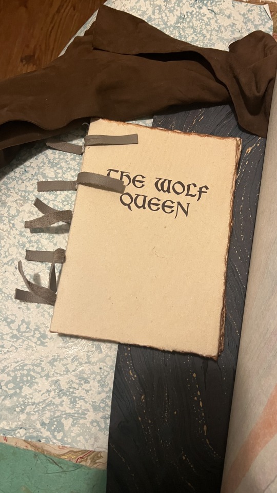
Binding: The Wolf Queen, from The Elder Scrolls V: Skyrim
This binding is a compilation of all 8 volumes of The Wolf Queen from Skyrim. Please consider reading my making-of process here!


Thank you for the commission!
Process: Part 1 | Part 2 | Final Results
243 notes
·
View notes
Text
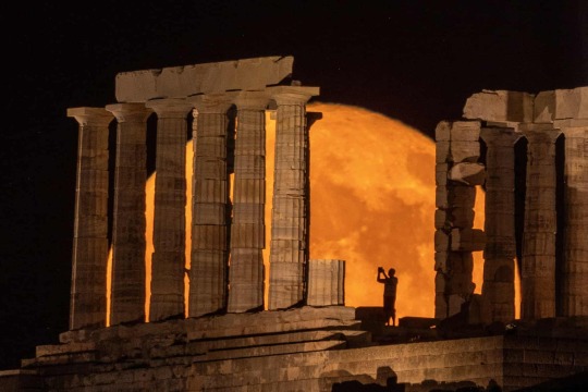
The Temple of Poseidon near Athens, Greece, in front of the buck supermoon
Photograph: Alkis Konstantinidis/Reuters
194 notes
·
View notes
Text

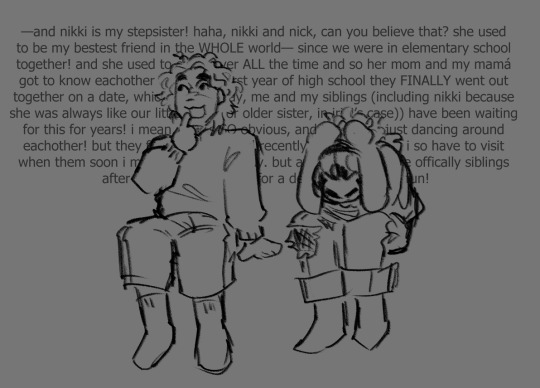
i did in fact make another aftg oc. i have my hater now i need a lover. + alki w my other aftg oc, nick :)
#my art#aftg#all for the game#ocs#nicolas hakim#alkiviadis megalos#culinary student AND exy player alki you are insane forever and ever#I PROMISE ILL GET BACK TO NORMAL AFTG POSTING …… i just have brainrot#tsc come to me so i can drool over jeremy already
126 notes
·
View notes
Note
Can you draw Gillion hissing at a cat? I think he would having hissing competitions to see who's the loudest.
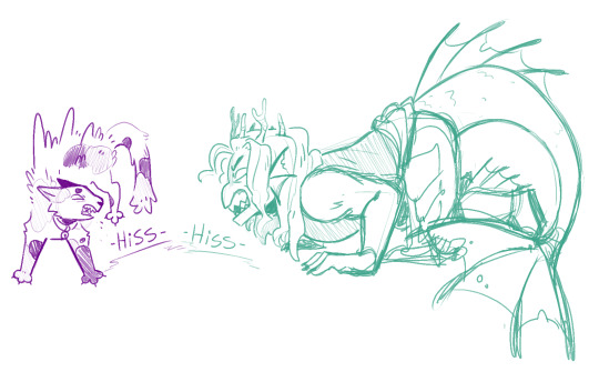
As someone who’s recently finished the tournament arc and watched Gill have beef with Alky I agree with this. Any cat Gill sees and it’s on sight man
#miskipz draws#asks#jrwi#jrwi show#jrwi fanart#jrwi riptide#gillion tidestrider#jrwi alky#okay but fr fr that gill pose tho?#gives myself a high five a little aha
193 notes
·
View notes
Text

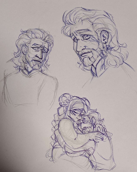
I haven't figured out how to draw him yet but this is a PSA.
in this household we respect Gale and anyone who can sympathise with astarion but doesn't extend said sympathy to gale (or lae'zel for that matter) WILL get dropkicked into avernus.
also bonus live reaction of when Al- I mean the guardian showed up not in armor

103 notes
·
View notes
Text

Some traditional art I drew of Alki with alcohol markers over the last few days!
#pmd#pokemon#pokemon mystery dungeon#pkmn#mada's art#pmd ocs#jigglypuff#oc: alki#traditional art#markers
12 notes
·
View notes
Photo

Did this a few months ago and forgot to post it! Some Alkibiades + Alexios from Assassin’s Creed Odyssey. Obsessed with them 🍆
#alkibiades#alexios#Assassin's Creed#assassin's creed odyssey#ac odyssey#it's heh but I'm just glad to be posting some art you know#the way I'm obsessed with this game and Alki#my art#nekrosmos art
181 notes
·
View notes
Text

Alki Point Lighthouse, Seattle, 2004.
58 notes
·
View notes
Text

Darcy doesn't seem too happy about all this… but then again, Piper doesn't seem too happy with her either.
Next Page Expected - 9/29/24
#mada's comic#pmd webcomic#pmd: apw#a precarious world#pokemon mystery dungeon#pokemon#pmd comic#apw comic#pmd#mada's art#oc: darcy#oc: piper#oc: alki#skitty#jigglypuff#fennekin
13 notes
·
View notes
Text

Alkis Ghinis — Leda and Zeus (Morphological References II) oil on canvas, 1975.
156 notes
·
View notes
Note

(Hello, ally!!)

Awah- HI DIAONA!! ;v;
33 notes
·
View notes
Text
Bookbinding Process (1/2): The Wolf Queen, from The Elder Scrolls V: Skyrim
I have a very exciting comission— I’m binding The Wolf Queen, an in-game novel from The Elder Scrolls V: Skyrim. I’ve never played the game, but my client told me they enjoy collecting and reading the books in the game. According to the Elder Scrolls wiki, there are apparently 820 of them! I’m binding the one of the longer stories, which is actually broken up into 8 volumes.
In researching, it seems that the volumes seem to take on completely different binding styles, but we agreed on the style shown here. We also decided to condense these volumes into 1 book— the entire story is only about 12k words, and while the handwritten large text works well for reading the story on a small in-game window on your monitor, it’s not really practical for a physical book. That, and even if I were to print these true to size for the game, each volume would still be about 40 pages, which only equates to 10 sheets of folded paper, so it wouldn’t make for a very robust collection on the shelf.
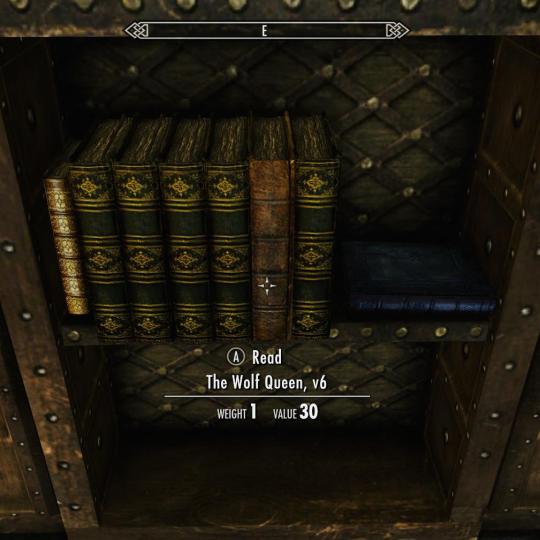

You can see that these books in this game are actually quite weathered, and it seems like all the paper is unevenly torn. If we were to equate Skyrim’s time period with our own based on technology, it’s likely these pages would have been parchment. The in-game textures definitely support this, even for the bindings that seem to be a few centuries ahead of their time.
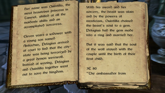
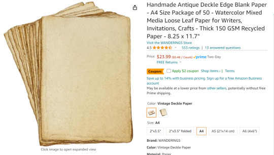
We agreed that antiqued cotton paper would be a suitable alternative, as enough parchment for this project would run a couple thousand dollars as-is, and I don’t believe I have the equipment necessary to print on it. I needed something with a quick turnaround for this project, so I went with this paper in the ‘Vintage Deckle’ finish in the A4 size. According to one review, it’s also short-grained, so it’s actually ideal for bookbinding.
Typesetting
I’m using Adobe InDesign to typeset this, but it can also be done with Word and other alternatives.
Here’s a guide by ArmoredSuperHeavy on tumblr.

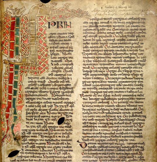
I think Bethesda owns the font used in the Elder Scrolls games, but there is a dupe of it on dafont.com called Cyrodiil. However, it definitely feels and reads more as a modern font; it was designed with readability after all. I’m definitely going for something that feels like a Celtic manuscript, based both on the decorative Celtic knot tooling, and the Gaelic look of the font. I eventually found Kelmscott, which carries the same Gaelic characteristics as Cyrodiil, and is still relatively easy to read, but feels more calligraphic.


I also downloaded Medieval Victoriana for the decorative first letters of each chapter.

To typeset the text, I followed a tutorial article by Grace Fussell and Adobe’s guide for creating book files.
I wanted the text to look dense and almost glyphic, as many old medieval manuscripts do, while still being easy enough to read. I played around with the paragraph tools and eventually settled on this layout. While certainly not all manuscripts have multiple columns, I want this typesetting to really break the boundaries seen in most modern prints of books, so I decided on this two-column format. Some manuscripts keep the text frame smaller and in the center of the page, much like you see in later centuries when the printing area was restricted by a press, but once again, I want to emphasize the look of ‘handwritten’ manuscript, so I made sure to use wide margins.
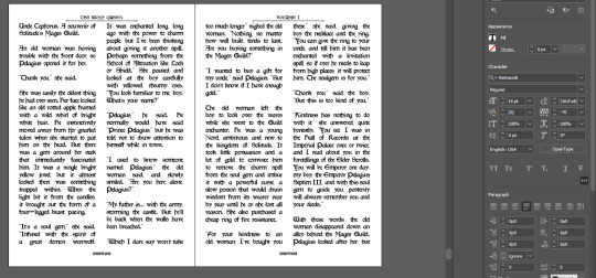
Some other fun details I added were glyphs at the beginning of each chapter, and surrounding the page numbers.
I exported the file for print with InDesign’s ‘Print Booklet’ feature, with the 2-up perfect bound with a signature size of 8 (2 pieces of paper/4 spreads/8 text pages).
Text Block
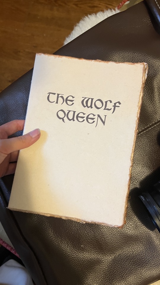
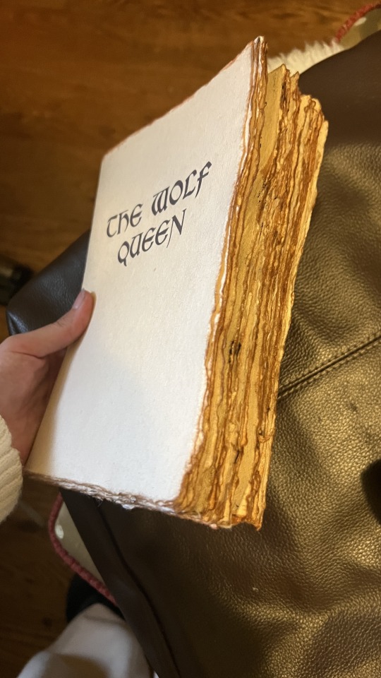
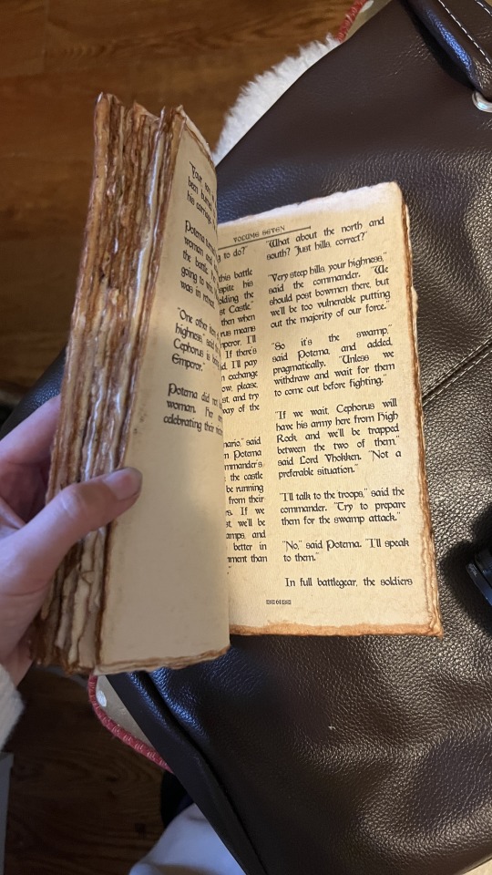
Here’s the printed and folded signatures! I’m really pleased with how these came out— it has the exact weathered look I was trying to emulate from in-game. As an added bonus, since the source material wasn’t particularly long, the thickness of the paper (150gsm) gave the text block a good amount of volume.
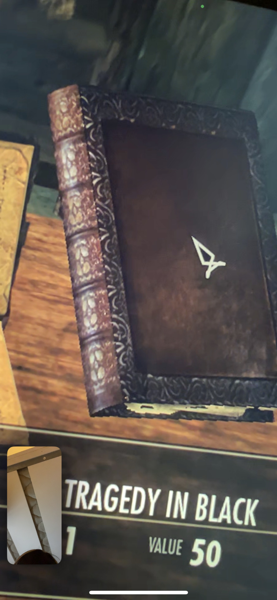

Out of lack of good online reference, my client ended up sending me photos of the book in-game. I was excited to realize this book seems to be bound on cords or leather straps— kind of difficult to tell from the model. We decided to go with a slit leather strap.

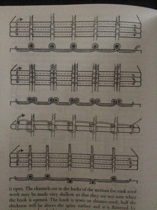
I couldn’t find a great reference image of the stitch for this, but I used the same technique of punching and sewing my signatures as this double cord instructional from The Thames and Hudson Manual of Book Binding.


Endpaper
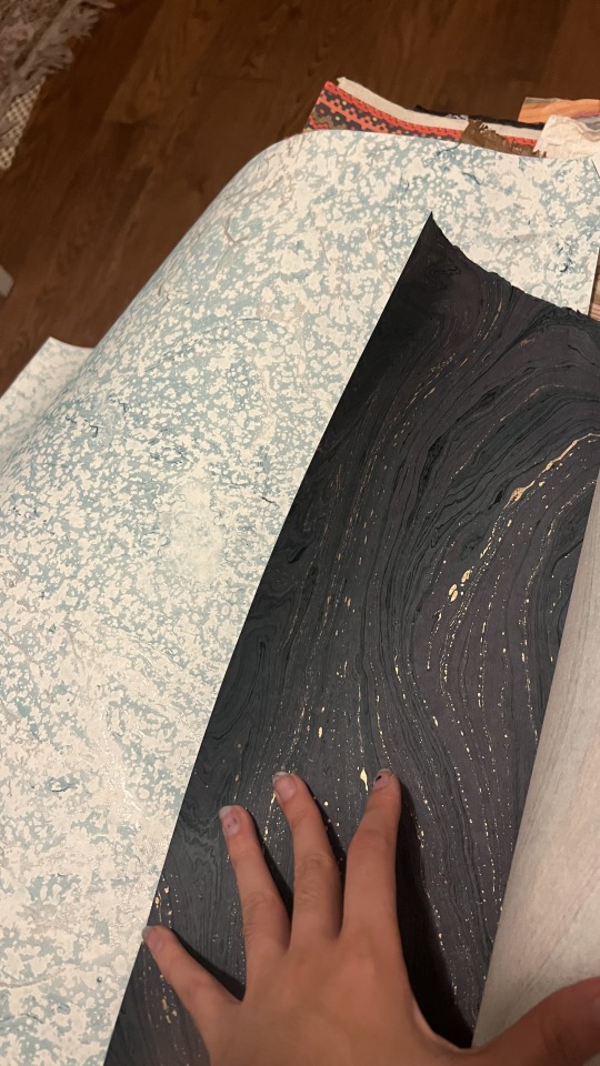
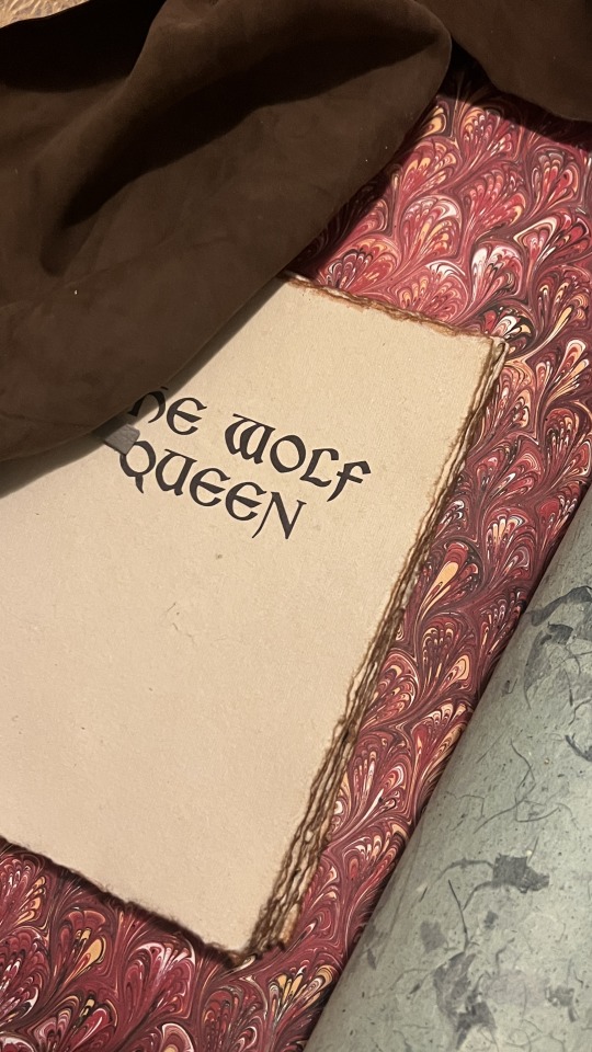
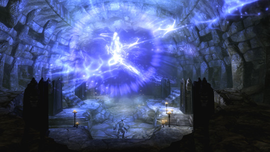
I definitely wanted to go for a more traditional endpaper, so I looked at what I had in my stash of marbled paper. I was initially drawn to this Renato Crepaldi peackock marble I got from Hollander’s, which has a beautiful red that screams “medieval” to me, but Skyrim is a cold place, so I was also drawn to go for this blizzard-esque marble. Though, I ultimately decided on this dark blue/indigo paper I got from the Paper Source.

I went for the indigo because the protagonist of this novel I’m binding, Potema Septim, the Wolf Queen herself, is associated with the color purple. Since the goal of this binding was to recreate an in-game item as it would be in-game, a bookbinder in Skyrim would also most likely want to make design choices reflecting the contents of this specific book. Or maybe they’d be illiterate and just go for the red. Either way, my client also liked the dark indigo, so that’s what we went with.
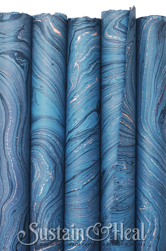
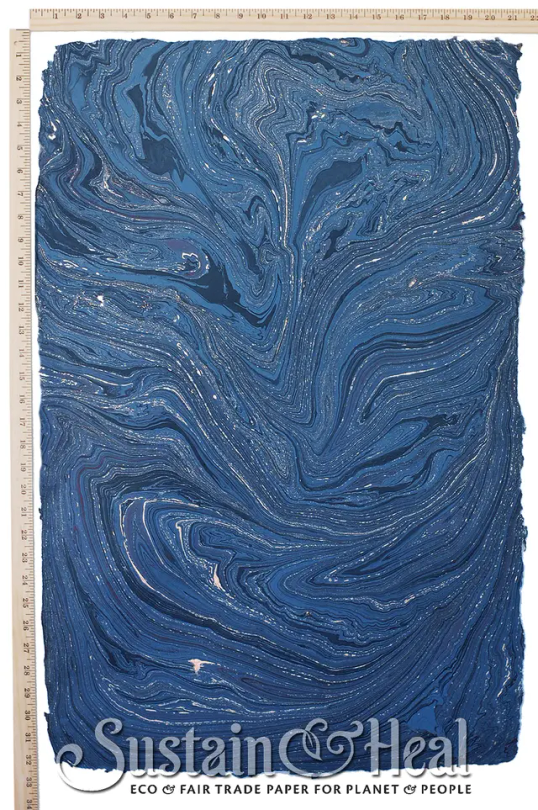
This endpaper is the cover weight of De Milo Design’s line of paper called Sustain & Heal. It’s fair trade, handmade in Bangladesh, from jute fibers.
It also has deckled edges, so I made sure to align my cuts to use that, and I tore the rest by hand to keep the natural edges consistent. This is a bit of an unconventional aesthetic choice, but it stemmed from that it’d be odd if the fly leafs were straight cut with the rest of the text block so extremely deckled.
Headbands
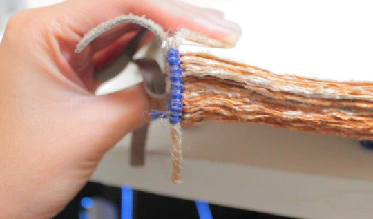

Keeping with the purple/indigo/blue theme, I made two-colored headbands around jute cord with DCM embroidery floss in colors 31 and 796. I basically used the technique outlined here. In retrospect though I’d recommend doing a big double endband or something bulky with this paper, since the deckled edges tend to push the endband back towards the spine and hide it.
Please continue reading here!
Process: Part 1 | Part 2 | Final Result
20 notes
·
View notes
Text
WEAKNESSES: WINE
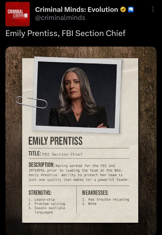
169 notes
·
View notes
Text

Lush is a person who drinks alcohol habitually or excessively; a drunkard. ⠀ Example: Tom is the biggest lush I've ever seen - he always has a drink in his hand. ⠀ Example: You'll see her sitting at the bar all day. She's a real lush. ⠀ Origin: The word "lush" was a slang for "liquor" (archaic since around 1920). ⠀ Learn slang in our app - https://onelink.to/ewf6kr
#lush#alkie#alcoholic#slang words#slang terms#english slang#slang#english#learn english#englishslang#english language#esl#toefl#efl#toeic
8 notes
·
View notes