#adding an image id later
Text
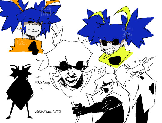
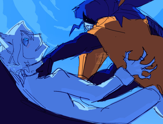
Wanna develop scarab more but she started off as just a fun akumatized ladybug design so I’m working backwards here…
#my posts#fanart#mlb#miraculous ladybug#mlb fanart#digital art#miraculous fanart#digital fanart#described in alt text#akumatized ladybug#akumatized!ladybug#chat blanc#i need to watch the chat blanc episode to understand him more#I think scarab would hate him tho#digital illustration#sketch page#sketches#Sorry for the lack of image id’s on my latest posts#will be adding them later
82 notes
·
View notes
Text


After a surprisingly long wait: the refs!
Additionally (since it starts today and it's what these references were made for) here's their ArtFight profile:
Only one more month of the hiatus, I'll see you all soon!
#image ids will be added later when i have more time! sorry :(#and also i am finishing up that 6 cats challenge. do not worry!#announcements#not story#artfight#warrior cats#warriors#clangen#ns: snowymoon#ns: dreamkit#ns: timberrose#db: wallabysun
41 notes
·
View notes
Text
Phil replied to Tubbo on twitter!

[Image ID:
A cropped screenshot of a tweet by Tubbo @/TubboTWO with a reply by Ph1LzA @/Ph1LzA.
Tubbo’s tweet reads “this was last weeks gang gonna drop this weeks gang in an hour ish”. Attached is a selfie of Tubbo with Freddy Badlinu, Billzo, Jack Manifold and Philza in their competitive cooking stream set-up.
Phil’s reply reads “I still can't believe what we made was edible lol”.
End ID]
142 notes
·
View notes
Text


today i left for alola
im really, really tired so all you get is these pictures of farelos cheering me up before the big trip
good night
#gay rambles#calling these my alolan diaries#alola diary#lol#pokemon#unreality#farelos the eevee#sorry for the lack of image id i cant manage it right now ill try later#edit added image id
15 notes
·
View notes
Text
ik i need to pick and chose my battles but like. what the fuck
#chirping#i feel Bad so i'm not gonna reach out rn#but like. someone just used image descriptions as a way to like. make a joke????#like i was looking for and id right#i had saved the post a while back to look thru the notes later#find one pretty quickly#it looks normal- maybe made by someone new just bc of the formatting#it's just. it's describing something that isn't present in the post at all???? like wtf????#like it was describing like a meme template. instead of just making and adding a meme this person completely misled anyone using a screen -#- reader. like what the fuck????#i saved the link and i'm gonna send an ask later#even if you don't have IDs on ur blog u are still making it harder for people who Do. ugh.#godddd i wanna deactivate. get a fresh start. but i won't. yayyyy#delete later
3 notes
·
View notes
Text

great line up on the dash tonite thanks yall
2 notes
·
View notes
Note
HI HELLO do you remember when you told me to read romantic comedy. well. i just finished romantic comedy and oooouaaaaaahhssssssffssjjhvrrbbbfs i am very emotional right now. hajime … i am holding hajime and all of the rabits gently …uwaaaaa
YEAH..... romantic comedy......... yeah............ its sooooo much, so much happens in it on
ra*bits good children theme is something that can be so personal actually people pleasers make some noise (but not too loudly just in case)
#extremely well timed ask i saw it right as i was opening a tab for human comedy#but yeah........ hajime's struggles and learning to speak up for himself and be selfish#i could go on abt this for hoursss#i think it was so interesting that they added the parallel w kaoru's bad boy image#and also. in the end ra*bits Did join rhylin some months later so im hmmmm#it's also worth comparing this story to hajime fs1 idol story id say#since he Chose to wear a skirt then#its also so nice to me how much nazuna values communication since that was what valkyrie lacked...................#aaaand yeah. enstars stories about growing up huh#enstars#direct0rhutao#preguntas
5 notes
·
View notes
Text
new wormhole ive been going through recently: looking up local historical sites on wikipedia and the national archives catalog!! so facsinating!!
#some of them haven't been updated in like decades#and the buildings have probably been taken down or are just gone#or roads are just inaccessible now#like someof these pics are the last pieces of evidence of their existence!!#isn't the internet so cool!!#i wish i could share the stuff ive found but id rather not dox myself#history#usa#anyways i saw this one room that looked so fucking creepy like it was an old quaker house#BRO THE VIBES WERE AWFUL#like there was a single fucking lightbulb in there that was added later on (maybe 1910s?)#AND YET THE PICTURE WAS SO DARK HELP#and it's the only image of the interior of the house#to ever exist#AND IM PRETTY SURE THE HOUSE IS GONE???#like wow the image of it makes it look so fucking scary like im sorry I HATE THE VIBES :sob
0 notes
Text


Went walking on the flood wall and down as close as we could get to the river the other day. Muddy n rainin.. also the fog :] you cannot tell but the last picture is of the river (Ohio)
#took a while to type out all the image ids#but i really wanted to do it :]#barking#(thats the me talking tag.. but adding it so i can come back to this later easier)
1 note
·
View note
Text
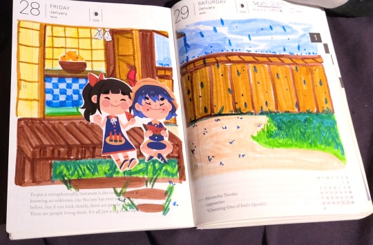
You ever had a diary? I think I always liked the idea of having a diary, journal, or burn book, something that just gives a place for freedom of thought and reflection. But I could never actually find a way that felt good to me to do that. What if I just don’t have anything to write about? What if I have too much to write about? And at that what should I write about to being with, just my feelings or what happened in the day? It was too much for me when I was growing up to fell comfortable doing, especially when I know that I like to take time to make my thoughts come to fruition. But in the last five years I’ve enjoyed it more and come to the conclusion that it didn’t actually matter that I had no thoughts in particular, but that I took to the page when I did. That I had somewhere to personally discuss my interests or show them. Plus as someone who like art tools, I feel theres something to be valued in those too. So I wanna talk about some of the tools I use and what I usually put into my journals, picture references and some of the artists I buy stickers from (but no personal stuff like full entries or personal pictures)!


My journal of choice: Hobonichi Techo Cousin, A5 (5.8"× 8.3"× 0.7")
Hobonichi is probably the most popular choice due to it’s quality and variety in size, I myself have used two different sizes in the past. The Techo Classic and Cousin. I eneded up preferring the options that the Cousin provides being a bigger size and having several options for noting events on a day, etc. To see all the features of the cousin you can see it here: https://www.1101.com/store/techo/2016/planner/all_about/cousin/ What I really preferred was the size difference. The Techo classic wasn’t bad if I didn’t have a lot but it was a problem if I had a big event in my life I wanted to scrapbook or had a lot I wanted to talk about. You may say “What about the opposite then? What if nothing happened?” Well as an artist that leaves me with some more places to draw when I’d like to. Or a page for general scrapbooking. I can figure out more of what to do with a blank page, than a full page. Even then in the Cousin size I have had times I use both pages for a single day or thoughts. The river paper is also well fit for a lot of the pens and markers I use too, I never get leaks through the page and even if I can lightly see through the page it’s not harsh enough that it distracts of makes the new page hard to write or work on. It takes fairly well to tape too, Due to how thin it is though it can tear a bit easier if I’m not careful with my placement. It’s definitely in high demand and if you’re looking for a journal, planner or diary you’ll definitely see it recommended a lot.
For the coming Year I got some special accessories for it and decorated it in a specific way to make up for the fact that I couldn’t see the cover this time around. If you’re someone who wants to have a decorated cover, inner pages, or back cover there’s a lot of accessories made for them as well. The current clear cover I use is actually one I got on Etsy because of it’s affordability and the size. For this next year though I’ve got a special cover from Hobo’s collab with One Piece as well as a pencil Board! I’ll show what the cover looks like, how it fits and such too just to show what I mean about decorating it too.

So both here have covers, my current has a jelly cover so that I can see the stickers, the next year’s has the one piece fabic cover. For this year I decorated the front cover very lightly as I hadn’t known I was gonna do and ended up adding stickers a bit half-planned, but the back is very decorated with purpose! I had gotten some stickers of one of my favorite manga and other various deco stickers, so made something in a vibe that I liked together. Because I did this directly on the cover I wanted to be sure the jelly cover was thick still.


I don’t have anything on the cover of next year’s for this reason, It’s a non-transparent cover that tucks around the cover page like a book sleeve and can’t be easily taken off, but I have decorated the first inner page to make up for that, personally. It allows me to have a bit of a ease into using it for any personal usage but also allows me to be a bit non-precious with it. This is something I learned with sketchbooks, where the easeiet thing to do is draw something or just throw down a rough work on the first page so that you don’t try to hold the sketchbook to too high of a standard to the point you don’t ever use it. So I used the same logic and busted out my washi tape to cover the first few pages and give myself that little bit of freedom with the rest of it. Speaking of Washi, let’s go over some of the material I’ve used in my journal for a variety of things and some of the washi/sticker groups I’ve got stuff from!

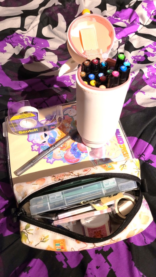
Basics (Pens, Pencils, Erasers)
Overall I’m pretty basic with my usual pens, I use Bic standard ball point. I have one in Black and Blue, and usually keep the black one in my pencil case. If I am feeling more colorful I have some One Piece gel pens that I use (I seem obsessed with One Piece but it’s purely coincidence here I promise). Because I draw and such, I naturally have a set of art pencils that I also use in the journal on occasion. It’s not very often but they’re still handy to have on hand. The pencil set also came with an eraser; Faber Castell’s dust-free vinyl material eraser.
Markers, Faber Castell, 25 Pack

The Faber Castell marker pack is one I’ve had for about 10 years now, It’s not something I get out frequently but even still it’s surprising none of the markers haven’t dried out or lot of saturation. These markers I feel work especially well on Hobonichi’s river paper, where theres no bleed and the colors are still really vivid. The downside to that is I frequently find that when i use them on standard sketchbook paper they absorb into the paper really fast, which is nice, but on the river paper they set a little slower. I believe it has something to with the way they don’t bleed through, but I’m not sure. It’s not a problem if I let it dry for a minute but if I make something more involved because I want to dress it up I have to let larger portions of the color sit for a minute so I don’t smudge it on my hand. Usually too I use it in combo with some stickers I have. Usually as well I use it to fill double pages that I just didn’t get to or to mark general events in a busy two-day schedule. Likewise with stickers I tend to use them in a similar way where I use them to fill a larger portion of the page first or compose the major portions of it before writing anything down. It lets me be sure that I’ll have enough room for little thoughts but also the art or such I place down.


Sticky Notes, Washis and Stickers
For These I usually get my washis, stickers and sticky note tabs from fanzines. Previously I got the Demon Slayer Planner, Persona 5 Planners and other various fan projects that usually include sticker sheets, stationary etc. This year as well I’ve joined several “Sticker Clubs” at the end of this year via patreon. Currently I’m in the patreons for: Boxerbun’s Fight Club, Bryson McBee, Janet Sung, Mogumu, Ocean Club and previously Trungle’s. Not many of them are Washi based, most of my current washis are from fanzines I mentioned, except 1 from uchuu summer, which I received more recently. A lot of Washi tough tend not to be sticky enough to totally tape down objects or papers, they’re better for decoration and stuff like that.


Camera / FujiFilm
I do supplement my journal or more diary style entries with actual photos! I find that I don’t take a lot of photos in my life but know that it can be important for personal confidence in a lot of ways. I was never really comfortable getting my picture taken or even being in pictures but because of that I also feel like I didn’t get to properly preserve an idea of what I look like. This is something I especially noted in the last two years because of the passing of several family members, who I have few pictures with because of my aversion to taking them. I don’t really want to lose that time together going forward so I have pushed myself by doing physical photo stuff and doing atleast one selfie every 3-4 months. To do this I decided a Fujimax (FujiFilm Instax) would be nice to have, they’re both convenient and the film is easy to use. Learning how to use it was nice and easy but also gave me a really nice and easy “gift” if I was hanging out with someone for a special occasion. I literally did a photo exchange with some of my friends who also had a Fujimax (by total coincidence) where we both took pictures together and then exchanged them. It was really nice and gave an extra sense of sentimental value for something so nice and simple.

The size of the photos too, in combination with my A5 makes for a good amount of space left to write, even with multiple pictures. Also due to the size of the pictures and the writing space at the bottom, I can tape them in in unique ways that let me open them like a pop-up book or write under them too! Similar to the Hobonichi, these cameras also have a lot of accessories that you can buy from both amazon and handcraft sites like etsy. Often as well I find that theres a lot of nice deco stickers made for this size, or around this size, due to kpop fan creations like Custom Photocards, Anime merch of arcylic cases and things of that nature that encourage adding your own stickers and then an acrylic or sleeve card to protect it.

And that is about it! I really eased out of using general planners for taking notes and stuff to actually doing all sorts of things that just are nice little stationary works for myself or journals about life. It’s like scrapbooking but a bit more personal or varied. It’s not necessarily about a specific event but about anything and everything from events, to notes, to drawings and thoughts. When I let myself be really free form with it I had a lot more fun overall and feel like I’ve let myself understand and reflect on things a bit more than before. It’s been really nice and is actually a part of what got me into the idea of doing more text blogging to begin with. While I don’t think I have some of the decorem or informative sides that most other blogs have, that was never really the goal. I have a lot of thoughts, so many that I decided to start making a place for them in my personal life, so to be able to share a little peek into that and get out all the little thoughts I have about the activity or even some of my general knowledge about it is fun.
#Hisui Notes#blogging#journal#journaling#hobonichi#bullet journal#notebooks#stationary#stickers#longpost#text post#i haven't added image descriptions/ID yet and will hopefully add them a bit later apologies!
1 note
·
View note
Text
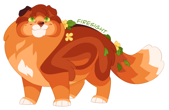
Star Firesight!

Bonus! Healer/Second Firesight:
And Outsider/Apprentice Rusty/Fire:

Design Notes:
I redesigned him again despite saying I would stop doing that... Prev design and old bio here.
He still has a lot of the same features as my previous design, i mostly just changed his pattern and coloring! I wanted him to be a rustier color!
I also changed his cheek fluff to be round, mostly just for an interesting face shape! his cheek fluff hangs a little more flat when he's older just to give him a more matured look (hes been thru some shit, his cheeks hath deflated)
Character Bio:
Star Firesight
(Fireheart/star)
Bisexual & Polyamorous; Trans Tom; he/him
Age as of 1st arc's beginning: 7 moons; 11 Hyrs
Age as of 1st arc's end: 2 cycles, 5 moons; ~26 Hyrs
Title meaning: -sight = this cat can spot things that others cannot; a cat with a close connection to the Stars; this healer receives many signs from the Stars; the healer may also be very good at spotting illnesses or injuries.
Outsider -> Healer -> Second -> Leader of Thunder Order
Mentor: Redtail (died) -> Spottedleaf
Mother: Nutmeg
Father: Jake
Sibling: Sapheart (Princess)
Half Siblings: Socks; Ruby: Tinyclaw
Mates: Sandstorm; Shriketail
Kits: Squirrelflight (sire: Sand); Leafpool (sire: Shrike); Foxleap (sire: Sand); Icecloud (sire: Shrike)
Grandkits: Star Hollyleaf; Falconstrike; Jaywing; Alderheart; Sparkfire
Other notable kin: Cloudtail (nephew); Snowshoe (nephew); Mistletoe (niece); Spiderleg (nephew); Shrew (nephew)
Notes:
Firesight has chronic pain (and mobility issues later in life):
Fire has the Scottish Fold breed's mutation which effects cartilage in the body, this causes his ears to fold, but it also causes chronic joint pain and can progress into swollen and inflexible joints.
For Fire, he is has the heterozygous version of this mutation, which means that his disability progresses more slowly, as a young cat he does experience some joint pain, with some days being worse than others. He is able to medicate with his own chronic pain herbal mix he created as a Healer. However as Fire grows older his joints will worsen, and by the time of his old age he will be unable to jump and some days is unable to walk.
He is able to still use his medication to aid him and is able to lead a happy life, but he is disabled and I didnt want to leave that out of his character! It's important to have disability rep (and spread awareness of the issues with the Scottish Fold breed) and I hope I serve him justice!
Character Summary:
In Progress (to be added later)
...
[Image 1 ID: a digital drawing of Star Firesight, an AU version of Firestar from Warrior Cats. He is standing with his left side showing and has a proud and happy expression with a smile. He is a short, chubby and round shaped rusty orange and red tabby tom with small folded ears and green eyes. his chest, underbelly and paws are all a lighter shade of orange, and he has a red stripe down his back as well as a single red swoop shaped stripe on his side. He has red to orange striping on his face and red freckles on his cheeks. His right ear is brownish-black, he also has a small black spot above his nose and a black stripe on his back. He has a white flame shaped spot on his chest, a white muzzle, white paws and a white tail tip. He wears yellow flowers and green leaves in his pelt and a simple crown rests on his forehead made up of a diamond shaped red stone and a small teardrop shaped white stone below it./End ID]
[Image 2 ID: a digital drawing of Firesight, an AU version of Fireheart from Warrior Cats. this drawing is almost the exact same as the first image, but in this he has no crown./End ID]
[Image 3 ID: a digital drawing of Fire, an AU version of Firepaw from Warrior Cats. this drawing is almost the exact same as the first image, but in this he has no crown, or flowers and leaves adorning his pelt. his face also seems younger and he has a brighter happy expression on his face with his mouth open in a smile like he is talking./End ID]
#millionth redesign lol#cryptidclaw's warriors au#rise of change#firesight#firestar#fireheart#firepaw#firestar design#fireheart design#firepaw design#firestar au#warrior cats au#warrior cats design#warrior cats#warriors
522 notes
·
View notes
Text
You added an "image description" to my post - now what? (FAQ)
[Plain text: "You added an 'image description' to my post - now what? (FAQ)". End PT.]
While I'm literally always willing to answer (good faith) questions about image descriptions, alt text, and online accessibility writ large, I also know lots of people have social anxiety about sending DMs, doing IDs "wrong," or just not knowing what IDs are for in the first place. Hence, this FAQ.
If I added an ID to your post and/or asked you to do so, and you're confused about any aspect of that, this is where to start. You can absolutely still reach out to me, I just thought I should consolidate as many answers as possible.
"What is an ID and why does it matter?"
IDs are a description of the content of an image, and can range from a transcript of a screenshot of text, to a description of a detailed piece of art. They should be in plain text, and placed on the line immediately following the image (unless it's alt text, more on those pros and cons later).
IDs are primarily for blind and low vision people who use screen readers to navigate the internet — but help others too, including lots of neurodivergent people. Check out this post (link) and the notes for more examples (dyslexics, migraine sufferers, people who can't interpret expressions, people with slow internet...)
IDs are important because without them, the Internet really sucks for people who need them. You probably don't realize how many undescribed images circulate on tumblr every day, with no way for a lot of disabled people to engage with those posts.
A blind person talks in more detail about all of this here (link).
"I reblogged your ID, is that enough?"
It's not that I don't appreciate it, but editing it into the root post and then reblogging that is much more impactful, for a variety of reasons. It means people who need IDs don't have to dig through the notes for them, it means that Tumblr can't glitch by failing to load the notes and make the ID functionally disappear, and it means all people who find the post in the tags or on your blog will be sharing the accessible version.
To explain visually, the best thing to do is something like this:

[ID: two mock-up Tumblr posts to illustrate adding an ID from the notes to the root post. A blog named "your-blog" posts an image of text reading "something cool you posted" with the caption "check out this cool image I made!" In the notes, the blog "image-describer" reblogs with an ID, which is highlighted. This version of the post is labeled: "original post, reblogged via ID writer."
The second version of the post is from "your-blog" again, where they've added the ID directly under the image, with the same caption below the ID. This version is labeled "updated root post, with ID copy-pasted. End ID.]
"My caption/commentary first, or ID first?"
Include the ID right under the image, followed by your caption or commentary. Unless you're putting your commentary before the image itself, a sighted person will see "image, commentary" in that order, so to ensure the post flows the same way, use the order "image, ID, commentary."
Commentary frequently assumes that the reader has seen the image, after all! A person might not even realize the image is described if the ID is buried too deep, because they might lose patience and skip the post. Or, to explain visually:

[ID: two mock-up example posts with an ID, one formatted well and one poorly. They both start with an image, which is just the text "screenshot of a tweet or something." The first post includes the ID immediately under the image. Below, it continues: "commentary blah blah blah get a load of this guy can you believe it." The post is labeled "Like this!" in green with a check mark.
The second post includes the commentary first, then the ID after the commentary. It's labeled: "Reads awkwardly, deprives screen reader users of immediate context" in red with an X. End ID.]
"I want to make a change to the ID, is that okay?"
Yep! If you want me to change it on my blog too (whether it's characters' pronouns, some typo, etc), just message me.
"What if someone else adds an ID to my post? Would they also be okay with me editing it into the original post like you are?"
Almost certainly! I can't speak for everyone, but I've literally never met an ID writer who wouldn't be okay with it — because we all have the shared goal of maximizing accessibility. If you're unsure or nervous, you can always include credit, but most people are even fine with going uncredited.
"I put your ID in the alt text, is that enough?"
I will never tell you not to use alt text when the alternative is an undescribed post, but I really strongly suggest putting it in both the alt text and the post. Some people who use screen readers prefer the flow of alt text, for good reason — but it's also poorly implemented on Tumblr, and it can glitch and disappear on reblogs, in drafts, or just apropos of nothing.
Moreover, when a low-vision person or anyone else wants to read the alt text directly, Tumblr's display options aren't great. (Unless you use XKit Rewritten's AccessKit, which I will always plug, but that's not an option for mobile users.) Long alt text often extends off the page and gets cut off. Tumblr used to use a terrible eye-straining purple background for it, and could always do that again with no warning. It's just not ideal.
Here's a visually impaired person talking more about the pros and cons (link).
It seems we're in need of a compromise, so what can you do? One option is to include the same alt text as image description (placing the ID directly under the image as always, because remember, flow for screen readers is important). I like to lead with "ID from alt," in order to clarify to screen reader users that they can skip the ID, and help differentiate it from the other option I'm about to describe. This should be self-explanatory, but here's an example of a post I did in this style (link).
Option two is to include a short description in the alt text, and a more detailed explanation in-post. This can let screen reader users instantly know that the post is described, and decide whether they're interested enough in it to stick with it, but it maintains an in-post description for others to benefit from too.
Example of me doing this in a post about IDs (link)
Example of my mutual describing art like this (link)
Also, it's the style I follow throughout this exact post! Take a look!
As usual, the ID is directly below the image in all these cases. This means screen readers move immediately from the alt text to the full description, and the post flows the same way it would for a sighted person.
If you're here because I wrote an ID for you, it might be easier for you to put it in the alt text and the post body identically, and that's perfectly fine! But if you're confident writing one short sentence for the alt text and including my ID in the body, you can always go for that too!
"Do I need to keep the brackets or the words 'image description/ID' in the alt text?"
Nope, no need. Brackets are purely for the visual distinction, and most screen readers preface alt text with something like "Image" that fulfills the same purpose as the "ID" label. It's not the end of the world if they're there, but it's redundant, so feel free to remove them.
"Can I put the ID under a read more? Or in small text?"
Please don't. Read mores are glitchy, and oftentimes have to be opened in a new tab. Accessibility that requires jumping through extra hoops isn't accessibility. And worse, if you change your URL or get deactivated, that read more link is usually just gone for good, and the post is undescribed again.
Meanwhile, small text, italics, colored text, and so on aren't good for low vision people or others who read the IDs directly — such as with increased font size — for whatever reason. If you want the ID to stand out visually even more than with brackets, an indent is fine as far as I know. And remember, IDs always go immediately below the image!
"Why do you sometimes copy italics and stuff as plain text? Is that a screen reader thing too?"
Same reason IDs shouldn't be in small text, italics, etc — because of sight readers with low vision. Font in weird styles, or in a fixed size regardless of device settings (to my knowledge, this includes headings) isn't very accessible, so I try to provide an accessible transcript.
Colored text is sometimes even inaccessible to sighted people using certain Tumblr themes! If Tumblr gave individual users the option to disable small text and colors on their dash, then I'd tell you to use them to your heart's content, but as it stands, they're not very accessible.
"Okay, I want to make my blog more accessible, but I don't feel capable of writing IDs on my own. How can I get help?"
Good news, this is my absolute favorite question! I strongly recommend the People's Accessibility Discord (invite link here, please let me know if it breaks).
It was created for this exact purpose of crowdsourcing IDs (and answering questions about them). I talk about it more in this post (link), where I also describe an alternative if you're like me and have massive social anxieties about Discord servers.
TL;DR: ask in the post if someone can add an image description, and edit it in once someone does! If you've read this far in the post, you're clearly an expert on how to do that.
In that post, I also recommend OnlineOCR (link) and Google Lens to extract text from images and save you typing if it's just a twitter thread or something. I would always spot check the text, adjust formatting, and remove superfluous characters, but it usually saves you lots of time when you might not normally have the energy to describe something.
Lastly, a lot of description blogs take requests! I don't unless I specify otherwise, because I easily run out of spoons, but @accessible-art is a great example of a blog that does this for non-fandom art, and there are lots of fandom blogs out there that do similar.
"I want to learn how to write image descriptions for my posts! Do you have any resources?"
This is my image description masterpost (link). I get a little scared about linking it because it's long, and a lot of the linked posts are long, and I don't want to overwhelm people — so please, start with the first few links to get the broad strokes, and then feel free to treat the rest like a index. That is, peruse it if you're looking for answers or advice on a specific topic!
While learning, keep in mind that different ID users want different things out of IDs, and that's okay. Some people, including many blind people, care quite a bit about color, but others don't, and that doesn't mean either is wrong about the types of IDs they prefer versus ones they find unnecessary.
Blind people have a massive range of lived experiences, and all the other people who benefit from IDs broaden that range even more. Generally, no one involved wants huge walls of text, but some people prefer super-minimal IDs, while others prefer a nice handful of (relevant) details. It's stuff like the difference between "Two characters hugging in a cozy-looking house," versus "Two characters hugging with their eyes closed, both smiling. Their house looks cozy and cluttered, with warm lighting."
Neither of those is objectively wrong, and there will be people who prefer either. Nor is it wrong for you, the ID writer, to make a subjective judgement, such as on the "cozy" mood. You don't want to misrepresent things, but subjectivity is usually unavoidable on some level, and therefore fine. Likewise, you don't want to let the ID get so long it's a slog to get through (here's an example of what NOT to do), but if you're describing a complicated image like some art might be, it's okay to add some details. Just start with the important stuff and general idea first.
The purpose of an image also matters. With memes, shorter is almost always better, and excessive detail is annoying (post with examples). You don't need in-depth detail to appreciate most quick jokes. But on the other hand, art is often shared for the purpose of appreciating the details. This post goes into detail about how context matters, and how longer IDs make sense for art sometimes. It puts it better than I could, so I really suggest reading it if this is something you're wondering about! Key word: not length, not brevity, but "relevancy."
In my opinion, IDs are easiest to learn by doing, but also by starting small. If you want to build up your "description muscles" and confidence by just transcribing tweets, that's perfectly fine — and also, the path that myself and a lot of people I know have followed.
Lastly: follow some described blogs! Check out how other people do it! Writing IDs is an art, and though it has a few hard do's and don't's we've gone over, we've also gone over how it's subjective. Everyone brings a slightly different style, with a different level of lengthiness, and it's great to learn from multiple sources. Here's one list of blogs like those (link)!
"Why would this matter if I know I don't have any blind people following me?"
Consider the cycle of inaccessibility (link). If no one ever accommodates blind people, then of course you're not going to see them on Tumblr, in fandom, or in whatever internet circles! And blind people aren't the only people who need image descriptions — again, consider this post, especially this addition (link).
Worst case scenario, even if you have no one who can benefit from IDs either following you, and no people who need IDs would follow you even if you included them, you're still helping people who do maintain accessible blogs to do so — and moreover, normalizing image descriptions in general.
"I don't think blind people would be in this fandom. I mean, there's a huge visual component!"
Described comics and webcomics exist. Audio descriptions for TV shows and movies exist. Disabled people who find creative ways to play video games exist. People who watched a playthrough of a video game by a person who happened to read out the dialogue, and give descriptive commentary on the action, also exist. People who lose their vision over time, or gain other reasons to rely on IDs over time, also exist.
102 notes
·
View notes
Note
Wow, you are making a gameeeee!!!
YEAHHHH I AM!! Learning Godot while writing the story stuff on the side. It's not gonna be anything large but just something to finally actually make a game instead of just dreaming about it.
We're doing a thing where you play as a cop and interrogate a person who's killed a lotta people, but with just the added thing of how in like a cyberpunk setting, 70 years in the future with mass surveillance, it would be incredibly hard to get away with multiple murders let alone one, so I think it might be cool to explore how they still got away with it for a long time. The idea is that Ima use the hitwoman chara I've been animating as the one being interrogated (attached images for a memory refresher). I think it's a nice fit because a hired assassin would probably take extra precautions to keep their anonymity, especially in the future.
It's mostly just the interrogation room and maybe a break room to discuss with coworkers so i think we wouldnt get overwhelmed by our ineptitude in 3d either since i can just make the interactions 2d animated
Been researching the fuck out of interrogation techniques and read a few books on how cops bait a confession out of people
Idk when id have anything to show since im still focusing on just normally animating but hopefully sooner than later ill make this real


56 notes
·
View notes
Text
the red means i love you . . .


ex!geto x f!reader
1.3k words.
warnings ! blood, crazy suguru, dubcon, size dif, fucking near a corpse, piv, mention of murder, slight overstim
notes ! id forgive him tbh

The plastic material of the grocery bags threatened to rip in your hands as you climbed the stairs to your apartment, the amount of food in them acting like 40 pound weights. A sigh of relief fell from your lips as you finally reached your front door. Quickly, you reached for your keys, the cold metal slipping through your fingers, clinking on the ground. “Fuck!” You set the bags down to pick up the keys, only to have a few things spill out… There’s no way your day could possibly get any worse, right?
Once you got inside and got everything put away, the faint sound of someone whimpering caught your attention. It could be the neighbor watching TV, but… it sounded so close. Your feet moved softly over the floors, cursing the landlord for deciding on wood when one of the boards creaks beneath your weight. “H-Hello…?” your head peaked around the doorway to your extra bedroom, an empty mess, covered in…blood?!
The sudden presence behind you didn’t go unnoticed, his delicate touch creeping up your side. “I’ve missed you, angel. Y’like my gift?” his hand gripped your chin, forcing you to stare at the corpse of the guy you just went out with, his mangled body burning into your retinas. “Thought I would show you who you really belong to…” His breath brushed against your ear, sending a sickly chill down your spine. His free hand moved to your stomach, skin on fire underneath his as he trailed it down lower, lower, lower.
His fingers slipped under the waistband of your shorts, gently tapping along the top of your underwear, threatening to sneak in. “Aw, c’mon. Don’t act like you didn’t miss me, baby…” he chuckled lowly, barely lifting the elastic, letting it snap back against your skin. You were frozen in his grip, too scared to move, to fight back. He was double your size on an average day and tonight? It felt like he towered over you. A pure beast ready to consume its prey. His footsteps echoed in your head as he brought you closer to the body, to the blood. A sadistic smirk snuck onto his face as he shoved you down face-first into the blood, almost growling at the sight of you covered in the crimson liquid, the way it stained your clothes. God, he needed you.
He was quick to pounce on you, tearing your shorts and panties down at the same time, most likely ripping some of the lace. He’ll pay for new ones later, don’t worry! The groan that left his lips at the sight of your cunt shouldn’t have made you soaked like it did. “See, you did miss me!” the blood sneaking into your mouth made you gag, the feeling on his thick fingers prodding at your hole pushed the urge to vomit away. His thumb drew lazy circles on your clit, the image of you already clenching around nothing while covered in blood giving him a sick sense of satisfaction. “Look at ‘er… seems like she missed me too, no?” his cruel laugh hung heavy in the thick air.
His middle finger dipped into your hole, the way your gummy walls squeezed around him so desperately inflated his ego beyond repair, his smirk morphing into something more sinister. Soon, he added another finger, thrusting them in and out of you painfully slow. You didn't want it- didn't want him. But you couldn’t deny how amazing it felt. He just knew your body perfectly, better than you ever could. He knew all the ways to make you tick, squirm, cum, all with a single glance. It was such a sick thing that he was the best possible guy for you, but also the absolute worst. He was horrible during your relationship, forbidding you from seeing friends, talking to any guys, having certain apps on your phone. It was beyond stupid.
Your moans were taunting you. The taste of the guy’s blood seeping into your mouth completely forgotten as Suguru attacked your cunt with his hand, stretching you open for him. The familiar coil twisted inside of you, your orgasm slowly sneaking up. Of course, he was able to tell. A soft whine escaped your lips when he pulled his fingers away, leaving you a soaked mess. “Please… Need it s’bad…” your voice sounded so desperate for him, like you needed him to live. Your neck ached from the position he forced you into, face down, ass in the air, presenting yourself to him.
He loved seeing you like this, all ready to take him. The sound of his belt coming off made you happier than you would ever admit, the clinking of the metal connecting with the floor made you cringe. He pulled his pants down, lightly tapping against your clit with the head of his dick, eliciting a sharp gasp from you. His hands gripped your hips as he rutted against you like a dog in heat, grunting as your juices covered him. ‘’Gonna feel so good, angel…”
Slowly, he inched his way inside, a string of curses falling out of his mouth, your tight heat pulling him in. your warmth enveloped him deliciously, like a sweet haven for him to fall apart in. Your brain felt so fuzzy from his slow thrusts. “Jus’ move faster, please!” you cried out, trying to push your hips back onto him.
His hand found its way to the back of your neck, fingers wrapping around it harshly. He shoved your farther into the pool of blood as his thrusts became sharper, rougher, seeming like they were meant to hurt you instead of pleasure you. The stinging feeling of his nails digging into your skin was more pleasurable than the way he bullied his cock into you, pure jealousy driving his actions.
“Don’t.. Tell.. Me.. What.. To.. Do..” Each word was punctuated with a sharp thrust, his hips drilling in and out of you like a machine. He pulled you up, his hand moving to press against the front of your throat as he rolled his hip up into you, the look of fear in your eye somehow making him even harder inside of you. His lips connected with yours in a harsh kiss, the vile taste of iron blending with your saliva, blood smearing onto his face. “‘M close.. S’close, Suguru!” your whines filled the room as his free hand moved down your stomach to your clit, rubbing messy circles along your clit. His eyes squeezed shut as he felt the way you clamped down around him when your orgasm hit, cunt refusing to let him go.
He shoved you down, quickly flipping you over onto your back and ripping the rest of your clothes off, throwing them in random directions. The way your face was flushed and the sweat on your forehead did things to him, his hands moving straight to your breasts while he pushed back into you. Your small sounds from the overstimulation only egged him on as he continued his rough pace. “So pretty f’me…” The red liquid covering your face made you appear as a piece of art in his eyes, a beautiful painting that deserves to be hung in every gallery. “All for me, yeah? My girl… you’re my girl.”
He smirked down at you, rolling his hips against yours, pace slowly starting to turn sloppy as his orgasm neared. “Don’t think I can last much longer, pretty.” Your cunt throbbed around him at that, pulling him in impossibly deeper. His hips slammed into you a few more times before he pulled out, finishing himself off on your stomach. There was a sadistic glint in his eyes as his cum mixed with the blood on your stomach, his fingers swirling in it, turning it into a gross mixture that he brought up to your mouth. Your lips instinctively wrapped around the digits, eyes squeezing shut as you tasted the nasty concoction.
He still sat in front of you, holding your spread legs around his waist as he panted, staring down at you. “My angel, my darling, my princess. You’ll always belong to me…”
#suguru smut#suguru dark content#jjk smut#jjk dark content#jujutsu kaisen smut#suguru geto smut#suguru geto x reader#jujutsu kaisen dark content
84 notes
·
View notes
Text
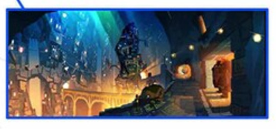
Decided to split up the artwork that turned up over the weekend in part as wanted to focus on THIS thing first:
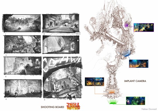
Brunch Studio has a now hidden page where they go into detail of what they did for Trollhunters (Both og film and TV) including creating the Trollmarket set design. Which is neat because some of Rémi Salmon's work was saved from whatever his website is doing! Another of the artists mentioned on there is Fabien Ouvrard. Through some tracking down I managed to uncover his instagram and later his artstation account. The first had some cropped work from Trollhunters whereas his artstation didn't... Until Saturday.
Being able to have a proper look at this thing managed to figure out it is in fact the shooting board for the below video:
Not entirely sure if it was part of a pitch, a spec or what just that it's incredibly cool.
If you really zoom into the Shooting Board you find this image which given the other artwork. Who painted it is currently a mystery.
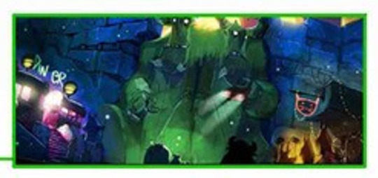
The matching image on the reel is a pretty easy one to ID, Geoffroy Thoorens dated back in 2014. The trolls beforehand are a bit more of a mystery though there is a suspicion who they might be which we'll come to shortly.
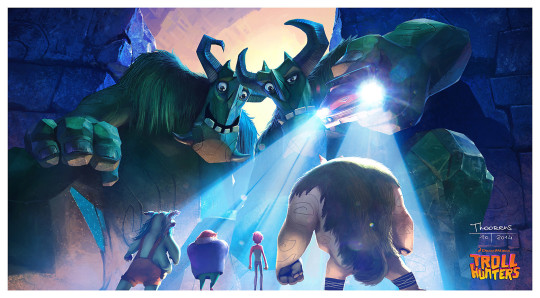
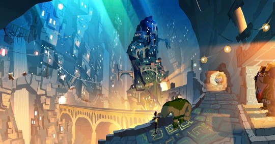
Next zoom in is this which the artbook confirms is Zibach.
Whereas the Reel is Thoorens again, also 2014. It's likely this is an overpaint of Alfonso Blaas' version because of the remarkable similarity.
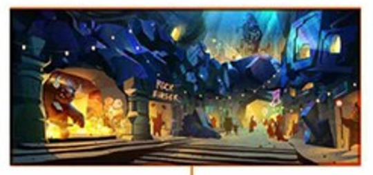
From the zoomed in stills again this one can absolutely confirm is Zibach because it was on tumblr with an instagram redirect.
Broken tumblr posts can't stop me:
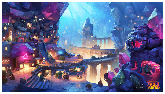
The next transition gets a bit more in the air seeing as it's a composite. From what I've been able to figure out:
Alfonso Blaas - Trolls, he has them all uploaded separately and they're painted over Headless Studios linework
Christopher Zibach - Heartstone
Geoffroy Thoorens likely had a hand in the rest as he does have those funky gem bridges on his artstation which have not really shown up elsewhere. It could be a mixture of him, Blaas, Ouvrard or even other artists too!
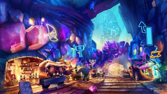
After that is a bit of a mystery. On the shooting board it's clearly Zibach so somebody must have made their own version of it. When that happened they added Blinky and Toby in the process.
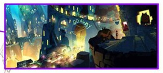
With nothing for the sweeping in to GO AWAY shot it like was based on Fabien's sketch using the above Zibach as a reference.
The Heartstone went through all sorts of weird and wonderful transitions though being in water with the posing did show in Zibach's shown below. According to the artbook and comparing to the reel it looks like that particular image was drawn by Dominique Lewis possibly with Thoorens's background, difficult to tell.
It's been incredibly neat seeing some brand new work (If small), sketches and an excuse to watch that video again.
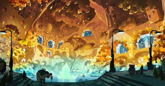
#Trollhunters#Tales of Arcadia#Vis dev: Christopher Zibach#Vis dev: Geoffroy Thoorens#Vis dev: Alfonso Blaas#Vis dev: Dominique Lewis#Heartstone Trollmarket
88 notes
·
View notes
Text
added facial palsy mouths, cleft lip, a second more severe ptosis option, esotropia, acne, several types of scars, and a port wine stain
no energy to ID an image right now but I'll upload examples later
52 notes
·
View notes
Last Seen Blogs
kumori94
Cloud

pasharx
Pasha bhayi 👑
nadaroule
*NadaRoule's Diary
*

bestintheworld10
Pipe Bombs from SM Rock

mcpesto
McPesto's Selections