#added my own visualisation of the color palettes!
Explore tagged Tumblr posts
Text
Lazy experimental sketches bc I need to get back into my art jam again, we will not talk about the lack of hands thx…. 😭
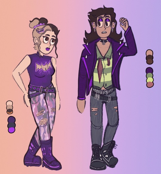
N e way fellow dtmg besties do y’all rmr that one episode where Billy turned evil bc of a singular new haircut … I’m happy that I let @fluffyselfships mod Kitty cook with their idea of the missed opportunity to give him a full on new look in itself 🫶 I’m honestly obsessed w the concepts given !! (Their sketches r under the cut) felt like drawing these two alive in this tho, I need to go n color my stuff more often !
They’re v skilled when it comes to creating outfits, both of these were designed by them, so here are the doodles that they drew which I worked with <333 I want to improve on drawing more expressive stuff tbh, It really does help radiate the energy of a character 💜
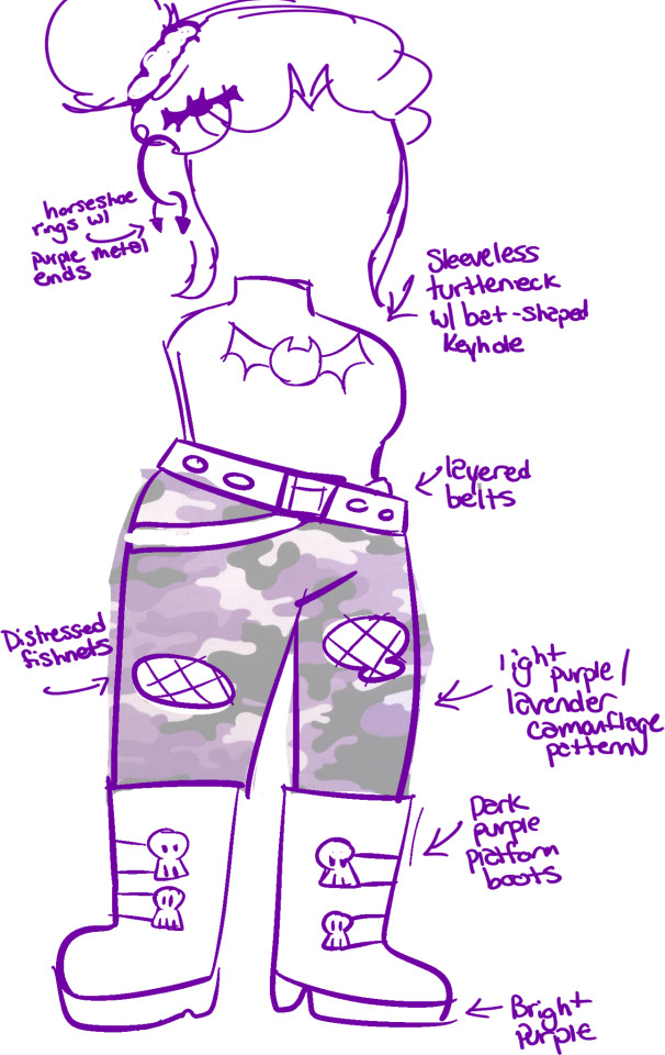

To be fr with y’all tho. Imagine the bombastic ego now that it’s become twice as big … ☠️ if u read this far congrats u get this art that I have a love/hate relationship with :]

#dtmg#i dont mind if this doesn’t get much reach bc truly idk whether I’m proud of this or nah ☠️#added my own visualisation of the color palettes!#methinks I would be kind of an enabler oopsies daisies#brainrot is so real
17 notes
·
View notes
Text
HOW TO DESIGN A CAFÉ
Since I was a child I have wanted to own a café. I would often visualise how I would make it. Right from the chairs and cuisine to the complimentary cookies I planned to serve with coffee, I had thought of every detail in my head!
I am partial to cafés the way I am partial to armchairs. Coffeehouses like armchairs are warm and cushy, and time flies when you are in one!
If you are about to actualize your dream of opening a coffee shop, read on for some really useful tips, tricks and advice that will help you, not just plan but also execute your café design smoothly.
1. Pick one thing that you feel passionate about
Whether it’s a cuisine that you enjoy making or eating, a theme that mesmerises you or if you are simply a coffee lover who wants to make delicious coffee for people, focusing on one attribute makes it fairly easy to define the others.
For example, if you feel strongly about Italian food, you can plan your food menu and decor around it. It will give you a great starting point! I’d recommend doing thorough market research to make sure that there is a lucrative market for your chosen cuisine in your city. No matter how much you fancy something, if there is no demand for it you are bound to fail.
You can also choose to open something classic, like a patisserie or a sandwich bar. If you are absolutely sure you want to open a coffee shop then you can plan a small food menu that includes accompaniments from your local cuisine while keeping the focus on different types of coffee.
It is always a good idea to keep a variety of food items that fall within your choice of cuisine, in the beginning because you will eventually find out what your customers love and come to your coffeehouse for. You will definitely be tweaking the menu as you come to realise what your best-sellers are!
2. Choose your decoration style wisely
It is easy to fall prey to trends, they look inviting and are easy to follow since they are everywhere but trends come and go. For example, Farmhouse Style and Shabby Chic are having a moment now but so was Industrial, a style people are now getting bored of, visually. Classic style of decoration never goes out of fashion but it can seem basic.
To keep the look balanced, I’d suggest furnishing your coffee shop with a theme that goes with your cuisine while considering your target customers. The theme does not have to be directly related to it, people often associate pizza with movies, so with Italian cuisine on the menu you could style your restaurant with the classic Hollywood theme!
There is no limit to decoration themes as there are plenty to choose from so weigh in your budget before you choose. A decorative style like Shabby Chic could be more expensive as compared to a simpler style like Modern. Size matters too. Smaller spaces can feel cramped if there is too much going on or there are a lot of items kept for ornamental purpose. It will also cut down on the sitting space. Some themes I personally like for cafés are Rustic, Scandinavian, Contemporary and Classic.
You cannot beat a Rustic style coffeehouse. Exposed bricks, wooden floor and solid wood furniture with a touch of color in the form of upholstery, Rustic style evokes nostalgia that creates the perfect coffee drinking atmosphere, whether you want to get creative or catch up with friends.
Scandinavian and contemporary are great no-nonsense decorating styles that you can’t go wrong with. Scandinavian style complements smaller spaces well as it is a clean and minimal look with the right amount of color. Splashes of bright color in this style will keep your space from looking boring without overwhelming it! You can also go for a mix of two themes such as Rustic and Classic.
3. Choose quality furniture that will last
Solid wood furniture is definitely more expensive than other kinds available but it looks classy and lasts a really long time. The elegance that good quality furniture creates cannot be matched by Chinese quality furniture.
Make sure your furniture designs complement your space and style of decoration. If you have chosen Rustic style you can go for classic furniture. Rustic finish on tables, chairs and stools with leather upholstery looks extremely chic. The warm color palette automatically creates a welcoming atmosphere for customers. Have you ever noticed why you always gravitate towards cafes styled in Rustic-Classic interiors? This is exactly why! The earthy colors draw you in.
To take it up a notch, you can get Chesterfield sofas and sofa chairs. Since people love to sit in coffee shops for long durations it is advisable to use comfortable chairs and sofas with cushioning and upholstery. No one wants to go to a cafe and come back with their backside hurting. Also, leather contrasts with the rustic look beautifully creating an appealing visual space. Wicker is another popular style these days and could be a great addition to your chairs and stools. Wicker is a good choice for outdoor furniture as well, if you have some outdoor sitting as a part of your cafe do consider it!
If you want something more fun that caters to a younger crowd, you can go for patterned upholstery. But stick to pastel or medium tones for Rustic style. Sofas and chair sofas are a must if your space is medium to large. People always choose them first. Small coffee shops can keep upholstered stools and chairs with simple designs. Large spaces can do a combination of styles such as bar stools, stools, chairs, sofas and matching sofa chairs (like in the image above). It makes the space more interesting and gives the customers more options to sit.
4. Make the space warm and welcoming
People often have their favourite coffee shops that they regularly go to. Most preferred coffeehouses are those that are friendly and hospitable. Small things can make a big difference and help you achieve this effortlessly.
Flowers, small potted plants or even candles on individual tables add a nice artsy touch. You can also keep some magazines and books for people to read. A lot of people come alone for coffee, especially if they want to work, reading a magazine would be a nice break for them. People who love to read adore places that house books and it also shows that you are thoughtful and are willing to take an extra step to make them happy. You can also keep a few board games for people who come in groups!
To store and display the books and games, you can get a sideboard or display unit. A high and narrow display unit will take less space and store more.
Another thing you can do for your customers is keeping indoor plants. Potted plants, plants hung in baskets suspended from the ceiling, on tables or on a separate buffet, the possibilities are endless! Research shows that nature can increase social interaction, reduce stress and enrich mental health! Adding plants to your cafe is an easy and environment friendly way to spread cheer and happiness in your coffee shop.
Lights play an important role too. Harsh lights can be blinding and make people uncomfortable whereas dim lights can cause inconvenience. I'd suggest designing your cafe in a way that brings maximum sunlight into it during the day. You can also use pretty lanterns and pendant lights too! Glass pendant lights with geometric shapes are really popular these days. Yellow light is warmer than white and hence recommended for coffee shops.
Something I’d strongly recommend is to do an informal feedback session before you officially open your cafe. A few trustworthy friends and family members is all it takes. Invite them over and take feedback on what could be done better. A good idea is to do this when you have some time left to make some changes. There will be certain things that you won’t be able to do anything about but it would be worth it if even one or two suggestions strike you as interesting and useful.
For more ideas and suggestions about creating your perfect coffee house write to me at [email protected] and to see custom made, handcrafted cafe furniture click here.
1 note
·
View note
Photo
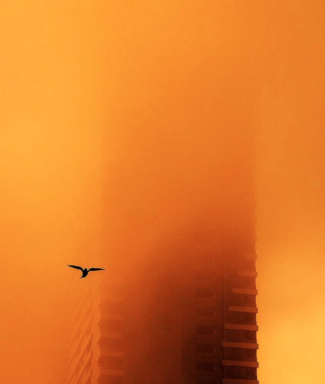
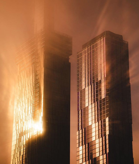
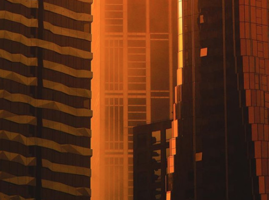
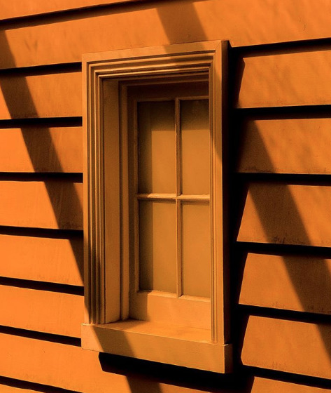
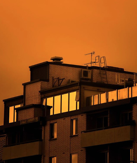
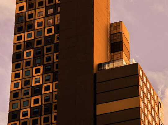
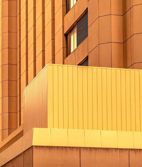
MAI Wonder of the World - Michael Wilson
Today we turn our gaze to Australian creative director & photographer, Michael Wilson, who shares some of his hot tips on how to become a harder worker, what it is about cityscapes that makes them feel so darn special, and we find out if he would be at the front or the back of the line if life outside of earth were a viable option.
Read on for our full #interview
Hi Mike, so you mentioned that you began taking photographs as a way of capturing locations while you were working as a TV commercial director & that you are completely self-taught. Could you share with us one of your earliest on the job work experiences?
Sure thing. So one of the things that I learned pretty early on is that the more prep you do the less nervous you are. Simply visiting locations multiple times in different lighting conditions, or looking at the scenes with and without a lens, and pre-visualising scenes by sketching and shooting test frames all helped me feel more confident and focussed come shoot day. On one of my first big jobs - think 45 person crew, multiple locations, months of post-production required - I’d prepared an extremely detailed, visual shot list with exact angles, lensing recommendations, performance cues etc. This level of prep not only gave the 15 clients on set confidence but also gave the crew a clear roadmap for each setup. It’s pretty standard stuff, I know, but every job deserves it. And from that I learned that when everyone knows where you’re heading it’s easier to get their support and trust. Further to that, when you have a plan and capture it, it opens up the opportunity to creatively explore other options.
How long did it take you to start gaining recognition as a creative director and as a photographer, and what do you believe has most helped set you apart?
When I first started out I was told that you can’t always ‘out-think’ people but you can ‘out-work’ them. It might be a boring and unpopular thing to say, but hard work is what helped me get noticed.
“ I figured that focus, perseverance, dedication and a little obsession would eventually pay off.”
I’m also my own harshest critic, so when people told me my work was good I’d go back to the drawing board and try to make it great. It sounds cliched I know, but it got me into a mindset that was constantly focussed on improving my work. I was also lucky enough to be surrounded by great people who were willing to share their collective wisdom. All I had to do was put my ego in my back pocket and be willing to listen and learn.
You live and work in Australia, but a lot of your cityscapes have a real universal likeness to them… What is it about these types of locations that particularly attracts you?
Oh thank you, that’s really kind of you to say. That’s exactly the feeling I’m trying to capture. The cinematographer Roger Deakins (Fargo, Blade Runner 2046), director David Fincher (Se7en, Gone Girl) and photographer Nadav Kander are all major influences on my work. They create scenes that evoke a feeling, an atmosphere, and ultimately a reaction. This is my/the ultimate goal and what attracts me to certain locations over others. I’m aiming to create images that have a cinematic quality to them, moments that are bedded in a world that have a universal connection and are not merely documentation. To do this I rest heavily on light, shadow, time of day, mist and fog, reflected sunlight and the structure and design of modern-day canyons in our cities.
Something that caught our attention recently on your Instagram account is your primary use of yellow, orange, and black color palettes… What has been drawing you to this particular color spectrum and how much of your work is photo manipulated?
This all started after I read a quote from Stanley Kubrick - and I paraphrase badly here - but apparently primary colours evoke primal moods. That notion resonated with me, after-all I’m less interested in documenting a building and more excited by my ability to evoke a mood. As I mentioned earlier, Roger Deakins has a major influence over my work. His use of silhouette, primary colours, and scenes drenched in colour and atmosphere is inspirational and the gold standard as far as I’m concerned. So with those colour cues in mind
“I developed a series based on the idea of ‘would you miss me when I’m gone?’ i.e. what if the places you pass by every day were about to disappear - hence the apocalyptic colour palette - would you look at them differently?”
So this particular spectrum was born out of the concept and designed to serve the storytelling. Truth be told, the more I worked with these warm tones the more I felt I was creating a distinct point of view. To bring these tones to the fore I start by shooting in warm light - most often dusk - and I adjust my in-camera white balance to as warm as I feel necessary. This usually takes care of those warmer tones. In terms of the use of black, dusky light generally delivers lots of deep shadows. Therefore, a large majority of my image creation is taken care of in-camera. If I get this right, then my time in Lightroom is minimal. In general, I spend no more than 10 minutes on a image. Most of it is taken up balancing the desire to see detail in shadows versus creating a slightly surreal world full of simple silhouettes. If you scroll through my Instagram feed you’ll see a variation of orange and yellow tones. This shows how each image is a response to the time of day it was shot, light values and atmospheric conditions. I do get a lot of questions asking if I ‘build’ the cityscapes in Photoshop, or add fog etc.
“Part of the challenge for me is working with the elements in front of me - the light, the city, the weather - and so adding elements in post-production takes that challenge away.”
In some ways I wish I could add more fog or rain or other atmospheric items - it’d save me having to shoot in bad weather - but I just don’t have that level of expertise.
Do you have a preference to digital over analog photography and why?
That’s such a tough question. On one hand I absolutely love shooting on film. It’s sharpened my technical skills, helped me shoot less but better images, taught me to slow down and really think about each frame. Further to that, shooting with film cameras has a certain ‘feel’ to it. I love the solidity, the mechanics and the weight of them.
“I tend to shoot my more personal stuff on film”
Rroad trips, portraits of friends and family, important moments in life, times that already have a certain nostalgia attached to them. And on the other hand, digital gives me certainty.
Name something weird or defining that only where you live has?
I’ve had the opportunity to live in London, Amsterdam, Auckland, Sydney, Adelaide and now Melbourne. All of which have pretty defining quirks. But as a photographer whose work relies heavily on the weather, Melbourne is easily the most dynamic I’ve experienced. It embodies the ‘four seasons in one day’ notion and is predictably unpredictable. And this is a good thing, for me at least. Anything that brings drama and atmosphere to my images is welcome.
Now for some quick questions for fun...
Who is your favorite family member and what’s so good about them?
I have two boys, so if I pick a favourite I’m sure that my life expectancy would be greatly reduced.
If they discovered life on another planet meaning that you could feasibly move there, would you be one of the first or one of the last to head over and check it out?
As much as I’d like to be first, I’m not so keen on being the canary down the mine.
What television series are you streaming right now?
I just finished the incredible Sharp Objects and the very tense second series of Ozark. So now I’m on the hunt for a dose of Nordic Noir.
To more Mike follow him on:
Instagram
Website
#photography#cityscapes#australia#melbourne#sydney#london#amsterdam#stanley kubrich#david fincher#roger deakins#nadav kander#orange#yellow#warm#color palete#stella atois#vodafone#cannes#maiwonderoftheworld#interview#friday#artistoftheday
14 notes
·
View notes
Text
Final Brand Style Guide Project
Inspiration
Using what we have learnt from the entire module, alas the final project provided us with an avenue to create a brand identity either for ourselves or for the CNM department. I chose to create a personal brand guide because I realised that I have never really thought of making something for and out of myself (literally), and while the entire month of ideation and creative process was definitely not easy (not an understatement), I am still thankful for such a wonderful opportunity to give my abilities a test run.
So before embarking on a personal brand, I had to perform research on my own self. Using guiding questions provided in the lectures and understanding the essentiality of performing critical reflections on oneself, I knew that I wanted to create something minimalist, professional and classy. Magazine layouts and editorial designs have always attracted me, and hence, in the first FP consultation I displayed some inspirations of vintage magazines and editorial typefaces. However, a part of me realised that this idea was something I desired, but it didn’t represent me as a whole. Taking some time off to reflect again, I made my final decision to anchor my brand based on something that I really loved: food -- and in particular, BREAKFAST. Now, I was ready to start planning for my brand guide; starting off with the most important elements -- the logo, color scheme and typography.
Logo
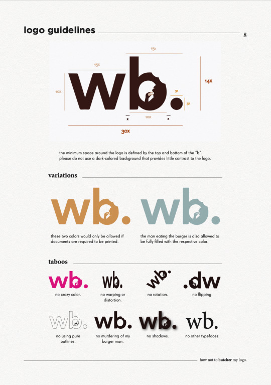
Incorporating the vibrant and light-hearted nature of food with the minimalist and professional attributes of an editorial theme was an extremely difficult task. Thanks to the feedback of my peers, as well as inspirations on logo designs, I decided to use this logo here to helm the brand guide.

Here, the typeface of my logo provides the professional outlook, and the bite marks and the man eating the burger in the letter “b” injects the more casual and slightly fun direction using the design concept of negative space. The full stop at the end was a creative decision I performed to tie the entire logo together.
There were feedbacks from my instructors that the man in the logo may be too small and hence become unnoticeable when downsized, and that the burger’s color could possibly take on that of the entire logo. Unfortunately, I decided to stay on with my original logo format as I felt that firstly, enlarging the man makes it too distracting in my opinion and I generally feel comfortable with the spatial relations between the man and the space inside of the “b”. Secondly, I chose to change the color of the burger primarily due to contrast and recognisability, and I felt that filling it with the same color as the entire logo would not make the “burger” itself obvious.
Color Scheme
Next, for my color palette, I was looking for an overall scheme that revolved around bread, eggs and tea (my most favourite components of breakfast). Hence, using these self-took images below, I composed my color scheme as shown below.
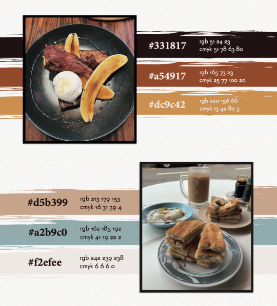
The colors mostly evoke the vibrant and palatable nature of food, with the only exception of the blue, which was a decision I made to include an accent color that could provide a touch of professional contrast to my overall color scheme.
Typography
Lastly, for my typography, I planned to use a sans-serif font as my character style, coupled with a serif font to provide a good contrast. As I was looking up Google for certain combinations suitable for magazine themes, I came across this pair that really caught my attention.

The article was right. Super Grotesk was the unique sans-serif typeface I needed to embody the dynamic spirit of my layout, accompanied by the serif typeface, Minion Pro, to support my characters with neat and outstanding paragraph headers or prominent quotes. Thereafter, I decided to employ Gotham as the strong title typeface to ground my pages together.
Now, with all my base elements, I was ready to embark on my creative process. After long hours of looking up inspiration from Pinterest and Behance, I embarked on a food magazine theme as the layout of my brand style guide.
Front Cover
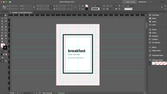
Performing a playful rendition of Time Magazine, I came up with the title “Time ...to eat” to introduce my brand guide. Using InDesign, I demarcated the margins of the magazine’s signature red borders using the Layout settings and drew out the borders using the Rectangle Tool and the Pathfinder function as shown in the screen shot below.

As my logo contained bite marks on it, I wanted to incorporate this similar design element on my cover page and hence, I decided to use donuts. Using the Quick Selection Tool on Photoshop, I traced out the donuts from the images I took, created a new layer, and exported this image as a PNG file. With this, I could attach these donuts unto my cover page without worrying about additional backgrounds.

Page 2
Inspired by a design I found online that held a photo frame with a simple quote, I decided to create one to introduce the specific theme of my brand guide. Borrowing the guide lines from InDesign, I created the base and content of the frame, and employed Drop Shadow function in the Effects panel on various elements, as seen in the screenshots below, to create a 3D effect to stimulate the frame hanging on a wall.


Words from the Editor
To formally introduce myself, and also inspired by magazine preface pages that usually feature the author/editor’s message, I also created a page to welcome readers in into what I am about to show them.
Resume
Naturally, I felt that the first thing I wanted to showcase was information about myself. Hence, the first collateral I presented was the resume. Using InDesign’s margins and guide lines, I created the various sections in a typical resume, but added my own touches, and employed the use of various “eaten donuts” to represent my various skill levels. These donuts were also used to demarcate the various pointers under my job responsibilities, to replace the typical “bullet points”. The final product will be showcased at the last segment of this blog.
Logo Ideation Process
While thinking of how to best present my logo, I was inspired by a senior’s work that featured the step-by-step logo creation process. I borrowed this idea and suddenly had this thought of using noodle strands to help the audience visualise the order of my logo ideation. These noodle strands and the fork was vectorised using Illustrator so as to efficiently remove their backgrounds and to be easily embedded unto InDesign like a clipart.

Business Card
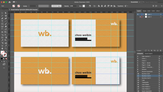
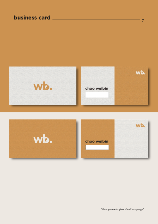
For the name cards, I wanted to create a light and dark version, and maintain a professional and minimalist outlook. Firstly, I made use of the Rectangle Tool on Illustrator to create the bases of the cards. While I shortlisted a yellow and blue background this collateral, many of my peers found that the yellow would best represent the vibrancy of the brand and hence, I decided to employ this color.
For the front, while inserting my logo, I found that the contrasting burger color looked very uncomfortable when downsized. Hence, I made the decision to fill the logo with a full color just for this purpose. For the back, I only wanted to retain minimal information being my name, phone number, email, and linkedin account. But after finding that it might seem a little too plain, I sought to make use of design principles of asymmetrical balance to provide a more wholistic design.
In order to create the paper-like feel for my name cards, I applied a Texturised effect unto the name cards, and dropped a small shadow to create contrast between the product and the background. I borrowed the guide lines on Illustrator to standardise the dimensions and locations of each element.
FINAL BRAND STYLE GUIDE
With that, here is my final and end product. Primarily, these pages were designed and collated on InDesign. As I wanted to stimulate a magazine-feel as much as possible, I created an A4-sized rectangle background on Illustrator, applied the Texturised filter, and pasted them on relevant pages. Other than the two donuts seen in the front and back cover that were edited using Photoshop, the remaining pictorial elements were vectorised using Illustrator.
Do observe that for the second half of the brand guide, I inserted a few quotes below the pages as my form of small interactions with the readers. However, bearing in mind also that I could not fulfil similar formatting with the “resume” section as the entire resume took up a large margin of the page, do kindly note that the titling and quote is placed in a slightly different fashion as compared to the rest.

(cover page - comments were made from my final presentation to include my logo at the front, hence I placed it below and structured it to suit the theme of a magazine front cover. I also received feedback that the background was too heavy in contrast, hence, I decided to change it to a color from my color scheme.)
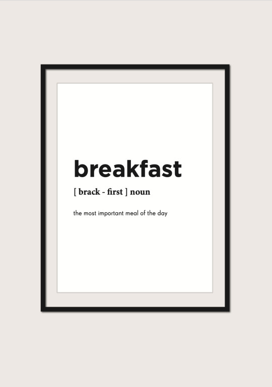

(food image - this image of breakfast was used to complement the previous page with the quote on breakfast)
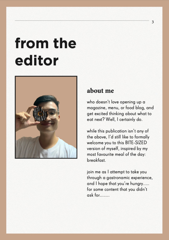

(food image - another breakfast food image to accompany and support the previous page that introduces my message to the readers)

(resume - vectorised donuts were used here to indicate my various skill levels, and as bullet points to my job descriptions. I received feedback from my final presentation to bold the institutions and my company and role, as well as to enlarge the relevant dates, which I rectified in this draft above.)

(logo - vectorised fork and pasta strands were used here to guide the audience’s vision to my logo ideation process, with the final logo presented the biggest at the bottom.)


(typography - for my final presentation, while many noted that the simplicity of the page was its charm, some also felt that maybe I could incorporate some visual designs to compliment the other pages. Hence, I borrowed the vectorized image of a man holding a chopstick as my symbol for “placing” and “picking” the right typography for the entire magazine. The image has also been edited to 80% opacity to not take over the spotlight of the page)

THE END
I really hope you have enjoyed this as much as I really had fun creating this. It was a rather intense month coming up with all these ideas and discerning what was effective in communicating my brand, but overall I was very grateful especially to my TA, Zicheng, for entertaining millions of my annoying emails and still being able to deliver the best advices to me, as well as my peers who constantly pointed out the rooms for improvement. It’s really a bittersweet end to this journey, but I’m forever grateful for being able to learn this in CNM and also to retain a project that I would be able to at least be proud of for a long time :-)
0 notes
Text
Space
Article: https://uxdesign.cc/worry-less-about-spacing-in-figma-8b44f34db4f5
1. What is a spacer?

It is a trasnparent box with your colour of choice and a text box telling you what’s the pixel value of the verticle or horizontal space
Here is a card conponent with spacers in it:

2. Set up spacer conmponents in Figma: Creating a main spacer to help you control all spacer

At different times, you might want to make the spacer less visable or entirely dissapear. This main spacer will function like a switch to help you control the full set of spacers.

Differentiate vertical and horizontal spacers:

Color help differentiate verticle and horizontal spacers in my setup.
Use color different from your acual color palette used in design
3. What is auto-layout in Figma?
The frame’s size is then determined by the total size of the items within it. Autolayout frames can have their own padding, fill, stroke and corner radius, so you can create buttons without adding addional layers.
4. Combine spacers and auto-layout together
Build spacers into your component using auto-layout:

5. How it helps you and others:
It simply visualises the spacing rules you have created.
You will spend less time creating unnecessary rules and maintaining your design
You have total control over when to show or hide spacers with a single switch
You are documenting rules on the fly and making it easier for the developers.
6. An imperfect solution:
Don’t start your design with spacer and auto-layout.
The combination of spacer and auto-layout might easily turn into a nightmare if you introduce this approach too early in your design process.
Starts adding value when you have a really solid design concept, and is almost ready to componentise everything and create a design system.
Autolayout is not almighty yet: Adapting your component with nested auto-layout to different width might be particularaly challenging.
Thoughts: Because sometimes i find Grid systems too limiting when designing layouts, Spacers are perfect to space different component sizes, I have definitly used spacers in figma to help me design but I did not realise there was auto-layout. This feature might just make my life a lot easier.
0 notes