#acme comic con 2024
Explore tagged Tumblr posts
Text


The end of September in Glasgow 👀❤
Tim and Quelin (Mr Brown and Muriel) are also coming! :)
1K notes
·
View notes
Text
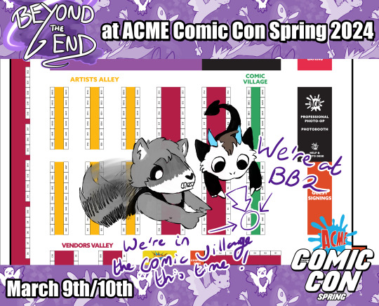
I'm going to be tabling alongside @duskdragonxiii at ACME Comic Con Spring on March 9th and 10th! It's our first time in Comic Village rather than Artist Alley so come by and give us some support while we sit among the big publishers!
We'll still have our usual stock plus some new stuff!
15 notes
·
View notes
Text
“𝓐𝓵𝓵 𝓽𝓱𝓪𝓽’𝓼 𝓵𝓮𝓯𝓽 𝓲𝓷 𝓶𝔂 𝓱𝓮𝓪𝓻𝓽 𝓲𝓼 𝓶𝓲𝓼𝓮𝓻𝔂 𝓪𝓷𝓭 𝓭𝓮𝓼𝓹𝓪𝓲𝓻…𝓪𝓷𝓭 𝓷𝓸𝔀, 𝔂𝓸𝓾 𝓬𝓪𝓷 𝓼𝓱𝓪𝓻𝓮 𝓲𝓽!”
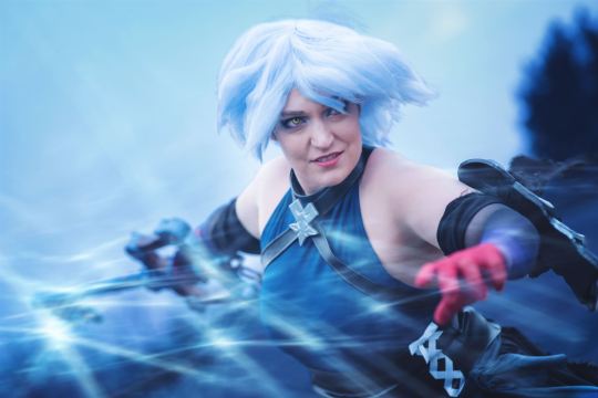
📸: https://www.instagram.com/alasdair_watson?igsh=ZzhwbDBwdmZ4bHN6
#kingdom hearts#disney#kh#square enix#cosplay#kingdom hearts cosplay#keyblade#kingdom hearts 3#kh3#kh anti aqua#kh aqua#anti aqua#wayfinder trio#anti aqua cosplay#kh3 cosplay#acme 2024#acme comic con#acme glasgow
7 notes
·
View notes
Text


ACME Autumn!!! We're running a Fallout stamp rally!
Featuring the talents of ClicksArts, CyberWireSketch, KittenKattArt, rockbtmbasement, Cutiemals, ScriptKittySketch and myself!
We'll see you there!
#ACME#ACME Glasgow#ACME Autumn#ACME AUTUMN 24#ACME AUTUMN 2024#fallout#I am! Excited!#glasgow comic con
0 notes
Text
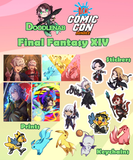
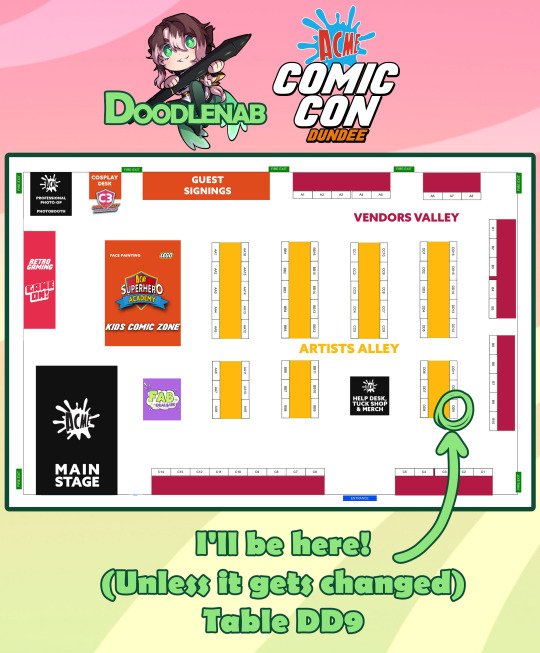
I'll be tabling at ACME Comic Con Dundee on June 15th! (This Saturday!)
Here's just some of the things I'll be selling, as well as where you can find my table!


#If you're going please feel free to come and say hi!#artists on tumblr#ACME dundee 2024#convention artist#comic con#artist alley
0 notes
Text
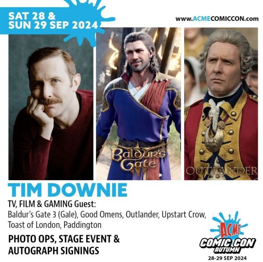
Tim Downie. ACME Comic Con. 28th-29th of September 2024. Glasgow, United Kingdom.
10 notes
·
View notes
Text
SDCC 2024 Exclusive Star Wars “Dark Side Rising” Darth Vader Print by Tricia Buchanan-Benson x Dark Ink Art x Acme Archives
Acme Archives Ltd. and Dark Ink Art will be at San Diego Comic-Con 2024 again later this month with some great officially licensed exclusives. Check out the San Diego Comic-Con 2024 Exclusive Star Wars “Dark Side Rising” Darth Vader Print by Tricia Buchanan-Benson! This Star Wars inspired print featuring Darth Vader is a 13”x19” hand numbered fine art giclee print limited to just 150 pieces. It can be pre-ordered now at DarkInkArt.com/pages/sdcc-2024-exclusives for $89 for pick up in person at the Acme Archives SDCC booth #5629. The artist will be at the show signing prints. Non-attendee ordering for shipping will start July 24th at 5pm PT. http://dlvr.it/T9Vxb3
0 notes
Text
Good Omens graphic novel update: August 2024
This time last year, the Kickstarter was in full swing, what a journey it’s been since then! Colleen is still working hard to complete the graphic novel and we have some incredible pages to share with you.
There have been many merchandise updates in the past few months and whilst a number of backers told us they loved these, others wanted to hear more directly about the graphic novel itself. So, for this month we will focus 100% on Colleen’s work, and how the various editions of the book are coming along. Everything is shaping up rather nicely, if we do say so ourselves!
You may have seen some of the sneak peeks Colleen has posted recently, such as this wonderful scene between our heroes:

And our favourite angel and demon on the road.

Collen has recently shared a rare view from her drawing board with us. "Working on pages 75 pages apart at the same time" she explains. The joy for us is that these pages arrive similarly out of order, so the graphic novel is unfurling like a magnificent jigsaw.

The reversible alternative covers by Rachael Stott and Frank Quitely are coming together beautifully. Different vibes, both ‘heavenly’ and we’re delighted to share them with you:

Moving inside. Here's an introduction to your introduction: our favourites include: Dog: Satanical hellhound and cat-worrier. Everyone should have one!

With the pencils mapping out the story almost completely in place, here are some samples from across the book – don’t worry we’re not giving too much away. It is always interesting to see these images come in, then watch them evolve over time

As we enter the latter stages of inking and colouring, we're also getting glorious new artwork by the bucketload. Colleen has been working diligently and it’s simply wonderful to see the story coming to life so vibrantly.
We shared this a few updates ago in its inked form. Now here it is in full glass-shattering colour.

A jaunty moustache and some 'definitely not-bad-news' being delivered in the middle of a birthday party.

A prior inked piece we shared before. Crowley venting his frustrations, oh so subtly.

And here's a closer look at some of the Horsemen in situ.


...of course you must also have some snippets of Aziraphale and Crowley having a fine time with books and wine.

And this rather lovely panel ends the previews of our main duo for this update.

But one final thing before we leave our heroes for this month... feast your eyes on this absolutely gorgeous celestial piece.

And now to the admin.
If you have a query, please check the Good Omens graphic novel FAQ page at terrypratchett.com. Some key recurring questions:
The Good Omens graphic novel was listed to publish in July 2024 - why have I not received it? We shared an update on April 16th 2024 introducing the new timeline and full context on why dates had to be moved. You can read that here. We appreciate that some didn't catch the timeline update and had been expecting items to arrive across July and August - the graphic novel and surrounding items are due to arrive in Spring 2025 to align with the new publication date. Thank you for your patience. We promise that it will be worth the wait!
I've been in touch with a query about my pledge but have not heard back - what should I do? We have been dealing with a significantly increased number of messages recently and our team are working through them as best we can. If you have messaged over a week ago and are yet to hear back, please get in touch again, either via the message thread on Kickstarter or your previous email chain. Rest assured, we are reading and working through all messages as quickly as we can and appreciate your patience.
If your question is not answered in the FAQ, please don't hesitate to contact us and we can get back to you as soon as possible.
Events
We announced in our June update that Crowley's S2 Bentley would be appearing at ACME Comic Con in Glasgow. Unfortunately, our team will no longer be attending, so the Bentley will not appear at this event. We wanted to let you know as soon as possible in case you have booked tickets expressly to see it, or to meet the Good Omens HQ team. Maggie Service is also no longer attending the event, however Quelin Sepulveda, our beloved Muriel, is still appearing on the Saturday, and there are many filming locations around the central belt of Scotland if you are visiting, so you can still make your trip a little more ineffable. We apologise for any disruption to your plans.
Colleen has also had to cancel her appearance at the upcoming DragonCon, as she explains here.
211 notes
·
View notes
Text

Maggie won't be at the acme comic con in glasgow after all :(
189 notes
·
View notes
Text

I wish I could be there :) <3
178 notes
·
View notes
Text
🌑🌑🌑

✨Anti Aqua is here✨
#kingdom hearts#disney#kh#square enix#cosplay#kingdom hearts cosplay#keyblade#anti aqua#kh3#kingdom hearts 3#kh aqua#kh anti Aqua#acme comic con#acme glasgow#acme 2024
14 notes
·
View notes
Text

I've no plans to reprint my Menace to the English stickers and we're already sold out of the plain Scottish ones but there's pride flags for anyone who feels like being a menace
These ones as well as the B-grades will be available at ACME Spring this weekend! Table is BB2!
[Shop | Etsy]
12 notes
·
View notes
Text


At ACME Comic Con Spring in Glasgow next weekend? I'll be with Dusky at table BB2 and here's the catalogue of the stuff I'll be bringing with me!
If you would like, you can now place an order to be picked up at the con!
You will need a ticket to enter the con
You will need some proof of your purchase (confirmation e-mail, order number, or similar)
Your purchase will be kept safe until you collect it
Things marked "PWYW" on here have prices on the site because that's how the shop works - please accept these as reservation costs
We look forward to seeing everyone there!!
List of fandoms under cut
Shin Megami Tensei
Persona
Mo Dao Zu Shi/The Untamed
Scum Villain Self-Saving System
The Dumb Husky and his White Cat Shizun
Genshin Impact
Link Click/Shiguang Daili Ren
Everything for Demon King Evelogia
Devil Survivor
Kamen Rider Zi-O
Kamen Rider 1971
Kamen Rider 555
Kamen Rider Kabuto
Kamen Rider Amazons
Ultraman Mebius
Ultraman Taiga
Hypmic
Ace Attorney
Saint Seiya
Pokemon
Uuultra C
Breaking Bad
House MD
Neopets
Hatoful Boyfriend
Air Gear
FNAF
Timeranger/Power Rangers Time Force
Gundam Z
Beyblade Metal
Buddy Daddies
Beyblade Burst
D. Gray-Man
Caligula
Caligula 2
Digimon
Yu-Gi-Oh Vrains
#ACME Comic Con#ACME Glasgow#ACME Spring#ACME Comic Con Spring#ACME Comic Con Glasgow#ACME Scotland#ACME Spring 2024
10 notes
·
View notes
Text

💖 Mitsuri Kanroji 💖
#demon slayer#mitsuri kanroji#demon slayer mitsuri#cosplay#demon slayer cosplay#mitsuri cosplay#love breathing#甘露寺蜜璃#love hashira#acme 2024#acme#acme Dundee#comic con#acme comic con#恋こい柱ばしら#恋こい柱#鬼滅の刃#swordsmith village arc#swordsmith village
0 notes
Text
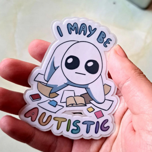
Hit sticker from last Rai Con! I love you autism sticker This was inspired by me trying really hard not to info dump about Doctor Who and failing so bad cause I'm... real normal about it
They'll be returning for ACME this weekend! Find us at BB2!
[Shop | Etsy]
1 note
·
View note
Text
Good Omens graphic novel update: June 2024
Welcome to the June update. A lot of behind the scenes work at the moment but we're grabbing the travel sweets, popping in the Bentley and hitting the road. More on that below.
Admin
Ongoing reminder that the project FAQ can be found here.
I pledged using my Apple ID, or no longer use the address my pledge is attached to, or I cannot work out what email address my pledge is connected to. What should I do? Please contact us via your Kickstarter account where the pledge is connected; we will be able to see on our system which address it is. If it's one you have access to, great! The FAQ has information on how to resend your invite link to access the PledgeManager. If it's one you are not able to access, then you can let us know which email is preferred and we can update this on the system, which will automatically send a new invite.
Events
We've had a lot of queries about when the Good Omens team will be attending events more formally, after some Aziraphale and Crowley spotting at conventions we'd been to previously. Well, we're excited to confirm the first: Good Omens HQ will be at ACME Comic Con in Glasgow, Scotland this September.

We'll be bringing the actual-real-life-home-to-Crowley-and-his-plants Bentley from Season 2 of Good Omens, the first time the car has been made available publicly for fans to come see and get photos with, ahead of its journey back to the set and the start of Season 3 filming.
We also see Quelin Sepulveda, aka Muriel, has been announced for the event for some additional ineffable joy.
You can get your tickets for ACME Comic Con here. We hope to see some of you there.

While we won't be rocking up with the Bentley to this next one, we want to let you know about Ineffable Con which, though sold out in person, is also taking place virtually in July. The fan-run event hosts great panels, auctions and more, with money raised going to Alzheimer’s Research UK, in memory of Sir Terry Pratchett.
Where next? We have - not an exaggeration - a list of about 200 events somewhere from when we asked fans this on Instagram and while we can't promise quite that amount of convention attendance, we're certainly looking to do some more things in future with Good Omens at large. Watch this space.
Good Omens items...
This month has largely seen prototypes and samples for the wider Good Omens merch store arriving, and while we can't share those yet, we are certainly excited to see more fan product suggestions coming to life. That does, however, leave our public item updates a little slim on the ground.
To make up for that, here's some new panels from Colleen:

Also known as, "What could possibly go wrong?" And:

Also known as, "Well why don't you ▇▇▇ ▇▇▇▇▇▇ ▇▇▇ ▇▇!@#▇" or words to that effect, we'd imagine.
Update from Colleen
Following such a positive response to Colleen's piece last month, bringing you behind the scenes into making the Good Omens graphic novel, we are delighted to say that she has agreed to write something for our updates going forward! For June, she's going more in depth into the process of flatting and the technicalities of colouring on screen vs print. Over to you, Colleen.
---
I mentioned the other month that I use a flatter to help me with technical work on GOOD OMENS, and here is a great example.
This is my original, hand drawn line art.

And this is the flatting file which was created using the MultiFill computer program.

It will put your eyes out.
The raw image above demonstrates how the color art lines up solidly under the line art. If it doesn't do that, you get a weird phenomenon in print called ghosting, a tiny little line of white around each segment of color. I had this issue on one major project and ended up redoing every single color file after I got a look at the first printing. Nearly two weeks of work.
The same image with the line art on top.

The layer order looks like this.

Background copy is the clean, line art layer.
I scan the art at 600 dpi, then make the blacks pure black, the whites pure white. Then I convert back to greyscale, then RGB, then duplicate the layer. Then I delete the white on the upper layer so the line art layer is transparent but the blacks on that layer are not.
If you have blacks on a layer that has been multiplied, you can see slight color through those blacks. You want pure black.
The lower layer is where I use the MultiFill program to create the digital flats. First you use MultiFill to drop in the random colors, then the companion plug-in Flatter Pro to make those colors seal under the black lines.
This probably sounds like a silly thing to worry about, but if the flat colors don’t line up perfectly under the black line art, you get the dreaded ghosting I mentioned. You can see it below in this image. It’s a tiny little white line that will appear around the black lines and color areas.

This drives me nuts and is an absolute nightmare to fix.
It’s a very common problem, especially for people who work for web and don’t anticipate the problems going from web to print.
What looks great on your computer can cause big problems in print.
From here, my flatter Jul Mae Kristoffer, who is way over in the Philippines, does flatting that is more in keeping with the areas of color I want to isolate. As you see on Layer 1.

But again, this is still pretty ugly, and not what I would use for final color. Flatting is a technical issue, not a creative one, though in some cases a flatter will make choices you may use. Most of the time they don't.
Here is my final color page.

Sometimes my MultiFill flats are so wonky I have a hard time getting my brain to snap out of what I see before me. If I get stuck, it's a good idea to just pick at it and come back to it later.
If it really, really bothers me, I’ll take the MultiFill flatter layer and desaturate the color so it doesn’t poke my eyes out.
Here’s an example. The digital flat file.

The desaturated flat file that doesn’t make me want to poke my eyes out.

And the final color.

Sometimes I just put in a solid white layer so I don’t see the flats at all. Flatting is there to allow you to easily pick spots to color in, and doesn’t usually appear in the final work.
Sometimes I want to create my colors using transparent color over a white ground, which is more delicate in the final.
Here’s an example from Neil Gaiman’s American Gods. I also selected all black line art here and converted it to sepia to give it a vintage look. Except for the fairies. They’re green.

A colorist must also consider color settings.
Different clients can have different requirements. I find these color settings, which I got from the Hi-Fi Studio, to be pretty solid. I use them as my default for all my projects unless otherwise requested. If your publisher has other settings, they’ll usually send you a csf file which you can upload to Photoshop. The program will save your files and you can just switch between them as you need them.

This tells the printer things about the paper and the spread of the ink you will use. That’s what dot gain means - it makes printed color look darker than intended, so you set up your files to account for it.
When you hover your pointer over each box, it will tell you what each setting is supposed to accomplish.
Another really important thing to consider when coloring comics is color range.
I’m coloring this book in RGB range, but for print you use CMYK.
I’m about to confuse the heck out of some people with this post, I’m afraid. But here we go.
Here is this shot in RGB color setting.

And here is the same page calibrated for print in CMYK.

The biggest shift is in the reds. Print cannot match those reds.
You may not see much difference here, but it’s the sort of thing that drives artists crazy.
A computer should be perfect for conveying exactly what you want, right? It's all just 0's and 1's, binary information, and that information should be the same from one computer to the next?
Nope. Not even close.
First off, computer monitors must be calibrated. You can use a computer program or a tool that measures the color on your computer screen and then adjusts the color to an industry standard.
Have you ever been in an electronics shop where a bunch of TV shows were on display, all of them playing the same show, and have you noticed how different the color was from one TV to the next?
It's like that.
I freely admit I don't pay a whole lot of attention to calibration, but if I were a professional photographer I would. I'd have a little spectrometer attached to my screen and software would adjust my monitor to the best possible standard range. As it is, I just use the default setting on my computer and hope for the best.
If your monitor is properly calibrated and your art is shown on another monitor that is properly calibrated, the art will look almost identical from one monitor to the next.
YAY!
But from one monitor to the next, that's about where the resemblance ends.
Colors are calibrated to something called RGB, or Red, Green, Blue.
All colors come from a mix of red green and blue. At their greatest intensity, all the colors in the spectrum together become pure white light.
This is why RGB is called ADDITIVE color, because you ADD colors from the spectrum to get ALL colors, and all colors create the entirety of the rainbow, and pure white light.
Your computer monitor, your phone, your television, all images are created via light using RGB, a gamut that covers all possible colors that can be created.
That's a lot.
And that's why some of the colors you see on your TV or phone are so deep and intense.
For the widest possible range of color and intensity, you use RGB.
Unfortunately, there is what you can create with light, and then there is what you can create with pigment or ink. And that is why printing what you see on your computer almost never looks exactly like what you see in a book.

For printing, you must use a color setting known as CMYK. This stands for Cyan, Magenta, Yellow and Key/Black.
In printing, the pure blue is actually Cyan and the pure red is actually Magenta.
CMYK color range is not created by addition, but by SUBTRACTION. In order to get the color you want, you reduce the percentage of one of the four colors for ink mixing. Mixing all colors, instead of giving you white, gives you black.
The gamut of CMYK is limited to what can be created with ink.
You've probably heard the term four color press? This is what that means. Four colors, with each color of ink run over the paper on rollers which, combined in varying layers of opacity, create all the printing colors you see.
But remember, what you see on your computer monitor and what CMYK gamut can handle are two different things.
Now, I’ve been really careful with the color settings on Good Omens, so there haven’t been any big surprises, but let me show you a snippet of a project I did for the French fashion house Balmain.
The RGB version:

And then this shot after it was converted to a CMYK file for print.

That's a pretty big difference.
Now, you see this shift mostly with vibrant colors, such as that pink there. But other colors hardly changed at all, right?
That's because this issue is about range of color. CMYK and RGB occupy a shared range which you can see demonstrated by this graphic I got from Wikipedia.

The graphic shows the RGB ranges supported by various digital formats. SWOP CMYK is the most common range my publishers use. Note that the bounding box line shared by the RGB and SWOP CMYK formats shares about half the range space. So whatever RGB colors you use that are outside that range will be digitally converted to the smaller SWOP CMYK range.
And you may not like what you end up with.
As you can see, some of the most ethereal and intense colors get lost outside of the SWOP CMYK boundary.
A look at the Dark Horse Comics color settings in Photoshop. Theoretically, this information should prevent your art from looking like mud on publication.

Now, after I just told you the dangers of coloring in RGB then converting to CMYK for print, I tell you I am coloring Good Omens in RGB anyway. There’s a couple of reasons for this.
Remember, RGB give you a greater range of color, so it can be to your advantage to preserve your original files using a format that gives you the greatest range.
Again, here is the unaltered file.

You can see what the CMYK result will be simply by clicking the Proof Colors button here. This will show you how the art will convert.

And the Gamut Warning will show you which colors are out of gamut range for print.

The intensity of that magenta and that purple in the top right are not going to print true.
This is how it will look in final.

So even if you do what you think is perfect color on screen, there is no way it can perfectly convert to print. Almost everything will involve a little bit of compromise.
Even though you have to consider the color shift issues, preserving your files in RGB gives you greater wiggle room, especially if you get lucky someday and get to work with a printer who can print in 6 colors. Or maybe some technology you don’t know about will pop up and make printing super glorious. Who knows.
Regardless, you should keep an eye on that gamut and color for CMYK print, while preserving your master files in RGB.
Until next time.
848 notes
·
View notes