#WorldBuildingPasta
Explore tagged Tumblr posts
Text
The next phase of the Ayrum project was climate, which I'll introduce with the resource that made my work possible in the first place: these datasets created by Nikolai Lofving Hersfeldt, who runs WorldBuildingPasta and shared all of this with my client and me via Panoply. These were tremendously helpful and I wouldn't be able to achieve a fraction of the final detail without them.

My own adjustment to this data begins with Surface Temperature, which came down to correcting the coastlines (I mistakenly sent in a version of the elevation map that resulted in continental shelves appearing above sea level), refining the effects of elevation, and adding a color gradient.

I was then able to combine this data into Annual Minimum, Average, and Maximum temperature maps, seen above, which was pretty useful too.

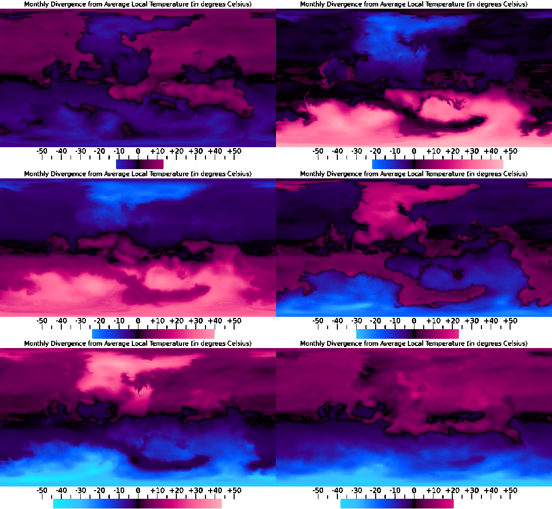
One use for the Annual Average map, for example, was providing a baseline to compare each month's data against, seen in the sequence above.

And from the Annual Minimum and Maximum maps, I was able to create a map that presents the overall range of temperatures throughout the year, which does a good job of showing just how extreme the conditions are in higher latitudes and further inland.
#digital painting#imaginary climate maps#mapmaking#imaginary maps#Ayrum#Photopea#worldbuilding#commission#long term project#Surface Temperature maps#monthly data sequence#WorldBuildingPasta#Panoply#Christopher Maida Artwork
32 notes
·
View notes
Photo

Retrograde Earth Climate key.
by AncalagonTheBlack42
Context;
A few attempts at doing a speculative map for a world that spins backwards have been done on the internet since a certain study by Mikolajewicz et al came out in 2018 that gave various climatic data on what might happen. I myself have been worldbuilding one for a couple years on/off. Several maps have been shown on here before or since speculating climatic conditions based loosely or speculatively on the map. Especially when it comes to more specific details that the pictures in the study itself don’t provide, but the accompanying video files do. I have been one of these individuals before.
However; none of these used data directly from the study to simulate the temperatures, humidity and seasonality of such a timeline directly, mainly working off guesstimates. With permission from Mikolajewicz himself, I managed to download climate data used in the study and collaborated with the owner of the WorldbuildingPasta blog, who specialises in speculative climate maps of alternate and alien worlds, and he managed to run the data through his software in much more detail than was previously available, creating the map and key shown above.
In other words, this is by far the most accurate climate map to the study that has been made so far, as it was created directly from using the study’s data, although it isn’t perfect, as there appear to be slight differences between the definitions and criteria of biomes between the study and the blog’s software.
Still, this appears as far as we can tell to be the most detailed take on a Backward Spinning Earth so far. Note the substantial changes in the size and distribution of certain habitats, such as the reduction of deserts and dense rainforests, while Dsx climates, very rare in our timeline, are pretty common here.
Where do you think would be the most interesting place to live here?
83 notes
·
View notes
Note
Hello, Is there an artist who can simulate a realistic planet map on gplates? I need this for my project and I can pay for it.
yes actually! worldbuildingpasta takes commissions, you can contact him through [email protected], but on his blog (which i linked earlier) he gives this general guideline:
Projection help/small jobs/general advice: 20 USD
Climate simulation or Resource mapping: 100 USD
World maps (basic coastlines and topography): 200 USD
Full tectonic history or Detailed Terrain: 800 USD
1 note
·
View note
Text
i think that the newer atmospheric models suggest that atmospheres can transfer heat away from the subsolar point effectively enough to have a large temperate region and liquid oceans on the day and even possibly night side. there's a worldbuildingpasta series about it if you're interested
in news: tidally locking a planet does more than just trap one side in eternal day, it creates some of the most obscenely overly complicated questions about how wind works and what the atmosphere should look like
19 notes
·
View notes
Text

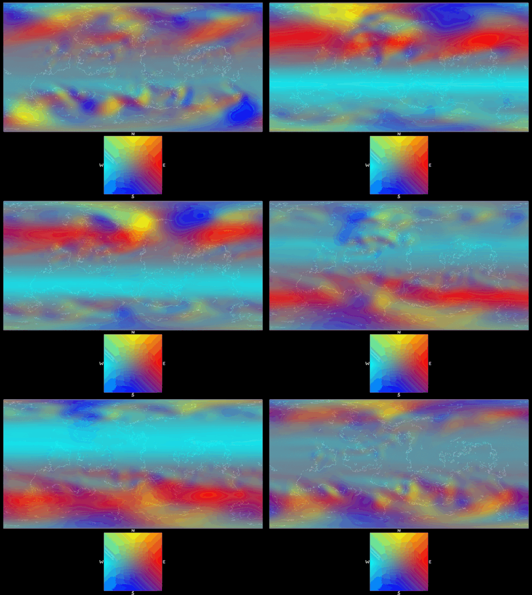
Precipitation was the next dataset that I refined from the lower-resolution Panoply version, which started with applying the wind data (as seen above, I only combined and color-coded WBP's datasets and added a coastline overlay to produce this) to the elevation data in order to create detailed rain shadows.

Once I found the rain shadows and highlights (or the Orographic effect), I was able to apply those to the preexisting Precipitation dataset, and also make the continental interiors a little rainier and then apply a color gradient to the greyscale maps.

With the monthly precipitation established it was then possible to create an Annual Total precipitation map, revealing where the more consistently dry regions are.

Combining the monthly precipitation and temperature data (to wildly oversimplify) also allowed for monthly snow and ice depth maps, which were pretty consistent with Nikolai Lofving Hersfeldt's datasets. As you can see, Ayrum's high obliquity precludes year-round frozen poles.
The next phase of the Ayrum project was climate, which I'll introduce with the resource that made my work possible in the first place: these datasets created by Nikolai Lofving Hersfeldt, who runs WorldBuildingPasta and shared all of this with my client and me via Panoply. These were tremendously helpful and I wouldn't be able to achieve a fraction of the final detail without them.

My own adjustment to this data begins with Surface Temperature, which came down to correcting the coastlines (I mistakenly sent in a version of the elevation map that resulted in continental shelves appearing above sea level), refining the effects of elevation, and adding a color gradient.

I was then able to combine this data into Annual Minimum, Average, and Maximum temperature maps, seen below, which was pretty useful too.

One use for the Annual Average map, for example, was providing a baseline to compare each month's data against, seen in the sequence above.

And from the Annual Minimum and Maximum maps, I was able to create a map that presents the overall range of temperatures throughout the year, which does a good job of showing just how extreme the conditions are in higher latitudes and further inland.
#Ayrum#mapmaking#imaginary maps#imaginary climate maps#precipitation#wind direction#worldbuilding#commission#major project#monthly data sequence#snow and ice depth#WorldBuildingPasta#Photopea#Christopher Maida Artwork
32 notes
·
View notes