#Weiner Werkstatte
Explore tagged Tumblr posts
Text

I don't get it. What's going on here?
Wiener Werkstatte Christmas card, Vienna, Austria, c. 1905.
4 notes
·
View notes
Text

11 notes
·
View notes
Photo

#weiner werkstatte#angel#angels#frohe weinachten#christmas#vintage christmas#vintage illustration#star#the nativity
3 notes
·
View notes
Text
Drawing People 2
Expecto patronum, my dude. It’s me, Evan! I am but a humble visitor in your land of tumbling, so I do not mean to presume, but perhaps the “long post” tag applied to my last missive means verbosity hath claimed my tongue, once again. Let me see if I can make the second act of this drama a little snappier.
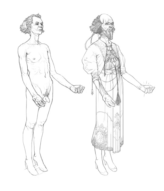
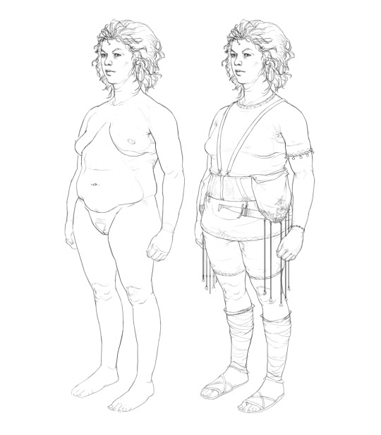
these folks got basic, boring poses so I could use them as simple mannequins. Drawing like this out of my head is fun, but kind of time consuming. Doing a thorough job of the figure before clothing it shortens the time a good bit, and keeping the pose pretty simple removes any demand of the fabric to do difficult things.
Who this? Can’t tell you. Why this? Experimentation! These drawings were great test beds to answer questions about rendering: what kinda stuff works with characters in this idiom, what kind of linework, what level of detail, etc. But on the other side of the arbitrary distinction I’ve just decided to conjure are compositional questions. God I love that word. Composition — The sum of a picture.
Art history, and particular commercial art history has so many good answers to compositional questions, and a lot of their answers make a lot of sense for visual novels, what with commercial art often needing to wrangle decoration and flatness with representational stuff. I’m partial to the solutions of your Muchas Alphonse and kin, but that sort of density and curation of parts is only possible when you’re working with a single picture at a time. Duh, you say and I concur. We have to do more modular stuff, especially if we're going for a high level of detail, and we’re splitting up character and background duties. We needed to find ways of simplifying, modularizing and keeping things unified.
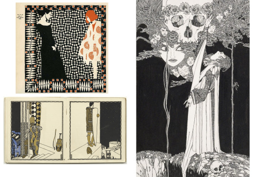
Western commerical art in the late 1800s is really a zenith of single-picture making in my books. It seems to me that there was an endless variety of exciting design exploration supported by real chops.
Luckily commercial art has some answers to this as well. Ya’ll heard of the Weiner Werkstatte? How about John Austen? Oh you’re a connoisseur are you? You’re a quite hip individual? Well then, you heard of Carl Otto Czeschka? (I dunno if that’s actually a deep cut.) Here are some common themes between them. Flatten space, use only a few distinct values and colors and use heavy blacks to unify the picture.
Aside from these general ideas, we were specifically interested in Austen’s use of orthogonal perspective. It seemed like a really natural fit — centering the picture on the characters with the world as framing, it’s flatness generating less friction with textual and decorative elements and giving us a pretty consistent format to interface foreground and background elements. Hypothetically it gave us a tremendous amount and demanded less work… Hypothetically.

Pyrga didn’t wind up actually featuring in the prototype but I still love the big weirdo. A compositional feature you might not notice unless you a comp dweeb is that they're not fully balanced pictorially. They very much need an answer to their left, preferably above their shoulder. I tried to carry this compositional incompleteness forward with every asset so they would mesh well with one another and even if they were solo, there would be a visual relation with the background.
So bam. heavy blacks, less variety in the linework, very few colors and orthogonal perspective. There are things that work well here: being attentive to the turning edge of the shadows gives it a flavor I don’t see many places, and aiming for more naturalism gets it out of the Hades/Hellboy sorta cartoony zone that it was trending toward initially.
There are problems, too. I’m not good enough to get that level of naturalism out of my head with any kind of speed so I needed reference. With this character, that’s sort of ok. They're kindof an amorphous blob of fabric and that’s just fine for kit bashing different references and imagined bits and whatnot, but other characters have much more, let’s say definite garments. Secondly the spot blacks pose a real issue for decoration, they wind up needing to override any kind of patterning, and the linework on turning edges winds up noising up and cluttering things. The lack of line opacity and overall brush size is also making some detail work challenging, but I wasn’t quite sure how else to get the linework readable with the asset scaled at different sizes.
Now all this stuff shoulda given me pause, but there were a lot of plates to keep spinning. We were in the thick of writing, I was bouncing between finishing up other designs and trying to get the UI on track, yada yada. Petra was on the mind, as well. We were missing some key things for her — A mask and a cloak.
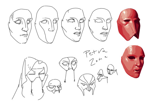
Designing this mask coincided with a push for more overtly greek looking stuff, so I was thinking of how to style a sort of blank face after typical greek statue face forms.
What good is a mask to a very overpowered warrior? Our answer was threat display, what with Petra often fighting enemies that wouldn’t be repelled by armor. This was something to stop hapless goons from running into the three toothed meatgrinder. So the question is what’s scary, then? What’s badass enough you don’t wanna fuck with the person wearing it?
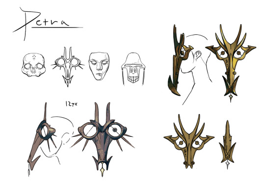
It’s nice to do a little painting every now and then. 90% of this project h linework and flat color. Here the painting was particularly useful to communicate the form to future me who’d have to draw it from a lot of angles.
Turns out neither of us wanna fuck with the Hydratic's eponymous Hydra. It’s a pretty obvious subject in retrospect, what with Petra being a state zealot, but the thought of making that her mask didn’t come up till quite late, likely because in my head the Hydratics were a fundamentally 2d people — wouldn’t you know, turning a 2d idea 3d gave it a lot of personality.
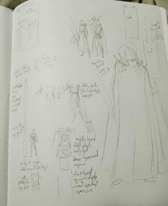
A sasha sketch page. They had a lot of really fascinating ideas about Hydratic garments that made so much sense for their history.
The mask design was pretty straightforward all things considered. But the cloak… Sasha and I had been trading sketches of just what to do with that fuckin thing for like months. It was a complex problem because there were a lot of bases to hit. The Hydratics are modern, sporty, military, brand heavy, decorative, flat, uninterested in veneration. Petra is workmanlike, zealous, uncharmed by culture, physical, and at a pinnacle of hydratic military service. We need some indications of greek-ness no matter what, but we shouldn’t be too greek cause reasons. Getting these competing elements to all work together became a very interesting puzzle. How would you solve this?
For us the answer actually came outta watching 1917 a while back. Both Petra and Io are supposed to have a couple cues that liken them to ww1 soldiers, their experience in the apocalyptic conflict sharing some character with 1917’s hellish proceedings. This got me thinking about more dedicated military gear, and a slightly different character to Hyrdratic warriors. What of instead of hoplites, they were more like riflemen?
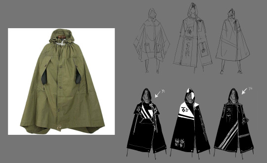
This almost looks like concept art!
In research, I’d found a genre of eastern european military poncho/cape thingies that really worked. They got armholes so the soldier can handle their firearms while still wearing it, it doubles as a tent, it’s rugged, it’s got kind of a rigid silhouette but it can be worn in interesting ways to break up the figure, and importantly, it’s got a whole lot of real estate what you could jam Hydratic Icons on. It’s a perfect fit for Petra who’s traveled Greece fighting monsters and champions. Her spears even work as tentpoles!
I can’t say I’m 100% happy with the final design (pictured at the front of part 1) but good golly it’s a hellofalot closer to the goal than what we were cooking up before. So I think we can call this a draw. Some problems on the style front, some solutions on the character design front. But the damoclesian sword of asset-completion hangs large above our heads, dear reader. Oh dam I think that means there gonna be a part 3! Good golly! Check back in soon for the laborious conclusion to this junk where I do a full process breakdown of an asset.
13 notes
·
View notes
Photo

Set of Six Accessories Josef Hoffman for Bieffeplast Weiner Werkstatte
Set of six desk or kitchen accessories Josef Hoffman for Bieffeplast Weiner Werkstatte in black finish. Two baskets with glass inserts., a bud vase with glass insert, a centerpiece/bowl, a napkin holder and a square desk accessory. BIeffeplast 1970s. Labeled.
20 notes
·
View notes
Photo


Josef Hoffmann (1870–1956), an architect and designer, was a creative mastermind who believed in the power of the aesthetic. Hoffman played a central role in the formation of the Vienna Secession. Vienna, a leading cultural destination at that time, saw its middle classes - from artists to architects - strive to emancipate themselves from the aristocracy’s domination. Inspired by the ideals of the Secession, in 1903, Hoffman established a fine arts enterprise known as the Wiener Werkstaetten (Vienna Workshops). It had a clear aim: ''to make all facets of human life into one unified work of art.'' At the Wiener Werkstaetten, both architecture and interior design were unified artistic projects, with every element from structure to tableware considered part of one package. Environments were fully composed, finely crafted and aesthetic.
Adolf Loos (1870–1933), a pioneer of the modern movement in architecture, considered architecture as integral to people’s lives rather than remote or detached. Whereas Hoffman was of the opinion that architecture and design were artistic projects and strove to produce modern art, Loos viewed art as autonomous and far removed from the manufacturing of everyday buildings and household items. Loos also aimed to create modern culture, committing himself to ideas that were both evolutionary and liberating and believed the intention of architecture and design was to create an enduring and unobtrusive background, thereby leaving room for individual self-expression.
https://www.yatzer.com/adolf-loos-josef-hoffman-mak-vienna-modernism
http://www.dara.org.ar/index.php/caminos-al-modernismo-josef-hoffmann-adolf-loos-y-su-impacto/
11 notes
·
View notes
Text
Vienna secession chair

I recently bought these three rather unusual pieces at a yard sale for $5. I believe it is 19th century standing out from his typical works. The quality of his work is excellent and was geared to the tourist industry. Pittaway-Jarvis operated from 1882 until 1890, and 1907 into the 1920s and 30s. This piece is unusual, having more interest with the steamboat, sailboats, dwellings on mountainsides and figures of the period onshore dressed in flowing skirts with parasols. Your artwork is done by the Italian artist Alberto Prosdocimi (1852-1925) - many of his subjects are famous Venetian landmarks, fishing boats and canals with gondolas. The back label reads ‘PICTURES AND ART GOODS FRAMING, PITTAWAY-JARVIS Limited OTTAWA, ONT.’ I look forward to your input. The painting measures 31 x 42 cm (12 x 16 inches). I’m not sure where it originated, but I know my grandfather was posted overseas in the Second World War and may have brought this painting back for his wife. Prosdocimi F.’ from my mother’s parents who were born in 18. Your six chairs are collectively worth at least $3,000. Bentwood furniture is in demand, and the turned elements, along with the caned back panels, are unusual and rare. Apparently, David Gabriel Fischel started his bentwood furniture business in the town of Mimoñ, located originally in the Bohemian district of Niemes (now part of the Czech Republic). The odd chair was also Hofmann’s design - he had previously designed for other furniture companies. He did this along with artists and other designers such as Gustav Klimt, Kolomon Moser and Otto Wagner. His work included everything from glass, metal, pottery, art and - Bentwood Furniture. He established the Vienna Secession in 1897 and the Weiner Werkstatte (translating to Vienna Workshop) in 1903 - the Austrian variant of Art Nouveau. This was during the Arts & Crafts movement - one geared to inventing new designs using handwork to offer function and beauty with new designs to the middle-class public while moving away from the influences of commercialism as much as possible. You have stunning bentwood chairs designed circa 1900 by Josef Hofmann - one of the most influential architects/designers of his time.

1 note
·
View note
Text
Egon Schiele: “L'Arte non può essere moderna, l'Arte appartiene all'eternità”
Egon Schiele: “L’Arte non può essere moderna, l’Arte appartiene all’eternità”
di Sergio Bertolami 36/2 (Parte seconda) – I protagonisti Con l’idea che non esista un’arte moderna, ma eterna, Egon Schiele dal 1909 entra a pieno titolo nella cerchia dei pittori di primo piano. Fa parte del “gruppo Klimt”. La Weiner Werkstatte stampa tre sue grafiche. Già nel 1911 gli è riservata una monografia, scritta dall’amico Albert Paris von Gütersloh, uno degli artisti del suo stesso…

View On WordPress
0 notes
Text
6 - Industrialisation


This week introduced industrialisation and graphic design in the midt of mass production. The Graphic Design Magazine, Ver Sacrum, was developed during the Vienna Succession. Emerging from Vienna was also the first design company Weiner Werkstatte.


In Germany, Peter Behrens was a craftsman during the industrial boom and had developed the turbine hall which was the pinnacle of mass production of products. He also started his own design company, AEG, where he contracted various designers who would assist him in projects.

Contrastingly, in response to the acceleration of speed and modernism emerged Art Deco which celebrated decorative elements.


At the same time, the Bauhaus was the first school of design which was significant for artisans to employ mass production. It was a complete diversion from the decorative and an emphasis of function over form.
0 notes
Text
Answer 11 questions and then come up with 11 of your own and tag followers. (I was tagged by @brigdh to answer these questions)
1. How do you organize your bookshelves (alphabetical, by subject, by color, etc)?
Well, size is a big factor since I’ve got a lot of large “art” books and tiny “gift” books but within that it’s primarily by subject/type: Museum exhibition catalogs/books, sewing/historic costuming pattern and technique books, historic book/catalog reprints, fashion/material culture theory, art history, photography, history by time period, fiction by author, miscellaneous
2. If space/money/ethics were not an issue, what is a wild animal you’d like to adopt? A penguin. It would make my spouse so ecstatically happy.
3. Do you play any sports? If so, which one?
Hahaha! No, at least not now. In high school I fenced but that was primarily because ATTACKING PEOPLE WITH WEAPONS and the fact that the fencing instructor was sympathetic to a technical theater schedule which was my primary extra-curricular activity. He would also help choreograph fight scenes for my school’s Shakespeare Festival week.
4. City, suburb, or rural?
City all the way. I hope to never have to ever learn how to properly drive a car. That said I also love hiking through the Scottish countryside so I guess I like the extremes. Absolutely no to suburbs.
5. What is your ideal breakfast?
A strong cup of cappuccino and fresh pain au chocolate.
6. What is your favorite style of art?
Is melancholy and contemplative women in pretty dresses an art style? If you’re looking at art movements I’m a fan of Beidermeier, Art Nouveau, and Weiner Werkstatte style decorative arts.
7. What unusual thing do you keep in your purse/pockets/car trunk?
I generally have my combination pen/screwdriver/level in my purse but weirder than that? I still have a Doctor Who Weeping Angel Valentine’s card in my wallet that says, “Can’t Take My Eyes Off Of You”
8. What is the scariest movie you’ve ever seen?
Return to Oz. I still occassionally have nightmares about the Wheelies and the hallway of of severed heads.
9. What is your favorite Wikipedia article? (Everyone has some weird but fascinating trivia page, surely!)
Emu War I guess?
10. What is your favorite word? Least favorite?
Favorite: Whatever will get me the highest score in Scrabble when it’s my turn
Least favorite: All the high scoring words I can spell with my tiles that I can’t play on the board.
11. If you could know the absolute and total truth to one question, what question would you ask?
The full legal names of my father’s birth parents.
I’m not going to tag anyone but feel free to play along if you want!
5 notes
·
View notes
Photo

Selling Vintage Foreign Postcards on Ebay from U.S.A As an ardent collector of topographical view postcards of U.S.A., Texas and artist signed postcards of great artists such as Alphonse Mucha, Oscar Kokoschka and other artist of Weiner Werkstatte, I used to purchase large lots or collection of postcards from different venues in US, such as Estate Sales, Wholesalers, Rummage Sales, Flea Markets, Auctions and from the internet.
#apartment london#apartment new york#apartments#apartments barcelona#luxury house#luxury villas#luxury villas italy#luxury villas mallorca#luxury villas marbella#real estate#villas for sale gran canaria
0 notes
Photo


Weiner Werkstatte book design at the MAK, Vienna
1 note
·
View note
Text
Woebegone Weiners
3 Star Yelp Review
Manor Oktoberfest
73-11 Yellowstone Blvd Forest Hills, NY 11375
Only recently did I realize how much I love Austrian/German food. Maybe it's because I started making sauerkraut from scratch and I'm jealous that my kraut has not been perfected yet. Maybe it's because I giggle every time I hear the word schnitzel. Maybe it's because of the sweet and slightly burnt smell of large baking pretzels. Whatever the reason, I'm a fan. There's a place close to me called Werkstatt that serves some of the best Austrian food I've ever tasted. So my standards are pretty high now. When my gf and I walked into Manor Octoberfest, I was hoping that I'd be getting much of the same experience. I got the Wurst Platter "Oktoberized" (a German word you've never heard)-aka $4 extra for bacon, mushrooms & onions. My 2 wursts were pretty good. The flavor was alright, but a tad bland. The kraut and potato salad were also alright, but make me feel a little like they were spooned out of a vat. No presentation, no seasoning. The part I was most excited about was the "oktoberization" (another German word you've never heard) of my meal. It's pretty hard to mess up sautéed vegetables & bacon, but sadly this was the part that disappointed me most. The thick cut of bacon was overcooked and the veggies were bland and undercooked. Overall, the meal ($25 for just my portion) made me feel like I was at a sub par diner. Sorry friends, it's just not worth it.
0 notes
Photo

Josef Hoffman (1870–1956), Cigarette Case with elaborate ornamentation of gold, opals, lapis, turquoises, mother of pearl, agate and semi-precious stones, c. 1912
John Foster has a great visual post about the Wiener Werkstätte (Vienna Workshop) over at Design Observer.
#Weiner Werkstatte#Vienna Workshop#Josef Hoffman#stones#cigarette case#design#Design Observer#modernism
31 notes
·
View notes

