#Uni!Arial
Explore tagged Tumblr posts
Visit Tumblr Blog
Explore Tumblr blogs with no restrictions, modern design and the best experience.
Last Seen Tumblr Blogs


Fun Fact
After the announcement of the deal with Yahoo!, there were 170K signatures of unhappy Tumblr users petitioning to prevent the sale in 2013.
Text
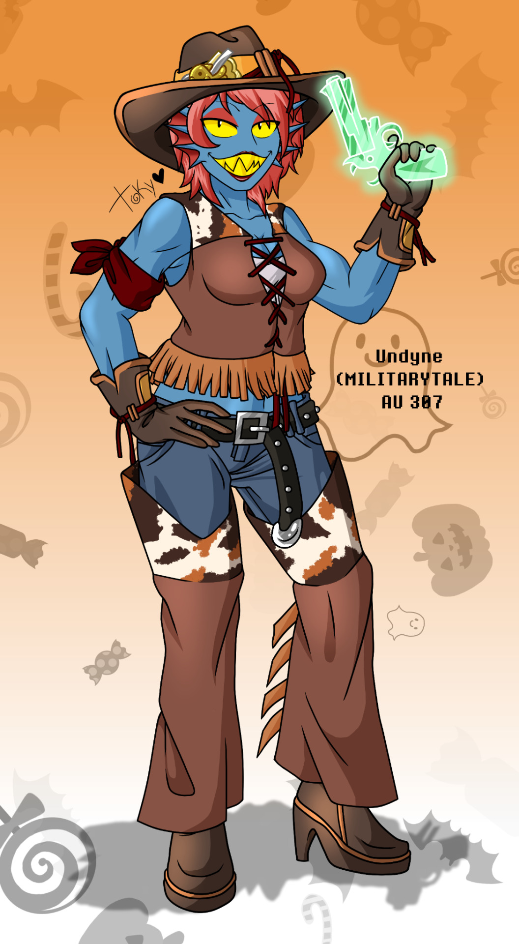


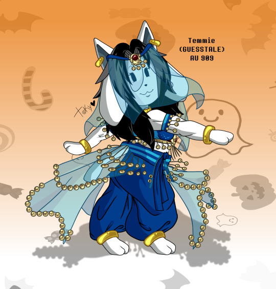
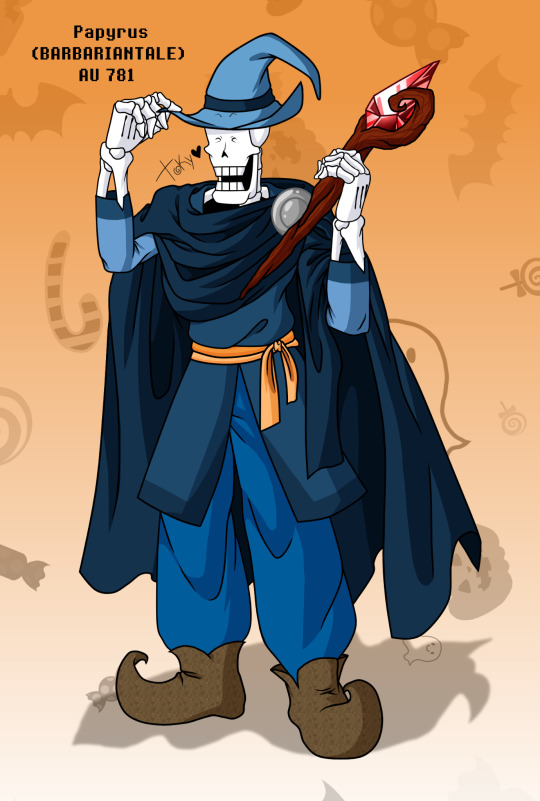
UNITALE (An alternate tale) - HALLOWEEN! ✨
Well, some forgotten and delayed Halloween things hahaa ñwñ ✨ but, at least the costumes are always fun to wear!! 🎃 see you, greetings! TOKY! ♥️
#UNITALE (An alternate tale)#Halloween#Halloween costumes#Halloween 2023#M!Undyne#Hit!Sans#H!Toriel#Uni!Arial#Guess!Temmie#B!Papyrus#Costumes#food#drinks!#Many dances and a wizard?!#Undertale au art#Ut AU#Ut AUS
20 notes
·
View notes
Text

🎃 Halloween Event Collab by @zarigi and @toky502 🎃
#Halloween Event#Art Collab#Undertale#Undertale OC#Uni!Arial#Guess!Temmie#M!Undyne#B!Papyrus#Dark Unity
14 notes
·
View notes
Text
TYPEFACES I THINK THE MOBSAI MAIN CAST WOULD USE
Decided to be insane and come up with some headcanons on the typefaces each character would use. Please shout at me about it on the psychohelmet forum if you get the chance. I've copied and pasted the headcanons under the read more for your viewing pleasure.
I wanted to share my headcanons for the different fonts (using this term very generally) each of the mobsai main cast would use (if we are imagining that they were given free rein to do so for some reason, and also that they wrote using a latin alphabet, obviously) which I just made up off the top of my head right now.
Anyway, here we go:
Mob - Calibri
I think this one makes a lot of sense, just off the bat. I really don't think Mob would be a serif sort of guy, he's too plain and unassuming for that. What better than to make him a very default font. I honestly don't think you can even get more default than calibri. It even sounds a little lame when you say it. Despite that, it's a pretty dependable font, it appears everywhere, and I would argue is very powerful due to its universality and legibility on any-sized devices. But don't just take my word for it, here's what Microsoft has to say about it: "Its proportions allow high impact in tightly set lines of big and small text alike. Calibri’s many curves and the new rasteriser team up in bigger sizes to reveal a warm and soft character." I would argue that this clearly reflects Mob's welcoming character and desire to understand and empathise with any number of characters within the show.
Reigen - Arial
Again, I do feel like this just makes sense to me. Reigen is also a real sans-serif sort of guy, he's the greatest psychic of the 21st century, he's spice city's bro! Arial I feel is also a little more professional than calibri, while still being quite similar in appearance, which I feel reflects the influence Reigen has over Mob's character and development within the story. Described by Microsoft as an "extremely versatile" typeface, especially "for display use in newspapers, advertising and promotions", I think this works well for Reigen's character. It's also a pretty dyslexia friendly font, which I think would be a fun fact he'd shoot at Mob.
Dimple - Papyrus
This one was a little tricky. I wanted it to look dated, considering Dimple's been dead for some time, while also being a little flashy to reflect his desires for godhood. I settled on papyrus because, well, look at it. It's definitely what I'd consider a meme typeface (which I think is fitting for a sentient fart, honestly), but it's also loud without being too out there, and a popular and fun font to use. It's unapologetic and real, which I think Dimple represents as a character, and the complete opposite of a font like calibri. It also looks good in green.
Ritsu - Times New Roman
Ritsu is absolutely a serif guy, through and through. He's always on that 12pt Times New Roman shit, even if he's just writing a casual email to someone. Ritsu is someone who takes things seriously, and has a reputation he wants/needs to uphold. I'm sure he read somewhere that TNR (I'm not writing that shit out again) was the professional font and just made it his whole personality or something. It looks good, so I'm not complaining. I've also heard that TNR is a good font to make study notes in, because you remember it better (I think this was a myth uni students used to tell each other though) but I'm sure he stands behind this fact wholeheartedly.
Teru - Blackadder ITC
Just listen to what Microsoft has to say here in its overview of this font: "Blackadder ITC font is an elegant, yet menacing display face is perfect for theatrical uses and scare tactics." Not only is it elegant and swirly, but works well with his flashy appearances and fashion choices throughout the show. It's impressive and makes a scene when it appears, and walks the line between impressive and gaudy very well for someone as in-TERU-sting as Hanazawa. I do think he'd switch around fonts a little, but this would be his favourite for sure.
Serizawa - Roboto
This one was also hard, and I'm not sure I did him justice. I think, given Serizawa's lack of real-life experience outside of a terrorist organisation as well as his time online, I wanted to go with a font that was professionally acceptable, but still a bit of an outlier. Roboto is also the default font on android devices, and all other google services, which I figured would reflect the 'shut in' phase of his life. It's sorta plain, but does the job and follows the rules without asking too many questions. I think if we were talking specifics, he'd be Roboto Mono.
Tome - Courier New
I need to preface this explanation by saying I love Tome. More than almost all of the characters in this show. She reminds me a lot of myself as a kid. This one's personal. Tome is obsessed with proving the existence of aliens, or any sort of extraterrestrial and paranormal activity. She starts the Telepathy club to research these phenomena, she's absolutely committed (apart from in that one episode) to show the world she's right, to have her friends take her interests seriously. I think she'd want to use a font that was interesting to look at, while still being serious-enough to reflect her passion for pursuing the truth. She probably watched the X-Files as a kid and really wanted to type up some legit-looking reports on the unexplained. No I'm not projecting.
Shou - Comic Sans MS
I mean, what did you expect. He uses Comic Sans for all his reports and thinks he's the funniest guy ever for doing so. He also just likes how it looks, I think he'd be into superhero comics and would love to make any work he does look similar. Not only is it a funny text face, Microsoft also calls it "useful" due to its readability. I think that definitely mirrors Shou's extraversion and his role as a helpful figure, both to Ritsu and to his father at the conclusion of his arc. I also bet he logs on to Toichiro's desktop sometimes and changes his default email font to comic sans too, probably makes the fantastic five or whatever they're called piss themselves with laughter. Also a frequent Wingdings user, for sure.
Toichiro - Futura
Guess I have to put him in here too, since I talked about Shou. I chose Futura here for what it stands for, a purely geometric and efficient typeface which I feel reflects Suzuki's ethos of wanting to be the best and creating a world where 'supreme beings' rule over normal humans. The progressive feel Futura has here becomes skewed, not towards a bright future but towards a descruction of the old order and a rebuilding of an ESPer-led world. An incredibly popular font, which I feel is all about appearances and precision, it wants its letters to stand in line, breaking away from the old 'grotesque' style of former sans-serif fonts. Do you see my vision?
Sample of their fonts below:

15 notes
·
View notes
Note
7, 16, 29
Okay, @dahllaz, let's go.
7. your preferred writing fonts:
I am definitely a sans-serif girl. Arial or Calibri will do it for me. Very easily pleased. It doesn't take much.
16. favorite place to write:
Not sure I would call it my favourite place, but I do most of my writing at my laptop at my work desk. I have a standing desk in my living room, with an executive fancy office chair (I needed the extra height, because the standing desk's lowest height setting was still too high for the highest chair setting in a regular office chair, because I am a short ass. I also use my old massage table bolster as a foot rest, so that I can sit at the proper stance, back straight, arms at right angles, feet on the floor/rest). It's a very comfy set up. PLUS, a standing desk. So I can stand when I want. It's in my living room in front of my television so I can also watch tv/listen to music when I work.
Back in the day, I used to handwrite all my fics and I would do it on the train, during breaks at uni, breaks at work, wherever the mood took me. Now I mostly type it directly. I type faster than I write, so it flows a lot better.
29. how easy is it for you to come up with titles?
Actually, pretty easy.
The majority of the time, I have the title before the fic springs to mind. Or, I have a general idea of the fic and the title will come to me. Definitely before I start writing. I have a history of using song titles. Paint It Black, Memory Cloud, The Girl of My Dreams is Giving Me Nightmares, Wicked Game, Spoonful of Sugar, etc...
Although, sometimes the fic titles will come from themes. Deep Deep Down Where the Darkness Dwells, A Swan is A Beautiful Creature, Molasses and Taffy, Sometimes, The Catch, Subject 3662, The Best Deceptions, Blooding the Water.
It's a rare, rare fic where I don't have a title before I write. Even D5, which remained title-less for the first six or so chapters before I posted it, was actually titled well before that, I was just resisting it and trying to think of something else.
Same as The New Moon, (for obvious reasons I was resisting this title), but after The Blue Moon, The Honey Moon, The Waning Moon, and Lunar Eclipse, there really was only one title for the fifth in the series. I mean, I could have called it The Waxing Crescent Moon, but let's be real it just doesn't have the same ring.
2 notes
·
View notes
Note
HIIIII :D
12 and 7 for the fic writer asks?
Hello!!!!
12. a trope you’re really into right now
I'll be honest this answer changes DAILY (hourly even) but you know the 'I don't remember who you are but I think you're important to me' thing? yeah. That. I literally wrote an orv fic with it like last week..
7. your preferred writing fonts
For fanfic it's just my Google docs default which is Arial. Stimuwrite's default is Roboto sans and I don't change it. It's only when I'm writing something serious like uni notes or assignments that I ever switch fonts and it's to use comic sans because yes.
2 notes
·
View notes
Note
Hi <333
For the writing asks i would like to know 1, 16 and 35 or just one of those if all are too much
Heya Berry!! <3 hehe
1. What font do you write in? Do you actually care or is that just the default setting?
I write in Arial! It's the default setting, though I had a long time where I wrote in exclusively Calibri and got very upset when it for some reason wasn't set to be that. Then I stopped writing for a while and apparently that reset the brain, and now it's Arial gfdhsj
(not the default, and very important to me, is the gaps between paragraphs. literally will not write past a paragraph before enabling that if I forgot before, it's too blocky otherwise and I need it for the brain)
16. What’s the weirdest thing you’ve ever used as a bookmark?
Oh, I think I'm pretty tame in that regard? My current bookmarks are an actual paper bookmark (space, in blue/ purple) and a long expired coupon for an etsy shop I once bought earrings from. In uni times I often used pens or highlighters as bookmarks though, when I had to flip between many sections quickly, because those leave a gap I can quickly slip my fingers into! But otherwise I don't remember any particularly weird bookmarks, I mostly just use the nearest clean flat something that's available!
35. What’s your favorite writing rule to smash into smithereens?
I think there's a rule about not starting sentences with like "and" or "but" and stuff? I'm so ready to break and ignore rules I'm not even sure about the details fghdjs (plus the differences between German and English grammar - fuck if I know)
There's just a difference between like, academic writing (which I never want to do again, jfc) and creative writing - the latter is a medium to toy with to begin with! But now that I'm remembering academic writing, god. One time we got to write an essay where we didn't have to hide that yes, this is our opinion and we are in fact a person writing this and not a perfectly objective computer. I immediately just turned the whole thing into a bit and that's why I once had to reference a youtube comedy sketch in APA style <3
And oh, actually! I just remembered I take so many liberties in terms of compound words and capitalization, where German brain comes through. Like night vision I hate that it's two words, I say nightvision because it looks better to me, and I won't stop, same with any other suddenly-a-compound-word words, don't mind that read along <3
#answer let luce#betweenblackberrybranches#my first powerpoint after uni was the sleep powerpoint#and i felt so vindictive making it as unacademic as possible but still having a proper reference list#like yes having easy access to the sources is sexy#having to write like im not a biased human being isnt#and i just love pretending im funny!! cant you let me be funny!!#me @ academia#we're holding hands
7 notes
·
View notes
Note
21. obsession from childhood?
52. favorite font?
61. favorite line you heard from a book/movie/tv show/etc.?
hello and thank you so much for asking! once again I am very sorry that it took me ages to reply to this, I am not very reliable when it comes to these things. :( but I always love doing this, so @ everyone please don't stop asking me stuff or sending me messages! :)
21. obsession from childhood?
I used to be obsessed with spies and would always imagine myself as one. In my mind I was part of a team of three girls called Agent A, Agent B and Agent C. I'm not sure which one I was haha. I even incorporated these spies into a writing assignment in fourth grade and ended up writing like six pages instead of just one. I would also make my own spy supplies, which were basically just ordinary objects with a label on it and some imaginary features. I even chose my sunglasses based on how spy-like they look when I was in like sixth grade. I also loved this book series in middle school called Jane Blonde about a spy girl and thought about it 24/7 during that time.
I grew out of it eventually but a good spy movie/show still catches me to this day. actually, now that I think about it, maybe I should get back into this again.
52. favorite font?
I don't think I have one, I usually use Arial whenever I'm writing something. mostly because it used to be the default and is one of two options for uni assignments but I also switch back to it now that Word changed the default to Aptos. but I also don't have anything against that, so I guess it's really whatever.
61. favorite line you heard from a book/movie/tv show/etc.?
"Take control of your life, Todd! The instant you take control, interesting things will happen." (Dirk Gently's Holistic Detective Agency)
this has been my WhatsApp status for probably 7 years now (jesus christ, how can it be 7 years already since I watched this show??!) and I don't think I'm going to change it anytime soon (but also because no one cares about your WhatsApp status haha).
I think this a good attitude to have in life. always remember that you're in control of what you do and what your life is like and that it's so much better if you make conscious decisions instead of just going with whatever is happening right now without considering whether that's what you actually want or not.
1 note
·
View note
Note
7 and 12 for fic writer asks!
I'd definitely say my preferred fonts are Arial and Times New Roman! A habit that stuck from uni days.
A favourite trope of mine at the moment (if you can call it a trope) is Jayce and Viktor being so insane and in love with each other that it drives the whole narrative.
Ask me things
1 note
·
View note
Text
Permanent marker
Copy
Easy eng
Gv dot u k site
Japan go jp
Is place more than peopel
Th gv
Arial font
Peppa pig font
Oyster card font
Some thing baby and cute toys
News
Cute cafe
Sg style news
Uni
Nice uni at top
Silapakon Stamford Pim Cu Abac Bu
R at bottom and take one letter out, so they dnt get rndm as pwrs
All park
Regent garden in th
Swan lake cd rom
Call duck
arqa.com/en/architecture/the-opera-park-opens-in-copenhagen-providing-a-green-oasis-amidst-a-bustling-urban-development.html
Shop
Ais, otop Betagro Bkk bank, chatrium Bts Bts Carabao Carabao Central Ch 3 Ch 7 Drink cafe Cp Do home Dtac Dusiit Dusiit Ec car Fruit juice and coconut jelly Ginger power Ginger power Gp Hotel and sugar Ichitan Japanese, yamaha K bank Kce ec, renewable energy Krung th Land and house Miso Mk Motorcycle loans dylan Paint Pang company Pet Pruksa Renewable energy Singha beer bath Sm house Solar energy Srisawad Stilesville shop Stilesville shop Sugar Swensens Th food group Th bev Well being services Well being services Wellbeing services Wha
Permanent, dnt change web
Page can save as pdf, thank you
Can close frbes
Dnt hnd any wpns and pl plns dwn
0 notes
Note
7 and 16 for the asks
thank you for the asks!!! 🥺
7. preferred writing fonts:
honestly i like arial lol. i do arial, georgia, and inter. arial is gdocs default, inter is obsidian default, georgia is my darling.
16. favorite place to write:
i love writing in bed on my phone, but anywhere where i have a computer and it's pitch dark is perfect. for example, a uni computer lab past 1am... just so quiet
1 note
·
View note
Text
I am a person of principles. Sometimes my principles a beyond myself to conprehend. I was having a nice chill weekend and then I watched some videos about fonts and decided that I should switch the font for my upcoming talk as I am not really happy with arial. And i decided to go with Helvetia as it is a bitt more minimalist and elegant and has a cool pop culture legacy. So I cycled back to uni to redo my whole talk for more than three hours so that the "a"'s and the kerning is a bit different. Also i was chilling with a colleague during the redo, philosophised about the detailed placement of lines for some figures and finished of with competing in guessing the rgb values of colours.
No person on the planet will notice these little details but the thought of me keeping in the errors in the figures is tormenting.
Just havin a normal one i guess.
0 notes
Text
EXTRA CONTENT! (UNITALE - An alternate tale)
There are objects that at the beginning were created for a greater good... But, over time their purpose is forgotten and they are used for the massive collective suffering... Always a reason, always predictable, everything is repeated... A hope and a sentence at the same time...
The system


* You have to choose the path to your destiny... - The system


* This is the result of not accepting your error... - The system


* Nature is unstablelly beautiful and dangerous... - The system


* The price of a cursed life... - The system
NEXT
#UNITALE (An alternate tale)#Info extra unitale!#Arial the Skeleton#Arial#Uni!Arial#Prototype 1#Alternate universe 502#Golden soul#Omega orb#The alternate interdimensional gap#Bell flowers#Unitale Oc#Undertale au art#Au undertale#Undertale Oc#Undertale au#Undertale au's#The system#UNITALE
10 notes
·
View notes
Note
No, no @codiemarin has a point bc people who like Arial can not be trusted 👀
valid we have to use either arial or times new roman for uni and i always use times new roman
0 notes
Text
Typeface selection
Part of my research was to look into a typeface selection for my animation when the time came to create it. I looked into various different sources and opinions about what typeface could work and considered the context of the speech, furthermore who it was said by.
An article on the website 99designs by Lindsay Kramer "a copy and content writer" cites the following:
"Fonts are one of the most important design choices to make when developing your brand identity. The best fonts leave you feeling like you’ve made an instant friend while the worst fonts are like a stranger who won’t leave you alone."
Therefore it was critical I get my typeface selection correct if I wanted to send the right message through my animation.
Kramer lists the following points about what makes a good typeface:
Even kerning Consistency Balance Legibility
Then lists the following points about what makes a bad typeface:
Overused Imbalanced Unreadable Boring "Fauxotic" fonts
When choosing a typeface I should consider that the typeface is
"Well-crafted and aesthetically pleasing (and) appropriate for your brand".
Kramer lists the following as good typefaces:
Didot Bodoni Garamond Futura Helvetica Mrs Eaves Baskerville Akzidenz-Grotesk Clarendon Gill Sans Verdana Frutiger FF Din Proxima Nova Uni Sans
And then the following for bad typefaces:
Copperplate Gothic Times New Roman Trajan Pro Comic Sans Courier Papyrus Bonzai Neuland-Inline Brush Script Souvenir FF Blur Impact Trajan Pro Curlz Jokerman Lobster Bleeding Cowboys Arial
While all incredibly subjective dependant on the clients needs I feel that this list is incredibly consistent with what I believe. Therefore out of the selection of "good" typefaces, I decided to choose Helvetica. It is incredibly well known and the only draw back from Kramer's list is that it's "overused". However, I thought that since I was working with kinetic type I might be able to use it and get away with it since I will be playing with different ways to present it visually. Not to mention that the wide array of weights that the font family offers allows me to choose weights when I animate to illustrate points better.
I then looked into other sources for a second opinion on what the "best" typefaces are and was met with the same answer on BonFX, a table created by Douglas Bonneville in 2015 lists Helvetica as the number 1 best typeface to use.
With that I then moved into whether Helvetica could be appropriate in a professional setting (to reflect the professionalism of Helen Clark throughout the speech) and found a resource on Studio Kayama by "ikumikayama" under the article "5 fonts that add credibility and professionalism to scientific research". Helvetica is listed at number 2 on their list. With Kayama citing "Helvetica is a font that looks great on both print and on screen. Nature , Science, and Cell request that their figure labels be in Helvetica". Therefore Helvetica is appropriate for a formal/professional setting such as this topic, and furthermore reflecting the professionalism of Helen Clark throughout the speech.
Finally I looked at a resource dedicated to praising Helvetica (despite a potentially bias view). An article on Indusnet by Mainak Biswas titled "Helvetica Lovers Unite: Probably the Most Prolific Font in the World". Biswas states that Helvetica "is legible even when the viewer is in motion, making it popular amongst signage and airline logos" therefore switching it so that the type is in motion would most certainly be viable. Biswas also states that Helvetica is "omnipresent, a lot of big brand have their logos in the Helvetica font. Even though it was widely used, the message it sends across and its professionalism is unmatched".
This concludes my research, justification and selection of a typeface for my animation. Helvetica is suitable for a professional setting and therefore represents Helen Clark in just as a professional setting. Is incredibly popular and safe to use and has a wide range of weights to be able to utilise during my animation.
0 notes
Text
i’m fucking formatting this smut in APA format because i recently finished a psych paper alkdjfaksfjsl
i finished an econ paper using the indented paragraph style of APA bc i had to format it a specific way but i’m.... i’m writing a fucking smut in APA format aslkfjalk
#the only difference is i'm using arial instead of TNR bc i prefer arial#personal#ok so maybe i just have the wider line spacing and indented paragraph#but that's not the point#the point is that i am formatting a smut like it's a uni paper#char rambles
1 note
·
View note